|
|
|
22:43 |
|
|
transcript
|
5:15 |
Hello and welcome to Python for Entrepreneurs. We are so excited and honored that you are taking our course. We can't wait to help you build your online business. Now, before we get to all the mechanics of what we are going to cover, what you need for the course, how to connect to this database or that, let's just talk briefly about why right now is the best time to start an online business. It's easy to get nostalgic and look back and say well, twenty years ago things were so much easier, I just started like look at the companies that exist now. But I am going to show you that yesterday was not as golden as we think it is. It's also easy to say well, I've just got to wait, now is not really the right time to get started, and if I just put it off for another two years all these thing will fall into place and I'll be ready to roll- I don't think so. I think the right time to start is now. You build a base, even if you just started as a side business and let it grow, let it mature and build it up over time and you are going to have something amazing. What did it take to build a business before the internet, an actual physical business, with things made of atoms, rather than bits? Well, you would probably run full page ads in expensive magazines like this, here is an ad from 1968 when Chevy was advertising their brand new cars. Whether you were starting a car business or something on main street, it is hard to get started on these types of business. The startup costs were probably millions, the time to get started is maybe a year if you are fast, it's really hard to get started, the barrier to entry is quite high; and the even so, the profit margin this companies make is quite low. So General Motors just had a record breaking year for profit margins, and it put them way up in the stratosphere at 6%, that is not very high but there are many businesses like gas stations and stuff that make like .3, .2% profit margin. It's extremely hard to work with that little bit of extra revenue, so maybe these physical businesses were not the way to go, maybe it was the .com boom days, back in the late 1990s, early 2000s that we should have started our business. I think venture capital was more accessible at least you didn't have to prove so much to get it, if you'd create a web site with a crazy idea maybe the people gave you money, but to actually get started for most folks was really hard. I recall in 1998 going to a workshop type thing, put together by a couple of software and hardware companies working together and their goal was to show us how easy it was to build an e-commerce site in 1998, and they said look, all you are going to need is this load balancer, this SSL accelerator, these kinds of connections in your data center, this special hard drive, and they said, in the end, it's just going to take you only a 100 000 dollars to get started. I think we could have thrown away some of their software and get started from maybe 50 000, but still, that is a pretty high barrier to entry. This isn't something you just spend up on the side because you have a great idea, it also takes a while to get all those things in place, set up the load balancer, set up the server, set up the software on them, but not just that- connecting the things like credit card systems used to be way harder. While starting a business in a .com day was easier than before, it's not maybe as easy as we might remember. what does it take to start an online digital business today? Let's look inside my business. The one that you've probably bought this class from. So I started Talk Python Training in the early part of 2016, and I went back and I did some math to figure how much I spent in time and money to get things started. It cost me 346 dollars in materials, in hosting, and domains and SSL certificates, to get started, that's it. I built the entire website with the e-commerce capabilities, the email account management, video delivery, everything in 2 to 3 weeks, that's it. After that, I launched the first product on Kickstarter and within 2 months was making solid money. That is a very, very different picture than even the .com days. And yet factoring this out over time, my profit margins are running at 93%. I am telling you, right now is a golden time to get started, and throughout this course, I am going to give you a look inside of my business, Talk Python Training and the podcast, and Matt Makai is going to give you a look inside the Full Stack Python. So you are going to have two real world examples of how we have started a business that to some degree or other is standing out and succeeding. Now it's not all rainbows and unicorns, there are more challenges in other areas today. Almost because it's easier to get started you'll see the competition is tough, so let's just go back ten years if you could pass the technical barriers, put money up front to get started, and get things up and running, chances are you would be running in a pretty thin pack, competition existed but it wasn't so tough, it wasn't so hard to get the word out. However, zoom forward ten years to today, and it looks more like this- even if you are building a business that is unique, it's still really hard to get the word out, so the technical chops to build the business is not enough. That's why in this course we are also going to talk about SEO, growth hacking, the things you need to stand out and break free of this dusty pack. All right, competition now withstanding, I hope you are excited to get started because it is a golden time to start a business, and we are both super excited to share our story and our techniques with you.
|
|
|
transcript
|
2:16 |
It's time to meet your instructors. This course is co-written and co-recorded by Michael Kennedy, that's me, from Talk Python and Matthew Makai, from Full Stack Python. We'll each be presenting various sections of this course, and looking inside our individual businesses, and that's why we wanted to take this moment, show you our picture, let you get used to our voice so you'll know who's presenting when. Let me tell you a little bit about myself. I'm Michael, hey nice to meet you, I'm really excited that you are taking my class. I created Talk Python To Me, the number one Python podcast which, within almost year and a half has had over 2 million downloads. That, in and of itself is a really interesting business story to cover and a large portion of my income actually comes from running the podcast day to day. When it makes sense, we'll look inside the software or the techniques I've used to start that podcast and make it successful. Of course, you are taking this course through Talk Python Training, and I started that as well and in the opening section I gave you a bit of an introduction there, but this part of my company was created in just a couple of weeks, and then the first course was created about a month after that, and many of the ideas and techniques in this part of my company the e-commerce, the mailing list, those sorts of things are definitely going to be covered in depth and you'll be looking inside of that software, seeing the source code I wrote to run my actual business, not just a bunch of demoware. Welcome to the course, I'm super excited to be sharing with you, it's a course I wanted to create for a long time, and I am honored to be creating with Matt Makai, from Full Stack Python. Thanks Michael. Hey folks, my name is Matt Makai, and I am the creator of Full Stack Python. And I am also a developer evangelist with Twilio. I started Full Stack Python back in 2012, because I had a bunch of junior developers on my team and I wanted to explain to them how to build and deploy web applications. It just expanded out from there. In 2014, I joined Twilio as a developer evangelist. I started out in Washington DC and now I am out here in San Francisco in the Bay area. Twilio makes it easy for developers to add communications, such as phone calling, messaging and video, into their web and mobile applications. The best part about this job is I get to help developers build and deploy their applications, just as I am going to explain some of the technical concepts throughout this course that will help you build and deploy your own business.
|
|
|
transcript
|
4:26 |
We can group these general topics we are going to cover into five big areas. First one is building your online product. This is web development and web design. So we are going to talk about how to actually build your web app and how to make it look good. We are also going to talk about managing your development process, with your editors, source control, that kind of stuff. Then we are going to take your online product and show you how to turn it into a functioning business. How do we integrate credit cards, how do we integrate email, all the various things that you need to actually have a working online business. Then we are going to talk about putting that business online, how do we deploy it, how do we setup our servers, and virtual machines, how do we monitor for errors in performance and production. And finally we are going to talk about growth. Remember the opening section, that dusty set of motocross riders? we are going to talk about how you can break free of that pack and get ahead. So if we look at the technologies that we are going to use to build our web app, it's going to start with our web framework, Pyramid. There are many web frameworks we can choose in Python, the three most popular probably are Django, Flask and Pyramid, and Pyramid is a really nice balance between too much hand holding and too small, it's the goldielocks framework, in my opinion. We are also going to talk about Python some of the core language concepts that you need for your web app to work and we are going to use SQLAlchemy to talk to our database and create a data-driven web application. So, this is the code side; on the other hand, we also need it to look decent. Now, we don't assume that you are a designer, but we are going to show you enough CSS and HTML that you can build something that is functional and - not terrible - let's say, and if you're great at design you could probably do way better than that, but we'll get you started so that you are at least comfortable with HTML and CSS and some of the front-end frameworks, we are going to use Bootstrap but there are a couple of options there. So, these are the technologies involved in building your web application. And while you are building it, we are going to talk about what you need for the development process. We are going to be using PyCharm as our IDE, our enhanced editor that will let us do all kinds of things, we can create a Pyramid web app with it, we can of course edit the Python code access and manage our database, work with JavaScript and CSS and HTML, it's a great all-around editor for what we are trying to do. We are going to use Git and GitHub to manage our code, make sure that it's safe and sound, we can always get back to a previous working version and most importantly, it will let us aggressively experiment and try new ideas without fear of breaking it irreparably. Once we have our application built, we are going to have to make it a real business, so we'll have to deal with users, users' accounts, all the various things around resetting their passwords and sending them receipts, that kind of stuff, so we'll have to have inbound and outbound email, and most importantly, to us, probably is accepting money from them, so we are going to integrate Stripe and credit card processing into our application. Once our app is ready to go live, we need to put it on web server somewhere. So we are going to deploy it onto Ubuntu, using Digital Ocean, so we want to create some virtual machines on Digital Ocean that are Ubuntu servers and we'll push them out. Of course, for accepting credit cards and working with user accounts and passwords, we are going to want to use SSL so we'll see how to integrate SSL into our web server, we'll use nginx as the front line web server and then we are going to use uWSGI, to run our application behind the scenes. Once we get it all up and running, we want to make sure that it's working right, so we are going to integrate Rollbar error monitoring into the system, that will send us messages on Slack or email or whatever we want if something happens to go wrong, and we may know if there is a problem before even our users do. Finally, we are going to talk about growth, because, having the technical pieces in place, as we said, is not enough. These days, running a business is as much about marketing and positioning as it is about the technology, technology is of course required and table stakes, but to really break free you have to work on getting the word out, standing out on Google, reaching the users where they are. So, we are going to talk about SEO in Google, we'll talk about mailing lists, acquiring interested users, converting them to paying users, and a whole bunch of other things that fall into this banner called growth hacking, a bunch of techniques that are non-obvious and maybe users never see but actually attract attention, attract users, and grow your business.
|
|
|
transcript
|
3:26 |
Here is a quick section to let you know that it's OK to skip around. We didn't build this course for you to take it in a straight line, part one, part two, part three and so on, we built it to maximize the efficiency of you building and launching your online business. If that means there is sections you already know, and you want to skip over them, that's fine. If there is something that's extra important and you want to start there, you want to skip right to that, like for example integrating credit cards into your system or error monitoring or deployment, it's fine, our goal is to maximize your productivity, to minimize the time that it takes for you to get started. So, maybe one path through the course starts like this: you watch this introduction, including this video here, you already know Python, so maybe skip that, you don't know Pyramid, so make sure to do the Pyramid parts but you have web design and CSS and Bootstrap, you know those things, skip that, but maybe come back, learn some SQLAlchemy, jump over the credit card section, and so on. That's how the course was built, we want these pieces to be somewhat independent, even though the application builds up over time, and we want to encourage you to get the most out of it and not sit through an hour of something that you already totally know, like for example CSS, if you know CSS. We are also going to be giving you additional resources so if you go through a section and you are like "oh I really wish we went deeper into something" - both, the Talk Python To Me podcast and Matt's Full Stack Python have incredible amounts of additional resources, for example, when we talk about Pyramid or SQLAlchemy, we spend about an hour with each of the founders interviewing them about their project where it came from, where it's going, so we'll make it to those areas, maybe I'll point you at those interviews for example. And Matt has a whole book on deployment and a ton on web servers and the DevOps side of things, so he's got a ton of how-to articles and links that he'll be sharing throughout this course. So, on one hand, skip around, jump over things you don't need, and if we don't go deep enough, we'll try to give you extra resources that you can find, mostly from our resources that we build ourselves, but also additional third party ones, if that makes sense.
|
|
|
transcript
|
1:24 |
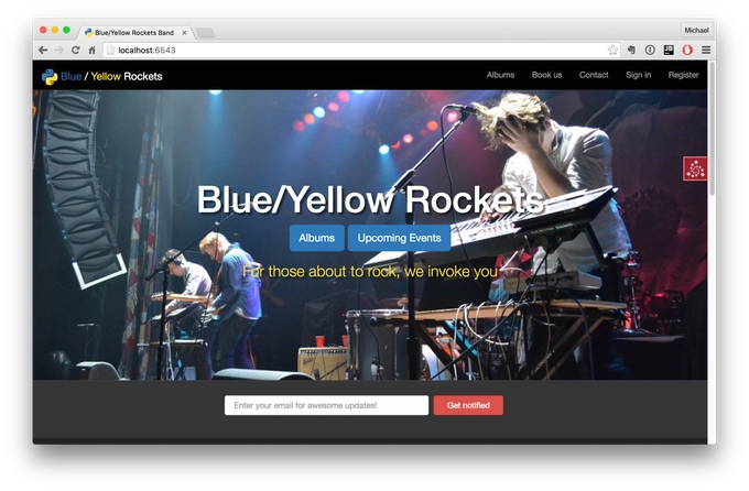
So you are ready to build your own business, we are going to build one together, and what are we going to build? Well, we are going to build a rock and roll band's e-commerce site. And this is our favorite fictional tech-based rock and roll band called The Blue/Yellow Rockets. And, you can see right on the screen we've got a nice design, with the CSS front-end framework, this is Bootstrap, it's responsive, we also have mailing lists for users who are interested in hearing more about our events that are not yet published, under the albums, if you went in there you would see that you could do e-commerce, sign in and register lets us create accounts, most of the things that you can do in our app, you can see right on this front page here, so we are going to build this app slowly; first we are going to start out just building a basic website that is static. And then, we are going to add a little dynamicness to it, using SQLAlchemy and databases, then we are going to add credit cards and mailing lists and all the stuff you need to do to build a business rather than just an app, and then we are going to deploy that and use a little SEO to try to get it to show up in Google. So that's what we are going to build, and of course, you want to have the source code, so how do you get it? Well, GitHub of course, here at this URL, you will be able to go and download everything you see us create throughout this class, so I recommend you go right now to github.com/mikeckennedy/Python-for-entrepreneurs-course-demos. Maybe that's a little bit long, but go there and either star this or fork it or both.
|
|
|
transcript
|
3:51 |
So why do we have sponsors for this course that you paid for? Well, here's the deal- I knew that there is a bunch of companies making cool tools like Jetbrains makes PyCharm which we're going to use in the class anyway, and we've got Digital Ocean they have great hosting, and I'm going to use them in the class anyway. So I thought hey look if I reach out to these guys maybe I can get some special deals for you, in fact that's exactly what I have in store, so hang in there. So how did I pick these sponsors? Well, actually I came up with a course outline and I knew that I would be talking about PyCharm because I love PyCharm regardless of whether or not they sponsor this, I knew I'd be talking about Digital Ocean, I have all my servers running there and I've had great success; I knew I'd be talking about Rollbar, things like this. So I simply reached out to the companies I was going to feature anyway and said hey would you like to be part of this course and give the students some things? They said, many of them said yeah that's awesome, it looks like really cool what you're building, we'd love to work with you on this. So that's how we came up with them and because of that, this didn't really changed the content, it's not like we now have a section on Rollbar because Rollbar sponsored the show, quite the reverse, we're going to have a section on Rollbar and Rollbar decided to sponsor the show to be very supportive as part of that. So let me tell you quickly about the sponsors, and the things that they have to offer and then we'll come back to each one of them later in the course. So, first of all Rollbar. Rollbar is super super important if you're going to run your code in production and you are going to do it as a small team you won't have people constantly monitoring the servers, that's probably you; and so with Rollbar, you can just basically add a few lines of code to your pyramid web app or whatever type of web app you build and anytime there is an error it will automatically capture all the details and send those back, store them on Rollbar and send your notifications like Slack or HipChat to your phone and so on. In fact, just about an hour ago, I pushed out a bad update to the site, something went wrong, I forgot to check something for when users were not logged in versus when they were logged in and my phone started blowing up, so instead of letting it just be broken for an hour or half an hour whenever I go back and check my e mail and people say hey Michael the site's broke what happened; oh yeah, yeah, I must have broken something. I immediately got a notification and fixed it, so yeah I broke the site but Rollbar, they got my back. We will talk about integrating Rollbar in chapter 17, which is called logging and monitoring. So there we'll get into detail with Rollbar, they have a great free plan, so you can use basically use their services for free. PyCharm, we are going to use PyCharm throughout this course that's the editor that I really like and you don't have to use PyCharm to do this course, but I very much like it, and I think you're going to see as we go through the course it has so much to offer that is really really worth using. They have a free community edition and that's cool, the one drawback of that is it doesn't do web development stuff so the PyCharm guys over at Jetbrains decided to offer all the students a free three month pro license, so check your user account or a course page, I haven't quite integrated this yet, but either in your user account or on the course page you should see the ability to claim your PyCharm license. Digital Ocean is where I have all of my servers, they offer very high performance ssd backed virtual Linux servers, they are super fast, no nonsense, easy to set up, and I just love them, we will be talking about them when we get to the deployment section. Again, like PyCharm, these guys wanted to offer you something special so they're giving every student a $50 credit to do whatever you want at Digitial Ocean, you can get servers for five bucks so that could be like ten months of hosting; or if you want to go crazy, get a slightly bigger ten dollar a month version and you have still five months of free hosting, that's great, so check out Digital Ocean, we'll be talking about Digital Ocean in the deployment chapter which is chapter 15.
|
|
|
transcript
|
2:05 |
Welcome to your course. I want to take just a quick moment to take you on a tour of the video player and all of its features so that you get the most out of this entire course and all the courses you take with us. So you'll start at your course page, of course, and you can see that it grays out and collapses the work that you've already done. So let's go to the next video here. It opens up this separate player and you can see it as standard video player stuff. You can pause or play. You can actually skip back a few seconds or skip forward a few more. you can jump to the next or previous lecture, things like that. It shows you which chapter and which lecture topic you're learning right now. And it has other cool stuff like take me to the course page, show me the full transcript dialogue for this lecture. Take me to the GitHub repo where the source code for this course lives and even do full text search. And when we have transcripts, that's searching every spoken word in the entire video, not just titles and descriptions and things like that. We also have some social media stuff up there as well. For those of you who have a hard time hearing or don't speak English as your first language, we have subtitles from the transcripts. So if you turn on subtitles right here, you'll be able to follow along as the words are spoken on the screen. I know that can be a big help to some of you. Just because this is a web app doesn't mean you can't use your keyboard. You want to pause and play? Use your spacebar to toggle that. You want to skip ahead or backwards? Left arrow, right arrow. Next lecture, shift left, shift right. Want to toggle subtitles? Just hit S. And if you're wondering what all the hotkeys are, you can click this little thing right here. It'll bring up a dialogue with all the hotkey options. Finally, you may be watching this on a tablet or even a phone, hopefully a big phone, but you might be watching this on some sort of touchscreen device. If that's true, you're probably holding it with your thumb. So you can click right here to seek back 10 seconds, right there to seek ahead 30, and of course, click in the middle to toggle play or pause. Now on iOS, because the way iOS works, they don't let you auto start playing videos. So you may have to click right in the middle here to start each lecture on iOS. That's the player. Now go enjoy that course.
|
|
|
|
12:41 |
|
|
transcript
|
1:41 |
The first thing that you are going to need to take this course is Python. We are going to be using Python 3 in this course. You may or may not know there is bit of a divide between an older version of Python called Python 2, sometimes referred to as legacy Python, and a newer version of Python 3. But, the tide is basically turning and Python 3 is really the best choice to start new projects today. We are not going to go into too much detail about the differences, we are just going to focus on Python 3 in this course. You can download Python 3 from here if you don't have it or if you are on Linux you can use things like aptitude to get it, we are going to actually go into detail how to setup all of these tools on your machines, but just know Python 3 is one thing that's going to be required. The other is a great editor, and by far in my opinion the best all around editor for building web applications in Python is PyCharm. So we are going to talk about how you download and install PyCharm, there is multiple versions, editions I guess you would call them, and we'll talk about which one you are going to need and why to choose that and so on. There are other choices if you don't want to use PyCharm, you don't absolutely have to, you can work without it of course, and we'll talk a little bit about that in the upcoming setup videos, but let me just leave you at the one thing - why would you use PyCharm? You are going to see throughout this class why this is absolutely the case, but we are not there yet, it's going to take a while to build up all the various moving parts, they are like OK, this thing really is awesome, so while ago, back in 2015 I wrote a blog post called Nine Reasons You Should Be Using PyCharm and you are welcome to check that out if you want to see just some of the benefits.
|
|
|
transcript
|
3:11 |
Hello my fellow OSX fans. Let's talk about getting your machine setup so you are ready to take this course. The first thing you are going to need to do is set up Python 3. We can check to see whether Python 3 is installed, first let's see what happens when we say Python--version. OK, so we have Python 2.7 installed, that comes with the OS X, that's cool. But if we ask for Python 3, which on OSX we can do by typing Python3 like this, you'll see no, there is no Python 3. So, just download it and choose that, choose the 3.5.2 choose whatever the current version is when you get here. Now, I already downloaded it so let's go and install it. It just comes as a package, install package, so just next your way through it. Excellent, it looks like it was installed just fine. Now, let's try that again. Excellent, we have Python 3.5.2 installed. So Python is all set up, the other thing we are going to need is an editor. And we already talked about using PyCharm as the editor for this course. So, over here at jetbrains.com/pycharm we'll see, here is the PyCharm page, and we can go and just download that, there's actually a choice when you go to download, do you want the professional or do you want the community edition. Now, what's the difference? Well, on the other page, if you scroll down farther, you'll see that for the basic Python stuff, everything is the same, right, the community and the pro edition. Where they really differ, unfortunately for this class, is actually where it matters. So, in addition to having the regular Python support, it's all about web development, the web frameworks, database support, things like that are only available in the pro edition, but luckily there is a 30 day free trial. And it's not too expensive, you can pay $8.90 a month or you can pay $89 a year and it gets cheaper as it goes on and on. So like I said, I've already downloaded PyCharm, let's go ahead and mount it, it's a disc image, and installing is pretty much draggy droppy, no problem, just wait for it to copy over. And now it's all ready to go. When it launches, it will ask you the first time what theme you want and so on, I would choose, I like the dark theme so I choose the Dracula theme for both the IDE theme and the layout or font colors. You can pick whichever you want. And there you go, PyCharm is ready to create a new project, of course, we are saving that for a little bit later, but just to look ahead, it's going to start right there. If for some reason you really don't want to use PyCharm, Sublime Text is a great option, it has support for Python, JavaScript, CSS, not as good as PyCharm but still, not bad. Another good recommendation is Atom, if you want the more lightweight text editor, so you can download that, and it's also free, this is from GitHub. But like I said, we are going to be using PyCharm for most of the course, and it really is more full-featured, more helpful, more efficient than most of these. All right, this Mac is ready to rock and roll and get going on this course.
|
|
|
transcript
|
3:59 |
If you are using Windows, let's get it ready to build your business with Python. So the first question you might want to ask is: "Do I have Python on my Windows machine?" And there is a very high probability the answer is no. But let's just verify. So we can start by just typing "Python" and see what happens. Nothing, there is no Python. By default Windows does not include any form of Python, which is unfortunate, but that's the case. The first thing we have to do is download Python. And over here at Python.org we can choose the version 3, so Python 3 whatever the latest one of that is, so I've actually already downloaded it, that's over here, so we can go ahead and install that, it's super easy, just run the installer, I would certainly advise you to add Python 3 to the PATH and you probably want to customize this, we don't really need it for all the users, but that's good. What else do we want? Why don't we go and precompile the library that might make it a little faster, associate the Python files if we want and you'll notice that it's going to go into your user profile here under the hidden AppData\Local folder, so I prefer to have it a little more discoverable for me, so I am going to say "this is going to be Python and it's going to come here." So I can just come to my user profile and find it. All right, let's go. Great, Python was installed, now let's see if we have it up here. We still don't have it and that might seem a little bizzare, we added it to the PATH, we've installed it, but these prompts read the PATH from the system when they launch and they don't auto refresh. So let's try again. This time I'll just ask for the version. Python 3.5.2. Perfect. So, Python is ready to roll on this machine. The next thing we need to do is set up our editor. We are going to use PyCharm. We talked a little bit about why we are choosing it in the beginning, but let's just go over here you can see if you hit download, and this is at jetbrains.com/pycharm, there is actually two options here, we can use the community version or the professional version, if you go back to the original page, you'll see there is a "choose your edition" section and it will show you what the differences are. And so, the main Python features - version control, auto complete, things like that are identical between the editors, but, for this course you are going to need some of the pro features - web development, Python web frameworks like Pyramid, as well as the database support. So you want to make sure you get the pro edition, it comes with the 30 day free trial and if you want to buy it, as an individual, you can either get it for $89 a year or $8.90 for a month. So, you could get just a month worth to try out this class, if you are going to take more than 30 days to get it finished, I really recommend that you use PyCharm, the pro version, you'll see throughout the class why it's so much more powerful than many of the other options. That said, if you don't want to use PyCharm, you don't have to, you could use something like Sublime Text, this is a great editor, so you can get that at sublimetext.com or Atom, at atom.io from GitHub, also a good, more lightweight editor. So, I already downloaded PyCharm because it's little big, and let's just run that, there is really not to much to do here just got to decide how you want to either put it on your desktop or associate with "py" files, things like that, and let it go. And, let's go and run it. When you first launch it, it will pop up this window and ask you what hot keys you want and what theme, if you are on Windows, you probably want the Visual Studio hot keys and if you want it dark, a dark editor like mine, that's how I like my code, then choose the Dracula theme, otherwise you could probably just pick the default. All right, now we have Python and we have PyCharm, this Windows 10 machine is ready to build a Python-based business.
|
|
|
transcript
|
3:50 |
If you are using Linux, it's time to get your machines setup to take this course. Let's see what's involved. Here we are in Ubuntu, and you can see I have the PyCharm page pulled up, so there is a couple of things we need to take this course, we need Python 3, and we need PyCharm. As we get it farther into the course, you'll see that there is some packages we need, we are also going to need Git, but let's save installing that until later, this is what you need to get started. So, the first thing is to ask well, "do you have Python 3?" Let's find out. If you just type python --version, you'll see that that's Python 2. That's cool, in Ubuntu, you can type "Python3" to run specifically Python 3 regardless of how your path is set up, and let's see what do we get here. 3.5.2, that is the latest. So, it looks like we already have Python set up, that's great, and if you have 3.5.1 or 3.4 something, that's fine, as long as it's basically a new version of 3.5, we'll be in good shape. The other thing that we need to get is PyCharm so over here at jetbrains.com/pycharm I've got the page pulled up and you can see it says "download now", and if we go to download it, there's actually two editions, the professional edition and the community edition. Well, which one should you pick, what's the difference? If you go back to that first page, you can scroll down a little bit and see there is a little comparison table here, all the Python features about code inspections and auto complete, things like that are exactly the same between the two editions, for this class though, we are going to need a few extra things that are not covered in the community edition, because we are doing web development and we are working with databases, you will definitely want to use those features in addition to the Python web frameworks like Pyramid. So, I strongly recommend you get the professional version, there is a 30 day free trial, if you want to buy it it's not too expensive, as an individual you can either pay $89 or if you want you can just pay $8.90 a month for a couple of months, as you go through this course, I think it's totally worth it. If for some reason you really don't want to use PyCharm, you can get away with that, you can use Sublime text, this is also a highly capable editor, as you'll see, there are quite a few features that PyCharm brings that Sublime text does not. Especially when you are newer, it will help you even more, bur regardless of your experience level, I think PyCharm is a much better choice, nonetheless, you may want to use Sublime Text or Atom is also a great Python capable editor from GitHub. So those are your choices for the editors. Now, we've got Python, we downloaded it, I actually already downloaded it because it's kind of large, so let's go and install this. Over here, we are going to uncompress it, and we'll just extract it here, so we want to take this folder and put it somewhere more useful, I like to have this little bin folder over here, so we are going to move this over, I mean the name in here is not the best so let's rename it, like the version number rather, so rename this, so we want to run this file, so if I double click it, obviously it's just going to open up the editor, so let's go back to our terminal here, and we can try to run it like so, and it's going to go and launch, perfect. Now, you may have to install the JDK, because PyCharm is based on IntelliJ, which that platform is a Java based application, so if you try this and you get a Java error, just install the JDK by googling for whichever version it says that it needs and install that, then you should be able to run this. The other thing is, this is nice that it's over here but when I close it, it goes away. So we can come over here and say lock that to the launcher, that way when we close it, we don't have to have this thing open, we can just re-launch it from here. Great, so this Linux box this Ubuntu box is ready to take this course, we have Python 3 installed, by default, and we have PyCharm set up and ready to roll, so let's get to it.
|
|
|
|
18:05 |
|
|
transcript
|
1:39 |
So what you are going to learn in this chapter about Python? Well, mostly it's really to give you enough Python to be able to follow along. For example, when we get to the credit cards section, when we integrate Stripe into our web app, we are going to talk about exception handling with "try...except" blocks. And, if you are not totally familiar with those, that might get a little confusing. So we are going to give you a really short introduction on exception handling and a bunch of other Python concepts like that. That said, if you know all these ideas, if you are already a Python programmer, don't feel bad about skipping this chapter, go ahead and skip the whole chapter, go on to the next one, and then you can come back and use this as a reference. This section will be broken into many small little videos, one core concept each. So, if you find we are working with some idea and you are like, Oh, I actually don't know this very well, just jump back to this chapter, find that core concept, watch the video and then continue on where you left off. That said, we are covering a lot of concepts in Python, but this is not an introductory course. If you really need to learn Python from scratch, and you want to do it in a solid way, I recommend that you take my Python Jumpstart By Building 10 Applications course, which you can find at talkpython.fm/jumpstart. So we cover about the same number of concepts in that course, as we do in this one, but that one covers it in seven hours, instead of however long - half an hour, an hour, whatever this section turns out to be. So, this chapter is a bit of a choose your own adventure, if you stay here, we are going to do a demo in the next section and we'll build a little game, to get you comfortable with the Python language and the editors, or skip this chapter and get right on to the next one.
|
|
|
transcript
|
5:28 |
So let's take a few moments and spend some time getting you familiar with Python, maybe you've seen it a little bit but it's been a while or maybe you are fairly new and just seeing it in action will teach you much of what you need to follow along, and of course, we have the detailed reference section in the course if you want to look at any specific topic or concept. What we are going to build in our demo section is a memory game. It will show colors to the user and the user will have to recall the colors in the correct order. It's going to be very simple but at the same time it's actually going to cover a decent amount of what you need to know to get started outside of the web frameworks, which we'll cover separately. So, here we are in PyCharm, and I've created a new empty project based on Python 3, but that's all I've done. To get started, we are going to need to create at least one file, let's go and create a couple of files here, one of them is going to be our game and this is going to be the actual objects and data structures in our game. And the other one is going to be the plain of the game, so we'll call this one "program". Let's focus on the game first. Like I said, the game is going to keep a history of colors shown to the user and then we'll go back and ask them "what colors did you see?", and of course hide the colors and say "what colors did you see?", and they have to recall them in the correct order. So let's create a class called Game, the way we do that is we use the class keyword and say the name and the type if we had any subtypes, we could derive it from here, but we are not going to do that, and we are going to go over here and we are going to define an initializer. So, a __init__ and PyCharm will write most of that for us. In here, we need to keep track of a few things, we want to keep track of the history and so on, but let me just write "pass" for just a minute. What I want to do is I actually want to sketch out how we are going to use this gameplay, and I want to show you how PyCharm makes this incredibly easy to do. So we are going to have things like "add a move", or "add a color", "show the current configuration" or the level if we are going to call it that, maybe first level, second level, and number of colors they have. And then we want to test the users, so we want our game have those operations. I could just go ahead and just say "def" and I want to create a method here, so I create a method by saying "def", let's call it show_level(), and when I hit open parenthesis you'll see that PyCharm add self, which is required as the first parameter for Python classes, and we are not going to really need anything else here. So, I could do some stuff that we are going to work with here, some variables we want to set, but I want to show you that we can actually sketch out the flow and have PyCharm fill in the details for us. We are going to come over here and we are going to have a main() method, this is not a Python convention, this is just a Michael convention, and what I want to do is I want to work with our game in other modules, so we'll say "import game" and then we could say "game.game" or perhaps a better way would be "from game import game" like this. So, that's going to be our game object down here so we'll say "g = Game()" to get started, and we have to think well, how is this going to be played? We probably want to go around in a loop as long as the person can remember all the steps, we want to do a few things each time through the loop. So we'll do a "while" loop, we'll say "while True", because we just want to keep going around and around as long as the person has won. So the first thing we want to do is say "game", we are going to say add move. Now notice, this method does not exist, and PyCharm is highlighting this saying: "there is a problem here, this doesn't exist." But, we can come over here and hit Alt+Enter and it will actually add that method to class for us. So we can go over here and say "we are going to add a move" and then we want to say "game.show_level()", that's the next step we want to do, and then, we want to test the user, so we'll do a conditional here, we'll say "if", we want to see whatever we want to do to test them, we'll ask them to enter the colors, maybe all in one line, or one entry per line if we're at level 5, there might be 5 entries they have to put, However we test them, we want to have the game do that test here, we want to check, if they don't get it right, we want to stop the game and say "sorry, you lose"; if they do, then we want to just keep going through loop, so we'll say "if not" - the negative of testing, something like this, we'll say test_user, a player, let's call them player, this is kind of more fun to call them player, so we'll say test_player, if that's not the case, what are we going to do, well, let's tell them they lost, so we can print out the message and we can break out of this loop. And down here, we will print something like this, "Game over". So, let's look at this for a moment, we are going to create a game, which comes out of our module here, and while basically forever, until we decide it's time to break out, we are going to add a move, we are going to show the level to the user, and then we are going to take it away and then we'll test the user and if they get it right, we are going to add yet another move, show the level, which is now more complex and so on. This will not actually run, if I run this program here, it will just basically define this method, so in Python, we have a common convention that lets you say "if you are running this program, instead of just defining the method you can actually run it", and the way we do that is we can use a shortcut and the convention is this __name__ that is in the module whatever module's been run, if it's being imported, the name will be the name of the module like "program" or "game", but if it's being executed as a target, it will be __main__ and we can say "OK, this is the time where we want to call this method we just wrote." I can see that PyCharm says we don't yet have this method, let's go and write that as well and it's going to need to return True or False. Ok, so we now have this structure for our game, what we need to do is actually go implement the game class over here, what does it mean to show the level, what does it mean to add a move, things like that.
|
|
|
transcript
|
10:17 |
Now when we have the basic shape of our game built, let's go and actually implement it. So to get started, there is two basic things we need to keep track of. What are the things we could show a user, like what colors and what have we shown the user. So we'll come over here and we want to define a variable on this object so we'll say "self." and we'll just create a variable name out of thin air, and that is how you define the variables, make sure this happens in the __init__ method, not somewhere else, so we want to say "history", and we want this just to be an empty list so we can do that with just empty brackets like so. The other thing we want to keep track of is we want to have the choices, or "plays" let's call them. This is going to be another list and this is going to contain all the distinct plays that we could have, so we might have red, we might have blue, we might have green, let's say we are going to have four colors, OK. Now, in order to make this a little nicer game, let's add some color and some more verbiage, but we want to have a short thing to test against, so we don't make the user type red they can hit "r" and "b" and so on. So instead of putting individual items in here, we are going to put something called tuples, and this will let us put multiple values for each particular play, so we are going to put in here, we are going to say "Red", that's going to be what we show the user but what we are going to test for is just "r" and then yellow and so on. Ok, this is a good start, we are going to improve this in just a minute, but let's finish some of the other implementation here and then we'll move on. Next, let's turn our attention to show_level(); I would like to be able to clear the screen, whatever is on there remove it, show them just the colors that we've picked or that we have at our current level maybe four colors at level four, and then take that away again, so we are going to need a "clear" method, so we can say self.clear, like so, and we can add that method here, which goes at the bottom, we are going to use a pretty cheap way to clear the screen here, we are going to go and import one of the system modules, so to use something out of the standard library, we have to import it, so we are going to "import os". Now we could do a little bit of work to test what platform we are running on, but I am just going to do it from Mac, you do it for whatever you want to run it in for, and you could use the sys module to figure out whether you are on Windows or on a Linux Unix based machine. But we are going to say "os.system" and call a system command, and a system command we are going to do is clear. Right, that's what you type in the console or the terminal to clear the screen and that's where we are going to have our game here. Now PyCharm is giving us a little warning that this doesn't have to be a instance method, it could be a static one, but just to keep things consistent, I am going to say "don't bother us with that". So you won't see any squiggles there. Right, so first thing we are going to do when we show the level is we want to say "we want to clear the screen", and then we want to go through each item in the history remember up here we have this list, "history", so we'll say "for h in history" and when you... in self.history, in Python the primary way to process a collection is to use this "for...in" loop, so "for" some variable we make up in the collection, so if we have ten items in our history, we are going to pull them out and work with them one at a time here, so than we could say "print", now, we need to think about what are we going to put into this history here, and what we are going to put in are basically selections of these, so we want to print out the first element here, so there is a couple of things that we can do but let's just keep things simple we'll print [0] there. The next thing we want to do is also we don't want to have this pile vertically, let's have this just go horizontally, it seems like that's a little better so we can say the "end" is just going to be two spaces, or a comma or something like that. If it prints this out as fast as they can and it goes away, that's not going to be so great so what we want to do is we want to make it go slowly so we can put this thread to sleep using the time method here, and we could go to the top up here and type "import time" or in PyCharm hit Alt+Enter and say "we would like to just import this name", so see how I wrote "import time" at the top, and now, it has a handy little sleep function and let's say it's going to sleep for two seconds. Now, something that happens in this that you won't see until you run it but while I am here I will go and take care of it, I'll put a note that we need to flush the output, just because the way it works in the terminal this doesn't always flush that stream as you sleep, and so it doesn't show in a nice smooth way, we'll see that we need to do that here. And maybe two is a little long, let's put that at one, and last thing, after we are done showing them that, let's "clear", this is going to take that screen away, so we are going to show them the history, clear the screen, show them all the moves they are suppose to remember and then take it away. And then we are going to test them, but before we test them, let's add a move, right? We've got to start out with the empty set of history, let's add some will say self.history to add something to a list we just append to it. Now, there is a really nice way to randomly select from a sequence in Python, so if we have the random module imported, we can come down here and say "I would like to pick one of those random items", so I say random.choice and pick some sequence and it will just give us one random, so that's really nice to write there. let's hold off on the test here and let's just say "return True", let's just say they are passing for now so we can see the other stuff working. All right, so like I said, there is going to be a little bit of a problem when we run this, but let's go ahead and save and run this. Now, how do we run this? Right-click over here and we can say "run" and pick whatever thing it is we want to run, and run, now, notice, it doesn't really like this stuff being empty here when we call clear, and really we have to just run this outside in the terminal. So a simple way to do that is just copy what PyCharm is doing. Here you can see something is happening but we are not really seeing this item, so like I said, we need to flush this because that's a little bit funky, so we are going to say "sys" import that module, go to standard and just say "flush". Now let's try this again, so yellow, blue, yellow, blue, green, yellow, blue, green, blue- you can see it's just slowly building up as it goes. All right, we are of course not testing the user, but it looks like this works, except there is one problem, something I don't really like so much here, that green is yellow, that blue is yellow, everything like that, so we can come over here and use an external library, external package that I have installed, and I have installed it with "pip3 install colorama", so we are going to use this thing called colorama, and that lets us add coloring to the console. I have already installed that like I said, and so the way you use it is you just add in a string colorama.for.red let's say, like so. We are just going to do this for each one. Let's just run that again, make sure I hit save, and run it, and now you see, blue is blue, blue is blue, red, red is red, and as it builds up we'll see more of these, yellow is yellow and so on. Great, so that feels much more like a game to me. Now it's really down just to testing the player, so what we are going to do is we are going to go through for each thing in our history we are going to ask the user what is the first item, what is the second item, and so on and we'll just see if they can get that right, so let's start out with the little message to them, just to say "look, you are going to need to remember four items", or five items, or whatever it is and let's do this white, so we'll say colorama.fore.white and then what we want to tell them is we want to say "there are three moves, or two moves, or something, we can use this string format style, like so, and we can say .format and say I want to give it the length, the number of items in this object's history. And then for each one of those things in the history we want to loop over it and test so we'll say "for h in self.history", we want to test something. Now, I'll show you another good trick here, another good technique, remember, each thing in the history is one of these and what we really care about is the second value, not the first. Down here, we were just using indexes into it, [0], [1] and so on, but we can do what's called tuple unpacking here, so I could say we can give the text and the entry or the "v" for value, and because this is a length two tuple, the first value is assigned to you and the second is assigned there. So we can just test against that "v", so let's say something like this, we want to get input from the user, that's super easy, we'll say input, use the input method and we just give the prompt. And we'll give them a little hint on the things that they can type and then we'll say "if guess != v: return False". So, the very first time that they get it wrong let's say nope, that was wrong, and in the end if they make it through all of them, they must have gotten them all right, so we'll say "return True". All right, I think our game is just about ready to play, let's save it and then run it over here and see what we get; green, OK, so it says one move we have to remember, and that was "g", OK, worked, green, green, green, green, now red, so "g", "g", "r", it really seems to like red and green. Let's just put something wrong so we can see that it said "all right, look, you entered something wrong", it's supposed to be green, you said red, there it goes. But, we made it to level 7, that was pretty awesome, but what is even more awesome is our game is totally implemented here, so we come in, we create the game, we start out with the empty history, and the various plays that we can make, to show the level, we just loop over the items and we print out the text, and because we are not using an inline, it doesn't flush, so we are going to force the flush here, do rest, to add a move it's super easy, we get a random one from our plays, and to test the player we just go through each one of them, these entries in the history and we unpack the values and we check that their guess is the right value. There is so many things to learn in Python and it's a very rich and powerful language, but at the same time, you've seen a significant portion of it, in action. If any of this was too fast, or unclear, please go and review the reference section where we go over every one of these ideas topic by topic, there is something on loops, there is something on conditionals, there is something on methods and so on. If you need to find out more details about something, before you start the rest of the class, make sure you check out the reference section. Otherwise, let's move on to getting started with web development.
|
|
|
transcript
|
0:41 |
Before I close out this lightning review on refresher of Python, I want to point out that there is an appendix at the very end covering many concept reviews. There is about 45 more minutes down here at the end, covering the language concepts point by point, so if you need to understand "if" statements better, there is a short video on that, if you need to work with loops, there is a video on that; define classes, you guessed it, a video on that. So we are going to move on to building web apps with Pyramid, but if you feel like you need a little bit more, go and jump to the end, check out the language concepts on the part that are little shaky and then come back to chapter 4 and move on. If you are ready to jump in to web development, you don't have to do anything, you are going to be taken right there when this video finishes. Let's get started.
|
|
|
|
1:02:47 |
|
|
transcript
|
3:06 |
Over the next couple of videos, we are going to talk about choosing a Python web framework and which one we are going to use for this course. Let's start by answering the question "what can you build with Python?" Well, it turns out there are a bunch of amazing products and companies that you all use and are familiar with, built with Python. Let's look at a few of the use cases. The Onion, the hilarious fake news organization, their web application is built in Python Spotify is also using Python for their web front-end NASA - rockets and spaceships and all sorts of amazing stuff, they are using Python bitly, the short link app, is built with Python. Bitbucket, Atlassian’s competitor to GitHub is built with Python, that's very nice Survey Monkey, they use Python all over the place Quora, the best general Q&A spot on the internet, they are passionate, passionate users of Python, not only do they use Python for most of their app and their web front-end, you'll see them right frequently looking inside their engineering organization talking about the challenges and how they solve them in Python and so on. Disqus, one of the most popular comment add-ins for your web site so if you have a blog or say a podcast, and you want to have comments at the end, you can have this nice live pushed-based comment section right at the bottom of your pages and that's largely done with Python, not 100% but much of it. Instagram uses Python in a lot of places. Reddit, Reddit is a major user of Python for their website as well as SQLAlchemy for their database YouTube was built with Python Pinterest built their website with Python PayPal is a massive user of Python, you'll see throughout their whole company they are doing many interesting things with Python they are blogging and writing about what they are doing with Python one of their services that does pricings for the exchange rate where they charge you some small percent for a transaction throughout the day that service that answers that question what percent do people have to pay or what should PayPal charge you, throughout the day, that service is written in Python and handles several billion requests per day, and is running down around the millisecond response time. Dropbox maybe one of the biggest users of Python most of the backend stuff happening at the company at the server-side at Dropbox is happening in Python. The client stuff side, the little box that does the sinking and the app that runs on your machine, also Python interestingly, so you'll see that Dropbox is a major user of Python and some of the Python core developers, as well as Guido Van Rossum, the creator of Python himself, work there. So Dropbox is a heavy user of Python and an absolute hotbed of it. And finally, Talk Python, my websites, my podcast, my training site, all run on Python and we are going to be of course looking inside the code that does that. If you'd like to see where this information came from, read a little bit more about how each company or product is using Python, you can just check out this bitly URL down here at the bottom, and there is a nice write up featuring these companies as well as more.
|
|
|
transcript
|
2:04 |
When deciding on a Python web framework, it's important to consider the tradeoffs that you make when you choose a particular framework. So on one hand, we have a host or what are called micro frameworks, these frameworks are very lightweight and they are great for building quick, simple applications, and then you bring many many pieces together to add on functionality. Will that allow you to make exactly the app that you want because you've only brought in the pieces that you need, it's actually a lot of work and it's a little bit hard for beginners because you don't know about all the little pieces you've got to put together. On the other hand, we have what I am calling building block frameworks, maybe this is not quite the right term but what I mean is these are the frameworks that have large pieces that you can stack together maybe you want to admin backend for your database, boom here is a little piece you stick in there you want to data access layer right into the framework, boom, there is your ORM, the way that you talk to your database, and so on. These are great, if that's what you want to use, but if you don't want to use those, if you want to use a different kind of database, say a NoSQL database versus a relational one, then all of the sudden these building blocks can be getting in your way and you have to work your way around them. That's kind of the way I see the spectrum of the web frameworks, and in the building block area, we have Django. one of the most popular web frameworks for Python and it has a lot of great building blocks, but like I said, has things like a built in ORM, and if you don't want to access data in the way their ORM works, or you are kind of fighting against the system a little bit, to go and do something different. On the other end we have frameworks like Bottle, which are fast but very simple and don't come with very much functionality, I would put Flask just up above Bottle in terms of what it brings to the table and how many little pieces you have to put together. And then in the middle, what I would call the goldielocks range, not to small, not too big, would be Pyramid. Pyramid is a framework that we are going to be using for this course, it's not as much of a building block thing as Django, you can pick all the various pieces you want to use Mongo DB, no problem, use Mongo DB, it's a little more full featured than some of the micro frameworks. So, let's take a look at Pyramid now.
|
|
|
transcript
|
2:36 |
Let's have a quick look at the relative performance of Python among all the technologies that you might use to build web applications. But before I show you this graph, I want to emphasize that performance is not the only thing when you are starting a business, it's much more important that it's easy to work with that it's quick to get something out the door, but it's also nice to know if what you are working with is going to live a while as your business grows that you won't have to replace it right away, that it would be able to handle some decent growth before you maybe have to so some sort of optimization or even change frameworks. So let's look at Python relative to the other technologies. Here is a graph of numbers taken from the TechEmpower benchmark, and this is one of the more well respected benchmarks for web applications and it's absolutely comprehensive, there are many frameworks and variations on different servers with different databases and so on. So here you can see we have a couple of technologies, the fastest one that I put on the list it's not the fastest, but it's definitely interesting, is Bottle. So Bottle running on Python 2 is quite quick, it's doing over 35 thousand requests per minute. Than we have Flask, running on Python 2, remember, these are all micro frameworks, they do less so you would expect them to be able to be able to do more of it. Then we have Pyramid with Python 3 right there and it's coming in third, that's pretty excellent. Let's look at the rest, just down from that we've got Node.js and MySQL and we have Flask and Bottle in Python 3, we have Django, we have Ruby on Rails and we have ASP.NET running on Mono. So I think you can see that our choice of Pyramid puts us well to the right of this graph, it's certainly not bad, in terms of performance, but notice something else, that if we look at this on Python 3 alone, remember, Python 2 is getting phased out in just a couple of years, and there will only be Python 3 going forward, if we look at Pyramid 3 on Python 3 and we take away say Bottle and Python 2, we only look at it running on Python 3 for example, well then, our choice looks pretty smart on performance. So as you can see, Pyramid is a very capable web framework in terms of performance it's been great for all of my businesses, I've been able to run my businesses and websites on Pyramid on simple cheap virtual machines as you'll see we'll do something similar with Digital Ocean, here in this course. My podcast receives over a million HTTP requests to the Python backend which goes all the way to the database, per month, and running that on a 10 dollar Digital Ocean server doesn't even break a sweat. Barely registers on the CPU meter.
|
|
|
transcript
|
2:35 |
Let's take just a moment and talk about Pyramid - the web framework and the principles behind it, before we look at the code and the building blocks to create web apps with Pyramid. You can learn more about Pyramid at trypyramid.com and they have this little saying up here that I think captures a lot about the framework "The start small, finish big, stay finished framework" Idea is you don't have to know a lot to use Pyramid, there is a few simple building blocks and then many more that you can bring in as your app grows in complexity and needs, and they have a 100% unit tests and they are very conservative about pushing on new versions, so it's the "stay finished framework" as well. Pyramid focuses on simplicity and they take a "pay only for what you eat" approach and it has a really interesting idea behind it that you should be able to get started with Pyramid even if you only have a partial understanding of it, that means you can do the major things, how do I render some HTML to a view, how do I process a post, things like that, without fully digging into all the details which I think is a really constructive way to get started. Remember, I called Pyramid the Goldielocks framework because it's not a micro framework that has too little, it's also not a large building block framework that you have to take the large building blocks and put them together or not, they focus on the core things that you do in a web framework, mapping URLs and code, templates and serving assets. Pyramid has great documentation and tutorials to help you dig deeper, we saw earlier that Pyramid is very fast and especially when you consider the Python 3 angle, in the age of cloud computing it's easy to think we can throw as many machines at a problem as we need, that costs money but more importantly that costs complexity, so having a pretty fast framework is a real benefit. Pyramid has 100% test coverage and their philosophy is if it ain't tested it's broken. So you can count on new releases of Pyramid not breaking your code. As you can see, Pyramid is open source, it's available on GitHub and is distributed under a permissive open source license. Finally, Pyramid is one of the few frameworks that takes a forward-looking approach to Python 3. Python 3 is the default implementation their documentation and tutorials are in Python 3 and that's the recommended way to run Pyramid. So as we transition from Python 2 to Python 3 as an industry, Pyramid is already in the right place to make that transition because they have already gone through it.
|
|
|
transcript
|
3:36 |
Are you ready to start writing some code for the web in Python? Yeah, I definitely am, it's time to get started. So that's what we are going to do in this section. So what are the steps to create a project and get started in pyramid? The first thing that we're going to do actually is not to install pyramid but to install a template manager program that will then install everything or create everything that we need for our pyramid web applications. So we're going to use this thing called cookiecutter. Now cookiecutter manages all sorts of project templates and it has hundreds, maybe even thousands of them available. Many of these are for pyramid, and so we're going to install cookiecutter, external separate package, and then we're going to use cookiecutter to use template or a scaffold to create the starter website. Now, pyramid web applications have a lot of moving parts, almost all web applications that are realistic have a lot of moving parts, they've got css files, javascript files, images, the actual views probably come along with some testing and things like that, so you might see examples where somebody uses flask or something just create a here is the one function you write to create your app, you can do the same thing in pyramid, but it's not realistic, it doesn't really set up what you need, so this cookiecutter process will put all those pieces together just like you need for pyramid to get going. Now, one of the things I like to do especially for web applications is create a virtual environment. Virtual environments in Python allow us to set up a separate copy of the dependencies and a separate set of the dependencies for individual applications, so this means that if I have three web apps, maybe one is using a newer version of pyramid or a new version of sqlalchemy, and the other one is using an older one because we haven't upgraded it yet. And this means that we can run both of those, side by side on our machine, we don't have to change our global environment and possibly even mess up our system. So we're going to create a virtual environment, this is technically optional but highly recommended; pyramid web applications are a little bit different in that in their full form they are actually Python packages, so that means we need one additional step, one additional command that we enter to register this in our virtual environment system or whatever Python system we're running in. So we'll run that and then, we'll serve our web application we'll add some features, and then we'll just go round and around and iteratively develop our app, until it's ready for deployment. How do we go through these steps? We can choose one of two options— if you have PyCharm professional PyCharm will let you click a couple of buttons, go through one or two screens, and it will take you through all of these steps. But even if you're going to use PyCharm, which you don't have to, but if you are going to, it's still nice to see the command line version so you know what the actual steps are, you know the way things fit together. When you get to PyCharm, you can click the few buttons and be really happy that it put all the pieces together, but really understanding how your web app works is important. If you have PyCharm community edition, or you're using something else, like Sublime Text or Visual Studio Code or Emacs or some other editor that doesn't have this project template mechanism, you're going to go through the command line edition. And then of course, you just open it up in that editor. So for this one, we're going to choose the cli. Let's jump over to our Mac and create our first project.
|
|
|
transcript
|
6:27 |
All right, it is time to create our project using the command line. If you're going to use some editor that's not PyCharm professional, this is really the way to do it, if you are going to use PyCharm pro, you can still do it this way, and then just open the folder, and go with it there. So what we're going to do is we're going to start by installing cookiecutter, and then we're going to actually use cookiecutter to create the project. So we are going to say pip install cookiecutter -u for upgrade in case you already have it, and --user, so that it just installs for me, it doesn't actually modify the system, and just to be safe, on Mac and Linux you might say pip 3 to ensure that you're installing this into Python 3. It looks like we've got it installed, there was some kind of update or something but we now have cookiecutter, so if we go over here to the pylons organization which has pyramid as a subset of it, you can see there is a number of cookiecutter templates if you browse around; the one we're going to use is this pyramid cookiecutter starter, this is the certain most basic, most foundational version, it doesn't pull in a whole bunch of different things like other specific database integrations and so on, because we're going to do that manually and exactly the way we want to do it. So we're going to run this template, and all we need to do that is get this url to the github page, you know it's a cookiecutter template because you have cookiecutter.json. Now cookiecutter can install all sorts of things not just this, it can create templates and generate them for all sorts of things but it's going to work really well for this. So we're going to come over here and make sure we're in desktop this project area thing, and notice it's empty right now so we're going to say cookiecutter and give it this, I've already downloaded this one, so it's going to say can we get a new copy, yes is a good answer, but this is typically how you'll see it here, it will ask you a question and say what do you want to call the project let's just call it my web app, and then it's going to propose a repo name, and a repo name is maybe not the best nomenclature here, really this is the actual folder structure for the Python pyramid project and this is going to be the Python package name that it's going to use, so you have to avoid certain things like test, anything that's basically a built in package in Python right, like os wouldn't be good, other things you might use, requests wouldn't be good, so just be aware of it when you pick this. And then, we're going to pick Chameleon for this course the JInja 2 probably is the most popular which is why it's a default but Chameleon is a much cleaner syntax in my opinion, much better language for the web, so we're going with that. there's a bunch of stuff, it says okay we've created the project now if we look here, you can see there's folder that contains stuff that has to do with packaging, so the changes, the setup.py and so on, and then here we have our actual web projects we've got our static files, our templates, our tests, our views and so on, so it gives us a little idea of what we could do, we could come over here and we could cd into our folder that is created the my web app, and then it proposed we make a virtual environment so let's go do those things. So we'll cd in here, and then we're going to make a virtual environment slightly differently than they propose, but we're going to say Python 3-m for module, so run the venv module, we're going to add a --copies, the reason is on Mac, I don't believe this is a problem on the Windows or in Linux but on Mac, the way PyCharm interacts with the virtual environments if you don't do the copies, it doesn't resolve the symbolic links correctly so you want a --copies and we'll call it .env. They proposed just env, but if you used .env, PyCharm will automatically detect and use this so it will save you one step along the way. Okay, so we run this, now if we ask which Python you see it's the system one, so we have to activate that virtual environment so we'll say either source or .env, activate notice that my prompt changes and it has a .env on it, that's great, if you are on Windows this is slightly different you drop the little dot, you don't need that and then this is scripts not bin, and this is activate. So we have our new prompt, and now if we ask that which Python of course we're using the proper one, so let's say pip list, see what we got and let's go and upgrade setup tools, this is not technically necessary but it's really out of date— it's like eight full versions out of date so we're going to do that, and now we have our files here we could go and pip install some more stuff but we're just going to run this setup file which is going to install everything else that we need, so we'll say Python setup.py and if we want to say use this folder structure right here, these files right here as the package files, don't copy them somewhere else, don't create a distribution or anything like that so we're going to say develop, which means reference the files in my working folder, that's exactly what we want, we're going to make changes we just want to rerun it and see them take. Everything is looking good, we finished processing the dependencies for our web app, let's do a pip list again, notice we have all of our dependencies and their transitive closures as well as our app referencing straight out of this location that we want to work from. Okay, so everything is ready to go, we've got our package registered the last thing we want to do is just run it, so we're going to run p.serve and we are going to say development.ini, so pserve is the way to run the web server and then we have to give it a configuration file development or production, we want development, because we're not in production, we're in development, let's go. Ta-da, look at that, let's open this in our browser and see what we've made, and there you have it, there's the pyramid starter project and it says welcome to my web app, pyramid application generated by cookiecutter; so now we have our project, it's ready to go. What's next— well we start adding features and make this our web app, not just a scaffold.
|
|
|
transcript
|
3:31 |
Let's review the core concepts around using the command line to create a pyramid web application. So it all starts with cookiecutter, and we can feed cookiecutter a whole variety of templates, there are a bunch for pyramid and other application types as well; we're going to use pyramid cookiecutter starter, this is the most straightforward, standard way to create a pyramid web application. There's a few others that bring in sqlalchemy in a certain way or zodb or things like that, but this is really the best one for this course because we're going to focus on sqlalchemy later and bring that in in a way that makes most sense for what we are doing. Ok, so we're going to use this cookiecutter starter and all you need to know is what is the url to the github page. We're going to pip install cookiecutter and maybe throw in a -U for upgrade and a --user so you don't modify the overall system, just modify for your user account. So we're going to install this, and once it's all installed, we'll be able to run cookiecutter commands. So we're going to run cookiecutter and we're going to give it that url from the GitHub repository that contains the project template like this, and once it runs, it's going to ask us a bunch of questions like what do you want to call the project, this is like the friendly name you show to the user, what's the repo name, this is the actual Python package name and make sure that you pick Chameleon for your template type here, okay. After that, we're going to have our project generated, and it says you can do a couple of things which we will more or less do, we're going to change into the project directory, we're going to create a virtual environment, remember I called it .env, not env, and I added a --copies flag for PyCharm plus mac interaction, we also probably want to as soon as we get that activated, we want to install the newest tools, I don't think that's shown actually here in the steps— no, it's not so we'll say .env/bin/activate, or .env/scripts/activate.bat on Windows, and then we'll come down here and we'll upgrade our setup tools to the latest version; remember setup tools itself is actually quite out of date for some reason, and then we're ready to run our app, we just say pserve development.ini, and everything goes. Now before we can actually run our project, we're going to need to register the website as a package in our virtual environment, so we'll say Python setup.py develop and it's going to download all the dependencies as well as register our actual web application as a package basically. And the develop we'll say look back here symbolically rather than linking over to copying those files over that means we just continue to edit these files and Python just picks it up. So that's exactly what we want. And then we're ready to run our app, so we just come down here, pserve development.ini and it should just run like this. So here you can see running on local host on the particular port, it might seem weird that it's listed twice, but that one is an ipv4 listing and another as an ipv6, even though it says local host in both, it's really one is ipv4 one is ipv6. Take this url, open it up in your browser and boom you now have pyramid running in your browser, it's ready to go, the only thing left— let's start adding features and making it your website.
|
|
|
transcript
|
4:40 |
You've seen how to create a new pyramid web application on the command line and we're going to do a little bit of follow up of that here, but in this particular video, we're going to focus on how to work with PyCharm. Namely, PyCharm professional; let's switch over to PyCharm and see what we can do. So the first thing I want to focus on is, let's just see how that project we created with the command line could be opened in PyCharm. So if I come over here, you can see here's the web app and remember, if you look over here, into this folder that there's actually this invisible, hidden .env folder, so with all that in place, if I drop this on to PyCharm, it's going to open it, on Linux you have to say file open directory and then just find that directory, we can open it up and it's already got it; now notice, there's a couple of things, first it's doing some indexing the very first time it's seen this virtual environment so it can help, after this it should have that cached and be much quicker. So notice, it's already gotten a little pyramid logo up here, and a play button, that's because it actually discovered this was a pyramid web app and it's created what's called a run configuration that can run it, that's because this is PyCharm professional, if you don't have the professional edition, this is not going to work; you can still go and create one and there's a video at the end of this chapter showing you how to do it, but it's not going to automatically find this for you. The other thing to notice is it's already found that virtual environment so if you go down here, notice if I open up the terminal and I ask like which Python, you can see it's already using that one that's in here. When I run this, it's also using that one, you can see here. There's the two things, we click this, boom it's working again. So that's how to take the existing one that we created outside in the command line and get it running here. Let's start from scratch. So let's take a step back and say we want to create a brand new project in PyCharm, remember, this only works in professional, see the other video if you are using community edition. Okay, so we'll create a new project and down here we will pick pyramid and it's got an old out of date interpreter, so that's all well and good, let's tell it we want to put it into this project area on our desktop. So I'm going to go here and then we'll give it something not just that we're going to say this is going to be my_pycharm_app or something like this we're going to pick chamelon, these are hidden you might need to push them down, starter is the scaffold that we\re looking for, chameleon is the template language and this is all perfect; this virtual environment is not great, so let's go and create one, so we'll say create a virtual environment and where do you want to create it, we're going to create it here. And I'm not going to call it project area, I'm going to call let's say /my_pycharm_env, do it like this, now this is super important, don't forget to turn this off for Python 2 you want Python 3, really important. So, we'll pick Python 3, we'll hit okay, it's going to create a new one you can see it's installing all the things that we need, okay, everything is ready to roll, it's pointing out hey notice the pyramid is not installed into this virtual environment yet, of course not, but it's going to install of course, so we hit create, now it's going to go ahead and install pyramid just stand alone for us and once it's done indexing these files which of course is going to cash again afterwards, it says this project is not installed for development, so you should run setup.py develop, so let's just click that. Notice it also has package requirements are missing but by running the development setup it's going to basically hit both of those issues and take care of them. Boom, everything is set up, the project is set up, the dependencies are installed, the run configuration is set the run configuration is set to run, that virtual environment again if we look in the terminal down here, there's our virtual environment we had it create if we hit run, it's running that virtual environment and there it is once again up and running. In this case, it's not generated by cookiecutter it's generated by PyCharm. So, using PyCharm is a pretty nice way to get started when I first started working with pyramid and was newer to Python I would use this a lot, now I find myself using the command line version and then opening it like I showed you right at the beginning of this video in PyCharm, whatever makes you happy, they're all basically equivalent. All right, now our app is created, up and running, we're ready to start adding features to it.
|
|
|
transcript
|
1:22 |
Time to review creating a new pyramid web app in PyCharm. So with PyCharm you can basically get all the stuff done at once and you get a lot of help. We're just going to go and say create a new project, pick pyramid and say we would like to put the project here, create a new virtual environment, set up all the details there, we can pick the starter scaffold chameleon language and the template is usually good, so we'll just leave that there and click ok, and that pretty much does all the steps that we needed, except for a final one about registering the project. So everything will be created, the virtual environment will be there the scaffold will be selected and so on. Once it opens up in PyCharm, the newest version that even shows you a little dialogue or a drop down bar thing at the top that says, hey you still have to run setup.py develop, click here to do that; you can either click that or if you go to tools you are just going to say run setup.py task and actually pick a whole bunch of things to run but pick develop of course, and once that runs, we'll have our pyramid app created and ready to go, and we'll have a little run configuration, you press the button and boom, you get your two URLs, click one of the URLs, it doesn't matter which, click one of them and you will be up and running, boom— here's your new pyramid web app, created by by PyCharm.
|
|
|
transcript
|
2:11 |
Now, before we close out this section, I want to talk really quickly about a slight variation that has happened in the template over time. If you look at the github repository, you can see over here this is the blue yellow app that we have created and we've got our temples folder, and it has a my template, this was created by the scaffolding, the starter scaffolding. And we used it throughout the whole rest of the class and so I'm not changing this, even though it actually turns out to be not exactly what you're going to get when you say run cookiecutter with your template, because there's just so much material that builds on it, it wouldn't make sense to try to redo it because the changes are super small, but I do want to address them, just so you understand what's going on. So over here, we're going to have just by default a single file which makes it really hard to reuse the design and flow and so on, and we actually get to a section where I show you one way how to do that and it works totally fine, so we're going to sort of add later the feature that the template comes with these days, but just to show you, if we look over the one we just created in the previous set of videos, there's a layout and my template so the layout is like an outer shell that could be reused across different pages that you want to add and the my template here is, what's unique about that particular page the content of that page. In the previous versions it was all squished together, here they broke it into two pieces, if you create one and start from here just keep going with the way they have it, this is actually a little bit nicer than the way it used to work; feel free to keep this flow and go with this layout in this my template thing here when we get to the layout section, the global sort of shared master view layout just realize that there'll be a slight variation here versus yours, okay, and this one, if you start from the github repository code instead of creating our own project, you will be able to follow along exactly. Whichever you prefer is totally fine, I just want to point out that the newest version of the template generates a slightly different HTML templates than the previous scaffolding did, so it will be a slight variation, but I don't think it's going to make any difference to you, now that you know about the difference.
|
|
|
transcript
|
3:46 |
In order to get started and be effective with Pyramid, it's important to understand the project layout. And what files are created and where new ones should be put or where you go and find existing ones for things you want to change. Let's take a quick survey what comes out of the starter project scaffold. Now, as we build up a real professional application, this structure will get much richer and we'll add on many more concepts and conventions of our own, but they will be framed around this basic skeleton. So let's start at the top. At the top we see the "static" folder, and here we have CSS, JavaScript, images, basically these are the static files that are just served up directly as files, they are not processed as some kind of action request that our Python code is going to handle, we just say here is an image, here is a CSS file and so on. There is a special rule for caching inside this folder I believe the default is one hour but of course you probably want to make that higher and do some cache busting techniques. Then we have our templates, or what I am going to call views, there might be a little confusion on the nomenclature here and the nomenclature that Pyramid uses is somewhat unique to it, Pyramid is a MVC, a model view controller-based framework, like Ruby on Rails, like ASP.NET MVC, like many of these. So when I speak of the project items, I am going to use the more general MVC terms but as much as I need to corelate that with the Pyramid words or folder names or things like that, I'll try to line this up for you. So we have the templates folder, and this is where the dynamic HTML pages that are rendered by Pyramid itself go, so for example if I wanted to make a request, go to a database, pull back ten items, let's say we are doing a book store, get ten books back, pass that book data off to this template, this template will generate the HTML page that has like basically ten rows of whatever, we do to put a book if it's a listing or whatever. So these "pt" files, these are chameleon templates and they are in there, in the large MVC world these are called "views", the __init__ file this is like your application startup code, there is several methods in here that run right as your app starts up, you register the template folder, you register the static folder, you talk about the views and various other setup. If you do logging or other configuration, it all happens here, so think of this as your main entry point to your web application. Then we have unit tests, your web app scaffold comes with a set of unit tests the very basic but they show you how to write tests, so you'll know how to test your own code going forward, they serve very good as starter template ideas but they don't really test anything important in the basic code of course. Finally, we have things called views, in the MVC world these are controllers, these are the methods that run when a request and HTTP request comes into our web app, you'll find one of the methods in this "views" file for now, we are going to expand greatly on this later, but for the starter project there is some functions in here, and we map URLs to the various functions and then those run, they select a template out of the template folder and pass some data, boom, we have a magic dynamic data driven web app. You also see this .egg-info folder and a bunch of stuff under there, basically you can ignore this, this is the output from setup.py when you called "setup.py develop", this is the files that put in place here, instead of registering and copying this over to some side package, so you need this for your app to run, but you can generally and should generally just ignore it. You'll also see your project settings and configurations we have the development.ini, which configures how our app runs locally and then production.ini for when we push to production.
|
|
|
transcript
|
4:53 |
So in the introduction when we talked about using PyCharm, I said you really should use the professional edition for this course. Now, I know some of you out there are saying nope, I'm not doing it but you still want to try out and you're using the community edition and I want to give you a little bit of help here, you can go to PyCharm community edition which is a hundred percent free and easily open and run these pyramid web applications; let me show you. Here you can see I have PyCharm CE for community edition, now here's the repository demos off of github that I've been working in and here's the first set of starter code, so let's go ahead and just make a copy of that so I don't alter it, and I'll show you how to launch this in PyCharm community edition. The first step would also launch it in professional edition, so we go over here and you want to have the directory selected that has set up and development and production in it, that's true for all the versions of PyCharm and this is really your root of your project for your website so I'm going to take this and drop it on PyCharm, you can see it loads up the project, we don't really need to see the tips do we, this is a new virtual machine, I have not been using before I wanted to start fresh, so you guys have exactly the same thing I do for this demo. So here you can see the project and everything we've been working with at least in this edition, and if I drop this onto the professional edition it is very possible that it would have a run configuration for pyramid, if it didn't I'd be able to go up here and hit edit and then I hit plus and there would be something about pyramid and it would give me all the right options, but this is the community edition, it doesn't support web apps, so let me just show you. So I'll pick an unnamed, just basic Python app, and over here I'll call it web or something like that and set single instance only because that's really frustrating and now the script, what script do I run, well first of all, there's a couple of things we still have to do to get everything ready so let's look at my desktop, I'll just do this work on the desktop really quick, since this is not where things are staying; so we have our two web starter project there, and in there we have the right folder, the one we just opened. We also want to have a virtual environment so let me go ahead and make that instead of using the system environment. So that makes the environment, and then we got to source activated notice the prompt changes, and now we're going to need to set up our web app, really, what I need to complete the step behind me in PyCharm is I need pyramid installed, but I'm also going to have to do all the other setup stuff, so let's go ahead and just take care of that. And now that we have the virtual environments Python active we could just say Python setup.py develop, like that, alright, it looks like everything got installed and set up correctly; the thing that we really need to see is if we ask for which p.serve we should now have this p.serve script set up here. Ok, so now what we want to do is we're going to tell PyCharm to run that as the script and the parameter we want to give it, is just going to be this file right here so let's get the path, here is a cheap little way to do it. So we just come down here and we just pass the development.ini say run single instance, give it a name and we also need to give it an interpreter so remember, we want to give it the one that we had just created so let's close this for a minute and register the other the new one we just created with PyCharm, since I just created it, it doesn't know about this one so let's go over here and say add local and grab it off the desktop. Now, we want to edit this, notice how it has the two processes running it's basically indexing all the libraries in there, and you know how to run code well it's happening in PyCharm, and so for whatever reason they don't let you edit your configuration. Here we go, now it's back, let's edit this, and we can just pick the environment that we chose, ok so we registered our package in a virtual environment which installed p.serve as one of the dependencies so now we can reference it, we also point to the development.ini or any other configuration file you might run and we chose that same virtual environment, now we should be able to run it and see what we get. Ta-da, look at that serving on this, we click it, that looks like pyramid to me. So now you can see how to set up and run pyramid web applications in PyCharm community edition, like I said, it's not as powerful as the professional edition and I'd recommend you get it, but if you don't want to get it here's a nice fallback case.
|
|
|
transcript
|
1:34 |
Let's talk about the building blocks that you are going to use to build your application when you are using Pyramid. The first thing that we want to do is take a request from the outside world and somehow map this into our application and that all begins with routes, routes are URL patterns that we then map into particular view methods, speaking of views, these are the methods that are going to process our request, whether they show us an HTML page through rendering a template or make some kind of update to a database and do a redirect, that's where we are going to do it, is it in these view methods. And note that in MVC, these are called controllers. Next, we are going to talk about templates, typically what we'll do with our views is we'll come up with some sort of data and then we'll pass that off to a dynamic template and this template is going to take that data and turn it into HTML that actually goes back to the user. The thing that flows between the views and the templates are called models, and these are basically dictionaries in Python and this is both data and behavior that we can pass to the view. Pyramid has rich support for static assets, so images, cascading style sheets, JavaScript and more, we'll be able to manage those separately, more or less offloading the request out of our web app and passing it just to the web server itself. We also want to work with configuration files, you want to put your API keys and other sorts of information like that into the configuration files and these are often different between dev, tests and prod.
|
|
|
transcript
|
2:28 |
Let's look at the views we get when we create a brand new app from the scaffold in Pyramid. Now, this is not a very realistic one but it lets us point out the key elements and we'll look at a more realistic one afterwards. It all starts by importing the view_config decorator from pyramid.view and here we can specify the route name as well as the template that will be rendered from this view. Next, we define a method, the method name doesn't have to correspond anything in the view configuration or anything like this, it just happens to be some kind of method that takes a request object, it doesn't have to do anything with it but it does need to have the right structure that is going to do some sort of processing, here we just create a dictionary and pass some static data so, we are going to create a model as a dictionary, this one has a project key in it, we are going to pass it to mytemplate.pt, this is a Chameleon template and somewhere it presumably is working with the value of project so it will display web app somewhere. Like I said, that previous view, not so realistic. Let's look at maybe something more realistic here, so what this method is, this is going to be a "reset your password" method and note we've given it the route_name of reset_post, you can see on the next line it's only accepting form posts. If you do a straight request against this URL, it'll just say "I can't find this for you", but if you do an HTTP post against it, it will say I am actually in the process of resetting my password, here is the form data, well it will be happy to process it. Notice it also has a template and the template name corresponds to the template method, this is not required like I said but for sanity sake, I would recommend it. So what does it look like to handle this request? Well, it begins with going to our request it has a POST and a get dictionary and we are going to go to the POST dictionary and get the email that was submitted in the form. next, we are going to go to our data layer and create a password reset request, we'll pass over the email and presumably in here we'll also check in if the email is empty, or doesn't exist or it's just going to return an error and say "we cannot reset your password", Notice the reset_password.pt view will be used to show the error and presumably that's the same as the get version that they filled out the form to say I need to reset my password and here is my email. If everything goes OK, we'll do something like send them an email saying "here is the link" and then finally we'll send them back a message that says "check your email for the reset code." This is what a realistic view looks like in Pyramid and you will write probably hundreds of them, building your application.
|
|
|
transcript
|
2:56 |
Here we are in the __init__ file for the entire website. Remember your website is a package, this is basically the entry point into your package, your website. We have a "main" method here, that's going to be run by Pyramid and the first thing it does is get a config and we are going to use this config to define various routes. We'll begin by mapping static folder, and setting some cache details on it, the static folder allows you to drop any file into there and it will be served up without going through the Python layer, so we can put our JavaScript, our CSS, our images and things like that in there. Notice also that it's setting the max age and this is in seconds so 3600 seconds is an hour; in a real app you probably want to set this to days, weeks, months, maybe even years, depending on what you are trying to do. Then we get to the more dynamic content and these are called routes, so what we are going to do is add some routes, we'll add four here, the first one called home goes to just forward slash, and notice, there is a name and then there is a URL pattern, so the name has to be unique, among all the other routes, and then the URL pattern can be just a simple static URL or it can be data-driven. The first two, home and albums, these are always the same, these are just static, the album one, however, is more interesting. Notice it's "/albums/" some "{name_fragment}", so this is like some kind of name or title that we can use to look up the album by title. So we could have just "/albums_1", "/albums_2" but that's not good for SEO and it's not very cool looking in the URL bar either, We're going to make sure they have "/albums/...something" involving the actual name of the album. So when we get to our view method, {name_fragment} is actually going to be a variable or value passed over to our view. Similarly, the store lets you buy an album by name. Once we have all those things in place, we'll say "scan()", that will tell Pyramid to go through all of our files, look for these view methods that have the right decorator and the names of the routes, and then wire them together. Finally, what we'll do is we'll take this config and we'll say make a WSGI app, so WSGI, W-S-G-I is the standard way in which all the different Python frameworks speak to the underline web server. So this is basically saying once we've configured everything, create the app and hand it off to the web server to go run. Now, this is a little bit tedious in the style and there is a couple of ways to reduce the TDM with traversal and various other things, and we are going to talk about the thing called pyramid handlers that makes this much easier to sort of create a standard style class-driven URLs so you'll say "here is a class I want to register as having views" and then it will be able to discover all the various views on it automatically. So as you add methods, they can automatically be rendered and you don't have to come back here for every single method.
|
|
|
transcript
|
1:19 |
Another key building block is configuration. In any real web application you are going to have specific details that either you want to keep out of code because you want to make them editable and configurable, or more likely you want to have different versions based on where your app is running. Is it being used in development? Is it being run in production? Things like that. So here is a standard configuration file, this will be in development.ini or production.ini, take your pick; you can make these files up and hand then off to the web server. Notice here that we have two values that we've added, we've added db_file, which is going to be a relative path to a SQLite database file, and api_key. Maybe this is our MailChimp or Stripe API key. For whatever reason, our application is going to need this data to work. So how do we get to it? Well, over in the __init__ method we saw we have this "main" and it creates a configuration, we've already used this for a routing but it also has other functions, for example we can say get us the settings, which are the settings out of this section of ini file and then we can do things like just say get the db_file or get the api_key, config settings as a dictionary and it's populated with all the values that you see here. Then you save this pass around your application and use it wherever you need them.
|
|
|
transcript
|
0:47 |
Let's look a little more carefully these models; in practice, we'll probably use classes and sort of extract these models out of them, but in their essence, a model is simply a dictionary, possibly containing lists and more dictionaries itself. So we are going to go to a list view of albums. And, the list view needs three things about the album enabled to generate the list, so it's going to need to know is there an audio preview it can let you listen to, what is the title, what is the URL if you click it to view more details or try to buy that album. So notice, we are going to return a dictionary with the key called "albums" and within it, it's going to basically, the value of that albums, is going to be a list of individual values so we'll be able to loop over those in our template.
|
|
|
transcript
|
1:56 |
Here is the template and this template language is called Chameleon. It's really clean and nice and it uses what's called template attribute language, so TAL. And often whenever you see the code that has to do with this template language you'll see "tal:" in the attributes, the other way that it works with code is you say "$" and put on curly braces and within there you can write basically arbitrary Python code, arbitrary Python expressions at least. So what we want to do is we want to take some albums, here we passed a dictionary or a model that has a key called "albums", and that album is a list, so we want to loop over it, so we say tal:repeat="a albums". I like to say something like "a in albums" or something like that, but it's just a albums, no "in". So what it's going to do is this div that has the tal:repeat= is going to be repeated for as many times as there are albums and each time through a will have a different value. Then we want to go and say "a is one of these individual albums, let's say that URL for buying it is going to be a.url" and the title, the text we want for the link is "buy", whatever the title is, so "a.title". So values that pull out the text or look at the string representation of data passed in, will be passed within, there is "$" expression and like I said, these can be methods, these can just be values and so on, we can also do tal conditional, which is really nice, this is our "if" statement in the template language, so we only want to show "preview music" if there is some kind of preview available, remember, some of our albums have previews, some of them didn't. So, here we can say tal:condition and it will completely leave this segment, or this node out of the URL, if has_preview is falsie. Now if we run this and we give it a set of albums, we can come out looking something like this, assuming we've given it basically zero style. But that gives you a sense of how this template will render, what we give it.
|
|
|
transcript
|
2:25 |
Python comes with pip and pip is all about installing packages and making sure we have the latest up-to-date version of all the various Python libraries we are using. But web apps are not just about Python. In fact, you don't typically even see the Python as a user, but what you do see are CSS frameworks, JavaScript libraries and various front-end interactive pieces and PyCharm and pip have no real great way to deal with those dependencies. But there are a couple of systems out there that do. One of them is Bower, another one that comes to mind is npm, which comes with Node. So you can find Bower at bower.io. Here you can see their little slogan "Web sites are made of lots of things - frameworks, libraries, assets and utilities. Bower manages all of these things for you." Yeah, that's exactly right. So let's look at our website in PyCharm and see where these dependencies might be and how we can switch to using Bower to manage them. Here is the app we created in PyCharm using the scaffolding. Notice here we have some static pieces, the Pyramid logo, the CSS theme and so on, and so where are dependencies? We are actually using JavaScript and we are using CSS, front-end frameworks, we are using for example Bootstrap, well, the way it works, if we go over here to this template, we are going to pull this out, so there is one common template that is shared across all the views, but let's just focus on this one template for now. Notice right here, the open source MaxCDN, we are using Twitter Bootstrap 3.0.3 and we are importing that. We are also using HTML5 Shiv and Respond.js, we are pulling these off the dedicated versions on the CDN. Well, this is pretty good and there probably are some benefits to this for our users and that if they have gone to another site that also uses this exact version off of this exact CDN, they won't have to load it, it makes development harder and you have dependencies on the CDN and personally, I don't really like it, so for example what if you are on an airplane or you are in a coffee shop with poor Wi-Fi or something like that, and you'd like to work on your web app, you better hope you've already cached these things. So let's switch to local versions that we can control more carefully and we'll do that with Bower. One more set of dependencies we probably have down at the bottom, here you can see that we depend on jQuery and we also depend on the JavaScript that comes out of Twitter Bootstrap, which of course itself depends on jQuery.
|
|
|
transcript
|
6:32 |
In order to use Bower, you have to install it. And the way you get it installed is with npm, so you just "npm install -g" for global, rather than local one, "bower". So here you can see it says it requires node, npm and git. I've already installed bower, so I don't need to do that but you should follow these directions using node and npm, once you get them set up, we are going to work with installing our dependencies. so over here, we have our web application, and you can see our code, this is our top level for a website, here is the egg-info from "setup.py develop" and here is the actual logic of our application, and the static folder is where we would like to put things like JavaScript, CSS, images and so on, so that seems like the right place for Bower to manage its dependencies which largely consists of those things. So let's go over here, we can see that I am actually in that folder, in the static folder and let's say "bower list", see if anything is here, nope, there is nothing here, and notice, there is no bower components folder here, so you know there is actually nothing going on with bower. One of the things we want to replace, we saw the dependency on Bootstrap, and we would like to replace that so why don't we install that? Your first inclination would be to do this: And it's fine, you can totally "bower install bootstrap", but you are going to get all of the assets and things, basically clone the entire bootstrap repo in GitHub, so you have all the building blocks, not just the stuff you want to ship for your after work, so there is a shorter version you can use, so if you say "-css", it just brings kind of non-intuitive, it brings a CSS, JavaScript and fonts but basically the distribution folder for bootstrap. So I've already installed this, it doesn't need to download it, you can see it's taking this straight from GitHub, it's validated it and it's installed it. Now if we go back here, you can see we have bower_components, bootstrap-css, little bower project file we've got the CSS that we need, minified, non-minified, we've got the fonts and we've got the JavaScript, again minified and non-minified. What's so different about this? Well, one we have it offline, we could have just gone and downloaded bootstrap and dropped it in here, unzipped it, but then we couldn't upgrade it, we couldn't manage it, so for example I can come over here and say "bower update", and if there was a new version of bootstrap, it would have actually upgraded it for us, so that's really cool. You know, do that for all of our dependencies, We probably want jQuery, so let's go and install that, move this over so you can see them coming in, so we have bower, we have jQuery, we saw Respond.js we also saw HTML5 Shiv let's put those in, so now we have those as well. Another one that I think is great is Font Awesome. Font Awesome is really good for little widgets and icons in your site, that are not actually images but are fonts so you can color them and resize them perfectly, so let's put that in there as well. Beautiful. Now, all of our components are set up here, so Font Awesome for example, there are our fonts. And the last thing to do is go to our template and start using these instead of the ones that are coming off the CDN. Notice over here how this refreshed, let's go and find our bootstrap.css here copy the path, and let's update this. Now you don't want the whole path of course, you just want from static down, because this is sort of the folder containing our app, this down is our app, so let's just go back here and cut this off, like so, so now we have our Bootstrap. Now, there is one little detail about this possibly getting cached and if we update it, that could be a problem, it rarely is for Bootstrap, it much more likely is for our site. Let's do the same for HTML5 Shiv and Respond.js. Great, so that should take care of things for the CSS and now we just have to do the JavaScript. I have no intention of debugging these, so let's just keep using the min versions. All right, let's run the site, it better still look the same. Oh, how interesting, this is worth pointing out, so when you create one of these projects in PyCharm, notice there is two blue_yellow_apps running here, this one has little green dot that means it's still running, this is one I tried to run, it crashed so it exited sadly with code 1, that makes it sad, so what happened? Well, these web apps of course they listen on a port but you can only have one app or process bound to that port, well, how do we solve that? We just go to PyCharm and say "PyCharm don't do that", say I would like a single instance only so that way when you say "I want to run or rerun this app", it will shut down the old one, meaning there should be no problem running it. Here notice I wasn't using my virtual environment, so let's set that back as well. Notice how it asks: "Do you want to rerun this?" Just say "never ever show me that again", and it will automatically rerun it for us every time. Wonderful, so it's up and running on localhost, let's have a look, see everything is still working. Well that sure looks like Bootstrap, let's have a quick look; so here you can see our Bootstrap, if I click on this, great, we have Twitter Bootstrap. And what else were we looking for? Response.js but of course, these are only brought in for IE8, I really hope no one is using IE8, all right, let's check this out one more time, jQuery, OK, good, jQuery is good, and the bootstrap.js, perfect, so it looks like we've successfully moved to Bower, managing our various dependencies, bootstrap distribution, Font Awesome, HTML5 Shiv and Respond for old school IE support, and jQuery. Finally, if you ever wonder "well, what is installed here what versions and so on", you can easily ask Bower. Say "list" and it will tell you if there is an upgrade or anything like that, for our purposes we can ignore extraneous, this thing sort of manages this as if we are building a Bower package ourselves and then these are the dependencies and then what it's saying is "you are not using this in your current package", no no, we are not using that way, we are just simply installing them into our web app. If we wanted to set up a file with these dependencies so we could regenerate them just from our bower.json, we could, but I don't really see a huge benefit to that.
|
|
|
transcript
|
1:32 |
Let's review using Bower for installing and managing packages in our web application. It starts by installing Bower, so notice here we have "npm install bower --upgrade", make sure you do that in your home directory or add a "-g" to make sure it installs globally, not just for this project. Than you could ask "hey, what version of Bower do I have? I have 1.7.9, great". Now you could start using Bower to install your dependencies so we have "bower install bootstrap-css" and that will give us just the distribution version of Bootstrap, we can also then install a few other dependencies here we are installing jquery-dist, which gives us just the distributed version, not the building blocks for jQuery and we also installed Angular.js, because in our theoretical app we want to use those three things together. Once we've done this, we now have a bower_components folder, notice that it's in the static folder of our web app, and that we are going to put the Bower components in there, we have our three folders that were installed and managed by Bower, it has the bower.json file, so it can keep track of versions and whatnot, as well as the various things we need, so css, fonts and js from our Bootstrap distribution. Then we can ask Bower what packages are we using, and notice here there is an actual upgrade for Angular.js so when we say "bower list", it's kind of like a check for updates as well as listing the dependencies. Here it doesn't show any linked dependencies between these, if there are dependencies, like for example Bootstrap, the main distribution is marked to depend upon jQuery so those two would be linked in this graph here.
|
|
|
transcript
|
0:31 |
While we are still on the topic of learning Pyramid I'd like to give you the back story. In my podcast, in fact on one of the very first episodes, episode 3, I interviewed Chris McDonough, and Chris is the creator of the Pyramid web framework. So if you want to get the back story, learn its history, why Pyramid was created, how Chris thinks it's different than the other frameworks and where he thinks the web is going, check out this episode, it's talkpython.fm/episodes/show/3 it's all you have to type into your browser.
|
|
|
|
41:56 |
|
|
transcript
|
1:06 |
In this section, we are going to go over source control with Git and GitHub. But what is source control? Source control is a concept, and we are going to use a specific implementation of source control named Git. Source control stores the project files, all of your code and related documentation, and every modification made to those files. Source control is also commonly referred to as version control, so you'll hear those terms used interchangeably. A huge advantage to using source control is it allows us to track changes made to each of our files and then revert to previous versions, just in case we made mistakes or we want to go back to a previous feature that we had. Now when should we use source control? Use source control right from the beginning of our project. It's important not only for independent projects, ones that you are working on just by yourself, and also projects that you are working on with others, it's truly required for working with others, so that you don't step on each other's toes when it comes to making changes to your code. And the best part about source control is that it allows you to aggressively experiment with your code.
|
|
|
transcript
|
1:35 |
In this video we'll learn about what Git is. Git is a specific implementation of the source control concept. It is the actual tool that you'll be using in order to keep track of your file histories. Git was originally created in 2005 by Linus Torvalds, who also created the Linux operating system, and that was back int he early 1990s. Linus and a team of thousands of developers needed a source control system that would scale to thousands of maintainers, and so they created Git. A major advantage of Git is that it is both free and open source. And because it's used by a project team on a major operating system to underpin all the changes that they make to their files, you know that it will scale to whatever size business you are able to grow. Now Git may look a bit complicated at first, so you'll see something like this, "git status" and it will display a bunch of changes that have been made, but over the next few videos you'll become very comfortable with the basic commands, so when you see something like "git status", "git add", "git commit" and "git push", you'll know exactly what they are doing. These are the basic building blocks of working with the Git version control system you'll become very comfortable with them shortly. In the next few videos we are going to download and install Git, so if you already got Git on your system, you are good to go, you can skip that video. We'll then perform a few first time configuration options and then get started with the command line interface. Let's dive in.
|
|
|
transcript
|
2:18 |
Let's get ready to use Git by downloading and installing it on our system. Now in this video, we'll use Mac Os X but the steps should be roughly the same on Windows or Linux. The first thing you want to do is open a new browser tab, and go to git-scm.com. This is the main page for Git. Go ahead and scroll down, go to the downloads page and you'll see download links for all the major operating systems and then it'll auto detect which operating system you are using and then give you a little download button over here on the right. We'll say download for Mac, the download will get started, and we'll get it on our system, this will give us the latest version of Git. Once this download is complete, we'll just need to click on it, and on Mac it will verify, open it up, and we can just open this up. Now, the one issue you may have is if you have not enabled unidentified packages under security you will need to go into system preferences and update the security for that. Go under security settings and we can say unlock the changes, enter your password, and allow apps to be downloaded from anywhere. Now you can say allow from anywhere or you can just specify that one last place. Close this, go back to it, continue, install, again password, it is installing software that will be used system-wide and that is why it actually needs your system password. Close this, we can close this out, now the last piece, we just need to go into terminal in order to be able to use it, so I can open up a new finder window, go to applications, utilities, terminal, double click on terminal then we type in the command "git", we're all set. Now we can start using it. Now that we've downloaded and installed Git we just need to perform a few first-time configuration commands and that's what we'll work on in the next video.
|
|
|
transcript
|
2:56 |
Now that we've downloaded and installed Git, we just need to perform a few first-time setup commands, in order to get things up and running. Now you only need to run these commands once, so just keep that in mind, you don't need to do this every time you start out Git. Back in the terminal, we can now work with Git. Let's run our first set of commands, now we are going to use the "git config" command, there is a whole lot of options here, we are really just going to run four commands. The first thing we want to do is set up our username, this is how it is going to identify us, who we are, this is our natural name. So we'll type "git config" and we'll give it the --global, we're saying we're setting this up for all of Git on our system, not just for a single project. So "git config --global user.name" and I am just going to give it my normal human name, Matt Makai. Now if you don't get any output back, that's good, that means that everything went smoothly. With the next command, we are going to set up our user email address, now this is super helpful when for example we commit code and we are working on a large project, we are working on an open source project, maybe with people we don't necessarily know and then they need to get in contact with us. Now on our own businesses that may not be a big deal, but if you hire contractors, you are going to want to know who you should contact in case anything goes wrong. So for this we are going to say "git config --global" again, "user" and instead of name we are going to say "user.email". And in my case, this is just matthew.makai@gmail.com. Now again, no output is good, that means it's saved properly. And we'll check it in just a moment; now the third thing we want to run, and this is optional, but I always set this, I set my editor, now by default, typically Nano is the editor that pops up, but I use Vim. And again, if you are using Sublime Text, what you can do on your own system is set the path to the executable, so a little pop up with the Sublime Text editor whenever you need to commit some text or you need to write some text that Git will interpret. We'll get into that a little bit later, but for right now, we can set this up by saying "git config" again, "--global core.editor", and in my case again, I am going to press specify "vim". OK, so we've got our three things set, we just want to double check that we've set them properly, we can say "git config" and then just list out. Now in my case, user.name is Matt Makai, user.email is matthew.makai@gmail.com, and my core editor is Vim. Obviously your setting is going to be depending upon what you set, and again if it's a little bit confusing at this point, you don't have to worry about the editor, but you should go ahead and set user.name and user.email. With those few settings out of the way, we're ready to get started and dive into using Git.
|
|
|
transcript
|
6:40 |
We've got all the boring first-time configuration, the downloading and installing, all out of the way... And now we are going to dive into just getting comfortable with the command line, now there is going to be a few concepts here that are going to be unfamiliar, we're just going to flex our fingers a little bit and get used to typing in some of the commands that are common in Git. Swap with command line and now we are going to create a new directory. So type in "mkdir" if you are on Mac and Linux, or "md" if you are on Windows, and we'll just call this "project", so we just got a generic project name and we want to make sure we're in a new directory so there is nothing in there. Create a new file, now on Mac and Linux again, you can just type "touch", you can say "README.md", or you can just open up the file and actually edit it directly. We've got an empty readme file, so if we were going to take a look at what's in this readme file, there's just nothing in there, so this is a good time where we say "I've got a blank file, I've got my first file, I'm just going to create a Git repository, I want to create it from step one." We are going to use the "git init" command, I-N-I-T to initialize a new Git repository. Now our file readme.md is completely untouched. In fact, it's not a part of this Git repository, we can use the git status command and it will tell us exactly which files are currently being tracked and which are not being tracked, now since we haven't added any files to the Git repository, there is just nothing in there, and it tells us there is a single untracked file, that's readme.md of course. We want to add this file to our Git repository now there are two really important commands when it comes to adding files and the separate concept called "committing". We can run "git add README.md" and now it won't give us any output but that is actually now in a staging area, saying hey this is a new file, README.md, that I am supposed to somehow handle, it's in this limbo zone where it's actually not been committed to the repository, so the repository is not keeping track of changes to README.md but if we type "git commit README.md", it will now be committed to the repository, so the repository will track the changes of this file going forward, it will see what the current status is and what's in the file right now, and then it'll track every change that happens to it, in the future, every time we add and then commit that file again to the repository what happened is it opened up our editor, now if you configured your editor like I did, I set Vim as my editor, so it opened up Vim, and if you say your editor, it will pop open your editor and it will say hey I need a message, just tell me what's the reason why you are adding this file, and this allows us to see why we changed files over time, so in this case, it's our first commit, I'll just say adding initial file to Git, nothing too complicated, I'll save that and then I'll quit out. Now our file has been added and now committed to our Git repository, so if we say "git status", nothing to commit, in fact, our readme file is now a part of our Git repository's history. Now that we have a single file in our Git repository, we can use a new command - "git log"; "git log" tells us every commit that is happened in reverse chronological order it will give us the last several commits we've made to this repository, so over time we're building up commits so these are like you can think about them as like check points if you play video games, basically just where we've said hey I want to save my progress. Now let's say we want to modify the readme file, we can say let's open this up, we'll say "Woohoo, I'm learning Git!", now we can save this, and now when we type "git status", it's going to tell us that readme has been modified, git knows there are changes to that file and we can use the command "git diff" to find out what those changes are. So "git diff" on a specific file will tell us the difference between the version that is currently in the repository and this version that has not been committed is the single line, "Woohoo, I'm learning Git!" That's super useful for seeing what files have changed and exactly how they've changed, between when we committed last and when we've been modifying our files since then. The same commands that we used earlier - "git add" and "git commit" allow us to say: "Hey I want to set another checkpoint for my Git repository." So we can say "git add README.md", again, we can see "git status" - it's been modified, and we can say "git commit" and this time, I am just going to specify "-m" so instead of going into my editor I'm using a shortcut, I'm saying "git commit" and I'm saying, just passing a message, "second change to file", and that's not really a great commit message, we'll talk a little bit more about what a descriptive commit message would be in the future, but we'll just use that one for now, I'll save that, and now when we take a look at "git status", we can see nothing to commit again, working tree clean and if we take a look at the "git log", we've got two commits, in our Git repository, so that's pretty awesome, now we can see over time how we've been changing our files and when you have thousands of files, in a typical project that's really useful to be able to go back and change things or go back to see what you've changed over time. I want to just recap a few of the commands that we used "git init" is the command that we used to actually create a new Git repository, since we already have a Git repository here, this won't do anything, it'll say "hey, just reinitializing it." But it won't change anything that we've done there, we still have the same status, the same Git log, "git init" - so "git init" creates a new project, "git status" tells us which files have been modified or which files are waiting to be committed into the repository that are waiting in the staging area, "git log" gives us the commit history over time, we have "git add", which will add a new file to a staging area and we have "git commit", which then commits all the files in the staging area into the repository. So that's a crash course on a few different commands, now the great part about this is if that went way over your head, no problem, we are going to dive into each one of these commands and we'll explain a lot more about all this stuff, but I just wanted you to get familiar with some of the basic commands that you can use in order to work with Git. You may have noticed, we keep talking about this concept of a Git repository, Git repositories contain all of the changes that you have made to all of the files in your Git project over time. We'll talk a lot more about Git repositories next.
|
|
|
transcript
|
3:34 |
We had a chance to dabble with some of the basic Git commands on the command line. Now we need to do a deep dive into the fundamentals of what a Git repository is. You are going to use a Git repository to keep track of all the changes in your source code that underpins your business; let's say you are developing your application and you are happily hacking along in a single source file, just getting started. and you've decided "OK, I'm at a good spot, I want to save this", so you use the "git init" command, you start adding changes with the "git add" and the "git commit" commands and over time, you build up file history in your Git repository for that file. Now, of course a Git repository wouldn't be very useful if it was only for a single file, it's going to keep track of all the changes in your entire project, your entire code base. We could have several files or we could have as many files as we need, and chances are you are going to have a single Git repository for your entire project. And that way, it provides you with the ability to roll back to previous versions of your files just in case you break something or just to understand where you might have accidentally introduced the bug when you were working on something late at night. To recap what we did in a previous video, we used the "git init" command in order to create a new Git repository, that was an empty Git repository; we then added changes with "git add", which puts files that we're trying to track into a staging area, and then we used the "git commit" command in order to move those files that were in the staging area into the permanent Git commit history. Now a Git repository contains the entire history of all of your files, with commits as pointers to the repository changes, let's take a look at what this looks like in practice, I've switched over into the Full Stack Python open source Git repository history, I have about 1800 commits that I've made over the past four years to the Full Stack Python code base. We can take a look at the most recent Git commits, with the "git log" command. Now this is just showing me in reverse chronological order what the most recent changes are that I made to the repository. If we want to drill into any of these changes we can use the "git diff" command, we can specify two commits and take a look at what the differences are between those two commits. In most cases you only have to use the first seven characters of the entire commit string in order to specify which individual unique commit you want to take a look at. Let's try to run this right now. The "git diff" command is showing me the files that I actually changed, so if we take a look at the third line and the fourth line here, about-author.html, we can then glance down and see red where lines were removed and green where I added something. So in this case it really was just changing some in line CSS styling on the top banner and if we press space bar, we are just going to go through more of the changes that were made, but it looks like I was doing here was I changed the base template and I made some changes to the top banner on the site and that cascaded through all the HTML files. So if we fly through all the changes here, we'll see that all the HTML files that had that banner were changed, seeing these changes and then taking a look at the commit messages is super helpful for figuring out how changes were made over time to the repository. So that's the "git log" an "git diff" commands. Typically, you'd have one repository per project when you're working with Git repository so I'd say as you are starting you side business, your project, just start with the single Git repository and track those changes over time, even if you are not working with anyone else, again, this is still really valuable, even if you yourself mess something up and then months later you need to hunt down what happened. Now the one other bit about repositories containing all of the changes that you've ever made to the source code, is that the repositories can easily be copied and backed up on remote servers and services; this is where services such as GitHub and Bitbucket come in.
|
|
|
transcript
|
3:36 |
We are taking a look at the source control concept and the implementation known as Git so far in this video course. And now we are going to talk about GitHub. GitHub is a cloud service that allows us to store and manage our Git repositories; GitHub is certainly not required for using git but it's often conflated with git by new developers, because they are used hand in hand in many different projects. Let's get some clarity on the difference between Git, the source control system and GitHub, the cloud service. Git is an implementation of the source control concept, so it is a specific tool that we use from the command line. And it simply allows us to store and manage our code in repositories. GitHub on the other hand is a company that provides a web application for managing Git repositories, it makes it much easier to use git because now we have a user interface with which you create and manage Git repositories if we choose; it hosts the remote repositories, so the great part about this is it's providing a back up service, if our laptop that we're developing our business on suddenly crashes, we know we have an exact copy up on GitHub and we can always just sync our new laptop and grab all the files that we were working on. GitHub also makes it easier to work with other people, so for example, later in this course we'll talk about contractors and if you hire contractors it's often easier just to give them access to your code through GitHub rather than them having to sync their repositories with your repositories and just use laptops, you can use GitHub as a central location for your source code. GitHub is also going to assist us with our deployments later, so as we go on to build our application, and we're ready to deploy it to a cloud server, we are going to use GitHub as a bridge between the code that we have in our Git repository and the location that we're going to deploy it to. And here is how Git works. Let's say all of my code and everything that I've been working on are in a Git repository on my local laptop. Then, I create a repository on GitHub, I'll push all my code up there, I'll use the "git push" command, so that I have a remote repository to push code to. So I'll say something like "git push origin master", we'll take a look at these exact commands once we get into the Git specifics in the next section. But for right now, this is just an overview of what we're doing. We can also pull the code down, so for example if I'm working with someone else and they've pushed their code up to GitHub, I can then pull it down with the "git pull" command, it makes it really easy to have a central location for all of the code that way if I'm working on it on my own, I can simply be assured that I have a place that it's all backed up, or if I'm working with other people, it's not only backed up but we know that we have the source of truth for our code. An important concept with GitHub is that there are both public and private repositories, when you sign up for GitHub, which we'll do in the next video, you'll get unlimited public repositories, now the one thing you need to really be careful of, is that your code is visible to the entire internet, anyone can see a public repository, it's an all or nothing deal, either it's public and everyone can see it or it's private and only you can see it along with the people that you've manually added to that project. Now personal accounts are $7 a month for the private repositories they are also free for students, if you are a student, you should be able to get access to as many private repositories as you want just for free; while I know $7 a month can be cost prohibitive in some cases, I highly recommend that you get a personal account for the $7 a month when you start building your business, that way you can keep your code private. While you are working through these videos, you can just simply use a free GitHub account, and upgrade it when you're ready to start your business.
|
|
|
transcript
|
4:54 |
It's time for a whirlwind tour of GitHub, the service that's near and dear to my heart because I use it pretty much every single day in order to store and manage my own code. Go to github.com right now in your browser, assuming you don't already have an account, you'll come across a page that looks like this; this landing page allows you to quickly sign up for a free GitHub account, just go ahead and pick a username, email address and password and click sign up. This is the logged in GitHub dashboard that will show you the activity that's happening among people that you follow and it'll show you your own repositories and the work that you're doing. What we have on the left side, are the people that I follow and the activities that they've done. So for example when Eddie Zane stars a repository I get a look at that when I come into my dashboard. We can also see other people that I don't follow who performed activities on my repository, so for example I have a Python project called "underwear" and someone has stared that project. So the gist with this dashboard is it just gives you the activities that people that you follow and people that have interacted with your projects have made on them. On the right hand side, we'll see the repositories that we've contributed to and the repositories that I have under my control. The next page that we want to look at is the profile page. So if we click the icon at the top, we could say your profile and this will bring you to the profile page, this will show you any of the repositories that you're working on, your top repositories, you can actually customize which repositories you want to be shown here and then you can see the number of contributions that you've done, that are highlighted by each day. You can also fill out your profile, which can be used for other people to just know who you are and what you are working on and the gist is we get an at a glance all the things that we are working on with our projects. Now for you, if you are starting a business, you may only have a single project or maybe a couple of different projects that you are working on, you don't really need a great GitHub profile, but active developers have a ton of contributions and things that they are working on via GitHub. So we've seen the dashboard page, this profile page, we can also take a look at other people's profiles, so let's take a look at Michael Kennedy's profile, if we go to mikeckennedy, it's going to bring up his profile, if you follow someone on GitHub, you'll see all the activity that they do or the other repositories that they star, so when we go back to the dashboard, we can see the people that we're following, all the things that they are working on or what they've stared, and at first I didn't really understand why would you want to follow people on GitHub and the gist is once you follow a bunch of people, you can see what their activity is and it's a really great way to stay up to date with what libraries that they are interested in or what projects are they working on, at a glance be able to keep up with all the developers that you know. We know what the dashboard page looks like, we know what our own profile page and other profiles look like, let's jump over into the account settings, so click the icon again and when you drop down the settings, click on that, under account settings you can customize your profile, so if you want to add a link you your personal website or your new business that you are building, you can put that in your GitHub profile, there are couple of tabs you also are going to want to know about, the first would be just notifications, under notifications you can specify whether you want to receive emails or just notifications via the web, once you log in onto your GitHub account, this page just gives you control over the notifications that you receive. Another important page is security, and this is where you can turn on for example two-factor authentication. I recommend that once you start your business, especially if you have a private repository, you turn on two-factor authentication your account is much more difficult to hack when you have two-factor authentication on. Two more pages that are useful, this little bell up here is the notifications tab, now I don't have any notifications right now, but typically when you are working on projects, you'll have a bunch of notifications whether that's pull requests or issues that are filed against your project, now if you have private projects, obviously no one else is going to be able to see that but if you are working with other people on those projects, you'll get some notifications for what they've been working on or if they've @ mentioned you in some pull request that they are trying to make, some improvement to the project. So the notifications page is really useful, where you see at a glance what's happening and what other people are trying to notify you on. The last thing is to create a new repository, so we can click the little plus icon and we can say new repository or we can import a repository, which just means if we have an existing one we can import that as well, but the new repository window the new repository screen lets us punch in some basic information about our repository and then I'll create what is essentially an empty repository that we can then clone from GitHub; but we're not ready for that quite yet, what we need to do next is create some SSH keys that allow us to interact with the repository, so that's the gist behind GitHub, this is the create repository screen, we have the dashboard page, which allows us to see at a glance what activity is happening on GitHub, all the people that we're following, all of our repositories, we have the profile page, which allows us to see our own profile, follow people if we're looking at a different profile and we had the account settings, which we can modify our profile or increase our security, change our password, those basic things. So that's a whirlwind tour of what GitHub offers us for working with Git repositories.
|
|
|
transcript
|
2:51 |
We've had a chance to play around with Git and take a look at the basic settings on GitHub, but in order to go further with our projects, we are going to need to setup public and private keys, also known as asymmetric keys. Asymmetric keys are computer science concept for encryption and authorization, in the next few videos we'll create our public and private keys but let's take a look at the basic concepts behind them. Let's say you've got a message or a piece of data you want to share with someone and you don't want anyone else, even if they intercept it, to be able to understand what's in that message, you can use a public key as long as the party that you are sending to has the appropriate private key that matches with that public key and you can use the public key to encrypt that message or data, only the party with the private key will be able to decrypt that data. A public key can be shared freely, posted on the internet, wherever, it doesn't matter if it gets out in the open, in fact, it's better if it's out in the open, because then people can use to send you messages as long as you have the private key. The private key is the counterpart, it's used not only to decrypt that data that is encrypted with the public key, but also to sign messages and to validate you are who you say you are based on the fact that you own this private key, you will never want to share your private key and if you ever think that your private key has been compromised you are going to want to regenerate both the public and private key. Here is how encrypting and decrypting messages with asymmetric keys works, let's say you've got a message in plain text, you can use the public key to encrypt that message, so when you take a look at it, it looks like just a bunch of garbage, but inside that supposed garbage lies the message that was originally plain text that was encrypted. Only the owner of the private key can decrypt the message and extract the plain text. This is how one way encryption works, with asymmetric keys, the public key does the encryption, the private key does the decryption. There is a counter part to this which is if you have the private key you can use that to identify yourself and use it as authorization, and this is what we need to do on GitHub in order to specify who we are. We can use the private key to identify I am who I say I am, because I have this private key, and it says the public key is out in the open anybody should be able to confirm that you have the valid identity based off of a message that you've signed with your private key. Let's say you have a message and you use your private key to sign it, then anyone can take that message signature and confirm your identity based off of the public key, so that's the second bit associated with asymmetric keys. The private key can be used for authorization, in addition to the public key being used for encryption. Just to recap, public keys can be used to encrypt messages and data, and they can only be decrypted by that private key; a private key can be used for identification, I am who I say I am because I own this private key, I am the only one who controls it and that be confirmed and validated by the public key, so that's a really high level overview of asymmetric keys and how public keys are used to encrypt data, and private keys are used to sign messages and authorize identity.
|
|
|
transcript
|
2:57 |
In this video, we're going to use the ssh-keygen tool, on Linux and macOS X, in order to generate our public and private SSH keys. we've shifted over into the command line, and we're going to use the ssh-keygen application. But before we do that, I want to introduce the "man" command, "man" is for manual, so if we type "man ssh-keygen", it will give us all the parameters and some contextual information about using the ssh-keygen application, if you are ever wondering which arguments you should be using with the command, use the "man" command in order to take a look at what that command is that you are going to be using. Now, we can use the ssh-keygen command and we pass it two parameters, the first is "-t", so we're specifying what type of key we want to create, and pass an "rsa" for the RSA type, and we'll pass on the number of bits that we want for our key, we'll say 2048, now 2048 should be the default and most systems but we want to manually specify that, just in case, by default on some systems is less than that, we want to make sure it's a strong key that is unbreakable by current technology. And when we press Enter, it's going to ask us: "Where do you want to save this key?" You could save it under your default .ssh subdirectory, which is under home, but we're going to specify right here, I typically like to take a look at the files after they're generated, and we'll call it ./entrepreneurs, by specifying the period and forward slash, we are going to save it in the current directory. This is up to you, if you want to use a passphrase, I typically use a pass phrase on most of my key pairs, it depends on whether I'm using them for automated deployments or not, anything where I need to automate it I will typically not have a passphrase, but for my development keys I typically do have a passphrase, just in case that key somehow wherever did get lost. So in this case, I won't put in a passphrase but typically I will and it's going to be up to you whether you want to do that or not. I would recommend for your development purposes have a passphrase and then anything that you're doing with deployments, you don't need a passphrase. Our key has been generated, and there is two files that are created here, the first one is a .pub and a .pub file is a public key, the one without .pub is our private key. These are plain text files we can take a look at whichever one we want, and it will actually show us the inside of the file, when you want to upload a public key, you can just copy this bit of text and then paste it where it needs to go. The other key that's been generated is our private key, now typically we would not want to share this private key with anyone, you can think of this as the only key that unlocks what has been encrypted with your public key, so let's take a look now, I normally wouldn't show my own private key but we'll take a look of what's inside the private key file. "BEGIN RSA PRIVATE KEY", it has very long hash and then it'll have the end of the private key, again, don't share that with anybody, but now you have the two files that you need and we can plug them into GitHub or when we need them for other purposes later, so save these files somewhere safe, never share your private key and you can actually have your public key out wherever you want. We have just generated our public and private keys using the ssh-keygen application.
|
|
|
transcript
|
2:42 |
If you're using Windows, you can download an application that will generate SSH keys for you, there's nothing built into the operating system that will allow you to create a key pair like ssh-keygen on Linux or Mac but we can use a separate program to do this for us. So that's what we're going to do in this video, if you are using Linux or Mac feel free to skip this one. At your Windows desktop, click on your browser of choice, and bring out putty.org, that's P-U-T-T-Y.org. Click the link to download PuTTY but we don't want the putty.exe file, what we want is PuTTYgen, so go ahead and download that file, save it, and we can run it. A newer versions of Windows may tell you that you can't run the file because you don't have appropriate permissions, but in our case we do want "more info" and we want to say "run anyway". This is the PuTTY Key Generator, you can think of it like a user interface that's very similar to ssh-keygen on Linux or Mac. Make sure that "SSH-2 RSA" is selected and then click generate. And we want to randomly move our mouse around and that will allow us to have some randomness that will be input into the key. Just go ahead keep moving your mouse around until the green bar is all the way over to the right side. After we've moved our mouse around enough to generate randomness, we'll get the key generated, now what you'll see here is the public key for pasting into an authorized key file or for uploading to GitHub, so we can copy and paste that and put that wherever we want. This is public key, so anyone can have this, this file can be shared publicly. Now just like with the ssh-keygen command, we can add a pass phrase if we choose. For a development key, I typically say that you should use a pass phrase, now if you're automating a deployment, you may not want a pass phrase, but in our case, for a development key, we do want to add a key phrase, add a secure pass phrase, it has to be the same on both, and then you can select save public key and we can save this wherever, under downloads you might want to call it just entrepreneurs.pub and we can save our private key and we call this just entrepreneurs. We can bring this up in our downloads folder, this is the public key, we can share this widely, we'll copy and paste this into GitHub and then we have our private key. So that's how we generate public and private keys on Windows using the PuTTYgen application.
|
|
|
transcript
|
1:39 |
Whether you're on Windows, Linux or Mac, we now have both the public and private SSH key that will allow us to control access to our repositories on our GitHub account. Switch over into location where you've created your public and private keys. We can say we have our private key and again, don't share your private key with anyone because it's the only mechanism we have to control access to our repositories. And then we have our public key, we take a look at what's inside our public key, we're going to see a hash with our email address. now go ahead and copy this and we're going to paste it into GitHub in just a moment; switch over to your browser where you have GitHub open. Now chances are your account's looking pretty barren right now, because you haven't created any repositories, and you haven't really done any work with your GitHub account. We're going to change that very soon. But first, we need to add this public SSH key to our account. Click on your account's icon, and go to settings. Over on the left side, click SSH and GPG keys and then click the button for new SSH key, give it a title, such as the computer that you're on, like Macbook and we could say "Development key", just some sort of description that allows us to know what we're adding this key for. Then paste in the contents of that key file, just double check there are no spaces or anything that was added in there, but GitHub likely will complain if there's any problems with it, click add SSH key. Now we have that added to our account and we can use this to control privileges for creating and cloning repositories on our account, so that's all we needed to do to add an SSH key, a public SSH key onto our GitHub account and now we're going to be able to use this as access privileges on our account.
|
|
|
transcript
|
2:38 |
GitHub makes it really easy to create a Git repositories through their user interface and that's what we'll take a look at in this video. Log into your GitHub account, and bring up your profile page, we're going to click the plus icon up at the top and say "new repository", give your repository a name for the project that you're working on, you can just call it "myproject" for now. So give it the name that you want for yours. Give it an optional description. "This is the code for my project." and then here is a really important part, you can make this repository either public or private, one thing to note is that if you don't have an upgraded account for $7 a month, you won't be able to create private repositories, so if I click on this right now, it will ask me to upgrade my account. For this video we'll just create a public repository that will serve as an example for what we're creating, there is a few other options down here, one is: "Do you want to initialize this repository with the readme file?". This readme file is a description of what the project is some installation instructions, really whatever you want to put in there that you think is going to be useful to the reader. And that reader might be you, say six months or a year down the road if you start working on the project and set it aside, every project should have a readme with some explicit instructions for how to set it up and what the project's purpose is. We'll click "initialize this repository with the readme", and then there is two other parts here you can add .gitignore file and this is going to specify the Git "hey, these are a bunch of files that I don't want added to version controlling, don't track these files." And these are set up for specific programming languages, in this case we'll choose Python and we can add a license, licenses are typically used for open source projects, and I use the MIT license, if you're just building your business, then chances are you won't have to worry about a license, it's really for open source projects so that people understand what the explicit responsibilities are when using the code that comes in that repository. Once we've got all this set up, we can click "Create repository", awesome. Now, we've got the files that we've specified, yes we wanted the gitignore, we have a license, which is the MIT and we have a readme file, which specifies that this is my project and just the description, and then we can work on these files. The next step would be to clone or download this project, so we could just go over here and say "download a zip file" and this will contain all of the files that are in this repository, that can be really useful, but what we really want to do is work on this project and that's where we are going to need to clone this repository. This is the URL that we can use to clone the repository which will give us all the files and the version history for that Git repository locally on our system.
|
|
|
transcript
|
2:30 |
Our GitHub account is configured and we've created a repository now we want to clone that repository onto our local system using the SSH keys that we've built throughout this chapter. Switch over to GitHub to the example project that we just created, we're going to clone this repository onto our local system. Now typically what we want to do is click the clone or download button, and copy this URL. But we don't have access just yet, we need to do one step on the command line, before we can make this happen. Go to the command line, where you have our public and private key; so again, entrepreneurs is the private key and entrepreneurs.pub is the public key. We've already uploaded the public entrepreneurs key, we want to copy the private key into our .ssh directory under our home directory in order to make this active. So type "cp entrepreneurs ~/" and put that in your home, tilde is for home, and then .ssh. Now if you don't have a .ssh directory, just create that directory. With our private key and a .ssh directory, now we can clone the Git repository, change into the directory where you want to clone the repository, and run the "git clone" command. Now we've already copied the URL that we want for the repository so we could just paste that in. And now if we press Enter, we're going to get cloning my project and the repository is there. So now we can see all the files that we have and in fact even the .gitignore file and the .gitdirectory are in there as well. We've got our Git project history so we can type "git log", all the Git commands that we are going to learn even more about in the next chapter. Let's clone one more repository, so move back into maybe your home directory or wherever you are keeping your projects, switch back over to your GitHub, take a look at the Git repository "Python-for-entrepreneurs-course-demos" that is under Michael Kennedy's GitHub account. This repository contains all the code and the example materials for this course. And we want to capture all of this onto our local system. So just like we did with our example repository, click clone or download and copy and paste this URL. Move back over to the command line, and then type "git clone" and paste in that URL. It may take a few minutes, this is a larger repository, but now we have everything we need, on our local system. We can use any of the Git commands that we want, like "git log" to see what's changed, we can even "git pull" for all of the files that might be new, so that's how we clone Git repositories off of GitHub. In the next chapter, we're going to take a look at all the Git commands and get intimately familiar with how each of them work.
|
|
|
|
36:38 |
|
|
transcript
|
1:27 |
We got our first taste of Git and GitHub in the previous chapter, and we have a little bunch of monotonous one-time setup where we installed Git, signed up for GitHub and configured our account so that everything was connected. With all that out of the way, we're going to get more hands on with Git in this chapter. First, we're going to take a look at the Git commands, git add, commit, status, push, pull, remote and a few others. These are the basic building blocks of Git that allow us to use it as a version control system. Source control is critical even if you're working on your project by yourself, if you're working with others, we're also going to cover collaborating with other GitHub users, we'll add collaborators to our repository, and take a look at how pull requests and issues work. Learning about collaborating through GitHub will set us up great for later on, in one of the chapters where we take a look at working with other people on our businesses. Most of our time in the videos in this chapter are going to be spent on the command line, it's better to get comfortable with all the Git commands on the command line first, because that's really where you're going to be working most of the time. But we'll also take a look at graphical user interfaces, these GUIs are clients that can make some confusing tasks easier by providing visuals that make it easier to understand the outcome of the commands we're trying to run. Those are the three primary objectives for this chapter. I also recommend that you take some time each day to practice using Git so you can build your muscle memory, so the Git is a tool that boosts your productivity rather than getting in your way whenever you are trying to get something accomplished. Both Michael and I have been using Git for the last several years and I can say with experience: When you use it regularly, the tool becomes second nature to you
|
|
|
transcript
|
1:59 |
We're going to dig into all the fundamental commands that are part of Git. You can think of commands like "git status" as the building blocks for how to use the Git version control system; now the best way to get comfortable with these commands is just to get to the command line and start working. At the end of the previous chapter, we cloned the Git repository that has all the demos for this course, change into that directory if you are not already there, because we cloned a Git repository, this is already enabled to use all the Git commands; "git status" tells us all the changes that have happened in the Git repository since our last commit. In this case, there is nothing to commit, because we just cloned a repository, we haven't changed any files. If we were to create a new file in this repository, then "git status" would show us that that file has not yet been committed to the index. Let's do that now, I am going to say "touch newfile", and this is just an example of a generic file, and now if we say "git status", it's going to say this file, newfile is untracked. Every file that is new or has modifications that has not yet been added to Git will show up in this list. If we delete this file before it's added to the Git repository, then it will disappear from this list. So if we remove new file, and then again we type "git status", we'll see nothing to commit, there is no list of new files or file modifications because within this directory and all the subdirectories that Git is tracking in this repository, nothing has been changed, that is really all there is to it, when you're working with the "git status" command. Git status is one of those commands you don't even really think about all that much, when you've been using Git for a long time, it just becomes an intuitive command so that you can check which files you've been working on and what you need to add and commit to your Git repository. One handy feature you can use to get yourself familiar with all these commands and the flags that you can set on them, is to use "git --help" and then the name of the command, so in our case, "status". This brings up the man page that will explain what the command does and any options that are available as arguments, scroll through the page using the space bar, and type "q" in order to escape, that is "git status", it's one of our helpful building blocks for working with Git.
|
|
|
transcript
|
4:47 |
Now that we're familiar with the "git status" command, we can start adding files to our Git repository, Git has a two step process for committing files, the two step process requires us to add files and then commit them. First we'll visualize the "git add" and "git commit" commands, and then we'll see an example on the command line. Let's say we've got a pretty typical Git repository on your local system, it's got a bunch of files and subfolders with files within them. In most repositories there would be a README file, maybe an app.py, something that contains your Python code, and of course you want to make some changes to these files, so you open them up in your text editor, you make the modifications that you need to, in this case we'll say that README.md and app.py were modified. Now what happens when you run the "git status" command? Assuming that you have at least one commit in your Git repository, you'll have a commit hash, this commit contains the most latest file changes, excluding the ones that you just made to README an app.py. So when we run the "git status" command, it will say that there is untracked modifications to README an app.py. The first step for us to get these added to a new commit, is to run the "git add" command and point to README.md and app.py. If we run "git add" with these two files, then the staging area will be updated, and if we run "git status" again, these files are not yet committed but they are part of the staging area and ready to be committed. The next step would be for us to run the "git commit" command, we don't have to specify specific files with the "git commit" command, because, it's just going to take whatever is in the staging area, it's all or nothing, when we run "git commit" and we give it a commit message, it will create a new commit and that commit has a specific hash, so for example let's say our new hash is 12ab0f1. Now this is actually just the shortened version of the full commit hash, the full commit hash is a much longer length, which we'll see in just a moment, finally, if we run the "git status" command again, it's going to say that there are no modifications to any files, because the modifications that we made to README and app.py have been committed to our Git repository. Let's see what this looks like with an example project. I'll run through an example of how I use the "git add" and "git commit" commands, as part of creating the Full Stack Python open source project. Don't worry about falling along for now, we'll go through an example with the course demos, Git repository in the next video, this example is just to give you an idea of how these commands fit together. I'm already in the Full Stack Python project and we can use the "git log" command to see what the latest commit is, I mentioned a moment ago that the hash was actually a part of a much longer hash, this is the full hash for "git commit"; however the last seven digits are typically enough to identify a unique commit within a Git repository, and most recent commit was done on December 19th when I added some new NoSQL resources. We're going to add another commit now. However, there aren't any changes that we need to commit, I am going to modify one of the files and regenerate the site, so that we have some changes. I'll use a text editor of my choice to open up one of the pages, which is the change log. I was fortunate enough to cross the 800,000 reader mark for the year, so I'll add a little note about that in here. So now this one file is modified, so if we type "git status", it will show us that this one file is not yet staged to be committed, however, I don't want to just commit this one file I also want to regenerate the site so that new HTML files are created from the markdown. In order to regenerate the site, I add a shortcut command, I just type "m" and it runs a makefile, which handles everything for me. And now there should be three files that are modified. The HTML file that gets generated and then the original markdown source file, now, we can add these three files, I am going to change into the root directory where all and change-log.html are located and then I'll run the "git add" command with period, period means add any files in the current directory or subdirectories for a "Git repository", there is one flag you should know about, in case you're deleting files and that would be the -A flag, this includes everything when you're adding files, including deleted files which are not normally added unless you specify the -A argument. If you already added files to the staging area, you can continue to add them over and over again, and it won't change anything, and it won't commit them until you actually use the "git commit" command, let's do that now. We are going to use "git commit" and we'll use the "-m" flag in order to specify a message on the command line. Now we've added and committed some files, and if type "git status", it's going to say there is nothing to commit and we can continue to work on new files. So that's an example of how I use the "git status", "add" and "commit" commands together to work on full stack Python and Byte Size Chunks.
|
|
|
transcript
|
2:05 |
We learned the conceptual idea behind "git add" and "git commit". Let's dive back into the command line, so we can test out the Git add command. I am in the Python For Entrepreneurs course demos Git repository. But there is nothing that's changed in this repository so when I run the "git status" command it tells me that there is nothing to commit. This repository contains all the source code for the entire course and if you look at all the directories, you'll see the example code, for each of the chapters, now this chapter on Git doesn't have any example code but I am going to add some resources that I think are really useful when you're getting started with Git. I am going to create a new directory, this will be for chapter six, we'll move in, and I am going to create a resources file. We'll just add a single resource to this file for now, that way we can test the "git add" command. This is just a link to the Full Stack Python source control page that has many resources, not only for Git but for the general source control concept as well. We'll save this file and then quit out and now when we type "git status", we'll see that we have a single file that needs to be changed, but it seems a little odd, it's not pointing to this specific file that we just created resources.markdown, what Git is telling us is that there is actually a new directory that has files within it that needs to be added, I'll move up one directory, and now I'll explicitly specify we want to add the Git resources directory. When we type "git status", we'll see that there is a new file in a new directory that needs to be committed to the repository. We've set up the file for staging, what happens if we accidentally added this to our staging area, that is where the "git reset" command comes in handy, we can type "git reset HEAD" and now, we're back to where we were before, there is a new directory, a new file, but they are not in the staging area. We'll add this again and this time we'll use the period, which says add every single change that is from this directory and every subdirectory within this directory. "git status" command, and now we're ready to commit this file and the new directory, but we'll handle that in the next video.
|
|
|
transcript
|
4:08 |
Once new, modified or deleted files are in the Git staging area, then we need to use the "git commit" command to permanently track those changes as part of a specific Git commit. Unlike the "git add" command the "git commit" command does not specify particular files, "git commit" will simply take all of the files that are in the staging area and add them to the next commit, we use the resources.markdown file, which is already in our staging area from the last video, as an example, after typing "git commit", you'll see this screen, which will ask you to enter a commit message, the complexity of the commit message is going to depend on how many changes you made; typically it's a good practice to just make small changes at a time. Your repositories can have as many commits as you want, so just adding a single file or a few files at a time, many times a day is a completely acceptable and quite frankly a really good practice to get in a habit of. What should you type when you see the "git commit" message screen? In this case, I've only changed a single file, so we can have a very simple commit message, once you've entered your message, save the file, and then we can quit out of here and now our commit is complete. Writing commit message is a bit of an art, let's talk about how to do it well. First off, what should be in a commit message, you should give context on the changes that you've made to other developers, now, these other developers may actually be you six or twelve months in the future, the commit message should be the one line that allows you to jog your memory or understand if you can't remember what this commit was all about. Why is this group of files together, as part of a single commit. It will take some practice to get used to giving context to messages in just a short phrase, but, go about it in an intentional way, and be consistent in the way that you write your messages, the first line of your commit message should be the title and that should be less than 50 characters. If you can't express everything that you want the reader to know about this commit message, in less than 50 characters, come up with that short title, give a blank line and then write the rest of your commit message. In many cases, you're only going to be adding one or two files, maybe just making a simple change and in that case you can use the -m flag, "git commit -m" and then pass a string in with your commit message, it won't take you to the text editor where you are going to enter your commit message, you will immediately enter your commit message on the command line, when you use the -m flag. Those are some principles behind "git commit" messages, let's take a look at few examples of good and bad commits. A really great example, the "git commit" title would be "remove deprecated API calls", at high level, you're removing some functionality, a contrived bad example would be "January 12th work", first off, the commit message already has time stamps, you don't need to include that in your commit title, and second of all, it just doesn't give you any context for what happened. How is January 12th work any different than January 13th work? Another solid example of the commit title would be "fix typos in README", it's simple to the point and just tells you "hey, this is a commit in which I made one single change to the README file", the counter to this great example would be the bad example, "Kelsys grammar checking", there is no context for who Kelsey is and grammar checking, what actually changed? Finally, another great example would be "simplify image filter processing", this looks like some sort of feature change that is going to be relevant if you're working on that specific repository and you know the files that are in that repository; a bad counter example would be just "changing code in the zeta module", well first off, we'll know which files are changed as part of the commit, and second thing is changing code doesn't give us any context, of course we're changing code, this is Git repository, this is a commit, what actually changed, in this case, this message doesn't give us any context at all. So now you know how to use the "git commit" command, and you learned the difference between good and bad commit titles, with that, you know the "git status", "add" and "commit" commands which we'll be using constantly as you work on your projects.
|
|
|
transcript
|
2:46 |
So far we've only been working with our local Git repository with these commands. But Git is known as a distributed version control system the word distributed is important, because with each Git repository we get not only the current version of the Git repository, we get ever single change that has ever been made in that repository, the setup is different than earlier version control systems where you had to check files in and out of the central repository, now with Git, we can share and sync up remote Git repositories with each other. That is where the "git remote" command comes in. The "git remote" command allows us to control and specify the remote repositories that we want our local Git repository to work with. We added the resources.markdown file to the staging area and then committed it to our local Git repository. Next, we'll use the "git remote" command to specify which repositories not hosted on our local system we want to sync up with, whether that is pulling down files from them or pushing changes to them. Remember, we cloned this repository from GitHub using the "git clone" command, so there is already a Git remote repository associated with this repository, if we type the "git remote" command we'll see that there is one but that doesn't give us a lot of context for what origin is, I always use the "git remote command" with the "-v" option, this is for verbose. "-v" describes not only the name of the other repositories, but also the URL where that repository lives, what happens if we use the "git init" command, to create a new Git repository and don't have any remote repositories, we can clear our way, existing remote repositories, with the "git remote remove" command. Now when we type in "get remote -v", we'll see that there is nothing there, but we actually wanted origin as a remote repository, so we can add it back in, "git remote add" and then the name of the other repository and then the URL for that repository. Now again, "git remote -v" and we'll see we have origin back as a remote repository. And we can absolutely have more than one Git remote repository at a time so we could say personal server and then add a URL that is along with our personal server. So for example I could have a git.matmakai.com and we can say "course-demos" for that. Then when we type "git remote -v", we'll see we both have origin which is for GitHub and personal server, that's the "git remote" command, used to specify other repositories that we want to sync our files and our file history and the commit history, which contains all of the changes to our files over time. After setting remote Git repositories, we can then use other commands such as "git pull" and "git push", to sync those changes.
|
|
|
transcript
|
2:06 |
Now that we have the "git remote" command in our tool belt, we can use the "git push" command to transfer our new commits to another repository, let's push the change that we made in this chapter on the course demos repository up to GitHub. We got our change committed, and we can see that we have remote repository, with the name of origin, let's push our new commit up so this repository is synced with what we have on GitHub, you can use the "git push" command so "git push" and then we're going to specify the name of that remote repository, and there is one more thing, we need to specify the branch, and we've been working in the master branch so far, before I kick this off, I want to just escape out of that command, not push up yet, and show "git branch", we're working on master. "git branch" shows up which branch we're currently in, but how do we get into master? Well, the first time you run "git init", it's going to create the master branch for you, that is where all of your changes are being made, unless you explicitly specify that you want to work in a different branch, if you're making small changes to your project, then you may never need to use other branches, you can just stick to master. Let's get back to pushing up our code. Again, "git push origin master", now, GitHub is going to challenge us for our username and password, in my case it's mattmakai, I'll paste in my password, and now we can see we pushed up to GitHub. We push from our master branch, into the master branch of the private repository. Now when Michael is working on this project, he can pull down these changes and he can see the new file that we added, "git push" is only one way that we can push our changes up, we can also use a pull request via GitHub which can often be much easier for code review purposes and when you're working with the bunch of other people, "git push" is great when you're working on a repository by yourself, or with just one other person, pull request tend to scale to a much larger teams, and we'll take a look at those a little bit later in the course. For now, you should be able to use the "git remote" and "git push" commands in order to sync your changes up from your local repository into GitHub. That provides you one way you can work with other people, and it also backs up your repository just in case anything happens to your local system, and you need to pull down everything from GitHub.
|
|
|
transcript
|
3:02 |
So far in this chapter, we've taken a look a lot of the commands that allow you to add changes to the staging area, commit your code, push those changes up to other repositories, whether those are local or in the cloud. As you start to accumulate all of these commits, it's often useful to go back and look at what previous changes were made, for example, the Full Stack Python repository has almost 2000 commits, so if I want to see when I added a new page or when I may have introduced some typos, I can just go back with another command we'll introduce in this chapter, which is "git log". Back on the command line, in our course demos repository let's run "git log". What we're seeing are all the changes made in reverse chronological order, by commit. If you press the space bar, we'll continue to scroll through all the commits until we get to the original one, which will be much further down. What if we only want to see commits that have happened say this year, we can use the "git log --after" and punch in the year, a month and a date, and it will only give us the commits that have been made in 2017, so this is much shorter list and we'll run out and get to the end pretty quickly. so again that's a "git log --after", you can also use "before", and then you punch in a date by the year, month and day. And that will give you everything before or after a specific date. When we use "git log", we are only seeing a short summary with the author of the date and the commit message, what if we want to see more detailed information about the specific files that have changed, well, if we want to see all the details, we can use the "git log -p" command, and this will give us the low level changes, every single one of them the difference between the old file and the new that has changed in this specific commit, but this is pretty overwhelming, so instead of using "git log -p" typically, most developers use the --stat argument. This will give you at a glance all the files that have changed and roughly how many changes were made to those files, so this is much easier to scroll through and see what has changed over the past few commits. Using "git log" without any arguments, will give us the laundry list of the author, the date and the commit title for every single commit, the -p flag will give us absolutely everything about each commit, the --stat argument gives us a hybrid with all the files that have changed, and if we want to see a really condensed version of all of our commits, we can use the --oneline argument, this is going to give us a very condensed version of just the last seven hex digits in a commit, and then the title for that commit, and you can see why commit messages are so important, because eventually, you will have a laundry list of these throughout the entire history of your project and it's going to be really useful for you and anyone else that you're working with to be able to see everything at a glance. That is the "git log" command, and some of the common arguments that you'll use after you start building up your commit history.
|
|
|
transcript
|
3:05 |
At this point you've got all the basic commands to work properly with git, we've used the git remote and git push commands to push our code up to GitHub, and now it's time to switch back over to GitHub, take a look at the web user interface, and start figuring out how we can collaborate with other people on our projects. Now even if you only plan to work on your project yourself, there still might come a point where you want to add somebody to your repositories they can do a code review for you, or you could have someone helping out with the documentation or the testing. You can also set up a GitHub repository for your business if people want to file issues, you could use GitHub as a way to track those issues. So whether you're working solo or with other people, GitHub can be really useful. Log into GitHub and it will show your newsfeed, you have all the activity for the people you follow. Click on your profile and then go to the repository where you have the Python for entrepreneurs course demos, and I am going to use the full stack Python repo for this example, the first thing that we're going to do is take a look at the issues, when you click on your repository, you'll see your code, issues, pull requests and a bunch of other bits up on the top menu. Click on issues and this will bring up the issues menu, now if you have an open project for your business, anyone can file issues against it. So that is one where you may want to handle if there are any issues with your service, you can say "file an issue request on GitHub", or maybe a separate repository that you've created where you can respond to those tickets, creating issues is easy, just click the "New issue" button, and then you can create a title and write your comment with a more detailed description of what the issue is. And then you can save it and if you create a contributing file, in the base of you repository, so we can see CONTRIBUTING.rs text, this will give information about how people should file their issues against this repository, so creating issues is that easy, just create the new issue, and you can tell other people create a new issue on GitHub in open repository. However, if you are running your business off of a private repository, you've upgraded your GitHub account, created a private repository, no one will be able to see your repository and they won't be able to file any issues against it, if you're working with other people on your team, or you've hired some contractors and you want them to be able to handle issues, you need to add a collaborator. The way to add a collaborator is to go up into settings on your specific repository and click the collaborators menu item, you will see a text box here, and you can add either a GitHub username or an email address and we'll send them a notification they've been added as a collaborator and they can either accept or reject that. I am going to show an example right now, I'll add Michael to this repository, he is not currently a collaborator, there is no collaborators on this project, as we can see here. I'll click "Add collaborator", and now he is going to get an invite to become a collaborator on this project, once he has accepted that, he has full access to the project, he can handle issues, modify any of the code, so you don't want to just add anybody as a collaborator, only add the folks that you trust and then any general issues that you want to track, you can have an open repository where people can file those issues, you don't have to add them as collaborators. So that is all you need to do, in order to add issues, and handle invites for collaborators on your project and you can add as many collaborators as you want.
|
|
|
transcript
|
3:40 |
GitHub's user interface makes it easy to collaborate with other people, by adding them to your public or private repository. You can also handle issues through their interface whether you are creating them or just responding to tickets. There is another handy feature on GitHub that I sometimes use especially when it comes to documentation. And that is you can modify files directly on GitHub. Your are unlikely to use this for any of your coding, but, it can be handy if you need to make some tweaks to a README or any other text files you've got in your repository. I like to show this to people because if someone doesn't already have Git and GitHub set up, they just need a GitHub account and they can modify files directly through their web browser. It lowers the barrier to entry in case you're working with somebody who is a bit less technically savvy, let's take a look at how it works. Let's edit a file directly in GitHub right now. Click into a repository that you want to use. In this case I am just going to use Full Stack Python and when your repository comes up, as usual, it will list all the files that are in your repository. Now you can click into any of these files and I will show you the contents and if you just want a copy and paste version, just a raw file, you can get that just by clicking the "Raw" button on the user interface. For this example, I am going to go back and take a look at the README and modify the README directly. So click into a file that you want to edit right on GitHub, and then click the little pencil icon, edit this file. This brings up the editor where you can modify the file and also preview the changes, I'll just make a small edit, I'll say "View all topics on the [table of contents page]", copy and paste URL, and then it is on table-of-contents.html Alright, let's say that is the change that I want to make, and then we can commit the changes, they should look familiar, this is the same as using the "git add" and "git commit" command on the command line, we give it a title, that actually could be all that we specify so we could just say "update README with link to table of contents", but we can also add an extended description just like when we used the "git commit" command and it opens up text editor where we can add a longer description in addition to the title, just a couple of reminders, you should have your title be less than 50 characters anything longer than that really should be condensed and then added to the extended description if you just can't quite fit it into that 50 character limit, I'll add a quick description here, and obviously for much larger commits you are going to want to have a really detailed description of what exactly changed and particularly why those files changed as opposed to "the what" because "the what" would be captured in the diff between the two commit versions, I'll add "the why" here and say "Because the table of contents page has all topics, and the intro does not." There are two options down here, we can commit directly to a branch, in our course repository we've been using the master branch and for many repositories people are just working on the master branch. We can also create what is called a new branch and a pull request, and if you are just working on the repository by yourself, typically you are just going to commit directly to the branch. And that is what we'll do here, OK, now our change is committed and there is a new commit that was just created and we'll see it up in the corner here, if we click on it, it's going to show us the diff between the old commit, the second to latest commit and the absolute latest commit which was just created if we flip back over into a README file, we can see the change that we've made here: "View all topics on a table of contents page." that is how you edit files directly on GitHub, this can come in handy if you're working with someone who doesn't have Git installed locally and they just want to edit through the web UI or if you just want to make a few tweaks to your project and don't have access to your local development environment.
|
|
|
transcript
|
2:09 |
You've made some changes to your repository on GitHub through the web user interface, or one of your collaborators has pushed some changes to GitHub, how do you get that code into your local repository? That is where the opposite of the "git push" command comes in - "git pull". "git pull" will take the commits and the code within those commits from a remote repository and pull it down into your local repository, you've already got the hang on the "git push" command so we'll slide back over into terminal and you can take a look at how this one works. We just made our change directly on GitHub, now what this means is there a remote repository that is stored on GitHub is one commit ahead of our local repository, this situation can also come up when other people that you are working with commit and then push up their code to the central repository that is stored on GitHub. It needs some way to take those new commits and bring them down to your local Git repository, let's do this now with the "git pull" command, I've switched over into my Full Stack Python local repository, we can say if we type "git status", there is no in progress changes that have not yet been committed, however, if we use the "git log" command and we just say "give me the last commit", we'll see "add markdown stub page", but that is not the latest commit that was actually created on GitHub. So now we can say "git pull" and then specify where we want to pull from, so I want to pull from origin, but before we do that, let's take a look with the git remote command and we'll see that origin is set up for Matt Makai fullstackPython.com Git repository, that is the right location and we can say "git pull origin" and now it's going to pull down the changes from a certain branch, so I made those changes in the GitHub pages branch, and I'll press enter and now we get our changes that we made directly through the GitHub web user interface and we pulled down that latest commit. So just as we used "git push" earlier when we made local changes, we can use "git pull" to pull down changes from remote repositories. And that is how you keep everything in sync. We've covered a lot of ground in this chapter, but with all these commands, you are in great shape to keep track of all the changes in your repository and along with GitHub, work with other collaborators on your project.
|
|
|
transcript
|
3:08 |
All these git commands can get a bit confusing, so it's helpful to have a user interface through a desktop application to help you manage all of your changes in Git. In this video, we'll take a look at one of those desktop applications, there are many of them out there but SourceTree, which is made by Atlassian, is one of the best. We'll download, install, and set up SourceTree with our GitHub account, so we can get a little bit of extra help managing our git repositories. The first step to get SourceTree is to get a sourcetreeapp.com and download it for Mac, or whichever operating system that you are working on, once that's saved, we can open it up, once it's extracted install it, either by dropping it to applications or through the installer if you're on Windows. Once it's installed, we can open it up, and if you get a confirmation, just click open, now we do need to use an Atlasian account in order to log in here, but we're going to connect this to GitHub instead. So, if you don't have an Atlassian account, go to atllasian.com and sign up for one, just a free account, once you've got that in place, we'll say "use an existing account" and we can log in, OK, now we're registered, and we can set it up, click GitHub and we're going to use the OAuth authentication, we'll connect our account, if you enabled too factor authentication, you'll need to get the verification code, punch that in and you should be verified, well to give it access to some of our account, including both public and private repositories, and we'll have it generate an SSH key for us. Click "Copy to Clipboard", awesome, so now it's listing all the repositories that we have got associated with our account, and this may take a few minutes, once the list is populated, we can click on a specific repository, and we can also search, so I'll search for "fullstackPython" and we can specify where we want to clone that repository. For now I'll just put this under my home directory. Since I already have most of my repositories on my local system, instead of cloning one, I am going to just add it based off of the files that are in my local file system, now there is a few ways we could do this, one way is just to drag and drop into the tool from the finder or we can click "Scan a directory", alright, now I've added Full Stack Python, this allows us to work with all of our Git history within a nice graphical user interface instead of just using the command line. To be honest, I don't really use GUI tools all that much, I tend to stay right on the command line and you can do everything you need to do on the command line, but especially when you're learning all these commands together, it can be helpful to have this tool and essentially it's going to run the commands behind the scenes for you. I won't go into all the features, that SourceTree offers but I will show you that you can compare various commits you can see what's changed, in each of those commits and just in general, as you start to add commits to your project for your business, there is a nice way to go through everything just in case you've introduced defects and you need to fix them, go back and see what's changed, those sorts of tasks. That is a real quick overview, of how you can sue GUI tools, like SourceTree in order to manage and view all the changes you're making to your projects through Git.
|
|
|
transcript
|
2:16 |
We've gone through a lot in the past two chapters on Git and GitHub, let's just take a few minutes to summarize what we went over at high level. First we dug into Git commands, such as "git add", to add modified files to a staging area, "git commit", which actually commits them to the index for Git, "git status", which allows us to see what's been modified since our last commit, "git log", which shows us all the commits that we have done throughout the entire history of our Git repository, and "git push" and "git pull" to move files to and from local and remote repositories. As I've said a few times throughout the course of these videos, these are all the building blocks for using Git and while you need to become comfortable with each one, they really work together in combination, with Git in our tool belt, we're able to use GitHub to collaborate with other users on our projects, in some cases, this will just mean that people can file issues tickets against bugs they found in your application. Other times, you will actually be working with people on code, where you will be pushing and pulling from the repository and while git and GitHub can be overwhelming for non-developers, you can also use GUI tools such as SourceTree to make it easier to add and modify files that you're working on others with. As I said at the start of this chapter, you really need to have daily practice with each of these commands in order to build muscle memory. Get in the good habit of making small commits at a time, pushing them up to your repositories on GitHub and in general, make it a part of your daily workflow as you're building your projects. Now what do you do if you get stuck? Well, here is some more resources to help, there is a couple of pages that I work on constantly on Full Stack Python, which are Source Control and Git, and this will provide many more tutorials and resources and additional context for what these tools can do for you. Now, if either of these pages, or any page on Full Stack Python doesn't have what you're looking for, you can file an issue ticket at the URL you see here. Whatever questions you have about using git and source control, I'd love to be able to answer them on these pages so that not only you can get the answer that you need, but also anyone else who is reading Full Stack Python and of course, you can ask questions on Twitter, either myself @fullstackPython or Michael on @talkPython. Git can take a while for you to wrap your head around what is happening, but once you get comfortable with it, it's a really great safety net for your projects, where you know that your code is not only backed up, but you can also roll back to earlier versions in case you accidentally introduce bugs or just need to see what changed. With that, let's keep working on our projects.
|
|
|
|
1:09:24 |
|
|
transcript
|
4:58 |
It's time to talk about web design. Design is critically important these days, it used to be we could create ugly sites and as long as they are functional, people would use them. Seriously, go back and look at the early days of Yahoo and it's just unimaginable what that thing looks like. But today, things like fancy mobile apps, sites like AirBnB and so on, people expect a nicer user experience, and of course, we want to deliver it for them. Now, before we get too far into this entire chapter, let me ask you: Could you design this site today, could you design AirBnB, the way it is on the screen here today, without much effort? If you could, you could probably skip this section, we are going to be talking about foundational stuff, some of the core concepts in CSS, and some techniques we can use to make our life easier when working with CSS. If you could literally design this site today, then feel free to skip to the next chapter. All right, are you still here? Great, then I am assuming that you are probably thinking "but I'm not a designer", and if I presented this page to you, this is a pure HTML unstyled page and if I presented that to you and I said make that look like AirBnB, make that look beautiful like something, someone comes across on the web and says "wow, this is an amazing app, I must have this", you are probably thinking oh my Gosh there is no way, I don't even know how to begin. I just want to put this out here, we are not starting from here, we are starting from a much better place. Now, before we get into all the details of where we are starting and the tools we are using, let's talk about some of the goals for this chapter, this next series of videos. So, my primary goal is to make you not fear web design, if your design is something you haven't been doing for a long time, and like I said, you identified with that guy with the axe or the hammer in the previous screen there, you shouldn't fear web design, I'll give you all the techniques, there is a handful of techniques that will make this so much better and so much easier and we'll start from there and so I want to make design your advantage, help you push through any barriers that you might have or challenges you might have so that you can build maybe not perfect AirBnB-looking apps, but good enough so that either it could be a prototype or you can evolve it or maybe bring on a graphic designer at the very end. So the goal of this chapter is to learn the CSS basics. Now, we could go on and on and on and have an entire course on CSS, but that's not the theme of this course; the theme of this course is teach you enough for each step so that you can get about building your business and do something awesome, so keeping on that theme, we are going to talk about just a handful of items starting with CSS selectors. You must know CSS selectors to be effective with CSS. Also, the CSS box model and related to that how the box model plays with the layout and display modes. We are also going to talk about floating items, you know, making this thing stick to the right side of the screen, while stuff floats around it and stuff like that. When things don't go perfect, you'll want to use the browser developer tools, so we'll talk briefly about the browser developer tools with how they relate to CSS. Think of this whole chapter as a precursor to the front-end frameworks, so that when we get there, you'll be comfortable and confident with working with them. OK, so I want to tell you you can learn enough web design. Even if thing on the right here totally scares you, we are not starting from here, that's what it looked like in 1996, but thankfully, it's not 1996, it's 2016, at least at the recording of this video, so today we have things like front-end frameworks, Bootstrap UI Kit, we have font sets including all the typography and settings that come with the front-end frameworks but also things like Font Awesome, which is basically that you bring in hundreds of different types of little graphics that you can use and style into your site perfectly. There is theme aggregators that take the various front-end themes and then create a whole bunch of different styles on those and then you can go pick one, download it and stick into your site; and we have graphic arts on demand. So, for really cheap things you can drop in on Fiverr for example and spend five, ten bucks and get some decent logo or picture for more nuance things maybe somewhere like 99designs; we'll talk more about these options way way later in the class. The final thought that I want to leave you with is: You can learn enough web design to make decent products and decent websites. If you take the tools I am going to show you in this class and you put a little effort into learning the CSS basics and a little bit of practice, you'll be totally fine. I feel like, personally the sites I build these days, they might not be AirBnB quality but they are definitely decent, and I used to fear working on the web I totally was just a rich client sort of guy and could totally get that stuff right, but web CSS, I had no idea. So, some of the things I'll show you kind of helped me on my journey and I think they'll help you as well.
|
|
|
transcript
|
3:02 |
Now I hope that you are comfortable heading down this path, to get better with CSS and web design. I want to show you something that is maybe way at the far end of like where most of us are going to be but is also super inspirational. So I don't know if you've seen this before but this place called CSS Zen Garden; basically there is this page here and it has some content on it and they ran some kind of competition on this page, where they said can you take this page, which to me looks very much circa 2005, year 2000 sort of Wordpressy feeling. You can see things got like "Road to Enlightenment", some plain text, "So What is This About", "Participation" and "Benefits" and so on. And they took a bunch of submissions and you can go over here and click this and see all of them but I pulled up a few that I think are pretty remarkable. So what you are going to see on the next five tabs is exactly the same HTML file the only thing they have done is change the styles, that they are applying to them. Change the styles, right; the styles also may include like background images, so really think of this like changing the images and change the style but the structure of the HTML should be unchanged. Check this out. So, here is the first one, remember, exact same content. How about that? So this is kind of like an old style sort of printed book field and as you scroll through it you can see The Beauty of CSS Design, A demonstration of what can be accomplished, the "Road to Enlightenment", selecting the design, and so here is a bunch of various things, now let's go back and just compare - A demonstration of what can be accomplished, the "Road to Enlightenment", "Participation", here is the various people that are showing up here, things like that. Cool, right? Again, just changing the CSS. Let's try the next one. Here again is the same page and if I make it a little wider, it even goes to the side a little bit here and you can see we have this kind of robot, like 1960s robot character in this background and again, The Beauty of CSS, A demonstration of what can be accomplished and if you scroll down you can see the robot sort of stays there, that's cool and "Participation", look at how awesome it is, look at how different these designs are and all they are doing is putting different styles and layouts on the various text blocks and images and so on. Here is another. Again, super different, A demonstration of what can be accomplished, but what you can see here is what can be accomplished is quite amazing. So these are all the various pieces, I don't totally love this design but I love how it's so different than the others. Here is another, kind of some cool CSS animations again, these various pieces, all the text, laid out entirely differently. So, I really like this one, that's cool. And then, we can kind of look at this last one, it's a little bit like a boy scout type of thing, the zen garden troupe, here you can see they've got their very awesome Apple or is that an Apple or Macintosh, something like that. Old school Apple there and again, very very different look and feel compared to what we have before. All of that came from this standard basic page by just changing the CSS file and the images the CSS file brings in. So there you have it, if you need to get inspired about what CSS can do, you can go and head on over to csszengraden.com and you can see all sorts of amazing designs. Right here all of these are, remember, the same HTML, it's just different CSS coming into play.
|
|
|
transcript
|
0:34 |
Finally, if when you get to the end of this chapter you feel like "well, that was really great but I really need more, I need to dig in and actually learn CSS better, web design better", the place that really helped me was, maybe not a place but a book called "CSS: The Missing Manual" So this book I found very approachable and I sort of went through it and learned a little bit each day and got better at it. I think you'll get a ton out of going through this section, web design foundations, and then the front-end frameworks we get to later, but if you want further reading, you want more detail and maybe even a reference, well, "CSS: The Missing Manual" definitely I think that's a good one.
|
|
|
transcript
|
5:35 |
There is a variety of ways we can style HTML pages with CSS. But by far the most flexible and most modular and professional way to do this is to use one or more style sheets. So, let's look really quickly at what goes in the style sheet, some of the major pieces, and we'll use these ideas throughout the rest of this chapter, and really, honestly through the rest of this course. Here we have this file and this static folder called site.css and any page we wanted to use it, obviously we have to include that style sheet being present in the site obviously isn't enough, you have to include it in each and every HTML page you wanted to style, and we'll see when we get to the more advanced the second part of the web development, a way to unify this across our entire site so we put in one and only one place and it flows across the site, but however we accomplish that, we need this link "a href", link to our style sheet with the "rel" style sheet settings. Now notice, we don't have to close it off here, unless we are doing XHTML, all the HTML5 content browsers these days totally understand it like this. The first thing that we can do is we can target elements that are just native to HTML, so here we are going to target the body and we could target things like paragraphs, divs, "a" for anchors and things like that. And so you can specify by a name, there is not that many HTML elements so there is a limited set of what you can put here, of course. But, you can have these bare names for HTML elements and then you can style them and this is very common, you might want to style tables look or h1, h2 headers look and things like that. Here you can see we are setting the background color to #ccc which is just a little bit off white, and we are setting the color, the text color to #222, so something just a step back from full black. And the format here is totally standard, you have the selector and the selectors can be complex as we'll see in just a second, so body but this could be very complicated, then we have curly brace a bunch of CSS properties we are going to set and then there is a close curly. Of course, semicolon each line. So, let's look at something a little more flexible, if we want to style my CSS class, instead of just saying the name we say .name, so in CSS . (dot) means class. And, we can map that over to HTML that looks like this, there's class= whatever you put after the dot. And here we are just doing more properties, we are working with the box style for a little bit so we are setting the padding, we are setting the line height here is a little tip, if you want a readable set of content, one thing that you can do that is really easy, that makes a big difference just as a reader of the site, is if you set the line height a little bit higher than default, which is just one, because that little extra space makes it a little extra readable and surprising how much just a little bit of line height=1.25 em or 1.5 em, something like that, "em" is the standard height so this is like a scaling factor, like 1.25 times basically, it's a way to think of that. Now, we can have like I said, more complicated selectors here, so we are expressing the hierarchy in this next one, we are saying "I'd like to go to anything in the page that has the class nav", .nav means class nav and then "space another item" means contained within that thing I found with the class nav, somewhere deep down in the tree could be immediately contained or it could be several steps down, contained within this nav item, is an unordered list ul and that unordered list has a dropdown class. There might be many unordered lists in the nav, the one that has the class dropdown, so the lack of space between these, so ul.dropdown expresses that the class is on the ul. And then, we want to say "immediately within that ul we have a thing with profile image", so the "greater than" sign means it's not just somewhere in the hierarchy, it's directly contained within this thing, so ul and then right within it, there is something with id profile. So, the hash there maps to id. So we have bare elements, we have .things for classes and we have #things for ids, so here you can see #name maps to id=name in HTML. Now, this is style sheet, so this is kind of the ss, if you will of CSS, the other part is the cascading and inheritance styles, so if we look over here, we can say .content.lead and this is a specialization of the content setting. On the second item we are staying everything with content has padding of 20, but if it happens to be the content and a lead, so maybe the first paragraph that is content is marked as lead, something like that, it gets a little more padding, so when you combine without spaces, you are doing an "and" operation, so here we are saying "the element we are looking for has both the class content and the class lead." Notice how this inherits from the content above, so the padding is replaced by the specialization. So the lead one has padding 30 not 20, it's setting the font size to 18 so it's making the fonts more specific, but the line height, because the more specialized one doesn't apply, it falls back to just the content, so the line height of the content with lead is also 1.25 em. So that is a light introduction to CSS, this will give you a little bit of a handhold on where we are getting started and we are going to look at selectors in much greater detail in an upcoming video.
|
|
|
transcript
|
2:45 |
Let's talk about stale static files. Remember when we talked about Pyramid and the static folder - its whole purpose is to cache things, and make sure that our page loads as fast as possible. But when we are trying to develop the site or deploy new versions of the site, this can be problematic. So imagine, we've started out with this CSS file in the very standard black text on the white background. So here our body has the color black and the background of white, and it looks like this- that's pretty decent, you can see the white background and the black text. Maybe we decide for some reason we want to change the styles, or like, hey, wouldn't it be cool if we could make like a dark version where the font is white and the color is very dark grey or something like that? And we either edit this and try to load it for ourselves or we push it to production and visitors who have been there before and previously cached the original site.css, come back and when they view the page, it still looks the same or when we are developing it and we view the page, it still looks the same and this is totally frustrating, I want you to wear two hats when you think about this problem - on one hand, it's annoying for you as a developer constantly changing your site that these styles don't change and adapt with you, this is true for images, this is true for JavaScript and it’s also true for style sheets. I suspect it's probably the worst for JavaScript, because there is no visual confirmation that something is happening or changing or you have the fresh version when you are working with JavaScript, but you have the problem across all these static resources. Now, there are ways that you can tweak your browser, say if you turn on the developer tools and say: "While I'm in developer tool mode don't cache this." But think about it from the perspective of deployment as well, there is no way you can go to all the users and go have you been here before, you might need to force refresh your browser so you can see the new site and if you don't, it's going to look like crap, so I am going to show you a really simple technique that will solve this problem 100% of the time. You'll get maximum cache value, you could set the cache duration to like a year or two years or ten years, it wouldn't matter, the second you deploy a new version, if there is a change, users will download it, there is no change, they'll use the cached version. Similarly for you while you are developing it. So, this may seem like it's a little bit of an advanced topic, getting in the head of just basic styling box model layout and so on, but I wanted to put this first, so that we don't worry about these problems again like I'm so over dealing with "Oh is that thing fresh, do I have the latest version?" You'll see it's super easy to solve this problem and if we tackle it now, we won't have to worry about it for the entire rest of the class.
|
|
|
transcript
|
4:43 |
Let's jump over here to PyCharm and have a look at the web application that we are going to be using to explore web design. So, I decided to take just a basic empty shell from the Pyramid starter project, which does include Bootstrap but really basically nothing else, and strip it down to just its essence. So, I wanted to keep the content and styles in play at the very minimum so let me go and run this, and show you what we got. So over here we've got our design foundations demo app and you can see we have a thing for style sheets and caching, CSS selectors, we look at box model layout and floating items. So the part we are focused on right now is this cache busting and stale caches, so check this out, if I click here you can this is just going to refresh this page, it's as if I came back to it, same thing is if I go up here and hit enter, it's just going to reload this page, so let's go make a very trivial change to the style sheets affecting this app. First of all, notice we've created a style sheet static/css/site.css in our static folder, remember we have Bootstrap and some other things installed in Bower, so I replicated that in our little demo app and I made the CSS folder and image and a js folder. So over here, I've made a variety of CSS for the various demos that we are going to work with, theme and site are used across everything and then these are specialized little changes that we are adding on. We'll get to those later, but for now, notice we are including site.css in the index page, and over here we've got some colors. Now, let's change a color, see it's black on white, what if we want to change the color? Now this is pretty cool, check this out in PyCharm, notice there is a black thing on the left and if I hit Alt+Enter it will say: "Hey, you can change the color, what do you want the color to be? Pick something that you've recently worked with, or whatever." Right, so this lets you go and say you know what, I kind of like this green, maybe we'll use this green here. And of course, green is not going to be lovely, what are we trying to set? We are trying to set the color, so let's set the color to like a cyan, not quite cyan but close enough. And then let's come over here and set the color instead of this being white let's set it to something black, like right around there, that's good enough black. Choose. OK, I am going to save, Command+S, you can see the little presenter tip, saved every file, now if I come back over here, and I am like: "All right, I just changed, let's move this aside, I just changed the color from black to cyan and I changed the background from white to basically black." And you would think if I come over here and I visit this page, that I would see a black background with cyan text, but wait. What? What is this? Like it's white and if I click around, it's white, if I click around, I click on here, I navigate over this page, oh, now on this page - look! It finally changed, but now it's gone again, if I do a force refresh then look, cyan-color text, well, cyan-ish-color text and a black background. Finally that change took hold. This doesn't happen very often in development, if you set things up correctly. But, in production, this happens all the time, you actually want this to happen, you want the browsers not to download the CSS and the images and everything, except for one time ever, like that would be ideal if it never ever downloaded it again, because that means when people visit your site or more importantly when they got to like the second page, it's instantly got all the images, all the CSS, all the JavaScript, and it doesn't ever go back to your site to pull that in. So we want to aggressively cache things but you can see there are these problems it introduces, now, I said you don't run into that problem as much, when you are running in development, so if I go over here, you see it's still white but if I force refresh it, it goes, sorry it was still black, but is I force refresh it, it goes to white. Now notice, over here that I am running the production version, let me check out the run configurations I've made, one of them is running production.ini and the other one is running development.ini, so normally, you are going to be running development and when you do that locally, you are going to most of the time not run into this caching problem, you are still going to run into it and like I said, it's worse around JavaScript but it's not as bad. But in production, it's going to be a problem for your users, and so we might as well solve it now at the beginning, and we won't run into it ever in development and our users won't either.
|
|
|
transcript
|
8:03 |
First of all, if we switch this to run in dev mode, we'll have less of a problem, the caching will be less aggressive and things like that, but again, the real problem is what do you do for your users, so like I said, let's fix this for everybody. The problem is, let's just do a "view source" really quick here, the problem is the system sees this, when we load this, the caching is turned on and so it says: "Look, we are going to tell the browser to hold onto this and don't come and get it again for the next however long." I think the default will be just an hour, but I don't recall if I have changed that in the site. Nonetheless, we want this to change when we change it, so the easiest way to make this change is if we had a different URL, so over here, we can see our CSS with our color we put back, the easiest way to sort of trick the browser is you come over here and you can put some query string on the end and you say "?whatever", it doesn't affect the web server at all, so we can say things like "cacheId=42" and it will reload that because hey it's never seen "site.css?cacheId=42", it's only seen site.css, so if we can somehow make this thing go on the end and make this number change if and only if the contents of this file changes, well, then we can create a way that we'll always have a new URL for new files but then if it's tied to the contents, like the same contents always generate the same number there, it won't generate different numbers for the same content, which means they won't keep redownloading it. So once it gets cached, it will have the right effect for us, so let's see how we do that. We are not going to need to do anything to the site.css file, but we are going to need to understand the contents of it. Now over here in the views, what we would normally do is we would normally just return the model like this. But down at the bottom, I've written a function called extend_model that lets us add things, the view, the templates, so in this case the index.pt, the box model.pt, for Chameleon templates or page template, for the extension, need to accomplish its job. So that lets us isolate that common code down here, now we are just giving the dictionary and returning it back, so we are not extending it yet but we are going to. Next on this little tour, let's check out this utils file we've added here, and now this is where it gets interesting, I said what we need is we need a number or some kind of short-ish signature that we can stick on the end there that has to do with the contents of the file. Well, you know what's perfect for that? A very simple and fast hashing algorithm, so we can just go and import a standard library hashlib and get the md5 hash out of it and just apply the md5 hash to the text that is the content of the file, this works for text files, by basically treating them as binary, so "rb", so what are we going to do? We are going to say: "I am looking for a file, like the site.css, full path to it, let's create an md5." And we are going to open this in a "with" block, so it gets closed straight away, we'll do a full read to just read all the data out of the file, update our hash and then we are going to return a hexdigest. So this is a short hexadecimal string that we can stick into that cache id. Now, this works perfect if there are two criteria met. First, that this is a full local file name path, not a web URL path, right, we need to pull this off our hard drive, not off the web, second, that had better exist or this is going to throw an error. So up here we have a little bit of error checking and juggling to make sure that's the case, so we are going to be pass a URL, we have to somehow convert this URL into a full file path, so here is the trick that makes this super easy: Every module in Python has a dunder file (__file__), and this dunder file is the full path to whatever file it is you are working in, so in this case we have "util", so if I say "copy file path", this is what comes out. This is the value of dunder file. What we want to do is we want to say: "I would like to take that and just in case this is not an absolute path, it should be, we'll convert it to an absolute path, and then I want to strip off the file name part and just get the directory where that file lives." That is our root directory, right, it's here, there is the directory, we can use it. And so when we say things like /static/css/site.css well, guess what, if we append this directory to it, then we have the full local path, right so full path here, check for the file exiting, get the hash, kick it out. Now, if you didn't totally follow along with that, that's fine, just this is code that you stick in your web app and you just basically forget about it. There is another step here that I am skipping as well, in production, you don't want to do this recomputing over and over and over again, that would be not terribly expensive, but it would be inefficient, especially if you have lots of images lots of JavaScript, lots of CSS. So what we do is we would store this hash in a dictionary, and only computed if we haven't seen it already since our process started up. There is a few more nuance bits around there so in the final app that you get, it will have that version of this built cache id but the one we have now is just going to recompute it every time. OK, great, so I have this method, how do I somehow use it over here? That's where our extend, our little extend thing comes from, our extend_model so let's go over here and we'll say "import", now because this is a package, I can't say "import utils.whatever", I need to say the full package name and that's designable_web.utils and then down here, we are going to have method. So, anything that I put in this dictionary is going to be accessible to the views, so let me put that function in there so it can be used, let's do this we'll say "model dict" and just put a value in there for a second, we want to say build_cache_id and we are not going to call that function, we are going to pass that function so it could be used as many times as needed by the view. So if we put it here like this, when we get to our view, we can just call this function, all right, last step, let's put it over here. So let's apply to these two. So this is fine and then we want to say "?cacheId" or you can put whatever you want to, it doesn't matter, "=" and then I need to call that function and put the hash value of theme.css. So we are going to say "${" to tell Chameleon: "Hey I want to execute some code, the code that I want to execute is this built_cache_id" So I want to do this and then we need to give it well that file here. So let's do this, we just pass it like that, it looks little ugly on this end but it saves so much trouble and it's totally worth it. Now, I would do this to all the CSS and all the JavaScript on this page, but for now, let's just do it on these two. First of all, let's see that hey it still looks styled, this is a good sign, and if we go and view source again, it's not there, and if we view source here, notice now we have this cacheId, site.css cachId and so on. So, if we change this file, I'll leave this open and put it on the end here, and I'll go and make some kind of change to it, first of all, if I refresh, refresh, view page source, notice as I flip back and forth, these are not changing, right, those values don't change, but if for whatever reason something here changes, like this becomes #222 and this becomes yellow, I can come over here and I just click it, remember, this wasn't working before, boom, instantly changed, if I do a view page source, you can see now the cacheId totally changes. So my browser has an old version of site.css and a new one but because the HTML, it only uses the new one. This is beautiful, this means we will never have to worry about this caching problem either in a development mode or in a production mode
|
|
|
transcript
|
2:06 |
Let's quickly review this concept of cache busting. Recall we'd started out with the white site with black text and it looked like this, more or less and then we made a change, we wanted to say "switch it", so we had light text and a dark background, without the cache busting in place well, remember that basically had no effect, at least under certain circumstances, not the least of which is in production. So we added this cache id query string parameter to our CSS files, so "?cacheId=whatever", right, you can put anything after the query string question mark there, and we wrote a function called build_cache_id and it looks at the contents of the file and it creates an md5 hash which has the really nice property of - it's pretty short and it changes if and only if the contents of that file change. So basically, every time we change a file, we get a new URL that also gets aggressively cached but it doesn't matter to anybody because it's always caching the new one. So now with this in place, we no longer have that problem, when we deploy a new version or just continue to use the site it automatically adapts to the new CSS, regardless of what the cache settings are and they should be extremely aggressive in production on that static folder. Here is the code that we wrote in sort of simplistic, "help you understand what is going on" version, we used the dunder name to create the full path, and then we took a relative file URL, this is basically a web relative path, and we used out full path and a little bit of os path juggling to come up with a local file name, verify that that worked and then we just computed the hash with our md5 hash there and returned hash digest. Now I said in production, we really should use a dictionary and recompute this only if we'd never seen the file before for that run of the process, so I've included in the demo code the file called static_cache.py, which is a much more production-friendly version. It's not identical to the one we'll have in the final product, it's not identical to the one I am using on my websites, but it's really close.
|
|
|
transcript
|
5:24 |
Now let's play with CSS selectors and see them in action. We'll come back to our designable web app that we've been playing with and we'll continue to use through this whole section, this whole chapter and let's fire it up. So, we have a special CSS selectors page and it's just a little HTML form with a little bit of fancy JavaScript that I created and we are just going to use that JavaScript to explore selectors. So notice there is an entry box up here, we can out any arbitrary CSS selector, and this little dialogue here gives us some tips on the things that we can involve in our search, so we have a table, we have things like table tr, td, th, we have a body and lots of divs, we have a few things with names, these are jumpstart Pythonic and launch and we have some classes that apply to things in our table, like course-img that is actually above but this_month as a class and the latest episode as an id. So we'll come back to this, and notice from this little divider on down, this is just a static snapshot of the episode page of my Python podcast at talkpython.fm. In here I added a few things, we can just play with these selectors so let's see how it works. There is a CSS style called "selected", and it basically sets the background to yellow and I think it adds a border as well. So what we can do is we are going to go type arbitrary CSS things up here, and click find elements, it will apply that style to the items that the CSS style matches. Let's look quickly at the source code here, so we see what we are working with. So here we have our little set, this part right here, we have our set of course images, you can see they have a class course-img, it's hyperlinks in image and so on, and then down here we have our recorded episodes and then we have a table, we'll play with those, we've got a table, and a tr and here we have a ths we have tr in the body, we have tds, and some of these trs have the latest episode, some of them have usually one because that's an id, there's this_month class on some of them, and then as it goes back, maybe that one is this_month, but as it goes back, those go away. So let's go over here and play with our CSS selectors. Now, the most general CSS selector is just star, if we hit this, we are going to select literally every element on the page. Not super interesting, so let's undo that, we could find all of the table rows if we just hit tr, remember you can find and select any element with just the note name, so here we are passing this into jQuery and jQuery uses CSS to find elements, and then do whatever you are going to do with them, but the idea is really what you would do is you would put this in your CSS style sheets and then use it to target the styles of a thing. So all right. So if we hit tr, you can see all of the rows are selected. If we wanted to look at just say, we could select just the table as a whole, notice how the border just goes around that, and remember, if you put a space that means I want to find within the table a thing, so I could come over here and say I would like to find all the t heads (th) within the table. Now, that might be a little funky because where else would t heads live, of course they are going to live in the table. We also look for things like the "text-date", and this is a class, so remember class you say . (dot) oops, I had that backwards, let's do "date-text" now you can see we found all the text here and we could style this, we could make this gray as we have here, do all sorts of things. Also I could find all the course images, so course-img and that's going to select- oops, this is a class, so we need dot, that's going to select these pieces, if we wanted to just get the images contained within them, you could do that and you can see we are just selecting the images. Let's see what else we can get. We haven't used the id yet so there is this one called latest episode, and let's go over here and say I would like to find the latest_episode so when we do that we say #latest_episode that should be this one right here about the game and we could also find the .this_month so that should select the first four and you can see it does select only the first four. We can go farther, we could say i like just the tr so the table row that has the id latest_episode and the class this_month, now because the way we set this up really this is the same as more or less searching for this, right, but let's go and write anyway. So what we are saying here is tr with no space means "and", and so tr with the hash and the thing means the table row with the latest_episode id and the this_month class. You will have this page in the code that you can get from GitHub, and download it and run it and tweak the HTML, play with the CSS selectors, do all the stuff that you want, you can even come back here and select the things that we are interacting with up here like I want the input and I also want to have all the buttons. So if we do this, we can get these three things, right, and comma separating in CSS selectors is an "or" or maybe a grouping, I want to get all the inputs and I want to get all the buttons and process them as the single thing.
|
|
|
transcript
|
1:42 |
So let's talk about CSS selectors as a concept; we've seen that you can select by type, so we can start out with this site.css file here and we can select my HTML node, so a body, div etc, we can select by CSS class that's . (dot) so here we want all things that have the lead class, which would be including this paragraph up here, or we would say I want all the divs that are main, right, so there might be other things that are main but we are targeting the divs that have the class main. And we could also select by id, so here we are saying I'd like the image that is the profile image, or I'd like to go to a div and get to the profile section and do whatever we are going to do with that. We've seen in our little demo app how we can combine these into a hierarchy, so we can say things like: "I want to go to the table, get the table row, and it has the class .this_month, so the class this_month, and here we are setting that to be yellow." We can even use this greater than sign, this angle bracket to say table angle bracket row so I only want the table rows that are immediately contained within the table, I think in the example that we have here we have a table body, so this would return no rows, the second statement here. And we also played around with the idea of inheritance and specialization, so we have this content thing, and notice we are setting the padding and the line height and then we have a more specialized version a content, which is also a lead and this will take precedence over just plain content, there is actually kind of a order of operators like you have in programming languages or math, equations, things like that around what is more specific and what is less specific for example an id is more specific than a class. But nonetheless, we have this content, which is more specialized as a content lead and we have a regular content. So notice we have the padding and that padding is actually overwritten in the lead to be 30, the font size we are setting, because it's just unset in content but the line height we are not overwriting with the specialization so the thing that we end up with has basically padding of 30, the fonts size of 18 pixels and the line height of 1.25em.
|
|
|
transcript
|
4:53 |
Now let's explore this thing called the CSS box model. Now, the box model lets you control how various items want to be placed, next to other items, or elements on the screen. And there is a wide variety of things that we can set and work with, a combination of basically margin, padding, orders, width, minimum width, and same for the height, as well as the display mode which we'll get to in the next section in layout, but the box model works in conjunction with this display mode or layout. So, we are going to look at the box part of it then we'll look at the layout next. The HTML we are working with is drop dead simple, we have three things and these are divs, we'll change a few colors so that we can easily identify these pieces, and we'll go from there. So here is what we have, we have an outside piece, we have an inside piece and the inside piece contains a thing called "contained", and it has content. So the thing we will focus on is this inside piece, OK, how is it affected for by what is inside it, and how does it affect its relationship with the outside as well as the contained element. So let's go and run this, and pull it up. So we are going to go to the CSS box model, here you can see, let's go over to the CSS really quick, we'll see the outside piece has a gray background, so that's this piece here, the content piece has a black background with yellow text, so if we go down a little the content or the contained pieces, black background with yellow text. And then, the inside piece, is light blue, with solid red border. Now you don't see the inside piece, do you? Right now the margin is zero, the padding is zero and the border is zero and so it basically has no other size defined for it, other than what it is containing, and because of the containing thing is effectively on top in z order, you'll never see the color of the background thing. And then, this gray thing here that is the full outside, you can see that around the edges you don't see any of that inside piece that holds it contained showing up. So let's make a few changes here, so let's set the padding to 20 pixels and we'll set the border and the margin to zero. So when we change the padding, that gives it extra space, it has to be bigger to contain whatever it contains, so let's just do this. Now you actually see the blue, thing which is the inside element, that's the thing we are applying this box model to, so it's got some size, which is defined by the content that it contains, we could set it explicitly either through width or min width or things like that, but if you don't do that, it's set more or less in this current form by the thing it contains. And then, it has to have 20 pixels extra on each side, so this is on the inside, now, if we wanted it the other way, if we wanted just to leave some room around the edges but not show through, not actually show the thing but just leave some space, we could switch it and we could let's make this 40 or whatever, right, we could say look we need some extra room on the outside, and finally, we can go back here and set the border, normally you will set to like 1 or 2 or something small but we'll set it to 10 so it's really obvious. And now we have this border that goes around it, so let's do them all together, so we are going to have a padding of 30, sorry this is a margin, we'll have the margin 30, with the padding of 10, and we'll have the border of just 1. We set those, you can see around each edge we have 30 and then right around it we have a border that comes next, which is the however big it is, in this case it's 1 pixel, and then we have the padding, so you can actually see the thing that we are setting, which is the inside before you get to see its content. So that's the CSS box model, and you can play around with these here and see what you get, now we are going to talk about the developer tools, little bit more, but just while we are on the box model, let me just pull this up and if I say "inspect element", it will show the developer tools for this, and you can see I can choose different things like the CSS rules that apply and I can toggle them and so on, but what I want to point out is that it has this box model here and if we go and find the right piece, not the contained but this thing it will show you up here the actual size is 3.23 by 2.22 and the reason is the thing inside, the contain or the content is 300 by 200 and then we have padding and we have a border, and we have a margin. And you could actually see as I move around that it's highlighting this in the UI. So to understand the CSS box model, you will want to play with these three values along with the display, which we are going to focus on next, and the developer tools, as we get more in depth into them, are really good for understanding things like this various sizes and box model settings that are applied here.
|
|
|
transcript
|
2:20 |
Let's look at some of the key concepts behind the CSS box model. As we saw there is basically four things that define the box. First of all, what is the content's width and height, and then how much padding is there, how much of a border is there and then how much of a margin is there. So the colors will help us understand this picture a little bit here. The content is within the black box, background color of whatever it is we are focusing on the box model four, is white and so this padding that sort of is the area outside of the black box. And then the border is blue, and then the margins are always transparent and see through, so they define some space but nothing that you can visually see. We also saw that the developer tools let you quickly and easily understand the box model so if you right-click on some element, you hover over it, you can see the computed size with the regard to the box model and the top left here like it says LI 152.31 times 46 and if you pull up the computed box model settings you can actually see the exact pieces that make up the box model. So this lets you visually understand the box model but how do you control it? Especially in CSS? Well, we can look at our CSS file and see, so over here we have our site.css and we are going to style something with the lead class, and we can set the padding, the margin and the border, you can either do this in a multistep way here we are setting the padding all the way around to be 5 on each side and we are overwriting the padding on the left to be 10, so 10 on the left and 5 top, right, and bottom. You can combine that all in one statement, but I always forget which is the top, which is the bottom, how many pieces you need so I often want to be really explicit I'll say padding left for example or margin left something like that. Here we are setting the margin and we are using 5 pixels all the way around, you can use any of the CSS measuring units, you can say 5 pixels, you can say 5 em so 5 line heights, things like that, we are also setting the border, so the border here is 1 pixel, it's solid and it's gray which looks very similar to the border on this code block that is on the screen right now actually. You can also set things like border radius which will give the whole element sort of a rounded edge style which can be kind of nice sometimes. So this is how you control the box in CSS.
|
|
|
transcript
|
1:15 |
So, it's time to talk about layout, and layout works in conjunction with the box model to basically determine how things look on the screen, where they get placed, when there is new line wraps and so on. If you understand a few things about CSS like the layout, the box model and the selectors, you are like 80% of the way there. So, let's take a pretty cool example here, here we have a list of items, they are actually hyperlinks that go to the various parts of our pages, home, CSS selectors, CSS box model layout and float items, so these should be pretty familiar to you by now, that's just the little list that's on the home screen but notice this is on /layout, there is no extra stuff, it's really just this little bit on the screen. So we are going to do just a little bit of CSS and tweak with the layout to turn this into a full-on navigational menu. Now, just to be clear, this navigational menu is probably not what you wanted to do for real navigation, we are going to get to Bootstrap and responsive design and drop down menus and all sorts of cool stuff, but this is more just to show you like look how dramatically we can change the layout and the appearance of a numbered list more or less, so this is going to be really cool and it won't take much effort at all so let's go do this.
|
|
|
transcript
|
6:22 |
Here we are in PyCharm again, with our little demo app, and notice we are in the layout template here, and we have an extremely simple set of content in our body, it's just an ordered list, with five list items, each of which is a URL. So let's take a look at this and see how we can play with the layout to change how this stuff appears on the screen, and just a way to have something practical we are going to create this navigational-like thing. All right, so let's run this, see where we are starting from. All right, so you saw this picture in the introduction, and here we just have these items, you can there is really not much going on and it's really just this ordered list, OK. The other thing we want to observe is we want to include in this layout.css and of course we are using our cache_id thing so we don't have to worry about that. Right, now if we look over here, this just says: "Make the fonts big, and put no spacing or no padding in the body." So we're here in our layout page, so what we want to do is we want to target the LIs that are in this ordered list, so let's go and work at that first. The first thing we want to do realize that these are display block, I think they are actually something like list display or list items, or something like that but effectively, they take up a whole screen, if I come over and I say, let's just try to highlight them for a minute, so we say like background color is yellow, just make it something totally obvious that will stand out, you can see they more or less take up the entire width, other than their little number there. What we want to do is tell them: "Don't take up the whole thing, just take up as much space as you need to." So we can come down here and say "display", this is basically the CSS command or CSS property that we are going to focus on for this demo is the "display". So, there is things like "block" and there is this list item which is out, it's actually displayed right now but it's also behaving more like a block if you will. What we want to do is say look, we'd still like to apply the box model to these list items, but we want them to flow, kind of like words in HTML do, and the word wrap and not taking new lines on their own just sort of take however space they need. So we can do that by just setting them to inline-block. Now if I run it, you can see OK, this looks more interesting, this looks different, now let's go over here and let's set this to be my favorite dark color #222 and run it again, this is all right, we'd like to set the color here and this is something that you'll see that's a little bit funky in CSS. Sometimes you try to set the color and what these are, are actually are hyperlinks, and so I can come down here and I can say: "You know what, I want the color of everything in there to be let's say white, OK." And nothing happens. The reason nothing happens is we are not, the anchors actually have a stronger color setting than just the list item. So, we want to set for all the anchors that are contained within the list item we want to set their color, so we'll set this to be color. Now if we run it, now it's starting to get white, and notice, if we hover over it, we are still getting this little color, like, so there is three color settings for anchors, or hyperlinks, one is the main color, the next one is what happens when you hover over it and the third is what happens when you click it, while it's loading the next page, so these are what are called pseudo classes, or pseudo property, so the hyperlink we come over here and we hit ":" and this really works for anything, we could say hover and set this pseudo property because of the colon here, and here we can set it to be, let's set this to be like kind of a gray, so let's say "aaa" to make it kind of obvious, darker when we hover, notice because we said this hover pseudo property now we have this color is white, let's also set the text decoration to none, by default the text decoration is underlined, so now just like this, all right, we are getting in there, we've set the display to inline-block to get this to float across the top, we've tweaked our colors a little bit, now it turns out we are actually coloring the wrong thing, I set the color like that so you could really clearly see the list items but the thing that we really want to set is the ordered list, I want to set its background color and if we leave these alone it will just inherit from whatever is contained within, now I try this again, here we go, we are starting to get somewhere, OK, it's starting to look like navigation, and let's maybe put a little bit of padding, these little box on it, let's say 5 all the way around, and see how that looks, oops we've got to say 5 what, 5 pixels, little nice space here, maybe we want to have them a little more spread out on the border, so we can say padding, right let's put this like 10. Now if I refresh it, you can see there is a little more separation between each of them. Here, let me pull this up and then I'll go back on like a quick tweak, so we don't have anything there, now if I refresh it, you can see this is how it looked before, this is how it looks now, and all we had to do to make that happen, let's put this back for you, is basically set the display to inline-block for the list items and then we did a little bit of work with the box model and a little bit of coloring with the pseudo properties on the links. And notice, if I click this, it's sort of for a second, here it's been visited, we can go change this again, and we can change all this like so, we don't want to do it here, sorry, we can do it up here, we can say we have this, we can come over and say "visited" and we can also hit the other state that we might have for this which would be "active". Maybe we could even, maybe we'll do something different for "active", so you can see it more clear, make this yellow, OK, so if I click this you can see I probably stop for just a second, you can see the yellow, so that's the "active". All right, so from this, to that, change a few layout properties and change of the colors, pretty nice.
|
|
|
transcript
|
3:51 |
Let's return to our design web app. Here we have a very basic set of HTML, we have a top div and within we have two things, we have - this is a message and we have some dunecat picture, whatever that looks like. And then we have a paragraph, the idea is that this is kind of be a navigational bit at the top, and here this is going to be the content of the page. OK, so let's just see what it looks like, here we go, I applied a few styles to make the fonts bigger, to shrink the dunecat, here you can see "I are dunecat, I controls the spice, I controls the universe." Beautiful, so if you have read the book Dune, this is a great little worm cat there. And notice, we have this message, we have this cat, what I would like to see is I'd like to see this message here and this part sort of scaled a stretch and this cat the stick in the upper right. So, how do we do that? Let's go over here and the way that you do this, the way you say "I want the thing to stick to a side", is you say there is a couple of options, to create layout among them. but here let's say we would like this thing this image, now because there is only one image on the whole page I can just use just the image type, but we probably want to be specific, I come over here and we say "float", and now "float..." you have a couple of options, you have "none", which is standard, you have "left" and you have "right". So we'll pick right, that sounds good, now this is not kind of do quite what we expected, there is a couple of problems here, one is the order of these things and the other is this container, the black thing, if we look at the black thing before I run this is this, and it contains the div and it contains the image. But when I run this, now all of the sudden the dunecat is shooting out the bottom and the main content is wrapping around it, OK that's bizzare, why is it not like at least lined up with this vertically, we wanted to go to the right of that thing. Well, in HTML, the way it works, the thing you would like to float- let me rephrase, the thing you want to wrap around it goes after the thing that is floating. So in order to get that to work right, we've got to say the things that floats first and then the various pieces that go around it, so let's look at this again, there you go, that's better, at least they are kind of visually lined up on the top there. But, what is the deal with this wrapping around it, well, that's because it's float, but why does it not stay in this box here? The reason is, we need to tell the content of this, we need to tell basically the browser that this stuff is all suppose to wrap around it but everything after that, is not, it's suppose to go back to normal layout, so there is a "anti-float", if you will, that we can set here, and we can put more or less any HTML item here but a div is like zero height if it has no content, so this is decent, and the way you stop this floating is you say: "OK, here is the end of the stuff that wraps, now make a new line" as you say "clear: both". We could technically just say "clear: left" but let's just say clear both, that'll cover both cases; so if I go over here and I refresh, now it should go back to exactly what you would probably have thought we got in the first place. Perfect, now of course, we've got some height to sort of line this up, and vertically align them but that's a whole different conversation. So we were able to use the "float", let me just move this around a little, to show you the cat sticks to the side, right, the cat totally sticks in the upper right, and we can get this sort of navigational thing at the top and the main content to go below it. And we did that by setting the image to float right, making sure that the thing that is floating right precedes the stuff that is supposed to float around it or wrap around it and then when we are done, we have all the stuff that is supposed to wrap around, we say: "Stop this float business, go back to normal layout" by saying "clear: both". So we have "float" and we have "anti-float", which is "clear".
|
|
|
transcript
|
1:34 |
Let's review the main ides behind this floating concept, so here is the goal, we want this image to float right, stick to the top, and stay within this little black box that we put it in, and message and other stuff to float left, and then, after that, we want to go back to normal layout, put the main content below. All right, so how does this work with "float"? Here is our CSS file, we can just tell it "hey image, float to the right", and like I said before, you are going to probably need to be more specific like image #cat if the cat had cat id or something like this, right, you don't want to float all the images, you want to float a specific one but we are going to go to the image and we say "float right", and then we are going to make sure that the image precedes all the stuff that it's suppose to float or wrap around it, in this case it's kind of bizarre, because it wraps to the left, but the stuff that goes around it or is supposed to sort of be next to it, in this floating, idea has to go after the thing, so we put the image first, we tell the float and we put all the content we want there, it's in a real app there is probably more than just "this is the message", and then, when we are done, remember the cat was sticking out of this top div, and we need to tell it like: "Hey, stop wrapping around all that stuff, we are done with this idea of wrapping, go back to normal." And the way you do that is you say "clear: both" for the style and you can put it on anything, it could be hyperlink, it could be whatever, but here is more or less invisible element, which is a zero height div and that's just as good as any. So when we want to stop wrapping, we say "clear: both", "left" or "right" are the other options.
|
|
|
transcript
|
6:55 |
We played a little bit with the dev tools in the browser now it's time to actually focus on them a little more deeply. Now, notice in this particular example I'm using Firefox, the other browser I use all the time is Chrome, and almost every browser, every major browser has some form of dev tools in it and they are quite similar in a lot of ways but they all have some unique thing to them, what you see here might not be exactly what you have in Chrome and so on, but they are all really good and the idea is what is more important here is you have these tools available to help you, let's use some of those tools on this page. So we come over here, there is several ways you can get to it, you've got tools, developer tools, I find this often easiest to just right-click and say "inspect element" and that will pull up the tools, right now I have them in this separate page here and you can see, let's scroll through this page for a minute here. In Firefox they have this cool thing where you can go into inspector mode and then click this and say I want to know what that is, or this or this, and click that, and then you come back, you can see it's selected the various things and also as you move around here, so you can always move around here but sometimes you are like "I want to know what is that", and so you select it and there it is, now, you can even do things like you can change the content, so this says 7.2 hours, maybe you guys think that's too long, so you come over here make that 5 hours and change it. Or you could change this hyperlink or you can go and edit this, if you want to edit a big block, you can actually come down here and say edit, and you actually get in here and like rewrite the HTML when you click out, it regenerates whatever it is going to be on the DOM there. All right, that's cool, let's go back to this subtext thing. You can see all the CSS styles over here, like you can see the subtext here, I'll hover it here I'll show you exactly where it is, see how it's centered in the page, and that's because we have top-courses.pitch and it has "text-align: center". But we can toggle these on and off, I can change it here if I want the color to be yellow, I can change it here and notice, it's just this little tiny bit there. Oh here we go, we are messing with this one down here, let's move this a little to the side here. So when I was tweaking with it, it ended up over here, so we can do things like change the color, turn it on and off, and so on, and this lets you explore the design parts of this page like, let's go up and we can find the pictures, so like here is the image and we can say you know what, what if I just want the width of this image or what it would look like if it's a 150 pixels. And you can just set it and tweak it here. So this is really cool for the design. We also have a console, which is basically just a JavaScript console and so you can do anything that you would normally do, like if I want to find all the images, on the page, I can give it the CSS selector, and you can see it came back with five images, we could even do a little function on it, we could log out what we have in on images. If I run this, you can see actually those are all the images on the page, whatever JavaScript you want to run, you can do this here. This is also important for showing you errors, like if there is a JavaScript error on the page or if there is like a 404 or 500, you'll often see them show up down here as well; all right, so this is cool. And like here you can see the various things we have it turned on for, right, we could show errors and warnings for JavaScript or less, yeah. Pretty remarkable that actually the print in the console still lets you go back and select these in the DOM, I haven't realized that before, this is pretty amazing. Ok, we can go to the style editor and do some styles here and kind of tweak it in a more permanent way that may poke in at the DOM, you can do profiling, we are not going to do that, you can check out what's going on at the network, this is pretty interesting, so let me change the size here a little, like this, so we can still see it going, let's say I only want to pay attention to just the document for now, so just this, we have the courses/all and you can actually see the response time, the server is pretty far away from me, it's on the East Coast of the US, I figure that is kind of half way between the US and Europe and it makes everyone more or less happy, but I'm on the West Coast, so like the ping time is a 100 milliseconds, just to get there, so this is pretty good response time, we can come down here and view like a particular page, 140 milliseconds. We can also see things about the CSS, and we can see things about JavaScript, we can see things about images. One thing to notice, we talked about the caching and cache busting, so notice this here bootstrap.min, that's a cache id, font-awesome...cache_id, all these things, here notice, out of the cache, out of the cache, so there is quite a few requests going back to this page, get me these images, get me these style sheets, get me these fonts, but we've only made one request to the server, and that's for the main content and everything else is cached, so that's really cool. Few more things we can look at, we can jump between various pages if you have like frames there, if we click this, you can actually put this into like a responsive design mode so here I can like make sure that my little drop-downs are working good, you can set the size to be various things like you want to test what it looks like if say it's on a tablet, or if I want to test what it looks like if it's in various ways, and even go into like a touch mode here. I want to show you another one that looks kind of flashy and you might be like "oh that's kind of a cool gimmick", but it can actually be pretty helpful in helping you understand how pages are laid out, especially if you want to go look at someone else's design and say "how do they do that?". It's this thing called Tilt 3D so let's go over here to tools, web developer and I've installed it, it's add-on, I'll show you where it is in a moment and click this, and it gives us a 3 dimensional stacked view of the web page, you can kind of see like it looks like that standing out on top of that which is standing on top of this, it gives you a view over here on the left, that's pretty cool, the real thing is that's cool as when you grab it in the middle and you rotate it like this, and you turn it around like so. And say "I want to look over on this side, let's look over here, and I want to know like what is this thing that contains both the image and this logo up here." So I can click on this and actually double click it and it will pull this up and it will say that's the navbar brand top nav image, here is the actual content. Or you can say you know, what is this thing down here, containing this, oh I see, that's a form control, which is input, you can see this is your email address. All right, so you can get actually a pretty interesting view by looking around and going "OK, I want to try to understand what are the building blocks of this piece, how do they put that together", and you could do that pretty well with this Tilt 3D thing, and you get it for Firefox over here at addon/tilt. One of the things to notice, that's pretty cool, like if I come over here back to this Tilt thing, notice when I pull it up, it has, it was looking like this before, when I pull it up, you can actually go up here and pull out other things on it as well, so I can come over here and say "show me just the HTML" or "show me the CSS that applies to it", or "show me the attributes that are set on it", so this is pretty cool for exploring things, so I recommend you check it out.
|
|
|
transcript
|
3:22 |
Let's wrap up this section by saying what we haven't covered and what we might still be covering in the future. I tried to give you the essence of web design and the essence of CSS, and style sheets and tweaking the HTML and those kinds of things. But there is plenty of stuff we haven't covered and I'll let you know why. So, things the that stand out in my mind the highest, most important one, probably still remaining is this concept, first of all the front-end frameworks like Bootstrap UI kit and so on. And within them are things like grid layout. So more than just displaying inline-block or "float: right", you can do a ton of layout and design with the CSS grid definitions that come not as part of CSS but as part of these frameworks, so we are going to cover that later, when we get to the front-end frameworks. Typography and fonts, there is a lot to getting the right fonts that look good on all the screens, that look really readable I talked a little bit about line height, there is also letter spacing and variety of other things that play into this. So, when we get to the front-end frameworks, we'll see that they have a really good defaults for this kind of stuff, and we'll talk a little more about this when we get there. Tables, designing tables, laying out tables, we haven't talked about that again, things like Bootstrap have a lot to say about this, maybe we'll get to it but certainly the frameworks have a lot built in. We haven't discussed that at all. Themes are really important, there are places you can go and grab something that is really close to what you would like to build drop it into your Pyramid or any website really, and make a few tweaks and then you have that as a starting point. Remember, I said we are not starting like it's 1996, now we have these front-end frameworks, we have these themes so you start from a good place, and then you make it yours rather than starting from basically upload zero. Now, all those things that I mentioned so far, we are absolutely going to cover later in the web design part too, LESS and SASS, these are things that we are not going to cover but it's worth pointing out CSS is great, but for large sites it can become pretty unwieldy, I worked on some sites where we had ten thousand lines of CSS I mean it was a ridiculous amount of CSS, and when you get to that scale, you want to do things that are sort of problematic, like you would like to say here is the color we are using for these types of use cases in this site, and here is where I define it and it just applies everywhere. Kind of like a global variable or some sort of global value that is brought into the other areas. You'd like to be able to partition your files into mini small files, but then compile them back into one really easily for performance, say when you go to production. LESS and SASS have these features and more, so it's high level programming language for CSS that then you transpile or compile down to actual CSS. If you go look at the Bootstrap source code, it's built this way and you'll see it in a lot of places. It's worth checking out but it's just, this is not a design class I am just trying to get you guys going, so something you might want to look into as you get farther down the road, but we are not going to talk about in this class. All right, with that, I think you are ready to go do some basic web design, we are going to move on to more advanced web development topics, later in the class we'll come back to this front-end frameworks, but I hope you feel much more comfortable and capable around web design than you did an hour ago when you started this chapter.
|
|
|
|
1:50:28 |
|
|
transcript
|
4:01 |
Are you excited? I know that I am. We have reached the chapter where we dig in and really build our web application. We are going to focus on all the stuff you need to build a data-driven web app now that you have all the foundational stuff in place. We are going to start with something called handlers. Pyramid handlers. Now, these are not super well known features of Pyramid or extension of Pyramid really is the way to think of it, it's a separate PyPI package. But, they allow us to do simpler routing and more importantly, they provide what I would consider universal access to core features. If for some reason we want to be able to access the user in a certain way, or a particular cookie, like an authentication cookie, various places where we are processing the request, remember in a real web app you have like a hundred, two hundred methods that are actually handling these requests talking to the database and doing things, and the right level of separation is really important. Handlers facilitate that, in a really interesting and powerful way, and they are quite easy to use, I think you'll find them of nice addition. We are also going to look more carefully at the Chameleon templates, so we haven't done a whole lot with these templates other than sort of poke at them and say that they exist, but we are really going to look at them and use them to build a website. We are going to go and take real data and pass it onto the templates and do interesting things with it. We are also going to stop making copies of our website design what we've done so far is we sort of copied pieces around and poked it at saying "look we'll address this later", we are now going to address this concept of a shared layout, we are going to do this through a mechanism inside of Chameleon, called Macros and you'll see that we have a single layout page that defines basically a hole where the customized content goes for each particular view, and then we are going to put all that stuff, all the CSS all those sort of wrapper bits of the HTML in one page, one template and share it across the whole thing. So that means if we want to add a new page, it's super easy, we just fill in that hole, if, more importantly, if we want to change the look and feel for our site, we just do that in one place and every page in our site automatically adapts to that common look and feel. We are not going to do read-only data anymore, we are now going to accept input from users, let them edit things, this can be as simple as letting them log in or letting them register to create an account, but it could get more advanced with some kind of backend admin section that we might build, certainly to do things like input our albums into our web page, we are going to need some kind of admin backend. While passing pure dictionaries around is what is required by the template and it's the way Pyramid works, it doesn't mean that that's what we should be doing, we are going to introduce this concept of a view model which is a richer, more intelligent class basically that is tied to the template that it's being displayed in, has the validation rules and some of the data access rules that we might need in this separate layer. So, when we do this, the action methods, the ones that actually process the request, their job will be much simpler and some of that validation and the complexities of whatever problem we are trying to solve will be moved over into this view model. This will make it easier to maintain and validate our code, but it will also make it easier to test our code because we can work with the validation in these view models, not just poking at fake web requests. Speaking of validation, we'll see that the view models are an important player in the server-side validation, which we are going to need and we are also going to talk about adding client-side validation, so that most of the time we don't even have to go back to the server, users get immediate feedback saying what they need to do to properly fill out the form. Alright, so that's what's on deck for the chapter, I think you are really going to learn a lot after we get through these topics.
|
|
|
transcript
|
2:09 |
Let’s just do a quick refresher on the web app that we built that we are going to use for this entire chapter and continue building on afterwards. This is a website that comes from the very first Pyramid section that we did, we just created a new site and this is the one that we did with the command line, and you can look over here and you can see I've made the copy, this is the demos GitHub repository, come over here you can see I've made a 4-applied-web dev and here is our app. I just copied this over but I just wanted to make sure that you guys had separate versions so you could see it in different stages. Now, because I copied this over here, this one also had this local registration, this development registration of the package that is the website, so you are going to want to make sure when you come over here and run this one that you overwrite that, we could do that really easily, we can say "Tools, Run setup.py Task, Develop", it looks like everything is good, and if you notice, I am using the blueyellow Python environment that we created also in the previous section, you can use the global one, you can use a different virtual environment, but just be aware of which one you are using. Now let's go and run the app, just see where we are starting from. So this is basically the empty starter project, from Pyramid. Now, remember our static caching that we had talked about before? Now this project doesn't have that because when we started out, we wanted to focus on Pyramid and then come back to some of this CSS ideas and design ideas, so what I am going to do is I am going to make a quick folder, copy that code over and add it in here. OK, so I've done a little reorganization, added the "css" and "image" folders, as well as a "js", even though technically that is still empty, and now our CSS files have this build_cache_id, so we don't have to worry about them being stale as we talked about previously in the web design section, for ourselves while we are developing but especially for our users, so everything is setup and ready to roll, now we are ready to start working with Pyramid handlers and develop our web app for the Blue / Yellow Rockets.
|
|
|
transcript
|
2:44 |
In the next few lectures, we are going to look at this concept, this package called pyramid_handlers. Pyramid handlers are a different, alternative way to basically group and map routes to action methods, or methods that process the request. Then while Pyramid handlers are not required for building very advanced websites with Pyramid, you'll see that they do have a few key advantages, for example, they let us group common functionality, these handlers, and I am going to go and start calling them controllers, after we get started with them. But just while we are introducing it, the package designer Chris McDonough, same guy who created Pyramid, calls them handlers, so... these handlers let us use classes to group common functionality, both in terms of related web methods, so related action methods that are processing different requests, so for example if you have like a user account management thing, we might have a handler called "account" and then there might be a register / log in / log out. And those might be all grouped into the same class and you can imagine there will be other functionality private methods and whatnot that will be used across those different action methods as you work with users. We also see there is less routing work. Now, there is two ways to reduce the routing work, what you've seen so far with starter scaffold is you have to be extraordinarily specific and every time you want a separate method to be called, a separate view method, you have to make a route, name that route and apply it as a decorator to that method, and that gets really tedious in real applications and it gets tedious quickly. so there is two ways to go around that. One - you can use this concept called traversal, which is one of the other alternative scaffolds, or we can use this concept of mapping the routes to classes and then only when we are adding a new group of functionality, do we actually have to go and fiddle with the routing. And finally, the core web infrastructure is always going to be accessible. We can create a base handler class, and all of our handlers or controllers can derive from that, that means a bunch of functionality that has to be universally accessible, will be. So, we'll see that if we have like a common check for a cookie, like authentication, or particular logged in user, or some other common functionality, we can put that into the base controller and then any time we add some new group of functionality, it will automatically pick that up. We'll also see that using handlers allows us to create shared templates and layouts that let us have a common look and feel in a super easy way.
|
|
|
transcript
|
2:11 |
Let’s get started with these handlers. Well, the first thing we have to do is to "pip install" them, they are an external package that doesn't come by default with the scaffold, so we are going to go install it. Now, there are a couple of way in which we can install it, I'll show you a third way that is good for now but also a little more helpful when we get to the deployment stage of things. So we could "pip install" using the package manager in PyCharm, so if you hit Command+, on OS10, that is "settings" in basically any OS10 app, you just go to the settings, project interpreter you can see there is no in here, there is no Pyramid handlers, so we can easily add that, go over here and just say pyramid_handlers and pick that, and see, written by Chris McDonough, here is how I could just click this button, "boom, installed". So that's a good start, the other thing we could do is go over to terminal and activate our virtual environment that we are using, so once we've activated it, we could "pip install pyramid_handlers", I could hit Enter there and that would work, but neither these help tell the deployment system: "Hey, in order to run this web app you are going to need Pyramid handlers." So if we go over here to the setup.py, remember, a Pyramid web apps are a Python packages, they have requirements, so we could come over here and say you know what, we have a new requirement, we are going to use Pyramid handlers. And right away, PyCharm says oh, you have some requirement that is not satisfied, I could click this or I could just go "Tools, Run setup.py..." and I guess I'll do it this way, "develop", just to show you, it's easy to see how to click the button. So if I run this, it will realize "oh, we need this Pyramid handlers" and you can see now the requirement installation dialog went away, because we just installed that along with verifying we have everything else but of course, we've been running this throughout the whole course, everything else was already there. Now one final thing to use Pyramid handlers in our web app is to add a "config include pyramid_hanlders", so Pyramid actually loads that up and that will make it possible for us to call "config.add_handler" in addition to or instead of "config.add_route". Now let's go and run this just to make sure everything is hanging together correctly, and it looks like it is, pull the website up, and there we have it, still looks more or less like the starter scaffold, but we are going to address that pretty soon.
|
|
|
transcript
|
3:08 |
Let's see how we define a set of use, or action methods grouped by a common class, by using handlers. So, we are going to have to start by importing Pyramid handlers, so of course you want to make sure that we've installed it and we just saw how to do that. Once we have it imported, we can use it in any of our custom classes, so we'll begin by creating some kind of class, here we have to start calling these controllers because in the NVC world that's absolutely what they are, if you look at the documentation for Pyramid handlers it actually says a Pyramid implementation of plone controllers. These are controllers, folks. So what we do is we create just a plain class, we'll see later how to enhance this with a base controller concept but that's not required for what we are doing. Then, we are going to add a couple of methods to this controller class, and these are just standard methods, they take no parameters other than themself, and they return some kind of dictionary or a Pyramid response, but often you are going to return a dictionary as a model. Then you do just a standard processing on the index, maybe we want to index, in this example is going to be like the home screen. So, maybe what we want to do is show like a list of albums or upcoming events or who knows, something like that, right, so somewhere in the middle in that common area we are going to access the database, maybe call web service, do some computation and return that data to a template. Now, once we've mapped these URLs, we could start calling index in about but that's not enough, we need to give it additional information. Most importantly, we need to specify what template we are going to use, what template file, so that the system knows what it should display for the HTML. So, we bind that and more information together using the action attribute, so here I am using the full namespace, "pyramid_handlers.action" and you can set the render to be some kind of template here I've set it to be the index Chameleon template in the home folder, we are going to do a little reorganization as we get into this. Similarly down here on the about method, we'll set the "about" template as the render, you can put other things in there, for example we could say that we want the JSON serializer and just return JSON objects, or all sorts of things, there is quite a few options, and we'll look at them as we go through this section. Now, this defines the controller that could handle the request but nothing is going to happen if we write this, we need to actually tell Pyramid: "Hey, these URLs map over to these action methods." The way we do that is we map the class as a handler, so we can say config.add_handler, again, give the route a name but this time it could be much more general, so we could say /home/{action}/{id} and "action" and "id" are data elements, variable pieces that could be passed across, so "action" actually names the method, so home/index will show the first method, home/about will show the second. Now the way it's written here, this id is required but you'll see as we get into it, there are a few variations. So you could do things like home, home/index and home/index/7, whatever that means.
|
|
|
transcript
|
4:07 |
So let's create our first handler, or like I said, I am going to be calling them from now on controllers. And notice I have hacked up the mytemplate page and let's just run the site real quick to see what things look like here. OK, I threw away all that starter stuff and now we just have a really simple 3-point navigation and a basically something that tells us which page we're on. So this is not handlers yet, this is just me tweaking the template, down here, it's run bu this view here. Now because we are building professional, long live, large web applications, we want to add a little more structure than just "hey, here is a single file that contains a ton of stuff in it", that's not great as this thing grows, so first thing we are going to do is we are going to create a little more structure here so we are going to go over here and we are going to create a directory called controllers, and then in the templates, we are going to create a grouping of template files for each controller file. So let's go over here, create a file, I'll call this "home_controller", because I want to build a home controller class, and for each controller, whatever the prefix name is here I am going to put a folder in here now I have one called home, later, we are going to need one for say... albums, so we are going to use that part of the name down here as well. OK, so you can see there is going to be an each controller a number maybe 4, 5,10 who knows it depends on how complicated it is, a number of action methods. Each action method typically has a corresponding template, so let's copy that and paste it over here and call this index, what we are going to do for our method is we are going to have three methods here, "index", "about" and "contact", so let's just go over here make those, there is CTRL+C, CTRL+V great and then let's quickly fix these up so we actually know which page we are on, this is going to be the contact page, the contents of it aren't super important, maybe we can pass a single piece of information here, let's just say... maybe we'll just do something like this where we pass in some value, who knows. Just to show that each action method is actually doing something different. Great, so we have our "index", "about" and "contact". Let's go and add the controllers. So recall, the first thing we've got to do is import pyramid handlers, now, PyCharm grays this out saying "hey. you are not really using this yet", no not yet, but we will. The name of this class is basically immaterial, we just need to use it when we do the mapping but just for me I like to have it the name of the grouping, controller and so that's how I am going to call this, and then we are going to add three methods, we are going to have a "def index", for now I'll just say "pass" and then we'll do this for about and we'll do it for "contact". Do a little format, great. OK, so remember what we need to return here is a dictionary. And we also need to tell the "index", "about" and "contact" methods what template they should use to render that dictionary, so we'll say @pyramid_handlers.action and we'll say "render=" it's going to be "templates/home/", this one is going to be index.pt. And "about", "contact". Maybe some day I'll come up with some alternate implementation here that when you call these functions, if it doesn't have a render, it looks for, you know, something like in this pattern, but right now, you have to explicitly say this. So let's try go into say like /home/about see what happens. Spoiler alert- it's not going to work. So if I go here, you can see 404 not found. Remember, creating the controller is not enough, we also have to map it.
|
|
|
transcript
|
5:51 |
All that stuff happens down here in the entry point, in the __init__(). Now, this is a pretty simple implementation right here, but as it grows, we kind of want to group these various pieces and so let's do a little work to reorganize this to make things a little nicer, so if I highlight those two things, I hit CTRL+T, I can say "make that into a method" and I'll say this will be init_includes or something like that so down here you can see we are now just calling this function and we can do this for the init_routing, OK so like I said, as this grows, we kind of want to have a bunch of pieces, init_login, init_database etc. OK, when you see this config.add_route, this is for the traditional routing, the ones that go straight on functions with the @view_config, like so. And we are not going to use this one, although I'll leave it in just for a moment, we are going to say config.add_handler, and in here we are going to specify a route name just like you have "home" above, I'll call this home_ctrl, something like this, and then I need to give it a URL, so let's say the URL is going to be /home/ and then we get our flexibility by saying {action}, so if we have the action method here, like so, then we can just have this one route and it maps to /home/index, /home/about, /home... whatever is on that class basically. And then at the end we have to set the handler to be equal to a thing, so now we've got to come up here and start importing our handlers, so we'll say import, now remember this is a package so you have to say the full name "blue_yellow_app.controllers.home_controller as home", just to save some sanity down here let's say home.HomeController. OK, so this should be enough to get started, let's just run it and verify that that's the case. Again, this is not running that particular- I think this is going to crash the way I wrote it, I'm saying there is a missing piece of data from the model, oh no actually there is one thing I forgot, I'm very sorry about this, let's go back to the controller, all the controllers, if I have the basic controller implemented I wouldn't need this, but for now, that's why I forgot it, but for now, we are going to need the __init__() methodm so w'll say "def __init__" and it has to take a request object, so notice, over here, we are passing in the request to be used, here we don't pass the request to the method we actually pass the request in the initializer and then it's available for all the methods, so let's use PyCharm to store that like so, now we run it, now we'll see my dictionary error I was hoping for. Renderer was passed in non-dictionary value. Alright, so what do we need to pass along here? So we need to return a dictionary and we said there was going to be a value and the value is going to be HOME, I'll just put all-caps HOME just so we can see. The other thing we need to pass is we need to pass that CSS cache busting thing, that we worked on before, I'll show you how we don't ever have to do this again but just for now so it works, we are going to pass it. Alright, let's try it one more time. Come over here /home, beautiful, here is the "home" controller, the value from the controller is "home" index. Now, again, if we go to "about", it is going to have the same problem, renderer was passed non-dictionary value, but notice home/index and home/about are maps, let's just go fix up these other two. Now, in development mode when you make some changes and you go over here and refresh, on the templates, that works, but for the Python code you have to restart the app, we are going to restart, reload, so here we have home, about, contact. Look how cool that is. Ok, so it looks like everything is working now, if I go here, notice, this is not the same home view, so let's go and work with the routing just a bit to fix this. so over here I would like to have really just home/index also stand in for "/", so let's comment that out, I want to do another one, I will just say "call this root" or something like that we'll just say the URL is going to be /home, now we come over here and say the action is going to be index, with an n. OK, so this tells the Pyramid handler system "look, if somebody comes to "/", just render the home/index", otherwise, render using this sort of hierarchical action-based routing. Now the other thing we are going to have to do is we are going to have to go over to our view and not try to map it to a thing called "home", which doesn't exist, so let's just entirely comment that out, in fact let's just go for broke, delete it. I got a warning because it's used in the tests down here but that's OK. Put those on hold for a minute. OK, let's try again. Now, check this out, we're up here on "/" and we get value of "controller is HOME", about, over here /index or like this, same thing. Now of course we probably want to change this link up here to just be "/" but you can see how we can tweak the routing to make this really nice, let me show you one more hang up you are going to run into on a routing, so if somebody says /home/index/, well that doesn't match to the regular expression so too bad, so it's easy to fix, just come down here and we'll just add another one, now this name is a dictionary key, so it has to be unique, so we'll say a little "/" like this, like so and that will let us map this little "/" and then some of these also take data, right, the home/about, the home/index and so on don't. But if you have like albums, details, you want to pass in like a number and so it's very common to have... like I had in my slides, some kind of of id here, so we'll say something like id, like this. Now this part looks almost the same for every single handler or controller you are going to setup. So at some point what we'll do is we'll write a method where we pass in that piece of data, and that bit of data and we'll just let it build these groups of routing for us. Finally let's do a little more cleanup, let's delete this. Great, our website is now using handlers for all of its work. This is not required, but I find this to be a much better way to organize large applications, it's hard maybe to convince some of you if you just want to write functions, but as you go through it, you'll see here is one more cool feature, here is one more cool feature, and they will just build up until you are like "OK, I get it". And if not, it's fine, just use the other style.
|
|
|
transcript
|
1:39 |
Let's review some of the options we have for mapping action methods on controllers. So here you can see we have a HomeController, it has a pyramid_handlers.action decorator on an index. Now, this one allows... this particular action method is actually processing a form post on the home page. So if maybe on your homepage you put a form that has a place for like an email address and a button that says "hey, sign up for my newsletter", this would receive the email address and actually put them in your newsletter, there is very likely a corresponding GET version that shows the homepage and that form and so on. So over here you can see that we can set the renderer, this is probably something you are going to do almost all the time, you want to pick some kind of file convention I've shown you my templates/controller name directory/action name file convention and that works very well for me, so we are going to specify this here and then notice, we are actually setting the request method, so this method will only be called if there is an HTTP post to that URL that we've mapped it to, if there is a GET, there is some other not-shown method that is run, so here we can filter by request method, in Python you can't have method overloading by parameter, there is only one method with the given name in any given class or outside of any given class in a particular module. So we can't have like index and then have some parameters and then an index and a get, so here we are actually setting the name to allow us to have an index_post and an index_get.
|
|
|
transcript
|
3:16 |
There are few things over here that were not so smooth. For one you saw me forget to do this because in my web apps I don't ever have these initializers on the top level controllers, but also this build_cache_id stuff, this is not so great, so let's see how we can use a base controller to make all these shared pieces, you can see everyone is going to need to have the request, it's going to have this initializer, we are going to want to use this build_cache_id all over the place and as this complexity in features of our app grow, that requirement to share all these things is going to absolutely grow as well. So what we are going to do is we are going to add a base controller. Like so, and all it's going to do is have the various common pieces so we are going to start up by moving this down here, like so and then inheriting from BaseController PyCharm imported it, you can see it's added the import line up here and, this built cache id thing, let's move this around, so we can go down here and say "self_.'build_cache_id', so we are going to set basically field here that is this implementation, like so, and we need to import this like we did above, here is our static cache utility method that we are going to put here, we could actually take and move the implementation down here but I am not a big fan of doing that. So now we can come up here and delete this, make this much simpler and do it similarly for these others, now when I run this, it's not going to work quite as well as you would think, it's going to be missing the build_cache_id, because of the way we are expressing it in the templates. See this "NameError: build_cache_id", it turns out before we were passing in the model and now we have associated it with the underlined view, but that's no problem, we just need to make a small tweak. Let's go over here, we can do a replace, we'll replace "this" with "view.this", so because we are storing it on the controller it's now considered to be part of the view, remember the way the nomenclature pyramid is, controller is a view basically. So if I do this and I say "replace all". There, I have replaced in all of them let's just look at this one, so now anytime we want to use our cache id we'll just come here and say view.build_cache_id now let's try this again, perfect, everything is back the way we wanted it, but we have a much simpler normal controllers, here you can see we just have the action decorator to set the template, and then we just return a basic model, whatever is special about this method and the base controller handles the initialization, it's going to handle common layout, it's handling these other utility features that we need, like this static cache id utility and so on, So, like I said, as your app grows, this base controller is going to be the place where your common shared functionality lives, and it's going to keep your normal methods you write much simpler and make the maintenance of your app across various action methods and controllers much simpler.
|
|
|
transcript
|
1:08 |
As you've seen, creating a base controller, some kind of class that all of our controllers derive from, allows us to centralize a lot of shared functionality. First of all, we no longer need to define a __init__() that grabs the request, which is a requirement for all the controllers, it also lets us set things like that cache busting utility, making that available to all the views and here you can see we are setting a page title that means we can go into our templates and say I'd like to set the title to view.page_title. And things it derive from the controller base, if they want to change the title, they can just set the title to something else before it gets rendered. But this way every template and as you'll see, the shared master template later, will be able to rely on this field being there. We also can set properties to say "is this a get request or a post request?" and simplify that, here you can see we even gave a set_title function that will let us define a common ending for the title of our web app that let us specify some little prefix like your account-my web app, things like that,
|
|
|
transcript
|
3:35 |
So as you can tell, I am very bullish on this idea of handlers and controllers in Pyramid and I think it really makes organizing and extending your code, your website much much easier. There is one little gotcha I want to make you are aware of, and give you a real quick fix for. So notice in this controller I've added a new method called dont_expose_as_web_action these three methods are meant to be called at /home/index or /home/about and so on, but maybe this is like an internal function, and this is really meant to be used by these other things possibly conditionally, like this is "create a new user" and it passes some data or something like that, so it turns out that if we don't take a small step, this method also becomes callable, with the way we've set things up, let me show you. So if I come over here and notice it's printing called don't expose, even though you are going to see a crash in the browser, if I go over here and I put this method name up here, dont_expose_as_web_action, it crashes, because it doesn't return what is required for the page, but whatever it did, was executed on the server, and if it's executed on the server, this does things like alter your database or changes permissions or other things like that, you probably don't want it to be executable. Also, this follows the inheritance hierarchy as you can imagine, there is also on the base controller, I've added a dont_expose_as_web_action_base, if I go over here and I do this again _base, I get the same error and you can bet if I scrolled down, here you go, called on the base, so how do we deal with this? It turns out there is a couple of options and it's really quite easy, we just need to be aware of them mostly. So what I have done is I have written a decorator that we can add to these methods to say "these are not the web methods you are looking for", so we'll say "import blue_yellow..." say like this, "from" and I've written a decorator called "suppress" so if I go down here and I say at @suppress on this. And let me just go ahead and do the same thing for the other methods, so we get it all done at once now if we try those again, let's go over here and try the one, you can see on the screen on the background, home controller and we hit it, we no longer get mismatch of model type or something like that, we get 404 not found and you can see there was no processing on the server, again we try it for the base, which also has this suppress decorator, 404, but things like our about page work perfect, OK, so what's the suppress thing about? Suppress is just a really simple decorator that I wrote, and it just has a little trick, so what it does is it comes along and it says OK we are going to be like any other action that Pyramid might go look for, but instead of doing whatever action decorator does, we are going to say "look, the request method that we are looking for" remember, you can specify the request method that is a match for this particular action, we are going to say "the request method that is a match for this one is not an HTTP verb", so normally this is post, get, put, delete, etc, a few other ones. Not an HTTP verb, it is not something the browser is going to send, you can put a random GUI there, just something that is not get, post and that will mean there is going to be no match, regardless of how the URL routing gets setup. So very simple fix to make sure that there are certain methods that you don't expose, now on some web apps I realize this just doesn't matter, people poking around, it's not going to make a difference but I do want to point out that this could be a problem, in certain circumstances and there is a super simple fix for it.
|
|
|
transcript
|
1:39 |
These controllers through Pyramid handlers are awesome, and they really make working with your code and organizing it super easy, but one of the challenges you run into in this nice and easy routing that we've set up, this pattern matching we've set up, is methods that are not necessarily intended to be public, can become externally callable via some URL. So in this example we've got something that is meant to be mapped to your URL, the index and you can see it checks and says if there is no data we are going to reset the data and then we are going to do something else. Now maybe that reset data has consequences you don't want people to be able to mess with, and because we've written good, small organized code, we have this broken into different functions, and things like that, but because it is a function, on a controller class, it is executable by default we probably don't want that so imagine what we would get if we went to /server/home/reset_data maybe it's fine but maybe it's not and if it's not, what do you do about it? Well, you saw that we can create this suppress decorator, it's also an action decorator, it just happens to change the target request method in HTTP. So basically we tell Pyramid handlers "look, this function should only be called if the browser sends not an HTTP verb-type request, instead of get post" and so on, let me just put that @suppress onto the various methods we want to basically make inaccessible by using the invalid HTTP verb. Now we can safely put these methods on our controller classes and we won't be concerned about them possibly getting called inappropriately.
|
|
|
transcript
|
5:07 |
Maybe it's time to pause for a moment and take a look inside Talk Python Training, see what the web app there looks like now that you know all the moving pieces, you can see, I am pretty sure you are familiar with this site but we can come over and here is the courses, and these are the courses, and this is a data-driven bit here we could go down to this particular course here, pull out the details, you can see it's rendering all these things, it's rendering for each chapter all the lectures in that chapter, point out the times, so if you click this, it will launch the video as you know. It's got account management log out and so on. Let's go look and see what the Talk Python Training website looks like. So if you look over here, you should see things that are quite similar, so for example we have a controllers folder, and there is a good number of them in there, our data access layer is sort of twofold, or use a set of services that are like high level orchestration of the lower level SQLAlchemy-based data stuff of course, we haven't talked about these yet, we are getting there, I just want to kind of give you the tour, you can see our SQLAlchemy course definition for example, and if you look at each controller, so for example we have our account controller here and just like I was recommending, down here we have our various organization of all these pieces and if we look at the account, you can see there is a bunch of options, views and actions you might do, like you can change your email, change your password, you know, view your account, login, logout, etc. So let's look over here, we have a register method, this actually shows you the page with the register form and it checks: "Hey, are you already logged in? Well why don't you just go to your account, there is no reason for you to register if you are logged in." Otherwise it sets that title like I talked about and we are going to talk about our view models and how we use those but there it goes, so here this one is mapped to the GET and it just shows the blank data basically, and then this one, is mapped to the POST and so here is what happens when you register for the account, it comes in and it gets the data from a dictionary, see that in a little bit, verify some stuff, maybe you can set some warnings like "hey, if I already have a user by that username you are trying to register", maybe it will tell you that this username is already taken, and return just to the form with your data filled out. Similarly, email taken, too bad email is taken, but if it's not, let's create you a new account, let's set you as logged in with a cookie authentication layer, save some logs, send you a new email, add you to the mailing list and depending on where we are trying to send you back to, maybe you registered but you have registered as part of trying to join a class, I'll send you to one place or if you just registered straight up the website I will send you to a welcome page. Alright, so that's sort of the way the templates and the controllers interact, there is at the top of course a base controller here, you can see there is a lot more going on in the base controller that we'll get to, let's look over here at this __init__ I told you it gets more complicated, we have our includes, handlers, dv, email, e-commerce, video players all these sorts of things, so for example for initializing log in, we go to the settings get the log in and so on. We are going to come back to this, we are going to dig into this in more detail as we get to the various pieces, but I kind of wanted to give you a tour to see what are we actually doing, recall I said there is a way to sort of build these handlers, the routes for the handlers in the nicer way so notice build_handlers_sequence given the config, the home, designation our courses or player, right, so you have HomeController or CourseController and so on, and here we map to the various combinations like /courses, /courses/, /courses/all, or /courses/show, details, things like that. Finally, we also have some unit tests over here, which we haven't really talked much about but over here we have this TopLevelWebTests class and we did something that is a little bit maybe unorthodox but I think is highly effective, if you look at the website, there is the sitemap.xml, and if you actually view it in a way you can look at, there is a whole bunch of URLs that talk about what courses you have, what courses have transcripts, how you register, how you log in and so on and so for our test what we actually do is we go and we get the site map, and then for each URL on the site map we come back and we do a request against it and verify that the request is supposed to be either a 200 or a redirect. So if there is some problem with any of those pages, there is a really good chance we are going to get a 500, of 404 or something else that's not great. Like I said, we'll be back here but hopefully this gives you a view of sort of you can see what we've learned, and where we are going as we build up more realistic and full-featured web apps.
|
|
|
transcript
|
1:05 |
Let's take a moment and talk about the options we have for templates and template languages. So three of the most popular template languages for Python are jinja2, Mako and Chameleon. As you've seen, Chameleon is default template language in Pyramid but it's not the only option, if you prefer jinja2, then wherever you see the include and the requirement specification for pyramid_chameleon just change that to pyramid_jinja2. Similarly, if you like Mako, go for that. In this section we are going to focus on two things, we are going to focus on how to use template to define data-driven HTML pages, and how to use Chameleon to build a shared single definition of the site design. So, how do we build one view that basically defines the master view for all the pages and then each individual page just adds its own special content, whatever it is about that page that is unlike all the others.
|
|
|
transcript
|
1:05 |
It's time to write some code that actually generates some interesting HTML, not just the static stuff that we've been playing with. So I made a few changes to the web app, off screen, just so we're ready and you don't have to watch me do a bunch of boilerplate stuff. So I've created a new controller called albums, of course put it in the controllers folder, I've created a new template or views folder and I've added an index in here, we'll look at that in a moment and see that we're rendering to that index, through using that index page template as the renderer right now we are returning nothing, we are going to add something more interesting here in a moment, I have also mapped this album controller to a set of URLs and I've added this add_controller_routes method here, kind of like I showed you in Talk Python, over here I am saying - for any given controller I would like to be able to map /that controller, /that controller, /albums, /albums/ and then /albums list and /albums/buy, as well as with some additional data. OK, so this will work for almost every route that we are going to need in our entire application, you'll see we've got a handful of other ones, we have like a robots.txt and we want to have say some kind of sitemap, maybe things like that don't fall well into this pattern, but other than a few things like that we're totally good. So we have this albums controller, this index method, which maps to just /albums, through this, and we've got this basic code here, I've updated the fav icons we are not using the default one anymore, we'll see that in a moment and we've added some basic HTML to this page, here is our little nav section up here and we just have these albums, so we are going to come back and talk about this nav section in a moment, for now let's talk about getting some interesting data over here, so the other thing I've added is this services and data section to our site, now you don't have to break it down like this but I find on one hand you have data access layer, class definitions, ORM information and all sorts of stuff that are like right at the ORM layer mapping to the database, and then you have one step above that some kind of data access logic like I would always like to have my albums sorted like this or any time I do a query against a user I want to join that against their purchases so that does always efficient, and so to make that work more easily, I defined services layer that then typically works with the ORM and the data definitions. Now we don't have that yet, we haven't talked about databases, so I am just going to return just some static models here so we have one function get_albums, it returns a list of albums and each album has a title, year, a preview image and a set of tracks. Eventually, we'll put that into a couple of tables in the database but for now let's just hack it together the effect as far the template is concerned is basically the same. So if we run our site, make sure everything is going, we'll see here we've got a new link up here that I've added, if we go there it just says albums, /albums, so that's great, now let's pass the data, the idea is going to be that we would like to see all the albums listed, and maybe even some information about their tracks. Listed here so they'll have little picture and a link and maybe some information about its track, you'll notice that some of them have preview, some of them don't, so that's nice as well. Alright, also here is the new icon, I've just made it this blue-yellow Python logo. I don't need the Pyramid one anymore, and of course this navigation is going to be replaced by a bootstrap navbar but for now we'll just keep it there just to sort of help with this common look and feel concept.
|
|
|
transcript
|
3:45 |
So now that we have this data, let's go and get into our controller, pass it to our view and then do some interesting stuff with Pyramid. So over here, we are going to this is typically how it looks in these action methods, you map to some request, it gets you here based on the URL with data passed, you do some data service as in web service access here to get some data, look up what user's logged in, something like this, and then you are going to return the model. And remember, the model has to be a dictionary. Not a list, a dictionary. So let's go over here and our data access is going to be to use this services thing, so we'll say "from...", come over here to our album service, and we'll say something like "albums = AlbumsService.get_albums". OK, the way we wrote it it's one of these static methods, and then we are going to return a dictionary, so we'll do something like we'll give it the name albums, is this albums. Now that might look funny, this is just a key, it could be anything but albums seems like the right choice, I guess we could make it a little more obvious, it doesn't have to be the same, this could be all_albums or something like that. So now this completes the data access the controller side of things and its job is to just hand off the data to the view, into our index.pt and notice we have this albums and within the albums each one has some..., we have a bunch of them, it's a list, each of them has title, year and tracks and then the tracks have information. So that's what we have to work with. So let's just print them out into this area, so now we are going to get started with Chameleon, now the first thing we want to do is we want to maybe write out the standard shape of what we want, so let's just start out let's say we have an image and the source is going to be empty for a minute, the alt is going to be empty for a minute, line break here, we'll put the title, so we could say H2 is going to be the "title" and then down here we'll just have a little div and this will be track count like so and I'll say six tracks or something like that and if there is a preview, we want to have a link, we'll just leave it empty for now, we'll say preview. Not all of them have preview, so we only want to show this some of the time. Let's see how this looks, it's not going to look great but we will click on albums, here you can see we have the title, the track count and the preview, it could be worse. OK, so how do we tie this thing... let's clean this up a little and sort of isolate this a bit. How do we tie this thing, let's give it a class of album-in-list like that, how do we tie this thing back to the albums and how do we do a loop, things like that? So, when we get to controlling this HTML dynamically, you'll see that there is a bunch of stuff under "tal" for template attribute language, so we have attributes, case, conditional, on error, replace, all sorts of things and the one that we are looking for right now is repeat so in here we are going to say something like "a albums", now that's not very self-explanatory but albums is a collection that comes to us from the controller, and this defines a local variable each time through we'll be able to like look at a.title and things like that, let's just say that we have two of those now, if we go and refresh. Ok, this is a good sign, one- it didn't crash, two it duplicated it, let's try to set the title, so any time we want to work with the some property or code and we want to then convert that to a string in the DOM, we'll use $, let me say a. to know what's in here, so a.title, it looks like that, it can also be something computed, it doesn't have to be just straight up attribute access so this could be the length of a.tracks, something like that and it will leave the preview alone for just a minute, let's try that, great, look at this, so now we have Digital Age Boys and Girls, Year of the Snake, those are the two albums we have the number of tracks - five and preview and preview. We also have things like what year is it shown and so on, let's go and put this image source here, now if we look back at our data, we'll see that there is a URL if we were going to try to link to it, whether it has a preview and an image so first let's put the image there so again, this maybe should be renamed "image_url", something like that but let's see what we get now, oh yes, so not straight up image, we are in a loop, the loop variable is "a", so "a." there we go, so we have these two huge images.
|
|
|
transcript
|
4:38 |
Maybe a little CSS will have to work, so how do we style this? Let's go look at the page source - look how nice and clean this is, first of all, so this little block that we were working with that has the class, the whole thing got duplicated each time so we can just style album and class image in CSS, let's go do that. So here is our style, we can come over here and let's start by going down, we'll figure out some other stuff to put in there in a minute but we want to style the image and let's say the height is always going to be 1.50 px regardless how wide it is, maybe it would be better to match the width but let's see what we get - that looks pretty nice, and here we have that and maybe we want to actually have this thing float left and of course we've got to reset it, remember, we come here, so clear both should set that across and the padding, padding doesn't look so amazing to me, what do you think? How about we add some padding on a margin rather, here set that at 10 px. Here we go, alright, and finally, square, squares may be good squares may be bad, let's do one more thing, import a radius 5 px, just to little round it off bit there. Ok, so I kind of like this, so we're going to stick with this, with the Year of the Snake maybe we also want to show the tracks here, so we could go do that, and down here we'll just do something like UL and we want some LIs in here so we can come down here and say tal, again "repeat", "t in a.tracks", and then the text, I'll just make this "t.title", they both have titles. Oops, I always do this, I always say "in", and "in" is not the syntax, it's just variable and then the set. So there we go, we've got this, I am starting to not like the float thing so much here but that's OK, let's change this form an H2 to a div with a class="album-title" and do a little style on that. And we'll just set the font size to like 18 pixels or something there is a lot of padding that goes on with those pieces, with the headers, OK, that's alright, and while we're at it, let's do one more thing, let's put this free, this preview over by the title. Here we go, and I think that looks not great, but I don't want to spend too much time doing design, let's go over here and just put a little spacing on those things, and let's go and add margin right, a little bit bigger so our bullet points stand out a little bit more. OK, so you can see that we've done a little bit of work with our templates, we've gotten the title, we've done some looping, now we've obviously done some styles, there is nothing about the template there but the way it nicely carries on with the classes and so on, that definitely works well. So, let's look at this preview, now if we look at our data, the first one has the preview, the second one has no preview, so how do we know, how do we control the templating to say "only show this if that thing is True or False"? So this is really easy in tal, err... in Chameleon, so we come over and say tal:condition, and we just set the value, so we are looping over albums for each album we want to know whether it has the preview, we do it like this. Notice, the preview went away on the one that does not have the preview, how cool is that? Alright, so things are looking pretty good over here, we've got our data passed in, it's flowing down here, we're rendering it really well, granted we are not going to do much styling yet, I am going to wait until we get to the front-end framework parts before we really go all in on making this beautiful and whatnot. So let's consider this temporarily good enough.
|
|
|
transcript
|
3:25 |
Now, notice up here we have this home, albums, contact, right, as we click around, the other thing I'd like to do is add just a little bit of a concept of a logged in user. We are going to get to user accounts and all that stuff later, but let's start talking about the template a little bit up here. Now notice, right now I have this part hidden, but if I put it back, we have this section that says should you sign in or register or are you already signed in, you can view account or log out. And notice there is no real actions here but just from a template perspective, we would like to show some or the other, so let's go back over here, our base controller here, and let's add some kind of behavior here, so we are going to have a property, a property is basically a function that you interact with, like a field but in fact it's a function call, and it's also read-only, so we have this, we'll say is_logged_in, and we are going to "return" right now, let's just "return True", yes, they are logged in. So over here, let's go back for a moment, our base controller has all of these attributes, or fields and then it has these properties, our albums controller derives from that so our albums controller has those properties as well, so it has is_logged_in and so on, so that means over here I can do this, remember, when speaking of the controller we say view., so we'll say, it's tal condition, is_logged_in, actually, we don't want this, we want the opposite of that, so we'll say "not" and then put this on those, we want this in the case you are logged in, in here we want to when you are not logged in. So let's rerun it, because we changed the Python code which means we've got to restart the web app, so over here you can see we have our account, we have our logout and that's because in the base controller we said yes, they are logged in, right now, so if we come over here and look we have account, and log out, because those are logged in users, if this was false, if they weren't logged in... we refresh this, rerun the code and refresh it, you can see now we have sign in and register, so that's how we work with the template attribute language with Chameleon templates and so on, let's just review. We go from our albums controller, we get to our action method, we do our data access, web service access, whatever calculations we want, we return that as a dictionary, as a model, to the template. Great, so the template then has access to the view which is the instance of the controller class and all of its properties and fields and so on, so we can say "tal conditional" don't show this if they are logged in, do show this if they are logged in, or show this if they're not logged in rather. And then we come down here and we say create little prototypical HTML block that we want to work with and then we'll say "tal repeat" and we'll create a local variable for each time through the loop so here we are going to create - now that we are floating this we don't need this anymore, we are going to create an image and we are going to use the image URL from the "a" each album coming through again, we want to set the title, use the tal conditional on whether or not it has a preview and then we are going to go the albums tracks and loop over those as well. And you can see that our albums are on the screen in a pretty decent way that represents the data that is backing them. Like I said, we'll make this more beautiful later but it's a good start.
|
|
|
transcript
|
2:15 |
Let's talk about layout and a common look and feel. Obviously, we would like to have one place to maintain the look and feel of our application, we'd like to have the overall look and feel of the site easily adapted and brought into every single page that we create and if we had a new page, we want to be able to do that super easily as well as if we want to make changes like here I have a little "brought to you by H I R E D" thing on my podcast, what if I want to change that? I'd like to be able to change that in one place and have everything just take that look and feel, what if I want to switch it to a whiteish rather than a dark colored site; I want to be able to do that in one place, similar with navigation, everything. The mechanism by which we accomplish this is shared layout. And I want to point out while it's most obvious that this is about the look and feel of our site, there is more to it than that, a modern web application is very important to have the same consistent information in all of our site, things like what is the fav icon, what is the description, is there an RSS feed, where is it, all that kind of stuff is important. It's very important that we consistently bring CSS files all the CSS files in the right order into the page, it's also important to bring the right JavaScript files into the page and again, in the right order. Of course we want to do this in one place, so we want to make a change it flows through, but it's also just very important to know that we are controlling that absolutely consistently across our site. We want to have consistent analytics, so we might have Google analytics, maybe Facebook pixels for trying to do Facebook ads, and we want to track conversions, all those kinds of things you again want to be able to put that in a shared layout and have that flow or change throughout your site all at once we also want to have structured ways for the individual pages to bring in additional CSS and JavaScript. For example maybe you've got some page that is kind of a single page app thing and you want to bring in AngularJS, you'd like to have a way for that an individual page to consistently bring in the additional JavaScript and CSS that it's going to need, and weave that into your overall look and feel and JavaScript ordering and so on, and we can use our shared layout to control this aspect as well.
|
|
|
transcript
|
8:16 |
I hope I convinced you that this shared layout is very important for managing large real web applications. But how do we go about doing it? And technically, in Pyramid there is a package we can add but it's not very flexible and I don't really like the way it works very much, you'll see that we can use the concept of a Macro basically to write this functionality for ourselves. So what do we do? Let's start by creating a new folder here, and we'll call this "shared", OK. Now the easiest thing to do is the majority of our content here actually that we've been working in, this is just the home page, is actually all the stuff we want shared everywhere, first of all notice this, this makes me a little crazy, I would like to make this concrete and not variable so let's set this to be en-us for our language, now let's copy this into our shared and let's call it _layout. This is the convention that I like that says this is not the thing that is meant to be directly requested, but is a supporting template, to be used by things like "index" and "about", so let's come down here and we'll just, we want to keep pretty much all of this the same, we are going to set the title but let's not worry about that for the moment, CSS, Bootstrap, everything... it gets down to the body, we want to keep the navigation the same, it's really this little bit like just that tiny bit is all we really wanted to write for index, so how do we go about converting this into a template? Let's go back to the top. So we can come up here and use the macro extension language for tal so "metal", and in metal we'll say "define-macro". Oh oops, I am doing the wrong spot. Let's do it down here actually on the HTML, sorry. "metal:define-macro=", and you make up this name, you can call it whatever you want but you have to remember what it's called, so "layout" and then we are going to come down and here we are identify places where things would want to be punched into this field, if we want to replace the content, so this looks like a thing we want to replace, so we are going to put a div in here, and we are going to add another "metal" definition, this time we are going to define the slot and let's go and just call it also a main content, so this is where the main content of the page will be inserted into our overall thing. We also, like I said maybe we want to allow people to insert additional CSS so up here, right at the end, let's say right there, after our theme CSS and site CSS, we can have additional_css and down at the end, we can come down here and after all of our JavaScript gets imported we could have additional_js. And these are three places that the pages like "index" and "about" can optionally insert their data, so this defines the layout, shared template. The next thing to do is convert our index to use this template, and now this is going to get much, much simpler as you will see so let's just do like this for a minute, we are going to say we want a div on here, we are not going to put all the HTML, because that is coming in from the layout, and then we'll say metal:use-macro=, which one do we want to use, well, it turns out that we have to grab that macro and move it or carry it over to this particular page in a certain way, so the way we are going to do this is we are going to store it on the view and we'll call it layout. This name doesn't have to be consistent with what is in the page template, but for your own sanity that is recommended. And what goes in here not any of the stuff because that's all shared, just those two lines. How about that for a nice view, now we need to do one more thing to say which slot this goes into, remember we have three slots, so we'll say metal:fill-slot=, we'll say main_content, and just to show you how we can use the other ones, we'll add one more spot here, we'll say div, we'll say fill-slot and let's just say this is going to be additional_css and in here let's just put a comment but you'll see that it gets put in the page. Of course this would be some sort of CSS "include" if we were actually trying to augment just these pages CSS on top of the main site look and feel. Now, if we run this, it's not going to work so well. It says home controller has no attribute called layout. Great, why doesn't it have an attribute called layout? Because remember I said you have to grab this macro and carry it across. That's a perfect place for the base controller to always carry the layout across to any page, basically any view or action driven by any controller. So we'll come down here we'll say "self.layout =" well, what? Let's go up here and import this, we'll import pyramid.renderers and we need to do just a little bit of work here, we can just say we want to get the layout_render and the layout render is going to be this thing we've imported, get_renderer, and we have to give it a name, and it's going to be templates/shared/_layout.pt so basically load up this template and give us access to what would be rendered from it. And then from this layout we are going to get the implementation, like so, and then from the implementation, we are going to be able to pull out the macros and get the one that we wrote called layout, like so. So these three lines while not lovely or at all obvious, will grab that layout and make it available for all of our other pages to use, let's see how we did. Oh yes, so see how it says missing template asset, templates/shared/_layout.pt this looks correct to me but because this is a package it needs to look inside the package, and the name of the package is blue_yellow_app, so we'll say look inside the package like so, and let's try again. Ta-da, OK so this is pretty cool, let's just take a really quick moment and apply this to a couple of other pages like home and contact. So we just need something like this and we can actually even simplify it here so let's go right to the top, we don't need this and then this is where our content goes, let's find it, there it is and I'll do that for the other pages. I've applied this change to all of the pages, the three from the home controller and one from albums, and because it's in the base controller, this bit about grabbing the layout and storing it, it means anything in our site will basically as long as we follow this controller methodology, will have access to it and notice how simple our albums view is, all we've got to do is to find the albums and this little bit of repeating and that is it, everything else will be carried forward, from the layout. Let's run it and just see how those site's working now. OK, they are looking good, I click around albums, the albums are still looking good, let's go over here and just look at the source real quick. And you can see the part that the home page added was just this, if we go over to the albums, you can see the little part where we've added in our dynamic code but everything else is consistent, I could show you, let's just switch the about and contact in the navigation and we'll just see that flow across the entire site and then I think we can call this a success. So I switched home and contact and now when I go over here you can see every page immediately picked up that change, now that's a minor change but the point is any change we want flows across the entire site, remember, now it's so much easier to add no content and not worry about all that HTML stuff, we'll just have to basically duplicate one of these things and fill out the main content and we're good to go.
|
|
|
transcript
|
3:13 |
Let's review the three major steps you take to create a shared layout, It starts by taking a template and converting it to a macro that will be the shared layout that defines the overall look and feel of the website. Next, we are going to capture this macro in the controller and we are going to make it available to all of the views, the other dependent page templates Finally, on most page templates we are going to use fill slot and stuff that individual unique data that makes up that particular page into those slots and let the rest of it be filled by the overall macro. So step one, we begin by taking just the standard Chameleon template created by the starter project, and we converted it to a macro, here you can see we are saying metal:define-macro and we give it a name, in this case I wanted to call it layout. Notice we are applying that to the HTML tag so the entire page, and then we define several slots that the dependent pages can use to stick in and populate the page, here I've highlighted the main content where all the data goes but because of these slots are optional, it's fine to put additional places of which basically adds additional flexibility for your dependent views, in this case we made a place at the end of the layout so that we could add additional JavaScript files in the right location if the dependent page needed to. Step two, in the dependent pages, like here home/index.pt, we are going to consume it, so all you put in this page basically is use macro and within the use macro, we are going to fill the individual slots, so we are going to say we are going to fill the content and whatever the page contents are, we put that right there, and we are also going to in this case be using an additional JavaScript file that is not included into other pages, so we are going to include it, here we are going to use AngularJS on this one page so we are going to include that script file along with maybe some others that aren't shown on the screen. Now remember, to wire those together, we have to capture that somewhere and then make it available, because we are using this idea of a controller based, it's super easy to put it in this one place and it becomes available to our entire website. So that takes basically three steps: One, we are going to get the renderer from the layout.pt, now remember, we have to use the "web application name:the path", that's basically the package name in Python, then we are going to get the implementation, and we are going to go to the implementation say I'd like to get the macro called layout, that's what we called it, and we are just going to store that on a local variable called self.layout, that makes it available to the dependent views by using macro view.layout. Now reasonable question is that seems like a lot of work, you have to juggle those things, and whatnot, is there just a packages you can include that does this magic? Well, yes, there actually is a package you can include called Pyramid Layout. But if you go back and look what we did, there is literally nine lines of code that weren't just already boilerplate HTML and if you go read through here, it's not particularly simple, I mean, what they are doing is great, but I feel like it's just overkill and there is too much going on here, so you can pick whichever makes you happy, we are going to use this simple macro-driven mechanism that we've adopted here but if you want to use this package, you can as well.
|
|
|
transcript
|
0:34 |
Now let's quickly look at how our project structure adapts when we use this shared layout. As you've seen, we've organized the templates that go with the action methods on our controllers into various directories here. Now notice, we have a new shared section and I am using the underscore prefix to indicate that this is not the thing you are supposed to access directly, but is in fact consumed by the other views. There is nothing that says you have to do it this way, but as your site grows, having some sort of organization like this is really, really helpful.
|
|
|
transcript
|
1:46 |
Everything we've done so far has been data that the users can consume, but they haven't been able to contribute or edit it in even the simplest way. We are going to address that now in the next couple of lectures. So let's start by talking about HTML forms specifically within the context of Chameleon templates, but also in general. Here is a form and this is a very simple form, what it lets users do is enter their email address and their password and then log into our website. In our website we are just going to say the email address is the username, keep it simple. So you can see, everything is contained within a form and forms have actions and they have methods, so here the action is just double quote which means it's going to submit back to the same page, that rendered this form, so if the page that rendered it was /accounts/signin, it's going to post back, to that exact same URL, and this is usually what you want. It also has a method the method is POST, it could be GET, it could be some other thing that might limit us in a few ways, typically POST is important, POST communicates to the server that you don't want to be able to cache this, you are possibly altering data, things like that. It has a number of input forms, as well as a single button, and these input forms have a type so like text and password, and they optionally have a value, here we are specifying a value of ${email_address} and ${password} Initially, you can imagine those would be empty. But it could be that they submitted this form back to us and they had typed in an email address and there are some kind of reason they couldn't log in, but we'd like to preserve that data that they have submitted to us for multiple round trips. So we can do that by refilling, repopulating the input fields with whatever data they had entered.
|
|
|
transcript
|
2:20 |
There is one basic flow or pattern that you need to understand to work effectively with forms, and once you get the zen of this idea, forms are piece of cake, so let's talk about this pattern I am calling GET/POST/redirect. So imagine we have our app running up on DigitalOcean, our application has a database, things like that; now, a user comes along and maybe they want to register for the site, so they are going to come along and they are going to do a GET request to accounts/register. And that's going to bring down the HTML, the form that you saw in the previous video that has the inputs and buttons and actions and all that sort of stuff. The user is going to edit this locally, and then once they are ready, they are going to post that data, that form back to the server. That's going to come back to an action method on one of our controllers, we are going to look at that data and decide either it's valid or not valid, assuming everything works, we are going to save that validated data to the database, and then, we don't want to just leave them on the "create your account page", we want to take them somewhere, maybe we want to take them to our catalogue or we want to take them to their "account page" where they can set their picture or whatever, but we are going to do a redirect, an HTTP code 3 or 2 redirect, in this case we are going to redirect them to a "welcome page" that helps them get started with our site. So this is how almost all forms work, GET, to get the original form, you edit it, POST back usually the same URL, not required but is helpful, and then if everything is good, we are going to make some changes and redirect, to some new place. If we were adding a book to a book store, we might redirect to the details of the book, or maybe we'd redirect to the listing of all books in the bookstore showing the new one at the top, something like that. Now I just made up this pattern, it seems very common to me and it really helped me be effective, understand how to work with forms. It turns out, other people came up with this similar pattern as well and they put it on Wikipedia, however, I think it's a little bit different it feels like they are jumping in the middle of some kind of experience because they call it POST/redirect/GET, you magically have a form, and then you somehow post it, redirect to a place and that redirect causes the GET, so here it is on Wikipedia, known as POST/redirect/GET, I think the ordering more like GET/POST/redirect, you can call it whatever you want.
|
|
|
transcript
|
5:10 |
Let's come back to our web app and add the ability for people to register for our account. Now, I've done a little bit of pre-work, so we don't have to do everything from scratch, I've created an account controller and down here I've created the folder, input three entirely empty page templates, or views down here, and I've used our add controller routes and registered that controller for all the standard routes that we have for other controllers. Over here you can see we have this /accounts view, and we have a /accounts/sign in view. Now, let's do the same for register, so we are going to come over here and we are just going to say register, now notice, we are going to have to come back and make a change to this, this is not going to be sufficient for the way we want to write our code, technically we could get away with this but we are going to want to add a second method in a moment, but let's just start here, this is going to be our, let's just put a note to ourselves, "GET /account/register", OK, let's just make sure this works. Here we are in our home page, notice I've added a register option up here and if I click it, it just takes us to account/register, hey create an account, so the first thing we have to do is create the form, so we are going to go over here to our register page and notice we are using our view layout, our shared layout and notice how and completely simple and wonderful this is, this is the full content of this page, let's start by adding a form, so remember the form action is going to be empty and the method is going to be POST, it's how we are going to submit the form, and then we want to put a couple of inputs in here, so we can have an input of type text and we can set the value, we are going to put something here in a minute, we are going to have the input of type, say this is, let's go and give these names, so the name, it's going to be email, and this name is going to be password, and this can be confirm_password, something like that. Now obviously, we don't want the password type to be text, we want it to be those little dots, that obscures the text that's in there so we can do that by putting that to be password type, and then ultimately we want to have some mechanism for submitting this back so we'll add a button and you can set the type to be submitted and here we'll just add the message register. Now just prepare yourself, this is not going to look very good, it's going to look probably straight out of 1994, but we'll be able to apply some styles and techniques to it later when we get to the front-end frameworks to make it really nice-looking. So if we refresh the page, we now see this here, so what is this? OK, so let's try to make this little nicer, notice that we don't know what's in here, there is a couple of ways we could do it, we could have the text preceding it, saying like "email address:" and then put the form, "password:", put the form, and so on, or we could make it a little cleaner and try to put this all in one, there are some drawbacks to this but I kind of like it, we'll say email address, we could put a placeholder here, and if we do that, when I refresh you can see it says email address but of course as you type, it goes away. That's lovely. So let's go down here and put the placeholder, and this will be "password" and then this will be "confirm password", like this, alright, that's looking good, and now we just need some new lines on it here, so everything wraps, like I said, everything is looking straight out of 1994 here, I guess it's not quite that bad, but it doesn't look great, maybe we could put just a little bit of padding before we carry on, so I am going to create a class called standard form and any of the standard forms we are are going to put padding onto their inputs, so let's go down here and say "any time we have a standard form and it has an input", whether that is text or whatever, we are going to put a margin, I said padding, but let's put margin of 10 px. Let's do the same for buttons. So we can, remember, this is or if we separate with the comma, so if it's contained within standard form and it's input, it has a margin, if it's contained within a standard form and it's a button, also this, so let's see how that works. Little better, it's not amazing, but it'll have to do. Let's add one more thing here for just the inputs, say the width is going to be 350 px. There we go, like I said, not amazing but I think this will totally do for a form, now if we try to register, what happens? It looks like it works, we can put something in here and it refreshes and whatever I put in there just went away. But it is actually posting back, and being processed, up here, I can show you that, like so, if I come over here and do a little print, calling register, remember I've got to rerun this app to see Python changes, and we go over here and click it, and see it is calling it but we are not doing anything to get the data, we are not obviously processing anything, now we want to get to our GET/POST/redirect pattern.
|
|
|
transcript
|
2:51 |
We saw that we have our basic form and it does call whenever we post it, it calls back to this page but the point of this page is really just to create the form, this is the GET part. So what we can do is let's put a little note here, "calling register via GET", and recall that we can come here and we can set the request_method to be just GET. Now let's look again. Will it work if I click register? Yes, the GET is fine but watch this, boom, 404. There is nothing that will respond to /account/register POST, right? So what we've been able to do here, save this method, this is only the GET part, this only registers it, now let's have the part that actually processes the data that comes in from the form. So we are going to come down here, we are going to have one that's called POST, and I am going to try to make a mistake here and you will see something weird is going to go on. Just look at this screen for a minute, pause the video if you wish, and we've got this method responding to GET, this method responding to POST, and it says different stuff here... GET, POST. What do you think it's going to happen if I run this? If I come over here if I click on this, I click here, this is not going to turn out in an amazing way for us. Boom, not found, huh, that's weird, and yet, if I come over here and submit it, it actually is working, you can see "Creating call register via POST", so here is something you have to be super careful of and I run into it every now and then and then I'll "oh, what was I thinking, why was I not paying attention?" Some languages, when you have classes allow you to have multiple methods with the same name and you are overwriting them by signature or something like this, this is not a concept that exists in Python, we need to, if these two methods are going to coexist, they have to have different names, basically what happened was this method was created and then it was ejected from the class and then replaced with the only the one that handles POSTs. That was not amazing, so I wanted to make sure you saw that because that's something I am sure you'll run into, so I'm going to call this register_get and register_post, and yet if I try to run this, it's going to say well there is nothing at /account/register, yet there is something at /account/register_get, so what we have to do is we have to say tie these back together and say "no no, these both respond to the register URL" but they have to have different names so they can coexist, so we set the name of this here to be like so. Now of course rerun the Python, now everything should be working good I click on register, I get this, calling via GET, click the button, call it via POST. Great, now that we are calling this via POST, the next thing to do is to figure out well what data did they send us? What's your email, what's your password? Things like that.
|
|
|
transcript
|
2:19 |
So we've wired up our form through the register page and it calls the GET version when we do an initial load and it calls this post version when we submit the form. So this is really nice, it lets us separate the data access and various things we do to initially populate the form from the thing we actually do to process the request. In this case that's the request to register for the site. now the next question is well, how do I get the data they gave us from over here? We had an email and we had a password and we had confirm password. How do we get that? So over here we are going to go to the request, now the request was stored by the base controller onto this class, so we can just say self.request and there is a way to access the post data, there is a way to access the query strings, there is a way to access the routes and all of those can communicate data to this method, so for now we are just going to focus on POST and later we'll look at the way to unify this and sort of forget this is ever a decision you make, where did the data come from, for example. So, on the request object, there is a POST dictionary, standard, more or less standard, it's a multidict but a standard dictionary type of access, so we want to get a hold of the email, and the best way to do it is to use the GET, because if for some reason this field or this key is missing from this POST, it will crash the site if we don't do a GET, if we just do ('email'), but this will just make it Null if it's not there, so we want to do this again for a few things. OK and let's just print this out just to see that the data is getting here, we are not going to do anything with it yet, but we'll print out the data. This is going to be jeff@jeff.com, password is going to be the letter "a", this is going to be also the letter "a", let's register so we get "oh would you like to save this?" Not right now, check this out, we've passed our data in, it's jeff and I made this mismatch here just to be silly, a little lowercase "a" and uppercase "A", so this is how we get the data passed over let's pull this up so you see it together, anytime we post the data, it just gets stored in this POST dictionary, which we can access however we want to do with dictionary access.
|
|
|
transcript
|
3:46 |
So now we have this data being passed in, we would do something... let's comment that out for a second, we would do something like maybe over here we would create account in DB we would send welcome email, before we did any of that of course we want to validate no account exists and maybe passwords match, although you know this confirmation business I know a lot of sites have it and it feels great but at the same time if you have a really good way to reset your password, then maybe we could simplify and streamline the account creation and maybe get just a few more percent people to actually sign up for our site, that would be really nice so we can decide if we want this in practice, but these are the types of things, validate that the data is OK, that they actually entered an email the email is valid things like this and then if it is, we'll create an account, I'll send a welcome email and then what we want to do is we want to redirect. We can just raise an exception, a specific exception type. Now this redirect pattern, I told you get POST/redirect is super common, so the ability to redirect to a URL is also something you need all the time, where the stuff that all the action methods need go? It goes in the base controller, so let's write a redirect function over here. So here we'll just have "def redirect", and then we'll have to_url, where do we want them to go? It could be on our site, it could be somewhere else, it just depends what URL we put. OK, we are going to need access to this exception thing, so let's go over here and say import pyramid.httpexceptions and let's keep it a little bit short, so let's say "as exc", so we don't have to type out that long thing, and then down here we are going to actually add one more parameter, let's say whether let's let the user decide whether or not this is a permanent redirect, sometimes you want to have a temporary redirect, like our login for example, other times, you are going to permanently do a redirect and this is important for SEO, we won't get into it now but let's go ahead and set that ability here. So we are going to return or cause one of two types of exceptions, we'll say "if permanent", we want to raise our exc.HTTPMovedPermanently. Now notice we can set the location, we can set the details, the headers, comments, all sorts of stuff but we are just going to say the location is the to_url. But if it's not permanent, we are going to raise the different type of exception, HTTPFound, so I know you are looking for this but I found it over there so go redirect over to this to_url. So PyCharm is still in this, this can be static, let's just tell it, hey don't bother me. Don't make it look like there is something wrong with this, so back to our account controller, we're ready to redirect, assuming that we get through all this validation, we don't have to return anything, we can just say self.redirect because remember, this throws an exception, where are we going to go? Let's just go to /account. And this is not going to be a permanent redirect, this is just when you log in. So, let's do this, we can put this back for a minute, and we can print out redirecting, alright, so we pretty much have the GET/POST/redirect thing in place, and here is the GET, the user is going to post it back, the post is going to hit this one, we'll do the various work, which we are not doing the validation yet, we'll do that in just a moment, then we are going to redirect here. Let's rerun the app and check it out, so let's go register, my name is going to be "jeff", the password is going to be "a", again "a", hit Enter, calling this we have two passwords, redirecting our account page and where are we? We are now on /account, not /account/register, just /account, because guess what we register for the site, how awesome is that? Ok, last thing we are going to talk about after this is how do we add a little basically temporary validation and we'll see a pattern that makes all of this cleaner.
|
|
|
transcript
|
3:44 |
So the next thing we need to do is deal with the case where the account already exists, or the passwords don't match and let's just do this by assuming we are just going to test for the password to match and I'll trigger it either match or not match so we'll do something like this, we'll say "if password is not equal to password confirmation", now what? Well, we want to stay in this form, right, we stay in this form by saying this, so we stay in the form by just returning it and up here we have a renderer, it's going to render that form again, but the data that we put in here is what we want to well supply to the view, and the view can do whatever it wants to do with it. But likely what it wants to do is tell the user there is an error and make sure that all the data that entered is still there, so let's carry the data that they entered over, so I had email and I'll just fill this out, so instead of redirecting away, what we are going to do is we just want to send this data back but really we need one more thing, we don't want to just to try to submit the form and have it bounce back, we want to say: "Hey, you know what? Your password does not match." So let's add one more additional field here, called "error". There, so we are going to have the email and password, confirm password and so on, let's update the form to put those in the value, and finally let's go ahead and show the error, we'll say up here we'll say something like a div, and it's going to be error, now of course we don't actually want to show this error when there is no error, do we? So let's give this a class of error so the error message, so we can make it red or stand out or something, and we'll do a tal condition and only show it if the truthiness of error is True, so it's a string that is not empty, something like that. Let's add a quick red color for that CSS class, now this is not going to work the way you would hope, I think, let's go and run it. And we'll see how successful we've been. Spoiler alert, not successful yet. So I go over here and I want to register, now I've got all this ability to carry on and show the message and resume the data that they passed in, and yet, not so awesome. What's the problem? hm, NameError, there is no error, the initial GET did not supply the right dictionary and you'll see that we have a nice clean way to solve this but just for this step, before we get to that too much, we need to go over here and just grab this and in our GET we need to supply the same information, of course these are all None, they are None but they must exist when we try to access them out of the dictionary that is the model, let's try one more time. OK, great, it didn't crash, let's put this email as jeff and I'll put this as the password, now I'll try to hit this, see what happens, boom, how nice does that look, "Error: The password and confirmation don't match", and you can see obviously it’s the in password, maybe I want them to be "the password" and "the password", let's see if I actually typed that right, hopefully, I intended this to match, let's try. Boom, they did match, so we did the redirect. Alright, you see how that works? Over here we have our error, we have the various pieces of data, like the email and password and so on that we wanted to pass in, and in the controller, we have our GET/POST/redirect pattern and GET sets the initial data, sometimes it's empty, it could be a drop down list, it was populated, who knows what it is, but it has to exist, then we are going to work through here we'll handle the post, if it's successful we just go and do the things we do in redirect, if it's not, we are going to return the data that they gave us as well as some kind of error that they can use to understand what they did wrong.
|
|
|
transcript
|
4:11 |
Now recall over here, we had to pass this structure data to our template and for our template to work we really needed email, password confirmation and error always provided. Moreover, we had some validation that we were going to do, right here, like that the confirmation matches, and we had this bit of code we had to write to pull this stuff out of the POST dictionary to get the data loaded from the POST into our method. All that stuff should really be done somewhere else and unified into a single, consistent style. So I want to introduce you to this concept of view models, now view models means many things in different situations, what I am talking about here is we have specific classes that bundle the validation and the data, and how to get and convert that data to and from strings in the forms and so on. And they are typically, not a 100% of the time but very often there is a single view model dedicated to a single Chameleon template, single view. Because what's in that view is often similar but not the same as other things. They can create data the form might need to show itself, so for example maybe you have a form and you want to say "select the state" and you have a drop down full of states, well where do those stated come from? They would come from the view model. As well as the validation, but most importantly they provide consistent data exchange, so I am going to create a folder over here, called viewmodels, and just to save us a little trouble so it won't be a major deal... but let's put a few things in a common base class, so we can call this whatever we want, so let's just call it ViewModelBase, make it really obvious, and it's going to have basically one method to dictionary. And what we are going to do is we need to remember, over here we need to return literal dictionaries, if you try to return a custom type you would see it's not going to like it so much, it's has to be a dictionary. So what we need to do is take whatever class we are working with and turn its data into a dictionary. For custom types this is pretty simple, we can say self.__dict__ and a lot of times we can get away with passing this, if this is insufficient, you can overwrite this method and then return the data in whatever for you want, sometimes that will be necessary. Now, remember what we are trying to work on is we are trying to work on a register, so let's create a register_viewmodel, like this, and it's going to be a class called RegisterViewModel, it's my naming convention, you can use whatever you like, we are going to derive from ViewModelBase, and we'll let PyCharm pull that in, here we go, we could import that, great, what are we going to do, it's going to need to have some data, remember, what do we have up here, we have... let's just actually grab this here, and say "well, we want to store this data and we want to make sure we have this", so let's just put it into __init__ and down here obviously this is not what we want, we want to say "self.", let me just clean this up. OK, now we have this data here, and if we call to dict, we are actually going to end up returning a dictionary with email as a key, because remember, __dict__ is basically where the fields are stored, the attributes are stored, and we are going to have the value of None, let's actually start using this straight away, so if I come up here, we can say "I'd like a view model to be one of these", we could import that at the top, and down here we'll just return vm.to dict, remember that comes from the base view model. Now, let's go and run this and see that everything still works. If I go up here and click on register, it should provide that information, remember when it didn't it crashed, boom, there it is, email, password, confirmation, and so on. OK, so now we've got a little bit of this managed, this little bit of what that view needs to display itself, managed right here, we could even inline this, like allocate this and call to dict straight away. Next up, let's go down here and work on this part.
|
|
|
transcript
|
6:24 |
Ok so let's move this over into the view model as well. This part here we will point in in this data and I am going to call it like this, I'm going to add a function called from_dict and we need to give it a dictionary, so we go like this, let me just cut that out of here we'll add that method, let PyCharm do it and POST is not a good idea, let's just call it data_dict or something like that, and here we are going to do basically the same code but instead of self.request, we are just going to say "get that from the data_dict", like so this lets us get it from the query string, from other places as you'll see later we'll unify this into one piece, and this will be self.email and our error, we don't get that from the form, that's generated in the handler, so that might come out later. Now let's go over here and we'll say vm.from_dict and then see all this stuff, let's just write this in terms of the model, the data the model the view models gathered and then we'll fix this so we'll say vm.password, if those aren't equal, we'll move this somewhere else in a moment. vm.confirm_password. If that doesn't match we want to turn all this data back but we also want to set an error so we'll say vm.error, it's going to be whatever the error was. And then all of this goes away we just say "return vm.to_dict()", remember, it can't give it itself. So look how this what we need to get from the form is gone, we are going to remove this in a moment, the concept of doing the testing here is well and let's try it one more time. Go over here and try to register, this will be "jeff", hit Enter, oh oops, my little print statement is killing us here, I forgot to move that over, and let's just delete this, alright, that was just telling us that was being called, right, this is not actually part of the form or anything, this is just me trying to print this out and from the previous one. Let's do it again. We repost it, ta-da, error, the password and confirmation don't match because I entered two values, let me just put the word "the" into both of them and now it should run through that comparison and it should be all good. Boom, your account is valid. Last step, let's move this validation into the view model, so I am just going to take this and we'll say vm.validate, this is a thing I am making up, we can call it whatever we want. So down here it's going to just run whatever test we had, well how about this, of course vm doesn't make sense here but "self" does, and let's start by saying this, the beginning of this validate we are going to just in case null out the errors, and then we are going to do this, if there is some kind of failure, we are going to set the error, maybe this error should be a list of errors, who knows, but for this sample case, we are just going to make it a single string, not a set of errors that could possibly occur. OK, and then up here we are going to say "validate" and then we are just going to say "if there is an error, we don't really care or know what it is, we just don't want to display the page", OK, so we are going to create the view model, we are stored from the POST data, we'll do a validation and we'll just see if it failed the validation we'll go and just show the form again, we don't have to worry in this area what happens, but what we do care about is up here, we'll start working with vm.email and things like that to create the account assuming everything was setup OK. Alright, last bit, let's try, one more time. So over here, we'll put in an email address, the password is going to be, I'll make them mismatch for a minute, we'll try this, error, it doesn't match, alright, this should be identical behavior as we had before. Now they do match, boom, look at that, how nice is that, we could also add additional validation here, we could say things like "if self"... "if not self.password", like if the password is empty, you could say something like this, like maybe we want to bail out of here as soon as we can so we could change this to return right, we are not collecting a set of errors, and we'll say "if not self.email" OK, great, now we are really validating for all the things that we probably care about, we could also check for valid email using regular expression or whatever, but you can get the idea, right, so if I just hit "register", you must specify a password, the password doesn't match, I better remember what I typed, make the match, you must specify an email address, see how it carries the data back around, beautiful, let's pick that one, let's say go, and boom, we are registered. So you can see we've created this thing I called the view model, based on our ViewModelBase, which really is just to give us this to_dict as a common feature and it stores various fields that the template is going to need, initially it's empty it could allocate these from a database or somewhere but this one, there is no data to start with, so it starts like this, and we have a from_dict, which will read the form POST basically, and then a validation, and look how much simpler this becomes. So let's go over here, I'll show you cool trick on the accounts control, I can go to local history, show history, I haven't checked this into GitHub but let's have a look anyway, so we can compare this against yesterday, oops, that's not good enough, there we go, so we can compare this against this, so you can see that the GET call is much simpler, this register here is just the to_dict and no longer does the controller really care about the data that's being exchanged, it only has to work with the data that it cares about, so we've pushed that off to the view model and look how much simpler this has gotten, all this stuff about getting this thing or that, you know, getting the password, "what was it called in the form again?", forget it, that's the view model's problem, it goes to the from_dict, this I took away because I just didn't want to edit it, and this validation, here we only had one but you saw we really needed three or four different validations at least, and so those were all moved and expanded down into this "validate", and we just look at the error. So this view model idea is a bit of a new concept that layers on top of what we are doing here, but once you start working with it, you really want to keep working on it because it makes the separation so much simpler and these controller actions become ridiculously simple so I encourage you to adopt it in your own app as well.
|
|
|
transcript
|
3:30 |
Now that you've seen view models in action, let's review them in a picture. So we've seen that we can have these view models, classes really, in this case we have a RegistrationViewModel that we've created and what we want to do is use this type to help alleviate some of the challenges of sharing and passing data back to the views as well as validation and getting it from forms. So we are going to have two methods here, two actions, one is a register, which is handling the GET request and one, which is going to handle the POST or the form submission. Here what we need to do in this register_get is we need to return the data that will be displayed in the Chameleon template, so we probably have to have an email and a password and things like that. Our RegistrationViewModel is a class that has those properties or fields and we write a to_dict method that will turn that to a dictionary, basically a model as far as Pyramid is concerned, to be passed back. So, this is really nice and simple and this might even be doing data access in the constructor for the registration view model, right, it could be doing lots of interesting stuff to get that data, that model prepared. Next, we want to handle the form POST, now we have the register_post and how do we do this? Again we are going ot create our view model, and now we have a from_dict, so given a dictionary which in this case is coming from the form POST, let's parse that data back into our variables, in our registration view model and then we'll be able to work with all those values as if they were just present in the view model. We also kind of add validation, so here we can call a validate method once we've restored it from the dictionary, we can check and even use this error field that we've added, so if it happens to be there is something wrong, we don't want to accept their form POST, in this case we don't want to let them register for the site, we can just return the view model to the same template and this will round trip all of their data they have entered as well, so this is really nice and simple. If we do validate, then we'll work with the various fields on that view model, so view model email address, view model password and so on, once we actually create the account and do the login and so on, then we might raise an HTTP found exception to redirect the user to wherever they need to go. Remember, the GET/POST/redirect pattern. Here it is, with view models. Let's look into this to/from dictionary concept a little more deeply. So what we've done is we've realized that basically any view model needs to be able to convert itself to a dictionary so it can be passed to the templates, so we've created a ViewModelBase so that it has the simplest possible implementation of "to dictionary". it just returns all the fields, if for some reason your particular view model can't work this way, just overwrite this method and create a dictionary and return it. Now we have our various page-specific view models like a registration view model and it derives from this ViewModelBase and it has a __init__ where it creates this fields, so above when we say "to dictionary", we get an email address, a password, and an error passed to the view. Optionally, if it's supposed to support a processing of form post, we can add it from_dict as well, not all of view models need this, but this particular one did. And so here you can see we are passing in a dictionary we don't really care where it came from, and the case we just saw it from the form POST but it could come from the variety of locations and we are going to use the GET sort of the safe dictionary key access or dictionary value access to get the email address and password and store those.
|
|
|
transcript
|
1:10 |
We've seen how valuable view models can be for validation. Let's look at this a little more deeply. Here we have what I would call a standard view model, we have a ViewModelBase, it has a "to dictionary", we have the RegistrationViewModel, it has a __init__, it sets the fields, and it has a from_dict, so it will take in data as well as just return whatever data you set to the view. If we are going to convert this to one that also supports validations, there is two simple steps we have to do; first, we need to round trip some kind of error message so we are going to create a self.error, and in the beginning, everybody starts out pure, there is no errors, there is nothing wrong here. However, we do want to have the ability to add some rules, potentially set some errors, so we do that by adding a compute_errors function, now the way it works is we create one of these view models, we say from_dict and then we call compute_errors and if something goes wrong, it's going to set the error message, then in our action, we can check and see if there is an error, there is no error, everything was good, the validation passed, if there was, well maybe we want to stop. we could also return some kind of boolean expression from here but since we are going to need the error message anyway to do anything useful in the form, we might as well just use that.
|
|
|
transcript
|
3:32 |
We've seen that we can use view models to add very nice and elegant server-side validation. Now, if I come over here, I can click this and you'll see it in action. Notice, in the background it's saying "hey you called the server for a POST", but it didn't let us register, "you must specify a password". OK, I'll put something nice, now it says they don't match, now I'll try it again, and so on. So it says "you must specify an email address" but notice if I put just "kj" it thinks that's great, because we didn't actually validate that it was a proper email address, we probably should do that. however, let's go back over here and see if we can take a little bit of the load off the server and make it a little nicer experience for our users, let's add client side validation using HTML 5, this is super easy, folks. So all of these fields, are going to be required, and in HTML 5 in modern browsers, we can say that they are required by adding the "required" attribute. Literally, this is all we have to do. Like this. Now, if I come over here and I reload, reload the HTML and I hit go, notice all the required ones turn red and fill out and if I bring up the server here again, as I click this, notice, there is no going to the server, this is purely client-side, so I can put a, b and notice as I interact with it, the red goes away. How nice, huh? The other thing we want to do is we want to validate that this is not just required up here, but is an email, so in HTML 5 we have a few new types, one of them being email. So if I refresh this again, I can come over here and I can put "the", "the", if I say go, well it looks like 1password thinks I am creating account, that's not what I am up to, go away. Here I've disabled 1Password. So if we have some kind of password here and say go and it says "you have to fill out this field", also this one, notice it got good if I just put something like the I register, It says "no no, you must enter an email address, not just some text", how cool is that? And I'll say the@the.com notice, apparently that is still valid, because maybe it's an internal domain, but at least it does a little bit of validation, here we go, put something like that, now if it works, this is going to go all the way the server and the server actually did further validation set what you typed here did not match what you typed there, OK, this should let us through, cool, now notice this actually looks different in different browsers so here this is Firefox and you saw how this was represented, now notice if I do the same thing over here in Chrome, refresh this, and I try to register, it says "please fill out this field" and I put "the", it says "please include an @ in the email address, "the" is missing the @" and so each one has a slightly different way of working with those so we'll say the@the.com, abc, so now of course if I type in the passwords correctly, it will let us in. So you can see with a little bit of "required" and a little bit of type="email", everything is good, you might wonder "hey should I just skip this whole server-side validation thing and put it all in here in a JavaScript or HTML 5?" No, it's super easy to take these things and just HTTP post them to the server, as some sort of app or something like requests, and entirely skip the whole client side validation so you are going to need the server-side validation too, but you will probably give your users a slightly nicer experience with the little sprinkling of HTML 5 validation.
|
|
|
transcript
|
0:54 |
Let's review HTML 5 validation. So there is a couple of things that we can do to help our users understand what they should put in here. First of all, we've added "required", so here this is just for the sign in, we can say both the username and password or in this case email address are required and we can also put a placeholder to give them a little hint about what should be typed in there and what is required, and further, for certain data types like email, we can say the type is email and so the various browsers were validated at least do basic validation like make sure that things have an @ sign and so on in them. And then we say type="email", we'll get nice little error messages like this, if I put in just "Michael", it says "you know Michael, you probably need an @sign in that email address or it's not an email address." So be sure to add this to your site where possible, it's really easy and you get these in browser support.
|
|
|
|
2:02:57 |
|
|
transcript
|
2:27 |
It's time to go from decent design to really good design. We are going to use something called a frontend framework to do this, so let's talk about what we are going to particularly focus on about frontend frameworks. We are going to start by doing a quick survey, in this course we are going to use Bootstrap, but you'll see that Bootstrap is not the only choice and I am not necessarily recommending you use it because there is actually a ton of good choices which we'll see a few of them right now, Bootstrap is just the most popular and the one I really know the best so that's why I use it. Speaking of Bootstrap, we are going to do a quick introduction for those of you who haven't heard of Bootstrap, or I am sure you have heard of Bootstrap but maybe don't know exactly what is that comprised of and what the moving parts there are. We are going to focus specifically on the grid layout. Now, this is a topic that very much likely would be best at the end because this is kind of a complicated topic relative to the other Bootstrap stuff which is very obviously visible and visual, but it's also one of the most important parts about Bootstrap, we are going to use it for the other examples in this chapter so we are going to put it right up front and focus on grid layout. Next come up a set of UI components, these are buttons, images, forms, navigation, dialogue, and themes. So we are going to focus on these various parts of Bootstrap that we can work with, the first five or so are quite small, see there is a really great set of buttons for call to actions, a lot of small classes you can apply to images to get a big bang for your buck and so on. But themes at the end is the thing that really makes this super important as the entire chapter, because, while knowing how to use Bootstrap is important, if you just start from there, you still have to basically be a designer and be creative and build this, and even if you are, you don't necessarily want to start from zero, you want to start from more or less something that is like what you want to work with, so we'll see that themes allow us to find something that is a very close fit to the design that we are looking for, and then we can just drop in and boom, make it ours. Finally, we are going to bring this all together by building out this Bootstrap-based design using a beautiful theme for the Blue / Yellow Rockets website. So you've seen several pictures of the Blue / Yellow Rockets website as I've talked about what we are going to build throughout this course, this is what we're actually going to put that HTML, CSS and images together to make something that looks like our end product.
|
|
|
transcript
|
2:47 |
So let's take a quick survey of frontend frameworks. We said that we are using Bootstrap for this course, and Bootstrap is by far the most popular and widely used one. But Bootstrap is just one among many frontend CSS design frameworks. Here is Bootstrap, this site that you are looking at right now, I just grabbed one off the internet, this one is designed and built in Bootstrap. Now, at the top I put the number of GitHub stars for each project so you can see relatively how popular it is and then the link to get it at the bottom, so you can see that Bootstrap has little over a 100 thousand GitHub stars that is some serious love it's getting, The second most popular framework is Semantic UI. And you can see it's quite popular as well, 30 thousand GitHub stars and its main claim to fame is that it's very simple and easy to work with as well as it integrates with many third party libraries so it's easy to bring lots of stuff together. Foundation is a lovely looking framework, and it sells itself as an enterprise-grade responsive frontend framework And so, you can check it out, it's got 24 thousand GitHub stars, all of these are extremely popular, it's just sort of dwarf by Bootstrap, right. So this one is really popular, really well done. Materialize is cool if you like the Google Material design and you want to bring that design into your web application, you can use Materialize. Again, 21 thousand stars, Gaggle Mail, this is not the website for Materialize, but it is actually a website built with Materialize, and personally I think this looks fantastic, right, this is a really good looking way to build your website and like I said, if you want to make it look consistent with Google's Material design, this is really great. And there are many, many more such frontend frameworks. This article here, you can see the URL at the bottom, it is the top ten frontend frameworks of 2016, and of course, all the frameworks I just showed you are listed there, but there are another six or so. So you can look around there, what's cool about this article is it says here are the pros of this frontend framework, here are the drawbacks of this frontend framework, and what makes it special, where you can find it, where you can learn more. So, if you are not yet decided what you want to use, check out this article, this is cool. I'm here to tell you that Bootstrap is by far the most popular, and that has important knock on effects, so it's not just well, other people know how to use it or you can find answers on Stack Overflow, but when you get to the themes, it's much easier to find the Bootstrap theme that looks great that you can use, it's not expensive or has the right licensing, a Semantic theme right, just popularity helps there.
|
|
|
transcript
|
9:15 |
Do you remember that scary page from the web design section? It looked like this, it was just plain basic HTML, zero styling. My contention was that most of you were like "oh my gosh, I don't even know where to start when looking at something like this" to try to make it look like AirBnB or something beautiful. If we just take Bootstrap and drop it into there, you'll see it already is going to look quite a bit better. So it will look like this. Now, the title slightly changed but other than that it's identical, other than just including the Bootstrap CSS, but notice how much more pleasant it is to look at. How much nicer the words are in terms of reading. The line height changed just a little bit, the fonts and spacing, the spacing between the letters, the spacing between the lines, all of that, the typography is much cleaner, the headings look better, the colors are adjusted a little bit. Bootstrap, just by including it, will take any page and make it look a little bit better, but we want to go a lot farther than that, remember, this is our goal, this is the landing page or homepage of our Blue / Yellow Rocket Band. Now, let's just do a quick tour to point out some various pieces that we are going to see on our tour of Bootstrap. So we have this navbar across the top, that comes from Bootstrap, you can't see it because I am not resizing the screenshot, but if I did, you would see that that is a responsive design that turns into a slightly different version on mobile than it does on wide desktop screens. We have nice looking call to action buttons, albums, upcoming events and "get notified", we have this big banner, this hero image to call out to people coming to our page to just let them know "boom, here is the band", like you are on stage with them here, and this is part of one the themes that we are going to bring in, you can see the form about getting notified looks pretty nice, that comes from Bootstrap, both the button as well as the form and the way it behaves, from some of the form controls in Bootstrap and the image and the upcoming event below the up above picture of the band there, that's actually in the grid layout so that image itself is responsive so it changes based on the size that it has to work with, as well as those two components, they don't just crush themselves together, they fall one on top of the other when it gets too skinny like on mobile as well. So all of this is going to come from the Bootstrap grid layout and image classes. So with that in mind, let's go take a quick tour of Bootstrap. Now, you may be tempted to pull up bootstrap.com, that's not Bootstrap; getbootstrap.com, that's where Bootstrap lives, just remember, there is some sort of the weird site just at bootstrap.com. So here we are at getbootstrap.com, notice there is a notification a Bootstrap 4 is coming pretty soon, so it's not released yet, I believe there is few breaking changes so just be aware when that comes out; but here is what we want to look at; we want to look at Bootstrap and it's broken into a couple of sections, we can download the zip file and solve it that way, I am actually recommending the way to do this as via Bower or npm, take your pick there, something that can auto update and manage that for us. So let me just click on getting started, and it talks about how you download, I talked about you can just download the Bootstrap source, it comes with Saas, so kind of a higher level than CSS design language there, you can use the CDN, that's what you get from the startup projects in Pyramid or you can install with Bower, just "bower install bootstrap" or maybe a better option is to use bootstrap-CSS and that will give you a smaller version. You could also install with npm if you don't want to use Bower. Let's look at a few examples. So over here, this gives us a quick idea of what we have to work with. You can flip through and you see there is a bunch of options, of all the various things you can do, here is a nice little Cover thing, here is a Carousel, and so on, let's just focus on this one real quick. So here you can see we have the nice let's call it "well", this thing that says "theme example" at the top, you can see the navigation, the navigation is a little dropdown and if I change the size it should even become responsive and it does, like this, very nice. All that is automatic. There is some nice buttons, different sizes, and colors and so on, tables. You don't think too much about styling tables these days because people shy away from them, but when you have tabular data - guess what, a table is pretty sweet and they have nice easy designs for it, we've got thumbnails, these labels here, badges, dropdowns, all kinds of stuff, cool progress bars, and so on. So next, let's go back to the Bootstrap site, they could work on their layout there a little bit couldn't they? Let's look at CSS, the design elements you have to work with are broken into a couple of categories, you've got CSS, which are the core CSS elements, and you've got components and then things that require JavaScript to work, so that goes at the end, these are broken up into different pieces, and we can check them out. So there is a couple of things to notice over here, that Bootstrap is HTML 5-friendly, it's mobile first, I talked about typography, I haven't talked about normalize.css but normalize is really important. One of the pains of web design is when on different browsers the same HTML CSS looks different, and often that difference arises from the browser having no explicit style for a thing and then making their assumption about how that should look and if say Firefox has a different assumption about how H1 should look compared to say Chrome, then that's going to look a little bit different. Normalize explicitly sets every single possible style so those types of challenges basically don't exist. So when you include Bootstrap, you get one of these reset or normalization.css files which is great, we are going to talk about the grid system and how you can use that to achieve tabular type layout that is also responsive, it's not just tables jammed in there, we talked about typography, tables have really nice ways to style them, let's see if we can pull up one, like this is a pretty good looking table, table-striped, here you can see the alternating styles, it's a little subtle, so a little bit harder to see, so all you've got to do is throw it on there and your table looks much better automatically striped. You can see that forms look much better in here, so we can use like form control elements, we are going to get into that, buttons, we have some nice looking buttons and colored call to action sort of primary color buttons, very nice. We are going to spend a dedicated section on that as well as on images, you can see what different image shapes that we have to work with, as well as responsiveness. Speaking of responsive, Bootstrap comes with a number of responsive design helper classes. So for example, if you've got certain page elements that should only show up on large screens and you want a different representation or a small one, you can combine these settings to basically hide those. I use this often in navigation, less so outside of there. Now, let's look at the components, there is a few interesting elements in the components, we have these Glyphicons, these are OK, Font Awesome is way better, and so I'll be using Font Awesome for our stuff, but it kind of plays the same role. The idea is to use a font for little icons rather than pictures because you can perfectly resize them by changing the font size and change the color by just changing the color for an element, which is very hard to do with images. So you can sort of style these icons better if they are fonts than if they are fixed images. The most important take from this section we are going to work with is navigation, so you'll see little warnings as well like warning, this requires the JavaScript to be available which requires jQuery and the JavaScript file for Bootstrap. So you can have little tabs, like this, these are nice, or you can have these things called Pills, over here, or more likely, what we are interested in is the navbar, down here, so something like this, make it wider, it should look all different, here we go we have this nice little dropdown here and links, stuff that sticks to the right, stuff that sticks to the left, we have forms, like search boxes, all kinds of stuff. And we can even change this to be a dark version or a light version, depending on whether we put the nav inverse or nav default. Last over in the JavaScript area you'll find some cool things as well, for example, Modal dialogues are really great or Scrollspies also, super cool. Let's look at Modal real quick; so if we had some kind of link, we are going to click and have something that looks like this come up, and put whatever HTML in the middle we like that's great, of course we can style it here we can launch a Modal dialogue and it kind of pops in, and whatever you want to put in here you can have and you can close it back out and so on. So, we want to make use of that in our design, for sure. The other thing that's cool down here is Scrollspy, so the idea is you've got these various sections on your page that relate to navigation, and as you scroll, you kind of move into these other areas, and you'd like the navigation at the top to be stuck sort of to track as you move, so if you are kind of doing a more of a one page design, you still want navigation, this Scrollspy is cool. Alright, so that's a really quick fly over of Bootstrap.
|
|
|
transcript
|
1:35 |
If you can remember way back to when we first got started with Pyramid, one of the final things we talked about in that chapter was how to install and manage our static components, we talked about Bower installing and managing them with Bower. And here while we are talking about Bootstrap, I just want to give you one more reminder like, use something that could manage and upgrade version of our static files, things like Bootstrap, they are released all the time and so it's really great to be able to go to Bower and say upgrade that to some point version release, here we have 3.3.6, maybe 3.3.7 is current, we could run a command line command and just have that happen. So, if we do that, we get a bower_components folder, and of course, we want that to be in our static folder. Let's jump over here to the GitHub repository, just real quickly and see how this looks in our actual example we are going to be working with. Over here is the Blue / Yellow App and I've called it blue_yellow_app_9, to point out that this is chapter 9 about Boootstrap and not the one from web design or web starters and so on. And if we look in here, you can see in the static folder, we have the CSS that we write, the images that we create, the JavaScript that we are going to write, and we have Bower components, and in here, we've got Bootstrap CSS, jQuery, we also have Font Awesome, which is really great, we are going to be making good use of that, we've got HTML5 Shiv and Respond for the older Internet Explorer and non-responsive or non-HTML 5 browsers, so we don't use that very often. The basic idea is we are going to install Bootstrap CSS along with everything else we need, using Bower.
|
|
|
transcript
|
2:14 |
It's all these shiny features of Bootstrap that catch your eye when you first get started. The typography, the images, the buttons and so on, but the grid, the grid plays a super important role in helping design websites, especially from our responsive perspective. But also from an SEO perspective. So here is the training website, the Talk Python Training website, at least what it looks like at the time of this recording, and notice, we've got our big hero image, we've got a get notified section, and then we have three courses that are featured, and those courses of course are going to change over time but these are the three featured courses. What happens if this window shrinks, if it gets smaller than the width of those three images? Well, a lot of sites is just going to create like a scroll bar, and then that will actually force the design of the rest of the page to fit that virtual size that that scroll bar would have, but luckily, I use the grid layout in Bootstrap to design this, so that doesn't happen. Here is what does happen. When you shrink this down to sort of phone size, it doesn't look quite as good like the Talk Python Training overlaps on some of the little images in the background, that kind of stuff is really hard to deal with, but look at the apps, see that Python Jumpstart By Building Ten Apps, it's now on top of the Write Pythonic Code, which is on top of the Python for Entrepreneurs part. That's because I designed that into a grid and said I want you to be kind of like a table, as long as the screen is desktop size, but once it gets too small to fit those images, switch into a vertical layout, basically turn the table pieces or the table columns I guess you call them, into what would be line breaks and separate rows. This is the kind of layout that's very easy to achieve with the grid, we don't have to worry about trying to use sort of invisible tables, that's not great for SEO unless you actually have tabular data then tables are fine, but a lot of time people traditionally had used tables for layout, which is not a good deal. You could try it with divs and floats and so on. but that is also really hard to get it just right and especially as the site changes, you'll see Bootstrap has a solid and understandable and predictable solution for this.
|
|
|
transcript
|
6:05 |
Here you see a grid of gray squares, so what do these gray squares mean? Well, they are supposed to have content but I decided to make just squares so you could very clearly see the grid actually come out of the page, imagine there is text, or there is pictures, or something much more complicated like some hierarchy of a thing, containing a div, containing an image and whatnot. We have different CSS classes on the screen here, you see I have column md, so md stands for medium, down here we have some column lg, that stands for large. And down here we have small. What do those mean? Well, medium means I would like this grid to retain its grid capabilities, or continue to look like a table on medium screens and above. That means I would like you to remain like a grid, on small screens, and above. But if it gets smaller than what small is defined to be, we'll see that later when we get to the concept, if it gets smaller than that, then I want you to break and turn it to like vertical stacked set of rows. So, this section here, this should last and retain its grid shape for quite a while, these right here will retain their grid shape until maybe about if I shrink it about to this bar, much more than it will probably wrap it, it will break down its table form, same with this. We could also control how much of a percentage of the grid things take up. For whatever reason they use twelve elements, so here you can see we have twelve column large ones, this adds a twelve, this adds a twelve, and you basically get then ratio of the screen for each segment that you define. So are you ready to see it in action? Let's see what happens when I resize this. Alright, so if I get bigger, nothing happens and it gets smaller, pretty soon the bottom one will break first, because I said I only wanted to have this grid layout on very large screens, but any moment now, it's going to break, there you go, now these, all of the sudden become wrapped on top of each other. But the small ones and the medium ones, they still retain their grid form because they are supposed to be grid-like longer, on smaller screens, let's say. So, now the medium ones are going to break, and there they go, and you can see the small ones are still there, but eventually, if I make it skinny enough to small ones, themselves break as well. And, it turns into basically a bunch of vertical slices. And as we put it back, things start to reappear and then eventually, we can get our grid layout back. So it's really easy to put stuff into these grid cells, as we'll see, but this is how these various pieces work, we also have extra small, there might also be an extra large, we'll see when we get to the concept, all the various CSS classes, the exact pixel size, and what that means and so on. Let's look at the code to make this work. So for all the demos in this CSS section, except for the final bit where we design the whole front page, I've created this bootstrap-example-snipped folder and put a bunch of straight HTML, we have one image we are working with, and we are just using Bootstrap straight off the CDN. So these are basically empty HTML pages except for the fact that they have Bootstrap and then we put this grid stuff or various things like buttons and the other ones, or dialogues and so on. And you also don't need PyCharm to open them, you can just double click them and view them right off the file system most likely. Alright, so here you can see we have the grid pieces, you can see these same CSS classes, notice I put that as text and as the class so it's really clear what is going on there. Now it always goes like this, we have some section that is called a container, and it contains a number of rows, so here you can see a row, here is a row, here is a row, and within each row, you can break it up into 12 segments; in this case, we've broken it up into 12 segments two ways, we said we'd like this first one to take eight twelfths, or two thirds, and this one to take four twelfths, so one third. Because we said medium, we wanted to retain its grid style or its tabular behavior on screens larger, medium or larger basically. Here we said let's break it up into three pieces of equal size, four, four, four, again, that's twelve, and here, we are breaking up into two pieces, six and six, but we want them to remain grid like, longer, even on small but not extra small screens. And then, at the bottom, we have our twelve cell piece, pieces of one but they fall apart very quickly when the screen gets small because this only works on large and above screens. It's easy to get this grid stuff somewhat complicated and I feel like people will sometimes make it more complicated than it needs to be, for example, you can have offsets and polls, and all sorts of funky stuff going on with these cells, like, I could have just the second one here but I could tell that it's offset by three cells and so on. But the simple form what you see on the screen here and which is pretty much good enough all of the time if you want to just keep it simple, the simple form here is pretty easy to understand and it's super helpful to design your website using the grid system from Bootstrap and it's even more important these days, I haven't mentioned this yet but Google ranks your page higher if it's mobile-friendly for mobile searches. So if somebody is on their phone, or their tablet, and they search, if you have a responsive website, there is a better chance that your website will be listed higher for those search results. And with the grid, it's really easy to do, so be sure to check that, you can actually look at the Google Webmaster Tools tools, you can sign up for those, register your site with them and see whether or not Google thinks your site is responsive and mobile-friendly.
|
|
|
transcript
|
5:21 |
All users know how to click buttons. It's one of the primary ways to work with user interfaces, there is even great cartoon episodes about the inability to avoid clicking the big shiny red button. We can use buttons in our websites to help drive user engagement and user action, so here is Wistia, they are video hosting company, I don't use them, I just think they have a good sign up registration page, so I am using it as an example. You can see it's easy to see where your name, and your email and whatnot go, they are also using the same technique that I recommended, actually using the placeholders rather than the separate labels that apply to the areas where you type in your text. But notice, down here at the bottom, it's very clear what they want you to do. They want you to click "create account" and if you look at this in HTML, this is actually a button type="submit", it comes from a form. Up here, we also have something that looks like a button, and this is just a hyperlink to go log in. So, the concept of a button doesn't have to tie to the HTML thing - the "button", more correctly, it should tie to some kind of user action. Sometimes that's submitting the form, sometimes that's going somewhere. So, let's take a quick look at Talk Python Training, and the use of buttons on the landing page or the homepage, here. So, if we scroll down a little bit, you can see the first call to action is... I would like for people to subscribe to be notified about new classes, ideally, what I would really like, from a customer retention perspective is to get somebody to register, it's a little bit stronger commitment to the site, to actually create account with the plans of coming back and engaging with it over time. But, if they don't want to go straight to register or just straight to one of the classes, getting people to just give me their email address so I can send them newsletters and announcements about upcoming classes and deals and things like that, that's really important to the website and to the business. And so, I've used a button here to ask people to fill out their email address it's like michael@talkpython.fm, click that and they will be subscribed. The other place where I am using buttons on the landing page, so if you come down, is here. So another great way to keep people engaged with my community and my content, is through the podcast. And of course the podcast is free, but if people subscribe to the podcast, they continue to hear the message about updates to my courses, and I think they just generally get inspired a little to learn Python and they know that I have courses, right, hopefully that that somehow comes back together. At least if they just subscribe to the podcast and never came back here, that would make me happy. Down here you can see another call to action, now, just like in the Wistia example, up here, this is actually a button, if we look at the HTML you'll see that it's a button, but down here, this is just a hyperlink that actually opens in a new tab over to Talk Python To Me. So, let's look behind the scenes how that works. So you'll see that buttons are easy in Bootstrap. Here is that subscribed form, and I've styled it so it's a nice tight little thing here, if we look at the HTML, you can see we've got a form, with an "input type=" HTML, required, all that kind of stuff. But what's relevant for this discussion is we have a button, it has a type="submit", and then we're using the Bootstrap classes that say "this thing should look like a Bootstrap button", the first Bootstrap class is btn, and btn says "this is going to take on the general shape of a button", and then, there are specializations, you saw the "listen to an episode" looked different than this one that is red. So then we can give it a various action class: danger, info, default, and so on, and depending on the theme that you are using, those will take on different colors and styles but you can classify them like that. So I think red converts pretty well, it calls people's attention to it and they know OK, I am going to go click this button, so I am using btn-danger, which is why this one is red. If we look farther down below, the call to action to go listen to the podcast, here you can see this looks exactly the same, except for blue. So let's look behind the scenes of this one. Here we have a hyperlink, and Bootstrap can style buttons and hyperlinks to look like these Bootstrap buttons, like I said, there is these two basic usecases, right. In this one, we have a hyperlink, again, class="btn but we are using btn-primary, which is this blueish color rather than btn-danger. Now there is actually six types of buttons, here we have default, primary, success, info, warning, danger and link, like I said, depending on the theme you use, this may, this will look different, it's got a little bit of a 3D effect, the hover effect, all that comes from the theme, so that may not look exactly like this but you have these categories to work with. Then you also have four sizes, the top row, from top to bottom is button large and the class for that is btn-lg, and then you have just the ones that we have been working with, the straight up buttons, normal size, and small and then extra small. So be sure to use these buttons in your web design any time you need a clear call to action.
|
|
|
transcript
|
7:09 |
When it comes to images, Bootstrap has a lot of options to work with. We'll see that they will into two basic categories. First of all, Bootstrap lets us define responsive images. And, one of the challenges with images can be, on small screens, they can create like huge scroll bars and tweak the design to not fit on the page of say a phone, but on a large design, if you have a 27 inch screen like I have at my house, then you have these little tiny images designed for phones and it looks silly. So, how do you set the correct size? That could be a challenge. So, with responsive images, you can tell the image to basically take the size of the container, and often that container could be a grid cell that is like one third of the screen or a quarter of the screen, something like that. So we have these responsive images, we also have a couple of ways to apply different looking feel without actually changing the images. So we can change their shape and style, not in some image editing software like Pixelmator or Photoshop or something like that, but just apply in CSS and that way if you change your mind, you maybe want to circle at one point then you would like it to have just a little polaroid border later, you can do that and you don't have to actually redesign the image. So let's look at these two aspects of images in Bootstrap. Let's start with responsive images, so I am going to open this in a browser, there is a very large logo and if I zoom it back, you can see that's its size. But more importantly, let's have it keep the size and let me see if I can change it, nope, it's just too big and now we've got to scroll to it and imagine this is a phone it looks like this, it's not a super experience looking at this image, right. So let's see how we can change this, well, we come over here to say this is an image, and it is responsive. That's all we have to do. Because we are including Bootstrap, it defines its class, img-responsive, and this does not use JavaScript, it just uses CSS styles. So now, if I refresh, you can see it fits into this area, and as it gets bigger, it sort of fits the full screen. Now, it's huge, because all that is on this page, is the image, so the image besides a 50 pixel border that I've added on the body itself it's just taking the size of the body. But, imagine this is just some small part of an overall page, we can see this over at training.talkpython.fm, down here. So if we make things wider, you can see we have these images here but as things get skinnier, you can see that we have these images here, these little featured courses, those have image responsive style as well as they are in the grid so here when they break like this, they fit onto a single row, because the grid is too small to be grid-like, as it gets bigger, then they break into their various grid cells and now they fit exactly within the grid, I've actually set a maximum width so they don't get like ridiculously big but they are still responsive. The other style is the shapes, so let's look at those. So here we have that same image once again, and it's just included three times in a grid, each one takes up one, there are four columns, so one third of the screen. Now, what if we would like this one to be by itself, this one to be rounded, this one have a little polaroid thing, so I'll show you those styles here, let's start up with the first one to be rounded. So if we apply rounded to it, you can see it just takes a little bit of an edge off the corners. And, I personally really like that, again, you can see I have these are image rounded over here, and there it is again, right, super easy, you could set the border radius and so on, but image rounded lets you put the idea of rounded images, rounded edges on the image, but then tweak that with CSS on what exactly that means. Now over here, very common thing is to have a circle, maybe we have one on this page, let's see, if I go to about, I think I do, yeah, there, so there is a picture of me and that's actually a square picture but it has the image circle style applied to it. So if we actually view this image, you can see it's square, I didn't edit that, make it round in Photoshop or something, I just applied the style to it, so let's do do that over here. Let's make this one a circle. Now, circle is not quite the right word, circle implies equal radius all the way around, what that really should be called is oval but there you go, we have a perfect circle because it's a square image if the image was twice as long as it's wide you would get kind of an oval thing; so just be aware, really the images you are going to apply the circle style to have to be basically square. But this I really like the circle style, I don't know why it just seems a little class here, it lets you focusing on as long as it's in the center whatever is the real subject of the image. In this case it's the logo not the sunbeamy things around the outside. And finally, the last one is going to be a little bit hard to see but you can use the img-thumbnail style, let's wrap this around, and this gives you kind of a little polaroid effect, this one I've used before but I use this much one less often, this one, these two are my go-to styles from Bootstrap. So for responsive images, you can see we can set the class img-responsive. And as our screen goes from wide to skinny, you can see that the image basically adjusts to however much space it has, in this case, like I said, it's taking the full screen, which is kind of ridiculous you would never really do that but it makes perfect sense in one of these grid cells or something like that as we saw it. Also notice that we are applying two styles, the shape style and the responsive style together. So img-circle to make it circular, to give it a shape and then img-responsive to give it its size, so you can combine these without any problems. We also saw we have the three image styles we have rounded, circle, and thumbnail. So we can set just img-rounded, img-circle and img-thumbnail, and I also applied img-responsive because this is in a grid and I want these three elements to take up basically however much room they have within their grid cell, which is more or less a third of the screen. So before you reach for Photoshop or Pixelmator or some sort of actual editing tool, of course you need to trim up your images and so on, but before you overdo it trying to create circles, and rounded edges and whatnot, be sure to leverage these Bootstrap styles so most of the design of your image can actually be done in CSS.
|
|
|
transcript
|
0:48 |
Users spend a significant part of their time interacting with your navigation bar. It tells them what the site is about, what are their options, where can they go, what can they explore, it's super important to have a good navbar. Here you can see the one from Blue / Yellow Rockets Band, we'll put this design together in just a little bit. It's also important that this navbar adapt to various screen sizes. So this is great on a desktop, but what if it's small, we'd like it to collapse into what is often referred to as a "hamburger menu" so these three little lines and that square box are rounded square box. And when we click that box, would like to see it expand out and show us the same navigation or very similar navigation here. You'll see that Bootstrap gives us all of this for free, basically.
|
|
|
transcript
|
8:05 |
Here we are at getbootstrap.com, let's check out the navbar and you'll see there is a couple of options. So, we have the default navbar, there is actually a brand image, you can put all sorts of links and stuff in there, now if we slow down here, let's see, it requires JavaScript, so you'll see we're going to use this .navbar-collapse that was that "hamburger menu" thing, in order for the "hamburger menu" to expand, we have to include the Bootstrap JavaScript on pages that use this and this pretty much looks like all of your sites, so if you are going this in the expanded version, you are going to need to use, include the Bootstrap JavaScript. It's no big deal to do so, but it might be something not on your radar, so make sure you do do that and that library requires jQuery, so jQuery needs to precede it in the include statements. OK, so you'll see this navbars, there is a lot of moving pieces here and I find it just so much easier to just copy this, like here you can see this is the "hamburger menu", they are actually using the glyphicons for what that looks like, you can replace that with whatever you want, if you don't want their style. This part is for screen readers to tell that the action here that they are in, this will actually expand or collapse the navigation, so sr-only is for screen readers, for the people with like low visibility or blind folks, things like that, so you can help them out by putting things about your navigation up here, it all starts with the class navbar and this is what it actually looks like, the thing that we are seeing here in HTML, this is it up here, with these little dropdowns, and so on. So it's navbar and it has this light color, because it's navbar-default and this brand over here, this is like your logo, right, your brand area, then we have the main set of links that are on the left, navbar-left, this is our form, all of these things this is navbar-left, you can set an active item, so if we go back up here, you can see this one is active, so if you want to indicate which page they are on you just do that here, and then we can come down here and see navbar-right, this might be like your login, logout, user picture if you have people sign into your account, stuff like that, and then they have this little dropdown here, right, so these are lot of unordered lists and list items and hyperlinks and so on. OK, so let's see how this works on our page. So, here I have copied into nav that HTML, just the standalone HTML file, everything we need, let's start by looking at the "head", we are including Bootstrap, 3.3.7 happens to be the current one and like I said, we are including the bootstrap.js file which depends upon jQuery so we are including both those here. Then we have the nav, remember nav is an HTML5 element and it tells the browsers and search engines "this is the navigation for the site", that's really important because if you do searches you'll see that this navigation can actually drive what shows up on Google. For example, if I search for "Python podcast", you can see some of those items appear in here so for example music appears, it's also really nice of them to pull out the latest episodes for us, that's pretty cool, again, if we search for "Talk Python Training" and scroll below the ads, courses, about, login, pricing, they kind of put together a navigation based on some of our nav items, and some of the other things found on our page. So what I have done here, I've more or less just literally copied what was on the Bootstrap page and dropped it in here, now I have this nav section, we'll pull that up in the end, there is now some content here, this just puts some padding around the content. So, I more or less copied this over and I changed just a few things, I changed what was up here, so we have albums and events and the shop and so on. And then our navbar right, we have a mistake apparently, we have the account and logout assuming that we are logged in, right, we would show something different conditionally with a "tal:condition", based on the account here. The forms and the more complicated drop downs are not here, I wanted to keep it simple and of course, I put the Blue Yellow Rockets. We'll have real links on all of these, normally, but just to keep it simple, it's not really a part of a page yet so I don't have any actual destinations for these hyperlinks. So, let's see it in action, alright, here we have our Blue / Yellow Rockets, that's our brand, it's a little bit bigger, we have our albums, you can see the color changes a little bit, this is all the float-left stuff, here is the nav-right, this is our account and logout, and as I move it, you can see the right stuff sticks to the right and the others, doesn't. Now, that's great, except for let's see if it's responsive, you'll see that it's somewhat responsive, so yeah, this is not a fantastic user experience right there, that's pretty crummy but if we make it small enough, like on a phone it would actually work really good. The problem is, there is like this intermediate stage where you have too much navigation, right, like right here where this just goes all wanky. So, the other thing that we can bring in are the responsive utilities, and this doesn't have just to do with navigation, it just happens to be something you typically will need to use if you have a rich navigation on top; so over here in the CSS category, we have responsive utilities, now check this out, we can come over here and we can dynamically show via "visible", or hide via "hidden" various elements on our page. And notice, these each apply to one screen size, so if I want something that's hidden anything below 992 pixels I am going to have to put both of these classes on it, OK? So, let's see how we can apply that to fix our navigational problem. So over here it looks like if I could get this one to go away and medium size this would be OK, and then if I could get 4 and 3 to go away when it's little smaller, I could probably fix this, let's try. In addition to having this nav, we go over here and say "you know what, I am going to add a class, the class is going to be hidden-md and hidden on small." Let's go up here, I think this one just needs "small". So what you want to d is you want to pick, it doesn't have to be the last three, you just want to pick, if you are going to give up a one or two navigational items, which ones will that be, right, if you don't want this behavior which I contend you strongly do not want this behavior, we are going to have to give up something on smaller screens, so let's say 3, 4 and 5 happen to be the things that are nice to have, maybe they also appear on the footer or there is other ways to get there. So notice now I refreshed it, we're on a medium-size screen, this link 3, 4 and 5 are hidden, if I pull it out just a little bit, 3 and 4 should reappear in just a moment, there they are, 3 and 4 reappear, and on a bigger screen realize I have a pretty small resolution because I'm trying to record something that can be seen on small screens as well as large, so on full resolution, it wouldn't feel so cramped, but let's make it a little bigger and then after we get pass medium you will see 5 should reappear, there we go. There is 5. OK, so we can make it go in, and probably we're a little aggressive on number 5 but you can see that the navigation collapses just in a perfectly smooth way and over here, everything is working great. Recall earlier, by the way, it's worth pointing out that they have the same thing uphere in Bootstrap and I said they need to do something to fix their navigation. Maybe we could teach this Bootstrap guys something huh? How about that. Alright, so over here we have this perfect "hamburger menu" and then on larger screens it grows dynamically. This is a very nice way to use this responsive utilities to easily opt in to showing more or less content, based on the screen size.
|
|
|
transcript
|
2:26 |
Now let's look at one final thing before we leave our example here. Notice this is light across the top, and if you look up here, you can see that I have a propensity for dark navigation across the top. Not, always, one of my podcasts is all about the white but I kind of like this dark style when I am doing developer type stuff, I know this is like a podcast where developers come, we all like dark themes - not all of us, many of us like dark themes, so how do we do that? Well, it turns out to be super easy. If we come over here, we can say instead of navbar-default, we can have navbar-inverse, now if I just do that, and refresh this page, now you can see we have a nice dark version and everything inverses itself. It's really great, but notice there is something weird going on, and this makes no sense to me why Bootstrap does this, but they do it. Look, really carefully here, zoom your eyes up here into the corner. Notice? Rounded edges, like what the heck? Why would rounded edges be here? I think they just kind of overdid it on the rounded edges when it comes to navigation. Like it just doesn't make any sense to me, it seems like it should be a bar across the top. Never mind, we can fix that really easily. So up here, we can see .navbar has border-radius like that, let's copy this, and here is the way I like, any time I'm overriding a Bootstrap theme, instead of sticking this into my main site, what I would do is I would have a style sheet like this, I always put this right after Bootstrap. I can call it something like bootstrap-overrides. So, any time you want to change the default behavior of Bootstrap, put it there if it's not specifically about your site, so you kind of know like what themes of what things am I doing specifically to sort of be part of or counteract what Bootstrap is doing. So let's put this here and we want of course "0", now we are going to need to include that so bootstrap-overrides. Thank you, PyCharm. Now if I go back over here, refresh, so much better, you can see down here somewhere, this is the border radius that came from Bootstrap but the bootstrap-overrides said "no, no, no, no - stand back, we're putting zero here" and if you look carefully again, now it looks more like you might expect.
|
|
|
transcript
|
0:48 |
So let's review the key elements of Bootstrap navigation. At the top we have a nav element, you can also use a div but nav is preferred if possible, and we are going to set the class to be navbar and navbar-default, remember that makes it white, you want to use navbar-inverse to make it dark. And then, we have a header, that's going to have the brand and the toggle element, and we are going to have the part that would be collapsed, which would be all the menu items. Here we actually have two sets of menu items, we have the ones that have the active flag on so albums, events and shop, those stick to the left, and then in the upper right we want account and logout. Maybe we would make that a single thing with the dropdown, who knows. We do that via navbar-right.
|
|
|
transcript
|
1:48 |
Any web app worth interacting with must have not just HTML forms for user input, but beautiful and engaging ones. Too often they look more like this, here is a registration page that has a few icons and so that's kind of cool, but other than the few icons, it really looks terrible, it has not much of a style, these are more or less the default styles that come with your web browser. However, with just a little bit of work, we can make this look much better. The one on the right is enticing and you know on the other side of that "create an account" page is some kind of really cool and engaging application. The one on the left, this is probably more like something put up on your intranet that you have to deal with that you dread every time you have to go to it, and half the time it doesn't even work. Having these forms that look nice and are engaging is really important and you'll see the Bootstrap has a couple of options for this, Bootstrap has a couple of classes that we can use, that make the basics of having really nice input forms easy. Now it just so happens that this registration page here on the right comes from this place called codepen and someone there was nice enough to actually create this in a form that we can play with. So if you go over here, you'll see that you can actually play with the CSS and the HTML and you can come over here and change it however you want. Now it says "registration dialogue". So if you like this form and you want to play with it, hey, here is something to start with; we are going to go back and focus on the simpler form just building out the ability to create a blog post and make this form that starts out looking really bad look... you now, not amazing but pretty decent, just a few key Bootstrap classes.
|
|
|
transcript
|
4:23 |
Here we have a standard input form and the goal of this is going to be able to create a blog post. We are not going to write the server-side stuff, we are just going to talk about the Bootstrap components for now. So, here we have a form, we have the method that we can post it back, we've already talked about this in the second web development section. But, over here we've got this input and it just, we are using placeholders, this is kind of a nice touch and we've got this text area where you type out the content of your post, and then a nice button. So let's see how this looks. Well, that's probably even worse than you would expected, there is various pieces there like all flowing together, I guess we could throw in some "brs" onto them, right, some new lines, so let me just make a quick copy we'll kind of have a before and after; we could put some line breaks here. So now we've got it looking like this. So what we are going to do is, let me put a few line breaks in here and give it some room, we are going to make this top one look nice. So it turns out "brs" are not the answer, even though they do slightly improve the situation. We are going to go and use the Bootstrap forms, so to do that, we are going to set the class here and the class is going to be form-control, like so, now if we just set this and this on each one of them, and the button is not going to be a form control, but remember from he button section, it's going to be a btn and we could decide what style we want, we'll say "primary" for now. Now if we just refresh this, it's not perfect but it is much better-looking and see the little nice glow that comes on, you can see that there is some padding this stuff is not stuck right up against the edges there, I think some of the styling is coming from Bootstrap already so having it I guess we can look really quick, so if I put like- there you go, this is how it looks with no Bootstrap at all, right? OK. But there are a few things that we need to work on. First of all, that these things are touching each other, that is not super good so let's go fix that and normally, this would be in the CSS file but just because these are standalone HTML pieces, let me just stick it in here so let's say any time we have a form, and the form has an input, or the form has a text area or it has a button, any of those things. What we want to do is we want to say "margin is 5 pixels". All the way around, so let's see how that looks. There you go, that looks pretty good, you know what, we've got a lot of room on this screen, let's go for 10, go for broke, there that looks like a decent amount of space around each one of these, and notice we are styling the bottom as well, let's actually make it only a target this one, we'll say the id here is "new", so we can come up and say form#new to apply only to the form with the "new" id. There you go, I can see the bottom one is still like it was. Perfect! So we've got these three things here, and this is looking pretty good but notice, it's fully across the screen, now, it depends on the container it's in or whether or not this is OK, if you look at Bootstrap, if you go over here on Bootstrap and you check out the CSS thing, it says look, they have decided to be mobile first, and so, and you can kind of tell like this is more or less built to look good on something that is like that size, it looks less good on something like this, so let's apply a little bit of a style here to make this a little more manageable for desktop apps. So again, we'll come down here and we want to style let's say those two things, but separately. We don't want to include the button, we could say width, and just fix it but let's be a little more careful and say max-width: 350px, it's probably good, let's see how that looks, here we go, so now regardless of the size, except for the reason I use "max" is if it gets too small we still want it to not start to scroll, right, so we just want to limit how much it grows. So, to me, this is a pretty good-looking form already, and all we've done is use the inputs and stuff in the text area is form-control plus a little CSS to set the padding and to set the max width and for the buttons we've just used "btn", "btn-primary" or you could use "danger", you could use whatever, "success", whatever color you want down there, you can go with that.
|
|
|
transcript
|
1:16 |
As we've seen, beautiful forms are key to user engagement and happiness. And, you just want your app to look beautiful and entice people to interact with it. So we've seen that those forms on the left can easily be transformed to the forms on the right, using just a couple of CSS statements and some Bootstrap CSS classes. Remember, we've added form-control to the inputs and text areas, button to the button, and we added a little margin to input some text areas. Let's look at the code. Here you can see we have our inputs, we've added the placeholders so we don't have to deal with having a title or a label and the important thing is we've added form-control. This makes the input display or layout in what's called block style, that means each input is on its own new line, that's why we don't need a "br" or some sort of line break, but it also makes them wide and sort of full screen as we talked about to look best on mobile devices and small screens. So we threw this input and text areas style to say let's set the max width to 350 and we also thought they were a little cramped, so let's put a margin on it. And that's how we got that really nice-looking form out of basically raw HTML with Bootstrap.
|
|
|
transcript
|
1:39 |
So dialogues are relatively new to the web world, they are not new but compared to everything else, they are fairly new. The primary benefit of working with dialogues is people don't need to leave your page, you don't obviously need to use nasty secondary pop up windows, which was never great. Let's look at an example and how I've used dialogues on my training website, so here I am in an incognito window, so not logged in, on one of the course listing pages, and it happens to be this course, you can see the URL at the bottom if you want to try this yourself. If you click on one of these lectures, and you are not logged in... It's important that's you're not logged in for this to work, it will pop up a dialogue that says "hey look, you are not signed in and you don't own this course, so I am not really going to let you watch the video, because I spend a lot of time on this, I've got to pay the bills, or go do something else, and I don't want to go do something else, so help support the course by paying for it." Well, here I am using this dialogue in Bootstrap to pop up two very quick options, they could either sign in, if for some they weren't signed in and they just didn't realize "oh, if I sign in then I get to my course", or you can click that button and it will go to Stripe and do a credit card purchase right there, we'll get to that section later. If neither of those two options make sense, maybe you are not sure what this course is about, you want to see whether maybe you want to buy it maybe you don't, I put a little description in a video at the bottom where you can watch something very much like this video itself to help convince people you know, give them a little bit of proof that these videos and these courses are not crummy but actually pretty decent quality. You'll see that adding this functionality to our web application is super easy with Bootstrap.
|
|
|
transcript
|
3:52 |
So let's jump right into code and see modals in action. I'm over here at getbootstrap.com in the modals section. So we can scroll down here and see some examples. So, here is this simple static example, here is a little dialogue, the styles are not over done on it, it's really kind of unstyled but it has a title at the top, it has as much content as you want to put in the body and then at the bottom it has a footer with the "close" and "save changes". And in order to do that, we've got to put a couple of things together here, we've got to put this section, this modal dialogue, with the fade option, role dialogue and then here we can see we have the header and you can put whatever you want there, you have the body, alright, this is just standard HTML that fits into the container, whatever size that is and then at the bottom, we've got our two buttons, one has the data-dismiss modal and one is just standard button that we could hook some kind of event, submit a form, whatever. The other thing that we're going to need to do to show the dialogue is we're going to actually have to trigger it. Now here we have a button, but this just as well could be a hyperlink, which will then trigger that. It's possible that almost anything can trigger it, certainly buttons and hyperlinks even if they are styled as buttons, will do it and the reason it will do it is it says data-toggle="modal" and so that's going to toggle the modal, and then the specific dialogue it's going to target, this is a CSS selector #myModal so id myModal, which is right here. So these two things are linked together by that CSS selector by the id. Let's look at this in action. Well, first of all, we can click it here, and it comes up looking like so. Alright, let's look at it in our code. So over here, I've got something very similar to what you just saw, in fact, the id may look really familiar. So here we have a button, and it has some kind of "buy now" button, and suppose for whatever reason that makes sense for us, that showing the dialogue with the details to buy a thing rather than leaving the page is what makes sense for us. And so we've implemented that dialogue down here, notice, it is still within the body, and just like you saw before, we've given it the right id, modal fades will fade in instead of just appear, and there is a role="dialogue". And then we have the various pieces, the header, the contents, and the bottom. Over here, we can click on this, and see what happens, so here is our "buy now" hyperlink, click it, and because it's got that toggle... that data toggle modal thing, it's going to click and show this particular dialogue, and now notice, this one doesn't close, this button doesn't have the data-dismiss, but this one does, right. The same is with this little x up here and in fact if you click anywhere outside, it also closes the dialogue. It's worth noting it doesn't actually destroy it, so if there was some contents in there, like if over here we had some kind of input like here, and I click away, and I click back, that input is still there, so in case you accidentally close it, it's not like everything is lost, it will reappear the way it appeared before. So that's how these modal dialogues work, they are very easy to work with. Just there is a lot of pieces, there is a lot of nesting here, you've got modal, modal dialogue, modal content, modal header etc, so just be really careful to not mess up what goes where, right, so you want to balance your HTML tags, don't leave an unclosed div or paragraph or whatever, because that's going to mess up the dialogue and it can cause all sorts of weird problems like one example I had messed up, I missed some kind of closed tag and the dialogue would show but it would never go away. Or it would show and it there were like cycle showing over and over, it was very bizarre. So as long as you're careful about and make sure you close everything and it's well-formed HTML, you are in good shape.
|
|
|
transcript
|
1:24 |
Let's review what it takes to get a dialogue in Bootstrap on a web page. Remember, there is two parts, we are going to need some kind of trigger, that can be a button, or a hyperlink styles of button or even a plain hyperlink if you really want. Here, the important part is that we have data-toggle and that toggle mode is set to modal and the data-target is set to that id of the modal dialogue, so # in CSS means id. And then we are going to have to have the HTML fragment to show and that is a little more complicated but it's always the same so you just copy and paste it, it's fine, we have a class "modal fade", of course we are setting the id, if you are going to have more than one thing, one dialogue on your page, it's super important that you use different ids, HTML is suppose to have one and only one thing with the given id, basically id is supposed to be unique per element and there is some other stuff that we could set, we've got the modal dialogue, the content, the header, the title, the body, we also have the data-dismiss. If we want to have like a little "close" button in the upper right and maybe a "close" or "cancel" button on the bottom be sure to give them the data-dismiss="modal". And then, you are free to put whatever you want in product details, this whole area is just standard HTML, so you can use things like the grid layout, and hero images, whatever you need.
|
|
|
transcript
|
1:11 |
So you now know about Bootstrap. But there is one last step to go from bad to decent to amazing. So far we've gone from bad to decent, using the basics of Bootstrap. So here let's call this bad one number one. Number two, this is our basic page with Bootstrap, we could now improve this of course, with our dialogues and out buttons and things like that, but still, this design is not going to win too many users. We need to really let our page shine. So what we are going to do to make that happen is we are going to take our knowledge of Bootstrap, our knowledge of HTML and put it together with themes. So, we could start with this thing on the left with basic CSS in Bootstrap we get to middle, and then with the Bootstrap theme, we get something super compelling and modern looking here on the right. One of the wonderful things about themes and Bootstrap themes in particular is there are many to choose from, so you'll see you get a lot of choice on how your page looks then you can mix in a few images you get from a graphic artist or from some sort of stock photography, put your own copy in there and you are ready to roll.
|
|
|
transcript
|
7:27 |
So it's time to go explore this concept of themes, and see what we can use to start building our website. I showed you a pretty compelling example I think in that last video showing how we started at the basic page and then moving to a somewhat styled plain text page, to a themed page and now I am going to show you how to go find those themes. Now, in no way is this an exhaustive search of all the places you can go find these, there are many of these Bootstrap theme websites, one place you can start, a place where I have started on some of my projects before, was Start Bootstrap. At startbootstrap.com you can see that there is a bunch of Bootstrap themes here, if we scroll along, these are really nice because they are both free and open source. Remember that beautiful website I showed you? Well, besides the content of the HTML, that's the theme right there and if I open this up, you'll see this is actually right there on gihub you can fork it and below if you scroll down, you can see there is 70 comments about people trying to implement this theme and so on. You also can get a nice live preview, download it or view the source on GitHub. So, if we click the live preview, there is the page, and we can scroll down and look through it, see it's got these nice little animations, things pop in as you go along. I would be absolutely comfortable having this site represent my business. So this one is called Creative, you can see the URL up there, let's look at a few more. So here is another one I pulled out of that site, Start Bootstrap, so you can scroll along and it has this nice big skyline, things are wide-open, so this is really good, what you'll see that's often common in these Bootstrap themes and a lot of modern websites, because it's really easy to conditionally show on high end things, it's easy to add new things, take away concepts from your page; what's common in these sites is these sort of vertical slices so you can see here is a vertical slice of our services, here is a vertical slice of some picture, and whatever, vertical slice of our work. Those correspond very well to div.containers containing div.rows and then you can do whatever stuff like grids and whatnot you want in there. So here you can see all this stuff, very nice theme, and if you want to use this one, you can actually see it's right here on GitHub you can go grab it. Maybe you are not into some kind of startup with the splashy front-end screen, maybe you need like a dashboard type of thing, so look, they have these really cool dashboard ones as well, we can go over here and look at some charts, scroll down, you can see there is these nice charts here, they are very interactive, and if you want to have a chart like this, and you want to have these various sort of live tables, these live dashboards and so on, not every bit of is interactive but you can see all these pieces here, these are all really cool, right, see how this is all interactive, you could totally add this, you can base your site on this, no problem. Now if you are actually going to build a site this complicated, I have a better recommendation for you in just a minute, but hang in there, this is again open source and free, very cool. Final one on this Start Bootstrap category is very simple, maybe you don't want to take that much of the theme but check this out, here is a nice little navigation starters, you've got these things on the left and you can just show and hide it like this, so if you want some kind of navigation like this, you want to start really simple, you could grab this theme. So those are the free open source options, and that's great. Sometimes though, you might want to start with a super high quality design, maybe you are willing to pay like 50 bucks, think about that, if the thing that is going to represent your business to all the people who come and visit it, that's worth 50 bucks, I am telling you, at least, so I'll show you a place where you can pay a little bit of money for really nice designs. So over here at wrapbootstrap.com, this is place that doesn't have free themes, they are pretty darn cheap, but they are not free, so if you look over here you can see we have paid one of 30 I don't know how many items are on the page, it looks like maybe 20 or something along that line, if you look at the scroll bar, many, and now check out these themes, remember, I told you if you are going to build the dashboard-looking thing, this one is s lot better and you would have to pay 12 dollars to get it, can you believe it? Or, actually maybe this one, these are both really nice. You can see that for just a little bit of money you can get some pretty cool designs, let me show you a fee that I pulled out here. So here is that dashboard, and it has some nice, live interaction things when it first loads, you can see the little gauges are moving there, you can toggle these switches, it's got all these little tabs, really nice stuff. And, this is only a part of it, so like here is a nice social wall, if we open this up, you can go and see how your apps are getting laid out, it has this little inbox-looking thing if you want to... like add some kind of messaging component, you've got graphs, let's go up a little, you've got all these nice interactive graphs down here, all kinds of great stuff, so if you are building some kind of interactive dashboard-type thing, this is pretty cool, even these little things are nice and interactive, even have wizards that will walk you through the step one, step two, step three, and so on. OK, so moving on from the admin world, let's go over here. Now Reen, this is another one that has a really nice, fresh design, you can see they've got this cool user interface here this is basically a place where they are trying to sell you a bunch of designs, so 14 000 designs available but a really nice place where you can come, find some designs there. Again, another place, you can see the demo of this theme, they've got all these variations here, so maybe we want to look at this one. So this is nice, light and fluffy and if you are doing like analytics or something like that this might be a good one. It has these cool sort of section-wide background images, pop up stuff and so on. So maybe this makes sense for what you are doing, and here is another nice template, Epone, you can go check out all the different samples, here is a nice "about your team" page and so on, So, I am not necessarily recommending any one of these particular ones, I just want to point out that there are all these sources, all these places, you can go and find just the right theme for your website. So if we go look again at let's say... Talk Python Training you'll see that actually this theme that we have going on here and which is also similar to the theme that we have on Talk Python To Me, the podcast, this theme that we have going on here, this is actually from the first place, the theme that I use I believe was called Landing Page, so if I just search for landing page, here we go, it took me a second to find it, this one Landing Page, this is the one I actually based my site on if I do a live preview, you'll see this is where that big... let me pull up Talk Python next to it, so here you can see this big landing page with these call to action buttons, that should look kind of familiar, and these sections where you've got the text and then picture on the right, picture on the left text on the right, alternating slices of the dark/light, dark/light, that should look, once we get past the first few parts, that should look kind of familiar here, and so on, down at the bottom, we've got this little footer, and "connect with us", and down at the bottom, we have a footer with, it doesn't quite say "connect with us", but similarly, I updated it, obviously I didn't leave it to be exactly the same I didn't want to just copy their site, I wanted to make my own but I knew this is really quite close to what I was looking to build, so why not use it?
|
|
|
transcript
|
2:33 |
Now that you know Bootstrap, you know about Bootstrap themes, it's time to take a page that looks like this and turn it more into a page that looks like this. As you can imagine, we are going to use Bootstrap plus a Bootstrap theme to jumpstart our path from the left to the right. Let's begin with the theme. So over here, I am going to use the same theme that I use on Talk Python To Me and Talk Python Training just so that you guys can see like this is the theme I used, right? You don't necessarily have to pick this theme as you've seen, there are many beautiful themes like this one is really wonderful and so on, but we are going to use this landing page theme, mostly because that's what I used. So, if you are really going to use this as your website, it probably makes sense you go fork it, on GitHub, just so you have a copy, that said, we are going to stop by just downloading it. Alright, let's just look in here and see what we've got. This is what came out and over here, now you can see we have this landing page. And if I cycle back and forth between our target here, you can see a lot of similarities like I dropped out this little HR, horizontal line, and moved the call to action buttons up and the little subtext or the H3, H2 whatever that is, underneath there and so on, let's go down a little bit, to let's say this section here, something like that, you can see that that looks a lot like this, well, a little more like that side, actually no, this one. Those are quite similar obviously, different pictures, the background is not white but black, I kind of like this darker sites for certain things, notice that there is a distinction between this color and this color for these horizontal slices as they build up similarly over here you can see the horizontal slices are light gray, dark gray, light gray, dark gray. So what we are going to do is we are going to move that theme into this website, we are going to have it more or less just look like what the theme that we downloaded looks like, we are of course going to plug this into the master view, the Chameleon templates and things like this. Then, we are going to take the various design elements I have in our final page and move those over. You will see over here on the desktop I've got a few images here that are being used in the page, we'll talk about where do we got those and how we are going to use them when we get to them, but we are going to bring that over, plus a little bit of our design and content, mix it together with the theme and we'll be off to the races.
|
|
|
transcript
|
11:37 |
Here we are back in PyCharm. And this is our master layout page. What we want to do is we want to bring in the common elements, files actually, from that landing page theme that we were just working with. So over here, we have our CSS, we are going to be using Font Awesome. Now, I believe I already installed Font Awesome here, yes I did, using Bower so I am not going to use their copy of Font Awesome. Remember, Bower lets us track for updates and automatically update and things like that, they have some fonts, this actually comes from Bootstrap itself, so we are not going to need to do anything for that, we have some images, we are going to bring those over initially, and then we are going to throw them away because I don't think we are going to use any of their images. We are going to use index.html to basically build our master page as well as our home/index.pt file, we'll take the common look and feel, we'll put it in the master, we'll take the inner bits that are just the landing page, we'll put that into index.pt. And then of course we have the JavaScript. This JavaScript is just the Bootstrap stuff as well. So, let's just start deleting stuff until we get it down to what we actually need, so here is CSS, we don't need that, in fact all we need is this landing CSS and this index.html, and the images. So that's really nice. Let's go over here to our CSS and we'll just put the landing page in here, I can copy from finder into PyCharm, that's pretty sweet, so we got this, and we are going to need to include that of course, so let's go up here and we'll include that right at the top up here. So there is our landing page and don't forget to update it over here, or otherwise that little cache stuff will no longer work, we are not going to change that page much, but nonetheless. You don't want to get caught with the stale CSS, so we have this, and we are going to need our images, and now I am going to make a folder just so we know like what to keep clean so I'll call this "theme", remember, we are going to mostly throw these away, but I'll put them here for now because we want to get the site looking like the theme, and then like what we are looking for, OK, so I'll put these over here, of course, we are going to have to patch up the HTML, speaking of HTML, let's go and look at that. So we can come here, we can see, depending on your experience with HTML how easy it is to go OK this matters, this doesn't matter, all of this stuff we already have all of that here, so if you look, here you can see we have all those things, all the title, the author, let's change that and I suppose I don't really care for taking credit but I don't want really to give credit to someone else, that would be weird, so let's just start deleting, I think maybe it's not the safest but it's the clear so landing page is out, we have Bootstrap, the order matters, so Bootstrap first, let's double check we are doing that up here, we are of course, we were already, so there is Bootstrap, we're going to go back here and see what else we've got, now look, they are including this Google APIs font, so there is a cool place I think it's fonts.google.com, yeah, and Google has a bunch of great fonts that you can use, you can include them into your web page and so on but they come down in many different formats and varieties and it's easiest just to link directly into them and that's what this theme is doing, I don't know where the fonts appear on this page but we are going to put this, and you can see they're also doing the fonts from Font Awesome. Let's make sure those both get in here but we are going to have to of course change Font Awesome a little bit. So we'll go over here like this, organize it, so we can keep track, now we are not going to go to relative Font Awesome in fact, we are going to go to /static/, this is easier, bower, font-awesome we'll just copy the path and then we'll have to fix it because it's going to have my full path, we'll go back here and it's top of the static that we're looking for, alright, so there is our Font Awesome, and we've got the Google fonts here in HTTPS, sometimes you'll see this written like that, which means use whatever scheme to access the fonts that you have here so on a basic HTTP go to HTTP Google, if you are in encrypted page will do HTTPS, we'll just leave it though. Alright, I think we have the CSS integrated. Let's go back and we'll just keep chipping away at this sucker until it looks like the way we want, so that's done, we already have this working, so the head is done, we again have the English language set and HTML 5 DOCTYPE, now they have a navigation bar over there let's go and just take this, and we'll fix that up, so down here we have our little navbar but remember, this is not the Bootstrap one, this is just a cheesy one I threw in here, we did our Bootstrap one in a separate file so let me just keep this here for just a minute so we can copy the pieces that we are going to need for our links, OK, so we'll come up here, all this stuff is just about the little collapse responsive design, so we can forget about that, this is really what we're after, we need some "lis" with some references in them, OK, I have moved those pieces around so we have exactly what we had in the previous page other than I drop the full long home path there. Let's look at our target to see where we're going so we can have it look more like that. So we have albums, "book us", and let me just actually copy the path here, so we have home, let's forget this for a minute. OK, great, so now we have what we are aiming for in the final design here, now notice, I think "book us" is not going to work. So now you can see I have basically the navigational items that we are aiming for in the final one, right, we don't have to get this perfect, we're just going to get it mostly working and I think "book us" might not work yet, I'm not sure. We can at least get the structure the, navigation in place. So, let's go up here and see how we're doing, so far so good. Now if we go down here, this part is "about", this is the landing page, this is actually the title, this is the content of the homepage. So let me start collapsing stuff because we don't want that in our general layout, right, the general layout is for all the site, not for the homepage, we are just going to start collapsing these little sections until we get to a section, this one, we want to make sure we have the footer, at the end, so let's take this footer and bring it out, and notice we have jQuery and Bootstrap, but I think we have that already, so now we go down past our navigation, here is the main content, the stuff we left in index.html it's going to go here but not in this page, it's going to go into index.pt. Now, after that of course, we are going to have a footer. A proper HTML 5 footer that is, and for now I am going to leave it looking like things look here. OK, we have jQuery, we have Bootstrap, and we even have a spot for our additional stuff when we want it. So I think things are OK, we are going to be missing a few images, but we don't have any content yet. Let's go and run this and just see how things work, OK? I'll just change the title while we are at it up here, this is going to be the Blue / Yellow Rockets, I think I had spelled it like this, are you guys ready to see what happens? Let's go. I'll put it over into Firefox. Well, we're getting somewhere, we got a few things that we need to work on, right? That doesn't look great, we do have these elements up here and we did actually set their color to be black or something, so now we are going to need to start working on this page. This is kind of how it goes, you know like oh that looks sort of like something, but not so much, so first thing we don't want a default light navbar, we want an inverse, navbar-inverse, so we refresh this, that's closer, let's look over here, I like for the navbars to be extra dark and so we can keep them in place, so they stay in place, and they kind of stand out over the various colors of black, so we can go and work on that, but what you've seen so far is how to bring this template into our page, let's go ahead and do one more piece, let's go ahead and finish bringing in the main content, here you can see we've got something there, there is a bit of a top bar being stuck in a weird way there like there is this overlap and we can easily solve that, but let's just finish bringing in the main elements of the page, so this is everything that goes into the shared layout. We are going to need to of course redo the footer text and so on, it's not quite right, but, everything else that you saw here, from there upward, all of that is only specific to the home page, it's not specific to the entire site so where does that go? Let's close this stuff, actually, I am going to need this again in a minute, that goes in home/index, right, that's our homepage. And so what goes there is this, and just for a minute, I am going to do a couple of "brs", just so we can see it because remember, that the navbar is over top, we'll fix this but let's drop it like this. Now, here, I am sure there are many images that are not working, for example, here, let's go and fix that, so this is going to be /static/image/theme, like that. Let's double check, static/image/theme OK, cool. And let me fix these over here, there is a few more, the dog, of course, the dog is good but the dog is there; the phones are good, but the phone's over here. OK, everything looks good. Now, it looks like this is going to work, but what may be the most important feature is actually missing, let's reload this and see what we got. OK, well, there is the landing page, and alright, look at this! It's coming along very well actually. Remember that cool big landing thing right here, with a little pencil, the guy and the pencil being creative or something, glasses mean creative, we're missing that and where does that come from? Well, it turns out that over in the CSS, it's actually referring to the file right there. So just like all the other files, we need to appoint to where it goes. Now, it should be in good shape, ta-da, there we go, beautiful. Now there is some weirdness about the body having padding and stuff, because we're mixing our old design to the new design. What I am going to do next is we are going to go through and try to make this look a little better, we need to do some work up here and we need to do some work on the padding and whatnot. You can see how we've taken this theme from, this time we started with Start Bootstrap of course, I said if you want a premium one, they have premium ones here, they have great premium ones at Wrap Bootstrap as well, we talked about that, we've taken this one and in just a few minutes we've migrated into our site and our site looks sort of like we wanted. Obviously, we want to use different pictures, we want to have different horizontal slices, but the actual hard work is done, the hard work that remains, is not web design, the hard work that remains is actually selecting the pictures, writing the copy that is really compelling, what is the story you've got, you know, 30 seconds or 15 seconds to tell everybody what you are about, how do you do that, that's where the hard part is. But, you know, that's up to your business, you will have to that yourself, we'll go and move all the other pieces and sort of make this our design by copying over our goal into this site, in the next video.
|
|
|
transcript
|
8:36 |
So you've seen we did a pretty good job bringing this theme into our site. There are things that are not great, so for example this border and so on, the multiple colors up here, the height, there is a lot of things that we might want to change about this theme, so let's go and tweak it so it feels much more like the design that we're hoping for. Just to remind you, what does that look like, that looks like... this. It didn't have to match it perfectly, but it has to be sort of where we are going. Let's try to make this fit the best it can with the current design, then we'll start bringing in our elements. So I want to put the changes required for making this site feel like ours, into two places, the stuff that is going to affect the _layout, that is going to affect the entire site, I am going to go and just put it right in here, the stuff that is only relevant for the homepage because the homepage is going to be fairly styled up, relative to the rest of our site, I am going to actually create the CSS page for that. Alright, so here is our home.css, let's go over here and let's add that in. Now remember, we added this little section for additional CSS, it's exactly what we need, let me just copy what we got up here, so I don't have to type it out again, so down here we're going to put home, this is blank right now, so it will have no effect but it's going to be all lined up, now this is at the bottom but remember, it fills a slot which is at the top, so that's all good, let's just make sure everything is holding together, if we refresh, do some view source, it looks like I had misspelled this yeah, here we go, alright so now you can see we have our home section and now we have our custom CSS that our home page is adding back as well, it's empty so there is not much to it, but it allows us to kind of go crazy, not worry about messing up the rest of our site, like I said, I find the landing pages usually have a lot of styling done to them, relatively speaking. What else is funky, like what is this white space on the left? We could use our developer tools to find out. So it looks like this main_content here has this padding, if we could take away, oh wouldn't that look better? Heck yeah, OK, So this is from site.css line 6. Thank you Chrome for telling me that, so over here, on line 6, we don't want that anymore, do we, let's make it actually super explicit, main_content has now no padding, when we refresh it, oh yeah, it's coming along, it's looking better. Next, let's work on this stuff up here, why is this black and that's not black? So let's look and figure out why it has a color, whatever it does. I see, so we're setting this .nav to have some various properties, that the rest of the navbar doesn't. So let's actually go up and let's just apply this a little bit higher, I mean, we have two options, one, we could say you know what, forget this, we could even tone down the fonts but I don't mind them being that large, but, we could say turn this off and just accept the gray color or if we want black, let's suppose we do, we want to just apply that a little higher. So up here, it's really the nav-inverse that is setting the color, so we are going to go back over here, right here, let's do this. And we'll just say background-color, let's see what they have here. Sometimes it's helpful to actually just go and you can see because it's got a border color a background color, you can just copy this, and drop it in here and then we can change it, so while I am a big fan of the 222, I want to use 000 for that, let's see what the border color means for us, oops, did I save this? Oh, there we go, I forgot my . (dot) I must have missed that when I copied it, OK, now it runs, OK, this is good, fiddling with that gets us pretty close. Instead of spending more time tweaking it, let me just drop in another CSS file, and we can talk about it. So offline I created this thing called navbar, it sets the border radius, we talked about that earlier, it sets the actual height of the branding image which we'll have in a moment, what it does if the text has to wrap, as well as a few other elements. Now of course we want to include those, and so I mean nav here, nav there, so we've got this lined up pretty well, let's do one final thing let's go over here and we have these "brs" that we threw in when we had the weird layout, and that was just to hold them for a minute. Now, we have our navbar looking pretty solid, we can go check her albums, there they are, we can check out book us, that one we haven't written, contact, we've written that, sort of, of course we are going to need to something a little more interesting here. In fact, I think this is going to be the problem throughout the whole site, so let's go and try to address that in, let's go put in the site, so that has to do with this main content section here, so let's go down here and add a margin-top to this, and let's say 50px, see if that is sufficient, I think it is, this, however high this is, we probably want the margin to be that high. And it tells us here the height is 51 so you know, why not, let's say 51 I guess. There we go. So now as we click around, except for pages that don't exist, so if we click around, you can see this fits right to the top. Maybe for the pages we want to actually give it a little more of a margin or whatever, but this is looking pretty good, now, the last thing about the navigation up here is this Start Bootstrap, that is not what this is about, is it? Let's see what were we supposed to say, Blue / Yellow Rockets, like this. Right, so let's go and add that, again, let's go up here in the brand section, so here we have that part, and I was going to paste this thing in, we are going to drop that, I was going to say Blue / Yellow Rockets I don't know if I've got our image or logo yet, it does not look like it, so let's start bringing in some of our images. So here we have our logo let's go and throw in the hero on as well, and we'll put those into images. Now, if we run it again, it won't quite look like what we were going for, but let's have a look. OK, there we go, we've got that, now, we need to do something about that layout, don't we. The fonts are too big, or something to that effect, so we can deal with that in a second, but this is looking good almost, except for we were aiming for having colors right here as well. So if you look, these have yellow foreground, blue foreground, so let's add that into our site down here, so that's the official Python, something close to the official Python yellow and the official Python blue, so if we go over here and look again, there we go. There is our Blue / Yellow Rockets. Of course, all of these fonts are too big, so let's change the font size of those to see what we get here and over in site we have our old nav settings about the navigation fonts let's take that out, we don't have them indicated twice, that's just weird, OK, there we go, we've got that, I guess the final thing is we probably want to push these down a little bit and then we can call our navigation done. So if we set the padding top to be 10, I think that's going to line up pretty well, let's get it over and see what we're going to get. And maybe 8 is better. It doesn't sound like much but sometimes that's all the difference, so all we want to set this padding top, which we already had been fiddling with, over here, let's set that to 8. I think we can call this done. Here we go, maybe we want to change the fonts a little bit, and so on, but I think this is close enough for us to work with, that's what I am going to call our navbar for this site, maybe on a real professional thing you would keep them going, but for this demo app, I think it's good enough.
|
|
|
transcript
|
4:23 |
Now that we have the site kind of fitting with our old site and the new site like our navigation works more or less like we'd want and so on, it's time to start adding our copy and our content, let's begin with this huge image right here, like this image is pretty decent but we can do better. So, we are going to take this image here, many of the images you are going to see me use here are images I've gotten from Flickr, under creative commons commercially allowed uses, so I'll be sure to link to those somewhere in the site or something to give credit, that's the requirement for using them, but I am going to put them here. Another great place to go is Death To The Stock Photos if you want free images or you know, for a real site, like for my sites, I paid a couple of dollars, like ten dollars for my images, and it makes all the difference to have a great image. So we want to take this and move it into our site, over here, we already have our hero, great, so the next thing to do is go to the landing page and find this section and change this, I don't think it's that one, change this one, to hero.jpg and notice down here there is another mistake, so let's actually put this on there as well. I think one image we weren't seeing, we'll see in the moment, OK, let's go refresh again, oh we've lost our image, of course, because it's not on the theme, it's right there. Alright, beautiful. Check this out, isn't that cool? Here we have our hero, our guys rocking on stage like I already want to listen to the music that they are playing, and of course, we are going to need to change this, this, change this links, that's all easy to do, let's go to the bottom really quick, oh yeah, this little plant image was messed up in the CSS, so it didn't show up. OK, great, now, let's flip back over to what we were looking for, here we have this and if you look, notice, this is a little shorter, than over there, so we can look at that really quick. Here you can see that we've set the height to be slightly different and so on, so let me go ahead and just take this, and we'll move this over, to our home, remember, we can start using our home now, this is only going to appear on the homepage so let's see if that works, I want to double check that that's actually a jumbotron alright, let's see how well I did, there we go. Now you can't quite see if I scroll just a little bit though, ooh this is not quite the thing, hold on, that I think was supposed to be the jumbotron, here we go, so you can see it's not quite as huge, we need to move the stuff up and of course we will be doing that as we go, right, it doesn't have to be perfect, you get the idea of how to do it, that's the main takeaway here. So next, let's focus on these bits here, so I am going to be copying some of this stuff out of our existing or sort of final target site, there is no sense in you guys watching me write this copy, right, so for example, this top thing up here like this, we can just use that. OK, so I've copied this bit over and I changed the layout just slightly for what we have going on here, so let me just give you the quick summary because like I said, it's not worth you watching me create all the copy for the entire site here. There is a lot of stuff that was going on in the theme and I just simplified this down to this jumbotron and then this message that is contained within it, but it uses exactly the same settings for like the cover image and so on. So, here we have an H1 and then I put a paragraph that has the two buttons and these are just Bootstrap buttons - button, primary, large, one goes for out albums and one is going to go when we have them to our upcoming events. Then after that we had our little subtitle "For those about to rock, we invoke you" and of course those need colors as well. So here you can see we are setting the yellow color for the subtitle. Alright, so I think this top part is in good shape, even our little navigation works, how about that, so I feel like we've come a long way already, now let's scroll down, now we're getting two pieces that maybe this main content that we need to work with. So our hero image and our main H1, H2 section with our call to action buttons is done, now it's time to focus on the rest of this homepage.
|
|
|
transcript
|
2:39 |
It's time to start focusing on the horizontal slices, let's look at where we're going again. So over here you can see the next thing we want to do is... anyone who comes who is interested in our site or in our product or a band, we want to encourage them to sign up. From a business perspective, getting somebody to sign up on your emailing list is so important, having a person sign up on your mailing list, even if you mail them infrequently to tell them about the stuff that you have to sell and in this case maybe this is upcoming events and albums but, in my case, that might be training classes or podcast episodes. Having somebody sign up on your mailing list is something like 20 times, 10 to 20 times better than having them sign up on Facebook, having them follow you on Twitter and so on, so we are going to put this right here. So this is a really simple form here, if we look at that at "inspect element", you'll see it's just a form that posts a newsletter/add_subscriber, we'll talk more about how to implement that later, and input with a type and a placeholder and a button, OK. So let's go add that to our working copy here. I am going to put it right about there. So you can see each part has one of these sort of name sections so you hyperlink to it, but it goes content a, content b, content a, content b, and so on, so I am just going to duplicate this, we are going to do better than the way they are doing their content a, b stuff in a moment and up here, we have a container and a row this is Bootstrap grid stuff, so let's go in here, we are just going to take up the whole row, and I am going to paste the HTML from there because there is really no value in you guys watching me type that like I said, we are going to have a form, it's going to have an input, it is going to be a form control, that's Bootstrap, and it's going to have a button to say "get notified". Let's see what we've done. OK, that looks well, not quite like what you expected I suspect, so remember, the Bootstrap forms are ultra focused on mobile, and this might look decent on a screen that looks like this. It doesn't look decent on a screen like this, so let's apply some styles real quick. So, over here I am just going to take some styles that I already put together, so you don't have to watch but let's just talk to it, we have a form, the form is over here, it has an id, where have you gone, form? There you are, you have an id called "newsletter", so form#newsletter targets exactly that one, we want to set its overall width, we are going to display the forms as inline blocks rather than blocks, we'll set the max-width on a various pieces, and then it should look better, let's try. There we go, that looks pretty nice, right, this is close, to what we were hoping to build I think.
|
|
|
transcript
|
2:45 |
OK, let's see what's next. Well, we've already added our get notified section, now we want this upcoming events, and we of course want this to be responsive so if I make it smaller, we want the images to go like so, we want that to go underneath, we don't this to look too weird, it is kind of weird that the image is so big just temporarily but we are going to use our Bootstrap grid again to do this. And if you look of course, these images that come from the original, are exactly responsive in the same way, that is where most of this behavior is coming from. So again, let's come down here and we've got, here is our form, so let's rename this to newsletter or something like that, so that we can link to it, we are going to do this again, but now, we want to do things a little bit differently. Like I said, we are going to work with this "a, b" stuff in a better way but I'll just put "b" for the moment. Inside here instead of having this, we are going to have some different HTML and I am just going to paste it, like I said, not worth watching me type, I'll just copy. So what we are going to do is actually we want to get rid of that one, now what we want to do is we want to have a section that has that picture, so here is the picture of one of our live events to try to tell everyone, "OK, look how fun it is to come to our concert." Next to it in the responsive way we are going to have some really cool upcoming events, so if you are in North Kansas, Bottleneck, they've got awesome stuff, I'll be sure to stop there, Boulder, Colorado, Crystal Ballroom, Portland, lots of good places, so we are going to be, our band is going to be playing there, and we want to have this responsive layout, so notice, we've got this section here, that's just like a padding if you will, there we've got 3 and a 5 and a 2 and if I did things right, adding those up add to 12 and it does, so remember, we need 12 columns to make up the whole grid and this will be 3 twelfths wide of screen and this will be 5 twelfths wide of the screen, When you think of it as a ratio. We are going to need to add this image, I don't think it's here, no it's not, so over here we've got our event, there it is, it looks like fun, right, I just can't wait for some stage diving to start to happen. Alright, so we'll put that over here, like this, great, and let's just look at our site again. so it should appear right under this newsletter and if i refresh it, look at that, beautiful, When we're done we'll have a darker color, but that is that, now let's check the responsiveness. There we go, responsive, just like we expected, really cool, huh? you can even see the alternating style a, b, a, b, going. OK, so that section is done.
|
|
|
transcript
|
3:22 |
We have our upcoming events all done, let's see what the next section is. OK, so here is upcoming events, OK, the next one is this cool section with the three band members, here in the middle. And, we are going to use again, like you imagine, one of these horizontal slices with grid layouts, so that some kind of responsive design happens, that's a little insane, but responsive design for the three band members there, of course, we could set max sizes on these images and that would prevent it from getting too crazy. So let's duplicate this section, like so, and we are going to switch it, like I said, we are going to automate that part later, we want to change this to "band" and in here we are going to put something very similar, not the same, but similar, where we've got our title that's going to be at the top and then we have some medium rows, maybe we want to make those small, I think we could do better with that, those pictures being huge, and of course it's not an "sd" but it's something with an "m", alright, so here we're just going to put our little header at the top, maybe that should be an H3, let's try that, we don't want to fight with defining what is important on the page here, so we are going to have H3 and then again, have a little bit of padding on the left and right, so like basically 25% left, 25% right and then we'll have three, one sixth worth of images for these guys. Now, this is going to look a little funky, it's not going to layout just right, but let's see how far we've come with this, there is the band members, and, well, I've got to say, I am not impressed with the way Rags is looking, he is not rocking it out, that's because we didn't move his pictures, so let's do that, go over to the members, there they are, we are going to move their images over, we'll make a folder for the members, and in there we'll put those three guys. How about now? There we go, that looks great, right? Notice some of the Bootstrap things we are doing here, we are doing an image, responsive, we already talked about that, we are also applying the circle style because if you look at the original images, they are square, but of course here, they have got that cool circle look, and I just love the way this sort of spotlights on them and it looks really good. The last thing that we need to do is put that in the center of the page, so let's give this, we have this band, so we say .band and go to our home and down here, we can say .band, text align center, like so, if we try again, there we go, that's great and just for now, I am going to put that back to H2. Alright, I think that looks pretty good, want to check the responsiveness? You know it's going to work, right? OK, so go like this, scroll down, there is the band members, they are kind of huge, but they get smaller. Now, notice this is a little small, let's do one more thing for the band members for their names, we'll say it's a block display, that's a little bit bigger fonts, we'll give it some margin, because right now it's kind of crowding up against that, let's run it and see how it looks. There we go, that's better. Dave Wilson, Mark Spencer, and so on. Make it bigger, unwrap, I think the band members are good and this section is looking done to me.
|
|
|
transcript
|
4:24 |
We finished the band members, and we hadn't added "book us" because it's literally, basically just the same, the final thing to do, of course we want to delete all of those pieces, right? This is all leftover, like that dog, that's not our dog, so let's start deleting those, and we'll go all the way down to here, so let's make sure this is still hanging together, yeah, there is our parts, everything is looking great, but notice this footer, this footer is kind of a funky, I don't really love the footer, so what I'd like to do is replace it with the different one, and we have an example of where we are going, we have like, we're going towards this dark theme, so I like this kind of dark part and I plan on putting this site on the internet, so if somebody actually comes across and he thinks that Blue / Yellow Rockets are a real band and they want to like buy something, obviously they can't and so this is just going to basically say look, this site is actually a demo site for this course, which you all are taking, so I want to put that as the footer. I'm going to go over here, and the footer is shared across all the pages so it's in the layout, here is the footer that is already there, this came from the theme, let's drop it, it's using the HTML 5 footer tag, which is great, I use a new copy that I wrote, and we'll just talk about it real quick. Here again using HTML 5, you can see it's using the grid layout, and it has a few bits of padding and then here is our story - Blue / Yellow Rockets, etc now, there is one thing that's really notable here, and let's just see how this looks and then we'll talk about it. Alright, so watch the footer, at the bottom, there we go, that's looking pretty good, we are going to need to do some styles here because it's not all the way there and let me just paste these in you can grab little bits if you need them. So down here, let's just do it at the bottom, here is a bunch of settings to set the width and the padding, the line wrapping and the colors and all of that for all our footer elements, so let's just see what effect that has, hopefully a good effect, there we go, that's at least what we're aiming for, you can decide whether you like it or not, I like these sort of fade to the background footers, this doesn't really do that too much with the white but when we switch the main content colors from black to white, I think it will. Notice these things right here, notice how these images... they light up, maybe you noticed before they were blue, now they are not blue, so these are not actually images at all, like see this email, let's go find that email. Alright, so up here a little bit there is an "email", there is mail to contact to talkpython.fm and this is what appears to be the image, in fact, this is awesome, this is Font Awesome, so Font Awesome, remember, we installed that up here in the bower_components, it has fonts that act as images, and why is that important or cool? Well, if you've got a normal image, the image has a color and if you make the image a different size than it's meant to be, it gets real grainy or fuzzy or weird patterns up here and things like that. With fonts, you can infinitely scale them and you can color them with CSS. If you go over here and just search for Font Awesome, you can see first thing that comes up: fontawesome.io and they are actually running a kickstarter that is insanely successful, like insanely successful, they are almost to a million dollars, unbelievable. But, that’s not what we're here for, yeah, here you can see 924 thousand dollars, congratulations guys, this is awesome, so let's go check out the icons. So we can come down here and I could say well, I am looking for stuff to do with Facebook, and then there is all the icons, like I could get any one of these, let's suppose Facebook square is what I want, then, it says "alright, this is cool all you've got to do is include that plus the Font Awesome CSS and then you style it to be whatever color you want, you want the Facebook blue, just set a CSS style for this thing, and it will be that color." So I did that for all of the little social bits like for the email, here is one for GitHub, here is one for some video file, here is one for YouTube and so on, so if you look at the bottom of our file here, you can see all of those little things, the YouTube looks a little funky, because it's so squished. I really like this, I find this Font Awesome, little fonts or icons to be really helpful because you can continue to style them, you don't have to keep building new images, so make sure you look there first, if you are looking for little icon-like things for your site.
|
|
|
transcript
|
3:31 |
I think we've done it, I think we've built the page, we've adapted the landing page into our site the way we want it, if we look through, you can see we've got our great little banner we've got this "get notified", we've got upcoming events, we've got band members, and "book us", and we've got even our cool little footer. There is two final things I'd like to talk about here, one is I want to get this become dark like the rest of the site, so let's see how we can do that. It may be easy. If we go over to our site, here you can see the color is black, let's set the color to be white, in fact, white is not the best color, you maybe want just a shade off of white little less, and let's set this; black also is not the best option, so I really like when I am doing the dark theme, 222 it's not that different from the PyCharm editor actually, if you want of course you can come over here and pull this up in an editor and say look I want a really bright version of this, and I want this green and it will pop it in there but I am just going to go with that, now, let's just see what effect this has, it's not going to be perfect but it will definitely darken some things. Here you can see it's darken the few of them but we have these alternate ones, why is that this color, let's find out. It turns out, when you're on one of these section "a", the section "a" has a color- and that's our alternating color, so here we'll go like this and instead of having that dark, let's set it to like 333. Now how does that look? The color, I like the colors pretty well, maybe it's a shade light, not entirely sure, but I don't really like the bars, these are supposed to be borders in the previous examples, let's look and see where are they coming from. OK, on section "b", you can see there is these borders, let's go ahead and take these over here and have a thought about them. Alright, what do we want to do? See how I copied it straight out of Firefox, that's beautiful, so the padding is OK, maybe we want to tighten that up a little bit, this one not so much, let's set that to "none", and similarly down here, OK, that's pretty good, it may make sense to have a border, right, if we really wanted a border, we could do something like this to 1px solid #111 and then there will be this little border here, but I don't think it's necessary given the contrast that we already have between the two levels, right, this is a pretty good contrast going on here. Alright, so there you can see we've got this whole page more or less looking like what we wanted it, and I know this section, this demo section here at the end of this chapter is kind of long, but we went from like zero to a really pretty good-looking website, I could get behind having this be my website if I was this band or if this was somehow representing my business, I think we could actually do better, but it's certainly not bad, and we did that by grabbing the theme. Really great, I am pretty happy with where we've come from, hopefully you feel inspired to be able to go grab one of these themes, apply it to whatever it is you are building and make it awesome. We have one more thing to come back and look at before we are done with this chapter.
|
|
|
transcript
|
7:07 |
Now before we call it quits with our design, there is one thing I'd like to talk about and it will give you some really powerful techniques for working with these page templates, these Chameleon templates in general, and it also will make maintaining these pages that are like this, easier. So, there is a few things that are a little bit weird here, let's suppose I want to add a new element, like a new horizontal slice which I opened up the right page to do that so let's suppose after the news we'll just have another one. and I just have this say like right here, another row, something like that, another slice. Now, watch what is going to happen, when I hit refresh, notice, oh this one is next to what kind is it, this is an "a", well, it's next to an a above it, so it needs to be a "b". OK, but now below it, below it there is a "b", darn it, and now I need to switch that to an "a". Now if I run it again, you can see when I scroll down, it's like Whac-A-Mole, like as you reorder these things, as you interact with them, this is super annoying, like why should I have to do this, and you don't have to do this, this is like the work a computer can do. What we can do is we can actually tell our view: Hey, I would like you to just manage this for me, so how do we do that?" Probably, you could also do some kind of cool alternating CSS jQuery thing, but we are just going to do it straight up in Python. So remember our view, or our controller is over here. We want to give this view some capability, remember when the page is rendered, an instance of this class is created, and then it's passed, it does its work and then it's passed into the view name down to the template and it's a persistent object that is stuck for the entire rendering of that page. So let's go over here and say that this is going to have some kind of field. So we can come down here and say this has some kind of field, alternate_mode or something like that, equals False, or some to that effect. we are going to write a function, get_alternate_row_style, I'll just call it alternate_row_style, OK, what we are going to do is we want to say self.alternate_mode = not self.alternate_mode when it has cycled those, it will say if self.alternate_mode oh my gosh, sorry my C was coming through there for a second, "not" alternate, so we want to toggle these and now we are going to say if it's True, we are going to return alternate, like this and else: we are going to return empty. So this is going to be like the modifier type of thing going on here. So remember we need view, view this home controller and we want to take this, so let's go over here, and let's just change this like forget all this content section a / b stuff. now, just so I don't completely wreck the style, the style is based on this content section "a", content section "b" from the theme, so just for expediency sake, I would probably do clean up on this later, let's just add an additional class that we'll use to alternate the color. And like anything, we want to generate text in our view, would you like this, say view.alternate_row_style like that. Or, maybe the terminology is weird, but it's going to return what it's going to do is toggle its mode from True to False, True to False, True to False, and let's actually... let's do it like this, so it starts with whatever its real value is, not the opposite. And it's going to return this, which we can use as CSS class. OK, so up here, we are going to say "get me the alternate style" and we are just going to put this on every slice, and when we duplicate one of these slices, like who cares, I am going to say "a", and it looks like this. I want to say "a" and it looks like this, like I said, we do some cleanup, we'll probably just have content section, and content section plus the style alternate. That was the one that was messed up, we had two of them, and now it's going to get a in this again, OK, now that was a Python code, so we've got to rerun it and let's see how it looks here. It's not going to look so good, because we are not styling it, based on this but if we were to go look at the page source, I think it would be good, now let's just go back and style that here, so we had something about "b", right, where did it go? I'll put it over here, great. This could actually go into home, which we're going to do in a second, but we want to just look at alternate, OK. So what we have for "b", this is what we are going to have now, and we probably want to make this a little bit stronger, we'll do like this, if we have the content section a that also has an alternate, we are going to do this thing to it, and this only applies to the home page, so let's put it over in the home page section. OK, let's see where we are, we are not there yet, alright, and of course, this style that I was looking for is down here, here we go, I think actually that's all I need, let's find out. No, almost, this one is 222. Here we go, look at this, so now we've got row, alternate row, row, alternate row, row, alternate row, there is little bit of margin here that we need to maybe take care of, but that's fine, now watch if I go into take this another row out, if I remove it, our site doesn't require all this juggling, it's just going to be fixed. It's really cool. So over here, like you know what, we don't want this anymore, forget this section. It's out, now if I run it, look the site works from the design perspective perfectly. And so we can do just little bits of... I don't know what you think of them, as like HTML helpers, that our templates can use, Chameleon templates can reach back and go "hey, I know you can keep track of state, because you are an object, you are an instance of an object, and you can run Python code", so just do a little bit of like more advanced computing then it's easy to do in a set of Chameleon templates. So this technique is usable for alternating rows like I said, there is like some CSS and other things you can do, some JavaScript to pull that off, that's not a huge deal, but this technique is much more broadly applicable than just for alternating rows, so I wanted to make sure to show it to you, and of course, this is how it works on my website. That's it for Bootstrap, go out there and build something awesome. With Bootstrap plus Bootstrap themes, you are basically a good designer. So go out there and brace your creative side and make something that will impress you and all your customers.
|
|
|
|
1:12:50 |
|
|
transcript
|
3:35 |
Are you excited? I know I am, we've been juggling around and working around the fact we don't really have a database or data access to make our dynamic websites, so far. I've been trying to tech you the web foundations and now that we are through that section it's time to finally have truly data-driven web applications. We are going to use SQLAlchemy. SQLAlchemy is the most flexible, powerful, and popular data access toolkit for Python. Here you can see at SQLAlchemy.org you can find it, of course, "pip install SQLAlchemy" is how we are going to get started. Let's look at a few reasons why in addition to being powerful, fast and popular we might choose SQLAlchemy, a little more nuanced look there. We'll see that SQLAlchemy is more than just an ORM, there is several layers to it, and we'll talk about these layers in a moment, so there is a low level core that abstracts the differences between different databases, like talking to Microsoft SQL server versus Oracle versus MySql, these all have a slightly different syntaxes and you don't have to care or know about those, you could easily switch between them, but the core's otherwise similar to something where you express your queries in exactly the scheme of the database itself. So you can use this, there is no ORM required, although we are going to be using it in our apps for the most part. It's mature and it's very high-performance. Mike Bayer, the creator of SQLAlchemy, has done a lot of work to highly optimize SQLAlchemy. It's DBA-approved, so for whatever reason you have a DBA who doesn't like ORMs or automatic query generation or SQL generation, you can actually swap out with what is generated by SQLAlchemy with hand-written statements. It does have a very powerful and easy to use ORM while the ability to work without an ORM for certain queries and situations is great, you'll see, my philosophy is 80, 90% of the time, the ORM saves you so much time and energy and provides flexibility without getting in your way that you can do just the raw SQL or core level queries just for the few ones that don't quite fit with what you are doing. SQLAlchemy uses the "unit of work" design pattern, this is as opposed to "active record", and this is I think a slightly more sophisticated data access design pattern. What that means is you begin unit of work, you make some queries, make some changes, make some updates, deletes maybe and you do all of your database work and then you commit the unit of work and all those changes are either applied or none of them are applied all in one batch, as opposed to inserting individual records and hoping that everything hangs together. It supports many databases, SQLlite, that's the one we are going to be using, MySQL, Microsoft SQL, Oracle and so on. It also supports something called Eager-loading, as well as lazy loading. So Eager-loading is the ability to say to the query engine "hey, I am actually going to query this collection but I am going to do traversal of a relationship over to these two others" and instead of doing that lazily, which is a really big problem for performance, in certain circumstances, you can tell it to do that all in one shot as one sort of three way join and you have only one database access instead of using lazy loading, which is really cool. So SQLAlchemy is a great toolkit, it's what I use on all the Talk Python websites, it's what is driving this website that you are looking at right now.
|
|
|
transcript
|
2:18 |
Let's talk for a moment about some popular deployments of SQLAlchemy. So, I think it's really important when you use a technology to see that there are other major companies being successful with it, often importantly beyond the realm in which you are going to use it, so you know what you are getting into is going to scale as far as you need it to. So let's look at what some major companies are doing with SQLAlchemy. Dropbox is using SQLAlchemy internally, doing some really cool stuff, remember, Dropbox is basically the center of the universe for Python with the founder Guido van Rossum there and a bunch of the core developers, so this is a good thing to know that they are using SQLAlchemy. Uber, I love Uber, so much better than taxis, right, and Uber you can imagine, this is a huge deployment that Uber has in terms of all of their data needs, SQLAlchemy here, that's great. Reddit, Reddit is interesting in that they use the core, not the ORM layer, and Reddit gets a ton of traffic, and Reddit is using SQLAlchemy, so that is really cool. Firefox is using it, OpenStack, the open source alternative to like AWS, right, there is huge set of tools and cloud infrastructure, those guys are using that, Fresh Books for invoices and billing, like if you are an independent contractor, and you want to create invoices and give them your clients, Fresh Books, they use SQLAlchemy, that's great. Hulu, Hulu is pretty sweet, lots of video streaming fun to be had there, and that video streaming fun is powered by- you guessed it, SQLAlchemy. Yelp, Yelp is pretty awesome. Triomet, shout out to the local transit here in Portland Oregon, so that is like the buses and the trains and whatnot. And of course, Talk Python and my related websites, like I said, the website that you are looking at right now is powered by SQLAlchemy. If you want to know exactly what each one of these companies is doing, with SQLAlchemy, you can see SQLAlchemy.org/organizations.html that link there at the bottom lists all of these companies and many more and it actually has a paragraph or two describing what each one of them are doing with SQLAlchemy. So if you want to dig in even farther, go and have a look otherwise, we are going to get started digging into the details of SQLAlchemy.
|
|
|
transcript
|
2:27 |
Let's talk briefly about the architecture of SQLAlchemy. We'll see that it's made up into three basic building blocks, three layers. At the very foundation we have the plain Python DBAPI. This is the way you access databases built into Python itself, and if you work in this level, you are not using SQLAlchemy and you are doing dialect-specific queries against a particular database type, so if you are talking to Oracle, you are using Oracle-flavored SQL to talk directly to it and you are getting back just rows of columns that you are working with. But if we bring SQLAlchemy into the picture, we can look at the core layer, and that's the lowest level that we can work at in SQLAlchemy. In here we have this really important concept called the engine. It's the engine's job to abstract the way of the database and take care of many things for us. The engine handles connection pulling and so you'll see that it's super important that there is one and only one instance of an engine per connection string. if you are talking to multiple databases, you might have multiple engines for that purpose, but for any given database you want to access withing your process, you are going to have a singleton instance of this engine. In its job it's to manage connection pulling and speak the dialect of the underlying database. So you give it a connection string and part of that connection string is the type of database it's going to be talking to, is this SQL server, is this Oracle, is this MySQL? And that will adjust the dialect correctly, and use underlying drivers to talk to that particular database. We also have a SQL expression language, which is a little specific to the core, and we can define schemas and types here. Where we probably want to spend most of our time is at the ORM. This is where you map classes, and objects into databases. I think the best way, most efficient way as programmers for us to work, not necessarily performance-efficient but mentally-cognitively-load-efficient is to work in objects and hierarchies, not in normalized database schemas, right. So this lets us come up with classes, decorate them or define them in a way that SQLAlchemy knows how to translate them to and from the database, and then we just work in these classes, we create the classes and we can insert them into the database. When we do queries, it's with regards to the fields or attributes of these classes and so on. This gives you just a sense of the various pieces at play when we are working with SQLAlchemy.
|
|
|
transcript
|
7:21 |
Are you ready to write some code? Start talking to the database? I am. This is going to be awesome. Over the next couple of videos, we are going to build up everything that we need to talk to a real proper database. So I've created this folder called data, and you can see it's empty, it just has this placeholder.txt in it right now. We are going to put all of our files and classes here to work with SQLAlchemy, so just like controllers are where we do all of our processing of our request, data is going to be our database stuff, and templates of course are view. So just one more component or thing here on the left. We are going to start with a few core pieces of SQLAlchemy and then we are going to model the albums and the tracks in our website. We'll begin with this thing I am going to call modelbase. Now, a lot of times people put everything all into one file here and there are some advantages to that, but I personally find it much easier as your application grows larger and larger and more complex to have stuff spread across multiple files so you know where to go look for the relevant data, imagine you've got a database with 50 tables, so 50 classes potentially, you don't want those all in one huge file, you want those broken into little pieces, so you can do a quick little find in PyCharm or wherever, and just jump into just the right file. So we are going to start with this thing called a modelbase, we are going to come over here now, and as you can imagine, we are going to start by importing SQLAlchemy. This thing that we are going to work with, this thing called the declarative base, is actually a base class that is shared across all of the classes we want to map into our database, so basically by virtue of our classes we create deriving from this class we are about to state here, this will teach SQLAlchemy about their schemas and their their relationships. We are going to import SQLAlchemy and here we have ext and then there is a declarative section. And I'll just shorten it like that so you don't have to type the whole thing out, Now, what we are going to do is we are going to create this class and I am going to call it SqlAlchemyBase, you can name it whatever you want, you probably should uppercase the first name because it is technically a class, we are going to go here to this and we are going to say declarative_base; now declarative base will actually create a type here like so, this is all we have to do in order to create this base class. And, like I said, you can mix it together with other files, you'll find that you need to include this in a lot of places and it's easy to get circular references and stuff so I am just going to put it in its own file right here. Now, PyCharm is warning us that if we look over here, in our requirements, we are not listing SQLAlchemy as a requirement, so that means when we move to a new server, when we say "Python setup.py develop or install", it's not going to include SQLAlchemy and that is going to be bad, so we can let PyCharm just add this requirement for us. The only thing that is mildly unfortunate, is that it doesn't order or alphabetize and it's not misspelled, PyCharm, it's how it spells SQLAlchemy. OK, so first thing we needed is this will be our single base class. Now, basically this is mapped to a particular database, so if you are talking to multiple databases, like one thing I do on Talk Python is I've got a core database and then I have the analytics database, because the analytics data is huge, it's like near gigabyte. The core data is much smaller and I kind of want to keep those things separate. So you would have two separate bases, one for the core of a database and one for the classes that map into the analytics database. But our world here, we are just going to have one for the app we're building. Now the next thing we are going to need to work with is this class whose job is to basically manage the connection, create the classes, and the database if we need to, as well as process the unit of work stuff that we are going to get to later, we are not going to talk about it yet but let me go ahead and get the foundations of that class ready, so we are going to add another type here, called DbSessionFactory and this is going to be a class and actually let me rename that to... like so, OK, so we've got our class here, and for a moment, we are just going to do a pass, now this class is going to need to work with that model base that we are using above, so let's do this, let's say "from", remember, we can't just say "modelbase", this is the package, so we've got to say the full package name, we will do a relative import, so we are going to use our SQLAlchemy base here in just a moment. We are going to need to pass data over to this class at startup, so for example, if we put into our configuration file, the name and the location or even type of database we want to talk to, we want to pass that information on, so I am going to create a function that can be called during app startup. We'll just call this "global init" or something like that and it's going to take a single parameter, which is going to be the db_file. Now we are going to use SQLite for this web application, that is just an embedded database that is file-based, it's not a proper server, like MySql or SQL Server, something like this, all we have to provide to create the database, the connection if you will, is the db file. OK, so maybe we want to throw in some error handling and we could say something like this: "if not db_file: raise Exception ('you must specify database')". OK, so after we get started we got some validated data here, the first thing we need to do to talk to the database is to create a connection string. SQLAlchemy connection strings are like regular connection strings but they have a little extra scheme in the front and that scheme tells SQLAlchemy what dialect, what database it's going to be talking to, instead of just having the file like you would in SQLite we'll say "sqlite:///" and then the database file. So this bit right here tells SQLAlchemy we are using SQLite and then the remaining part is actually passed along directly to SQLite itself, so this is the connection string. And you saw in the architecture section that the thing that manages connections and dialects is the thing called an engine. So we are going to create an engine here and for that we are going to need to get a hold of SQLAlchemy. So again, we'll import SQLAlchemy and down here we'll just say sqlalchemy.create_engine(). One of the things that bugs me a little bit about SQLAlchmey is so many of the functions and methods take *args, **kwargs and it's like what the heck is supposed to go in here? Right. Well, there are many things we can put in here, one of them is the connection string, like so. Remember this is one and only one instance of this engine we are supposed to create per database connection string. You might think that we would need to store it or something, but actually the things we are going to store have implicit references to the engine, so we are not going to have to do something special to hang on to it but realize this is the one and only time we are creating this engine here. Alright, so the engine is ready to roll, the next thing we need to work with is the SQLAlchemy base connect it to the engine, so that it knows how to create the tables and things like that, But let's put this part on pause for a moment and let's go create some classes so we actually have something to put or model in our database.
|
|
|
transcript
|
3:58 |
So of course, we want to model albums, and albums have tracks and so on. So let's go over here and create a class, called album, like so and in here we are going to create a class called Album. Now, remember what I said, in order to map this to the database and have it participate in SQLAlchemy's ORM behaviors, this class has to share that common base class that we've created, so we'll say something like this: "from modelbase import SqlAlchemyBase" and then this is going to be our base class here. We are also going to need to work with SQLAlchemy. Maybe as you get more used to this, we'll import the things that we're just about to use here, but I am going to leave the namespaces or the module names on here so that you can tell explicitly where things are coming from. So of course, we want to specify what this shape, what this looks like in the database. And let's suppose it's going to start up by having an id, that would be reasonable, right, this is going to be like our primary key, notice that we're creating these at the type level, the class level, not the instance level and the __init__(), because we are going to use album.id as part of our query syntax later on. So, it's important to create it this way, we'll go over here and what we want to do is create a column, right, and we are going to have a bunch of columns we are also going to have a name and so on. But these columns, they take a couple of parameters, one of the things they need is a type, so we'll have an integer, like so, and we want this to be a primary key, we'll come back and work on that in a minute. We want this to be a string, and so on, let's suppose we are going to have a year and I'll just go and flash this data model out. So here we have a basic album, now, there is a lot of stuff that is actually missing here like uniqueness, constraints, like defining what the primary key is, just having it called id is not enough, and so on, we are going to come back to that in just a moment, but let's go ahead and also add a track class. Again, we are going to do the same thing, we are going to import SQLAlchemy, we are going to import our SQLAlchemy base class that we created, and we are going to create a class called Track and it's going to derive from SqlAlchemyBase. OK, we're off to get started, and then we're just going to specify the columns here as well. There, we have an id, a name, a length, an audio and video URL as well as the order in which this track should appear within the album. Now there is a couple of other things that we should come back to and we will, like relationships, this track should be tied to a particular album, so there should be a many-to-one relationship from tracks to albums. Now one final thing before we go on to working with these is... I like to be very explicit about how this class maps to the database, and so we can come over here, we can set a __tablename__, to something like this, so I am going to call it Album and PyCharm thinks this is misspelled, it's not, right, so here I am going to make it Album, you could make it something different than like a type name, so it could be like albums, like this, plural lower case, but there are times, especially when you are working with the relationships, it's unclear whether you are talking about the thing in the database or the thing in the model, and so this makes it very clear if the name of table is the same as the name of your type. But it doesn't have to be, right, if for some reason you are working with like an existing database, you maybe don't control that. OK, so now we've got these two classes that are supposed to be mapped to the database, they are incomplete, granted, they have no primary key for example, that's really bad. But before we move on, let's see how we can use SQLAlchemy to actually create the schema and relationships within our database by just the information we put here.
|
|
|
transcript
|
8:26 |
OK, so how do we create the schema in the database from this? Well, what we are going to do is we are going to back to this session factory and pick up with this engine here, so it turns out that our SqlAlchemyBase class here has a metadata property. Now, metadata does not appear in PyCharm's IntelliSense or autocomplete, which is kind of annoying but just run with it. Now on here we have a method called create_all. and this will go to the database and actually inspect it and if it sees that there is a type it's supposed to manage that's not in there or there is no database at all, it will create the database, create the tables, set up the relationships; be careful, once this is done, it will not update existing tables it only creates new ones if they are missing. So, there are limitations here but it is quite cool how this gets you started. If I run it like this, it's going to crash. And the reason it is going to crash is it says "OK I know enough about the models to create the database, but I don't even know what database you want me to create so how am I supposed to do that?". The way we do that is we pass the engine. And this is one of the places where this implicit relationship gets wired together, so we don't actually have to track the engine, there is one other pace that we are going to get to later. Let's go ahead and call this, we can come down here and we'll do it in our init, we have init routing, let's go and add one more init_db let's say, we're going to give it the config. So for now we are just going to put it like this, so we are going to come over here and we want to call this global_init with the db_file, well, what is the db_file? Let's make a place where this data is going to go, OK, so we'll make another folder, remember, maybe a full-featured server this would just... you wouldn't have to have a file location, you would just say go to that server, that server is configured to store data, but in SQLite there is, it's only file base, right, so we have to put it somewhere, so I am going to say right here in this db folder we want to put it there, so how do we get that? Well, a few simple tricks. We can come over here and we can "import OS", which gives us access to the path functionality. So we can go and say "I would like to know where this folder is", right, that's out package, so we can say top_folder let's say, use os.path.dirname, so dirname is just the directory stripping the filename, and what we can give it here is let's do a quick import up here... "import blue_yellow_app", right, so it seems like why would you do that but there is a __file__ right here and this is going to be the top level, this is going to basically be this folder, technically it should be like this, right, but when we grab the dirname it's going to be this folder, and then, we can have rel_folder, so if we know that we're in here, it's going to be db, so it's going to be db and then what do we want to call it, well, we just make up a name, let's call it blue_yellow.sqlite, extension doesn't matter, it could be called anything but it will help us understand oh that's our sqlite file and then finally we'll say db_file is os.path.join(top_folder, rel_folder). so this should be passed along here now, this information here, that's coming along here, we probably want to pass that in the configuration file, maybe we want something different for production, so from the production.ini to development.ini. So we'll come back and deal with that in a little bit, but, let's go and run this and see what happens, we are going to call, when we say run it's going to fire main, it's going to call init_db, over here that's going to look through the relative location where our stuff is and create a path over here at this folder it's going to go call global_init, global_init is going to create a connection string based on that file, let's go and do a little print, "connecting to db with conn string" and we'll just put it here, like so. So we should see this come out, and then we are going to call engine.create_all and over here, that should actually, because there is no database file, that should actually create the database itself, well, actually this creates the engine, create_all is going to do that. Now, this is not going to be as cool as you think, the first thought would be of course if this works, like, as you can dream, right, this would create a database which has albums and tracks. Don't think that's going to work, if something could have triggered it in a way that will make this work, but let's try I am pretty sure it's going to be an empty database and then I'll explain why. So it runs, it didn't crash, that's cool, here is the SQLite path it looks like, I have a pretty long path here don't I, but blue_yellow/db, blue_yellow.sqlite, that's cool and if we go over here and refresh it, we have a blue_yellow.sqlite. Now this database is empty. How do I know? Because that right there is a white file, not a database-looking thing. Why is this empty? Let me prove to you it's empty, you can actually look at this databases in PyCharm, so we come over here, you may need to download the drivers for the serial SQLite, since I think I've already done it, let's see we'll find out. Put it over here, no, it doesn't take because it doesn't know what it is, come over here, notice, "no driver files found", so let me install that really quick. OK, browse to the blue_yellow.sqlite and it figured it all out, so if I hit OK, you should see it will pull it up, however, it's empty, nothing happens. Like I said, there is no data in this database, so what's going on here? Let's put this away, we'll come back to it when it's got something to look at. This is a little bit tricky, it's easy to solve but you just got to get used to it. When we run this line here, the SqlAlchemyBase basically says "I would like to... I will look to all the classes that derive from me, and then I will map them to the database" But in Python, the way that a class gets defined or created it's not a compiled time, it's when the module gets loaded. Well nowhere in the application, prior to this code being run, were tracks or albums loaded into memory. A lot of times what I find I have to do in order to get this to work just right, if I am not cramming it all into one file, which I do not recommend, is to just do an empty sort of import up here, so blue_yellow.data.album and then do one for track. Now PyCharm is going to whine, because we are not doing anything with these and you can just tell it you can say "disable this for this particular statement, like, don't complain to me about this, I know what I am doing, I have to do this or it's not working", so look at the color of this icon here. Now if I run it again, because those tables don't exist, it should discover these and create them. Let's find out. OK, so it didn't work, why didn't it work, it says you know, there is no way we are going to be able to do queries against this album, let's go and fix that first. So over here, we've got our id, and it's easy to make it a primary key, you just say primary_key=True, that's not enough really for it to be like auto-generating or have a default value, or anything like that, so we can also say autoincrement=True. And so this creates the simplest possible primary key for a database and auto-incrementing integer, that works great, similarly this one is going to fail, if we don't give it the same features. Let's try again. Ooo, now it's running, let's go over here and do a synchronize again, notice the icon changed, now we have a database looking thing, oh that is sweet, so now we can go over here and refresh this, and there is a little chevron that opens up and look at that, we have data or not really data, we have schema in our database, right, we have albums and we have tracks, how cool is that? so what did we do? We came over here, I'll put this away for a moment, we come over here and we after creating our classes and as you saw required to give them a primary key, we basically just called SqlAlchemyBase.metadata.create_all and because these had been imported, the SqlAlchemyBase now knows about our album, now knows about track and it was able to create the schema because it didn't exist, it knew it needed it and we asked it to do so.
|
|
|
transcript
|
5:25 |
There is a few final touches we need to put on this before you could call this a proper database model. So you can see we pretty much have our tracks and our albums put together the way we want, we will be able to put them in the database and so on, but, one thing that is missing is the relationship, obviously, a track should have an album associated with it, so we can come down here and do an album_id and this can just be an integer column just like that one. This would let us be able to make the relationship in the database in the sense there would be a number here we could do another query to go back and find the album and vice versa, but this is not enough to actually create the relationship, so in order to do that we have to have a sqlalchemy.foreign_key and here we have to say the name of the table and the field that we want before. So this is going to be Album.id, in case we go back to that album class we are looking for the id here. Now that's part one of this relationship. So we could use this to actually do the queries to find the tracks and so on, but SQLAlchemy will go a lot farther for us. So if I were given a track, maybe just I'm in a method and somebody does a query to the database to get a track back and they give it to me, instead of my trying to do another query to figure out what is the title of the album or something like that, SQLAlchemy will actually map through lazy loading the actual album instance that this ID would represent so we can say this... Now, for this relationship to work, this is going to be an ORM piece here, so we are going to import the ORM at the top, there is a relationship that we'd like, now, there is all sorts of stuff that we can put in here, let's say album is going to be the relationship, and we can say on the album class, there is probably a reverse of this relationship, there is probably a set of tracks that is a list or something like that, that represents all the tracks that have the id for this particular album. So we can when we get this album traversing this relationship, we'd like it to also know about its tracks. So there is kind of this two way directional thing here, so we can do this by back_populates. And then we can say "tracks", like so. And PyCharm wants a new line, so we'll go and give it to it. OK great, so this will give us the relationship back to the album, we need the reverse of course. So let's go over here, now I think this side of the story is more interesting, because over in the track there is just a singular album and a singular album id, but on this side, we are going to actually have a one-to-many relationship, one album has many tracks, so we are going to have tracks here and what do we put to actually have a collection? Well, again, sqlalchemy.orm.relationship, here this is going to be "Track", and just like before, it's going to back_populates this time "album", that's the actual name over here, so that is talking about this, it's going to back populate that, and then there is all sorts of other powerful things we can add. So for example, we can talk about the order, so, remember we had that, we are going to talk more about this in a minute, we have a display order over here, so we can say we would like things in this list to automatically be ordered by display order. And I think it has to be Track.display_order, we can come over here and talk about what type of collection we'd like to use, by default I think it's a list but one of the problems you can run into when you have an ordered set like this, like track should always be in order, if I put a new one in there, before it goes into the database it's not necessarily ordered, so we can solve it like this. So we can create what's called an ordering list, it comes out of SQLAlchemy as you can see on line 3, and we can say this is going to be display_order as well. OK, so this way of we insert something into the object before it goes to the database, it's also still going to be ordered, so we don't have like this weird well... has it been saved, has it not been saved, well you can't look at the order if it's not saved, like... that's no fun, let's not do that. We could also talk about deletes, the tracks should not exist, without the album. The album can exist without the tracks but not the other way, so when we delete the album, we would like to also delete the tracks. So, we can say "cascade the deletes to all" there, that's quite the relationship but I think we're in quite a good place. Let's see if we can get this to work again. Now, we are not going to be able to run this and have it work in fact, it will probably crash, it might not, no, there is not enough of a change; if we go look at our database, there is no change here in terms of like the track doesn't now have an album id, there is no additional indexes, so when you're just getting started like this, honestly, the easiest thing to do is just blow away the database and rerun create_all, let's run it again, OK, so that should recreate the data that will come back in a second, if we refresh this, now you can see there is a little bit more stuff, we've got our album id we've got our foreign key constraint, things like this, OK. Our relationships that we just modeled are now created in the database.
|
|
|
transcript
|
3:12 |
The final thing that I want to talk about are indexes and uniqueness. So uniqueness constraints are super important, for example, when we get to modelling users in the database, we want to make sure that their username and their email are unique, so that people don't create two accounts with the same name or same email, that would be bad. We are not going to worry about uniqueness just this moment, although I guess we could, with like track names and so on, but let's look at this one. Display order is very likely something we want to query by, in fact, in this relationship we said we even want to do an order_by here, the best way to make databases fly, to make your site super fast is to make sure you have indexes on anything that you are going to do a query by. If you want to find all the albums, for a given year, you are going to want an index on this. If you want to order by price, you are going to want an index on this. Now, there is a trade off, the more indexes you add the slower inserts become but how often do you insert an album versus how often do you query it? Thousands of times more reads than writes, hopefully if you have a lot of traffic, right. What we can do is let's suppose we want to query by year so we can come over here and we can say "index", and this is all it takes, index=True, boom, we're done. So now we'll be able to query and order by index, maybe we want to do that by price as well, order by, let's go over here and display order we definitely want this to be like that, maybe we want to have a uniqueness constraint, on the name on both albums as well as the track names, so we can't have three tracks with exactly the same name, there we go, so now we have a little bit of a richer data model that is going to enforce things like uniqueness here. maybe we also want to make sure that our albums have a name and so the name is required, it's not nullable, so you can say nullable=False and that will tell SQLAlchemy to put a basically to construct the tables to say guess what, nullable=False, alright, again, just like we did last time, there is no data in here, so let's just blow it away and rerun this and we'll just recreate the data. So we can look over here one final time, and now you can see there is this vertical bars here that represent their indexes on these things, there is the dot (.) to represent that it's non-nullable, in fact you can even come over here and look at the table and you can see what does it look like, we could add new things here, we could look at the primary keys, the indexes, the foreign keys and so on. If we open up name, you can see that "not null" is checked here. Whereas by default, these things are nullable, so if you don't say "nullable=False", they're nullable you might want to have that, keep that in mind. So there you have it, we have albums, we have tracks and I think they are modeled in a really decent real world way, we have even the relationships between the model, the uniqueness constraints, the indexes, these things are ready to go and it's a little bit of extra work to create the fields like this, but I think you'll see as we go through the rest of this course that having this album class here makes the rest of our app a thing of beauty.
|
|
|
transcript
|
5:52 |
Now that you've seen SQLAlchemy in action let's go back and review the building blocks. We saw for the ORM we start with the SqlAlchemyBase or whatever you want to call it but the declarative base created out of the declarative base factory method here. remember, this is a singleton base class that is used for the base type of all of your objects that come or map to a single database. Multiple databases maybe multiple bases here, if you are going to have one database, there is just one of these. And then, any time we want to create a type that maps to the database, we just derive from the SqlAlchemyBase. Here we have album, track, purchase, everything we want to put into this database is going to derive form this type. When we actually create those classes, we probably want to give them a __tablename__ to be really explicit how they map to the database, we are going to give them a primary key, probably called id, call it whatever you want, and here you can see this one we are giving an integer, primary key that is autoincremented by setting the column type to integer, primary key is True, autoincrement also True. Then we have some other columns, name, year, price, those are different types, string, integer, float, and we also have relationship. So we have tracks and we set this up to be a sqlalchemy.orm.relationship over to the track of class. One thing we haven't seen yet is what do we do with default values. Everything that we've had just a nullable default value is acceptable, because there were like names of albums, what's the default besides null there anyway, right. Well, here is the case where default values of just zero or null don't make sense. So here we have a PasswordReset. And, we could have created an auto incrementing id for password resets but how secure do you think that would be? How secure would it be to have like well, I tried to reset my password and it was 6, it was /reset/6 what happens if I put 7? Or 5, like, these things that you can predict sometimes predicting them is super, super bad, and so here what we want to do for the id is make it a really long good, we could have gone around this by having an autoincrementig id and then another field that was like the public id or something, but we don't have to do that we could just do it this way, What we could do is we can set a default function so we have two versions, at the bottom we are having a create a date and we want that to just be when the object was created, unless you set it otherwise. So we can actually pass the "now" function, notice that we are not using parenthesis when we are assigning the default, we are passing the function, not now. Otherwise, it would just be the value of when the program started, that would be bad. but we're going to say: "SQLAlchemy, any time you create a password reset, typical in the database, initialize the createed data by calling now at that time and the id is a little more interesting, we are actually giving it a lambda here, so this is lambda that takes no parameters or arguments and returns a string and what it does is it uses the UUID4, which generates like a 32 character hexadecimal number with dashes and we want the dashes to go away, just the 32 characters so this lets us not worry about creating long, interesting look up ids for these password resets, we just set these two defaults, create a new password reset associated with the user and call safe and it's good to go. We also saw that primary keys are required so here we are setting the id in this account to have a primary key, it's equal to True, and any time we want to do some kind of query like maybe we want to run a report that will tell us about the accounts created today, we want to make sure that we have indexes. So primary keys automatically have indexes, other things that we want to improve performance, sometimes dramatically, dramatically improve performance, like a 1000 times better, if there is a lot of data in index versus no index, right, so you want to really think about what are you going to query by, what are you going to filter by, what are you going to order by, put indexes where that makes sense, OK? So here we might want to do a report, so show us our new daily users, so we want to index that. Also we can have uniqueness constraints, so in this case, we have the email address associated with the user. We don't want it to let multiple users have the same email address, right, this could happen really easily if somebody forgets their account and just says "well I must have not registered" and registers again. And then if they say well I forgot my password later, which account do you reset when they enter their email? Right, it's really not a good deal to have that duplicated so make sure you put the uniqueness constraint in the database. Finally once you get your classes all mapped out, everything is ready to go, it's time to create the model in the database, to actually create the schema, create the database, set up the tables and so on, remember, you start by importing all of the types. If Python has not seen those types, has not imported those files, as far as SQLAlchemy is concerned, they don't exist, so make sure you import them up there. And then we're going to create and engine from a connection string and then we're going to use SqlAlchemyBase.metadata.create_all, and that will create the data. Remember, if the table already exists when you call this, it will make zero changes to it, it only creates new tables, it will not alter or migrate anything, One of the things worth looking at here is this echo=False on the engine, SqlAlchemy.create_engine... echo=False. We haven't talked about this yet, we'll get to it later, but if you say echo=True, all sorts of diagnostics will start to spit out of your application and you'll basically see all the SQL commands that SQLAlchemy is going to send to the database echo to your terminal, which is really handy, so we'll use that as we get into this a little bit more.
|
|
|
transcript
|
2:13 |
Now that we have our schema created, let's actually query some data. Now, in order to either insert, update, delete, or query data, we're going to need to talk about this DbSessionFactory and the unit of work pattern. The way SQLAlchemy works, we've already said, is to use the unit of work design pattern and what that means is you begin a unit of work, you make a bunch of changes, inserts, updates and deletes and then when you are finally done you can either abandon the unit of work or you can commit it. The final step here is to actually create the thing that manages this unit of work for us. OK, so if we look up here, we are going to need to import sqlalchemy.orm and down here we're going to create, I am going to say sqlalchmey.orm.sessionmaker, kind of like declarative base. This factory method here is going to create this thing that will itself be a callable function that can make these unit of works. So we are going to need to store it somewhere, I'll call it a session_factory and so we are just going to do store it here, we'll say DbSessionFactory.session_factory the name maybe gives away, let's just call it factory, right, because there is too many sessions in here. And let's go ahead and set that to be None initially, and then we'll do a test, remember, I said we want one and only one engine so we are going to bind the engine here, so this tells the factory basically how to tie itself back to the database and the base classes and all these things. And again, we don't want to actually run this method over and over, we run it two times, we get two engines, that would be bad, so let's do a little test here, so we'll say if this is already created, we're just going to return, there is nothing to do, OK? And in this sense, we're only going to be able to ever create one of these engines per connection, in this case we're just doing one, so here we go, this is going to be great. Now we're ready to basically call this like this, so we want a session, we'll not do this here really but this is what we're going to do.
|
|
|
transcript
|
5:55 |
OK so how do we use this? Well, there is a couple of things we need to do. One, our database is empty, so we are going to need to insert some data, that's interesting. Two, we are going to need to query the data and I think it will be more fun and have a little more dramatic effect if we write up the code to query the data, we'll see there is nothing there and then when we actually insert it it will immediately appear. So let's go back to our albums controller here and have a quick look. Remember, we wrote this method here long ago, I am sure it feels like a long time ago and we have this AlbumService, and this is a design pattern I love to use for these ORMs. The ORM deals with mapping, classes directly to and from the database but there is oftentimes more application-scale sort of things are happening, well, I want to join with this or any time I query one of those, I want to make sure I also update over here... those types of things. So I am very keen to have these service things, right, so services, these are the applications view of accessing the data, you don't work directly in the ORM, you can if you want but we are going to go over here and work like this, we have a function called get_albums, so you can see this is the old_get_albums, remember we had this fake data, we are going to have a new one here. So what we are going to do is we are going to go and do a query so let's say like this, we are going to need to get a hold of one of these sessions, and again, this is going to be DbSessionFactory and we are going to need to import that and I don't really like this "Factory.factory", let's give this a function over here, so we come down here def, make this a static method as well, and we'll call this create_session, something like this. and we'll just return like so, OK? So instead of doing this, we can do something a little more obvious like create_session and then our goals are going to be to get the data from the database, so how do we do this? What we are going to do is we are going to be able to create queries from these sessions, so we are going to say session.query and we give it the type that we want to work with, in this case we want to query an album, and of course, we are going to need to import this, maybe we want to do some kind of filtering, like let's see, I changed the album just a little bit here to have an is_published. And this will let us do some kind of interesting queries if we don't have too much data, so we come over here and we'll do a query and we'll say something to the effect of filter(Album). Wow, this is what's cool about ORM, is you get to express the queries, this is kind of the "where" clause if you will, in terms of the classes, so I can say is_published, leave it alone like that or == True, however you want. A lot of times these get kind of complicated, you might want to do them on multiple lines, so we are going to say order_by, maybe we want to order by Album.year, where is year? There is year, so we want to order by Album.year and maybe we want to actually show the newest ones first, let's be a little consistent there, notice how PyCharm puts little line continuation for us, thank you. So this is pretty straightforward, order_by, but what do I do if I want to order by descending, I can tell you already, there is not a order by DESC, OK? This is the only order_by function we have. so it's not entirely obvious but we can come over here and on these we have like descending, ascending, "like" for substring matches, there is all sorts of interesting functions on these columns that you can do filtering or ordering by. OK, so this is going to give us basically a result, a set of results here, or leave it like that. Now, we can go over here and we can say things like .all and that will snapshot into a list but if we don't do that here we just have an iterable, that's still running across the database, we haven't actually returned anything yet. So, we are going to need to somehow do that. So let's go ahead and do that, if our goal really is just to return a list, we don't want to return this "results", which still kind of partially tied to the database, we'd like to snapshot that like this, come over here say .all and then return albums. OK, so that means outside of this function there is going to be no more data access, it's not like a dangling open session sort of issue going on, OK, so this should run and it should give us back nothing, because there is no data in our database, but let's do one thing, so we can actually see what is happening. Remember our engine, it has an echo, not there, our engine, our engine has an echo, and we can say echo=True and this will turn on all the debug output, when I run it, you should see a bunch of stuff. Hopefully, I haven't messed anything up, we are about to find out. So notice all this output, that's not an error, that's SQLAlchemy looking at the tables, trying to understand. Tell me about the album, tell me about the track, OK? That's from echo=True. Now we go over here, this is all well and good but if I hit this album's button, or navigation item here, we are going to go run that query and let's see what happened. So check this out, BEGIN implicit transaction, SELECT, just refer to this as star, right this is all the columns... I come down here, FROM album, WHERE album is_published, ORDER BY "Album".year DESC. How cool is that? Let's go back and look at what we wrote. session.query(album).filter(Album.is_published), order_by(Album.year.desc()), right, there is album year descending and then we snapshot that into a list. Right, so we came back, we passed that off to our view, our view said let's loop over it, oh, there is actually nothing here.
|
|
|
transcript
|
2:13 |
It's time to actually insert some data into our web application. Now, you can see I've added right here an admin_controller, it has this standard GET / POST / Redirect pattern for editing data. And we've done this before. We did this in the advanced web section. Part two of web development. Remember, we just changed stuff in memory We just printed out something, we didn't actually put something in the database, because we didn't have SQLAlchemy or any data access technology that we had talked about. But we're going to follow the same pattern GET - it's gonna show the form, POST is going handle it and you can see I've got a "todo" down here and we're going to insert some data, We'll insert an album and a bunch of tracks that go with it and we're gonna log the fact tht that was done and just a printout, Not really logging, we'll get to that later. And we can look at this new_album.pt Alright, a really simple form here, I've done a little bit of work to make it look prettier, so for example I've added some Bootstrap here, some Bootstrap stuff over here, so it's gonna look a little bit nicer but we basically have the things you need to create an album. We've got title here, price, album image and URL and then, we're not gonna go all-in and create a huge backend for managing albums and tracks and reordering them and so on. What we're gonna do is we're just gonna take a bunch of track titles, and we're gonna use that to sort of build a some kind of data relationship and in the real life, you could of course use this technique to go on and extend what we're doing to let you manage and reorder tracks or whatever your equivalent of nested related items are. OK, so we're gonna take this, we also have down here a newalbumviewmodel, but that just basically will transfer that stuff to and from the form and then also has this cool property that I added to it that given "new line separated", so one per line, text that represents the track titles, it will turn that into a tightened-up list of track titles and we're going to use that to create the tracks, like I said in the real one, we'd wanna have the length of the track, then various things, maybe audio link to an mp3 that would let us preview it and so on, but this is just gonna be a a simple little trick for us to get started
|
|
|
transcript
|
10:35 |
Let's just run this and see what we're going to get. So over here in albums, we have now an add new and this takes us to our admin section and here is our form, you can see it looks pretty decent bootstrap. What we are going to need to do is we are going to need to put in some data, so where does this data come from? Remember we had tracks there before, and those tracks came from this fake data that I entered we're going to reuse that fake data, let's look at what we're going to do in the admin controller here. Now, a pattern that I really like to use when working with ORMs is I like to have a layer of separation between the raw ORM and just straight up queries against the database and the controller our view action methods here. And the way I do that, you can do whatever you want but the way I do this is I have this thing called an album service, we have an account service and things like that and it will do sort of orchestration of the data, higher order things, right, so here we are going to call get albums that's already being called and it's returning nothing, so that's why that album's page is down empty, here is where the fake data was living, we are also going to be able to create an album, so let's go over here, and let's just do that and insert an album here, we'll go and call this method so I'll say album service which I've already imported, say create album, and what do we have to give it, we have to give it the title, so the vm has a title, and we want to send it the track titles, so these are the track titles, notice the p here for the property not the t for straight text. Okay, so we are going to pass that along and we are going to actually have it return a new album, this is going to be an instance of this class here, right, we are going to create one of those and we want to get it back from the database and the reason why do we want to get it back why don't we just want to insert it and forget it, well, maybe we want to log that was created, we are going to need a piece of information that is not immediately accessible from what the user has given us. Namely the primary key that is an auto incrementing auto-generating id, so we'll say something like this, there, so once we save it to the database it's actually going to come back with its auto-incrementing or auto created id set of course this isn't actually doing anything you saw that it just did a pass but this is what our controller method is going to do now we just have to go and actually create this item here. So as we saw earlier, in the db session factory, we have to create one of these sessions, right, we are going to create a unit of work, we are going to make some inserts, and then we are going to commit that unit of work. So here we'll say session=this we want to do a bunch of work and then we'll say session.commit. So the first thing we want to do is we want to create an album and insert it, well, how do you create an object in Python if you weren't doing database stuff, something like this- there right, so that will create an album and the way we tell the database to insert it we go here and we say add this album. And then when we commit it, everything is going to be great, also we want to return the album, like so. Okay so this is great but none of the values have been set, so let's go and set these, so here you'll see that we can set the title is title year=year, and now these names just happen to line up they don't have to, as of course, now that's pretty close, there is one other thing we want to set, there is an is published we want to set that to true because we are going to want to do some kind of query there based on that. So this will create the album and insert it, the other thing we want to do is actually create the associated tracks in the other table so how do we do that, well, we could do this commit to generate the key and then we could actually go back and associate the album id on each track with this one but there is a much better way in SQLAlchemy. We can traverse that relationship, so we can come down here and say for a title in track titles, right, this is a list of strings, we can create a track like so, and then we can go to the album and go to its tracks here and say .append and just like any list, track. And then this tells SQLAlchemy well when you insert this album, also take all the tracks and put it in that other table, and set up the foreign key relationship to match whatever the auto-incremented or auto-generated id is, so again, we are going to have to set a few things here let's just look and see what tracks have, so the id is going to be fine, we are going to need to set the name, also we are going to need to be a little careful here this is name as well I believe. Yes, it is name, okay so we want to set the name = title, and what else- actually I don't think we need this, but we do need display order, remember display order is actually used in figuring out how these will come in here Now how do we get the display order, let's just put the order in which they appear here the easiest way to do that in Python is to use enumerate and we'll project back an index and the title not just the title so we can come down here and say this is going to be index maybe we'll have one to end not zero to end minus one, and so this is going to associate that with our tracks, and now we are going to call commit, and that should add everything to the database, it's going to be great, except for up here we have our query which I had accidentally deleted, I'll put it back, there is going to be a small problem with this, I want you to see the error because this is super frustrating sometimes when you are working with these views and web apps and I am going to talk about two possible solutions but let's have this work, sort of and then it's going to redirect, and so the working part will be inserted into the database, it's going to redirect to albums, it's going to run this method and this method shouldn't work. Let's go. Alright, so over here let's go to albums, see there is none, so that query works right now, and let's take this test data here and I am just going to throw some of this in, okay great we've got this all filled out now I am going to click it, notice it should go way from new album, and it should go back to /albums, fingers crossed for the insert. Boom, wow that actually surprises me, that this works, let's do a quick clear down here and have a look at what's going on, so if I do a query it's going to write obviously go to the database, find me where it's published and sort by this, but you should see actually a second query and if there were ten albums, you would see eleven queries at the database, that's bad. Okay so let's go to the very beginning, here is the select album ta ta ta ta from that where it's published, this is the one that gave us the album and then, we in Chameleon try to loop over the tracks, well the tracks weren't loaded, we only loaded the albums here, so that is going to go back to the database down here it's going to begin another query where you select the track ta ta ta from track where the album id is something and the display order is something, order by display order. So here this is album one and we are getting that back. Okay, so we are going to this database, the error I thought you might see was a detached instance what happens is if the session gets cleaned up, we are going to make it happen, no it's still working. What happens is if this session gets closed and then you try to navigate that relationship, if you go to one of these albums and say album.tracks it might not have a connection it can use to get back to the database, and so that's not great. So what we can do is we can actually, there is a couple of things we can do, say hang on to the session basically is not good, the other one is we can go and do a join and we could actually, we know that when we call this function it's very likely we want to get the tracks as well, so we could pre join that and remove what's called an n+1 performance problem and just make it one query not one that returns an item and then n more things back to navigate those relationships. So how do we do that, well, we go over here and we say there are options and we say joined load now you've got to see import that from SQLAlchemy.orm and then you give it to actual relationship it's going to follow so it's going to follow tracks on the album, I'm going to continue that, so notice, down here we had those two queries, let's run this again, we've got to rerun the whole site, because the Python changed. If we rerun this again, same behavior, although, we can tell it probably was faster though, but check this out, we were going to do select* from albums left outer join with track as track one on album id=track one.album id so it's actually doing that join, so even we've got a hundred albums back, we are only making one query to the database, so this is really cool, you don't want to use it all the time, like if you don't always need tracks don't do this, but it's great to be able to do it to make everything run faster. While we're at it, let's just add one more album, because a single album or a single record in the database, that's kind of boring, right. let's add new again, and I'll just copy this over from the old data. Okay, here is the other album, from the fake data that I had entered and let's go ahead and hit create here and now that should work perfectly, it should create it, insert into the database, redirect to albums, that's going to do a query again, and let's see does it order over here, it orders by the year descending; the first one was 2001, this is 1999 so it should go on the end, ready, set go. And that was just lightning fast, boom, there we are, we've got our year of the snake entered and you can see that the order in which the things are shown here the relationship is traverse, is exactly the order in which they were put in. Let's do one final thing, let's actually open this up and see what's in here so we go to table editor, I am going to close this, and you can see here is the two albums, and we can go over to the track as well and you can see here we've got the new tracks, and the display order, it's 1, 2, 3, 4, 5, 6, 1, 2, 3, 4, 5, and here if the foreign key that we are using to associate them back with the album.
|
|
|
transcript
|
0:54 |
So let's review, real quickly. The core element of what we did was this create album method, so we created an album and we gave it the data needed, the way we did this is we create a session using the session factory, in this case we were inserting so we allocate new objects and add them to the session, we want to add some related dependent objects like these tracks, so we go and use our relationship that we have, we append to the tracks and when things got inserted, all the foreign key relationships for the auto-incremented ids were all worked out we called commit, we returned the album, we did a little print, we haven't looked at that yet but somewhere in here there should be created a new album with id 2. So you can see that after we called commit our album now actually had its primary key back which we can use for all sorts of things, you maybe want to use this for further processing in your app.
|
|
|
transcript
|
1:44 |
You've seen one of the key foundational design patterns in SQLAlchemy is this concept of unit of work. The way it works is you create a unit of work, you make a bunch of changes to a variety of entities, they can come from the same table here they are coming from three separate tables, customer, supplier orders, you make a bunch of changes, inserts, updates and deletes. And then, we can either commit all of those changes or none of those changes, as a single unit of work. So this is the concept, how does it look in code? Remember we created the db session factory class to manage all these details for us. And here is kind of what was in that global init section, so remember, we create one and only one engine per connection string, so we have our engine, and then in order to get a hold of one of these sessions is we are going to need a session factory or session maker as they call it. We are going to create this instance, of a session factory, again, there is a one to one mapping between the factory and the engine and there is only one engine so there is only one of these factories. But we are then going to use this to create these sessions over and over and over, so do you see it here, this is only done once. But then as you interact with the data, you are going to go through these cycles of creating a unit of work, doing the work and then committing or abandon it. So we always start by calling the session factory, to create the session, we make a variety of changes, maybe we want to add a query, maybe add some more data, and then when we are finally finished, we want to save those two adds and maybe we queried some objects and actually updated them by just changing their properties, we want to push all those changes back to the database, we say session.commit. If you don't want to commit the session, don't, nothing will happen.
|
|
|
transcript
|
4:40 |
Let's take this unit of work concept and apply it to querying data. Now, here we have a function that give it an email and a password we would like to finally account for the user. We never ever want to store the straight plain text password, we always want to hash this in some interesting way so we are going to go and do that and then we want to do a query to find the account where the email is what they specified in the hashed password is the result of hashing what they typed in. So the way this works is we are going to do the unit of work when I create the session and then we are going to do a query so on a session, you say .query and you give it a base type to start from, in this case we want to start form account and then we can do filtering and ordering and so on so we are going to say session.query of account and then we want to filter account.email is email. Here you can see we use the column names of the type in the boolean expression for the filtering. So we are going to account.email==email and you can use and and all the standard Python boolean operators. And we are going to say account.password_hash==hash and the fact that we have two filters means an and, there also is an and function you can use but just piling on multiple filters will result in an and query. This we know should only return one item, one or zero, depending on whether they got the password right, instead of getting a set back, we can get just one of them and immediately pull that back from database and execute it by saying one. So this will give us an account, if we see what goes to the database, like if we have echo=true turned on we would see something like this, select * from account, where email =? and account.password_hash =? and then it passes those as parameters, the email address is whatever is typed there, that's mine and the password is ABC, it's unlikely that's a hash but whatever, you get the idea. Not only does this map to sql in a really nice way it uses parameters so you can avoid sql injection attacks entirely. Now if we want a setback, we want more than one thing, we can call all, so here we're doing another filter and this is not an exact match but this is like some albums, these are all the albums published or created since year 2001 and if we do the .all to it, this is actually going to snapshot it into a list, so we don't have to worry about staying connected to the database. When we run this, you can see we will get this select * from album where album.year is greater than again parameters. Exactly the sql you would expect. Now, you saw it technically lays out the names, of the columns that are specified in the album class, but the effect is the same. So those are all pretty straightforward, greater than, equal to and so on, here is a few more that are not obvious but are really cool, so 'equals', fine, 'not equals', we do this not equal like this, if we want to say it's 'like', so like substring search, you can say 'in' sql something is like a sting say percent, that's like a wildcard, you can do the same thing on the colons, remember the colons have extra function so we can say .like on the name, if you want to do a subset match, so I'd like to find it all the elements or all the rows where the name is either Ed Wendy or Jack, you can do this in similarly with a tilde you can do 'not in', 'null' is none, 'and' is either multiple filters or there is an and operator and there is no way to combine those for 'or', so you've got to us the 'or' function. They use or_ because or itself is a keyword. These are the common ones I think there is more, still you can see in the link below you can get the full exhaustive list but this will take you very far. We also saw that we can order our results, so for getting back a set non an individual item it might make sense to order them, so what we did is we said order by album.year that's an integer, but we said descending because these columns can like I said, fill multiple roles they can both be the value when you have the instance, but on this type, they enhance these queries. so here we can do an order by descending, and we run that you get select * from album order by album.year descending. Finally, if we want to update the data, we are going to do the queries just like you've seen we're going to pull them back from the database, like again, here is our one album, get the album by id, but what we are going to do is we are just going to take the object in memory and make some changes, like here if we want to change the price we'll just say album.price=new_price and as long as we commit the unit of work, this is going to do an update back to the database.
|
|
|
transcript
|
1:26 |
Finally let's talk about inserting data. We've seen the unit of work in action with this session and inserting objects are no different. So again, we are going to use a session factory to create a session and then to insert new objects, we just create new instances at the types that map to those particular tables. So if we want to create a new album, we just create a new album, and we are going to set some properties. In the example you saw me write the code, I actually use name value keyword arguments to set the name and the year in the album initializer. But, you could just as well create them and sat them like this in an operative way and that would be totally fine. This is not yet putting the database, we are still going to have to add it to the session, we also want to associate some tracks with this album, so we are going to create a new track. And we can actually go bidirectionally with these relationships, so we could either set the album on the track that maps from track to album to the one here, or like you saw in the other example, we could go to album.tracks and add this track. Either direction has the same effect. We can set the details of the track and name, title, whatever. Create another track again, set it up with this album so now this album has two tracks, if we tell the session I'd like to add this album to the database, we are almost ready there, so everything is queued up, the unit of work is queued up and then we have to commit it and now all those three items and their relationships will be created in the database.
|
|
|
transcript
|
0:36 |
So those are the core elements of SQLAlchemy. You'll see it in action as we go through the rest of the course, so you'll probably learn a few more things, but I think you know the majority of the key elements that you need to build your application. Now if you want to get the full story, the history how it's built, why it was built and so on, from the creator of SQLAlchemy himself, listen to this Talk Python episode number 5 with Mike Bayer who created SQLAlchemy back in 2005 and he talks about how it's evolved over time, from 2005 to I think this was recorded in 2015.
|
|
|
|
33:32 |
|
|
transcript
|
2:29 |
When you look at how businesses communicate with their customers, it's easy to think of social media. Here is a growing startup, it has 10 thousand Twitter followers, the YouTube channel with a million of views, a Facebook page with 50 thousand likes. These are all important. But, they are dwarfed by the power and importance of having an email list of qualified, engaged leads. So we are going to talk about how to build these email lists, how to integrate them into our website, some of the options for commercial places to manage them, send them, create campaigns and track reports, and so on. The first thing I want to tell you is that email lists are very valuable, now I am not talking about email lists that maybe people have gotten from some place you can buy a bunch of emails and they are kind of filled with a bunch of people that don't care, but I am talking about people who have come to your webpage, like what you are doing enough to actually enter their email address into your site and say "hey, please email me when you have something interesting to say". Those are highly, highly valuable and convert far better than Twitter or Facebook or YouTube or these sorts of things. It's easy to miss that because you don't see email, you don't got o a company and see their email list, like you do see their Twitter followers for example, it's kind of the dark matter of marketing and outreach, but it's super important, so we are going to focus on it. In fact it's so important that a lot of companies, before they even launch, will create a landing page that is basically all you need to do is put your email here and we'll tell you when we launch. So here is a company called Backpacker travel 2.0, they've since launched but this was their landing page back in 2015 and you can see, it has the title, one sentence about what they do and awesome new community for backpackers, and here: "notify me with your email" right here, OK, super simple, super important to build that list of really engaged and interested customers before they even launch. They also have social media, Facebook and Twitter, I would say probably the two most important, it's the email address that is the thing they are going after here. And I encourage you to do something like this before you launch your app as well. As soon as possible start to gather interested contact information, you'll get your domain out a little bit sooner, which will get it older in the search engines, which again helps in ranking it higher, but most importantly this will build your email list.
|
|
|
transcript
|
4:33 |
There are a number of companies out there that will basically be the backend for your mailing list. But the first thing I want to say is: Don't build this yourself, it's easy to think "well, I know how to send email out of Python or out of my web app or somehow, I could setup my own server and I can do this", it's not going to turn out as well as you think, there is way more going on in these email systems than you think. So first of all, setting up just a valid email server with the right MX records, making sure it doesn't get onto a spam list, blacklist, and it just starts not showing up, these are all really hard, I've had friends who setup email servers and their mail just go straight to my Gmail spam, because there is something wrong with their email setup, it's just not trusted, right, so that is not super easy, the spam rules and laws around the world are complex and you'd rather have somebody help you with that, right, like for example there is the US CAN-SPAM Act, there is a lot of rules around that, but that's just United States, there is many countries right, maybe they have their own spam rules, there's subscribe and more importantly unsubscribe, when people become uninterested, functionality you have to implement this, segmentation and by segmentation I mean breaking your users into various stages, you'll hear people talk about acquisition funnels and customer funnels, right, people who are new users versus people maybe have signed up to your newsletter but they haven't actually bought anything, people who are paying customers, people who are repeat customers, you can use these mail systems to categorize your contacts, your email list into these different groups so if you want to have a special followup just for second-time buyers, you could do that easily with what I am going to show you, you would have to build that yourself. Reporting, analytics, like who has opened the emails? Were they delivered? Did they bounce? There is just tons of that so you don't want to get involved in this, A/B testing, trying slight variations over time on your emails to see what works better and improving over time, getting help so if you are going to hire somebody to come work with you, right, find the consultant or something to help you work with your marketing angle. If you say "oh and I have this totally custom thing I built", and they are kind of like: "What? I don't know if that is a good idea", if you say "hey I use MailChimp" or "I use GetResponse" or something like that, like OK, great, I know how it works, I can work with that. There is a lot of automation and workflow as you'll see, we'll talk a bit about that. But, you can do things like well, 30 minutes after a purchase, send this email, and then if they click this button, then send them this email two days later, if you want to setup that kind of automation or workflow you have to build that, there is just lots and lots of reasons you don't want to build this yourself. So what we want to do is look at a couple of options we have for getting the software as a service type thing to plug into our app as an API. So we are going to be using MailChimp, I've been using MailChimp for a long time, it's a solid, good, well known, well understood platform. They have a nice free tier as you'll see, right here it says sign up for free and it's pretty generous, so we'll be doing that in a little bit. So as we go through this course, this section we're definitely going to be working with MailChimp, I want to show you some other options because MailChimp is fine but you can pick whatever you want. Another option that looks really good to me is customer.io so this is similar to MailChimp but it has a lot more tracking and automation and kind of those rules that I talked about, right, if they click this button then do this thing in two hours and so on. So customer.io is pretty cool. GetResponse is another one that works really good for email marketing, webinars, landing pages, this is a little bit more than just pure email, so it's kind of a bigger platform but you know, marketing is its whole own thing and if you want to get into this, this is also a good choice. I've also heard really good things about drip.co which is from Leadpages and Leadpages is a place where you can create landing pages like that one I showed you in a previous video, actually, or more importantly, create a whole bunch of different landing pages you can run ads and drive people to do these various pages and do the A/B testing and so on, so this is a very powerful visual email automation system, to go behind those types of things, and I've heard this is really good as well. But, like I said, we are using MailChimp because that is what I am using and it works really well.
|
|
|
transcript
|
4:09 |
So, let's create a MailChimp account, here we are, notice we have free pricing, and let's just check out pricing real quick. We come down here, you either be a little lamb, a bit of a stallion or a pro marketer. Let's see, what do we get for this free version, so forever free, we can come down here and it says you can have up to 2 thousand subscribers. Now, 2 thousand subscribers is actually a significant number, and you can send up to six emails per month to your entire list, right, so if you have 2 thousand subscribers, you can send 6 emails to 2 thousand people per month, and then, the price goes up after that, it gets a little bit expensive, like quite quickly for example, so you'll see it says starting at but you can go tot his growing business section that says, well, it's free up to here, what if you have 3 thousand, it's 50 bucks. What if you have 5 thousand, 5001, you see it's 55, what if you have 10 thousand, 80 bucks a month. So these numbers actually go up quite quickly but I can tell you if you have 10 thousand qualified leads for your business, this should be a small percentage of your monthly revenue, OK, so this is actually 80 dollars well spent. The prices on the other platforms that I showed you are similar, OK, so let's go create an account here, so this is going to be... alright, my account is ready to create, let's get rolling. Alright, confirming my email, check for humanity, let's see, all the squares are street signs, that looks solid to me. Hey, I'm not a robot, good to know, thank you MailChimp. Alright, after going through a bunch of steps, verifying my email, filling out my address, we now have an account, yeey, it's basically empty but whatever, so down here as we have our list, you'll see your sort of list growth reports and whatnot going here, we can import existing subscribers like if we have a database full of usernames and emails, things like that, but we're just going to create a list. The list is going to be blue_yellow_band. The default "from" email address will be... let's just put michael@talkpython.fm default from name will be "Michael at Talk Python" in a slightly different way, "You registered to get notified of events and albums at Blue / Yellow rockets." OK, and we have to have our addresses as this part of the CAN-SPAM story we can get notified of these various things but we're not going to do this, by the way that's not my real address. OK, so now we have no subscribers, but more importantly we have a list. So now that we have our list crated, we're going to need two things in order to integrate it with our website, we're going to need a list id and we're going to need our secret API key. So let's go get our list id first. So down here at the bottom, onto the details for our list we can take this and we can use this in our website, so this is our list id, we're also going to need the public API key so I am going to go to my account, and then extras, API keys and I am going to come down here and I am going to create an API key, now I am not going to show you guys this, because I don't want you messing with my account and send an email on my behalf but I am going to create an API key and I am going to copy that over to the web app, So you can see I've created a new API key and it is ready to use, so we've set up a MailChimp account, we've created a list, we've added an API key to our account, we're ready to now integrate this into our web application.
|
|
|
transcript
|
4:16 |
Our MailChimp account is created, we've created a list and we've created an API key. Let's start moving this into our web application. So here you can see I've created blue_yellow_app_11, so this is in a separate section in a GitHub repo so you can see the snapshots over time, so make sure that you go to the correct section if you want to check out this code. One of the things is how do we get this API key into our app, we probably don't want to just jam it in code and bury it somewhere, that's not a good idea, we could put it into our configuration.ini files here so here is our development.ini, we'll also have a production.ini, maybe these are actually different between production, and development, I don't know, we want to put them somewhere, another option that is pretty common is to put them into environment variables in the server so they never get checked into source control, that's pretty solid, what we're going to do is I am just going to leave some empty spots here when you get this code, you can copy it, you can fork it over and you can put your own API keys here and fiddle with it if you like. Or just the MailChimp part won't work in the demo if you don't put your own API keys here. Once I fill this out, which I'll do off-camera, the question is how do we get this data in from our configuration files. so here is our "main", startup for our __init__(), and I've added an init_mailing_list section, so first of all we're going to read this data in, so we can come over here to config, I don't know if we've talked about this yet, but the config has a get_settings, which returns a dictionary of all the things that are in that area we were just looking at. If we want the MailChimp API key, it's pretty straightforward, we just say settings.get or however we do dictionary access, right, do you want to crash or get null if the key is not there; so we'll do this, and let's just say that's not misspelled, so we'll grab this value and then we'll also do for the list_id, OK, so it's loaded into our running Python app, now where do we store it? Well, much like we have an album service, let's create an email service. Or a mailing list service. OK, and down here let's just create a class called MailingListService, and let's just give it a couple of pieces of information, first of all, maybe you could hold that, right, and maybe we could treat these as static so we'll have a static initialize method here that we can initialize in the beginning and then those will be set for the rest of the app, so we'll call this global_init, so here we can come down and say "I want to set MailingListService.mailchimp_api is going to be this", and what else do we want? We want to set the list to be the list, like so. And that is going to store the data here, and then later, we're going to have things like "def add_subscriber... email". Like that, something like that, and let's just put a pass. So in this area we are actually going to work with the MailChimp API itself and use this information that got set during startup to initialize the API and then we'll do the work that we've got to do to actually submit the user to the list, so last thing to do is import and call this from __init__(), so let PyCharm import it, thank you PyCharm, and then we'll call global_init and what do we want to give it, the mainchimp_api and mailchimp_list_id. And after that, we should be able to go and call MailChimp mailing list .add_subscriber, and just know that that information is already right there for that class to use to get them on the list, but of course, we're not doing this here, we're going to do this somewhere else. Let's just go and run the code to make sure that we've gotten something out, and I will print, let's just print out the length of the list id, OK. Up and running, OK looks like we imported something if that crash was zero, maybe that would be a problem but it looks like it's working. Now we're ready to structure our controllers and a little bit of other code to make sure that we can submit these people to the MailChimp API and of course we'll be using the MailChimp API when we get down to the final step.
|
|
|
transcript
|
4:50 |
Our next goal is going to be to make this form work. Remember we put this form on the page when we did our bootstrap stuff, but it went nowhere. Well guess what, it's going to go somewhere now. In fact, there is a few steps that I thought "well, it's not really worth you watch me do this because we've done it several times over and over again", so I did a little bit of work off-camera, let me just give you the rundown on that so I created a newsletter controller, and now if you look back here, and you look where this form submits to, you'll see it goes to newsletter/add_subscriber as a POST. OK, so this is unusual because it's not posting back to the same page, right, but it's kind of weird to post back to index, the homepage, so we are posting over to this area and letting this controller handle newsletters all on its own. So here this is a post to newsletter/add_subscriber, and we don't have the GET, basically the index is the GET, so our first goal is going to be to get that information from the subscriber, what they've posted to the form and then we're going to go and call, once we have the email address, which we don't have yet, we're going to call, we are going to go to the mailing list service and import that and then we're going to call add_subscriber with email. And we also maybe want to check whether or not this works here so we'll say "if this did work" then what are we going to do? We are going to redirect over to "hey, you subscribed", if something else, if it doesn't work, we'd like to redirect to /newsletter/failed. Now how do I know that? Because over here, I've actually created well you can see the two methods down there but more importantly, I've created the "subscribed" and "failed" pieces and these are more or less static HTML that says "well, we had a problem subscribing you, failed", or subscribe like "hey, you are on the list, awesome, thanks for signing up, here is a few more things you can do." So what we're going to do is we want to actually finish this method, so that we can capture this, and then we're going to write just a little bit of detail here in this video and then we'll come back and do a proper MailChimp API section. OK, so how do we get a hold of this email here? Well, we could go and actually create a view model but it's literally one piece of data so I am kind of thinking we're just going to get direct access to it now if you look down here in the base controller, I've created this property called data_dict, which merges the GET / POST and matchdict so this is routing, this is query string, and this is the form POST, OK. And it is like order precedence from bottom to top, so I am just going to use this property and somewhere in there is going to be the email presumably, so we'll do something like this we'll say self.data_dict.get('email') and let's just go back to verify that's actually what we're calling this, I think it is, but go to our form, which is right here, name is email, that's the one that is going to tell us what we've got to look for, I just want to get that, we probably want to do a test, although we could have this thing check as well, so we could say "if not email... go like so". Right, maybe we even want to check the format of the email but the MailChimp API should tell us if we get it wrong. We also have a "required", if you look back over here, you can see we have a required and it's a type="email", so at least form the HTML perspective this should be mostly good, but of course, people could post to this end point without actually going through our HTML or without running the validation, using some other mechanisms, so we want to make sure we validated here as well. So next let's go down here and return nothing, well, this is actually going to return None, which is going to come back False, and so it's going to go to "failed", but let's just run this and see it's running through its steps here. I am going to come down here, here is my email address, and let's get notified, remember, it's going to call that function, the function is going to return None implicitly, that's going to not be True, so we should go to "failed". And apparently, add subscriber is missing its email, did I forget to pass that? Let's look. Here. Oh no, I upgraded that from an instance method, to a static method without realizing that PyCharm had helped me out there, so no I did pass the email, I just screwed up. Alright, let's run that again, add subscriber, yes I want to send whatever that was, boom, oops, it seems that we were wrong with that signup, try hitting the back button, verifying your email address was valid, so we could look and yes, it is valid, of course, our code is broken that's why we're actually ending up here, right, we haven't written it, but that's kind of flow, alternatively, it should say "yeey, you succeeded, welcome to the list and we are happy to have you part of our community."
|
|
|
transcript
|
8:19 |
Alright, now we are ready, we've got our mail list service, ready to manage subscribers, adding, removing, updating subscribers, all those kinds of things, we've got our forms and our controller, a GET / POST / Redirect pattern ready to do this gathers the data from the users, all that is left is to actually call the MailChimp API itself. So it probably doesn't surprise you to know that MailChimp is available right here on PyPI. So all we've got to do is "pip install mailchimp", now, there is a couple of ways we can do this, remember, we're using this virtual environment, yours probably is different but this is the one I am using for this demo so I need to make sure whatever I do I do it here, now we could come up here, this is pretty sleek, I could just import MailChimp like this, now notice, MailChimp has a little red thing saying there is no module named MailChimp, but PyCharm is smart and it knows that this is a package on PyPI and we could install it, so one way to install it is just hit Enter and let PyCharm do it here; another one is we could actually go to the interpreter and say I want to add MailChimp and it will go find it, here, so it's just to show you, the third way you can install this of course is to go over here and activate that virtual environment, so source or ". activate", the path to it, and then we could just "pip install mailchimp", it's going to download, install it, boom, everything is ready to go, one thing that you need to be careful of with MailChimp is this docopt requirement, the current version with docopt is 0.6.3, but this won't run with 6.3 this only runs with 0.4.0 so you have to pin that version here for docopt, which is really frustrating but whatever, that's the way it works. OK, so we have this installed, we need to put this as a requirement in our setup.py so when we install this into our server, it's automatically going to bring along the dependencies MailChimp, docopt and so on, after all that, we are ready to create this, call this API here, so the way it works is we say mailchimp.Mailchimp like so, and what we need to pass is you can see is the API key, so this is going to be MailingListService.mailchimp_api maybe we should call that key, I don't know, whatever, that is what we're going to use, and then it's just literally one function call, so maybe we want to do some tests, we'll say "if not email... return false", we don't really want to take an empty email, now, the MailChimp API throws exceptions and we maybe don't want to throw a straight up exception, so we could just catch them and return True or False, so let's do this, we'll say "api", now in here there is a lot of things, folders, lists, so what we care about are lists, and on the list, we can do things like batch subscribe, or get the clients, we'll look at growth history but what we just want to do is subscribe and there is a whole bunch of options, I'll show you what will work well, so first of all, we're going to pass in the list id, like so, so that goes in, remember that came out of our ini file or configuration file, through the __init__(), back over to here; next, we have to pass the email and we pass this as a dictionary, which is kind of funky, but it's OK, it'll work, so we are going to have our email, and we probably want to do things like strip it, so if there is any spaces, maybe lower-case it, so it's sort of canonically just the lower case, no white space variant here, the next thing is merge_vars, we are not going to use merge_vars here, these play important roles for things like first name, last name, they allow you to do segmentation, so like paying customers versus free customers, and all sorts of stuff like that, we'll talk about that when we get to the concept section, but we're going to set two other things here, we're going to set double_optin to be in false, so what double_optin is and you can decide what you put here, MailChimp, if I say True, will actually send and email to the email address entered saying "hey it looks like you want to subscribe to this mailing list, click this button to confirm your subscription there." I am going to assume people coming to my site are qualified leads, maybe you want to set that to be True, the default is True, and so on. So we'll say update_existing, this is pretty important, if you are doing this multiple times, or different levels, especially in the segmentation stuff, so if this is already here and sort of failing to subscribe, I just want to update them, and replace_interests is false. So, interest this doesn't matter so much here but I want to put it here anyway so when you get to the next section, if you go farther with MailChimp that you don't accidentally leave this out, so what is this about, this has to do with interest groups, and you can use interest groups for segmentation, so like I said, paying customers, people who bought this course, people who came from here and there, if you say True there, the default, it will only allow them to be in one group, if you say False, you will be able to build them up so a customer can be both the paying customer and originating from a web cast and interested in data science, or whatever it is like your groups are consisting of. OK, so we've got one little squiggly thing here, what is this unhappy about? The missing except, OK, so if that worked, we are going to return True, if it doesn't work, let's catch an exception, do a print and later we could log this to somewhere like roll bar or something, but we'll just catch it, like so, and we'll print "Error during mailing", so here we can print that out and then let's return False. OK, so I think we're ready, what do you guys think? Do you want to try this? do you want to sign up to our email list? We could email ourselves, that sounds cool, let's run it. OK, here we are again, it's running, it didn't crash, that's good that means that we've probably setup MailChimp alright, so I'll come down I'll put my email address in again, and let's get notified, actually let me use my other one, the one I used to register at MailChimp, so, I'll use my michael@michaelckennedy.net, are we ready? Go! Awesome, you're on the list, OK, so I think that worked, we actually could have caught the response form the API and print it out, the response, but let's just go look at the MailChimp results see if we're now on our list. Anyway, here is what I decided to write: "Awesome, you are on the list", something fun and playful. "Thanks for signing up to be notified about upcoming events and albums", remember this is our band, "your address is in good hands, we won't spam you and by the way, hey why don't you sign up and follow our twitter account as well? Like if you are willing to sign up on the list you are probably willing to follow our twitter account." So, this is great, let's go check it at MailChimp. Awesome, look, our Blue / Yellow Band has a subscriber, exciting, let's go look who is it, want to bet? I think I know who it is, awesome, michael@michaelckennedy.net. So, check this out, we just subscribed it, apparently it's evening time, maybe I should go eat dinner, I don't know, we can even see more information about ourselves here like what groups we're in, I can make this customer or this person an important person in my list so I can manage them separately, maybe they are like the head of an account, at some company I am trying to work with, so I want to make sure I treat them well, you can see all the activity about like past campaigns, how I as a subscriber am basically responding. MailChimp does e-commerce tracking for certain things, I don't use that but you could here, social profiles like I could, you know, I think it will start pulling stuff like if it finds my Gmail registered somewhere but that email I just used, is not really registered anywhere, it's just something that I know will get to me, so I doubt you'll see it anywhere in that list. Alright, so here you go, how are we, we were signed up via the API, we did not detect the language because guess what, I didn't use the form that they filled out, instead I used just the API, and this is the time zone in GMT. Great, so this is a really good start, but, hopefully we end up with thousands of people in this list, not just me signing up to myself, but that's how you use MailChimp. Pretty easy, create an account, create a list, get the list id, create API key, "pip install" the MailChimp API and boom api.list.subscribe.
|
|
|
transcript
|
3:36 |
So what does it take to integrate with MailChimp? Well, you saw after we created our account we just have to pip install MailChimp and we got that from PyPI, that was awesome, and then we had to figure out a way to get our secrets, our API key and our list id, API key is really important to keep secret, list id not so much. You'll see that you'd have to actually put that in some of the forms that you put on your page if you take some of the form code I think, but the API key, you want to make this is not shared, so be careful with it. Here you saw we put it into our project.ini file, we have the development.ini and the production.ini and then we're going to use the config.get_settings to pull that out by key so here config.get_settings gets that settings dictionary right there and then we just get the value from the dictionary, it's just a Python dictionary by name, so we store the API key and the mailing list id and then we pass that on to our app, we had crated that mailing list service class that we just stored it globally as a static field there. Now we want to add subscribers, of course, we get the email address, if you can get their first name and last name that's great, if you don't have it, you can just put the email address, and we're going to use MailChimp's class, so mailchimp the package.mailchimp the class and we create that by calling initializer with the API key and it gets us the API, then we just say api.lists.subscibe and it takes the list id, the email address as a dictionary, funky, double_optin True or False, that's up to you, you've got to decide for yourself, and so update_existing=True, replace_interests=False. Now, why do you want to do this False? Well, we can look at segmentation, just for a minute. If we want to actually put people into different groups, maybe they are coming in as an unqualified lead, and then once they have bought an album, we could both indicate both which album they bought as well as that they are a purchaser of an album and once they have attended the live event, we could put them in yet another group and we could go to MailChimp and say "show me all the people who have come to a live event, show me all the people who have bought one of our albums. I want to mail everybody who bought this album, and tell them there is now a new bonus track that they could download." So you would use segmentation and groups for that, so here is the code you've got to write for that, it's not super obvious but it's not hard either. So you've got to go to MailChimp, and actually go to the list and go to the interest groups then create a group and then within there you have to create little subgroups called interest and groupings and once you do that, you can take those and subscribe people to it, so suppose I have a group or an interest named Talk Python groups and one of the subgroups is called Training, so there will be all the people who took my classes, right, as opposed to people who signed up through the podcast or some other random source that they may be signed up. So, here would be Training and if I want to indicate put on this list and flag them or segment them to know that they came from the training angle, not the podcast angle, then I would do something like this, I would create this group and this subgroup and then piece in code and then I would use the merge_vars with groupings set to that value and both lower case and uppercase because sometimes it varies, that's kind of funky but you know, you do what works sometimes when you are working with APIs right? And it's in this case where replace_interests may be important to be False, if you want to have them additionally in say like the PyGrass group and the Training group if you knew that they came from both locations, right, did you say replace_interest is False.
|
|
|
transcript
|
1:20 |
Now what fun would it be to have a mailing list if you never mail it? So, the way you get started doing an email campaign, is you go to the "create campaign" section, I typically pick the regular campaign, which gives you a nice beautiful HTML designer, you pick the list, if you did the segmentation thing I talked about, you pick the various segments you want it to apply to, there is all sorts of rules about dates and groups, and lots of powerful rules you can apply there. Then you design it out just the way you like it, you can do preview, you can do tests and then finally you hit boom send an out it goes to however many thousand people are in your list. My only advice is test this on yourself when you first get going, right, so make sure that you run through it to see what effect all the settings have there is a lot of choices that after you get used to it are really simple but are not necessarily obvious in the beginning, as well as make sure you proofread it, like you probably have all gotten some kind of email from me with like a missing period or some word repeated or something funky as you like write the copy and rewrite the copy and rewrite the copy because you want to get it just right, be sure to proofread it, you can send it to a friend and have them proofread it as well through MailChimp before you actually send it out you can either send it right away or schedule it. This is your time to shine, you've got these people interested in what you are doing, you set up the infrastructure to communicate with them, and now it's time to share your message.
|
|
|
|
1:04:04 |
|
|
transcript
|
1:37 |
There is a very good chance that you are going to need to manage user accounts as part of your online business. It could be that you just put them on your mailing list and you email them things and they do transactional purchases or something to this effect. But for most businesses, we want to have users come back to our site, have an account, be able to log in and have access to things. And if that's the case, we're going to need to talk about how you create model and store user accounts. Not just how do you make it happen, but how do you do it securely, and in a way that is really delightful for the users. Like everything we put in our database we're going to need to model users in SQLAlchemy, we want to create our user or account class that map that to the database, so we'll see how to do this in a way that is secure as well as high-performance, so make sure we have the right indexes and uniqueness constraints and things like that. We're going to talk about the importance of strong password hashes, it's hardly a week that goes by that you don't hear some major web application losing all of their user accounts, their database being dumped in one way or another for a variety of reasons. If you do things correctly, that will have no big impact in the world, right, it will be too hard for people to recover the passwords. But most sites do this wrong, luckily we're using Python which makes it really easy as you'll see. The thing that makes is easy is this library called passlib, so we're going to be using passlib to hash and manage the sort of encrypted one-way hashed elements in our database. And primarily that is going to be our passwords.
|
|
|
transcript
|
6:36 |
It's time to have users in our application. So let's start by creating a class over here in data, we have our albums, we have our tracks, let's have an account. And it's going to be very similar over here, we're going to use these things, actually a bunch of this, let me just copy that, don't need the ordering list, may not need the ORM, we'll find out in a moment. So we're going to create a class, called Account. And it's going to derive from SqlAlchemyBase like all the things we map to SQLAlchemy and let's go and give it a __tablename__, now we need to give it things like an id. So here is a very rudimentary user for our database. There is a couple of things I want to talk about here as we are going through this. First of all, it's really important to have an email for your users, you will be super surprised how quickly people forget their logins, one of the very first things people do when they go create an account is they will create an account, maybe they will mistype the password, they will have to come in and reset their password, so email is important. Also, you want to be able to put them on your mailing list and so on. So email, however, because email is often used as a unique identifier for your account, it's important that this is unique and you want to do queries by it, like "find me the user with this email when they log in and stuff", so you will have an index, so let's add all of those. OK so now we have a nice strong email, we will have a create a date here, let's just make it really easy for the create a date to get set, so this doesn't get forgotten or incorrectly done, so what we're going to do is: As soon as you create one of these accounts and insert into the database, we are just going to set the create a date to right now. So we want to import datetime.datetime, and now, and if you want to just do the days you can do today but we're doing now because we might want to know like to the second when accounts were created. Oh, I almost made a mistake here, be very careful, do not put the parenthesis here, you want the function, not the value. Now, are you going to do queries and reports based on this created date? Like "show me all the users created today", then you want an index, I am not planning on that, so that is fine. Here we have the emails confirmed, we don't want this to be nullable, but we do want to have a default value and by default, let's say the email is not confirmed. Same thing down here, some users when they log in you will want to be able to give them access, namely you, and people that work with you, give them access to backend tooling and other higher order features, maybe higher permissions, so this is an easy way to create a set of super users that can really manage the site in a real rich application with many people involved, you probably want group policy but we're starting simple, we are going to start here. OK, so the last thing to talk about is the id, now it's totally reasonable if we put the id as an auto incrementing number, but there are few drawbacks we need to consider in that case. So if we go over here, imagine that there is an account page, I think there actually is, yeey, your account, we could view the account of some user and it was like this, account/7, yeah, it's not found but imagine it was found; if you had that URL, you might wonder what is at account 8 or account 6, or account 1, and you might start poking around the site and so one o f the things you might consider, you don't have to do this, but I do on my sites is make things like this, where it would be really easy to guess or enumerate or loop over all of the elements in your site if for some reason a bit of security got to lags and you didn't verify that that was the same user or they were super user or something like this, what we can do is we can make this look more like that, and randomly generate it, maybe a little more interesting than that but we'll make it a big alpha numeric thing that is extremely hard to guess, and is not numerable, in which case one, you don't reveal how many users you have like if you are super excited about a new service and you are thinking about buying it for your business and you come along and you see oh, I am user 52, maybe this is not a real business, I thought this was really popular, right, that should send a wrong message as well, so for a couple of reasons like that you might want to make the actual account id not just the basic number. So, let's do that here. So I am going to import uuid, and we're going to let me just show you here, so we're going to use uuid4, which comes out like this and we would like just basically this text in here to be our user id, we could keep the dashes or we could replace them, with that, so we can use something like this, here, as the generation of our key, so this is not going to be an integer, this is going to be a string and this is of course going to be the primary key is True and we want to set the default to be basically that generation sequences that I just wrote, so we are going to give it a lambda that takes no parameters and it's going to return that code right there. And of course, we've got to do it like so. Alright, so now this should give us a non-discoverable, non-leaking how many users you have sort of id for account base here, so that's great. Primary key should make it unique and indexed, we'll have our email, created account, confirm, super easy. I think we're good, we also don't need that. For a simple beginner account I am going to declare this thing is ready to go. Wait, it's not ready yet, I've realized there is one super important thing, that we need to store, so we have our user id, you notice there is not a user name, I am just going to use email as the user name, but when they log in, having the email is not enough, you would probably want to have a password, right, so we could write this, do not write that, do not put the password in your database, do not put the plain text password in your database, we are going to talk about how to deal with this but we're going to put a one-way hash of the password. Very strong, hard to reverse, in the database. OK, now this account class is ready to roll.
|
|
|
transcript
|
2:18 |
Here is the account class we created, it's called Account, obviously, and it derives from SqlAlchemyBase and it has a __tablename__ that matches the type name, just like all of our entities do, we're going to give it an id, a created date, whether or not that user is a super user and then the ability to log in via email and a password, remember, hashed password. Now, the id is a little bit different, remember we didn't want to leak how many users we had or let people poke around by guessing their user id, right, like "mine is 100, what's at 101? Who knows, let's go poke around and see if we can find that." So we are making this a string, and we created a default function, which is a lambda that just returns the uuid4 as text, so it'll be a nice big alphanumeric thing that we can't guess easily and of course don't forget to set it to be the primary key. We also might want to run reports on "hey, how many users were created today? How many users were created this year?" and so on. So we created a datetime column, now in my demo I realized I created a date, not a datetime and I went and updated it, notice, we probably want the minutes, hours, minutes and seconds, so datetime, not date and then we are going to set that to be the default of datetime.datetime.now without parenthesis, OK? Then we want to give a little bit of permissions management, very basic to our account here, and whether or not this user is a super user and they have access to do all sorts of interesting additional high-privilege things in our site or if they are just a regular user and they could only access what regular users can do. So we set that as a boolean but by default it's False, we also wanted this to give the ability to log in, so basically as far as the user is concerned, their credentials are their email address, don't need a name and an email, if you are going to get an email anyway just use that as the user id. Or as their ability to log in, right. So have their email here, and of course that has to be unique, we want to do searches by it, so index is True, and it can't be null. Also, we're not going to store the password, we're going to store the password hash as a string, it's very important to not store passwords, and we'll talk about a couple of solutions on this.
|
|
|
transcript
|
1:05 |
We have an account class but we don't have an account table. Now remember, all we should have to do is run this app, it will know what derives from this, it's SqlAlchemyBase and it's going to add the table, remember if the table exists, it won't update it, but if it doesn't exist it will create it. But it's not going to work, I want to just remind you why. Run this, OK, it looks like it's running, fantastic, if we refresh and- no, let's go back over here to our db session, remember this business, where we had to import these things, well, we need to do that again, and for account. Now if I run it, what this is doing is making sure we have that before we call create_all on our SqlAlchemyBase, the SqlAlchemyBase has seen the account, so run that again, over here, a little refresh. Yay, we have an account class with all the things we'd like. We have our text id, we have our email with the uniqueness, with the constraint, and with an index, and some constraints over here as well.
|
|
|
transcript
|
8:03 |
So we have our account table, now let's go insert some data into it. Let me run the app and remind you guys how this is supposed to happen, so we come over here, clear that up a bit, we can register and we can put in our information right here. But this did nothing before because we had no account class, and no data access, let's review. So here is our account controller, and we have "signin" and we have "register". Remember this follows the GET / POST / Redirect pattern and this is already fine, we just went to that page and it looked great. What we want to do is we want to register here and let's just check the validation really quick, it looks like the password and confirm password have to match we have to have a password and we have to have some kind of email, you might want to check that this is like matching the regular expression or it's some kind of proper email, at least it has an @ and a dot in it. Something like this. OK, so now what we are going to do is we want to create the user here, now we don't want to just allocate a new instance of an account, set some properties and store it, this account creation and whatnot, it's a little complex we are going to hash the passwords and we're going to do a few other things as well, like the other major parts of our data access, we're going to have a service whose job is to manage all that stuff and here we're just going to call create account on the service thing, so I am going to call this account_service, it's going to handle things like generating password resets, changing passwords, etc. OK, we'll create a class, AccountService, and it's going to be mostly static stuff, let's add a method here, called create_account. Now, it's going to take the email, it's going to take the password, I think everything else is auto-generated, the user only enters their email, their password and the confirm password which if they match, great, we'll just send one, if they don't then we won't ever let them get here. But I want to be very clear here that this is the plain text password, this is not what we want to put into the database, OK, so up here we're going to have to import the account and let's do it like this, let's say "from that import account", I just want to work with that character right there and we are also going to need the session, so we're going to need to start out like everything we do by creating a db session, so we'll say "session = that", and later we want a session.commit(). And somewhere in between what we want to do is we want to say "account = Account", like that, and we could set, remember, we could use keyword value arguments here or we could just say "account.email = the email they passed in", and account.password hash = I'm just going to write something bad for a minute, hash plus plain text password, right. The next thing we are going to do is talk about how to generate this, this is just temporarily, please don't do this, just to show you how this whole process is going to work. So, there is one final step and that's going to be session.add(account). Like that. Then we commit it, and then we're all done. So we are going to actually come and create the user, and this is not imported, is it? It's cool, we've got auto-completion for anyway but we're going to need to import it for this to work. Now the other thing to be careful here is this is actually not "return", so just to use this thing here, we're going to print out the email address, now, this should be complaining a little bit more, because we're not actually returning the account, there we go, so we're returning it, we'll be able to print this out here, so we have this step right here, let me put this "send welcome email" down here because we're not going to get to send welcome email until, well we have email working there are we, but this part, this little step here, don't forget this. There is a couple of places or ways which we could validate this, so we're going to have to do something like this. So here we want to do something like find the account by email, right, this doesn't exist yet, we're going to write it in just a second, and, if the account is not None, we want to do something like this, vm.error "An account with this email already exists", and we'll just stay on the same form, so we'll say like so, remember how awesome our view models are? Well, here they are being awesome again, so we are going to want to, this doesn't exist, we've got to write that, we want to make sure that this is not already an account existing here for this email, right, if they forgot they created account they might try to create it again or if they have problems logging in, and they go maybe I never did create an account, let me try and register, like "nope, you are going to need to reset your password", something to that effect but here we've created it and we probably want to log something interesting but for now I am just going to print it out. OK, so let's finish this little part right here, right, this is why we create this account service, there is going to be a bunch of these little helper methods, all to do with accounts, and we can just stash them here, use them throughout our app and forget about it and not make really complicated action methods. Alright, so again, we are going to need the session but this time instead of doing an insert we're going to do a query. So we'll say account = session.query(Account), we want to do a filter OK, so we are going to get just the first one, now we could do one but I think one will throw an exception of None is found and ideally, one won't be found in our particular use case here. So first is better. Now we are not just going to use this for the register method, we're going to use this for login, we're going to use this for all sorts of things but we need it for register right now, so we're going to go ahead and write this, there is one thing you might want to be careful of, what if there is a space in their email, right? When they entered it in the form, there was a little space, or maybe it's upper case and you want a lower case, something like that, so we've got to be really careful here maybe we'll do a test, we could do this in our view model, but the emails could come from all over the place not just that one view model, so let's make sure this particular method is durable under bad inputs, so we'll say something like this, "if not email", so if there is nothing here, we're just going to return None, so there is going to be no account, it's empty, remember that's not nullable, and then we can just say this. Get the little case version, strip off all the white space, and then we'll go through our little database trick here. Great, I think we are ready to roll, let's give this a test, in fact, let's debug it, we'll step through our little account register step. Alright, are you guys ready to register? I am here we go, OK, my email address is going to be let's say this one, it doesn't really matter, it's going to be test and this will be test two, we'll just make sure our matching email works, so we come down here nope, it didn't validate, alright, let it go, the password and confirmation don't match, OK let's just make this test one more time, I am going to step over, this time it should validate, alright, so we're going to run this find_account_by_email, notice it came back None, right here, that's good, we don't have an existing account, we just created the account, inserted into the database, we get back, now we have this account, let's open it up and have a look, here we have our id look, the id is this big giant thing created as well, here is what day and time it is right now, here is the email address I use, and so on. Great, so I am just going to let it go, and we should have redirected to your account. Yes, it works. Now of course, we did not hash the password, we are going to talk about that next, let's just look really quick. Here we got our id, and this and our HASH:test password, not the best password there is but that is OK. Very cool. Let's try to log in again with this, and just test our code make sure we are getting that one object back, so let's go, now, notice this still says sign in and register, we haven't managed the whether or not the user is logged in within our web app, within the database, it's all done so let's put the same email address and test, and test, register, and it's going to come down here and hopefully our little test about creating an account that exists, oh look, here is an account that already exists by that same email address, so guess what, there is a problem, this account already exists, let's go tell the user. Well, you can't register, that account already exists.
|
|
|
transcript
|
12:08 |
Why should we hash our passwords? No matter how carefully you are with your database, there is a chance that it will get leaked, whether it's from poor coding practices, like SQL injection attacks, which we're luckily relatively immune from, because we're using an ORM with SQLAlchemy, or maybe you have a copy of the production database on your laptop and your laptop gets stolen and you don't have your hard disk encrypted or there is a million reasons why you might lose this data, what you'd like to do is set it up so that if you lose this data, the report might say something like this- Gawker was hacked, but don't worry, it looks like they use all the best practices around account management and storing them into database and it's extremely unlikely anyone can take these passwords and do anything with them other than knowing your email address, which that's really not that private, is it? That's not what this Gawker report says. Let's jump over here and have a look. Because this is just the way these things go and I want to really make it clear that this is super important and you got to get it just right. I think you'll really appreciate what I am going to show you afterwards because it makes getting it right way easier. Alright, so it says oh it looks like about a million passwords were stolen, initial attack etc etc, I don't really care, did they hash their passwords, yeah the MySQL data contain 1.2 million accounts, half of them were kind of, didn't have a hash at all, which meant they connected through like Facebook, or something where the password wasn't ever given to the site, so that leaves about 750 thousand potentially vulnerable ones so they did hash the stored password, fabulous, and they even salted them, good job Gawker. And so compared to places that don't, hey this is actually really good. Unfortunately, neither salting nor hashing was done very well, they were done using some weak algorithm, they were stored in some ridiculously small amount of size, etc etc etc. You don't want to be a part of this, they have reported that 400 thousand cracked, whatever. This is not the kind of press that you want, right, all press is good press except for this kind of press I suppose, so, how do we solve this problem? Well, we hash things correctly, luckily there is a fantastic library called passlib and I've used passlib a number of times and it's great, so it's a password hashing library for Python 2 and Python 3 and we're going to use it now to create password hashes in a really excellent way on this website that we're building. So here is the passlib documentation and it's really easy to create, notice, here we have some password "toomanysecrets", and this is the kind of thing that actually we are going to store in the database. OK, so how do we get started? Well, we're going to get started by "pip installing" and there is a number of ways, let's go, the place we're going to need to do the hash is down here, and let's actually create another function specifically for doing this hash. OK so we're going to write this function hash_text, and to do that we're going to use passlib, now notice this is not part of our requirements, so we're going to add that there, that's good, remember, that puts it over here, let's do a little cleanup on this and you know what PyCharm- passlib is not misspelled, thanks so much. I don't know about you, but I like to be able to scan this, so alphabetic, like that, it seems really nice. OK, so we have passlib here that's great, I guess I already installed passlib fro whatever reason, playing around with something, but if you don't have it installed, remember, you are going to want to make sure you install passlib. OK, so this is going to go away, we want to say AccountService.hash_text and this will be the plain_text_password, OK, so if we write this correctly, we'll be in good shape. Now, it turns out we don't need all the passlib, we can just get one thing from it, and we are going to go here to this thing called handlers, sha2_crypt, and here we're going to import sha512_crypt. There is a couple of options in our passlib, if we go to "getting started", "walkthroughs" I think, the first thing is if we find the way to "New Application Quickstart Guide", you'll see it's the first thing it's choosing the hash, so it says these are four good choices, four different algorithms you can choose, becrypt becrypt is probably the best one, although I've seen people have problems installing it on different operating systems and whatnot, so I am not going to use becrypt for this example, you can if you like, if you get it working, perfect. If not, we're going to use 512, sha512 hash here, which is very strong, actually sorry, we're using this one. What's really cool about this is they actually give you, they keep track at this and say all this four hashes share the following properties, there are no known voulnerabilities, it's widely documented and reviewed algorithms, public domain and so on, there is a few other things that we'll come back to, right. It works across the number of OSs and applications. Really really nice, we don't have to worry about this, and they even keep track of it for us. What do we have to do here to write this, to implement all these best practices? We are going to need to take the password, we're going to hash it, we don't have to just hash it once, because even though that does obscure the password, it can be guessed really easily these days with GPU-based password crackers and all sorts of things like that, so you want to do this over and over until this becomes computationally expensive to guess, not too much for you to log in, but computationally expensive to guess. So we're going to take that and hash it over and over and over iteratively, something like a 150 thousand times and then we are going to take that, the input is going to consist of the original password and some salt and choosing a strong algorithm, all of those things we need to keep track of using this. Let me show you how that works, let's go down to our hash password, OK, so we are going to return, let me just hold it for a minute. Now here is what we are going to do, we are going to go to this and we are going to say "encrypt", and what are we going to give it? plain text password. Problem solved. Alright, one thing we probably want to set is a number of rounds, and we're going to set it to a 150 thousand. Python 3.6 we could write this, and make it really obvious, we are not running Python 3.6 it's almost out but it's not yet. What this tells us to do, is not just take the password plus the salt and hash it with this strong algorithm but then fold that over and do it again and again a 150 thousand times. So I would say you know, do this until it takes a little bit of time to log in, do it so, maybe it takes a tenth of a second computationally to do this, right you are going to do this when they log in as well as when we create the account. And, well, we can go back and just look in our database when this works, so let's one more time create an account with proper hashing, as you saw, I better use a different email address, I am going to put in test, just the word test, off it goes, that worked perfectly, and very quickly, and so I didn't notice any slowness and like "why is this thing lagging", like it felt instant, if I go over here and look at my table and I refresh this, we now have a new thing and instead of HASH:test we have this, let me put this over here just to show you, look at that puppy, OK, so it gives you a little bit information about the algorithm so that it can reverify the number of rounds because over time, this is great but in five years, 150 thousand might not be fast enough, maybe we want 1.5 million. So this lets you over time upgrade your account any time somebody logs in we see oh this is actually an old one, we want to add some more rounds to it, you could recompute their hash if it validates. And then, in here we've got the password plus the salt, all over there. Right, so if this gets leaked to the internet, determining if that is the word test is not going to be simple, it's going to be simple, it's going to be much much harder than if you just had put in the database of course, it's going to be much harder than if you had just hashed it once, because it's doing it a 150 thousand times, and because it has the salt it's not clear that it's just four characters, it was probably much more than that. And the salt was randomly generated along with this. OK, excellent, now final thing is, we've created our accounts how do we test a log in, alright so let's do that. Let's start at the controller level. So up here we have a "signin", "hello, sign in", great, and now we need to validate this, so let's just say this AccountService, so we are going to say get_authenticated_account and of course, we're going to pass the email, remember, that's our user name, and we are going to pass the password, and then we'll say "if not account", right, either we got an account or we didn't, we'll figure out how we do this in a second, we are going to set an error, so we'll just set the error and return to dict, stay on that page. Otherwise, we are going to do something like return self.redirect to /account or wherever we want to go, right, this is just going to be our indicator that everything worked, so let's try this method, you'll see as easy it was to create the hash, is also as easy to validate it. Again, this is plain text password, now I can't just reencrypt the password and then test it against the database, because it actually contains randomly generated salt, so every time you encrypt it you get a different answer even for the same plain text, but, what I can do is part of that big string of text stores all the things it needs to- basically to do that internally without regenerating stuff. So what I can come down here and do is first I have to get the account, so I'll say find account by email address, right, so that is going to be really easy; does the account exist? Yes or no, and then if it doesn't, then we're going to return nothing, but if the account exists, what I need to do is actually validate that this plain text run through the same algorithm with the same salt, generates the same crazy character set. How do I do that? I say here and I say verify, and I give it the secret, which is just going to be the plain text password and the hash is on the account, like so. Right, lets just remind you over here, it's this, it's that field, alright. So we are just going to return and this returns True and False so let's say False. Actually, we are going to want the account from this so we'll say "if not that...then return account". OK, let's make sure we get this right, we get the account by email address, and if we have no account under that email, then we're done, then we're going to verify with the same information, let passlib handle that for us, if that doesn't work, we are going to return no account. If it does, return account. Alright, let's try it, are you ready to sign in to our first account, OK, sign in, let's see, they both have the same password, I am going to try this one and I am going to put first something wrong, I am going to put the word cat, cat is not the password bam, look at that, error email address or password incorrect. Let me say test, bam, you are logged in and it felt instant to me, I mean, you know how it comes across in the video but I am trying to be a little bit loud wacking on the keyboard so you can hear it. So let's do this one, you have to be careful, remember, this one, its password wasn't generated with the sha or whatever, so this one I just put in #something and it is going to crash if I try it, if I do this one, I'll just log in again, test 1, 2, 3, I'll make a lot noise here. How quick it is, nice and speedy, it's fine, remember. OK, so that is how we manage the accounts, the final thing that we have to see is how do we actually indicate that in our website that people are logged in across more than just one request and the trick to that is going to be cookies.
|
|
|
transcript
|
1:36 |
Let's review creating strong hashes and following the best practices around storing passwords with passlib. So remember, it starts by importing some kind of handler, some kind of hash, from passlib, so passlib.handlers and here we're getting the sha2, like you saw you can use becrypt you can use a number of recommended hashes there. So we're using sha512 nice and large, hard to guess and so on. To create an encrypted password, we are going to just call "encrypt", remember, this is one-way encryption, this is hashing, we can never get this password back but given the plain text again we can validate if running the same operation on it actually generates the same hash. This not only applies the hash as you saw but it uses a 150 thousand password hash folds, so the way it works is we take the password and we want to hand it off to the hashing algorithm, of course, we are going to mix in some salt, so that no matter what the word is, the actual thing that gets hashed is not that word it's that word, plus some other random characters that we again, mix in when we validate it. So we are going to take this and we are going to do it again, and again, and again, and eventually, what pops out is a much stronger password, not this long, but in fact this great long thing as we saw right here and it even has a little bit information about the number of times so it's folded in the algorithm, so that when we later want to validate it we know how to do that. This creates the hash. Now, if we were given this hash, and a plain text password, we would want to answer the question is well, if I were to hash it again, is this valid, is this actually generated from the same plain text input as the original hash was? We can do that with "verify", so we say sha512_crypt.verify and then we give it the secret or plain text password and then the hash which we stored in the database. We're not storing the plain text no, no store the hash.
|
|
|
transcript
|
2:51 |
Now throughput this class I've tried to give you a look inside the real businesses the real code that runs in production, for Talk Python the podcast or the Training website, and things like that. So, let's take a quick look at how account management works in Talk Python Training. And I come over and I say I would like to register, I am going to fill out the username and email, like I showed you in the example, I prefer to just drop this username and just have email but whatever. Username, email, password and confirm password, we'll hit go and then of course password is required but it would take us through the registration process, you've all been through this process, so let's go over here and notice, we have a GET / POST / Redirect pattern again. We are doing basic stuff, we are actually checking to see if the user is logged in, we'll get to this part later, when we talk about how to manage this inner app, but if they are logged in then don't let them try to log in again, just take them to their account. This is unlikely, but maybe they type training.talkpython.fm in their browser and it remembers the registration page first or whatever. OK so that is basic and then, here is the thing that actually does the work, we have our view model just like I showed you, it's going to verify things like "hey, the password is required, don't mess around", and we never touch the database for this. Then we are going to come down and we do a few more checks, because you can log in both by username or email, we do checks for each, if you try to create an account with that username it says: "Hey this is already taken, do you need the login instead?" "Hey that email is taken, do you need to login instead?" And then we have an account_create... username, email, password and we're explicitly setting whether or not you are an admin to be False, and then, we are going to talk about this later, about storing your authentication your, login and a cookie, we send a "welcome" email, we add you to the MailChimp mailing list that we have talked about; we have the ability to indicate like "hey, go log in and when you're done go back to this other place", like if I send an email to somebody and say "hey, thanks for buying this course, go log in and then you'll have access to it", well, that log, that final redirect might be where I want to send them is the course not to their account page but if nothing, no one is there then we get this, now if we look at the AccountService, here is our create_account, so we have more login and whatnot, we'll talk about that later, we have a little bit stronger checking here to make sure that the data is valid, and I have this little context manager that I use for managing database sessions, the unit of work, but here we go, we are creating an account or setting the hash password or adding it we are logging in, and then we get it back from the database again there is a couple of reasons I did this but it is not really worth going into, I just want to make sure I get the actual thing I put in the database back out here. So that's a peek inside Talk Python Training, it should look pretty familiar to what we just saw in our demo.
|
|
|
transcript
|
0:59 |
Now that we've stored users correctly and safely in our database, it's time to have them log in and log out. We've seen this where we can go and either register for the site or we can sign into the site and our code would actually verify the sign in correctly. However, even after we signed in, you would see that the web app doesn't really know that the user is signed in, so they come here, they click sign in, they click on this and what we would like to have happen is once we redirect them over to their account page or wherever it is we are going to redirect them to, we'd like to change that navigation to say here is your account, we'd like every single request be able to know which user is signed in and basically answer two questions, is there a user signed in and what is their id or actually retrieve them from the database automatically. So we're going to spend the next couple of videos, a demo and some concepts talking about how to make this happen in our web app, in Pyramid. You'll see it's quite easy.
|
|
|
transcript
|
8:45 |
Back in PyCharm, let's add this ability to track logins and know what the logged in user is to our web application. The part where we actually do the log in is in the account controller on these two methods, the signin_get and in particular the signin_post. Now, we are going to do a lot of code, juggling some cookies and things like that, so let's take that code and put it somewhere else, over in this infrastructure bit, I am going to create a file, Python file called cookie_auth, and here we are going to use a couple of methods, right, so we are going to define a method called set_auth and for set_auth we are going to need two things, we are going to need the request this is the request that comes into the web action method and we are going to want to store the user id, OK, now remember, if we look really quickly at our data, where is our user, our account, our id is actually a sting which is a fairly large I think 32 character alphanumeric string. So that is what is coming in here for our user id here. now what we ultimately want to do is we want to go to the requests, and say set_cookie, now it's going to turn out this is not going to work as well as we're hoping but this is the plan, we're going to do it the wrong way and then I'll show you a way that works a little better. So, next, the question is what do we put into the cookie? We could put anything we want in terms of a string, I think there is limits but reasonably storing the user id is no problem, however, one thing that is a little concerning is if I just put the user id in there, what if someone forges a cookie and then just starts guessing user ids, because our user id is a 32 character alphanumeric string that alone is going to be a super super hard, what we can also put a little verification on here to make sure that you can't just stuff user ids in here but to verify that the user id comes from our web app, we'll add an additional secret that we can test when we get the cookie back. So what are we going to have, it's going to look something like this, we are going to have the user id, let's just say, I said alphanumeric, didn't I, let's say it looks like this and then we are going to in here have some kind of hash of the user id, so then when we get it back we can look at this number and then we can look at this, and make sure "hey, this was the hash we expected to generate given that user id" and that will make it much harder for people to guess. So let's begin by coming over here and get the hash, hash_val, now in order to do this, we are going to use a simple library called the hashlib, OK, so up here, we are going to import hashlib, we want to take our hashlib, and we are going to sha512 algorithm and we are going to hash this user id but you can't give it a string, you have to give it bytes, so we can say go over here and code that string, in the bytes, using utf8. And what we get back is a hash object, and we don't want a hash object, we want a string, so we can say give me the hexdigest of that, and let's just print out the hash value here just so you can see what is coming on, and comment this out. So let's just run this to make sure everything is coming out good, it turns out we are going to hash something else in just a moment. So let's come over here and we'll say first we import a cookie_auth alright, so I want to come down here we are just going to call cookie_auth.set_auth on account.id, OK, so here we sign in, we get the authenticated account, either we get nothing and we tell them an error or we get the actual account back then we'll have access to its id and we should see what is going to happen here. So, let's go sign in, I'll just use my saved credentials, this is from the last video, I just remembered them, we are not passing the user id apparently. Oh, we are but we are not passing, what we really need to pass is the request, we didn't technically use that so I forgot about it, but we are going to use it in just a minute, let's try again. Alright, so here you can see this is this huge hexdigest, alright, but this should be fine for what we're doing, it's huge but a 120 characters, not that huge. Alright so what we want to do is we want to create the value and we'll say the value is going to be the user_id: the hash. Here we'll just say user_id, hash_value. alright, so our goal is going to be to take this and actually set the cookie. So setting the cookie is really easy but it turns out there is going to be a little catch that we need to be aware of, so I want to make sure you run into it so you understand this sort of slightly more complicated version that we're going to have to go through. So I'll call this auth_cookie_name, and let's just call this blue_yellow_auth, or user something like that. So we're going to have to ask the browser for this cookie, and then we're going to tell it to save it, so what we do is here we say the cookie name, we say the value and then we say the timeout. So let's say we'd like to save this log in cookie, for either 30 days in which it will expire or until they log out and we'll talk about logging the out in just a minute. Now you would think, you would think that this is going to work. However, let's find out. So I rerun this, I go over here and refresh and if we go and actually look in the network tools, let's do one more request there we go, and only see HTML, OK, great. So if we look at this and we look at the cookies, you can see that PyCharm has inserted some kind of cookie for us because it wants to be able to debug this request, right, this is basically running in the PyCharm web server right now, but the cookie that we added, it's not there. So that's weird, and it turns out this is just some bizzare thing, with Pyramid, somehow the combination of all the pieces we're using kind of dropped the cookie along the way. Oh, actually one mistake I did make, this is supposed to be response cookie, obviously, so let me just verify one more time that it's still not setting the cookies. so we click on it, still not setting the cookies, so request we get the response, we tell the browser "set this cookie", it didn't set it so this turns out to not work, as well as we're hoping and the way to make it work is we have to hook into a different point in the life cycle of Pyramid. I feel like this is a bug, at least in extreme shortcoming, I don't really know why this is happening but it's easy enough to solve so let me show you how we are going to do this, we are going to have a function here, and I am going to hide it from people importing this module that we created here so use a double underscore, so we are going to have add cookie callback and in here, I can do this code basically, adjusted for what I changed names here so this is going to be value, this is going to be plain name and this will be the request and let's go ahead and also do this way I think we can just do it response.set cookie. So how does this get called, right, if we don't do it up there? Well, what we're going to do is we are going to tell the request: "hey, when you are just about done, call this function for us." Let's put nothing there. So we are going to say add response callback and this thing takes two values, directly, so it takes the request and the response but I also want to pass the name of the value so I can create a function that is a closure that we could pass those along, so I'll create a lambda, of request response and in here I am just going to call this function, and I am going to call it with of course the request, the response, that's passed through in the lower levels of Pyramid and then I am just going to give the cookie name which will be the auth_cookie_name and I am going to give it the val. OK, so instead of trying to set it directly, we are just going to say "hey, do a callback, set it here", let's try again. Reload the page, and now we're going to need to set the cookies, so let's go to our sign in, now if we look at our GET, check it out, our blue_yellow_user is here and then there is the log in. So you can see setting cookies is super easy, there is this weird catch where you've got to do it through a callback but really it's not hard at all to set. So this cookie will be around for 30 days and then we can ask for it, so the next thing we're going to do is we are going to go and actually read this cookie and make it accessible to the rest of our web application.
|
|
|
transcript
|
4:57 |
Now that we've seen we can successfully set the auth cookie, we can read it back and use that to check whether or not we should consider the person logged in. So let's run another function down here in our cookie_auth module, called get_user_id_via_auth_cookie. And we're only going to need the request for this, so what we're going to do is, we're going to read this back in, now, we are not quite there, we don't quite want to leave this one alone here, we are going to make some changes but let's go ahead and keep working with this for just a minute. What we want to do is we want to read in this cookie here so we are going to startup by just checking to see whether or not there is a cookie. So we are going to see, we'll ask the question, is the auth cookie in the dictionary of this thing called cookies, if it's not, which is what we are going to check for, we are going to return None, so nope, there is nobody logged in here, no cookie. Great. But if it is here, then we can get its value. So remember that string we generated up here, we got it back, but want we want to do is we want to verify this thing and sort of use this check and again, I am going to change what we are hashing up here before we're done, so we are able to basically treat this as a string now and do whatever it is we want to verify, so let's say we have parts is going to be val.split and we want to split on that colon we added, and if we'll say the parts. the length of the parts is not equal to two, something went wrong. So we are going to return None, right, so there is something wrong with this login cookie here. So then we have the user_id is going to be parts[0] and the hash value it's going to be parts[1]. So we just want to check that if we rerun this procedure, everything is going to come out the same as we expected so let's go over here, and the procedure was that we would come over and hash the user id, which look, they called that the same, and then we want to give this hash value check and then we want to say "if not...", "if hash value is not equal to hash value check" then we're going to return None but we're also going to do a little message here, so we can keep track of what is going on, we'll say "Warning: Hash mismatch, invalid cookie value", something like this, OK. Alright, but if they do check, there was no sort of sticking user ids in the cookies and hoping that we can just log in with them, instead we are going to get this back and we can just return user id, OK, so this is pretty solid, we should be able to use this, let's go over to our account controller, when we set this, this is going to set it but other requests like maybe this one for the account page, we don't want unauthenticated people go to an account, we want to make sure they are logged in. We could add a function here to work directly with that cookie auth but it turns out maybe the albums controller for purchases needs to know who is logged in, the home controller all sorts of things, the whole app needs to know. So we can go to our base controller and give it some properties, like we have a property there, we'll give it another one and this one is going to be logged in user id. And here we are going to use the cookie also, let me import it up here like so. So down here, we'll just return cookie_auth.get_user_via_auth_cookie(self.request). Alright, so that will let us ask questions like this, if we go over here, we'll say "if not self.logged_in_user_id, that's a property so if we don't have one, we'll print "Cannot view account page, must log in", and then we'll do a self.redirect to /account/signin, right, so we'll have them sign in and if there is no problem, if they are authenticated, then we just display this basically empty page for now. Alright, so let's try this. So if we go over here, and we go to this page, let's get rid of this thing, you can see we have the cookie right now, so if I hit this it should stay, great, everything worked, now, if I take the same thing, the same page and try to view it in a private browsing session, let's go here, not signed in, notice that we were not signed in, and it redirect us over here. Right, this one it says refresh it all we want, we are staying signed in, go over to this one and obviously if we try to go to account, we are signing in, we could sign in, and now it will let us in. Alright, so you can see that we're signing in we're still not managing this but let's come back and do that in a separate little section here.
|
|
|
transcript
|
2:09 |
Let's come back and look at this cookie values that were working with this hash, and the hash is already better than just having the user id but we can do a lot better, so let me write a function to say given a user id, I am going to get the hash because I we've got to do it there, and down here we've got to do it again, and we don't want to do this more than once, so I can hit Ctrl+T to refactor, extract the method, hide it from the importers, so I'll say double underscore, so this will be hash hash text or something like that. OK, and so this will be, we'll just call this text as the input value here, so of course, we want to add some salt to this so that you can't just take the user name or the user id rather and then hash it and see what comes out. So, this salt, we're not going to share with anybody, we'll just say "we want this to be something simple for now", saltiness for the text, OK, so what we are going to hash is actually that string which is going to generate an absolutely different hash than just the user id which we're putting in the front part of this thing, OK. And so, we are going to change the text and we are going to send it back. Now this is actually going to be a nice little test, because we already have a cookie with this incorrect value here, so it should let us sort of do this detect, we should print a "Warning: Hash mismatch" and it will treat us as if we're not logged in. OK, we also need to in order for that to work, call the right function here, so here is where we do the check, here is where we do the original generation, let's see what we get. Now if I come over here, the only page right now checking is account so hit this and it says you must sign in even though it's authenticated. Why? Because the hash did not match, it was invalid, but of course, if I do sign in, now we should have this new one, we've signed in, now that's replace that cookie, everything is good. So the last thing we need to do is allow a user to sign out, as well as maybe we want to indicate up here instead sign in flip that to log out, instead of register, maybe a link to view our page. So we are going to come back and look at that next.
|
|
|
transcript
|
2:03 |
So you can see, here I am on my account page and we can only access that if you are logged in, However, the main navigation does not indicate whether or not I am logged in and of course we want that to change, so let's take the information that our controllers know, about the user, whether or not they are logged in and let's push that on to the master view here. So we come down to, let's get this out of our way, don't need that, come down here to our shared layout, and not far down, we have our navigation bit, about sign in and register. And let's go over here and do a conditional so we'll say tal:condition, now we actually already have access to the controller, now the reason that we have access to it is we have this base controller and we are guaranteed every single request that runs through Python is running through that base controller in some way or another. So it's doing good stuff for us here, so what we are going to do is we say if it's not the case that the view remember that's Pyramid's terminology for the view...the controller, is the way we structured it and what did we call this, we called this like logged_in_user or something like that, logged_in_user_id, as a property. So if it's not the case that there is a valid logged in user, then we want to show a sign in and we also want to show register. but we're going to have an alternate version for when you are signed in. This is going to be log out, let's do account here, and maybe just like this, and this will be log out, I don't think we've written log out yet but we're going to. OK, so if the user is signed in, you should see this, if the user is not signed in, you should see the sign in features. So, let's go over here and refresh this, remember, we're signed in right now boom, sign in, log out, but if we open it in a private browsing session, sign in / register, if we do sign in / register, then we are signed in. Beautiful, right. Check that the account works, log out, it's not found yet, let's go write that.
|
|
|
transcript
|
4:11 |
OK, the last thing we want to so is now that we've been able to log into our site is to log out of it; so remember, you can only view this page if you are logged in and if you log out, well, there is no log out. So let's write lo gout real quick. We are going to do that in the account controller, and let's just duplicate that method real quick and we'll change this to "log out", now we are going to need very little information here, actually we don't even need a template, because "log out" is not a view, it could have it, it could say "you are now logged out" or you could just log them out and redirect them to the home page, where they basically just see the sign in stuff come back, so that is what we're going to do, we're going to say self.redirect to '/' and do nothing, so over here when I go cookie_auth and we'll just call it "logout" and it's going to need to have access to the request so it can actually do that. So it turns out that deleting the cookie is a very similar to writing a cookie where we have this callback, OK, so we are going to come over here and we are going to say request.add_response_callback and this we are going to call delete_cookie and in order to delete the cookie, you don't have to pass the value, you just have to have the request, the response and the name, actually, you don't even need the response, do you. So let's write that. We'll just say response.delete_cookie and we'll give it the name, and that's it. There is nothing more to it, let's do little formatting so everybody is happy, PEP 8 and all that, if we rerun this, we should be able to go over here, run our page, click around you see we're logged in, if I hit log out, it should delete the cookie, redirect us to the homepage and this navigation part up here should change because the cookie is not there, so we are no longer signed in, ready, set go. Boom, how about that, so we're logged out, if we try to go to our account again, it's going to say no, you've got to sign in, see indicate sign up here, now we're signed in, go to our account all we want, and if we ever decide to log out then boom, we're logged out. So I think that wraps it up for our little demo, and adding user tracking to our web app. Let's add one final handy little utility to the base class here. So if I go to the base controller, it's nice to know that we have a logged in user id, but every time we want to work with the user, which is often extremely common, you are going to want to go, you are going to need to go and do a query against the database, for that user id and get them back, so we can shortcut a lot of those steps over here and we can just change this to be create a logged in user, and then we'll say something like this, we'll say "id, uid=self.logged_in_user_id", we'll say "if not uid: return None", so if nobody is logged in, obviously we can't go to the database, but if they are, we can go to the AccountService and we can say find user, or find account by, and we don't have an id yet do we, nowhere along the way have we needed to find the user by id, yet, so we'll write that really quickly, so we go over here and by, id and we'll do uid, so we can add that method to the account service, and it will add as a class method and down here now call this user, and this is going to be super similar to this one up here. Let's just do the query ever so slightly differently. So, let's go over here, and we'll say "if not user id", we'll return None, I don't care about this lower case thing, it's not likely the case is changing, we want to create the database session and we are going to do a query with SQLAlchemy to say the id is equal to the user id there is the first. OK, then anywhere we want, for down here maybe we want to go to the albums and we want to do, we somehow want to get access to the user, we just say self.logged_in_user, that does the query against the database using the cookie information we've already stored, and then we have access to the user, like so. Now, you only want to call this if you are going to do some sort of test for the logged in, you would do something like this, right, logged_in_user_id, we could even add another property just is_logged_in or has_user, something to that effect, because you don't want to hit the database unless you actually need the user, but this is a really handy method to use, to have around, because you are going to want to access to that character all the time.
|
|
|
transcript
|
3:05 |
Let's review how we created a tamper-proof cookie to track the logged in user on our web app. So we created our cookie auth module in the infrastructure folder or submodule, and we are going to pass the request and the user id, so the request lets us get access back to the browser to set the cookie, the user id is the value that we want to set, now we could just store the user id straight in there and if this was a number, this would be a super bad idea, because it's really crazily generated, it's this huge 32-character alphanumeric string, it's still pretty hard to guess, but we are going to go a little farther when we do this get salted cookie value thing so that we actually make it even harder to guess, we basically make it tamper-proof. So here we make the cookie tamper-proof with a slated hash that lets us check the value, now, we also saw that for whatever reason in Pyramid, we need to use a callback instead of directly setting the cookie on the response, so we are going to set the response callback here and this function has to take a request and response but then you can see we are using a closure to actually pass the request and response along as well as the value. And this technique works on any cookie, this is not, this really has nothing to do with authentication other than you want to be really careful that people can't temper with it and guess user id, so we did this salt thing, but if you want to store just random cookies, you can have a number of them and this is how you would do it. There is a few pieces you didn't see in the previous screen, so to get slated cookie here, we can just say we want to return some text plus the original string, maybe plus some more text, this could be huge, it could be one character, make it up randomly, you could have it based on some other part of the user like their email address, but then again, if their email address changes- do whatever you think makes sense but you want to have some sort of verification that the cookie is not tampered with, and then, when we call that __add_auth_cookie_callback, you can see we just say response.set_cookie, we give it the name, the value, and the maximum age, so this cookie is going to expire in 30 days, or if they call "log out" we are going to delete it immediately. Finally, what fun is it to set a cookie if you don't ever read it back, so here when we do our request, we want to know "is somebody logged in?", we are going to first see if that cookie exists in the request that is coming from the browser, was that set in a previous request in that particular browser. So we are going to say "is the auth cookie name in request?" If it's not, then we want to return None because there is no id we are ever going to find if we don't have the cookie, then we are going to get its value super easy, request.cookies, give it the name of the cookie, this is just a dictionary, we get the string value back, and the way we constructed it was we put in the value and then a hash, that would let us know whether or not that value is even messed with. So then we just do a little bit of work to split it apart, to recompute the hash and make sure that it wasn't tempered with, if we are happy that nobody messed with it, that it's the same thing we sent down from the server, then we will return the actual value we care about, the user id.
|
|
|
transcript
|
1:41 |
We could go about using this cookie_auth module throughout the whole application, but because most of the time we are going to begin working with users, at the level of the controllers or the web action methods, it makes a lot of sense to me to add a few properties to the base controller so that throughout our entire application as we add new controllers and everything, we always have access to this logged in user and we don't even have to think about it. So we can add two properties, in this case, we are going to add one called is_logged, before we had the logged in id and in this slide I guess I decided you don't really need the id unless you really want to know the user itself, so here is just a bollean you can test is user logged in, and to compute it it's super easy, we go to our cookie auth, we say get the user by the auth cookie, and if that returns something, hey they are logged in, if it's None, which the cookie is not there or it's tampered with or something, then it is None. So then they are not logged in. So, that's a really easy thing we can test with, if we want the actual user itself, we can use the property logged_in_user, which will get the user id from the cookie_auth layer, it will check to see whether or not it's a value, right, if there is nobody there, nobody logged in, no id, then just return no user as well, but if there is a user id, let's go to the account service, do a SQLAlchemy query to the database and retrieve that account, Once you have this on the base controller, you have it on all of the views, right, so then in our layout template, we can actually do a tal conditional to change what shows up in our navigation. So here we did a tal condition "not view.is_logged_in, and a tal conditional "view.is_logged_in. So, when they are not logged in we see sign in / register, when they are logged in, they see account and log out.
|
|
|
|
1:14:56 |
|
|
transcript
|
2:27 |
Remember back in the mailing list section where I talked about sending email, how important email is for your business and communicating with your users? Well, MailChimp is great for things like newsletters and certain types of bulk emailing. However, sometimes you want to send one email to one person, things like "hey, I forget my password" or "thanks for creating an account", or things like that. And I am going to show you how to add that capability as well as accepting inbound email to your web application. You probably have all received at least one or two emails from my system, here you see one, Talk Python Training, this is the email you get when you create an account for the very first time. You can see it has a nice HTML version with pictures and everything. What you can't see is also there is a text version as well that is sent in parallel or sort of embedded within the same message. But like in the MailChimp section in the mailing list section, I told you you don't want to create your own email server and maintain and manage that. That's still true. So, what are we going to use to send outbound email? We are going to use AWS. So, Amazon has a really great service called Amazon SES or Simple Email Service. You can see if we take a step back one slide, look right at the top, it says Talk Python Training via Amazon SES, so you can tell that was sent through SES on behalf of talkpython.fm. So this is a simple email service, you just get SMTP server address, a port, a username and a password, you set that up in your web app, you create a standard Python SMTP client that can send email, and then you just start just sending HTML email, we'll talk about specifically how to do that, and we'll go into a demo to see how to do that, you might be wondering what does this AWS thing cost, like "could I afford to use this, or would it just make more sense to actually create mailing server?" Now, realize that SES actually does anti-spam things, it tracks bounces for you, it helps all sorts of behind the thing stuff to make sure your email domain remains trusted. So what does this service cost? Well, as far as I am concerned, it's basically free, it costs 10 cents per 1000 emails, or 1 cent US dollars per hundred emails. So, you can basically send as many emails as you want, if you have so many users and so many emails going per day, to register, you are going to have a thriving business.
|
|
|
transcript
|
5:14 |
Let's add email capabilities to our web app. So you'll see that I've copied the previous working version to a new folder 13_email, and renamed the project as well. So, be sure to open that one to get the code into GitHub project. Now, I have also done a few other things in preparation. One is I added the ability for us to indicate whether our web app is in debug or release mode. And, why do we care about that? Well, if we were working with some, say, user account or testing some kind of bug related to email, we don't want to accidentally send a bunch of email to real live users and indicate or tell them "hey, something has changed about your account" or whatever it is we've triggered, when in actuality we only changed our local database and nothing really changed. So having this debug mode is pretty important if the emails you are messing with might actually go to someone other than you, so I'll talk about how we did that, and we also have this init_smtp_mail as opposed to the mailing list which we had before, so let's just look how this goes together. So here I now put little dividers here so you can see what is going on, we have a mode, we can set this to dev or we can set it to prod, honestly if you set it to anything other than dev it's going to treat itself as in production. So we're going to pull that in and check that and then this is left over from the MailChimp section the mailing list, and then here we are going to need four pieces of information that we would get from SES, Simple Email Service, so you go on and go to your SES account, or you create an AWS account, go to the SES section, turn that on, you are going to have to verify your domains before SES will send from a domain on your behalf, you have to verify that you control that domain, so I had to go through this step to verify talkpython.fm so that I could send email to the users and say this email is from michael@talkpython.fm. So you've got to do all those steps and then at the end, you'll come up to a section where you get the username, password and the server address and the port; so, we are going to have all that here, that is going to be great, you'll just fill those in, and let's go check the mode real quick, so here you can see we are going to set the mode, we are going to grab this and we are going to set it depending on whether that setting is set to dev or not, really simple, right? And then, down here, then here in the email, we are not quite done with this section but we are going to come down here, we'll get the settings, and we'll get those four values and I also have this "unset", which is what is in GitHub right now, and I'll just print a warning if I run it it'll say "warning, SMTP values are not set", and so we want to make sure it just says "Look, you are not going to really be able to send mail unless you go in and tweak this and put in your actual settings." It doesn't have to be SES, it's going to be any SMTP server but the one we are using is SES. Great, so now we are ready to add email capabilities, let's go over here and add an email service. So anytime we want to send email, we are just going to go back to this service and we are going to do it here. So let's create a class, it's going to mostly hold static information, it's going to need to hold the username and the password, the four things that you just saw, or five really, including whether it's in debug mode so let me just create those really quickly. So we want to have some way to set these values, we don't really want to let them... expose them outside, put the double underscore to sort of hide them, so I want to have a method called global_init. And it's going to pass in things lie the username, the password and so on. And then we'll just store them. Now, one thing we do need to do is this needs to be a number, so we are going to need to convert it and what I have over here is not a number so I am going to put zero, but just realize, zero is not the right answer, there is three or four options, none of which is zero, OK, so zero there because this is going to be a number, so this will setup all of our emails here. The next thing we need to do is import this and call the setup function here, so let's do this. And the other thing we need is we are going to need "global dev_mode", to indicate whether it's in debug or not. OK, so that will initialize the email service, so then later when we want to call create an SMTP server client, send the email, it's going to have everything it needs, and we are just basically carrying those on from within the config file onto here. We make sure the production.ini also has a numerical value here. Great, let's run it, make sure everything works, it looks like it is starting just fine, beautifully. Now notice, you didn't see those warnings about your setup is not working because I am using a separate config file that I am not including in the source code because it has my own settings, we should actually be able to send mail.
|
|
|
transcript
|
6:05 |
Our email service is all initialized, it has everything it needs in terms of credentials and connection info to get started. What it doesn't have is the ability to create an SMTP client or send an email so let's work on those things. So first thing we are going to do is we are going to add another static method and this is just going to be used locally, I don't think it will be used outside, so I'll call this create SMTP server, right now I am going to return None, now we could use Python't built-in email system but I want to use something different, I am going to use a package called mailer, so if we come over here, we can go and check out the documentation for this character, so mailer is just a simple package that makes it easier for us to send email, you can see that we can setup an HTML version, a plain text version if the client that receives the message doesn't want to see HTML, they can actually display just the text and handle attachments, things like that. So we are going to use this mailer package, so we are going to start just letting PyCharm drive for us, so we'll say import mailer and PyCharm says you know, I don't really know what mailer is but I can install it for you and we'll let it. OK that was great, now it's going to say oh first of all, it's going to say add requirement mailer to setup, so when you install it it will automatically install mailer rather than crash, you definitely want to do that, and now the last thing is it's going to say look, we are not using that. Alright so what we want to do, is come down here and create an SMTP client like so, so we are just going to create an instance to this mailer class, and we just need to set the host, the port, whether or not to use TLS, is it encrypted or not, so here I have just copied those values in, set the host port, username, password and to use encryption, and we are just going to return that. Anywhere we need to create one of these abilities, to send the message, we are going to call this function to get it started. The next thing we want to do is we want to be able to send a basic email, that is going to be the base method that the rest of this class is going to use, so we are going to add methods like send_password_reset, send_new_account, send_purchase_email, all of these things and what those are going to do is they are going to basically build up the information that goes into the email and then they are going to feed it off to this method which will actually do the sending. So for this one we don't need too much information, we are going to need a to_address, a subject and an HTML_body. Alright, so the first thing we want to do is we want to get access to this SMTP server and there is lots of things that can go wrong, so let's start here. So now we have our server, let's just add the except block, we'll do better than that in a minute, the next thing we want to do is we want to create a message we want to send so we'll say "From=", now let's just use a standard "from" address, so let's go up here and do this. Now in order for this to work, because the credentials at SES I have only approve sending out of talkpython.fm I am going to use a talkPython address. So it will be demo and this will be Talk Python Demo, something to this effect, right, you will need to change this to be whatever your domain that you verified with SES is. So let's go down here, let's make sure we set the character set to utf-8, that's pretty standard, like so, and then let's go ahead and set the Subject to be the subject and we'll set the HTML to be the HTML_body. Now it gets a little complicated, I have some HTML, how do I set the body to some text version of the HTML body, what do I do here, well, it might sound complicated, but it turns out it's not complicated, we are going to use a nice little package. So if we come over here, to pypi.io we can look for HTML2text, so this will turn HTML into markdown structured text so for example if we have like bold in our HTML it will just go ** and put the words in there, standard markdown. So that actually seems like a pretty decent compromise for well if you want to look at HTML, we'll give you kind of markdown that you can read. So we are going to use HTML2text. And again, PyCharm can take care of everything for us. And with that handy package, it is super easy to convert this to text. We just give it the HTML that we want to convert, and boom, we are done. So now we've created our message, we've created our sender, it's up to us to just send it. Easy enough, right, no problem at all, but maybe we want to check, remember we have that debug mode, we'll say "if it's in the debug mode", so let's say "if it's not in debug mode, then we want to send it". Otherwise, let's do this. Let's print this out, just so we know that something went wrong here, and maybe just so that you can see things happen, let's do a print("Sending message (live)!"), something like that and we'll do an "else", print("Skipping send, email is in dev mode"). Alright, the next thing for us to do is to actually test this out by sending some mail.
|
|
|
transcript
|
4:15 |
Remember back when we created the register method? We added this little bit said hey when we figure out to send email, we are going to send an email here. So I want to go through two levels, I want to send a very basic email just to show that sending emails is working and then we want to come back and we want to look it away to send very nice, beautiful emails like I showed you in the beginning of this chapter. OK, so we are going to come here, we want to go email service, and let PyCharm import that, thank you PyCharm and we want to call send_welcome_email, and we are going to need to say who we are sending it to, remember, we don't actually get their name, we just have their email address, so we'll just send them an email say "hey you, welcome". Alright, so PyCharm can write this function for us, like so, and it defaults to a class method, I am cool with that, you can change it to static if you want or do something else, so what we are going to do is we are going to come up with the HTML_body, and it's just going to be standard HTML. So let's do something like this. OK, so here is a pretty cheesy HTML email that we are going to use, and let's just make this one, let's make this one strong so you can see some of the markdown stuff happening. We are going to send this email and the way we are going to do it is we are just now going to call emails service, right? In email service, we want to call that basic send_mail and we have to give the "to" address, which is email, subject is going to be "Welcome to Blue Yellow Rockets", and the body is just going to be this HTML_body here. Right, that's all we got to do. Now we are going to get much more advanced about constructing interesting stuff, we are not going to write HTML like this much longer, but for a simple test, let's try this, we are going to run the site, and hopefully, there is a lot of moving parts here, hopefully we got it right, so let's go over here and log out, and we are going to go register, and I am going to try different account, I am going to do +blueyellow, it's a trick you can do on any Gmail address, is put a plus wherever you want and it basically registers as a separate address, use the same password, it's very fancy, it's called test, so let's go. Oh, it looks like it didn't quite work, so obviously, I forgot it was in dev mode, so that is not going to send anything, and up here in this "register" we forgot to do out cookie_auth, remember we did our cookie_auth in "sign in" but we didn't do it here, but the account was created, I have to create another one. Let's store the fact right away, let's do it almost immediately. Store the cookie_auth, so here we are going to sign in, and we are going to send our welcome email, and let's just go over here and put this not in dev mode. OK, I've actually set it to be not in dev mode, what I have in my real apps over here is, I'll print this out, so let's go and do it here we'll say print('Running in ...such and such mode. We'll say dev, dev mode, else prod. Try again, OK, so now you can see we are running a product mode, because I changed that, let's register one more time, +blueyellow2 and back here for the sending, alright, registered, we just sent one live message, great, now let's go checkout my email, you can see it took a second to do the email sending and then it redirected, it didn't crash, that is already a good sign so let me go check my email and see what I've got. Awesome, look what we've got here you guys, welcome to our site, I can see we have some sort of misspelling here, "Thanks for registering with use", here is this, it should be "us", right? And I should probably put a new line in there, but that is not the point. Look we sent, let me zoom this back a little, here we go, we sent our email to us, HTML email via Amazon SES, it sent it to that address, how cool is that?
|
|
|
transcript
|
3:30 |
Let's review what we had to do to send email out of our web application. Not mailing list, not newsletters, but one of individual emails, based on various actions people take in our site, like for example signing up or asking for a password reset or purchasing something, getting them receipts, things like that. So we use the mailer package, and we are going to create a mailer object, which is basically an SMTP client. So you can see that we had set up a global initialize function that pulled things like the server port, username and password out of our configuration files and just stashed them in these variables. Then when we want to get one of these mailers, we just go and pass all the various credentials across and we say use_tls is True, so use encryption, this is very good, now we are going to get this back. Once we have one of these SMTP clients, these mailer objects, we can actually use it to send email. So here is our base send_message method. Remember, we are going to create other methods that customize, that basically build up the body, the subject, things like that and then call this function. So it's the only one that is really creating the SMTP sender and actually creating the message itself. So we call our function you just looked at, create SMTP sender, to get the SMTP client; then we want to create a message object, set the from address, the to address, the character set, the subject, at the HTML_body and we are also going to set the body so that there is an alternate view if somebody has "show HTML" turned off in their mail client, they will still see something and we use the HTML to text package to actually turn that into markdown in a real simple way. So that will give them a decent representation of some kind of body there and then we also added a debug mode to our configuration files, to our initialization and pass that on to the email service so that we don't send email while we are fiddling and developing the app, we only send email in production. Obviously, when you are testing the email, you want to turn that off, so that you don't mail your clients or your users but only mail yourself or people on your team, in general, you should probably not let it send email in debug mode or in dev mode. And we did this in a "try..except" block, because sending email, like many network things, can go wrong in many ways, so here, in this case we are just printing out a basic message of what went wrong, it couldn't send an email to this email address because of whatever the exception contains, and then notice we are re-raising the exception, because we don't want to eat it, we just want to log it and then raise the exception again. I didn't do that in my demo, you probably want to add that to your actual code. In my real websites, of course the exceptions don't get eaten, they get dealt with appropriately, whatever you are doing up above that. OK, so let's briefly look at the packages, here on pypi.org we have the mailer package, "pip install mailer", you saw that we just let PyCharm handle all of that, this is a really nice package building on top of Python's ability to send mail and it just makes it a little bit nicer. We also used HTML2text, because we want a text alternate version if you are not going to be able to see the HTML, what does the plain text version look like, but we can use this HTML2text to get that. You could even let your users decide OK, I want to receive text messages or I want to receive HTML messages and then you could just only set one or the other in the body in your mail message.
|
|
|
transcript
|
12:09 |
Well, this technically worked, I probably should have done a little bit of this, maybe a few more "brs" here, to put some new lines, things like that, but this worked, but this is not how you want to write your email, right, it would be much better if you just had either actually the ability to edit the email, maybe you write it as markdown and then transform it to HTML as you send it, or at least have a separate file so it's not in your Python code. So that's what we are going to look at now, so let's come over here and I'll make a folder called email, and what we are going to do is we are going to create some templates, so let me go ahead and make a folder named templates as well, in here we are going to put the base HTML, because not only are we going to have stuff like this with all the HTML in it, you will see that there is going to be styles galore to make this work in all of various email clients and look pretty and things like that, so you definitely don't want it in here, so let's go and change this, we want to create a welcome.html file, and it's going to look like this, now, not all of these pieces really mean anything, like this title doesn't really mean anything, as far as the email client goes, because it's just going to use whatever the subject is. Let me copy the Talk Python Training welcome message and we'll start with that and then we'll build it up. Alright, so here we have our title, we can go and set it to "Blue Yellow Rockets", but I don't think it's going to show up in any client anywhere. Now notice here, we are setting all sorts of styles on the body, now, you might be tempted to say "well Michael, why don't you do this and put a CSS style here or even better, why don't you create a CSS style sheet and link to it?" I didn't do that, because it doesn't work. Sometimes, under certain circumstances, some of it will work but style sheets are not a good idea for these email messages, you need it to be totally self-contained and even then not every style you set will be respected by the various clients, some of them just strip pieces out. But, basically you've got to set the styles right on here, so I am setting things like line height 1.5, to make it more readable, I am getting rid of the padding, so I can set a background color, make the fonts little bigger, things like that. Now notice at the top we have this image, if I come over here and pull up in a browser you will see what it looks like, it's basically this image edited down just a little bit, so here is this, so that right at the top, I am just leave this here, I am not going to create a separate image for the email, but obviously, in your app, you will not create a Blue / Yellow Rockets picture, instead you will create one for whatever your app is. So notice we are linking back to it, HTTPS is very important, it's very likely that their client is HTTPS, so you are better off with that. We are setting a max-width, this margin-left, right, and a max-width makes it float in the middle of the page, that's cool, so let's just change this around a little bit, congratulations, and let's go and put in their email address, how do I know I can type {email} because I just made that up and I'll show you how we replace that in just a minute, "congratulations {email}" you wouldn't really do this but I just wanted to show you we have something to replace. "Thank you for registering with our site!" And we got a little bit here, this div we can just drop this, we don't need that right now, and down here we have this "find your course right now", how about we change this to "find your favorite album". OK, and notice we've got links back to wherever we want to go, and the style is set straight on it, right, I wish we could do CSS but it doesn't seem to work reliably, so we are not doing it, and here is a little bit, right, there is a little picture of me, with some links and stuff at the bottom, "thanks for registering... and the band", something like that. Now, let's just go over here, say reveal this in finder, alright this is what it looks like in its raw form it has, congratulations {email}, obviously this is going to be replaced dynamically, so how does that work, we have our favorite album, these all needs to be like a link to back, the images and stuff, full URL back, whatever your real domain is, we don't have a domain yet for our Blue / Yellow Rockets, so I can't really easily do that. Alright, so here is the template, now how do we load and expand this? We basically want to take all this content in here, replace things like this, and then use this as the HTML body that we are going to send in that basic send the message, So let me add a function, let me add a file here, we'll call this template_parser, so what we are going to do in this template parser, spelled correctly, is we are going to have all the templates loaded up and set, so over here, let's have a welcome and initially it's going to be None, let's have a reset_password, it's None as well. And then, let's add a function that we can call, so that at the start of our app we can pull this in and it will like load up what goes in there and then we can use them throughout, OK, so let's do this, we don't need any arguments here but we are going to need to call this one time and we are going to need to use the path module, so let's do this, we'll say "templates...", now what we need is we need to get this current folder that contains the template folder and then we are going to add on templates, so that is easy enough, so os.path.dirname from this particular file, so get just the directory that this file is contained in, that will be email, the full path to it, and then we are going to say "join... 'templates'". Alright, so that is going to create folder and then what we want to do is just load up each one of these. Say "welcome". So here we'll get the welcome file, and then we'll say like this, we'll say "welcome_file", we are going to open that, "as fin", and then we want to set welcome on a class just the content, OK, so we'll do this and we would also do this let's say we'll do one for password reset, there won't be any content for this one, but just to show that we'll do this for each type of email we want to set, so welcome email, a reset, a purchase and so on, you might have like five or ten of these. OK, so this we need to call somewhere, let's do that in our __init__. So we are just going to import this, and we'll call global_init(), we just need to call it once, "templates", you might as well group it down here with the other email stuff, like so, so that should read our email templates, let's make sure that didn't break anything, this is still running, it looks like we loaded them up correctly, great. So the next thing we need to do is they've got that raw template in them, we want to actually expand them, so let's do this, so here we will write a function called expand_welcome and as you saw in our welcome email over here we have this little curly such and such called email. OK, so we can come down here and actually, let me just show you more general way, so we can do it like this, we can come down here and for a given template we could do something to this effect so we are going to do something like pass EmailTemplateParser.welcome, EmailTemplateParser.reset_password and so on. And we'll say grab the final text, we want to start out and say "for k in data", so data is going to be a dictionary, and then we want to replace the key that's going to be, so here if we get a dictionary with a key called email, and a value for what the email should be, then we will be able to pass that in here, so that should be perfect, and we won't do anything fancy we are just going to replace our key with the actual value that we got and when we are done expanding all that we will return final text. So this way we can have as many templates as we want, we don't have to keep rewriting this, or whatever, maybe you want to have like expand(welcome) and it just takes the email and then it calls this internally, who knows, but this will let us expand that out. So let's go to our email service, and we are going to change our send_welcome_email, now our body is not this anymore, so HTML_body is going to be our EmailTemplateParser and what we are going to so is we are going to say "expand" and what do we want to give it, not a huge fan of the way this looks but we want to give it welcome and we are going to give it a dictionary with email and the value is going to be just whatever the email is. And that is all we are going to change, we want to go to that template parser, we want to say grab that HTML that we stored in the file, that is easy to edit with smart tools that have IntelliSense, and give that to a designer they can do whatever they want with it. We are going to load that up and we have already loaded it in memory we are going to transform it to do the replacements with our little curly bracket syntax I made up and then we are just going to send it. So let's register one more time. And let's just put a 3 right here. Alright, fingers crossed, again, there is a lot of moving parts what we just wrote, let's see if it works. It looks like it works because it's already sending the mail, and it's talking a moment and now it is redirected and done you might consider kicking this off to a background thread or some sort of like Celery queue or something like this, it didn't make it asynchronous but for our purposes this is good enough. Let me check my email. Look at what we got here, how cool is that? So remember we got this version that we had in memory before, and I said that is not good, let's do better, so now we got this better one, right, here is our picture, congratulations, this is the email expansion that used to be {email} and we passed the value when we registered, and it expanded it to this, right, so you can use this as URL fragments like "hey, you just bought the album, click here to go download it", whatever you need to do you can pass in as many of those things in that dictionary as you need to, and of course, everything else is static HTML and here is thanks for registering, Michael & the band and so on. So this is, by the way, I recommend you guys send emails, you come up with these little email templates, and you just write them as pure HTML, you put little placeholders where the values have to pop in and off it goes, you already have all the infrastructure you are going to need to do this with this template parser, all you have to do to continue to add new email capabilities, is basically the add new templates, so you obviously have to write the HTML of the email you are going to send, and then in the email service, we had to know that this thing required an email and the template to expand it, so you are going to have to write a send_password_reset and it is going to take like, you know, the reset password URL and things like that. Alright, this Blue / Yellow Rockets web app is totally hooked up with outbound email, with mailing list, the last thing we need to talk about with regard to email is how do we let people contact us, how do we put something like "send me a message at michael@blueyellowrockets.com" or whatever it is, we'll talk about that in just a moment.
|
|
|
transcript
|
2:09 |
We've seen that sending templated emails that is a plain HTML file with a few little replacement pieces of text in here is incredibly easy in Python. So, here is a fragment from the email template I use when you purchase a course from me at Talk Python Training. So I need to send you things like how do you get back to the course you just bought, how much did you pay for it, what date was it purchased on, what was your email, how did you pay, things like that. So, you can imagine the rest of the formatting that you already saw, stick this right in the middle and that is pretty much what you get. So I'll use a dictionary with the course URL fragment set, the course price, already formatted, I typically format that to a string in Python and send it over like 69.00 or just 69, however you want it to appear, so you don't rely on the string, sort of string representation of whatever it is you pass across. Similarly with the purchase date text, I'll actually create a string exactly the way I'd like it to look, in Python and then just pass that, ultimately that string in the dictionary and so on. So this is really easy, how do we load this up and actually send it? This method sort of combines two of the things we did, it's a little harder to use but if we want to get a template from a file so we'd pass in the HTML file name in a replacement dictionary, and we'll just read the text in, not all emails are going to have a replacement, like maybe you are going to send "hey, thanks for signing up" and that is the same for everybody, you don't have to pass like some dictionary, you can just send, just return the HTML. But if we do have a replacement dictionary, we are going to use my little curly syntax {some text name} and we'll just do a replace, straight up string replace on all the keys in the dictionaries with their various values and return it. And that is it, you are sending HTML email out of files that you can manage separately that are not in code, that are not in a database, that are very simple for people who are not programmers or just want to use design tools like HTML editors on it.
|
|
|
transcript
|
4:20 |
You are going to want a professional-looking email address for your contact page and for your communications. Here on training.talkpython.fm you can contact me, just go to the bottom and click on contact and right here it says all you got to do is you can find us on Twitter or send us an email at contact@talkpython.fm. How do we do that? Well, it used to be you could use things like Google Apps and just create a free accounts there and set those up as custom domains and that went away a few years ago. So, I could setup my own server but I have already gone through this two times, don't set up your own email server, here is the third time, don't set up your own email server, I'll show you a service that is amazing for this kind of stuff. OK, so I own the domain talkpython.fm and I want to add email to it. There is a great service called Pobox, pobox.com and you can come over to Pobox and you can for 35 dollars a year set up custom email routing, rules, spam filters, all sorts of stuff on top of your own custom domains. Now you can also pay a little bit more and set up an inbox there and do your email there entirely, but I think Gmail is one of the best email systems out there these days and so what I do is I just have all the email, with various rules redirecting to a host of Gmail aliases and addresses. So think about that, 35 bucks a year and you have high quality, properly implemented, no need to worry about it, you don't need to keep it running inbound email. I'll take you on a quick tour of my Pobox. So over here, just to show you the pricing for individuals, come down here, you can get the full mail system for 50 bucks, or this is what I have, Pobox Plus, all I care about forwarding, forwarding up to five different addresses, use your own domain, and you even get an outbound SMTP server so I can send mail through basically outbound email and as a reply somebody writes me a message to contact@talkpython.fm, I can reply to them and it looks like it's coming from contact@talkpython.fm, but they don't really have a server. So that's the service I have, I am logged in over here, you can see I can add a variety of addresses so if I want to add address maybe I could do something like support@, these are my various domains, talkpython.fm, boom, I hit add and it will tell me which email address do you want to use, I could say let's use mikeyckennedy plus talkPythonsupport@gmail, whatever you want, then I can do rules against this, in my Gmail, right. I am not going to click this and actually add this but that is how I would do it. You can see I've got a bunch of senders, I've got spam filtering turned on, I can blackmail addresses so if some address starts getting spammed a ton I can delete that address and tell it to like throw away those emails and so on. Basically you just have to set up your mail settings when you add a new domain, so that's easy, they take you through it and so on. Over here you can see some stats, I'll just show you some numbers real quick, so apparently this is the email traffic that I had, right, this is how many emails I sent or received, so green is delivered, these are held, these are spam, I get quite a bit of spam because I publicly list my email address, so obviously it gets spammed like crazy, but these guys are pretty good at dropping it and then I forward it to Gmail and they also get rid of the rest of the spam, nothing really bounce, maybe one bounce there- no, no bounce, it's all good, and these are the ones I've replied to, you can see over here it tells you like those are messages sent to other people through the SMTP server here, right, that's me replying to people that sent me messages, over there. Pobox, it's beautiful, you don't have to do anything at all in your server, all you have to do is map your domains, MX records, the mail records, to the right settings here that they are going to give you, then you set up rules to forward it to where you really care to answer your emails, and like in my Gmail, I set up an alias for contact at talkpython.fm so I can even send outbound from Gmail as that and I can also automatically reply from that address if somebody sends it to me and so on.
|
|
|
transcript
|
5:33 |
You will be understandably eager to launch your web app as soon as possible. And, to do so, you are going to need to cut corners. However, you should know which corners you maybe shouldn't cut. One of these is actually implementing some sort of "I forgot my password" mechanism in your web application. Users will forget their passwords, it's surprising, the first time I launched some app that had many users and they had to create an account and log in, I was fortunate enough to have put this "reset your password" feature in there and have analytics that I could watch in real time, what people were up to. And, within like the first half hour, somebody reset their password, how could they have forgotten they password in half an hour? I have no idea, but, they must have had some sort of trouble logging in, so they came and they reset their password. And they logged in and everything was great for them. So I just want to point out that you are going to need this probably sooner than you think and you are definitely going to need it along the way. You can't look at somebody's information in the database and know their passwords, so you can't help them. If they send you a message and say hey I forgot my password, can you help me out, like got to the forgot your password, that is how I help you out. Alright, so we are going to talk about the mechanics and features of this "reset your password" flow. We actually have almost everything we need already in place, so it's not too much work, so I'll take you through it. Now, before we build this in code, let's talk about the keys to a good password reset process. There is a couple of things you want to be really careful about, first of all, most importantly, this should not be guessable. Here is two possible URL schemes, which of course derive the underlined database schema, here at the top one, if I want to reset my password at Talk Python To Me, I could do this, I could say account/reset/some big alphanumeric string that is very hard to guess. Or, I could use an auto-incrementing id type thing, password reset one, password reset two, if you got to reset your password and you see you are 1214, there is a good chance that you want to see what is at 1216, or 11 or whatever, right, if this is guessable, it's really a bad idea, you could possibly find somebody else's unused reset, set their password and log in to their account, that would be super bad. So, make sure this is not guessable. We'll see that Python and SQLAlchemy make this super easy to do but you want to just keep in mind. These resets shouldn't last forever, they could last for a while, a day, a week something like that, but you shouldn't have them lying around forever. Just because they are harder to guess, you don't want unused reset hanging on your system that people could potentially come along and discover somehow, find and mess with, right? So, they shouldn't be around forever, they should expire, so again, we'll talk about how to do that in the schema. They also should not be able to be used twice, once you've used your reset password, if you need to reset your password again, just go through the process again. And finally, this one is a little more nuanced, consider how sensitive it is, whether somebody could use the password reset, to discover if somebody is registered at a site. So if you have some silly simple little web app that lets you like favour poets on your forum, understanding whether an account is registered there is probably not a big deal. On the other hand, if you are somewhere that knowledge of even using the account, even the existence of an account is super sensitive, like Ashley Madison, which was an adult website for people specifically who are married, who have affairs, now, suppose somebody comes along, they are concerned that maybe their spouse has created an account there, they could go to the password reset thing and just enter their spouse's email address and it goes great we've found your account and sent you an email, they don't actually care whether they get the email, they don't care whether they can reset the password but they've used this reset password process to learn something very bad about their spouse, that their spouse is registered at this affair site. how you respond when somebody submits one of these password reset forms may somewhat be determined by how sensitive it is knowing some account exists here, similarly, if it's like say banking of some sort, somebody could take a set of credentials, like LinkedIn had millions of accounts stolen, Yahoo had like nearly a billion accounts stolen, some ridiculous number of emails stolen. You could take those and then just replay those against like your reset password over and over and over, and then figure out what the response is and go oh it looks like these 200 accounts are registered, now let's try to go and guess their passwords and try to break into them. So there is all sorts of reasons knowing whether or not an account is registered, may or may not be a big deal. On my website, I store absolutely no credit card data, no billing information, no addresses, just email, password and access to the courses, so I am less concerned about leaking that information than if I were a bank or some sort of adult site type of thing.
|
|
|
transcript
|
3:02 |
Let's return to our account controller. Now, there is actually a bunch of small fiddly work that you have to do to get the password reset process in place, there is three different views, let's go in our templates and I'll show you. So first of all, you need to update the sign in process, so next to the sign in, you could say something like "here is the login information... email, password, login", and then "Oh, did you forget your login? Click here to reset it." So then, that will take us over to this forgot_password view, this will let you enter your email address and say "I would like to reset my password", which will trigger the creation of a password reset in the database, and send you an email with that information that you can use. Then we also want to tell you "hey, we sent that to you correctly", so we have a reset_sent view, we could have just added that as a view to the forgot_password form and shown it only after it was submitted, but it's just about as easy to have to views as it is to have the conditional logic to make that happen. So we have this, and then finally there is a link that the person gets in their email address, when they get in their email address, they are going to click it and it is going to take them to a form, here, where they can actually enter their new password and it will reset it and then they can go log in. So, I went and put those forms together for you, there is nothing fancy, they are just like the log in forms and so on, but there is no use in you watching me do that, right, you've done these forms over and over, so it's all good, you can review the code if you want and you'll see it in the demo. Now at the bottom of the account controller I added the corresponding action methods, and the view models, OK, so here is the forgot_password form, right, this tells you what it does, we've got the GET / POST /Redirect pattern, we are not redirecting yet, we will, it's got the ForgotPassWordViewModel that has a few pieces of information like what is your email address and things like that. Then of course we have the basic reset_sent and then we have the form to do the actual reset itself. OK. But, notice, these don't really do anything, other than just hold the data. So our job will be to create the table in the database so it manages the reset password, set up the code to do the resets and send the emails. Oh yes, and over in the email section here, we now have a template for password reset, here, and let's just view this in the browser, here you can see this is a basic-looking one, this is just one of those template emails we already talked about, so we heard about your password at Blue / Yellow rockets, remember, this is an image and I haven't changed it, we are just going to go with that image for now. If you click this button to reset it, it's going to take you to this URL which is where things are running. And then it's going to say account/reset_password and then we are going to replace the reset code with whatever the reset code that we generate for them is. Alright, so that's the plan, let's put it into action.
|
|
|
transcript
|
2:50 |
Alright, let's start adding the behaviors that we need to do this password reset. The first thing that we are going to need to do is we are going to need to add data, so we've got our account class, our albums, and our tracks, we are going to need another table in the database, so let's add it. Now, what goes in here is going to be very similar, we are going to derive from SqlAlchemyBase, we are going to set a __tablename__, we are going to add a bunch of columns. Let me go ahead and just put those into place. Alright, so here is our PasswordReset model, and we are going to map it to the PasswordReset table. Now, let's just review, so we have our id and remember we don't want it to be guessable, this should not be an auto-incrementing id, but it should be the primary key, so we are using a string, setting the primary key to True, and then we are using this lambda to set a default value that is generated from a random uuid4 which is a 32 bit alphanumeric string, 32 character id, which we are turning to a string and then we are getting rid of the dashes that come with it. And we are also keeping track of when it was created, so that one, we just know when it was created, and two, we can know when it should expire. We keep track of whether or not it was used and when, we probably could put those into one by checking for null on the use date, but it's not a table we expect to have tons of records in, so that's fine. And then, a little analytics like who actually did this, who was the user, where did they come from, right, so if you need to go back and auditing and you get a crazy number of reset requests and it all coming from one IP address, or some IP block or something like that, you could potentially use that information to block future reset requests. Finally, last but not least, you are going to need to tie this reset request to a particular user, so when somebody comes back with that email address to reset it, it's actually going to reset the password for this user so we have a foreign key relationship mapping back to that user, right. So let's look at the database, over here, notice we have Account, Album and Track but we have no reset request. We run this, and we refresh, we should now have PasswordReset, oh, we do not, and back to SQLAlchemy, why don't we, apparently no one has loaded up this code, so let's go do that. Remember this bit? Try again. Oh oops, it looks like I called that User.id, when I should have called that Account.id. OK, great. It looks like everything ran well, if I refresh this, we should have our PasswordReset, it looks like the database is ready for us to put a bunch of PasswordResets in it.
|
|
|
transcript
|
6:01 |
Now that we have our password reset table all set up, let's go and actually create some. So I'll run the web app here, and let's go to sign in, we'll see sign in now, this is the standard sign in we had before, we'll have forgot your log in info, just reset it, we can click that goes to account/forgot_password. While I am talking about it I should also add something like "don't have an account? Register here." And link over to register, but, you guys can set that up, that's easy. So now what we need to do is we need to put in your email address, and this is going to submit this back, so let's write the code that when we submit this form, notice it's required through HTML 5 and our view model test to see the email is there. When we submit this form correctly, we'll then create one of those password resets, assuming that we can find the account. OK, here we are in the forgotten password GET / POST / Redirect set of functions, and this one is already done, you saw everything was working, we can check out this view model, we have an email and an error, that is really all there is to it, and we have validation that the email exists, we could do better, right, we could check that it matches the right pattern and so on, so we are going to come over here and we are going to load that up. Now, let's do this, so we are going to validate and we'll say "if vm.error", if there is some kind of error, we'll just reshow this to the view, OK, so any validation will you hear should take care checking things out. Now, we could actually add a validation to verify that the account exists, but we are going to need the account over here anyway. So let's just do this, we'll say "reset =" we want to use the AccountService, and I have already written a function that is empty. create_reset_code for an account and I had written it to take an account here but let's give it an email address. OK, so we'll pass in the vm.email, and then again we'll say "if not reset", so for some reason we couldn't generate like... the account doesn't exist, so there is nobody registered with that, or something, we'll say vm.error, now here is what you think about do you want to tell them "no, I can't find that account" or "hey, yes, I did find that account" or do you want to just say something super vague regardless of the outcome like "hey, we sent an email to that account if it was registered", something to this effect, but I am going to assume that this is not super sensitive so we are going to do it this way. Alright, we couldn't find it, we couldn't generate it, otherwise, what we want to do is we just want to do a redirect to account and what was it called? reset_sent. Alright, if everything is good, we are going to say "hey, just go look in your email", and of course here we want to say to do send. Alright, that looks like all we got to do here, let's go write this function. So we are going to need to do a couple of things, first, we are going to say "account = AccountService.find_account_by_email, we already wrote that so this is cool; let me say "if not account: return None". So we don't need to rewrite that or reimplement it here, duplicate it here, now if the account exists, so it will be down here, then let's just create a PasswordReset now let's think about what do we need to add here, what do we need to set? So, this is going to be autogenerated, great. this is going to be auto generated, thank you for that. These are going to be set later, so we have created_date, user_ip_address and user_id, we don't need created_date, sorry, we just need user_ip_address and user_id. You want to get that from the request and set that for real, and, this is the most important one, user_id is going to be account.id. Now this creates it, of course we got to add it to the session, and commit the session. OK, so this should do it, all the default should take care of everything but those two pieces and of course we want to return reset so that we can actually use the id up here, OK, so that is going to reset it and then let's just do a print "Would email the code {} to {}". Alright, so we would send the email with this code and we'll talk about that next, but let's just verify that everything is working so far. So I come over here, not signed in, so I try to sign in, oh I forget my password, let's just prove like I had forget my password, and just this, no, don't update it now, oh it looks like I can't log in, let's reset it, here is my email address, this should do all that work, go to the database, find my account with this email, verify that everything is OK, create the password reset, use all the defaults, store it to the database and then fake whether or not it sent the email and redirect me to the reset_sent, go. Boom, check your email, your reset link has been sent, let's check down here this is my fake email, we would have emailed this code to that person. Alright, so next we are going to need to send the email, and then actually process the code when they click the link in their email.
|
|
|
transcript
|
2:02 |
Alright, it's time to actually send this email instead of just print it out, let's say EmailService.send, we have these various things here, let's do send_password_reset. And what do we got to pass, we are going to need to pass the email, and the reset code. And we don't need to pass the whole thing, we can just pass the reset.id, so let's generate this method. OK, now it's going to be very similar to this one, so I'll just copy that really quickly, and instead of sending welcome we are going to send password_reset, reset password, which I have already done, it's got the email, I don't think we actually we need the email in that part of it, what we need is the rest code, let's just double check that really quick, we need the reset code, so here this goes like this, and we have the rest.id, then we'll say... this is going to be "reset your password...", it's kind of a long title but we are going to go with it. OK, let's see what we get here. Let's go over here and generate yet another reset, this time it's a little because it's actually sending the email, you can see down here, "Sending message (live!)" and then boom, it says we would have send it, that's left over, we actually did send it, let me check my email, hey look what we found in our email. "Reset your password", and here you can see the URL, let me hover over this, shows you some great long code, reset password and I put local host, please don't really put local host in yours, but so I could do the demo without doing some kind of deployment, here we go, so if I click this, it should take us back to our app with this "Reset your password". Now in the next video I am going to come back and actually use that code right there to validate and perform the reset. And that will wrap up everything to do with the password resets.
|
|
|
transcript
|
6:10 |
So recall from last time, that we has sent a password reset, we generated and sent a password reset email to my test account. And here you can see we have exactly what we are looking for, an account/reset_password with some giant, hard to guess number or alphanumeric thing here. So what's left to do? Well, we need to actually perform the password reset and that involves adding validation, make sure that this is real, active, not used with the right account sort of code here and we are going to actually set the password and use up and record that effect that password reset was used, let's start here. So this is the reset password piece, now actually, this even the GET requires a little bit of validation. When we see this page, we would like to see a message that says something to the effect of "sorry, this password reset code is invalid or expired" or something like that, so let's go here and do vm.validate, now we haven't done much of that method yet but we are about to, and then we'll show this back, now, in the GET, we are not going to redirect somewhere, we are just going to show them a message, this validate will generate a message which will get shown saying "hey, this was already used", something like that. So what is happening? Well, we are going to need to restore this from the dictionary, so if we run it the way it is now, it's going to give us this message saying "reset code not found" and it is going to hide the form to submit the password, because we haven't called from dictionary, now you might wonder where is the dictionary coming from, it's coming from the route, not a form, so we'll come over here and say vm.from_dict, remember, we have this merge dictionary, it has the routes, it has the query string, it has the forms, all that, so if we rerun this, it should revalidate, OK, now it's found the code, that's good, so next, now we have a code, let's try to get it from the database, and that's going to come out of the account service, I think it's probably the best place, so we'll say AccountService.find_reset_code and we're just going to give it the code. And let's store this, we'll say self.reset, I think it's what I called it up here, let's look, yes, self.reset right there. So that is going to set the code, and then validate, we can come down here and we are already checking that when they are setting the password, when they are actually doing the POST back, we are checking for the password, we don't want to check for that on the GET only on the POST, so we have this mechanism to indicate whether it's get or not, you can see that happening here on the POST version, this is False it defaults to True, OK so the last two things is to add validation around the reset code, so we'll say this, actually let's go ahead and use this up here, we'll just say if this query didn't actually set a reset thing, we'll say the reset code is not found, OK, so that will do two in one, and then down here we want to say "self.reset_was_used", then we'll do a message like so, "This reset code has already been used." Alright, that's good, and then if it's expired, what does expired mean, expired means, let's say 24 hours, 7 days, let's go 24 hours, huh? So let's just compute the time from when the reset code was created, that was automatically set, to now or reverse rather, so now minus when this thing was created, created_date we called it, so that is going to be the change, and then let's move this down, right where we are using it, let's say this, if dt.total_days, or total_seconds, so we got to turn that into days, let's just do it like that, days=dt.total_seconds divided by 60 to get minutes, divided by 60 to get hours, divided by 24. we'll say days is greater than 1, then we are just going to say it's expired, otherwise, if it makes it through all of this, we are going to be golden. "This reset code has expired, generate a new one" Let's try this again, OK, if I rerun this, how is everything looking? Oh reset code not found. Why was it not found? Because we have not implemented that query yet, let's go do that. Which one am I talking about? This one right here, find_reset_code, so let's go write that, so we are going to do a session, right, this is going to be super easy so we'll say "reset = session" remember how this goes, query of PasswordReset, we'll do a filter, password_reset.id == code, and then what do we want next, first like that, we are just going to return reset, so either we are going to find one or not, now let's see if this works again. Oh perfect, so it found it but this one is expired, apparently it's been more than 24 hours since I've done that last segment, let's just double check that here. This was sent, yes, one day ago, beautiful, OK. So it looks like it's working, I am going to send a new reset code. Alright, it was sent, let me check the email, OK we are in good shape, zero minutes ago, let's see if this one works. Boom it passes all the validation, it's not been used, it's not expired, things like that, OK, so the next step is actually going to perform the password reset, we'll do that in the next video.
|
|
|
transcript
|
7:12 |
OK, we have an active reset code, we have all the validation and details to pull it back from the database, final thing to do, set the password, use up the reset code. Let me open this in a second window here, there we go, so I can have the old one, and have it in two places, we can see that it gets used up again, OK, let's just do a bit of validation, we'll say "if vm.validate" we haven't called this method yet but does that return an error? No, it doesn't. So we'll just check for the error here. Now, when we do get this correct, we want to redirect, we don't want to redirect, we are just going to set the message, sorry. So we are going to say vm.message= "Your password has been reset, please login.", something to that effect, and then we'll return vm.to_dict. OK, beautiful, now, what is left here? Well, actually doing the reset, so we'll say AccountService and we want to do a couple of things, right, remember this verified that we have a reset code that it is not expired, it exists, things like that, so we can go over here and just use that, so we have to do these two operations, and the order doesn't matter too much but let's use up the reset code first. So we'll say use_reset_code(vm.reset), which one do we want to pass? It doesn't really matter, let's just pass the code, keep the dependencies a little lower, it's just a string rather than actual class, I want to add this method here, and so all we are going to do is we want to create a session, we want to get the reset code, and we'll say "if not reset: return", and then what we are going to do is we are just going to do a couple of things, we also need to set the user ip so you can see we have three things to set, the used_date, datetime.now, whether it was used, I could combine those like I said, and then we want to set this. Alright. So we are going to say our ip address is user_ip, was used is True, actually I get this exactly right, used_date=datetime..., right, so it was used now, and we don't want to forget to say session.commit. And this probably should be reset_code. OK, so what are we going to do? We are going to come in, we want to create a session, we are going to query for the code, yes we got it before but that was associated with this previous session, we got disconnected when we left very likely, so let's just get it again. We'll do a quick test to make sure in case some reason, somebody calls this with an invalid code, we are not going to crash by working with None, and then we are going to basically use up this code, we are going to say that it was used by this ip address, on this date and yes it is used, and then we are going to call save, which will push that back, OK, that is step one, over here; step two will be set_password, we are going to set the password for a particular user, so let's get the account, we'll say AccountService.find_account_by_id, we have vm.reset, remember, we have a user_id foreign key constraint there. And I am not going to check if this account exists because there is a foreign key constraint here, so this should always map to something. So this should return something, maybe that is a bad assumption, we'll see. We'll say let's just pass the account id over here. OK, so this should actually be pretty easy, again, we are going to get something from the database and it's going to look really similar to this. OK, so juggle this around a little, we are going to have plain text password, we are going to pass it in, and we are going to pass the account id, so we are going to get the account, and just again, this could be called somewhere else without the same validation, so let's just verify that this is not going to crash, and then all we have to do is go to the account and set the password hash, remember, we don't want to set it to the plain text password, we are going to do this. But luckily, we already have this method, something about hashing text, and we'll give it the plain text password, and then we just call session.commit. This is cool, this lets us set the password within code, any time we want to, it just happens to be right now we are doing this in the context of some kind of password reset workflow, maybe there is some other mechanism where we want to manually create an account and then set its password or I don't know, but this method will let us set passwords for any account whatsoever. Alright, let's take this thing for a spin, rerun it, if we come over here, and let's just make sure everything is hanging together, let me just do a quick test, here, show my password is this and it was test, T-E-S-T. OK, great, come back and test that again in a minute, so I want to set it to "cat". And, of course, remember I added that user ip well, we didn't pass it along, did we, alright, so let's go ahead and pass it along, we can click here and get right back to it, so this is going to take the ip address, and we can actually get that from self.request.remote_addr, OK, try again, ready, let's just resubmit the form, and we should probably change this color, it's not super obvious here, maybe make a color, or make that a little more obvious, but "Your password has been rest, please login." Hey, I set it to "cat", let's try this again, so I am going to try my old password, "test", no that's incorrect, let me try the new one I just set, "cat". Alright, so it turns out that my try to login didn't work, why didn't it work, well, I had a bit of a mistake right here, check this out, AccountService.set_password, that's probably not the password I want to use, is it? OK, let's actually set the password this way. OK, I am going to set the password "cat", your password's been set, let's try the old one first, "test", no, let's try the new one now, "cat". Boom, we now have a new password, it is very secure it's called "cat".
|
|
|
transcript
|
1:57 |
Now that you've seen password resets in action, let's review the fundamental data structure that was central to this whole process, so here is our PasswordReset class, which maps to our PasswordReset table via the __tablename__, and you can see that our id was created with the intention of making this not easy to guess, remember, that was one of our keys to a good reset process was that it's not reset one, reset two, but it's a big hard to guess more or less randomly generated thing, so our default value for a lambda here does that. we want to store the created_date and we just do that with the default value as well, but we need that created_date so that we can expire these after certain amount of time, in our demo we choose one day. And then finally, we need to be able to use up the reset code, so we have a used_date so we know when it was used, just to keep it simple as a boolean, we have a was_used, our used ip address actually had two vales, in the beginning it was the ip address used to create the reset code, and then in the end, we overwrote that value with the actual ip address used to apply that code to the account. Maybe I should have two separate fields created_by_ip_address used_by_ip_address, it's up to you, how you want to store that. And finally, this password reset needs to apply to a particular user, and we make that link by them providing their email address, we can then look up the account, we don't let them log in but we do grab the id and associate it here so if they actually own that address they can go to their email which we sent this code to them, the id basically, in their email they click it, they come back and then they can set that code for that user. Alright, that's it for password resets, there is kind of a lot of small little steps, but you can grab the most of the code from GitHub and just adapt it to your purpose.
|
|
|
|
38:21 |
|
|
transcript
|
4:16 |
You worked really hard on building your business. But prospective customers are not just going to show up for no reason, you will have to take a thoughtful intentional approach towards marketing particularly with the content that you create and making sure that that content appears as high as possible in Google through search engine optimization. So that is what this chapter is about, search engine optimization and a bit of an introduction to content marketing, which will set the foundation for our growth hacking chapter later on. Search engine optimization or SEO seems like it's a complicated topic, a dark art, but really, what it comes down to is just making your business more likely to be found by prospective customers, if you are the top result in Google or on the first page of Google search results, for keyword terms that describe problems that your business solves, then more people are going to know about your business, and are going to try your product to see if it solves their problems. SEO comes down to following a few basic principles that actually make your content better, and make it more accessible to people who read websites. Don't think about this as tricking Google or tricking Bing into making what you write pop up higher in the rankings, there is nothing tricky about it, we'll take this nebulous topic known as SEO and we'll have some basic steps that you can follow and what it's going to give you is when you put in 10 percent of the effort, you're going to get 90 percent of the results. You can read entire books on SEO but what we're covering in this chapter is absolutely the most important parts and there are very simple principles. Ultimately, this will make what you create better and because it's better, it's more likely to pop up at the top of search results. And what should you create in order to market your business? Well, content can fall into many different categories and what we're really going to focus on here is writing, particularly creating useful content that is accurate and helps out prospective customers. So for example, let's say I write a book on using Python, with Vim, I will write free information about how to set up your Vim plugins or how to tweak your syntax highlighting for Python, that way when people are searching for a solution to a problem they have about Vim, they are likely to stumble upon my site and if they have stumbled upon it several times, they may say well "what else could this provide me that may make it easier for me to use Python with Vim?" Content marketing provides the first touch point with prospective customers to your product. The main thing to remember is that you're helping prospective customers, you are not sales-pitching them, you don't lead with "here is my product, use it, buy it", you're assisting them solving the problem that they have using information, and once you write this content, you're going to use search engine optimization in order to make sure that content is more likely to be found, so these two concepts work together, you're creating content that will be used for marketing so that people can discover you and you will use some basic principles of SEO in order to make sure that content appears higher in the search rankings, so what are we going to cover in this chapter, first off, when you break down an HTML page, there is certain elements that explain to Google what that page is about, and this has been true of any search engine, since the start of the World Wide Web, the title tag, the H1 tags, meta descriptions. Titles and H1s have been around since the very beginning and meta descriptions are more recent, but each of these is an indicator to Google what your content is about, search engines also have a preference on content length and the clarity of the text. There are many complicated algorithms on Google side or on Microsoft side, when they search an index or content you don't really have to worry about that, all you have to do is make sure that the content length is appropriate and that your writing is clear, it's appropriate for the audience that you're writing for. Url structure is also important for search engine optimization, what is better for you as a user, if URL contains the exact keywords that you're searching for so that you can remember what you're even reading when you just look at the URL itself, or a hash with a bunch of random digits, so we'll cover what makes a good URL structure, so you can make sure that your site follows a certain practice that is going to be most optimal for search engines to index; and we'll also cover site loading times, page size, mobile support, these are all particularly important as people read more on their phones, less on the desktop, your site and the content that you create should support any type of reading habit, through the next few videos, we'll break down each of these concepts, using Full Stack Python as an example and then you can apply that to your own projects to make your content more appealing and more likely to be found by prospective customers.
|
|
|
transcript
|
10:46 |
SEO and content marketing make it more likely that prospective customers are going to come across your business. Let's take a look at Full Stack Python as an example for each of the topics that we're going to cover in this chapter. I am just going to walk through the process that I use and point out some non-intuitive points which we'll dive into throughout the chapter. You can follow along by just opening up an incognito browser either in Firefox or Chrome, the reason why we're using incognito is because Google tailors the search for your search history, which can throw off your results compared to someone else who is searching. This is not an exact science, some of your customers are already going to have a search history but we use incognito mode to provide a baseline for searching for common terms and keywords that you believe your customers are going to be searching for. Let's take a look at a couple of examples, so my book on Python deployments, typically goes along with web development, so if someone searches for "Python web development", I want my website with good quality content that is going to help that user to appear first, organically. And that is the first thing that we're going to see here, we can't necessarily get the top spot on Google, because what you can see is that an ad appears on top, from one to four ads can appear on every Google search, there is nothing we can really do about that unless we want to pour a lot of money into adwords. What we are really targeting here with content marketing is the organic search results, and that is what we can see here, web development for Full Stack Python appears first in this list of search results. A couple of things we can see about this, number one, we've got the full title for this web page, we've got the specific URL including bolded parts of the URL that matches our search terms, "Python web development". That is an indicator, not only to Google but for the searcher that this web page is exactly the content that they are looking for and then we have a short description down here, web development, they catch-all term for activities, and learn more in Full Stack Python, it has bolded the search terms, now if we click on this result, it's going to bring up obviously the page, and now we're on Full Stack Python, now on this page in particular, I have an advertisement for the Full Stack Python Guide to Deployments, it's just the first way that someone can see that there is a deployment book that is related to the search term, but it's not in their face, there is no pop up, they can pretty much ignore if they want to, and that's fine, what is really important here is the content that is going to help them solve whatever problem they have, web development is very broad term so the problem that they have is probably they just want to know what it is, maybe someone told them about using Python for web development and they wanted to learn more about how Python is used for web development and this is one of the first things with content marketing, you do need to make some assumptions about what problem you're solving when you're creating a piece of content, sometimes it will be obvious, if you're solving a specific stack trace error in someone's application, obviously there is a solution based on the set of steps that you could take, that solve that problem, and fix the stack trace. In this case, we're really just providing information about web development, so there is a couple of key pieces here and I am going to pull up a Chrome developer tools. Let's highlight this header tag, this H1 tag, it's web development, and this pulls up the source code down here. You should only have a single H1 tag on a page, that is one of the first rules. Because the H1 tag is an indicator of what this webpage is about, let's scroll through here, and we can see that we've got a bunch of description that explains how Python fits into web development and then provides more resources. And to be honest, this is not actually one of the better pages on Full Stack Python, it's much shorter in content length than it should be, but it at least provides a starting point for Python web development and since this is a very broad search term, it's likely that is one of the reason why it appears at the top of Google. In addition, it has all the terms that people are looking for related to Python web development and there are many links to other pages with concepts such as web frameworks and specific web frameworks in Python that again are an indicator to Google or any search engine that this is a good page on web development. Now we've run this search in a desktop web browser, but not everyone is going to be reading or searching for content on the desktop, they may also want to find it when they are on the mobile phone, commuting to work, something like that, so let's open up a new a tab and we'll again open up a developer tools and here is a little trick for searching on mobile when you are just in your own development environment on your laptop. Click this little icon down here, and now we've gone into the mobile simulator on Chrome. And we can simulate searches from different phones, and what typically this is used for is seeing how your website looks in various browsers. It's really helpful for when you're doing your development work you can say "well, how does this look on an iPad, how does this look an an iPhone?" And the answer should always be "it looks awesome!" It looks just as good as the desktop version, because people are searching both on mobile and on desktop and you want to support both. And you can do that by making sure that your CSS, which you learned about earlier, is following responsive design. Now let's try this search term again, on the iPhone 6, simulating the iPhone 6. And we can still search up top here, we can say "Python web development", now it's a little small, so let's bump up the size here. Now we can see there is two ads, and then again, Python web development pops up. Now the layout is a little bit different here, instead of the full URL we're seeing almost a categorization but this actually still follows the URL, saying the site is Full Stack Python and it's one level deep. When we click on it, we'll see that there is, and this is the URL structure, it's at the base URL, there is no subfolder for example if we were to say blog in here, it's not under the blog subfolder, it is just one level deep on Full Stack Python. Now how does this look on mobile? It looks pretty good compared to the desktop version, we've taken away the sidebar, or actually the sidebar is down below, below all the choices so if we scroll all the way down, then we'll see the advertisement, for the Guide to Deployments book, the email updates and then we have chapters, now the one thing about the chapter is instead of listing everything out, like we can see over here, we have every single topic, that is listed out on the desktop version, which is fine on the desktop in case you want to just quickly bounce over to different topic. On mobile, that is a real pain in the butt, the way that I've designed this is just show the high level chapters, so when you click on any of these, you'll see you can get immediately to that chapter and then you would have to click on all topics if you want to go to a drill down page such as postgres. So the general theme is, think about the topics that your users are going to be searching for, if you built a business related to selling vacuum cleaners, you wouldn't create Python content, you would create content about what the best vacuum cleaners are, or common solutions to fix an issue with your vacuum cleaner, like how to clean the bag in the vacuum cleaner, things like that. So you'd write content, that is going to solve the problems of that user. Let's take a look at one more thing and we'll do that by doing the view source on the web development page, I want to point out some important elements on this page, that we're going to dive into further in the next few videos. Now you already know I'll write HTML and there is some important elements here, one of which the meta description, meta name="description", is not actually a required element on a web page, but it's really important because this is what often sets the description that people see when they search for a specific term, so again, "Python web development" and we can see, web development catch all term, if we look at the meta description this actually matches exactly what is in this meta description and the search results. Now that is not guaranteed to happen, but if you put the right terms into the meta description it's likely that this is what is going to pop up as the description on the search results page. A couple of other things, one is the title, and it's a unique title, that is specific to this particular page, web development on Full Stack Python, so it has these search terms that are commonly associated with this, in the title itself, and then the title is very similar to the H1 tag but the H1 tag has just the header that has exactly what this page is on, let's take a look at one more example. Let's say we want to write a book or some guide on monitoring and we want people to be able to find monitoring. Now, I have a page on that as well, and you will see it follows the same pattern as the other one, we have a nice, clean H1 tag, good URL structure, that is not too deeply nested in a bunch of subfolders, and again, we have a bunch of useful information along with links to other projects and services that are going to be useful for someone who is searching for monitoring for a Python application. Let's talk about a few things that I have not done on here. First off, if we take a look again at the web development page, this is not an H1 tag, if we had this top banner as an H1 tag there would be two H1 tags on the page and that would confuse not only the person who have visited that page but it would also confuse the search engine as to what exactly is the content that is on this page, so this is just a link and it's styled with a larger font, but it is not the H1 tag. Another bit that is important here is that this page when we go to the source it's very simple lightweight amount of HTML and other related content, for example, the CSS is minified, which means that it's all compressed down together in a single line or as close to a single line as possible and it's been hand tuned to make sure it's as fast as possible and there is no JavaScript outside of one addition here and that is just Google analytics, so we do have a Google analytics snippet here but it loads at the very end of when the page loads because it's in the last element that appears right before the close of the body, there is no other jQuery or React or Angular, nothing like that on this page, which means that it loads extremely fast and site speed is really important for appearing higher up in the search results. So that is a quick overview with a couple of example pages and example queries, where in my case with Full Stack Python it's advantageous to appear at the top of the search results for these search terms. So, it's going to depend on what your business is, who your audience is, so you're going to want to write down a bunch of the search terms that you want your site and your content to appear at the top, and then you can start writing on that topic. If you write consistent, clear, accurate and really useful information, over time, your content will begin to appear higher up in the search rankings, and that is pretty much what SEO is all about, there is no dark arts here, it's just a structured set, a fairly simple activities to make sure that you have a clear set of keywords for your content.
|
|
|
transcript
|
3:24 |
Let's dive into constructing titles and header tags. The main rule around titles and headers is that they should be as short as possible and name should match your target keywords. So the first thing you'd want to do is come up with the list of keywords that you believe your customers or prospective customers are going to be searching for. Let's say I've created a new Python task queue that competes with Celery that I think people should use instead of the Celery task queue, I want to write articles around that topic, but there is a right way and a wrong way to write a title, for example, this one isn't terrible because it has some keywords in it, like code execution but it's probably not what people are going to be searching for when they are looking for a task queue or trying to find out what other task queues are out there in the Python ecosystem. Rather than talk about something like what you did, how I learned about offloading code execution, the focus should be on the concept and the implementation itself. Let's say I've created my own task queue called Backr, and now I want people to discover it. Well, I could write a title instead of offloading code execution we'll have this specific terms in it like Python, we'll say task queue, background Python jobs with the Backr task queue, and then the name of the site, so the focus changes from what you did to what actually the content is on that page, more likely, that a reader is going to be interested in an article with this title when they are looking to adopt a new task queue. Let's get out of the Python ecosystem a little bit and switch over to an example where you've created a business where you have gym equipment that you're selling. You've written down a list of keywords you want to target, bench press, because your machine can substitute for bench pressing, home exercises, and in general weight lifting; certainly you could have an article, that would be "Ten Weight Lifting Tips For Beginners", it's not a terrible title, but it's much better to break that out into multiple, more specific titles. Now the good part is the "Ten Weight Lifting Tips For Beginners" had weight lifting in it, but it's unlikely that anyone is searching for ten weight lifting tips, but it is likely that people are searching for a solution to that problem, maybe they don't know what the proper form is for bench pressing, we'll say the name of your business is Ultimate Home Gym, you can have an article specifically on proper flat bench press form that will target bench press as a keyword, break out another one of those weight lifting tips into "Four Exercises That You Could Do At Home" that will touch on not only exercising but the people are looking for something to do at home rather than going to a gym. And then let's say one of those other tips was Wireless Headphones To Get that could be an entirely separate article, it's targeting not just headphones in general which is a really broad category, but weight lifting headphones, ones that are good for doing exercises so it's more likely that the audience that are searching for an article like that is going to be interested in your home gym equipment, rather than if you just said best wireless headphones, they could be for any purpose, and they land on your ultimate home gym website and they are not at all interested in home gym equipment, you are self selecting your audience by choosing the right titles. So here is what this looks like in HTML. You've already got a lot of web development experience under your belt so this should look familiar, but your title would be the title of the article and then the brand that you're trying to build, most likely the name of your business, but you're going to want to have that end of the title, so in the search results people are going to see the name of your business at the end of the title, and in the H1 tag, we'll not have the name, it will simply be the title of the content that you've created and there should only be one of each of these elements on every single page. That way you've kept it clean and clear both for the search engines and of course for the people that are reading your article and hopefully will become customers.
|
|
|
transcript
|
3:38 |
Titles are often too short for a reader to really grasp whether the information contained on a page is what they are looking for or not. So meta descriptions provide a bridge between the title and the full content that is in the page; let's take a look at an example, let's go back to searching for "Python web development", now as we saw earlier, this brief description here is specified by the meta description on that page itself, and we can view that when we look at the page source. Put the meta name="description" and the content for that meta description. The meta description should be an expanded description for what your page is all about, now it should still contain the keywords that you want to target for searches to land on this page, and note that by having a meta description it does not guarantee that that page when it's in the search results will actually display the same description, for example, if we take a look at Python deployments, I have a meta description on this page and yet, it's not displayed here, Google decide that there is a better description for this page than the meta description that I gave. If we take a look at the deployment page, and we pull up the meta description, we can see it's a perfectly reasonable way to describe the page and in some cases, depending on the keywords that are searched for, in fact, if we search for this exact meta description, we'll see that the meta description actually does appear in this case, so it's a case by case basis based on the search terms that are plugged in, don't get too hung up if your exact meta description is not always displayed on the search terms. So make sure every single page has a meta description. And here is some additional rules that you are going to want to follow when writing meta descriptions for your content. First off, it should be less than a 128 characters, now technically, on mobile searches it can be less than 130 characters but I typically leave one or two characters room and I aim for less than 128 characters, otherwise, the description will be cut off. And that is OK, Google will just append 3 periods to the end of the description but this is typically targeting 128 characters, it's a good practice to increase the likelihood that your meta description will appear exactly as you wanted it on mobile and desktop searches, include the keyword terms that you want people to find your content for based on their searches, so it's no different from the titles or the headers in that case, it's just that we have more room in which to describe the content on the page, meta description should be unique for each page, in fact, it's a search penalty if you have the exact same meta description on every single page on your site, at that point, the search engines are pretty much just going to ignore it because it's not relevant to each page it's just a blank catch-all description. Think about the meta description as sort of an elevator pitch for your content, instead of getting one phrase for the title, you get 10 to 15 seconds to rattle off what the page includes, and why someone would want to read it. Now just like the title and the H1 elements, you should only have a single meta description for each page, otherwise it's completely unclear which meta description should be used likely that will resolve in a penalty against your search results. Don't get too hang up on meta descriptions, each page doesn't have to have the perfectly tailored crafted meta description, just take your title and expand upon it a little bit, make sure it has all the keywords that you want and if you had to cut certain keywords that are related to your content from the title, put them into the meta description. And just make sure it makes sense, you want the meta description to be readable by human, not just look like a bunch of random keywords strung together, just write a clear concise sentence that contains your keywords and that is all you need to do for the meta description on each page.
|
|
|
transcript
|
4:46 |
So you got a list of keyword that you want to target, that you believe that prospective customers are going to be searching for in Google. You've set up some example titles, and expanded upon that with meta descriptions, and what about the content itself, let's think about the length of the content. How long should what you write be? Well, the right answer is whatever is most useful to your readers, you should know your audience better than anyone else, but let's get a little bit more specific than that. Take a look at some examples. Say I have written a new book on static site generation, one of my favorite topics, because I use a static site generator in order to create Full Stack Python. I want people who search for "Python static sites" to come to my site. And here is Static Site Generator by Full Stack Python. If you click on it, it looks very similar to most of the other pages on the site, what makes the content on this page relevant for the audience? Well, it's broken down into a chunk of content length there is just enough for someone to read in a few minutes, we've got our header here and then a short description of just what this is and then we expand upon some of the topics, in subsections that are going to be of interest to people that have searched for static sites, like for example why are static site generators useful if you've never used one before and one of your developer friends says "hey, you should check out static site generators", you are going to wonder "why would I even want to use one, what is useful about them?" So we describe a little bit about that, we have a few paragraphs, how do they work with an example, and as you can see, we're relevant, I've added pictures that reinforce some of the concepts that I am describing with the text. But the way that all this is broken down is that each section isn't actually that long, just two or three paragraphs, maybe a little bit longer if it's a really complicated topic, but it makes it easy for a reader to consume each subsection and they can skip over parts for example if they are not interested in Python implementations because they have already picked one, they know they want to use MkDocs or Lektor, they can just skip over this one and they can scroll down to the rest of the information that is contained on the site. So overall, how long is this content? Well, I use a tool on the command line that is just the wc, the word count command and when we punch some text in, it's going to give us the length of that content. Remember that you can use the man command to get the manual, now let's use this on the content that makes up the static site generator page. We'll go into Full Stack Python and we'll go under pages, this one is under the web development chapter, and we can see 33-static-site-generator and we'll run that through the word count. Word count has 3 lines that are output, the first one is the number of lines contained in the file. This file has 217 lines, and this middle one is really what we are looking for, this page is about 1500 words long, that is typically right in the middle of the range, good size web page between a 1000 and 2000 words on a page. It can't just be a bunch of filler words, it has to be relevant to the topic at hand, if you want a guideline on approximately how long each page should be or if you bumped up against the maximum size of a page and you should break it into multiple pages, aim for about 1000 to 2000 words. Finally, this third column is just a number of characters, I don't really have any recommendation around the number of characters I would just take a look at the words, so let's go back to this page and again just think through the content length. It's a good size page, again, about 1500 words, but it actually used to be much larger, and that's because I used to have sections for individual implementations of static site generators, now this page is for the concept of static site generators, rather than specific implementations. Pelican is the implementation that I used to create Full Stack Python. If we search for Pelican I broke that out into its own page, now this page is fairly small and needs to be expanded upon, it doesn't have 1500 words, it's pretty much just the description, little additional information, and some further resources. And I'll expand upon this over time, but this is one way you can think about "how long should my content be?", make it about one specific topic, maybe that's a concept, some conceptual idea that you are writing about and then break out this specific implementations or the tools into their own pages, but as you are just starting, you may just want to keep all that on a single page if the contents that you're writing is not large enough. Think about your content as evolving over time, as you continue writing you may need to break things out to keep them focused on a specific topic. So that is the way that I think about content length, as approach has been successful for jumping up the rankings in the search results, there is certainly other approaches that you can take and you should develop your own approach, but when you're just getting started, aim for your content to have a word length about 1000 and 2000 words and make it as useful as possible to your audience.
|
|
|
transcript
|
2:28 |
Time to take a quick look at URL structure. I say quick look for a reason. I want to keep this as simple as possible, let's look in an example. If you go in Full Stack Python, and you click on any of the pages that are listed in the all topics, for example, web frameworks, we can see the URL up here at the top, there are no subfolders between the base URL fullstackPython.com and this particular page, it's a simple URL as possible with perhaps the .html. Now, the .html provides no penalty so whether you have a clean URL with or without that, for example, if we just had web frameworks, be the same thing, and I suggest for each of your pages, don't nest more than one folder deep so what do I mean by folder? I created a blog last year and this is for specific topics, the blog top of the page is not in our folder, but when you click on an individual post, you will see that it is under the blog folder, some blogs have the month and year listed for example let's say it's 2017 and it's December, and this would create a new URL structure where you actually nested four levels deep. So blog 2017, December I strongly recommend against doing that, there actually is a penalty the further down something is nested. The reason behind that is, the further something is nested, it seems like it's less important so it's less likely to appear at the top of the search results. It's also just a longer URL, keep your URLs as short as possible, while still maintaining all of the keywords that you want people to find your content when they search for those keywords, now a couple of other simple rules, you'll see that I have "How To Make Phone Calls in Python" as the full title but the URL only has make-phone-calls-Python, and that is because the filler words like "two, in, a, and" don't need to be in your URL, just keep it to the keywords. I could have just as easily said "how-to-make-phone-calls-Python" but I kept it as short as possible, short URLs are better not only for search rankings, but also if someone wants to give the URL directly to someone else, they don't have to use a URL shortener like Bitly in order to send over something that is not a gigantic piece of text. So keep the slug, what is often referred to as the slug, as short as possible, for the content that you create. This is one that you don't need to overthink, make sure that the fully qualified URL is only one folder deep in the URL and keep that slug simple with the keywords that you are targeting and remove any extraneous words like "and, to, the" from the URL. By following those simple rules, very clean URLs, they are more likely to appear at the top of the search results.
|
|
|
transcript
|
6:48 |
One significantly underappreciated factor in achieving high search result rankings is how fast your site is. Fast can mean a couple of different things, the page load performance is important, both in your server responding to the web browser's requests, so keeping the number of requests low is important, but also the rendering time once the HTML, CSS and JavaScript is downloaded. The browser has to render everything, so keeping the CSS small and the JavaScript minimal improves the rendering time in the web browser. Let's see how we can measure the speed off of the web frameworks page as an example on Full Stack Python. In Chrome, I am often in the network tab of the developer tools, so when you open up developer tools, go to this network tab and we want to see how fast does this page load, press the refresh button, and empty cache and hard reload, so we'll clear all of the files that you've already downloaded, and reload everything. Now if we make this a little larger, we'll get this handy dashboard down below, the things that are most important to look for here are these are the files that you are actually downloading, and then a little waterfall diagram, that will show you when those files were downloaded, so the first thing is always the HTML page, the actual page that forms the backbone of the content and then that page has references to other files, like the CSS, or the images that are on the page, so we can see the page itself is first and then after that, once we have the page in the web browser, the web browser then sees "oh, I got to also get the CSS, I got to get these images", and then we'll initiate request after the HTML is downloaded, so that is why we can see these bars start after the page itself downloads. Now the size is important, the average web page in 2016 was something like 1,5 MB that is just insanely large, we're viewing pages on a web browser just through a cell phone connection. Sure, you can download it, but it's probably going to be a little slow. One cool feature about the Chrome developer tools is that we can actually simulate a slow connection, so up here we have a no throttling, so throttling is disabled, we can change the presets, we can say well what if they are only on regular 3G connection, what does that look like? and then again, hit shift and then empty cache and hard reload, and this is going to simulate a much slower connection. Now this took three fourths of a second to finish. On our fast, no throttled connection it finished in a tenth of the time, so when I am working on improvements to my site, I try to keep throttling on, keeping in mind that a lot of people are going to be on cell phones, reading this content. What is some other handy information that we can get out of here? We can see the number of requests, this page has six requests, this was very low compared to most pages. Let's take a look at New York Times. If we reload this, we can see it's still loading, on a regular connection still not loaded, still not loaded, let's reload this- still going. 2.8 MB and sure, there is some images here, but it's mostly text. You can see this massive dependency, and all these different files, and a lot of it is just ad networks. It took us 33 seconds to load the front page and it's still going, this is why you want to avoid adding a ton of JavaScript to your pages. Alright, let's go back over here, what else can we clean from the Chrome developer tools? You can see the total amount transferred, so this page is a little bit less than 35 KB, this would load really well on an old school modem. We know that this would work well even for the lowest common denominator connection. Even people on the oldest cell phone networks are going to be able to load this page. That is what you should target when you're creating content, and you're creating your blog, avoid using JavaScript model view controller frameworks like Angular when you are creating content that other people are suppose to read. The reason why this matters for search results is think about the user experience, if your search result is the top one, a searcher clicks on it and it is just not what they are looking for, the faster they can see that it's not for them and click back button, or the faster they can see that it is for them, and get the information that they need, that is a better user experience, regardless of the search engine whether you're on Google or Bing or DuckDuckGo. Reduce the number of files, don't have a bunch of CSS files there, don't have a bunch of JavaScript, put them together if possible, make sure that your images are small unless they really need to be large and detailed. Now how do you get a benchmark other than the Chrome developer tools for how well you're doing? Well, there is a couple of tools that I recommend, one of them is a free tool via Pingdom, so this is tools.pingdom.com and you can run a website speed test. So I am just going to run this on the same page, the web frameworks page of Full Stack Python, I'll take a few seconds, and I'll run this test, and now we can see if we scroll down it's going to give us a performance grade, sort of an arbitrary number but this one looks pretty good, tell us the load time, you are typically aiming for something that is less than a second and I'll give you a relative performance indicator. So faster than 99 percent of the tested sites that are out there, six requests and the page size, the same information we could get out of Chrome developer tools, and you can test from different locations, which could be really important if for example your audience is only in Asia, or if they are only in South America, you can do tests from those locations. And it will give you some insights into what you can do to improve your performance. Some of these you may not necessarily be able to do, for example, leverage browser caching, this is just an issue with Google analytics, nothing I can really do about that to make it better. But the rest of these, especially for an unoptimized site could be really low score, so are going to want to address those. And, we'll just get a little bit of a breakdown, some more information about the size of the content and the types, the request types, so super useful information, and what this does is it provides you a baseline you can test your site, over time, and work on improve on it, provide you some insight into what you should be changing in order to make it better. Another tool that is great for that is page speed insights by Google. developers.google.com/speed/pagespeed/insights. And we can hit the analyze button, it's going to go out to the site and it's going to analyze both from mobile and from desktop and then provide us with some fixes. There will typically be other rules when you are working with your unoptimized site where maybe you don't have minified CSS, or you have a bunch of redirects that are not necessary. So what is great about this is you are going to be testing for both mobile and desktop and it's another free tool that allow you to improve the content and if you are improving your performance over time, it will definitely help to improve your search rankings.
|
|
|
transcript
|
2:15 |
We need to talk about a couple of must-haves for the site that is hosting your content. HTTPS support and readability on mobile. Let's look at a couple of easy ways to do both. So Full Stack Python has HTTPS support, it's listed as a secure website, so everything looks good here. And this helps with the search engine rankings, Google has prioritized HTTPS connections over sites that do not support HTTPS, Full Stack Python is a static site, so the way I handle this is I use a tool called Cloudflare, Cloudflare is a service you pay for monthly and you can set your DNS records so that the Cloudflare will serve up your site through an HTTPS connection. It also has some nice benefits where it will minify your HTML CSS and JavaScript and in general, it will just make your site faster. But this is what I use in order to easily add HTTPS to Full Stack Python. Of course, you could set up your own HTTPS certificate that actually is the route that I would recommend for most applications, but if you want to slap Cloudflare in front of your application so you can have HTTPS support from day 1, that is also one possibility. So yes, you need to have HTTPS support and that will help you in the search rankings. Another thing is support on mobile devices, and as we showed earlier, you can test this by using the mobile emulator in Chrome, your site should look good on mobile devices, and not just good, it should be completely readable and the way that you would accomplish this is through responsive design, Full Stack Python is based on Bootstrap version 3 which has responsive design built right into it, and I recommend using a CSS framework that just has responsive design built into it, use that as you are building your site up. So we can see all this looks fine on whatever mobile device you are using, whether it's an iPhone, or a Galaxy S, any of those. One reason why this is so important right now, is that Google changed their index, so instead of it being desktop first, it's now mobile first, the search engine results on mobile devices are based on whether your site is mobile-friendly, if you are not mobile-friendly, you are going to take a huge penalty in the search rankings. So make sure whether your readers are on desktop or on mobile, they will have a great experience. Easiest way to do that is just with the responsive design rather than a separate mobile site and a separate desktop website, so those are two must haves, HTTPS connection support and responsive design so that anyone can access your site easily on a mobile device.
|
|
|
|
1:49:51 |
|
|
transcript
|
2:34 |
You've got your application built, and you're ready to go, ready to launch. But it needs to be hosted somewhere, we can't just run it off your local laptop; that's where deploying web applications comes in. The deployment is a huge topic, the goal for this chapter is not to make you an expert in devops and deployments, but instead to have some practical experience getting your application shipped and allowing you to ship constantly, as you make improvements to your code. We'll keep this as simple as possible, each video is going to focus on one aspect of the deployment and just about everything is going to be hands on, at the command line, rather than a whole bunch of theory. Here's what we're going to cover: first off, you need a server somewhere that is going to host your application. And we use a cloud service to do that, in this case, we're going to use Digital Ocean. I've also used services like Linode in the past, and the idea here is we're just going to get a single server, and deploy our application on it, we're not going to use an infrastructure as a service provider like Amazon web services or Azure, we'll keep it simple, just have a single server that allows us plenty of scale, and is more secure because it's only a single box that we're going to lock down against malicious actors. Once your infrastructure expands to multiple machines, there's more attack factors, so in this case we'll keep it simple, we'll keep it straightforward so that your application can be as secure as possible, without having to learn too much about web server security. Once we provision our server, we'll install an operating system, we'll start to configure that operating system for a deployment user and make sure it's locked down and ready for the rest of deployment which will have a web server, and in the Python world what's known as a wsgi server, web server gateway interface, it is a standard interface between an application like the one that you built, and the server which is actually executing the code, that's a wsgi server, it pretty much runs your web application, if you're in the Python ecosystem. We will get all that set up, along with the application dependencies, so whatever specific libraries and frameworks that you're using, for example Pyramid we'll be able to install those on the server that's running the code, so your application will run just like it does on your local machine. Throughout the deployment we're going to use Ansible, a configuration management tool that is built in Python to automate every step throughout this process. The first deployment that we do will be automated so that subsequent deployments can be done with a single command from the command line. Ansible has some core concepts like playbooks and tasks that we'll review and then we're going to write all of our tasks within these Ansible playbooks and you'll be comfortable adding extra steps as your business grows and expands, and you want to change your application over time. Let's dive into getting your application up and running.
|
|
|
transcript
|
6:08 |
We'll start a deployment by setting up for an account on Digital Ocean, and getting it all set up with a droplet, which is the equivalent of a virtual private server that we can log into and deploy our application to. Head over to digitalocean.com in your web browser and click the sign up button, and if you already have an account, go ahead and log in, but I'm going to walk through this with a brand new account. After you've entered your email and a password it's going to ask you to confirm, just go to your email inbox and click on the link that will confirm your account. Once you've confirmed your account, you're going to have to enter some billing information to verify that you are a legitimate user. Now the great part is that there is a promo code for every single student for 50 dollars to get started with Digital Ocean, but you will still need to enter your credit card information or connect your PayPal account to get started. So, enter your billing information, then scroll down, select the link that says I have a promo code, and when this modal box pops up, go to training.talkpython.fm sign into your account and then click account at the top navbar, go into student offers and you'll see Digital Ocean credit which you can claim for free. Now, this is my code, it won't work anymore I've already used it sorry, but you'll copy and paste this and then enter that into the promo code field. Once you've entered your payment information and applied your promo code, you get to the third screen in Digital Ocean's onboarding flow, which is to create a new droplet, click the create a new droplet button, and this is how we're going to provision our first server. First we are going to choose an image, this is the distribution that we're going to deploy for our server. Take the default one of Ubuntu and you're going to want to be on 16.04 which means April 2016, now this is an LTS release long term support, so even if it's a year or two out of date, that doesn't matter because they're still applying updates and security fixes for the next five years from the initial release of this operating system. So Ubuntu 16.04 should be your choice for distribution. Scroll down a little bit and you get to choose a size, now I recommend you go with a ten dollar a month plan, just for getting started, you can always resize up and down your server, but this will give you five months of runway with just the Digital Ocean credit that you got. If you feel like the application that you are building is more compute intensive or needs more memory, feel free to choose a different option. I often use ten dollar a month servers for Python applications and they work great. Keep scrolling down to the data center region, and pick the one that's closest to your customers, in my case I'll just choose San Francisco since I am based in San Francisco and of course if you're in Europe you're going to want to choose something in Europe, if you're in Asia Pacific region, probably worth choosing a server there, that way your server is as close as possible to your customers. Keep scrolling down and for now, we'll just leave the additional options unchecked but backups can be extremely useful, monitoring can be very useful, so these are options that you want to take a look at later on. Now we need to add an ssh key. So click new ssh key, and then there's two ways we can handle this, one- you can use the ssh key that we created earlier in the git chapter, or we can create a new ssh key, just in case you've forgotten, I'm going to create one right now on the command line. I've shifted over into Ubuntu 16.04, this is the same operating system release as what we are going to deploy to, so in this chapter I'm just going to use Ubuntu 16.04, that way we can mimic the environment that we're working with locally and the environment we're going to deploy to. You've already got your development environment set up, so don't worry if you're not using Ubuntu for development, if you're using Mac or Windows that's totally fine, just know that ultimately your application is going to be running on Linux, the Ubuntu distribution. Alright, let's create that ssh key. So we use the ssh keygen command, and we're going to give it the type of an RSA key with 2048 bits, if any of this is confusing, feel free to jump back to the git chapter where we go through creating all the ssh keys for working with our git repositories. All right in this case I'm just going to save this file under my home directory, I called it do deploy. I create two files, one is the private key, this one that we've named here, and there will be a public key that we can share that has the .public extension at the end. We're not going to want to use a pass phrase because we're going to use this key in order to automate our deployments. Alright now this is generated, we're going to take a look at the contents of the public version of this key. Now copy and paste this bit, the entire thing, and we'll paste it over into here, and then give it a name that you're going to remember. So my case blue yellow jackets prod ssh key. Click add ssh key, now we're going to be able to use our private key in order to connect as soon as this server starts up, just create a single droplet and if you want you can choose a specific host name and then click the create button. Now you'll have to wait just a few minutes, server is being provisioned, and then eventually it'll start up. Sweet, now our server is ready to go and we can copy this IP address, and now let's just make sure that we can connect to the server, we're going to use the ssh command, and the -i argument, i is used to specify a particular private key rather than your default private key which is stored in the .ssh directory for your user account, in this case we're going to point it to the one that we just created, because it is the private key version that will allow us to authenticate against the public key that we used when we created the server. So this is home matt do deploy, and then we're going to say root, so the root user is the one that we're going to use to initially connect, and then we paste the IP address, the Digital Ocean gave to us. We'll get prompted, are you sure you want to connect to the server- say yes, and now we've connected to a remote server as root. So now we've got our server ready to go, and now over the next few videos, we'll start configuring the server so that they can run our application and it will also be locked down and secure against unauthorized access attempts.
|
|
|
transcript
|
5:18 |
Now, that we provision our server on Digital Ocean, we can start the process of configuring our server to get it secured and ready to serve up our web application. Throughout the major of this chapter, we're going to use a configuration management tool known as Ansible, in order to automate our deployment. Before configuration management tools became popular a lot of deployments were done manually, anything in programming that is done manually is a subject to a lot of errors and takes more time than it should, compared to when its automated. That's why I love using Ansible for deployments, and hopefully by the end of the chapter, you will as well. So Ansible is an implementation of the concept known as configuration management. Configuration management tools are used to programmatically set up and configure infrastructure, in our case that will be a single server running on Ubuntu Linux. Ansible was originally created by Michael DeHaan, and there was a company he founded around it that company is now owned by Red Hat, so Red Hat is actively maintaining and evolving Ansible as a tool but what is especially great for us, is that everything in Ansible is written or Python, in fact, if you go to github and look under the Ansible organization and the Ansible project you're going to see a Python project and you can go in and read all the code behind how Ansible is created. Ansible is made up of many, many modules that are written in Python and as a shameless plug one of my favorite modules, is the twilio module which I wrote a few years ago, and still maintain; this module is actually very simple, it's just a bit of Python code that calls the Twilio API and allows you to send text message notifications or multimedia message notifications when something happens in your deployment. As long as you have a trial or upgrade a Twilio account you can send text message notifications to yourself, or anyone that's involved in deployment, but as you can see, this is all just Python code, so as you get more comfortable with Ansible, it's worth taking a look at the source code so you can understand what's happening under the covers. But for now, we're not going to worry about way the Ansible is written, just know that it is in Python and we're going to use it to automate our own deployment. Now because it's Python, we can just use pip install Ansible, and we'll get the tool a part of our project and we're going to use the absolute latest up to date version of Ansible, because Python 3 compatibility came fairly late to this project, it's really only in version 2 that Python 3 became experimental and it's still under active development, so in our case throughout this chapter, we're going to use version 2.3 which is still under active development, and I'll show you how to install that shortly. Ansible uses a module based system to accomplish all the tasks we want to perform throughout deployment so for example, if you want to install a package on Ubuntu, we're going to use the apt module and we'll specify all the packages that we want. Ansible organizes everything, in what is known as a playbook, you'll execute the playbook using the Ansible tool so the playbook is the high level concept that makes up the entire deployment process we're going to write two playbooks in this chapter the first one will be an initial configuration that will run a single time to lock down the system, make sure everything is secure. And then we'll have a second playbook, we'll run every single time we want to deploy new code; each of these playbooks is going to have many tasks within it, a task is a single step that we want to accomplish and you write tasks in yaml which stands for yet another markup language. At first I was skeptical of yaml, I hadn't used it before Ansible, but it really is a very natural way to write maintainable playbooks that you can come back to 6, 12, 18 months later and still understand what they're doing. Which is definitely not the case if you're just going to automate things with bash scripts, those are some of the vocabulary words you're going to hear me use throughout these videos What I also recommend is to pull up the Ansible documentation that's at doc.ansible.com/ansible/index.html their documentation is fantastic, it has coverage over every single module that is written as part of core Ansible. It will also provide more detail around what each of these concepts means so you can become more comfortable with it, as we do the deployment. I always keep the documentation open as I'm writing my playbooks, because it's so handy to just go over to the module index and take a look at the documentation for every single module that's out there. So for example, when I wrote the Twilio module, I had to write some fairly extensive documentation along with examples that show exactly how to use this module, so the format for every single Ansible module when you're reading the docs gives you a high level overview, and then the options; now the options are references that I am always looking at because they will tell you what you need to specify in your playbook in order to get a single task running. After the options list are one or more examples for how to use a specific module and this case for the Twilio module, you can see that there's a bunch of yaml, and there are five parameters we need to specify in order to get this working, and if we take a look at other modules, so for example the utilities modules, will see that every other module follows the same pattern, brief description, the options that are necessary, some examples, and then other information you may need to know, for example if a module is still in preview mode, and it can change, or whether it's stable and therefore there will be backwards compatibility going forward. Spend some time taking a look at the Ansible documentation and in the next video, we're going to write our first Anibal playbook to configure our server.
|
|
|
transcript
|
22:53 |
Hopefully you took a look through the Ansible documentation, but I found that the best way to learn Ansible and how to do automated deployments is just to dig in and start writing your first playbook. The first playbook is going to be one that we only run when we spin up a new server, the base Ubuntu image that we selected on Digital Ocean is not harded against attackers who might want to try to lock into your box. The main security mechanism that's in place from the start is just that you can only log in with an ssh key, but there are many more steps that we need to take in order to protect this box, because it is live with a public IP address on the internet. Shift back over into your development environment, and either go into the course demos or move into your own project you can start writing the deployment playbooks for your project as we go along through this chapter. Or if you don't have your project set up just yet, you can follow along through the course demo. Within the course demo's git repository, switch into chapter 15, deployment, there will be another folder within it, blue yellow app deployment. This is the same project that Michael was working on the previous chapter, where he set up email, we're now going to take this application and deploy it on our Digital Ocean server. The first step is to create a deployment directory, that will store all the files Ansible needs to execute, create that directory, and then switch into it. If you haven't already activated your virtual environment, go ahead and do that now. You can see mine is activated here, I just have one called entre, and it's also using Python 3. The first thing we want to do, is install Ansible. Now typically we would just say pip install Ansible, but since Python 3 support is being actively worked on, in the development branch, I recommend installing the development branch rather than the current stable release. As soon as Ansible cuts the 2.3 version you can then install Ansible via Ansible 2.3. The way that we install from git, is we instead use the git protocol pointed to the repository that we want to install, in our case that's going to be github.com/ansible/ansible. Now this is going to clone the git repository, and install it into our virtual environment, in my case, I've already installed Ansible, wait for it to finish in your own environment, and then we can proceed. Now that Ansible is installed, when you do pip freeze it'll show us that Ansible 2.3.0 is installed, that's the minimum version that we're going to want. With Ansible installed, we can now start to write our files. The first file that we need is a hosts file, this is where we tell Ansible where our servers are located; open up hosts, file name hosts, under the deploy a directory in your editor. In my case, I'm going to use Vim, and we're going to start this file off by naming init config, which is going to correspond to the playbook that we're running. Next, we need to specify the IP address of our server. Now, if you don't remember what that is, you can shift over into our droplet, click copy and just paste it in. If we had many servers we wanted to deploy too, they would all be listed here but in our case we're only going to deploy to a single server. Next up, we need to do one more thing, which is we need to specify the Ansible Python interpreter that we want to use when we connect to a remote machine. Ansible is actually going to be interacting with the Python environment on each remote machine, so our Digital Ocean droplet already has Python installed by default, but it's Python 3 in Ubuntu 16.04, that's the default installation and we want to explicitly specify that, otherwise we'll encounter some errors down the road when Ansible is trying to work without remote environment. So type in ansible_Python_interpreter and specify under user bin Python 3, save that. Alright, that's all we need to do right now for a host file we'll add to it later, when we write our second playbook, this is all we need at the moment. Quit out of your editor, and that's our first file, hosts. We're going to write a second file, and that file is init_config.yml. Open that up, and I typically start my files with a comment very high level of what this playbook intends to accomplish. So in our case this is just going to lock down the server, and set up a non-root user. So what's this non-root user? We're going to create a separate user named deployer and we are only going to log into the server with deployer we're actually going to disable the root user as a log in account the reason behind this is because many malicious actors will just try to connect to servers as root, they won't try any other accounts, and even if they do they need to know the username which really could be anything that we want it to be; it's just one of the security precautions that we're taking as we set up our server. Now we're going to specify which hosts we want to apply this configuration to, and we're just going to give this a name, here we'll just say apply initial configuration to server, next up, we're going to specify the hosts, now the hosts is going to apply based on what we've set up in our hosts file. And we can't say all here, and that will apply this configuration to every single server that we've listed, but in our case, we're going to say init config. For this playbook our user is going to be root, because we're going to log in as root as we lock down our server and later on we'll log in as a deployer user, and the roles that we'll apply are just going to be init config. Now, the role is a directory that we're going to create and that will contain other yaml files with tasks within them that are going to run when we execute this with the Ansible playbook command, that's all we need for now in the initial config yaml file. We'll save, quit that, now we're going to create two subdirectories; the first one is going to be group vars, this is the variables that we'll use, that are customized for our deployment, and the second one is roles, so create those two directories, move into roles, and create a subdirectory init_config, move into init_config, and then create a directory named tasks. This is the directory structure than Ansible is going to use in order to kick off and execute the playbook. Within tasks, create a new file, main.yml this is where we're going to write the playbook with specific tasks each step that we need to lock it on our server, again, I always start with a brief comment, now let's write our first task. Again name is just a description of what we're going to do, this first one is going to update and upgrade packages, and install a package named fail2ban. Sometimes when I'm writing playbooks, I will actually just write out all the tasks just to start, so I know what steps I need to take to flesh out the whole playbook, and that's what we'll do here; so the first step is, we're going to install fail2ban, which is going to prevent anyone from continually trying to access the server it will create a delay between when they try to log into the server and when they are allowed for their next attempt. We can also use it to blacklist certain IP addresses, if they're constantly trying to attack our server. Now the second step, we're going to create a non-root group so any user in this group is going to get what is called super user privileges which allows them to make a system wide changes that are called privileged changes, which is escalated privilege required, execute certain applications or access certain resources on a Linux system. After we create our non-root group, were going to create a non-root user, this user will be added to that non-root group, we need to add an authorized key, which is the equivalent of what we did when we specified our ssh key on Digital Ocean, after we have an authorized key, we will add the non-root group to super user privileges. That will give our non-root user the ability to make all the changes that we need on the system, like restarting services, installing new packages, those sorts of things. Next, we're going to disable the root ssh logins. That way, no one will be able to ssh in by connecting to the root user, once we start ssh. One more step, we're going to make sure that no one can log in via password on ssh, we only want to be able to log in via our private key, once we've made those two changes, the last step is to restart the ssh server. So that's the high level of what our initial configuration is going to do on our server; now we need to fill in each one of these tasks. For this task, we're going to use the apt module, the apt module takes a few parameters, first is the name and this is going to be what package we want to install; in our case, fail2ban, we want it to be present, so we want it to be installed on the system, and we want to make sure we update the system cash so we don't get an old version of fail2ban installed on our system. And we'll specify yes to upgrade packages that are out of date. Ok, so how do we know what the apt module does? This is a good time to go take a look at the modules index for Ansible. Typically, if you just do a search, the first result that's going to pop up is the Ansible documentation, Ansible and then the package name, and then the module name, so this documentation tells us how this module works, as well as any requirements, so we're going to be running this with Python 3, and aptitude is installed by default on Ubuntu, that's the package manager for Ubuntu. And these are the parameters that can be specified and in some cases we don't need to specify them, so for example if we see that something is not required, it will either have a default, or it just won't apply when we run this task. So there are a lot more advanced options that we can set here we've only used the basic ones because we're just installing a simple package; this is why I keep the Ansible module documentation open because every single time I write a task I want to see if there's some sort of additional option that I should be using as a part of writing that task. Switch back over to our playbook, let's write our next task. We're going to use the group module in order to create a group and the name of the group is going to be the value set by a variable. We haven't set any variables yet, but this is what our group vars directory is going to contain, we're going to write a variable separate from our playbook within the group vars directory, and one of those variables is going to be a deploy group, the name of the deploy group. Now, this should look familiar, state present, because we did the same thing with the apt module so what we're saying with this module is create a group named whatever our deployed group variable value is. Now, if that variable is not set, Ansible will throw an error. In most cases, I do not set default values, because I actually want Ansible to tell me when it's encountered an error. If you're writing a playbook in the future, what you can also do is you can specify a default value with default, so in this case, we could say deployers, and we need to make sure that we have single quote within the double quotes, and that we use deployers as the value, if deploy group is not set. So it's just a handy tip for when you're working with Ansible, if you do want to set default values. In our case, we don't. Next what we want to write is the user module, the name of the user is going to be set as deploy user, the group will be the deploy group, we'll use the value of that variable we'll set a default shell, I always like it to be bash rather than the default just ssh shell, we'll say we want this user to exist. For some reason, we were writing a playbook where we wanted a user to be deleted or definitely not exist, we could say absent, we need this user, so that's why we would say present. Next up, we use the authorized key module and now we're going to set an authorized key for a user, the user is going to be the one that we have specified as a value to our deploy user variable, state present again and note that in the previous task, particular present within quotes now that shouldn't matter, but let's remove them here Ansible can get a little tricky with the quotes but a general rule of thumb is that if you're using a variable you're going to want to surround that with quotes because your variable may have spaces or special characters in the value, if we know because we're hardcoding something like present or absent that it won't have special characters or spaces we don't need the quotes, so I'll typically leave them out. However, spaces and special characters can mess up Ansible's parser which is parsing the yaml, so if you want to be on the safe side you can use quotes around everything in your playbook and the only one I don't seem to have trouble with with spaces is the name task. So again, typically I won't use quotes around the value to a name. Alright, let's finish up the authorized key, we need one more bit here, we need to specify where the key is located on our local system, so that it can be uploaded to the remote machine, so we'll use the key argument and then we're going to look for a file we're going to do a lookup for a file, we're going to use another variable we'll set ssh dir and we'll add the name of our key which in our case was do deploy, and we particularly want the public key. Now real quick, we could leave this and it's probably better to leave this as a variable, so there's multiple ways that we can write our Ansible tasks so maybe the whole idea is we want these to be maintainable over time and variables help us to keep our playbooks maintainable. So instead of hardcoding do deploy as our name, let's call it ssh key and we'll add the .pub at the end; we'll say ssh key name and then we'll make sure that we create a variable for that later. Alright, we're getting pretty close to being able to run this, let's fill out the remaining four tasks. The next two tasks we're going to modify the ssh daemon configuration, we're going to use another module named lineinfile which allows us to replace certain lines in files the destination of this is going to be on our remote machine, and actually, in this case we're going to be modifying the Super User, the sudoers file, we need to modify it so that anyone in our deploy group gets Super User privileges when they use the sudo command. The state should be present, we use a regular expression to define that we want the deploy group in this file so what we're saying here is, if the value of our deploy group is in the file you can skip this step or Ansible can skip this step but if it's not located in the file, we want to add a line, and that line is the value of the deploy group, and then some text that specifies that the deploy group is getting all privileges. Finally, we'll validate the file, to make sure we didn't mess anything up. Next, we're going to use the replace module the file here, it's going to be our ssh server configuration, we'll again use the regular expression and if the file says permit root login, then we want to change that and replace it with permit root login, no back up- we don't need to back up the file. Let's copy this, next disable ssh logins by password, password authentication- yes, it should be replaced with password authentication- no. Last task, we just want to restart the ssh service, so we'll use the service module the name of the service is ssh, and state should be restarted. Cool, that's our playbook, save it and now we just need one more file to declare our variables, and we'll be able to start executing this. So go into the group vars file, and we'll just create a file named all. So this is just going to contain all of our variables for our deployment. And if your deployment gets really complicated, you can create many variable files I typically don't have so many variables for single applications that I just store them all in one file for convenience. Alright, so there are four variables that we defined in that init_config playbook. The first one was deploy group, I'll just say deployers, the second one is deploy user, let's call this deployer; The third one is the directory that stores our ssh keys, I just stored the do deploy under my home directory, and then the ssh keyname do deploy. That should do it, save the file, and let's see if we can execute this. In order to execute our playbook, we're going to use the Ansible playbook command we have to specify a few arguments here, and rather than just typing this over and over again what I typically do is I just store them in a shell file, so this is going to be a bash shell script, and we are going to use the Ansible playbook command now -vvvv says give me very verbose output sometimes you're going to want that, sometimes not, especially when I'm writing a playbook, executing for the first few times I want to see all of the output, just in case I run into any errors I want to know immediately what those errors are, so I can fix them. We're going to use the init_config yaml file that we created, we're going to specify a private key that is stored under our home directory, do deploy these will all be root, they were connecting their own machine with and we're going to use our hosts file, save that, let me try that, in order to execute the shell script you need to change its permissions so 0700, on init.sh, now if we look at this init.sh file, it has the x for executable, let's kick it off, oh no, of course, the first thing we run into is one error so let's modify this and what actually the problem is is that it's a private -key, alright, one more time okay so this is typically what you're going to find when you work with Ansible and you are just running it for the very first time so let's work through a few of the issues that I ran into. This is the verbose output, and this is a good opportunity to just kind of understand the errors we may run into, so what's the problem here? What it's telling us is that it couldn't find this public key, now at first this is a little bit confusing, this is definitely our public key, but what I realize just by looking at it is this appears incorrect, so we don't want to specify the relative path, which we did with a period before the forward slash we just want to specify the absolute path, so let's go ahead and modify this init.sh again and in our case it's going to be just home/matt/do_deploy and we'll save this, all right, one more time- awesome, so now it was able to find the file but again, we ran into an error, so let's take a look at what this error message is telling us. Well, it looks like there's a problem with one of our tasks, now when you're working with Ansible, and you're writing a new playbook you can't expect everything to go right, just from the beginning; that's why I think it's really important just to dig into what are the errors that are occurring, and not be afraid of them, because the great part is that we're actually getting some midi information here, that we may have used two arguments based on what we're seeing here and they're mutually exclusive, you can't put both of them in there at once in our case we use both package and upgrade at the same time, now that may not be necessary, so let's go into our roles, init_config, tasks, modify_main.yml. So the issue here is we are not actually going to use this upgrade we just want to make sure that the fail2ban package is present upgrade is used when we actually want to upgrade existing packages that are there. So we'll remove that, save it and now try to run it again. A whole bunch of blue output, that's good so far, it looks like we may have gotten past the point that we had earlier and let's let Ansible do its thing. Alright, so we got even further, it doesn't quite look like everything worked out all right, one more error that we ran into, this one looks fairly easy and straightforward, it looks like the period is missing from deploy.pub so it wasn't able to use, to play pub as an authorized key, so this typically happens when you're working with variables so if we take a look at what's under our variables file, we're going to see that the ssh key name is do deploy but there's no period after it, so if we go under our tasks, and take a look at what we have here, it looks like we use the name and then we appended pub but no period after that, so we can save that, and once again, we'll kick it off. And this is a fairly standard workflow for how you're going to work with Ansible, and once you got the scripts written, you can run them over and over again, it's going to automate your whole deployment but there is a little bit of work and just getting it automated to begin with. Let's kick this off again, okay, amazing, so it looks like everything worked just fine. Now, if it actually did work we should be able to connect to the remote machine as a check with this new deployer user, let's try that right now. So we're going to ssh in, and we're going to specify the do deploy key and this time, we're going to use deployer user name as opposed to root, and we'll copy and paste our IP address, and let's give this a try- yes, we are online and now our server is more locked down because no one can log in with the root user name, and let's just test that out real quick; we know we could do it earlier, because we were able to log in but now let's try to log in with the root user. No, unable to do so, and it's just going to give a blanked denial which is permission denied due to a public key. Really that's our ssh configuration, that is preventing us from logging in via root. With that, we've written our first Ansible playbook, this is a playbook that you're going to want to run whenever you spin up a new Digital Ocean instance, it's going to lock down create a new user for you, that can handle the rest of the deployment, and now are ready to install our web application and make sure everything is up and running.
|
|
|
transcript
|
7:26 |
We just wrote a whole bunch of code in the last video to create our initial configuration for Digital Ocean droplet. You may want to take a little break, but as soon as you ready, we're going to dive right back into creating our second playbook, we are just going to form the foundation for us to deploy our application to our server, not only once, but every single time we make changes. Let's switch back over to the command line. We've already got some of our files set up, from writing the initial configuration. Modify the hosts file, and we're going to create a new configuration. I'll just call this one common, and again, specify the IP address to your Digital Ocean droplet. We're also going to specify the Ansible Python interpreter as Python 3, save that. Next up, create a file named deploy.yml, write out a quick comment here, now just like we had our init_config.yml, we are just going to write a few lines here, we'll apply this to a common host and this time and this is the really important part, that the user is going to be deployer. Now, this user should be whatever name that you've named in your group vars file for your non-root user, and the roles we're going to apply just common, so common will be the name that we use under roles for this playbook. Save that file and quit out, now head under roles, and instead of init_config, we're going to create a new folder named common, move under common, and we're going create three directories here: templates, handlers and tasks. Now templates are going to be files like our configuration files for supervisor; handlers are used for services, for example if we need to restart nginx after many different tasks that we do, we can just call a handler to do a common operation over and over again. And then task, we've already been introduced to, that will form the backbone of all the instructions we want for applying our configuration to the server. Head into tasks, and this is where we'll start things off create a file, name main.yml, start out with little comment and now we're going to take advantage of the include statement, so rather than just writing every single task in here, like we did in the previous playbook, for initial configuration we're going to essentially import other yaml files that Ansible will use as instructions for setting up our server. First one we'll call Ubuntu, now throughout the remainder of the videos in this chapter, we're going t be creating several other yaml files, in this video we're just going to flesh out a Ubuntu, but let's go ahead and add the other includes just as comments, so that we can see how this entire deployment will come together. The next one we'll call letsencrypt, and this is going to be setting up our SSL certificates for our web server after that, we'll set up the web server itself, which will be nginx, we'll be configuring that with https; the next one will be our source code, which will happen and git and these should all be yaml, not HTML. Next up, we'll handle application dependencies, then we'll handle running as a wsgi application and finally, we'll just create a notification process, because as you build out your deployments, sometimes these deployments can take up to 5, 10, 15 minutes to complete so it's nice when you can walk away from your computer and get a text message when it's finished or something like that, or get an email or post to a Slack channel. Notifications are really simple modules, but they let you take your attention away from what's happening with the playbook and go work on other things. Alright, save this file, and now we'll create ubuntu.yml. In this playbook, we're really just going to do a couple things, we're going to install some basic Python packages, system packages through Ubuntu, and we're going to set up the firewall, we really only want to have two ports open in our case the first one is just going to be port 22 for ssh, and the second one is going to be 443 for https connections. And then, port 80 it for http connections, even though we're not going to respond over http, we will redirect to the https version of our application. Alright, the first task we're going to write, ensure Python packages are installed, again use that apt module, and we're going to use a slightly different syntax here, we're going to use a variable, but we're not going to declare this variable in or group vars file, we will say update_cache before we install each of these items and here we're going to specify become is true what this does is use a sudo in order to escalate privileges so we can install the system packages, without using sudo deployer is not going to have the appropriate permissions in order to install these packages and our deployment would fail; when we write become true, we can become any user, we can use this to become a postgress user for using a postgress database but if we don't specify who else to become, it'll just use the sudo mode. Alright, now we're going to use with_items and this is how we can avoid creating multiple tasks when we need to install multiple packages, in our case, we only need to install a couple of packages the first one will be Python-virtualenv, the second one will be Python3-dev. What happens here is that with_items think about it like it's plugged into the variable item for the apt module, pretty much just a for loop and this is the list of items that we're going to use and it's going to run this task with each of these items. Put that out of the way, let's enable our firewall, we can use the ufw module we'll say allow port 22, and again we need to use become true and now we can copy this a few times, this time http port 80 copy it again, https 443, and one more bit we need to write is to actually enable the firewall, ufw module and we're going to specify state enabled and become true. There is something slightly different about the way that I wrote these tasks compared to the ones we've seen so far. What you'll see here is in this module this ufw, the only thing we needed to specify here is that our state should be enabled, here we only had a couple things we need to specify, so instead of writing them on their own lines, what we could do is we could say rule out and port 443, this would work just fine, but if you're writing a bunch of tasks at once, it's often easier just specify it all on a single line and this is the format we would use, we would use a key and equal sign and then the value, rather than a key and then s colon and then the value. So it's just another way that you can specify with Ansible in a more compact fashion and we'll use them interchangeably throughout, we don't need to edit the group vars all file, we probably should create a shell strip just to make it easier for us to kick off this file, just like we did with init.sh. So copy init.sh, or create a new file, and I just typically call it prod_deploy so a production deployment, we'll modify prod_deploy, and instead of initial_config, this will be deploy.yml, we will use the same private key, but the root will be deployer, as opposed to root. Save that, let's give it a try, see if it works. So we kick this off, looking good so far, ok so we did run into an error here, so what seems to be the issue? Well, the connection timed out, couldn't connect, that's kind of odd. But if we go into hosts, one of the things is that I mistyped an IP address and this happens frequently, take care if you are modifying files by hand especially when you're typing out certain digits, this was 234 and it should be 243 little things like this can trip you up, so if it doesn't seem like you're able to connect at all with Ansible, double check the IP address or the host name, make sure that your private key exists and that you are pointing to the correct one and make sure that you're specifying the appropriate user name like deployer if you have already locked down root. Those are things that have often tripped me up as I am using Ansible. Let's try this again. Alright, now this time it looks like it was able to connect successfully. Alright, looking good, now let's just make sure that we can connect to our server because we did change the firewall rules, so again we'll just manually connect to make sure everything looks good- and it looks like we're still able to connect even though we've got the firewall rules in place, awesome. So now we have the start of our new deployment playbook, and we can add new tasks, new files to it, build it up over the next few videos, until we've got our completed deployment and our application is up and running.
|
|
|
transcript
|
3:56 |
So far we've been working with the IP address of our Digital Ocean droplet, but we're not going to have people connect directly to the IP address, we want a domain name. If you've ready got a domain name for your business, that's awesome; if not, we'll use name cheap to get the domain name and then configure its records under the domain name service, the DNS, to point to your Digital Ocean server. DNS provides the bridge between a nice name like fullstackPython.com or talkpython.fm and the server or a group of servers that are running serving up your application. Bring up in a web browser and go to the domain name register of your choice. I use Namecheap for just about everything, and I've been using them for several years, so haven't had any issues with them. Sign up for an account, or sign into your existing account, and you can register for a domain name. I'm not going to walk through the whole domain name registration process, but it essentially you search for a domain name, buy it, and then it will be added to your domain list. So today, I've registered for Pythondeploymentexample.com and now it appears on my domain list. First thing you want to do is go click the manage button, which will bring out more configuration options for your domain name. The only thing we really need to configure here is under advanced DNS, this is where you set the host records that will connect from the domain name to your server. Now as you can see, there is a couple of default host names that are set here and this brings up a parking page for a Namecheap, just a default parking page that says like this domain name has been registered at Namecheap We don't really want that, we want to point this to our Digital Ocean server. So change the type to an a record, that's an address record, leave the host www, and then change the value to your IP address. Now again, you should know your IP address, but if you don't switch back over into your Digital Ocean droplet list, click on your IP address to copy it, go back into advance DNS, and paste it in. We can save that by adding a little check mark, and then the one other change we want to make, we're going to have a URL redirect record, the @ symbol is for a naked domain so in our case, that is going to be Python, if you were to type in Pythondeploymentexample.com, without the www, it's going to redirect to the www version; typically, you are not going to want to use the naked domain, you're just going to want to use the www version. There's some esoteric rules why that's the case, but that's simply how I set mine up, we won't get into those rules, but that's the recommended practice I'd say you should follow. Now, instead of just http, what we're going to have instead we're going to point it to the https version, we'll leave it as unmasked, and save the changes, that's really all we need to do to set up or host records. What we'll find is now if we go to Pythondeploymentexample.com it is going to try to contact our server. We can tell because if we go to the network tab, and then we click on this, and it actually redirected us to exactly what we specified, https://www.Pythondeploymentexample.com but our server is not serving anything up yet, we haven't configured our web server nginx to respond to requests in fact, we haven't even installed it yet. So that's what we were going to do in the next couple of videos, but the reason why we had to set our domain name up first, there was two reasons: number one, when you change these records, it can often take 15, 20, 30 minutes to propagate to all of the DNS servers around the world. These changes often don't take effect immediately, so sometimes you have to give them a little bit of time if you make changes. The second reason is, we're going to use a service called Let's Encrypt to create an SSL certificate, and it has to be pointing to the specific server or IP address in order to use their service. So now that we've got that set up, we are ready to continue configuring our server and getting ready to load our source code for our application.
|
|
|
transcript
|
11:26 |
When our application is deployed and running we're going to want to make sure it's secure using an https connection; that way our users can pass us information and we know it's going to be encrypted from the time they entered into the browser, until it reaches our server. This is not only important, but mandatory when you're using services such as Stripe, you don't want your users' credit card information to be leaked because of the insecure http protocol. Now it used to be much more difficult to deploy secure applications because ssl certificate is more expensive. If you'd go to a company like Digicert, and oftentimes pay a few hundred dollars a year to get an ssl certificate that was certified by a brand name, that's all changed with a service called Let's Encrypt. As it says right on its home page, at letsencrypt.org, Let's Encrypt is a free automated and open certificate authority a certificate authority grants the ssl certificates that are used to create https connections if you self sign a certificate, and you don't use a certificate authority, than a user in a web browser like Chrome is going to get a warning that the certificate was not issued by a certificate authority. The certificate authority provides an additional stamp of approval that is accepted by all major browsers, as secure and generated via their process. One of the great parts about Let's Encrypt other than the fact that it's free is the ability to automate obtaining certificates. We're going to add this now to our Ansible playbook, switch back over to the command line where you've got your deployment scripts. We're going to need a few new variables added to our group vars file. Go into group vars and edit the all file, the first thing we're going to need is to specify or fully qualified domain name, now in my case, this is going to be www.Pythondeploymentexample.com but you're going to put in your domain name that you registered and just set up in the last video, into the fully qualified domain name. Second, we're going to need to specify the directory in which our web server is going to serve up static files like HTML and JavaScript, css; we're going to use the default one that nginx is going to serve files from on Ubuntu "var/www/HTML" and then one more bit we're going to use our email address that will be added to the certificate, so when we request the certificate we're going to pass Let's Encrypt our email first off so that they have a contact, but second of all, that is going to be added to a part of the certificate and we're going to call this ssl_cert_email in my case that'll be matthew.makai@gamil.com. Those are the three new variables we need for this chapter. Save the file, and then we're going to go back up into our roles directory common, go under tasks and now we're going to write a new file, this one is going to be letsencrypt.yml As always, we'll just add a simple comment up top, now we've got a few new tasks here. The first one is going to be familiar to us, and that's going to be the apt module so use apt and the name here is going to be item, because we're going to install more than one yes we want to update to the latest cache, we're going to become Super User when we do this and we're going to install two packages, the first one will be letsencrypt, and the second one will be nginx. The letsencrypt package has some command line utilities to make it really easy for us to in an automated way go and grab that certificate and nginx is going to be the web server, which will serve up all of our static files and serve as what is known as a reverse proxy, it's going to be a pass through where any requests that are supposed to go to your application nginx is going to pass them on so pyramid can respond to those requests. Alright, the next module we're going to have is a new one and that's going to be the stat module, think about the stat module as a check on something, as storing the state that we can use in conditional statements throughout our Ansible playbook, and execute tasks or not execute tasks based on the results that come back from the state. So we only want to grab the certificate, the first time that we need it we don't want to get a new certificate every single time that we do our deployment we're only going to do it if the certificate does not exist. The way we're going to check for that is we're going to check the letsencrypt directory when it's created and it's going to put it under our fully qualified domain name and if that path exists, and we'll check for it later in the next few tasks then we're not going to go ahead and get a new certificate, we're going to skip those steps. Again, we're going to use become true, so this check as soon as we have finished installing, the first task with the letsencrypt and nginx packages, we're then going to check if we already have the certificates based on the directory that was already set up for this application. Alright, next up, were going to stop nginx because we can't use letsencrypt unless nginx has stopped. And we'll give this the name of nginix for the service and the state should be stopped. We are going to need sudo privileges for this one, and we're only going to stop nginx if the directory is not defined and it is not a directory, so the when condition here says if the certificate directory that letsencrypt creates when it runs is not a directory, it's just not defined, and it's not a directory, then we'll go ahead and run this step; otherwise, skip it, we've already got our certificate. Next up, we're going to create the certificate with the Let's Encrypt command if we're going to use the shell module, the shell module allows us to execute commands on the command line now we're going to pass a bunch of parameters in here we're going to pass in our fully qualified domain name we're going to pass in the directory in which we want to serve files from we're going to pass in our e mail address so these are all the variables that we just define in our group vars all file, agree to the terms of service for Let's Encrypt and we'll renew the certificate by default when it expires. We will need to have sudo privileges here, and we only want to do this again same thing as above we can actually just copy this and paste it if we don't already have the certificate. Okay, so we use the shell command, so we drop down into bash and we just executed this command straightup on the shell and the one thing to note is that there is actually a Let's Encrypt module as part of Ansible, but it's in a very early state, and it's in a preview mode so it's likely that that module is going to change significantly over time I just thought it was much easier to use the shell command and execute a single command rather than trying to use the Let's Encrypt module. This is a trade-off you're sometimes going to make in your Ansible playbooks, sometimes it's just easier to do things with a shell command now that's not going to necessarily be as maintainable as if you have a really clean module that's already been written but occasionally this stuff can come up when there's a new module that's been added and it can change over time. We just need to do two more things here, the first is, so now when we get our certificate we're going to generate a strong parameter for our ssl file that is going to be used during the key exchange when a web browser contacts our web server, this is something we're only going to want to perform once and it will actually take several minutes, even on the latest hardware in order to generate a file that will be used in the key exchange. But this makes our handshake in https protocol more secure. Again I am going to drop down into the shell, use the open ssl command and again we're only going to perform this when it's not already been done. One last command we need to boot nginx back up, we can use the service module, save the file, now one more step, we need to go into main yml, do the comment that is prepended to the line to include letsencrypt.yml, now we'll try to run this; we've hit a snag as we wrote our files, so let's go back in and see unsupported parameters for the stat module- go back in and check out what we just wrote. Now the issue here is that the indentation that I used is incorrect this springs up a really good point about Ansible which is very sensitive to indentation, because the playbooks are based on yaml, what we've said here incorrectly and the reason why Ansible ceased to run is because register and become are not arguments that are passed to the stat module they need to be one level up, the first thing is we're registering a state known as certs, and we need sudo privileges, because only sudo can access the directory that we're looking for, so these are two arguments that are run with the stat module not arguments that are passed into the stat module, we'll save that, and then move up a few directories, and we'll kick it off again. Once again, we ran into an issue, but we got past the previous one that was causing us some trouble. We'll go back in, modify letsencrypt, so what we actually want to do here is, we want to make sure we only run this when a directory does not exist so the way we can do that is with not certs.stat.exists so sometimes we need to fiddle around a little bit with some of these conditions, just as we are more doing our programming and make sure that it maps up to exactly what we would expect. So we can delete the rest of these, and just replace them with not certs.stat.exists. Let's give this a try one more time. This time it looks like everything ran fine, but the real test comes in when we take a look at our url. Now the thing is that this is not actually configured for the url to work just yet, nginx is going to answer when something contacts on port 80 directly through its IP address we have not set up nginx to handle our domain name just yet, we'll do that in the next video, for now we can see that we can contact nginx through the IP address, so it is up and running just by installing a package, but we need to tweak the configuration files now so that it will serve up via the domain name.
|
|
|
transcript
|
5:54 |
We've gone through a lot of hands on work with Ansible and we're getting a lot closer to finishing our deployment and getting or application up and running. This is a good time to take a break from writing the code and think about the bigger picture, what we're actually accomplishing when we do a deployment. After you've done a bunch of deployments you can start to visualize a map in your head of how all the different pieces fit together, and that's what I want to present here with some visuals to help you tie together all these disparate Ansible tasks and the yaml files, and all the commands that we are running through Ansible to get all the pieces up and running. It all starts with you working on your application, on your local development environment in most cases, that is going to be on your desktop or on your laptop and chances are it's going to be self contained on your own system; and then you have prospective customers that are out there with their web browsers, their iPhones, their Android tablets, they would love to use your application, become customers of your business but there is no way for them to access what you're running locally on your development environment. First off, it's not secure in order to run a business like that, and second, your business would shut down every time you shut down your laptop or your computer, that doesn't really make any sense. We need to deploy it on a remote server, and that's what we've be doing so far one of the first steps in this chapter was to go to the digital ocean website, sign up for an account, and then provision a server. The server provides the foundation for the rest of what we are doing in the deployment. When we provision the server, we didn't just get a bare bones box we also installed an operating system on it, that operating system Ubuntu Linux allowed us to connect from our local development environment to that remote machine over ssh; then when we ran any of our Ansible commands, they went through an ssh connection. That connection from our local development environment to the remote machine allowed us to then install the web server, which is nginx in our case, and we also went to the Namecheap website to configure a domain name; the domain name was then configured through DNS which are the domain name servers, that pretty much keep a look up table between the easy to type in and remember URLs like Pythondeploymentexample.com and the IP address of our server. We also had our server contact the Let's Encrypt service to grab a free SSL certificate this SSL certificate allows us to serve each https connections so that we're having a secure conversation between any of the customers that are going to eventually come to our web service, and the server that is providing that service. That's pretty much where we are right now, we've done a lot of work so far, and we've got the baseline for what we need to finish this deployment. And we also have our Ansible playbooks that are the foundation for the next few steps that were going to take, in the remainder of this chapter. So what are those next few steps? We need to get our source code from github onto our server and our source code includes not only the Python application but also the css, the JavaScript, images, the static assets that our application needs in order to properly serve our customers, it's stored on github, and we're going to pull that down from the server. Our local environment is going to keep that connection with the server but the server itself is going to contact github and use git to pull down the source code and the static assets that we have. Once we have the source code, we can stand up our Python environment using a virtual env, just like we do on our local development environment, install our dependencies that are stored in our requirements.txt file or a setup.py file and use pip to go out to PyPI to pull down our dependencies, like Pyramid; and then we have a web server gateway interface server, this is the Python web application server that runs our Python code and the virtual env isolates those application dependencies just like it does on our local development environment. And again, our server is going to go and contact PyPI, download those dependencies, they don't come from our local development environment they come from the central hosted service PyPI. Now once a deployment is finished, we can get some notifications oftentimes, when you have a sufficiently large application a deployment can take 5, 10, 15 minutes to complete so it's nice to walk away from your deployment, go grab a cup of coffee and just get a text message when the whole thing is completed. So we'll see an example of that, where I will show how to use Twilio just to send yourself some notifications right from your Ansible playbook. You can also have other notifications such as email or a Slack message you can take the same exact principle and put notifications wherever you need to this is particularly handy if you have other people working on the application and doing the deployments and you just want to be notified every time the application is updated, when we get that notification that the deployment is done, that's where the real work that our application is doing comes in. Customers on their web browsers, their iPhones, tablets, they can go type in your domain name, the domain name servers will give them the IP address that they should look up and then all of the communication happens between their devices and the web server that you have running on your server, hosted on Digital Ocean. The web server passes some requests on to our Python code so it functions as a reverse proxy and other requests it's simply serving up files so it's doing what web servers are traditionally doing which is serving up static assets such as the css and the JavaScript. All of the communication that happens between a customer's device and your application, happens through the web server. And that's how your application will be up and running, finish with the deployment when you want to update your application, you simply run through this process again, and the steps that have already been completed, for example, system packages that need to be installed, Ansible will check to make sure that those system packages are still installed but skip over those steps, and simply pull down the latest version of the code and restart the web server, the wsgi server, and the latest version of your application will be running and continue to serve customers. So, that's the big picture of how our deployment works we're getting really close to being finished with your application's deployment. So next up, we're going to finish setting up the web server, and we'll grab our source code, set up all our application dependencies, get the wsgi server up and running, add the few final touches to our Ansible playbook such as getting notifications when the deployment is done, and then your app will be up and running ready to serve customers.
|
|
|
transcript
|
9:47 |
We already installed the package for nginx, as a part of the last video when we were configuring the let's encrypt certificate. We need to now configure nginx to serve up traffic via https, and handle any request that come through our domain name. In this chapter we're going to create a new yaml file, just for nginx and we're going to introduce a new concept which is known as a template file in the template file will have an nginx configuration with a few tokens in it that our Ansible variables will replace, and that file will then be copied over to a remote server where nginx can pick up that configuration and use it when responding to traffic. First, we're going to create a new yaml file that will serve as a handler. Now a handler for Ansible is typically used to stop, start and restart system services whenever we complete some task in one of our playbooks, so rtaher than rewriting the same task over and over again to for example restart nginx, we just have a handler with one task in that handler file that will restart nginx for us and then there's a special syntax we can use at the end of our task to call that handler. Once we write the handler, we'll take a look at that syntax. First, we're going to want to go back into our Ansible roles, common and handlers, and create a new main.yml file, here we're going to give it a name of restart nginx, we'll use the service module, provide the name of nginx, and we'll give it the state of restarted, and we are going to need super user privileges to do that; save that file, then go back into tasks and we're going to create an nginx yaml file this one will only have three tasks in it, because we've already done a lot of the configuration for nginx, give it a quick comment, close that off, and then our first task is we're just going to double check that nginx is installed properly with the way that we've written this current playbook, it should always be installed by this point, but I like to have it just in case we remove the let's crypt and replaced it with another yaml file, for example. We'll use the apt module, and again, we'll need Super User privileges just for this. Our second task is going to be to delete the default nginx file that is served up as index.html, we don't want that to appear when users go to our website. We are going to use a different module, this one is the file module, we're going to give it a specific path on our remote server, and we're going to ensure that it's removed. The state should be absent, as opposed to present. Super User privileges because nginx files are protected and then our third task is going to be to write a configuration file this is new with a template file, that we're going to write in a moment what Ansible is going to do is to take this configuration template, insert variables where there are tokens, and then ensure that that file is on the remote server we'll give it the template module and the source for that is going to be nginx sll configuration and the .j2 is for Jinja 2 template. The destination, and this is for the remote server, will be in the configuration directory for nginx, we're going to have a new variable that we'll define in a few moments, .configuration. We are going to need Super User privileges for this, this is where we're going to use our handler, we'll use the notify syntax, we're going to have restart nginx be the handler that we notify. So what does it mean restart nginx here? How does Ansible know what to do with that? If we go back to our handler, we can see that the name was specified as a restart nginx, so it's a really expressive way where you can give a specific name in your Ansible file, Ansible will fall back to the handler and look for that appropriate name that you've specified. Alright, now we need to write our temple file what I've done is rather than having me type a whole thing I've copied in the template file that we need and I am going to explain each piece. What I recommend is to go to the course demos github repository, and copy this file into your project. At first blush this can look like a really complicated file but there's really only three parts to it: the first part is where we specify the upstream app server, the wsgi server. This is not running yet, but that's where our pyramid application is going to be running, it's going to be running on a different port on our local host system, only a service running on our local host is going to be able to access that wsgi server these first three lines set up nginx as a reverse proxy, and it knows when certain requests come in, it will forward those requests over to the wsgi server and then it will return back the response that is given from the wsgi server, pass that back to the web browser device that sent the request. The second part here is simply for web browsers that try to contact our web application not through https, so if they're just using standard http what we want to do here is rewrite the url so that they are contacting us via https. http runs on port 80, and that's why we're listening on port 80, and then we're essentially just redirecting over to port 443 where we have the rest of our web server configuration running via https, that is using the ssl certificate retrieved from let's encrypt. Here's the most complicated part of our nginx configuration we have a server name, this is just going to be our fully qualified domain name we're listening on port 443, these two lines specify where our SSL certificate lives, we specify certain properties about our sessions, time outs and caches, which protocols we support and the ciphers and then were specifying that .pem file that we created. We also have some logging that takes place as nginx is running and these are the locations for where those log files are stored and then we have two bits down below, the first one is how we configure nginx to do what web servers were originally intended to do, which is simply serve up static files. Any url to our web server that has /static as the start of its url will not be forwarded to our wsgi server. This is really how we define whether we're in web server mode serving up a static file or we're in reverse proxy mode, where we just simply pass on the request to the wsgi server and then return the response that the wsgi server gives us. That is only defined by if in the url, the url starts with after the domain name /static then we're going to go look up and see if we have a file by that name we're going to have a new variable that defines where our application is stored and we're going to go look up the static directory within that application and serve up those files. Finally, we have the configuration for the reverse proxy where we forward on certain headers to the wsgi server and we pass that through and this is what ties together the proxy passes what ties together this part of the configuration with what we defined up front, which is the upstream wsgi application server. Ansible is going to take this template, insert the values of variables where there are tokens, and then make sure that this file is saved on the remote server. There is one more bit we need to do before we run this, and that's just update our variables file. We used a few new variables in this video, the first one is the wsgi server port the wsgi server port is specified in our Pyramid configuration, so let's take a look how we can obtain that. Take a look at production.ini we're going to have a port number in here, and that port is 6543. That's the port we want to specify for our wsgi server. Next up, we're going to specify an application name, and this application name will be used as the directory for where our application is going to be cloned once we do our git set up, we'll call it blue yellow, and then the application directory, this is going to be an absolute path to where our application is stored on the remote server. We'll say home deploy user, and then we'll use the app_name as well for where that source code is stored. Those are the files we need, let's go back into the deploy directory, but there's one more thing that we forgot, we need to specify that we want to include nginx.yml, as part of our deployment process. Let's go ahead and run the script, run this playbook, and it looks like everything ran great, let's test our application. Alright, now at first blush that may seem like it's a really bad thing that we get a 502 bad gateway, but that's actually really great we've got some great indicators here that everything worked well. The first is that we're using https, and when we went to Python deployment example we were redirected from http to https, DNS records all worked, we know that this is being served up from our application and the 502 bad gateway means that when nginx tried to access our web application it wasn't up and running, so as soon as we put that in place our application will be served via the reverse proxy. These are all good indicators that everything is up and running to this point, once we get our source code and run our wsgi server, we'll be in business.
|
|
|
transcript
|
9:20 |
We got nginx working, ssl configured, got that https connection and DNS is pointing to the correct IP address, but what about our code, we need to run our wsgi server, to execute our Python code and respond to requests. In this video, we're going to create a deployment read only key, add it to github, then pull down our code onto the server and make sure that every time we run our deployment playbook Ansible is always pulling down the latest code so that we can constantly update our application as we continue to build it. And we already have a deployment key for Ansible, but we're going to create another deployment key that we're going to use for read only purposes, this will be stored on the server, and it will only be used to pull down code as opposed to both push and pull from remote git repositories. We're going to pull out our handy ssh keygen command once again 248, specified the type of RSA, once again store this somewhere safe outside your git repository, call this read only key, no pass phrase on this one because we're going to automate the deployment and we don't want to have to type in the pass phrase when our server is trying to pull down our code. Okay, so now we've got both a public and a private key let's take a look at what's inside the public key, we're going to copy and paste that put it on github. Alright, so copy the contents of this key and now move over into the github repository that you're deploying, Now if that's the Python for Entrepreneurs course demos that you're using to follow along, what you're going to need to do because you don't have the settings where you can add a deploy key you need to fork the repository, I'm going to fork it to my username, and now with the fork repository, we can go into settings. Within settings, there is a special section for deploy keys, now with deploy keys you're going to click add deploy key we'll call this read only for prod server, and then paste in the contents of that key and don't allow right access, make sure this is not checked, click add key. Punching your password, all right, now we're all set up, where we can pull the contents of this repository onto a remote server, but we can't push code back up to the repository, and that's exactly the set up that we want, because we don't ever want to take code from production and put it back into our development environment, we want it to be a one way pass from development to github, to the production server, or test server, or whatever other servers we have that are running our code. With that in place, we're ready to get back to writing our Ansible playbook. Once again, you are going to write a new yaml file, and this one is going to be under rules/common tasks, and we're going to write git.yml. We'll just add a little note, in this playbook we're going to have four tasks the first one is to ensure that git is actually installed on the remote machine because right now it's not, we'll use the apt module and the name for this package is git-core we want it to be present of course, and we'll say yes to update cache, we always want to update the cache to make sure we have the latest version and become true Super User. Alright, the next task that we need to write is to create a directory to store our deployment key, and this will be created on the remote machine so we're going to use the file module, even though we're creating a directory this is still going to use the file module, the path here is going to be the home directory of our deployed_user and we'll just create a directory called git_deploy_key and the state is going to be a directory, we're not creating a file we're going to create a directory, we don't need to use Super User privileges for this one we want this to be accessible by the deploy_user; the third task is to ensure that the deploy key is on the remote server so if it's not there, we'll copy it over using the copy module the source is going to be the local deploy key directory and then the name of our deploy key, so in our case, that was read only key and we'll make sure that that's a variable as well. So that's the source file, then the location that we want to store that on is going to be the remote machine, which will be under the deploy_user and actually that directory that we just created up above, git_deploy_key directory. And we want to make sure it has the appropriate permissions and that the owner is not set to root but set to the deploy_user with deployed group. With that deploy key in place and we've configured it on github, now we can clone or we can pull any updates from the remote repository on github onto the server. Now there's a special module for this, and it's just named git, the repository is going to be- we'll use the code repository variable and the destination will be the app directory that we've already specified in an earlier video; the key file that we're going to use is that key file that we specified above, deploy_user, git_deploy_key, and the read only key name. One more thing, we want to check, or git is going to check whether we want to accept the prompt that will pop up when we're trying to access a new remote server so we want to say yes to that except the host key, we can save this file and then we just need to make sure that this file is in the main.yml, so we'll include git.yml, save the file, now let's just update our variables here. We got just a couple of new variables, we've already got deploy user but we do need a local deploy key directory, now this is for our local file system, so this is just going to be for me home/matt for you- whatever directory you decided to store that deploy key in. And then the one other bit is just the code repository, and this code repository is that remote git repository that we're trying to clone. Now, in my case, that's going to be mattmakai, and then Python for Entrepreneurs course demos, but obviously for you, you're going to specify your git user name wherever you fork the repository to, and then .git Now, when it clones that repository, it's going to put it under the app directory that we've specified up here, which is the home/deploy user, and then it'll put them under put the code under blue yellow, so that's exactly what we want let's rerun this playbook- now it's going to go through all the same steps for configuring ssl, https, but it's going to skip a lot of those steps because they've already been done in previous deployments, okay, so we got to our git.yml file, but it looks like in one of the tasks we forgot to specify one of the variable names, local deployed directory. So let's just take a look at that file real quick, yeah, right here, local deploy directory and it may just have been a case where we messed up on one of the names. So we said local deploy key directory, so now we have a decision, we can modify that file itself and that's probably going to be a better name, local deploy key directory, and it looks like we didn't include read only deploy key name so we're going to need to include that as well. And in this case, it's going to be read only deploy key that's the private key that we are going to need on the remote machine. Now, that's important because we need the private key, not the public key on that remote machine, so this private key is going to be stored on that remote machine, so that it can connect to github to pull down the code, all right, let's give this one more try- now it's important to note that this is the name of the private key, not the public key, because the private key is going to be stored on that production server that will allow it to connect to github, pull down that source code, so don't use the name of the public key, use the name of the private key here. Let's try this one more time, so everything looks good from what we can tell here, but we can double check this if we log into our remote server, we'll do that by specifying our private key, and we're going to be deployer@ and then the IP address of our remote server, let's see if we've got our source code; well that looks good, we've got our git deploy key, and we've got blue yellow, all right, we've got our source code and now we can use this source code to install our application dependencies and get that wsgi server up and running.
|
|
|
transcript
|
7:14 |
Our application source code is on the server so it seems like a good time just to take one more look at our map and see where we are and where we're going to go in the last few videos. We've already gone through setting up our domain name getting our ssl certificate and setting up the web server, and now we also have our source code pulled down from github, along with any static files that are in our git repository on our server. The final missing piece of the puzzle is our wsgi server and that's what we're going to set up now. The wsgi server along with using a virtual environment to store our application dependencies is what's going to run our Python code and have our application run from end to end. Of course, this is going to involve a few more changes to our Ansible playbook but once this is all done, our entire deployment is going to be automated so we can run it again and again as the code continues to change. We are going to start out by creating a new dependences.yml file that will keep under common tasks, go ahead and open that up roles/common/tasks/dependencies.yml the first one is going to be Python 3 virtual environments, and the pip command specifically for Python 3 on our new Ubuntu system because we're going to run a whole application with Python 3 rather than Python 2. The name here we've seen this before, we're just going to specify item and then we'll have a longer list of items, with the with items command. Update our cache, use the super user command and our with items list is only going to have two items, Python 3 venv, that will install the appropriate system packages, next up, we want to check if the virtual env should be created, so if it's already been created, we'll just skip the step of creating a virtual env. so as we continue to repeat running our deployment it doesn't matter whether the virtual env exists or not, we'll create it if it's necessary, and if it's already there, we'll just skip that step. And we've seen this module before stat, and we'll check the venv directory so this will just be a variable and we'll register venv created. Now we actually want to create the venv directory, we'll just do this from the shell module and we only want to do this when the venv, which we just checked if it's been created, when it does not exist. Finally, we want to use the pip 3 command to install our project dependencies and again, we'll just use the shell command, we're going to combine two commands together, we're going to move into the sub app directory, I'll explain that in just a moment and we'll take a look at our venv directory, use the pip 3 command, install upgrade, so if there's any new dependencies they git added as we change our code, we'll automatically update to the latest versions, if we take a look at the code, we have many different subdirectories with versions of the application, and our is the one that we're deploying in this chapter under chapter 15 deployment, and this is actually where our application lives; in most projects you're just going to use the application directory because that's where your application is going to live, but we're separating out in this deployment, the application directory from a sub application directory, because we have all these sub directories. In your case, you probably don't have to do that in your own project. So, now we need to create these two variables, the first one being venv directory, and the second one being sub app directory. First one, venv directory, this one will be under the deploy users home directory I'll just call it venv, and the sub app directory will be the app directory plus a sub directory. Save that, and then the final step, make sure that we add to our main.yml dependencies.yml, we should be able to run this now, it looks like we had a little typo there, we should be able to run this now, so yours will likely take several minutes because the pip 3 command is going to PyPI, pulling down all the dependencies what we are going to do, is we're going to ssh over to our remote server, and there's nothing running, our wsgi server is not actually running here but if we activate our virtual environment, we go under the directory where our application lives, we can now type p serve for the serve command production.ini, we're running on port 6543, let's go to the Pythondeploymentexample.com nginx serves as a reverse proxy, hits the upstream server and now the wsgi server is executing our Python code. But, we see that there is an issue here, if we take a look at this network tab, we're getting 404, that's why we don't have any design or css is not there, images are not there, so we need to slightly change our nginx configuration in order to handle this. The problem here is that when we set up our nginx configuration, we didn't set the right static directory, so I'm going to create a new shell here, we're going to go to our local course demos, we need to modify our template for nginx, which is under rules/common/templates/nginx and the big issue here is that we didn't specify the appropriate static directory so our app directory is not actually serving up static files it's not the correct location, if we take a look under blue yellow app there we have the static directory, so right now nginx is trying to serve up static assets from an app directory, when it should serve up from the sub app directory, now what is our sub app directory, that we just defined. That's going to go to blue yellow app deployment, and then I'll go to blue yellow app, so in our case, we're just going to specify blue yellow app, and save that. Rerun or deployment playbook, what this is going to do is refresh the configuration for nginx, let's see what happens. We hit refresh, and now we get actually back the files that we need and our application is up and running, with all the css, the images the JavaScript that we need. We're manually running the wsgi server right now, so if we stop this and we exit out of our connection, then we refresh the page, we get that 502 bad gateway still. So in the next video, we're going to stand up a Deamon process that will run the wsgi server in the background, automatically restart it if any issues arise, and then our application deployment will finally be complete.
|
|
|
transcript
|
5:50 |
We got our whole application up and running in the last video but the wsgi server was only running when we were logged in under the deploy a user and running it manually. That's not going to suffice for a regular application, what we really need is some way to keep our pyramid application up and running in the background, all the time, and have it automatically restart if for some reason the application shuts down. That's where the tool supervisor comes in; supervisor is a commonly used tool in Python application deployments to start, stop and restart services that you need to run your application. We're going to install supervisor, we are going to have it run the p.serve command which is using the waitress whiskey server to run our application, then when we go back to our application's url everything will be set up nginx will serve as a reverse proxy, and forward requests on to our Python application our Python application will run its code supervisor will ensure that the application stays up and running and our application will respond back through nginx server and we can keep on serving users, let's set up the last few bits of our Ansible playbook now. We again need to write a couple of new files, one is a yaml file for a supervisor that will run the wsgi server, and the second is a template for the supervisor configuration we'll start out by writing the yaml file for Ansible. Open up roles/common/tasks and start one up that is called wsgi.yml. Our first task is to make sure that supervisor is installed via the system package this should look familiar at this point, we're going to use the apt module search for the package named supervisor, make sure it's installed and just in case update that system cache and we need to be a Super User to do it. Alright Ansible install supervisor, then what- well, we need a configuration for supervisor. So we use the template module, and we'll specify a supervisor app jinja template and it will be put under the supervisor configuration directory on our server. And we'll just give it the name of the app name, just in case we want to have multiple supervisor configurations out there. Often this will come in if you're running a task queue like celery, you'll have multiple supervisor configurations for every single process that you want to manage. So by giving it the app name we should know which application this one is running. We load up our configuration, and then what we want to do is we actually want to stop the supervisor process, we need to be Super User for this, and we actually also need to be Super User for the previous command, all these should be run with Super User privileges. Now there's one quirk that I often run into with supervisor which is that if you just restarted quickly, it often won't take the configuration files and reload them on Ubuntu, it's a bug that's been out there for a while, and so the way that I typically get around it is I pause during the restart process, I stop supervisor I pause and then I restart it, and that gets around the issue. You may be able to find a better way to handle this, but for now, we want to make sure that we know that this works, when we restart supervisor that our configuration takes effect, so this will ensure that you won't have any problems with it. There is certainly room to optimize this part of the deployment. And then finally, we need to restart supervisor and then I also restart nginx when this happens, that way nginx is not caching any of the results everything is restarted from a clean slate. Next, we need to write our template file for supervisor, it's under roles/common/templates/supervisor_app.conf.j2 and this is what this supervisor configuration looks like the program will be called app name or we'll punch in the application name that we've given it which is blue yellow in our case, we'll give it the commands to run so under our virtual env directory, so we're reusing a lot of these variables that we've already created we use the pserve command, and we'll give it a production.ini, we need to run this from a specific directory, and so we can specify the exact directory in which we want to run this command that will give it the sub app directory, but of course, in your case, if you don't have sub applications folders within folders multiple versions of applications, just give it the app directory. The user we're running this as is the deploy a user so we're not running it as root, we're running it as our deploy user, we do want to auto start this application up, we don't want to manually start the application, and we also want to auto restart it in case supervisor has to restart the application, if the app shuts down we want to restart it, and we'll redirect any errors to log files, and this should be standard error. We've only reused variables that we already defined, so we don't need to define any new variables for our deployment. The one last step is just to make sure that this new yaml file is a part of our playbook, so under rules/common/tasks/main.yml make sure wsgi.yml is in there, save that, let's try to kick it off- it looks like everything ran without a problem, but the ultimate test is to check our url, see if our application is live we'll restart- boom, blue yellow rockets, we got our whole application up and running, being served by a waitress on the back end as our wsgi server and we're in business. So now we have our complete Ansible playbook that also can form the foundation in case you want to change any of these pieces if you want to swap out the wsgi server, use a different wsgi server add new features and functionality to your application, if you need to do additional configuration, you can do all that by modifying this Ansible playbook. We can rerun this over and over again, as our code changes, keep our application updated. And finally have a repeatable automated way to do our deployment.
|
|
|
transcript
|
9:23 |
We've got our site up and running, but I'm sure you noticed so far that every time you do a deployment, it can often take 5, 10, 15 minutes to get all the steps done. As your application continues to grow in scope and complexity, deployments can take even longer. That's why it's really nice if you want to get a notification when the whole thing is done or when certain steps are completed. So in this video we'll take a look at Ansible notifications and we'll use one type of notification as an example and it will also teach you about other notifications, and once you get comfortable with this notification module, you can use any of the other ones, that come bundled as a part of core Ansible. Let's take a look at our deployment map one more time; we've walked through all the steps, and the final one here is an optional one to use the Twilio Ansible module to send a text message notification that your deployment is completed to your phone. The way this works, when your Ansible playbook is running, and it hits the Twilio notification task, an API call is done from your local development environment to the Twilio service. Twilio then sends a text message notification from a Twilio phone number to your phone number and you can send a notification to as many numbers as you want, the great part is if you're working with a bunch of other people and you are distributed, you'll all get a notification at the same time, that the deployment has been completed. Let's first take a look at the documentation for the Twilio module, I wrote the Twilio module about three years ago, when I was getting really into using Ansible, and this was the first module that I contributed, it's pretty simple, you really just have a few arguments that you need to pass in and let's take a look at an example, you just tell it the message that you want to send, your Twilio account_sid and auth_token, you can think of that as like the hash that represents a user name password for the API the from number, which will be a Twilio phone number and the to number which will be your phone number and then there's a new part of the task that we haven't seen before which is delegate to, and this simply says don't execute this task on the remote machine, execute it on my local machine that way it's your local development environment calling the Twilio API rather than all of your remote machines calling the Twilio API, you only want to send a single text message notification. Now, this isn't the only notification module, there's many other ones out there bundled with Ansible, and you can see the list here under notification modules, some other useful ones, Slack notifications, Sendgrid, I also happen to write the Sendgrid notification module which just calls the Sendgrid API to send email notifications, if you already have a mail server setup you can just use the mail notification module, I love using Flowdock, so Flowdock notifications are helpful as well; you can see there's a whole laundry list of different notifications regardless of whatever channel that you want to get notified on there should be something there that is bundled with Ansible. Alright, let's send our first notification, now we're going to need one more yaml file, we'll update our variables file with just a few more variables. Let's start out by creating roles/common/tasks/notify.yml. We're only going to have a single task here, and we can technically use this task many times throughout our deployment if we want to send a text message notification any time in the deployment process. So the module is Twilio, we're going to send a message app deployment complete, we're going to specify account_sid and we'll just have these as variables in our Ansible file, our auth_token, and if you're wondering where these come from, we're going to get them from the Twilio dashboard, in just a moment. The from number will be a Twilio phone number that we have so this will be Twilio phone number, and the to number is the number that we want to alert, one or more numbers that we want to alert, so we could technically use a list here, but we'll just give it a single phone number as a part of our variable. Now, we could also send an mms which is a picture message and the way that we would do that is with the media url argument but that's optional, we don't have to do that, we'll just send a plain old text message when our deployment is complete. We'll use delegate to local host, and so our local development environment will execute this task and call a Twilio API, we just need to populate these variables I am going to open up a new window here, that way we can remember which variables that we need to populate. Alright, let's modify our variables file here, we need a Twilio account sid, we need a Twilio auth token, Twilio phone number, and we don't have any of those right now, and we need an alert number so this is where you populate your own phone number so where do we get the account sid, auth token and the Twilio number itself? We need to sign up for the Twilio service, we can grab a free account and let's walk through it right now, click the sign up button on twilio.com punch in your information to sign up for free, and then click get started. Once you walk through the verification process, you'll get put into the Twilio dashboard, I'm going to log into my existing Twilio account. Once you've signed up, you're going to get to the console dashboard, like what you see here, this is also a trial account, so this is the same one that you have, I've got two things here, we've got an account sid, and we've got a hidden auth token so I'm going to copy this account sid, and this will be what we place in here now we need to populate the auth token, I'll make this one visible, but I'm going to reset it after this video so no, you cannot use my account sid and auth token. Save that, and then we need a phone number Twilio accounts come with trial phone numbers, but if you don't have an active number, just click the get started button, click get your first Twilio phone number, choose a phone number and now we can configure this number, click done and we're going to paste this in under our Twilio number. We use quotes around it as well, great. Now we can click manage numbers, click into this phone number and we can click the messages log to see any outgoing messages real quick before we send the text message notification, just click configure and this brings up the number configuration screen it just has some basic properties about our phone number, what its capability is, so not only can we do text messaging but we could also do voice calling, although that's not built into the Twilio Ansible module. Then we can configure what happens when someone calls this number and when someone text messages this number if we go back to our messages log, we should be able to see an outgoing message as soon as we finish kicking off our Ansible playbook. So let's save this and quit out, and we'll go back over, we need to modify the main.yml again, to include notify.yml. Go under roles/commo/tasks/main.yml, and include notify.yml save that, and now let's kick off our Ansible playbook one more time. And of course, I had a typo of in there, so let's just modify that real quick. It's not delete to, its delegate to, save that, let's kick this off again. Now we should be able to walk away from our deployment go grab a cup of coffee, and get a text message when our deployment is done. So it looks like we had a failure in the module and there was some sort of coding error behind it, unfortunately this is a case where Ansible not yet completely compatible with Python 3, the support is still in experimental mode, because Ansible was built in Python 2, since the beginning you may face this with some modules, so one way to get around this is just to run a separate Python virtual env that has Python 2, I've already set one of those up, and we're going to just activate that so we can take a look at how will we finish this, I just called it entre2, and I've activated it, it has the exact same thing as our Python 3 installation but it is running Python 2.7, instead. Now over time, in the next few months, chances are you won't have to worry about any of this with any of the Ansible modules but for right now, it's good to know that sometimes you do have to fall back to Python 2, for certain modules, if they fail, when you're using them with Python 3. Ansible is getting way better at Python 3 support, but it's still one of those issues they can crop up, let's kick this off one more time, and we've taken away the verbose output so we can just see each task running in sequential order; one thing to note is that just because we're using Python 2 to run Ansible on our local development environment, doesn't mean that we're using Python 2 on the remote servers, the remote servers are still working with Python 3, so there is compatibility between using Ansible and Python 2 on your local system and using Python 3 on all the deployment servers that you're working with. So now it looks like everything was fine with the sms alert and if you're following along at home, you should have received the text message which will say sent from your Twilio trial account, app deployment complete. Do you want to get rid of sent from your Twilio trial account, or you want to send to other phone numbers, other than your own- that's where you would upgrade your account and then just send text messages with a standard Twilio account or you can switch up the notification module, and use a different one to get emails or send something into your Slack channel. So that's how we send notifications in Ansible, and we can get around some of the trickier issues that can occur if certain modules error out on Python 3 compatibility during your deployment.
|
|
|
transcript
|
2:42 |
We've been through a whole lot in this chapter, let's take a look back on what we have accomplished so that you'll know how to keep evolving your deployment as you continue to build your business. When we started out, at the beginning of this chapter this was the situation- we had built an application but it was sitting on your local machine, customers had no way to get to it because you're not going to run your application off of your local development environment. By the end of the chapter, we had set everything up on our Digital Ocean server we put many, many pieces in place and the best part is we automated it all with Ansible, whenever you want to deploy and update you can just rerun the Ansible playbook, Ansible playbook follows a principle known as item potency, item potency sounds like a fancy word, but all it means is that we can run the playbook over and over again, and it will continue to work because the changing state of our deployment will not impact the ability for the playbook to function. For example, if we already have our virtual environment set up we'll simply skip that step, because we don't need to create a new virtual environment we've either used the Ansible modules that handle changing state or we've built checks into our playbook, to determine if our server is in one state or another and handle that appropriately. Make sure that as you continue to update the Ansible playbook, you keep in mind what happens after the first time you run your playbook, are you depending on your server being in a certain state, what if it is not in that state, what if you don't have a system package installed, what if you've already created a certain directory. Make sure that you can run your Ansible playbook over and over again and it will continue to be successful in setting up your application. With that, I want to provide a few more resources, a couple of them are of course full stack Python, the first one being the deployment page, there is a slew of resources on there if you want to get into continuous integration, and other more advanced deployment setups, you should also check out the wsgi server's page, to better understand how Python applications are run in our deployment, we use waitress, there are other wsgi server implementations out there, like green unicorn and mod wsgi, so you can learn more about that both on the deployment and the wsgi server's pages. All of the files that we've used throughout this chapter are stored within the deployment directory of the Python for Entrepreneurs course demos, you should be able to copy and paste the code examples from the Ansible code examples rather than having to type everything in manually and so hopefully that'll help you get up and running even faster. And then, finally Michael and I did an episode on deploying Python web applications that talks about other bits that you can deploy, such as nosql databases, task queues, other code libraries that you may want to consider using, as you build out your application, and if you run into any trouble please hit me up at @fullstackPython, on twitter. Now you can stop worrying about getting your application up and running and get back to building your business.
|
|
|
|
1:07:43 |
|
|
transcript
|
4:53 |
So are you ready to learn about how to take your online web app and make money with it? Accept credit cards, set up business models, talk a little bit about charging for products, things like that? Well those are the kinds of things we are going to learn in this chapter, we are going to start with accepting credit cards and actually working with the APIs as well as just talking more generally about some of the options we have for creating and accepting purchases via credit cards in our web applications. Once you start accepting money, you will have to of course have a business model and that has sort of two components in my mind, on one is how do you form a company, right? Once you accept money and you start entering purchase agreements with people, you don't want to do this personally, right, you want to do this through some kind of formal business that has limited liability, or some kind of protection for you, at least in the United States, the two primary models are LLC (Limited Liability Companies) and Corporations, so we'll talk a little bit about that and even if you are outside of the United States how you can still create one of these within the US as a US company, if that makes sense. The other part of this is how do you actually sell your product, do you sell by recurring subscriptions? Do you sell by one-off purchases? do you not sell it at all but sell ads? Things like this, we'll talk about some of the trade-offs there. And finally, we'll also talk about other ways to accept money from customers, we'll see that many of your best customers won't put their credit cards into your system, instead, they will say can we do a bulk purchase? Can we buy something for my team? I'd like to set up some kind of arrangement for my whole company, things like that, and for that you typically use purchase orders and invoices, so we'll talk very briefly about those as well. Now, once you've created your web app, it can be scary to charge for money. But there is a picture I want you to keep in your mind, something like this- it's definitely something that's hard to get right, how much should you charge? What business models should you use? If you charge, will all of your users quit? Instead of thinking of charging money as a negative, think of it as a positive. As long as you are fair, charging money will allow your business to grow, it will allow you to hire other people to make whatever your users like now, make that more awesome and provide more value to them. Not everybody will pay for what you have, maybe you have some kind of free trial model or something to this effect, I don't know what your web app is, but your business will definitely be well, a business and not a hobby if you charge money for it and it will let you put all of your time and energy into it once you get it to grow strong enough. So think of charging money or asking for money from your customers and users really as your ability to grow. They are getting value out of what you are doing, many of them will be more than happy to support your work long as you are fair about it. The path is not always a straight line to where you are going. Let me give you a little bit of example from how I started. In April of 2015 I started the podcast, and in the beginning it was just a hobby more or less, I never really expected anybody would sponsor it, you can see there is an ad at the top of the page, I didn't expect that, that was a pleasant surprise and so I started this as just something to share with the community, start telling stories and something I wanted to do but then I realized after companies came and started to want to sponsor and so on, that maybe I could make something more out of this, maybe I could actually if I could take it a little bit farther, I could actually make this my job, make the podcast more awesome, put more energy into it, make sure that it keeps going, things like that. Moreover, I had always wanted to start some kind of online training company but there is such a chicken and egg problem of how do you find people who like what you are doing, how do you get people to know about you, how do you get them to trust you. Instead of just going and saying starting this company directly, I actually started the podcast first and then once that had a good audience and people knew me and trusted me from there, then I felt confident to actually go and launch Talk Python Training where you are taking this course. So had I just gone and tried to start this training company on my own, maybe I would have succeeded but the odds would have certainly been against it, it would have been much harder than if I already had built up some kind of audience. Maybe I could have made this work going through some other training company and try and work basically as a subcontractor like an author on royalties sort of thing, but starting my own business that was quite risky. However, with the podcast there as the foundation, then it becomes not so risky, so I want you to think about all the building blocks in the way you might create one thing and then level it up to another instead of necessarily just going directly towards the thing that you might have in mind at the end. OK, so there is many building blocks, many ways to put this together and build up a business and just be creative.
|
|
|
transcript
|
2:33 |
So how do we get started accepting credit cards? Well, it's gotten much easier than it used to be, that's the good news. When I first started working with e-commerce systems, you had to go and set up a payment gateway and a credit card processor and you had to have a proper merchant account at your bank, which meant extra paper work, extra validation, all sorts of hassles and whatnot and the APIs to integrate these were not pretty, so the thing that comes to mind for this is authorize.net but there are many of them. Now, the world has gotten easier since then, so for example, PayPal has great options for integrating payments and direct credit card processing into your application. Another one, Braintree, is a little more credit card focused and they actually were purchased or acquired by PayPal. So these are kind of the same company but two different offerings, and I would say the startup darling of credit card processing these days is Stripe. Companies like Uber use Stripe, so you know they are big companies that rely on this and that works really well. And it turns out that for my business, I also use Stripe, you may or may not have noticed that when you purchased this course, but I am using Stripe and I've used it across several web applications, different companies and it has been fabulous, it's super easy to use, they have great Python support and we are going to see how to integrate Stripe payments into our web application. Now Stripe has actually a bunch of different options and ways in which you can work with it. You can create your own payment checkout thing, create the forms on your web application, manage all the stuff and just use them to actually charge the card, that's one option. Or you can use this thing called Stripe checkout. And Stripe checkout is a really simple one click, enter the central information, buy it and go. It works on web apps, it works on mobile apps, it's really cool, it's super easy to integrate, and it saves us some of the challenges about PCI compliance, because we never even see the credit card, it actually goes, this is a little pop up comes via JavaScript straight out of Stripe, they take the credit card, they do the processing on it, so they give us this one time token where we can finalize the payment, and do all the additional processing like recording our database, the purchase details.
|
|
|
transcript
|
3:26 |
Are you ready to see what this Stripe checkout is all about? One of the things you'll hear often when people talk about these checkout flows and accepting credit cards are the funnels, conversion funnel, purchase funnel and so on, and you want the number of steps involved, and the amount of information to be entered as minimal as possible, and as far as I can tell, this Stripe checkout is the absolute bare minimum for new customers. So, let's see how this works, first I'll show what we have on Talk Python Training, and how I use it, you may recognize this as we go through it, and then I'll show you a little bit of behind the scenes on stripe.com and then we are going to write the code ourself. OK, so over here, we can go pick a course, you can see I am not logged in, let's just pick the Jumpstart course, and come down here you can see there is a button here that says buy now, get lifetime access for 69 dollars. So, if i click this, notice I am not logged in, It says OK we are going to buy this course, here is a little logo, I can put in my email, if I were logged in, that email would already be pre-populated, so I am going to put in a credit card, expiration date, CVC and I hit pay and that's the entire funnel, that's the entire process. This happens on Stripe server, this is actually coming from Stripe. What I put here never goes to my server, it only goes to Stripe. Now, once this is submitted, a token, a one-time token will be sent back to my Pyramid web app and then we'll do the processing to basically enter you in the course so that I know to give you access to it, things like that. So over here at stripe.com/checkout, they have many different options for what you can do, but you can see they have a little example to show you what it looks like, it looks similar to what I just showed you, right? So, to get started, they have some documentation and basically all you have to do besides having a Stripe account, which does not require special type of bank account or anything, just any account to transfer money into when you get paid, right, that's the good part. You have an account, you have a bank account, you set up an account with Stripe, and then you get an API code here and then this is all you need, it's just this script, so you can see all of this, these details, this data, -key, data-amount and so on, this drives the UI that you saw. Here you can see the script that is running this actually comes from Stripe, and then you've got a final POST back that you are going to go and this is where you receive the token to finalize the payment. Now you are trading a little bit of flexibility here, lack of flexibility for both avoiding some of the PCI compliance issues as well as simplicity, all this checkout stuff and verification you don't have to do, so for example if I come over here and I put in just some random stuff, and I put like 11/11 of course that's expired, 123 and I try to pay it says no, no, look, those two things are wrong, already, so if I put- no, no, I meant 21, all this nice validation is already good, apparently that came back as some kind of credit card but they don't only have just the UI for it but all the validation and it's kind of playful as well, so let's go see how we can take this API and embed it into our web app to buy albums.
|
|
|
transcript
|
4:14 |
So like some of the other demos, there is a lot of moving parts but you've seen them over and over and so seeing them one more time is just going to slow things down. So I did a little bit of pre-work to get the web app ready for all this integration that we are going to do. First of all, notice, I've created a Stripe checkout settings, in our various configuration files, the development.ini and production.ini. Now, when you create your Stripe account you are going to see we have a public key and a private key. The public key actually goes into your webpage, in that JavaScript form. Your private key is what you use to finalize the token, public key can be public, as you imagine. Private keys should never be public. You want to protect those. Also, you have two types of keys, you have a public test key, you have a test key set of keys and you have a live set of keys. So, you want to make sure that the development.ini has the test keys, for most of the time, maybe one time you want to switch it to live and do a purchase on your own credit card, but the majority of the time you want this to be the test keys and then in production, over here you want to put your actually live keys. It's really nice because they actually have the word "live" or the word "test" in the API keys. Next, we want to read these in, so we're doing that in the __init__(), down here and I've added an init_credit_cards, so here I have this unset things, you can see the warnings, we're just pointing those two keys and I created this thing called a CreditCardProcessor and we're passing that configuration over here. And this thing is going to have a couple of functions about actually doing the purchase, finalizing the purchase, reporting certain types of errors, things like that. So what we're going to do in part of this demo is we are going to write the code that goes here. We've also created a few other things, I've created this store service, which will actually finalize the purchase in a larger scope, it's going to charge the credit card but it also record the purchase in the database things like that, so we'll have, it will manage everything that has to be done for sort of completing a purchase, recording in our system, record it on Stripe, and up here we have somewhere in the database we want to store these purchases so once we finalize it was Stripe, we don't want to depend on Stripe any further, we want to have a record of the purchase in our database. So this is pretty bare minimum, but it will do, we are going to have an id, it can be autoincremented numerical, nobody is going to see this, we want to know when the purchase was done and we have a default of when we insert it, which basically is always correct, we're going to give it a description, so we can say like "hey, they bought this album or that album", whatever. How much did they pay, maybe they had a discount code, if we do that kind of thing like coupon codes, we'd want to store that here on the record as well, but we're not doing that so we'll just say they paid this amount. The price could change at the album over time. And then we have just some relationships to say this is the album they bought and this is the account or the user who bought it. Finally, we have a store service in an album, store controller and an album controller so up here, we're going to have when we show our albums, we're going to want to actually put that buy button next to each album, now we don't have an album details page, it would probably make much more sense to put the buy button on the details page, but for now we are just going to stick it next to the album. And once we do, we are going to need to have that post back go somewhere so to isolate the credit card processing we have a store controller so whenever we purchase something, we'll tell that Stripe form to post back to store/complete, and this method if things work correctly, we'll send them to success, if they fail, well, we'll send them to the failed method here. Alright, so that's what we have to build upon, let's go and implement these various methods and add our Stripe checkout code to the template.
|
|
|
transcript
|
11:35 |
Let's add that Stripe checkout purchase dialog to our albums. If we look over here and we go to the albums page, I've already added this "buy" button. Now if I click it you can see it doesn't do anything, this doesn't come from Stripe. I just want to have a place for it. Now of course, this really should be a link that takes us to a details about the album with reviews and all sorts of reviews, and from there we can buy it, but for now we are just going to have this button where we buy it directly, because displaying albums isn't really the point of this web app. OK, so let's replace this placeholder Bootstrap button with the Stripe checkout button that will let us do this. So in order to do that, we are going to need to take the Stripe checkout code which is that, and let's go find that template file. So here this is out little button, and what we are going to do, notice, that we're actually getting the price here from the album, remember we're looping up here, here is our tal:repeat, we are looping over all the albums that were passed to this view, we'll name them "a", so down here if I want to get the price I can say $${a.price} and I put another dollar sign there because I want the dollar sign to appear in front of the number to say "buy it for a $9.99, rather than just buy 9.99 with no currency. OK, so this thing is out, but I am going to leave it there for just one second and paste what we've got from there, I am going to do that because I want the style information here, so that it will like float and so on. OK, let's just do that straight away, now here is a test code, we are going to replace that with our test code in just a second, but let's just see what happens. Great, so now this is switched to pay with card, one thing that you'll find is you don't have a lot of control over how this button looks, that's unfortunate but as far as I can tell, you can't do much for that. Here when we click it you'll see it automatically pops up, we can enter our email, credit card, the expiration date, CVC, this "remember me" I don't really take this, I am going to take that away, but it could remember this information for you if you want, it's so simple, people don't buy stuff that frequently I am willing to let them type it in once or twice, twice or three times, I guess. If they are going to come back and make a purchase. Notice also two things, this is in test mode and this is powered by Stripe. So this is where you might have noticed if you either recognize the style log, or you just saw this powered by Stripe. OK, great, so how do we take our information and put it in here? First of all, let's look right at the top. This /your-service-side-code, it sounds problematic, let's say what we have up here for our controller, we have a "store" and then we had a "complete" is what I believe we had, let's verify that that is what it is. StoreController, so /store and /complete. OK, great, so that's what we are going to have, so here we are going to post to the correct thing to complete this, this is definitely good. Now it's really important that the site that serves this also is under HTTPS, OK, if your site does not have an SSL certificate, and you put this on your page, theoretically people could intercept the page and do various bad things to it so you can read the Stripe checkout docs about this but basically you need your site to run over SSL so like if you look back over here, this is running over SSL. So let's first of all start getting this code to be our code that came from our configuration file, remember, this is just something I grabbed from Stripe. So over here in the albums controller, that's the controller rendering this page, what I need to do is pass the extra information, so let's say we have the stripe_key, this can be the public key, I'll just make it super obvious about that. And then, here I imported the credit card processor and it has a Stripe public key, let me show you. As a Stripe public key as public but not the private key, right, hiding that from everyone else as best I can. OK, so let's make this a little more legible, there, so we're going to put that where this key goes. So you guys already know how to do that, dollar curly thing, and then we just put the value of the key, the amount here, this is not going to be the amount, the amount is actually going to be the price of the album. Now notice, this is in cents, US dollars, well, you've got to say the currency, so data-currency="USD" and then here, we want this to be in cents, so we say a.price that's in dollars, so then we need times 100, and we probably don't want a float for cents, so we'll do something like that, convert it to cents and then drop off any decimal point that might be there. Next, this is going to be the name of the company this comes from, so like Talk Python this is that section up there, so this would be Blue / Yellow Rockets, this is not necessarily how it appears on your credit card, you can kind of figure that on the user's credit card, you can configure that in your Stripe account. This is going to be "Blue Yellow" and then we'll put something, what do we want, it's going to be the name of the album, and then album. Here this is the little icon that shows up, in our example here it's this little store, but over here notice it's this logo right there and that just comes out of like /static/image/whatever, you can make that up long as you have a square image, you can stick it there and it will take on that shape, it's auto, OK that's fine and do we want the zip code, that's true. I think we can also do this. OK, let's go back and refresh, like it's got to rerun this code, refresh it, OK, pay with card, "remember me" - it's wrong, I'll figure out how to do that in a second, here we go, what we are going to buy, Blue / Yellow Rockets, maybe I should just drop this, because you only have a little bit of room to work with here, so we have instead of this "Blue Yellow: album name" we'll just do it like that, here, we can buy "Digital Age Boys and Girls" and we're going to pay 9.99 for that. Now that's the price of this one, this one is 12.99 that one 19.22, whatever we made up, right? Here is the Year Of The Snake, so it would be nice if this little pay with card thing sort of set the price, so let's go down here where is this pay with card. OK, I had to lookup what this was, it's data-label and oddly, it's not in like the Stripe example and then "remember me" was allowed, actually you can come over here to checkout stripe.com/docs/checkout and go to the reference and there is all sorts of stuff you can put in here, so like data image, data name, data look how and currency, like they say the default is USD here is the data label, you can even pay with Bitcoin if you want to actually receive Bitcoins, they won't auto convert Bitcoins for you, things like that, so let's try again make sure it's saved, try again, now it says buy album, 9.99, buy album 19.22 and when I click it the "remember me" thing is gone, that's cool, "Blue / Yellow Rockets: Year Of The Snake". Maybe the last thing to do is we could like work with this here to get that picture changed and then I'll call integrated, so here is the link to that Python image, why don't we just use that for now. So we can go to image, we'll just say like so. So now let's try again, ta da, there is a little image, it's not perfect, right, I mean this is not really our logo this is just the Python logo but whatever, right, our Blue / Yellow Rockets guys would pay some small amount to have like some graphic artists do something for them, we'll talk later about actually how you might get that done really cheaply, but we come up with some kind of logo, stick it there, we got our Blue / Yellow Rockets, that's the company, this is the item you are buying, The Digital Age Boys And Girls album, putting your email address, and we'll actually be able to do this. In test mode, this is really important, you can use 4242 sixteen times, as a test valid code, in fact, there is actually a bunch of test card numbers here, like you can test Visa, you can test debit, Master Card, international ones, you can test for specifically like invalid funds, expired cards, all sorts of stuff, credit card, address failures, so you can use this to test, the one we're using is this top one, just a basic Visa. Now, as long as I put in something valid here, and I put in something here and there we go, and look it passed, on Stripe it passed and then it went over to our store to complete it, but of course, we haven't written this function, have we? So, it wasn't valid. That's going to be our next thing, to write and implement the finalization of that, but when you noticed, that that turned green, that actually did the processing on stripe.com. So if I come over here and I put in like if I leave this blank, and I try to pay it will say no, no, no, if I put in like here I think I put that card number in wrong so that should fail, notice this card number, there is a way to check with credit cards if the number itself, it's like an integrity check on it, you can do that, but we can have a test like I can come over here and have some kind of failed payment, declined, you guys are going to get really good at typing this by the way, so this card is actually going to be declined, so I don't think it will even get pass this screen, yeah they are like "yeah, I don't think so". I think the CVV has declined here, yeah, if I look back at this, this is going to decline with incorrect CVV, this is going to decline with the processing error, so you get an error back from the server, error occurred while processing your card, maybe try again, that's like the credit card equivalent of "did you reboot it?" OK, so you could see this is actually a really nice interface, and the final thing we need to so is just handle that whole store/complete, you'll see that's actually quite simple.
|
|
|
transcript
|
2:21 |
Let's review what it took to get Stripe checkout integrated with our webpage. Remember, all we really had to do was add a little bit of HTML that referenced the checkout script, set some properties, probably dynamically computed from our Chameleon templates, and Stripe took care of the rest. So here you can see we've got our form, we've put it onto our page and this is actually the checkout code for the training website where you buy courses. So, the action is /purchase/complete/${course.url} because we need to figure out what course you purchased and then the source, notice the HTTPS is highlighted to the Stripe js, it's really important that this code runs on a page that is running over SSL so you don't get in a trouble, and then you have to pass in your Stripe public key and here we're grabbing it off the base controller but in another example we just passed it as part of the dictionary, we have to set the amount in cents and the default is US dollars in cents, here we're setting the active email, so if you happen to be logged in, then it will automatically prefill that, but you don't have to be, it will just be empty and you fill it in, turn off "remember", set the name, this is the name of the company you are buying it from, remember across the top, we are also setting the data-image to set the picture, right, that's a little icon, the little Talk Python To Me icon, you want a label to say what it is you are buying so buy the course for this price, and you also get a little bit longer description but none of these get to be very long, so be sure to test them. And that's it, you out this on your page, it's going to prefil and preload and put a little button that will say whatever it says in this case it will say "buy course for this amount of money", when they click it, it's going to go through all the checkout process, with the few things that you have there, and finally if it does work correctly, it's going to post back to purchase/complete/url. So you have this button, you'll be able to click it and when the user clicks it you'll see something like this. Really nice, we saw this form is quite smart, it does a little wiggly animation to tell if the things are not right, it's quite intuitive and friendly, and it's a very good purchase funnel because there is very little to fill out here, especially if your email is already prepopulated.
|
|
|
transcript
|
9:43 |
Let's implement store/complete and finalize our purchase. So just because we went through and clicked this and Stripe even said "OK, we saw the green checkmark", that didn't charge the card, it's not until we go through this final step where the card is actually charged and we just got that token that we could finalize and do the charge, everything was ready to go and it would have more or less worked. OK, so, it's over here in this store/complete method that we are going to work with this, so let's just start by printing out what get back, so remember, we have this data_dict, which is merging all the various dictionaries together with the get post the routing and so on, so this will show us what gets posted on a successful purchase. Let's go and just do this request one more time, so go here, I wish I had that "remember me" thing now, alright, here we go, posting over, when I get "Could not return the valuable callable", that doesn't matter, all I want to see actually was what comes right here because notice there is no template, no render. Alright, before that will happen, check out what we got, this is what we got. I am going to put that here for our reference. OK, so there is various things, like this comes from the routing, obviously we are going to the "complete" method but the two things we care about are the stripeToken and stripeEmail probably, so I am just going to make a note, we're not going to do anything here, "send email receipt", so you want to send the receipt, you want to say "hey, thanks for the purchase, here is something for your records" to self.datadict of stripeEmail. So we are going to want to do that and that's just going to be like a pending to do, I am not going to implement it, that's left as an exercise for you guys, we already saw how to send templated emails so this is super easy to do. But the thing that we want is we are going to get this token here, this tok value and we are going to use this in our API. We are going to go to our StoreService, and here we can say purchase_album. And what does it take, it takes an album, it takes a paid amount and it takes a Stripe token, so alright album, that is not going to exist, amount paid so this will be album.price, and then this will be token. Now one thing we want to be really careful of is this amount paid, what is this paid in, this is going to be a float so let's say USD. Straight dollars, not cents. Great, so we are ready to go, notice, there is a few things that we need, we need to have the user or at least a user id, we could record just the email address and not have this foreign key relationship to our user, but maybe we want to make sure you don't have to add it to somewhere else that they are logged in. So here we could just put self.logged_in_user, for the album, how do we get that? Notice there is no information here about the album, well, we can pass one more thing, on this route here, we could pass 'id':28, the id of the album, and then we could use a query to get that back, how do we pass this along? Let's go back to our template that shows the buy button. Over here, remember this, right there, we could just do a / and on this we could say a.id and then we'll pass the album id. That's part of the route, remember, the generic routing we set up is always controller action and then this thing called id whatever that means, like this last thing we called it id, so let's just double check on the album, what comes through there, right, the album is an integer, so we'll do a convert there. OK, great, so then we are going to have this id, and let's go and get that album here. So we are going to convert this, and we can give it a base sort of default value, like minus one or something that won't exist but if this is not there instead of crashing we'll just get a "not found". So maybe we'll do it like this, album = AlbumService, oops, what do we call it, albums plural, and then we can do a find, we don't have a get_album, let's say get_album_by_id. And we'll write that in a moment, but assuming that works, we are going to pass in the logged_in_user, we are going to pass in the album, its price and this Stripe token. Now, we should probably check whether or not this succeeds but we'll deal with that in just a minute, let's just say self.redirect('store/success'), down here. OK, now this success template doesn't exist, so it's not going to go so well but if we see that URL "store/success", we know that things are going pretty good, OK. So let's write get_album_by_id really quick, so this should be simple enough, session, you want to create a session and then we are going to say query or let's just say return and we are going to do session.query of album, filter, we're album.id is album_id, and then we'll say .first(). So that's pretty simple, right, let's make it a slightly more legible like so. OK, so we are going to go to the session, do a query for album, match by id, that's a primary key so it's either going to be one or zero and first we'll return either None or the thing that is there. So all of this should work, let's do a little print just to make sure this is working print("Finalizing purchase for {} buying {}"). So self.logged_in_user.name and album.name. OK, so this doesn't actually do anything yet, but let's test what we've got so far. Oh yeah, remember, this is only going to work if we sign in, so let me sign in really quickly. Oh I changed my password, I think it's cat now, here, we better update that, that's important, OK let's go buy this, oh let's do one thing as well, here, let's make this a little bit nicer let's go over here and say data-email, self.logged_in_user.email if... I forgot what is this base class here, what is it, for logged in it is is_logged_in, if that else None. OK, so if I try this again of course, view, view is that thing. Now I've added the email address, when I click buy you could see this is pre populated with the email address tied to my account, I can't even edit this if I want, here we go, so we go and out all our information and off it would go. Before we move on, let me just add that quick check, so this account controller, let's go over here, not let them buy this, so we'll go to this form and we'll say we are only going to show this form tal:condition="view.is_logged_in". Right, if you're logged in, you can see the buy button, otherwise, we'd want to add something obviously, so let's say hey you can't buy but let's just see how that looks really quick. So if we go to albums, we see the buy button, if we go to the albums in our private window, we should not see the buy buttons, OK, great. So now we are guaranteed that we'll have that little message there, cool. What I do on Talk Python To Me, or in Talk Python Training is you can enter an email address, and if I see that there is no account associated with it, and you are not logged in, I'll actually create the account for you, and then do the purchase associated with your account and give you a chance to set a password, or you know, you can always reset it through the reset process even if there is no password set, so there is a couple of options on how to deal with that right here. So let's go ahead and do that final purchase. Alright, here we go off to our success, that went through Stripe, and bam, "account object has no name", no it doesn't. Yeah, so here I have name, I guess this is going to be email, that's unfortunate, let's rerun this, let's refresh that, now, this form is still like ready to submit, so let's just resend it and see what we get, there is errors but "finalizing purchase for mikeckenendy@..." buying Digital Age Boys And Girls because remember, I am not printing out this thing anymore, but remember, we're passing the id of Digital Age Boys And Girls. if I go back and I do the other one, if I try to buy this one, The Year Of The Snake and it crashes of course but that's not what is important, what is important is we have purchasing Year Of The Snake, OK so we're passing all this information to the "complete" method. What's left? well to record it in the database, and to actually finalize it with Stripe.
|
|
|
transcript
|
8:09 |
OK, we have all the information we need, I guess that we probably want to send this email after this successful purchase, so we've got this, we need this little print out, I don't think we need that anymore, that was just a test that we were getting the user and the album passed through correctly, we got our Stripe token correctly, now it's just down to doing this bit of code, let me just verify logged_in_user, album, price and token, user, album, price and token. OK, so there is two steps to do, one is to save this to the database, that is going to be easy, we are going to do that here, so let's just go ahead, we are going to create our purchase, it's AlbumPurchase, we want to create one of these and let's see what it takes, it has an id, we don't have to do anything there, created is auto-set, these four though, description, let's set description last, amount_paid, say like this purchase=..., purchase.amount_paid, is going to be amount_paid_usd, purchase.user_id is going to be user.id, album_id is going to be album.id and that's like this, finally, we'll just say purchase.description is going to be something like, we'll set that in the line above and then we just say session.add(purchase), session.commit. Standard SQLAlchemy. So this records it for us. The other thing we need to do is record it in Stripe. So let's go over here, and we'll say CreditCard..., I moved all the Stripe stuff over here, we'll say complete_stripe_purchase and it's going to take the token, description and the price in US dollars, amount_paid... So let's go and set this description, OK, so that's what that's going to be, and then, I think in order to complete this purchase, we are also going to need the identity, so the email, but that may come with the token, we're going to find out in the second. No, actually, we are not going to pass the email here, because it was previously associated with the token in that checkout form, so it will just remember the email, so we are going to do this, and then we are also going to say StoreService.__record_purchase() and it needs user.id, album.id, amount_paid_usd and the description. So those two things we are going to do, I probably should add a little more validation and error handling, but for this demo, we are just going to roll with this. OK, so final step is to implement that right there. You can see we haven't gotten far. It turns out the Stripe API is quite simple, we just need to use the Stripe package, so I am going to go up here and import it, and PyCharm will take care of it for us on a couple of levels, so it is going to say first of all, install that package, that seemed to go well, next add it to the requirements, to the setup, OK, and now this last one is hey you are not using it, well, that is what we are going to do now. So the way it works is we have to set up, first compute the price, price in USD, price_in_cents (USD) or let me just leave like price_in_cents, we are going to round this up, and we are going to take the price in US dollars and we are going to round base 10 and of course convert that from dollars to cents, OK, so there is our price, we already have our description, and the next thing we need to do is set the API key so we'll say stripe.api_key = CreditCardProcessor.__private key, like so, not the public key, the private key, this is the one you don't share, and then all we have to do is create a charge, say stripe.Charge.create and here we have to pass a few things, the amount, it's going to be equal to price_in_cents, you don't want to get one one hundredth of what you expected, do you? No, currency='USD' source is going to be the stripe_token and the description=desc. And then we can return the charge for whoever wants to inspect it, record details about it and so on. OK, so let's just do a quick thing back here, just do a cleanup, and let me just print out the charge, so that we can see what happens here. Now there is a lot of moving parts, but I think we got it right, let's give it a try, so I want to come over here, to this album and I want to buy the album, I am going to put in my test card, remember you will get really good at this, because you do this a lot, we can go to our service, it's going to finalize this with Stripe and we of course did something wrong here, our stripe error invalid request looks like I need to convert that to an integer. I thought we were so close. OK, let's do this. Try it again, Now I could try to do this again, let's see, is it going to rerun it or is it going to crash. Oh look at that, store success, now we are missing the template so it doesn't feel so good, right, it didn't go "yes, you purchased just album, thank you, here is your download link" or whatever, but, it went through, the charge went through. So here you can see all the information we got back. This is what came back from Stripe. OK, here is the amount, amount refunded, etc, etc, the name of the purchase, the id, this is the thing we can go back and look up in our Stripe dashboard, the exact name of the id so maybe we want to put that on the purchase record, it would be a really good idea to do that, we are not doing it, and so on. OK, so our Stripe purchase worked, we just need to write that template, so I'll do that and pause the video and you can check it our in a second. Here we go, that's better, right, I just wrote the template and refreshed it and notice I also added the actual album that we purchased so you can say thank you for purchasing such and such, you can have a download link, whatever you need to do to like get them their deliverable that they are looking for when they purchased it. So over here, we already had in the "complete", we had the album id, so I just took that onto the end and then just again, grabbed it and success, we also have a failed and it just says "sorry, that failed, try again", we could grab the error message out of the Stripe colon, things like that and carry some more messages on in the fail thing, but for the most part those were already done by Stripe, there will be a few that could fail, so for example, if I hit the back button here, and I refreshed it, trying to apply this token twice would cause an error, things like that. OK, so there you have it, we have added credit card processing via Stripe checkout to our application. Remember, all you need is a bank account, that can accept direct deposits or automatic, electronic transfers to have a Stripe account, so theoretically, if this were set up correctly and it was not in test mode, that money would be transferred two days later, there is a two day delay and transferring the money that you get, Stripe holds on to it for a little bit in case there is some kind of complaint, and then they send it on your way.
|
|
|
transcript
|
2:02 |
We saw that once the Stripe checkout stuff is all done and everything passes and the user says "bye", Stripe verifies it, then it does a POST back with a token to our own web application. And here is the code that ran that basically used the Stripe API to do that final checkout to actually process the purchase, remember, we get a token but that token is not yet claimed, but no purchase has actually happened until we call and create a charge on the Stripe API. So here we go, we've got a Stripe token and in this case imagine we want to buy a course at Talk Python To Me Training, then, we're going to compute the price, remember, in cents, we want this in cents, not dollars, we are going to set the description, this is going to be what shows up on their credit card, what shows up in our records when we download the records from Stripe, things like that, so we'll set the description, we have to set our API key to our secret key, our private key not, the public one, make sure that use in the live key if you want things to be live, you also have to flip a switch on your account that says "going to live mode", don't forget that, and then we just say stripe.charge.create we give it the amount, currency, the token as the source and the description and you see we got back a tremendous amount of dictionaries or nested dictionaries all sorts of information about fraud, about what the purchase id was and so on, so you can store as much or as little of that as like you can get back to that information through the Stripe dashboard in your account, but sometimes, it's good to have it stored right in your database. Hopefully that was not too intimidating, I think adding credit card payments to your web app especially using Stripe checkout is really quite straightforward, there is a few steps, but with the code that you've got from these samples, and the examples, the concepts and so on, I think you should be able to get it working no problem, so best of luck and fingers crossed for that first credit card purchase to come through.
|
|
|
transcript
|
4:29 |
Now, often people ask me about whether they should form a company, some kind of company really early in this process, and sometimes they will ask me what type of company that should be, should it be an LLC, should it be an S corp what should it be. I would say until you have actually put something out there, until you actually have a thing you want to publish, it's probably not really worth creating a company, I mean, I guess you could be considering getting funding before you launch, in which case, have a company, you could be considering patenting something probably worth having a company, things like that, but neither of those are probably the most common case and so until you are ready to launch something I wouldn't really worry about it, but these things don't happen in one day, or right away, it could be a few days to get this finalized, so don't wait until the day before you are ready to launch with all the final loose ends and the excitement of actually doing a launch to wait through this paperwork, but it's not something you got to start with for sure. So the two primary business structures in the US are what are called a Limited Liability Company versus a Corporation. Now, according to Wikipedia, in US this is the private limited company, this is a company that designs basically pass through taxation with the limited liability of a corporation, so what does that mean? First of all, let me say I am not a lawyer, nothing in this course is legal advice, but I do have an LLC and here is my understanding. With LLC the income from this business, especially if it's a sole proprietorship is basically treated as just consulting income, or self employment income. Whether you make ten dollars, ten thousand dollars, or ten million dollars, it's taxed as if you just personally had a salary of ten million dollars, with the side caveat that you have a little bit extra, well, you have extra tax to pay through self employment tax. So, when you are getting into this, if you are making a significant amount of money through here, be sure to get an accountant and talk to them and get a consultation about taxes. LLCs are easy to set up, they have less reporting, they have less formality to them, as far as income goes, it's just like you earned income that your business had, and you can get a partnership which would mean like you say you have three people they each have a third, you would just receive one third of the income and you would have to disclaim that minus expenses on your tax report. This is quite common, you might think that this is only for dinky little companies not major companies like real companies don't operate as LLCs only like little mom-and-pop dry cleaner type shops do, right, in fact there is some really large companies like Fidellity, The trading and investment company is in LLC, Enterprise, Albertsons, the large United States especially in the West Coast, very large grocery store, one of the largest grocery stores on the West Coast in the US is an LLC. So these can be very large, or they can be very small. The opposite of an LLC would be a corporation, and S corp, right, so this is more about how you treat the income and taxation than it is about the protection, because done correctly, the LLC should give you the same amount of protection as the corporation. But here you can set it up so that you don't get taxed twice, the corporation pays taxes and the shareholders also don't have to pay the exact same taxes, so the accounting is much more complicated there is some prescribed ways in which you have to operate and over site that you have to set up, thing like that, but S corp is also a very common option. You can transition from one to the other, I know that it's possible, I've never tried to do it, I don't know how hard it is to do, and I don't know, to me it just doesn't seem like a huge deal which one of these passes to go down, right, either there is a good chance that your business is going to have a hard time taking off, because most businesses do, unfortunately, so then the structure doesn't really matter that much, and if it does take off, you'll have lots of money and lots of interest on getting this done just right, but do set up some kind of legal protection because you don't want something you do to come back and bite you personally with your house, with your family, anything like that.
|
|
|
transcript
|
1:16 |
So you are thinking, well that's cool Michael, LLCs, S corps, US corporations, none of that applies to me because I live in the country X, where X is not in the United States. Now obviously many countries have similar corporate structures and similar types of protections. You might just want to choose whatever is local for you. There are sometimes, especially if you are looking to get venture capital and participate in some of the US markets that you might want to have a company that is set up and registered in the United States, with a US bank account that can accept credit card payments and things like that. That can be really challenging to get done if you live in some country, especially if you don't have good connections to the US, so Stripe again, Stripe the same people we are using for the credit cards came up with this thing called Atlas, and the idea is once you get into the Atlas program. they will help you set up and incorporate a US company set up a US bank account and accept payments as if you were a US company. So if you are outside of the US, but you want for whatever reason to be within the US as a business, check out stripe.com/atlas.
|
|
|
transcript
|
5:51 |
So let's talk about how you are going to price and sell your product or services. We have a product and we want people to buy it. It seems to me there is three popular basic ways that are generally accepted for this, we could have our customers come in and say alright, "here is what we offer, it's this price per month, enter your credit card and we will charge you indefinitely". So, we could use a subscription and here we'll charge them a small amount over and over. This business model, it's quite popular and growing in popularity because once you get somebody to sign up, it's great. Right, I am thinking of things like 1Password that used to be able to buy it for 25 bucks, now it's 6.99 a month, indefinitely. Right, so that's great work if you can get it, but then you end up with a lot of challenges, you end up with having to make sure there is always some reason for customers to stay, that they are always continuing to get value from you, continue to get more value, and that sounds really great, but it can also put competitive pressures on you that are not great, I am going to give you an example at the end, where this might not have been the best choice. So this is very popular, it works pretty well, it's well known, it's well understood, but many people are reluctant to buy a subscription that could just go on and on and on, they like to get a thing and own it. Well, if you have a thing, a customer can come along, they can pay you more money and they can own that thing. So for example courses at Talk Python Training, this is how you buy them. I ask a little bit more money than a subscription, a lot of these video places are like 30 bucks a month, for my courses I typically ask 40, 60, 70 bucks, something like that, but once you pay one time, it's yours forever, at least until I go out of business and something terrible is wrong, but until then, I'll give you access forever, you don't have to pay again to get access to this course, you have it as a reference and so on, it's something that you almost own. Another way is to say "look, I am going to get a lot of users, not just a reasonable amount but a lot of users and I am going to have a thing the users are going to come, check out the thing, but instead of having them pay for it, I am going to sideload that, I am going to give them a little bit of an ad, and I am going to charge the advertisers a couple of them lots of money and it will be free for all the many users". So an example of this might be my podcast, right, like my podcast is entirely free, at the time of this recording it's coming up on 3 million downloads, and nobody who has downloaded has given me any money for the right of downloading and listening to it, I just do it for free. But because I have so many listeners and users, I can go and speak to companies that have something to sell, something to communicate, the story they need to get to the Python audience, and they are very happy to pay a decent amount that makes the podcast ad model work. If I try the ad model on the courses, maybe I could make it work, maybe I couldn't, I could tell you right now, with the number of users I have, the ad model would not work. I have a good number of users, I am very happy how that's going, but it's not 3 million. So these are different scales, you really got to think about it, so like I said, I'll give you an example, like subscriptions, I think this is what people go to first, it's really tempting to say "I am going to set up a renewal, automatic renewal billing, give me your credit card every month I am going to charge you 10 bucks", whatever it is, it could vary. This works OK, it works pretty well for software if it's software people are going to use all the time, like Office, people use Office a lot, they are happy to pay like 6.99 a month, a lot of the online course models have this, but I decided when I came along with mine that I was going to go with the single purchase, so why did I not do the subscriptions? Well, if I look at the competing, the other companies making online courses, so those might include Pluralsight, it might include Lynda.com, things like that, those are good people I know some of the folks at each of those companies. But, the challenge I have is I think my courses are pretty high quality, it's what people tell me, it seems like the feedback is really good, I put a lot of energy to make them highly polished and hopefully you are enjoying it. But, because it's just me, me and Matt and a few people in the future but it's not a huge number of people, if I am going to try to compete against a company like Pluralsight, they have like five thousand courses, so a subscription to my place for a couple of courses, even if you really like these courses, and a subscription to a place of five thousand courses those are really unbalanced, and it's really challenging for me to make the case, "you should have your subscription with me, than you should with the other place". On the other hand, if you want to learn one thing, if you really want to learn about Python and building web apps, that you can create as business, like this course, where you really want to get started, you want to take the Jumpstart course- well, if the price is not too high, it makes total sense to pay that one time to learn that thing high quality in a place that you know and trust. OK, but it doesn't necessarily mean a subscription that is going to go on and on and on, if I can only generate five courses a year. Maybe that makes sense, maybe it doesn't. My calculus was that the single purchase model would alleviate some of that catalog unbalance friction that I would have to really compete uphill against, and I think that's worked really well. Hopefully that little look inside my thinking, whether it was flawed or not, it seems to be going OK but that's what I came up with, hopefully that gives you an understanding how to price your model, looking at your competitors, and so on.
|
|
|
transcript
|
3:53 |
Not all of your purchases are going to come through your credit card system. In fact, some of your best customers will not ever put their credit card into your credit card system. And that's OK, so not all your purchases are going to be single purchases, they are not going to come through the credit card system, your best customers aren't going to use this. Why? Not because they don't trust you, but because your best customers are going to want to come and buy ten, twenty, a hundred, a thousand of your thing, and probably they don't want to do that by putting a thousand things into their shopping cart or in my case they would have to actually make a thousand separate purchases, the way the checkout flow works. Instead, what they are going to do, is they are going to give you a purchase order, and you are going to send them an invoice and then, some time later, it always seems to be longer than you would expect, longer than you kind of agreed upon, and way more variable, but eventually, they will pay that invoice and you'll get money in a big chunk. So, that's really great. Now, maybe this is old hat to you, when I very first got started it was not to me, and so it's great to have software to help you keep track of this. So I have two recommendations, both of these are online systems that I can recommend. So for my accounting, I actually use FreshBooks, and FreshBooks is decent, it has like a starter tier that's like 15 dollars a month, in the beginning it feels like a big deal, but once it serves to help you with enough payments and taxes and so on, then it doesn't seem like such a big deal after that. So you can use FreshBooks, this is cool, it will let you fill out the details, and an invoice, in response to a purchase order, it will actually email these directly to the people, you can set up Stripe and PayPal as places you can receive money and then when they fulfill those, when they pay those invoices which they can do online, the money will automatically go into your account. Or, you can say "send me a cheque here" or there is a variety of other ways in which you can pay. So FreshBooks is really nice, I recommend it, I've been using it for a few years and it's worked out great for me. Another one that is a little newer is this thing called Invoiced. And Invoiced is really nice it seems like a little more polished than FreshBooks, it seems a little bit newer, I know FreshBooks has been talking about they just spent ten million dollars on redesign of their web app. So I suspect FreshBooks is going to get a big bump any day now, whenever that thing goes live, but it's not live yet, so for the time being, at the time of this recording, Invoiced seems more polished, it's also cool that Invoiced has a truly free tier you get like ten clients in one user, the user being you and ten clients from which you can accept invoices and so on. Either one of these, I recommend you just check out both and pick whichever one works best for you, but there will come a time sooner rather than later, hopefully, that you are going to need to handle invoices and invoicing and all that kind of stuff. In fact, even the stuff that comes through Stripe for the credit card purchases, the one off purchases on my training site, I actually just take those and bulk them into an invoice that I sort of pay for myself, right, here is my training course fee and boom, there it goes, and so then it mixes them with all my other invoices, things like from the podcast ad revenue which are almost exclusively done through invoices, as well as a few consulting things independently here, so it just lets everything go under this one accounting software, which works well because I run my stuff as a sole proprietorship so all the income I have to deal with personally anyway, if you are in S Corp, you would probably do it differently. Nonetheless, make sure you get some software to help out with accounting, because accounting is not fun but the software makes it well, almost fun, certainly when you get paid is fun.
|
|
|
transcript
|
3:18 |
So let me leave you with the Story of Stratechery. Stratechery is a blog, which then became also this sort of follow-oner podcast called Exponent. And it's done by a guy named Ben Thompson and his co-host James. Really great, one of my favorite podcasts to listen to, I am always super excited when it comes out, they don't always get a hold of the topics I want, sometimes they are kind of rambly, but most of the time they are really good, and this particular episode, 34 of the Story of Stratechery is something that really should be studied by people that are building businesses, like us. They are not building necessarily the next Facebook, but maybe the next business that is going to give you freedom to build what you want and sort of grow, OK. So this guy Ben started this thing called Stratechery a few years ago, and what is it, it was a blog for business analyses of the tech industry, so this thing that Microsoft just did was that a good move, was that a bad move; this thing that Apple is doing, how does that compete against what Amazon is doing? And so on, so he does a lot of writing like this, and the writing is really good and he has subscribers to his blog and some of the content is paid, he went through some really rough times and some really challenging times, but came through and generated quite successful business, so his blog at the time of this recording I am sure it's actually gone way pass this because it was growing quickly, he had 20 thousand subscribers to his paid blog, and that's a 10 dollars per person, per month. So, that's something like 240 thousand dollars a year, for blogging. So, he goes through, and normally, what they talk about is other businesses, but it so happens somehow that James talks Ben into talking about his business, how it came to be and so on. So, I would say you should really listen to this if you've got some extra time and you want to just get some of these ideas percolate. First ten minutes, maybe first eleven minutes are kind of rambly, they bounce around, so go and listen to that if you want or if you are like this is nonsense, skip to minute eleven or something to this effect, you can see the link there at the bottom, I think it's case sensitive, so be careful. You'll hear them talk about a few things, they talk about the jungle floor and they talk about this thing called a canopy, and so on, and what they are talking about is on the internet, there is really room for two types of companies, there is room for huge companies that that just take over, so Amazon taking over online shopping, Google taking over search, Facebook taking over social, things like that, there is only a few of those and they those the things that live at the top of the canopy; and then, there is the very niche stuff that lives at the bottom of the floor, like Python podcast, or training for people working on raspberry pi, or various specialized stuff that can never be quite big enough to be huge businesses and so you'll hear those references without explanation because they talked about it in previous episodes. If you've got an extra hour, and you just want to listen to something, I strongly recommend you listen to like minute eleven onward of this episode, it will really give you some insight into all of the stuff that we were talking about here.
|
|
|
|
1:05:07 |
|
|
transcript
|
3:18 |
The last thing you want to see in your web app is some kind of crash, a 500 error or maybe it's even a little more subtle than this falling octocat, maybe it's some button doesn't work, because behind the scenes, it's calling some kind of JavaScript thing where that's crashing. So, how do we know when this has happened? Right, our server is not going to tell us, it's just going to return 500 to the user and that's it. Our users will tell us sometimes, if someone comes to buy something from you and they see this page instead, they are going to lose a lot of faith in your app, in your product, they are going to wonder - did you already charge their credit card or did it crash before? Should they try to buy it again, will they be charged but not receive their product? Whatever it is. This is really bad when your app crashes or behaves badly. So how do we know about it? Well, users will sometimes tell you, but for every user that tells you something is wrong, there will be plenty of users that have come to your site and just got, "this thing is crap" and left. So, relying on the users is not enough, and often they will say "well, it crashed and I tried this and it didn't work", how do you know what crashed, how do you track that down? So, we want to first talk about how we can at least record this information locally, some of it, so that we have it, and ideally, we would get notified, right away like possibly by the time the user was done typing up an email saying look I went to this URL it crashed, you've already actually got it fixed, or you are already working on the fix and you can shoot them a quick note "hey thanks, I already noticed here is the problem, come back in 15 minutes and everything will be working great", that actually turns a bad experience into pretty good experience, if you hit a website and the owner already like maybe proactively emails you saying "hey, I saw you run into this error, I am working on it, it will be fixed soon", before you even contact them, that's ridiculously good customer service; so, how are we going to do that? Well, two main things- we are going to start with logging, so having logging is important not just for the errors the users run into, but also for auditing who logged in from where, when, people trying to hack your website, what other things are going on, are you running out of memory and so on, how many requests per second, there is just lots of stuff that you want to do in logging that you are going to come back and look at. But that's just what I would think of as level one, right, logging puts into a file what has happened, and if you bother to go sift through that file, you might learn something about what's happening, that's great. But, like I said, ideally, you'd like to know straight away when that happened, so we are going to talk about monitoring with the Rollbar, and how we can actually capture, not just some of what went wrong, but possibly even the state of the variables in the call stack, the URL, the platform version, the browser version, everything about the application state from both the client side and the server-side and send those notifications to us right away. Slack, text message, whatever. That's what this chapter is about, first we are going to focus on logging and then we are going to sort of take it to level two the next level with monitoring.
|
|
|
transcript
|
4:09 |
Welcome to level one, logging. So here is a log file from Talk Python Training, I've edited it down for a couple of things, condense some information to remove things like usernames or email addresses and whatnot, but this is more or less what comes off of the server. And, here I want to highlight a couple of things we can learn about this log, in fact, I learned a few things even just looking at it for this presentation, so hey, that's pretty cool. Alright. now let's start with user actions, so here you can see I've specifically added login information to the account controller to the purchase controller, things like that. So you can see here, here is a case where a user successfully logged in to the app and coming back to the class, thank you, whoever that is, that's awesome. They can also see over here that somebody who is not yet a user has come to the website and they filled out that Mailchimp newsletter form right on the front page that says "hey I am not ready to buy class yet but some of the stuff on your list looks really cool, just let me know when it's finished", so they enter their email address, and they subscribed to the mailing list, also very cool, thank you. And down here, you can see somebody has logged out, so in my actual logs I have the username and email address just so I can sort of corelate that back to who these people are, but of course, I don't really want to violate their privacy. So I took that out, but you can add these actions, so you see "oh, cool, people are using my web app in this way". We can also see things like search engines, so down here you can see some kind of search engine is trying to actually get to the lecture 52018 from this course. Well, that search engine didn't buy access to that course so I am not letting them in, I am actually not sure where that is coming from, and that's one of the things I am learning, I tweaked my sitemap a little bit and I am not really sure how it got here so I am going to look into this, but nonetheless, you can see what search engines are up to, and you can even see what hackers are up to, and let me just tell you, if you have a website on the internet, it is constantly under attack, you put a website up, it gets a little bit popular, you'll be blown away at like how many hack attempts are on it. So, here we can see that somebody is trying to look and see if I am running a Wordpress site, and if I am they are going to then flip over, they are trying to load the login page and then they are going to start dictionary attacking it or using default passwords or something like that. So you are "oh my god, someone is hacking my site", yeah, they do it, all the time. So, you just have to make sure that you have your security story down, you have to make sure that your website is patched, do that in Linux or whatever right, behind the scenes and make sure it's patched, make sure that all your dependencies like Pyramid stuff are up to date, like you need to be super vigilant because you can see even in just the simple set of logs here, people are hacking way on it, and these are just the ones that went to places that were not found, right, who knows what else is they are doing that I haven't put logging in for. So the big question is "how do I generate this log"? Python itself has logging built in, but I want to show you something that I think is a pretty significant improvement over Python's default logging. And that is Logbook. So Logbook is a package put together by Armin Ronacher, Armin Ronacher is the guy behind Flask so you know this is solid software, and you can see from this little welcome to Logbook "hello world" example that it's very simple to get started, you'll see that it's nice to compose these across different layers of our application, lots of good stuff, OK. So over the next couple of videos, we're going to be introducing Logbook adding Logbook to our web application, and logging a couple of types of information, application startup and some of the requests, like you saw in that previous screen.
|
|
|
transcript
|
6:12 |
Let's add logging to our application. To be honest, we've been putting this off for quite a while, just because I wanted to cover the core concepts first, in a real app, I would have started with logging sooner. But, we've kind of seen logging a little bit, if I run our app you can see that some stuff comes out here like running in production mode, using this database, but this logging is not going to where we wanted to go, this is just print. So we are going to convert these to proper log messages that we can direct to different sources to rotating files directly from out of the app to the console, maybe even to databases, we could do all sorts of things with these once we get it to logging framework. OK, so to get started, let's go to the beginning of our app here, and we are going to have, we've got this init_mode, that's cool, let's go ahead and add one thing at the beginning here, very first thing we're going to say is init_logging, and we're going to write this function, and up here, I am going to define a startup_log, so the rest of these little configuration methods, they might use this log, so we want to make sure that this runs first so that the log is around for everything, so over here we can create this method, and I don't like having these detail methods first, I have like the main flow going and then this, so what are we going to do in this logging? We are going to set that log file, so we are going to define a global startup_log, and that lets us basically initialize it here, rather than working with the local variable and what I'd like to do is I would like to put into the configuration file a way that we can configure the level of logging. You'll see that there is different levels of logging we want to come out of the application, and there is messages that map to different levels, so some things might be informational, some things might be warnings, some things might be errors; we can through configuration say hey only show me warnings and errors right now, say in production. But in development mode, maybe we want to see everything, all the little steps and the info pieces. So we can store that into a configuration file and pull that in and we'll do that in a moment. But first, let's just assume they are there and get it out. So remember we are going to get our settings_dictionary, say log_level, we'll get the log level and we'll say log_filename, so we get both of those, OK great, then let's create a file that is going to actually manage the logging, this __init__() is already getting kind of complicated and we are not done yet, so let me go over here and create one of these services, we have services for emails, for mailing lists, for stores, e-commerce whatnot, let's add one for logging. OK, like before this is going to follow pretty much the same pattern, we have a few sort of static variables here, so I have a staticmethod, and this is going to take log_level, and file name, alright, so let's just do a quick pass here really quick and we'll just wire these things up, and then we'll be ready to actually add Logbook. So we are going to need to import that of course and we'll say global_init and we'll give it the log_level and the log_filename. Now this is going to return a logger for us, and we'll say something like this, we'll say startup_log = LogService.startup_log, something like that. And we'll make this a property, and you can see it doesn't exist yet, but it's going to in a moment. Now that got added as a field, I don't want it as a field, I want this as a property, and the name is going to be this. Right now we return None, but in just a moment once we get Logbook setup we are going to return the Logbook instance. So we almost have the skeleton of this logging setup in place, let's just go ahead and put something in our configuration file here. So remember we had our log level and our log file name. Let's set this to be INFO, that's pretty good, and we'll have log_filename, and let's just set that to be ./ we'll just do ./app_log.txt, something like that. OK, final thing to make sure this is all hanging together, let's just do a little print, "Logging setup:" like this, and we'll just say we are going to print out the log_level and the filename. OK, run it, "Logging setup: None and None". Oh yes, why is that happening, because in a little bit when we get to Rollbar, I am going to need some more access to private keys that I can't share with you guys so I put that into a separate startup file that's just on my desktop, let me move that settings over and try again. Running again, what do we get? Here we go, logging setup info is going informational and above notices are going to be sent to ./app_logg.txt. Excellent, so now we are ready to integrate Logbook.
|
|
|
transcript
|
10:56 |
We've set up the structure of where we are going to store our information, read it in from the config file and whatnot, let's use Logbook now. So, this is probably no surprise, we'll start by saying "import logbook". Now, remember, this needs to be put into our setup requirements, this needs to be literally installed because we don't have it yet, so first, let's install the package, thank you PyCharm, ta-da, OK, I got to move away for a second, and then come up here, hit it again and I can add it to the setup, and then it's saying we're not using it but that's cool because we are going to that now. So the first thing that we want to think about is where do we want the logs to go, do we want them just to go to the console, do we want them to be sent to a file? Things like that, and my perspective here is in production, we want them to go to a file and in development we just want them to go to the console, so we'll set that up now. Now this level when it comes in here is going to be a text string straight out of the config file, Logbook has its own enumeration, which represents this, so I am going to make this very clear and say log_level_text, we are going to need a function to convert that to Logbook levels, so let me go and just paste that function in because once you see it, you'll be like "wow", there is not point watch me write that, so here what we are going to do is we are just going to have a function, pass it a string, and it's going to come in and it's going to pull out logbook.CRITICAL, if it sees the string CRITICAL, Logbook.ERROR, if it sees the string ERROR and so on. And we are also stripping it and uppercasing it, so there is a little bit of non equalization going on. OK, so the first thing we are going to do is say "level...", so we want to come here and say get the Logbook level and we are going to pass in that text and it's going to convert it to that enumeration. The next thing we got to do is decide where do we go, where do we pass this information, we could do a couple of things, we could queue this on the filename, or we could also pass the development mode or whatever, I am going to basically say if you supply filename, it's going into the file, if you don't supply filename, it's going to go to the console so we'll say something like this, "if filename", now let's start with "not", so standard logging, right, so if it doesn't go to the filename, we are going to say Logbook and we are going to setup a stream handler, and the stream we want to go to is standard out, which we can get from sys, we'll say standard out, so that's just console, and we want to set the level to level, so remember, if I log in informational message, but I say I only want to see streamed to the standard out, stuff that's warnings and errors, that message will basically silently go away, which is really nice because that lets us turn up and down the logging just in one place and the rest of the app doesn't have to worry about it, right, they log at whatever levels they think make sense, and then here we just adjust it. And so we can set this up and then we need to push this to the application, so basically that means make this globally available as a stream handler for the rest of the application. So later anywhere in our app we can just create a Logbook, set some values and start going, and it will use this stream handler. So we'll come down here and say if it's not the case we have no file, we do actually want to go to the file system. Now, we could just go straight and log to a file, but on busy application that turns out to be a huge problem, like on Talk Python To Me, recently I went and checked my logs, I had something like 3 GB of log text, that's a serious amount of logging, right, and you want to clean that out every now and then, if this is one huge 3 GB text file, that's going to be a problem, trust me. So what we are going to do is we are going to set this not just to a file but we set to a timed rotation file handler, so basically we get a log file every day, the base name plus the date. Again, we are going to set the level, and then we are going to set a date format, let me format it like this, so we are going to print it out, store the date in year-month-day format and again, in this case we want to push this to the application, so nowhere outside of this little block of code, do we care or even know about how the logs are written; we'll say here if you don't provide us a file, we're just going to stream it to the standard out, but if you do provide us a file, we are going to create a rotating file based on that base filename that you provided us. Alright, so that's all good. Now that this is in place, we can go over here and write this little startup log, so when we go and try to access to the startup log, we are going to return an instance of a Logbook, and that is going to be of course leveraging this but we don't have to directly say anything, so we are going to create a new Logbook, and the thing that you actually create is a logger and in here you give it a name and so this is like the area of your application, what part of your app is doing this, so this remember is going to be used sort of through the startup process and nowhere else so I am going to call this, I'm just going to call it "App", right, this is the application startup level. Let's go back up here one more time, and let's use our little startup log that we are creating, and just print a message to say "hey, everything is working", so we'll say the message is..., so we'll say logging initialize with the level and the mode, whether or not it's in file mode or standard out mode. OK, and then, we're going to say LogService, let's make that static, actually let me change that to a static method. Now, we can do things like we can log, obviously and you can see that we can specify the level and this is the most generic way to write a log message, but I wouldn't really use that most of the time, what instead I would do is I would come down here and I would say either notice, like if I want to set a notice level or maybe there is an error, or there is an informational thing, or there is something critically bad things like that, so instead of saying just "log", which seems like a decent choice, I am going to say this is a notice, so I like to have informational levels for stuff that I could really easily turn off and notice, This is like just below warning because there is nothing wrong, I just want to brace the startup of my app. So, we are going to do it like this, alright, now let's go back and because I changed this part right here, this needs to be a GET, and instead of doing this "print 'Logging setup:'" like that here we can go ahead and just let our log service handle that. In fact, I think we could probably simplify this here as well, I kind of like to be inexplicit, but let's go over here and in the rest of these places we're doing prints, we could do something like this, so here we have a print, we could say get our log service there and say log. this is a warning, so we can warn and we don't need that warning anymore, because warning is going to be actually inserted into the message by Logbook, OK, that's cool, we are also printing down here, let's go down and change this to say log.notice, right, there is nothing, let me go up here yeah, that's a warning up there, great; this is a notice again, this will be a warning, take that out, alright, so we are going to warn if MailChimp is not set up and finally, same thing for credit cards. OK, it looks like we have replaced our print messages here, let's go and run, and actually, let me change this as well, to not have a file name, so we'll say there is None here, which or we could just cut it out, and then in production, let me put this over in production as well, in production, we're going to have this setup, and maybe this is going to be NOTICE level, and we want to go there, but here we are going to do INFO but have nothing, OK. Let's give it a shot. Huh, remember, that other file I had, I got to change it as well, but that should give us a chance to see the file logging in action, so here check this out, I accidentally ran with the other not shown .ini file, and you can see that we got our logging initialize, level is INFO, so notices will show up, mode is hey, file mode and it went to that file. Local, like in your web app folder, probably not the best place to put logs, but I'm sure it's a bad place, but for now, it's working. So we'll say this is running in production mode, excellent. Now, I've changed that, let me run it again. Maybe it didn't like my # None there, let's just put blank. Here we go, so there is no file name, so now we are in standard out mode, and app is running. So that's the basic way of using Logbook, we come over here and let's just review, we come over here, we set up the global stream handler or basically the message handler either a stream handler or a time rotating file handler or other things. And then you just get a hold of log, by saying logger.... logbook.logger allocate one of these, and notice it says "App" here and we are doing a notice log there and if we go back to our console, you can see we have a notice from the app. Alright, so this lets you really easily reference what part of the application is working, we'll go back and we'll put some of this into our controller structure, and there is a really nice way to bring that throughout the application for all the web requests in just one single location.
|
|
|
transcript
|
4:58 |
Now that we have logging set up, there is one additional thing I'd like to do at app startup that I think will make the forensic story much stronger for our application. If you run into an error, if you are having a hard time reproducing it, or even if you discover a security vulnerability, it would be really good to know when in your app's life cycle is it running which package, right, which version of that package. So what I am going to do is add the ability to find all of the dependencies of our application and log out the dependency and the version at the start. That way when you go back into the logs you can actually see which version it's running on for all the packages and their dependencies, and their dependencies and so on, when you are looking at the log file, so if you have to go back six months and you see some things happening, you could actually check that version of some library that may have been giving you trouble, and see if it was just the version it was running on or if that's still long running problem with your app. So let's go down to our logging bit here and we'll write one more function. log_package_versions. So let PyCharm write that, thank you, but this is going to be big and ugly so I am going to put it at the very bottom, down here like this. OK, now the implementation for this is not especially insightful, so let me just drop it in. OK, so what we are going to do is we are going to get the startup log, and then we are going to set some requirements that we're using, I'll show you how to get that in a second, we are going to put them in alphabetical order, and then first of all, we are going to print out the Python version, which is great to have in your log files every time your app starts, and then for each package, we are going to print out its version as well, and finally we'll do just a tad bit of timing so that we'll know whether or not this is putting lots of pressure on our app startup, right, if this takes three seconds, maybe it's not worth it, if it takes 50 miliseconds, it's probably great to have it in the logs. OK, so how do we figure out what the requirements are? Well, remember, we are using this particular virtual environment, blueyellow_env, now I've activated it here, so when I type "pip list", these are actually the dependencies that only this application uses, remember this environment is tied in a one to one mapping over to this application, so what is here is what is used by the application. If I had added something that I stopped using it, I could "pip uninstall" it, right, but this list basically is what we need, so we can just use a different format, json. And this will actually be something we can drop into Python and use. So here we have this list of requirements and we can just drop that in, do a little formatting, and notice the version is listed here, we are not going to use the version. What we are going to do instead, is we are just going to use the name part, now you'll be tempted to go through and like delete the version, whatnot, because you want to have this nice and cleaned up, but here is the thing, as soon as you reinstall another dependency you are going to need to rerun this code here and recopy and paste that chunk there and it's going to get messy so my view is just leave it more or less like however it is once you just format the file. So let's go and run this and see the logging of our versions. Excellent, look at that, OK so if we go to the top, logging initialized, here is the Python version info, so we are running on 3.6.0 right now, which is built for Apple, fantastic, and then the package versions, we got Chameleon 3. Remember, I deleted it here, right, we are not using the version of this list, just let it tag along because it's a pain to maintain. docopt - we have to use docopt 0.4.0 at the current time, because MailChimp doesn't support the newer one, I don't know why but that is really annoying, here we just installed Logbook 1.0.0 and so on. So this is cool, right, this is all of our versions and how long did it take to generate it, 34 milliseconds, acceptable. Also we are running in production mode, which is cool, that's because of the particular hidden ini file that I am going to put a bunch of production settings into, and then here is our other various things, so connecting to the database with this connection stream, and starting the server right this actually comes out of the PyCharm, but this is a print statement that should be converted to some kind of log statement, you can tell because it doesn't have the date, time, level and section of the app. I don't know what you think about this version stuff here, but I really love o have this in my logs so I can go back and see what was running when.
|
|
|
transcript
|
5:59 |
Now that we have Logbook all set up, and loading at startup, let's see how we can leverage our controller infrastructure that we've set up, basically our Pyramid handlers, to make it really easy to get specific messages for any web action in our entire website without even thinking about it. So here is some that we might want to log, sign in, that seems like something that you want to know about, people register, people sign in, these are really good things to log; similarly when somebody purchases something, we want to log that as well. So we could go create a Logbook, enter some information, but you'll see this can actually be done automatically leveraging our base controller. So down here, let's just say self.log and let me put a little log_name here, remember, this is going to basically be the section of our application, so we could say first it's going to be just controllers in general and we can start with this, we'll say logbook, we got to import that into this module, and then we'll create a logger and we give it the log name. Super simple. So up here, like in "sign in", here, let's just do a little message, and let's do self.log.notice, failed login, something like that. And we'll do the message here and then down here after this, we'll say "self.log.info..." and notice as well I guess, "User successfully logged in", and let's go ahead and say "vm.email", so we know who that was. Alright, let's check this out see what's working. Let me log out, and then sign in, and I think I changed to the "cat" at some point, so let's try "cat", boom, we are logged in, let's check the logs, user successfully logged in. Let me just try a fail real quick, no that didn't work, so I must have messed up my "cat", there we go. So we have notice, controllers, failed login attempt, and so that's cool, these notices are coming from app, these notices are coming from controller, but, one simple step and we can do better, alright. So that was already cool that now by doing this setup, every web action has instant access to our logging infrastructure, but let's do a little bit of work on this name here. What we can do is actually we can shorten this to say this is going to be a controller, say just "Ctrl" and I am going to use a short version, just so the log file lines don't get too long "/" and then we could say "Account" or "Store" or whatever to say which controller, how do we do that? We can actually leverage the type name of the instance, we are going to say type (self).__name__ and this would be something like the full path name or at least account controller so what we want to do is we are going to actually just replace "Controller" with nothing. So instead of saying controller/account controller we'll just take controls, say controllers maybe plural/account/admin/store, you don't have to do this way, you could just stuff straight name into there but I kind of like the grouping of this so if you do some kind of like sorting on the name or the location, it's all the controllers are grouped together. Alright, let's try one more time. Alright, log out, sign in, now we go down here, we can see oh Ctrls/Account, user Michael logged in, so now we know exactly what controller or web action we were in, more or less, we can do one final step here, now let's go ahead and log that somebody purchased something here. So we'll say "YAY, we have a purchase, somebody bought something", so notice that PyCharm is showing us that we are missing some pieces so we say self.logged_in_user.email, what did they buy, they bought album.name. OK, let's go buy that. So we'll come over here, let's log out really quick, log back in, take it through the whole process. Alright, now we are logged in, we can go to albums and hey, we can buy this album, and remember, our test codes four twos all the way across, alright, let's buy it. Success, now let's check out logs, OK, so we've come down here, the user has logged in, we have some request going to Stripe etc, etc, etc, I think I am printing that out somewhere, we could take that away and then we have Ctrls/Store, yeey, Michael bought Digital Age Boys And Girls. OK, so besides that print statement there, which I can get rid of, you can see we have Ctrls/Account, Ctrls/Store and so on. So now, with just this little bit of work, we are going to have a really good logging for the rest of our application. Right, that's Logbook, I totally recommend you use it, I've been using it for long time and it's really stable and easy to use, and it makes logging fun.
|
|
|
transcript
|
3:52 |
Let's review what we did to set up Logbook in our environment. First thing we did is we imported Logbook and we actually imported sys as well, then what we did is we actually got the log file name, and the log level. Now, here I just typed it in, and we saw that we use the file, if we were going to trigger file logging and if there was nothing, we just logged standard out. Now, in practice this probably as we did goes into your development.ini and your production.ini, but where you get it from it doesn't matter, we set the filename and we set the level, and then if we have a filename, we must want to log to it but if we don't we'll say stream handler, standard out, we set the level. Remember, here we are setting it to trace, that's one of the most verbose things you can do and because we said "push to application", that means this stream handler is available from anywhere in the entire process. OK, next, we said if we do have a filename, instead of creating a stream handler, we are going to go to timed rotating file handler. So every day we get a new file, and after a few months you can clean out the really old files, keep the last month, two months, actually I archive mine, put them into a Dropbox somewhere, things like that, so we give it the filename and the level and a date format, and again, we just push this to make it globally available. So it's the levels here that act as a filter for the rest of the messages, where you see things like log.notice, log.trace, log.info, log.error and so on. Once we have the setup, how do we create one of these Logbook loggers and actually use it? Well, we say logbook.logger and allocating instance of the logger class and here it takes the name of the logger and you saw that they actually appears in the output. Then we come up with some message, right, there is just random text, this is the text of the message we want to send in our log, and then we just say startup_log in this case or name of the logger instance . critical error, notice, info, trace, etc and then we get some message that looks like this. We've got the date and the date format that we put out, we've got the notice because we did a log.notice, and then just the text, well actually then the app that we specified in the name and then the message we sent out. So really nice to trace back what type of message it is, where did it come from in your app and so on. Finally we saw that the controller infrastructure provides a really nice way to create customized loggers for every single web request that is instantly and always available. So in our __init__() for the controller base, we just say logbook.logger and we came up with the naming scheme, mine was Ctrls/ the short name of the type because I always called it account controller, home controller, store controller, I don't really need that in my log, so we just did a little bit of work with the replace that dropped that name, and then, like in our account controller here, we are going to say "self.log..." and then "notice", users are attempting to log in. And users successfully logged in, and you see messages like this at the bottom, so "NOTICE: Ctrls/account: User login SUCCESSFUL", and I wrote this function, property really, extra_log_details, and I put that in the controller base as well and it looks at self.request and it will pull out the ip address, the user agent, the URL etc, there is a bunch of things on the request object you can log automatically and that gives you additional information so if some user comes and says oh I had this error, this thing didn't show up you can look at their OS, look at their browser and you have a better chance of reproducing it.
|
|
|
transcript
|
1:52 |
Logging is great, but how often do you actually look at your log files? When something is wrong with your application, you want to know, you need to know right now, you would like everyone on the team to get a notice, "the website is down, users are getting errors" and so on. So, the way we do this is by integrating some kind of monitoring system into our web application, the one that I recommend and the one that I've been using for a long time, is called Rollbar. And, Rollbar is cool because it works across many different technologies like it's great with Python, but it also works with Node.js, client-side JavaScript, .NET, you name it, Ruby, lots of different platforms are supported, so you can sort of bring all of your monitoring from different applications together even if you are not using Python for everything. So, we're going to go and look inside of Rollbar and I'l take you on a tour of my Rollbar account, then we'll create a new application, which is going to be the monitoring app, or the app that we are going to monitor inside Rollbar and we are going to associate that with our Blue / Yellow Rockets web app that we've been building this whole time. And then, once we get it setup, we'll see if there is an error, we'll get a notification in all sorts of places, we can setup our email, I am going to setup a Slack channel so we'll get a notification in Slack, and then when we do get that notification of the error, it actually contains all this information, it contains information about where the stack trace or traceback was, what the value of the local variables when it crashed were, what operating system and browser were they using when they caused this crash and so on, and so on. Lots of pieces of information we'll be able to use here to really quickly track down and solve the problem. Alright, let's get going to Rollbar.
|
|
|
transcript
|
6:31 |
Let's look inside my Rollbar account. I have got a couple of web applications registered. Here is Talk Python Training, I also have Python Bytes registered there, I have got Talk Python The Podcast site, which handles a huge amount of traffic, that site is registered here and so on. Right now, I am on the Talk Python Training dashboard, and you can see there is a couple of errors that have occurred, now it might look like this is a problem, but in fact these are not coming from production, they are coming from somewhere else and so we don't need to worry about them too much, we can go and resolve them and they will just go away from our dashboard, but nothing major is going on right now, there will be some items that have occurred, some errors that have occurred that I have archived away, so let’s look over here, this is the items section, and we can see here is all the errors and other activity on my site that has occurred over as long as the data is stored, OK, so you can see all activity, all dates and so on, and if we are only looking for errors, we could come over here and say "just show me the errors" and it also makes the deployment story here, so for example here is some errors that have occurred and then these are the deploys that have happened, and if I click this, here it will actually take me to view the files that were deployed, you can see the changes in GitHub and all the commits and all then link over to GitHub from there and so on. And, these are actually the ones that have been resolved, that have been fixed, so here is an error that I ran into, you can see it occurred in production, and then once I realized what was happening, I replicated it in dev and then I pushed a new release out and it was fixed. So, this I got a notice, basically a little pop up saying hey, something is wrong with your app here, so that was really nice that it told me this error and you can see I've checked little box to say this is solved, so if I see the open items, it will be gone now. So let me give you a concrete story where this has really helped me and then we'll look and see how that happened. So over here I've got this section "what users think". And this is just like reviews that I got off of iTunes and other people sent me on public places like Twitter or something, so when people say cool things about the show, I put it here so people who are new to the show they come and look "oh, maybe this is worth subscribing to", right, so thanks Nigel, who says: "Michael finds great guests for the show, and really motivates me to become a better Python programmer, thanks for all the effort," really cool, and this is like randomly selected, so as I refresh this, you'll see different quotes coming up here, that leads us to error number 49, what has happened here? So it turned out I entered these quotes into a database locally, I developed this UI locally and I tested it, it worked great and then I pushed everything to production; SQLAlchemy recreated the database structure just fine on the server but, this set was empty because I hadn't yet gone to the admin section and entered all of the pieces, I hadn't entered any quotes basically and somewhere we were doing doing random.choice and it turns out you cannot choose from an empty sequence, which took down the homepage of my website. So that freaked me out a little bit, I got a quick notification and I went over to Rollbar and said "oh my gosh, what is going on here?" and actually I didn't even know that this was the error I just saw cannot "load page, 500", something like that. So I drop in here it says... OK, let's see, here is the problem, we've got in the home controller, and the home view model which is calling this function get random views and we are specifying the count, notice how it defaults to 3 but that is the value we are passing, and then we are calling choice.append and we are doing a random.choice So basically, we did a query to the database, get all the reviews back and then we are going to do random.choice for as many times as this count is passed in. And, what is the conclusion? Well, the conclusion is that "reviews" was empty. So this is a pretty simple error to solve, but if it was more complex we can do a couple of cool things like look, I can click here and I can see the arguments, these are the arguments that were passed to random, notice the sequence is empty. And I can open up the arguments here and say "OK, self was passed to this function, get_random_reviews, and count was apparently took on the default and just did 3". But if this was a different number, it would have captured the actual arguments passed here, how cool is that? So you also see the locals like we are creating the chosen things and so you can see all the data that was present when there was an error and that is super helpful. So, we can also see how many times this has occurred, this happened at this time, on this machine, on this address this looks like it was me reproducing it in the dev mode but it did happen unfortunately in production. You can integrate with this people API or you can say if ever there was an error, here is the active user, so you could actually contact the user and say "hey Joe, I see you bought my class and you came to this page and it crashed, here was the problem, we got that fixed, thanks for reporting it" or whatever. So browser OS, information about IP addresses and it says "they were not able to find a deploy that caused it" because it wasn't actually caused by a deploy, it was just- I guess it was caused by a deploy, but sometimes they can go back and look at the GitHub this in integrated with GitHub they can find actually a deployment that caused it, OK, here is the first deployment that it saw the error in. And similar items, nobody's run into this problem, you can go to community solutions and see if anybody has a fix for, you cannot select from an empty sequence. Alright, so this is really nice information to have, and the fact that it appears instantly, in all the places that you are going to set up an integration with, is really like the half the value, just right there, just getting notified immediately when there is an error, and then that notification coming with all this great information so you don't really need to debug it, you just got to go fix the code. Well, that's really great too. So, in the subsequent videos I am going to show you how to integrate Rollbar into the Blue / Yellow Rockets application and that should be really easy to do.
|
|
|
transcript
|
10:12 |
Now you've seen what Rollbar is all about, you probably want to add it to your app and the first thing you need to do is create an app in Rollbar that represents your app that you are actually building, so you can create a brand new project or I am going to create one from GitHub repo, and that's it, I just click that button and boom, it was done, so you can see I did this from the demos repository, I'll probably end up changing these codes over time, but if we were going to do JavaScript like AngularJs, jQuery-type stuff, and catch client side errors you can use this code and we are going to do mostly server-side error tracking this is going to be for our Python app, so we are going to want to use this code. Now it says "if you want to set up the client side bit you just drop this in", boom, you are done, you can drop that in like your layout, your master layout page there, and then, it also shows you how to handle error messages and things like that, we'll go down to the configuration reference, actually click on code brace integrations, Python and then we have Pyramid. So it says in your ini file, production.ini or whatever, you are going to add this to the Rollbar includes, you can do it here in the includes, I actually like to have that in code so let's go over and do that in code here, so in our __init__(), come up to the top, there is an init_includes and we just need to add one more of those so we are going to use rollbar.contrib.pyramid. Now, this is not the package name, it is package name but this is the PyPI package, which contains that as a subpackage. OK, and then we need to add this into our pieces here so let's go and do it like this and let me just do a divider and this actually appears above this main, so be sure to not put it there twice, it hates that. So here is our Rollbar setting, and we are going to put our production key here, so let's go and do that and I'll put maybe a note "js key =" whatever it does, like so, so in case we want to put that in later, I guess we could look it up. Anyway, here we have our things, now it says rollbar.acces_token, rollbar.environment and we don't actually have to worry about this, we don't have to pull these in, all we have to do is basically have the configuration there and we are going to have Rollbar go and when it gets included, it's going to go look in that configuration. That's cool, right, and this is not misspelled, so we'll do that. Right, a few more steps here, so next it says, we want to replace our app:main which is right here, with this bit here, like so, and the name is blue_yellow_app. So we want to make sure that appears where it says YOUR_APP_NAME, OK, Alright, that's looking solid, anything else we have to do? All we need to do is filter part here, I'll put that down below as well, a little bit of copy and paste into various places, I think we are ready to go. OK, let's just run it and see that it hangs together. It does not hang together and why not? Because there is not module name Rollbar, of course there isn't. We haven't done anything that has triggered PyCharm to say "hey, don't forget to include this", but we will make sure we put it in our setup.py. Alright, so let's just put Rollbar in here, I'll come back and organize that, now it says oh this is not satisfied, let's go and install that for us into our virtual environment, now we can give it another try. We got much better chances of success. Oh I'm missing access token somewhere, oh, again, I am using the wrong one, let's go switch back here to our configuration file, that's the one we are actually working with. So if we run this again, excellent, look at that Rollbar is already initialized, so we don't need to do it again, very cool. Alright, so it looks like it's working, one thing I just want to double check before we get going is notice it says environemt=production, let's change that to dev, first of all, let's take that away from it, let's move this stuff over into the production.ini, what else do we need to check? Check this little top bit here, and we have the filter I believe at the bottom. Fantastic. OK, so this is all setup and good to go, we got our production, our production, maybe give a little extra space here, production there and guess what, that's cool for production but this is the development one, so let's go to the few places where it says production, and put in dev, dev, dev. Alright, well, it looks like we got it working, where do you think we should go crash this up, that seems like a good idea, let's just go and make sure this is empty. Alright, if we go to items we go to our dashboard, it says "it looks like you have no data, no errors", and it just comes back and tells us our keys, and encourages us to set up, here you can see all the different languages supported again if I click on Python, I get like the basic usage, how to set it up as middleware, here at Pyramid which is really cool, we've already done that so let's go and see if we can make this crash, we tried to write good software, let's try to write some bad stuff, alright. So let's make the home page, let's make the sign in crash, and here we'll just say something like this, "raise Exception('Boom!')", something like that. Alright, so if I try to sign in and if I submit that form, something bad should happen, so let's just clear out those logs there. OK, let's do a little log out / log in. "cat", here we come. Bam, exception. Now this is what an exception looks like in your dev mode. But in production, you don't see all this, like users just see something like nginx, bad request or could not process request 500 error. And that's it, just boom 500, nothing else. So imagine you don't see this and now, let's go look at our app. OK that didn't look good, does it, did it submit it, we'll go find out. Now look at that, I refresh Rollbar and guess what, boom, there is an exception. Now, that's pretty straight forward, because the way we wrote it, but let's just go look around and see what we've got. OK, so we've had..., here is how many times it's occurred in the last 60 minutes hours and days, and we can see OK, here apparently is the call stack, let's look at arguments, check this out, we have sign in email and password and how fantastic is it that they are staring out the password, like that is just attention to detail like nobody's business. OK, so that is really cool, the error was this, it happened on this line, because we wrote this but in a real crash we'd have our inbound data that we could look at, OK so somebody who is signing in, this was their user email address and this is their password and it crashed, we also looked if there's locals I don't really think there is much there, OK, occurrences, it occurred once on Firefox on my Mac, surprise surprise, people - no, there is no person, we didn't integrate the people API there, these are the browsers, it loos like Firefox is causing us, Firefox 50 is causing us a lot of problems, obviously this is both more important in the JavaScript reporting as well as in real life. OK, we have IP addresses, this is the one, is there expected deploy? No, see if it click over here what do we get? Here is exception, you get all the information. Here is some other information I didn't show you, these are the parameters that are actually running in Pyramid. So, it contacts the account controller and see it's in dev environment framework, there's Pyramid, there's the version of Python, level of error and here is the version of our notifier, not that that matters so much, here is what our POST consisted of, and our GET request consisted of, these are the actual headers, I mean, just it goes on and on right, look at all this stuff, there is probably cookies in here somewhere, here is the host name, look at this if we want to replay it, let's see, I wonder if it still crashes- let's find out. Yep, it looks like we still got some trouble going on here, boom, not the best, is it? OK, so this is really cool, you can even see the raw json which is what was submitted by the API. So that's it, we've integrated this error tracking and error monitoring into our web application.
|
|
|
transcript
|
4:05 |
So it was really cool that we went to Rollbar and we saw the error message but how do we get notified? I mean, this is better than logging by a long shot but it's not as good as I said it could be. Well, you have a little bit more configuration to do for that. So, let's go over here and look at my email, check this out, in my email, just five minutes ago I got pretty much what we got in our dashboard, so bam, an error has occurred, Python For Entrepreneurs Course in dev mode, here is the error, and this just shows you the trace back of all the various things that I showed you when we looked around, OK. So that's really great. But, there is more options OK, so let's go over here, click on settings for the project and go to make sure you have source control integrated, so you can get extra information, but notifications, that's where we want to go, so right now we have email, and we could connect this to Bitbucket issues or if you are using Campfire or create GitHub issues automatically from this, all of those are awesome, I'll just scroll through, we got Jira, we've got Slack, we've got Trello, you can sort of break out of the box and do webhooks, all you want, I am going to integrate this with Slack. OK, so we come down here, I have already authorized Slack and I am going to say enable Slack integration, it says cool I am going to use this and where is it going to go, I am going to post to a runtime, so we are going to post all he errors to runtime, save those settings, and then if we come down here you can see on a tenth error, tenth time error occurrs, we could sent that and it's an error not a message, when there is a deployment, and how do we know like if something gets reactivated or whatever, we are going to get all of these sent. But if for some reason I don't want to know when an item is reopened, I could just delete that, right. OK, so let's go cause that error again. Here it is, and if I hit it again, it's going to happen again, actually let me just make a different error so you can see what it looks like the first time. It's going to be a ValueError, and this is going to trigger it, here we go, sign in again and "Ka Boom!", ValueError. OK, now notice, I got a little pop up already right there, now it depends on how your Slack is set up, if it pops up like an actual notification, or it just says "hey, there is something going on, look at this, red thing Rollbar", nice message, there has been an error in dev, a new ValueError, kaboom, there is some of your notifications, right, and if you have the Slack app installed for your phone and you turn on notifications for this channel, you can create a special runtime channel or something, right, and then you will get those notifications popping up on your phone, straight away, so again, we can just click here and let's use Chrome because that is where it's authenticated against, and we'll pull it up, and there it is, "Ka Boom", ValueError in all the stuff that you would expect to see. So, that is how you set up the notification side, so don't forget to do that because that is where some of the biggest value for what you have in Rollbar is, the fact that you get notified straight away. Final thing to notice is we have a dev section here, if we go over to settings, you can see here we have environments dev, there could be test, there could be production, you can hide the notifications and messages from various things, so you can come over here and say "I don't want to see dev errors", I only want to see production errors, or production and staging, whatever, right, but you probably don't want to leave this on, because you will get freaked out - "oh my gosh there is something wrong with the website", no, actually, it's just somebody doing some development and they are not done. Something like that. So that is how you add Rollbar to a Pyramid app. I have this running in all of my Pyramid apps, and it has saved me more than once.
|
|
|
transcript
|
3:03 |
Let's review the core concepts of integrating Rollbar into a Pyramid web application like the Blue / Yellow Rockets App. So, most of this is going to happen in the configuration.ini file. We replaced our app:main with pipeline:main and the pipeline basically lets Rollbar get a look at all the requests and then it feeds it on to our app, and then it rolls it back and so if there is kind of errors or anything like that, Rollar will get to catch them before they flow back to the user. We added our Rollbar ids here, we have our JavaScript one, if we want to use that injected in code, we also have the ones that we got directly from Rollbar that they pull in themselves, so rollbar.access_token, rollbar.environment, be sure to set the environment correctly, remember that really helps knowing whether you should freak out if you see an error or "oh no, that's just test, don't worry about it", we can say which branch back in GitHub we want to go from, we also need to add this filter:rollbar and set our environment and access token there as well. it looks like in the slides I have dev in production, don't make those different, whatever, those should make them the same. OK, so you put that in here, make sure you set, you install Rollbar the package and you set it as a requirement in your setup, and once you've done that, then you can just config.include('rollbar.contrib.pyramid'), in your main setup somehow and that is all you have to do, all the errors that are uncaught will be reported to Rollbar, how lovely is that? Now, there is one more step, because sometimes you actually handle errors there is a crash and you don't want to let your app crash, you never want to let your app crash, so ideally you handle these errors and Rollbar will say "you didn't handle this one, you should have a try / except or more error handling" or something, but if you do handle it, it won't show up in Rollbar unless you take some special steps. So if we are going to report handled errors, we are going to need to import Rollbar initialize it with our access token and the mode production dev, whatever, probably pull that out of a configuration file, and then we are going to do a try / except block, so we'll try something risky and if we just want to report a message not a full on error, we can say "we got an IO Error for the risky operation and this is just a warning, we handled it, it's cool". If it's entirely uncaught, maybe we want to actually submit it as a full-on error as if it were uncaught, so we can report exception info and that will just create more or less what you saw when we didn't handle it at all. But this way we can catch the error, still report it, but not have our users see an entirely terrible crashed server right, that definitely shakes people's confidence in your product. Alright, that's Rollbar, super easy to integrate, they've got a free plan and it is super valuable, I really appreciate it having it around, so if you depend on your site being up for your business, something like Rollbar is definitely recommended.
|
|
|
|
25:39 |
|
|
transcript
|
4:02 |
Let's talk about getting help. We are going to talk about when and where you should get help with your business. Now, this is not me recommending you go hire a bunch of people but just to think strategically about your time and when it makes sense to get some help here and there; then I'll show you some really great ways to do that. So we're going to look at a place called Upwork, although there are few other options, Upwork is a really good place to find short term and even long term, but sporadic work type of consultance for a whole variety of different things. We're going to talk about Fiverr which is a place where you can get all sorts of stuff done, graphics and other little tasks done for like $5, $10, I think that's where the name comes from. We'll talk about getting help with design, and what Fiverr and Upwork both would apply to that, we're going to look at a place called 99designs which is a low risk way for you to get this done. When you think about getting help, these are the standard ways you might get help with your business, graphics, other sorts of consulting and so on, even household chores are in the game here, under consideration. So think of it like this, if you spend let's say ten, twenty hours a week doing things like cleaning up the house, mowing the lawn, racking the leaves, all of these types of things, well, you maybe don't have a bunch of money because hey you are trying to start your own business, and you are just getting started, it still may make sense to think of ways to be creative and try to juggle your time differently. So let's suppose that you could do let's say five hours of consulting a week, and just to put some numbers on, let's say you make a 100 dollars an hour doing consulting for five hours a week. If you take five hours that you would have focused on your business and did five hours consulting but then took that money and applied it to free you up all the other things so you don't have to mow the lawn, you don't have to clean the house, things like that, maybe you could get back twenty hours, right, because obviously you don't pay people a 100 dollars an hour to mow the lawn. So the whole idea is just be creative about how you spend your time and energy and where it makes sense- get help. In this chapter, I am going to show you some really concrete ways to do that. Let me leave you with a brief story. So on the very first day that I was 100% independent, I was no longer employed as a full time employee, but I decided to quit, start focusing 100% on the podcast, and knowing that part of that time is going to be spent building classes exactly like this one. On my first day literally, I quit, well my last day at work was February 15th, so first thing I did, first thing in the morning when I started working 100% on my own projects was I went and I posted an ad to get help with my podcast. I was spending two to four hours a week editing the audio and I had been doing that for six months, nine months, something like that, I decided I needed as much free time as I can get to focus on growing this business, on doing more things like these online courses, so I went and I posted an ad on Upwork, specifically I posted this ad. You can see that was about ten months ago. Since then, I've hired more people through Upwork, I've done things on 99designs, I've done things on Fiverr and so on but the message is I decided that my time was more well spent focusing on the future and I could actually backfill this money and make more money if I had more time. Now that's a really careful thing you want to balance, right? I had been doing this work for a long time, I knew exactly how much effort it was, and I wasn't speculating I would need people to get help but I specifically knew here is two to three hours I could get back, those two or three hours a week will certainly pay dividends if I can rework my schedule. So, throughout this chapter we are going to talk about the various places you can get help, when you should and maybe shouldn't get help.
|
|
|
transcript
|
0:50 |
Let's talk about Upwork. Upwork is a place where you can find all sorts of freelancers, if you need somebody help with Search Engine Marketing, you can probably find someone here. If you need somebody help with graphics, you could find someone here. You need someone to help with back office stuff- you could find someone here. There is all sorts of people that you can look through here and this is a really great place because there is a lot of ways in which you can vet and research and verify the contractors that work via Upwork before you even have to reach out to them. Upwork came from maybe you've heard of Elance or oDesk, those guys merged and they've got something like over 12 million freelancers across a variety of areas. So chances are you will be able to find someone that can do the work for you.
|
|
|
transcript
|
3:12 |
In the introduction to this chapter I showed you a job I posted. Let me give you a look inside Upwork, how that went. So here is the job, it's already closed so nobody can come apply for it, but this was the job I posted to have somebody help edit my podcast. I said I am willing to spend up to $75 on this, now since then, I have spent a lot more money on that because the person I hired for this one job, it was one podcast, actually turned out to be really good, and I've been using them ever since. And I actually pay a lot less than $75 per episode to get it edited. OK, you can see about ten months ago it was posted, apparently I have 23 good reviews, five stars, so this is a sort of bidirectional market place; like I said, I can verify the people that are applying for these positions, they can verify that I am not some kind of crazy person, that I pay my bills, I am easy to work with, all these things, it works in both directions. So let's just scroll through and have a quick look. So you can put in whatever you want in the start here, I said look, I am going to record these episodes, here is information about the podcast, I've been doing this myself, I would like to hire someone to do it, I'll share the files with you via Dropbox, things like that. And then I said I'd like you to do this in Audacity, at least maybe do it in Audacity because I am recording it, at least at the time I was recording it in Audacity and I wanted to send them the files directly so they had to highest quality. But it turned out I am not sure if the guy in the end uses Audacity, it doesn't really matter, but, you get to ask specific questions, there is the section where you can say enter a bunch of questions and these are really important to keep the back and forth down, right, if you want them to use Audacity, make sure you put a question that says "are you familiar with Audacity?" If you want to know their experience with some particular thing, put it in here, right, so you'll get a place where they have to basically fill out these questions and that be really helpful on both ends, so you can quickly look through and go yes, this person has skills, or the background that I need. OK, so that is the ad. Let me show you some of the applicants. So over here, once you actually accept the job or give the job to one of the applicants, the rest of the people go into this archive, so I posted a job, you can see a couple of people withdrew their applications, that doesn't really matter, but look at this, we have 71 applicants, and those are the people I didn't hire, and the two that withdrew I think they withdrew when they saw that the job was closed. So, we had 73 people, really 74 apply for this job, that was really surprising to me how many people were willing to come work on this project, and if you have 74 people apply for a job with lots of background information and whatnot, there is a good chance that that is going to workout well, and if it didn't workout well, right, suppose I hired this guy and he for some reason didn't workout, didn't do a good job or was slow or whatever, there is 73 other people I could come and then pick for the next round, so one of my pieces of advice to you is start small, in little small pieces and that lets you both build trust with each other.
|
|
|
transcript
|
4:03 |
So Anthony Pukal, he is one of the guys that applied and he seems like a really nice guy, he said I'll do this for 65 dollars. And you get all sorts of history about him, he's done 20 jobs, worked almost a 1000 hours, he's had a great success, he is top rated, these are all good things. Here you can see his part of that cover letter, these are the questions that I asked, are you familiar with Audacity? "No, I use Adobe Audition, here is my experience, I produced over 250 hours of podcasts and I worked with O'Reilly on some various projects", etc, etc, so he is really clearly qualified to do this work, right, he has many hours of experience of doing this. And, then he says look, here is a personal letter, here is another thing that I would say is very important when you are hiring people, is attention to detail, and make sure that they are actually responding to you, not just sending some like cover letter that is like completely generic. If somebody sent me a message and it just says "Hi, I edit podcasts and this is my experience, thank you", that person immediately gets kicked out. On the other hand, if they send me a message, "Hi Michael, I listen to your podcast, it sounds really amazing, I think I can make it sound at least that good, I've been editing like this, I've been doing all this work," here you can see, look at this, "In episode 19 you mentioned..." like, that is really, the guy looked at what I am doing, and he is really interested and so on, so this to me, this is very important that there is something that shows they have actually looked at what you've done and they are excited to work with you and they know what that work means. Finally, if you go to the bottom, you can see his work, right, it says work history and feedback, you can sort it by highest, lowest rated, whatever, one of the things that I also look for is how much the jobs that they have been doing, specifically apply to the job that I am asking for, so if somebody is applying to say edit video, but they are actually, most of their jobs have been like virtual assistant or something weird like that, they are out. Like I'm looking for somebody who is a video editor, not a personal assistant who is like hey, I bet I could pick this thing up, right, so you can tell that really quickly, down here you can see things like podcast editing, "he is a top guy he produces great quality", "he made my life simple" these are all really good things, right, great experience. So, you can really see this before you even interact with the person, OK. The other thing that point out is this guy is in the US, so he is near my time zone, he is native English speaker, that may or may not matter, right, depending on what you are doing, it may or may not matter. So here is another guy, from Greece, and he says "I'll do the same job for 30 bucks". And he is also top rated, extremely high success rate, lots of history on Upwork, so that really helps, again if you look at the cover letter, he answers the questions well, "yeah, I use Audacity" but mostly just as sort of a transfer format, this is usually what I work in, here is my experience, eight years I've worked at the Greek Broadcasting Company, doing interviews and radio dramas, I mean, this guy has got serious professional TV and radio type of work, so you can come down here, now notice, if you look at this, there is no personal stuff. There is no "Hey Michael, I check out your podcast, this is really great, etc etc etc" but at least there is some comment about what I sent over, so that is pretty good. And then, if you go and look at his work history, he is extraordinaire at what he does, we can count on him, and he doesn't disappoint, right, there is all sorts of reviews like that, so this guys is definitely in the running as well. Right, so from then on I might start a conversation with them, you can send messages. In the end, it's one job, one week, 30 bucks, 50 bucks, it's not a tremendous commitment, so you can try somebody out and if it works out well then you keep working with them, if it doesn't work out well, well- you learn something and you move on.
|
|
|
transcript
|
1:48 |
A final thought about Upwork before I go, I've had really good success with things like this, help me edit my podcast, help me create transcripts for my online courses, I have a really great women named Marija who does that for me, who I also found through Upwork and we've been working together for almost two years; this experience has been super. I have tried to hire somebody through here for web development and I tried to hire somebody for a software development job, and I found those to be much, much more sketchy. I don't know why, maybe it's just because software jobs are in demand and everyone is trying to jump on the bandwagon or something, but, I've interviewed people where they claimed to be in different location then they actually were, they lied about their history, things like that, so for example there is a guy I think he was from the Philippines who said he was in Chicago, or somewhere like that. And, I don't remember how I figured that out, I think it was through like real time Google analytics and I said "Where are you right now?", "I am in Chicago", OK, go to these various webpages on my website, not because I was trying to test him, but I was a little unsure, but really wanted to show him those things there and I happen to have my analytics up and I look over and it says on this page, one visitor from the Philippines. It's totally fine with me if someone is from the Philippines, I don't care, like I hire people from a bunch of places and I would be more than happy to work with someone from the Philippines, but not someone from the Philippines who is lying and saying they are in Chicago. Be a little careful if it actually comes to software development, web design, those seem to attract folks that are trying to find they way into the industry I guess, I don't know, that's my one word of caution here.
|
|
|
transcript
|
1:30 |
Let's talk about graphic design. So, there are many design agencies out there, one of the things I think can be really tricky is how do I go find somebody to do design? because if you find someone and then you don't really like their style, or you work with them for a week and what you get back is not really what you were hoping for, that can be really frustrating and it could be expensive as well, but not just expensive in money, but in time, right? You are looking to get your stuff going, you spend two weeks going that one path, you need to just start over, find a new person and so on. So let me tell you about this place called 99designs, so I've used 99designs twice, yes, twice I've used them, maybe three times, I can't remember, but I've used them at least twice for various projects that I've had going. And, one of them is for my most recent podcast, and I am going to take you on a tour of that, but the idea of 99designs is you go and you say "these are the kind of designs I like, here is what my project is about", and give them a little extra background information and so on. And then, you post the job here and a little bit like you saw on Upwork, people will go and apply to do your design. But, they actually submit the design that is the final product. They say 99 designs as in like 99 designers will submit their design to you, and then you just pick the final product that you like. When I did it I had fewer than 99 designs, but that is because I cancelled the whole thing sooner, as I'll show you. This is really low risk, you get a bunch of great responses and choices within just a few days. And so I am a big fan of 99designs and what you get out of it, it is a little rough and a bunch of designers actually put in a bunch of work to create designs for you and you can only pick one.
|
|
|
transcript
|
6:16 |
So let's look behind the scenes at my account at 99designs. I launched my newest podcast, Python Bytes, which is like latest news and headlines show for the Python community. I had no idea what I should use for a logo but I knew that I did not want yet another "go to Python.org get the main logo and put the microphone by it", or something silly based on that, I wanted something creative and unique. And I am pretty decent at web design, I am not very decent at graphic arts. I knew I needed to get help, so here is an ad I posted a while ago, or a contest as they call them here. And you can see it's 699 dollars and that is kid of expensive but that's a bit of a premium pack, I think you can do it for like 399 dollars, something to that effect, but I wanted a few extra things as well as I wanted to pay just a little bit more to get some of the better artists to come along, and you can also guarantee it, that means you are going to start the contest and you promise to pay somebody 700 dollars at the end regardless of what happens. and, that's a bit of a risk, but I had good experience with 99designs before and you'll get better artists, and you'll get more people participating if you do that. So here you can see I've awarded a winner, this guy was really good, and you can see here is what it is, I want Python Bytes podcast logo on social media, I currently run this podcast etc, so I talk about here is the background information, I run this other one, here is the things I am going to need, and so on, and here is how it works. It takes you through and says how much do you like modern versus classical, mature versus youthful, like which way are you going? Are you going for a sophisticated design or a playful fun design and so on. It asks you all these questions when you get started, and then, more importantly, it shows you a bunch of various designs and then you could say "I like this one, I don't like this one, I like this one, I really like this one, I really don't like that one", and then, this stuff is supplied to the artists, in the beginning, like oh, I really like this one, if I had something like this for Python, maybe I'd be happy, right, so they can use that to kind of get a sense for what visually you are looking for. So I created this contest and I ran it only for, I think I ran it for three days, it could run for either a week or two weeks, I don't recall but, you can run it for a while and I actually stopped it earlier because I was really pleased with one of the designs and I was feeling increasingly bad as more and more people were doing work and submitting designs "I am like, no, none of these are even close to the one that I chose in my opinion". I could have gotten a lot more submissions by letting it play out over time, but let me go ahead and show you what I did get. So here I am going to flip through these designs, you can see I said "no, I am not interested in this", so this one did not speak to me, look at this, like what is that, a cactus? No, I think it's microphone, there seems to be a snake embedded in the middle but what's the other stuff, this doesn't make any sense, but let me just flip through a few. This is the one, the design that I actually picked, but not in its original form, I went to this guy and said hey this is really cool and clever, could you give this to me on white, and in a few other formats? So I really liked this one, here is a few other, he also submitted this in the beginning. This one, actually this one is OK, but I don't know, it's still just like a basic remixing of that logo and there is rules like legal copyright protection trademark protection I guess, against remixing the Python logo as I found out, long story, but, these are not bad but I think they break that rule so I couldn't pick them. This one was pretty cool, but one of the things I did that didn't think through when I first put the contest together is that it asks you is this a blind contest or can the artists see each other's submissions as they come in. And they saw that I liked the submission with this snake and the bars, and this guy or a girl immediately started making other designs with that exact same thing and so this is pretty clever, I really thought well they just like basically, literally ripped off that guy's idea about the snake, and then started incorporating it. So in the future I would actually create blind contest where the designers can't see each other's work, but once you've started the contest, you can't change it, so I was kind of stuck with that. Again, just remixes of the Python logo, I think this is actually against the trademark. This one I actually liked pretty well, but again, it was against the trademark of the Python organization, so I couldn't use it. So now, we are starting to narrow in on the final design that I really liked, see different colors, a little bit of feedback, could you do it on the white, things like this. And then, here is the final design that I went with. Oh I chose this guy as the winner, we worked back and forth for three or four days and they ended up delivering all the various sizes and styles that I needed to get the website launched, and if you look at the final product, here is the website, the final product on Pythonbytes.fm with the logo and the design that I got from 99designs. Now, I got this picture here in the center, and I got that little icon at the top left but other than that, I designed the whole page using bootstrap and themes and so on, but if you look throughout the site you can see how the sparse white background of the design and the colors were really central to the rest of the web design, so once I had this design I'm like "oh, I think I can totally design the site around this and make it look really good", so over here you can see a lot of the colors that come from here, over there, things like that. So 99designs, I've had two contests there and they have both come out really well, so that's not a huge sampling but my experience has been it's been a great place to get help for graphic design, especially when you don't really know what you want, because you get many submissions and then you can work with artists over time to get what you want, rather than picking an artist and trying to work with them until you come up with something, you can get a bunch of different submissions and ideas all at once.
|
|
|
transcript
|
1:07 |
Next up is Fiverr. And, If you looked at 99designs and you are like "wow, that is expensive", 700 dollars for like a logo, and, I think it is expensive but, like I said, I felt like it was worth it, and you want to start smaller, which is totally something I would recommend, if you want to start smaller, than you can go to Fiverr. Now, Fiverr, the name, I believe comes from the fact that you pay five dollars for a thing, and the prices really are pretty close to that, so I'll give you a look inside of one of the projects or things I did over Fiverr. But here you can find much smaller projects, much cheaper but at the same time, I would say, obviously if you pay five dollars for a thing versus 50 dollars on say Upwork versus 700 dollars on 99designs, you are going to get a verity of different skill levels, and effort put into it and so on. Fiverr is pretty cool for really small things, I haven't used it a ton, I've used it for graphic arts but you can use it for all sorts of things.
|
|
|
transcript
|
2:51 |
Alright, let's look inside my account on Fiverr. I'll show you one person that I hired for a project, I've actually hired two or three various things. Here these are also mostly graphic arts, like I said that is where I need the most help, I have the least skill and graphic arts seems like something that is pretty easy to get help with. So here you just log in, you can create a new project here, right, so post the request, and I posted one for a logo, for the actual business, the LLC that is the thing that owns the podcast and the courses, and this LLC is called PDX Web Properties. And PDX is an acronym that's been adopted for Portland Oregon, so it's kind of like Portland Oregon Web Properties, but you know, a little more concise than that, even though it's still a long name. So I wanted a logo for that because when I bill people on invoices, and I have a website, because I felt like I probably should have an actual presence on the web even though it's very limited, I should have something that looks at least a little bit established. So I said somebody create me a design for this, and you get a bunch of proposals, much more like Upwork and then you pick one and you work with that person. So here I said "design 3 original logo concepts for my business" and this is, I said I am going to pay a little bit extra, I was in Europe at the time so they charged me in Euros, thanks for that, anyway, I said I'll pay and instead of one design give me three and I'll pick the best one. And then I said also, no that was five dollars, that thing, or five euros, but then I said I want it really quickly because I was trying to set up some kind of invoicing thing, there was some reason I wanted it more quickly. So, I paid a little bit extra for that, ten bucks didn't seem like a big deal. You can see it was actually delivered in ten days and 23 hours, that is the countdown, you can say here is all the details about what I want done, and what was posted, this person, actualreviewnet did a good job, so you can see over here, initially they sent me these three things, I had sent them a few pictures about Portland, some iconic things and so on, like a picture of one of the volcanoes Mt Hood, and there is a sign that has this deer thing on it, in the city and so on. So they gave me back these three designs, and I said I kind of like this top design first, and they said well OK, I'll give you a few variations on that, and I didn't really like the color scheme here, and this seemed more energetic, so I think this is the one I ended up picking, you could actually check it out. If you go to PDX Web Properties, you can see here is like little landing page, and it just talks about "oh, we run these podcasts and the training company and there is me, we're in Portland", it's super simple. I just wanted something that I could put up and say here is the website of the business, right, I felt like having that logo put on invoices made it feel little more real, a little more professional and spending five bucks for that that seemed reasonable.
|
|
|
|
26:10 |
|
|
transcript
|
4:50 |
You built your business, you've deployed your application, you're up and running, but how do people discover you? What if no one shows up? Unless you already have a customer list of people who are waiting to get their other hands on your application you're going to have to do some legwork to go out and get customers. Previous chapter we talked about search engine optimization, content marketing, and that can form the foundation for drawing customers. But I'd like to go over some examples of how to think about acquiring customers for your business. I've titled this chapter growth hacking, but really, growth hacking is software developers rediscovering marketing and then rebranding it, because they didn't want to call themselves marketers. Although when you think about it, it's kind of ingenious for developers to rebrand marketing and do something may consider to be a hotter topic. That's kind of what marketing is anyway. Growth hacking can seem like one of those arcane arts just like search engine optimization, so I want to provide a simple framework to think about how you can get started acquiring more customers. And it all comes down to understanding your costumer funnel- what's the funnel? The reason we call it a funnel is because you can actually visualize it as a funnel; the first step is getting awareness for your product. Most people when they hear about what you've built aren't going to be ready to buy, but if you can at least get them on your site get them reading your content, get them to understand who you are, that's the first step towards them potentially becoming a customer, if they need what you're selling. There are many ways to visualize a funnel and a lot of it's going to depend on what type of business you're building. When you search for a customer funnel in google you'll see a lot of different variations on the customer funnel. I've just picked some steps that I think are likely to be the most appropriate for the types of businesses that are enabled by building a web application. Think about each of these customer steps throughout the funnel and then figure out how they apply to your specific business. Once a customer has awareness of your business, only a certain percentage of them are actually going to be interested in what you're selling, and that's fine, not everybody is going to be a customer of yours. In fact, being specific about who you're selling to is really important for making sure that you are actually delivering something of value to your customers. If they've got interest, they're likely going to evaluate what you have even if you have a free product or a freemium product that you upsell parts of it later, they're still going to evaluate whether they even want to take the time to use your product. There are so many web sites out there, so time is a valuable resource the prospective customers would need to spend in order to determine and evaluate what you offer. For those that evaluate and decide they want to take the time to try it out, then you get to the sign up phase. This is really where you can figure out if they've get through the sign up process whether your application and your business is going to suit the needs of prospective customers. After they've signed up, they'll start using it, and you can start getting feedback and engaging with prospective customers. If you have A freemium based business, the sign up and the payment could be two separate steps; if you have a customer that using a free version of your product, getting them to pay up whether for advanced features or just to continue after a free trial period is the ultimate goal for making sure that your business is generating revenue. The customer journey doesn't end here- you need to make sure that what you're delivering is a value to the customer and that they want to continue paying for what you are offering but typically, going from awareness to paying customers is a hard enough problem on its own and so that's what we're going to focus on with some specific examples throughout this funnel, I have some good ideas that you may want to try for your own business. Again, I want to emphasize you can't just blindly take other ideas and think that they'll work perfectly in your business; every business is different, so the way that you're going to market yours you really need to think through the implications of how you want to do that. But, seeing some other examples of how other businesses do it can be really helpful, rather than you having to start from scratch with a blank sheet of paper to do your own marketing efforts. Rather than just roll through a bunch of slides in the rest of this chapter, we're just going to work in the web browser and take a look at some examples of growth hacking- marketing. The first step for any business is to generate awareness and that's why I want to introduce a concept known as turkey carving as you're spending so much time creating content, trying to draw in perspective customers. As they're evaluating what you're building there is some tactical advice around email campaigns that's proven really successful for Michael, I'll show you what that details. Now you may have people that are aware of what you do and they're interested, but maybe getting them to use it is the really hard part, and that's where putting out either a freemium product or in some cases just open sourcing some code can be really powerful for getting people to take that next step, from being interested to actually using what you've got. If one of the problems is just getting people to sign up, take a look at some calls to action, how you can structure your landing pages to increase the chances of someone signing up for your application. Finally, we'll take a look at some pricing tables, break down some of the psychology behind the way that you may want to structure the pricing for your products and services. Let's take a look at some of the examples so you can figure out the best way to market your own business.
|
|
|
transcript
|
3:39 |
When you're trying to generate traffic for your application, specifically at the top of the funnel where you want awareness and interest in your product, it can be really time consuming to create all the content. And that's why growth hackers and marketers use a term called turkey carving when they think about how to package up that content in different ways. Think about when you're creating an application, the hard part is coming up with an idea, and then coding the whole thing, what if you could take bits and pieces of that code and then repurpose them to create traffic. You minimize the really hard part that's most time consuming and you generate more traffic because you make the content or useful to more audiences based on the way that they want to consume it. Let's take a look at an example. One of my colleagues at Twilio was building a Python application with Flask, and decided to use google spreadsheets essentially as the back end database. There were already a bunch of spreadsheets that he was working with, and so he started using this Python library known as g spread, google spreadsheets Python API in order to programatically interact with google spreadsheets. He found that he spent a lot of time writing the code, making sure that everything worked, and he realized this could be really useful information for other people because there weren't enough great tutorials out there for using google spreadsheets. So we wrote this blog post, Google Spreadsheets In Python, he told a little story about what led him to create this application, and then he gave all the code that someone would need in order to use the g spread Python code library. And that's where most people would stop, they would say cool, I wrote a blog post, this blog post did really well, I got a lot of traffic from it. But how can we take this content and repurpose it for either slightly different audiences or ways that other people would want to consume it? Well, you could take the exact same code and repurpose it as part of a tutorial. So one of my other colleagues created this video tutorial on YouTube. So the hard part of coding and coming up with the idea of what should be written about, was already done, but its repurposed because some people prefer to watch videos rather than just reading a blog post, and we can take this idea one step further- how about another slice that helps an audience that's not Python developers- PHP developers, this is a blog post that essentially does the same thing, where a PHP developer said hey I use google sheets all the time, how can I interact with google spreadsheets programmatically just using PHP code? Or how about the Ruby developers? So instead of just getting a single blog post, Google Spreadsheets In Python, which to be fair did really well as far as the traffic, you can generate far more traffic in much less time simply by repackaging a lot of the content in slightly different ways. Now of course, you're not going to copy the exact same text into a new blog post, but there should be less concerns about the creativity and more just sitting down getting the work done, doing it, rewriting the same code on a different programming language or generating a video that uses that same code, there's three different blog posts, consider those three different slices of a turkey; you've got a whole turkey and it's just a matter of how you slice that up into different blog posts, videos, you can even use this with technical talks, workshops. Turkey carving is really useful for saying what's the hard part and how do I do the hard part and then repackage it in many different ways for many different audiences, which should be easier than coming up with a brand new idea and writing an entirely new code base, every single time you want to write another blog post. So that is turkey carving, and you may want to try that for your own application when you're thinking about how to market it.
|
|
|
transcript
|
2:49 |
Let's talk about a pro tip that Michael taught me which fits into the funnel around the evaluation and sign up process. It can also be used for existing customers if you're emailing certain things out to them, like a new feature. Once you have perspective or current customers' email addresses, they've opted in to your email list you, can not only send them emails you can send follow up emails if they never even open the original email that you sent to them. A couple of cases where this is really good- if you've got an email newsletter and you're excited to announce the big launch of your application, and only 50 percent of people even opened that email, you can follow up a week later with another email slightly different subject line and hopefully get some percentage of that 50 percent which didn't open your original email to open up, and then read the new email. Likewise, if you have an existing customer base, you've got some great new features and 20 percent of the people just never even opened the email, you can do the same thing with them. Let's take a look in an example. Back in August, I sent out an email to my Full Stack Python newsletter list, an email list of any sufficient size is going to have a significant chunk of people who never even open an email that you send, regardless of how the subject line is worded. In this case, the subject line was "less than 24 hours to back the Python for Entrepreneurs video course", this was on when the course was originally on Kickstarter. Now I'm in MailChimp, and we can see the results of this campaign, if we just scroll down a little bit. A little over 50 percent of people opened up this email, 10.5 percent of people clicked through one of the links in the email; that is fairly common, and we can see over time, once we sent the email out, people tend to open it up in spurts and then there's a long tale of traffic over the next 24 hours. But what about after a week? Chances are most people are not going to be opening up their email, I know that I open up a lot of my email newsletters on the weekend, oftentimes I just miss things or I am bulk deleting a bunch of emails and getting a follow up email would be just fine by me. So what we can do in MailChip or most likely whatever email software you're using, is you can resend in an open campaign. I'll give the link out to this at the end. Essentially, once you have a campaign and you can replicate that campaign, you can change the title of it, and then you can send it out to a certain group, and if you follow these steps you get to the point where you can send it out to everyone who has not opened up this newsletter. So that's super helpful for bumping up the effective rate at which people open up your email newsletters. You want to be selective when using this, you don't want to spam people, but if you got a really important announcement and you want to make sure to maximize the number of people that open up the email that announces something that you've worked really hard on, this can be a great way to do that. You can go to this link here, and this shows you how exactly to do it with your own campaign.
|
|
|
transcript
|
3:44 |
If you've got some awareness and interest in your product, but people just don't seem to be taking that next step towards using it, what approach you can think about depending on of course your own business is whether you could open source some code that you've created and essentially fit that into the funnel, if developers happen to be part of your prospective customers, open sourcing some bit of code can generate not only some awareness, but also speed the adoption and the usage by letting people try out in their own systems the code that you've created. This one a little bit hard to describe, just theoretically, so we'll take a look at two specific examples. The first one is a project called Sidekiq which has background processing for Ruby think about task queues which offload some of the code execution outside of the usual http request response cycle in a web application, it allows you to do batch jobs and that sort of thing on the side. Sidekiq is released as open source for the Ruby community, you can go and check out the github repository; but there's also a business behind it as well, the developer who created this also decided that there should be a pro version and an enterprise version, so that he could work on this open source project full time. The idea here is Sidekiq is really useful to a lot of Ruby developers, particularly ones that use rails, so why shouldn't he spend more time improving the quality of this software, so that other developers who are relying on it don't have to worry that much about this part of the system, and then companies pay him for that support. So this model is almost a support or a licensing agreement that everything gets fed back into that open source project. Developers are likely to use Sidekiq because it's already open source and they know they can fork the repository and modify the code if they need to, but companies that are relying on it know that development is not going to suddenly go inactive, it's a good hybrid model that allows this developer to keep building with it. If you want to learn more about Sidekiq, there is a really great site that has many examples of developers who have gone and built their own businesses on indiehackers.com. Indie Hackers did an interview with the creator of Sidekiq, and explained how we got started and that sort of thing and just in general how open source allows Sidekiq to continually get adopted by Ruby developers, and then also companies that are relying on Sidekiq can pay him for support so that he can continue to pour his own time back into the project. Other than the website, Sidekiq is not being hosted by this developer so let's take a look at one more example, which is Sentry. Sentry originally started out as a way to collect and view errors that were occurring in Django applications. It was open source because this was a common problem error reporting and logging as happens in every single Django application, and over time Sentry became so popular that the developers realized this would be really useful as a product, so they created a hosted version of Sentry, which takes the pain out of hosting it yourself, rather than a developer having to stand up their own server, secure that server and then have their own version of Sentry which of course they need to patch and maintain over time. They can just pay Sentry and the developers who are creating the open source version of Sentry to host it for them. So if the prospective customers for your web application are developers having some open source component whether that's something they can host themselves or something that helps them in their own application, or provides a critical piece of the application that they're building can be a way to speed adoption and usage for your business. Now I don't want to make it sound like this was all conceived in a grand plan by these developers, a lot of the stuff evolves over time, but with hindsight, we can see that whether your project starts as open source or if you open source something later on, that could potentially help in the funnel. If you're solving some hard problem with your application consider this as a possible strategy, if you're running into roadblocks to usage.
|
|
|
transcript
|
4:44 |
Once you're doing well the content marketing, rolling out a ton of great content, turkey carving, sending out your email campaigns, maximizing the number of people who ultimately open up your emails and click through, and you get some tricks like open sourcing some code in order to generate awareness and usage of you product, and you've got prospective customers looking at your site. What if they're just not signing up? If we take a look at the funnel, after a prospective customer has decided to evaluate your product and sign up, you've got to make it easy for them to actually go and do that. Let's take a look at a few examples that do it well. I already showed MailChimp as an example for email marketing, but now I just want to show their home page. Let's say you discovered MailChimp either by a recommendation of a colleague or you read one of their blog posts, and you go to the home page, you're immediately greeted with their value proposition and a button to sign up, not only sign up but sign up free. I'm sure MailChimp has done a whole lot of ab testing on this to figure out how to maximize the number of people who actually go through and sign up. And perhaps a lot of folks want to get started with an email list, who would eventually be great customers but they're concerned about paying money up front. And I know I was in this boat, I wanted to start an email list for Full Stack Python but I didn't want to pay 50 bucks a month in order to do that, when I only had like five or ten people on a list. So I used MailChimp, and I signed up for free, I went through this process and it only asked me three questions, an email, username and password, and I got started for free and I was able to use that up to two thousand email users a month. So what's great about this call to action on their home page it just makes it as easy as possible for you to sign up. Now that may or may not be applicable to your business, if you're only serving enterprise customers you're not just looking for just any person to sign up, your call to action maybe something like talk to sales, and while at first blush that may seem not great, because they're not actually going to be able to do anything immediately with the product, that may be just fine for your own business. So don't just blindly follow a call to action based on what other companies are doing, but take a look at a lot of these onboarding flows and see which one will most likely match up to the business that you are building. Let's take a look at a couple of more examples. So Trulia is a website for real estate and what they are trying to do here is rather than get you to sign up for an account, they really want to collect email addresses, so this is a landing page that they created rather than their home page, and you may get to this via some sort of google or facebook ad, and what they want you to do is enter your email address and then you can get a personalized estimate once you fill in some more details. So this is super effective because there's not a lot of effort that goes into this, you already know what your email address is, you punch it in and you click the 'get my personalized estimate' button. So something like this especially, if you have a much more expensive product, can be more appropriate because what you want to do is you want to get prospective customers' email addresses so that you could follow up with them later. Another example would be Zendesk, which is a software as a service help desk and they're dealing with customers of many different sizes, if you're building a one person business you could still use Zendesk in order to handle your help desk tickets. But they also have customers that are Fortune 500 companies with thousands of call center employees, so what they've done is they've recognized that they have two different customer bases, and if you're a self starter you can just click start a trial, or if you prefer talking to a salesperson, you can click up on 'sign up for a demo' if you're not actually the one who is going to be setting up the software yourself. So what can we learn from the three of these and many other call to actions or on a customized landing page for various businesses? It's no accident that the value proposition is very clear and in big bold letters. There is either one or two buttons, preferably less is better, and we see this in all three examples- value proposition, single button, value proposition in the form of a question of how much your home is worth. For your own business, if people are going to your home page or going to a landing page that you've created, but then they're just dropping off the bounce rate is too high, simplify and make sure that the value proposition is very clear and this can take a lot of iteration. I'll guarantee that there was at least hundreds if not thousands of hours that went into creating each one of these, what looks like really simple web pages, it takes a lot of work to make something simple, but simple is what converts the best, for most businesses. So I recommend when you're thinking about your own call to action, take a look at a lot of these onboarding flows, mix and match different pieces, think about how that works for your own customers, get your first version out there and then iterate on it like crazy to determine what ultimately produces the most results when measured in the percentage of prospective customers that land either on your home page, on your landing page, and get through the sign up part of your funnel.
|
|
|
transcript
|
6:24 |
When you've got a bunch of prospective customers using your product and engaging with it, you'd like to see them move from prospective into actually paying customers. So I wanted to go over some non-intuitive parts of pricing pages that will help you to think past just the basic design of the page. Once again, we'll take a look at a few examples. I've used MailChimp as an example throughout many of these videos, and their pricing page is also a really great example as well. They only have three options here. Now technically MailChimp has more of a spectrum from free to really expensive paid accounts, but they've made the smart decision to keep things really simple on their pricing page. On the left, you've got free, which hopefully by the point that people are actually looking at the pricing page, they are already on the free account, so they know where they sit and they are probably considering going up to a paid account. And one of the non-intuitive things about the psychology of pricing pages is that you want the gaps between pricing plans to be meaningful, it does very little if growing business and pro marketer were only separated by five dollars per month, well that will introduce his hesitation- should they go for the less expensive plan or should they go for the more expensive one, it's only hypothetically a five dollar a month difference in that example, so they may just say I don't know what to pick, and they'll close the browser and say I'll decide on it later, and maybe later is never. So what you actually see here, is a huge gulf between growing business and pro marketer, it makes it really easy to make the decision. If you're in a large company, chances are you are just gonna pick the pro marketer, you know that it's easier to get that larger plan through your procurement and legal team, rather than some tiny little amount that could be put on a credit card each month. But if you're running your own business, or just getting started with your startup, the growing business plan is probably going to be the one for you. So that's the first thing to learn from these pricing pages. Make sure that the difference between the pricing plans is distinct enough that people don't have to hesitate when trying to decide; it should be very clear to them which category do they fall into. We've also used Zendesk as an example and there is a slightly different model, this one might also fit in yours if you're considering a per seat licensing agreement, so for example you multiply each of these plans by a hundred, if you had in their terms a hundred agents, while each of these columns doesn't look like it's that big of a difference from one to the other, when you're considering per seat, it's going to add up very quickly. One thing that's great about this page is that it shows you when you move from left to right, you get every single thing plus new features on top of it. So if you're considering team vs professional, you can very quickly see the biggest features that may impact your decision whether you should choose one or the other. In the worst case scenario a pricing page would make you decide which features that you want to mix and match make it too complicated to see, well if I upgrade from the 19 dollar a month plan to the 49 dollar a month plan, do I actually lose some features? This is very clean for deciding what do you need based on the state of your business. One thing I don't like about this, but I understand why Zendesk did it, because they have many customers across a wide spectrum, but in some businesses you really want people to make a decision that you are in heavily influencing, so for example you want to highlight one of these plans the one that is actually most applicable to the vast majority of your audience. Dropbox does this with its pricing plan page, where it talks about the most popular plan. It just highlights this one on the left is the most popular, so if you're undecided or you're not deciding for a business, you'll just know ok that's the plan that I need to choose. Let's take a look at one more example. On Swiftype's pricing their amounts ratchet up quickly, and they're really pushing people towards the business class. Chances are most of their prospective customers are going to choose business anyway, and they're trying to catch some of the lower and startups with a basic plan, and that's why they have it, just in case. But really they're trying to push most businesses to choose that pretty much 1,000 dollar a month plan. When you're designing your own pricing page, you know your own business, what is the plan that you would prefer your users to choose? If it's a 100 dollars a month, then one way to subtly influence people choosing that 100 dollars a month would be to create a 500 dollar a month plan with all the same features plus maybe one or two features that aren't that useful for the majority of your prospective customers. That way they feel like they're getting a really great deal with a 100 dollar a month plan, because they're only paying a 100 dollars a month versus 500 dollars a month, and they don't need those couple extra features that aren't that big of a deal. So that's one way you can subtly influence and guide customers towards a certain pricing plan that's not only going to be something that they can't make an easy decision on, they can just immediately put in their credit card or they can decide right there on the spot, but also it fits the pricing model that works best for your application and your business. If you're just getting started, you may not really be sure about the really large accounts, and so that's why a lot of these pricing pages include a custom plan with a contact sales button just in case a really large customer is interested in some enterprise features that maybe aren't even built out yet, but they want to explore that through a direct conversation. As we are deciding how to put together your pricing plan, and move customers down the funnel from sign up to usage to actually paying for your product or service, we should take a look at a lot of different pricing plans that are out there, see which ones are closest to your business, which ones are similar to the business model that you've created. One way to see them quickly at a glance is to go to pricingpages.xyz, there is a really great list of curated pricing plans, that you can scroll through and see how many companies out there are positioning their own pricing. Those are some examples of growth hacking and ways to market your business, so you can start to move customers from awareness which is hopefully generated by your content marketing, through the evaluation, sign up process, getting them using your product and ultimately paying for it. So you can start generating some revenue and keep your business self-sustaining.
|
|
|
|
38:12 |
|
|
transcript
|
0:47 |
There it is, at last, the finish line, you've done it! Congratulations, you've made it to the end of this course and wow, was this a long one; you've learned so many things, it turns out there's a lot of stuff that you need to know to build your online business, right? But you now have this power, you know all of the moving parts you have a formula to create a successful online business. That doesn't mean it's going to be easy, but at least you know what the steps are and there shouldn't be a ton of surprises along the way. The big question is what are you going to build now? I really hope you build something truly amazing, I hope this course played some small part in it and I wish you the best of success.
|
|
|
transcript
|
0:40 |
Now that you are thinking about what you're going to build and hopefully getting started on it, I want to draw your attention to the student showcase, so just at training.talkpython.fm/showcase we've got this place where we're collecting the cool things that our students have built. So as you're working on this project, and especially when you launch whatever it is you're going to create from this course, please send us a note, let us know you launched it, we'll list it here maybe we'll give you some kind of shot out either on the podcast or on twitter or both; but we'd really love to hear what successes you are having after this course and we'd love to share it with everyone. So please submit it here.
|
|
|
transcript
|
1:48 |
Now you've made it through this whole course, it's almost 20 hours of content. So we wanted to take this opportunity to go through every single chapter and go at a very high level through everything that we learned. So before we put the wraps on this course, let's touch, do a little quick lightning review. First thing that we talked about was the Pyramid web framework and the web building blocks. So when we think about the building blocks, these are the major moving pieces of Pyramid. So the first one that we touched on was routes. We're going to take some url and we're going to map it to some functionality in our web application. So we have this rich routing framework to map, not just URLs to functions but partition and past data as part of those function calls. We have views and the Pyramid nomenclature, and these are the functions or methods that actually process the request. If you're coming from the nvc pattern way of thinking these would be considered controllers in nvc. We have templates, these are the Chameleon dynamic HTML pages, again views in the nvc world, and we have our models. Now these are basically dictionaries that we return from our view methods, and they can be passed over to the Chmeleon templates or they could be passed like a Javascript's utilizer for services. And of course, we saw that the framework has rich support for static assets things like css and Javascript and images and so on. And we also have a multiple configurations that we could use this is the development.any and production.any files. We might put our Stripe API key or test Stripe keys into the development one but of course, we want to make real money so we'll put our actual real Stripe keys in the production one.
|
|
|
transcript
|
1:11 |
We learned how to use source control, including git and the cloud service github, in order to track our changes to our files and our projects, as we went along. This is not only useful for going back in case you mess something up, but it really allows you to move faster without having to worry about all the things that are changing in your project, you just add them to git and it will keep track of everything over time. We learned how to use git's building block commands, including git add, commit, status, log, push and pull as the main ones in order to work with our files, add them to the repository and manipulate them. These commands are the building blocks that we use in git. Github is the cloud service that stores backups of our git repositories and makes it easier for us to collaborate through github issues and pull requests with other contractors that we're working with or employees in our business. Again, think about using git and source control as something that allows you to move faster, because you are able to collaborate with other people not stepping over each other's changes, and you're able to sync up these files on a backup service just in case anything happens to your local machine.
|
|
|
transcript
|
2:08 |
Next, we took a break from Python to talk about web design. And we started by looking at the power of css at CSS Zen Garden. Remember, this is a single static HTML page, and yet the only thing changing here is the css and the images that it pulls in through css. So you can really do amazing things with css, often web developers try to kind of ignore css as long as they can, if they're kind of new to doing web development, they've come from somewhere else, but taking a moment and really learning a few fundamentals of css makes all the difference. One of the most important parts the css is the selector. So here we have a blank css page, and we're going to start out and say how do we select maybe by HTML node so you can say I want to work with the body or every div on this page, you could just say body or div; if you want to select by class so like here we have a paragraph a p with class equals lead we could say .lead, and if you want to specialize this if this was like I want to find all the divs that have the class main, you would say div.main, right, so . means class in css basically. Final one is by id, so here we have an image that has an id profile_image so we would say #, so #profile_image. Now usually, that's good enough for one page because we only have one id basically unique per page, but we also might want to say across the site every time you see a div#profile that part of the site we specifically want to style it differently so you can combine the HTML node or things like this you could combine classes and ids, all sorts of things you put them together sort of by just using no white space if you will. So selectors are super important and recall that we had this demo app that basically lets you type in css selectors and it turns them yellow, so here we're looking at the table that has table rows that are in this month, so like only the first four here in this particular month. And you can go here and play around and so if you want to explore this some more don't forget that little demo app that you get to play with.
|
|
|
transcript
|
1:41 |
Next up, we said alright, we know enough css we got our code in github and source control, and we know the basics of Pyramid, let's actually build some really interesting things. So we said here is our goal, how do we build this thing? We built our blue yellow rockets, not quite this far, but we came close so we said what are the elements of these real apps? Sure we have the building blocks, but let's do some more. First, we said let's switch from standard method based views to class based views with something called Pyramid handlers, which means it's much more convention driven, basically you set up the routing for the classes and you could have ten or fifteen methods on that class that all automatically pick up this url convention. We said with our templates, we want to have a shared layout so the standard navigation and standard css and javascript is included on all the pages and we just basically write what is different. We said we want to have form that excepts user input for things like log in, registration, a newsletter sign ups, all that kind of stuff. So we spent a lot of time talking about that, and that generated let's say much more complex or full featured view methods in our classes, so we said alright, let's take some of that functionality mostly the data exchange and validation, and move it to these things called view models which are easy to test, which are separate from the actual logic of the application. So that was a real big addition that we made. And finally, the validation on the client side was done by adding some HTML 5 validation through basically the required attribute or setting the type of the fields, and then the server side validation was done with the view models.
|
|
|
transcript
|
2:08 |
So we had a functional website but it wasn't beautiful yet, that's where we brought in bootstrap and the first major element of bootstrap that we talked about was the grid, so here's the Talk Python site, at least at the time of this recording and we said well, what if we resize this, right, say if we view it on a phone, we would like it to reflow like for example those three images at the bottom, we'd like those to not sort of get smaller and smaller and smaller but in fact turn into just three subsequent images. And we did that with bootstrap, and the grid, so over here, we've got sort of visual representation of how this grid might look so what we do is we say we've got these columns, and we express their sizes. On a medium size or larger I want them to be table like, anything smaller than md for medium, I want it to become one after another. You could do that for small, you could do that for large. So over here we do this in css, we'd say container within the container we'll have a row and within the row we have the columns. The important thing to keep in mind is the columns should always add to twelve. So here we've got one is eight and over here we have one that is four. Here's the sizes, right xs for extra small, sm for small and so on so when the size is smaller than this, it's going to turn into something like a one after the other larger than this it's going to be like a table style. So we found the grid to be super helpful, and the general layout we also said look, we are probably not web designers but we still need to design our web page, and if we start out the blank page we say this is how we start, and I don't know about you but that's a very high hill to climb, to go from here to a good looking site so we said well let's throw in bootstrap, and if we throw in bootstrap the topography and stuff gets a whole lot nicer, I mean, already this just looks better, but it's still just white and black text, right. So then we said let's go find some themes, some bootstrap themes and make this look super good. So don't forget to go and check out all the theme places and consider those for your projects.
|
|
|
transcript
|
2:24 |
We have a beautiful website but it does nothing because it has no database, there's nowhere to save our data so we said next up, sqlalchemy. And the primary thing we do in sqlalchemy is map classes to tables and relationships between them. So here's our album table, we have created this sqlalchemy base which all of our models derive from, we set the table name, the __tablename__ to album to control what is in the database, and then we give it just columns. So, for each column we want the database, we create a field and we say sqlalchemy.column, and we give it a type here the first one is an integer, the second one is a string, the third and fourth integers and floats respectively. We also saw that we can do things like add a primary key and make that auto incrementing or make something required and we even have a relationship here between the track table of one to many relationship, and the albums. These models can have default values, which means when we insert them they automatically get these fields initialized and these can be built in things, like here we have the now method, you want to be very careful to not pass now () as the default because that will call now, and every model will basically have the time of app start you want to pass the function, not the result of the function. So now without parentheses. We can also come up with more interesting ones, where we write a lambda expression and do whatever it is that we like and really you could write any function outside of this class and then pass it here as well. Without primary keys, databases basically don't work. Primary keys are very important for uniqueness, they're important for relationships and things like that. So we've seen in sqlalchemy that when we can say primary key = true magic happens, it just creates the index and registers the primary key, all those kinds of things. If we're doing any sort of queries, it's very important to have an index. Indexes can make the query results a hundred, maybe a thousand times faster and it's as simple as saying index = true on the field so you certainly want to think about how you are going to query this data as you define the classes, and maybe you need some sort of uniqueness constraint here's an account and we should not have two different accounts with the same email so we're going to be able to both index this email, search by this email but also enforce in a uniqueness by just saying unique = true.
|
|
|
transcript
|
1:15 |
I hope you're convinced that mailing lists are very valuable. Having a mailing list while not as sexy or publicly visible as like twenty thousand followers on facebook or on twitter, is actually much more valuable. We talked about how to set up MailChimp, we also talked about some of the other options, such as Drip and customer.io whatever you choose, definitely focus on having a mailing list; it's one of the really hidden secrets of a successful business. Here you can see many of these new businesses before they even launch, they'll have this page they are like hey, we're coming soon definitely definitely sign up for a mailing list, so we can tell you when it's ready to launch. And we want to talk about like how do you add a subscriber, right, we talked about forms and having people submit forms and validation, but inside your form, like how do you actually do this. You could have your own database, and your own mail system, but don't do that, use MailChimp or something equivalent. For using MailChimp, you just go and create their API, you give him the key and you just call list.subscribe give it the mailing list id that you are using, and a few options and boom- they're all automatically set up. Then whenever you're ready to announce your big thing you go to MailChimp and you send an email to everyone who's signed up.
|
|
|
transcript
|
2:08 |
People create accounts at our site so we're going to model this as an account class in sqlalchemy, and I think most of this is pretty straightforward, what's your id what's your email address, do they have a name are they a super user, but the most important takeaway from this section was you must not store your passwords as plain text, you must hash them. Very bad things like being featured on the front page of CNN saying you know, a hundred million accounts were leaked type of stuff happened, if you don't pay attention here. So be very careful about this. How do you go about this hashing? We could create an md5 hash and hash it ourselves, that's not a good choice, not really at all for md5, you could pick a better hashing algorithm, but what we saw was actually passlib really takes all those best practices and bundles it up into like a single function call. So install the library passlib and we're going to use sha512 cryptographic hash there's other ones you can pick from, but everyone that they make available to you is one of the recommended ones, then all we have to do is say sha512 encrypt and give it the plain text and how many times you want it to iterate it, so what does that mean? Well it means it's going to go around and around not hashing it once, but taking the result hashing that, taking the result hashing that and mixing all along the way. So we start with our password, and we say hash it, hash it, hash it, until after a hundred and fifty thousand times of doing that, we get something that is not just a little bit hard to guess but extremely hard and computationally difficult to guess. Passlib makes all of this best practice one function call that is super easy to understand so you should definitely do this. Alright, then all we have to do to verify this is get that back and say verify here's the plain text password the user typed in and this thing we stored in the database, that's here In the comments and it will verify that everything works. Notice that even stores the number of rounds so you can increase this over time for your new users and your old users will still use the hundred fifty thousand.
|
|
|
transcript
|
1:02 |
We have our mailing list, but there's other times, there's, let's call them user actions or user events where we might want to directly send mail out of our application. So we leverage the mailer package for this to set up a really simple way to send email and then we just create an instance of this mailer here, right, set the host, port, username, password, things like this. So these events might be the user forgot their password and they're asking for a reset, or they've created a new account, or they purchased something, things like that. And then, once we have this smtp sender thing, we can go and create a message, you just set the standard things you would if you were to type that out yourself, the from, to, and so on, you set the subject; the thing where it got interesting was we set the HTML body and then we use HTML to text also set the plain text body in case for some reason they set their email client to only read plan text. So this is kind of a really nice automatic way to do it and then we just cal smtp.send, and off it goes.
|
|
|
transcript
|
3:04 |
One of the best ways to drive long term sustainable growth to your business is through content marketing, and using search engine optimization or SEO, in order to increase the traffic that goes to the content you've created. Remember that content marketing is about giving useful, accurate information that is of interest to your prospective customers. The content that you write or that you create whether that's text or video or sound clips is going to be specific to your business, you have to understand your own customers and create content that is going to be relevant to them. Always think about it as helping them solve a problem that they have, don't sales pitch them on your own product. Your product should be part of their solution, but it is not the only thing that will take away all of their problems. Really the content works hand in hand with what you're creating in order to solve their problems, so you don't need to hard sales pitch them in order for them to be interested in what you've created. SEO is a set of tactics that allow you to increase your rankings in goggle over time it won't happen overnight, but when you follow certain practices SEO is guaranteed to help your rankings. Now what are those things that are involved with SEO? Well, first you want to make sure that your title tag, your header tags and the meta description tag in your HTML all map to what your content is actually about. And there are certain limitations that we covered, such as having a short title that is give take set less than seventy characters and other guidelines like that, that are going to help you to improve your SEO rank over time, that are openly promoted by google and other search engines that are actually informing you how you should handle these elements. Keep the content length to at minimum 750 characters to 2,000 characters on a page, anything that's larger than that should be broken up and anything less than about 750 characters on content you've created is typically not dense enough for it to rank highly in search engine results. Use a flat url structure, don't nest your URLs to deeply, so for example, if you have a .com and you have then /blog and /the year, the month, the day, all in different folders, that will actually hurt your SEO results, because your content is to far nested down a folder path. Always keep an eye on your site low time and the page speed and support all mobile devices by having a responsive design which recovered earlier in the course. Make sure that the site low time stays low because fast performing sites are ranked higher in search engine results. Also make sure to not bog down your site with additional Javascript that is unnecessary or social widgets and tracking snippets that don't provide you with actual value on your site and take away from the experience that your users have when they're trying to read your content.
|
|
|
transcript
|
1:04 |
We started out with a Pyramid application that we had built sitting on our local machine. But there was no way for perspective customers to access it. Throughout the videos in the course, we built up our application and deployed it to a server on Digital Ocean. What at first looked like a really complicated deployment diagram we broke down into individual steps. So we provisioned a server through Digital Ocean with an operating system on it we added a web server, our Python code using source control to grab our code off of github, we created public and private keys in order to securely access our code, and then we used a few external services like github, PyPI, Let's encrypt, Namechep, in order to register domain names and provide notifications through Twilio, so a combination of what we deployed on our own server, and external services that we were accessing allowed us to deploy our application and make it publicly addressable to any perspective customers through the internet.
|
|
|
transcript
|
1:44 |
Once we had our site up and running on the internet, in production, we said well, let's make sure that we can actually charge some money for this thing. So we said there's a lot of credit card options out there, Stripe is one of the easiest, most widely accepted and really respected ones out there. And if you want to get started quick and in a really smooth, short, checkout flow this checkout is actually really amazing. So we said look, all we have to do to use checkout is to come over here and basically add this form, this script to our page. So we're going to include the checkout javascript and then this little bit of HTML. Notice we're passing our key, things like how much we want to charge them, the name of the thing that we're charging them, and then when they click on the button that appears here, it's just going to pop up this single dialogue you enter four pieces of information, hit the button and boom, it's done, that's the entire check out flow; but the card is not charged yet. Stripe comes back to you and it posts to one of your methods the user doesn't really see this, but after Stripe has already verified that it would be ok to do this, you get this Stripe token passed to you. So when the Stripe token comes in then you have to take this and actually go to the Stripe API in Python, go to this charge class and create one. If that works okay, then you record it, you give them aces to whatever they were going to buy; if it doesn't, you record the error and you send them some kind of message. By this point, it's mostly gone through the verification process once that little Stripe check out dialogue goes away you're like 90 percent there, but there is a possibility of some kind of error, so be sure to work with this carefully.
|
|
|
transcript
|
2:46 |
We don't really want to run our code without knowing what's going on it's super hard to just look at a server on the internet that you have control over and know what's happening without some kind of instrumentation. So we started by setting up a Logbook. Logbook is a really nice clean way to work with logging in Python. From the same guy who created Flask. So we just import Logbook, and then we're going to set the level possibly set the file name that we're going to go to and we said look, if we're in development mode, we want to just output our log messages to standard out so we say logbook, stream handler, give it the standard out stream, the level we want and push that to the application so it's available everywhere. In production, we want to use a time rotating file handler so basically a new log file day by day. So we are going to do this kind instead and push that globally to the application. After we ran this once at start up, we just create a logger by saying the logbook logger give it a name, that will appear as part of the hierarchy of the log, and then you maybe come up with a message and say like notice, info, error, warning, those kinds of things. So the various options are log, notice, info, trace, warn, error or critical, and depending on the level that you pass when you set up only messages of higher priority than the level you've sort of set as the base will come out. So, for example, if you say I only want to work with info and above things like trace won't appear, right, if I only want to work with notice and above, info and trace won't appear in my log, so you can dial that in a little bit there. Here's what you get when you do one of these log messages, date, time, the level, here we have notice again, the app which is the name that we put at the top and then the message we actually wanted to give them. So that's great for the logs, but how often do you go back and read those, right, especially if you have a super busy site, it could be millions of lines of the users viewed this page, the users viewed that page, somebody is trying to hack your WP admin page, which you don't have, things like this. But you want to get notifications if something goes wrong, if your database goes down or there's some primary key violation that you never expected, you would like to not know eventually when your user complaints to you, you would like a notification immediately. So we also installed Rollbar, you can get a free account there, there's also a paid account, but the free account is pretty decent here and all you have to do is add a little bit of configuration to your either development or production.any file and then just a tiny bit of code to include it, and use it in your __init__for your entry point and that's it, everything's up and running, it just basically intercept all the requests to your site, and if there's anything that goes wrong, it'll capture all that information, store it for you and send you some kind of notification. So, you can check out how to set that up here.
|
|
|
transcript
|
0:58 |
It's so exciting to create a new business and work on all these things. But you shouldn't try to do it all, you should think about where your skills are best applied and where it would be much better to just spend a little bit of money to get someone to help you out. So we talked about two primary places to get help. Do you need help with things like, let's say in our case video editing or transcripts, or stuff that's not your primary goal, but it is a really important part of your work. Upwork is an awesome place to do this, I have a bunch of people that work with me through Upwork and I am really happy with that whole setup. Now graphic design is another really big challenge, especially when you're getting started. We talked about ninety 99 designs and how you can go here and basically set up what's called a contest and maybe 50 people will come and propose designs and iterate their designs and you pick one and you probably come up with something really excellent. My experience is being great a few times I've used them as well.
|
|
|
transcript
|
3:32 |
We covered growth hacking which is essentially just software developers rediscovering marketing and branding it in their own terms. Ultimately for any web based business, you're going to have a funnel where the goal is to move people from unaware that you even exist through awareness, interest in your business, evaluating what you're offering signing up to try out your product, using it and paying for it as well. So to move them from not even knowing about you, all the way through happy paying customer. With any growth hacking tactic that you hear about and that you want to try, ask yourself where in the funnel does it fit, measure that part of the funnel with analytics so if that's awareness and interest you're measuring with google analytics in order to determine how many people are actually coming and visiting your site. And then, determine whether that strategy is working for you or not. You can read things like a thousand tips for growth hacking but ultimately you are going to only be able to chose a few of them at a time that you're going to test out, so that you can see which ones are actually working and which ones aren't worth the time that you're investing in trying them out. Now what works for one business may not work for another but you can take inspiration from examples and try to incorporate tests into your business to determine whether they work for you. We covered five examples, the first one was awareness on turkey carving taking one piece of code and writing several blog posts about it, maybe adding a video into the mix, maybe even taking that same code and rewriting it in different programming language and then also writing several more blog posts on it. The gist here is take what's hard about what you're doing, the content that you're trying to create, and then create multiple variations off of it, with less work than if you had to come up with a new original idea every single time you want to produce a piece of content. Michael uses a great strategy for resending e mail campaigns to people that have not opened the previous campaign; if someone receives an email but perhaps it goes with their spam folder or they delete it by accident, they may never see your message and through tools like MailChimp, you can resend to people that are on your mailing list, but have not opened your email so that you can ensure that there is a higher deliverability and that more people see what you're trying to say to them. One way to drive usage and adoption of your product could be through open sourcing part or all of your code, we saw a really great example with Sidekiq where the developer is creating a tool and the tool was more rapidly adopted because it was open source and developers could just pick it up and try it out, and then when companies needed to have support on that product they were able to just pay him directly and he was able to create new features on it. So consider this strategy depending on your business if you're doing anything around coding or you need more developer adoption. The right call to action is really crucial, and making sure that people move from the evaluating stage to the sign up stage. You want to make it as easy as possible, for people to say all right sure, I'll give it a try, this looks like it might solve my problem. So we took a look at several examples of calls to action, to see what you might be able to use as design for your own landing pages. Finally, we took a look at a bunch of examples of pricing tables to determine how you might be able to best position your product for prospective customers, and certain psychological tricks that you can use with the pricing tables so that people can pick the right plan that is most appropriate for you running your business that also solves their problems.
|
|
|
transcript
|
1:19 |
Before you go, I want to remind you to don't forget the source code- we wrote a lot of code during this course, and there are many things I want to share with you and I want to make sure you have for your reference. So if you haven't already done it, go to github.com/miikeckennedy, url is here for the demo repository and star and/or fork this repository. That way, especially if you fork it you'll have it on your account forever. Have you already forked this, were you one of the early students who forked the course before you've seen this video, which is sort of the final version, I suppose this could even change afterwards, you probably have your fork out of date with what is in the actual course repository, but don't worry, you don't have to delete it or anything, you can just resync it, sync it as many times as you want so on github, at help.github.com/articles/syncing-a-fork with dashes they show you how to do that, first you have to do what's called a remote upstream link here they have that in the first or second paragraph, second sentence there, and then there's just like a couple of commands that you have to run so it's really easy to make sure that you are in sync with whatever the latest version is. So if you forked it long ago, be sure to run through this little process here so you have the latest greatest of everything, especially some of the reorganizations to make following along through the course easier.
|
|
|
transcript
|
5:54 |
Now you've learned so many things, and one of the things we spent a lot of time with was let's start from a beginning pyramid web application, and let's add a bunch of things to it, let's add handlers, let's add form handling let's ad data access, let's add Rollbar, let's add logging and on and on and on. We added all of these things, and if you want to start over for your own project, one possibility would be to take the source code like near the end of the project and adapt that to your business, but this might be a better option here- so what I've done is I've taken all of the ideas and the learning from the course that we're working on, and I've bundled them up into a cookiecutter template so that means you just need to run a single CLI command and you'll be in a much more customized place with your own settings and everything to get started with something that's more or less the final app that we are working with. Here's the cookiecutter template, if you browse through here you can see things, it's like better factored to organized it has a master layout, chameleon language, it has handlers, user management with passlib, bootstrap already integrated, error monitoring, logbook, all of these different things, it even has a cms which we haven't even talked about in the course. All of these things have been added here for. Now let me just show you how to use this. So let's start out entirely from scratch, let's go to the desktop here and let's mkdir testing or experimenting or whatever, you can put this where you really put your code now I want to start as if this is a brand new machine maybe you don't have everything set up on this particular machine so let's start by having a virtual environment; so here we'll create virtual environment .env in Python 3 and then we'll activate it, all right so use the dot to apply that to the shell you can see our prompt has changed to .env, that means this is activated so if I do like a pip list you'll see there's only two things, let's go ahead and notice set of tools that's pretty old, so let's just do this. So we'll run this command, pip install-u for upgrade set of tools, because there's actually that is something like eight versions higher so the things we're going to do later probably are better off having that; so now we just have these two things, what we're going to do is we are going to need these cookiecutter, we're going to install cookiecutter I've already downloaded it, but you just might come of the internet that's all set up well and god, so all we have to do is say cookiecutter and that url that we got from github, right there, mikeckennedy/cookiecutter-pyramid-talk-Python-starter first time you run this it will ask no questions and it won't ask this question anyway but because I've already got it it'll ask me to verify to get a new version. Now it's going to ask for a project name, be a little careful here if you name things like test or something, if you name it a thing that is already a Python package, in Python, that's a bad name, I'll call this the web app, like this. Notice it's going to guess the_underscore_web_app, try to take a shot at that this would be talk Python, and let say this is talkpython.fm it says suggest contact@talkPython, we can give a description for all the metatags and then if we have our API key for MailChimp and our smtp server set up and our Rollbar account set up, all of those things we could just type them here and it would automatically set it all up, but that's not what happened here it's not really worth doing, right, you just have those keys working basically. So now if we look here, we have the web app, let's go into the web app and notice a couple of things, we have a requirements, this is the thing you should install or the set of things you should install for production and then this here, actually pulls those in, and adds a bunch of other stuff that we're going to need for development. So what we need to do is a couple of things, we could say Python setup.py develop that's one of the things we have to do it will install a bunch of stuff, and give us little message to carry on at the end. Okay, that all ran well, and it says look, you should make sure you install if you're doing dev work you should also do this pip 3 because we have a virtual environment, it doesn't matter pip, pip3 install -r requirements-dev, so this is all the stuff like testing and the debug toolbar stuff like that that we'll need to run locally. Now the last thing to do is just p serve, the either development.any or production.any we'll pick the development, because hey, this is develop machine and look at that, all of our logging, all the stuff that we've added here initializing logging, level info, the Python version is 3.6.1 at the time of this recording, here is all of the versions that we depend upon, including our Python version up there and it looks like we're running in dev mode with this being our database, all of this should look entirely familiar, right, this all comes from the various stages of this course. So let's pull this up and see what we get here, and look at that, the web app, right here, this is the web app app and you can go and cruise around, you could even sign in and register to actually use the database that's there, you can play around to cms page here's a dynamic cms page, you can use for your site, the mailing list would work if you had put your id in there and even you get a little copyright, all that kind of stuff down there. If you want to get started on a project, after you've taken this course, and you want to kind of use the same ideas, probably the easiest way to do that would be to use cookiecutter and this cookiecutter template to start from more or less the end state but entirely customize it with your web site name and your keys and all that stuff.
|
|
|
transcript
|
0:39 |
We've both been looking forward to this chance to share all of these ideas with you and we hope you take them and build something amazing. If you're looking for more inspiration, you can stop by the podcast, and sign up and listen to shows on all sorts of topics, and hopefully they give you ideas and directions to go in; or, drop over at Matt's site. All of the topics that I covered such as git and deployments I cover on Full Stack Python as well, you'll be able to read not only about those topics, but related ones, and if you have questions please drop me an email or send me a message on twitter. Thank you so much for taking our course, it's really been great to have as student and we'll see you online.
|
|
|
|
46:01 |
|
|
transcript
|
1:15 |
One of the unique concepts in Python is to minimize the number of symbols and control structures in the language. For example, in C and C-based languages like C# and JavaScript, you have lots of curly braces, and variable declarations and so on, to define structures and blocks. In Python, it's all about the white space, and indentation. So here we have two particular methods, one called main and one called run and they both define a code block and the way you do that is you say define the method, (colon), and then you indent four spaces. So the purple blocks here these are also code blocks and they are defined because they are indented four spaces the "if" and the "else" statement. But within that "if" statement, we have a colon ending it, and then more indentation, and that defines the part that runs in the "if" case, and then we have the "else" unindented, so that's another piece, another code suite or block, and then we indent again to define what happens when it's not the case that the argument is batch or whatever that means. And we saw that these are spaces, the convention is to use four spaces for each level of indentation, it's generally discouraged to use tabs. Now, if you have a smart editor that deeply understands Python, like PyCharm or Sublime text or something like that, it will manage this indentation and those spaces for you, so it's much, much easier in practice than it sounds before you actually get your hands on it.
|
|
|
transcript
|
0:51 |
Variables are the heart of all programming languages. And variables in Python are no nonsense. Let's look at the top one, I am declaring a name variable and assigning it the value of Michael, and age variable and assigning it the variable of 42. Some languages you have to put type descriptors in the front like you might say string name, integer age, you might put semicolons at the end, things like that. None of that happens in Python, it's about as simple as it possibly can be. So we can declare them and assign them to constant values, we can increment their value in this case of the birthday and we can assign them to complex values like the hobby, which is really the list or array of strings, the hobbies that we have. So we assign these on creation, and we can even take the return values of functions and assign them to these variables, like so.
|
|
|
transcript
|
1:47 |
Any interesting program has conditional tests and various branching control structures in it. And many of these control structures you have to pass some kind of test, a boolean, a True or False value. Go down this path, or don't. Continue looping through this loop or stop. Let's talk for a moment about this general idea of True and False in Python; and I am referring to it as truthiness, because in Python all objects are imbued with either a True value or a False value. And the easiest way to understand this is to think of the list of things that are False, they are clearly spelled out, it's right here- False, the keyword False, the boolean keyword False is false obviously. But things that might not be so obvious to that are False, are as well, for example any empty sequence, so an empty list, an empty dictionary, an empty set, empty strings. All of these things are False, even though they point to a real life object. We also have the zero values being False, so integer zero and floating point zero - False. Finally, if you have some kind of pointer and it points to nothing, so the keyword none, that is also considered to be False. Now, there is this small addition where you can overwrite certain methods in your custom types to define False, but outside of this list, and those implementations, everything else is true. So if it's not in this list and it's not a custom implementation of a magic method that describes the truthiness of an object, you pretty much know the way it works. Now, in Python, we often leverage this truthiness or falseness of objects, so we might do an "if" test just on a list to see if it's empty, rather than testing for the length of the list to be greater than zero, things like that. So you'll run into this all the time and it's really important to keep in mind what's True and what's False.
|
|
|
transcript
|
1:24 |
The most common control flow structure in programming has to be the "if" statement. Let's see how we do "if" statements in Python. Here we have a simple console program, probably this bit of code is running in some kind of a loop or something like that, and we are asking the user for input saying "what is your command?", either list the items by typing L or exit from the program by hitting x. And we capture that string and we say "if", so simple keyword "if"... some boolean test, so in this case the command is == 'L' so that means is the command equal to L: (colon) and then define what we are going to do in that case. In this case we are going to list the items, we could do multiple lines, we are just doing one here. Now we don't say "else if", in Python we say "elif", for short, but then we just have another test, so if it's not L and the command happens to be x, then we are going to exit. And those are the two options that we are expecting, but if we get something that we don't expect, like "hello there", or empty enter or something like that, we'll be in this final bit here where it says "Sorry, that wasn't understood". So we start with "if" some kind of boolean expression, and remember, we could just say "if" command: and leverage the truthiness of that value, and that would run if they provided some kind of input at all, but if we want to test for else, we say if command == 'L', we have these additional as many as you want "else if" tests and there is a final optional "else" clause.
|
|
|
transcript
|
1:31 |
Sometimes within a control structure like if or while loops, things like that, we need to have complex tests tests against more than one variable and negations, things like that. So, here is a pretty comprehensive example of testing for both multiple values as well as taking over the precedence by using parenthesis and negation using not. many languages use symbols for this combination, like the C-based languages use double ampersand for and, and exclamation mark for not, those kinds of things. Python is more verbose and uses the English words. So here we are going to test for two conditions that both have to be True, it's not the case that x is truthy so x has to be falsie, from the previous discussions, so an empty sequence, None, zero, are False, something like that, and the combination of one of two things- z is not equal to two or y itself is falsie. So, using this as an example, you should be able to come up with pretty comprehensive conditional statements. Now, one final note is Python is a short circuiting conditional evaluation language, for example, if x was True, the stuff to the right of the and would not be evaluated. You might wonder why that matters, a lot of times it doesn't, in this case, nothing really would happen. Sometimes you want to work with like sub values of an object, so you might test that x is not None, so you would say "if x and x.is_registered" or something like that. Whereas if you just said x.is_registered, x was None, your app of course would crash.
|
|
|
transcript
|
1:41 |
In Python we have a fantastically simple way to work with collections and sequences. It's called the "for...in" loop and it looks like this. You just say for some variable name in some collection, so here we have "for item in items" and that creates the variable called item and we are looping over the collection items, it just goes through them one at a time, so here it will go through this loop three times, first time it will print the item is "cat", the second time it will print the item is "hat" and then finally the item is "mat". And then it will just keep going, it will break out the loop and continue on. Some languages have numerical "for" loops, or things like that, in Python there is no numerical "for" loop, there is only these for in loops working with iterables and sequences. Because you don't have to worry about indexes and checking links and possible off-by-one errors, you know, is it less than or less than or equal to, it goes in the test in the normal "for" loop. This is a very safe and natural way to process a collection. Now, there may be times when you actually need the number, if you want to say the first item is "cat", the second item is "hat", the third item is "mat", this makes it a little bit challenging. Technically, you could do it by creating an outside variable, and incrementing, but that would not be the proper Pythonic way. The Pythonic way is to use this enumerate function, which takes a collection and converts it into a sequence of tuples where the first element in the tuple is this idx value, that's the index, the number. And the second item is the same value that you had above. So first time through its index is zero, item is cat; second time through, index is one, item is hat, and so on. So these are the two primary ways to loop over collections in Python. Remember, if you need to get the index back, don't sneak some variable in there, just use enumerate.
|
|
|
transcript
|
0:59 |
Functions are reusable blocks of functionality. And of course, they play an absolutely central role in Python. Now, in Python we can have functions that are just stand alone, isolated functions, and these are quite common, or we can have functions bound to classes and objects that bind together specific data about an object along with those behaviors, we call those methods. The way we define them, interact with them, is basically the same, regardless whether they are functions or methods. Here you can see we have a main method, we want to call it, it takes no parameters, and returns nothing or nothing that we care about, so we just say main open close parenthese, like so, we can also call functions that take arguments, here is a function called input, and it gathers input from the user, on the consoles, it will give them a prompt, and this argument we are passing here is a string, and this is the prompt to share to the user, pauses the input on the console and waits for them to type something and hit enter, when they do, the return value comes back and is stored in this new variable called "saying".
|
|
|
transcript
|
1:33 |
You just saw how to call functions. Now let's really quickly cover how to create functions. Now, I should say right when we get started that there is a lot of flexibility, more than most languages in Python functions and methods, and so we are just going to scratch the surface here, and not really get into all the details. So the keyword to define functions is def. We always start with def and then some function name and regardless whether these are methods in classes or standalone functions, def is the keyword and then we say the name, and then we have a variety of arguments or if we have no arguments, we can just leave this empty. But here we have two positional required arguments, we could also make these optional by specifying default values, we can create what are called named arguments where you have to say the name of the argument to pass the value instead of using the position. We can also take additional extra arguments that the method was not necessarily designed for, but, like I said, we are not going to dive too deeply into those, here is the basic way to define the method- def, name, parenthesis arguments and then colon to define the block that is the method. Here we would probably do something like validate the arguments like throw some kind of ValueError or something, if name is None or email is None, something like that. Then we are going to do our actual logic of the function, create it using the database and here we are going to somehow get that information back and to this db_user, maybe we want to tell whoever called create_user the id of the new user that was just created, so we'll use a return value and we'll return the id that was the database generated id for when we create this user.
|
|
|
transcript
|
1:20 |
Working with files in Python, especially text files is something that you are likely to need in your application. So let's take a really simple example. Here we are going to create a file, we have three items in our data structure we want to save on the three separate lines, so we have cat, hat, mat and a list, and these are just strings. We are going to use the "open" method, and the "open" method takes a file name and a modifier, and then this "open" method, the open string that comes back can be used as a context manager, so we are putting into a "with" block, and naming the variable fout for file output, and this automatically closes the file stream, as soon as we leave this with block. So that's really nice and safe, makes sure we flush, it close it, all those kinds of things. Once we get the file open, we are going to loop over each item and we are just going to say "fout.write" and pass it the item, so cat, hat or mat. Now, write does not append a new line, it just writes characters to the file, so we want to say "\n" to append a new line, so each one of these items up here is on a separate line in the file. And notice this "w" modifier, this means write only and truncate the file if it exists. We could also say "a" for append, "a+" for create an append or "r" if we just wanted to read from the file but not write to it. There is also a "b" modifier for binary files, but you'll use that less often.
|
|
|
transcript
|
1:59 |
Packages and modules must be imported in Python before they can be used. It doesn't matter if it's in external package of the package index, in module from the standard library or even a module or package you yourself have created, you have to import it. So code as it's written right here likely will not work, you will get some kind of NameError, "os doesn't exist, path doesn't exist". That's because the os module and the path method contained within it have not been imported. So we have to write one of two statements above, don't write them both, one or the other. So, the top one lets us import the module and retains the namespace, so that we can write style one below, so here we would say os.path.exist so you know that the path method is coming out of the os module. Alternatively, if you don't want to continue repeat os.this, os.that, and you just want to say "path", you can do that by saying this other style, from os import path. And then you don't have to use the namespace, you might do this for method used very commonly whereas you might use style one for methods that are less frequently used. Now, there is the third style here, where we could write "from os import *", that means just like the line above, where we are importing path, but in fact, import everything in the os module. You are strongly advised to stay away from this format unless you really know what you are doing, this style will import and replace anything in your current namespace that happens to come out of the os. So for example, if you had some function that was called register, and maybe there is a register method inside os module, this import might erase your implementation, depending where it comes from. So, modules must be imported before you use them, I would say prefer to use the namespace style, it's more explicit on where path actually comes from, you are certain that this is the path from the os module, not a different method that you wrote somewhere else and it just happens to have the same name. Style two also works well, style three- not so much.
|
|
|
transcript
|
1:54 |
You'll hear it frequently said that Python is an ecosystem or a language that comes with batteries included, and what that means is you don't have to start with a little bit of Python and pull in a bunch of different pieces from here and there and implement your own version of this algorithm or that feature. Oftentimes, the things you need are built already into Python. You should think this batteries included is kind of like an onion with many layers, so at the core, the language itself is quite functional and does many things for us, the next shell out is the standard library, and in the standard library we have file io, regular expressions, HTTP capabilities, things like that. In the next shell outside of that are all of the packages and external projects written for and in Python, so for example when we want to add credit card capabilities to our website, we are going to reach out and grab the stripe Python package. The web framework we are using itself, is built around many packages, centered around Pyramid, the database access layer is SQLAlchemy. Everything I just named does not come included in Python, but is in the broader ecosystem. If it's in the broader ecosystem and it is a package or library for Python developers to use, chances are extremely high you will find it in this place called the Python Package Index, which you can find at pypi.org. Notice that there are over 88 thousand packages at PyPI. This means, you can go on and type something in that search box, and there is a very good chance that what you are looking for will return a bunch of results that you can then grab one of them, install into your environment and then use in your project. So here is what you do- when you think you need some piece of functionality or some library, before you go to start and write that yourself, do yourself a favor and do a few searches at pypi.org, and see if there is already a really great open source project or package that supports it.
|
|
|
transcript
|
2:26 |
Now that we saw there is over 88 thousand packages at pypi.org, we can just grab and bring into our projects and add great functionality HTTP processing, web services, web frameworks, database access, you name it, the question becomes how do we get those form pypi into our system or, any distributable package even if we actually just have a zip file of the contents, and the answer is pip. pip knows about the Python Package Index and when we type "pip install" a package, here we are typing "pip install requests", one of the most popular packages in Python, which is an HTTP client, pip will go and look in a certain location on the Python Package Index. And here you can see it found it, it downloaded version 2.9.1 and it unzipped it, installed it in the right location, cleaned everything up, beautiful. So, this is how we install something on the command line, if you need to install it machine-wide, you will likely have to do "sudo pip install requests" or alternatively on Windows, you will have to running in a command line that is running as administrator. Now, be aware, you really want to minimize doing this because when you install one of these things it runs the setup.py file that comes with the package that thing can have anything at once in it, and it could do anything that that package want to do to your machine, really, you are running as admin some sort of untrusted code, so be aware and try to install it locally, but if you've got to install it machine-wide, this is how you do it. If you have Python 3.3 or earlier, you probably don't have pip. Some of the new versions of Python 2 do have it, but most of the versions of Python 2 also don't have pip, so if you need to get pip, just follow this link and install it, then you carry on in exactly the same way. All the newer versions, Python 3.4, and later come with pip included, which is excellent. If you are using PyCharm, PyCharm has a really great support for pip as well, here you can see under the preferences tab, we found the project interpreter and you can see it's listing a bunch of packages, a version and the latest version, some of them have little blue arrows, indicating that we are using an older version rather than a newer version. So we could actually upgrade it. The little up arrow in the bottom left, once you select something will let you upgrade it and the plus will pull up a listing like a little search box that you can explore all those 88 thousand packages and more. So if you are using PyCharm, there is a really nice way to see what packages are installed in your active environment and manage them.
|
|
|
transcript
|
3:53 |
One of the challenges of installing packages globally has to do with the versioning. The other really has to do with managing deployments and dependencies. Let's talk about the versioning part first. Suppose my web application I am working on right now requires version 2.9 of requests. But somebody else's project required an older version with older behavior, version 2.6 let's say. I don't think those are actually incompatible, but let's just imagine that they were. How would I install via pip version 2.6 and version 2.9 and keep juggling those, how would I run those two applications on my machine without continually reconfiguring it- the answer is virtual environments. And, virtual environments are built into Python 3 and are also available through a virtual env package that you can install for Python 2 and the idea is this- we can crate basically a copy, change our paths and things like that around so that when, you ask for Python or this looks for Python packages, it looks in this little local environment, we create one of these small environments just for a given application, so we would create one for our web app that uses request 2.9 and another one for the one that uses request 2.6 and we would just activate those two depending on which project we are trying to run, and they would live happily side by side. The other challenge you can run into is if you look at what you have installed on your machine, and you run some Python application and it works, how do you know what listed in your environment is actually required to run your app, if you need to deploy it or you need to give it to someone else, that could be very challenging. So with virtual environments we can install just the things a given application requires to run and be deployed so when we do something like "pip list", it will actually show us exactly what we need to set up and use for our app to run in production. Typically we tie virtual environments one to one to a given application. So how do we create one? This example uses virtual env which we would have to install via pip, you could also use venv, just change virtual env to venv in Python 3 and it will have the same effect, but this works, like I said in Python 2 and 3, so here you go. So we are going to run Python 3 and we are going to say run the module, virtual env, and create a new environment into ./localenv. Here you can see it creates a copy from Python 3.5. Then we go into that environment, there is a bin directory and there is an activate program that we can run and notice, we'll use the . (dot) to apply that to this shell and not to create a new separate shell environment for that when it runs because we wanted to modify our shell environment, not a temporary one. So we say . activate and that will actually change our environment, you can see the prompt change, if we say "pip", we get the local pip, if we ask "which Python", you'll see it's this one that is in my user profile not the one in the system. Now, few changes for Windows, if I did exactly the same thing in Windows, I would have .\localenv of course, I might not use Python 3, I just say Python and make sure I have the right path to Python 3 because that is not a feature in the Python 3 that comes on Windows, and I wouldn't use the source activate you don't need to do that in Windows, but you would call activate.bat, otherwise, it's pretty much the same. Also, the "which" command doesn't exist on Windows, use "where" and it gives you the same functionality. So we can create one of these virtual environments in the terminal, but you might suspect that PyCharm has something for us as well, and PyCharm actually has the ability to create and manage virtual environments for us, basically it does what you just saw on the screen there. So here we give it a name, we give it a location here, we say blue_yellow_Python, this is going to be for a Blue / Yellow band web application, we are going to base this on Python 3.5.1 and we are going to put into my Python environments and under this name. Then I just say OK and boom, off it goes, set it as the active interpreter and manage it just the same as before in PyCharm using its ability to install packages and see what is listed and so on.
|
|
|
transcript
|
2:53 |
Python has this really interesting concept called slicing. It lets us work with things like lists, here in interesting ways. It lets us pull out subsets and subsequences if you will, but it doesn't just apply to lists, this is a more general concept that can be applied in really interesting way, for example some of the database access libraries, when you do a query what you pulled back, you can actually apply this slicing concept for eliminating the results as well as paging and things like that. So let's look at slicing. We can index into this list of numbers like so, we just go to nums list and we say bracket and we give the index, and in Python these are zero-based, so the first one is zero, the second one is one and so on. This is standard across almost every language. However, in Python, you can also have reverse indexes so if I want the last one, I can say minus one. So this is not slicing, this is just accessing the values. But we can take this concept and push it a little farther. So if I want the first four, I could say 0:4 and that will say start at the 0th and go up to but not including the one at index 4. So we get 2, 3, 5, 7, out of our list. Now, when you are doing these slices, any time you are starting at the beginning or finishing at the end, you can omit that, so here we could achieve the same goal by just saying :4, assuming zero for the starting point. So, slicing is like array access but it works for ranges instead of for just individual elements. Now if we want to get the middle, we can of course say we want to go from the fourth item, so index 3, remember zero-based, so 3 and then we want to go up to but not including the sixth index value, we could say 3:6 and that gives us 7, 11 and 13. If we want to access items at the end of the list, it's very much like the beginning, we could say we want to go from the sixth element so zero-based, that would be 5 up to the end, so 5:9 and it would be 13, 17, 19, 23, but like I said, when you are either starting at the beginning or ending at the end, you can omit that number, which means you don't have to compute it, that's great, so we could say 5: and then it'll get the last one. But you still need to know where that starts, if we actually wanted 4, so there is a little bit of math there, if you just want to think of it starting at the end and give me a certain number of items, just like where we got the last prime and that came back as 23 when we gave it a minus one, we can do something similar for slicing and we could say I'd like to go start 4 in from the back, so negative 4 and then go to the end. So that's the idea of slicing, it's all about working with subsets of our collection here, the example I gave you is about a list, but like I said we could apply this to a database query, we could apply this to many things in Python and you can write classes that extend this concept and make it mean whatever you want, so you'll find this is a very useful and common thing to do in Python.
|
|
|
transcript
|
1:43 |
Tuples are a lightweight, immutable data structure in Python that's kind of like a list but that can't be changed once you create them. And you'll see many very cool techniques that make Python readable and easy to use are actually clever applications of tuples. On the first line here, we are defining a tuple m, the way you define a tuple is you list out the values and you separate them by commas. When you look at it, it appears like the parenthesis are part of the definition, and when you print tuples you'll see that the parenthesis do appear but it's not actually the parenthesis that create them, it's the commas. We want to get the value out over here we want to get the temperature, which is the first value, we would say m[0], so zero-based index into them. If we want the last value, the fourth one, we would say m[3], that's the quality of the measurements. Notice below we are redefining m, this time without the parentheses, just the commas and we print it out and we get exactly the same thing again, so like I said, it's the commas that define the tuple not the parentheses, there is a few edge cases where you will actually need to put the parentheses but for the most part, commas. Finally, tuples can be unpacked, or assigned to a group of variables that contain the individual values. So down here you can see we have a "t" for temperature, "la" for latitude "lo" for longitude, and "q" for quality, and those are the four measurements in our tuple, we want to assign those and instead of doing like we did above where you index each item out and assign them individually, we can do this all in one shot, so here we can say variable, four variables separated by commas equals the tuple, and that reverses the assignment so you can see "t" has the right value of 22, latitude 44, longitude 19 and the quality is strong.
|
|
|
transcript
|
1:44 |
In the previous section we discussed tuples, and how they are useful. Sometimes these anonymous tuples that we discussed are exactly what you need, but oftentimes, it's very unclear what values are stored in them, especially as you evolve the software over time. On the second line here, we have "m", a measurement we are defining this time it's something called a named tuple and just looking at that definition there on what we are instantiating the measurement, it's not entirely clear the first value is the temperature, the second value is the latitude, this third value is a longitude, and so on. And we can't access it using code that would treat it like a plain tuple, here we say the temperature is "m" of zero which is not clear at all unless you deeply understand this and you don't change this code, but because we define this as a named tuple, here at the top we define the type by saying measurement is a collections.namedtuple, and it's going to be called a measurement, for error purposes and printing purposes and so on, and then you define a string which contains all the names for the values. So over here you are going to say this type of tuple temperature's first, then latitude, then longitude, then quality, and what that lets us do is access those values by name. So instead of saying "m" of zero temperature, we say m.temp is the temperature, and the quality is m.quality. Named tuples make it much easier to consume these results if you are going to start processing them and sharing them across methods and things like that. Additionally, when you print out a named tuple it actually prints a friendlier version here at the bottom you see measurement of temperature, latitude, longitude, and quality. So most of the time if you are thinking about creating a tuple, chances are you should make a named tuple. There is a very small performance overhead but it's generally worth it.
|
|
|
transcript
|
2:01 |
Classes and object-oriented programming are very important parts of modern programming languages and in Python, they play a key role. Here we are creating a class that we can use in some kind of game or something that works with creatures. So to create a creature class, you start with the keyword class, and then you name the type and you say colon and everything indented into that block or that code suite to do with the class is a member of the class. Most classes need some kind of initialization to get them started, that's why you create a class, we want them to start up all ready to go and bundled up with their data and then combine that with their methods, their behaviors and they make powerful building blocks in programming. So most classes will have an initializer, and the initializer is where you create the variables and validate that the class is getting setup in correct way, for example making sure the name is not empty, the level is greater than zero, but less than a 100, something like that. Now this is often refered to as __init__ sometimes just init, or even a constructor and these dunder methods because they have double underscores at the beginning and at the end, they are part of the Python data model which lets us control many things about classes, so you'll see a lot of methods like this but the __init__ method is probably the most common on classes. If you want to create behaviors with your class, and if you have a class that's almost certainly part of what you are going to do, you are going to define methods just like functions that are standalone, methods or functions that are parts of classes and you define them in exactly the same way, the only difference is typically they take a self parameter, the self parameter is passed explicitly everywhere when you are defining the class, some languages have a "this" pointer, that's sort of implicit but in Python, we call this self and it refers to the particular instance of the creature that exists, you might have many creatures but the self is the one that you are working with currently. So just be aware you have to pass that explicitly everywhere unless you have what is called a class method or a static method.
|
|
|
transcript
|
1:44 |
When you are new to object-oriented programming, the idea of classes and objects often can seem interchangeable and some people use them interchangeably; that's not really correct and so let's take just a moment and really clarify the relationship and differences between classes and objects. So here we have a Creature class, you can it has an initializer and a walk method, and notice that the walk method does something different if the creature is powerful, if its power is greater than 10 versus if it's lower. This class is a blueprint for creating creatures. We could create a squirrel, we could create a dragon, we could create a tiger, and those would all be specific objects or instances of the Creature class. So down here we’re going to create a squirrel and a dragon, and notice the squirrel is created with power 7, the dragon is created with power 50. Now these are both creatures, but they are now distinct things in memory. Objects are created via classes and the squirrel object is somewhere in memory and it has a power 7 and it has this walk behavior it gets from its class, but all of its variables are specific to it. We have also the dragon creature, with its own variables, so it's power is 50 and if we change its power, it won't change the squirrel or any other creature, just the dragon. And when we call squirrel.walk(), the squirrel is going to walk in some specific way based on its own power. So you can see the Creature class test is a power greater than 10 or less than 10 and if it's greater than 10, it does something special, maybe it walks in a powerful way versus a non-powerful way, who knows, but that will mean the squirrel walks in one way and the dragon walks in another way, even though they are both instances of the Creature class. So I hope that clears up the relationship between classes and objects.
|
|
|
transcript
|
1:30 |
A key design feature for working with classes and object-oriented programming is modeling and layers, going from the most general to the most specific. So, we started with a creature class, and a creature class has a name and a level and it's just a generic creature, it could be anything, so it could be a squirrel as we saw, it could be a dragon, it could be a toad. Any kind of creature we can think of, we could model with the original creature class, and that's great because it's very applicable but there are differences between a dragon and a toad, for example, maybe the dragon breathes fire, not too many toads breed fire, and so we can use inheritance to add additional specializations to our more specific types, so we can have a specific dragon class, which can stand in for a creature, it is a creature but it also has more behaviors and more variables. Here we have our initializer, the __init__ and you see we take the required parameters and data to pass along to the creature class, in order to create a creature, in order for the dragon to be a creature, it has to supply a name and a level, so we can get to the creature's initializer saying super().__init__ and pass name and level and that allows the creature to do whatever sort of setup it does when it gets created, but we also want to have a scale thickness for our dragon, so we create another field specific only to dragons, and we say self.scale_thickness = whatever they passed in. So in addition to having name and level we get from Creature, we also have a scale thickness, so that adds more data we can also add additional behaviors, here we have added a breed_fire method. So the way we create a derived type in Python, is we just say class, because it is a class, the name of the class, Dragon, and in parenthesis the name of the base type. And then, other than that, and using "super", this is basically the same as creating any other class.
|
|
|
transcript
|
0:53 |
By leveraging inheritance, we can crate a wide range of types that model our world very well, in this example on the screen we have a wizard and the wizard knows how to battle a variety of creatures, we have small animals that are easier to defeat, we have standard creatures, we have dragons, we have wizards. All of these types are derived from the creature type. Now, the wizard class, you can see, can attack any of these creatures, and the reason the wizard class can attack them is it's built, it's programmed to understand what a creature is and attack it and any of the derived classes can be used interchangeably. So this means we can continue to evolve and generate new and interesting creature derived types and we don't have to change our wizard code to understand how to battle them. That's great, polymorphism is essential in any object-oriented language, and that's absolutely true in Python as well.
|
|
|
transcript
|
2:30 |
Dictionaries are essential in Python. A dictionary is a data structure that very efficiently stores and can rapidly look up and retrieve items by some kind of key. You can think of this as kind of a primary key in a database or some other unique element representing the thing that you want to look up. Dictionaries come in a couple of forms, the form you see on the screen here we put multiple related pieces of information together that we can lookup, so here maybe we have the age of a person and their current location. Other types of dictionaries are maybe long lists of homogeneous data maybe a list of a hundred thousand customers and you can look them up by key which is say their email address, which is unique in your system. Whichever type you are working with, the way they function is the same. We can create dictionaries in many ways, three of them here are on the screen; the first block we initialize a dictionary by name and then we set the value for age to 42, we set the location to Italy. We can do this in one line by calling the dict initializer and pass the key value argument, we can say dict age and location or we can use the language syntax version, if you will, with curly braces and then key colon value, and it turns out all three of these are equivalent, and you can use whichever one makes the most sense for your situation, so here the created and then populated, here created via the name and keyword arguments or here created via the language structures. The fact that this is so built-in to the language to tell you dictionaries are pretty important. Now, if we want to access an item, from the dictionary, we just use this index [ ] and then we pass the key whatever the key is. In this case, we are using the location or the name of the property we are trying to look up so we are asking for the location. My other example if we had a dictionary populated with a hundred thousand customer objects, and the keyword is the email address, you would put in the email for the specific customer you are looking for. Now, if we ask for something that doesn't exist, this will crash with a KeyError exception, so for example if I said "info['height']", there is no height, so it will crash. there is a wide range of ways in which we can get the value out or check for the existence of a value, but the most straightforward is to use it in this "in" operator, so here we can test whether age is in this info object we can say "if age in info" and then it's safe to use info of age. So this is just scratching the surface of dictionaries, you'll see that they appear in many places and they play a central role to many of the internal implementations in Python, so be sure to get familiar with them.
|
|
|
transcript
|
2:38 |
The primary way error handling is done in Python is exceptions. Exceptions interrupt the regular flow, execution of your methods and your code, and unwind and stop executing a code until they find what's called an except clause, that is the explicit error handling that you've written, or if they never find one, your application just crashes. That's not amazing, so let's talk about error handling. Here we have three methods on the screen, method one, two and three, and maybe there are potentially error-prone, something can go wrong, maybe work with the file system, a web service, a database, things that are not always well known or can't rely on them always working. It could even just be that someone's input incorrect data and there is going to be a problem there as well. So if we want to make sure that when we run these bits of code, we can catch and handle those errors, we have to put this into what's called a "try...except" block. So we put a "try:", we indent the code, so it is part of the try block, then we add the error handling the except block and it could just be except: an empty catch-all, which is not really recommended. In this case, we are going to catch a particular type of exception, one of the most based types that we'll catch many of the errors that we might not expect, so we'll just say "Exception as x". We say as x then we can get a hold of the actual object that is the exception and ask it what went wrong. So, look at the error message, if this is a custom database error, maybe it has the record id that caused the problem, or something like that, who knows. It depends on the type of exception that you get. So here is a general one, but we're only handling errors in a general way, we can't handle say database exceptions differently than web service exceptions, so we can have multiple except blocks with multiple exception types, and Python will find the most specific one, so if we want to make sure that we can catch when we have a connection error, trying to talk to a web service or something on the network, and it won't connect, we might want to handle that differently than say the users typed in something incorrect. So we would add another except clause with the more specific type. The order of these except blocks is really important, the way it works, is Python will try to run the code, if an exception comes up, it will just go through and ask does this exception object derived from the first thing it finds, and the next, and the next, and if the first one answers yes to, it will just stop and that's the error handling at run. So if we switch these, almost everything including connection error derives from exception, so it would run the code, throw the exception and ask, hey, does this exception derive from exception, yes, boom handle the general error and it will never make it to the connection error so it has to go from most specific error handling to least or most general error handling.
|
|
|
transcript
|
2:09 |
In Python, functions are first class citizens, and what that means is they are represented by a class instances of them, particular functions are objects they can be passed around just like other custom types you create just like built-in types, like strings and numbers. So we are going to leverage that fact in a simple little bit of code I have here called find significant numbers. Now, maybe we want to look for all even numbers, all odd numbers, all prime numbers, any of those sorts of things. But this function is written to allow you to specify what it means for a number to be significant, so you can reuse this finding functionality but what determines significance is variable, it could be specified by multiple functions being passed in and that's what we are calling predicate because this ability to pass functions around and create and use them in different ways especially as parameters or parts of expressions, Python has this concept of lambdas. So let's explore this by starting with some numbers, here we have the Fibonacci numbers and maybe we want to find just the odd Fibonacci numbers. So we can start with the sequence and we can use this "find significant numbers" thing along with the special test method we can write the checks for odd numbers. So, in Python we can write this like so, and we can say the significant numbers we are looking for is... call the function, pass the number set we want to filter on and then we can write this lambda expression instead of creating the whole new function. So instead of above having the def and a separate block and all that kind of stuff, we can just inline a little bit of code, so we indicate this by saying lambda and then we say the parameters, there can be zero, one or many parameters, here we just have one called x, and we say colon to define the block that we want to run, and we set the expression that we are going to return when this function is called, we don't use the return keyword we just say when you call this function here is the thing that it does in return, so we are doing a little test, True or False, and we ask "if x % 2 == 1" that's all the odd numbers, not the even ones, so when we run this code it loops over all the Fibonacci numbers runs a test for oddness and it pulls out as you can see below just the odd ones, for example 8 is not in there.
|
|
|
transcript
|
2:57 |
Python has a great declarative way to process a set of items and either turn it into a list, a dictionary, a set or a generator. Let's look at the list version through an example. Here we have some get_active_customers method, maybe it goes to a database, maybe it just goes to some data structure, it doesn't really matter, but it comes back with an iterable set of users, so we could loop over all of the users, using a "for...in" loop to find the users who have paid today and get their usernames and put that into a list. So what we do is we create a list, some name paying usernames and we'd "for...in" over those to loop over all of them and then we do a test, we'd say if that particular user's last purchase was today then append to their username to this paying usernames list. And then in the end, we'd have a list, which is all the usernames of the customers you bought something from us today. This would be an imperative users' search, an imperative style of programming, where you explicitly say all the steps, let's see how we could do this instead with the list comprehension. Here you'll see many of the same elements, and it looks like we are declaring a list, so [ ] in Python means declare an empty list, but there is stuff in the middle. The way you read this you kind of got to piece it together, maybe top to bottom is not necessarily the best way to put this all together but let's go top to bottom for a minute and then I'll pull out the pieces for you. So, we are going to get the name of the user, and we are going to later introduce a variable called "u", which is the individual user for the set we are going through, so we'd say u.name, that's like our projection that we want, and there is a "for...in" statement, like we had before, where we get the active customers and we are going to process them, and then there is some kind of test whether or not that particular user should be in this set. So, we set the source, that's going to be out get_active_customers and we are going to express that we are iterating over that for "u" in that set and "u" declares the local variable that we are going to work with, we are going to filter on that with an "if" test, and finally we are going to do some kind of projection, we could just say "u" to get all the users, here we want all the usernames so we say u.name. Now, there are multiple structures like this in Python, we could have parenthesis that would generate a generator, but as I said before, [ ] represents list, and so when you have the [ ] here, you know what is going to come out is a list, and this is a list comprehension. Once you get used to it, you'll find this style of programming is a little cleaner and a little more concise. It's also different in another important way, because this can be just part of a larger expression, this could be say in inline argument to a method you are calling. Or, you could chain it together with other comprehensions, or other types of processing. The imperative style of programming required separate language structures that required their own blocks, so you can't really compose "for...in" loops but you can compose these comprehensions which makes then really useful in places the "for...in" loop wouldn't be.
|
|
|
transcript
|
0:46 |
So you've reached the end of the Python refresher and reference, if you feel like you still need more help getting started with Python, you want to practice more, dig much more into the language features that we just talked about, then please consider my Python Jumpstart By Building Ten Apps course. You can find it at talkpython.fm/course, and it covers almost exactly the same set of topics that we covered in the refresher as well as more, but it does it by building ten applications, seeing them in action, writing tons of code and it's done over seven hours, rather than packing just the concepts into a quick refresher. So, check out the Jumpstart Course, if you want to go deeper into Python the language and its features so that you can get the most out of this course.
|