|
|
|
15:26 |
|
|
show
|
3:23 |
Hello and welcome to Python for decision makers and business leaders.
I'm really glad that you're checking out my course.
Do you have to decide whether your organization or your team, needs to adopt Python or maybe even switch from one programming technology over to Python?
That's a huge decision and obviously it has large implications for your company but you've probably heard that Python is awesome and it's growing in popularity and it can do all these amazing things.
That's true.
In this course, what we're going to do is we're going to go through all the things that are good about Python what it can do for you, how it works and so on.
We're also going to look at maybe when Python is not the right choice and there are a couple of times unfortunately where Python is not the best answer and we'll be sure to call that out.
The idea is to make this course very fact-based.
You're going to see graphs, you're going to see numbers you're going to see trends and we're going to compare Python against the broader programming ecosystem and we're even going to write a little bit of code.
Now I realize you may not be a Python developer You're probably not.
You might not even be a developer at all and that's totally fine.
We're just going to see a couple of minutes here and there of Python in action because it's great to look at numbers and graphs and say Whoa, Python is great!
and see these people are adopting it and they have these wins or these successes but to really appreciate this and to make it concrete it's important to see Python in action.
Here's a really interesting problem that we solved in ten lines of code that maybe if you're not a programmer you couldn't have written but you're like Actually I could read this, this makes a lot of sense.
That's the idea we're going to go through, compare Python to the broader programming ecosystem talk about when it does make sense and when it doesn't, and we're going to back that up with examples, with code and with facts.
You might be thinking Well, this is interesting, but maybe my company is not really a software company we make tractors, or whatever it is you all make.
If this was 1980 that may well have been a true statement.
It could've been, We make tractors we're not a software company.
But as Satya Nadella said at the Mobile World Conference in 2019 Every company today is a software company.
If you want to compete, if you want a special edge over your competition, you really need to be a software company.
Not just any software company, you need to be a good one and one element of being a good software company is choosing the right technology to build upon.
You have a great foundation, with really poor cement.
You need something good.
It turns out Python is really good for many foundations but not all, as I said before.
I'm sure whatever your company does and I don't really know what that is it's still a software company.
Software and programming is something that will definitely give you an edge on the competition and this course will help you decide whether Python is the right thing to build that edge.
This choice is not simple.
Depending on what you need to do it might require one programming technology, or another or a mix of a few.
Choosing the right technology for your company or your organization, or even just for your team is tricky, and that's why we're going to compare Python with many different technologies, talk about its strengths and its weaknesses, so that you can make the right choice.
If you're a global insurance company, you probably have a different set of constraints than a film and animation studio.
Is Python right for you?
Well, we'll talk about its benefits and its drawbacks and then you can decide if those line up with exactly what you need.
|
|
|
show
|
0:44 |
Let's take just a moment and talk about the prerequisite knowledge I expect that you have as a student in this course.
Now, don't worry.
I don't expect you to be a programmer I already said that at the outset but I do expect that you probably have some experience working with technical teams.
You could be a programmer and that's great.
Maybe you're a project manager, or even you're a CEO but you work with, say, tech team leads.
If you have experience in giving some input into the software creation experience or the technical direction of your company that's really all I'm expecting.
So, no programming experience is required but I will show you a tiny bit of code so that you can see Python in action and make actual concrete choices about it.
|
|
|
show
|
3:25 |
Let's spend a minute and talk about the details of what we're going to cover in this course.
We're going to start out by talking about what you can build with Python and we're going to look at it from two perspectives.
What are the general types of applications that you could build with Python say, machine learning and artificial intelligence and what are some concrete things people have built with Python companies that you probably know.
I think it's very compelling to see a company in your industry has been successful with Python.
That could help make the decision that yeah maybe that's working out.
We're going to see that Python means three things not just one.
It's a language, it's a set of libraries and it's an entire ecosystem and it's important to identify which you're talking about when you're speaking with somebody comparing another technology.
If you say I think the Javascript language does this and the Python language does that, you need to know what they're talking about.
If they say, Should we adopt Python?
I heard it's really fast.
Well, what does that mean?
Does that mean it's computational fast?
It's fast to market?
It's got a lot of libraries so we can build things quickly?
What does it mean, right?
So knowing the three things that people talk about when they say Python and being able to identify which those are really helps with the conversation.
Then we're going to dig into a couple specific technologies.
We'll start with web development.
Python is great for web development.
There's a bunch of options there.
So we're going to go and check out some Python web apps and frameworks help you decide is that the right one for you is that the right space at all for you and if it is which of the Python frameworks are good choices.
Data science is probably the place where Python has the biggest lead over other technologies so we're of course going to spend a little time talking about data science and Python.
Also see that Python is really good at testing not just testing Python code but testing hardware testing other languages so we're going to talk a little bit about testing with Python.
And then we're going to compare it against other similar ecosystems Python versus, say, .NET.
How do these compare?
What are the advantages of .NET over Python and what are the advantages of Python over .NET?
And .NET, by the way is probably a fairly decent stand-in for Java.
They kind of play in the same space.
I know Java developers are not necessarily .NET developers but the capabilities of those two are pretty similar these days.
In the scientific computing world MATLAB is really important.
Python has been making big inroads into that community.
Should you use some proprietary thing like MATLAB or some open source thing like Python?
We'll talk about that.
And finally, Python with C++ not necessarily versus.
So you might decide should I use Python or should I use C++ or should I use them together?
They actually go together pretty well.
If you're going to switch to Python you need to know that you can hire developers.
It's one thing to have a really cool language.
It's another to be able to say and there's a bunch of people I can just reach out to work with on this.
Can I find consultants?
Can I find capable full-time employees, maybe co-founders?
Whatever it is that you need knowing whether or not the job market and the number of developers out there is a good fit for what you're going to need well, we're going to talk about that.
And finally, we're going to finish talking about you've seen all this amazing stuff in Python but when not to Python.
Yeah, I'm making it a verb.
There are some areas and some situations where it doesn't make much sense to use Python.
We'll talk about that at the end of the course.
And that's it.
This is what we're going to cover.
It's going to give you a really great broad view of the Python ecosystem.
|
|
|
show
|
2:42 |
Let's take just a quick moment and have a very, very brief history lesson.
We'll talk about a brief history of Python.
Python was created back in 1990 by this guy named Guido van Rossum.
He's been involved in the Python space ever since and he's still involved today.
Let's look at a timeline.
So, 1990, Python was released.
Guido actually started on it maybe 2 years before that.
In 2000, we have Python 2.
This was a big improvement to Python coming out.
In 2005, one of the most popular web frame works, Django appeared, and really put Python on solid ground in the web development space.
Since then there have been many, many others such as: Flask, Starlette, Pyramid, and so on and we'll talk about those, but this was one of the first major, major web frame works.
In 2008, Python 3 came out, and this turns out to be more controversial than you might think and this is the reason I put those two timelines on there.
Many of the folks had built their code and their libraries, and projects on Python 2 and were reluctant to change.
The actual change was not that big but the consequence of those things that needed changed well, that turned out to be pretty huge.
For a long time in the Python community there was this divide of people sticking to the old stuff and the progress being done on the newer, modern Python Python 3, luckily that's solved.
That is basically a done issue, except for legacy code these days.
In 2012, as we'll see later, the data scientists moved to Python en masse.
For whatever reason, they just hit critical mass there and tons of data scientists already coming over and it became an incredible area of growth for Python.
There's many, many, many libraries and tools for data scientists, and it's one of the more popular areas where Python is used these days.
But there's a clear inflection point around 2012 when this happened.
I'm not actually sure what it was that triggered it or precipitated it, but, there it is on the timeline.
Finally, why is this Python 2/3 being not a debate anymore?
Because, in 2020, Python 2 will be end of life.
No security fixes, no updates, no more support, it's done.
There'll probably be places like Red Hat, potentially where you can go and pay for commercial extended support but it's kind of like saying, Hey, should we stick or maybe move to Windows XP or Windows 95?
No, and people are also not moving to Python 2.
It's pretty much settled.
Like I said, the reason I bring this up is if this is a hesitation for you, this 2 versus 3 thing it's gone.
Really, all the modern libraries are on Python 3.
It's Python 2 that's being left behind.
So, here's a quick history of Python.
|
|
|
show
|
3:01 |
Does it seem like Python is booming Python is everywhere?
Well that's probably because it mostly is.
Here's a cover story at the Tech Republic.
Python is eating the world.
How one developer's side project became the hottest programming language on the planet.
And I bet you can identify that guy in the background who created it after that previous video, huh?
Clearly here's an article but let's look at some graphs and some real data.
Maybe you've heard of Stack Overflow.
If you're not a developer, maybe not but like I said, if you work with technical teams you've probably heard the term Stack Overflow.
And this is a question and answer site that has somehow managed to become the definitive place that software developers go to ask questions and get answers and solutions to very specific technical problems.
Millions and millions of questions, and page reviews and all sorts of stuff.
So, very, very popular site.
Certainly comes right to the top of Google if you search for a specific programming problem.
So let's see what the data that they're making public says about Python compared to the other languages and ecosystems.
They have this cool thing called Stack Overflow trends and you can go there and put in different technologies and get graphs that look just like this.
And I put it in for the major programming languages C#, Python, Javascript, Java, PHP, C++, R Relevant in data science, Swift, or IOS and macOS C, and VisualBasic.NET.
And here's a bunch of graphs.
I think already you can tell one of these is unlike the others.
Like, really, really unlike it.
But let's make it more obvious.
Yes, Python is absolutely growing.
Where many of these languages are either flat or honestly, most of them are trending downwards giving up a lot of space to Python.
There's a lot of reasons why this is happening.
We're going to explore some of those but here's the numbers from Stack Overflow not just for some short little trend but this is over 10 years worth of data right here.
This is amazing.
They actually highlighted this is 2017 in the fall of 2017 article called The Incredible Growth of Python.
They cover a bunch of really aggressing things and here this data is in fact much more modern.
This is just almost 2020.
They have make a bunch of predictions and if you look at those predictions, it's surprising.
They actually about predicted this growth with Python projected out a few years but they underestimated the decline of the other languages.
It's amazing.
So if it feels like you're seeing Python everywhere or you're hearing from many people that Python is amazing when maybe a couple years ago you hadn't heard about it well that's because the momentum behind Python is growing so fast, the number of libraries that people can use is growing, and growing, and growing and making it even a more compelling place to be than it was not long ago.
Oh, remember that shift I talked about in 2012 about data scientists?
Yeah, also it's pretty obvious in the graph here that's not the only thing making this graph grow like this.
There's a bunch of factors, but certainly it helped kick that curve up there in 2012.
|
|
|
show
|
0:47 |
Before we get too far into this course I want to take a moment and just let you know all the slides all the presentation material you see as well as all the code that we're going to write or explore during this course, is freely available to you.
Even if you're not in this course, just visit github.com/talkPython/Python-for-decision-makers-course.
If you're familiar with GitHub you know how to get this code there's a couple of options.
If you're not, the simplest thing to do is just see that green button where it says clone or download if you click that, it'll expand.
There's a button that says download this as a zip file uncompress it and you'll have the slides and you'll have the code right there.
To remember anything you see on the screen you'll have it here as a record to take with you, to share with your co workers or to play around with the code.
|
|
|
show
|
1:24 |
Last but definitely not least, let me introduce myself.
Here I am, my name is Michael, Michael Kennedy nice to meet you chat with me over on twitter where I am @mkennedy, why am I putting this course together?
Why am I passionate about Python and honestly why am I qualified to tell you about it?
Well, there's a bunch of things I've been doing I've been a software developer for like 20 years worked in many different technologies, but for the last four or five, I've been hosting the most popular Python podcast, Talk Python To Me.
Here I've interviewed an incredible array of people I've interviewed data scientists, astro physicists particle physicists, biologists, but of course people that work at Instagram running one of the largest Django websites in the world.
Through this experience, I've got a unique view at the whole spectrum of what Python is how people are using it and how they can be successful with it, also happened at co-host the second most popular Python podcast called Python Bytes, where we cover the news of the week in the Python space, so these are two complimentary different shows, and I'm also the founder and one of the primary authors at, Talk Python Training where your taking this course.
I've done a lot of work, 18 software developers and other folks about software development and of course I've put in a ton of energy into doing that for Python.
I'm so glad to meet you, I'm happy you're in my course and we're going to have a great time exploring Python together.
|
|
|
|
20:56 |
|
|
show
|
5:07 |
In this chapter, we're going to talk about what Python is, and what it is not.
Understanding what Python is, what constituent parts make it up, helps you consider whether those parts are valuable to you, and talk about the right level.
Are we comparing programming languages?
Are we comparing ecosystems?
Are we comparing libraries?
Is it matter that it's open source or not?
What is open source?
All these things we're going to talk about in this chapter.
Well, let's start off with a really quick and easy one.
Python, despite what you may have seen despite the logos, is not about snakes.
Yes, this right here is the official trademarked Python logo.
It is caricature of two snakes.
You can see little snake eyes a blue snake on the top, and a yellow snake on the bottom.
Despite that being the official logo Python was actually named after Monty Python the British comedy skit group, not Python the snake.
It doesn't really matter, but just so you know Python is really about Monty Python, and having fun.
Not so much about the snake.
More seriously though, Python is not 3 but in fact 4 things at once.
Here, this is Python, and this is our first bit of code.
We haven't even seen any programming yet and this one is really simple.
Like I said, I know you may not be a programmer but you can probably look at that for a minute and determine what would happen here.
So this is what we call a function.
If we call the function, we can pass it data.
Name, that's the purple thing there.
So I could say something like, Hello World, Michael.
And then what would happen, on the screen it would print out two different lines this is Python code, nice to meet you, Michael.
That's great, right?
So we would see that come out.
And this actually is the Python programming language.
So when someone says, I want to compare C# to Python they may be talking about the way you structure code and what you have to write down here.
But that's a very limited view of a programming language.
Some programming languages, that's mostly what they got but many of the popular ones, Python, Javascript .NET, and so on, they have much more.
So when you talk about them there's actually these layers that build.
The next layer up is a rich standard library.
You often hear in Python the phrase that it comes with batteries included, and when people say that they're talking about this standard library here.
And the idea is, there are many little libraries are utilities that you can use to greatly simplify the code that you have to write in the programming language here on the left.
So, in a language like C++, if I wanted to take a whole bunch of repeated data count how many times each one of them repeats and then sort them by how many times does it appear what one is the second most common how many times does it appear that might be like, 10 lines of code and you've got to think about the algorithm.
You could make mistakes, but you got to think about it.
In Python, there's built in libraries.
I could just go, create a Counter and say Counter, give me the most common grouping of this.
It will do that grouping, it'll do that sorting and boom, two lines of code, you have the answer you don't have to think about it.
That's what we mean when we talk about a standard library, or a base class library.
These rich little libraries that I can use to not do absolutely atomic building blocks and do everything from scratch, but in fact to build with much larger, more functional pieces.
Taking that idea further outside of what Python is delivered as, if I go to Python.org and download it, I get the first two things on the left.
But really when people talk about the power of Python and you can do so much with it they're thinking of third party libraries as well.
And Python has this thing called a package manager and the Python Package Index, which gives us access to literally hundreds of thousands of libraries some of which, you know, maybe just one of those is the Django web framework, or one of those is the Jupyter Notebook system.
Obviously those are actually built up of a couple libraries each, but you get the idea.
There's hundreds of thousands of extremely useful libraries.
We're going to explore those a little bit.
When they talk about Python, sometimes they're talking about this ecosystem, like of language plus the library but really all the libraries that are out there, open source or not.
And the fourth one, it's hard to overlook, the people.
Brett Cannon, one of the core developers of Python one of the guys who builds Python, creates Python and pushes it forward, has a great saying.
He says, I came for the language I stayed for the community.
And Python's community is fairly unique.
It's very welcoming, it's more diverse it's people who really, really want to be there.
Python often is a language of developer choice not something they're told they have to use but something that they rearrange their careers so they get to use.
So the community is very passionate it's built up of millions, literally of millions of programmers and other folks who program with Python.
So Python is these four things here the language, libraries, ecosystem, and the people.
When people say Python is valuable or I'd like to compare this against this other thing figure out what level they're talking about and make sure you're comparing apples to apples.
|
|
|
show
|
4:10 |
It's worth taking just a moment to look a little bit farther at this concept of the larger Python ecosystem the Python packages and so on.
Here we are at PyPI the Python Package Index and notice there are 206,248 different projects.
These are web frameworks.
These are data science tools.
All kinds of things.
It's really hard to appreciate the power of Python until you spend a little time seeing what is available in somewhere like this.
Let's suppose that you are a biologist.
Well, you type in biology and see oh, look, there are 800 different libraries for working with biology.
Maybe I want to be focused on genetics.
500 different projects on genetics.
What if you're into quantitative analysis as an economist or a trader?
Extra quant, 313.
The top one, enterprise architecture for quantitative analysis and finance.
If you need to build something around quantitative analysis you could start from absolutely scratch or you could come over here even dig in to this I'll show us what to do and come down here and it talks about what it is.
And it says how do you get started.
pip install quant and then off you go.
You start working with it and so on.
You got to read the documentation to figure out how that works.
What about web?
What can do with the web?
Oh, there's over 10,000, probably just, we're not counting anymore.
Though there's an incredible amount of stuff so Flask is one of the frameworks we'll work with.
We can come down here and it tells you a little bit about it.
It says the way you install it is you pip install flask.
This is something you type at the Terminal or Command line to install and manage these libraries.
There's other ways to do it but this is the most foundational one, I guess.
It says, Here's a simple example.
With those five lines of code literally just those five lines you can create a web server doesn't do much, you go to it, it says, Hello world!
But literally, that's a functional web application in Python.
You can even see them running, running down here you could go get it.
You also can get a sense of how popular these are, so number of stars.
This is really nice to know.
Is this highly used and highly maintained or is it kind of in the back waters of this area?
And maybe if you start using it you kind of have to, you know take over some of the development or at least there's not going to be that much out there to help, right?
So the more popular, generally the better but when you are over here if you have 800 choices for biology or you have literally over 200,000 projects it's hard to know if there are 10,000 of these things where should I start?
Which one's good?
You can't just spend your time working on that.
So I'll tell you about one more place, while we're here.
There's a place called Awesome Python and there's many awesome lists.
This is one of those types of things.
There's Awesome Python web frameworks and asynchronous frameworks but here's the most general.
So let's just look at this really, really quick.
So you notice over here on the right we have a bunch of different categories.
Maybe I'm interested in cryptography.
If I click on this it'll say Here are four highly popular cryptography libraries that you might use.
For example, Passlib is an awesome library for securely storing passwords.
If you create an account at training.talkpython.fm I super-duper encrypted hashed your password to store it in the database using Passlib.
Maybe I have to send some email.
Let's go over here and see what we can do.
So here's a bunch of different libraries you can use to send email.
And you click on it, you get some details, github repo and all of those sorts of things.
Places like awesomePython.com are really really helpful in determining what are the few stand-out packages or libraries for a given area.
Now that doesn't work perfectly because for example, I don't think genetics shows up here.
It does not!
It depends.
It works well if the category you are looking for appears on the right.
Otherwise, you're kind of out searching but still the idea is there are so many of these libraries.
And when people talk about Python they absolutely think about all of these hundreds of thousands of libraries available not just the foundational programming language that they type in.
|
|
|
show
|
5:00 |
We've already seen the incredible growth of Python.
We've seen how popular it is.
But you have to ask yourself, why?
Yeah, I talked about data scientists moving into Python and then actually bringing a whole nother group of not just data scientists but all the computational folks in all sorts of sciences and other disciplines such as economics.
But that's a result.
That's not why it's so popular.
That's other people coming along and finding it valuable.
I've been thinking a lot about this.
And the reason I believe Python is so popular is it fills a pretty unique space in the realm of software development in programming languages.
I've been a professional C++ developer Javascript developer, .NET developer, in Python developer and also worked with other languages more on the side.
And as I go through these different languages I found a special and that it's what I'm calling a full spectrum language.
Let me define that for you.
There are some programming languages that are really easy to get started with they're extremely productive for doing simple things.
At the very, very low end, we have things like the blocky Sketch programming languages they use to teach kids how to programme some of these visual programming languages.
But we also have things maybe like Visual Basic you know Visual Basic, it's kind of, can go pretty far but it's really easy to get started with.
But nobody would ever want to build an operating system with the Visual Basic.
So there are upper bounds what you might build with it they would never build YouTube or Instagram with Visual Basic.
There's these languages that are easy to get started with.
They're very appealing to people that are not really wanting to be full on programmers they just need to do a little bit of programming to get their job done.
You know, the computational side things like MATLAB definitely fill this role like I'm not a programmer but I need to make this stuff work so I need to visualize this graph or whatever so I'm going to do this little bit of programming in MATLAB and make that happen.
Again, MATLAB, you can't build YouTube you can't build desktop apps.
Right, you can just build simple visualization and analysis programs.
On the other end of the spectrum there are languages that are hard right from the beginning.
They're meant to build huge professional applications like C++ and C, or say, building Windows or Linux or Java or .NET, which are meant for building enterprise scale applications.
But how do you get started?
You get started by addressing all of the complexity and all the structures put into those languages from the beginning, just to do the simple things as well.
How do you get started in C#?
Well, you have a namespace, you have a class and you have all these qualifiers and all kinds of stuff just to get the thing off the ground and going and it's built that way 'cause it's meant for high end large scale software development but there's not like a simple cut down version of it.
Python on the other hand, is all about starting simple but for whatever reason, it's really well designed or its evolved this way.
There's not really a strong upper bound or a strong lower bound.
You've already seen two full Python programs.
The first one was at Hello, World thing where we passed the name that was three lines.
And even if you're not a programmer I suspect those probably made a lot of sense to you.
There's not a bunch of craziness and we haven't even talked about compiling and linking and all that weirdness.
The other one was the Flask web app.
And that was five lines.
There's probably one or two lines it was a little funky that you have to do in there but it was pretty simple.
Right, so you can get started incredibly easy as a scientist, as an economist I can look at this language and say actually, those five lines right there that's understandable, and that solves my problem incredibly, that, that is what I need.
And you don't have to learn all this computer science stuff to get started.
And yet, you don't grow out of Python, not usually anyway there's a few cases where maybe but just generally, you don't grow out of Python.
Python can scale up to build incredibly huge applications and infrastructures.
Much of the machine learning is done in Python.
YouTube is written in Python and it gets millions of requests per second millions of requests per second and it's implemented in Python.
Instagram, there's all these different things that are built in Python and these are large scale, serious applications maybe outside of the web space.
JPMorgan Chase has 35 million lines of Python running a lot of their internal important banking systems and software.
So you don't grow out of Python the same way you do some of these simple languages.
And yet, it's easy to get started.
And that's very appealing for a huge range of folks.
You have all the cool computer science techniques and infrastructure that you need to write real programs but you get to opt into it as you need.
That's what a full spectrum languages in my definition and Python is a standout among all of them for it.
|
|
|
show
|
1:07 |
No conversation about what is Python would be complete without mentioning that it is open source.
I'm sure you've heard of open source.
It's a trend in the software development space where the code is available and, typically it can be taken and adapted without permission without asking somebody, Hey can I make this change?
or, I saw there's this problem.
Could you please change your code because we wanted to do something else?
No, you could just go over here press this fork button and you are now the proud owner of a fully-functional version of Python and you could go do whatever you want rename it, make changes to it, and so on.
Typically, we don't want to do that because we want to stay part of the community.
We want all the changes everyone else is making to just come back into the thing that we're working on and make it so much better.
open source is really important these days and Python has been open source from the beginning.
You can get it right here on github.com/Python.
That's the organization.
There's a handful of things there and then /Python is actually the main Python runtime the library and the language that we talked about earlier.
So Python, open source, really amazing.
|
|
|
show
|
2:26 |
Let's just talk a little quickly also about the broader open source world.
Here's a report done by Red Hat on the state of enterprise open source.
You see the link here at the bottom Enter your information and download the whole report.
This is just what's off the public website there.
So I want to show you just a few pictures about it.
Now, you may say this is enterprise open source how is that different than open source?
Their definition, you can find it, on the Red Hat page is something like enterprise hardened open source or enterprise supported open source.
So this is really interesting.
It doesn't apply to all of it.
But I'ma show you one more thing to kind of of a retros-bit this enterprise term onto your other open source projects if you want.
But I think this is certainly totally relevant in terms of the trends we'll see.
They asked about 1000 IT folks who are in charge of things like this in their enterprise.
Does enterprise open source play a strategic role in your organization?
30% said it's extremely important, 40% said it's very important.
So we already have basically 70% of enterprises saying yes, it's very important or more than that.
And that's awesome.
And then you know, they're still important to the another 30% there.
Only 1% said, No, not for us, no, thank you.
There's a cool quote here as well says open source is increasingly used not because it's cheaper, though it often is.
But because it's genuinely better software.
That's for sure.
So many people with different ideas contributing to open source, at least the popular projects are really, really polished.
A lot of folks coming from other areas like say from Microsoft and .NET where Microsoft controls a language they control the libraries and a lot of the important frameworks like ASP.NET framework and so on.
It's a little uncomfortable to say we're just going to go and see what the community is done and like no one controls this and there's no SLA to go complain if something's wrong.
Who do I talk to?
How do I get them to fix it?
And yet, company after company are moving to open source because it turns out that it often is genuinely better software with way fewer restrictions.
So here's some other benefits as well lower total cost of ownership, higher quality access to Enterprise Level Support.
That's the enterprise side.
We'll talk more about that in just a moment.
But also access to the latest innovations.
You want to dig into more of this.
Just go grab that report from Red Hat and you can check it out.
It's pretty interesting.
|
|
|
show
|
3:06 |
Okay, so you've adopted one of these open source projects, and it turns out you need some help.
What are your options?
I guess it depends on what's going on.
Did you find a bug?
Are you trying to get a new feature or do you just need somebody to work on the project?
Let's just grab Flask as an example.
We're going to talk about this web framework later.
Let's imagine you're building a web application with Flask and you need to get some support in this broad sense.
I need a new feature, a bug fix or I need somebody to work with me.
There's a couple of things that you can do directly working with the project maintainers.
So David Lord, you can see David is the guy here who did the last commit.
So we could go over to the issues tab you can see there are 20 open issues right now and I could enter a message and say hey it looks like there's a problem with this code.
If there's legitimately a bug usually, you can come here, the project maintainer will address that and fix it.
If you have a new feature, you could file a bug and ask for the feature but remember you're asking for a favor, there's no reason that they need to take this and do this for you right?
So they may, if it's a good idea but they may not, if it's not in line with the project.
Another thing your can do is one of your developers or you yourself could fork this repo make a change and create what's called a pull request, which is, here's a change I've made to this software.
Here, I'm trying to give it back to you, let's have a discussion.
If you accept it, good.
I will automatically bring it back.
So that is also an option.
You could reach out to David Lord and offer to hire him as a consultant.
I have no idea if he does that type of thing.
You'll see down here, you can merger this pull request from gray li.
That is a fix that somebody else contributed back and David accepted to this project, but for popular, open source projects like Flask, you don't have to hire the maintainer.
There are literally thousands of people out there you can find at places like Toptal, Triplebyte, Hired, what not.
These various consultant market places and they can pair you up with Flask developers really easily.
So, because this project has 47,000 stars, that means it's very popular.
You can also see that it's used by 350,000 other projects.
You can bet there a bunch of people with Flask skills, if it's just a I need this thing built.
I need a consultant.
This works great for certain popular projects some of the time, but what if doesn't?
What if you need a broader solution?
You can check out Tidelift.
Now, Tidelift sponsors my podcast, but this is not a sponsored placement.
This is just me really liking what they're doing for open source And just want to give a quick shout out as an option.
So, Tidelift has this enterprise subscription.
So, it's managed, open source for your app developments teams.
You get things like security updates indemnification, maintenance.
So, what they do is they actually work with people like David Lord from Flask.
They work with the maintainers of those open source projects, and they group up all the enterprise users of those projects, and they all at once, one unified front, work with those projects to help get them maintained, security fixes done and so on.
So, definitely consider this.
It helps support open source, and Tidelift is doing a lot of good stuff for open source, so working through them is not a bad idea.
|
|
|
|
10:15 |
|
|
show
|
4:24 |
In this chapter we're going to focus on two important things which I think are very important to deciding is Python the right thing for you and does it fit for your use case.
The first one is what type of applications is Python really good at building?
Websites, API's, things like that.
Is it good for it?
We're going to find out.
The other one is who uses Python and how do they use it?
I think a really important case when you're thinking about is this technology for me?
If someone in your industry is being very successful with a technology, well, that probably should tell you.
Maybe we can make that work for you as well.
So, I'm going to show you a bunch of use cases of really interesting and well known companies doing cool stuff with Python.
Let's start with what you can build.
I mentioned websites, I said that YouTube was written in Python.
Also, Instagram and a bunch of other things.
So, building websites in Python, there are many many different web frameworks.
We're actually going to focus a little bit on that in this course.
But yes, you can definitely, definitely build websites with Python.
In fact, the Talk Python Training website would it surprise you to hear that it's built in Python?
And it's fast, isn't it?
It's faster than most of the sites out there.
So, yeah.
Python's pretty awesome for that.
Related to that are web services, HTTP API's, JSON.
So, if you need to build some way for applications to interact with your code rather than humans through a browser, then API's are the way to go.
In fact, at Talk Python Training we have mobile apps for taking our courses both in IOS and Android and those applications do all sorts of communication back to the server to get the videos, to figure out what courses you have, to get the transcripts to show and things like that.
All of those are, of course, written in Python and they work really really well.
So, if you need to build API's, there are many many options, as we'll see.
Data science is a huge part of Python.
We've already talked about the incredible growth of Python and how the folks coming from data science are finding it very welcoming cause it's a full spectrum language.
So, many of the things in the data science world were Python first and they start making their ways to other areas.
Think of iPython notebooks, maybe you've heard of Jupyter and Jupyter Lab.
This is a really cool interactive way to explore data that works with many languages.
It started out as iPython notebooks in the Python space.
So, of course data science is really really rich and powerful and Python.
Related to that is machine learning and AI image recognition, deep learning, all those types of things.
Most of the libraries that do deep learning or machine learning are Python first.
Yeah, they might work with other languages.
But, usually when these are designed, they're designed first to be consumed from Python and then other ways of working with them.
Maybe a C++ API or a Java API is built in.
But if you're doing some sort of machine learning it's extremely unlikely that you can not do that well with Python.
Robotics.
Python is very powerful for building and controlling robots.
Python is used to automate factories and build all sorts of amazing things.
Also, control little, smaller robots.
So if you do anything with robotics, you can use things like the ROS Operating System and work with that in Python.
Dev Ops.
Do you have a bunch of servers or a cloud infrastructure you need to manage?
You can use awesome things like Ansible or even through libraries such as Paramiko.
You can issue arbitrary SSH commands to remote servers all over the place.
So, in the Dev Ops world and infrastructure as code Hardware as code, Python is a really important player there.
So, if you're doing something Excel-like.
Putting a bunch of data into Excel and I'm doing a few calculations and I'm making a graph and so on there's actually a ton of functionality in Python in associated libraries either for directly automating Excel or working in similar ways, but better than Excel does.
There's actually an interesting Talk Python episode that I did called Escaping Excel Hell.
You can find it at talkpython.fm/200 and it talks about one, how to automate Excel.
And two, what are the libraries that are as programmatic equivalent of working with Excel.
And if you find you're doing a bunch of stuff with excel for your business, chances are you're kind of reaching the limits of it or it's getting challenging.
Python doesn't have those limits.
All right, so this is just a taste of what you can build with Python.
All the stuff on the screen here, it's very very good at these things.
So, if these are what you need to do, these types of apps or these types of capabilities.
Well, you're on the right track with Python.
|
|
|
show
|
5:51 |
As I mentioned at the outset, knowing who in your industry is using Python can be a huge help in deciding whether it's right for you or helping influence your team or your manager about whether or not Python is a good fit.
Let's talk about some really cool use cases.
SpaceX, one of my favorite companies I can't believe what Elon Musk and those guys are doing around finally starting to deliver on what technology can do for space.
Super, super cool.
I love to see those things land.
And you know what?
They have over 92 open positions for Python developers at SpaceX.
They're extremely secretive, so I haven't been able, yet to figure out what exactly they're doing with Python.
But if they have over 92 positions, not just jobs but maybe multiple openings in a given position for Python, you can bet that they're making serious use of it to get us into space.
Spotify, amazing radio music streaming service their website, built with Python.
Pretty awesome.
NASA, speaking of space, the other major space player.
NASA put together this cool documentary on all the steps that were taken to get back to the moon.
Man, I hope they really make that happen and it doesn't get canceled for whatever reason.
They showed engineers doing cool stuff, people doing tests and astronauts and whatnot.
In one of the sections they had in this promotional video was, and here are the software developers helping get us to space and writing the code to make this work.
You know what they had on the screen?
Of course it was Python.
Bitly, if you need your URL shortened and you want to share them and you wanted to have analytics real-time, quick analytics around who's clicking and sharing your data, Bitly written in Python.
Bitbucket, you've seen GitHub, Bitbucket is the other big competitor, maybe along with GitLab for that type of service.
And Bitbucket is written in Python.
JPMorgan Chase, maybe you're been thinking oh, all these other things are way out there.
We're like a way boring insurance company in Iowa.
Ain't nothing wrong with that but it's not SpaceX maybe so we don't get to use Python.
We use Java, or I don't know, whatever.
JPMorgan Chase has some of their most important systems written in Python.
They have 35 million lines of Python code and Python is typically short compared to other programming languages in terms of lines of code to get something done.
So that is a ton of Python they're using.
Not listed here, but also a massive, massive user of Python is Bank of America.
Quora, great Q&A site that you can go and ask deep questions.
Or ask questions and get fairly deep answers so Quora, does it surprise you to know that they're written in Python?
They're actually super passionate about Python.
They have an engineering blog where they talk about all the ways they're using Python and customizing it and trying to squeeze more out of it.
Super big users of Python.
Disqus, if you've ever gone to like a blog or certain sites that have a discussion section at the bottom Disqus may well be powering that.
There's all sorts of cool, real time web socket communication stuff going on there and much of what they're doing is Python.
They've written about it.
Instagram, Instagram may be the largest deployment of Django.
I can't remember exactly but they're doing incredible stuff.
They gave a keynote about how they're using Django at PyCon 2017, the biggest Python conference.
And that's on YouTube.
You can just search Instagram keynote PyCon and it'll come right up.
Yeah, huge, huge users and supporters of Python.
Reddit, the front page of the internet.
Reddit is interesting in a couple of ways.
They use Python, of course, to build their website and serve it up.
They also use a cool library called SQLAlchemy.
But what's even more interesting is you can actually find an open source version of the Reddit website out on the internet.
It's an archive version, it's not live like the Flask GitHub repo that I showed you.
But if you want to see what they did to build Reddit well, actually you can go get it.
YouTube, already mentioned YouTube was written and still runs in Python, handling millions of requests per second.
And that's a huge, huge scalability challenge that they're solving in Python and that's quite cool.
The Python Package Index, we saw all the cool libraries that you can get there.
Well, it's no surprise that would be written in Python is it?
Pinterest, if you've ever gone to the Pinterest website or used their APIs, written in Python.
PayPal, back to the financial space a little bit.
PayPal has a service internally whose job it is to say what the exchange rate is in money or how much should we charge as a percentage of this transaction and that gets called billions of times a day and needs near millisecond response time.
And they do that with Python.
Dropbox, Dropbox is a huge user of Python.
We talked about Guido van Rossum earlier.
He actually worked for many years at Dropbox and just recently retired.
It's time for him to do a little bit less corporate programming, but for a long time he was there at Dropbox doing cool stuff.
Even the client side Dropbox app, the little thing in your menu bar, in your task bar that looks like this icon, that is distributed as an application as Python.
And then of course all the back end stuff, Python.
Super cool.
Last but not least, Talk Python.
Of course our websites are built in Python our APIs are built in Python and it's been working incredibly well for us for many, many years.
And we have no intention to move away.
We have no complaints, millions of requests terabytes of traffic, beautiful.
Works like a charm.
If you want to read more about how some of these companies are using Python, like Quora, Pinterest, Spotify and so on, you can check out this link below.
There's actually an article that talks about a bunch of different sites, some of which I've highlighted here how they're actually using Python exactly.
And then others, like SpaceX or JPMorgan Chase have just pulled together from other places.
But here's a little bit of a reference for you.
These are just a few of the companies using Python.
It's a pretty diverse mix here and if it works for them, chances are it's probably going to work for you.
|
|
|
|
16:37 |
|
|
show
|
3:31 |
In this chapter, we're going to talk about web development with Python the whole spectrum of Python web frameworks how to pick one, and for the first time so far in this course, we're going to write a little bit of code.
That's right, we're going to create a web application a very simple one, and we're just going to hit the highlights of creating it.
But again, it's super important to see how effective Python can be by seeing just a little bit of it in action.
So, we're going to do that in this chapter.
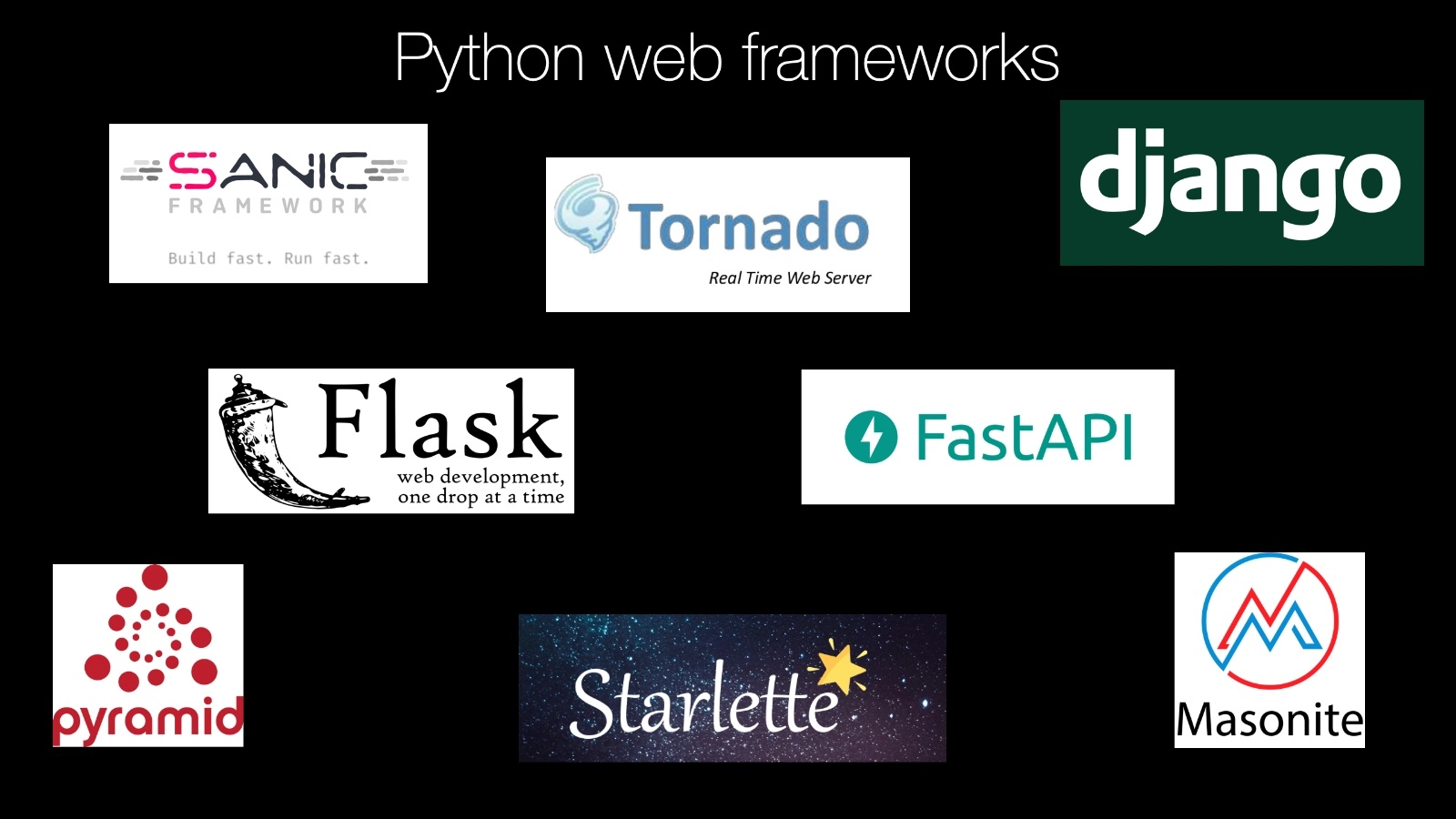
Let's start by doing a quick purvey of the Python web frameworks.
In some technologies, let's say .NET there's almost no discussion of what web framework to use.
In .NET you use ASP.NET, that's the framework from Microsoft and so you use that one.
Yeah, there's some other ones you could pick but they're not really used.
ASP.NET, you don't think about it.
Maybe you think about variations but you don't actually think about the framework.
In Python, it's not like that at all.
There are many, many frameworks.
That's a great problem to have but it is actually a problem to decide where you should start.
Just by name recognition, probably Django is the most well-known framework.
Many of the examples I showed you before on who uses Python were actually also who uses Django.
Django is great and it's been around since 2005 very popular, gotten a lot going for it.
However, probably Flask is the one with the most momentum.
For example, last year, two years ago it was 15% behind in usage with Django.
It made up 15% in just one year and keep in mind, these both have been out for like 10 years so it's really starting to take off and you'll see its influence all over the place.
So these are the two big frameworks in the Python web development space.
There's also Pyramid.
Pyramid is a great option.
Actually our websites are built in Pyramid and it's really, really been great as well.
So these are all three really good options.
Masonite is a newer one that's got a lot of helpers to help you continue to add features to your site over time.
That's cool.
Starlette is one of the new foundational frameworks and I say foundational because it itself is a cool framework but there are many things built on it as well as you'll see.
So Starlette is one of the more modern frameworks.
It really, for Python Three, it takes advantage of some of the new language features about describing variable types and things like that and also supports asynchronous programming.
Built on top of Starlette is FastAPI which is a, maybe one of the best ways to build APIs these days if it's going to be an API that gets a ton of traffic.
FastAPI is on par, as fast as NodeJS, as fast as Go and it handles the scalability that those frameworks do as well so if somebody says, we can't use Python for this 'cause it's not scalable enough it turns out, actually, FastAPI totally does it.
To be honest, many of these other frameworks also completely do it.
You know, our site, running on Pyramid gets millions of requests per month and it does terabytes of data traffic and yet it runs just fine on this not so scalable thing right, but if you need extreme scalability FastAPI is good, Sanic is another one that's in that extreme scalability world.
It's another new framework that embraces Python's async and await.
The async programming capabilities that was recently added in Python Three and Tornado is one that's been around for quite a while and it has, also, this asynchronous programming model but it has a older traditional model that it's kind of built-in before Python itself had something for that.
Here's a whole bunch of frameworks and, actually we're leaving many, many of them out.
These are just some of the either new and exciting ones or the most popular older ones.
|
|
|
show
|
1:36 |
With all those framework options which one should you choose?
Well, it's not too hard.
If you want a traditional web framework then probably Flask is the way to go.
Maybe Django, probably Flask.
Like I said, Flask seems to have a little bit momentum and what you'll find is a lot of the more modern frameworks have adopted Flask's API but they make some slight variation on it.
Here are some survey results from The Python Software Foundation in conjunction with JetBrains, a developer tools company.
And they did a survey, the biggest survey of the Python dDeveloper space, in 2018.
They also did it this year but we don't yet have the results so we're going to look up the year before.
Notice how Flask is ahead and this call that I have on the right here is that surprisingly, Flask has grown by 15% usage among people who answered.
So, that's pretty awesome.
Django also is still very popular you can see my Pyramid is in here.
And there's some other things Hug, Falcon, Bottle and so on.
You don't even see Starlette or FastAPI, do you?
I believe those were either entirely too new and when they did this survey, they weren't even born yet they weren't created yet.
Or, if they were, they were very, very new and they weren't popular enough to make it onto this list.
So which one should you choose?
Well, if you want a traditional web framework like I said, Flask unless your organization is all about Django then just go with Django.
That's totally good.
If you need something scalable or you want something more modern look at things like Starlette and FastAPI, and possibly Sanic.
But, I'd probably start with Starlette.
It seems to be the foundation of so many of these things.
And, yeah, it's, it's really good.
|
|
|
show
|
1:51 |
Well, we've finally come to the part where we're going to play a little bit around with Python.
We've talked at the high level about why it's cool we've talked about how it's efficient the types of things you can build.
Let's just take a couple of minutes and actually build out something non-trivial.
We're going to build this website.
Looks pretty good, right?
Guitary, it will rock your socks off.
So here's a simple little Flask website.
And the idea is, we're a guitar company.
We're selling guitars.
Go here and, click that button and say, browse our guitars and you'll get a list you know, like a book store, or like any store that you would expect online these days.
Click that button, you get something like this.
Here's all the guitars, there's a cool picture there's the title, there's the price.
In a real app you'd be able to click on it and get all sorts of details and order it.
In our app we just have these two screens you can click those buttons, see all the guitars just the electric guitars, or the acoustic guitars.
So this is what we're going to build.
We're going to only take a super simple look at it we're not going to build every single detail from scratch.
For example, the web design we're just going to drop that in there.
But it's going to work with our Flask app that we're going to put together.
Now this is the first time we're writing some code in this course, and I did say, I totally understand that many of you may not be software developers.
Let me just set some expectations.
When you see what's happening here in this next couple of videos, don't expect to follow along every single step if you're not familiar with Python.
Don't expect to be able to recreate it.
It's not to teach you how to use Flask or the Python web framework; it's to give you a little bit of concrete sense of what it's like for someone, possibly you possibly someone else, to use these Python web frameworks.
So we're going to skip around a bit.
We're not going to cover every single detail.
It's more to inspire you with what is possible than it is to teach you every single nitty gritty detail.
Okay?
Here we go, It's going to be awesome.
|
|
|
show
|
2:44 |
Here we are in our Python IDE, called PyCharm.
There's a couple of good editors out there in the world.
PyCharm is one of them, my favorite.
There's also a Visual Studio Code and a couple of other options.
I've already set up a project by just creating a couple of folders and a file here.
To say that, we're going to use Flask.
And we're going to start by creating the Hello World Flask application and then we're going to extend that out, quite a bit.
Often, people think the Hello World app idea is to show you the simplest thing that you could possibly do to get Hello World on the screen.
But actually one of the important things of these, Hello World little demo applications is to show you the entire system is, kind of, hanging together and working.
Yes, I can run Python.
Yes, I can open up the web server and things like that.
So, let's do that, real quick here.
Want a new Python file, my convention is typically called app, and in order to use a library in Python regardless of whether it is one of these built-in standard library ones these batteries included or an external one that I have gotten installed you just type import and the name of it.
Here, you can see it automatically helps us out.
It says Flask, that's what we want to use.
So in here when I create a thing called app and we say Flask dot capital Flask and we give it the name of this file which you can get to like that.
Now we have to create a function which is called when somebody requests a webpage.
So I'll just call that index or something like that.
And here we're just going to say something like really simple return Hello world like that.
How about Hello Flask.
Now this itself is not enough to reformat that This itself is not enough to make it exposed to Flask.
We've got to do one more thing.
We're going to go over here and say app this is a route as in a destination URL, it's just forward slash.
Then finally down here we're going to say app.run.
Now there's a little convention in Python that allows us to import this into a production server or run it in testing.
So I'm going to do that here like this.
We'll go ahead and tell it it's in it's debug mode.
So in order to run it I just right click and say run.
There's our web server.
Look at that, it's already off to a good start.
What happens if I click on it?
Well, Hello Flask.
Whoo, make that nice and big, there we go way more dramatic when it's huge right?
Hello Flask, that's it.
So we've created our Flask web application.
There was no compile step, there was no installing things other than to get this installed into here.
Which I did before.
But there's no like messing with the system and things like that, it's just write these couple of lines run it, and we're off to the races with our Flask web app.
|
|
|
show
|
3:13 |
Hello World is fun, but it's not very realistic.
We want HTML pages.
These are the pages you see on the web, right?
Not this silly little string.
So let's do a quick thing to change this.
Notice I've added two directories static, where we're going to put some design things like images and style sheets and so on and this template folder.
So over here I'm going to add a file HTML file called index.html.
It has a title.
Let's call this Guitary.
That's going to be our little application.
And let's put a little header like this.
Welcome to our guitar store.
And what we want to do is we want to list out the guitars.
We want to have some data and show it.
First of all, we're going to need to change this around.
Instead of saying here's a string we have to go to Flask and say render_template and we have to give it the name.
And PyCharm knows about this convention so it's like, oh, here's one that looks like it might work.
If we rerun this and we check it out now woohoo, look, welcome to our guitar store.
We look at it, there's exactly what you would expect.
That's pretty cool.
However, we would like to pass some interesting data.
We're going to get a bunch of guitars.
How do we pass the guitars along?
Well, let's just say I've got a little bit of data here and it's a letter A, a letter B, a letter E, and a letter J.
So we can come in down here and just say values equal data or whatever.
We could just make up this name as long as we know what to refer to over on our template.
And we can come down here and we can have a little section.
We can have, like an unordered list that has a list item in it.
If you don't know HTML, don't worry about it.
We're just going to put some repeating HTML in here real quick.
So what we say is we say it'll be % for letter and value's what I called it and then down at the end, we'll have to say N4.
And the middle, we're just going to put out the value.
So let's put out the letter and let's say we want to make it uppercase so we can do that if we like.
Now, over here guess we'd better run it again.
If we click on this, look at that, what we get.
A, B, E, J.
And to be honest we're kind of done with Flask in a sense.
Like, this is mostly what Flask does.
And to give you a sense that's why I wanted to go through this of what web frameworks do in Python is we get then started, get 'em running we tell it what the URLs that it needs to process are what is the logic behind each one we're going to go and get some data and we pass it over to an HTML file which has a way to take this data and an HTML template like this and we didn't really look at the outcome, did we?
Let's actually look at the view page source.
And it turns it into just straight, static HTML.
So this is what Flask does.
We're going to do two quick more things just to make this work better.
We're going to go and get this data from a database or something like a database instead of just making it up here.
But this part doesn't change.
We're also going to put a little web design on here.
But again, that's just HTML and CSS.
That's kind of a separate thing.
If you understand what's happening here you kind of know what Flask does.
|
|
|
show
|
1:50 |
Well, this was fun.
But what we actually want is to have a way to browse the guitars.
So, let's come in here and define one more thing and then we'll put our demo app away.
We want all the guitars and it's going to look really similar to this.
Let's go down here and say we want the guitars to be somehow we're going to have to get those guitars from somewhere in a moment.
And we'll just come down here and say this is the guitars equal to the guitars.
This is our variable.
This is the data name in the template.
And this will be guitars.
We've already added this cool little service database thing.
So I can come over here and say catalog, service.
Pytrom knows about it and will write the thing to us it up at the top and then we just say all_guitars.
That will just say None.
So, that should return our guitars here.
And then we can just go and print it out.
We're going to need this guitar's file so let's do that real quick and then we're going to get it to be all guitars.
And each of these guitars has a name and a price and so on.
We're just going to put the name out for just a second.
Let's see if that works.
Go in your saved guitars.
Oh, whoops!
Looks like I forgot to put this part member that's required.
Here we have it.
Here are all the guitars!
Look how awesome that is!
Just those few lines, we've gone to the database as we've got all these.
That course is not nearly as beautiful as what we saw before.
so, the last thing to do will be to just drop in a little bit of web design and then we'll be actually done.
Kind of amazing.
|
|
|
show
|
1:52 |
The very last element to finish this incredibly simple but surprisingly decent little web application is to update our templates to use our static CSS that we put over here.
We look at this, we've made a small change.
We've put some buttons up here and we said For each guitar, instead of just putting the name put this little section and put the image and put the name, and put the price.
Other than that, we have not yet really changed anything.
Want to see the difference?
Let's find out.
Man look at that!
Isn't that incredible?
Look, we got this cool web design here and we go click on guitars.
Bam!
There they are.
We can see our guitars just like before listed on this page.
Wheezer Classic, Acoustic Black, Mellow Yellow but now with just a tiny bit of change in the instrumental and a little bit of CSS, we have what I consider actually a quite decent looking little website here.
Super, super cool.
We'd have to do one more step to make these buttons work right now.
They can't do their full train they just show all the guitars, but that's like one more line of code honestly, and then that's it.
So I'm just going to leave it here, because remember the idea is just to give you a sense of what this is like.
What do you think?
Incredible right?
I mean, look at how amazing this website is and then here's the totality of what we put onto that page.
That's the guitar listing there.
And over here, this is the entire flask site.
So when I say Python is easy to use it's fairly easy to read.
You don't have to do too much to get started.
Well, here it is.
We could of course make this super advanced; do all sorts of things, but the simple version this website is actually incredibly simple to put together.
With just a handful of minutes and here we have it.
Granted the web design was already done but we wrote all the logic of it from scratch.
That's amazing.
|
|
|
|
19:50 |
|
|
show
|
2:45 |
You should be aware by now that Python and data science go together so well and it's one of the fastest growing parts of Python.
In fact, in that survey I showed you in the web development side the Python software Foundation survey along with JetBrains they also ask, Are you a web developer a data scientist, or other?
Web developer and data scientist, those were about equal so this is a huge part of Python and I think this is one of the areas as I mentioned in the full spectrum section that is really unique for Python.
People can come from other disciplines from say science, or engineering, or economics and they can come into Python and they can do this type of work that we're about to talk about because Python is so easy to get started.
But they can do real honest to goodness work that has incredible implications as far out to the boundaries of science as you want to think.
How far out?
Well, what if we're using telescopes?
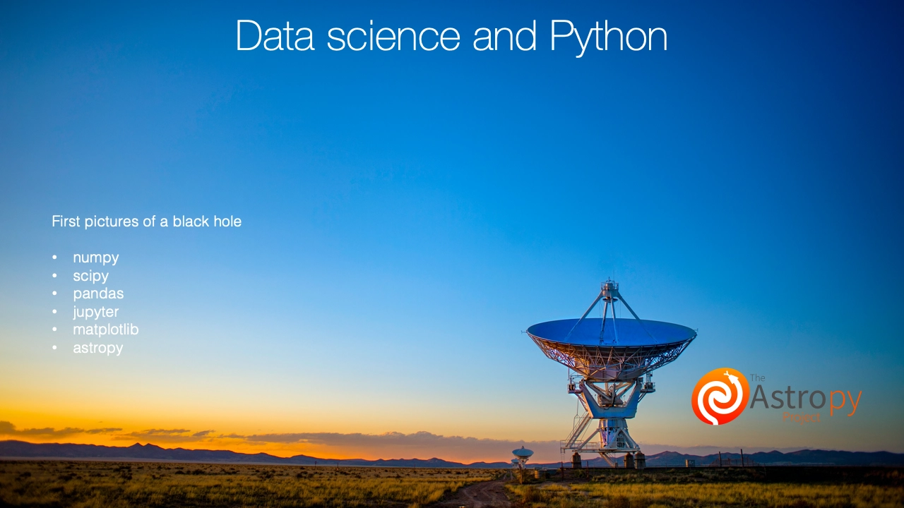
Yes, astronomers all over the world use Python to study all sorts of things.
To study stars, to look for exoplanets there's a whole bunch of libraries.
One of them, the most popular one, is called Astropy.
So this is a whole project for just doing astronomy with Python.
What was the biggest discovery in astronomy recently?
Well, as a non-astronomer, just looking in from the outside it was probably the fact that the very first picture of a black hole was taken.
This is not as easy as it sounds.
This doesn't just mean better cameras that can focus more.
There's all sorts of reasons that it's very hard to actually get a clear, true picture of what a black hole looks like.
So the people worked on this project they actually used machine learning to try to figure out what the real image looked like and tried to piece it back together from a bunch of parts with many interpretations but they taught the machine learning model what the most likely outcome was, and they recreated it.
They use a whole host of libraries that are from the data science side of Python NumPy, SciPy, pandas, Jupyter, Matplotlib and Astropy, of course.
This is just one discipline, and one huge discovery.
It would not surprise me if a Nobel Prize came out of this work done with Python.
But speaking of Nobel Prizes people did win the Nobel Prize for finding the Higgs boson at the Large Hadron Collider.
Yeah, Python was also involved in that as well.
Data science and Python, they go really well together and it's partly because of this full spectrum language.
It's so easy to come in as a non-developer pick up the little bits you need and just keep going, and going, and going until you've all of a sudden used machine learning and artificial intelligence to recreate the picture of a black hole.
Wow.
|
|
|
show
|
1:50 |
Most of this work that I just described was done in something called a Jupyter Notebook.
These use to be called iPython notebooks but now it's Jupyter because it actually runs many other languages.
Even though it started out being just Python now you can do things like R and Julia and even .NET and C++.
It's kind of everything.
So it's these notebooks that have this visual look here.
You can see the Lorenz differential equations.
There's a little description.
You can write a little bit of code and a little more description, a little bit more of code and oh, now you get a graph that you can interact with with these little widgets.
It's really really great for exploring data when you don't know exactly what you need to do.
You get the data and you start looking it at it and you slice it this way and that way.
And you ask questions, and you see it.
Very very different experience than writing the Flask web application.
In Flask we broke it into a bunch of little files we put them all together.
We wrote a little code here, called over to that thing passed it off to that.
Notebooks are these one thing here that you can work with and you just kind of explore it as you go.
You don't even necessarily know where you're going to end up.
At least the early stages of much data science is done this way.
You probably don't productize it.
You don't take this notebook and make it a web service that then can be consumed by an application.
You probably go and convert it over to that Flask type of story that we were talking about.
But at the beginning, the exploration and the explanation side, it's with these notebooks.
Oh, and this also happens to be similar to things like Matlab or R Studio.
Unlike say Matlab or Mathematica, instead of costing thousands of dollars, no.
This costs, well, nothing.
It's free.
I's supported by NSF, National Science Foundation in the United States and a bunch of other organizations as well as all the scientists working on this project as part of their research.
It's open-source, just like Python.
|
|
|
show
|
3:19 |
It's one thing to hear about Jupyter.
And Jupyter notebooks but to see them in action well that's something entirely different.
So the next demo that we're going to do in this course, may be the very last one actually is going to be working through a small analysis of real data out on the internet using Jupyter.
Over here, I've already set up an isolated environment with Jupyter.
All I have to do over here is type jupyterlab after installing those things.
Just going to get started and launch a browser here.
The browser's going to log my into my Jupyter server.
So what I want to do is I want to create a new notebook, and I have these different environments this is the one that I've set up for this course.
And it's all ready to go.
Click here, it creates this not named, which is kind of annoying so we're going to call this reference counter, something like that.
Now, what is this thing that we're in here?
So, what we can do is we can type in different types.
We can either type out raw stuff we can type in markdown, which is a way to write in formatted text.
If we go over here I can type something like this and what were going to do is, we're going to go to a site and were going to analyze what is the relative reference counter or authority of other sites, according to this one?
What I mean by that is let's take all the links to the site and figure out where it's looking out to in the world.
Figure out the domain names.
Maybe Github or Twitter, or Python.org.
How many times do each of those appear and then draw a graph, say we'll this one is the most popular, so it has the most authority.
We refer back to it the most.
So we can type markdown, that's in markdown.
We can type a little title here.
We're going to use a place called Python Bytes.
So, hit a button to execute that markdown and over here, on Python Bytes this is one of the podcasts that I run.
You maybe remember that from the beginning.
And what we do, is we have a whole bunch of episodes here.
And if you go into them you can see that we refer back to many things this one's referring to Real Python.
And if we go down this one's referring over to docs.Python.org, and so on.
If you look across all these episodes we have an RSS feed here at the bottom.
You can pull that out, which is in XML format.
And basically this is what the podcast players use to subscribe to the show, get the show notes and all that kind of stuff.
So we're going to use that as an easy way to get all of these show notes across all of the different episodes.
Instead of trying to go to each page separately.
So over here, we can, see that, we can add a new markdown section and say we will download the RSS feed, analyze all the lengths and extract the domain names and plot them by popularity.
Let's fix that spelling, also.
Here we go, so the next thing now this is a little bit of a description, we could have pictures and whatever, but the next thing we want to do is add some code.
So over here I could just come up with some variables.
If I run it, you can see, it executes this code.
X and Y, if we add them together and don't assign it it'll just print out the value, like this.
Obviously, that's useless to us.
But that's what this Jupyter Lab is all about.
We're going to write a little bit of Python, a little bit of a description.
Little bit of Python, little bit of a picture.
Little bit of Python and as you go through it you can poke at the data, you can look at it this way and that way and transform it.
And it's a very exploratory type of experience that we're going to have.
|
|
|
show
|
4:18 |
Now our goal is to go and download that RSS feed.
Let's get started and what I want you to take away from this and why I'm doing it live and I'm not just showing you some finished product.
What I want you to take away from it is there'll be big steps like I want to go to the Internet download that data and parse apart huge amount of RSS data.
Like 1.5, two megabytes of data and parse it apart into something we can use in memory and programming.
You'll see that that is a handful of lines of code and they're all really straightforward.
You could look at this even as a non-developer and go, wow, I see what that's doing.
That's not actually that complicated.
So we want to work with some libraries.
In our regular program, remember we had to import them to say we're going to use them.
Same thing here.
And if import is called feedparser and we're also going to need this thing called bs4.
We can go ahead and get those and we could put a little description above it but just for the sake of time I'm not going to do that.
So when I come down here we're going to download something from a url.
Pretty straightforward url there.
Now, how do we go to the Internet download this, parse it apart and get it into something we can work with?
Watch this.
feedparser.parse_url.
Now I'm going to print out a little bit of this.
Just the first hundred characters.
Going to run this.
Look at that.
Feed, title, Python Bytes, title detail, plain text.
Language, I guess.
It's not set.
How cool is that?
So this is quite amazing.
Let's run it again and just store that.
And one of the things that's really interesting about these notebooks is this takes a little while to run.
It's not hugely complicated but imagine I was doing some financial calculation that takes 10 minutes.
I can go on and keep working and it will just remember this.
If I want to run some other code at the bottom I don't have to rerun this.
I can explore, change, tweak it, and so on without having to recompute the whole thing.
That's a huge part of this for computationally expensive things.
The next thing we need to do is get the descriptions.
So let's play around just a moment and see how that goes.
If we look at the feed we can say it's what's called a dictionary we can get the items.
Let's see what that is.
Okay, there they are.
There's actually a whole bunch so let's not get all of them.
Let's just get one.
That's cool, now here it is.
And notice it has a summary and a little bit farther down woo, this is a mess somewhere it has a description.
I can't quite see it but if we just come up here and say get description there we go.
So what we need to do is go through all the items and get out this description thing and then it's HTML.
We're going to go through and we're going to find this hyperlink and then we're going to convert that out to get the domain, and then we're going to graph it.
It sounds like really a complicated problem but inspired by this these two steps already got us downloading and parsing to understand that.
You can bet that we can take these steps quite they're going to be big and useful steps right along the way.
So notice how I wasn't sure what I was doing so I just explored it and now I can say the descriptions are and we can use this cool little expression here.
We can say item, not get, description.
Or item, n, feed.get, items.
And we can just print.
We found some number of descriptions.
Let's run this.
Damn, look at that.
How cool is this?
We found 157 descriptions so what we have is a list or an array full of each description.
We can go through those descriptions and pull out those things.
So this is how we're going to get started.
We're going to go through and we've already gone downloaded the data converted it from xml to something we can work with and now we've converted it to a whole bunch of strings and the question is now 'cause these are pretty complicated what do we do with this?
With all this HTML goo.
It turns out, like I said Python's pretty awesome at handling it but we're making our steps right down the way here.
Very, very cool.
|
|
|
show
|
2:39 |
Given those HTML blobs, our job is to find the links.
Let's go and add another markdown section.
So we want to put a little description here.
Let's really quickly just print out one of these.
And we can just take a tiny bit of that to see hey, this is what it's going to look like.
And put that over here into our markdown using this little format here.
And now it'll remind us what we're working with.
So what we need to do is take this, find these links and then from each link we want to find the hyperlink part right there and then from each hyperlink, we get this.
And then we're going to be off to the races.
Just like Feedparser saved the day and made it super easy to get this far the next thing we're going to use is Beautiful Soup.
We'll come over here and say all links.
Going to be a list.
We're going to build these up and we'll say what we want to do is go through each one of these we'll say, for d in descriptions, and then get the links.
And the links are going to be first, we're going to create this thing called a soup.
And we'll say bs4.BeautifulSoup and we're going to pass it the description.
And this is the one line that will take that goo and turn it into something we can ask questions about.
For example, find all the hyperlinks.
And let's just print out the links.
Run that real quick.
Look at that.
Hyperlink, hyperlink, hyperlink.
Close, but notice we have the A and we have the text in the middle and so on.
So we could do one of these little expressions again and say what we really want is a the href or a, this group.
We run that again.
There we go, look we just have each hyperlink here.
Just the URL that we're looking for.
Look how easy this is.
This is so incredible.
Now, one more step.
Let's go to our all links and let's add these to it.
So, in the end we're going to have them not just for this one description but for all descriptions.
And let's do a little print statement.
So instead of just printing them all out we can just say we found however many and let's run that.
We found 2,824.
And notice, see there'll be a little star here.
Watch how long this takes to run.
And then afterwards.
But, later if we want to just work with like the link, the all links, something like that we'd run it, it's instant.
Because all of this computation here, and here, and here this is all just saved up in the notebook.
And we can just work with the outcome.
Assuming that this is all done, we'd have to worry about it.
So really, really effective way to explore this data.
|
|
|
show
|
1:43 |
Now that we have our links what we want is to get the domains.
So let's write that here.
Now it turns out this is not too hard.
We're going to need a library that's not super obvious but a little Stack Overflow googling will get you there.
So we're going to use urllib.parse and what we need is the domains.
This is going to be let's just put l for l in all_links for a second and if we print out the domains really quick well, that's just these.
But what we need to do is convert this thing so we can say this urllib.parse yourolivparse and we'll pass at that little thing.
Now notice we get a parse result over and over and over but if you look there's a value or property net location and that is what we want.
So we can say .netlocation or again what there it is.
There they all are and we have a duplication.
We want that duplication because these are multiple references back to the original site and we're going to count how many times each of those appear.
I guess we'll have as many domains there.
I guess we could have some little print out that means somthin' here at least.
So we could say how many times how many different ones are there?
That sounds like it could be challenging.
But we can just use what's called a set and a set will take a whole bunch of items worth duplication and just get it down to a unique set.
So we could say domain and we have to ask how many of those there are and we do that like this.
Run it again there are799 unique domains.
Cool, huh?
|
|
|
show
|
1:52 |
We're so close to having the answer.
We've gone and downloaded the data we parsed it apart.
As XML we started working through it and then we said well each one of has embedded HTML which is all sorts of yucky but we can use this Beautiful Soup to pull the pieces out.
And now we've found there's 799 unique domains and 2,824 total.
What do we do now?
Well, the last thing to do is figure out how many times each one appears.
That may sound complicated and in some languages it is, but watch this.
We talked about Python's batteries included well one of those batteries one of those things in the standard library is something called the collections module.
Like this, and it has this thing called a Counter and to the counter we can give the things we want it, well to count.
What are we getting?
Well it has, oh, looks like it's already got some stuff here like GitHub this many and so on but what I'd like is to sort it.
So we can say the most common is going to be counter not you guessed it most common.
And if we just print that out, there you go.
GitHub 447 references, Twitter 202 Python Bytes which maybe exclude ourselves maybe not YouTube, Python.org and so on.
Maybe we only want the top 25 'cause you don't want to graph all of them you just want to see the most important ones.
So we can come down here and do one literally one more line say give me all the items from 0 to 25, and we just show the top 25 and there they are.
Those are the top 25.
This is the kind of stuff that makes Python so useful it's just like a couple of steps a couple of lines.
You don't...
There's no algorithmic thinking here I don't have to come up with a algorithm where I could make mistakes or I have to spend time working on it.
No, I just grab the right thing ask the right question, and boom out comes the answer.
|
|
|
show
|
1:24 |
Finally now that we have these top 25 let's just do a quick graph.
Now I'm just going to copy some stuff over because the graph is kind nitpicky and the details are not important.
So what we're going to do is we're going to put in an import to use matplotlib and numpy and then we'll just do the graph like this and I just set the figure size.
Come up to Values, and I'm going to create a histogram bar chart here.
We hit it, and look at that.
We are done.
We have GitHub and Twitter and Python Bytes and now you can really tell what is important and what isn't.
And with that long tail, it tails off quickly, doesn't it?
So we've done it.
We've gone through winter Python Bytes downloaded the RSS feed, 2.5 megs of it.
We've pulled it apart to just get the description and then we kind of made a note to ourselves and then for each one of those, we said let's parse that HTML and just get the links From the links, we're going to get the domains and once you have the domains you just do a quick count and boom here you go.
Throw that at the graph in matplotlib.
Done.
Besides the graphepart I don't think there's anything that's super complicated.
Maybe not everything you're familiar with but I hope you were able to follow along and I hope this experience really showed you the power of Jupyter, Python for understanding data and just going out to, not just some local data source but going to the internet and grabbing that data and then turning it into insight within just a couple of minutes, beautiful.
|
|
|
|
8:08 |
|
|
show
|
2:13 |
How do you know your software is working the way you expect it?
How do you know that new bugs were not introduced?
Or that, when you find them they don't get reintroduced somewhere along the way?
Well, you right test for your code.
Maybe you've seen a graph that looks like this.
The general idea is that it is much cheaper to find bugs and correct them early in the lifecycle.
When you're planning it, creating architecture maybe when you're writing the code you found a bug and you fixed it before you ever release it.
Those are relatively cheap.
We do, maybe in some organizations, have QA Quality Assurance steps, where we find bugs there.
Not all companies have those, but some do.
Once you've released the software depending on how you release it it can be a lot more expensive.
If you need to go and do a deployment to the website that's not necessarily huge but if it's affected customers; if somebody's messed up a credit card purchase and then you've got to go back and deal with all that in the different systems and you've got to do the customer support or a package was sent to the wrong place or a buy decision was made on stocks when it should have been sell those all of the sudden have huge implications.
And, of course, if you're shipping desktop software well, it's just a pain to get that sent out again.
So the idea is that testing lowers the overall cost of software systems and that you should definitely do it.
Good news is, Python has two solid options more than that actually but two of them are really, really good.
It has a built-in testing framework that just comes with it.
Remember standard library, and the batteries included?
Well one of those batteries is a testing battery.
You can go and test your code like that.
But most professional software these days uses this thing called Pytest.
And Pytest is extremely simple.
You can see on the screen that first gray box shows the entirety of a program and it being tested.
It turns out it's incredibly simple but it also is very extensible and does a lot of cool things.
So we're going to talk just very briefly for a few minutes about testing code with Python.
We're not going to write code we're not going to spend too much time on this but I just do want to address it a little bit because it is important in languages like Python.
Also, you can use Python to test other things.
Python is simple to write tests in maybe you can test other devices, or languages, or so on.
We'll touch on that, too.
|
|
|
show
|
2:43 |
In the theme of giving you a slight little taste without going too deep into the technology and the programming details let's just quickly look at what a test in Pytest and Python looks like.
All we have to do is create a little method a little function like this.
Here this one's called test_electric_guitars.
And, as long as the name starts with test_ this test is going to be run when we say Hey Pytest, go test my Python code.
Now, what are we going to do here?
This guitar's library that we're working with on the next line, this comes from our website example.
Give me all the guitars that are electric.
And we want to test that this library is able to do that correctly, that it makes sure it's electric and not all the guitars or something like that, right?
So, we get the guitars back and then we can just do this simple little assert statement saying I would like to verify that all of the guitar's styles are equal to electric for the guitar and guitars.
That's it.
If what we get back are only electric guitars this is going to pass.
If we get something else, like an acoustic guitar well our test will discover that bug in the all guitars function in that library and let us know somethin's off.
We need to go fix it.
Pretty simple, right?
This is the test for what I would call the happy path.
If things are working in the right way the right input is being given to the library and it's behaving in the right way we asked for a reasonable guitar type we got some of those types back.
The other side of testing is, of course testing for invalid input.
Now this is super important.
I've worked with lots of interns and junior software developers and they're very good at the first type of programming.
I wrote the program and it does what you said it should do.
Great!
But soon as you type in something wrong oh, you were supposed to type in a number.
You didn't type in a number there and so the program crashed.
Or it turned out it couldn't get to the website so the whole thing crashed.
Testing for when things go wrong is almost as important for testing when they go right.
So testing that you have the right error handling and failure cases and so on, is super important.
So with Pytest it's easy.
We just create this thing called a with block.
We say it raises this type of error.
Then we try to abuse the library.
We say lib.all_guitars(None).
And it's not supposed to take None.
It's supposed to take some kind of string.
Electric, acoustic, whatever.
It got none and it says no, no, no.
This value you gave me, this is an error.
So this test is like an opposite.
Normally what you want is, if it behaves good the test will pass.
This one is if the library does not fail if it doesn't raise that error, then the test fails.
Because we said we expect this error.
So it's like a double negative but it's exactly the kind of test that we need to check for these error conditions and error handling.
And with Pytest, not to bad.
|
|
|
show
|
1:49 |
Well it makes sense that Python can test itself.
Most programming languages have some way to test that their own code is working.
But with Python you can test other things too.
There's cool plug-ins for Pytest that lets you just describe how things like APIs are supposed to behave.
And then Pytest will go out, talk to that API and very, yeah, it's returning the right data or the right status code, and so on.
So if you need to test APIs from the outside, Pytest is awesome!
Pytest is also good at testing IoT things.
Much of IoT's actually written in Python.
Things like Micro Python and Circuit Python.
But even when there's not, Python can interact with those devices and test them of course.
Hardware: things like modems and cell phones and other physical devices that you need to communicate with; Python can test those.
In fact, we already saw that Python Bytes podcast 'cause we did that in the data signing section.
My co-host there, Brian Okken, works at a company where they use Python all over the place to test things like cellular modems to make sure that they're working right.
So yeah, if you've got hardware to test Python is a really great option, 'cause it's easy and simple to write those tests against those devices.
Also, other languages integrate with Python.
C and C++, absolutely; Rust, it's easy to integrate with those libraries in those languages.
So if you've got a library, let's just say, C++ and you want to test it, you could write that in C++ and maybe that makes sense.
But you could also write in Python and test those other languages.
So here's just a sampling of what you can test with Python and Pytest.
There are many more use cases.
I didn't even mention Selenium for interacting with remote websites and complicated things like, Hey, I need to go login here, find this page, click this link and then verify something.
Python I beautiful for that kind of stuff too.
So yeah, you can test a lot of things with Python.
|
|
|
show
|
1:23 |
Python pairs well with Continuous Integration.
Are you familiar with this term, this concept?
Continuous Integration is an automated system.
It watches your source code repository for changes.
Any changes detected there so basically code saved back to the project it will automatically get that latest version run it through various tests.
For example, if it was C++, you would have to compile and link that code and then do some other stuff.
Python doesn't have this compilation stuff.
And the reason it's in the testing chapter is that makes the testing part even more important.
With compile languages the compiler verifies every single bit of the syntax clues together.
This function says it takes an integer and over here you are yes in fact passing an integer.
If you were to pass it something else it would fail the compilation step.
Python doesn't compile so there is no compilation step.
So when the only way you have to verify those types of things is just run it and the best way to run it in Continuous Integration is well, you guessed it to write a test, probably with Pytest that will have the same effect as well as checking the logical bits that you're trying to check.
So if you want to have reliable software and you want to do Continuous Integration or even better, Continuous Delivery check into a certain branch, it passes it automatically 'cause it's deployed to the web server or wherever you really need to have tests because without tests you haven't verified very much about Python.
|
|
|
|
16:32 |
|
|
show
|
0:44 |
You've got a really good look at the technical side of Python, what it's good at, how it works and it's time to take a bigger picture look to step back and look at the broader developer ecosystem and compare Python to other languages.
So in this chapter, we're going to go through a couple of the likely alternatives to Python in various situations and use cases and compare them.
How does Python work in, say, desktop apps versus .NET?
How does the computation notebook story of Python compare to MATLAB?
So if you're trying to decide between Python and something else, this is the chapter where I take my best attempt at putting those side-by-side and showing you the positives and negatives of each.
|
|
|
show
|
5:22 |
First step into the ring is Python and C# and .NET.
We're going to take Python and compare it to C# and the overall .NET ecosystem.
It just so happens I did professional .NET development for I don't know, 12, 15 years a very very long time actually.
And I still do a little bit of C# work on our mobile apps.
So we're going to pick on .NET here.
This is probably a pretty good stand in for Java.
It's not exactly the same Java and .NET are fairly good competitors.
They're kind of on equal footing and in a lot of ways, no they're not the same but they're similar.
So if you're also thinking about Java this is probably the closest comparison you're going to get.
Lets put em side by side, go down some of the features that I think are important and compare them.
Is .NET open source?
Yes.
Wait no.
Yes sort of.
It turns out some parts of .NET are open source some of them are not.
For example the main .NET Framework, I believe is not.
But something called .NET Core which is a newer version.
That's cross platform but doesn't do as much is in fact open source.
ASP.NET is open source and so on.
So there's, some of it is, some it isn't it's a bit of a mixed bag.
Python we've already seen straight across the board.
You can go to GitHub and just get it.
It's Open Source.
Is it compiled?
Sometimes that's an advantage sometimes that's a disadvantage.
.NET, yes its compiled and in further JIT compiled Python is, not really.
Technically if you look at the internals there's something that would look like compilation too.
But it is not in the sense that we're meaning here.
Is this technology owned and controlled by a company?
.NET, yes.
Microsoft, Python, no.
There is the Python Software Foundation, the PSF.
They kind of sort of own it and control it.
But it's more like that's a legal structure in place to be the steward of Python, not in the same sense that you know a commercial entities using it as part of their business.
Is there a strong base class library, or standard library?
Yes, .NET and Python both have incredible base class libraries.
There's definitely one of those.
What about building web apps?
Are they good at that?
There, I would call that mostly a tie.
.NET has ASP.NET so not so much variety but its really good at building web apps.
And Python, we've already seen.
There's so many options its very good that Flask cap we built was great.
Any work with databases?
Yes, both of these have extremely strong support.
.NET has a new framework.
Python has SQLAlchemy.
Those are actually very, very similar to each other.
And yeah, really great story there.
Mobile capabilities, .NET is actually extremely strong here.
And this is one of the places where Python gets red mark on its record.
Python is actually very poor at building mobile apps.
Its not that its impossible its just very, very immature.
And well, lets just say its practically not something you would choose.
On the other hand .NET has something called Xamerin which allows you to write mobile applications in .NET that work both on IOS and Android.
And that's what we use for our mobile apps.
Desktop applications, can you build those in .NET?
Yeah, there's a couple good options there.
WPF, its good at it I just don't love the technology that much.
There's also Windows Forms that which is, pretty good.
Python it has Tkinter built in that's kind of a old out of date mode.
Probably the best is Qt that's a really great way to build apps.
But its not as well supported as .NET.
Get to its rank, this one Python definitely shines.
.NET is number 4 of the languages on Stack Overflow.
That's that graph I showed you the incredible growth of Python.
At the beginning .NET is 4, Python number 1.
And, leaving the others in the dust.
TIOBE, another way that ranks the usage of languages.
I believe this one has kind of a longer tale affect in the sense that stuff that was written 15 years ago happen to be written in a language that still counts towards this rank.
So its got a much slower leading edge to to pick up the changes.
Anyway on the TIOBE programming language rank we have 5 for .NET and 3 for Python.
And Python is going up there.
I believe .NET is, actually, as well.
Price, both of these are free.
You don't have to pay anybody, anything for them.
You can use .NET and the associated tooling like Visual Studio Code or Visual Studio Community edition for free.
Same thing, Python obviously depending on the tools you pick you might buy a pay tool or not but yeah.
Python itself is absolutely free.
Another important distinction is is this a general purpose programming language?
Some things, like R and Julia, Matlab they are not general purposes languages.
You would never go and build YouTube in R.
But in this case .NET and Python are both very much on par here and they are absolutely general purpose programming languages.
Finally, the computing significa putting level.
This is the, Jupyter Notebook type of work that we just explored earlier in the data science section.
Until very recently .NET would of gotten a fail here I've got a poor.
And Python, would of course very, very strong as it, continues to be.
But .NET now, recently added the capability to have C# and F# type of code.
In Jupyter Notebooks, so in that, in my world that brings them up a little bit.
But that does not bring in all these incredible libraries.
Like Astropy and 800 Biology libraries that we found on PyPi that is still, I would believe mostly missing in the .NET side.
So Python definitely wins here but .NET is not as bad as some others.
|
|
|
show
|
3:52 |
Python vs Matlab.
This is mostly applicable if you're doing data science scientific computing, data visualization, things like that.
So, let's put them side by side.
Is Matlab open source?
No way, no it is not.
And Python, yes of course.
Is it compiled?
No, these are not compiled.
Is it owned by a company?
Yes, Matlab is owned by a commercial identity and Python is not.
Do they have base-class libraries?
Yeah, Matlab actually has super good base-class libraries.
That's one of it's features, it gives you all these libraries to do scientific computing and mathematical stuff.
Web capabilities?
No.
It's not for that, and Python, it's very strong.
Database capabilities?
Not really.
Not in a general sense.
Though, yeah, Python's very strong.
Mobile app capabilities?
No.
Python is poor, but I believe Matlab is even worse.
Desktop capabilities?
No, not really.
I know you can certainly automate Matlab but when you distribute it you have to buy licenses to Matlab and other funkiness so, I'm going to say no there.
And again, Python does not win this super well.
They have Qt and a few other things WX Python, for example but it wins in this competition here.
Stack Overflow rank?
Matlab does not appear on the list.
I'm sure there are questions about Matlab on Stack Overflow but far as the analytics I'm going to put negative infinity here vs.
the number 1 position.
That's a big difference.
TOB rank?
Matlab doesn't appear there either.
Even though there is a programming language there.
Price?
The price for Matlab is non-trivial.
This is $860 per user, per year, in perpetuity.
It goes on and on.
So, you can actually buy a license for something like three times that, and it will give you a permanent license forever, all of those are infinitely more than free and this one is a huge, huge importance distinction, is Matlab a general purpose programming language?
No, it's not a general programming language you can't build arbitrary things can you go build YouTube with it?
No!
Would you ever try to build Microsoft Word with Matlab No, that would be insane you can not do it.
It's not built for that, why is that important?
Because if you start doing you're analysis in your work in something that is not a general purpose language Matlab or Julia whatever, stay focused on Matlab, we build something in Matlab and we get it working and it's like ah this is really cool, couldn't we turn this into a great website or a cool product or, integrate this into our other thing?
The answer very likely is no you can't.
Because Matlab doesn't do that broader thing where as with Python, if you start building up your Jupyter notebooks and get some analysis going and then it's super easy to productionize that and put that into a service or package it up into an application, because you know what?
Python does those things but this is a big big point about this general purpose programming language and, I think it's really important in the consideration you're making and then we have the scientific compunioun level, I'm tempted to put Matlab under very strong and Python also under very strong.
But why didn't I give Matlab as high of a score?
If I had unlimited money, I'd believe they would be on par.
But in order to do the extra stuff outside of the box of Matlab.
What you do is you go and buy these tool boxes, you want to do wavelit decomposition?
Cool that's a $1000 dollars per user, per year to add that feature to Matlab, where as with Python that's just another free thing you get off pipeei if you had unlimited money, I think their very much on par with each other, but because they go outside the box in Matlab you have to buy additional things and those are extremely non-trivial prices, I think that kind of takes a little bit away from the broad capabilities of Matlab.
So, at least at the base level let's say Python and Winscp my interpretation is that it wins because you can go get all these other libraries like astropy and so on.
|
|
|
show
|
4:06 |
Next up in the ring is Python and C++ though C++ is one of the more established mainstream programming languages it's one of the core computer science capabilities.
This is like, I want to build Windows or I want to build Linux maybe I'm going to use C++.
So, or I'm going to build, you know, 3D video games, right?
This is probably the best of the low-level programming languages out there as I'm sure you know.
And, I'm going to throw C and C++ they kind of play in the same realm.
So let's just put them together.
Now, we have it as a versus but you'll see that it's also plus.
It could be Python and C++, as we'll see.
But let's start out by looking at the direct comparison of choosing one or the other.
Are they both open source?
Yes.
They're both open source.
Compiled?
C++ is definitely one of the compiled languages.
You've got a big project it's not unreasonable for it to take 3 or 4 minutes before you can run the thing to see if what you just did worked.
Whereas with Python, it's almost instant.
It it owned by a company?
Nope.
Base class library?
No.
C++ does not really have a base library.
There are libraries that you can find like STL, Standard Template Library.
But C++ kind of came before this idea of you get the programming language and thousands of little helper things classes, functions, whatever that can help you do stuff.
Like, I've got a whole list of a bunch of stuff duplicated create me a counter and give me the top 25 of them.
Right, like that in C++ is not super easy.
So, no, it doesn't have a base class library.
You can go get other libraries, but it's not the same.
Web capabilities?
No.
C++ not really used in the web.
You can integrate it into web apps but people don't build mainstream web applications like you saw with Flask, they don't do that with C++.
Database capabilities?
I'm going to say moderate, not that you can't talk to databases with C++, you definitely can.
It's just not as simple, it's not as easy as it is in Python.
So, in true capabilities, maybe they're equal.
But in, I'm sitting down to do this thing how long will it take me to get done?
It's going to take you a lot longer to actually get that database stuff working in C++ because it's just not as simple.
They don't have cool libraries or even any of the framework from when we talked about before.
Mobile capabilities?
C++ is strong here.
You can build iOS and Android apps.
Definitely iOS and I think Android as well.
You can definitely build iOS apps in C++.
So, not the main way to do it but you can integrate C into those languages and make that a core part of what you're doing.
Again, Python, not good at this.
Desktop apps?
Yeah, a lot of desktop apps are written in C++.
Most of the games you interact with are C++.
Things like Word, those are written in C++.
Even Notepad on Windows is written in C++.
Again, it's not super easy.
There are frameworks and libraries like MFC.
There are better choices.
I would definitely not start to build desktop applications with C++, but compared to Python I think it's in a better place.
There are like visual designers and whatnot that are, okay.
Stack overflow rank for C++, 6.
That's pretty far down the list, isn't it?
Again, you're putting it up against the number one contender over there, so, yeah, that's not great.
Even on TIOBE, I would kind of think C++ would show a little stronger, but it is behind Python in TIOBE as well.
So it's 4, Python's 3.
Price?
These are both free.
Of course you can buy tooling that can do stuff for these languages that cost money for either side but they're free.
General purpose?
Yes, again this is very important.
Scientific computing level?
Strong and very strong.
C++ is very strong at doing computation stuff many many computational things are done with it but there are fewer libraries.
You can't go and say, oh give me the 800 libraries to do biology with C++.
There's just a smaller set of these external libraries to work with.
So I'm going to put it as strong but it depends what you're doing.
If you've got to do really fast computation maybe it's the right choice?
I don't know.
Python has fast things like Numpy too.
These are always very subjective but my feeling is these are both good options but they're very, kind of they play in different worlds almost and what you're trying to accomplish there.
|
|
|
show
|
2:28 |
So far, it's been versus.
This or that.
Python or MATLAB.
Which one do you want?
But when it comes to C and C++ Python was actually built with C.
If you look at the thing you download it's actually called CPython because it is written in C.
It happens to run Python but the implementation that makes it go is C.
So Python integrates really well with C and C++.
There's a couple of ways you can do it.
You can make libraries in C++ and here's the extension story on how you do that.
You can import Python.h into your C++ file and off you go.
There's a library called CFFI or the C types module that lets you plug these two things together so you can write a core low level bit in C or C++ maybe it's taking to hardware or whatever and then it's very easy to turn that into a Python function or class that you can just work with as you've seen so far.
So this is a cool story but it goes further than that.
There's also this thing called Cython CPython, drop the P, Cython and it looks like pure Python.
Here's a silly little math function where we're going along and just adding up the distance or computing the distance over and over and kind of throwing that away.
It doesn't really do anything useful but that's not the point.
Notice how we put type information on the variables.
Do math start which is an integer and number which is an integer.
That's normal Python.
We haven't done it yet.
It's a newer feature.
We could have done it all along and it's fine but if you do this, you can actually run Cython against this and what it will do is compile it to C and then at C, then it will compile the machine instructions and it's as if you had written this directly in C or C++.
Moreover, you can actually in this world in this Cython world, you can start importing and working with C functions and classes and so on so you can directly create this boundary where C and Python touch each other but you still write Python code.
So here's another way in which Python and C and C++ come together.
Finally, if you want to look a little more into this check out this article over here on realPython.com Building a Python C Extension Module.
It takes you step by step of what you actually have to do to make C work with Python.
It's actually not that complicated.
Well that does it for our versus round.
Hopefully those comparisons were meaningful and gave you a good sense of what some of the trade offs are between all these different programming languages and technologies.
|
|
|
|
5:59 |
|
|
show
|
0:45 |
In this short chapter let's talk about Python and the job market.
There's two main reasons why this might be important to you.
As a decision maker, you might need to know will it be easy for me to hire somebody in a Python role?
If we decide to build our website in Flask how easy is it going to be for me to hire somebody to work on that project or to build out a team or get a consultant?
On the other hand maybe you're actually an independent person and you're looking for work.
Well, you'll be able to see what the job market looks like across the different technologies there, as well.
But I'm going to focus mostly on that first use case.
You're a decision maker for your company or your team and you're trying to decide will I be able to hire Python developers.
I'm going to take you through a couple of sources and show you some numbers and let you decide.
|
|
|
show
|
3:36 |
The first data source I want to refer to is Indeed.com.
So, it's a pretty big job site.
You can see the bottom indeed.com/jobs is where I got this data from.
So, you just go over here and you can type in Python jobs or .NET jobs or Java or so on and they give you a bunch of things.
Actually they give you a list of all the jobs but in the sidebar they show you things like the salary estimate for each of those jobs the number of full time jobs and contract jobs, and so on.
So let's look at Python first.
There are 70,164 full time jobs and 2,000 contract jobs.
Those are probably the only two that really matter to us but maybe full time is the most important metric.
So, Let's just focus on full time.
We have full time.
You can see the salaries are pretty high for Python developers.
They're a little higher for data scientists than they are straight up developers for whatever reason probably some supply and demand thing going on there but the salaries are not low for Python developers.
But there are many, many job openings.
Now that doesn't tell you how many candidates are swarming around in the world, but that can tell you if there's that many job openings it's likely there's a ton of Python developers.
Compare that against, say, .NET which has 54,000 full time developers but they generally get paid less as you can see.
Or Java developers, there's more Java than there is .NET but still less than Python at 66,000 and their salaries again I'd say pretty comparable to Python, yeah, just eyeballing those yeah, pretty comparable.
We have C++ developers.
There's fewer of those than any of the others but it's still a pretty respectable number at 39,000 full time jobs, and the salary I don't think that's quite as high but I'd probably have to graph it to be sure.
Anyway this is the main things we talked about we're not talking about MATLAB developers 'cause I don't really think there are MATLAB developers.
Most of the time there's like scientists who know MATLAB.
Anyway so I didn't put that up there.
This is pretty good comparison and I would say Python kind of stands out.
It's got more full time jobs and the salaries are definitely near the upper end.
If you're hiring people maybe that's not a positive but I think you're also going to get some of the best developers, right.
If it was like 35,000 say with .NET you might not get top of the line grade A developers that really know what they're doing if you're paying those rates.
I do want to add one more thing to the mix though there.
Let's pick a new language that has some momentum behind it, Rust.
Rust is a new language from Mozilla the people that make Firefox, and it's much, much newer.
Just how does like a new language like Rust compare to these others that have been around for a long time?
Well, if you look, there's only 1,400 jobs and the salary distribution actually it's really low, right.
There's the 25,000, 35, 45,000, right.
Python starts at 80.
Java starts at 85,000.
C++ starts at 80.
Now there's a few that are up in the high end but still, it's different.
But the most important take away is there are like 50 times more Python developer jobs let's put that as a stand in for developers than there are Rust developers.
So if you're trying to decide between one of these brand new shiny languages and say Python or maybe even Java right, you're going to have an easier time finding somebody to work on that.
Finally this is just a big grid screen full of numbers.
Let's look at it graphically.
All the graphs you're going to see are sorted alphabetically so .NET is first here.
You can see where it is.
Then we have C++.
We have Java.
We have Python, out on top but not that far behind Java and then notice I told you Rust is way, way down there.
Yes, Rust is way down at the bottom.
|
|
|
show
|
1:38 |
Let's round out this chapter by coming back to an old friend, Stack Overflow.
We saw Stack Overflow has that cool graphs about languages and demand interest in just interacting with languages.
They also have this thing called Stack Overflow Careers and if you go there, you can ask how many jobs you have that are Java jobs or Python jobs or Rust.
This graph looks surprisingly different compared to Indeed, but you know, that's fine.
Multiple data sources give you more perspective.
It surprised me how low .NET was on the Stack Overflow Careers.
Right now, there's 253 open positions there.
I kind of expected it to be higher because Stack Overflow originated as almost a pure C# .NET space.
Whatever, make whatever out of that whatever you want.
Then we have C++ is a little bit higher this time instead of lower than .NET.
Over in Java, we have Java winning the race here.
Java's over a thousand.
But Python, while not beating Java this time you know, it's still kind of neck and neck.
It's up there with Java.
And then Rust, yeah, Rust is even less represented here.
I think, for example, there's 80 times the number of Python jobs instead of just 50.
Either way, Rust is way, way, way down there.
What do you think?
What do you make of these numbers?
Certainly there's two major takeaways here that I think are clear.
There are many, many Python jobs available and that probably means there are many, many Python developers out there.
Second, Python developers are paid pretty well.
When we compared it against all those different languages on Indeed, they were at least comparable if not even a little bit higher than all of the others.
That's the Python job and hiring space.
|
|
|
|
8:17 |
|
|
show
|
3:55 |
We've spent some time talking about why Python is so awesome how many of the great things it does and how flexible it is.
And flexibility it does have but there are times when you should not use Python to solve certain problems.
Maybe this is because Python is not very efficient at this problem.
Or, it might not work at all.
So we're going to talk quickly about some of those situations.
You got a sense of that already.
Remember we did Python vs C++, vs MATLAB and so on.
And Python scored pretty high, I think.
There's a lot of green but there are a few standouts where there's some red in there.
And that's around mobile apps and, to a lesser degree, desktop apps but still, it's not maybe the best story you got going on there.
So let's talk about those two situations and just packaging up applications, in general.
Mobile: maybe you've heard of these things these little smartphones, everybody has one everywhere and having a mobile app is super important.
It turns out the story of Python on mobile is not incredible.
Here's a data point for you to consider.
One of the biggest Python training sites out there that teaches people how to build stuff with Python the website that is built with Python the company, the podcast that is about Python when we had to go build our mobile apps I went around and I looked at all the different options.
How could I possibly build this in Python?
You know what I decided?
There's not a reasonable way to do that.
Technically, I maybe, maybe could have pulled it off with some of the things that are out there.
But it is not the mainstream way and it's going to be jumping through a ton of hoops.
So, at Geniusy, we have an app in the Apple App Store, and on Google Play.
Those were written in C# and .NET using the Xamarin platform.
We have one code base for these two projects which is actually pretty killer.
We're able to share almost all the logic across those two operating systems and there's two phones.
So that's great but, even though I wanted to even though I tried, I could not find a way to reasonably build our apps in Python, on mobile.
Now you might be saying Michael, you can build your apps in Python on mobile there's this thing called Kivy, K-I-V-Y.
Yes, technically, there is Kivy.
To me, my impression, I haven't built anything in earnest with it but my impression is it is mostly about building kind of simulator game like interfaces.
And its ability to say, drag over a button here and put a text box there and have this stretch when it does this and a video player goes there.
Didn't really think that it could do it.
And by the way, until we have something that looks like this, a really cool development environment were I can have a UI definition and a UI designer and then my Python code, then I push a button and it compiles into a thing that I drop on the App store.
Until I have that, there is no way Python is on par for building mobile apps compared to, well, this.
This is literally how we built our mobile apps for the App Store at Talk Python Training.
Thing you see on the screen is login page not XAML.
The code is on the left this is XAML, like a WPF type of thing on .NET.
On the right we have both Android and IOS preview.
You can interact with the stuff on the right the tool box or you can drag over buttons and Carousel views and all kinds of stuff.
On the left we have our code these compile all into like the final version that gets shipped to the App Store.
Not only is there not something that's really not quite close to this in Python.
There is like not anything that even approaches this concept, not even close in Python.
And so until Python is on par with things like this on Android studio or working with Android directly in Kotlin or Xcode and Swift.
Until its something like that I personally would not use it.
As much as I want to unfortunately we are stuck doing something like this.
It worked out fine, but I would it's prefer Python, it's just it's not.
|
|
|
show
|
4:22 |
Another thing where Python is challenged.
This one is not impossible, it's certainly doable but it's not as easy as some of the other languages.
Is shipping packaged up applications to consumers.
Now it's easy to ship Python web apps to servers and make them run, or data science docker containers to data scientists to run their analysis.
Like, that type of shipping stuff is, easy.
Same as, it's easy to ship the libraries like NumPy Or Jupyter to developers so, they can use to write their code and do the things they got to do.
What I'm talking about is I would like to give a consumer a final end user an icon they can put in their mac doc click it, and make it run.
Or they put it in their start menu in Windows and they click the icon, and it runs.
They don't necessarily know anything about Python.
They don't know anything about setting up Python.
They don't want to know the thing was created in Python.
They just want, here's a thing I receive from this company or this project.
I double click it, a UI comes up, and magic happens.
There's two reasons that this is challenging.
One, we talked about Python being an intermediate level of goodness for building UI desktop applications.
There's things like [Cute], Qt for Python.
There's thing like WX Python, so yeah you can definitely build some decent UI's in Python.
But, it's not as easy as say windows forms or like old school visual basic where you had a designer and you drag and drop stuff over.
Remember that thing I just showed you about IOS and our app?
We have that cool visual designer and the properties and all that?
There's not much of that.
I believe the Qt folks have a Qt creator which is kind of like that.
I don't know how well it supports Python though.
Anyway, you can build these desktop apps.
It's not as good as some of these other frameworks but it's not bad.
But, it's also difficult to turn Python the Python source code, the Python run time and the libraries to depend upon into a thing you can give to a user with no dependencies and no other requirements.
Like, they don't have to set up Python and configure it.
Just, I want the icon, I just want to double click it and I want to work like Microsoft Word, Firefox Chrome, whatever.
Let's talk really quickly about some options for making that happen.
If you do want to do it you can use something called PyInstaller.
So, PyInstaller is a thing you can point at a virtual environment with your Python source code your dependencies installed, and it will create stand alone executables with these icons like I'm talking about for Windows, Linux, macOS, Free BSD, Soleris, and AIX.
I don't even know what AIX is actually.
But it will create them for them.
So, you can distribute your applications there.
And this works pretty well actually.
I've done it a few times.
There's certain weirdness-es and things like why does the terminal show up on this operating systems but just the UI and no terminal on windows.
There's just, it's not smooth and absolutely perfect.
There's just a few rough edge cases.
So, I guess the advice I would give you here is this might actually totally solve the distribution give me an icon I can double click it problem but just test it.
Make sure it's going to work for you.
This one's been around here for a long time.
You can see it's doing this fun razor thing.
Don't know what the status of it is but it's been recently updated.
A newer one this one uses the Rust packaging tools to try to do some more but maybe even improve upon PyInstaller called PyOxidizer.
It's the same basic idea though.
It's going to take your Python code it's going to bundle Python the run time into it it's going to bundle the libraries that you said you depend upon and try to run your code.
So, maybe this is what you need maybe PyInstaller is what you need.
If you can get those two to work for your project then you're really far down the path of like we can probably use Python to distribute our application.
For example, Dropbox does this.
If you have that little box icon in your start menu or you have it in your task bar or menu bar that is a local .exe or .app file that is 100% Python or mostly Python.
So, it can be done.
It can totally be done.
It's just not necessarily the easiest pressing to compile button in visual studio and there's the .exe, I copied over and it runs.
The streaming of these applications is challenging but it can absolutely be done.
So, It depends how committed you are to Python this is something that does take some work but it can be done.
|
|
|
|
8:19 |
|
|
show
|
0:34 |
Well, you've made it through the whole course.
Hopefully you found that informative, entertaining, and enjoyable.
So now you have a big question.
What kind of coffee do you want?
Well, maybe not coffee, that was our analogy at the beginning.
What kind of programming language do you want?
Is Python the right thing for you?
Should you maybe get a mix of Python and some other language?
We saw that they can be complimentary and they can work together.
So it's time to decide.
Play around a little bit, do some more research.
Hopefully you're off to a good start with all the things you've learned in this course.
|
|
|
show
|
1:19 |
Now before we get out of here let's spend just a few minutes doing a quick review a high flyover of all the things we covered in this course.
Member we started by talking about what you can build with Python and who used it and how.
Python means 4 things.
The language, the base class, their standard library the external ecosystem, like PyPI, and the community.
Web development with Python is a joy.
There's so many choices that can make it a little hard to choose, but once you figure out your bearings it's actually really great.
Data science and Python are amazing.
Python is one of, if not the leading language and technology in data science and scientific computing.
You saw some good examples of that.
Testing with Python, we have pytest.
It's great, it tests our code but we can also test other things.
We did a little bit versus, Python versus .NET and Java Python versus Matlab, and Python versus as well as with, C and C++.
We looked at Indeed and Stack Overflow Careers to figure out what the job market around Python looks like and finally we closed out the course with win not to Python, or maybe Python might not be the best option or a certain-use case.
There it is.
This is what we covered.
Now we're going to dig in to each one of these one more time for a quick review before we call it a wrap.
|
|
|
show
|
1:04 |
Remember, when you talk about Python when you compare Python to other languages and ecosystems, when you talk to other folks about should you adopt Python, is Python a good language is Python a good choice, remember it's 4 things so make sure you agree on what you're talking about.
It's a programming language.
We've seen a few examples of writing code.
Here's that Hello World example again.
It's the rich, standard library like that collections module where we're able to go get the counter and just ask for the top 25 most common domains, boom, there it is.
That's the standard library.
The third-party libraries over at PyPI that's the 809 Biology Libraries that you can just grab for free.
And then the community.
We haven't really been able to experience the community very much here, but trust me if you go to the conferences, if you work with the people in this community, they're very welcoming.
It's more diverse than many of the other programming communities out there and that makes it richer in a lot of powerful ways.
So, Python is these four things.
Language, libraries, ecosystem, and people.
|
|
|
show
|
0:29 |
Another really important thing to consider when you're thinking about Python is this is a full-spectrum language.
Many of the great choices we talked about like C++ is great for building desktop apps but you know what it's not?
It is not a great beginner language.
Python, on the other hand, is definitely good at beginning stuff, but again, it scales out all the way to discovering black holes using artificial intelligence so Python is a full-spectrum language and that should not be discounted when you're thinking about how it fits within your organization.
|
|
|
show
|
1:00 |
Remember the quote from that Red Hat survey Enterprises are choosing open source not because it's cheaper although sometimes it is but because it's genuinely better software.
And that is largely true and of course Python is open sourced which gives it some many of these benefits.
We saw that you go over to github, github.com/Python/cPython and you can fork or just download Python and guess what, you have full control over it.
The license gives you permission to do that.
But remember it's not just Python it's the ecosystem.
We saw those 206,000 packages on pypi.org.
Almost every single one of those is open source.
In fact, I can't think of one that is not although out of that many there probably are.
Obviously, I haven't looked and read the details about every single one.
It's not just Python, the main thing is open source but the bigger huge version of Python the level three of Python when you think about it that itself is also open source so, open source across the board.
|
|
|
show
|
1:15 |
Let's remind ourselves what you can build with Python.
We saw many different examples of many different types of applications.
We built a website with Flask and that was incredibly easy and also turns out to be very high performance and quite popular.
You can also build APIs and you can build those APIs with Flask or FastAPI or other types of frameworks.
Lots of options, many of them good.
Data Science, we did our domain authority thing from Python Bytes, the podcast data and we were able to do that using the Data Science tools Jupyter Notebook, NumPy, MATLAB, so on, super easy and very, very common.
AI, well, we didn't build any AI or machine learning in this course but you go look at all the libraries all the important ones, they all have Python support.
Robotics, there's specific APIs and even in whole operating systems built around programming robots and very strongly enabled with Python.
And it works really well with Python.
DevOps, we haven't done any DevOps but Python's important there.
And again, if you're doing stuff in Excel Python has some great answers for you.
Maybe that's using the Data Science libraries like Pandas and Jupyter to replace Excel or maybe it's just using one of the libraries that lets you automate Excel from Python.
|
|
|
show
|
0:51 |
If you care about Python it's hard not to love this picture, this graph.
Here we have 10 years of interest in various technologies on Stack Overflow and Python has one by one, 2016, '17, '18 and '19 surpassed all of the top languages and is now, by far, the most popular programing language according to Stack Overflow.
And not only is it more popular it's not, like, flattening off, like Java did or even turning down like many of these languages.
No, it's still going up just as strong.
It'll be interesting to see where this goes in the future but it is not a bad sign for connecting in Python.
Do you want to bet the future of your company's technology or your career on one of these graphs?
Would you rather be on a strongly rising curve or on a sinking, falling curve?
Well, I'll let you make that decision.
|
|
|
show
|
0:48 |
Before you leave this course and before we wrap things up be sure to go over to the GitHub Repository URL there at the bottom, and download this file or star it and start and fork it whatever you want to do to make sure that you have access to it because as you can see, we have the slides and we have the code that we've already created and we've uploaded it, and you'll have there.
Just a side note, I don't usually put the slides from my courses up here.
I don't want people to take them and go create derivative stuff.
There's already enough people stealing things from each pother online and whatnot.
But on these, I put them there because I want you to be able to use these graphs and these ideas to have conversations within your company within your organization to help decide spread the word is this thing actually for you is Python actually for you?
So don't forget to go here and get the source code for this project.
|
|
|
show
|
0:59 |
Finally, if you've decided that Python is for you yes, you actually want to adopt Python at your organization, at your team well, I hope you consider Talk Python Training.
We have a ton of courses, some of them beginner some of them more advanced about getting up to speed with Python.
So if you're interested in getting a group of people up to speed on Python, check that out.
We even have special business offers.
You get discounts for your team.
You get reporting so folks can see what's happening across different folks in the organization as they're going through classes.
Just visit training.talkpython.fm/business.
Lays it out there, and contact us and we'd love to work with you and get you set up and get your whole organization doing amazing things with Python.
With that, I want to say thank you, thank you, thank you for taking this course, making it all the way to the end.
Been a pleasure to share these ideas with you.
My name is Michael Kennedy.
Connect with me on Twitter via @mkennedy or just contact us through the training website.
Best of luck wherever you're going from here.
|