|
|
|
8:21 |
|
|
transcript
|
0:25 |
Have you ever struggled to build data visualizations in python? Are you confused by all the frameworks? Do you want to level up your ability to convey complex analysis through visualizations? Are you interested in building interactive dashboards? If so, then this course is for you. This is Chris Moffitt, and I am excited to offer this python data visualization course through Talk Python Training
|
|
|
transcript
|
0:53 |
Before we talk about using python to visualize data, let's take a step back and talk about why we want to visualize data. A good example of this is an Anscombe's Quartet. This is a data set that has four different unique sets of X Y. Data pairs. And if you were to run statistical analysis on each of these sets, you would find out that each set has very similar properties. The average the variants, the correlation between the X and Y variables and each data set is about the same. However, when you visualize the data, you can see that the properties of the data set are very different and this is a dramatic illustration of the importance of using data visualization in addition to standard statistical analysis tools.
|
|
|
transcript
|
1:00 |
So why might you choose to visualize your data? This list from Dr. Alexander Lex at the University of Utah from his data science course provides a lot of good examples that hopefully will inspire you as you embark on your data visualization journey, I frequently use many of the data visualization techniques I'm going to cover to answer questions, communicate ideas to others, test or reject hypotheses that I might have, for certain types of data Visualization is almost the only way to answer and reveal complex patterns in the data when I'm trying to record or present information. Maybe in a different context, visualization can be really handy, and for certain types of computational analysis, visualization is almost the only way to interpret the data. Finally, the most common use for visualizing the data that I've seen is to tell a story and we'll walk through some of those key considerations for visualizing data to effectively tell that story.
|
|
|
transcript
|
0:48 |
We've talked about why you might want to visualize data, but why use python to do it? Well, first python is one of the most popular programming languages in the world and is growing in popularity over time. I find also that Python is easy to learn. So if you're new to this space, the hurdles to get started are a lot lower. Python also works on all major operating systems so that you can run on your Linux your Mac or your Windows system. Python also supports many automation data analysis and visualization tasks. So this means that it will be a tool that you can use and grow with over time. And finally, one of the benefits of python is that there is a great collection of libraries that are available to do different visualization tests. And here's a sample of the ones that we're going to cover in this course.
|
|
|
transcript
|
0:37 |
Python is a great tool for data analysis and visualization, but one of the frequent concerns is that newcomers have challenges navigating this complex ecosystem because there are so many options broadly, the options are broken into three groups. There's a Matplotlib group, a JavaScript based group, and an OpenGL based group. In this course, we'll focus on a handful of Javascript and Matplotlib based solutions and talk through some of the pros and cons and help you choose which one is gonna be the best tool for the types of analysis that you do.
|
|
|
transcript
|
0:54 |
Let me lay out the course objectives. At the end of the day, I want to give you experience with each of these visualization libraries so you can choose the one that best meets your needs. So the way we'll do this is we'll talk about some of the most common libraries that have a good balance of power and ease of use. I'll give you the basic knowledge you need to get started with each of these libraries Each one has its own unique API. And I'll familiarize you with some of the key ways that you want to use the API. To get the most out of your visualization needs. Then we'll go through some specific data analysis steps to get you some more experience with using the library. At the end of each section, I'll go through the pros and cons so that you can go in eyes wide open and choose a visualization tool that meets your specific needs.
|
|
|
transcript
|
1:21 |
Here, the topics we'll cover in this course first, I'll talk about some basic visualization concepts that will help you get the most out of each of the tools we talk about next. The first library will cover is matplotlib, which is the grandfather of many of the plotting libraries in python. And spending time understanding it will help you greatly as you progress in your data visualization capabilities. Pandas builds on top of matplotlib for using custom visualization on top of the data frame that you're already using to analyze your data. Seaborn is a very powerful tool for doing statistical analysis and visualization of your data. Then we'll transition to some of the Javascript based frameworks like Altair and Plotly, which produces very visually appealing and interactive charts. The final two sections will cover are related to building your own dashboards. So, Streamlit is a tool for combining any of the visualization libraries that you've already used to add more interactivity. And then at the end we'll talk through Plotly Dash framework, which provides a tremendous amount of customization and flexibility for building your own interactive dashboards.
|
|
|
transcript
|
1:06 |
This course assumes basic python and pandas knowledge to get the most out of the data visualization libraries will be discussing. You'll need to be able to install libraries on your system using pip or conda and once they're installed, be familiar and comfortable importing those modules. The pandas will use it to read in CSV and Excel files as well as group and aggregate data more generally from a python perspective, you should be comfortable using dictionaries and lists and assigning values to variables as well as using an object oriented interface. Finally, the code will be in Python 3.8 and using Jupyter notebooks. If you're not familiar with Python and Pandas and those examples, I just walked through. I recommend 'Python for the absolute beginner' in the talk python training series to get you up to speed on basic python skills. Once you're there, if you would like to learn more about pandas, I recommend my course excelled a python at that point. You should have a strong foundation to really get the most out of this course.
|
|
|
transcript
|
0:23 |
To get the most out of this course, I encourage you to go out to Git Hub and download the materials for this course on your own system. Then through each chapter, as I walk through, examples, replicate that activity on your own system, explore the data and gain some experience with how to use these very powerful visualization tools.
|
|
|
transcript
|
0:54 |
Before we get started I'd like to introduce myself a little bit more and give you my background. As I mentioned, my name is Chris Moffitt. If you like to connect with me on twitter, I'm @chris1610. My email is 'chris@pbpython.com'. I've been using python for well over a dozen years in multiple business settings to solve real world business problems. I've also worked on the Excel to python course, which talks about how to take your business processes based in Excel and move them to a more scalable python and pandas solution. I am an instructor of data camp where I teach a course on data visualization with Seaborn and I blog at practical business python. Before we get started, I'd just like to say I'm really excited about this course and really appreciative of your willingness to spend a little bit of time with me and learn about data visualization in python.
|
|
|
|
9:13 |
|
|
transcript
|
0:47 |
If you're new to data visualization, you may be ready to jump right in and start doing some python coding. However, there is a surprising amount of research and science on how to most effectively visualize information. I'd like to go through a few core concepts that will make your visualizations much more effective. I also encourage you to take a look at some of the resources on this screen because there are many great books on this topic. And as you start to explore the various ways to use visualizations, more effective. Building out your knowledge, through books like this will help you be more effective in creating visualizations for your day to day analysis.
|
|
|
transcript
|
1:22 |
An important concept in data visualization is Aesthetics, Aesthetics describe every aspect of a graphical element on your visualization. A few common examples should make this clear. The actual position of an element on an XY. Axis is one aesthetic. Another common aesthetic is shape or size. To differentiate different elements. Color is a very important one that we'll talk about in future slide. The line width or line type can be useful in those types of charts where we have lines and as we apply aesthetics to the data, there's really only two types of data. So continuous data is data like time or weights or length or temperature, where there's a continuous range of values versus discrete data, such as count of, value of our dice, roll a yes or no answer. And in general most aesthetics can be used for continuous and discrete data, but shapes and lines usually work best for discrete data. We will use these concepts as we start to dive into each of the libraries that we're talking about because each library has a different way of mapping these aesthetics into your code.
|
|
|
transcript
|
0:52 |
We talked about differentiating data between continuous and discrete data. There's another way we can break it down. We can have quantitative data, which is numerical or qualitative data, which is sometimes called categorical data. So quantitative data describes the quantity of things. When we talk about the height, something might be 1.5 m, or weight could be 20 lbs. The price of an object could be $25, or time is measured in 60 seconds. Those are all quantitative numerical values. Qualitative data would be something like the hair color is red or blonde, nationality. US, a car as a sedan or a pickup and a pet as a dog or cat.
|
|
|
transcript
|
1:14 |
Now let's bring together continuous and discrete data and compare it to quantitative and qualitative data and give some specific examples. We have quantitative or numerical data that's discreet. It would look like a set of numbers like 1234 or specific dates. We could also have discrete categorical values and those can be broken down into an Unordered list like the pet list of dog, lizard or monkey where there's really no difference between them or an ordered list. Or there is some concept where there is a relationship between the order of the items in the list. If we look at continuous numerical values, those will be arbitrary numbers such as 5.5 a percentage or maybe currency as well as time that includes hours and minutes. The reason I cover this is that your visualization is going to be more effective if you treat for example an ordered qualitative value differently than a continuous quantitative value. And in fact some of the modules that we'll talk about can infer types of visualization based on the data type of your pandas data frame.
|
|
|
transcript
|
1:33 |
A very important aesthetic that we talked about earlier is color. Sometimes it's referred to as Hue and some of the libraries will be discussing. When we think about color, it's common to have a discrete color scale. In this case we have a categorical scale with a small number of swatches that are chosen to be representative of some sort of data set. We can also have a sequential discrete scale which goes from either dark to light or light to dark and then also a diverging scale, which means on each ends, it tends to be darker and as you get towards the middle, the colors converge in are harder to distinguish. A continuous color scale. On the other end has a nearly infinite number of colors It can also be sequential, which means it goes from dark to light or light to dark. It can also be diverging similar to the discrete color scale that we talked about where the middle is harder to distinguish but as the edges you can start to see more differentiation. One other item I want to mention as we talk about colors and start to apply this towards our visualization is to keep in mind that a large percentage of the population including yours truly do have some version of color deficient vision and that you can use these tools to choose pallets that will work well for people that have certain types of color blindness. So I encourage you to keep that in mind as you start to choose colors for your visualiztion.
|
|
|
transcript
|
1:02 |
If you're somewhat new to this space, I want to talk about one other topic that's really powerful and useful in the tools that will be covering. And that's the concept of small multiple plots. And this is basically just a way of putting a whole bunch of small graphs or charts together in one place using similar axes and scales so that you can identify trends This example from Seaborn shows how you can quickly look at this data and identify some of the outliers because there are so many charts condensed into a small space. This term is sometimes called a trellis chart, a lattice chart, a grid chart, panel chart or facet grid. So as you can see, there's a lot of different terms, but each of the visualization libraries that we're gonna talk about allows us to do this and I wanted to raise the concept now so that as we start to dive into the modules, you have some exposure to it and understand what it is. We're trying to accomplish with these types of charts.
|
|
|
transcript
|
1:15 |
I want to talk a little bit about the types of analysis that I typically do when I'm doing data visualization. The first type when I have a new data set is to do exploratory analysis. An exploratory analysis is characterized by the process of getting familiar with the data where the focus is on speed and doing multiple visualization types. I do this to find interesting nuggets and then dive deeper into the data. This is also typically something that I do as an individual. Once I have found the information that I want to convey to someone, I'll start to do more explanatory analysis. And what I mean by that is that this is focusing on communicating findings to an audience. The focus here is not on speed, it's on clearly conveying the message to that audience. I will spend time crafting the visualization and turning it into a standard report and frequently what I find is one tool might be good for exploratory analysis but a different tool Once I understand what I'm trying to say is a good tool for explanatory analysis and this is a good distinction for you to keep in mind as you start to use some of the tools we are gonna talk about.
|
|
|
transcript
|
1:08 |
We've talked about data visualization quite a bit but I don't want to lose sight of the fact that a lot of data visualization should really be a part of working with your data. And I thought this quote from Mike Bostok really drove that home. I want to give one specific example of tidy data versus wide data to hammer this concept home. When we talk about tidy data, I mean data in the example that is one line has all the complete information. It's like a record in a database. So in this case for the amazon sales data we have the name of the book the author and the user rating and some other information by year we can transform that data into a wide data set using the pivot table function. So here we have the fiction and nonfiction reviews by year in the wide data format My point with all of this is that when we're doing data visualization, you need to be prepared and comfortable using tools like groupby, pivot table, or melt to get the data transformed in a way that is most effective for the visualization tool.
|
|
|
|
56:41 |
|
|
transcript
|
0:29 |
In the past two chapters, we covered some important data visualization background. Now we will start to actually code in python. We'll start this journey with the most mature python visualization library matplotlib. Now matplotlib does have a bit of a reputation of being too complex or difficult to learn. However, I think with some basic concepts, you can learn matplotlib and start to incorporate it into your own data visualizations
|
|
|
transcript
|
0:59 |
As I mentioned, Matplotlib has been around for a long time. The first release was in 2003 and it was actually heavily influenced by MATLAB. John Hunter laid out some of these core tenants when he created matplotlib, he wanted a python plotting package that would generate output that was publication quality, so it had to really look good and generate in multiple formats. He also wanted an environment so that you can embed a graphical user interface for more rapid application development. He wanted code that was easy enough that he could understand it extend it. At the end of the day, he wanted making plots to be easy and I think the greatest testament to matplotlib is that it has been around for so long and that it is used as a foundation for so many of the plotting libraries and the data visualization libraries that we use in Python today.
|
|
|
transcript
|
0:47 |
Let's take a look at the landscape again and focus on what matplotlib does So, it is a foundational library for many of the visualization tools in the python ecosystem, and two of them that we will talk about in future chapters are Pandas and Seaborn. This chapter will focus on using matplotlib on its own because it is very powerful and can do a lot of visualization. The other key takeaway here is that matplotlib. If you understand it, then you can really get the most out of pandas and Seaborn in some of these other libraries, so it's well worth your time to understand that matplotlib and figure out how you can use it in your own data visualizations.
|
|
|
transcript
|
2:38 |
I'm a firm believer that the best way to learn this content is to follow along on your own system. So I'm going to discuss how to get your system set up so that you can experiment with some of the code on your own. I assume you have at least a little bit of familiarity with the Python package index or Conda and some of the other tools for installing modules on your system and managing environments. So one thing that I want to make sure you do is have a virtual environment or a conda environment set up so that the content that we're gonna walk through is separate from the other environments that you might have on your system. For this course, I'm using Python 3.8 but I don't use anything that is too specific to that version. So anything probably from a python 3.6 up to as of this recording 3.10 is coming out soon, should work. So as long as you're using a modern version of Python3 you should be good for most of the modules you can use pip or conda for installing I'm gonna use pip for the majority of the examples because I think that's a little more universal than Conda and for each chapter, I'll walk through how to install those modules. So for this chapter we're gonna focus on getting pandas, matplotlib and the Jupyter notebook installed and then I am gonna use stats models to show how to do a regression line and plot that with matplotlib, I did run into some issues and have in the past when installing on Windows. Sometimes Pywin 32 can be a little challenging to install with pip So, if you do have issues, I recommend using conda for some of these Binaries. like PyWin 32. So you can install doing conda installed pywin32 and then in future chapters, we're gonna install some additional modules that you will need for the visualizations during each chapter. I'll walk through this. But if you are a little more advanced and want to take a look at installing these on your own, you can but for now, just focus on pandas, matplotlib notebook and stats models. All the code I'm going to run through is in a Jupyter notebook. Towards the end of the course, I will be generating some code in VS Code. Finally, if you have any errors getting these modules installed or getting your environment set up, I highly encourage you to look at the individual package documentation because that will have the most recent information and tips and tricks we're getting these modules set up on your system.
|
|
|
transcript
|
1:50 |
Let's face it. Real world data is typically messy and I wanted the data in this course to mirror what you're gonna encounter once you apply these visualization concepts on your own. I've chosen to use data from the US. Department of Energy, fueleconomy.gov at this URL. I've downloaded the data and created a file called EPA_fuel_economy.csv Here's an example of the data that is in this file. The first seven columns include basic information about each vehicle per year. So you have the make model and year as well as the number of cylinders in the engine, the type of transmission, the engine displacement and the vehicle class. The C02 column is a measure of the estimated emissions of CO2. on an annual basis, barrels 08 indicates the number of barrels of oil per year to operate the vehicle and then what that cost would be on an annual basis We also include the different fuel type used for this estimate as well as the MPG, both highway city and combined. So I like this data set for a lot of different reasons. It has a large number of values, 24,000 values from 2000 to 2020, which means it's big enough that visualization is really going to help us understand the large data set. It's already in the tidy format. It has a mix of qualitative and quantitative variables and the variables are ordered and un ordered as well as discrete and continuous. So those concepts that we talked about earlier are going to apply. And then this is an area where we all have experience with vehicles. And hopefully it's interesting enough that you might choose to explore it on your own and see how it applies the vehicles that you own or operate.
|
|
|
transcript
|
1:08 |
One of the confusing concepts for new users to matplotlib is how the figure API interacts with the axes API. So an axes actually represents a single plot, whereas a figure is the broader container for one or more axes. This example from the matplotlib, documentation helps put it in context. So a lot of the things you think of with a figure makes sense. There's a title, there's a legend. We can have grids, we can have spines as well as in this example, a line or scatter plot. We also have X axis and Y axis labels and ticks. And those intuitively makes sense. But what is not clear to the new user is that this plot is actually an axis and that the figure is a container for one or more axes. And this concept is really important and I think we'll drive it home as we go through some more examples.
|
|
|
transcript
|
1:41 |
The second concept I want to talk about that can be really confusing for new mat- plot lib users is the fact that there are actually two interfaces to generating your visualization So the first one is a pyplot or a functional state based interface. And this is based off a matlab and it's designed for simple interactive plots and it relies on pyplot to automatically create and manage the figures and axes that we talked about in the previous section. The other approach is the object oriented approach where you create your figures and axes and then call methods on them to update them. Here's an example using pyplot of generating a simple histogram where you can see that the plot keeps track of the current figure and axes and just updates it with these commands. Whereas the object oriented approach, you create the figure in the axis using the subplots function. Then you update that axis with the histogram, your x labels your y labels, titles and then show that overall figure pyplot is around for that mat lab experience and has been around for a long time. So a lot of the examples you're going to see online will be in the py plot format but you should try and translate it internally into the object oriented approach, for this course I will focus on the object oriented approach because that gives you the most flexibility and the most ability to update and interact with some of the other libraries they were going to be discussing.
|
|
|
transcript
|
1:13 |
I'm gonna go through a quick example of launching my Jupyter notebook environment. I'm doing this on a Windows system and I already have the terminal set up to boot into a conda environment. As you can see, I have several environments set up on my system. I'm going to use the data of this environment for this course. I'm already in the notebooks directory so this will launch the notebook and then open up a browser with my environment and this is what my base environment looks like. Want to walk through the data directory that I have where I've placed three files that would be working through this course, there's an amazon book, Excel file, the EPA fuel economy CSV. File that we talked about and I made a summary file for the EPA_fuel economy that I'll use in some of the future exercises So this is a basic environment. I'll work through for the first couple of chapters and then at the end we'll use VS Code and I'll walk through how to use that a little bit later.
|
|
|
transcript
|
2:03 |
Now I'm going to create a new notebook to capture the information for our first exercise First thing I'm going to do is rename this notebook and I prefix it with the 02 just to do some of the ordering. Next I'm going to bring in all of my imports. Those are the standard for the path and pandas and numpy. Now I'm going to do 2 imports from matplot Lib. Plot is the standard starting point for creating all of our visualizations and a little bit later I'm going to show how to customize the ticker using this function from matplotlib. Next let's get our directory set up so we can read in the files. If you're not familiar with pathlib I'll give a quick overview. This is saying that our source file is in our current working directory under the data Raw subdirectories and files. EPA_fuel_economy.CSV. I'm also going to set up an image directory that I will use to store some of the plots a little bit later. And now here's the data frame that we talked about earlier so you can see at the top part of the data shows the first five records in this data set. I would like to do info to see a little bit more information about the data as well so we can see have a really good overview of the data and now we start to plot some data.
|
|
|
transcript
|
2:13 |
Now that we have the data loaded into our data frame. Let's do a really simple histogram plot before you plot something in a jupyter notebook. Sometimes you may need to use a magic command to tell it that you're plotting with matplotlib. Now in more recent versions of notebooks, you may not have to do this, but I want to point it out because you're going to see this a lot in online documentation. So now we've told the notebook that we're going to plot a matplotlib plot. Let's do a very simple histogram and I like using histograms because it's just one variable that we're looking at. In this case, we're going to plot a histogram of the combined fuel economy for all of the values. Now, one of the things you'll notice is that the Histogram is fairly straightforward, but you've got all this other information that is getting returned and a lot of times you're not gonna want to see that all the time. So there's a little trick you can do if you add that semicolon at the end it will suppress that information. So sometimes I will be doing that in the course. And what I'm showing you as an example of the state based interface using pyplot that I talked about that we don't want to use. So I'm going to go through that example just a little bit more detail so you can see how it works and I'll compare it and contrast with the object oriented interface So let me show how to customize the plot using the pyplot interface. So I've expand the example so that the plot has more information about what's going on So I continue to do the histogram. Then I labeled the X and Y axis with the number of cars and the combined fuel economy. I added a title and then I used plot.show to make sure that the final visualization is shown. Now we will go through the object oriented api and show how that works.
|
|
|
transcript
|
4:47 |
I wanted to highlight a couple of changes I made to the notebook just to indicate the difference between the two interfaces that we've been talking about. So I have updated the notebook. Out of the gate, say this is the state based interface that we talked about. And then down here is the object oriented interface, which is what we recommend. And you can always do a kernel restart and run all, get us back to the same spot. Now I'll show how to actually use the object oriented API. So now we have the same histogram that we did before, but instead of doing plot.hist, we did ax.hist. And on the surface it looks like we didn't really accomplish a whole lot, but by creating the figure and the axes we have a lot more control over it and it's a lot more consistent pythonic, API and we'll walk through some more examples of that. The other thing I wanted to talk about remember we did matplotlib inline appear so that the figures would automatically display. There is another approach I wanted to call out called matplotlib notebook. This is going to give a more interactive example and I'm gonna walk through and show it so that you're aware of it. I personally don't use it very often, but I think it is helpful to see. So I've enabled this notebook interface and I'm gonna do a little more complex example where we will let's copy and paste that. So we don't have to re type everything. So we'll create that histogram. But now we want to set the X Label, the Y Label and the title. Then we'll show the figure. Let me code that for you. So now what we've done is we've established that axis put the histogram based on the combined 08 column that we've been using set the X label and the Y label and title on that axis. And then showing this interactive figure that you can move and adjust and different plot types is maybe a little more useful than others. And then when you're done interacting with it, you can turn it off. Like I said, I don't tend to actually use this format very often I'm going to convert back to using matplotlib in line. I'm also going to comment this out because sometimes it gets a little confused when you make multiple changes in the same notebook, we start and run it all again. So when I ran it all again, I got this warning here because I have disabled matplotlib notebook. The figs show it doesn't like that so I can rerun it without that, it will automatically display and everything's okay. So just wanted to kind of walk through that a little bit more. So let's give another example of using the object oriented interface where we have a different approach to setting the X Label, the Y label and the title. So it's going to start the same way. So we defined our figure to find the axis object, put the histogram on that axis and then instead of setting the doing three separate lines, we can use ax.set and pass X label, Y label and title as parameters to it. And now we have the same histogram with x label, Y label, and title Set. But we have used a slightly different API. To do this and one pointed out because you'll see examples of both and it's a little bit of personal preference. But I do think using Set is a little more easy to understand and grasp as you're getting started with that matplotlib and just a reminder. If you want to get rid of the extra text. We had that semi colon. Rerun it and we have our plot So I'm going to restart and run all again.
|
|
|
transcript
|
3:35 |
Now that we've talked a little bit about how do you see the object oriented interface I wanna take a step back and talk about how we can also customize the plots. So the histogram that we've been working with, you might have noticed that the data is skewed quite a bit and maybe we want to dive in a little bit deeper on a specific range and we can do that So let me show you an example of customizing the range. We can pass, By passing the range of 10-50, we can tell the Histogram to only start at 10 And to go all the way up to 50. And this gives us a little bit more ability to focus in on the data. And it is pretty common operation you're gonna want to do with histograms The other things you can do, continue to copy and paste is try something called accumulative histogram. You can see there's a very different view here, we're still in the 10-50 range. But what it's telling us is When we get up until up to this 25-30 range that's where the vast majority of the cars are. So it's a kind of a different way to interpret the histogram data that we have been looking at. And another option we can do is just by continuing to change the parameters. We have a whole lot of different ability to analyze the data very quickly. So now we have, instead of having that filled in histogram we have the step function and have made it a horizontal histogram. And what I think is really interesting about this. And the reason I wanted to go through this is to explain to you that there are many parameters for changing the way that you look at the data in mat plot lib. And so it's important to look at the documentation, understand what those options are and figure out what works best for your own visualization outside of controlling the range. Probably one of the most common things that I do with histogram is you want to change the number of bins. So here we told it that there should be five bins between 10 and 50. Instead of letting matplotlib, figure it out automatically for you, you can specify it like I did there and to see the difference, it's really bump it up to maybe 100 bins can see a much more fidelity in your data. I don't think I want to talk about is why we're using the semicolon and what is actually returned from a histogram. Let's just leave it to the default number of bins. And let's say we actually want to know what the bins are. So the way we would do that run that command. So we get our same histogram. But if we look at the variable in it's an array of the number of values in each of the buckets or bins. You want to see the bins, you can look at the bins variable and you get that array and then the final one that I'm not gonna talk about much is patches, which are the actual bars and in more advanced uses of matplotlib. This is where you could do some additional customization if you wanted to, but I'm not going to go into that.
|
|
|
transcript
|
5:35 |
Now that we've talked about, how to use the object oriented interface to spend a little bit of time actually talking about how to work with figures and axes to plot multiple plots. For the first example we're going to create two plots and show how we display them together. So first we'll use this command to create a figure and with two axes. And if we want to access each axis, Mhm. Put a histogram on each one, and for the second one, just to show an example, we're going to create a second, histogram with a larger range. Put a semi colon on there, so nothing else displays. And now you can see that we have two histograms in one figure. So one is on axes, zero second, one is on axes. One we've got a histogram using the commands that we've discussed before. Now this approach of ax, If you look at what ax is, it's an array. And what I actually prefer to do is a different approach to make it a little more explicit. So I'll do everything else the same. And instead of accessing it through a list or a NumPy array, We've now assigned a variable. ax1 and I'm sorry, ax2. Mhm. If we run it, we get the same plot. Now this in and of itself isn't that useful, but it shows the concept. Another example that would make it a little more interesting is if we combined a box plot with a histogram. So let me show you how to make a box plot first. So here's an example now of the box plot and way to generate it is very similar to what we do for a histogram, you call the box plot function on the axes, set the title and the white label. And now we have a box plot. One of the things I don't like about this box plot is that it's showing all these outlier values. So one of the things I'm going to do is remove those and there's a parameter called show fliers. I set that to false. Then I have a little more consistent box plot that makes the data easier to to read because we have a much smaller scale. So now let's combine the two. Maybe I'm gonna copy a little bit of code here, just two. And while I'm at it I'm going to set some values so it's a little easier to read. And I'm also going to label the box plot. The final thing I'm gonna do to make this look a little bit better is I'm gonna set vertical equals false. So it will show horizontally and we'll add the labels just to make sure it's nice and clean. And there we go. Now we have two plots. So the figure contains ax1 and ax2. ax1 is a histogram, ax2 is a box plot. So we've talked about axes but we haven't talked about a figure yet. So let's show an example of why the figure can be useful So I'm gonna copy everything and after all the labels, I'm gonna actually label the figure. And we have other options. We can configure such as the font size and I'm also gonna make it bold. There we go. So now we have the MPG Distribution and vehicle MPG. At the top and this is all one image, which is really handy. The next thing I'm going to show is how we can have a little more control over actually how we create the two different axes. one way to do this so we can specify the number of rows, the number of columns. And I'm also going to specify the figure size. So what this will do is create a figure that will have one row and two columns. The figure size is nine x 4". So now we have a very different plot. So the histogram and box plot are side by side and maybe in this case we don't need the vertical there. So we have a nice representation of the MPG and distribution two different ways so that
|
|
|
transcript
|
1:52 |
One area where matplotlib really shines is the ability to save images in multiple different formats and we can use the figure that we just created to save our image. Earlier we defined an image directory and when we save it we can pass several parameters to it. And this will save a PNG image with a transparent background, the DPI of 80 and the B box inches tight. Just make sure that the figure fits within the size that saves it. So it kind of compresses the boundaries a little bit. If you want to save the image in a different format, maybe we want to save this as an svg image without a transparent background and higher DPI can do that as well. Another common one might be a jpg and we can even do a pdf if we wanted to. If you ever want to see all the options that you can save there's a little handy tip and you can see on my system, I have all the components in place. That I could save any one of these files so you can play around with it and find out what works best for you based on your use case for saving the actual images. And if we look, I've opened up in file Explorer, the images subdirectory and you can see the different files including a pdf, a .png, .svg file that it wants to open a Microsoft edge and a jpeg file
|
|
|
transcript
|
1:14 |
Now that we've done a little bit of matplotlib coding. I'm gonna take a step back and walk through a couple of quick reference items. That will be useful for you for the rest of this training as well as your continued development with matplotlib. First thing I wanted to lay out are the common imports that you'll use when working with matplotlib, you'll import pyplot as 'plt'. And then it's also convention that matplotlib is imported as 'mpl'. When working in a jupyter notebook, you can display the matplotlib images in line using the magic command, matplotlib inline, as well as using the notebook command to offer a more interactive approach. When setting up figures and axes. Use 'plt.subplots' to configure how many images you want to combine into a single figure. And then on each of these axes you can plot your display, such as a histogram, box plot or some of the other visualizations that we'll talk about. And then finally, when you want to update the display, you can use, set X label, Y label, or title as we've shown, as well as some of the other options that we've reviewed and are available through the matplotlib documentation.
|
|
|
transcript
|
4:20 |
We're going to continue working with the same data. But I've started a new jupyter notebook just to keep the notebooks a little bit smaller So let's go through just a quick refresher of what the top of our notebook looks like. We have the imports for matplot-lib, numpy and pandas. We've established the directories and the files for our EPA, fuel economy file that we've been looking at. We're reading in the data and then just taking a look at what the top five rows look like. Now we're going to go into plotting something outside of histograms, and box plots. And as I mentioned, I like histograms and box plots because it's one variable. But in real life you're gonna want to two variables against each other. And the most common way to do this or one of the most common ways is a line chart. So let's give an example of one. Let's say we wanted to plot the combined highway mileage per year and with matplot lib, we actually need to create that data. So I'm going to create a new data frame. So let me walk through this real quick. So I've taken our data frame and averaged the comb 08 column buy year and I used as index equals false to give me a nice clean data frame here. I also rounded the data just for convenience sake and it makes some of the plots look a little bit better. So now that I have for each year, what that averages. Let's plot it using a line plot. So you'll notice that I created the plot like we have in the past where I create my figure in my axes and I don't tell it to plot a line plot I just say plot, I give an X and the Y. So it puts the year across the bottom and the average by year across the y axis. But I don't specify that's a line plot and that's because matplotlib assumes just by using a plot using the plot command that it is a line plot But as you look at this, you'll see that there's some opportunities to clean this up and make it a little bit nicer. So let's talk about what we need to do to make this a little more presentable. One of the first things I noticed about this is, I really don't like the decimals here that it's a year, it's .0.5, you know, this, this doesn't really make sense for years. So the way we want to do this, we're gonna recreate why is we need to set what we call the X ticks. So these are called ticks on the X axis, Hence X ticks. So let's manually set those to 2 year increments. So now we have 2000 2002 through 2020 And two year increments. And what we did to do this to accomplish this is use the numpy function, 'arange' which says generate a list or an array between 2000 and 2022. With incremental steps of two. So this is one way to specifically do it. There is another way we can do this using a major formatter. So let me walk through how we would do that. I'm gonna copy the same plot. So we did the same plot set up our figure in our axes but then we access the X axis and use the function set major formatter. And we use the string method for matter to use the python string formatting option to tell it not to show to show zero decimal points for this floating point. So this is just another example where you can there are multiple ways within matplot lib to format and and work with your plots. This formatter option is very useful when you have dates, when you have currency other options where you want to clean this up a little bit more.
|
|
|
transcript
|
1:50 |
Another type of plot that will create a lot is very useful. Is a bar plot. So we can create one easily in matplotlib using the same format we've already been talking about. It's easily enough called bar, we can go ahead copy our information and now we have a bar plot and you may look at this and think, well could we maybe change the X axis to have more years and we can absolutely do that. So similar to setting the X takes on our line chart, we can do that and you'll see now we have Years every two increments. You might have also noticed that the year came through as an integer, so there was none of the decimal points that we saw in the line chart. And this is where behind the scenes matplotlib knows that bar chart is for categorical variables. And so it's doing some work behind the scenes to make these whole numbers or categories instead of continuous or floating point numbers. So that's just a little something that's going on behind the scenes. The other thing we could do with a bar chart if we wanted to is we could do a horizontal bar chart and instead of calling it bar, bar H and now we have a horizontal bar chart all relatively straightforward given the API, that we've talked about and hopefully to start to hammer home what the matplotlib api looks like and how you can use it to create multiple types of charts.
|
|
|
transcript
|
5:26 |
The next type of chart we'll talk about is a scatter plot. Let's get one started here. It's called scatter. And we're going to explicitly say what the X and Y axis are. In this case we want to plot the fuel cost versus the displacement. The other attribute I'd like to introduce is alpha, which is essentially how transparent the values are and we're going to pass in colors based on the number of cylinders. And while we're at it, let's go ahead and set some labels and titles. So now we have a nice scatter plot that shows us that as the engine displacement increases, the fuel cost increases which makes sense. A larger engine is going to use more fuel. The colors are telling us how many cylinders are in the engine. So we've got a lot of information that we're portraying in this plot. Let's go through another example of more customization that we can do on this plot and make it even more informative. So we'll keep the basic plot. Now we're going to set the X Label and the Y label and I'm going to show how to do that and increase the font size as well. We talked about using the formatter so let's format this access so it's a currency so maybe we show the dollar sign and a comma to make it a little easier to read. And for that we'll use the set major formatter. The other thing I'm gonna do to make it look a little cleaner is to change the font size and the rotation on our labels and we'll just change the label size on the Y axis And now I'm going to add a vertical line at $3500. So let's say part of our analysis is we have this target of $3500 that we're trying to get to or annotate on our graph. So this says axes vertical line. So we need to tell where to draw that line. We're gonna draw it at 3500, tell it we want to be black. We can tell what line style. There's a whole bunch of different line styles that matplotlib supports. Maybe we want to label this. So we'll have a line at 3500. So what this says is at a text annotation And we'll call the text as target of 3500. The X. Y coordinates will pass a tuple of 3500 and 2. So it should be kind of right in here. Size of the text should be 16. And then the final thing I'm going to do is add a grid so we can see what it looks like. I think that looks nice. See if I made any typos forgot to tell it. Put the major formatter on the X axis. I misspelled label size. And one of the other things I noticed now is I'd like to make this figure a little bit bigger. I think it's kind of cramped. So let's update this to fixed size. Will you run it? There we go. Now. We have a bigger figure. So let's walk through again. What we've done, We created our figure with one axis and the figure size is 9 by 7. We added a scatter plot. We the alpha is the transparency so that you can see more of the plots and the color is based on the cylinders. So notice that it's the displacement versus the fuel cost. But the cylinders are shown as the color. We set our X and Y labels. We included a size for the font to make it a little more readable. We set the formatter on the X axis so that the currency comes through with a dollar sign and a comma. We also set the tick parameters so we rotated the labels and the size. We added this vertical line on the chart That shows the target of 3500. And then we turned on the grid so this highlights all of the configuration options that you have available to you in matplotlib. And once you start to get the hang of it and start to look through the documentation. It's relatively straight forward but is verbose some of the future libraries that we'll be talking about to do make a lot of these easier.
|
|
|
transcript
|
2:51 |
We've gone through a lot of examples of matplotlib, code. And one of the things that you probably noticed is that the visualizations on average don't look very good. You can get the feeling that there's opportunities to customize the colors, but it would likely take a lot of code to set this visualization up to look more visually appealing. Fortunately matplotlib has some shortcuts available to us using styles Here's a list of all of the styles that are available to us. Let me show you how you would actually use the style. So let's say we wanted to use the 'ggplot' style, we would set that and behind the scenes it configures a bunch of different parameters. So let's just try for simple scatter plot. And now when we run it we get a much different display of the plot and maybe you can play around with this and figure out what works best for your own visualization. But I'll show a quick example of how you can print out several of the different styles and apply it to a visualization using a context manager. So let me walk through what we've done, I created a list of a sample of different styles and you can play around with this and see which ones you like. And then I use the plot.style context manager to generate our scatter plot using that different style. I also use an F string so that you can see what the style is. So let's take a look at the difference in some of these styles and you can see that the style controls a lot of different aspects of the visualization controls the color the grids, the fonts, even the size of the visualization. So as you play around with matplotlib and use it, you'll find the style that works best for your own scenarios, and I encourage you to play around with them and see what is visually appealing for your own applications.
|
|
|
transcript
|
3:15 |
Since our last notebook was getting kind of long. I thought I'd start another notebook to go through an example of how to do additional customization of your plots and also add a linear regression line to your plot. So for the new notebook I've set it up just like we have our other ones I have all of my imports. I established my file paths to the EPA fuel economy file. I read it in you can see the top five rows as well as enable matplotlib so it will plot in line. The one other thing that I wanted to call out, I added a new import here for stats models and for those of you not familiar with stats models, it's a really useful python module that does a lot of statistical analysis of your data in a very straightforward, easy to understand model and you can look at the documentation to learn more about it I'll go through one quick example but I encourage you to explore it more on your own. Similar to what we did in the past. I created a very simple average by year what the fuel cost is. So I have this nice simple data frame that we will plot in a second. So let's say we want to build a model to predict or show what a trend line would look like for the fuel economy as it changes over the years. So we'll call this the MPG Model. Now I've developed this model that says predict the fuel costs based on the year and develop and create a fitted line to that. If you want to see the values and see for each year this is what it predicts the values would be. And if you want to see how good your model is, this prints out a nice table that describes the model as well as some other measures of the effectiveness of the fit of that model. And I'll leave that to you as you decide you want to dive into this in a little more detail. So now that we have this model, let's plot it. So what I've done is create a scatter plot showing the fuel costs by year and then plotted as a line the fitted values so you can see that this line represents what that that trend looks like if we want to clean this up. Since this isn't really a very good fit. I'm doing this just for illustration purposes. Let's trim the number of years were showing and it looks a little bit cleaner. So in this example I just changed the range instead of going from 2000 to 2020 I'm just doing 2010-2020 And then I also compacted the wide range to go from 1800 to 2200, Just to make it a little easier to visualize. You can see that it's not too bad a fit for this range. Once again, I'm not gonna go into statistically how you'd want to evaluate this. But this does show you how to use matplotlib to plot a linear regression.
|
|
|
transcript
|
3:35 |
For the final exercise, we're going to pull together all of the concept we've talked about and build a really complex customized visualization in matplotlib. So the first thing I want to do to plot is get what the average fuel cost is for the years between 2010 and 2020. So let's build simple data frame. So what I've done here is created a new data frame called DF 2010 that only has the years 2010 and higher. And then just calculate the average fuel cost using the mean function and rounding it to zero decimal places. Now I'm going to build a complex visualization. I'm going to copy and paste the code in here and then I'll walk through each line what it does and we'll start at the end with the visualization that we have So I now have two plots side by side in one image that shows the fuel cost versus the year. I have a trend line. I have an average line that's annotated and then I also show a histogram with the average value annotated. So let's go through the code that we had to pull this together. So we already talked about how I calculated the 1970 cost. I decided for this example I would use the gg plot style, I set up my figure and my axes to do one row and two columns and I set the figure size a little bit bigger so that it was easier to see Then I plotted my scatter plot of year versus fuel cost on axes one and then I also plotted my fitted value and change the colored forest green and added a line style of the two dashes. I changed the labels for the year and the fuel cost to clean that up. I also set the wide limit in the X limit Using Axl. Set. I said a formatter so that the value was indicated with a dollar sign and had a comma. I also added a horizontal line that was orange with the average fuel cost and then I annotated it so that you could see that number 1970. The X. Y position tells it where to put it. So I told it to put that line at start or the annotation starting at 2017 That is everything we put in place for axes one. This first image I plotted, histogram on axis 2, I changed the color to sky blue and the edge color to white. That's what you see is set the format er again so that the dollars would show up nicely on the X axis. I added the vertical line and annotated it with 1970 as the average price and then I set the position for the Y position at 3500. I also added a title says EPA estimated fuel costs. Set the weight to bold in the size to 14. I also then save this final figure using "bbox inches" equals tight so that it is nicely formatted and this is a great example to show how powerful matplotlib is to combine multiple visualizations together and generate a really nice image that you can include in presentations or emails or other activities that you need to do to explain your analysis.
|
|
|
transcript
|
1:40 |
During the exercises, we went through a lot of different examples of how to configure and customize your matplotlib plots. So I want to summarize the work we did to create the plot shown here on the screen so that you can refer back to it when you're done with the course The first thing we did is configured the style and created our figure. In this case we use the 'ggplot' style and then configured a figure that has two axes, axes1 and axis 2 then we plot our scatter plot and line on the first axes. We also label the X and Y axis. Set the limits set a formatter on the Y axis so that we have currency We also added a horizontal line and annotated that line on the second axis. We plot the histogram and in a similar way, set a formatter, add a vertical line and annotate that vertical line. And then when we're all done we can save the image. In this example we added an additional title and then save the image as a transparent svg. There are a lot of configuration options in matplotlib. The API is very large. So I wanted to also recommend the official cheat sheet that's available with matplotlib It has a really nice summary of all of the functions. We've only scratched the surface of all the options available to you. So I encourage you to look at this cheat sheet, there is also one available for beginners and they're both available at the matplotlib/cheatsheets github location.
|
|
|
transcript
|
1:40 |
For this final section. I want to summarize what are some of the pros and cons of using matplotlib. And how should you think about incorporating matplotlib into your analysis process? From a pro's perspective, as you've seen, it is a robust option and you can create almost any plot type you can think of. There is lots of documentation and examples available from a cons perspective as you have probably realized, it can be verbose and sometimes complex to customize, especially as you're getting started. The one big watch out with matplotlib is the existence of the multiple API's. And some of the examples that you'll find will be the old state based plotting style and I encourage you not to use that and it can be confusing as you're getting started. We also talked about how matplotlib doesn't have as much interactivity as some of the additional libraries we will talk about in future chapters. So at the end of the day, my recommendation is you should learn the basic concepts because matplotlib is such a foundational and powerful library. My basic approach is to use other libraries for plotting and then if I need to I can get into the details with matplotlib to customize where needed. So think about this for explanatory versus exploratory analysis and then I want to re emphasize that when you're troubleshooting and trying to learn something new, make sure you always using Object Oriented API for your solutions.
|
|
|
|
17:50 |
|
|
transcript
|
0:22 |
In this chapter will build upon the foundation of matplotlib and discuss how to use the Pandas library to create custom data visualizations that leverage matplotlib and allow you to seamlessly visualize data while you're also wrangling and analyzing your data with pandas.
|
|
|
transcript
|
0:52 |
Let's talk a little bit about pandas. Most of you should know that pandas is a very fast powerful library built on top of python, that you are going to use for the majority of your data manipulation and analysis, and pandas has a lot of features that support this type of work It has a fast and efficient data frame. You can read and write data in many formats can pivot and group data. And one of the things that panda supports is plotting capabilities. And so while you're using pandas and analyzing working with your data, it's important to understand those visualization capabilities that are built in and you can use those very effectively. And then we'll talk about when you might outgrow that and need to use other tools for more complex or interactive visualizations.
|
|
|
transcript
|
1:33 |
Now let me go over the basics of pandas, plotting. An important thing to remember is that it is based on matplotlib. So all of the information that we learned in the previous chapter will be really helpful for understanding how to create and customize your plots with pandas. In addition, you can specify other backend, such as plotly or Altair to provide some of those plotting capabilities in pandas. Within pandas, there are two primary API's for plotting. There are also some specialized API's which I will cover later. The first primary method is a plot method that you can call on a series or data frames and it looks like this. If we want to plot a histogram, we can do a dot plot on the comb08, column and pass the parameter kind equals hist. Or we can do a plot.hist and it will create a histogram And both of those calls will create a histogram that looks the same. The other option is that there is a specialized API for histogram, and box plots that you call on the data frames. And it has a separate interface in this example, I create a histogram but actually passed the column and then it creates a histogram that looks very similar. There is some additional formatting that's done but the basics are the same. This specialized API does provide some enhanced capabilities that I will walk through in a moment.
|
|
|
transcript
|
5:41 |
For this exercise on pandas data visualization. I've created a notebook to import all the modules I need read in the source file and create my data frame. So restart and run all. Now we'll create our first plot which will be a histogram and as I mentioned there's two API. So let me show you the other example. And as you can see both plots look very similar or actually look exactly the same And the difference is really what is preferential for you. There are some benefits to using the '.plot.hist' and that you can use some of the command completion. But sometimes this is maybe a little bit easier to understand. It's really up to you on how you would prefer to plot with these two different API's. So let's do a different example. And instead of doing a histogram we'll do a box plot. And there are some other examples we can do. Let's let's play around with the different kind options. one example is a density plot which looks very similar to a histogram, but it's actually not exactly the same. I'm not going to go into the difference but just wanted to highlight an example. Another example is a 'kde', which once again is a very similar kind of plot and depending on the data, it may or may not come out differently. So for the next set of plots we need to plot the average fuel efficiency by year and I'm going to create a new data frame to do that. So now we have a new data frame with each year and then the highway, the city and the combined MPG. Let's do some, some plotting on that to show some more examples of our API. This example we're going to plot a box plot on that average by year data frame and give it its title. This is going to take each column and plot a box plot. We could do a similar effect by doing a line plot if we'd like. And we can also do some additional customization of this to make it look a little bit better. So you'll notice the years have some decimals on it and maybe we want to change the range to only go from 2000 to 2022 and clean up this X axis. We also can maybe do some other customization is to make it look a little bit better. So let's look at what we've done now. So we have created another line plot but you'll start to see some references to matplotlib. I specialized a fig size As an argument to the plot method. I also specified which x ticks to use and that it's arranged from 2000 to 2022 I also set the wide limit and rotated the labels by 45° and you can see all that is very similar to matplotlib because matplotlib is a basis for the plotting function in pandas. The next type of plot I'm going to walk through is a bar plot using the same API we pass kind equals bar and now we have a bar plot for each year for the three different MPG, but if we wanted to customize this a little bit to make it look nicer, do a few things, maybe we want to rotate. Now we have a bigger plot, that's a little bit easier to read. one of the other things we can do, sometimes the plots are easier to read if they are horizontal, so we can pass the bar H for horizontal bar plot and that's a lot easier to read with the years and then the final type of plot I want to talk about in this section is the area plot. Once again, it's really easy to change your plot types just by changing that kind parameter and now we have an area plot and I'm going to show an example of how to even provide more customization based on some of the matplotlib functions, so we create our figure in axes and pass that to the plot. So now we have that information that axes that we have customized in the past and can do some more customization there. Let me show a specific example of that. So now we've done a couple of things, we are doing another area plot, we've decided not to stack it so that the values show their relative value a little bit better. We also change the formatter so that it's a little bit cleaner and we set our labels and title to MPG or MPG. And set a title for average by year, all based on the matplotlib examples that we have walked through in the past.
|
|
|
transcript
|
1:02 |
Here's a quick reference. We'll go through to summarize the exercises we just completed for the data. We will use our average by year data frame. If you'd like to plot a box plot, you can pass the kind equals box. You can also title it if you so wish. Here's an example of how to plot a horizontal bar chart. You can also provide additional customization. In this example, I have a line chart, I've specified the X ticks set a wide limit and rotation very similar to what you can do with the matplotlib, plots and then you can further expand matplotlib by setting your own axes and using the matplotlib functions that we've reviewed to further customize your plots. In summary the plot types have several different options, including the bar, horizontal bar charts, box, KDE and density plots, as well as an area, scatter, hexbin and pie charts that all follow a very similar API.
|
|
|
transcript
|
1:00 |
In addition to the histogram and box plots that we can display with the previous API, there is a specialized API. For histogram and box plots available in pandas for these examples will use the combined data frame if we want to show multiple histograms across multiple columns, a histogram function makes this easy. In this example, you can lay out the various histograms across multiple rows or columns as well as controlling the values that are shared on the X and Y Axis. In a similar function for the box plot allows you to control the display of multiple columns as well as control which values are shown on the X axis And this example by changing the cylinders across the different values. You can also control the figure size. The layout and other customization is to make the plots more effective and appealing.
|
|
|
transcript
|
5:02 |
In addition to the standard plots that we've talked about with Pandas. There are four very specialized visualizations that I want to walk through so that you're aware of them and can use them where appropriate. Each of these is available through a separate import. We're going to cover the scatter matrix and andrews, curves, parallel coordinates and the radviz report. Let me go ahead and rerun this new notebook that I've created and we'll go through the first example of how to show a scatter matrix. Now let's look at what the scatter matrix is doing. It's a really convenient tool to see what the interactions look like between your various columns So for each combination of column, it plots different types of visualizations, scatter plots or histograms comparing the two. So you can see in this example, If you look at the CO2 compared to the barrels of oil used per vehicle, you can see a strong correlation line which certainly makes sense and intuitively something that you would expect from our data. So let's bring this down to a smaller subset of variables that we want to compare to give a better example of how to use this tool. So here are all the vehicle class options that are available to us right now let's consolidate some of those. So I'm gonna create a new car class data frame that is just for compact cars Midsize cars, subcompact cars and large cars so we'll filter out trucks and other types of data. So we're just looking at compact cars, mid sized cars and then we're just gonna include cylinders, fuel costs, C02 and vehicle class. Let's take a look at what that looks like. So you can see it's a much smaller set of data and now we'll do a scatter matrix with this smaller data set just to make it a little bit easier to understand what's going on. There you go. Now you can see how each of these values is plotted against the other and in those areas where the fuel costs is plotted against fuel cost we just show a histogram. So this is a really useful tool to quickly explore your data and understand what sort of relationships there might be between the different columns. I'm going to go through a more complex visualization called the Andrews curves which are useful for visualizing high dimensional data and that means data with a lot of different variables that are hard or difficult to see the interactions between. And then Andrew's curve is a unique way to visualize that data and here you can see each of the different types of cars and start to visualize how the values differ I'm not going to go into the details on how to use. Andrews curves. This is really a more advanced machine learning visualization but it is fairly unique and I believe pandas is one of the few places that has this visualization. So as you move down your machine learning pathway and start to tackle more and more complex visualizations and projects you might want to consider this in a similar vein, parallel coordinates are also a useful tool for visualizing high dimensional data. Once again, this is an interesting way to look at the interaction of these multiple car variables to fuel cost cylinders in CO2. And this is another way to view high dimensional data and help you maybe understand different ways that you can cluster your observations together in the final chart we will go through the final visualization is a radio visualization, which is another way to see where you might have natural clustering of your data and once again all three of these are definitely more advanced visualizations but I wanted to call them out so that you are aware that they are available in pandas when you need them. And finally I have been using a little bit of the matplotlib customization to plot these and I'm gonna show how to create one figure with three rows and one column showing the andrews, curves, the parallel coordinates and the radviz. All in one plot. So I create my figure, create three axes, plot those values on the axis for each of those different visualization and do a little bit of customization along the way to make it more visually appealing and understandable. And now let's look at each of these plots together in one visualization, you can imagine how you could use this to start to get a better feel for some of those more complex data and doing further machine learning or analysis on it in the future.
|
|
|
transcript
|
1:03 |
Here's a quick summary of some specialized plotting functions in pandas that we just reviewed. The scatter matrix is useful for understanding the relationships between the various columns and is a good tool to use early in your data analysis process for any specific problem to help you understand that there might be interactions or insights between variables you may not be aware of. In addition to that, there are three other specialized plotting functions that are useful for high dimensionality data. The andrews curves, parallel coordinates, and radio viz or rad viz plots allow you to view complex interactions between data. I will say it is a more advanced visualization and it's a little bit more difficult to interpret, but because pandas is one of the few libraries that has these tools I think it's important to understand they're out there and available and use them when appropriate in your data analysis.
|
|
|
transcript
|
1:15 |
So let's summarize where pandas fits in the data visualization ecosystem. From a pro's perspective it is your core data analysis tool, so you'll be using it anyway and it's helpful to have one place to go and quickly analyze, manipulate your data and then visualize it. It is also very customizable with matplotlib. So pretty much anything you can do with matplotlib you can do with pandas And there are some specialized plotting types that are only available in pandas that can be useful for certain data analysis problems. From a cons perspective, there are some concerns. The visualizations that are created by default pandas are not interactive and there are better statistical plotting tools out there, which we will cover. So where does that leave us with? How you should use pandas? Well, my recommendation is use pandas for your basic exploratory analysis and then when you need to you can customize it with your underlying matplotlib API only when it's needed. Finally, I recommend evaluating some of the other tools we're going to talk about for more interactive or complex statistical analysis.
|
|
|
|
39:31 |
|
|
transcript
|
0:30 |
In this chapter will talk about Seaborn, which is a very mature, high level statistical analysis package that works very well with pandas data frames. We'll be able to leverage a lot of the knowledge that we've already walked through in using, matplot-lib and pandas to do your visualization and then layer on top Seaborn. That has a lot of really unique capabilities for building complex analysis with only a few lines of code.
|
|
|
transcript
|
1:41 |
Now let's go through a little bit of background on Seaborn, as I mentioned earlier. Seaborn has been around a long time. The initial release was in 2013 and it has been continually updated over the years. So it continues to get new features and improvements to the API. In addition to that, Seaborn is based on matplotlib. So a lot of the concepts that we've talked about are going to apply to Seaborn and give you the foundation to more effectively use it for your visualizations at its core Seaborn is a library for making statistical graphs and python. So it builds on top of matplotlib and integrates very well with pandas data frames. So a little bit more detail about what Seaborn does. So it operates on a whole data frame and array, so you don't slice it by column, you pass an entire data frame to your Seaborn plots and then internally it performs mapping and statistical aggregation and summary to produce the plots. So a lot of the examples that we've gone through up until now you had to do some of this on your own. Seaborn abstracts that away for you. It is a data set oriented. So it expects kind of this pandas data frame and uses a declared of API. For visualizing your data. And what I really like about Seaborn is that it lets you focus on the different elements of your plot and not a lot of time on how to actually draw the plot. So Seaborn is really well situated for quickly exploring your data in a very sophisticated way.
|
|
|
transcript
|
0:58 |
Let's talk about getting started with Seaborn if you haven't already done so make sure it's installed. You can use python -m. pip install seaborn or you can use conda. It's a fairly straightforward package to install. Once it's installed, you'll import seaborn as sns. This is the standard convention that everyone uses when working with Seaborn. One thing I wanted to cover briefly that Seaborn has several styles that can customize the visual display of your plots. In this example, I have a dark grid style, but there are also styles for white grid, dark white and ticks. Additionally, there is a theming API, which allows you to set the style as well as the font size and the palette I encourage you to play around with both of these different API's and see what they look like and see what works best for your own visualizations.
|
|
|
transcript
|
1:58 |
I want to go over a core Seaborn concept that is really critical to understanding how Seaborn works and most effectively using it in your own workflow. Seaborn has a concept of figure level plots. There are three main plots that you're going to want to use most of the time. Relational plots, Distribution plots and Categorical plots. Each of these underneath is kind of a wrapper for axes level plots. So when you think about relational plots, there are scatter plots and line plots that show the relationship between two different variables. And you can create a scatter or a line plot by passing the parameter kind equal scatter or kind equals line to the relation plot function. From a distribution plot perspective you can plot, histograms, kde, ecdf or rug plots using the displot function and the category plot or catplot has a lot of really useful visualizations. So a strip plot, a swarm plot the box plot is probably very familiar to many violin plots. Boxen plots, point plots, bar plots, count plots can all be visualized using the catplot function. So the key takeaway from this is that you want to use the figure level plots first. These are easier and more flexible to quickly get a plot, but then when you need to do really advanced level customizations, you may want to drop down to the axis level plots and customize it for your unique needs. But I think starting with the figure level plots will help you understand Seaborn more effectively and get up to speed more quickly in using seaborn for your own data visualize functions.
|
|
|
transcript
|
1:54 |
Before we step into actually doing visualizations. I wanted to talk about a new file that will be using where I've summarized a few of the values that are in our fuel economy that we've been looking at to make it a little more easy to use Seaborn for visualization. So one of the things is that when you have a data set with a lot of different categorical values, sometimes it can be useful to break them up into smaller groups that are easier to summarize. I've made a couple changes that I wanted to walk through. The first one is the vehicle class. So you can see there are many types of cars, trucks, you can also tell if it's a four wheel drive or two wheel drive vehicle. So I've broken it up into a drive column. So the two wheel drive and four wheel drive vehicles have a separate indicator. There's also an indicator, whether it's a car, an suv a pick up a wagon or another. And then the transmission also has a lot of different values that really don't drive that much differentiation in the analysis that we're doing. So I've decided to break the transmission into an automatic and a manual category. And then another one where there are a lot of variables is the fuel type, where you can see that we have different types of gasoline, we have diesel, we have electric, we have other alternative fuel types. So I've chosen to break it into four categories, gas, diesel, electric and other. And then finally, for the years since we have so many years, I decided it would be interesting to just break the years into two ranges. So ranged from 2011, to 2020 and then another range from 2000 to 2010, and this is purely based on looking at the data and the types of visualizations that we wanted to do. I figured these different categories and groupings will showcase some of the unique features that Seaborn has.
|
|
|
transcript
|
4:17 |
Now let's go through and show how to use Seaborn to plot some data. I've gone ahead and created a new notebook to load in the data and get everything in our pandas data frame and I'll just walk through that real quick. So I have my imports and as I mentioned I have Seaborn as sns I am now reading in the summary EPA fuel economy file that I referenced. And you can see that I have a few new columns here. I have a date range, I have fuel type summary, I have class summary, I have the transmission so I have additional columns that I will use for the analysis. First thing I'm going to do is show you how to set a style when you set a style. Nothing is apparent yet. But let's go ahead and do our famous histogram and we're going to start that using a dis plot and now we have the history graham. If you want to see what the styles do, let's change this to white grid and we'll rerun it and you can see that. Now it's a white background. So I'm gonna stick with dark grid but you can use whatever one you want for your own visualization. I'm gonna go ahead and restart and run all again just to get us all on the same page. Okay now let's go through a little bit more about how this dis plot works. So I'm going to copy this. And really the best practice is to say that data equals DF. And then I can specify the kind. So let's specify that we want to do a KDE. And now we'll get that smooth kernel density estimate. Another one that's kind of interesting to do is the empirical cumulative density function. And this just tells you that at, let's say around 22 MPG, that's around 80% of the samples fall into that range or less. And then to get in that nineties, you've got to go up to call it 40 or so. So this can be useful to see what that that total trend looks like. One of the other plots that we talked about was a rug plot. So let's just do a KDE and rug equals true. And now we have this rug plot at the bottom. So as you can see the displot allows you to do many different kinds of plots by specifying the kind and other parameters. Now, let's talk a little bit about, remember I talked about figure and axes levels plotting in seaborn. So I'm gonna bring back up a histogram. But this time I'm going to use hist plot. You'll see a hissed a gram that looks not that dissimilar from our displot. And now I'm gonna zoom back out a little bit. So you can see them both. I realize it will be a little bit smaller, but I want to show that both plots are essentially the same. This one is taller and this one is wider. But the interesting aspect I wanted to point out is that you can see that this is an axes subplot and this is a Seaborn object. If I actually just write type around this to tell us what type it returns, see how it returns a matplotlib, axes here, it returns a Seaborn facet grid object. So this is the distinction where behind the scenes, the displot actually is using a lot of the same underlying code as the hist plot, but it's returning it to a different type of object and we'll talk about why we want to use that facet grid object that's returned to do more complex visualizations.
|
|
|
transcript
|
3:33 |
So let's continue to explore the Seaborn API by doing a cat plot now it uses a very similar api structure as the dis plot except it's gonna do a plot of each individual point horizontally which is essentially the same as a strip plot similar to what we showed with the hist plot. So now you can see the difference, that's the seaborn object versus the matplotlib object for the strip plot. So let's try a couple other types of category plots. Let's say we want to do a box plot pass in the kind as box. Now we have our box plot and I'm actually gonna change this. So it's on the Y axis a little more standard. So now you can see we have a box plot. So a bunch of different kinds we can do. Here's a kind of interesting one that you may not have seen before called a boxen plot. So it's got little little boxes, it's a little easier to see the data. Another one that's pretty common and useful is a violin plot and it shows another view of the distribution of the data. So one that I wanted to talk about is there is a plot called the bar plot so we pass kind equals bar. What it's going to give us is the average for the combined fuel economy with an error bar and that in and of itself, you know is not that useful but what is interesting is when we combine it with other variables. So let's combine that, let's do the data. Let's keep the, put that on the y axis like we have there and let's put something different on the X. Let's look at cylinders. Now this is a little more interesting and useful plot and starts to get at what seaborn does really well. What it has done is plotted the average combined fuel economy or comb08 based on the number of cylinders. You can see that two cylinder engines are relatively efficient. Three cylinder is very efficient although three cylinder engine is kind of unique engine structure and then it goes down quite a bit as the cylinders go up as you would expect because those engines are less fuel efficient. And Seaborn does a nice job of making it really easy to do these kinds of plots and do the underlying math behind the scenes so that you don't have to do it. Let's take a look at another type of plot that might be a little bit different in and of itself might not make a whole lot of sense. And let's use a point plot and a point plot gives us an average with bars. Now let's show how to maybe take this bar plot that we did and plot that as a point plot. I think it'll make a little more sense about what how that can be useful. And now we can see a nice trend of how the average goes down as the cylinders go up once we go past a four cylinder engine.
|
|
|
transcript
|
1:47 |
We've gone through examples of the dist plot and the cat plot. And now we'll talk about doing the relplot. So the relationship plot allows us to plot two variables against each other. In this example, we're going to plot the number of cylinders and the combined fuel economy. The default version of this is a scatter plot which we can replicate using a scatter plot similar to what we've done before. Where it generates a matplotlib, plot versus the Seaborn axes grid plot. The other type of plot we can do with the relationship plot or rel plot is a line plot. So let's copy this and change the kind that kind of line and now we have a line plot. What is nice about the relations plot? We can also do some other interesting things. Let's say we want to add color. And this is where Seaborn really shines. It has a very simple API. We passed the data, the X, the Y, the kind and the hue, just like we have with all of our other plots. And behind the scenes it takes our data frame splits out the data by the cylinders And the combined fuel economy then plots different line plots with an error range, as you can see by the lightly shady color for the automatic versus the manual transmission And this type of quick iterative approach is where Seaborn really shines and you can see some of the promise of these plots talked through far.
|
|
|
transcript
|
1:23 |
Now that we've done some Seaborn plots. I'll summarize this API. In a quick reference that you can refer back to in the future. Most of the plots we've talked about will follow this similar approach. First, we specify the type of plot in this example, a catplot and passing the data frame that we're going to reference. All the future references will refer to columns in that data frame. Here we pass in the Y and the X. Columns for the combined fuel economy and the number of cylinders we can optionally pass in the drive and the date range, column and row that tell seaborn to vary the data by these two column values. We can pass in the color to use using the hue parameter. In this case we tell it based on the transmission value of automatic or manual and we finalize this call with the type of plot that we want to do in this case a bar plot and behind the scenes, Seaborn is then going to split the data up by these different variables, summarize it and display it. As shown here. This is very powerful and speaks to the value that Seaborn brings and the types of really quick analytics that you can do using the Seaborn API.
|
|
|
transcript
|
4:40 |
As we continue to explore how to use Seaborn. I've created another notebook to import EPA fuel economy summary data. In this case I'm going to continue to use the dark grid style. So let's walk through an example of the displot. In this example we passed our data frame we'll use the fuel cost along the X axis past the year as the hue. And I'm also passing aspect equals 2.5 to spread this out. So it takes up more space and is a little more appealing. This is just one of the many options that's available to adjust the size of your seaborn plots. And I want to point this out while we're going through this. So let me give another example let's say we want to do a similar plot instead of looking at it by each individual year because there's a lot of years. Maybe we do the date range instead. Now we have a different view. We can see that the dates from 2000 to 2010 tend to cost a little bit more than the more recent models. Now if we want to vary the data by column let's kind of keep similar sort of data will continue to look at the fuel cost. But let's change it instead of using hue let's pass column and I don't really need the aspect ratio for this visualization and now what we've done is now we have broken the plot into two different plots by date range and this is a really nice way to just quickly go back and forth between the visualizations and see. Is this one a little easier to understand than this one. And I would say in this case I do like having the two plots side by side versus the plots with different colors. Now I'll show an example of, let's say we'll use a similar plot this time will change the kind and will also change the row. So here I did column equal date range. Now I'll do row equal date range and it will do what you expect added in two different rows. And in this case I'm using a 'kde'. So I get that that smooth curve versus the individual bars of the dis plot. And if I want to continue this I can take a look at a similar approach for the relationship plot. So let's do a relationship plot and will pass the cylinders and combined 08, what if I want to take this and add a color. So we'll use hue specify the drive column. Now we have a single plot but you can see the four wheel drive versus two wheel drive where they end up in their combined fuel economy as well as the cylinders in these different vehicles. And if I want to do a similar approach. Now, just like I did with the catplot with the relationship plot and maybe I'll clean this up a little bit and maybe I'll add a column to spread my data across the different columns. I'll keep the kind equal scatter and now I have two plots. The date ranges change across each column and I continue to have the color. So this will be 4 wheel drive and two wheel drive vehicles from 2011 to 2020 and this is from 2000 to 2010 if I want to, maybe the scatter plot isn't the best way to look at it. So let's keep everything else the same. But let's change the kind to line and now we can see the two different plots and what the variations are by year. It gives us a little bit more insight into what those relationships are over time, as well as between the cylinders and the combined fuel economy. But what I really like about this is when I'm working with Seaborn, I can start with one type of plot and easily change it to different plots by changing the kind by varying the data on the columns and the rows and changing the hue to get the data just in the way I need it to answer my business problem.
|
|
|
transcript
|
3:55 |
Now I'll show you how to use the cat plot to do some similar analysis. Well look at the same data and show a box plot that compares the average fuel economy for the two different date ranges And I've also passed the parameter, show fliers equals false to clean up the visualization a little bit. The other thing we can do with the cat plot. So it's very easy to also show other types of plots. So I will do this with a boxing plot which is have an interesting little plot to show how the boxes are stacked on top of each other. And then if we want to start fastening the data to look at it, we can do that as well. So let's take a look at the date range and we'll add a column and now we have box plots for the various date ranges with a column for gas, diesel, other and electric. So it makes it very easy to see that there's a much different range for the electric vehicles than the fossil fuel vehicles, which makes a lot of sense. Sometimes when we have a lot of columns, we may want to just wrap it. So let's do this so that we get more of a 2 x 2 matrix. It's a handy way depending on the data. You have to summarize it. What I also like about the catplot Is that we can use the point plot to see trends over time. So this will show the average highway 08-fuel economy per year and you can see how it increases quite a bit over time. Let's get a little more sophisticated view of this. I can do a point plot as well for this one just like I did here but I can say I don't want to join the lines together so that I can see the trends for the highway fuel economy over time as well as the fuel type summary. So this is another way to look at the data and depending on your unique data sets, this could be a helpful way, but it does highlight just how much flexibility there is with the cat plot. Another plot that I like to use quite a bit from a category plot perspective is the bar plot and I'll use some of the same variables that we've looked at before But one of the things I do here is set share X equals to false And what that allows us to do is to show different values on the X axis. So I can show these two years kind of compare them against each other And this is a nice way to see changes over time. I'm also comparing that electric fuel economy versus other fuel economies. You can see there's a period of time where there aren't that many electric cars and then once we get into 2011 above, there's a lot more examples of electric cars and the highway fuel economy for them. Why don't we combine this all by doing the cylinders and the combined fuel economy. I'll also include a column for the drive. We'll put a role for the date range, will show the transmission and do a bar chart as well. So this gives us a lot of data in these charts using a very simple, consistent API. And by varying these values. It's really a quick and efficient way to look at your data, analyze it and see what insights you have and what you need to do to solve your own unique problems.
|
|
|
transcript
|
1:09 |
The displot catplot and relplots that we've covered will be extremely useful for the majority of your data visualization needs. But there are also a few specialized plots within Seaborn that I wanted to briefly highlight The first one is a heatmap which will display the relationship between two variables The pair plot will do the pair wise relationship between the different columns and you can control how you want to see that relationship between the two different variables. The joint plot shows the interaction between two variables and also shows by variant and uni know, various graphs on the axes. So you can have a very nice summary of the interaction of these two different variables and how those values are distributed. And then finally, when dealing with color palettes, there is a pal plot which is very useful to see the individual colors in the palette and validate that they're the colors you want to use for your own visualizations.
|
|
|
transcript
|
4:33 |
In this exercise will go through an example of some of the specialized plots within Seaborn So I've created a new notebook called it exercise three using the same data set and the first visualization we're going to work on as a heat map before we do this, we actually need to transform our data. We're going to use the cross tab function in pandas to do that. So what the pandas crossed have does you've got the fuel type summary across the top here at the class summary Down here. So you've got the combined fuel economy for diesel cars is 32.89. Get this because we pass combination 8 to values and tell it to do a mean. So behind the scenes Pandas is using that cross tab to combine the data and do averages. What you want to do with the heat map is make sure it's in this format and once it's in a grid like this, then you just pass that the heat map and now we've got this nice grid that has a color coding that corresponds to the values from this table. And as your table gets bigger and bigger. This is a way to identify outliers and trends in your data. This one may be a little bit hard to read. So let me go through a way you can customize it and what we've done here is past the same data frame but told it to annotate the value. So now you can see the actual mean fuel economy summary as well as change the format so that the decimal points are not there. And then I also changed the color map, to yellow, green, blue, which I think highlights some of the variability a little bit more now. I want to show how to customize this as well. Now what we have in the code here is we're going back to matplotlib to create our figures and axes. So we're going to create a similar heat map this time we're going to use the ice fire color map and we're going to plot it on our matplotlib axis We're gonna add a Y label and X label and then I'm actually gonna save it as an Svg using the, matplotlib commands that we've already talked through. So it looks like I forgot to do one of my imports. I'll add that back in there. Now I have a different plot. I like this new ice fire and it's a little bit bigger because I changed the figure size, I have the annotation and now I have the different X and Y labels. You may be wondering a little bit about how I use the various color maps. So I want to introduce the pal plot function, which is a nice way to visualize the palettes. So this one is actually creating a diverging palette. You can look in the documentation, understand what these parameters are, but this is the hue and the saturation and the number of colors. So basically you have to play around with this to find a plot color that you like. So I'll show another example where maybe we'll call this one purple. So instead of a diverging palette, let's do a light palette. And now you have a purple palette. All this is an area where you can spend a lot of time exploring and playing around with the different colors and finding something that works well for your own visualization. So let me show an example of how to actually take a custom palette and apply it to your heat map. So we'll stick with the same cross tab that we already built, but maybe use a light palette to show it in green colors since we're talking about fuel economy. So I've used my figure and axes. Again, I've created a custom color map using the light palette with green, I pass as C map equals false because it's not needed for the heat map. I passed the C map to my heatmap function and then I set my label. So now I have a custom green palette and it does a nice job of highlighting those outliers where those electric fuel vehicles have a much higher fuel efficiency than, say gas, diesel and other.
|
|
|
transcript
|
4:31 |
The next plot I want to talk about is the pair plot. The easiest way to see what it does is to run it on the full data frame which will actually take some time. So you can see it generates this really large graph which compares every column, every numeric column in the data frame to every other column. So you can quickly look at this and see relationships. For example, if you look at the highway eight fuel economy compared to the combined 08, fuel economy, you see that they're very closely related, which makes sense because they're they're basically similar measures of fuel economy. But this is a really useful tool to quickly look at all of your data and see if where you want to dive in and do some more investigation. Now, this specific plot actually is maybe a little busy with all the columns, but you can specify which columns you want to plot. So let's go through an example of that. So now in this example I specify what the X variables are in the Y variables So I just want to look at cylinders, displacement and barrels. And I can also pass in hue to show colors for the different date ranges. Now we have a much easier to digest visualization because it's just three by three and I've added the color. So you can start to see some trends for the different date ranges. So let me do another example just to hammer home what that looks like and some of the other configurations that you can do with this type of plot. So here I can tell it to do a kde For the kind type. And it will give us a different view and now here is the finished plot and I will warn you that this plot is very computational expensive to calculate. It took a couple of minutes on my machine to actually create it. So I have obviously sped up the video. It is a really interesting visualization to show you how you can quickly vary the types of analysis and you can use it to zoom in on additional aspects of your data that you want to investigate further final plot I want to show is the joint plot And this plots two variables against each other and in this example I'm gonna plot the barrels 08 versus displacement and tell it to add a regression line. So this is a center scatter plot with a regression line but then you also have on the X. And the Y axis. This histogram that show the distribution of the data. So this shows how displacement is distributed and this shows how barrels 08 is distributed. I'll give another example where we can further customize this, let's say we want to add the date range into this. Now we have a similar grid but we also now have color coding for the date range. So you can see the blue for the earlier date period and the orange for the later date range and similar to what we've done with some of the other plots. I find it interesting to do 'kde' plots because these are not the types of plots that you see as much in other tools like Excel. So I want to highlight this so you can get some exposure to it. So here's the output where we see the relationship between the barrels and displacement and then how it varies between the two wheel drive and four wheel drive vehicles. So once again, this one is a little bit difficult to interpret in this specific situation. But I wanted to call this out so that you were aware there was an option and play with it on your own data, just like all of the Seaborn plots that we've talked through. This will really make more sense on your own data and give you the tools to quickly move back and forth and evaluate what works best for you.
|
|
|
transcript
|
1:26 |
Let's summarize the options you have for customizing your Seaborn plots, first If you want to customize all plots, you can use the Seaborn theme API. This consists of set style and set theme and is easy to use and great for high level adjustments to the style of your visualization. If you want to get into more detail for the axis level plots you can use the matplotlib axes level API. In this example we would set up the figure in the axis and then using that ax1 variable, we can set the X label, the Y label, pretty much any customization that we could do in matplotlib We can do, it is very powerful but it is only available for the axis level plots for the figure level plots. There are facet grid methods that we can apply. We get a facet grid as a return object. When we call one of these plots. In this example, the displot and then we can use set or set access labels, set titles, save the figure or add our reference line using these facet grid methods. This is very simple and streamlined API. That works well when you create multiple plots but it does have limited customization options outside of the ones that are predefined. It's important to understand the distinction between these and as you start to use Seaborn, you can play around and find what works best for you.
|
|
|
transcript
|
1:16 |
We'll wrap up the chapter on seaborn by talking about the pros and cons and where it fits into your data analysis stack. From a pro's perspective, Seaborn has some really sophisticated analysis tools and it's very customizable with a lot of different API's to suit your own needs. I find it very fast for exploratory analysis and at the end of the day it does create some very visually appealing plots from a cons perspective plots are not interactive so you can't click and drag and explore the individual output. Some of the customization can be difficult. It can take some time to figure out how to do what you want to do when you start to stray outside of the Standard API Where does that leave us for how Seaborn fits into our analysis stack? Well, my recommendation is it is a great tool for sophisticated exploratory analysis I think you should take some time to master the API. Use themes and some of the matplotlib concepts to customize your visualization when needed. And if you do need something that is truly interactive. We'll talk about some of the other tools that you may want to jump into once you are done with initial analysis in seaborn.
|
|
|
|
38:00 |
|
|
transcript
|
0:42 |
In this chapter, I'll introduce Altair. Altair is different from our previous visualization libraries because it relies on an underlying JavaScript library and provides a wrapper API. To efficiently work with python and pandas data frames to generate very appealing visualizations with minimal code. And then, as you want to get more and more complex, the API will grow with you and allow you to do a lot of very sophisticated visualizations with the tool. Many people like Altair and I think you will really enjoy getting a flavor of what it can do and how you might want to incorporate it into your own data visualizations.
|
|
|
transcript
|
1:02 |
I'll go into a little bit more background about the history and Altair and where it fits in the python ecosystem. It is a much newer entrant when compared to matplotlib and Seaborn being released in 2016. And as I mentioned, it is based on a javascript framework using the vega and vega lite formats, it is a declarative statistical visualization library and gives a grammar that you can use to translate your data into the visualizations you want. Some of the key aspects of this is that does leverage a pandas DataFrame and you build links between the columns in your data frame and the visual encoding channels and we'll talk about that in a minute of what that means and what the implications are Then altair takes this and plots the details. At the end of the day. It is a very concise grammar, but you can build very sophisticated, interactive and visually appealing plots of your data.
|
|
|
transcript
|
1:16 |
I'm gonna go through a little bit of what altair does behind the scenes because I think it will help you understand how to use altair most effectively. And when we talk about installing some of the packages and other ways that altair works it will all make a little more sense. Here's some simple code that generates an altair scatter plot and I'll go into it a little bit more detail to explain what happens. But behind the scenes, after you create this code, the altair package then converts this into a JSON representation of your visualization using the vega lite spec. And you can look at this specifications and see that a lot of the information that you pass in, that python code gets translated into a pretty much 1 to 1 mapping in to the specification. Once that specification is complete, it calls the javascript library to render the visualization. So all of this happens behind the scenes. And like I said, as you start to get into this, it is helpful to understand what the process is and as you start to troubleshoot and figure out how to get your data to work, it's useful to understand the underlying vega lite specs so you can reference that if you need to for more complex visualizations.
|
|
|
transcript
|
0:57 |
Now, we'll walk through how to install altair and all the components you'll likely need The base charting components are in the altair package that you can install with pip And this controls all of the basic API for plotting. As I mentioned, altair also translates your python code into JavaScript. One of the things that can happen is you can get really large jupyter notebook files So the altair data server package can be helpful for managing those large data sets so that your notebooks don't get so large and you have trouble maintaining them in GitHub or some other format. The final package you might need is Altair Saver, which is a package that you can use to save files. This may be a little more difficult to set up on a Windows system. So I definitely recommend using conda to install all of the drivers. Once you have these three packages set up, you should be good to go for starting to work with altair.
|
|
|
transcript
|
1:27 |
Before we go through examples of developing altair plots. I want to describe the API. There are two versions of the API. There's a shorthand and a longer version. We'll start with the short and simple version. Both of them start with importing altair as ALT. This is the code to show displacement versus fuel costs for the data frame. We've been working with, each altair plot starts with a chart object which is the foundation and you define which data frame you want to plot. Then you use the mark options to indicate what type of plot. In this case I want to plot circles but you could do bar charts, lines, area plots or geographic images. There are many different options. The next step is to encode your data frame to the visual channels and what that means is you want to tell in this case the X and Y axis which columns to use in your data frame. But you can also use those columns to inform the size the shape, the color, maybe add some text or alternative X and Y axes. This basic structure allows a lot of flexibility for visualization and I encourage you to keep this quick reference sheet handy as we go through the visualization so you can start to see how you can use for your own data visualization.
|
|
|
transcript
|
3:48 |
Now let's go through some examples of how to use altair, I have a notebook set up reading in my file and as we discussed, I have import altair as ALT and then I read in my file so now we have our data frame. So here's the first example of creating a altair visualization and when I run it in this instance I get this error and way down at the bottom it says the error is max rows error. The number of rows in your dataset is greater than the maximum allowed. So we've been using a fairly large data set and as we mentioned altair will by default encode all that data into a Jupyter notebook. You may have some scenarios where that notebook gets too large and you don't like that The way we're gonna get around this is we're gonna put a cell above here We talked about the data transformers. So we're going to enable one called the data server. And what that will do once we run that it is enabled now and now when we run our plot we actually get the visualization. So what is happening behind the scenes is there's now a local data server running on my system that will serve up the image in my jupyter notebook. There are other options available to you put these out here. So put this in our notebook just so we can see it so you can see that there is a JSON, a CSV, there's the data server that we're using. It's a little bit of personal preference about how you want to do this. But I'm going to use the data server for our examples. So let's restart and run everything just so we make sure everything works as expected. So we walk through this a little bit. But here's what we've done with altair. Now we have told it to create a chart with our data frame and create a circle and then the X axis is the displacement and the Y axis is fuel cost 08. So let's see what happens if we take the exact same code. And instead of doing mark circle we do mark point. So you can see, I have the same plot but instead of circles, I have points which are open circles. So that starts to get some examples. Now let's do another example where we can start to add a little bit more information here. Now we're going to show the displacement fuel costs but we're also going to say adjust the color by the drive and we'll also say the shape by the drive So now we have a plot that is similar, all the same data points, but now we have squares and circles for two wheel drive and four wheel drive vehicles are also encoded as different colors. Let's give another example of a different kind of plot using the same api shorthand. If we want to do a histogram, we have to do something a little bit different. So we'll want to market as a bar chart across the X axis, we want the fuel cost, but then around the why we wanted to count the number of instances. So now we have a nice histogram with the fuel costs. Like we've done in some of our other visualizations and I think you'll agree that the plots that altair creates are really nice. They've got some nice formatting on the numbers, they look clean, they look very modern and I think you're gonna find that you like this and your business customers are also going to enjoy these types of visualizations.
|
|
|
transcript
|
2:56 |
Let's go through some other examples of different kinds of plots just to hammer home the API. So this is kind of a useful one. We're going to look at our fuel type summary and we're going to use mark_tick So now we have this nice summary of the barrels and how it breaks down by the different fuel types. Another one that we could do that would be pretty interesting that we've done in some other cases would be a box plot. So let's go and create one and call it mark_boxplot. And we're gonna see that the box plot looks a little funny in this case that there is a box plot but they're all on top of each other and that's because it's looking at the year and it doesn't quite understand what that year variable is. So we need to give it some pointers so that it looks the way we expect So what we're going to do is we're gonna tell it that the year is an ordinal or categorical variable and then the fuel cost is quantitative. And what that's gonna do then is break out the year here from 2000 to 2020 and then show all of our box plots like we would expect. So this is a really important concept for altair. This usage of interpreting what the values are and the plots actually changing depending on the different types. And I'll go through some more examples of that in just a moment One other kind of interesting point about altair is that we can let's say create a bar chart. In this case we want to create a bar chart but we want to actually calculate the mean of each value. So this will tell us the mean fuel cost by year. So we can see all of our years and then what the average fuel cost is But if we look at the year once again, you could tell that Altair doesn't understand that the year is the year that it's just trying to treat it as a numerical value. So let's tell it once again what to do. And now we have our years 2000 through 2020 and our main fuel cost. So what I think is really important to understand with altair is it is doing that behind the scenes interpretation of the different types of data and most of the time it's pretty good. But because this year is just an integer in our data, we need to tell it to treat it as a Ordinal value.
|
|
|
transcript
|
3:39 |
Now I'm going to introduce a more complex API. That's available for altair that allows you to do even more customization of your visualizations. So let's take a look again at the histogram that we created a while back. And if we look at this part of the issue might be we're not really binning the data. So we're actually counting each individual example the fuel cost and how many there are. And if we wanted to really create a histogram we should break it into bins So we need to do that in this example. Now we have a histogram where it's counting in by bins from 0 to 1000 3,4 and so on for this visualization, we use the same format of creating a chart with our data frame marking a bar and encoding. But instead of just saying X equals and Y equals. We use the alt.x function and tell it to use the fuel cost. We're telling it that is a quantitative value. And we want to bin the data. We're going to also tell it to count and that it's a quantitative value. So this gives us a lot more functionality. Now we can do many different things with this api structure for instance, let's say if we want to control the bin structure so that maybe we have a little more detail here. Let's go through another example And here we have a little bit more of a useful histogram where we're breaking it down between zero and 5000, we're assigning a step of 250 and we're telling it to count here. So I'm kind of mixing and matching some of the different approaches. Let me clean this up to show how you can still use some of the Shorthand but using that alt.x and alt.y for more control over the visualizations. So let's continue doing this with some of our scatter plots that we've done. So now we'll do another scatter plot with displacement and fuel cost. We're gonna specify that you color it by the number of cylinders and in this case I specified cylinders as an ordinal. So you'll see how the colors are shaded as we go from zero or no cylinders up to higher cylinder number. Now, let's do this just a similar plot. But instead of saying the cylinders are ordinal, let's call them quantitative. You'll see a much different plot where now it's not a distinct grouping here, it's a gradient here, let's bring this all together with another example where we're going to look at our displacement and fuel cost and now we're going to say the cylinders are nominal and so we have a much different color break down here where there is a very clear distinction by color based on the number of cylinders. So once again this is showing how altair interprets the data and the information you give it about the type of variables and changes the visualization to try and be more useful for the end user. In the next section, we'll go through these different types, so don't worry too much about what they are right now. I will cover them in just a moment.
|
|
|
transcript
|
1:37 |
Now let me provide a quick cheat sheet on the long form API. This example the alt.chart mark bar and encode are the same but once we get into passing in the X. And Y. Values we use alt.X. And have a lot more flex. The ability for passing in the type other and other types of data transformation or information That's useful for the plot. So here's a summary of the shorthand and the long form we've shown how you can pass an X Equals name or pass in alt.X with the name parameter. We can also tell the type of variable either using the colon and the shorthand Q Or the type quantitative. And then we can also do certain aggregate functions on our columns. In this example we could sum the name by using the word some and telling it the name is using the name column or we can pass in the aggregate sum and the type. What I find is that the shorthand is best for quick exploratory analysis to understand your data and what you might want your visualization to look like. And then as you get further along and want to fine tune it you can use the long form to have more granular control of your visualization and I encourage you to print this out and keep this as a handy cheat sheet for you when you are working with altair on your own data sets.
|
|
|
transcript
|
1:26 |
In the very beginning of this course, one of the core concepts we talked about were the different data types and how they can be used in data visualization. So hopefully you recall that as you were looking at some of these altair examples but I'll summarize them here because it is hard to keep them straight and this can be another useful reference for you. So the first type of data type is a quantitative type that we can use the shorthand code Q. And this is for for a continuous numerical value. An ordinal value is discreet. So think of a categorical variable. There is an order amount to it. A nominal value is a discreet as well but it is a un ordered. So in this example colors red, yellow, green or countries could be good examples of nominal values, temporal is a time or a date value. GeoJson is also used for geographic plotting but we will not cover that in this course. So the important thing to keep in mind is that when you were working with pandas altair will infer what the type is based on a couple different lookups. So if it is numeric, it will assign a quantitative variable to it. If it is a date or time type it will be temporal and a string will be assigned to a nominal value. So this gives you hopefully a really useful table as you use altair and play around with different data types for your visualizations.
|
|
|
transcript
|
1:24 |
I'll go through some examples of how the different types can alter the presentation of your colors and axes. So in this example an ordinal type is going to show different colors but there will be a gradient from low to high. If we take the same values and use a nominal type, you can see that there are much more distinct separations in the colors and if we use a quantitative type it's more of a gradient and so depending on the visualization or what you'd want to convey or what the data type is, you can choose different values to influence the way altair interprets it. This also works for bar charts. So we talked about the quantitative example in this case for a year where it thinks it's a just number and so it uses a commas and a little more of a skinny bar. Then if we change the type to ordinal, then it removes those commas from the axis and makes those wider bar just solely based on the different types of data. So this is a really important concept and altair is unique in the way that you can specify this information and is very powerful for creating visualization that really support the type of underlying data that used in the visualization.
|
|
|
transcript
|
2:34 |
For this next set of exercises, we will show some additional examples of how to create multiple graphs in altair and also make them interactive. So I've started a new notebook with our imports. I'm using our data server data transformers so we can deal with the large data sets And the first thing I'm going to show is how to make the scatter plot that we've shown in the past a little more interactive. So with this new plot, it looks similar to what we've done in the past with displacement and fuel cost. But what's nice now is I can hover over individual points and see what the make model and year is and this command is enabled or this functionality is enabled by using the tool tip so I can tell it which columns to use in this case the make model and year. And then I also tell the chart to be interactive. So in addition to the hovering that I can do here, I can also do some panning and zooming of the chart. So this is really cool. And one of the key differentiating factors of altair versus some of the other tools that we've looked at so far. The next thing I'm going to show you is how to put multiple charts together in one visualization When we did this in matplotlib, we would use the figures and axes. But here what we do in altair is create each chart and then we can concatenate them together in this case I use a shortcut. I use the vertical bar to say put chart one on the left and chart two on the right and concatenate them on the horizontal axis. So now I have this mark tick chart as my first chart and then the bar chart with my bending equals true as my second chart and it puts them side by side. If we want the charts to be vertically stacked, we can use the ampercent and now we have chart two on top and chart one on the bottom. And remember altair has two different interfaces. The vertical bar or the pipe that we used previously can also be done with it alt.hconcat or horizontal con cat. And we could also do that with a vertical cat. So now we have the two charts on top of each other. So this is a really convenient way to build a visualization with all of the different charts in a single image versus two separate images.
|
|
|
transcript
|
1:22 |
Horizontal and vertical concatenation are useful when we have very different types of charts that we want to combine in visualization. But what you're going to want to do more frequently is to facet our charts and altair supports this and this example I am creating scatter plots and I'm telling it to facet by the row class summary. So what that does is it creates multiple charts where the data is filtered by that class summary, so you can see the cars, the other and and so on for a chart on each row if we want a different visualization because those rows don't break down nicely. We can say that we want to facet by class summary and maybe do two columns So that will do a side by side and give us a grid of six different visualizations. So this is a way to control that faceting. One of the things that's unique about altair is that you can create your chart. So here we'll create our base chart and then we will tell it to facet. So this is another way to control the faceting, like we've done so far. So we have our grid of individual plots and this makes faceting by rows or columns very easy and intuitive for altair.
|
|
|
transcript
|
2:13 |
Final concept I want to cover here when it comes to displaying multiple charts is how we can layer charts on top of each other. So we'll create our bar chart, let's say, we want to add some additional annotations to this. So the next thing we can do is develop our rule and this will be a vertical line. We can say let's show the bars plus the rule. And now it adds this red bar at the mean fuel cost and marks it is red. So now we've got a nice bar chart showing us where the median or the mean fuel cost is. And then the other thing we can do is, let's say we want to get really fancy here and add some text to show what those averages are for each period for each year. So now we'll define the text and combine them all together. So we'll add the bars, the rule and the text and now we have a nice chart that shows the average for each year, the mean fuel cost. And then it also has this red bar for the average across all of the years. And so this ability to combine things together is a very powerful function within altair. That gives us a lot of flexibility for creating custom visualizations and you may look at this one and realize, I don't like the way that the numbers don't show up within the graph. So the way we could fix that is maybe make it a little bit wider. So let's take the bars rule and text and add a properties attribute with the width of 700 in this case. And now we have a larger chart and those numbers show up within the chart and look a lot better. So this is really interesting and useful as you start to go into your visualizations and want to customize them with additional information to drive your business insights. This can be a great way to annotate the charts and call out the data that you think is most interesting or relevant to your specific analysis.
|
|
|
transcript
|
0:58 |
Do a quick summary of the ways to combine multiple charts together first, if you want to concatenate two charts or more charts together, you can use alt.hconcat to place them horizontally next to each other Or use the pipe symbol as a shortcut. If you want to vertically stacked visualizations on top of each other, you can use alt.vconcat or the ampersand. If we want to create new visualizations with multiple layers, in this case we will have a bar chart, start with a line and text. We can add those together on multiple layers of the same plot using a plus and then if we want to facet and create multiple small plots using different columns of our data frame to vary, we can use the facet to change in this case the visualization by class summary. Or we can specify multiple rows and columns in which we want to break down the data.
|
|
|
transcript
|
2:52 |
For this final exercise of altair, I'm gonna bring in a new data set that we haven't looked at yet and use altair to explore it and create some really interesting visualizations. So for Chapter six exercise three, I have a new notebook and I'm importing a data set that is an Excel file So you'll need to make sure that you have openpyxl installed. You can use pip to install it and then I'm going to read in the file and I'll show you the file here in the data frame. It's a fairly simple data set of books on amazon their user rating the number of reviews and what the average prices for that year as well as whether it's a fiction or nonfiction book. So the first thing we may want to do is look at how many reviews there are by year by genre. So now we have a nice chart that shows the number of reviews by published year The orange is nonfiction and the blue is fiction. So you can clearly see from this that in 2020 huge increase in the number of reviews, I'll walk through exactly what we're doing here. So we're creating our data frame, we're telling it that we're going to mark it as a bar. And then we tell it that the Y axis this year and what I wanted to do here is given a new title instead of saying year here, I wanted to say, published year, to clean that up a little bit and I want the title on the X axis to be number of reviews and then we tell it that the color is genre and altair takes care of everything for us. I've used this opportunity to introduce a few new concepts here but this shows why the altair API. Of using alt.X or alt.Y, gives you a lot more flexibility in the types of visualization even though you have to type a little bit more. So let's go through another example showing how we can do some pretty interesting things with the altair API. In this example I want to look at by year and fiction and nonfiction what the average prices and I want to use a tool tip so that I can see how many records there are each year and what that average prices and some cool things about this is that I've created this simple mark rectangle so almost like a heat map where I have the year in the genre and then the color is based on the average price so it creates this gradient of color. And then for the tool tip I use this alternative altair API. To say the tool tip should be the mean of the price. And I can also tell the format so that we have a nicely formatted string for currency, U.S currency and also make sure that the account of the records doesn't have any decimals. So this just shows you how much flexibility you have with that altair API.
|
|
|
transcript
|
5:20 |
One thing I forgot to mention is that we didn't talk about enabling any renderers with this data set. And part of the reason we didn't have to do that is the dataset has only 600 rows. So it's a much smaller dataset than what we've been working with. So there was no need to enable any of the background renderers. So I wanted to call that out in case you were curious about that for the next set of data analysis. Let's take a look at the authors and I found that due to the number of authors we have, We have quite a few 275 in this case. So I just want to focus on the top authors and see a little bit more about maybe what their distribution of books looks like over time and to get the top authors, I'm gonna create Pandas command to do this. So what we wanna do is group by author And I want to aggregate the reviews to sum those all up and then choose the top 20 authors by review and get just the author name. So at the end of the day I turned that into a list. So now I have a list of Of 20 authors from Suzanne Collins to Mary L. Trump that's going to be useful for slicing the data and getting a subset of the data for a chart. So let's put that chart together. Okay, let's walk through a little bit about what we did. So I created a chart and because I just want those top authors, I used the data frame query to make sure that the author was in. That top authors list that I created. I create a circle and I control the opacity a little bit. I made the circles black on the outside and at a stroke with so you can see it. And then I said that I wanted the author on the Y axis and the year on the X axis. So you can see I have my authors these top 20 here the year. And then let's look at what else we did. We changed the size of these circles based on the number of reviews and I set a specific scale between zero and 500 and add that to the legend. And I also modified that legend down here. So it has reviews. So it's a little bit easier to understand and I then also colored it by the author so that each author has a different color and we have the legend over here. So this is starting to get us some useful information about how the authors are distributed over time where you can see some authors are through this entire period whereas others are much more recent or maybe not as recent as others But there are some things we can do to clarify and make this visualization a little bit more easy to understand. So let's work through another example of how to make this a little bit better. So the first thing I'm going to do is because I have this color and I have the author. There's a lot of duplicative information. Let's turn off the legend here. That helps a little bit. So now I don't have all the authors over here but I still preserve my colors so starting to look a little bit nicer but there's some other things we could do. Maybe add some grids to it and change the shape a little bit. So now we've got this pretty cool visualization. I'm gonna shrink this a little bit so you can see it a little bit easier So now we have this visualization where we have grids to show each row for the author. We also have the colors, like we talked about everything fits within a nice square. So I'm gonna walk through what I did here, I am still encoding the data but I'm using the configure axis command to turn on the grid. And then one of the things that is really interesting that I did here is notice how I don't say df.query to get the top authors. I use this transform filter to say that the field is one is the is a predicate of another. So I say that the field author is in a one of top authors. So that top authors list that I created. So this just shows that you have some flexibility with altair to decide. Do you want to filter and make modifications at the data frame level or do you want to use altair to do that filtering for you, personally I do find it a little bit easier to use the data frame query approach. So I'll show you that here. But I do want to call out that this is the basic approach to combining multiple altair functions together. Once I do that filter, I also want to change the width and the height because I found that here things were scrunched a little bit and I added it. I specifically said that the way it should be 550 the height 475 and gave it a title. So now we have our Amazon author reviews from 2009 to 2020. And the circles tell you how many reviews there were during that period of time. And it's a nice visualization to show how things change over time for these big authors.
|
|
|
transcript
|
1:09 |
I wanted to leave you with a quick summary of what we did with that last visualization so that you can refer back to this when you're developing your own custom altair visualizations. So here's the code that created it and now that you've gone through this chapter, hopefully it makes a lot more sense to you. So to walk through this briefly we created our chart with our circles. Then we told it that X and the Y axis are the year and the author we control the size of the bubbles based on the total number of reviews. We also control the legend and scale. We put a color in there for each author to distinguish and then we added an axis and configured the transformation so that only our top authors are shown. And then we adjusted the properties to have the width and the height that makes more appropriate viewing of this visualization. So I think this is a really nice summary of all the things that you can do with altair and we'll summarize in the next section how you should think about altair in the context of all your visualization needs.
|
|
|
transcript
|
1:18 |
Now that you have some experience with. Altair, let's go through the pros and cons and how you should think about using it in your day to day analysis from a pro's perspective, Altair creates very visually appealing plots, It has many plot types as well. You can make interactive plots using very little additional code and then finally there is a lot of really good documentation and examples to help you figure out how to create the plot type that you need from a cons perspective, the API may take some time to understand. Sometimes it can be difficult to save images. So at the end of the day, from a recommendation perspective, I think altair is a great tool for very sophisticated exploratory analysis as well as being able to customize it. When you're developing your explanatory analysis. It does take some time to master the API So give yourself time to learn it, experiment it and play with it. The extensive examples help you build almost any visualization you can think of. Finally, I think altair is a great example to consider, especially if the API. fits your brain after you've worked with it, if it makes sense and you enjoy it and you can create the visualizations that you need to when altair is a solid choice for your visualization needs in python.
|
|
|
|
33:39 |
|
|
transcript
|
0:34 |
In this chapter we'll cover our final core library for data visualization, plotly. I find plotly a very powerful and easy to use tool and this is one of my go to tools for data visualizations. In this chapter, we'll walk through the history a little bit of detail, dive into the various API's. will go through some good examples and at the end I think you'll have a really good feeling for how you want to use plotly for your own visualizations and incorporate it with some of the other tools that we've talked about, as well as the dashboard frameworks, which we'll cover in the final two chapters.
|
|
|
transcript
|
1:06 |
Now let's go through a little more detail about the history of plotly and some of its benefits. It was first released in 2015 and has undergone several iterations and updates since then it is another Javascript framework similar to altair. Plotly is a commercial company in Canada and they may maintain this open source library for python which will cover as well as our in JavaScript. It also develops the dashboard framework Dash, which we will cover a little bit later. There are paid services but I want to be clear that this plotly library that will be covering is free and open source under the MIT license. Some of the key benefits of plotly are that it does leverage the pandas data frame. All of the visualizations are interactive by default, there is a high level interface as well as a low level api so you can quickly build visualizations and then customize them as you need. And then finally, Dash is an interactive tool for building dashboards which provides a very powerful ability to extend and expand your plotly visualizations.
|
|
|
transcript
|
1:08 |
since plotly is a relatively new package, it has a fairly simple and consistent API, plotly express is available for creating figures using a high level API. In this example you import plotly express as px. And you create a histogram using your data frame and specify which column to use on the X axis. This generates a very simple histogram and I use this for a starting point for visualizations. If you need to customize your figures in more detail. There is a graph objects API. That you can access by importing plotly graph objects as well Go. That's the convention and you create your figure with your data and your X You specify the data frame columns and then show the figure like we did in our previous example they both generate very similar figures. I use the graph objects to customize if need be. Most of the examples will be going through will use the plotly express API, which I think is sufficient for vast majority of visualizations you do.
|
|
|
transcript
|
0:54 |
Now we'll walk through installing plotly. Plotly is easy to install using pip. I recommend following the official documentation for the latest version of plotly but python -m pip, install plotly should work fine for you. The other thing I wanted to mention is that if you want to save images, there's a package called kaleido, which makes it very easy to save your plotly, images and multiple formats including SVG, PNG, Jpeg and Pdf. You need to install kaleido. separately using python M pip, install kaleido, and then this exposes a very simple api for saving your images. In this example, I will write the image as an svg and I specify the engine equals kaleido but that is not required in more recent plotly versions. I wanted to call that out in case you see that in some online examples somewhere.
|
|
|
transcript
|
3:03 |
Now that we've gone through the basics we'll create some plots. Here's my new notebook for visualizing data with plotly. I've loaded in our data frame and the first plot we'll do is a histogram like we have in previous examples. The command to create the histogram is called Histogram. We pass into the data frame and the column we want to show the distribution of data and then called fig.show to show it. And we have a nice histogram here. Similar to what we've seen in previous visualizations. Now, one of the things that you'll notice out of the box is that I have an interactive visualization as soon as I call figure.show that I can use it for a histogram to show the count and the bin for each of these bars. I also have other tools out here to download it to zoom in to pan and reset the axes. So play around with this. So you get a feel for what you can do. This is really powerful when you start looking at scatter plots and some of the other plots where you want to evaluate individual observations. So now if I want to save this plot we use that figure object and write image and it creates an SVG So I could create multiple different types and then I'll show you what it looks like. Just load that file directly and now I have a static SVG image. It doesn't have any of the interactivity that we saw in the notebook but this is really great for embedding in your presentations and emails. We talked a little bit about the plotly the graph object. So I wanted to show how to recreate that same histogram using a graph object. So here we create our figure, we passed the data as a histogram with the fuel cost eight column as the column that we want to generate the distribution for and we create a histogram similar to what we did before. So once again I just call this out so that you're familiar with it and as you progress in your plotly Analysis, you may decide you need to do this but I think you can do a lot with plotly express and I would encourage you to continue to stick with that approach. So now we'll do a more complex histogram. So we'll create a histogram but we'll add color based on the class summary I'm also going to update the labels so that instead of saying fuel cost 08 it says annual fuel cost and then I want to control the bins because we have a lot of bins here. I want to maybe use 40 bins. So now I have a more compact visualization, I also have the different colors, so you can see the different the different bars by class summary and one of the things that's nice with plotly is that I can click on this legend and it actually removes those items. So let's say, I just want to look at cars, I could do that or cars and SUVs or other. So this gives you that interactivity. That is really nice out of the box.
|
|
|
transcript
|
2:43 |
Now go through some examples of how we can customize our visualization. The first thing I want to talk about our templates. So I'm gonna do the hissed a gram that we did before. But I'm gonna add this variable template equals plotly white and now you can see that I have a very different background and look so compare this to this one. So we've got a whole different look just by specifying a different template. So if we wanted to, let's say try Seaborn, it gives you a visualization that's reminiscent of your seaborn plots, but you have the full interactivity that we have learned to appreciate and plotly you can refer to the documentation for all the different template options but this is a really good way to control the visualization of your plotly plots as we discussed with Seaborn and some of the other tools using colors is really important. So one of the things you can do with with plotly is generate these swatches of the colors. So here I'll show all the qualitative colors and you can see that we have a whole bunch of colors. So if you want to figure out what colors you want to use, you can use these swatches to kind of get a feel for what you like with the pallets that are already there, I'll show how to use one. So let's look at our histogram and I'm going to say I want a color discrete sequence of the qualitative set to which is right here and now we'll have a very different visualization with different colors. So that can be helpful for you to figure out what colors make the most sense for the visualizations you're creating. We can also generate sequential swatches. There's a lot of these. This is really helpful when you're doing heat maps and other types of visualization. So you can play around with this and decide what looks good for your specific use case. So let's do another, histogram using our sequential colors. You can see that I've got these kind of green colors and what you might notice that I put this underscore R on here. That means reverse the color. So if I take that out, I get very light colors and dark and it's not really that easy to read. So, by putting the underscore R in here, then I reversed the color palette so it's from low to high or high to low Really helpful as you're playing around with your visualizations and figuring out the best way to present that to your customers.
|
|
|
transcript
|
3:43 |
Now that we've gone through how to use some colors and other customizations. Let's go through some other plot types. This example I want to create a box plot. So I use the box function and pass in the X. And Y. For this individual plots. So we want to look at the fuel cost as well as the class summary. And then I also add color. I update the labels and then I also decide that I don't want to show the legend. So let me show you what that looks like. So right now I have the legend but it's really duplicating the information I have here So I want to turn it off and so I use this fig update layout and show legend equals false to make sure that that doesn't show. So now I have my box plots and this is a really nice way to see what the distribution the fuel cost looks like across these different summaries. And then the hover effect that we have seen with plotly works well here. So you can see the median, the mean, the quartiles, the upper fence as well as some of these outliers So this is where you get some really powerful features a plotly to help you understand the data and quickly kind of see what's going on with some of the outliers in this specific case, if we wanted to do a strip plot we would do the exact same thing instead of a box we would say P. X.strip. I'm gonna turn off my legend as well. And now we have a strip plot. So you can see each individual observation. There's a lot of detail here. But a good way to see all the observations for these specific vehicles. And then I'm going to show how we can do some annotations on our plots. So let me plot this and I'll show you what I'm doing. So I want to show my fuel distribution but also add a line with the average and annotate that average. So what we've done here is created that average cost. I'm rounding it to make it a little bit easier to read. I create my histogram. I've added a different qualitative color sequence in this case G10. Now I'm using update Y axis to say a different title. So instead of count, it says number of cars. And then I'm also updating my figure by adding a vertical line at the average cost and I add an annotation and I can use my python f string formatting to put that average cost in there with a dollar sign and then finally call figure show to view the actual image. So I've had a really nice visualization that I've annotated with my specific data that I wanted to show. Similar to what we've done in some of our other plots sticking with the theme of histograms. I'm also gonna show how there are different ways that you can configure what you show on your margins with your histogram. So this is a little bit different plot that maybe we haven't seen before where we can show the fuel cost is a histogram. But up here we can actually see each individual distribution what that box plot looks like So it's a powerful way to summarize a lot of data in one plot and we accomplish that by saying the marginal equals box. So that tells it to add a box plot on that margin up here, the top margin. This is just a really nice way to get to understand your data, get to understand how you can use plotly to quickly configure your visualization and zoom in on the visualization. That's going to be right for whatever you're trying to accomplish with that specific task.
|
|
|
transcript
|
1:33 |
Now that we've gone through some examples. I want to walk through the overall structure. I use for customizing my plots using the plotly. express API One of the things I like about plotly is that simple and there's kind of a consistent process for updating all the images. So here's the process I use. First you import plotly express as PX. Then you create your figure of a plot type. You pass on your data frame, the columns. And then you can also facet the rows and columns which will walk through in a little bit. But here are some of the common plot types. So if you want to do a scatter or align bar chart, just put those plot types in there, fill in your columns. You can also do a lot of more complex Plot types such as tree maps, sunburst, funnel plot. And then you can customize your plot with the arguments to that plot type, so we can change the color, the title. We talked about templates, there's also hovering in the way we control our categories all available through the arguments to that specific plot type. And then finally, once you're done with the basic plot type, you can customize it using a couple different types of customization. You can update the layout in their X. And Y axis or you can add vertical lines and rectangles. And this combination allows you to create a bunch of different plots and then customize them for your own needs and I find that this is intuitive and makes a lot of sense and that's one of the reasons why I really like using plotly express for my data visualizations.
|
|
|
transcript
|
3:17 |
Now that we've gone through how to visualize data with histograms and box plots will look at the scatter plot to see how the plotly API Is expanded to show different types of plots. So for this exercise we use our EPA fuel economy summary. I am also adding a vehicle column that set equal to one and I'll walk through why we do that in a little bit later. So the first plot I want to show is a scatter plot because I think it's a really good example of a useful data plot. That plotly express interactivity that plotly express provides is really useful. So we'll create our scatter plot here and I'm gonna zoom out just a little bit so it's easier to see. So now we have a scatter plot of our fuel cost versus C02. Each plot is hoverable so I can hover over it and see the data. I can also zoom in and look in more detail and then when I want to zoom back out I hit the home so let me walk through what I did here. I did a scatter because I didn't want to show electrical vehicles. I excluded those with C02 less than or equal to zero. I show the fuel cost on the X axis CO2. on the Y. I added the model for the hover name. So at the top you can see that and then I added the size of the circle should be based on the number of cylinders. Also added that to the color. So now you can see the gradient for the colors from two cylinder up to 16 cylinders. I also added the hover data so you can see the make year cylinders when I hover over it I can see those values. Which is really helpful to understand the data a little more detail. One of the other things I like is that you can do a lot of customization on that hover data. So here I wanna show the cylinders and the fuel costs but I want to format those so when I click over it, the fuel cost comes through as a dollar sign And the cylinders come through as a whole number. And that's because when I passed the hover data, I passed a dictionary until the making year columns should be displayed. And that these the cylinders and the fuel cost 08 should have a python formatting string applied to it. And this is a really useful thing is your maybe sharing this with other people and want to make sure that the numbers are clean and easy to understand. The final thing I want to show with scatter plots is that we can also do a scatter matrix so we can plot a two by two of cylinders versus fuel cost. So in this case the dimensions are cylinders and fuel cost 08. And I also want to show the color as the make and then now we have this nice plot and you can actually, if you select different values, they will get excluded. I have a lot of them on here so you may not be able to see that very easily. But those values are interactive here on the legend and you can also sub select and pan and move for those individual plots there. So really useful visualizations within plotly, Express and the ability to customize them and add that hover effect. So you can understand the individual data points in detail.
|
|
|
transcript
|
2:38 |
Now we're gonna look at some additional plot types and I'm going to create a new data frame that has the average fuel economy and the number of cars by year. And this will be a simple data frame that we'll use for plotting a line chart and some other plot types. So to walk through this I am grouping by I'm taking my data frame, grouping it by year in class. I don't want it to have a separate hierarchical index. That's why I set this to false and I'm aggregating our fuel cost to get them average and the vehicle to get the total number. This is why I added the vehicle column to our data frame so that we can count the number of vehicles per year. I'm rounding it to make it a little bit easier and this is our data frame So you can see for each year I can see the cars and what the average fuel cost was and how many fit into that. So now that we have this data, let's create a line chart to show what that averages over time. So now this is an interesting chart. We can look at the wagons over time and see how the fuel cost decreases and then we can do that for each of these other groups. So let me walk through what the line does. So I use my average by year. Class data frame, the X axis is the year. The Y is the fuel cost. I'm telling it to group the lines together by class summary because if you see this data, we have multiple different entries per year. So it groups it by class summary which makes this really easy to show all these together and then we have our similar hover effects that we have seen earlier. So that's a good example for the line chart. And what's interesting what I like about plotly express that I can change it instead of just doing a line chart. Maybe I want to do an area chart and let's see what that looks like. So now the same basic code except I just changed it to PX.area shows an area chart so we can kind of see what that looks like over time. And then if you want to see a good old bar chart, change it to show a bar chart. So now I can see for each year by each class how that the number of vehicles per year. So in this case I said that the X. Is the year and then Y is vehicle. So if we just want to see how many vehicles there are per year in each class then it is very easy to see in this bar chart.
|
|
|
transcript
|
4:54 |
Now I'm going to continue showing some additional plot types by creating a new data frame that we call average by year. And this is a simple group by where we group each value by year and they get the average fuel cost. So I have this simple data frame and I'm gonna do a scatter plot but actually add a trend line and show how easy that is to do in plotly express. We've already gone through creating a scatter plot but I've changed it by adding trend line equals ols. And what that will do is to plot the data and then add a trend line. And the hover ability that we've shown also applies to this trend line. So I can see what the formula it develops as well as the R Squared and what the trended value is along each data point. Now you may look at that plot and say that it doesn't look like a good trend line. If we want to add a Lowess trend line, we can do that as well which generates more of a nonlinear plot. But the same hover ability as well. So this is just a really simple example to show how useful plotly express can be for scatter plots and adding trend lines. One of the other things I really like about plotly expresses. There are some really unique plots and I'm going to go through one called a tree map which you may have seen before and I'm gonna show the plot and then I'll walk through what it does and this gives us each vehicle. So if we want to see who the manufacturers are and what types of vehicles they manufacture. So we can see that this is the whole universe in this dataset. Chevrolet has 1935 vehicles. They have cars, pickups, SUVs and then if you look at jeep they all have SUVs. So this is kind of a really fun visualization and this is what the tree map function does. You passing your data frame and you tell it the path to follow So we start with all, this is a handy 'px.Constant' function that covers this little box right here to make sure everything is included and then we tell it to make and then the class summary, which we've developed and then it counts the number of vehicles. So it's just a really fun visualization shows the power of that simple api that we've talked through with plotly Express for a tree map. If we want to follow the same thing. There's another plot type called a sunburst plot which uses a similar sort of structure where we specify the path, but it does it in a circle. So it shows how they are all related to the BMW cars SUVs ford, really kind of a fun plot. This has a lot of data, so it may not be too useful, but it just highlights how much flexibility you have with plotly express out of the box, we'll go through another example just to show that average by year by class and how we can use that with a sunburst. So we can use that to zero in on a specific time frame. So it's a little easier to read. So now we just look at in this case I started the year and then class summary. So you can see for 2018, here's the cars SUVs and pickups, 2020 car suv and pickup in the number in each bucket. And then the final plot I want to do is a heat map. So we've talked about these a little bit. Let's do a heat map of the year in class summary. So now we can see by each year what vehicles there are in the count. So we have our low to high. So you can see that the vast majority of our vehicles, our cars, not surprisingly and see what the difference is for SUVs, how that number is starting to grow over time. And the final thing I want to show is this density map. But we can put some other information on here together. So now we have our heat map in plotly terms, it's called a density map. And so we have our year versus our highway fuel economy. And then we use the marginal wide to show histogram similar to what we showed with the box plot in a previous plot. Now we have a histogram of the highway 08 fuel economy, showing that distribution. I use this as an example to put the template in there to change the visualization a little bit. And now I'm defining the wide range from 10 to 40 because when it was too wide it really was including a lot of the outlier values. So this gives us a little bit more granularity to see where the majority of the highway fuel economy is over time and how it is starting to trend up over time But once again, this just shows the power of the plotly. express API And how you can do some really complex visualizations with very little amounts of code.
|
|
|
transcript
|
3:22 |
The final concept I want to cover is facetting and it's actually relatively simple to do this with Plotly Express. So I've created a new notebook for exercise three with our standard data frame and I think the easiest way to show a facet is we'll do one for a histogram. And what we want to show is the fuel cost distribution over two different date ranges from 2000 to 2010 and 2011 to 2020. So the way we generate that is through our histogram. We tell it that the X axis is fuel cost. 08 and then we tell it to Facet the columns by date range as you recall, date range is field that we derived to break our datasets into two distinct categories. So that's relatively simple and we can do the same thing by row if we like. Let's facet this by the drive column and now we have a date range and a drive row a date range, column and drive row. So now you can see by date range if it's a two wheel drive or a four wheel drive and what that distribution looks like. So facetting. Is really pretty simple with plotly express. It's just these two additional parameters that we can pass to our plots. Let's say we want to control the visualization a little bit more. Maybe we wanna facet by class summary but we want to wrap it at three columns So we use facet col wrap. We can also specify the number of bins. So here we have a nice summary for the various class summaries of what the fuel cost distribution looks like for each of those different types of vehicles. And I want to show a simple example. One of the things that you may not like is the way it says class summary equals car class summary equals wagon. There is a trick to get those filtered out. So if we just want to say car wagon, pickup, suv and other we create our figure and then use for each annotation, we write this lambda to update the text and split it on equals and return the last value. So it's a little little trick may not be very evident but I wanted to throw that in there if you were looking at these various plots and wondered how you could update it. It just shows that concept of creating your figure and then updating it and then finally showing it and everything we've done for histogram We can do for box plots, lets create a box plot with a couple other parameters. So now we have a box plot with our fuel type summary and the average fuel cost. So we have a nice two by two grid. Let's walk through the code that does that. So we pass in our data frame the X and Y axis. We tell it to facet on the fuel type summary. We tell it here that the box mode, we want to group them together so that these two the two wheel drive and four wheel drives are grouped together. We want the color to be drive, we don't want to show the point so it won't show the outlier points. And then here I'm introducing how to modify the height. You could also modify the width if you'd like, but this just shows how you can start to use the different parameters for the various plotting functions to customize the way your visualization appears.
|
|
|
transcript
|
2:42 |
For this final exercise. I wanted to develop a single plot and do some enhancements and updates to it to support more customized visualization. So the plot I'm going to create is a strip plot which is gonna show the fuel cost 08 average fuel cost for these vehicles broken down by the class summary. So now we have this plot that shows the estimated fuel cost by class summary. Let me show the code that we actually used to do that. So I developed my strip plot and then I specified a range between 300 and 4000 to bring it in a little bit tighter to focus on some of the key values I updated the layout to remove the legend and then I updated the Y and X axes to have different titles that are clearer for people that are viewing this plot. So now that I have this, I'm gonna add some additional annotations on two areas. First I want to highlight this pickup of 1150, it looks like a little bit of an outlier because all the other pickup price, fuel costs are in this 1550-1600 range. And then the other thing I wanted to do is add an annotation So that we can say for the sake of this discussion, if you are greater than 3500, you are an inefficient vehicle because of that that cost being higher. So we want to indicate these on our plot. So now we have this customized annotated plot where we have the outlier value here specifically called out and then I have a range highlighted for inefficient vehicles. So let's look at the code that we did that. So we talked about updating the layout and the axis. Now I add an annotation at 11 50 where the Y values pick up, I can tell the text to use and to show an arrow and the type of arrowhead. And then plotly make sure it puts it an offset so that you can view it appropriately. And then finally I want to add a vertical rectangle with these X zero and X one. So that's where to start from 3500 to 4000. I want to fill it in with a light salmon color and call these inefficient vehicles and put that label at the bottom. And then finally I wanna display it and save this image as an Svg. So now we have this customized visualization with the key points that you want to show created and saved as an SVG so that if you want to share it via email, put it in a power point presentation or some other way to share it. You have that value and can repeat this when you want to run it on other slices of your data.
|
|
|
transcript
|
0:51 |
Now let me summarize what we did when we annotated and customized our visualizations. So this is the strip plot that we created. We start with using a basic strip plot and defining the range. Then we updated the layout and the Y. Axis to provide more clarity. And then finally we added an annotation and a vertical rectangle to further provide insight into the data and prepare a visualization that is suitable for sharing with others. And this basic process is really powerful and at the core of the way you can use plotly express and plotly in general for developing your visualizations, gaining insight and communicating those insights to those you may be working with.
|
|
|
transcript
|
1:11 |
Now that we've gone through all these examples, let's describe some of the pros and cons of plotly from a pro's perspective, it makes very visually appealing plots with an easy to use API. It supports many plot types and one of the really nice things is that they are interactive by default. The official documentation is good and thorough and saving images multiple formats is very easy. From a cons perspective plotly express is continuing to evolve. Sometimes the API Changes so that old examples may not be applicable anymore or can be done more efficiently with new code. Some plots may need data manipulation to get them in the right format for you to visualize them depending on the types of plots you want to do. But at the end of the day I think plotly is a great tool for sophisticated exploratory analysis and then has that ability to customize it when you're ready to present your results. It has very impressive interactivity and customization and a very I think simple and easy to use API And it's a great tool for you to start with and it will grow with you as you have more complex needs.
|
|
|
|
25:27 |
|
|
transcript
|
0:32 |
For this chapter, we're going to focus on streamlit. In the past couple of chapters, we've talked about the various visualization libraries that are available in python and some of the strengths and weaknesses of each of those. Now, we're going to cover two options that will allow you to build customized dashboards so that you can share your visualizations with others and provide a higher degree of interactivity than you can get out of the box. The first one we're going to cover is Streamlit.
|
|
|
transcript
|
0:57 |
Now let's go through a little bit of background about Streamlit. It was launched in october 2019, so it's definitely one of the most recent libraries that we've talked about so far. Streamlit is designed to allow you to make interactive visualizations with very little additional python code. There's not a large API and then you can use the visualization tools like plotly, altair, mat plotlib and others that we've already talked through to add interactivity to it. You can build your dashboards using pandas data frames and the multiple visualization back ends. There is a very small amount of code needed to create this visualization. Streamlit, it is open source and it's full feature and actively maintained. The company behind It does have commercial offerings that could be useful for you in the future. As you decide, you need to deploy it on a larger scale. For your own analysis the open source framework is sufficient.
|
|
|
transcript
|
0:56 |
Let's discuss how to get your streamlit environment set up, fortunately you can install streamlit using pip as we've done in previous exercises. You can use python -m pip install streamlit and everything should be ready to go in your environment. One thing I wanted to call out is that streamlit does have its own native plot types. Some basic plot types, such as line and bar charts and geographic charts are available. I'm not going to cover that. So for this course will focus on the libraries that we've already reviewed. As I mentioned, streamlit is a very recently developed library and it is constantly evolving and improving. I encourage you to take a look at some of the beta features and evaluate those and look at the documentation to see if there are improvements to the code that have been made that you may want to incorporate your own visualizations. And then finally, there is a library of third party apps that provide additional specialized functionality. You can view those at the URL on the screen.
|
|
|
transcript
|
0:59 |
Before we look at the code in detail. I want to go through the basic application concept. So the first thing to keep in mind is that a streamlit application is just python code with a few extra functions provided by streamlit and this example I have my file which will read in my day to create a histogram and plotly like done before. And then it will generate a built in web server that will serve up that plotly visualization. You can see that I've provided title in this case simple example. And then I tell it to display the figure using st.write So the important concept is that streamlit is just standard python. You can use tools like python and all the visualization libraries we've worked on and then use st.write to display those plots, images or data frames. And then when you want to run a file to get it started and serve it up. You use the streamlit run command.
|
|
|
transcript
|
2:32 |
Now I'm going to go through a simple example of creating a streamlit file, so we're no longer going to use a jupyter notebook for these examples. I'm going to use VS Code but you can use any editor you want, you can use PyCharm or Sublime or even just a simple text editor. And then I have my conda environment open to the datavis environment that I've been using for this course. I have already installed streamlit. Using python -m pip, install streamlit. So now let's create our first file zoom in a little bit so you can see it from a python perspective. I use path pandas and plotly express like I have in my other notebook visualizations but I am also going to import streamlit as ST. After doing all of our standard imports. I'm going to zoom out a little bit so you can see read in my source file using the EPA fuel economy summary, then read in my data frame. And then my final step here is to create a histogram and to keep it simple, we're going to focus on the histogram that we have already done in the past for the fuel cost as well as coloring it by class summary And then so the only pieces that are particular to streamlit are to add a title and we can also now display the figure and to do that we use st.write. So what we've done is created histogram figure. Now we're telling streamlit to show the title as simple example and to display the plotly figure. So now that I save this, I'll go to my terminal, you can see that I have one file here. ST simple one.py which is the file I used here. And if we want to run it, we now do streamlit run simple. So the command, streamlit run and you will see the URL's now where you can actually view your application and what happens behind the scenes is streamlit spins up this web server and now I have my histogram and I can interact with it. Like I have in plotly in the past and now I have a web application though which we can build upon and do more customization, which I will show in a moment.
|
|
|
transcript
|
2:06 |
Now let me walk through a few basics of a streamlit application. So as you can see, I have it running on local host ports 8501 and I have the basic plotly visualizations that we have come to know and love in our previous examples you can do all the types of things that you can do out of the box with plotly from your Jupyter notebooks so that is really handy but there is this little menu up here at the top where you can do some additional things. So one of the things you can do is you can rerun your application if you need to. Now I will cover in a moment that that automatically runs for you so you probably don't have to do that a whole lot but I want to point that out. The other thing there are some settings that you can use. One of the things that you may want to choose is whether you want to light setting or a dark setting, I'm gonna leave it on dark, you can also edit it, you can change the wide mode so that takes up more of the screen. You can also record a screen cast, do a few other things here, so play around with this so you get a feel for what is available. One of the things that streamlit does for you is it takes care of when you make changes to the file that it will automatically update here in the servers. Let me show you how that looks. So I'm gonna keep that running. So now I'm gonna make a simple update just to the title and we'll save it and now it tells you. So streamlit knows that the source file has changed and you can tell it to always rerun or just tell it to rerun and then it will go and rerun with those updates. One more example with no updates. And then we'll do always rerun. We'll make another change control+s to save and now it automatically re runs and updates So this is just a really handy thing that streamlit does behind the scenes so that it's very quick for you to do your visualization, your development. So that will reflect the current state in your web browser.
|
|
|
transcript
|
1:32 |
Now that we've gone through a simple example. Streamlit. I'll take a step back and talk about the API, as I mentioned, it is a relatively small API. but very powerful for adding interactivity to your plots. We talked about using Streamlit the convention is to import streamlit as ST. One of the other important functions that streamlit provides is a caching decorator that is used to speed up and minimize the amount of time that you're loading data. So in this example when we load our CSV File, the cache decorator will ensure that it's only loaded once or when it's needed. You can also use this for expensive calculations and this is some of the benefit that streamlit provides doing this all behind the scenes with the simple decorator. Streamlit also allows us to display text. We showed the title example and there are several other examples for showing text or other types of visualizations to the user. The real power of streamlit is using the widgets and these are different forms for getting user input that you can then use to filter and change your data. A lot of the common ones that you expect here such as a text input, date input, a multiselect or other which is really useful for controlling that input from the user And then finally Streamlit doesn't have a whole lot of flexibility when it comes to the layout but there are some options such as the sidebar columns and expander and a container and this is an area that there is a lot of active development in the streamlit API.
|
|
|
transcript
|
2:43 |
Now let's go through another example of using streamlit. And this time we'll add some interactive elements. So I started a simple file called ST. Simple_2 and put my imports in here for streamlit plotly express and altair the first thing we're going to do is to load our data in the previous example we just loaded the file directly. But what I'm gonna do here is create a function called load data and use the ST Cache decorator so that every time I run it will only load this data one time and save me a lot of time while it's serving up the data. If I didn't have this every time I refreshed one of my inputs it would reload the data and really slow us down. So now I've just taken the source file I've read it in that CSV. And then I'm going to return a data frame. So now we want to actually do a little bit of work with that data frame. So the next portion of code I want to walk through is now I'm going to load the data. I've defined that function. I'm gonna load the data and I want to get the current year or the range of years in the data set. So the minimum year and the maximum year. And then I also want to get a sorted list of all the makes because I'm gonna build some widgets so that we can select the different makes in the year range And instead of hard coding it I want to capture that information from the data set itself. And for the final input portion I'm going to create a title just call this simple example and then I'm going to use a multi select what this means is you can choose one or many valid makes and indicate to the user. They should select to make the other widget I'm gonna show is the slider, ST.slider and I define the minimum value and the maximum value. And then this is the range that we start with. So let's save this and run it and we'll show you what the simple file looks like. So I'm just gonna refresh how you run this. I'm gonna do streamlit run and then the file that tells me my URL's. I'm gonna minimize that. And now I have this simple example where we have two different widgets and I'll walk through those in a moment.
|
|
|
transcript
|
1:13 |
Right now this doesn't do much but I did want to walk through each of these widgets and how they're constructed and how to interact with them. So the first one I have this dropdown that says make and if you scroll here you have a list of all the makes of the vehicles. And what's really nice about this is it provides a lot of helper functions so if I want to select the Acura and the BMW it will add them to the list I can remove them, I can remove all. This is also smart so I can type and and search so if I just want to look for Ford and Toyota, I can do that and that's what's really handy with Streamlit, that's all out of the box, no additional configuration needed. Then the range I can adjust based on the year range that I calculated. So I know my data starts from 2000 to 2020 in this specific data set. But what's nice about the way I calculated it is that in the future if I had 2021, or 2022 data, this range would dynamically get updated as the dataset changes. So that's the basic overview of the widgets. Now make them actually do something.
|
|
|
transcript
|
2:33 |
Now let's go back to our code and actually do something with the user inputs. So you'll notice that the multi select, it returns a make variable and the slider returns a year range. We want to use that to filter our data. So the first two filters we're going to do is once we get the year range which is returned as a tuple will get the start and the end range and make sure that our data is filtered between those two ranges. And then we'll also make sure that the make is within that make list that is returned from the multi select. So now what I'm gonna do is create a new data frame that is filtered based on those inputs. So we'll call this the plot data frame and it's saying take the original data frame and apply the make filter and the year filter based on these inputs. I'm going to do one other quick update so you can kind of see how this works. So what I'm gonna do now is I'm going to calculate the average fuel economy for this new data frame. I'm gonna calculate that average around it and then I'm going to use the metric function to show that value and this will give you a idea of how to do interactivity So now we have our new file let's go back and we see that the source file has changed. So now we can rerun and you see this average getting displayed. So now as I change things, the average gets updated based on my selections. So we can change the year range, we can add a lot more. Maybe add a cadillac here and the range is updated. And so what's really interesting about this is all this is happening behind the scenes. Somehow streamlit knows that there has been a change to our widgets that the user has supplied a new value and then it runs this code all behind the scenes. That's one of the things that is really nice about Streamlit is it takes very little additional code to give that interactivity to your users using all the kind of existing data frame infrastructure and pandas infrastructure that you've built.
|
|
|
transcript
|
3:00 |
Now that we have our widgets working, it's actually pretty simple to create the visualization. So let's expand our code window and let's say, we want to add a histogram based on the selected data so now we can use our plot DF. So that's the important part is plot DF has been filtered based on the user input and we'll create a figure for our histogram. And just to show the versatility, I'm also gonna go back and use an altair chart. So let's say we want to use altair to do a tick plot for fuel type summary. And now that we have both of those charts displaying them is really easy so we can just go in and use st.write to write out the figure. So in this case the histogram and then also the altair chart. So once I save this we can go back to our example and click rerun. And now we have our histogram and our strip plot. And just to show these are influenced by what we select here, just like our average. So as those values are changed, it reflects in all the displays on the page. So down here we have our altair, here's our histogram. Have full interactivity with plotly we have the options with altair to save those images and then you'll also notice I have this option which is sometimes useful when you have really complex plots that you can expand it so you can zoom in if you need to and a lot of really cool options for you now. And then. The final thing I wanted to show is that you can also display a data frame. So let's look at this again. So now we're gonna write some sample data and we'll just show the 1st 10 rows of our plot data frame. So let's save that, it'll rerun everything and down at the bottom. Now we have that data frame, so if we want to inspect it, it gives us a nice data frame view. It's a table where you can easily scroll and if you choose you can expand it to see more of the information as well. So once again it streamlit makes it just very easy for you to take any kind of data structure image, whatever you're working with and display it to your users and allow them to interact with the data in a way that would be really difficult to do just using a jupyter notebook or not having some kind of web server solution like we are doing with streamlit.
|
|
|
transcript
|
2:44 |
For the final demo. I want to show how to control the layout. Using the sidebar function in streamlit. So I've created a new file ST simple sidebar. I have my imports that we've talked about. I am loading my data using the cache decorator and then I have my data frame My min year and the max year. One of the things I want to do for managing the valid makes is add an option to select all and so what I'm gonna do is create a new list where all is the first element and then I have all of my unique make values So that will show up and then we can choose to show all of the makes. And then one of the things that streamlit allows you to do as well is to set a default value. So maybe I don't want to have all of them but maybe for this example I just want to use the top five. So what I do here is I take the top five so do a value counts on make, take the top five and turn it into a list. So this will give me a list of all the type values and I can pass that in as a default. So let's go ahead and create my user interface. So I'll add my title sidebar example. Now what I'm gonna do here for the make, I still have it as a multi select but you'll notice that I say ST.sidebar. So that's telling streamlit to put this on the sidebar and then I still use my multi select and also pass in the default makes that I created up here, so that will give me all five. Then I will have the year range like we've done in the past. So let me show you what that actually looks like. So now we have this sidebar on the left, we still have our title and we can choose to close it and then we have a new option here that says all and we still have the ability to select everything else. And we have our slider. So what this allows us to do is to have a sidebar over here that we have all the widgets that we might want to control. And then over here we can put in the items that we want to visualize based on these inputs. And this is just a much more compact and convenient way to do things.
|
|
|
transcript
|
2:30 |
Alright, let's go back to our code and now apply our filters will need to be a little more complex. Using all. Now I use my year filter based on that range slider and then if someone chooses all in the make, I will create a dummy filter where it's always true. Otherwise I'll use the same filter that we use in the past and then we create our data frame based on the make and year filter. And I also want to show how if we choose to use our average fuel economy again and want to show that on the sidebar we can use ST.sidebar and show that metric there. So let's see what the results look like. So now we have our average, we show all makes here and we still have the ability to update. So now let's go back to our code and create our histogram using that data and we'll also include our altair chart. So now we have our partly histogram the altair chart and now we want to display both of those. We just do st.write instead of st.sidebar. So if we do write, it will write that on the main section of the page. So I'll go ahead and do both our visualizations. Now if we save it, go back and rerun it, you now have an easier way to update our visualization. So as we change our sliders and are able to view that at the same time we're viewing our visualizations and in a real time basis they are updating. We can also update our makes to just show one or many of those and then our visualizations are quickly updated based on those selections. And I hope this highlights for you how easy it is to incorporate, streamlit into your visualizations and how much power you have for manipulating the data based on the users input.
|
|
|
transcript
|
1:10 |
Now let's summarize some of the pros and cons of streamlit from a pro's perspective One of the big benefits is that you can use the knowledge you've gained with your existing libraries and just incorporate those in the Streamlit. There is also a relatively simple API that exposes a lot of flexibility and interactivity. It is a very professional display out of the box and there are open source and commercial offerings. From a cons perspective it is a young project and rapidly evolving. So some of the API. will change over time if you want to incorporate this into your organization, you may have to consider the commercial offerings or developing the infrastructure on your own. So from my perspective, streamlit is a really good way to add interactivity to the visualization using the tools that you already know and understand. It does have a somewhat limited widget and layout customization. So as you get to more advanced use cases, you may need other alternatives. But Streamlit is a really great place to start for building your own custom interactive visualizations.
|
|
|
|
33:49 |
|
|
transcript
|
0:35 |
Our final chapter will cover Dash. Dash is a very powerful and very complex tool that will allow you to create interactive dashboards that can pretty much do anything. You can imagine. Once you have mastered some of the concepts that we've covered in earlier chapters and your needs grow to more complex scenarios, then you may want to consider using Dash to build highly custom, highly interactive dashboards and visualizations for your own data visualization needs.
|
|
|
transcript
|
0:46 |
Dash is made by Plotly organization. It was first released in 2017 and is a javascript based framework. It is built for developing interactive analytical applications, primarily using plotly and under the covers that uses Flask and React to build these visualizations. It leverages the pandas data frames and plotly like we've worked with previously but it is also very customizable with html and CSS. There is an open source version which is full featured and actively maintained. There is also a commercial company which will support your enterprise level needs and offer paid tiers if that's where you decide you want to go.
|
|
|
transcript
|
0:55 |
We've covered a lot of really powerful tools, so why do we actually need something a little bit different? Well, many of the tools that we review do have some level of interactivity. However, there may be a need for additional tooling if you want to link multiple plots together. If you'd like to customize how users interact with your data, if you want to have more fine grained control of the html and CSS presentation or if you want to upload or download data, you may need to use something like Dash and Dash has many powerful advanced concepts that takes some time to learn knowledge of html and CSS is helpful. Javascript is also useful but not required during this chapter. I'll go through a really quick, high level overview to orient you, but I will certainly not cover everything that's in the dash library.
|
|
|
transcript
|
0:35 |
Now I'll walk through how to get started with Dash installing dash is as simple as using python -m pip install dash if you want to use dash with the jupyter notebook, you can also install the jupiter dash package. Once you create a dash file. In this example, I'm using app.py, you can run it just by typing python app.py. You can also run it within the notebook, and once you do this behind the scenes, Dash creates a flask aap and serves up a little web server with your interactive visualization.
|
|
|
transcript
|
1:02 |
All dash apps have a similar structure. So the first thing you'll do is import dash and plotly pandas. Any other python components you need, The special dash command is that you create an app object, then you load your data and perform the analysis. And in this case I create a plotly, histogram and then this is where dash has a lot more flexibility than tools like streamlit, where you actually need to build out your html structure for your visualization. So in this case I tell it that there's a title, there's a div section and then I tell it where to actually put the graph which I created earlier. And then finally, because this is a standalone file, we need to tell it that when it's executed to run the server. In this case I'm enabling debugging so that it's easier to troubleshoot while I'm developing.
|
|
|
transcript
|
2:49 |
Now we'll go through and create our first dash app. The important thing to keep in mind similar to what we did with streamlit is that this is a python file, we're not gonna use the jupyter notebooks, we're just going to create a file directly. And so the first thing we want to do in our file is import our standard libraries that we need for doing the analysis. In this case, I'm gonna import pathlib pandas. And then when importing dash, this is a somewhat new API for importing the modules for dash you do from dash import dash with capital D, html, DCC and the other libraries we'll need. And I'm also going to import the visualization we did with plotly express the next thing we need to do that is dash specific is to create the dash object. And in this case we're gonna call it app, we're gonna have a dash object with __name__ and I'll show why we do that in just a moment, once we're done with that, then we do the standard reading in our file. In this case we'll continue to read in our EPA fuel economy file, read it into a data frame and for this example I'm just going to create one visualization. We're gonna stick with our simple histogram of fuel cost, we'll add labels to clean it up a little bit and show the number of bins like we've done in our previous examples and then the final thing that we need to do is we need to tell dash how we want it to configure our display. So what we do is we have our app object that we created and we define the layout now to do this, it helps if you understand html. But basically we create an html div object and the children of that are heading in this case Simple, histogram and then another div that will contain our plot And this is where I insert the dcc.Graph and I give the id of example, histogram. And then I tell that the figure is fig which I defined up here. So this is everything we need to create our histogram The final thing we need to do is make it so that when we run this file directly it knows what to do. This is the python convention we use that if a file is run in a stand alone basis, then it will do the app object and run server with the debug equals true. And then you also notice that __name__ is included here and that's just to help identify the running object. So this is the full file and I will run it in next chapter
|
|
|
transcript
|
2:20 |
Now we're gonna go back to our command line and I have already installed dash. So to run the file, I use python and then the name of the file So we call it dash simple app and you'll notice that this is different than streamlit and streamlit. We had a specific streamlit run command here, we use the python, just standard interpreter to run that file and that's why we had to do the if __name__ == "__main__" so that it knows when this file is run to serve up the dash flask app. So you'll get this description here that we're running our dash app. This is with debug mode on and this is only what you should do kind of in a safe environment where you're doing development, production, deployment is something that's a little outside of the scope so you can see now that dash is running at this URL. I'm gonna copy that now. Let's take a look. I'll hit the refresh on that. So now we have our dash app which has the histogram and it's running on the local server. So this has all of the functionality of plotly express that We've seen there's also this button down here that gives you a little bit more information about the errors that maybe you see the server information. So that's put here by dash. And so I'll put a side by side. So let's take a look at this side by side so that we understand exactly everything that's going on. We talked about our imports. Notice how we say the apps name here. That's just for the internal running of the file. When we set up the flask app we have our histogram which looks very similar to the history as we've used before and now we have our layout. So I want to walk through this. The heading is simple histogram. You see that here. The div is behind the scenes. You can't see that but it does have a label and calls it annual fuel cost plot. And then I tell it the graph goes here and then behind the scenes we saw it run and have that debug equals True. So this is your basic dash app that will serve up a simple histogram will show how to add more interactive elements to it in a moment.
|
|
|
transcript
|
1:40 |
Before I go through the next code example, I want to take a step back and talk about the various dash components and the major groupings and how you want to use them. So the first one are components that you use for layout, which control the application appearance. And this is primarily through various html and CSS functions You access these by importing html. And we saw how you can use the html div H1 H2. And the full list is available at the link here. The second grouping of components are the core components which are made up of input widgets and graphs. So this allows you to place different inputs and ultimately to place one or more graphs on your visualization. You access those by doing from dash import DCC and this includes dropdown, sliders, checklists, etcetera as well as the dcc.Graph which we use in the previous example. The final grouping are called callbacks and this is what really adds a lot of interactivity to dash and these are the python functions that automatically will update the page for you based on user input, you access those from dash by doing from dash import Input, Output. There is an app called back decorator which will cover that defines the input and output and generally use this to filter or update your data and then display a new graph based on that update. These components combined give you a tremendous amount of flexibility on the appearance where you want to place items on the page and how you want to provide interactivity for your users.
|
|
|
transcript
|
3:42 |
I'm gonna dive in a little more deeply into the html and CSS options that are available to you. So I'm not actually even gonna load any data. We're just gonna do a pure html example. So one of the things you can do is develop an external style sheet and pass it to your application. I'm going to use one that is available publicly from one of the creators or one of the developers plotly and then I'm going to create a fairly complex layout. Now let me put that in here and then we'll walk through what we're gonna do. So let's walk through this layout. So once again we have our app we've established we're passing in our style sheet and now we're going to create a bunch of different python data structures that match to the html structure that we want to show. So we create a top level div. Then we add our H1 and H2. I'm going to add another div underneath that with a paragraph that I'm gonna call my annual fuel cost plot. I'm going to add a class name and ID. I'm gonna put some different styling on top of that. And then one of the other nice things that you could do is use markdown. So I'm using a DCC component Markdown to actually use markdown. It can be a really quick shortcut for developing html without necessarily going to the level of detail I have here and then finally I apply a style to all of this with a left margin, I change the width and I add a light gray background color and then the final thing we need to do is make sure that we set up this file so they can actually run. So now I have my full file here that does nothing more than serve up some html. So let me show you what that looks like. So notice how the flask app is called dash. Html_gen, which is the file name. So here is our new file so you can see that. I've got a very different styling. I have the heading the H1 in the H2. I have a color here. I have this gray background, I have my markdown rendered nicely and you can tell that I'm still running dash because I have this here. So let's compare these side by side. Now you can see my code. One of the things I wanted to mention is that the server behind the scenes knows when changes have been made. So let's say I want to change this to just update that. And then once I save it, dash will know that there's an update and it automatically reload. So this makes it really easy when you're doing your development you can play around update your file directly. You don't have to rerun that file every time it knows when there's been a change and we could maybe change, let's say the font size, maybe make a bigger margin. Now once I save it, we have those changes. So this is a really easy way to debug your applications and do your development while you can see what the results are in real time. I also just want to call out how much flexibility you have with this structure the dash has. If you compare this to what we did in streamlit, where there wasn't really that much detail, you could get to hear essentially anything you can do in html, you can do in dash. So it's it's a fine line you don't want to spend too much time just constructing the html. But there are certainly use cases where your users or you personally are gonna want that fine grain control and this is how you can control that with dash.
|
|
|
transcript
|
3:41 |
Let's go through an example of adding some interactivity to one of our dash plots. So I've created a new file called simple app 2 I'm going to load in our data like we have before you will notice that I did add two additional imports that we haven't shown. I am importing input and output and we'll show how we're going to use those in just a second. So the first thing we wanna do is let's say I want to make a histogram and filter based on our fuel type summary. So the first thing I'm gonna do is after we've loaded our data I'm going to get a list of all the unique fuel types and store that in a variable. Then the next thing I need to do is create my app layout. And I want to just have a simple application with a graph and a drop down with a multi select. So let me walk through what I've done here So I have my simple layout with our H1 and then the annual fuel cost plot. And you'll notice here that I use my dcc.Graph and I don't put the actual graph there. I just assign it an ID. So what this is saying is I want to put the histogram there and I'll show you a second how I create that histogram. The next thing I want to do below the graph. Is that a drop down and I'm gonna call this drop down the fuel ID. And I want to specify options as all the fuel types are available. The values of the fuel types. And what this allows you to do is if we want to use maybe a cleaner label for the values we can do that here. In this case they're they're clean enough so I'm using them the same. The other thing I'm doing is having a multi equals true. So that means you can select multiple options. So now the tricky part is this is my layout and what I want to happen is when a dropdown has changed I want to update my graph. The function would look something like this. So let's say we have a function where I want to update my output based on a fuel list. So then once I get that fuel list I want to filter my data frame so that I only have those values that are in that fuel list And then I create my histogram based off of that filtered data frame And then I returned the figure. So this is all relatively simple. But then the hard part is how do you make sure that once a change is made in your dropdown that it gets processed here in this function and then gets displayed here where we tell it to in the app layout and that's where the magic of callbacks come in dash makes it easy for us to define those just on top of the function. So we use this decorator. So now I've put this new decorator here. So what this is saying is remember I have my app to find up here and I add a callback and when you call a call back you need to say what the output is and what the input. So the output is a histogram which corresponds to this ID. And it's a figure type and the input is the fuel ID. Which corresponds to this value here. And the value it is input is a value and that can be a list or a single value. So then what happens is this call back? Make sure that whenever any updates are made that this function gets re executed with the new inputs and places the outputs in the proper place. So now we add our if __name__ == "__main__" and we have the full function. So let's walk through what this looks like when we execute it.
|
|
|
transcript
|
1:48 |
Now we'll execute our simple app and here's our new histogram. So you'll notice that we have a similar histogram to what we've done in the past. But we also have this down here where we can choose what values we want to include. So maybe I want to exclude the electric or the other and the data updates as I make those changes I can also add more using the multi select function. So let me show what that looks like while we're looking at the code. So I find it helpful to look at these side by side so we can see what's happening. So now we see our layout and see now here the histogram is placed where I tell the graph needs to be placed and then the dropdown is here. So here's my dropdown, here's my graph with my typical plotly flexibility and then the callback what it's telling me is it's looking behind the scenes for any changes so if I add diesel it knows that a change was made underlying behind the scenes. It calls this update output with a new list of values for fuel ID. And then I create my updated figure just like we have in the past The code here is the same. It's all in this call back to make sure that the right information is called to the function and the function returns a figure in this case that is shown in my screen and so now we have an interactive application where we can allow the users to explore this data and understand it in more detail than they could with maybe just a very simple plotly express plot.
|
|
|
transcript
|
0:42 |
Let me walk through a summary of how callbacks interact with core components. So using the Simple histogram, we specify the output is a graph object with an idea of histogram. We specify that the input is a drop down with an id of fuel ID. When the user changes values in the dropdown, the histogram gets updated and here's the simplified code that does that. We have our update function wrapped with the callback that defines the outputs and the inputs and the types of inputs and outputs. This is what Dash uses behind the scenes to automatically update your visualizations as users make changes to them.
|
|
|
transcript
|
0:41 |
For a final coding section, we will build a full featured app that showcases many of dashes interactive components. So the app will include a histogram and a scatter plot will be able to filter the data using a range slider for the year will also have toggle based options for filtering by transmission type. And then we will also allow you to select items in the scatter plot and display them in a data table. And this will be a very quick overview of some of the complex features that you can do in dash, but it should give you a really good start for your own data visualizations.
|
|
|
transcript
|
3:33 |
Now we'll go through the code for the full app and there. I'm gonna preface this and say there's a lot of code. I'm gonna go through it very quickly and I encourage you to run it on your own system and play around with it so you understand what we're doing. So I have my stub file here. The only new thing I've added from previous files is a styles dictionary that I'm going to apply a little bit later in the code to help present the final output. So after reading in the data, one of the things I need to do is capture the input parameters. So we need to know the minimum year in the maximum year as well as the full range of years to fill in our slider. We also need to know all of our transmission types. So I'm using a combination of min max and unique to get those values either as a list or an individual value. The next thing I want to do is to find our data table columns. So we have multiple columns that we could display. I'm gonna sort it down to a smaller number of columns so that it's a little bit easier to understand. So we will use that list a little bit later. Then the other variable that we need to keep track of is a total clicks and I'll walk through why we need that in a moment. But basically it's to keep track of how many times we've clicked on a button and make sure we can reset our data properly. So now that we've defined those variables, we need to create our app layout. And I'm gonna put this in here and walk through it. So we've created our app layout, we have a heading of fuel cost analysis. We're gonna put some text in here to show us an example. We'll display our graph here with the ID Histogram with slider. You'll notice that I passed some config here. So in this specific example it says displayed mode bar false. This just shows how you can turn off that plotly bar at the top the second graph. I want to show us a scatter plot and then I want to add my slider that says year range for the range slider. We need to have an ID. A min and a max and then the values and then I wanna actually show each individual year. So I need to define the marks, I need each of those values to be a string versus a manager. So then I have a little dictionary comprehension that will create that. Then we want to show our transmission type in this case it's the checklist for the labels and values for each of the transmissions. And then I display the or I modify the style to show it in line block so that it's horizontally displayed the next piece shows a horizontal bar. Then I add a button that says to reset selections and that's where I set the number of clicks equal to zero and I'll keep track of that each time you click it, then I add another header to show how many items are selected. And then we talked about that data table, so I'm adding a dash data table and it starts out empty, but then I will fill it in a moment. You can see here that the data table, columns that I defined earlier are now used to define which columns I want to show in this data table. And finally I'll put a little margin at the bottom so that it is easier to view.
|
|
|
transcript
|
4:27 |
Now that we have to find our layout. We need to create our call back. So let me show you what that callback looks like. We're gonna have a lot more inputs and outputs that we've discussed in the past. So first we have our histogram as an output. We have the scatter plot as a figure output as well. We're going to output our data table and that's a data type, which something new and then the children is something new as well. But this is going to update the count that shows how many items are selected. Our input values are going to be the year slider, the transmission list. We're going to have a scatter plot which is gonna send back the selected data and then the button which will send us a number of clicks. So now let's build out our function that's going to do all this. So now for our update figure we need the year range, the transmission list, the selected data and the number of clicks. Now I'm going to use this global variable for number of clicks. This is something I had to look up online to figure out. And the content that I found said that we may need to be a little bit careful about this. If you use in production in a multi user environment for our purposes. It works well if you find yourself needing to do this in a production environment, I would do a little more research to see if there's maybe some updated code to do that. But once we take that value, what I'm gonna do is take my data frame and filter it based on the year between the two year ranges and then the transmission type being in that transmission list. So now I have some filtered data we can use to create our histogram So now we have a histogram based on our filtered data frame here we can create a scatter plot on the filter data as well. So now we have our scatter plot with the X. And Y. And then we also have our hover data using the index as well as the make model and year. And we need that index so that we can get the data into our table later And then I found some other code that I had to use to update the layout. So when you for our scatter plot where we want to make it selectable the individual items to update our data. I had to use this click mode equals event and ui revision equals true for that to work properly. I also wanted to update our traces so that the selected marker color is red. And we'll walk through exactly what that looks like later. And this was a little trick that I had to do some research to figure out how to make this work correctly. And so I I pointed to the link from the plotly community too that would update those traces to the correct color and also clean the selected data to none if we needed to and now what we're gonna do is set it up so that if there was selected data I'll capture those points and then create an index list of all of those points. And then filter our data frame based on that index so that I can show those points. So this is a little bit of complicated code so take some time to understand exactly what I'm doing here to pull that data out. But that's part of the reason why I wanted to include it because I think it's something you want to do and it's it's a little tricky but it's basically just working with python data structures to get the right data structure out. Then I want to show the number of points. If there is no data selected, I'm just going to show the top 10. And then the final thing we need to do is make sure we return something. So we're gonna return our histogram or scatter and then are filtered data frame as a dictionary. So in the records format. So this is the way that the data needs to be returned so that our data table will work properly. And then I am also going to return the number of points label that I calculated up here and then our final piece is to show the name, make sure that runs when we choose to run it. So now I have the full file like I said, I think it's important that you take some time and make sure you understand all this But I've gone through it real quickly and we'll show the actual application here in a minute and show how it relates to this code.
|
|
|
transcript
|
2:13 |
Now let's run our full dash app and see what it looks like. I'm gonna zoom out a little bit so you can see a little bit more of it. So as we talked about we have our histogram here. We now have a scatter plot with all of our normal plotly functionality. Notice how this histogram does not have the bar that comes up here so we disabled that. You can still see it here. Then we have our year range slider as well as our transmission type selection boxes. So let's change the year range slider to may be do 2010 through 2014 and you'll notice that my data is updating in real time based on that selection. We can also choose to only have automatic and all of my data updates, let's add those in. And then the other really interesting feature that we added is that if you want to see some of the data, we have this table down here, there's a nice display of the data. So we're going to just for the purposes of this it is hard because there can sometimes be multiple dots on top of each other. So let's select the lasso and highlight these two nodes that they turn red. And then you can see those items down here showing the three selected points. So this is really useful for diving into your data and a really fun kind of exploratory tool that we've created. And then we also have our reset selection button that we created that keeps track of how many items are selected and then we'll now show only the top 10. So this is a good way to explore your data play around with it. Use some of these different widgets and I encourage you to download this file and actually make some changes to it. Play around with it and understand how the callbacks work and how the different elements work so that you can customize it for your own specific needs.
|
|
|
transcript
|
0:57 |
We've gone through a very quick summary of some of the things you can do in dash and there are actually many advanced topics that you can explore when you are ready You can upload and download files. There are options for maintaining state. You can cache your data. You can actually change the callbacks together. There's also a bunch of specialized plot types for a bioinformatics, geography, etcetera. There are more visualization components such as bootstrap and other widget components And then there are a bunch of options for deploying this as a flask based app, which is a definite more advanced topic. And then if you are so interested, there is an enterprise deployment option, which is a commercial product, but depending on your needs and depending on your organization's need, this may be something you want to consider.
|
|
|
transcript
|
1:23 |
We've covered a bunch of content with plotly. So let me talk about some of the pros and cons. One of the real benefits is that you use plotly expressed. So you can start basic and advance up to using dash when you need to. There's support for many widget types so you can control the input and act on it in many complex ways. There are a bunch of options for customization, both the actual output and the look and feel. And there is an open source and commercial offering if you're interested from a cons perspective it can be verbose for simple apps. I like streamlit because I think it's a little less verbose to just get started A multi user deployment is going to be more complex. But to be fair, most of the tools we've talked about would be complex to deploy in this type of environment. So where does that leave us with dash? I think it may be overkill for very simple exploratory analysis. So you shouldn't start there but if you do choose to invest, the time to learn is really gonna reward you because there's a lot of things you can do with the components and pretty much the sky's the limit. And if you do get to the point where you need to deploy something in your organization. There is that enterprise level deployment option with a commercial organization backing it that is available for you that may not be available in some of the other pure open source to us.
|
|
|
|
12:27 |
|
|
transcript
|
1:14 |
Congratulations you finished the course and I wanna thank you for all the time that you spent and hope that you've learned a lot in order to tie it all together. Let's take a step through some of the key concepts from each of the chapters. One of the first things to think about when you're doing data visualization is that this is a very rich area to explore and it's not all about code. I encourage you to take a look at some of the books that I've highlighted here Some are free, others are paid. But I think it's well worth the time that you spend trying to build up your knowledge and skills related to data visualization. Anything you do in this area will help you when it comes time to build your own data visualizations. Once you've built up that foundation, then you want to code your visualization in python. And this is where this course helps to sort out all the complex options that are available to you and find one that works for your own custom data visualizations that you're going to do on a daily basis.
|
|
|
transcript
|
1:13 |
It's helpful to review the course objectives that we laid out in the beginning and make sure that we accomplish them. As I mentioned, what I wanted to do with this course is give you experience with these data visualization libraries so that you can choose what best meets your own needs. So we walked through many of the most common libraries and gave you the basic knowledge to get started. We talked about how to install them and what the unique API was for each of these visualization libraries. Then we went through detailed examples of using each library for data analysis and you have all those Jupyter notebooks available and hopefully you coded along and can refer back to them in your own day to day workings. After each library, we reviewed the pros and cons and helped put it in context of when you might want to choose each. Finally, my main goal here, which I hope we accomplished as we walk through every step of this process is to give you the knowledge so that you can choose your own data visualization tools that work best for you and the task you need to complete.
|
|
|
transcript
|
1:04 |
Next we started talking about core data visualization concepts such as aesthetics, Aesthetics are the different ways that you can present information in a visualization using the position shape, size, different colors, different line widths and line types. We also talked about the main types of data. So we have quantitative data or numerical data which shows us quantities of things. We also have qualitative data which is categorical data and shows things like observed qualities in this example hair color of red. Then we talked about how you can combine all these to do exploratory versus explanatory analysis Exploratory analysis is the quick iterative analysis you need to do when you're trying to understand a problem and then explanatory analysis is where you need to refine that visualization and present it to others to tell a story or explain a situation.
|
|
|
transcript
|
1:24 |
After going through the background concepts, we started talking about our first visualization library, matplotlib and matplotlib is the foundation for many of the plotting libraries and it's really useful to understand as a base layer. When you start working with matplotlib, there are a few guidelines that will help you out. So the first is this image here that shows the different aspects of a figure and then the other key thing to remember with matplotlib is that there are two interfaces. There's a py plot or a functional/ state based interface. Do not use that. You should use the object oriented interface. If you use this it will be much easier for you to customize and develop complex matplotlib visualizations. So overall where do I recommend matplotlib? So it is useful to learn the basics because it underpins so many libraries within the python ecosystem. By knowing matplotlib. You can also develop plots with higher level libraries and then customize them where needed. For example, you you can do a high level plot with Seaborn and then customize it using the underlying matplotlib objects. When you create your exploratory analysis that has a lot more detail and annotations needed for the end users of that visualisation.
|
|
|
transcript
|
0:59 |
The next library we talked about was pandas and it makes sense to consider using pandas because you're typically going to be using pandas for your data analysis and you might as well start your visualization with pandas. Pandas has two primary plotting API. So there's a plot method on a series and data frames. So in this example you can plot a histogram. There is also a specialized plotting functions for histogram, box plots as well as some others that will give you a separate interface for plotting your data. So where does pandas fit into this? Well, I think it can be useful for some of your basic exploratory analysis and as I said, if you're already analyzing the data, you might as well start some quick plots with pandas. You can then customize it using matplotlib. But I really think going forward you should evaluate other tools for more interactive and more complex analysis.
|
|
|
transcript
|
1:12 |
The next library we talked about was Seaborn and like pandas, it's built on top of matplotlib but provides a very powerful interface. The key thing to keep in mind with Seaborn is that there are two high level APIS. The figure level plots and the access level plots. I recommend that you start with the figure level plots, The relplot, the displot and the catplot are really going to get you far for doing quick exploratory analysis. And then if you need to go into more detail and build custom plots, you can go to the axis level plots for more customization. So in summary, I really like Seaborn. It's a great tool for sophisticated exploratory analysis. I recommend you spend some time mastering the API. So that you can apply to your own data sets. And then when you need to customize it, use the themes and potentially drop down the mat plot lib for customization. If you do need high level interactivity then you may need to consider some of the other tools that we've talked about, such as Altair or plotly or potentially combining Seaborn or Streamlit for more custom interactivity.
|
|
|
transcript
|
1:07 |
The next visualization tool we looked at was Altair and this is where we start to deviate from our matplotlib based plotting tools because Altair is based on a javascript framework, it also has a different API with a combination of a shorthand and a long form approach to defining your data and your visualization. The end result is that you can create many different kinds of visualizations with Altair, you can also add interactivity to your visualizations. So from a recommendation perspective, I do like altair, it's a great tool for sophisticated exploratory and explanatory analysis. It's good for you to take some time and play around with the API. And start to understand that there is great documentation, so pretty much any kind of visualization you want to create. You can create with Altair and I think at the end of the day after you play with it, if Altair makes sense to you and you can create the visualizations that you want with altair, it's a great choice for data visualization in the python ecosystem
|
|
|
transcript
|
0:48 |
Continuing with the theme of JavaScript enabled python plotting libraries, we looked at plotly. Next, what is nice about plotly is it has a very simple, consistent API for all of your images, you can use plotly expressed to create many types of plots, add customizations and then display the plots. The nice side effect from each of these is that you get a interactive visualization by default. Where do I think plotly fits well. It's a good tool for sophisticated exploratory and has customization ability for explanatory analysis. It has great interactivity and customization with a very simple API that fits in your brain and I think it's a great tool to start with and it grows as you have more complex data visualisation needs.
|
|
|
transcript
|
0:49 |
The next tool we looked at was Streamlit, which provides a small but powerful API for adding interactivity to your visualizations. You can create your visualization with plotly or other tools and then use Streamlit to create a standalone app to display that visualization. Streamlit is a great place for adding interactivity to visualizations that you've already created with another tool, such as Plotly or Seaborn. It does have a somewhat limited widget and customization capability right now, but Streamlit was purchased by Snowflake and is getting continually updated. So I encourage you to come back and check in on it and see if it meets your needs, if you have complex layout needs that seems like it can't meet today.
|
|
|
transcript
|
0:57 |
The next tool we looked at was plotly dash, which is another dashboard component somewhat similar to Streamlit. It has multiple components and is extremely powerful. So there are layout controls, there are core components that contain the input widgets and graphs and then there's the callbacks which allow you to do your data manipulation and analysis and then update the page. It creates a very complex dashboards and it really fits for more complex analysis. It may be a little bit overkill for something simple, but if you do have the need to create custom dashboard applications for for yourself or others, it will reward you for learning all these components. And ultimately there is a commercial offering that you may need for enterprise level deployment. So keep that in mind as you build out more complex apps with dash.
|
|
|
transcript
|
1:06 |
Now that we've gone through all of these tools, I'll talk through how I typically work. Normally, what I do is I start my analysis with Seaborn. I'll do quick exploratory analysis. Seaborn really makes it easy for me to switch between the different types of plots that I normally use and then sometimes if I need to I can customize it with matplotlib. If I need to have more interactivity, I'll use plotly and typically I'll alternate between Seaborn and plotly to figure out which visualization works best for my needs. If I actually need to build more analysis, more interactive analysis and have started with plotly or Seaborn, then I'll move to streamlit, where I can have more complex interaction and filtering and share with others. But ultimately this data visualization stack works for me. But you need to spend time developing your own, playing around with the tools and understanding what works for the types of problems that you encounter on a daily basis.
|
|
|
transcript
|
0:34 |
Congratulations you've completed the course and thank you very much for taking the time to go through it. I really enjoyed pulling this content together and I hope you enjoyed it and learned a lot going through the course and at the end of it I hope you have chosen you your data visualization tools that you want to use for your data analysis tasks. If you want to reach out to me @chris1610 on Twitter and I love hearing from people that have taken my courses and let me know what you think. Thank you very much and have a good day.
|
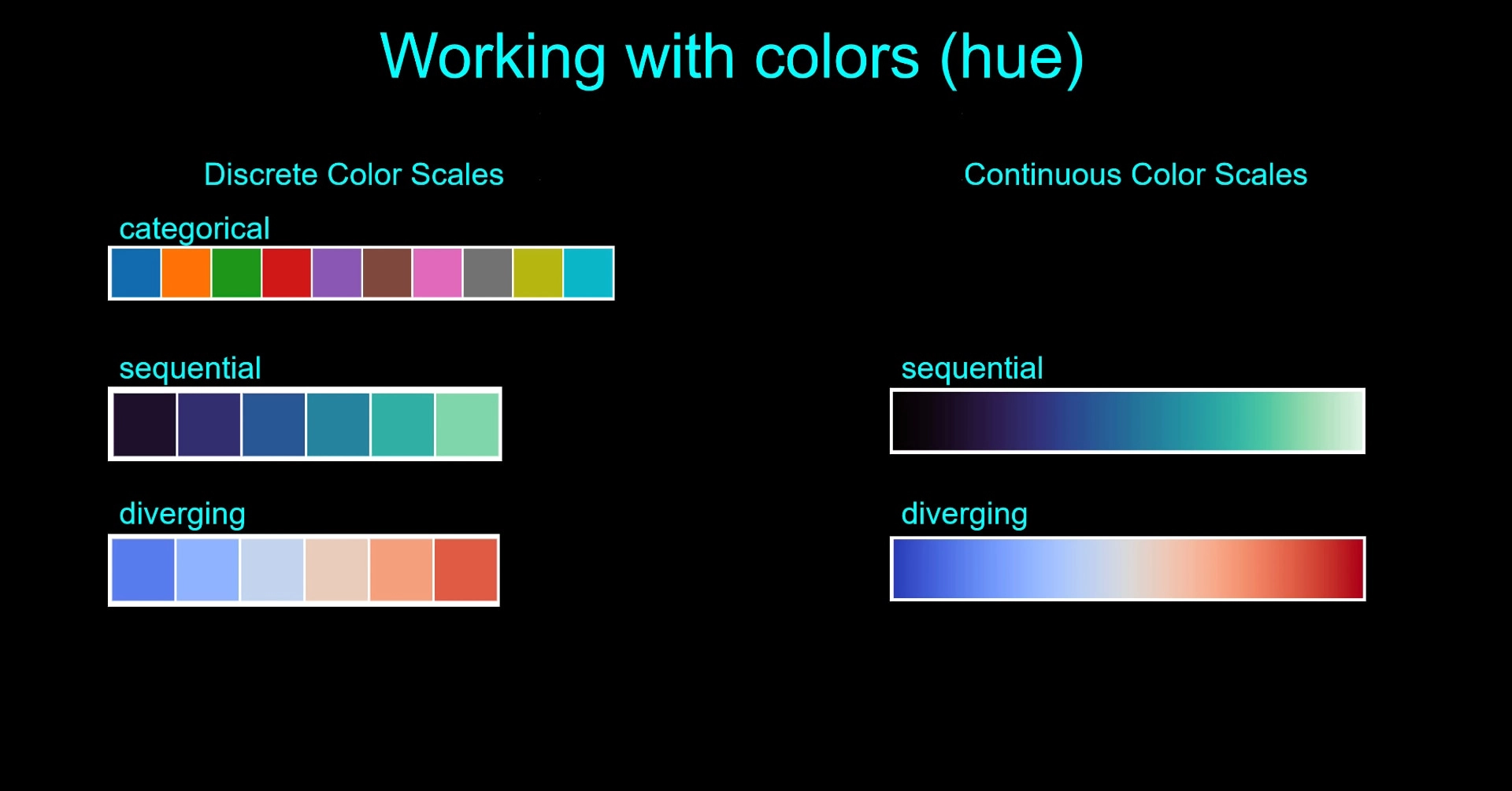
 Hi, I'm Chris Moffitt. I am passionate about finding ways to use the power of Python to be more efficient and effective in a business setting. I've been using Python for over 15 years to solve a variety of real-world problems for everything from web development to system administration and most recently data science.