|
|
|
18:39 |
|
|
show
|
0:50 |
Hello and welcome to Data Driven Web Apps in Pyramid.
In this course, we are going to take the Pyramid web framework which is a Python-based web framework and we're going to build some amazing data driven web applications.
We're going to use Bootstrap which is one of the most popular CSS front end design frameworks to make our web app we build in Python look great.
Of course, almost all web applications access databases.
At least the dynamic ones do.
And we're going to use the most popular and powerful Python-based ORM called SQLAlchemy to write Python classes and map those to our database.
Welcome, welcome, welcome to Data Driven Web Apps in Pyramid.
We're going to have a great time building some real world applications and learning some real world ways to put them into production.
|
|
|
show
|
1:46 |
Before we dig into all the code that we're going to write and the technologies we're going to use and the types of things we can even build let's just take a moment and admire the incredible power of the web.
The web is one of the most flexible and certainly the most widely deployed and used technology out there.
Think about YouTube.
YouTube is an amazing web application.
It really has brought video sharing to the entire world.
It also happens to be a Python-based web app and handles millions of requests per second.
Think about Airbnb.
With this web application, and a unique sharing philosophy they've literally transformed the way people travel and stay in cities.
Netflix uses their web app to redefine TV for many, many people.
In fact, this web app and their infrastructure account for 35% of the bandwidth of the United States in the evening.
That's pretty incredible.
Hey, let's throw one more in.
You're taking an amazing course and you're going to be learning all about building web apps.
Here's another one, Talk Python Training.
This site is built, of course, on Python and Pyramid and has taught a ton of people about Python.
In fact, many of the techniques and the lessons learned in building this site along with some of the others I'm going to bring into this course.
So it's not just about looking out there and seeing some incredible web apps built it's also taking a pretty amazing web app that I have built and taking the lessons and techniques from that and sharing them with you with Pyramid SQLAlchemy, and so on.
Do you have an idea?
Something you want to build for everyone?
Well, the techniques and technology you're about to learn will let you unleash this incredible power of the web to bring your idea to life.
|
|
|
show
|
3:08 |
In this course, you're going to learn what's sometimes referred to as full-stack web development.
Now, we don't spend that much time on the JavaScript side of things but everything else we do spend a fair amount of time on.
So, what the heck is full-stack anyway?
Let's look at all the pieces involved in a typical web application interaction.
We have a browser we have our server running out on some cloud hosting we have usually a virtual machine or set of virtual machines in the background and our database we're working with.
So, a request is going to come in.
It's going to magically find it's way through the internet to our server.
Our server is going to do some processing talk to the database, and so on.
Where's the full-stack part come in?
Well, let's look at the technologies involved here.
On the server side there are a bunch of different technologies you need to learn.
We're going to learn Python.
Well, we're going to use Python at least and we'll probably learn little bits of it along the way but we're going to focus on using Python along with Pyramid the web framework that we're going to work with.
The dynamic HTML templates in this case Chameleon.
The data access layer SQLAlchemy.
In order to deploy and configure our servers we're going to need to know a little bit of Linux.
Learn that.
We're going to use Nginx and uWSGI.
These are two cooperating web servers that we're going to with to run our Python code in Pyramid.
Then we're going to talk to the database.
Well, what do you need to know for that?
Well, maybe this is Postgres or MongoDB.
For the course, we're actually going to use SQLite and also a little bit of touch of MongoDB at the end but it's easier to switch to something like Postgres.
You many need to know the query language to get to that like SQL, or MongoDB's query syntax it's like a JSON type thing.
We're not going to actually focus much on the query syntax because we're going to use SQLAlchemy which lets us sort of abstract that away but you would more or less need to know that in practice.
You also need to know how to migrate or manage your database over time as it's structure changes.
Look at all these technologies just on the server side.
That's a lot to learn and this whole stack of technologies put together is part of what's called full-stack but there's more to it.
Over here on the browser side we have HTML and CSS we have to deliver to the browser, right?
That's ultimately the goal is to show stuff on the screen for the web browser.
HTML and CSS, we're going to do some work with that.
You typically don't want to do the design from scratch so you'll pick a front-end framework like Bootstrap.
Maybe you're even writing some rich JavaScript apps with say, Vue.js.
Those are grayed out, because like I said we're not doing much with JavaScript but these are the technologies that you might put into play for a full-stack web application.
The web can be a little bit daunting.
We're going to go through most of these technologies.
All of the white highlighted ones in this course and you'll have concrete small examples for each one.
In the end, we'll have it all put together in a full-stack Python-based web app using Pyramid SQLAlchemy, and Bootstrap.
|
|
|
show
|
1:32 |
This is not an introduction to Python course.
We do assume a little bit of working knowledge.
We assume that you have basic Python programming skills.
I would say if you're, what you might consider an advanced beginner, you're totally good to take this course.
We're going to use things like classes and decorators and functions and so on but we're not going to describe what a class is or describe what a function is or things like that.
So make sure you have some basic working knowledge of Python in order to take this course.
If you don't, consider taking my Python Jumpstart by Building 10 Apps course.
That's all about learning Python.
So here we assume that you know Python.
We also assume that you know a little bit of HTML.
That if you look at HTML, at least you can make sense of it you know what, say, an attribute is what a class is, things like that.
We're not going to be doing too much advanced stuff with HTML.
I'm not sure if there is such thing as advanced HTML but we're not going to be doing too much with it but of course, this is a web class and we're going to be doing a lot of HTML but I assume that you can work with standard markup.
Similarly, we're going to be using CSS and I'll talk a lot about what the selectors and classes and design mean, and especially when we get to the bootstraps section and applying that to our website.
So we're not going to assume you know tons of it but we're not starting from scratch with CSS either.
So basic HTML, CSS, and Python knowledge that's what we assume you're starting with and then we're going to build our full-stack web app from there.
|
|
|
show
|
3:44 |
When we talked about the incredible power of the web, we saw some amazing web apps built.
Only some of them were built with Python.
Let's look at a whole bunch of other apps web apps, built with Python.
I think it's always great to have some examples.
You know, maybe you're trying to convince your team or your boss, or something like that.
"Hey, we should build this particular app we're trying to launch in Python and here are five examples of other apps that are similar, that are amazing." So let's go through a quick list to give you some ammunition.
You might be familiar with The Onion.
This is a fake news comedy site that's hilarious.
They post all sorts of crazy, outrageous news items and that, of course, is built on Python.
Spotify, the music streaming service, their web app, Python.
NASA and JPL make heavy use of Python for all their awesome space stuff.
Bitly, the URL shortening site that gets tons of traffic does all sorts of analytics and stuff around the URLs they shorten, Python.
Bitbucket, SurveyMonkey, Quora what I think one of the very best online Q&A forums for thoughtful, somewhat deep answers.
Not always great but pretty good, built with Python.
They're actually pretty enthusiastic users of Python.
If you look at their engineering blog they often write about how they use and configure and optimize Python for what they're doing.
Disqus the comment section that you can embed into any web application.
If you go to either of my podcast sites, talkpython.fm or Pythonbytes.fm, you'll see at the bottom this little Disqus section.
That is built with Python.
Many of their services are based on Python.
Instagram, an incredible amount of traffic goes to Instagram, and they make heavy use and, again are very passionate users of Python and their engineering blog covers a lot of cool things like how they disabled garbage collection, for example to make their web apps run much faster.
Reddit, the front page of the internet, as some say gets tons of traffic, I think it's in the top ten websites on the internet built with Python and SQLAlchemy.
Youtube, we already talked about that.
Youtube is amazing, they get millions of requests per second and are based on Python.
The brand new relaunched PyPI, the Python Package Index at pypi.org, is built with Python and Pyramid.
They get tons and tons of traffic and they actually tried Flask, they tried Django and they tried Pyramid and they decided Pyramid was the best choice for what they were building.
Pinterest, also built on Python.
Paypal has some of their pricing services written in Python, and these pricing services are called by different parts of Paypal's infrastructure and other services and websites to figure out what the exchange rate is, what the fee is that goes along with various transactions and so on.
That has two to three billion requests per day written in Python with sub-millisecond maybe just single millisecond response time.
It's pretty incredible.
Dropbox is a heavy user of Python, the client you get on your machine, as well as much of their backing services, Python.
In fact, Guido van Rossum, the guy who created Python, works there at least at the time of this recording so you can bet that it's a real center of the universe around Python.
And, last but not least, Talk Python.
All the Talk Python stuff, the training site the podcast site, all that stuff is based on Pyramid and Python.
It's been working out amazing.
We get incredible, high-performance web apps that are easy to maintain.
We'll share a lot of the lessons from that experience in this course.
Want to read more about all of these how these companies are using Python?
Well, how about we use a little Python to get there.
Bitly/pyapp-25, that'll take you over to an article where I pulled a lot of this stuff together with more background info than I put in here.
|
|
|
show
|
4:50 |
In case you haven't already scanned the table of contents to figure out what we're going to cover let's really quickly go through some of the topics that we're going to cover in this course.
After this introduction section we'll briefly cover what you need to set up your machine and the tools and editors you need to follow along.
We're going to introduce the Pyramid web framework some of its design principles and compare and contrast it with other popular frameworks.
We'll create our first site.
Here's where we start writing code in this Chapter 4.
We're going to create our first site and get it up and running in Pyramid.
We'll look at the various options for HTML templates and then, we'll dig deeper into the Chameleon template language.
If you want to use another one, that will be totally fine but I make a case for why I think this is the best HTML template language out there.
We'll see that mapping URLs to methods in our web app is a central part of the MVC framework, the Model-View-Controller framework that is in Pyramid and popular among many of the Python web frameworks.
So, we'll focus on taking a URL and getting it to run a function and getting some kind of response.
Once we have some basic pages up and running we'll look at how we make our pages beautiful.
We'll bring in Bootstrap.
Also talk a little bit about some other front-end frameworks if you want to use something other than Bootstrap but we'll look at Bootstrap and how to bring that into our web app.
At this point, we'll have basic web app functionality happening but it'll all be based on fake, in-memory data.
Of course, we don't fake, in-memory data.
We want live, full-stack web apps.
So, we're going to move down a little bit in that stack towards the data access layer.
We'll talk about SQLAlchemy, how the ORM works we'll define classes that map our data into our database, and, of course run queries to get that data back.
See, the SQLAlchemy ORM is great for creating the initial database structure but if it changes, things are going to go crazy.
Right, our database is going to be out of sync with our ORM classes and you'll see that's a full-on crash.
It's really, really bad.
It's kind of hard to maintain the stuff.
Well, Alembic, a database migration framework that's peered with SQLAlchemy will come to the rescue.
We can point Alembic at our SQLAlchemy classes and our database, and go, alright.
We changed these.
Make the database scripts that are needed to do that change, to apply those changes automatically.
Just make that for us and then we can apply that to like say, staging or production as we roll out new versions.
It's going to be great.
Once we have our database working we'll want to accept user input.
Probably save it to the database, as well.
So, we'll talk about HTML forms letting users create accounts register, enter data, that sort of thing.
If you're accepting data, you had better be validating it, right?
The internet is a harsh place and lots of people try to send invalid data either by mistake or maliciously.
We're going to talk about some really awesome design patterns called view models for server-side validation and data exchange and then, we'll also talk about leveraging some HTML5 features so we don't have to write any JavaScript for client-side validation.
Testing web apps can be tricky because web applications depend upon things like databases, and other services and the web framework, itself, right?
Like the request-response model, all that.
So, we'll see that Pyramid provides special infrastructure to make it testable so that we can test our web application more easily without actually creating the servers and doing heavy weight stuff like that.
Once our app's built, tested, everything's working, it's time to ship it, right?
Put it online, so we're going to take our web app and deploy it on a brand new Linux server out on the internet and we'll have our web app running and live.
You'll see everything you need to do to take a bare Ubuntu image, and get it up and running to be our web and database server.
Finally, we're going to take a look back at how we built our application how we've structured it so that we have a lot of flexibility using various design patterns for accessing data and validating data, and so on.
And as an exercise, we're going to convert from a relational database to a MongoDB database.
That's interesting, if you want to know about MongoDB, you'll see how to do that but it's also interesting just to show how flexible these design patterns are because we're going to make this conversion by just changing a few handful of files even though there'll be many, many aspects of our site.
We'll have that really isolated and focused so it's super easy to do whatever we want with our data access.
If you wanted to, say, convert it to calling web services and some kind of micro service architecture you'd see the techniques we're using here for MongoDB would equally apply to that exact same transformation.
This is what we're going to cover.
I hope you find it super interesting.
It's a real world version of what you need to build and ship web applications.
This is almost everything you need to know to go from I know a little bit of Python and HTML to running these full-stack web apps that are things like the training site or YouTube, or stuff like that.
I hope you're excited to learn it.
I'm definitely excited to share it with you.
|
|
|
show
|
0:44 |
Now, before we get to the rest of the course, let me just quickly introduce myself.
Hey, I'm Michael, feel free to reach out to me on Twitter where I'm @mkennedy.
I've done a number of things in the Python space, one is create the Talk Python To Me podcast, where I've interviewed a lot of people who were involved in these various technologies, Mike Bayer from SQLAlchemy, Chris McDonough, the founder of Pyramid.
I'll talk a little bit about some of those episodes when we get to the right place and how you can learn more.
But I started and run the Talk Python To Me podcast.
I also run the Python Bytes podcast which is sort of a news one.
Check that out.
And of course, I'm the founder and one of the main authors at Talk Python Training.
Nice to meet you, I'm really excited you're in my course now let's get started.
|
|
|
show
|
2:05 |
Welcome to your course i want to take just a quick moment to take you on a tour, the video player in all of its features so that you get the most out of this entire course and all the courses you take with us so you'll start your course page of course, and you can see that it graze out and collapses the work they've already done so let's, go to the next video here opens up this separate player and you could see it a standard video player stuff you can pause for play you can actually skip back a few seconds or skip forward a few more you can jump to the next or previous lecture things like that shows you which chapter in which lecture topic you're learning right now and as other cool stuff like take me to the course page, show me the full transcript dialogue for this lecture take me to get home repo where the source code for this course lives and even do full text search and when we have transcripts that's searching every spoken word in the entire video not just titles and description that things like that also some social media stuff up there as well.
For those of you who have a hard time hearing or don't speak english is your first language we have subtitles from the transcripts, so if you turn on subtitles right here, you'll be able to follow along as this words are spoken on the screen.
I know that could be a big help to some of you just cause this is a web app doesn't mean you can't use your keyboard.
You want a pause and play?
Use your space bar to top of that, you want to skip ahead or backwards left arrow, right?
Our next lecture shift left shift, right went to toggle subtitles just hit s and if you wonder what all the hockey star and click this little thing right here, it'll bring up a dialogue with all the hockey options.
Finally, you may be watching this on a tablet or even a phone, hopefully a big phone, but you might be watching this in some sort of touch screen device.
If that's true, you're probably holding with your thumb, so you click right here.
Seek back ten seconds right there to seek ahead thirty and, of course, click in the middle to toggle play or pause now on ios because the way i was works, they don't let you auto start playing videos, so you may have to click right in the middle here.
Start each lecture on iowa's that's a player now go enjoy that core.
|
|
|
|
7:36 |
|
|
show
|
2:31 |
I'm sure you're ready to get in and start learning about Pyramid and building the web apps right away but before we do, let's just take a quick moment and make sure you have everything you need to follow along and write and run these programs.
Obviously, you're going to need Python, right?
This is a Python course and in fact we're going to use Python 3.
Python 2 will go unsupported in less than two years from now so of course we're using Python 3.
However, Python 3 doesn't come on all the systems.
Let's see if you have Python.
How do you know whether you have Python?
Well, you can go to your terminal on a Mac or on Linux and type Python3 -V and it'll tell you either no there is no Python 3 or it'll tell you what version.
When I ran this command it was 3.6 but actually 3.7 just came out so Python 3.7 is the latest.
As long as you have 3.5 or later, you'll be fine.
If you're on Windows this doesn't work.
It's a little frustrating but Python3 is not a command that comes installed with Python by default.
How do you know what you have on Windows?
Well, you could type Python -V and that'll tell you what one of your installations is if it's in the path.
It might be better to ask where Python and it will show you all the different locations and then you can type Python -V and see which one.
For example, on this Windows 10 machine we have the Anaconda 3 Python which is Python 3 from the Anaconda distribution.
We have Python 3.6 from Python.org, and 3.5 from Python.org all in these random, different locations here.
So you can adjust your path to target the one that you want but make sure when you type Python -V you get something Python 3.5 or higher.
Depending on your OS if you type this and everything works you're ready to take this class.
You have Python set up.
But what if you don't?
Maybe you need Python, maybe that didn't work.
There actually a whole bunch of tradeoffs and different ways to install Python.
One way, if you're on Mac or Windows, is just go Python.org download the latest installer, and get it.
But I want to give you a little more guidance.
Drop over at realPython.com/installing-Python and have a look there.
They have for each of the operating systems a couple of different ways.
For example, for macOS, you might use Homebrew to install and update the latest version of Python.
Things like that.
So go over here, see what they say for your OS.
They're going to keep maintaining this and updating it over time.
So this is probably the best resource for installing Python if you need to do so.
Once you get Python set up you'll be ready to move on.
|
|
|
show
|
1:25 |
We'll be doing a ton of live demos and almost every bit of code and concept covered will be done in some form of a live demo.
That means we need a really solid editor.
We're going to use PyCharm.
I'm going to use PyCharm for this course.
And you, if you want to follow along exactly should also use PyCharm.
It's in my opinion the best editor at the moment for Python.
If you don't want to use PyCharm for whatever reason you can use whatever editor you'd like.
If you want another recommendation one that's free, the Visual Studio Code with the Python plugin is looking like really the second best option these days.
And it's really good, and it's really coming along.
One other thing about PyCharm they have a community free edition and they have a pro paid edition.
Often, the community free edition is totally good and you can use it for writing all kinds of stuff in Python.
However, one of the paid features is web and database support.
This is a class about web and database programming so as you might expect, you're going to have to have the professional edition of PyCharm to make full use of it with this course.
If you don't have or want to get the professional edition of PyCharm you can follow along with VS Code.
You can sort of follow along with the community edition with a few little hacks to make it run.
But you won't get the full editor to support in PyCharm community.
Be sure to get the right version to get the most out of this course.
|
|
|
show
|
0:30 |
Everything you see me write.
Every bit of code that we create and all the stuff that we generate during this course and even some of the raw data needed to generate that is available for you on GitHub.
So I encourage you to drop over here at GitHub.com/talkPython/ here's a long one data-driven-web-apps-with-pyramid-and-sqlalchemy separated by dashes.
Go over there and star and fork this repository star so you can get back to it and fork it, of course so you have a permanent copy in your GitHub account.
If you don't want to, you can just go to the clone and download button and download the zip.
But I recommend that you link it to your GitHub account.
That way you have access to it forever.
So if you're wondering how something worked dropped over here in the GitHub repository and check it out.
There's a section that has the various versions the various chapters.
Every single chapter we have a separate saved copy of what we built.
You can go and see exactly what was built.
There's a before and after section.
So that you can compare and see what was done during just that chapter.
Alright, so, be sure to grab this.
And, and get it yourself.
We're ready to go.
You could start from scratch and follow along.
But like I said, at some point, you'll need, like the data and stuff to generate, say, the database.
|
|
|
show
|
1:15 |
Now, I've tried to structure this course so it's easy for you to follow along.
It's great to have a bunch of building blocks.
Here's how you do routing.
Here's how you do templates.
Here's how you talk to the database.
And then say well go forth and you can put your building blocks together.
Good luck.
But it's way more fun to build them up and have something you've created over time.
So, I've tried to design this course in a way that you can do that and if you get off track you can sort of reset.
I talked previously in the other video about having a before and after code for each section in the GitHub repository.
Let me show you that right now.
Here we are in the GitHub repository.
If you go over here to the source section you'll see it doesn't sort it really great numerically but for each chapter that we've written code we don't actually write code until Chapter 4 but for each one we have a separate section.
You'll see that say Chapter 5 is based on Chapter 4 code.
Chapter 6 is based on Chapter 5 code.
Things like that.
So if you want to follow along with the routing part you come over here and you can see we have this start section.
This is the code that we typed in that I typed in when we started Chapter 6.
This is the result of all the work we did during Chapter 6.
So if you want to say start from where we were in Chapter 6 and then do the routing work yourself just make a copy of this folder and start going.
Of course, this will become the starter code for Chapter 7 and so on.
We talked about in the course how to get one of these loaded up and running.
How do you create the virtual environments and register the packages and stuff like that that you need?
So, we'll get to that in due course but just know that we have these sort of before and after codes for each chapter and ideas that hopefully that helps you follow along if you get lost or something along the way just grab the starter code from a particular section or you can go back and sort of diff the two directories and see what changed.
|
|
|
|
1:55 |
|
|
|
22:25 |
|
|
show
|
3:41 |
Now this is obviously a course on Pyramid, so we're going to choose Pyramid as our web framework for this course, but let's talk through the various considerations and some of the trade-offs that you make with the web frameworks in Python.
The best way to think about these frameworks is as a spectrum and on one end we have what I refer to as the building block frameworks.
These are things like Django.
Now what do I mean by building blocks?
Well, they're really large sections of functionality you can just drop in or turn on and off.
For example, if I want an Excel-like editing experience for all of my database, all my tables in my database, with Django I can just drop that in.
I can just turn on a thing and, boom, you have Excel-like editing or maybe Google spreadsheets, more accurate because it's in the web, but you have this sort of big things you can drop in.
You want to a CMS, drop in the CMS.
You want user management, you drop that in there.
It comes with a built-in data access layer.
This is all a positive thing in a sense that you get these great pieces of functionality.
The drawback, and to me just personally, this is a pretty big drawback, is if you don't like the way those things work, if you don't to follow the prescribed way of doing things that Django offers you, well, too bad.
Django's going to make it much harder for you to be different or to choose what I think of as the best of breed building blocks.
Do you want to use, say MongoDB and Redis in this unusual way, you want to create your own little management backend, things like that?
Well, then you still have all the baggage of Django, but none of the benefits because it doesn't work that way.
You're fighting against the system.
If you would rather work that way, what you probably want is a microframework.
We have one in our framework called Bottle out there, super, super lightweight.
It doesn't do a ton, but it basically says, "Here's HTTP request, what do you want to do with that?" That's more or less it.
Probably the most popular microframework would be Flask.
Flask is very well known and used a lot.
Flask is a fine framework.
Probably my second favorite of all of them.
Flask is good.
It's a little more common to use Flask to create web services than it is to create web applications, so HTTP services rather than a bunch of pages, but of course Flask is used for that as well.
I'd say Flask offers a little more functionality than Bottle and then we have Pyramid, which has a little bit more support for building full-on web applications than say Flask comes with, in my opinion.
There's some benefits.
There's some drawbacks.
Some of the benefits of Pyramid include, it has better Python 3 support, it has better template support, it's faster, couple of other things.
We'll maybe talk about those.
It really comes down to the trade-off of do you want a microframework or do you want one of these big building block frameworks like Django, then the difference between, say, Flask and Pyramid is actually much, much smaller.
What you learn in one is largely applicable to the other.
We're going to see that Pyramid being a microframework will allow us to use something like SQLAlchemy and then if we decide, no actually we'd rather switch to MongoDB, no problem.
That's a super, super minor change and everything else will just keep working.
That's the really nice stuff of a microframework, real nice features of a microframework is that it let's you pick the various pieces and put them together just the way you want, not the way the framework wants you to or the few choices that framework has made for you.
|
|
|
show
|
4:13 |
Let's spend a moment on the Pyramid philosophy and some of the principles that they use to drive their project.
I love their tagline: The start small, finish big, and stay finished framework.
You'll see that the principles really drive that mission statement there.
First of all, they focus on simplicity, and the pay-only-for-what-you-eat approach.
And what that means is they've designed the framework so that you can get results even if you have only a partial understanding of Pyramid.
You don't need to understand all the stuff in order to make use of it.
You just need to know how to, say, create a view and a template and pass data to it.
That's really all you need to know if you just want to show simple data, things like that.
So they've built this start small and add your understanding to do more and more advanced stuff over time but if you don't care about it, you don't need to know about it, and that's really nice.
Being a microframework, they focus on minimalism; the core things that web applications do: mapping URLs to code, templating, security, and static assets.
And that's pretty much it.
Every web application has to do stuff like this, so that's what they've focused on, doing this really fast and really well.
Because Pyramid's relatively small, they can focus on having documentation for everything.
So their goal is to make sure nothing goes undocumented.
And I could tell you, I've submitted a couple of PRs back to various aspects of Pyramid and a lot of the conversation actually has been, well, what are the effects of this change on the documentation, on the tutorials, and making sure that that's always up to date.
Maybe even more so than, is this the right change for the framework?
So I can tell you they take documentation super seriously.
We talked about focusing on the core things the web framework does, routing URLs, serving static assets, and so on, and I can tell you that Pyramid is one of the fastest Python web frameworks out there.
It's super fast, really runs well, and it runs well on Python 3.
Some of the frameworks out there, you'll see they run pretty fast on Python 2 but not on Python 3, and nobody wants to be in that place these days, right?
Python 2 is on its way out, so having this run fast on Python 3 is really, really awesome.
I can give you a little bit of background just running Pyramid for my web applications, both the podcast website and the training website run on Pyramid.
I've had various things of those sites each featured on Hacker News, and be on the front page, in the top five or top 10 on Hacker News for a day or two, and that sends a ton of traffic over.
You go over to the web server, pull it up, it's like a $5/10 web server, virtual machine, and it's doing like 5/10% CP usage even though it's just getting hammered with all this traffic.
So this framework is super fast and easy on the hardware, and really, really scales in some impressive ways.
We obviously want our web frameworks to be reliable, and it's really encouraging that every release of Pyramid has 100% statement coverage for their unit tests.
That's awesome.
Pyramid is open source and released under a permissive license.
You can see your github.com/pylon/pyramid, and you can go check it out, download it, clone it, do whatever you want so you'll always have access to your web framework.
One of the first things that drew me to Pyramid was actually it's super strong support for Python 3.
So they made a statement early on saying, Python 3 is the future, Python 3 is going to be our default implementation.
Yes, it may still run on Python 2, but we are going to build all of our demos, build all of our examples, and primarily test and develop on Python 3, and make sure things run fast on Python 3.
Which they've done really well, and that's awesome.
You definitely need to be on Python 3 these days, Python 2 is on its way out really, really soon.
At the 2020 deadline, it's basically going unsupported and you do not want to be built on a framework or a runtime that's unsupported.
So the fact that Python 3 is the default implementation for Pyramid is just excellent.
|
|
|
show
|
3:31 |
It's time to take a quick tour of the various building blocks or the concepts that we use in Pyramid to build our web applications.
But what are these building blocks?
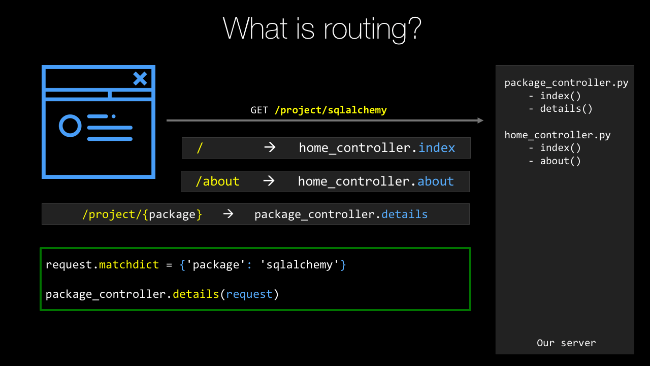
Everything starts with a route.
When we get a request into the web server, we're only given a URL and the URL has to be mapped over to some sort of behavior.
And Pyramid is a MVC, model-view-controller framework, which means we need to come in and figure out which function should that map to which controller.
And then let it process that and return whatever view it decides makes sense, okay.
So the first thing that we're going to do is to define a set of routes or pattern-matching on URLs to figure out where does that request get handled within our application.
Then we'll have, what Pyramid calls views, but I'd prefer to think of as controllers because of the MVC nature.
And these are either methods or they can be classes that process our requests.
In our course, we're going to stick to the method style of working, but think of it as just something that you can call some function or method that can be called to actually handle the request.
Here's the URL.
Here's the data associated with it.
Maybe from the URL itself.
Maybe from a query string.
Maybe from a POST.
Take that data and just process the request whatever that means to you.
Once the request has been processed, we need to generate a response.
And, very often, what this is going to be is some form of dynamic HTML.
Maybe you run a podcast and you want to be able to say / is going to show the details for that podcast.
Well, the template itself, the basic HTML stucture's always going to be the same, but the various pieces of data, what is the description, what is the play link and things like that, is going to change.
So we want some kind of dynamic HTML.
See the Pyramid has at least three options on how you can build these.
Three different templating languages you can use.
But really nice support there.
The data that is passed from the controller down to the template, this is called a model.
So this is both data and behavior passed to the view.
And this is typically done in the form of a Python dictionary.
There's also support for static, or cached, assets.
So if you've got CSS, JavaScript images, those types of things, one of the easiest things you can do to make your website seem ultra-fast is to cache those really, really carefully.
So you'll see that maybe, even though you might return, I don't know, 250K of JavaScript and images on a particular page, if your browser caches that, that site is going to get much, much faster after the first request.
Of course, configuration is super important.
The way we want our app to work locally, whenever we're working on it.
The way we want it to work in production.
These are probably very different things.
Maybe different database connections.
Maybe one has outbound email turned on for all the actions.
Like if you click the reset password button for a user, well that's probably the user doing that in production, they want to get an email.
In development, you want to make sure that does not happen.
If you're testing some problem, like I'm interacting with a user that says, "I can't get into my password reset," and you touch that button, logged in as them, you don't want to actually send them a bunch of fake emails.
So you want different configuration settings.
No email in dev.
Real email in production.
Things like that.
So Pyramid has support for that, as well.
|
|
|
show
|
3:15 |
So, let's dig into these building blocks.
First of all, we have our views or controllers.
So, what does that look like?
Well, we start by importing the necessary decorator, from Pyramids, so from pyramid.view import view_config, and then we just define a function.
The name of the function doesn't actually matter, in this case, and then we're going to map...
a route...
to that view.
In order to make a regular function become one of these controller functions, or actions, what we're going to have to do is we put this @view_config decorator.
Usually what you'll find is there's at least two values you set, sometimes it can be omitted, sometimes there's more, we'll talk about that...
Is we're going to set the route name.
This is what URL maps to this function, it's a route name.
And then the template that we're going to use to generate the dynamic HTML, so that's the renderer, we're going to use mytemplate.pt right now.
And then this method always takes a request object.
Which is one parameter request, and that's the way it works.
The request carries with it things like the data passed, and the URL, the form post, all that kind of stuff.
It's sort of the jumping off point to get the data out of all the inbound stuff, and things like cookies, and so on.
We're going to take that data, do whatever it is we got to do, maybe check for an account, maybe pull some stuff from the database, things like that.
And then when we're ready we're going to return our model to the template.
We do this by returning our model as a dictionary and the framework is going to manage getting that moved over to the template and rendered dynamically and responded back as HTML to the browser.
This is about as simple as things get, with views right?
All we do is we have a function, it returns a static dictionary.
Let's look at a more realistic one.
Over here, we have one and we're saying this actually only responds to POST messages.
We're going to reset password and maybe there's one that generates the form but this one is going to do the password reset when they submit that form, okay?
And first of all we're going to get the data that they put into the form, right?
What is your email that you're going to reset your password to when they click the button?
All that data from the form ends up in a dictionary called POST.
Alright, we're going to grab that out...
And then we're going to try to create a password reset using our data access layer.
That may or may not work, but if it doesn't work, then we're going to send them an error saying, "No no, sorry that didn't work," and we're going to render the reset password again, but this time the error message will be shown.
And if it does work then we're going to say, "Alright well it looks like that worked," so send them a message that says, "Check your email for the reset code." Presumably that repository thing actually sent the email.
Not sure that's a great pattern but it fits on one slide, so that's why it looks like that.
Alright, the idea is we call that function, and either it did not send the password or send the email, or if it did it saved it in the database, sent the email, and now they just got to go check their email.
Alright this is a more realistic type of view here processing a form POST.
|
|
|
show
|
2:49 |
The next major building block to cover is routing, or routing, if you prefer British English.
Routes allow us to define patterns that match some URL and map over to a particular view or controller method.
Sometimes that just says, "This URL calls this function," other times it says, "This URL contains Data," so like /package/request or /package/sqlalchemy would pass the request or SQLAlchemy to that function.
So, let's see how we do this in Pyramid.
So, we're going to go to the main method in the __init__.py file that is basically the entry point or the start up for our web application, or we're going to start with this thing that's a configuration file reader.
On there, it has a function called add_static_view.
So here, we're naming the route static, and saying it maps to /static or anything under there.
So, what we can do is we can go here and say anything in this directory or below it, will be cached by a quick little calculation.
It's one month, so you've got to put an integer that is the number of seconds to cache it for, I like to put this as calculation so I can see 60 seconds, 60 minutes, 24 hours a day, 31 days, okay, that's a month.
Then we're going to define the routes that are the various URLs that go to our action methods.
So the first one is /, just like that, and that's home.
Right, that's just the basically the main page when you hit the site.
And we want to have a /help so add a route for that for help.
Then we're going to have, in our PyPI example, the route that they use for an individual package or the URL is /project/{package_name}.
Now notice, this one is different.
It has package_name as a curly bracket and then a variable looking thing.
package_name will actually be passed to the function that we apply this to.
So, like I explained before, SQLAlchemy, requests, whatever so the URL itself will carry the information along and that's defined in the route here.
Also, we have things like account/login.
And the final action to do is to tell the system to go figure out what functions are associated with these, so we have the route name, we also need to have to have the route to actually apply to this.
So we run the scans and it looks through all the Python files, looks for that view_config decorator using various route names and then it puts those two things together.
And finally, we have to return this WSGI application, W-S-G-I, WSGI, application that the web framework's going to use and this is just at the end of the main startup always.
So this is how you define routes in pyramid.
|
|
|
show
|
1:49 |
Configuration's a super important part of our web app.
Like I described in the intro to this chapter there's certainly behaviors you would like to be different in development than in production.
A real simple is, do you send email notifications to users when you take certain actions?
Well, in production, of course you do that, right?
I want to reset my password, or I purchased this thing.
If you're doing testing locally, especially if somebody comes to you and says, hey, the site's not working for me, I tried this, but this happens, you might want to log in as that user and then try that action.
And obviously you don't want them to get the email.
The easiest way to do this in Pyramid is to have different configuration files, both for development, production, test, whatever the various scenarios you have are.
In fact, when you create a new project, it comes with a development.ini and a production.ini, and in here we have a bunch of settings that Pyramid uses to control itself.
But we can add other settings just by saying key equals value, so db_file=/db/webapp.sqlite, API key equals whatever that thing is.
Notice there's no quotes on the strings, they just come back as strings anyway.
Super easy, we can do that.
Now how do you get to them in Pyramid?
Well, we saw that main startup method, and the settings being passed in there, so that's super easy.
We go to that again.
Now we can go to that config and say get us the settings, this is a dictionary that has those keys and values.
So if I want the DB file, I just say configsettings.get, and there's just standard Python dictionary access.
Get me the thing for DB file, get me the API key, and off you go.
And obviously these can be different in development and production.
|
|
|
show
|
2:03 |
The final building block that we're going to talk about here are templates.
Templates are super important.
They let us define in an HTML-like fashion the general markup for our site and then add little bits of dynamic behavior to it.
There's actually three choices we can use for the template language.
We can use Mako, we can use Jinja2, or we can use Chameleon templates.
This is a Chameleon template here, and I'll talk later about why I think Chameleon is the right choice.
But let's just see how this works.
It's kind of the same for all the template languages.
So what we're going to do is we saw that we passed a model over that had packages, right.
One of the keys in the model was packages, and the value was actually a list of packages.
We're going to use tal:repeat and I'm going to say for every package in packages, I want to replicate this HTML block, including the DIV that has the tal:repeat on it.
So we'll have a DIV containing a hyperlink in a span for every package.
And then for the hyperlink we need to set the URL, so within this little repeat loop we can say p.url, p.name and so on.
And then we're going to show the summary but only if the summary exists.
Like if there's an empty summary or it's not set, then we're not going to show it.
So you can see that if we want to take some sort of text or anything and get a string version of it and just plunk it into the page, we'll use dollar curly expression.
We can do these conditions with tal:condition and so on.
Often when we take this and actually pass that data to it and render it, that pyramid render it, it's going to look like this: requests, Http For Humans, boto3, AWS API and SQLAlchemy and so on.
Cause that was the model of the three packaged requests Boto3 and SQLAlchemay passed along to this template.
So that's what its going to look like.
Unstyled and ugly of course, we're going to work on that later.
|
|
|
show
|
1:04 |
Before we move on from our introduction of Pyramid, I want to give you a little extra information if you want to go deeper.
So, obviously, I run the Talk Python To Me podcast and over at talkpython.fm/3, so Episode 3, you can see I interviewed Chris McDonough, who was one of the creators of the Pyramid Web Frameworks, who, if you want to hear a conversation going deep inside from the creator of Pyramid himself, well, then, drop over here and you can have a listen.
It's about an hour long.
Similarly, we're going to talk about SQLAlchemy, and over at talkpython.fm/5 I interviewed Mike Bayer, who is the creator and maintainer of SQLAlchemy.
Also, similar story, go deep inside and learn the history and the features of that framework.
Obviously, I'll tell you everything I think you need to know to build the web apps and do the data access throughout this course, but if you want to get a little bit deeper and learn the personalities behind all this stuff, then definitely check out the podcast.
|
|
|
|
20:34 |
|
|
show
|
2:44 |
I don't know how you feel, but I think there has been enough talking.
It's time to write some code and start creating some software.
So, that's what this chapter kicks off.
We're going to create our first project.
And we'll see that there's actually a couple ways to do this either with a command-line interface which applies everywhere or a simplified, shorter way with PyCharm.
I'll show them both of you.
But let's talk about how we get started in Pyramid in general.
So, every web framework has its own style of scaffolding or the putting the structures in place so you can get started.
So, here, what we're going to use is a thing called Cookiecutter.
So, Cookiecutter is an arbitrary Python utility that takes starter projects for all sorts of things for Pyramid web apps but also for Flask and Django, and even old Atari-type things written in C and you can create projects from them and sort of get a headstart on that structure.
So, we're going to use the Cookiecutter packages for Pyramid to do this.
This is the official way recommended by the Pyramid folks.
Once we've installed Cookiecutter just pip install cookiecutter, we're going to use it to create a site.
Now there's several different types of templates we could use.
Within those projects we have choices like what templating engine do you want to use, or things like that.
So, there's a lot of flexibility here but we'll just start with what they call the starter site.
We're going to create a virtual environment.
This typically, the virtual environment you want that to reflect what you're running on the server what your target environment is and the way to control that really carefully is have a dedicated separate Python environment for your web app.
So, we'll do that here.
Not required, but very much recommended.
And then we're going to register the site as a package.
Pyramid's decided that their web applications are best deployed as packages and manages packages.
So, we'll see that there's an extra command that you have to run here and say "Here's the package that I'm working on, "install it into this Python environment." Not much to do but it's easy to forget so I'll show you how to do that.
And finally, we're ready to run our application.
We're going to serve it up, interact with it.
We'll add some features, and then we're going to go back serve it up again, test it and we'll just keep adding and adding and iterating.
So, these first four steps, we're going to do to get started and of course, you just build software over time by adding feature after feature after feature.
And so as I said in the opening, we can use PyCharm or we can use the command-line.
First, let's talk about a way of doing this that works for everybody no matter what OS you're on no matter what tooling you're using.
This command-line interface path will work for you.
It takes a couple steps but once you get used to it it's no big deal at all.
|
|
|
show
|
7:54 |
Alright, we're going to begin creating our project by simply opening up our terminal or command prompt if you're on Windows.
Want to going to go to the right location.
So over here in our demos, this is the Git Repository that you all have access to created a thing called Chapter Four: First Site.
For each chapter I'm going to have a starter and a final bit.
So, starters whatever we happen to start with.
Later on, we're going to start with our app making major steps.
Like one point, it'll have a design added to it.
At one point, it'll have SQLAlchemy data access added to it.
We want to start from that point on the next chapter so we'll kind of move along so you always can kind of catch up or start from the same place that I'm starting from at any given chapter.
So over here we're going to create our site in this final and the starter one, there's nothing to do yet.
We didn't start from anything.
This is from scratch so we'll just have a blank folder there.
So let's change directories over here.
In this, you'll see I have oh-my-zsh.
It's detected this is a Git repository.
It doesn't really matter if your shell does that or not.
So what we want to do, is we want to make sure that we have Cookiecutter installed so that we can run the various templates.
So we'll say pip, maybe pip3, just to be safe.
Install, it will ask for an upgrade just in case and I'll say --user cause we find it just installs in my user profile.
I'm not a machine, which means we don't require sudo.
Then finally, cookiecutter.
I should already have it.
Looks like everything's up to date.
Yours might have installed it.
You can always just type cookiecutter and see what you get, right?
Something like that.
It shows you where it comes from.
Okay, excellent, we already have this installed and ready to go.
So step one, make sure we have Cookiecutter installed.
We have that.
Step two, will be to use one of the Cookiecutter templates.
Now if we're over on the Cookiecutter site on read the docs, you'll se that there's this thing called pantry full of cookies; cookie cutters.
And there's tons of different things.
So heres a flask thing, heres a bottle heres a pyvanguard; whatever the heck that is.
If you look for a pyramid there's a whole section on these templates.
So here are a bunch that come from the pyramid team and this one down here I actually added myself for the Python for Entrepreneurs course.
The one we're going to use is this pyramid cookiecutter which is just a Git repository here.
So we can just take the root of the Git repository and we'll just come down here and say cookiecutter and give it the full URL to the repo.
Not .git, not that, just the page basically.
It says we've already gotten this before can we get a refresh version, yes.
It's going to ask some questions here.
It's going to say, "What is the name of your site?" We're going to call this PyPI cause that's going to be the name of our site.
Let's call this Python Package Index.
Alright, that's going to be our demo throughout the whole class here.
It's going to say the name that we're going to use in the Python Package in the folder structure stuff "Is Python Package Index okay?" Let's go with PyPI; something a lot shorter to type.
That says, "Great, we're almost ready.
"What template language do you want to use?" Default to Jinja2, use to default Chameleon.
We're going to use Chameleon.
You can make another choice if you want.
I'll tell you why later why I think Chameleon's the right choice but you can pick any one of these three.
Hit okay, and it's gone and created a various project structure over here so we could type tree and see what we got.
It's created this folder which because you can see it's got all this kind of stuff.
It's has a setup.py.
This is actually a Python package and here's the implementation of it.
It has the same name always.
Then there's a __init__.py for the package.
Then here's our pews, here's our templates here's our static files, and so on.
We can go up here and see it says "All right you can go in here "and what we want you to do is go into that folder "and create a virtual environment." So, we'll do that.
They want to create the virtual environment.
You can name it a lot of things.
.env, or venv, is one of the best choices if you're planning on using PyCharm cause it will automatically detect those.
I'll make it more explicit and say venv.
Now the next thing to do, and so we ask "which Python" and Windows asks "where Python" it'll say, "It's the system one." We want to do is use this one, so we need to activate it so we're going to run that.
Notice my prompt changes here and if I ask the same question I'm getting the one that I just created.
So that's good.
On Windows you don't say source and this is scripts; venv\scripts\activate.bat.
Okay, so now we have our virtual environment activated.
It's created in the directory that is the top level of the package; good.
Now all we have to do is to basically register our package and we can run it, register our website.
We do that by saying Python setup.py develop.
Now normally you would run an install command here.
What we want to do is tell Python to leave these files in place and just let us edit it here so we don't have to ever rerun this command again.
It'll just reference this local working location rather than copying it over to what's called site packages.
So we do this, it's going to install all the dependencies and get everything setup so we can run it.
All right, great, it's installed everything.
Now we can ask what is installed by saying "pip list" and we've got a bunch of things.
We've got pyramid and the underlying template language installed.
We even have this full local location installed with the package PyPI which is our web application itself.
One thing that's kind of annoying about virtual environments in Python is they always install out of date versions of both setuptools and pip.
So, go ahead and update that real quick too.
There's only 11 versions out of date.
What's wrong with that?
Okay, so we should be able to run our web app and go interact with it now.
Let's see "pserv" and we see if that exists.
Looks like it does.
That got installed when Pyramid got installed, okay?
And that Pyramid got installed when we ran the setup.
Then what we're going to give it is.
Let's just look around really quick.
We're going to give it either the development.ini or the production.ini.
Here we want to give it the development one so pserv development.ini.
There's a small chance this will fail.
There's this weird behavior sometimes that the package in the virtual environment doesn't get registered exactly right unless you activate, deactivate, and then reactivate it.
Fingers crossed this works, let's see.
Perfect, okay if it doesn't just deactivate the virtual environment reactivate it, and then you'll be totally good.
All right, so now if we go throw that into our web browser we should be golden.
Let's see what we get.
Ta-dah, the Pyramid Starter Project is up and running and this is the Python Package Index Pyramid Application generated by Cookiecutter; hooray.
So, we now have this basic structure over here.
If we look at it, whew a lot more stuff going on now that we have that virtual environment stuff registered.
Up here's what matters.
This is all the package installed locally and then the virtual environment.
This is what you really care about, right?
We've got our package here.
We've registered it and now it's running.
We can go edit our template to change this look and feel of our CSS.
We can go change our view to have different behaviors or to have additional URLs and so on.
All right, so we're up and running with Pyramid on the command line.
|
|
|
show
|
2:40 |
So you've seen how to create a Pyramid website using Cookiecutter, virtual environments and what not on the command line.
Let's review those steps so that you have a nice, clear series to follow.
Okay, so, what do we do?
We started by sayin' we're going to use Cookiecutter and we're going to need a template to work with.
So I use the Pyramid Cookiecutter starter template.
Just copy that URL and we're going to feed it to Cookiecutter,.
You can use any one of the five actually if you feel they match what you're doing better.
So we got to make sure we have Cookiecutter installed.
So pip install cookiecutter maybe throw a -U for upgrade a --user so it doesn't require sudo things like that.
But here we go it's going to get it going.
That's great.
We pip install cookiecutter and then we're going to create the scaffolding.
We want to create the site using Cookiecutter.
So we'll say cookiecutter and we'll give it the URL to the template.
It's going to ask a bunch of questions.
If you want to follow along make sure you choose 2 here for your project otherwise there's going to be trouble.
Alright, great, so you choose that you answer the various questions and it gives you a few steps to follow after that.
It says go to the project, create a virtual environment.
Make sure you upgrade pip inside of tools because Python doesn't do that for you.
How frustrating but that's the way it goes.
And then, once you've registered the project we'll be up and running and then you can serve it up.
Oh, what's that look like?
Well, we're going to run Python3 -m venv.
Some versions of Mac and Python intersected with PyCharm all require this --copies.
If you have the latest version of everything you don't need it but you can throw that on there if you're finding you're having trouble.
So we're going to create our virtual environment and we can activate it.
Say source .env/bin/activate on Mac or Linux on Windows it's just .env\scripts\activate.bat and then you can ask well which Python or where Python should be the one in your virtual environment.
Then final step is to install the dependencies install Pyramid, and to register the site with Python.
So Python setup.py develop.
Everything should be up and running and working.
It's just time to serve up your app.
Open the web server and start interacting with it.
So pserve and give it one of your configurations probably development.ini.
What'd you get?
Well you get your site up and running of course.
So really nice, here we are on the close looking at our starter project just like we did in the demo.
|
|
|
show
|
0:34 |
You've already seen how to create a pyramid website from the command line interface and like I said, that works everywhere.
But if you happen to be using PyCharm Professional this gets a whole lot simpler.
So, this does not work on the Community Edition one of the differentiators between the paid and Community Edition of PyCharm is this web development stuff, so really for this course the professional one is the only one that makes sense.
But if you have that, you could skip a lot of this and go ahead and just do it in PyCharm.
So, let's see how that goes.
|
|
|
show
|
2:33 |
Over here in PyCharm, let's go create the same type of app that we did on the command line interface but this time using PyCharm.
Here you can see we don't have any recent projects it's just basically bare.
So we'll say "Create a New Project" and let's use Pyramid, okay great.
It says we're going to create a new virtual environment and it's going to create it in the folder, doing exactly exactly what we did, so we don't have to expand that out.
And we want to set the location so let's go and say this is on desktop just call this "PyPI Web" or something like that, okay.
And we can also, this is important come down here to more settings.
Remember there are the different templates?
There they are again, and this is going to use basically the same thing.
And let's go and switch that to Chameleon from Jinja2.
Okay so we're ready, we're going to do all the stuff of running the Cookiecutter: it's going to install Pyramid it's going to run the right template for us create the virtual environment, activate it all those things, ready?
Go.
They're just creating the virtual environment.
Now it's installing Pyramid.
So if we look over here, we've got our PyPI Web and everything is pretty much up and running.
I'm not sure it's going to totally work yet, notice it's doing some indexing down here, give it just a moment.
PyCharm knows that this project is not installed into the virtual environment.
You can see if you just click on this terminal and all which virtual environment it is you can ask again which or where Python and it's this new one that we just created and it knows in here that this is not set up.
So it knows we need to run Python setup.py develop or I can just click that, and it's doing it for us.
See up here above it also says these packages are required but that setup action actually installed those packages so it kind of solves two problems at once.
Alright, now how do we go run our app?
We don't have to type pserve develop, we just press this.
and let's click it and see what happened, are we ready?
Ta-da, same thing.
Our starter template has been used to create a new Pyramid project, this time we just called it PyPI Web it was generated not by Cookiecutter, but by PyCharm.
Really cool, pretty much exactly the same thing but a whole lot simpler.
All we had to do was click Create New Project, Pyramid give it a name, and then click, it will go ahead and set up this package to be run and edited.
|
|
|
show
|
1:24 |
Let's review creating Pyramid web apps with PyCharm.
So remember, we just go new project, and we pick Pyramid and then we pick a new virtual environment.
We set the location, which basically names our website.
And make sure you expand out the more settings and choose Starter and Chameleon.
So Pyramid, virtual environment, Starter and Chameleon.
Basically, it solves a whole bunch of those things we did at once.
And then the final thing to do is to run the setup.py task in development mode.
Now, if you don't get that little dialogue that says hey you need to run it this way you can go to tools, run setup.py task and just type develop.
But the newest version of PyCharm typically finds that and you just click that little bar that comes up across the top.
Then you're ready to run your app.
How do you run it?
Well, you click that little play button and it runs, and then you go interact with it.
Easiest way to do that is just to click the hyperlink at the bottom and boom, your site's up and running.
So this is really a nice way to create new projects.
Honestly, I don't use it very often these days.
When I was new to Pyramid, I would use PyCharm to create those projects and it helped a lot.
The more I got good at working with Pyramid directly I find myself going to the command line more and sort of doing stuff manually.
But either way is totally fine this is certainly a good way to get started because it helps you through a lot of the steps and it makes it real, real simple.
|
|
|
show
|
2:45 |
Let's take a quick tour of the directory structure, or the file structure that we have for our pyramid project so you can see what, how they've organized it and what all the pieces mean.
Regardless whether you've created this in PyCharm or you've created it using Cookiecutter on the Command line you'll get the same basic output.
So over here, we'll have our directory here it's called make_your_project.
This is basically the top level package that represents our website.
So in here we have a static directory.
This is where CSS, JavaScript, and Images go.
You don't have to drop them all flat in there, right?
That's how the templates work but I would create a css folder, an images folder a javascript folder, maybe even more than that.
So any, sort of, directory structure you want to create underneath there, it's totally fine.
Then the dynamic HTML templates live in templates.
And PyCharm colors them purple but there's nothing really special about that directory.
When our app starts up it's going to run this __init__.py and there's a main method in there that gets executed.
So that is the entry point for your app that's where all the initial setup goes where we register the route and maybe we read the database configuration and get it all set up, things like that.
We're going to talk about how to test your web applications and one of the real big advantages of Pyramid is it's super, super testable.
We'll talk about how to do that and it's really, really nice.
And finally, where your views or controller methods go this is right now, a single views.py file.
That might be okay for a really simple app but in practice, we'll want more organization for our tests and more organization for our views, even templates.
So, consider this the starting point but as we build this up, I'll show you ways where you'll probably want to reorganize things as if you know, if this is going to be a real major application.
That's how it starts out, just a test file and a view file.
Now, this .egg_info thing, this is an artifact from running Python setup.py develop and it's needed for Python to do its magic but you can just ignore it, okay?
So it's going to be there, but just ignore it it's part of the register of this package for development mode.
We have our two project settings and configuration files.
We've gone over this a few times but development.ini, that's what you want for dev production for production, probably, things like that.
And that's really all you need to mess with.
Maybe setup.py, maybe?
If you're going to add a dependency or something like that in there but this is a starting place.
So you know how and where to go look for what you need.
Typically you're going to be in __init__.py in views, in templates, dropping stuff into static.
|
|
|
|
35:11 |
|
|
show
|
1:19 |
When we created our project our website with Cookiecutter you saw it ask a question.
What template language would you like to use?
Would you like to use Jinja2, Chameleon, or Mako?
So let's look at these three template languages all of which are totally viable choices for our web app and compare them and sort of see what the trade-offs are why you might choose one over the other and so on.
So like I said there's these three options.
We have Jinja2 and I would say really this is the most popular one of these.
It's very much the default for Flask and now it is also become the default for Pyramid.
So being the default means most people pick that and I believe Flask this is the only one that ships with it.
So that really tilts the scale in it's favor if you will.
There's also Mako.
This is probably the least popular.
This is the one I've seen the least of I guess but maybe I'm just not looking in the right places.
But Mako and Jinja2 are pretty similar.
And then Chameleon we've looked at Chameleon.
And below you see the three packages that you have to install only one at a time for enabling that language in your web app.
So pyramid_jinja2, pyramid_mako, or pyramid_chameleon.
And if you pick the various options in that Cookiecutter template it will choose for you.
|
|
|
show
|
4:38 |
So, let's take a simple but fairly realistic example to compare these three template languages.
Okay so the idea, the goal will be given a list of category dictionaries with an image, name an image and a name on each one of them display them in a responsive grid.
In this example we're going to be working with this data and these are actually from a bike shop so there's different categories of bikes: comfort, speed, hybrid, and each one has a category picture we won't go into the details, right, this is not our main demo and stuff, but pretty simple example.
We're going to return this data to the template and our goal is to turn that into HTML showing the picture in a responsive grid type of layout.
We want it to look something like this.
We're going to do this in each of the languages and see what the various moving parts look like.
First up, Jinja2.
So you can see with Jinja2, every time you have a statement on a given line, you open it with {% so {% if not categories %} So if there are no categories past this view we want to just show no categories rather than like a blank page.
But if there are categories, we want to loop over each one of them and print out or add to the DOM a div and within that div having the image within a hyperlink and the category within a hyperlink.
So a couple things to note there is a lot of open close, open close, open close notice at the end we have {% endfor %}, same with endif.
That seems unnecessary and annoying but the thing that I think is not great about Jinja or Mako you'll see is the same is this is not valid HTML.
I can't take this and open it up in an editor that does not understand Jinja and have it think it's okay, right I can't hand this to a designer and have them use their tools on it.
But okay, let's put that aside for just a minute what else have we got here?
So we do {{ }} to get the value out, we want to get the name, and we want to print the lowercase out.
That seems great, there's nothing wrong with that that seems totally beautiful it's as good as it's going to get.
But this {% endfor %} and the fact that it's not valid HTML Eh, I'm not loving it.
Alright so that's Jinja2 let's look at how it looks with Mako.
Super similar, a little bit less syntax, it's not {% if not categories %} but it's % and then one line of Python including the colon.
You do still have the endifs and the endfors and so on.
Now, in Mako the values that come in as dictionaries you have to treat them as full-on Python dictionaries you can't do your attribute access, you can't say c.name you got to c.get(name).lower(), maybe if you want the default value that's not none to be a little bit safe here.
So the sort of attribute access is not so nice in Mako but the structured stuff, little bit better so I'm not sure which I prefer but just on a pure popularity basis I think I would tend to pick Jinja2 just because like I said that's really popular so picking it obviously puts you, so your examples and stuff sort of match what's out there.
Okay, so we've already seen Chameleon, let's compare how Chameleon would do this same bit of code.
Simpler, right?
Do you want to show the no categories?
tal:condition, not categories.
You want to show the other part when there are categories?
tal:condition categories.
You want to do a loop?
tal:repeat, c.categories, and then you have basically the same type of access as you have in Jinja2 c.name.lower(), but instead of doing {{ }}, you do a ${ } I'm not sure actually, I think I like Jinja2's better but look at this, this is valid HTML.
Like this is legitimate HTML here, it's not invalid.
It has wacky attributes, like tal:condition that don't mean anything to the browser but the browser will just ignore that.
So I do really like that, but I also like just the lack of ceremony with all the the % and the { and the endfors and the endifs and all that kind of stuff.
So to me, this one definitely wins because it's pure HTML and because it's just cleaner in my opinion.
But like I said, you can pick whatever you want you want to use Jinja2, that's totally great you can use that, Pyramid totally loves it.
But for our example, for the reasons I just described in this one app we're going to build in this course I'm choosing Chameleon because I think it really is better.
It's not as popular, but that doesn't mean it's not better.
|
|
|
show
|
4:38 |
Alright so let's write some code and let's interact with these templates here.
So lets go over here to our get repository and in chapter five templates I'm going to start on this which is right now the same as the starter code, but obviously when I'm done it's going to be whatever we did during this chapter.
So what we want to do is we want to take this starter site that we created this Py PI site we created in the previous chapter and I want to do interesting stuff with the templates.
Because we really just ran the cookie cutter before we could do that again but I do want to take this opportunity to show you how to take an existing pyramid web app and get it set up and ready to launch in PyCharm.
So there's a couple of things we could do.
We could open in PyCharm and use some of the UI tools or we could use the command line and then open in PyCharm.
That's what I like to do.
Whichever you're more comfortable with just go with that.
So what do we need to do to get this started?
This will basically be the same thing you need to do every step along the way that you want to launch and run something you've gotten from GitHub for these projects, so it's worth going over.
So what I'm going to do is I'm going to go to the folder that has a production and development.ini in there.
So I want to cd over there like that, and I want to make sure there's no hidden files.
We have no hidden .env or anything.
We'll call it venv so it doesn't hide.
It will be more obvious for examples.
We got to do just a couple of things.
We need to create a virtual environment so that's Python3 -m venv.
In Windows, you can't put the 3 but you got to make sure it's Python3 that is Python in the path.
It's a little trickier.
Really wish they would unify that but it is what it is.
Okay, so when I do that and then we're going to run, we're going to activate it so we're going to say source.
Sometimes you'll see people say.
It means the same thing.
source venv/bin/activate There's the prompt.
It should change and again which or where Python.
It should be that one.
It's good.
Once we've activated it, then the last thing to do is simply to run the setup so it would say Python setup.py develop.
Let it install and everything and we're good to go.
Great, with that in place, we can put away our terminal.
Now, I want to open this directory in PyCharm.
On Windows and Linux, you have to go open PyCharm, and say file open directory and browse here.
On macOS, there's a little treat.
I can drop this folder here and it will just open that directory.
And start PyCharm.
All right, so a couple of things happened.
Let's expand this out here.
PyPI templates.
Ah, no, that is not the template folder.
I guess the name kind of freaked out so you can come over here on marked directory and mark it as that.
And right click here.
Save marked directory as template.
While we're at it, might as well go ahead and right click and mark directory as resource route.
We'll see where that makes sense later but those two things are good.
Okay, so this is up and running and we can actually run it.
Notice it's already detected this.
Let's see if it's using the right virtual environment.
Click here.
It looks like it is.
Could ask which Python or where Python depending on your OS and yeah, that looks like the one we want.
So, okay, everything's great.
We should be able to, once it's done indexing, click this.
Here we have it.
Same app, you can see here's the one from before.
Here's the one that we got from Cookiecutter.
Okay, great, so looks like everything is up and running.
If you get an error that the port is in use that means it's already run it somewhere else.
A nice little trick, notice it's running here if I try to run it again, it'll crash.
It says it's already in use so a quick little trick we can go over here to Edit Configurations, and say only let one of these run.
That way, if I try to run it instead of just running another it's going to rerun this one here.
So, we can just rerun it, rerun it.
That's super helpful.
Okay, so that's what we did to get this up and running in PyCharm.
We went there, we created the virtual environment we activated it, we did the Python set up.
py develop, and then we opened that directory.
The very same directory that contains the virtual environment.
That's the one we'd open.
That's the one with the production and development.ini.
Now we're ready to go play with the templates and we'll go over this in the subsequent videos and subsequent demos but I just wanted to make sure we kind of covered that somewhere in the course.
Might as well do it the first time we hit it.
|
|
|
show
|
8:42 |
Now that we've opened this project it's right here in our recent projects so we'll come back to it.
Notice also PyCharm says here's an unregistered vcs or git root, so we can just add that and it'll turn on git integration.
Notice here we've got our branching and stuff is now detected.
We won't do anything with that really but just typically a good thing to say yes add this GitHub root, or this git root, okay.
So we are ready to do some work here because when we created this project with Cookiecutter and it asked the question what template language do you want to use and we said I want to use Chameleon we have these pt or page templates here.
If we had chosen Jinja2 we would have I think it's just .html files but inside it's Jinja2.
And Mako, I think there is mk or mak Anyway you'll see different extensions here.
So first of all, there are actually two layouts here but in the views, there is only one view what's the deal?
You notice we are actually pointing at this view.
And the layout, this is not full HTML, but it's seeing there is a wrapper, standardized HTML that is used for the whole site called layout which has all of our doctype, HTML, etc.
on there, so we will come back to that later but here's the contents of the page that we want to work with, there's Pyramid our application that was generated by Cookiecutter.
So what I want to do, I want to take data passed in here and render it.
So let's just go and we'll place this little h1 part, we'll just say this will be some packages and we are going to pass in some fake package data.
And I just put a div, and I'll say todo put packages here.
Okay, great, so let's start by looking at the view I want to pass little data here I mean this is mostly about the templates but the templates are not interesting without data.
So let's go over to our view, and instead of calling it this which drives me crazy, let's call it maybe home_index or just index or something like this.
I'll give you the same thing here this could just be home_index.
We can rename that here, but rename is under refactor so we'll just call it home_index.
There we go, okay so you can sort of see the tying together of all these here.
So right now we are passing projects which wasn't actually used in the template and we are going to pass something more aggressive.
Let's call this packages and let's put some data here.
And I could just type it in, right, I can just put in package 1 package 2 and so on but let's give this a little sense of some kind of data driven access here cuz that's where we are going and we are going to do this out of the database, right, this data would not come from being hardcoded, that would be silly.
So maybe just for now, I'll write a function up here that says get_test_packages.
It can return out list.
Within this list we are going to have some dictionaries.
And each dictionary represents the data of a package that will have a name and a version.
Okay, so we will come down here and we will say name: something and version: something else and we want to have let's say 3 of those.
So to have requests, I common I'll say 1.2.3 SQLAlchemy 2.0.0 and Pyramid I think that's 1.9.1 or something like that.
So down here we can just say this going to be just get test packages for our data.
So this thing we are going to be able to refer to remember stuff within the { } is going back to the template, that right there is our model we can access its keys just by saying the name inside the template.
So let's go down here, and I'll just say for now the packages are, and I want to print them out so I can just say $packages like that and it will pull that array, and print it it's not going to look like what we want but it will do it.
So let's see what we get when we run that.
So there we go, todo put some packages whoa, there is a big fat list right there but it's working right, pretty cool.
So what we want to do, not, let's not do this we actually want to loop over those and print out requests is this version SQLAlchemy is that version and so on.
So let's go change this, so we will replicate this div.
We'll give it a class package, something like that.
We want to replicate that for each one of the packages so we are going to say tal and then Chamelon tal is Template Attribute Language so tal: I noticed the sweet, sweet integration of PyCharm here.
I type tal and it tells me all the things I can do.
I can repeat, so I want to say p packages.
This is like for p in packages.
You drop the for, you drop the in I kind of wish they kept it for historical reasons it didn't originate with Python, I don't think so that is why it is like this.
So anyway what I want to do, I want put a little span and maybe as a class title and then here I want to print out just p.name if we look over here name and then let's do one that will be version and this will be p.version.
So notice, we are defining a local variable within this block by looping over it and then referring to it here.
And now I can save, I don't have to rerun this code just save it and the templates will automatically be reloaded.
So now, look at that, boom, requests SQLAlchemy, Pyramid, we can even do a little test we can say tal:condition p.version and only show the version section if it is like that.
I can do like a say not let's just say 3 zeros if it's not there.
So let's remove this version from one of them.
Yeah, okay, so notice it shows the versions when it's there, but Pyramid had none so we determined that, so we just said 0.0.0 as our default.
You may have noticed one thing that I was rerunning I was rerunning our app here I said you didn't have to do that before.
When you change the templates, there's no need to rerun it.
But the Python code, however if I change this to 1.7.7 and I save but I do not rerun notice that it is still like this.
So we have to restart the Python bits, if those change now they did but the templates are automatically just reloaded every time.
So there we have it, a real, real simple bit of code we were able to go and pass some data and form a model which itself was a list of dictionaries.
It doesn't actually have to be dictionaries at that level.
Like the list could be database objects but it happened to be dictionaries.
So we passed those back and then we used tal:repeat.
We used the string print operator and we used tal:condition on version to print out either the version or if it was missing we defaulted it just triple zeros.
One final thing to look at before we move on let's look at the raw HTML that was created by this.
Okay, you'll see it's really super nice and clean.
We come over here and do a quick view source.
There is a bunch of stuff that is put out by the layout.
We will talk about that later.
But this bit right here, where it says content.
That is from our template that we just worked on.
Notice we wrote h1 some packages, and we said div here is the class package and this this one right here, that is the one that one is the one that has tal:repeat on it so right that is this.
So it has tal:repeat but it is just that block of HTML replicated over and over and then we have this span with the title, raw text in there.
And then the span, this one has the tal:condition and it just drops it out, right?
Either shows one bit or the other, it doesn't actually show you any of that stuff.
So you can see the HTML that comes out is as clean as you are willing to write it.
It's pristine HTML, very light weight, really nice.
|
|
|
show
|
2:26 |
Let's quickly review what we just saw in action.
So we saw that we can use the TAL the template attribute language to control most of the things we do here.
So for example if we want to have something not shown, if there's no categories or shown when there are categories then we can use the tal:condition.
If we have a set of objects, or some sort of variable we can say tal:repeat.
Here we're going to say for each category I want to replicate this div.
So loops are written with tal:repeat.
Anytime we want to output some form of a string like for the source attribute on it's image we want to say well it's the image URL or the text is c.category, things like that.
We use this curly bracket expression if we want to test something true or not.
Optionally show or hide some segment say tal:condition then we put any truthy or falsey statement in Python so not categories or categories that's in intervals so our list it's going to be true if it's not none and it's not empty.
Otherwise, nothing.
So it's the perfect test for us here in Python.
One thing you need to be aware of is this is generally a good thing is that when you say ${} expression that tries to protect you from any form of injection attack.
So imagine you're creating a comment section at the bottom of a book store.
Somebody could go and say well my comment is angle bracket, script evil java scripty right?
So in order to protect you from that Chameleon will actually, HTML escape anything that it prints out there.
So if category had some kind of HTML in it say it were bold or something, it shouldn't be but let's say it did if it had some kind of text in there that was HTML it would appear as view source to the user if you did it this way.
So, if you want to actually show the HTML you have to say structure: for raw HTML and then it'll just drop it in there and the browser will interpret it as HTML.
Be extremely careful here.
Make sure whatever exp is that does not come from user input that comes from you, maybe some kind of CMS or somewhere where it has trusted input and it won't be some kind of injection attack.
That's the basics of Chameleon.
|
|
|
show
|
2:20 |
We saw that our view was actually broken into two parts.
And it was using what I'm going to call a shared layout master template.
Let's look into this.
So what is the concept here why do we have this layout page?
Let's look at a real world site, say talkpython.fm This site is built with pyramid and it uses this concept.
So over here you can see that I've got this home page this is just the main index page on the site.
And it's got this big hero section with episodes and last episode and so on.
And it's got this navigation across the top.
But as you move around the site you'll see it has the same basic look and feel.
Navigation bit and the branding and the Rollbar stuff is there but the content of the page changed.
You go into an episode, same thing.
But at the top, the same stuff is coming along.
Also what you can't see but is happening the same Javascript, the same CSS and lots of other things like that like the RSS feed indicator in a metatag.
All of that is being shared across these.
It's the layout page that makes sure that this is consistent and automatic on every single page.
In order to implement a new page all I have to do is figure out what goes in the middle.
And it's wrapped up by the design.
If the design changes, it changes across everything.
No muss, no fuss, it's super easy.
It's important to realize that this is more than just look and feel so that you have consistent head meta information, right?
There might be description, there might be a title there's all sorts of stuff that goes up there included CSS, the correct order of the CSS and potentially even some javascript for single-page app type things like.
Some of those go at the top, some go at the bottom.
It's typical to put the noncritical javascript files at the bottom so that the page loads and half a second later the javascript stuff loads the first time and then of course it's cached, it's instant.
We also have consistency analytics.
You're sure that every single page includes your Google Analytics tag or your GetClicky tag things like that.
And, you also have a controlled way to add on additional CSS and additional javascript and make sure every time that goes in exactly the right place.
|
|
|
show
|
7:00 |
Alright, let's play with this layout concept here over to our project.
And we saw we had a templates folder and it has a home_index that I created and this layout and this layout, this is the shared layout.
If you look, let's start with the home_index that's what we're playing with.
Notice there's this use-macro layout.pt and then, inside it's super critical that it's inside this fill slot content.
So what's that about?
Well, the macro is just the other page template that's obvious, but down here this defined slot content right there.
So, if we looked at our view source on this let's run that really quick.
Pull that up again.
We'll see that there's this class content and then here is this stuff and it's, here's this outer div and it's contained within this column, mid 10 that's grid stuff from Bootstrap I'll talk about that later.
We have our starter template container, row, so a bit here and then, column, medium 10 starter template, container column two, and then, here's our 10 and then, there is that.
Right?
If we don't fill it it's going to be filled with no content but as soon as we do fill it then obviously, the contents go there.
We can have more of these if we wanted.
Suppose we want to have a section up at the top that will be extra CSS, let's say.
Let's say, additional CSS and we just put nothing, like that and it's going to put a div, which is kind of funky so we can say, omit tag.
Just put it like this, okay.
So, it will either have nothing or we could go down and fill that slot as well.
So, let's go down here, and it turns out I can reload this and show you nothing is changing.
Notice, we're omitting the tag right there.
This still works.
Everything looks the same.
So, you don't have to fill these actually these are optional but if we wanted to, inside this page we could say, metal fill-slot, and put this and we could just additional CSS from the page.
So, some pages you'll find like if you're doing a store page or some section of your site maybe those pages want to have one more CSS file.
Alright, so if we come here and we rerender it, it still looks the same but now you can see we've got that right there.
Now, I think I need one more omit tag.
There we go additional CSS from the page.
So, this gives us a really structured way for these pages to reach back in and basically fill in little holes in the template but otherwise having the template be almost exactly the same except for the places where we're allowing the individual pages to change the content.
Probably, would have an additional javascript one at the bottom as well.
Let's go ahead and put that down here and it's very likely we want that after jquery and stuff.
Put it down at the bottom.
Okay, great, this is looking really good.
Now, let's go and do one more thing.
Let's create another view here.
So, I'm going to come, really quickly I'll say.
Let's create one called home that's called about.
Alright, something like that.
The route name is going to be about.
The template is going to be home_about and we'll talk more about routing but I have to add a route for this to work.
So, when I come down here, I'm going to have one.
It's going to be about is the name that's what we used in the decorator we just typed in and then /about is the url.
That right there is the name and then, /about is the url.
Do a little clean up.
We could just return nothing because we don't care about these little packages.
It's return empty.
Now, when you're not using request here notice PyCharm is complaining it is not used and Python, you can put an underscore to say I know primer here is required I don't want to name it and that sort of tells the system like no I'm not using this but just remember to put it back to request when you need.
Okay, great.
So, the last thing to do is to create this.
Well, let's see what happens if I run it without the template first.
So, we come over here.
I try to go to /about.
It runs, but it says missing template home_about.
So, we need to create our page template here and the easiest way, honestly to do this is to just take one of these and just copy and paste.
So, control c, your command c and then, v say home_about and we'll just say about.
So, now if you go refresh it look, home_about, and then if we go back to home, refresh it, we have our home.
Let's do one final thing.
See these things at the bottom here.
These come from the layout up here these right here.
So, let's change this.
These are FontAwesome, these little slash i's here take care of those in a minute.
So, let's change these to just be slash let's put home right here and you'll have another one /about, and we'll just put about.
If we come back here and refresh now, I have home.
I go home, hit about.
As we navigate back and forth the layout is perfect, it's like absolutely perfect.
So, we're just punching stuff in to the holes defined by exactly the same stuff.
Pretty cool there, okay.
So, that's how you use these layouts.
It's really, really easy.
One convention that I like to use that we'll adopt later and we'll talk about the organization, but when a page is not meant to be shown directly it's just there to support other pages.
Like this layout, nobody ever requests this directly.
They request this one or that one but never that one.
I like to name this slightly differently take a riff off of Python to say this is kind of an internal thing and I'll put an _layout to indicate no this is not a top level page it's just there to support things.
Of course, if you do that, you've got to go fix it here and there.
So, one more time, rerun everything technically not necessary, but just to be sure, make sure everything is working.
There we go.
So, we've got our layout in place.
This comes as part of the template but it's really an important part of building any large web application.
The Talk Python Training site has 62 different templates.
Imagine if I had to manage the CSS and HTML, and the structure across all those files and if I wanted to change them I probably just wouldn't.
So, really great, definitely take advantage of this feature.
It's easy to use, but you have to know it exist.
So, take advantage of it.
|
|
|
show
|
2:25 |
Let's review the core concepts at play with this shared layout.
So, the first thing is we're going to have a layout page that defines the overall structure of our site and the way that we do this is we tell it this is a definition of a macro so we say, metal: define-macro.
Now, you don't usually have to type this from scratch but Cookiecutter creates it for you automatically and then just copy it from somewhere.
But this is how you do it.
You give it a name, Layout or something like that.
And then you decide where you're going to allow the pages to fill in pieces, so over here we can say here's where the content goes.
Maybe above that we have the navigation and other things.
Now, because these are optional to fill it's generally better to have more.
So maybe have a place for JavaScript to be injected and a place for CSS to be injected in a controlled way.
If people don't use it, a particular page doesn't use it there's no harm, it'll just turn into nothing.
This is defining the layout page and then to consume that, to add a page to your site then you going to basically just have a div section and here you're going to say, use macro and then you want to use this relative file syntax load: Now here, we've organized our templates a little bit better so this one is in templates/home, and it's index.pt.
And then we moved the shared layouts into a shared folder that's one up.
So, we can say go up a folder, so got off home into templates, go into the shared directory and find _layout.pt.
Then we can put our page contents here and we can add our additional JavaScript there at the bottom so maybe this page requires Angular2 so we're going to drop that in.
Again, Angular might actually go at the top just because it's one of these single-page app things and you want it to run as fast as possible and not have those little double-mustache things all over the place for just a brief second.
So, maybe not the perfect example, but the idea is that we're going to put that JavaScript, specifically for this page this extra JavaScript, at the bottom.
And that's it!
These are super easy to use, highly recommended.
It's basically a mandatory to do something like this for your site, and it's great that Chameleon has this support.
Other languages like Jinja also have it but it's great Chameleon has good support for it.
|
|
|
show
|
1:43 |
The final thing I want to look at is changing our project structure a little bit for these shared layouts.
And you saw just a hint of that in our example previously.
As our application grows we're going to want to add more and more structure for what we're doing.
Here's a richer PyPI_webapp.
This is really where we're going this is what we're going to come close to ending the course with.
Notice we have a controllers directory.
This is where I move the views and I broke them into different files.
So the stuff related to accounting, or creating accounts is under account controller.
This general homepage and stuff is under home and then package related things like package details and so on it's in the packages controller.
Because each one of those controller modules contains multiple views, it makes a lot of sense to create a sub folder in the templates page that maps to that controller.
So, for example, we're going to come over and say have an account folder in templates and put all the related views.
So when we say index, we don't have to say index_account and have them all mushed together.
We also have one for home and potentially one for packages and so on.
Then we have the shared layout that we talked about.
So shared underscore indicator as well.
So those two things they definitely don't try to request that directly.
So most of the views are going to use the _layout.
Not all of them.
For example maybe we want to add a site map and the site map will be generated by one of these page templates but obviously it's just going to be an XML document.
It doesn't make sense for it to use it but like 95% of the views will use this shared layout or some derivative thereof.
|
|
|
|
38:24 |
|
|
show
|
3:33 |
Having properly structured URLs is super important for web applications.
It matters for SEO, Search Engine Optimization but it also matters for usability and discoverability of your users.
I'm sure many of your users will be either typing into the URL bar or looking at it and trying to make sense of the structure there so you want to have good control and put some thought into your URL structure.
And we're going to dig into the mechanism in Pyramid how we do that, how we create the best possible set of URLs and map those to our view methods.
So let's start by just talking about what is routing.
We've mentioned it a few times and it's basically mapping URLs into action methods or controller methods.
So let's go through this.
So a request comes in.
This request is an HTTP GET, that's a verb, a HTTP verb for /project/sqlalchemy.
And imagine, over on the right we have our server and this sort of weird conceptualization of the various view methods, or controller methods index and details to do with packages and index and about to do with home.
We've registered some routes in this application.
We've got / and that goes to HomeController.index.
And so the system's going to ask Is /project/sqlalchemy a match for that?
No.
And in this case it has to be an exact match.
There's no ambiguity or variability here.
So, no it's not that.
We also have /about that goes to home.about.
Now, also not a match, so we'll keep goin' The next one we have is /project.
And then that last part can change, right.
This is data driven, so that's part of the data, alright.
sqlalchemy, requests, mongoengine whatever goes in there, Pyramid, alright.
that's what goes after /project.
In our route, we've defined a little variable here and this one we said "If something like that comes into the system "map that over to details." And in addition to that, capture whatever value goes into that {package} location and pass it into the method as, not a parameter but as a piece of data.
We'll see how to get that in just a sec.
So this one's match and as soon as it finds the first match it's just like, we're done, calling this one.
So it's going to prepare the request it does a bunch of stuff.
In addition to the common things it's going to go to the matchdict which is a dictionary that's always on request.
Sometimes it's empty, sometimes it's not.
These variables that come from the URL the routing itself like {package} those values get stored in that part of your request.
So here our request is going to have, more than just this but the matchdict will have at least package as a key and then that value for this URL is going to be sqlalchemy.
And it's going to call details passing that request and we can pull out that matchdict and work with it.
So that's the gist with routing.
We'll see that we can do all sorts of interesting and powerful things like we could say I want to map this to details but only if those are only letters, no numbers.
Or maybe if it's only a number we want to do something different.
So later on in this section, in this chapter we're going to and do some really powerful things with routing.
But let's stop here and add this functionality to our application.
|
|
|
show
|
2:45 |
Alright let's start writing some code to do with routing.
Let's being by reviewing the Git repository.
Now we have Chapter 6 that's the chapter that we're on and again, here is an exact copy of what we're starting with.
This is just copying over Chapter Five's materials the template stuff.
It's going to stay that way, this one is the one I'm going to work on, so this one is changing.
Now, I'm not going to go over and over again setting up this in PyCharm.
If you need help with that be sure to check out the previous previous chapter where we did that.
But I will show you one quick thing I'll go ahead and go through the steps and have a shortcut for the rest of the things going on here.
So let's go over to this folder.
Now over here remember where the development.ini and production.ini there's no venv There's no virtual environment.
And there's a couple of steps to go through creating it and activating it and it's also good to update pip and setuptools cause setuptools at the time of this recording is 11 versions out of date, oh my goodness.
So instead of typing that over and over again I've created this alias venv, which runs Python3 -m venv, virtual environment called that and then it's going to activate it and then it's going to update the tools and then just let you know it worked.
So I'm going to be running this from the rest of the time and this is the thing I've created, it's not a Python thing so either make a batch file, or put this in you bash.rc or your .bashrc or zshrc whatever you're using.
Okay, look's like everything is good notice it activated it, and even got the new version right there.
Okay so we're going to just drop this under PyCharm.
Let's go ahead and add that vcs root.
Alright, in this chapter what we're going to do is we're going to build up the routing URL structure and the basic sort of layout in terms of the views and what not.
We're not going to implement all of them, but at least we'll get some place holders in place.
We'll just make sure things run and click down here we should have our virtual environment.
We do.
The one in routing looks like it's working.
Now remember for this to work, we also have to say Python setup.py develop, we can do that here.
Or we can go over here if we click.
in the right spot right there, see it runs setup task develop would be the same thing.
Okay, you should be able to run this.
Looks like it's working let's just make sure we can open it up, great.
Everything's good here's our fake data that we showed.
Alright.
|
|
|
show
|
4:16 |
Go work on the routing now.
We've got this main method.
Now, this is going to start to get complicated, in fact as you get these real apps filled out I think in Talk Python, possibly this might be 150 lines.
I don't know.
It's more than just 12, 13 lines of code.
So let's do a little refactoring here.
Let's take the stuff to do with the routing and make it it's own little method.
So that part, we can come over here.
Say right click, refactor, extract, method.
Of course there's hot keys for all of this which I normally use.
And I'll just call this init_routing.
OK, let's get a little room.
Let's keep going here; let's do this one as well.
There's includes.
Alright, looks pretty good.
We'll add some stuff about databases and other things as we go.
Alright so down here with this well let us just focus on the routing.
So far we have two routes mapping to two viewer action methods and those are over in here.
So this, I'm not a huge fan of this.
This is all kind of crammed together into one thing and well they're kind of related, home and index home about.
Whatever.
Let's put that home prefix here as well.
Right.
Remember, keep these in sync, and you'll be happy.
Of course we got that.
Alright, so let's do this.
Let's create a controllers folder.
Careful here.
Notice I said, "create directory." That is actually going to make this part likely fail.
So what that does is that loops through all the files in this package and subpackages.
What we need to do is create a subpackage.
Now, packages in Python can be mysterious.
They're quite simple in this context.
I'm going to call this controllers.
And what it does is simply make a directory with an empty __init__.py.
Okay, so that's all we got to do to tell Python that "Hey, there's this thing going on here." So let's move that over.
And let's rename that to HomeController.
Let's see that things still work.
And again we want to tell the single s's only.
But clicking on it, problems.
So this, basically, is not working for us we need to change this just the tiniest bit.
So what we need to do is go over here and put the package name, just say "Go to the top," and look.
So PyPI: right here.
And PyPI: right there.
Python says that's misspelled; I say, "Learn it." Okay, try one more time.
Try it again.
Hey, hey, it's working again!
Alright, so everything is good.
We've got our organization going here.
And the templates, let's go ahead and organize these as well.
So, create one called home.
And we're going to have packages.
We're going to have a PackageController.
I'll just create one called packages here as well.
And finally, we're going to have some account stuff in our route.
So let's have account.
Alright.
Oh, and also, don't forget, shared.
So, you might be saying "Michael, what does this have to do with routing?" Well, it technically has nothing to do with routing exactly but as we're adding these routes I want to make sure we're putting the structure in place so this doesn't become a mess.
Because we have to have controllers for the routes which means we got to have the layouts, and so on.
Alright, quick reorg.
Over here we can probably drop the name home.
Of course, one more time, we've got to fix these up.
This has to be home.
That has to be home.
And then in our various things up here this has to be ../shared/layout.
Let's rerun it and try one more time make sure everything's good.
Alright, looks like it's hanging together.
Click the various bits.
Okay, all good.
|
|
|
show
|
4:16 |
The last thing to do, let's extend this let's have, I'm just going to copy and paste it'll be a little quicker I'm going to call this AccountController.
And PyCharm asks, can we add this to Git I'm going to just say yes you can.
So we go over to our AccountController I'm going to get rid of most of this.
The name has to be changed, so let's just comment this out for a second.
But just so we have the pieces in place and we'll do the same thing for packages.
Packages, we're going to write some bits here.
OK, so for packages, remember what were looking for, is we're looking for /project that's the way it works.
Let's just remind ourselves.
PyPI.org, if we go over to any particular project and we click on this, notice the url is /project/the name of the package with a /.
Okay, so that's what we're aiming for something like that.
And let's put a little project, package name bit in there.
So this is the route that we're looking for.
And let's call that package_details.
And this is going to be packages not index, how about details?
For now, let's just return no data.
We'll return the package name in just a minute.
Okay, great, this is looking a little broken but it's actually not broken that's just PyCharm not quite refreshing itself correctly.
So we've got our home, it says home let's just call this details.
It's going to be contained in the packages so it'll be packages.details, that's we don't really need, since we've broken this up into the modules by category we don't need to put them on the method names.
So we need to add this.
If we try to run this now and we refresh, well, actually, it doesn't even run.
Didn't make it that far.
If we come over here and we look you'll see, no route named package_details found in view registration.
Alright, so the next thing to do is going to be go fix that.
So that brings us back to this method we were working on before.
So we've got our stuff to do with home_controller maybe, we'll put it like that, I don't know.
Over here we'll have packages or PackageController.
And we're just going to do the same thing.
config.add_route and we're going to give it a name.
What'll we call it, project_details, I think?
Let's look, no, package_details.
So we'll say package_details and the url is actually going to be /project / whatever the name is.
Now, something that's a little bit annoying with Pyramid routes is whether that's there or not makes a big difference.
And if you want to let them put it there or not put it there, it's not a great option.
So what we can do is, like have two routes, one with a / and one without a /, it's okay.
It's not great, but it'll do.
So if we come over here, for that to work we're going to have to have both routes here.
So let's rerun this, and it should just say the details is not found, so we'll fix that next.
But let's see that we can get a little farther what we did, it ran, that's good.
If we refresh it, we come over here to /project/requests.
Great, details wasn't found.
So the next thing we have to do is just put the details in there, easy enough.
So let's go down here and what's a great example?
Let's take about is pretty simple.
Let's paste that as details just copied and pasted in PyCharm.
We'll go over here and we'll have package and I'm just going to put the name, package name.
We'll figure out the details when we get to the data access section but let's just work on the route to make sure this is loading the correct one, okay?
|
|
|
show
|
3:14 |
Now, this is not going to work.
If I come over and refresh it, it's going to say well now you say there's a package name and there's not.
Let's fix that last thing.
So the question is now how do I get that package name?
Remember, it's passed into request which we now need to use this, so put its name back.
And then we want to get the name out.
So here's a quick simple one.
Package, name, it's going to be request.matchdict notice no autocomplete, watch this.
Go over here and say request.
So, if we import this, if we say from pyramid request, import, request and now come down here and say dot we get all sorts of stuff, including matchdict, which is a dictionary.
And in this, this where it's been passed in the URL, has that variable.
So we do a get on it.
Then we'll just come down here and say package name, whoops, this needs to be in quotes.
Let's re-run it, and see how we're doing.
There's requests, what if we go for sqlalchemy?
There, sqlalchemy, and so on.
Notice how the routing is passing it along.
Here are the details for pyramid of course we don't actually have that data but we can get the structure in here and then we'll just create hyperlinks out of the database, or out of our fake data either one, that point back to something like this.
Okay, so this route is working really well.
We've a few more we want to add let me do a little clean up here.
Also, you'll notice that this we're not testing this here so it could be this comes back as None because for some reason it didn't get passed or, more realistically we went to the database and they did a query for a thing that didn't exist in our database.
So we can say, if not package name then we can do, raise say import pyramid httpexceptions as x.
I'm going to go x.HTTPNotFound.
That'll I'll just tell whoever's listening it wasn't found.
Let's suppose, just test this really quick.
If we go ask for gone, let's see what we get.
So here we can ask for pyramid, everything's great but if I go and say gone, boom, not found.
So that little bit isn't working.
Of course this doesn't make sense.
But if we don't get past package name or we try to do a query and it doesn't exist then we're going to tell them it's not here otherwise, it will return the details of it like this.
We're going to get much more advanced when we get to the database section, but this interaction with the routing is pretty typical.
So, a request comes in, it has matchdict the values passed in the route like so appear in here and we interact with it however we want.
We get the value back, maybe we talk to the database call a web service, whatever.
|
|
|
show
|
3:11 |
So let's round out the rest of the URL structure we're going to use for our site.
So we're going to have a few more things that we'd like to do.
We've saw that we've got our home stuff we got some packaged things.
We actually want a few more things going on here in the package world.
We want a URL that looks like this.
So, we're going to go /projects/SQLAlchemy/releases.
and that will show all the various releases.
We also want one like this.
It's starting to stretch a little off the screen with this tiny resolution I have for recording.
This is not correct.
But we're going to go to the project.
Specify the project like SQLAlchemy and then get the releases, and get the details for a particular one, so like, /releases/117.
This one will list them all.
We interact with one, this is going to be the details.
So let's go over here.
Let's call this releases.
And I'll keep with my little example of having the slash on and not on the end there.
Maybe put a space to show the grouping.
Actually, this one we'll just call release version.
Right, there's only going to be one.
Okay, all that has to do with PackageController.
Let's go add these releases here.
This URL.
So, and the PackagesController.
We're going to need something again, like this.
And sometimes it's handy to have a URL structure up there to remind you what's coming in.
I guess I'll stick with that for now.
So we could put this here.
Total cleanup.
So the name, kind of remember these releases have to match exactly, so let's put releases.
Again with a slash, and then the fully releases.pt.
Again we're going to get the package name and we're going to pass it on to the view.
But we're also going to have to pass the releases.
We'll do that later.
Let's remind ourself.
Something like the releases are going to be some kind of list.
Maybe like this.
So we'll just say releases there.
Again we have this release version one.
So let's go put, that'll be our final details.
We're only going to need one of those.
So we have release version, and also let's copy the URL so we remember the data that we have to work with.
So we're going to have package name and a release version.
Let's go ahead and grab that data like so.
Over package name and the release version.
Let's name this is the same here.
And there for now.
Okay, so this is all looking really good.
Let's just make sure that it works.
So we've got Pyramid, should still work.
And we should have releases, which is going to say "Here are the releases." And then again, one, two, three.
There's our details for that particular release.
Okay, it looks like that routing is all in place.
|
|
|
show
|
2:26 |
The last thing we're going to do is we're going to have the ability to login and out and basically manage accounts.
You've noticed, I've already created that part there.
Let's go and add the routes for that and we'll figure out what we need.
So, here we'll say account_controller just for time sake, let me just drop those in there.
We're going to have /account, account_login account_register and account_logout.
Go over here.
I'll implement those real quick and we'll come back to it.
OK, I've just dropped in a few of the things that we're going to need that correspond to account account_login, account_register, account_logout.
Over here we've got, here's just going to be /account this is going to be you're home, and notice, in this one I'm explicitly setting the request method.
I really only want this to respond to GET and this one, actually, it doesn't matter so much but down here it definitely does.
So, here's the login that's going to use the template login which I've created over here and this one responds only to GET.
This is going to show the form whereas this one is going to process the login when you submit it as an HTTP POST.
So we'll set the name, because we can't have two functions with the same name so we're going to have to name the route there.
With registration, same thing, register_get, register_post and finally just to logout.
So that rounds out all the URL's that are going to be at play here.
Let's run this, and just double check.
So, let's go over here to /account/login All right, looks like the account stuffs working.
Trust me, I think the rest is going to be just fine as well.
That was a lot of juggling of various pieces and I find that to be one of the things that can be tricky routing, because we've got these view methods that are contained within the controllers.
The controllers then link, you know leverage these templates and the templates are then laid out in a certain way.
Pretty straight forward.
What we've done is we've registered our core home routes the various ones to do with packages that we put in to the PackagesController the one to do with accounts put them in the AccountController and then finally, we run scan and it just goes through every file looking for @view_config decorators and then lines them up.
We saw that if they don't match there's going to be an error.
|
|
|
show
|
1:22 |
All right, let's real quickly review using the routes creating and using the routes.
So, we start out going to config this is in __init__.py Go here and we say add route and we give the route a name and a URL.
And that URL may or may not contain variables.
We saw in the release example for an individual release there's actually two variables interspersed into the URL there that we could grab out which is pretty awesome.
And then we're going to create a view method and apply the route name to be the name passed there.
And then things will be better for you just keeping track if you do some organizations.
So we'll use the help template in the home folder.
The name of the function is help and so on.
But there's no reason they have to correspond other than it helps you link these things together because there's no other real way to know what links where.
To get the value passed in the URL.
So if somebody said /help/installing We're going to go to the request.
We'll go to the matchdict then we say get topic and it's going to give us installing.
And what I've done here is I've passed overview as a second parameter there so for some reason no topic is passed or it's not found we're going to pull back some kind of default help we can show them instead of showing a 404 like here's an overview of the thing.
You asked for help that didn't exist.
So you're going to get just an overview.
And that's really is all there is to it.
|
|
|
show
|
5:17 |
What we've seen so far is the basic routing but there's a few advanced use cases that are really, really helpful.
So, let's go over here for an example.
If I come over here and look at the episodes that were recorded I could click inside the new PyPI launch, awesome!
So actually if you listen to this they'll talk about how they use Pyramid and various things to build the thing that we're modeling for a course.
That was a lucky click.
Notice the URL is /episodes/show.
Really wish I'd have put details there but that's in the past.
And then the number.
And then just for a little SEO and helping people make sense of the URL, I put the actual sort of friendly name of the episode as well.
And this is the main one.
But what I would like to do is say for social media and stuff let people just say, what is this 160, 159 like, let them just type talkpython.fm/159.
And notice that redirects over.
I'll just go here and just paste it.
It redirects back to the right site, the right page.
I want to add that functionality over here to our PyPI here.
This doesn't exist in the real one but I want to be able to go like five fifth most popular package.
That's pretty easy to do.
I could come over here and you could say "Alright, well that just goes in the package thing here." So let's go and just call this "popular".
And let's just say this is going to be {num} as in 1, 2, so on.
Actually, I got to go ahead and add it over here, don't I?
Ah, make it listen somewhere; let's do this.
Now, we're going to show details 'cause it's we're going to reuse this template here because it's going to use a different route but then it's going to effectively either just show that one or probably what makes more sense is what I do on Talk Python to do a redirect.
But let's just go over here, like this.
So we're going to convert this to an integer and then let's do a little test that says "If the number, if it's not, if it's not between 1 and 10 then we're not going to show the popular." We're going to say "You're not going to be able to ask for the 100th one." I'll just say, "That's how it's working, alright?" So then we'll say, "the whatever-eth popular package." So we'll just drop that in here now so we can use the template.
Really, we'd go to the database and actually get what one that is going to be.
Okay, so, this is going to work, I think.
But not in the way that you are hoping it's going to work.
So, let's go over here, and we'll ask for 5.
The fifth most popular package.
Awesome!
Well let's try to go home.
That works good.
Let's try to go and see projects/requests again.
That works good.
What about, about?
Ah, so far we're getting lucky with the order.
Let's look over here see if I can find something that'll break.
Yeah, let's try to go to account.
'Member, that worked before.
Account cannot be converted to 10.
Hm.
Well, what's going on here?
So, there's a couple of things that work in this thing.
So, remember what I said is we start at the top and you just go down into one of these matches.
Well this says, "I want to look just for effectively / a single thing." Well, account is a single thing.
So we need a way to tell it, "No, no no." "That needs to be a number." What we can do is we can actually add a little bit on here to say, "No, we're going to check that and this is going to be constrained in some way." Now, this is not as wonderful as it could be but let's go and do it.
So we have custom predicates, is going to be an array.
But what we put in here is we're going to put any function that given some of the information that's in the route whether or not it's matching this route, this popular route.
So we'll just create a lambda.
It's going to take info and some stuff we don't care about.
And then we're going to say, "Go to the info which has the match data in it." And we'll say, "Get me the num." And if you don't have that, "Give me the match string there." And on the string, I'm going to ask, isdigit().
And we're just going to return that.
So now if I rerun it, let's see how it works now.
First of all, account should not match, alright?
Account is not isdigit().
Here we go.
So, account goes there.
But let's see if what we had before, like 5, still works?
The fifth most popular package.
8.
The first most popular package, first, and so on.
So now our system is working beautifully and we're able to add that constraint right there.
Really, really nice.
|
|
|
show
|
6:06 |
For our grand finale, to do the last thing we're going to do with the routing now we're going to build a custom CMS.
Now that might sound hard, but we're actually going to do this, minus the data access layer or the editing layer, in just a couple of minutes because routing is that powerful.
So what we'll find often when we're building web applications is, there's some part of the site that is very much driven out of the database in the sense that it has lots of structure.
Like the Talk Python stuff, we have the episode the episode has a title, it has guests, it has links it has all these sponsors, all that kind of stuff.
And those pages are perfect to drive 100% out of the database.
But sometimes, you want to let people often in the marketing, create custom pages.
Like I just want to have a landing page that tells the history of our company.
And maybe one that shows our team.
And you don't want to go create separate views for each of that, so often, people will fall back on to what's called a Content Management System think Wordpress, Joomla, something like that.
It turns out that with routing, we can bring that capability right into our Pyramid web app with just the smallest amount of effort.
So let's see how we do that.
So you can see I've defined CMS page and a CMS controller and we're going to pass them with a page, title, and details.
Down here, we're just going to use the same structure but then we're going to show the title on the details notice we're using the structure to save but this is trusted HTML, it's okay.
So we're going to show that here.
But what we need to do is allow arbitrary URLs to map here.
So the problem, well, the fact that we can't get there get it to run, 'cause we don't have the routing in place.
But I want to be able to just go like company/history shows this data.
users/popular shows another.
Lets say deployments/popular who's using our site, or whatever.
Just arbitrary stuff up here, and I want it to map to possible entries in the database.
Basically, like Wordpress would or something.
So how do we accomplish this complicated and difficult thing?
Turns out to be not bad at all.
So we'll go down here and we're going to say config.add_route like that.
And then the name I said was CMS Page but what we put here is different.
We're going to say that this is whatever.
Remember like in this example here this doesn't capture the / This has to be kind of basic data.
The star says, "No, no.
This can be anything." So let's go over here and lets grab that.
We'll say subpath = request.match.
We want the Import there.
Now we'll save matchdict.get('subpath') And then let's just print out for here.
We'll just put subpath for just a second so we can see what's happening.
We'll just run that real quick.
So if I come over here and I say company/history.
Look, we get company and history.
I'll broke them into little pieces.
So let's actually convert that into, I don't know probably some kind of thing that looks like this.
Well, what I typed.
We want to just get that out.
So probably the easiest way we could grab the URL but then it might have query string stuff and all sorts of weirdness, so let's just say subtext or suburl is going to be '/'.join('subpath') We'll say suburl.
Now we see company/history.
Okay, you might of noticed up here you have a little fake data, so I said company/history so I'm going to request that we get these details.
They ask for employees, we'll get other details.
So lets do a little bit of fake data access.
So let's say page is going to be fake_db.get('suburl') Tell PyCharm it's spelled okay for us.
We'll say, if not page If they ask for something that totally didn't exist, well we still want to return a 404, so we'll say raise HTTPNotFound from there.
Otherwise, we're going to return page.
That's the page that came out of the database.
It has the same structure that we're expecting.
Are you ready?
company/history.
Look at that!
Company history, details about company history.
How about employees?
There's our team.
Beautiful!
What about other?
Nope, there is no other.
Now, the big question of course is does the rest of our site still work?
Yes, of course it still works.
It's beautiful.
Now, why does it still work?
This is super important.
It works because this goes at the very end.
Remember, this will match everything so it's the last chance.
So what happens is, if it gets through all of these and none of the data driven parts match it'll come down here and say "Okay, well, why don't you give it a shot?
Go to your database and see if we have some conceptual page details for that URL.
But if we don't, we're just going to let what would otherwise happen if this CMS wasn't here just a 404.
But if it is, hey, let's render it!" So this gives you a final way to sort of add on the CMS.
What do you need?
You need a way to make entries and edit entries in the database.
It's pretty much it.
You got a CMS.
The trick to make it happen is that little star right there.
|
|
|
show
|
1:58 |
Often when people are designing their sites or making decisions more on the technology to use for their site they have to think, well, is this mostly a CMS?
In which case, people are going to be just making pages out of the database and it's not really that data-driven it's sort of more edited.
Think WordPress, Squarespace, things like that.
Or, is it data-driven, like say Amazon?
Which, should I make my data-driven app or should I go and get an off-the-shelf CMS?
But most of the time you'll find you kind of want a little bit of both, actually.
Sometimes you want to have a few extra pages that really don't need to be data-driven they're just filled out.
But you want to put them into your main site so you're going to create, what?
Templates and empty views, or other weird stuff like that.
So what we can do is we can actually leverage routing and create data-driven pages that just show content and we can let the marketing team create their landing pages just using the CMS.
And it turns out, it's incredibly easy.
All we do is create a * subpath route URL structure.
And it just says, "match everything".
So we can then apply this route to some function and we have a page that is going to fill in all the pieces and keep our general design but let them drop in pretty much whatever they want, you know, arbitrary HTML.
And then we're just going to go and build that up out of the subpath and give us the structure, 'cause that's an easy thing to drop in the database and query for.
Go get the page, if that page is not registered in the database, be sure to return a 404.
Because otherwise you'll have no 404s at all on your site again.
That wouldn't be great.
Probably those would convert to 500s in bad ways, anyway.
But, if it does match, you just return the page and then you can use that in your page.pt template to put all the details in there.
Super easy, just don't forget that this must, must, must go at the end!
|
|
|
|
36:23 |
|
|
show
|
1:34 |
So far we've kind of ignored design for the most part and we're not going to go deeply into design in this course.
It's not a course about CSS and HTML and web design but we should cover enough that you understand the design tools that are in place as well as be able to bring in extra things, like themes and stuff that are really easy wins for making your site look better in a hurry.
So let's briefly talk about what we'll learn in this chapter.
We're going to do a quick survey of what are called front-end frameworks, or front-end CSS frameworks.
These include things like Bootstrap and Foundation but there's actually many of them.
Even though the template you start with comes with Bootstrap in Pyramid you don't have to stick with Pyramid.
We will for this course, but you don't have to.
And so you will have a nice sense of what's out there and what the trade-offs are because we're going to use Bootstrap.
It really is the most popular one and it's what the templates come with.
We'll go ahead and use that.
So we'll do a quick introduction to what Bootstrap is.
A few of the features are super-important to know and really helpful, so we'll talk about grid layout and a few of the controls like buttons and widgets.
And then we're going to bring it all together.
Remember right now, it's just that red starter Pyramid project look and it's fine for a single page that you just want to show off like a picture but it's not really a proper web design.
So we're going to see how to use things like layout macro pages and so on to bring it all together.
|
|
|
show
|
2:05 |
Now before we start working with Bootstrap let's do a quick survey of what's out there.
So Bootstrap probably is the most popular front-end framework for a CSS framework, that's out there.
And that has a lot of benefits.
It means one, there's a lot of tutorials and demos but also there's a lot of themes and other sort of add-ons and extensions.
So popularity does matter, especially if you want to get into the theme side of things.
But it's not the only thing, right?
Maybe there's another one you like better.
Like I said in the opening for this chapter we're going to use Bootstrap.
It's pretty popular, you see, at 125,000 GitHub stars.
There's a nice URL you can go to, expo.getbootstrap.com and there's a bunch of sites built with Bootstrap that you can click around and get some inspiration from.
And it's always view source.
You can even borrow it to build your own site.
Another one that's really popular is Symantec.
So, Symantec UI is a nice framework for building clean web apps, and this one has 41,000 stars definitely consider that.
Foundation, Zurb Foundation it's really, really popular.
This one is a little more popular among what I would call, the professional designers the people who really do design for a living.
It does a little less hand-holding.
It's more of a foundation upon which you can build your design.
Hence, I guess the name Foundation.
So, if that describes you a little better it may be considered checking out Foundation.
There's Materialize.
Here's an example of an app built with Materialze.
Nice and clean, looks really great.
And there's a whole bunch more.
Actually, a really great article is this one here at KeyCDN, Top 10 Front-End Frameworks of 2016.
Yeah, it's a 2016, but many of them are still relevant.
And it's nice, 'cause it actually gives you a little bit of the trade-offs, like, "Bootstrap is good like this." "But it's not as good as that." "This other one, Materialize has this advantage so consider it." So if you're actually shopping for what front-end framework to use, give that a quick look.
If you don't know, Bootstrap, that's probably the way to go.
|
|
|
show
|
4:27 |
Let's begin our exploration of Bootstrap by installing it and just seeing what effect that has.
It's actually kind of remarkable.
So if we come over here, we now have a Chapter 7 Bootstrap, and again we have the starter and the final code.
The starter code is what we're starting with and then the final code actually, is a copy of starter right now, but will, of course evolve into whatever we do during this part.
So we're going to break this into two sections.
We're going to play with basic HTML, CSS, things like that.
So we're going to do a little bit of bare HTML some stuff with grids, and so on and then we're going to go back to PyCharm, back to Pyramid and apply that in a major way to our web app.
So, let's begin at looking at what I consider kind of a scary page.
Not scary in the sense that the HTML is complicated.
In fact, it's as simple as it can be.
We have head, we have a title, we have a body we have an h1, and a couple of paragraphs.
That's simple, right?
It's scary in the sense that it's a blank slate to start from and design.
Everything has to be done.
You have to figure out the line spacing, the fonts the colors, the color balance the background colors, everything.
Everything you want to do, layout systems, right?
If you're going to do some kind of grid layout.
Don't use tables by the way, that's not so good unless it's tabular data of course.
But, to me, this looks, anyway it's hard to read it's kind of icky.
So we can do one super simple thing to get started here that's going to make it nicer.
So let's just open this in PyCharm.
Remember file open directory on the other OS's.
Alright, here we are inside PyCharm.
As you can see from what view source was yeah it's a simple little HTML page.
But what we can do is we can simply add a reference import through style sheet Bootstrap.
So, for the moment, I'm going to use the Bootstrap CDN I prefer to install it locally, but let's just drop this one in here and we're using Bootstrap 3 Bootstrap 4 has been released at this point but all the templates that Pyramid uses and all the Cookiecutter stuff even outside of what Pyramid does uses to generate these sites is in Bootstrap 3.
So, here's the trade off I'm making we could use Bootstrap 4 and talk about that but that would mean every, well not every bit much of the existing website would stop working the navigation and what not, so we'd have to unravel that.
And this way, we can just build on what the scaffolding is generating for us.
I decided less effort, less confusion, let's just go with Bootstrap 3 for now.
If you want to upgrade to 4, that's fine they're incompatible, so just be aware.
A lot of things about them operate differently.
It matters whether this is 3 or 4 but we're going to use 3 for now.
Alright, with this simple change, let's go back here and I'm going to duplicate this tab so that we have them side-by-side.
Check this out, look how much nicer and more legible that is.
Old, new, old, new.
Bootstrap has default values for fonts, spacing, padding colors, notice even the color of the fonts, it's a little bit different and it's just, it's just nicer.
So just the act of putting Bootstrap here makes our site look better.
It also has another really important purpose.
Bootstrap functions as what's called a reset CSS.
You may have heard that it's hard to write code for the web because on different browsers things appear differently.
Now, sometimes that's just true incompatibilities in the browser, but a lot of times that is browsers making different assumptions about what a non-styled element should do.
What should the padding be on a non-styled text input?
I don't know.
But if you don't explicitly set it, it's up to the browser to go, "I think it's this." And sometimes those assumptions or those defaults are different or incompatible and that can be really annoying.
So what reset CSS's do is they explicitly set every possible style of every possible element.
That means browsers no longer get to guess and there's more consistency.
So you get that sort of easier to design for the web also by dropping Bootstrap in here.
That's how we get started, nice and easy.
And it's already having a positive effect on what we're doing.
|
|
|
show
|
1:02 |
Two quick parting thoughts.
One, thee lorem ipsum, the filler text that I put here is not standard for ipsum, it's what's called hipster ipsum, so if you just search for hipster ipsum you know ipsum like that and hipster you'll get a slightly more entertaining filler text here.
So we have like Etsy, bicycle rides, Kickstarter gentrify, Buschwick, Brunch Craft Beer, and so on.
It's kind of fun to play with.
So you can go and generate paragraphs of text there.
And also, even though this is not a Python site sometimes you need to run the HTML page in the browser to get it to work right.
What we're doing, that's not true but in PyCharm, even on plain HTML pages and come over here and say run and it opens over here like this.
The reason it looks a little bit different than that one is I have this one zoomed like that so you can see the differences a little more clearly.
There you go, so now you can see it's actually running in a proper web server.
Sometimes that matters for JavaScript and things like that.
|
|
|
show
|
2:44 |
Let's start explaining Bootstrap by looking into one of its most powerful and useful features.
We're going to look at its grid layout system.
This is something people often get wrong when they're doing web development, and Bootstrap makes super easy for you.
So, that's a really nice place to be.
Something easy that used to be really hard.
Alright, so here is the Talk Python Training website circa 2018.
Probably still looks like this, but maybe it's changed at some point when you're watching.
But the principle is the same, I'm sure.
Here is how things look on a standard laptop or desktop browser.
Alright, so you scroll down.
This is in the middle.
We've got this part broken into thirds with an image and then below it, details about it.
Here we have these sort of three...
What, what's the value proposition?
You can learn online.
You don't have to get a subscription, those sorts of things.
These are broken up into thirds as well.
Here's a part that, maybe it's hard to tell, but it's broken up into halves.
There's this half and that half.
The student testimonials, again, halves here halves here, and so on.
So this is how it looks on a desktop, but what if we make it skinnier?
The top part, not so interesting, so I'll pull up one of these thirds.
So we make it smaller.
Notice the images automatically get smaller.
That's not technically the grid layout, but that's inter played with Bootstrap and the grid layout.
A little bit smaller and eventually it says you know, this is too small to make sense as a grid, so maybe you're on some kind of phone.
So now, if we go to the site maybe that's even a little skinny for a phone.
Now we're on the site.
Here's maybe how it looks on as standard iPhone or Android or something like that.
Notice how these wrap super nicely, and they break instead of being broken into horizontal slices they wrap, basically become more sort of vertically stacked elements, and that happens throughout the site.
And this happens incredibly easy for us using the Bootstrap grid, so we'll talk about how that works.
Also, we're not going to cover it in the course but it's an easy feature.
Notice up here we've got this navigation and as you get smaller, it's going to run out of space for, say, pricing and business and podcasts and eventually, notice some of the elements went away because instead of totally breaking that we say, you're only allowed to how the extra sort of secondary items in the Nav when there's enough room, and if it gets too small, then put them- You know, take them away, put them back like that.
If it gets really small, then there's no room for the Nav, so make that a dropdown menu.
So all sorts of cool stuff for Bootstrap.
Somewhat on the same principle, but the main thing we're going to focus right now is this grid layout.
|
|
|
show
|
3:13 |
So let's come over here and we're going to go back to our grid_layouts.html here.
Now the grid_layouts.html looks like this.
Let's actually just open it up and have a look; looks like this.
Now notice these things are wrapped but as I make it a little bit larger now they're horizontal.
A little bit more, they're vertical, horizontal and so on.
And out here, we have these lg.
If I make it completely wide those will be horizontal instead of vertical.
So what's going on here?
The way Bootstrap works is it uses 12 slices vertical slices of the screen.
Whatever this overall gray box is contained within it's going to break that up into 12 slices.
Why 12, I don't know.
10 seems reasonable.
Maybe 10 was not enough.
I guess because thirds is a lot easier on 12 but you have basically 12 little slices to work with.
What we can do is we can say "This part right here I would like to be 8 of the 12, or 2/3.
This one will be 4/12 or just 1/3." The other thing that we put in here is this md for medium, sm for small, and lg.
We've already seen this ability when it gets too small it'll no longer be horizontal.
It'll wrap and vertically stack.
The sm, md, lg talks about how soon that should happen.
Large, lg, says, "I want it to be this horizontal slice but only on large screens." As this gets just a little bit smaller the large are going to wrap, but medium and small they're like this is at least a medium width screen so it's fine.
Go a little more, and eventually the mediums will snap.
Boom, they're they go.
We're still left with the small bits and eventually if it gets sufficiently small, we get that.
One thing that's nice to play with is some of the responsive design tools.
This overall is more broadly classified as responsive design.
What we've seen so far over in Firefox or Chrome.
We saw the responsive grid features here but let's imagine we want to test this on different devices.
We can come over here and right click and say inspect element and click on that little thing right there.
Or we could just hit command option m.
Take your pick.
Now we have what you might think of as a little embedded phone type of thing here.
Notice I can scroll in it and everything's looking really quite good.
Got a little menu, you can turn it sideways see how things would look as if it were sideways and so on.
Let's put it vertical.
How does this look on an iPhone 6 Plus?
A little wider screen, okay that's good.
How about on a Google Nexus 7?
That's wider, right?
That's nice, so what else?
Samsung Galaxy 7 looks like this.
That's really nice isn't it so this is a great little tool for testing your design on different devices when you're working with these responsive grids.
Instead of always trying to resize your browser you're like, how exactly would it look on this particular device?
Well, you can go pick it right there.
|
|
|
show
|
3:17 |
So we saw this little grid layout HTML in action here.
We've got our grid layout, and now let's go and see how we define this grid layout itself.
So maybe we'll do a separate container here.
Do an h2 and in PyCharm you hit tab and it'll expand stuff, that's great.
So we'll call this new section This can be starter section.
So down here, the way this works is you need to have a div that is a container and then for each row, you have a div that is a class row.
Then you break your piece among these divs by partitioning the 12.
So here, 8 and 4.
4, 4, and 4.
6 and 6, so on.
PyCharm has a cool zen coding feature that lets you write stuff like this more quickly.
So watch, I'll do div.
Then how do you say the class in CSS?
You would say, ".container" right?
Then you say, "immediately contains" in CSS like this.
That's a div.row.
Then what if we want to have three divs that have this class right there?
We can come down here and say, "div dot that times three." Now if I hit tab watch, boom.
It's pretty awesome.
So div with the container, div with a row, three things.
So this will be, thing 1 thing 2, thing 3.
Now if we open this up we got thing one, thing two, and thing three.
Remember these are medium, so they're going to break at about medium size screen there.
Okay, so pretty awesome.
We want one more row, so we could come here div.row and maybe want div.
That multiple always needs to be 12, right?
So we'll have let's say 6 little horizontal slices, like that.
Now if we look at it, you can see there's those slices.
By the way, I put a CSS style in this page to make it have these little gray borders so that they stand out.
If you didn't add on that extra style and you just run it like this you would not see those pieces stand out nearly as clearly.
But the grid is still there, right?
Notice the behaviors happening is just super hard to see so I of course put that in here so it stands out in a really obvious way for you.
Okay, that's really all there is to the grid.
You can pretty easily use those to design the stuff so we come look here.
You can see we have a container, we have a row and then we have a column md 4.
md 4, md 4, that's how we get our thirds right there on that page; super easy.
And of course, the responsive design bit just falls right into place there.
Oh, last thing on the image is worth pointing out here since I don't think we're going to talk about it anywhere else these images have the class img and img-responsive.
Those two things are what are in place to make them actually change size to match whatever container they're in, okay?
So, img and img-responsive.
|
|
|
show
|
1:37 |
Let's quickly review the concepts around this grid.
We've seen this little section from our Temple HTML that we've worked on.
We've got columns that live within rows and the idea is the columns are broken up into 12 elements.
And we can have columns that are one wide or 12 wide or anywhere in between as long as that's an integer.
So the top, we said we wanted a 2/3 to 1/3 split so that's column 8, column 4.
The bottom, we want 12 little bits so column 1, 1, 1, ...
and so on.
The other distinction here is we have sm, md, lg.
But the idea is that tells the layout how soon to go from horizontal to vertical partitioning.
And we saw in the HTML, we have a div that is a container a div that is a row, and then divs that have col- - so col-md-8 column-md-4 and so on.
Then you have as many rows as you want in this case four, within that container.
And bootstrap just handles the rest.
So this col-md-8 goes right there col-md-4 goes right there it makes it 2/3, 1/3.
And if you're wondering about the sizes sm, md, lg and so on.
Here's the exact pixel definition of sm, md, lg, xs, xl.
So xs is less than 576 pixels sm is larger than that up to md which is 768, 992, and 1200 or larger.
That's a really large, large, extra large.
So this is where that breakdown happens when you use these specifiers.
|
|
|
show
|
1:20 |
Another really visible aspect of Bootstrap is buttons and related to that, forms.
So let's look at that.
Here's wistia.com, the signup form where you create your account on Wistia.
Now Wistia's like a video hosting company I don't use them really for anything but they're a pretty cool company and this is a decent login page.
It's kind of nicely styled and somewhat unique.
And notice, there's a couple of buttons here.
We have a button down at the bottom which is going to submit this form and in HTML, there's actually angle bracket button.
Probably has type equals submit, something like that.
So this is actually the button that HTML itself knows will submit the form.
Up here, we also have a button.
But that's not actually a button, it's just a hyperlink.
These could look exactly the same or they could look slightly different like they have them here.
But the idea is, we have this concept of a button.
I click on this big thing and it does button-like stuff.
It does some action.
Whether or not that's buttons or links in HTML, it doesn't really matter.
My rule of thumb is: it's a button if it submits a form otherwise it's a link; pretty much is the way it goes.
But the visual aspect and the conceptual aspect of button and whether or not it's a button or hyperlink those are separate and Bootstrap lets you easily style them in that way.
|
|
|
show
|
7:27 |
The next thing we want to do is create a form with a button.
Maybe some hyperlinks with buttons as well.
So we'll just create a new HTML page here called "Buttons." So we'll start by Bootstrappifying this.
Of course this goes in your standard and layout page and your normal pages don't have to to this, it just falls into place.
But for these little one-offs, it has to be done separately.
So let's imagine over here that we have a form.
Its action is just going to be nothing.
We'll just leave it like that for the minute.
And its method equals POST.
And in here, we want to have maybe something for your email and your password and let's say it's login, okay?
So, we'll come in here and we'll have an input, type equals text and we'll say placeholder equals email we'll say it's required.
That's decent.
Actually, let's hold off on this just for a second.
Let's see it in its raw form here.
And let's have another input.
Make that password, placeholder that's password also required.
And let's have a button, and I'll type equals submit and I'll say login.
And maybe next to this button we want to have a hyperlink.
Where for some reason, if you don't have an account we can take you over to the register.
Okay, if we open that up it looks very bad, very bad.
That looks super old school, doesn't it?
And of course it's going to look slightly different in the different browsers.
So here's our email, here's our password.
The placeholders things are working.
The required thing is working.
Register works, but of course there's no file there.
So kind of working, but let's make this look better, right?
Actually, one of our goals is to make register also a button, look like login.
I'm not sure about really the semantics of putting it like that, but just for an example.
So let's start by saying how does it look if we just put Bootstrap.
Looks a little bit better, right?
The general text input looks better and so on.
Let's go down here and just put a little style on this so you can see it.
Of course, this would go in CSS, but just for the demo, I'm going to just cram this on here.
Let's put it at least in the style section that'll make me feel better.
So we'll give the forms a little bit of padding to push it away from the edge.
Let's also do this, let's say width is 500px.
I'll say that in just a minute.
We're going to make it look a little bit better but let's build it up here.
So now we've got the margin is 10 on the input and so hopefully that looks a little bit better.
Let's try, woo, it's not amazing, it's nowhere near amazing, but it is better.
So what can we do with Bootstrap?
Well, let's focus on our buttons since that's where we started.
I want that to be a button, and that to be a button and I want 'em to look pretty much the same.
So in Bootstrap, a lot of this stuff is done with classes, so we'll come down here and say that first of all I want to treat this like a button so I'll say btn, and then what kind of button?
There's themes that have different styles.
Is it like a successful thing is it a possibly dangerous thing?
So you say btn either success or danger or default or primary, let's go with primary.
And then we'll do the same thing so this is our button in HTML and here's our hyperlink, we'll do the same thing here.
That one's going to be a successful operation.
We want to encourage them to register, right?
Refresh, boom, look at that.
That's pretty sweet, right?
This one submits the form, this one navigates away somewhere we don't have existing, but whatever.
You can see these are working well.
And that's pretty much it for buttons.
You can have small buttons, large buttons different colors, I'll show you a little template layout or a table of those and what they look like in a second.
And let's go ahead and round out how these things look, right?
They kind of look a little bit boring.
We can do better.
So over here, we can say a class is a form-control and sometimes this goes farther than you like.
It's slightly mobile focused, it trends towards focusing on mobile, so you'll see in a second, look at that.
Well, it's like okay that would be great that would look super on a screen like this, right?
But the way it is right now, not so much.
Let's do a little bit of help on this thing.
Let's go put a little class on this and just say text-align is center.
Here we go, that looks a little bit better.
So this is okay, I like the styles, the rounded edge everything looks good, but I do have this zoomed, right?
There's a non-zoom version.
Whoops.
So pretty decent, but when it looks like this not so much, what can we do here?
Let's go and we'll put into our form here a login, that looks a little bit better.
And maybe we'll even throw our center on there as well.
Let's do one little quick thing to make this look decent, I'm going to go to the form, I'm going to set its max width to be 500px, eh, 450, 450.
And then if we set the margin on the left and right to be auto it'll just center that.
And let's go ahead and say background color we can even pick, oh it's over here in PyCharm.
Let's just create a little border be it solid gray, I don't really want gray.
I just want to pick a color like that.
Okay, how 'about that, pretty decent.
We need a little bit more, maybe put 10 here.
Say margin top is 50px.
And I've noticed for some reason, periodically that if you look at this, these extend too far to the right by 10 pixels, so we'll just push them back maybe a little bit more, 30, rather, instead of 20.
There we go, so here's our nice little login form and it's looking really great.
We've got our buttons by just having btn and then btn-style, right?
Primary, success, etc.
and we threw in some form control to make that look good as well.
If you head over to the training site, you'll see that stuff in action all over the place.
There's a button, go to login, there's your login.
Here's your reset password.
If you want to register, there's your register.
Little CAPTCHA, 'cause people been trying to hack into it.
And so on, go to these course details and we have still more buttons all over the place.
This one is a hyperlink, this one actually submits a form, for example.
|
|
|
show
|
1:33 |
Buttons in bootstrap are super, super easy.
Here you can see a "get updates", where people can subscribe to the newsletter for notifications on things like new classes and so on.
Now in here, this is submitting that form that posts your email address to the thing that actually puts you in the newsletter.
So this one is a button, and we want it to be nice and red, I've heard that red converts well even though it's marked as dangerous it's somehow attractive.
So btn and then btn-danger is what we used here.
You can also do this with links so here's a link that just takes you from the course's page to the podcast page to encourage you to, you know get more out of interacting with me basically.
So here's a link, looks exactly the same but here's a hyperlink and we say btn and then btn-primary.
There are actually different sizes of buttons and six different kinds of buttons.
We have default, primary, success, info, warning, and danger and maybe the one, if you don't even put any modifier on there, you might get something else I'm not sure how great it would look and of course there's just the plain link.
And there's different sizes: just the standard btn there's a btn-small, btn-large maybe btn-xs I think at the bottom, I'm not sure.
Extra small or extra large, I'm not sure which way it goes.
But here's the choices you have and primary doesn't always have to be blue success doesn't always have to be green, and so on.
You can of course, override the themes to make these buttons look differently.
But here's the six categories that you get.
|
|
|
show
|
6:04 |
Now it's time for the grand finale.
And we've seen a few of the building blocks of Bootstrap and I told you that Bootstrap was the most popular and that had benefits and here they are.
So the idea is we can start with this basic page here Yuck!
You know it's completely un-styled we can just drop Bootstrap in there and that actually is a really nice improvement.
However, this is still mostly a blank canvas and if you're new to design, this is really hard.
It's like, what do I do now?
I've seen some great landing pages and some other designs but it's a long ways from just making the fonts look better.
So what we can do is we can apply a Bootstrap theme to this and go from basic to really, really awesome with almost no work on our part.
You need to understand the grid, a few other basic concepts and just put your content in there, put it into a layout template Chameleon and you're off and running.
So where do these themes come from?
Let me just take you on a tour of some places that are pretty good for finding these themes and where you can get them.
Mostly they're open source and you just download 'em.
CSS, HTML, Javascript.
So over here, one place to start is Start Bootstrap at startbootstrap.com.
And this has a list of all sorts of popular ones.
This one should look familiar, right?
This one's nice down here, this one is really cool.
So I pulled up some of these.
Here is this one that I showed you on the animation previously.
That looks super nice, doesn't it?
Come in here, it's got, you know, here's your button.
It's got your elements broken in to pieces here it's got these nice designs where you hover over them.
I like these little animations as stuff comes in.
So I actually use this theme for something.
I used it for freemongodbcourse.com So freemongodbcourse.com is just like a special dedicated page for my free MongoDB course.
No surprise there, but look at this.
Alright so, new background image, similar button.
Come in, here's your four elements in a Bootstrap grid you know split it into three's.
Come down here, you've got this little call to action little video, these things you hover over.
It was really easy for me to take that theme and make this page.
Like a day, maybe.
So, really, really nice easy way to make your stuff stand out.
So you can grab this and go and download it.
But all this stuff that's right here, you just go and download it and adapt it to your page.
Alright let's look at some more.
Stylish portfolio, this is a really nice looking one.
Alright, you can see some of the similarities coming along but these background images that are really bold are awesome, by the way if you need awesome and bold background images, Unsplash is an amazing site that gives away free, hundred percent royalty free credit-free, do-whatever-you-want-with-'em images.
So you come down here and find some great ones and you want stuff to do with servers, right some web servers, some actual servers, but here they are you can grab 'em, download 'em, beautiful.
So if you need bold pictures, Unsplash.
Another thing you might need is some kind of admin dashboard, most sites won't need this but if you're building some sort of dashboard application there's some really good stuff, like look how cool this is.
See these little navigational cards, these smart interactive graphs that you can interact with here.
So we can go and look at the different charts we can look at tables, we can say I want to go to the cards.
Here's all the different cards, all kinds of stuff.
And you can even have, example of a really pretty login page.
Things like that.
So this is a theme that you can get over here, here's another super simple one.
You might think, Michael there's no theme here but actually there's a cool little side hidden sort of a minimalist one.
WrapBootstrap is another place that I like.
WrapBootstrap mostly has paid themes but when I say paid, I don't mean an arm and a leg paid.
Look at this $35, $25, $28, $20...
$18 If you can go from zero to nearly fully-designed awesome site for $18, you're doing well.
So, here's a few I chose out of that site.
Check out this dashboard.
Holy moly this is cool.
So we can go over here and get all sorts of cool graph stuff, again if you're building dashboard-y type stuff, come down here and it'll give you graphs and things about countries.
Let's see there's just tons and tons of widgets.
They've got this sort of Outlook email view.
I love it.
Come over here to tables, let's see, forms.
Want to have a wizard, look at that little wizard.
That's beautiful.
It's got its own grid its own buttons, and so on.
So again, if you're building some kind of dashboard-based thing, this is really quite amazing.
Here's another one that I like this has lots of little animations that fly in.
You can see the grid stuff at work again here.
All the stuff fades in as you go down really, really wonderful.
So that's it, that's just a few of the themes I went through on StartBootstrap and WrapBootstrap and pulled 'em out because they stood out to me and here again is an example of how I took one of them and sort of adapted it for something that was pretty simple but needed to be well-done on design.
We're not going to go into applying these themes we're just going to design some stuff from scratch based on our starter projects that we already have.
But, once you become familiar working with the templates and Bootstrap, you should be able to integrate these pretty easily.
|
|
|
|
30:37 |
|
|
show
|
3:29 |
It's time to take what we've learned about Bootstrap and templates and so on and apply them to actually put the design for our website in place.
We might leave a few details out until we get to the right location later but for the most part, let's start by ripping out this design and putting in a new design.
I'll try to not waste time doing this but I'll also try not to skip over too much stuff for you so hopefully I can find a decent balance there 'cause there's a lot of details in some of the CSS and so, alright.
So this is what we have so far.
We actually have this sort of data-driven even though it's not out of a database, it is you know a model provided to the template, changing it here.
This is what we want.
Now if you look carefully this is not PyPI.org.
It's a slightly different version.
It has 96 projects and it's running on localhost.
So this is what we want to build.
I have the new releases here, some of the top stuff.
Click on it, you get details and history, all about it.
So we're going to build this and notice up here I have a login and register.
Some of these things should look a little more familiar to you now that we've talked about Bootstrap if they didn't already.
Notice where it says this is the fake site.
So this is where we're going and let's just focus on a couple of things.
Let's design out this front page here.
So over here, this is the red version that we have.
There's really two files that we're going to have to work with in terms of the HTML.
We have our _layout and our index.
This does the navigation in the main top level design as we saw, and then the content gets dropped in here and that's going to be that special homepage or the details of the package.
Let's do a little bit of extra work to make things easier on us.
So let's go over here and let's do some organization.
First of all, this is going to become a true nightmare.
So let's do some organization here.
So far CSS images and JSON, and we'll put these things in their various places.
We have to update them over here.
It wouldn't be new, so instead of static we now have static img.
Let's go and set the title here.
Python Package Index Demo.
And this one's going to be CSS.
Let's just make sure everything is still working.
Yeah, it looks exactly the same.
That's what we want, okay.
So a little organization, reorganization worked okay.
Let's go and add a couple of things here.
I'm going to add a CSS file, called Site.
We're also going to want add one called Home.
Now Home is only going to appear in the homepage.
It's just going to style like that big top banner and then Site is going to appear on all of the pages.
So we'll just work with that one for now.
Let's make sure we include it.
There we have our site, and we can just do a quick test to make sure that, that's working.
Refresh it, and it looks like it had some effect, okay, great.
Put it back.
Alright, everything seems to be working.
|
|
|
show
|
2:57 |
Let's start her building by doing a little bit of tearing down.
Okay, so over here, we've got our CSS in place.
For our layout, let's just do a quick tour.
We don't want all of this stuff.
We want to have more control, right?
This says every single page is going to have this stuff up here and then, somewhere in the middle you'll have you know, this inside of a 10, 10/12ths segment a 5/6ths segment, you getta put your content and we don't want that.
We want this to be having much more control here.
So we'll do something like this.
See where we're getting with that?
Better.
Not great, but better.
We're here in the content, we're just going to have Home.
Don't know if we're going to end up using that Home CSS but we'll leave this part for here for now.
It just says Home.
I notice there's a lot of this design stuff from the theme coming in here and we want to go and start rolling some of that back.
Now, one thing we can do here is I would like to keep a lot of the theme that is already applied to this site but, I don't like the red.
I don't like this huge margin up here, and things like that.
So, I want to put them back.
We could go and start working on the theme itself one possibility.
Another one, something I like to do is when I'm getting started is I come over here and I would maybe make a new style sheet called Theme Overrides, and what the idea is we're going to include that after the Theme up at the top and into this section, we're going to put just a bunch of changes that override some of the settings that we don't like from the theme.
Alright, instead of typing this out, there's quite a few let me just paste them and we'll review them.
Okay?
So, in the body, we want the color to be mostly dark and the background white, instead of having all the padding and being red and so on.
Again, the font content of many things we're going to reset here, but from the theme so the colors are being set you can see black and blue for some of the elements.
A lot of this is just color or underlying changes really, really simple.
We're going to get to the nav bar in a minute that's a bootstrap thing that we're going to use so there's some changes to just change the color to match.
These change the color to match pi PI, not the default so that's fine, and then here we've just sort of reset the margin.
Okay, so let's see how we're doing now.
Here we go, something pretty white and clean and plain.
So let's try and go to work on this page next.
We're going to try to get this section in.
Some of this stuff here, these two pieces and, actually, this is the real live one.
We are just going to have one column here, just to keep things simple, so our data doesn't get too complicated.
|
|
|
show
|
5:20 |
Alright, let's put the basic HTML structure in place for this page.
We're not going to do the navigation yet.
That's part of the overall site look and feel, right?
We want to go over here, that sticks around, but from basically here downward.
And that's going to be an index.pt.
Okay so it's nice and room to work here and we'll just type this out real quick.
These sections at the top if you look over here, at freemongodbcourse.com for example, there's a big, sort of bold called to action section is often referred to as a hero, or a jumbo-tron.
I'm going to call it a hero, but it can be whatever.
So we want to have a div with a class hero.
And that's going to be that big section.
Then in here, we're going to have an h1, which is the main header.
And of course you should always have one and only one h1.
This is really important for SEO on your site.
Let's go over here, and so we find, install and publish.
This is taken straight from their site.
So let's see where we get into so far.
Oops, that stays like it is.
Alright, that looks amazing, doesn't it?
No, not all.
We're going to fix it.
We're just going to get the HTML here and then we're going to fix it.
Now remember, on the real one, we have a little search box or browse projects.
So let's work on that next.
We get a text input with a form-control and have a placeholder.
Search projects.
And down here we'll have a few br.
And over, browse projects.
How are we doing now?
Oh yeah, it's lookin' just like the real thing, isn't it?
It's comin' along though, it's comin' along.
So now we have our little hero section.
And we can tighten this up.
Let's go ahead and collapse that bit.
So, good.
We're going to leave that alone for a minute.
The next thing that we have to work on is this little slice right here.
We're going to make another div for that section and give it a class, so we can style it.
So we're going to say, we have a div.pypistats.
And in there, we're going to have a div with the stat value.
And we want 3 of those.
One for the projects, one for the releases and one for the users.
Okay, great.
Now let's just say, something really simple for now: 0 projects, 0 releases, 0 users.
Now if I was actually doing this from scratch, I'd probably just start focusing on designing the hero bit.
And then this.
But there's really only a few tiny pieces of HTML left.
So let's go ahead and do that.
The final part that we need to work on is this new releases stuff, right here.
So we have this h2 thing and then h3 maybe it is I'm not sure, it's a subheader.
Hot of the presses, the newest project releases and then we're going to repeat this in a data driven way.
So remember, we're going to have a div with a container.
It's going to be the grid layout stuff.
It's going to have a div with a row.
And then, we're going to have three divs.
Now for this one, we actually want to put, project-list So in addition to being a container, it's the container that contains the projects, great.
Now let's do a medium sized grid.
And we'll use this blank one here, just to do a little offset.
This line is going to be 50% of the screen width.
And it's going to be roughly in the middle.
And then that's eight, we need four left.
I guess if we really wanted it right in the center we could do three and three; however we want.
Let's see how that's looking.
Here's are little section the 50% in the middle that we're going to have.
Alright, so the last thing to do is, this is where we want our projects to be listed.
So we're going to have a div, that is a project.
It's going to contain a div, that has a title.
That's going to contain a hyperlink, okay.
Now we're also gonna have a div, that's a description.
So there's going to be a title that clickable and there's going to be some sort of description.
And this block of code we repeat for every package.
So remember this.
And here, lets just put, p, the package id.
Don't even remember that we better check and see what those values are.
It's been a long time since we looked at that.
So it has a name and a version.
I'll just drop the version in here because so if somethin' happens, alright.
Ready!
Boom.
There are three things.
Now of course, the styling isn't there.
And I guess we should put the version up there.
Let's put the version up here like this and I'll just put the description.
There we go.
That looks exactly like what we were hoping for.
Remember when I said that blank page seems scary.
Scary because it was a blank page not 'cause it only had Bootstrap.
Go from this to that, that's pretty far.
But it turns out the CSS that we need is actually not that bad, but just conceptually those look really, really different.
The next thing that we need to do is actually put the CSS in place to make this amazing transformation happen right here.
|
|
|
show
|
4:27 |
So, here's where we want to be but here's where we are.
Little bit of a difference, huh?
So let's focus on this what I'm calling the hero section right here.
So we go over to our site and we're going to have a hero notice that PyCharm is finding the classes used in HTML, and suggesting them here that's pretty awesome.
And let's start with color.
Alright, obviously, this is just white and black and that one is white fonts on a blue background.
So let's set the background color and I'm going to take a color that I've already grabbed from the design over there and the color is going to be white.
Let's see what that does for us.
Nothing on that page.
a little bit better, not 100 percent.
Okay, so that's a start.
Let's set the padding, notice over here there's a lot of space, and here, not so much.
We'll do 50 top and bottom and zero left and right.
Let's set the text align to be center.
The line height to be 1.0 and the font size is going to be 18 pixels, okay.
Little better, we still have some real weirdness going on with that that's quite large, so let's fix that.
So that's going to be the hero eight one.
Now first of all, notice this going all the way across and the font size is really wrong so let's go to the font size and say that's 32 pixels see what that does.
I think we need a little bit more to control this here let's do starter.
There we go, that looks like pretty comparable font size.
Set the font weight to 400, that's a little bit bold.
And here we'll set the line height to 1.3 so it's a little bit more space again text align is going to be centered just to be safe.
Here we go, getting a little bit closer.
Let's also make sure it doesn't change size in a weird way so well set the max width, 810 pixels.
And also let's set the padding.
And one more thing, now that we set the max width it looks like it's off to the left so we're going to want to set the margin left to be auto and the margin right to be auto kind of like we did with our login box.
Okay, that's looking good.
Next up, let's just work our way down this thing being all the way across not so amazing, let's fix that.
So that is a forum control and let's set the max width to be 550px.
And we also need to change the display style cause right now I think it's in line which you can't control some of these so we'll do inline block, oh I typed minwidth I meant the set.
So we have the width, that looks pretty good let's cycle back and forth.
Now the rounded edges verses square edges let's work on that.
We'll set that, we'll set the border radius to something like two pixels.
Here we go.
Now it's starting to look pretty close.
What else we got to do?
Let's up the font size to 20 pixels.
Change the padding to 20 pixels as well.
See how we're doing.
Oh, those look pretty similar.
Now the nav bar up top is changing the, sort of vertical alignment, we haven't worked on that yet we're just working on the blue hero but boy those are good.
I notice this one is white and underlined and this one is not, so let's go address that.
So that's going to be a hero and there's only one hyperlink so we can just say a and the color is going to be white and the text decoration is going to be underline.
Boom, there it is.
It looks pretty good, the font size is tiny bit different than what we're aiming for but that was also just an approximation.
So I think this hero piece is basically done.
Now this nap doesn't navigate anywhere that's fine, but in terms of modeling these two pieces here, I think this first hero slice is good enough.
|
|
|
show
|
3:41 |
With our hero in place, the next thing just let's work top to bottom to focus on is this, what I'm going to call the stats slice.
And that's here we have number of projects, number of releases, number of users.
Now what we're going to get is getting a little bit of gray a little bit darker, and then three little segments maybe in the middle third.
Alright, let's do that.
So here's what we're working with.
We've got a divet that is PyPI stats and in there we have stat, stat and stat.
Let's go and put that down here.
We have the stats.
This part is still going to be the gray slice so we'll set the padding at 10 px and 0 so up and down but not on the right.
We'll set the background color.
Now, I've already copied this, or copied it down before.
It's ec, ec is the gray, so let's see how we're doing already.
Looking pretty good.
Color seems to match, but of course the text pieces not so much.
Let's set a border bottom one PX solid and then a little bit darker is going to be d3.
How does that look?
And there's a little border coming in some orderly on the top.
I'll have the same thing, and then let's set everything to align center.
How's it looking now?
Better, looking better.
Of course, that stuff's not vertical.
It has new lines in it because these are divs but we can tell them to be in-line blocks rather than block display, which we will fix those.
So let's focus on that part now.
So those are going to be contained within here and they have the class stat so we can set their style right here.
The display is going to be an in-line block which should fix that wrapping or new lines.
I set the width to the other all equal space to 170.
If you wonder how I came up with these numbers I was just playing with it before and that's what I came up with that seemed decent.
So now they are kind of spaced out like we were hoping.
Let's do a little bit of padding.
Font size is 16, and then the color we have set to this Again, I just got this straight off PyPI and wrote it down so we could use it here.
There we go.
Now it's looking pretty close.
It's not exactly right because we're not using the same fonts, so let's go ahead and fix that now.
We're going to use fonts from Google some of Google's free web fonts, and let's go ahead and put those right here like so.
So we're going to use Source Sans Pro and we're also going to use Font Awesome as well.
So let's go ahead and drop those in there, and that way we can make things look a little bit nicer.
So if we come up to the body, come up here and set the font to be Source Sans Pro or Helvetica or Arial and then just some kind of Sans Serif.
So now we should be a little closer.
There we go.
Now, that's the final step to make these two look exactly the same, okay, besides the Nav bar.
That's pretty good, right?
I think that little slice is here.
Now, no data is being passed in, right?
We're not actually computing that yet.
We'll do that when we get to the SQLAlchemy section.
But for now at least the place holders are there and then when we get here we just need to say something like this project count, like that, something to that effect.
Maybe a little more formatting.
But we don't have those numbers yet so we're just going to leave 0 for now.
Alright, that's the first two slices.
|
|
|
show
|
3:33 |
So first two sites is lookin' great.
That part, not so much.
We want it to look like this, right here with new releases, hot off the presses and then a list formatted like so.
Alright, so first of all, it seems like I forgot the little subtitle there, so let's put that in place.
So I want to have a little h2 and then a little subtitle.
Okay, get in there.
Those need some styling.
Alright, bolded, smaller, things like that.
But it's on the right path.
Come on down here.
Now if we look at this, it's going to be in the project list.
So we're going to use that along with h2, the subtitle and the project pieces, just file that.
So do that again over here.
So the first thing let's target that h2 and set the font size to 24 pixels.
Font weight to bold, and the color to almost black but not all the way.
Lookin' good, lookin' good.
Also our project list, and then we have a little subtitle thing.
That was sort of italics there.
So we say font style, is that italic?
Good guess.
Hot of the presses, that's in italics.
Okay great, the last thing to do is to put these bits into those nice little boxes and give 'em some spacing and borders and so on.
So these have just the project for the overall section and there's a bunch of styles we want to set here.
I'll just paste those in.
So we're going to set the border.
Apparently I had that in there twice.
Set the border, the padding, and the background the minimum height.
Set a margin at the top and bottom.
Let's see how that looks.
Oooh, looking much better, looking much better.
So the overall box, I think is ready.
That looks totally good.
And then the last thing to do is to style those little pieces, right there.
So our project list.
Now this you can use just the starting characters here.
project.title.
In this one, we just want to set the font size to 20 pixels.
Make that a little bit bigger.
See how that affected it.
Closer, closer.
While we're at it, let's go ahead and set that hyperlink which is going to be project list.project.title that contains the hyperlink.
I'm going to set it's color to be that value.
There we go.
Startin' to look good.
Well, yeah just got to do a few more things and then we're done.
So project list.
The description, that's also italic, but not bold.
So we'll say normal.
The font size is 16 pixels.
See how that description is comin' along.
Oh yeah, lookin' like what we're waiting for.
The last thing to do actually I think the version looks okay.
The version is good.
So we're not pulling this data from anywhere but we're more or less gettin' what we're after.
Excellent, let's do a quick run through.
Sure is lookin' really good.
This part is lookin' really good and this.
We still have the outer shell to build.
Right, we've got the navigation up in the top and down at the bottom, we've got this footer thing.
So maybe we'll work on the navigation next.
But we are almost done with this page.
|
|
|
show
|
3:50 |
The next thing that our site needs is an overall navigation look and feel.
So here's our expected target we got this little icon up here and got those here, and then the bottom we have a footer but our pages, we don't have any of that.
So, our goal this time is to add the navigation at the top.
Also, we're going to need this image and two others so I'm going to copy those into our image location here.
You see we have like a blue cube here's that logo and a white cube.
The blue and white cube are going to be used in a minute, but we need the logo one right now so might as well get those files in place.
So the next thing that we need to do is we're going to put a nav item right here.
And we saw the really nice dynamic behavior a responsive design becoming a dropdown menu and all that kind of stuff in Bootstrap.
And in order for that to work we have to follow a very precise layout with lots of pieces involved.
So, just because I'm sure I'll make a mistake I'm going to copy this over.
I got it by copying it from the Bootstrap site and I'll put it over here.
So here, let's do a little cleanup and look at this.
So we're going to have a nav bar and normally these are whitish but if you say inverse it's darkish, usually black and gray.
And over here we're going to have what's called the hamburger menu when it collapses, right.
This is the toggle bit.
Here is that logo and then in this part we're going to put as many items as we want so I'll put three for now.
Let's look and see what we got.
It's probably not going to look good.
Let's see.
Ooh, that looks better than I expected.
Remember when I did the theme overrides it took some of these and put them in there.
Still need to do a little work to get these items down and over and of course to get help donate, log in, and register so we can do that really easy.
There, now we have the actual items.
Let's put a little bit of style in place to make sure that those go down and over like they're supposed to.
So down here for the navigation let me just pace this so you don't have to watch me type out.
So the image we're going to set to be a certain size we set the width to be fixed and that automatically scales the height and we also push it over a little bit.
We take and set the margin a little bit higher.
And then these items, we're going to push them down.
That's only part of the solution but let's see what we got.
Looking better, right?
This is looking really good.
But notice this is pushed into the left a little more than this so we need to do one more thing.
I want to target this register so I'm going to give it an id of Last, Nav, Link.
So I can push that one to the right.
For IDs, you'd say hash, so it'd say Last Nav Link margin right, 50px might be decent.
There we go, cycle back and forth.
Eh, close enough, let's say 45.
Ooh pretty close, I'm going to call that close enough.
It doesn't actually matter just as long as it has basically has the look and feel, right?
Now, let's see if we have any responsive design behavior here.
Oh yeah, look at that.
How awesome is that?
Bootstrap is really cool, isn't it?
How 'about that?
We got our navigation bits in place.
Now, remember, we do have other pages.
Here we go, we have our about and we have our home.
So if we go back and forth, notice it's already taken that design back and forth as we go here so that's really, really great.
|
|
|
show
|
3:20 |
Down here we're missing the footer.
That's what we're going to add next.
I think once we have that in place this page will be basically done.
The footer's going to appear on all of the pages.
We're going to come down here and put that I think we want to put it in this section here.
We're going to use a footer tag.
This is HTML5, after all.
I'm going to say div.copy.
Copyright.
Put that in here.
We'll just something like "This is a fake site." Alright.
So we'll just put this "Hey, this is a fake site.
It's meant to simulate the real one.
Go check that out if you actually want something.
And it's ours." Okay.
Let's do a little refresh and see what we get.
Hmm.
Not exactly what we were hoping for.
Let's put a little style in there.
I want to apply this style to the footer the width.
At 100% just to make sure that it totally stretches the padding.
Want nice, big bold spacing down here so I have 30 pixels all the way around.
Text-to-line is going to be center.
Color it's going to be white.
Background color 006.
Notice that it's finding this in the style sheet and saying, "Here is one you've already used.
If you want to be consistent just grab that." That's pretty cool.
How're we doing?
Oh, yeah.
There we go.
Go back to our About.
Refresh that.
Probably need a little padding but, you know it's more or less working across the two places here.
Looks good.
Looks good.
Let's do one more thing.
Let's add a margin on top of that just so we have a little more space.
Margin top.
Let's put that at 50px.
There we go.
This one was okay more or less.
But, there we go.
That's a little bit better.
Still a bit tight but I think that's okay.
The final thing to do let's go and actually set the background of our whole thing up here to this.
Now we still want to leave that white here.
That'll make our footer sort of fade all the way to the bottom.
Even on these short pages.
We have page.
This page content id thing here.
That's background color.
Set to be white.
Just like that.
Here we go.
Now, it looks like the way we want it.
Oh!
Alright, great.
All the main page content is going to be white but not matter how tall the site is our little footer thing will fade through the bottom.
Quite nice.
Now, I do want to work on this page project/requests.
This one here's what it's supposed to look like.
It's supposed to have all this great detail here.
We're going to put this in place but a lot of these things are hard to do until we actually have some data.
Let's come back to this when we get to the SQLAlchemy section in our...
Finish that up.
We'll build out this page here.
Alright.
Just looks basically blank but we don't have any data to fill it.
It's a lot easier to do when we actually have that data.
But it looks like the overall site design is off to a really good start.
|
|
|
|
49:47 |
|
|
show
|
4:07 |
One of the absolute pillars of web applications are their data access and database systems.
So we're going to talk about something called SQLAlchemy and in many many relational based web applications this is your programming layer to talk to your database.
SQLAlchemy allows you to simply change the connection string and it will adapt itself into entirely different databases.
When you use a local file in SQLite for development maybe MySQL for testing and Postgres for production.
Not really sure why you would mix those last two but if you wanted to you could with SQLAlchemy and not change your code at all.
Just simply change the connection string.
So SQLAlchemy is one of the most well known most popular and most powerful data access layers in Python.
SQLAlchemy of course is open source.
You'll find it over at sqlalchemy.org.
It was created by Mike Bayer.
And his site is really good.
It has tutorials and walk throughs for the various ways in which you can work with SQLAlchemy.
One for the Object Relational Mapper one for more direct data access, things like that.
So why might you want to use SQLAlchemy?
Well, there's a bunch of reasons.
First of all it does provide an ORM or object relational mapper but it's not required.
Sometimes you want a program and classes and model your data that way but other times you want to just do more set based operations in direct SQL.
So SQLAlchemy lets you work in a lower level programming data language that is not truly raw SQL.
So it can still adapt to the various different types of databases.
It's mature and it's very fast.
It's been around for over 10 years.
Some of the really hot spots are written in C.
So it's not some brand new thing.
It's been truly tested and is highly tuned.
It's DBA approved.
Who wouldn't want that?
What they mean is by default SQLAlchemy will generate SQL statements based on the way you interact with the classes.
But you can actually swap out those with hand optimized statements.
And so if the DBA says, whoa there's no way we're going to run this all the time you can actually change how some of the SQL is generated and run.
While the ORM is not required I'd recommend it for about 80%, 90% of the cases.
It makes programming much simpler, more straightforward and it much better matches the way you think about data in your Python application rather than how it's normalized in the database.
So it has a really really nice ORM with lots of features and this is what we're going to be focusing on in this course.
It also uses the unit of work design pattern.
So that concept is I create a unit of work I make, insert updates, deletes, etc.
All of those within a transaction, basically.
And then at the end I can either commit or not commit all of those changes at once.
This is in opposition to the other style which is called active record where you work with every individual piece of data separately and it doesn't commit all at once.
There's a lot of different databases supported.
So SQLite, Postgres, MySQL, Microsoft SQL Server, etc.
There's lots of different database support.
And finally, one of the problems that we can hit with ORMs is through relationships.
Maybe I have a package and the package has releases.
So I do one query to get a list of packages and I also want to know about the releases.
So every one of those package when I touch their releases relationship it will actually go back to the database and do another query.
So if I get 20 packages back I might do 21 overall database operations separately.
That's super bad for performance.
So you can do eager loading and have SQLAlchemy do just one single operation in the database that is effectively a join or something like that that brings all that data back.
So if you know that you're going to work with the relationships ahead of time, you can tell SQLAlchemy I'm going to be going back to get these.
So also load that relationship.
And these are just some of the reasons you want to use SQLAlchemy.
|
|
|
show
|
1:35 |
When you choose a framework whether that's for a database or web framework it's good to know that you're in good company that other companies and products have already tested this and looked around and decided yeah, SQLAlchemy is a great choice.
So let's look at some of the popular deployments.
Dropbox is a user of SQLAlchemy and Dropbox is one of the most significant Python shops out there.
Guido van Rossum and some of the other core developers work there and almost everything they do is in Python so the fact that they use SQLAlchemy that's a very high vote of confidence.
Uber, Uber uses SQLAlchemy.
Reddit, Reddit's interesting in that they don't use the ORM, but in fact they use only the core at least a while ago they were using only the core aspect of SQLAlchemy, that's pretty cool.
Firefox, Mozilla, more properly, is using SQLAlchemy.
OpenStack makes heavy use of SQLAlchemy.
FreshBooks, the accounting software based on, you guessed it, SQLAlchemy.
We've got Hulu, Yelp, TriMet that's the Public Transit Authority for all of Portland, Oregon the trains, the buses and things like that so they use that as well.
So here are just a couple of the companies and products that use SQLAlchemy.
There's some really high pressure, some of these are under you know if it's working for them it's going to work well for you, especially Reddit Reddit gets a crazy amount of traffic.
So pretty interesting that they're all using it and we'll see why in a little bit.
|
|
|
show
|
2:14 |
Before we actually start writing code for SQLAlchemy let's get a quick, 50,000 foot view by looking at the overall architecture.
So when we think of SQLAlchemy there's really three layers.
First of all, it's built upon Python's DB-API.
So this a standard API, actually it's DB-API2 these days but we don't have the version here.
This is defined by PEP 249 and it defines a way that Python can talk to different types of databases using the same API.
So SQLAlchemy doesn't try to reinvent that they just build upon this.
But there's two layers of SQLAlchemy.
There's a SQLAlchemy core which defines schemas and types a SQL expression language that is a generic query language that can be transformed into a dialect that the different databases speak.
There's an engine which manages things like the connection and connection pooling and actually which dialect to use.
You may not be aware, but the SQL query language that used to talk to Microsoft SQL Server is not the same that used to talk to Oracle.
It's not the same that used to talk to Postgres.
They all have slight little variations that make them different.
And that can make it hard to change between database engines.
But SQLAlchemy does that adaptation for us using its core layer.
So if you want to do SQL-like programming and work mainly in set operations, well here you go you can just use the core and that's a little bit faster and a little bit closer to the metal.
You'll find most people, though when they're working with SQLAlchemy will be using what's called an Object Relational Mapper.
Object being classes, relational, database and going between them.
So what you do is you define classes and you define fields and properties on them.
And those are mapped, transformed into the database using SQLAlchemy and its mapper here.
So what we're going to do is we're going to define a bunch of classes that model our database.
Things like packages, releases, users, maintainers and so on in SQLAlchemy and then SQLAlchemy will actually create the database, the database schema everything and we're just going to talk to SQLAlchemy.
It'll be a thing of beauty.
|
|
|
show
|
3:10 |
When you're trying to model something like PyPI a website with a database the clearer of a picture you have the better you're going to be.
So let's look around this running, finished version.
Remember this is not, even though it looks very much like what we built.
This one is actually the finished one that we going to sort of be aiming for.
Alright, and we're not going to look at the code but we'll poke around what the web looks like.
And we could just as well look at the real one but lets look at this.
So on any given package this is pulling up the package AMQP.
And apparently that's a low level AMQP client for Python.
OK, great I actually have never used this.
We have a couple of things going on here.
We have the name of the package the version, bunch of different versions actually a description, right here.
We actually have a release history.
So each package has potentially multiple releases.
You can see this one had many different releases and we can pull up the details about different ones, and jump back there.
We have downloads, we have information like the homepage, so right over here we go to GitHub, apparently that has to do with Celery.
You could pull up some statistics about it.
It has a license, has an author.
So, remember up here we have a login and register so we could actually go login to the site or create an account just as a regular user and then we could decide as Barry Peterson apparently did, to just publish a package and then there's a relationship between that user and this package as a maintainer and is probably a normalization table.
Also have a license, BSD in this case.
And we want to model this situation in a relational database.
Let's see how we do that.
PyCharm has some pretty sweet tooling around visualizing database structure.
So here we're going to have a package and it's going to have things like a summary and a description and a home page, a license, key words.
Things like that.
It has an author but it also potentially has other maintainers so we have our users name, email, password, things like that and then I don't have the relationship drawn in this diagram but there'd be a relationship between the user ID and the user ID and the package ID and the package ID there.
So this is what's often referred to as a normalization table for many to many relationships.
So that's one part and then the package, remember it has releases so here each release has an ID.
It has major and minor build version a date, comments, ways to download that.
Different sizes as it changes over time.
We also have licenses that relate back there.
And we have languages.
So here, this is going to relate back to that ID right there.
Finally we're not going to track any of this but there actually are download statistics about this.
About downloading all these packages and the different releases and so on so we went ahead and threw that in there.
This is what we're going to try to build but we're not going to build it in the database.
We're going to build it in SQLAlchemy and SQLAlchemy will maintain the database for us.
I think the place to get started is packages so let's go on and do that.
|
|
|
show
|
6:50 |
It's time to bring SQLAlchemy into our application and start modeling things in the database, and actually using a database.
How cool would that be?
The place to start, I think, is modeling the tables with classes in SQLAlchemy.
That's not actually the order, the first thing that happens in order when you execute the program.
We have to do things like create the connection connect to the database, make sure the tables are configured and match the stuff that we're modeling things like that.
But conceptually, the primary thing we're doing is modeling the database with these classes, so let's start there.
Now, I personally like to have a separate dedicated section for the various classes.
So we're going to create a sub-package.
So here we have our data and let's start by modeling package, we'll call it packages, something like that.
So here's how it works in SQLAlchemy.
We have a class, we give it a name.
Typically its name should be singular but, you know, however you want.
It represents a single entity in the database anyway.
It's going to derive from something here which we have to define, do that in a moment.
And then into it, we're going to put a bunch of columns so it's going to be like an int.
And then we'll have, say this be a name this is going to be a string, and so on.
The things that we put on the right here are special SQLAlchemy values and they serve two purposes.
At design time, they tell SQLAlchemy how to actually create the tables.
At run time, they're effectively this integers, strings, and so on.
So lets start by importing SQLAlchemy.
Sometimes you'll see this as sa to keep things short so maybe we'll do that.
Now notice it says this is not defined so let's install this.
Cause, it's actually not defined.
While we're doing that, we can go over here and also put it in the setup.
Alright, now let's try it again.
Oh perfect, so that's great.
So we want a column, and in this column we would like.
Actually, we were going to hijack the name thing and just make that the primary key.
Remember the name of the package has to be unique on PyPI anyways.
So let's just make this an sa.string and let's say primary key is true.
Okay, starts to feel database-y right?
The next thing, this is just something I like in databases is always knowing when a record was created.
It lets you look at things that were recently created or see them in order, things like that.
So let's add a created date.
A datetime.
And we're going to expand on these columns and make them a little bit nicer.
But let's just get the basic structure in place first.
A summary, now let me try to tie these back.
So if we go over to SQLAlchemy here's going to be the name or the ID.
This is the summary, right there that little tiny short thing.
So we'll come over here this is the sa.column.
And then, this part down here that is a big fat long description.
So we'll have a description as well.
We're also going to come over here and we'll have this little home page.
We're going to be able to click on that so we need to model the home page.
Also a string, and a docs URL some of them have the ability to say here are the documentation.
and a package URL.
Also you'll see that these have authors and maintainers and then, here they have an author.
So the author's Mike Bayer and Mike Bayers's one of the maintainers as well but so is this person, okay?
So we need to model it having a dedicated author but then also maintainers.
Now we could do this to a relationship or we could put it directly on there.
Maybe we want to keep it even in case they delete their account.
So I'm going to put the author information here and we'll use a join to get to the maintainers.
Then finally, these all have a license.
Now we're going to use, oh let's see if we find the license here.
Here we go.
It's MIT.
We're going to use a similar trick as we did here we would like to show just this simple information just the name of the license and maybe a link to it as well.
Which is just the same as the title basically.
So what we'd like to do is we could set this up in a way where we have to do a join on a license table because we're going to have a set of licenses.
But, if we make the ID also be the name and be unique why would you have two licenses with exactly the same name?
We won't.
So, because the name would be unique we could use this and then this could actually both be just the string but also the relationship.
So that'll avoid one join and make our table a little bit faster.
That'll be sweet.
So one more thing down here we're going to have releases and we're going to have maintainers.
But the releases and the maintainers requires relationships.
So we're going to come back to that in just a little bit but right now, things are looking pretty good for our table.
If I go and start working with SQLAlchemy and saying here's my package table well one it needs a base class for this to work.
But on the other, it's going to create a table called Package as a singular.
I personally don't like that I'd prefer to have plural names and maybe lowercase.
So we can control how this maps, so the database by putting a __tablename__ here.
And we'll say lowercase packages so on the table it's going to show up as lowercase packages.
But when we have one of them it's going to show up as a Package like a class would normally in Python.
The other thing is sometimes nice when we're debugging this you would like to see in PyCharm without actually expanding all the bits what package you got back, and so on.
So we're going to add a __repr__.
And we'll just return something really simple here we'll just return.
Just the ID, so it'll be package request package SQLAlchemy and so on if we're looking at a debugger output or printing a list of these things.
Something like that.
So that'll be a little bit helpful along the way.
Alright so here's the basic concept of what we want to build.
|
|
|
show
|
1:56 |
Now for SQLAlchemy to work right we need to put a base class here.
It needs to be a special one.
Every class that maps to the same database needs to use the same base class.
You can have different ones, like if you have an analytics database, and you have a core data database those might be different classes but all the ones that go into one database they should be the same.
Okay, so how do we do that?
Well, we're going to define a class and it's really quite simple.
You sort of create one and only one of them from SQLAlchemy.
So I'm going to put that into its own separate file, now.
I think this one totally justifies its own file.
What I'm going to do here is pushing the limit of maybe this is a little too fine grained but there's only one and it's supposed to be shared.
So I think what I'm going to do is, do this.
Create a model base class and then we have to import SQLAlchemy.extensions.declarative I'll just say, shorts we don't have to say too much there just, as dict then I'm going to create a class called SQLAlchemyBase.
This class is the class that's going to be the base class but instead of defining it this way we use a factory method out of this place here so we say, declarative_base like that.
And that's it.
This is now our base type.
It gets created at runtime by SQLAlchemy and then, by virtue of deriving from it, it basically means we're telling SQLAlchemy, "Here's another class that you're managing." So for example, put that here and let PyCharm import it.
So for the top, we have from model base, import this and those two lines are going to pretty much be the same for all of our types.
And that's it, this class can now be loaded and saved from the database once we connect to it.
|
|
|
show
|
4:20 |
We define our class that maps the database we have our SQLAlchemy base class.
Next thing to do is actually create that connection and configure the database.
So again, a new file to organize that code.
Call it DBSession.
So this is going to serve two purposes it's going to initialize the access to the database and it's also going to manage this overall session this unit of work design pattern so hence the name.
We're going to come down here and define a class called DBSession and we're going to give it two pieces of information.
We're going to have a factory and we're going to have a engine.
The engine is going to manage the type of database we're talking to and the connection and the connection pooling.
The factory is going to be the thing that creates sessions on demand, okay and the rule about these is there should be one and only one of them per connection okay so that's basically a singleton unless you're having multiple connections to multiple databases, in which case you got to manage that slightly differently than I'm showing you here.
You want to have a static method called global_init and then we'll just make sure we call this once and only once, so we'll say if DBSession.factory and it's already been called no problem So we're also going to need to take a DB file to the string.
What we're going to do is we're going to use SQLLite for this.
That means when you set up this code and you run it you have no database to configure install, manage, etc.
In production you probably if you're using SQLAlchemy you'll want to use some like Postgres or something along those lines that's just changing the connection string should be no problem but for here we're going to let them pass in a file and that file is going to represent just the actual SQLAlchemy file on disc.
That's all you need for a SQLAlchemy connection.
So it's probably prudent to do a little test here.
Alright, now we know we have at least something that could be a file.
Now let's define the connection string.
SQLite always looks like this.
sqlite:/// and I always like to print this out like here's my connection string.
If this had a username password in it maybe I wouldn't exactly print that I'd print you know maybe not the password for sure but let's just go ahead and print.
Connecting then like this connecting to DB at the connection string and then what we're going to do is we're going to create the engine.
So we'll say engine equals SQLAlchemy.create_engine.
Now it takes *args **kwargs which means thanks for the help, nothing sadly but what we can do is we'll pass the connection string here and then echo equals What do we put here, let's put false for now.
If you would like to see every operation every bit of SQL that is sent to the database as it happens, print it out, change that to True it's a really nice debugging technique to see what's happening.
Alright so because we want one and only one of those we're going to store that here and we also need while we're at it let's go ahead and create this factory and it'll just round out this thing here so we'll say DBSession.factory say SQLAlchemy.session.orm Better import that at the top too .sessionmaker say bind equals engine I think we're in good shape.
Okay so this will allow us to initialize the connection and create this factory and then later when we want to actually create the factories we'll see there's a couple of evolutions or steps of improvement that will apply to this factory thing here as well but for now this is the sort of standard starting place so what we do is we come up with a connection string we create the engine based on that and we hold onto it, one and only one of them same thing, we create the factory based on the engine and this is going to manage both the connection string as well as the dialect, the type of database we're talking to because of that right there.
|
|
|
show
|
7:09 |
With our connection and engine set up it's time to create the tables.
One way the wrong way would be to go to the database and actually start using the database design and modeling tools to just go and model the stuff.
Because we've already got that right here.
In fact, we need those to match exactly.
So it's better if we just let SQLAlchemy do it.
So, it's actually super easy here.
Let's go down after we've done this bit and if we can import our SQLAlchemyBase which we can, it has metadata right there.
And on the metadata there's no help from PyCharm here but it does exist when we say, create_all and pass the engine.
So, if the database doesn't exist whatever connection string info we gave it here it will create it and then it's going to create the tables and the primary keys and the relationships and all that stuff based on all of the various types that derive from this.
There's one really big caveat that's easy to miss here.
By the time line 27 is run every single class that derives from it must have already been imported, so SQLAlchemy has seen it.
If you import those afterwards, too late those tables are not getting created.
So I'm pretty sure right now, the way this is working is it's going to be failing So we need to do something kind of like this.
We need to go over here and say from pypi.data.packages import package, release and user, and whatever.
Alright, so we got to do this for all of 'em.
So we got to do it like this.
Now that, expanding out of all the ones you need turns out to be super error prone so let's add one little trick here.
And add one more file.
Now let's call this all_models kay, and over here I'll say, well exactly that.
So we're just going to list everyone here from packages, import package and we define release and we're going to import that and we define languages, we're going to import that and let's tell PyCharm "Hold on, no this, I know it looks like this does nothing," "but for the moment, we need to have this here." "It actually has an effect that you don't realize." "So thanks for the help, but not this time." And then over here, we can just make this a little simpler.
We can just import it like that, and we'll put that little, you know "PyCharm, please ignore this." So that way, we can just model it right here and it doesn't matter where where we do this import but that's a really not obvious thing but you have to basically, before you run this import every single model or it's not going to work.
However, with this in place and if we call this function, it should work.
So let's go to our __init__ down here we're going to include the net routing let's have a init DB config.
And we'll come down here and we'll just put that at the end.
And this should be pretty simple so we'll say, "DB session," import that and we'll just say, "global_init," and we'll have to give it a file.
What file do we give it?
Well, let's make a little folder 'cause this is SQLite, we'll just make a little folder called DB and we'll put it in here, okay?
If we were using, say PostCraft, like I said that we'd just give it a regular connection string like here's the server.
But we're going to need this, so how do we do that?
Let's say, "DB folder." We'll use the os module, yeah?
So come over here and say, "path.absolutepath" "of some stuff, we're going to say, os.path.join" And what are we going to put in it?
We'll say, "os.path.dirname of wherever we are." So, we're going to be in the PyPI folder just __init__.
So we want to be in the PyPI directory and then down here, we're going to say "The next thing we want is DB." And then the next thing we want is pypi.bin or let's call SQLite, how's that?
Want that right there.
And we'll just pass DB let's call that file.
'Cause it's not just the folder, but it's the file.
Great, now if we run it we're not using the config for now so let's put an underscore probably need it later if we say "Store different DB settings in production" "and development" here.
But now we don't need it.
Alright, so when we run this we should see it print out a path that's located here and actually create the database files.
You'll notice there's no little expando chevron thing here.
There's no files in there.
Let's run it.
Well it didn't crash, that's a good start.
It's creating this, you can see way down there.
Now, if I go over here say "Synchronize." Oh look, look look look what we got!
How cool is that?
Okay, so, it's really nice that this is here how do we know what's in it?
Did it actually create that packages table or did it not?
Well, in PyCharm that's easy to answer.
So we come over here and we can drag and drop this and it'll open up if, if if if it's a big if.
So you got to go here once on your machine and go "datasource SQLite serial" and then notice here it has driver.
It looks like it can update the driver files but sometimes it'll say you have to download the driver files 'cause there's no file.
So we can download 'em again just to show you what that looks like.
Alright, apparently that's updated.
That's cool.
We can come down here and expand this out in the schema and main and look!
There's our packages.
Primary key with an index ID.
Right, there's that.
We got a create date, which is a datetime.
Our summary which is varchar.
Our license which is varchar.
There's a lot of varchar happenin' around here.
But there is our database with our one table and notice it's named packages plural not upper case P package singular.
You go over here, say "Select," "star from Packages where author email" look at that, beautiful.
Beautiful beautiful.
If for some reason you don't have the pro version of PyCharm you can use this app DB Browser for SQLite.
Come over here and find the file.
And you get the same thing, right?
So here you go, it's not.
I dunno, maybe it's nicer or maybe it's not quite as nice.
I haven't used it that much but this is also another thing you can get for free.
Just google DB Browser for SQLite.
Either way, our database is all up and running.
Now this is only the beginning of course but we've created our database and we've got a lot of stuff in place.
Really all we have left to do is just to expand out all the other various tables we're going to work with.
|
|
|
show
|
4:01 |
So our package table came out pretty well.
But notice, there's a few things that you might want in a database that are missing here.
For example, we always have to set the created date explicitly, and if we forget it's going to be null, which is not great.
Maybe this is a required field and we don't want to allow it to be null.
I think by default they're actually not nullable everything but you can control those types of things.
Default values.
One of the really important things that people often overlook are indexes.
Indexes are incredibly important for fast and high performing databases.
The difference between a large set of data with an index and without can be a thousand times the query speed.
So, it's pretty important to think about it.
And in turns out to be really easy to do.
The primary key one already has an index by default and a uniqueness constraint.
Let's just start knocking out those additional requirements.
Like, I want a default value here so we can just put a default.
Now, you got to be really careful with this.
It can go wrong if you just make a minor, simple misstep.
So what we're going to do is we're going to use datetime.
So we'll import at the top.
We're going to use datetime.
And we want to use now, okay?
It's so easy to type that.
If you type that, it is going to be very bad.
What that means is, the default value for when everything's created is going to be basically, app start time.
But if we omit this, and we pass the function not the return value of it, then the default will be execute that function, and get the time when it's inserted.
That's what we want.
Maybe we want the summary to be nullable so we'll say nullable as True.
That means that it's not required.
Something I want to leave for the description.
Same with the homepage, the doc, and the package.
Maybe we don't necessarily have an author name.
Well, we might not have one actually for the e-mail but if we do, we would like to be able to search and say really quickly, show me all the packages that this author has published.
So we come down here and say index equals True, which is really nice.
And similarly, maybe we want to know show me all the packages with MIT license.
That'd be kind of crazy, but if we want to ask that question having an index here is really important.
Of course, these are going to be foreign key relationships when we get them in place, but there.
Now this is the table that we really wanted to build at the beginning, just didn't want to overwhelm you with all the pieces.
So watch this, if I run it again I'm sure its going to be amazing.
It's now, we've done that create table.
Let me refresh it, and hmm.
Where are my relationships?
Here's something you got to learn about SQLAlchemy.
It will create the tables, it will not upgrade them it will not change them, it will not modify them.
Once they're created, done.
No changes.
What do you do?
Well, in this situation, you just go over here and you just delete the database.
You just delete it, and it's gone and that works really well when you're just like really quickly prototyping, getting stuff in place.
But if there's data there, if it's in production, that's not going to fly.
So later we're going to talk about something called Alembic which will let you do migrations to take the database from one step to the next step, to the next step to the next step, and that works really well.
But for now, in this step, we're just going to delete the data, and put it back.
So you can go over to here and drop the table.
It's gone.
Rerun our code.
And if we re-sync it, package is back, but this time notice that there's a little indexy right there and there.
And if we go and actually open it you can see we have an index on author email, and index on the ID of course, and so on.
I don't think, I guess the SQLite doesn't store the nullability.
Doesn't have the concept of non-nullability versus nullability maybe here.
That's fine, we connect something like Postgres it'll convert that over, and definitely store those.
|
|
|
show
|
3:35 |
With our package class mostly in place I've already created the other various tables that we're going to need.
So we went through creating packages in great detail and we're not quite done we still have to put some relationships on it.
But, let's just quickly look at the rest because they're exactly the same and it's not really worth taking tons of time to work it out.
So downloads.
We're going to have a download thing.
Again, it derives from SQLAlchemyBase when I altered the name here.
This is interesting.
We have an integer, a bigint, primary key here and we're actually telling it to auto-increment.
So that way, we don't even have to set it.
It's just going to set itself right?
That's great.
Similarly for created date.
So when we insert a new record we don't have to set those two values.
But, for the download we got to store the release and the package and the IP address and the user agent.
And we might want to do queries by these showing me all the downloads for this release.
Count the number of downloads for that package.
So we have an index on those.
Languages, this is like programing languages like Python 227 or something like that.
So we have a little bit of info here.
Pretty straightforward.
Again, we're using the ID to be both the name and the ID since it has to be unique.
So, that will avoid one more join.
Same thing for licenses basically here.
Want to have a little simple basic information.
Here we have the maintainer table.
And this represents the many to many relationship between the user table and the packages.
So we have one user can maintain many packages and one package can be maintained by more than one user.
So here we have that information.
Real simple.
These we already did.
Releases.
This is going to be a release of a package.
So the release is going to have an ID.
More importantly its going to have a major minor build version and a date.
It also has a URL to download that version and maybe a comment on what's changed as well as the size of that download.
I'm going to put a package relationship in here but, that's not in place yet.
We'll get to package relationships shortly.
And then finally, the user table.
So we have the ID which is auto-incrementing.
And we have their name, their email.
Hashed password, we will never store plain text passwords.
Never!
So, we don't want to just put password.
We want to make it super clear that this is a hashed password.
Again, when do they create their account?
What's their profile image?
And we'll keep a record of when they last logged in.
Maybe we have a table, maybe an audit table but, for now, when did we last see these people?
Have they logged in recently or has it been like five years?
And that's it.
That's all the data that we need.
Over here in our database we just have the one.
But if we re-run it.
We go refresh.
There are all of our tables.
Perfect, right?
So SQLAlchemy will make the new tables but if we had made a change to packages that change wouldn't be applied.
Remember, that's migrations.
We'll get to that later.
Alright so here we are.
We pretty much have this up and running and we've got all our data modeling done.
The only thing we don't have in place currently are the relationships.
That's an important part of relational databases, right?
So we're going to put that in place and then I think we will have our models more or less than.
Oh, one more thing I didn't point out but I did kind of infer before.
Now that we define these new models we have to put them all in here.
I actually try and keep them in alphabetical order so I can quickly look, oh have I added licenses?
Let's see.
Oh yeah there it is.
You can end up with many of these.
So this alphabetical order thing can definitely help.
But every time we add a new class, it has to go here so the SQLAlchemyBase sees it that's why that create worked.
|
|
|
show
|
6:35 |
One of the core relationships in this model is that we have a package and packages have releases.
A release has a package and a package has many releases.
Okay.
So let's model that right here.
Now, SQLAlchemy has a way to build in these relationships which ultimately create foreign key constraints and relationships in the database itself.
So we come over here and we can just say releases is equal to and we need to go import up here...
some more stuff.
We need to import the orm to explicit use that.
I'll just say as orm...
and down here we'll say orm.relationship.
The first, again it's *arg, **kwarg which I don't know, it's a pet peeve of mine.
There's just a bunch of keyword arguments.
Let's just explicitly set them with default values but anyway, here we have, sum value the first thing we have to pass, the first positional argument is the name of the class that we're relating to.
There.
I'm going to put release.
What we probably want is to have a certain order here.
The way it's going to work is we're going to get a package back and it's going to have a property or a field which is a list that we can just iterate over so for, r in p.releases, things like that.
Having some form of order on that is going to be really important.
Either descending or ascending, of course we could sort it every time we get it back but it's much better to let the database do the default sorting.
If we need to change that, we can.
The thing that we're going to put here is we're going to say order by, equals.
Now we could put two things here.
One thing is I could say release and we got to import that, and we could say major version like that and that would be ascending or I could even say descending like this.
That's going to show three, two, one but then there's other parts as well right?
There's the minor version, if the major version matches we want to sort by that.
This is pretty common to write like this but in this case what we actually want to do is we want to put this into a list.
So we're going to do major and then minor, and then build.
We'll leave the comma.
So that's going to do the ordering.
If we go over here and look, these all have indexes so the ordering should be nice and fast.
There's not that many anyway but still, good.
Over on the other side, we would, if we do a query for a package, we're going to get its releases but then on each individual release we'd like to be able to navigate this relationship in code in reverse, without actually going back to the database.
We can say backpopulates equals package.
That means over on the release, somewhere down here we're going to have a package property which we'll do more details on that in a second.
But when we get one of these packages and we interact with its releases each one of the ones that comes back is going to have that set to the package that we got from the database.
Makes sense?
Okay.
This lets us navigate bidirectionally which is really really important.
This side of things, I think is done.
The releases is a little more interesting.
Let's go, how do we know that a release is related to a package in the database.
Well, it's going to have a package ID is equal to some SQLAlchemy thing.
Right, some SQLAlchemy column here.
Now, this is going to be set by the relationship but this is a field or column in the database that has to be set, and it's going to be SQLAlchemy not string.
That's the way that IDs are packaged right, if we go up here and look.
This is a string, so that has to be a string there, right, those match.
But in addition to being just a regular string it's going to also be, a foreign key relationship.
We'll say SQLAlchemy.ForeignKey.
When we did our relationship back here we spoke in terms of classes, the release class.
When we talk about the foreign key we talk in terms of databases so we'll say packages, not capital p package, dot ID.
That is going to store the relationship in the database but we also would like to be able to navigate it in memory and code, so here we're going to do orm again we got to import that.
Come down here, and this will be a relationship...
To the class package and it's going to back populate releases.
Let's look at that over here, and it's going to back populate this so if we get a singular release it's going to go and we interact with its package then it's going to automatically do this right so this bidirectional nature and then we're talking about this class here.
It can be confusing when you're working with these relationships when you speak in database terms when you speak in Python type terms but here's how we're going to do it.
Now in order for this to have any effect of course we need to go over here and drop these two tables.
If we rerun it we'll see if we got it right.
Encouraging, let's look again.
Now over here, actually if we look at releases...
if we look at releases, you can see we've got package ID...
is a relationship over to over to package.ID.
Alright, we have that relationship modeled there which is pretty awesome.
We have our foreign key constraint right there.
From package, back, did it put it on the other one as well?
No, just on the releases table but that's all we need.
Now that's pretty interesting to see it show up in the database but what we'll see is if we can come over here and we obviously this is not going to work, alright.
This is not really a thing but let me just type it out.
So if we have p as a package that we somehow got from the database then we can say p.releases say for r in releases print r dot and then off it goes right, major version or whatever.
This relationship will mean that we can do a single query to get the package and then we can just navigate this relationship.
Similarly if we have this we can go .package, .ID if we wanted to print out the name right?
And that would navigate these two tables in the database using our classes here and that's what we've built with our ORM relationship on both sides of the story.
|
|
|
show
|
4:15 |
Before we actually start using SQLAlchemy to insert data and query data and so on, Let's talk about some of the core concepts we've seen and some of the fundamental building blocks for modeling with SQLAlchemy.
So we started with the SQLAlchemyBase.
Remember, the idea was every class we're going to store in the database derive from this dynamically defined SQLAlchemyBase class.
You can call it whatever you want.
I like SQLAlchemyBase, but there's other you know, it's just a variable name it as you like.
So we want to create this singleton base class to register the classes and types that go in the database.
Remember, there's one and only one instance of this SQLAlchemyBase shared across all of the types per database.
So for example, we're going to have a package, a release, and user they all derive from this one, and only one SQLAlchemyBase type here.
To model data in our classes, we put a bunch of class level fields here: ID, summary, size, homepage, and so on.
And each one of them is a column.
SQLAlchemy.column and they have different types like integer, string, and so on.
We can see some of them are primary keys and even if it's an integer they can even be auto-incrementing primary keys which is really really nice.
And we can also have relationships like we do between package and releases.
One really nice feature of databases is they have default values.
We saw with our auto-incrementing ID our primary key we don't have to set it the database does that for us.
So here we can pass datetime.now the function not the value, the function and then it's going to call that function, now whenever a row is created and set that value to be, well, right now.
That's super nice.
We can also do that up here with more complex expressions.
So in the bottom one we've literally passed an existing function, datetime.now but above we wanted to define this default behavior in a more rich way.
So we're passing our very own Lambda expression that takes the uuid for identifier converts it to a string and then drops the dashes that normally separate it into just one giant scrambled alphanumeric soup thing.
You can create these default values by passing any function a built in one or one of your own making.
You also want to model keys and indexes.
So primary keys automatically have indexes we don't have to do anything there.
That's got a uniqueness constraint as well as a indexes.
This created one maybe we want to sort by the newest users for example.
Well if we're going to do that we very much want to put an index on that.
As I pointed out, indexes can have tremendous performance benefits.
It's totally reasonable to have a thousand times difference performance in a query if you have tons of data on whether you have an index or not.
Indexes do slow write time but certainly, in this case the rate of user creation versus querying and interacting with them is you know, it's no comparison, right?
We're creating far fewer users probably than we are querying or interacting with them.
We could also specify uniqueness.
We didn't do that in our example.
We can say this email we can't have two users with the same email.
You know, emails are very often used to like reset your password.
And if you have two users who's going to get their password reset?
All of 'em?
One of 'em?
Who knows, none of 'em?
So you might want to say there's a uniqueness constraint on the email to say "Only one user gets to use particular email" and that's super easy to do by just saying unique equals True.
Finally, once all of the modeling is done we have to actually create the tables and it turns out that that's super easy.
We import all the packages.
Get the connection string and we create an engine based on the connection string and then we just go to SQLAlchemyBase to it's metadata and say create_all and pass the engine.
Boom, everything is done.
Remember though, this only creates new tables it does not modify existing ones.
So if you need to modify it wait till we get to the Alembic chapter the migrations chapter or do it yourself.
Or, you know, if you're just in development mode maybe deleting it and just letting it recreate itself.
That might be the easiest thing that's what we did.
|
|
|
|
50:34 |
|
|
show
|
8:18 |
You can see we've defined our schema and modeled those in our data classes here and everything seemed to be working just fine.
However let's see what kind of data we are having over here and we can jump to the console, do a little query okay get all the packages, 0 packages.
Not so interesting is it.
Well I guess we're going to have to insert some data.
Now the reality of inserting data is we're going to need some web forms.
We're going to need people posting data to the service and things like that.
We're going to do that when we get to say the user section.
But for the moment we need to bootstrap this whole project and get some data in here so we can show it, things like that.
Along those lines, we're going to do two things.
First of all we're going to write a little bit of basic code.
And notice I've made a bin folder over here.
Create a new little Python file called basic_inserts.
Now in this basic_inserts what we're going to do is just insert a couple of packages and maybe some releases just to see how it works and then we'll go and actually use this little data to load up all the real PyPI data using exactly the structure that we have here.
Great, so let's get started.
Now notice we have two new requirements Python dateutil and progressbar2.
I'll go ahead and install those.
PyCharm is noticing that I've updated down here but I've updated the setup so we're going to need that for this load data thing but we're not using it yet.
One thing we will need is we're going to need to initialize the database.
So what we're going to do is we're going to come first import os and our DBSession.
And we need to import pypi as well.
So we're just going to go figure out the path to that file right there.
Then we're going to call DBSession.global_init.
We did that previously nothing new here but you have to do this at the beginning of every process is going to talk to the database.
Great, so let's define the main method that we're actually going to use.
I'll do the sort of main convention that Python uses for its processes.
So that's going to initialize the database.
And then let's just go over here and do a method I will call it insert_some_data.
So we'll just say insert a package.
So what do we want to do here?
Well let's figure out what we have to set in order to insert a package.
So what we going to do is we're going to insert a package and we're going to give it a one or two releases.
So we'll just come over here and grab some of this stuff so we can see what we need.
And let's just get started.
So we're going to say p = Package().
We're going to allocate one of those like that.
That's the one we defined we don't need to set the ID.
Actually, sorry we do is not auto-incrementing like the others.
So let's say id is going to be input package name and then the created_date.
We don't need to set the summary.
Summary is input.
Package summary.
We won't set the description or the home page of the docs for now.
We'll leave that alone.
Say p.author and also set the email here.
Okay that's going to cover that that sequence set the license that's easy.
Now we're going to create two releases.
So what do we need for a release.
Let's drop that stuff right there.
In the release, the id is going to be set automatically.
We need those.
We have a created_date they'll be set automatically and I will just copy this over.
So let's say r1 = Release().
So here let's set the version and the created_date will be automatic.
comment, url, size I guess we'll leave those all alone for now.
We'll set the size to a 100k.
How's that.
And we can do the same for release two.
Technically don't need to call it release.
Just keep the same variable name but just so it all crazy.
Got a little bit bigger.
Okay so we've created these in memory but that doesn't put them in the database.
How do we put them in the database?
What we have to use is what's called a session.
So here's this unit of work design pattern as opposed to active record that SQLAlchemy uses.
So we come over here and we say DBSession go to that factory and that creates our session.
And then later we're going to say session.commit().
Assuming we want to save it.
And it's somewhere in between we'll say session.add(p) for the package.
We could also go over here and say okay r.package_id = p.id.
And that would associate them in the database.
But we could do something more interesting now we could say p.releases.append([r1, r2]) And just put them together in memory the way we would in code.
And then this will navigate that relationship.
All right.
Well let's give that a shot.
I'll insert a couple of these.
Let's go and run our basic inserts let's see if we got things working right.
So far let's go with a request.
requests HTTP for humans, connect, writes oops misspelled it but that's alright MIT I don't know, we'll just guess to be 1, 0, 5, 6, whatever, 2, 0, 0.
Now let's do one more of these.
Let's go with SQLAlchemy the ORM for Python, Mike Bayer.
I'll go with BSD.
I've no idea of that's what it is but I'm just going to make this up.
1, 1, 1 and 2, 2, 5.
Then lets just bail out go back over to our database.
I want to run a select of packages.
I think I got it open again.
Look at that, here we have it.
It's all inserted we have requests and SQLAlchemy both inserted today.
We didn't set a lot of the details but we did set many of them.
Got our licenses and those now the other interesting question is what about this?
What if we go over here to over here and say releases and run the same query Look at that.
We have the various releases and most importantly the package ID was already set.
So that's really beautiful.
Let us fully leverage the object oriented nature of this.
We create the package packages contain releases.
So we went to the releases and we put the various releases in there release 1 and 2 and we just called add for the package and it followed the entire object graph to create these relationships for us.
So you get to skip out a little bit on thinking of all the ways your data is split up in SQLAlchemy and just think of how you wanted to focus and work in memory.
Now these relationships can have performance issues and we'll talk about that when I get to querying on how to fix it because SQLAlchemy does have ways around the inherent performance problems you might get here.
but it's a really really nice way of working and this is how we do inserts for data.
Over here we create a session.
We've allocated the objects.
We just add one or more of them and then call commit.
All happens successfully or with a failure right there.
If we wanted to make an update we could do a query.
Get one of these back from one of the sessions.
Talk about query, do a query make a change to it and then call commit and that'd push the changes back.
Okay so this is basically how we work inserting data.
And this is the real simple one and that's how it works.
Inserts in SQLAlchemy, create the objects add them to the session, called commit.
Boom, Inserted.
|
|
|
show
|
3:52 |
You saw how to insert data, now let's go through the nitty gritty details of actually inserting all the data from real sources.
So there is an API for PyPI I've used that API to get most of the top 100 packages.
So for example, here's click.
Let's look at that real quick.
And I've downloaded this and it's from Armin Ronacher, creator of Flask.
Here you can see the licenses and the languages in this funky format.
The author info embedded in there.
You see the license, it's not set here but it's set up here, so it's kind of a kind of confusing and tricky to make this work, but that's fine.
So here's a home page The maintainers right now, there's no other maintainers set.
The full summary and then here are a bunch of releases for it, right?
Each release has comments and so on.
Now, this data is not super useful to us in this format.
There's not much description but the other ones...
Let me just throw one in here so you can see.
It's sterling, park, parse or an alternative there.
Here you can see the description has a lot more a lot more detail, it goes over to column 1,614 so that's pretty long.
Right, so what we're going to do is we're going to import this data so you have actual packages, releases, users, etc.
to work with, how are you're going to do that?
Well, I'm not going to leave that up to you 'cause that's pretty messy but what I am going to do is I'm giving you these PyPI top 100 JSON files right here.
They're going to be just at the top of your repository right there.
Now, over here we're writing basically the same code.
Initialize the data base, get a session and what it's going to do is it's going to go through and check if and only if there are no users, it's going to load those files and it goes through and parses out all the users and then it actually saves them to the data base and then it goes through and finds all the packages, saves them to the data base, along with their releases and languages and licenses and so on.
And it prints out a little summary.
So right now there's no data and I actually deleted those other two releases I put in there.
So let's run this and I'm actually going to run it outside 'Cause it has a cool little progress bar.
So, let's go over here and say I'm going to activate our virtual environment 'cause we need the same packages and everything there.
And then we're going to say "Python," copy that path and we're going to run that right here.
Let's see how we do.
Beautiful!
It's got some extra junk that it printed out apparently but you could take that out.
Here's the final numbers it found 84 users, 96 packages- from those packages we have 5,400 releases, 10 maintainers, 25 languages and 30 licenses.
Cool, now let's just go over here and do a quick query to make sure that's in there.
So if we run that again, now you can see there's tons of releases.
This is all AMPQ, they go in order basically AsyncIO view packages there's all the packages.
Right, here's Tornado and so on.
These are the popular ones.
Really nice, so now we have actual data to work with.
You're welcome to look through this load data.
It's pretty interesting, how to take these actual real world data sets and import them using SQLAlchemy.
So, we've got all this JSON data now we're putting it in our data base, it's a lot of yucky details about making it work so I'm not going to go through it.
But, if it's useful for you feel free to grab it we now have data in our database.
And all the inserts and everything was done just the way you saw in the previous video.
|
|
|
show
|
2:26 |
One of the core concepts of SQLAlchemy is this Unit of Work.
Let's dig into that.
The unit of work is a design pattern that allows ORMs and other data access frameworks to put a bunch of work together and then at the very end decide to go and interact with the database.
Decide, now, we're going to actually save this data within a single transaction.
So here we have a bunch of different tables customers, suppliers, and orders.
They're all providing entities into this operation this unit of work.
So maybe we have a couple customers one supplier, and one order.
We've also maybe allocated some new one like we did with package and we're inserting that into the database.
And maybe we've changed things about the supplier.
We're updating those in the database.
And the order is canceled, so we're calling delete on that.
All that gets kind of queued up in this unit of work and then we get, so I'll call commit in SQLAlchemy syntax and that pushes all those changes which are tracked by the unit of work the so-called dirty records, right?
The things that need to be inserted the things that need to be deleted the things that need to be updated, and so on.
So we can use these unit of works like that.
And the way we create them are with these sessions.
So we've seen that we create these engines and the engine gives us this session factoring.
That was all encapsulated within our DBSession class.
We do this once, right?
And then, every time we want to interact with the database we create one of these sessions.
So we come over here and we call that session factory it gives us a unit of work, which is often called a session kind of treat this like a transaction.
A bunch of stuff happens in memory, then it's committed.
Maybe we add something, maybe we do some more queries maybe that tells us what we've got to do to add some more we could make changes to the results of those queries either updates or delete.
All of that work has not interacted with the database.
In fact, other than the query there's not actually been any interaction with the database.
This add doesn't actually add it to the database.
It just queues it up to be added and when you call commit that commits the entire unit of work.
Don't want to commit it?
Don't, nothing will happen in the database.
There will be no changes to your data.
And that's how the unit of work pattern appears and is used in SQLAlchemy through this session factory, and then committing it.
|
|
|
show
|
5:02 |
Here we are back at our demo app and remember, this is all being driven with fake data but we're about to change that.
Notice these 0 projects, 0 releases, 0 users.
Not so amazing and here, these are just things that we've hacked in here.
So our goal during this video, this lecture, is to actually fill out of those pieces right there.
So first of all, where is it happening?
Let's close some of this stuff off.
Right here we're returning the test packages and in our template, we literally just have zero, zero, zero.
So first of all, we need to pass that data along.
So let's say package_count, release_count, user_count is zero and then we can use these over in our template.
So we can put 'em like that.
We could actually get a little better format if we do it like so.
Like this, that way we'll get comma separators or digit grouping there.
So do the same for releases and users.
Let's rerun it and see how it works.
Ooh, releases_count.
Release, singular, count, it didn't like that.
Amazing, it's still zero but now it's coming from that place.
We can see if we were to put something here like 10,000, remember you've got to rerun it for the Python code to change.
There we are.
Now we have 10,000 projects, awesome.
So it is being driven with that data.
Now our goal, of course, is not to type zeros here but to go and get the data from the database.
There's two ways we can do this.
Well, there's probably infinitely many ways to do this but there's two obvious ways in which we can do this.
One obvious way would just literally be to start writing queries inside this home index.
That is not the way we want to do things.
It makes it hard to test our code.
It makes detangling the controller logic from the data access logic problematic and so on.
So a pattern that I've settled in on is putting what I call data access services and sort of grouping them by their roles.
So what we're going to do is we're going to come over here.
We're going to define I guess a Python package.
We'll call this services and these are not external services these are the data services I'm talking about and let's go and add Python file called package service.
In here we can have some functions, def.
Do a release count and let's take something similar and we'll put that in and do a user services well they're going to do many more things than count of course, but this will get us started.
All right, so up here we're going to save from pypi.data, import, oh not data, sorry.
services, ah, it looks like I made that in the wrong place, oops.
Okay so we'll import this and then we can come down here and we can just say, .package_count and release_count and we'll do the same for users.
User service, okay?
Now, I think it returns None, which is probably going to crash, so let's go and actually implement these.
All right, so they're all going to be basically the same.
In order to interact with the database, we need session right, so we'll say session = DBSession.factory like that and later, we're going to just call close on the session.
We don't actually have to do anything and we can just skip it.
I think it'll get garbage collected straightaway.
So we want to do a query so I'll return session.query and what do we want to do a query on?
Well that's on packages, so we import that and we could do a filter.
We could do an orderby but really all we care about is a super simple count.
That's pretty easy, right?
See the release and let's go do the user.
All right, run it again.
This thing should work.
Let's go refresh and look at that.
How many packages did we import, 96.
How many releases do we have, 5,400 with 84 users, awesome.
So everything is in place and now we can start doing things like get our new releases by just simply adding one more function over here.
So we'll do that later but everything's coming together and our little data access piece, well it's working really nicely.
|
|
|
show
|
6:12 |
Now it's time to write another query.
Actually we're going to write a couple queries to do something interesting and this actually might be the most complicated thing we do in the entire website.
But, yeah you'll get to see a lot of stuff in action.
So let's look over here real quick, here's our homepage.
We're now driving that little slice out of the database.
But remember this, this is just our fake data.
So we want to actually go get the latest releases and then correlate those back to the latest packages and then show them here.
Okay, how do we do that?
Well, we're going to write a function.
We want to say how many releases we want.
So, we'll have a limit by default that limit is going to be 10.
And it's going to return a list of package.
List comes out of the typing model and the package that we already have.
As always, everything starts like this and then we're going to return something down here at the end.
So what happens at the middle?
Well, the data model that I have chosen which was the most sort of naive and straightforward one maybe isn't the best for this site.
Maybe it would have been better to have a little information on the package itself about when it was last modified but, it doesn't matter.
What we're going to do is we're going to go get the latest releases find out the package IDs those correlate to and then we're going to go and get those packages out of the database.
Great, so how do we do that?
First we say releases is going to be and we're going to do a query.
And the way that queries work is you to your session and you say I'd like to create a query based on a particular thing.
Here we're querying Release.
Now we can do where clauses like this, filter.
We can do orderby.
So we actually don't want to do a filter.
We just want to say show us the newest ones.
And whenever you put some sort of qualifier here like a filter or a something that you're sorting by you use the type name.
Release.
and then what are you going to order by?
Created date descending.
Now PyCharm gives a warning that says descending doesn't exist.
Nevermind it definitely does.
That is going to give us back the releases.
And we probably want to limit those by something.
We don't want to get every release that's going to be a lot.
So we'll say limit, we don't know for sure if maybe there's some kind of release done really quickly on the same package.
So if we want to be sure that we give them say 10 or however many they're asking for we should probably double this or something.
So I'll say the limit times two.
And that's because we could have a really quick release of requests and then another one of requests.
And then, you know we'd have two more than just the 10 releases.
Actually get the 10 distinct packages.
So we've got that.
Now, what I want to do is come up with just the package IDs as a list of strings.
I'm going to do that with a simple list comprehension.
So say r.package_id for r in releases.
In fact, if we wanted to do it I could even do it as a set comprehension.
and that would give us distinct packages so we don't have to check for them existing twice.
Beautiful.
So, we've got the latest releases and now we've converted those to the distinct set of the latest package IDs.
Now all you got to do is actually get the packages.
I just realized my little trick here is going to be great but we're going to need packages in order as well.
So let's do this.
So now we need to do a query so we go back to the session.
Go to query and this time on package.
And how do we say I would like all the packages that are in this set of package IDs.
Turns out that's super easy.
Say filter package.id.in_ Because in_ is a keyword they say in underscore you give it package IDs.
That's it.
That's going to give us all the matching packages.
Now, we need to preserve the order.
So, if all we wanted was the packages we could just kick those back.
But remember, we asked for more than one so we don't get duplication, things like that.
So, let's go and actually turn this into a quick dictionary.
p.
based on the ID.
Do a little dictionary comprehension on that result and then finally we'll get these back.
so we're just going to put stuff into this little results array right here and we're going to do it in order.
There's probably a cool join way if I was better at data bases I could do that here but we're doing it this sort of convoluted way and it's going to work fine.
Maybe not the most efficient, but not too bad.
Alright, so we've got our results going through the releases in order and adding the packages in order and then we're adding them back.
So this should work, but we're not calling it yet.
Lets go over here, remember our get_test_packages?
So we'll say, package service, not latest releases.
Now, this is also not going to work because if we go over to our template it was using that fake data which had names.
We don't have names, we have IDs.
We actually do now have a description so let's put that in there.
p.summary in here.
Alright, let's give it a shot, see how we're doing.
Here's where the stuff goes, we run it, Boom!
Sweet, look at that.
We've got 1, 2, 3, 4, 5 6, 7, 8, 9, 10.
Exactly like we asked for.
Awesome!
So now we've got our packages right here.
It looks like awscli was the most recent release out of the ones that we have.
And now if we click on it, well it doesn't take us anywhere.
Let's do one more thing.
We have this ID here, and lets fix r href.
This is project/{id}, refresh Boom.
That page needs some help.
But this page, this page is done.
This is awesome.
|
|
|
show
|
2:10 |
So far we've seen our homepage is looking really sweet.
We don't have that much data yet but it is data driven and this is coming out of the database.
However, when we pull up the details for one of the packages under project/{package_id} well the details are not so much.
So that's what we're going to focus on in this video on how to fix this.
Now, the actual design for this page remember, remind you what this looks like it looks like this.
It's got this little install instruction whether or not it's the latest version the ability to see all the releases the details, the homepage, the maintainers and so on, and so on.
All of this stuff.
It turns out the actual web design to do all that would take quite a while and we already spent a ton of time back in the adding design after the bootstrap chapter that we already did on the homepage and this is really pretty similar.
So what I'm going to do is just quickly talk you through what we got here.
So here is some more HTML.
We're using the same, sort of, hero concept.
This time we've got that little install bit.
Whether or not it's the latest release and how to switch from that.
Same little stats.
Here instead of having the numbers though, we have the summary.
And the maintainers and we have the side bar navigation thing.
And then somewhere down here we have the project details.
And we're using structured output HTML like stuff.
Now if this was just marked down to be real easy to convert it to HTML and actually show it properly formatted but because most of it's restructured text and I haven't found a good library for that I just threw it into a pre so we can just read it, all right.
So it's not going to be perfect but it's close enough.
So with this in place, you think we could load it up but in fact, if I rerun it here it's going to run into some problems.
'Cause we don't have the data.
Right so wait hold up, we need the actual package object from the database.
You just gave us a fake name.
This is not really the package object.
Our goal will be to implement the data access layer and pass the right amount data over make this view happy, right.
So working our package service and our controller.
|
|
|
show
|
6:43 |
We have our design in place but we don't really have the data being passed.
Let's go fix that, so if we go over to our controller here we're just passing package name.
But we actually have to pass a whole bunch of other stuff.
So let's start by treating this for real and let's go over here and say package.
It's going to be package_service, and find_package_by_name.
Alright well that doesn't exist, does it?
So PyCharm can write it for us, thank you.
And this is going to be a str and it's actually going to return an optional package.
Optional comes from the typing library.
Okay so, what are we going to do?
What we always do when talk the database.
And then go here.
And we're create a session, and then we'll be able to return some result of a query.
Turns out this is super easy, remember the package name is also actually the ID and maybe want to strip off anything like spaces, or make this lowercase but we're just going to just do the query with it.
Assuming everything comes together, so we'll just say give us a query of package, and then we're going to filter on the package.id == to package_name.
What do we get if we do this?
Well we get one or zero packages of course but what we actually get is a cursor into the database.
Cause, it has no way of knowing that that means just one so if we want to make sure we get just the one we'll say first.
So first, or None if it doesn't exist.
Instead of returning like a query set thing we're going to get actually either the first package or nothing if the name doesn't match, hence the optional.
Okay so now instead of checking for this package name we'll check to make sure the package is actually found.
So there's a few things we're going to have to put here and it's going to be a little complicated it's going to get more complicated before it gets better.
Okay, so go over here and pass the package that's not needed anymore.
Now in order for this to actually work we're going to have to, let me point at some pieces here we're going to have to come and indicate whether it's the latest version, and if it's not which version it is here is the numerical value of the latest version and whether or not that numerical value is the latest, okay?
And by the way, if it turns out to not be the latest we'll get a different install statement right there, okay?
So, for that we got to return the latest version.
Now this is the part where it gets messier before it gets better.
I'm going to show you a way to vastly improve this but it adds another layer on top of things.
So first of all let's just come up with the details here and then we'll clean it up in another section under validation.
So we'll save the latest version we're going to default this to zero and we'll say if package.releases, remember this?
Our releases' navigating that relationship.
Now, right now this is going back and doing another database interaction which is not terrible but it's not awesome.
We'll fix that in a minute.
So we'll say r equals, let's call this latest release we need the latest version to be set to nothing.
An empty sort of nothing value or the real version but we're also going to need, if that exists there is a latest release we'll actually need that object.
So I'm going to say this is None.
I'm going to pass that in a second.
Alright so the package has releases the latest release is going to be the first one, why?
We go over to the package class, notice we're sorting descending by the highest version number.
Okay so it means the zeroth one is the latest release.
Have the latest version text is going to be alright pass these along, it's kind of big.
So let's wrap it, and we're getting close.
We're also going to need to pass the maintainers we haven't dealt with that yet.
So, I'm just going to pass that as an empty list so it doesn't crash.
And the other thing we need to discuss is is this the latest release?
And I'm just going to say it is for now remember the ability to navigate to different versions.
We're just going to say is latest is true, for the moment.
We don't actually take the versions here under these details exactly but down here when we look at the released version.
Pull up the details, here we're passing that.
So we'll come back to that.
I think this might be enough, so what are we going to do?
Going to go to our super simple query make sure we got something back.
If we didn't, must not be found.
Come up with the various data here's a little default.
If we actually do have releases we'll put those here.
I'm going to return these values.
So one more thing we'll need when we get the more complicated bit but we're just going to say that our current version we have out there is this, is the latest version.
Oh, look at that.
Alright let's do quick comparison.
Real, fake, real, fake.
Looks like our, oh our fonts maybe are not the most amazing here we might not be bringing those in.
But nonetheless, it's close enough for what we're doing.
And notice here's our description right, if we could transform this restructured text that would be better, but it's not.
Here's our project description, our release history.
I think we might need to put a wrap there.
Got the home page.
Here's the awscli, here's information on the status here's the license, here's the license again.
Here's all the extra metadata.
So it's looking pretty good, and here our latest version.
Well, it's good, it is the latest version.
We're also missing a little CSS, hold on I'll fix that.
There we go, now we got that wrapping and everything.
Looks a little bit better I just forgot to move a little CSS over.
Like I said, we're skipping over the design.
It's very very similar to before but just needed a few more styles.
Alright what do you think?
Pretty close, again it's not exact like we don't actually have the copy feature but I think it's close enough for our little demo app that we're building.
Here's the summary that was entered in the database.
Here's the package ID, here's the latest release.
Here's the date of the latest release that's those kind of are why we actually needed the object.
And yeah, everything looks really good.
So I think that's pretty much working.
Let's just review it real quick here.
In order to do this, all we had to throw in a filter and say package.field or column ==.
I know Django and Mongoengine have equals here but in SQLAlchemy, you put the equality statement here.
So you can do greater than and stuff as well.
So ID equal equal the value and then to get just one of them first.
And the rest was just passing the data off to the template.
|
|
|
show
|
7:07 |
Now, to see what I'd like to show you in this one.
It's time to finally look at this echo.
So far it's been false, but let's set it to be true.
And rerun our code and we see a whole bunch of stuff shoot out.
Look at all that.
So, what we're doing is actually, SQLAlchemy is checking for the existence of various tables like downloads, languages, releases and so on.
And then our app finally starts.
Alright so this is when we initialize our database stuff.
Now, let's go over here and load up this page.
Works great.
But notice all the different statements.
We have over here a begin, select package stuff from packages, where package ID is some sort of limit and offset.
Okay so this is getting you can see it's doing the query for the first awscli, right.
So, offset is 1, sorry, offset is 0.
Limit is one.
Okay the thing, that's first.
Great.
Then, we go back to the database again and we select release stuff from releases where package ID equals some parameter.
That parameter being the one we passed.
And we order by these three things in that order.
Two operations.
Not hugely bad here.
But imagine, you got a list of these packages and you looped over those packages and interacted with their releases.
If you got 20 packages you're doing one query to get the 20 packages and then you're doing this query separately, 20 times.
So 21 operations.
That's the so-called n+1 problem which is a common anti-pattern in terms of performance for ORMs This lazy loader's nice, but if you know you're going to interact with releases, there's something we can do better.
So let's turn this into a single query that would solve the n+1 problem.
Great, now we're getting one package so it's not terrible like I said, but the same technique applies regards of how many you're getting back.
Alright, let's have a look.
So we go over here, and we have this nice, clean bit of code on line 42.
Give me a query, filter it like this, first boom.
However, for what we're about to do we need a little more space.
So let's put some wrap in here and here and we're going to come over and say we would like to go options, and we want to call this thing subqueryload.
We're going to import that from the ORM.
And what we do here is we're going to put the relationship to be loaded.
So package.releases.
So what are we doing?
We're telling SQLAlchemy, go do this query and anything you return also go ahead and use a subquery to pull out all the related releases of this one.
You could also do a joinedload.
I think subqueryload's a little newer and fancier but they both would accomplish more or less the same thing.
We have our filter again and first.
So now, if we run the same thing again we should see one, more complicated but only one contact to the database.
There it is.
And let's try it with joinedload.
I think actually joinedload might be better here.
Try again.
Clean that up.
There we go now we're down to one interaction with the database.
That's what I wanted after all.
So, we come over here and we say select the package stuff here from and then we're doing another, sort of left outer joined on releases, to give us that.
So one interaction with the database.
It echos out to I think a standard error.
And then, just standard out.
But now we've got it down to one database interaction and that's better.
So you can either use subqueryload or joinedload and either will work.
Okay, so, let's look at performance.
I guess we haven't really talked about performance.
I'm going to go back and turn off echo.
'Cause we don't want to trace out a bunch of stuff.
So let me do this query a bunch of times.
Now, just to be fair, over here.
There's not a tremendous amount of data.
I mean, there are 5000 releases but only 96 projects.
It turns out, that even with tons of data we can get really good performance.
But let's pull this back up.
Have a look.
So all that stuff happening is 62 milliseconds.
Pretty decent.
Let's see if I hit it a few times if I can get it better.
Eh, 68, it looks like that's pretty much it.
Check this out, we have our render.
And we actually have SQLAlchemy.
Here's that query, holy moly.
That is quite the query.
I guess it would be interesting to try the joinedload as well and see if we get any performance difference.
Another thing, just while we have this pulled up here.
If we go turn on performance and go back to history.
And then we refresh this a few more times you can actually pull up performance if I click on the right part here.
Pull up performance is slower because we're asking it to do more work, but look at this.
Built-in profiling, so.
It turns out, where does it start to get slow.
Find package by name.
Takes about that long, okay.
Apparently to do that query, it takes a little while.
Let's go back and just, you know since now we can measure let's go change a few things here.
Let's try this subqueryload first of all.
Do that a few times, pull up the latest.
Now, this number's slower than the original but it actually, that's only because the profiling was on let's turn that off.
And notice, over here we now have two SQLAlchemy interactions one for releases and one from packages.
Let's try again.
20 milliseconds, how 'about that?
Subquery join is actually, subqueryload is actually faster by quite a bit, that's three times faster.
I guess the final thing to check would just be what if it weren't there?
Let's try it one more time, and just do the relationship.
And look at that.
16 milliseconds.
It's a little bit of a interesting case, right?
That we put that performance speed up in there and it actually made it slower.
It just reminds you, always, always measure.
So, I'll put a little comment here so you have that, like so.
Let's put it actually over here, above.
The reason I think this is faster is we're not suffering at all from the latency of talking to the database.
In a real database, that probably would be slower because you've got a few milliseconds between the interactions.
And this whole n+1 problem, if you have a hundred well obviously the join is going to be faster.
But I guess just two independent queries is faster in this case.
So, you know, measure, measure, measure.
See what's up.
|
|
|
show
|
4:03 |
We've written a few interesting queries and before we're done with this application we'll write a couple more.
But let's talk about some of the core concepts around querying data.
So here's a simple function that says find an account by login.
We haven't written this one yet but you know, we're going to when we get to the user side of things.
It starts like all interaction with SQLAlchemy.
We create a unit of work by creating a session.
Here in the slides we have a slightly different factory method that we've written, but same idea we get a session back, we're call calling it s.
We go to our session or we say s.query of the type we're trying to query from, account and then we can have one or more filter statements.
Here we're doing two filter statements.
Find where the account has this e-mail and the hashed password is the one that we've created for them by rehashing it.
And now we're calling one, which gives us one and exactly one or none items back and we're going to return that account.
So, if you actually look at what goes over to the database it's something like this.
Select * from account where account.email is some parameter and account.passwordhashed is some other parameter and the parameters are Mysie Kennedy and ABC.
You'll see that you can layer on these filter statements even conditionally, like you can create the query and then say if some other value is there then also append or apply another filter operation so you can kind of build these up.
They don't actually execute until you do like a one operation or you loop over them or you do a first or anything like that.
So here's returning a single record.
Also, it's worth noting that the select * here is a simplification, everything is explicitly called out in SQLAlchemy.
The concept is just give me all the records or give me all the columns.
If we want to get a set of items back, like show me all of the packages that a particular person with their email has authored.
We would go and again get our session.
We would go and create a query based on package.
We'd say filter, package.authoremail equals this email ==, remember double equal and then we can just say All and that'll give us all of the packages that match that query.
This one's not going against a primary key so there'll be potentially more than one.
Of course this maps down to select * from packages where package.authoremail equals when you know the email that you passed.
Super simple and exactly like you would expect.
So the double equal filter, pretty straightforward.
There's actually some that are not so straightforward so equals obviously ==, user.name == Ed, simple.
If you want not equals, just use the not equals operator.
That's pretty simple.
You could also use like, so one of the things it takes some getting used to is these SQLAlchemy descriptor column field value type multi-purpose things here is they actually have operations that you can do on them when you're treating the static type interacting with a static definition rather than a record from the database.
So here we say the usertype.name.like_ or in_ or things like that.
So, we saw the descending sort operation on there as well.
So, if we want to do the Like query, this is like find the substring ed in the name, then you can do .like_ and then pass the % operators as you would in a normal SQL query.
IF you want to say I want to find the user whose name is contained in the set, Ed, Wendy or Jack then you can do this .in_, remember the underscore is because in is a key word in Python, so in_.
If you want to do not, not in, this is kind of not obvious but you do the ~ operator at the beginning to negate it.
If you want to check for null, == None, the and you just apply multiple queries, the or doesn't work that way.
If you want to do an or, you've got to apply a special or operator to a tuple of things.
So, here are most of the SQL operators in terms of SQLAlchemy.
You can do a lot of stuff with this.
It's not all of them, but many of them.
|
|
|
show
|
0:44 |
Databases are really good at filtering and ordering.
Here's a function, find_all_packages and the idea is I would like really a list of all the packages in the database showing the newest ones first and the oldest ones last.
So we're going to do a query on package and we don't do any filtering 'cause you know, we said in the name, we want them all but we are going to do an order by.
So we say query a package.orderby and then we always express these operations in terms of the type, so package.created.
And if we just said package, dot, created it would order ascending by the created date but we want descending, so we go to that descriptor created and we say, .desc, we call the function to reverse the sort and then we just say give us all the packages, here they come.
|
|
|
show
|
0:49 |
In order to update existing data, we start like we always do, we get a session, and then we retrieve one or more records from the database.
Here we're just getting one package.
We're going to get this package back, and if we make changes to it, so we set the author value to a new name and we set the author email to a new email SQLAlchemy will track within the session that that record is dirty and it needs to be updated because we've changed some fields.
And then, when we're ready to actually save it, push all the changes back.
I could apply this to as many entities as we'd like it doesn't have to just be one, then we're going to commit the unit to work, and it's going to look at the changes, do all the changes in a single transaction, back to the database.
We use the unit of work to do our updates just like we do the inserts.
|
|
|
show
|
1:59 |
We saw relationships are extremely powerful and let us imagine as if our code and data were just connected almost hierarchically the way we would in a regular Python program connect it not split apart like we do in a database.
The way we define these we had an orm.relationship field to the class.
So here we have our releases say the relationship is against the release type that we're speaking in terms of SQLAlchemy entities not database and then we're going to do an orderby.
This could be a single thing or a list.
Probably an integer actually and so we're going to pass that in.
And then we're going to say it back-populates package.
What does that mean?
If we want this relationship to work in both directions.
So we have a package we can see the releases and if we have an individual release we can see the single package that it corresponds to.
So over in the release we're going to do the package ID value to actually store the relationship like we would store any value that's a string or an integer whatever it corresponds to in the other field.
And then we're going to say this is a foreign key and in the foreign key part we speak in terms of database packages.id But then we also would like to establish that relationship so we say there's orm relationship for the package type form released back to the package.
And it back populates releases and it's called package.
So you can see the symmetry here.
Not too hard to set this up, once you have an example.
Put them side by side, you go okay here's where I fit all the pieces for my particular data set and then you saw that when we load a package it doesn't actually load the releases unless we interact with it.
So if we touch it, it would go back to the database and do the query.
We also saw that if we create new releases and put them into the release package.releases what becomes a list and commit those changes that will actually insert the releases.
We work on the same but in reverse as well if we had said a package on a release.
So it's sort of bi-directional in that sense.
|
|
|
show
|
0:37 |
We started off this chapter by demoing how to insert data.
Let's actually summarize now here at the end.
So again, we're going to create a session which is the corresponding unit of work bit of syntax in SQLAlchemy.
Then we're just going to allocate some objects so here we're going to create a package and set its ID and its author maybe create some releases, set the release not package value, other properties similarly release two, set its package.
We're going to add the package, call commit whoosh, all three of those things because of the relationships get inserted into the database.
Super easy.
|
|
|
show
|
0:32 |
I did mention this at the very beginning of the course but if you want to dig deeper into SQLAlchemy hear the backstories of the design patterns that whole concept of the unit of work and why Mike thought that was great and brought it in you can check out talkpython.fm/5 that will take you over one of the very first Talk Python episodes I did with Mike Bayer.
And you can listen to the whole story about how he created it, how it's evolved over time things like that.
So if you want to dig deeper, here's a quick and easy way to do it while you're driving or doing chores.
|
|
|
|
24:08 |
|
|
show
|
3:46 |
Relational databases are very powerful, but one of the problems that you have when working with relational databases, and this is exacerbated by when you're working with ORMs, is this ability to have say SQLAlchemy create all the tables and the structures and the relationships automatically is awesome except when you need to change things over time.
Once it's already created those tables we saw, it will not change them.
Your database is somewhat calcified and it becomes hard to change, so we're going to talk about a subject and a set of tools and techniques to keep your database evolving as your code evolves and this, I think is one of the biggest challenges of running a relational database and is why some of the NoSQL databases with their more flexible schema has some advantages in this situation but you'll see the tooling for SQLAlchemy to actually evolve your database is pretty sweet so let's get started.
What is the problem?
Here's what happens.
We have a wonderful running site.
Here's our fake PyPI and it's doing its PyPI thing running working with this database.
Then we decide, oh you know, things would be nicer if we could track something else on the package if we had a last updated field so we could do simpler queries and maybe make this page a little bit faster.
Who knows, something like that.
We make that change in SQLAlchemy.
Then we want to run our code, well what happens?
Something that will send shivers down your spine if you see this in production.
Operational error, no such column, packet, keywords in this case we added.
The database schema doesn't exactly match the schema of SQLAlchemy.
At least if the SQLAlchemy schema is not a subset of that and will contain all the required fields you're going to get something like this and it's going to be super bad.
So here's the thing, you make some changes.
You push your code out to production.
Instead of your site becoming more awesome it just goes 100% offline.
This is any page that touches anything to do with packages will never, ever run.
That's a problem.
How do we fix it?
We keep our database exactly in sync with our SQLAlchemy code.
At least two ways to do this.
One way is to manually create an update script.
Every time we need to make a change to the database, we'll do that update script and we'll apply it to production or staging or some other developer's database, right?
It's not terribly hard when using SQLite like we are because that's actually just a file.
If you have live data going into it you have to stay in sync with that and that can be a challenge but the real problem is if you have separate databases like Postgres or something and different people are connecting to different databases that are out of sync right, or production versus development things like that.
So this is a big problem.
So the one way we could do it is manual.
Another one is we can use something called Alembic.
Alembic is from Mike Bayer the same guy who created SQLAlchemy and maintains it himself.
So these are quite closely tied together and Alembic is a database migration tool that will track the versions of databases.
So maybe your production database is the latest.
Maybe your staging database is some intermediate thing and maybe production is the most behind and long as you continue to evolve with Alembic you can have Alembic catch it up to whatever version of code that you ship with.
It's really, really nice.
It doesn't solve every single problem but it solves most of the problems and it gives you some plugins for sort of adding the final bits and we're going to use Alembic to help evolve our database over time as we evolve our code.
|
|
|
show
|
2:33 |
Before we actually get started here I want to just do a quick sync up on where we are on the GitHub Repo and the source code that you get for this course.
So over here in the GitHub Repo, we are now moving on to Chapter 11, Migrations.
We'll be working in Final.
Start of course, is where we're starting final, whatever we're going to do in the end that's what it's going to turn out to be.
Now in order to use Alembic we need it installed.
We need to make sure that we have the right virtual directory, which I've already created for this version of our website.
We need to make sure that it's active.
So I'm going to say .
venv/bin/activate, remember forget the dot, scripts not bin, on Windows.
Alright, so now looks like we're using the one in PyPI_migrations.
Great.
In order to use Alembic we have to, well, have it installed.
So pip install alembic.
Boom, looks like it's installed.
Excellent.
Now down here you need to make sure that you are in the folder that has your PyPI folder and the two ini.
So this right here is our web app.
We're going to put this next to our web app not actually deployed within the sort of request space of our web app.
So we have Alembic installed.
The next thing to do is to build some basic project structure.
And this structure is going to allow us to configure Alembic and it will keep track of the various versions and how to evolve from one to the other.
So the way we do that is we invoke Alembic.
We tell it to init, and we have to give it a folder to create and the convention is to use the same name Alembic so you will see the Alembic folder.
Here we go, it's gone and created that and it's done a couple of things.
It's created the folder and an Alembic.ini.
Excellent, so it says we're going to need to edit that and that's true, we're going to need to edit that.
But now if we look over here, we'll see an Alembic folder and we'll see an Alembic.ini and if we tree Alembic, you can see it just has a couple of things.
It has a read.me, it has a mako which is a template it uses to generate the SQL statements, actually that it's going to run.
It has an environment, which allows us to plug in our SQLAlchemy models and it has a versions folder which is going to keep track of where things are.
So as we use Alembic, we'll start to build up things there.
|
|
|
show
|
8:30 |
So, we've initialized Alembic, and everything's working.
So, let's go over to PyCharm.
I've already opened up this project and here you can see, there's our Alembic folder that we've set, and all of these things should go in a source control, so we can go ahead and add those straightaway.
Alright.
So everything's up to date we've added tem in source control, remember: we're going to get things starting to pile up in here but first of all, to get started we have to edit alembic.ini.
There's a lot of stuff going on in here but the part we care about is down here in this SQLAlchemy URL.
So, what we need to do is tell SQLAlchemy how it talks to the database.
Remember, we already did that, we did that here in our init_db if we track this down we see, we say sqlite:/// and then the path that we worked out.
And we can actually hard-code a relative path in here.
So, what we're going to do is we're going to say, SQLite and then the URL, it's kind of confusing I'll put some spaces then take them away...
The URL's going to be ./pypi that's this folder, and then into there, and then into here.
We can actually say copy relative path, I suspect.
Let's try that.
Oo, perfect!
Okay.
So, then, obviously there's no spaces here but there's just a lot of /.
things going on so that should tell SQLAlchemy how to talk to our database.
Make sure you save that.
So, we can run Alembic down here we can say Alembic current and ask what this current database version is.
Now, it's not super obvious but what it tells you here by having no other statements is no version.
This is not being tracked by Alembic and you can even see that if we go over here.
Now that I touched it, it has a version.
Let's see if there's anything that's in here.
Okay, so, by way of interacting with it with Alembic it's created this table that's tracking it but you can see that there's no, 0 rows.
When it's actually been migrated and tracked you'll see there's actually only one row with only one column and it's going to be a version number but if you can look at this in your database and get a sense of what Alembic thinks is going on there.
We could actually use just this information just setting the connection string and use Alembic to generate the scaffolding the skeleton pieces that we would need to implement to do these migrations, but there's a better way to do it.
We can let it automatically infer that from our SQLAlchemy models and that's what we're going to do.
So, first, let's see the problem.
Let's run it and make sure everything's working.
Good.
Everything is working.
Now, if we make some minor change here, like let's suppose I talked about there being a last updated let's do last updated date here.
datetime.now, that seems decent.
What happens if I run this?
Well, or you run it, rather.
Bad things happen.
So, imagine we deployed a new version we're excited to show off how amazing it is and tell everyone about it and instead, boom, last updated does not exist!
Ooh boy.
What now?
That's not good.
SQLAlchemy will create new tables but let's just go ahead and create a new table really quick to show that Alembic can also notice there are new tables and create them.
So, I'll just make a quick copy here and we'll just call this "auditing".
So, let's suppose, this is an auditing table it's going to have a created date and a description, that's fine, right?
We're just going to describe operations that happened.
Now, obviously that's not really enough, but that's fine.
Now, do not run your site.
If you run your site, it's going to create this table and that's going to cause some challenges.
So, we could do this all at once or we could do it in one step.
So let me hold off on this, just for a second, and remember: for this to work, I have to go up here and import.
So, right now, we're just going to sort of record this one change right there.
We have our app.
Not super happy, because it's not running.
So, what do we do?
Come down to our terminal, and we're going to tell Alembic to generate a new version, a new revision.
So we say, alembic revision.
And here's the part for the automatic stuff.
We also have to integrate one more thing.
We can say, autogenerate -m I think we're going to run into a couple problems.
New, say, last updated on package.
So, if we run this, there's going to be two problems.
I'm not sure what error message we're going to get.
One problem is we have not told Alembic where our SQLAlchemy models live.
The other one is I think it's going to complain that we're not yet managing the database so it doesn't know where to start from.
Let's try.
Can't proceed because it has not been configured.
So, how do we configure it to know what our models are?
That's over here.
Notice this: target metadata.
So we're going to say, where's our data from We're going to say, from pypi.data.modelbase import SQLAlchemyBase.
Remember this guy?
And then it has a .metadata on it.
So we just have to do that one line in order to connect these things.
However, it is very likely, remember you have to load all of these in order for this to work.
So, what we're going to do, is we're also going to say...
this.
from pypi.data import *.
Tell PyCharm: no, no, this time, it's okay.
This is going to load up all the models so that the SQLAlchemyBase has actually seen them.
In which case, when this thing starts to work with it all will be good.
Okay, so I've done that, and I've just pressed save.
I don't need to rerun the app because Alembic runs independently.
Now, let's try again.
Okay, we're going to tell it to auto-generate a change for last updated on package.
Boom!
It did it.
It said, "we have detected a new column." I guess it realized there was just nowhere to start from which is fine, and then check this out: this created Alembic/versions and then this funky weirdo wrap thing but it's fine.
There's a Python file with a hash type thing at the front.
It's created.
Now, this has done nothing to our database.
If I go over here, and I look at it, even if I rerun it we should get the same not-very-nice outcome.
Because all it's done is it's sort of computed what needs to be done in order to put the database in the right place.
So, over here in versions, we now have this and it says, okay, here's the revision.
This is what we're going to take it to.
There's nowhere that it started so this is the first upgrade.
It says, alright, we're going to do a couple things.
If you upgrade the database we're going to add to the package table we're going to add last updated and you can add a bunch of other details about it there and if you say, I would like to roll back this change you're going to drop that column.
And you can write whatever stuff you want here.
So, let's go ahead and apply this change that we've already put here.
So, we would like this, 2FE, whatever changed to create that column in packages so that our code works.
If we look over here, it's still not working.
So how do we fix it?
We go over here and we say, alembic upgrade head.
Just the latest.
So, it will keep track of all the versions in here and figure out how to get to the end and what various steps in what order need to be applied.
So we save this, now it's upgraded and it's applied that change which should have added that column.
I should have expanded that before.
Oh, great, it doesn't have it because I didn't refresh it.
So, let's see, there's no last updated, but if I refresh or synchronize, boom.
There it is.
Now does out code run?
Ta-daa!
It does.
So Alembic saves the day.
|
|
|
show
|
2:36 |
So we're able to add that change to that column.
We also added our auditing table, but I commented it out so, Alembic wouldn't notice those changes.
So now let's go over here and we can have it do another change.
So I'm going to say generate another upgrade and this upgrade is going to be adding auditing.
Now it goes and runs again and says oh, this time we are going to create a new table and that table's going to have a special index on created date.
Cool, huh.
So let's see what else we got.
We now have two pieces and this one says here's the revision and it derives from it depends upon this previous one.
So this is how they chain together.
We're going to upgrade.
It's going to go create the table in the primary key and all that.
Then it's going to create the index and of course dropping that in reverse is what's going to happen if we undo it.
So let's go and run this.
Let's get this database updated to the current version.
Again alembic upgrade head.
This time it's going to upgrade from this version do as many steps as necessary, to that version by adding auditing.
Now again, what do we get?
We now have an auditing table, beautiful.
Granted that auditing table could have been added by SQLAlchemy, but suppose that auditing table was defining a foreign key and maintainers that linked back to it.
It wouldn't be all put together correctly.
Here's how we can use Alembic to manage the structure of our database.
What's really nice is we can use the Auto Generate feature here to actually keep it in sync with whatever's happening on our database.
Let's do one more quick thing to round out this lecture.
At the beginning we asked alembic current to see what the version was and it kind of did a no op and so that meant there was no version.
Now we can say alembic current and it will actually tell us this is the current version of the database and that's the latest as far as Alembic's concerned.
Double check the state of any database by asking Alembic about Current.
Also in the slides I'm going to talk about this alembic_helpers and so I'm dropping this in here so you have it.
If you want to use the operations that I talk about in a moment, but they're not actually used in the demo.
I'm just including this here for the manual side of things.
Maybe it will even be helpful in the auto generated steps as well.
It's especially helpful in the manual bits.
I'll just throw that in there just so you have it.
|
|
|
show
|
1:44 |
Let's take a moment and review the core concepts of using Alembic and I think the place to get started is getting started.
The way we're going to get started is we have to make sure we have Alembic.
We simply get that by pip install alembic make sure this is the virtual environment that you want it to be in, okay?
So that works great; let's go install then we need to initialize the project structure just once, so we say, alembic init alembic first one is a command, last one is the folder and then it's going to go through and create all the structure and says don't forget you have to set your connection string in Alembic.ini or this isn't going to work.
Afterwards, you have a project that looks a little bit different; you've got an Alembic folder and here we have versions.
They're going to be initially empty but as you apply as you create revisions they're going to be stored in here and chained together as we saw.
Some scripts that are used to generate the SQL and run Alembic so environment does things like tells Alembic what your sqlalchemy models are the script.py.mako is actually going to generate the SQL structure that's going to be sent to the database things like that.
And finally, we have our Alembic.ini that configures how Alembic runs.
In order to use Alembic, you have to configure it so there's a whole bunch of settings in Alembic.ini but the one that you probably care about first is sqlalchemy.url and then you just set it to whatever your connection string is.
We're using SQLite so it's sqlite:/// the name of the file and we're able to use a relative path I think this may only work if you run Alembic from the right location so do that.
Turns out that's pretty easy from PyCharm cuz the terminal always opens in the right place.
|
|
|
show
|
3:09 |
We've seen there are two ways to make Alembic do changes to our database.
We have the SQLAlchemy class based changes and just straight up manual changes.
I didn't show you the manual changes but I did tell you about them.
I'll show them to you now so you can see what the whole set of steps are and appreciate a little bit better what the SQLAlchemy version the AutoGen version is doing for you.
If we're going to make a change we're going to record our revision.
The manual way we're going to get started by creating the pieces by running Alembic revision and then give it a comment -m, add key words to the column.
This is important, it's going to show up when you apply it.
It's also going to show up in the file name that stores it.
So, we do that and it'll generate some hash and then a file name friendly version of your comment.
Done.
Then we go and open that file and we see it looks like this.
It has a revision, the first one will have no down revision, no relationship, but as you build upon them, of course, they do.
And then it has an empty upgrade and an empty pass.
So, your job in the manual version is to actually implement those things.
Okay, that may or may not be something you want to do.
It's not too hard.
Here's another one we can do.
We can come and say we'd like to do op add column to the packages table and just passing a column like you would in your SQLAlchemy class, right?
I say, the column, keywords, string nullable, and so on, then downgrade of course is drop column.
This is pretty straight forward but it can be a little bit tricky.
One thing you may want to do is double check that this column does not exist before you try to add it.
If it does, this migration will fail.
And everything that depends upon it will subsequently fail as well.
And that won't be great.
Similarly for dropping it.
I talked a little bit earlier about the alembic_helpers.
There's this function that I got called table has column.
And give it a table and a column it'll say yes, I have it.
So, it'll go and do some funky introspection on the table and tell you whether or not that it's there.
The way you import it is a little weird.
Because where we run the code from and where it lives is not exactly the same place.
The way Alembic runs these it's a little bit funky.
So, you got to do this weird import to get it, but once you do then you can ask questions like, if the table doesn't have a keyword's column, then add it.
Things like that.
So, this may be helpful to you.
We could also ask alembic current.
By default it'll just say nothing which means there's no version.
Although it does when you run that create table just there's no version put into it.
And then we say upgrade and it's going to apply whatever upgrade.
So, in this case, we ran it on the database that had revision 708 and we upgraded a 689.
And that was adding the keywords column.
Now, it you ask Alembic.current it'll say, we're on that 689 version that we just upgraded to and by the way that is the latest.
And of course, as we saw, this version is stored in your database so you have an Alembic.version and you go do a query on it, you'll see 689, the one column with one row that is just that string.
Super easy to check.
Might just open it up in your tools and going what version is this in?
Even if you can't Alembic directly on it.
|
|
|
show
|
1:50 |
The best way to use a Alembic, I think is to let SQLAlchemy at least prebuild the various revision changes for you and then you can edit them still if you like.
In order to do that, you have to edit the env.py file and you have to set the target metadata to the SQLAlchemyBase.metadata.
And just like before, it is super important that that SQLAlchemyBase thing sees all of your various models.
That means you have to do some form of import like this from pypi.data import * or something to that effect to make sure that everything is loaded up.
But adding these two things we'll connect SQLAlchemy and Alembic so that Alembic can use your models to generate the revisions.
And that is way, way sweeter.
So just simply setting this target metadata is all we have to do to connect our ORM models to Alembic.
And then to make a change, we just add the auto generate like we had before but now we say auto generate this change.
It's going to go detect the various changes and it's going to create another one of these files.
We open up that file and now, it's better.
We have this little section in upgrade.
Instead of pass, it says, "These were auto generated "by Alembic, please review them and if you're happy "just leave them, or if you need to, make changes." Nothing happens when you auto generate this but it generates the file if it can guess and then you edit it to do what it needs.
Finally you just apply it again and it's going to apply that auto generated revision change rather than the one you had to manually write.
And that's Alembic.
A various nice way to keep evolving your database structure along with the evolution of your SQLAlchemy models and for the most part making that automatic.
|
|
|
|
52:20 |
|
|
show
|
2:27 |
In the next two chapters we're going to talk about accepting user input from the web.
And, primarily, this is going to be around creating HTML input forms and submitting those back.
We'll talk about validation both client and server side that's the next chapter as well as some design patterns that make this really sweet in Pyramid or, honestly, any server-side web framework.
But let's start with a super quick review of just what is an HTML form and what are its key elements.
They have an action and a method.
Here our form action is empty.
And it might look like that means like it doesn't do anything.
In fact, this is probably the most common action and that is to submit the form back to whatever URL you are on.
And this has some advantages.
It means you stay on the same page until the form is submitted correctly.
So, if they filled out something you can say, "Hey, you forgot to fill this out on the page." That's great.
The other one is it also submits additional information that might be carried in the URL.
Rather than just the route, it could also carry over like query string parameters and stuff.
So, we're going to, in this form submit it back to the same page for processing or the same action method, really.
And then, it has an HTTP verb for the method.
And, the majority of these, are POST.
This is really important because post is treated differently.
This means it can't be cached.
It means that it won't become stale.
Accidentally submit it twice you get like a browser warning for things like that.
Then we have various forms of input.
So, we have an input, maybe, a text.
We're going to put email addresses in there.
We have a password.
And you can see, we're actually pre-filling that with the email address if email address has a value.
Right, so, if we're loading up a page and we already have information about them on the server we can pre-populate these fields.
Those will have a password.
And, of course, the password doesn't show.
It has little stars or dots.
Right, so, these inputs have a type, optionally, a value.
I really like to put placeholders on them, as well rather than labels, so people can see really concisely what they're supposed to type.
And, finally, you need a way to submit the form.
It could be done in Javascript but more likely, there's some kind of button.
So, we're going to have a button and its type is going to be "submit." That just tells the browser when I click this button, submit the form.
And that's it.
This is a pretty standard HTML form.
We'll kind of take this basic construct and build a bunch of cool design patterns and the operations around it.
|
|
|
show
|
2:23 |
Now before we write some code let's talk a little bit about the flow that people go through when they're working with forms.
There's many ways to do this but there's one pattern that really helps both organize your server side code and prevent that annoying warning like "are you sure you want to refresh this page?
"You've posted it, it might resubmit "your purchase request" or whatever.
I'm calling this the Get Post Redirect pattern.
So what's that look like?
Well, we have of course our server.
Our server has some sort of data.
We have a web browser, and our web browser is going to interact with our site.
It's going to say, "Hey, I want to view this HTML page "that happens to have a form "like I want to register for your site." And then over here locally, they're like "All right, great.
"Here's my username, here's my password, my name," whatever you got to do to register.
They type that in and they click that submit button we just talked about.
That posts all that data back and they're like, "Great, we've got a new account.
"We want to create it, we're going to save that to the database." Now we're going to tell the browser to move over to another page, redirect, send a temporary redirect 302 over to /welcome, and welcome to the site.
That way, if they bookmark it or they refresh it or whatever they're going to end up on welcome having already created it not being left on the same URL where a POST just happened.
Like I said, if you refreshed that you would get a warning saying "Hey, this page is going to resubmit "Are you sure you want to do that?" So this Get Post Redirect pattern is super common and it's really nice on the server side.
I'll show you how to break that out into different methods nice and easy so one handles the get, one handles the post.
So one handles the show the form pre-populated with starter data.
The other processes that input and keeps the code really clean.
You don't have to test whether it's being submitted or not.
This common pattern is sometimes known under a different name, the Post Redirect Get pattern.
So over here on Wikipedia, they have an article on it.
You can read more about it as you want.
To me, you have to start from somewhere and you start from the get, and then you do the post and then you do the redirect.
That's the life cycle of that form interaction.
So I think that's why I call it Get Post Redirect but Wikipedia, they have a different name.
It's fine.
It's a pretty common pattern and you can get more information about it here.
|
|
|
show
|
4:06 |
Well, it looks like we're making our way through the various subjects over here.
Let's open up a new HTML form section.
This is Chapter 12 in the source.
Of course, I've already pre-configured this to load in PyCharm and registered the site by running to setup.py, things like that.
So let's just see where we are.
It's looking good.
Our sites are really coming along.
Alright, quick on logging though.
Check out the URL.
See, there's nothing here.
Click on this.
Hash, hash.
That's not amazing.
That means basically this is not implemented.
All right, over here in the AccountController we have a little bit of information and I think I had left more than I intended to in there before.
So we're going to start from this.
This allows us to show.
Well, it did not actually show or anything because we can't get to it.
We could come over here and type just /account and it says, "Hey, here's an account." Not a whole lot of details.
Also notice we're not checking to see that we're logged in.
So it could say your account is such and such, right?
I mean, we'd really come up with no data but still, well we don't want people to get to their account if they're not logged in or have an account.
We also have over here our templates.
We have an account that has a truly bare login page and sort of details, right, the login and register.
They all just look like this.
I guess it's with pointing out.
We also have already added some routes for this.
We do that before.
We have /account/login /account/register, /account/logout.
Place to start would be register because we're going to need an account to login.
Let's create it by registry.
So we have index and index is really basic.
It's just basically a static HTML page but let's go and create another section and these dividers become more helpful when we're working on these forms.
This would be register.
And this is really easy to forget.
Do not forget to change this.
If you change like information up here but you don't change the name it's just going to throw away that function and redefine it to be, guess what, register.
All right, so let's go to register.
Now, like what I was just saying we actually want to have get post redirect pattern.
So how does that look?
Well, we're going to come over here and say the method equals GET and POST.
So this method is going to handle displaying the form.
In this case, maybe there's nothing but maybe we pass over data like here's all the countries you can pick from or here's, I don't know, right maybe filling out, drop down, and things like that.
In this one, we're going to actually process their request.
But the thing is set about the function names also applies if we just leave it like this.
There only be one function at the end of this module and when it's loaded and that's the one that only handles POST.
So the GET would be 404.
So come over here and we can do a GET, and a POST.
Now let's just make sure everything is hanging together here.
Boom, register.
Register seems to be working.
It's all wired up.
Okay, so this is the starting structure of our get post redirect pattern.
We're going to have a form in here.
Put our form details in there and then we're going to submit that form.
First, I'm going to show the form here and we're going to submit and process it here.
In ideal situations we technically won't go back to this page.
They submit it, we process it.
We move along somewhere else.
But if they get something wrong, if they've if I don't fill out the email address well have to have that.
We can't register that.
So we're going to use the same template to render same details plus an error.
If things got successful, when we want to sometimes you can meet this render but if you have any possible chance of an error, you can't.
Now one more thing, this drives me crazy.
Over here, notice we're not using request.
Similarly here, we put underscore but this one we're going to need to use the request.
That's where we get the form data from so we're just going to leave it like this.
|
|
|
show
|
1:29 |
I don't know how you feel about it but this form doesn't seem super-useful to me.
Let's go ahead and implement this really quickly.
We'll not do too much design but we'll just throw some quick stuff together here.
So the other thing we need here is the method to be POST, and then we need a couple of things in here.
So let's have an input, the type is text placeholder is going to be your email address.
And it also needs a name and I'll put that right at the beginning.
This tells the browser what to call the value and gives us a name to retrieve the value by.
So this will be email.
And this will be password.
And let's do also a name, name name.
So your name, your email address, and password.
And on this one of course we'll want the type also to be password.
Now a lot of forms have password and confirm password.
I'm not a big fan of that because if long as you add the ability to reset your password if for some reason in that super-odd case that you actually register and then immediately forget your password or more likely screw up the password just go reset it.
That's the way I would do it.
I would not have a confirm but that's, you know, whatever makes sense for you.
And then of course you want to have a button and the type is going to be submit.
And the value is going to be register.
Let's see where we are.
That looks amazing, doesn't it?
What do you think, just leave it like this?
Probably not, maybe we need a really quick bit of design.
|
|
|
show
|
4:05 |
For this design let's go and quickly create a new CSS file for the account stuff.
So we can use this for just all the registration forms registrer, login, things like that.
Maybe even reset password.
So I have an account form type here.
And this is going to be a form that has an account type, an account-form class on it.
And let's just do a couple of things.
Let's, the margin on the top to be 50.
We're going to make it sort of stand out off the page right in the center.
And the way we do that is say margin left is auto margin right is auto, width 500px, background Color, let's pick it to be white.
Color is black.
Maybe not fully black.
Corner is 1px smaller and gray.
And border radius 5px.
Okay, so two things to make this work one we have to put this class on our form.
Two we have to include it.
So if you remember, when we talked about our shared layout way down at the bottom, we have this additional slot right there.
So let's us that to inject right here this extra bit of info.
We're going to fill that slot, oh, and I want the one at the bottom, excuse me.
We want this one at the top, additional CSS.
And we'll do it like so.
Alright, let's see how this is working let's go refresh our page.
Boom!
We're actually doing okay.
Let's put our register H1 maybe inside the form as well.
A little bit closer.
So it's getting there but still not entirely amazing.
Let's do a little bit more on our CSS.
For H1 we'll say text to line is center.
That's now working.
Good.
Actually, this background color white being there let's go and change the background color a little bit.
Make it DDD.
Okay, that stands out a little bit.
It's not going to be super good looking but it's good enough.
And then let's go and tell it that actually these have some classes.
Form-control, and they all have form-control.
Remember boot strap.
That'll make them wrap like this, hmm!
Not so much.
Let's set their width.
Alright so I told it to align center and we've just set some limits here.
And let's just set some margin on the top and bottom of 10px each.
Ah, we'll go for five, that seems extreme there.
Okay, pretty good.
And then we need our button on the right.
That looks pretty good.
We could do a little bit more but close enough.
In fact we could apply that more easily to all the stuff in here I suppose if we wanted.
Everything immediately contained within here.
Get to that.
Here we go, better.
Okay, so I think we're close.
You can see our inputs and so on.
But we also have this register button here but it doesn't look like a button does it?
So the last thing will be to give it a class of btn btn-success.
Awesome!
Awesome!
So I think our little form is all set.
And that'll allow us really quickly to do our login form as well.
And the HTML, all we got to do is have a form with that class, put our stuff in there, boom!
And it'll look like that.
So all of our account forms can look like this if we want.
Or you know, you style yours like you like.
With this in place we're ready to write this code that actually processes the response.
|
|
|
show
|
3:03 |
We have our register form in place so let's actually be able to register for the site.
Well, first of all I click here.
Hmmm.
Doesn't really take us there.
We actually have the route in place we just haven't put it up here so let's say account/register.
Try again.
Okay, now we have our register form here.
We have our name, our email address, and password.
And we can submit it.
And if you look at the browser at the top it is submitting stuff back to the server bunch of empty things.
But if we look in here this is what we get when we click the link in the navigation.
This is what happens when we submit the form 'cause one is a GET and one is a POST right?
Let's just print out the data that we're passing in.
So, we're going to say request and the way we get this is...
well that's not very helpful is it?
There's four different places that this data can come from.
Let's enhance this a bit.
If you have a smart editor like PyCharm we're going to say this is a request and make sure you import that from Pyramid.
Oh, let's try this again.
Comes from, oh yeah we've got POST capital Post.
We also have Get Also have matchdict So let's real quick print out what's coming in here.
Alright, remember you have to rerun it for the Python bits to take effect.
If I put my name as Michael, my email address is michael@talkpython.fm and the password is amazing, it's just going to be the letter a.
If we go back over here let's see what we got.
We have this thing called a multidict but as far as you're concerned you might as well just treat it like a dictionary.
One thing they do that's pretty slick is when you print it out if there's a password or something it'll star it out so it's anonymous.
Even though I told you it still is just the letter a.
So the name, it's passing though just like that.
Email's passing through, like that and password.
And then Get, Get doesn't have anything.
But if we had something up here like: question mark source equals promo, and we do the same thing you can see in this case those right there now our Get has the source.
So Get is the query string and then the matchdict is actually the data coming from the route.
If we look at the route definition there's nothing here, but if we had I don't know, something like mode or some additional data like we are with our package name up here.
Where were kind of come up here and say this is going to be: /newuser, right?
That would be the mode.
Now if we look back you can see the matchdict has that mode.
These pieces coming through over there.
Okay, super.
So this is the data that's being provided to us, now our job is to take well, in this case, just the POST data and use that to actually create the user to register the user.
So that's going to be our next step.
|
|
|
show
|
4:52 |
We have our data submitted to this register post action method here.
However we're doing nothing with it right?
So let's do something.
Let's actually create the user and save them to the database.
Okay so what we're going to do in this chapter is we're going to do kind of the ugly way of doing this.
And then we're going to improve dramatically upon that when we get to the validation and other sort of data handling things.
I'll show you the naive straight forward way and then a better way in a minute.
Remember when we ran this we saw that the POST has really the data that we're after.
And so what we're going to do is we're going to get that data out here.
We'll say email equals request.Post.get('email') We could of course get it out like this but if it's not there for some reason somehow this thing got submitted incorrectly.
Boom key error.
So if we do it this way we can test and say "No no the emails supposed to be there." something like that.
Alright so we could also get the name.
We'll do the password.
So that gets the three pieces of data out and then what we want to do is we want to check hey is this correct?
So we'll do something to this effect.
We'll say, if not email, or not name or not password for now.
Normally it would say if you didn't set the email send a message emails required.
If the name...
we'll do that later.
For now we'll just say error equals some required fields are missing.
In this case we don't want to go on and try to create the user we want to just send them back to the form.
Over here though when we are...
and here we'll have a little...
create user and then we'll have a redirect.
So we'll just say return...
lets go over here and import HTTPExceptions as x something like that right?
Keep it short.
We'll do HTTPNotFound and it's going to be /account.
So once you register it's just going to send you to your account page like "Hey welcome new user." so how do we communicate this error back to them?
What we want to do is lets actually add something over here.
And we have some piece of data I'll have a DIV and the class will be error-message like that We'll define that in a second and then we're going to put error and we want to say only show the error section if there is an error and of course we'd like that to look error-like, right?
So let's go to our site and say Color is some kind of red.
Let's darken it a tad.
Like that.
If I run this you'll find it's not as amazing as it seems like it's going to be.
See why.
You go here.
Register.
Boom.
No.
Error.
Where did that come from?
Well that came from the GET.
That came from not here but over here.
See what we need to do is we need to say errors None.
Again we're going to make this better shortly.
So here we'll say error is the error message.
We can fact in line that if we want like so.
Let's try again but sure to rerun.
Good.
If I submit this some required fields are missing.
Well.
That's pretty good but watch this.
If I say Michael and I say my email address and I submit it.
Everything is gone.
Do you know how frustrating that would be if this was a big form with important stuff in it?
It's already a little frustrating.
So what we need to do is also carry that other information across so email is you guessed it email and so on.
And for the same reason above we need then pass these as None.
Great.
Now the form actually needs to put that data back in so lets go here to the end and say value equals $name and similarly for all the rest.
Password.
Okay.
Rerun it.
All this roundtripping should be working.
If I put Michael and my email address and I enter.
Look it stays.
Very nice.
But some errors are there.
So let's look back over here real quick.
It's coming through but first we're pre-populating it with nothing.
You could put values if you wanted but if there's an error we're actually going to not create the user.
Carry that information back and send the error message in this case.
And that's what just happened.
So let's just see what happens if we make it through.
We're not actually creating the user yet but if we make it through.
Boom.
Now we're in the account page.
We passed the validation.
Now the step is going to be to come down here and actually do something with this.
|
|
|
show
|
3:39 |
We have the values: email, name and password and we validated that they're okay.
We will improve on that but let's just roll with this.
Now it's time to actually create the user.
So, how do we do that?
Remember we have the user service.
Let's put that logic right there and let's just call create_user and pass the data.
Of course PyCharm knows this doesn't exist and let's do like this, say user and then we'll have a TODO: login user.
I'll talk more about that in a moment but let's just first create that user so that they exist.
All right looks good to me except for the fact that it's returning None.
How are we going to do this?
Well at this point it's pretty straightforward I say user = User() and then we're going to return user.
Let's set all those values.
What do you think?
Yes?
No?
No.
Don't do that.
Be careful there so what we want to do is we actually want to take this password and turn it into something that is completely irreversible.
Hopefully so computational expensive that people will try and then just go "forget this, this is not working.
I'm going to go hack some other site that is easier to get to." You know, this assumes they get ahold of the password hash or something like that like if some data leaked but still you got to be really careful here storing this in our database.
We don't want to cause trouble.
So how do we do that?
Well, we're going to use this thing called Passlib.
Passlib is really sweet.
What it lets you do is it lets you basically choose an encryption algorithm and then just hash it with what's called customized salt so it's extremely hard to guess.
It's not just guessing the password it's also guessing other stuff being factored in and then not just hashing it which is sort of a one way thing but it can be, you can sort of brute force you can take a bunch of words and hash them and see if they match if you also knew the salt.
So what we're going to do here is hash it over and over and over like 100,000 times or something which will make it way harder.
So Passlib makes that super easy.
So we're going to do this from passlib we want to install that package .handlers.sha2 we're going to import sha512crypt.
Okay so this is pretty strong.
Bcrypt would be better and they do support it but Bcrypt, I believe, has stronger dependencies and in order to get it to work on your system.
sha512 doesn't take any extra setup so just for simplicity sake we're going to go with that.
I'm going to just drop two functions in here hashing_text and verifying_text so we're going to just call encrypt and we're going to say not just do it once with custom salt, do it 150,000 times and then you can just ask given a plain text password do these match?
So now we're just going to go over here and say hash_text password.
Boom.
Now we're down to just standard database stuff.
Remember it goes like this, session.commit() and then what are we going to do?
session.add(user).
Well that's pretty much it.
See in practice there might be some issues using this user because once you commit you need to requery it from the database.
We'll run into that later I'm sure and talk about it but for now this should let us create the user.
|
|
|
show
|
1:11 |
It looks we'll be able to call create_user over from our Account Controller but, you know, let's actually try it.
Let's go over here and register.
Actually, let's first look in the database and see that there is no user with that name.
So we'll check the email equals michael@talkpython.fm.
Zero rows, okay.
Now let's go register.
Alright, it seemed to work.
Seemed to register.
Rerun our query.
Boom, look at that.
User 85 has been created.
Here's Michael Kennedy, there's the email address I passed.
We got our default values of created_date.
Last logon, login we didn't set the profile image but I don't really know what to put there for now.
So we're going to leave that alone.
But check out this password.
That is one gnarly-looking password.
So apparently 150,000 times some custom salt a whole bunch of crazy so this is really really good.
This is, this should be totally fine for our password story.
Oh, sure looks like we're able to create an account and register.
Maybe we should try to login.
|
|
|
show
|
3:57 |
Register sure seemed to work.
Let's do login.
Now again, it's going to follow the get post redirect pattern.
In fact, there's going to be so much similarity between those two, I'm just going to highlight all this and hit Command D to duplicate it.
All right so let's make sure we change this to login.
Now we're not going to pass the name around.
Just email and password, potentially error as well, so we'll go with that.
All right let's clean up some of this print stuff.
This was just to show you where the data was coming from.
All right now we don't actually need to validate the password and stuff.
We'll just try to login and either it's going to work or not.
So let's just do this little login bit here.
This part, when I say login, I mean put like a cookie so we remember them as a session.
So here we'll just say do this login.
If not this, hope it's not user.
Here we'll say, the user could not be found or the password is incorrect.
All right this looks pretty good right?
We'll come in here, I'm going to do a POST.
Submit the form.
It's going to have those two pieces of data.
We'll write this in a moment.
If we go to the database and the user existed that email and the password is valid then we're just going to send 'em along.
Of course we want to save their session do some logging or recording all those sorts of things.
But for now, let's just put an error or no error depending on what we get.
It's going to turn it optional of user It's going to return an optional of user, 'cause maybe they don't login.
Right they try, but they fail.
All right so here's some interesting stuff.
Again we're going to need our session Again we're going to need our session.
So we want to create the session and then we want to create a query.
So we'll just say.
Let's see if we can do it super simple like this.
Return session query of user when the filter is.
Actually hold on.
Do it like this.
email == email.
Now one thing I really like to do is make sure we store these things in lowercase and stripped.
Not on the password, but on the email.
So down here we can say if email.
How about if not email, return None.
And how about we say user.email And it's going to be one.
So we may have a user back if we say if not user return None, user, whatever, same thing.
Now you might reasonably expect you could say well, let's just say hash the password and do the query in the database where the email and the password matches.
But every time you create a new password hash it generates a different salt.
So what we need is to ask Passlib to say, given the salt that you stored somewhere in that giant blob of goo take this raw password and validate that it is the same.
So we'll say, if not, verify_hash.
What does it take?
It takes the hashtext which will be user.hashpassword and the plaintext password.
Return None.
And finally return user.
Not super hard but you want to make sure you don't forget some of these steps.
That would be bad.
Let's try.
It's not going to turn out as well as you think.
Where's our form?
Well, now we should put our form in here.
|
|
|
show
|
1:42 |
Have the logic for login in in place.
We think.
Haven't been able to test it yet.
Cause we have no log in form.
Let's do that real quick.
Over here in register, we honestly have basically exactly what we need, minus one field so let's just take that and put it over in login.
So put that there.
We don't need the name.
Change this to login.
Think we're good.
Let's try it.
I'm also not including the proper CSS.
So down here.
After this one.
Alright login looks good.
We should totally make it look better but user can not be found or the password was incorrect.
Well, let's try this with some data.
The letter a.
Nope, still didn't work.
Let's try it with the actual log in details, ready?
Boom.
Wow.
Login is working.
That's sweet.
So let's just go review real quick.
So over here, obviously this shows the form and there is nothing super interesting there at this point.
But this is what is processing the POST.
We get the email.
We don't bother checking that the email and password exist because this will fail if they don't.
Obviously.
I can feel further reasons like they put in the wrong password or the wrong email.
But that certainly will fail if these are missing.
So that's sort of our double check right there.
For whatever reason the value doesn't come back from the database we say the user couldn't be found and we already saw that.
But if there is a user, we did a proper log in, then boom.
We over at account.
|
|
|
show
|
5:40 |
So we've been able to login our user and register users, and we're doing this just in the context more of demonstrating how to interact with forms more than how to do proper user management.
There's a lot of stuff that we're skippping over password resets, welcome emails, all kinds of things that you're really going to have to do, we're not doing.
But I do want to have the ability to have users in this web app, and one of the important parts is actually, once somebody has logged in or registered knowing okay well, on the next request who is that, are they logged in again?
Because HTTP in the web it's stateless, right?
We have to basically carry a cookie back and forth to say here's the logged-in user.
A new Python file called cookie_auth.
Now, there's a lot of details here that don't matter too much so I'm just going to drop them in here and talk you through them and you can take them or create your own mechanism.
Idea is, we want to create a tamper-proof cookie that can live in the user's browser potentially across sessions you can set it to time out after they close the browser if you wanted.
This one will live longer and we're going to set this when they log in and then on every request, if we need to know if they're logged in and who they are we're going to check it.
I realized I've put this in the wrong place.
I want to make a folder, a new category here, called I may make it a new subpackage.
And our cookie_auth is going to go there.
And I also want to have one other function called try_int 'cause periodically we have to parse ints and it can be really annoying to have to do a try except.
So we'll have text to the str it's going to return an optional int.
So here we'll just bundle this try except up and do it all here, so we'll return int with text and that didn't work, we're going to return None.
There's your optional, great so we're going to use this in our little cookie_auth thing.
Alright, now it looks like we have everything in place.
We're just going to have two functions, set_auth give it a request and a user ID and it's going to do some hashing and then create this, store the ID as well as somewhat tamper proof sort of check that this ID can't be just changed or played with then we're going to say before you send the response back call this function add_cookie, okay?
The hashtext is just going to do a little salty hashy stuff again with sha512 and then we're going to be able to ask give me the user from the cookie and then it'll just look in the request cookie pull it apart, make sure some stuff is okay and then get the user ID back assuming that it hasn't been tampered with.
Great, so that's all there is to this and let's go and use it here.
So down here we say login user, let's do it.
We'll say cookie_auth, import that.
We'll say set_auth, and what does it expect it expects the request, and user.id that seems easy.
Same thing for when we log in down here.
Good, now how do we know it's working?
Well, there's a couple things we can do but let's go up here to this index one and we're going to say user ID.
Instead of setting auth, we're going to say get got to pass in our request here like so but we got to name it.
Remember, we unnamed it, so it didn't complain?
Now we name it again apparently so we'll say if not user ID, let's just do this.
Let's say user equals user service and how about find_user_by_id?
Again, this should be super easy to write.
That's an int an optional user, and it looks really a lot like that.
So let's go down here and just borrow that.
Done, isn't SQLAlchemy a thing of beauty?
Alright, so we come out here and get our user and we'll say if not user, we're going to do a redirect.
Over to account login, otherwise we're just going to say maybe we'll set the user and pass it over so we can set the name.
If we need to do something interesting let's go to our index and just say welcome to your account, user.name.
Let's see if that all holds together.
Right now, we're not sending the cookie.
We could try to go and do a count.
And it says no result was found.
Ah, you know what I want?
I don't want one for that one, I want first.
One is, it's going to be an error if it's not there.
I think I used it before, maybe it was in a place.
First, I also want that to not crash.
Sometimes you do want it to crash.
You're certain you're asking for something and it's not there, but this time I don't.
So notice I try to go to account.
No, no, you're not logged in.
Let's try logging you in.
Okay, let's log me in.
Oh, how about that?
We'll click around, click over and register and then if we go back, account, Tada!
Very last thing up here, we have these showing it should say maybe go to your account and log out instead of register and log in.
We'll fix that next.
|
|
|
show
|
2:24 |
We've seen over here that our login and register still appear even though we are technically logged in.
If I go there, we are technically logged in.
So let's fix that.
This is part of the shared layout template up here.
We'll go down to this section here.
Put a little separation for these.
We'll have some kind of condition here.
tal:condition, not userid.
So we can communicate back to this template what the userid was.
It turns out that this gets to be challenging to always do this in the right place.
But let's do it for a minute and then we'll fix it.
This one, of course, we're going to change the account and logout.
Log out doesn't exist yet, but easy enough.
So this might seem like a great idea but if we pull it up, not so much.
So it turns out that if we do it this way every single part of our site is going to have to always pass the userid.
We're going to do that now and we're going to fix it in the next chapter.
Let's go over, we need the HomeController.
Here we have to have userid and pass the request.
I'm going to show you a better way.
But for now, this is what we're going to do.
We don't have it everywhere.
It's going to fail.
But let's just see that it works on the homepage.
Boom, it's back and look at this, account and logout because we're logged in that's so awesome.
'course if I click on account, it fails.
Let's go work on that one.
That one's easy.
So I'm just going to put these on the rest, it's all the same.
Alright, look everything is back.
It looks like its all working.
We can even go to the packages.
That was super annoying but it is nice that it's driving this.
We're going to fix that, like I said.
But here we have our site up and working with user sessions and cookies.
Let's do one more thing.
I'll fully quit Firefox and come back just to see we're still logged in.
Logged in, of course in a private window, not so much.
Log in and register versus account and log out, awesome.
|
|
|
show
|
1:36 |
Let's just round out this demo part of this chapter by closing out what we're doing with the users.
We've done all of these things and that let us explore working with forms.
Let's go ahead and add logout.
Technically this has nothing to do with forms but we have been doing this user stuff so let's just finish that up real quick.
So I already have this /account/logout route and we're going to come over to here and we're just going to add another little action method here.
We'll say logout.
You'll see we don't need a renderer and we don't need to set the get.
And we're going to return.
When somebody logs out we got to figure out where do they go.
Let's return them to http found at just /, okay?
How do we log them out?
Well remember the way they're logged in is they have a cookie that they're passing back and forth.
All we're going to do is delete that cookie their session is gone.
So we have cookie_auth and it has a logout function.
And we give it the request, that's it.
Let's look really quick at that.
It just said to call back to say delete this which goes to the response, deletes the cookie.
All right, well that should be pretty easy.
Let's try logging out.
Can see right now we're logged in.
We can go to our account page to click this.
Boom, login register.
I try to go back to account, can't go there.
We're logged out.
We got to go log in first.
Perfect, huh?
All right, well that rounds out the user stuff.
|
|
|
show
|
2:20 |
We went through several cycles of creating these GET and then POST view or action methods while building out our user interaction in the site.
So let's review some of those core concepts.
Whenever we're going to start we typically start with a GET action.
Because we're going to have to show the form to the user before they can submit it, right?
If this was like a RESTful API maybe that's not the case but this is a website so we've got to show the data, the form and any initial data to the user so they can submit it back.
So how's that work?
Well, we're going to set the GET request method and we're also going to set the route name to a shared URL.
Right, so this is register.
It's going to be registered for GET and it's going to be registered for POST.
Same thing with the template.
Then we need to make sure we have a unique function name.
I like to just call it, register_get, _post, whatever.
It doesn't have to be named that way, but it must have a unique name that's not the same as POST or the other verbs or it's going to erase it.
Right?
Python doesn't give you an error when you do that.
It just takes the last one you typed in.
And finally, we're going to pass any data the form needs Really it's going to exchange.
So we're going to pass the email address, the password, and even whether or not there's an error.
These are typically empty but if you have things like comboboxes and dropdowns and things like that, radio buttons, you might pass those along to initially populate the form.
So this is the GET action, this shows the form to the user.
They do some editing, then they are going to submit it back.
In that case it's going to hit the POST action.
So again, we're going to set the verb, this time to POST and we're going to use this shared route name.
Again here's register for both the template or the render and the route name.
We have our unique function name this time registe_post.
We have our data in this Post dictionary so we pull it out and we use the get instead of key access.
That's a little bit safer.
This is just get it and check to see whether it was passed and we're going to do some validation, this is super important.
If it doesn't work pass that data back with some kind of error message.
If it does you're going to do whatever processing you do here and then probably redirect them.
This is the final part of the get post redirect pattern.
|
|
|
show
|
6:08 |
Let's look at again how we're getting data from the browser.
It's actually coming to us in multiple locations and we saw this in the beginning of the chapter.
Here we're getting data from the Post dictionary.
But remember we also have the Get we also have the matchdict and it's quite common to get them from multiple locations.
So imagine, you'll have like part of the URL which maybe describes an item you're trying to let's say it's a book store, you're going to view a book and make a review of that book.
The URL might actually say which book the review is but the form might contain the details of your email address and your review details and so on.
So you have to get data both from matchdict and from Post.
Maybe there's a query string going on as well and you got to get it from Get.
All of these things can be confusing and they're sort of needlessly confusing.
What I would like to do is just go "Hey, what data did they just give me?
"Is there a thing called email, great, what's its value?" And whether that comes from Post or from somewhere else in the URL, great we'll just take it wherever it comes from.
Of course we can set up priorities so things like the URL has a higher preference or higher priority than say, the form which is maybe easier to edit which still has higher preference than Get which is the query string, which is super easy to mess with.
Things like that, so we'll set up an order of priority here.
What we're going to do is really quickly introduce this ability to sort of merge these in a nice automatic way.
And then we're going to use that internally in the next chapter even better.
So let's over to infrastructure and create a file, I'm going to call, requestdict.
So it's going to take all the data passed in and is bundled up there, and just convert it into one big source of data that we can ask "What's the email, what's the password "is the user logged in," things like that.
So I have a function just called create it's going to take a request, it's going to be a pyramid request and it's going to going to return, any.
I'd like to say it returns dictionary but we're going to give it a little extra feature that dictionaries don't have so any's what we're going with.
So the request, remember it has let's just go over here and we'll say it has some data.
We'd like to create a new dictionary based on the various dictionaries in there and as of Python 3.5, I think it is the cleanest way to create a dictionary out of say two dictionaries is you **d1, **d2, as many as you have.
This little star will let you accumulate these dictionaries.
Let's do it like this we want to have the least priority first and the highest priority last so let's say request.get.
And then we can even throw in the headers so any information passed along the header we can ask for in this way.
Of course we'll have Post and we'll have matchdict.
This is the actual URL that we told maps over to this part of our site, so go with that.
And then we can just say return data.
This is already better.
This let's us create this thing where it doesn't matter if the data goes in POST or matchdict we can just ask for it back and boom, we get it.
Let's go over here and see how we would go about that.
So here we'll say data = requestdict we need to import that, .create from the request and now you don't have to know that it comes from Post.
Or really where it comes from, we're just going to say "Give me that data." And let's just check really quick that we're able to log in, that this is working.
Great, we're logged out, so let's log in.
Here we go.
Boom, logged in, perfect, log back out.
That's working pretty well, we could go a little bit farther and have it so you could just say .email, like this instead of even using this dictionary access.
I'll go and add this, you can decide whether or not it's worth it for you.
So we could easily do that by adding just a little class here called RequestDictionary.
And it's going to derive from dict so that means it basically is a dictionary and it can do all the stuff we're doing here but in addition to this, we're going to define get_attr and it's going to pass in the item that it wants to get.
This is basically the key, maybe a better word there.
And then we just say return self.get(key).
And that's what we're doing above but it lets us do it in a simpler way.
So down here we can convert this to a RequestDictionary like so and let's just change this one to email you don't get any help because it's super dynamic there.
It's just reaching inside the dictionary and these are the keys.
So let's see we can get email and password I'll do a sort of mixed mode here for just a minute.
Sure we log in one more time.
Boom, looks like it still works.
Logged in, of course it had to get the email to get the right user back so that must have worked.
And I guess we'll go with this.
It's kind of nice to have this simple little thing and let's just ask really quick for something that doesn't exist to make sure what we get back is just null, rather than a crash.
Yeah, password2 is just None.
It didn't come back and give you a key error, for example.
This thing is pretty slick, it really helps us.
We could even throw in the cookies if for some reason we wanted to get data from cookies but I think these four locations are pretty good for starters.
Oh, one really quick thing, why don't we just now that we've done this let's tell it we're going to return a RequestDictionary.
Which is pretty cool, that way and when we go up here we do get at least the dictionary things.
We don't get help with email and password but that's okay.
|
|
|
show
|
1:18 |
Let's review this concept of having just one source of data rather than four or five being passed in from these different sources on request.
So we saw that if we just create just a few lines of code the simple create function that takes your request and returns this thing we created called a request dictionary which is really a fancy dictionary that lets you do sort of arbitrary dynamic access into its keys as if they were fields or attributes rather than dictionary style with .get or square brackets and things like that.
Then what we're going to do is we're going to pass in the request and we're going to say "Let's go and get the query string and the headers and the Post and the matchdict and all of that stuff and merge it into one super dictionary." And if there's data that is in both like say in the matchdict and the Get the last one wins.
So in this case anything in matchdict is going to override anything in the query string.
And then if we just use this in our action methods it gets so much simpler.
So over here in our registered post we say create us one of these dictionaries when we say d.email_address d.password where email_address and password these were the named input elements in our form.
This is certainly an optional design pattern but it's very very useful to help just centralize where all this data is coming from.
|
|
|
|
25:41 |
|
|
show
|
8:18 |
I feel like we kind of made a mess and we actually skipped over some important stuff in the previous chapter when we talked about forms and user input.
We didn't do all the validation that we should have and, we kind of made a mess while doing it only partially.
So we're going to do some dramatic clean up using a design patern called view models.
Let's just jump right into it and see it in action and then we'll come back and review the concepts.
We're on to a new chapter so that means on to a new section in our GitHub repository.
So Chapter 13 validation final of course starter is the same but right now, but final is going to be whatever we do in this chapter.
These numbers are of course subject to potentially changing as we evolve the course, but for now Chapter 13.
I've already setup all the virtual environments and stuff for here, let's open it up and get going.
So let's start by looking over in the AccountController.
That's probably the dirtiest or messiest on this little auto import stuff up here.
I kind of got stuff sorted out of order, but here we go.
So even when we are just trying to show the homepage we do have to pass the user but we also have to pass this user ID.
Remember we have to constantly get that from the cookie_auth here to pull it back, but even down here we're passing it.
We're going to pass all this extra data when we're even just showing the form.
So what we're going to do is we're going to create these things called view models.
See, they're just classes, and the classes are deeply tied to the data that's exchanged by this method and the data contained in the HTML.
So we know there is a form and register that is going to exchange that data.
And we know the layout, the shared layout, needs that data.
So what we're going to do is we're going to bundle that up into a class.
So we sort of keep the class in sync with the data in the validation and all that checking stuff is going to go into that class as well.
There are a lot of these things and they're like I say very much tied to the things being exchanged here.
So just like we did with templates we created some for account, we created some for the home and so on.
We're going to do the same thing for view models.
It's going to have a similar although, not exactly identical, structure.
So let's come over here and create a sub-package called view_models and in here I'm going to create a directory called shared and let's do one for account.
So as you might guess from these names there's going to be a base class that has lots of stuff that is shared like almost everything needs this error and absolutely everything needs user_id.
So that kind of stuff is going to go in there as well as the ability to take an arbitrary in memory class and convert it to a dictionary which is what's required in the web framework.
So let's start here.
Create a thing called view_modelbase and we'll create a class called ViewModelBase and this is going to be the base class of all of the other view models.
And it's going to have two important things.
It's going to come in here and it's going to take the request and of course, let's go ahead and type that so things work a little nicer and it's going to come here and it's going to say sel.request.
Just go ahead and hang onto this because sometimes the derived classes will need it.
And, let's go ahead and set that error which is a str to None.
So this means any of the forums that have errors it's just it's not everything using this but it's so super common that we're going to just put it here.
We'll say self.user_id.
And this is an int.
And for a second I'll say None.
Alright, so these shared pieces of data are going to be now available everywhere.
Well that's the storing the common data and how do we return this to a dictionary?
Well let's just say create a function called to_dict and it's just going to take the attributes or fields here that we're setting which actually go into an internal dictionary for this class.
I'm just going to return those.
Say self__dict__.
Alright, we can override this in base classes.
For more complicated things, but, here we are.
So let's actually do a few more things.
Here, we'll say self.equestdict, remember this thing?
It's going to be requestdict, going to import that .create_from_request.
Let's go actually go to our cookie_auth and we're going to say, try to get the user ID from the cookie.
Maybe it doesn't exist, maybe it's messed with might be None, but if it's not, let's store it.
Okay, so this is the shared bits.
And everything is going to derive from that.
Let's go over here and create an AccountHomeViewModel.
So AccountHomeViewModel, it derives from this, whoops.
No, it derives from this, which we have to import.
Takes an init, it has a request, which is a request.
And, we have to make sure that we call super() init with the request before we do anything else.
Now, let's go back here on this home thing on the details let's do this one first.
What other information do we have to do?
Well, we're going to actually pass the user along as well.
Alright, we're actually getting the user and we're trying to show it, so the user is included.
Let's roll that in here.
After this, we'll say self.user maybe with a little more space.
self.user = UserService.find_user_by_id(self.user_id) Look how slick that is.
Okay, and let's just make sure this can take None.
Yeah, if it's none it will just come back with nothing, great.
So, let's go re-envision this method now much cleaner with view models.
So we'll say vm = AccountHomeViewModel() we're going to pass a request we don't need this stuff, we just say look, if there's no vm.user we got to get out of here.
Otherwise, or turn vm.to_dict().
Now, this one didn't get that cleaned up but the more validation, and the more complicated the data exchange, the better and better this gets.
Let's just see that our account page works.
Let's go over here, we may have to log in, nope.
Click on our account page, oh look at that.
Account is here, whether or not we're logged in is here the user was found, all of that, completely isolated.
So what we get is these view methods that our super focused on orchestrating what has to happen.
They're not down in the nitty gritty details.
So, that one was pretty nice.
Let's do one about register.
We're going to create a couple of these so I think what I'll do is I'll just talk through this one more time and then we'll go quick for the rest.
All of them are ViewModelBase derive.
They all have an init.
That takes a request.
They all call super, like that.
Thank you PyCharm, and then they add additional data.
So let's go look over here, and copy this to get started.
Let's go over here and see what we need.
Well, we need, let's go like this.
Import that real quick and we're going to say return vm.to_dict().
What else do we need?
We have user_id, and we have error, common.
But these three things have to come along.
So let's just cut them to sort of remind us what we got to put here.
So we're going to have self.email = None So, here's those three pieces of data and now, that comes super nice and clean.
|
|
|
show
|
4:57 |
We're also going to use this over here.
And this is going to show you another aspect of these view models that is beautiful.
So notice over here that we're saying all right, some form data has been submitted to us.
Right here it's, look at this email look at this name, look at this password.
Well instead of remembering to do this and on complicated forms with ten pieces like this gets really tiresome really quick.
We could actually just do like this.
Even on the Get because state is going to come in but it'll just be missing so we could come over and say self.requestdict.get('email') Or we could just say .email, whichever you feel like.
That solves those three lines.
And then this validation, remember I said really really there should be three lines.
You're email is required.
You didn't enter it?
Oh, wait, you entered your email but your name is required.
You didn't enter it, and so on.
Well let's go do that.
We only want to compute those sorts of things on the form POST.
So let's add another validate function here.
And when that happens we're going to basically say if not self.email self.error equals?
You must specify an email address.
And you can imagine, same for name, same for password.
So over here that is this sort of stuff and remember all of these things are already being tracked so watch how much simpler this becomes.
vm.validate, and remember this is totally scalable.
Like this could become way more involved.
And it, it means you're more likely to write that extra validation code.
Because it's not making this method even worse even harder to understand, right?
There's, it never gets more complicated than just validate.
So then you just ask if vm.error if there is some kind of error were just going to return vm.to_dic().
Which includes the error.
Otherwise, we say vm.email vm.name, vm.password.
Done, how sweet is that?
So, look how clean this method becomes.
We create our view model and we ask for validation.
And if there's a problem we just let it exchange other data back with potential error messages, all sorts of stuff.
And, otherwise, we carry on.
Now let's do one more thing, let's go to this part here.
And let's add, say if self.email.
Remember we stored this in a simplified form.
We'll say email == self.email.strip().lower().
Just to make sure.
I think we're doing that in the data layer as well but let's make sure the data is already prepared when it comes in.
And we can come over here and say things like if it's not there we'll just say strip on this as well.
We're not going to mess with the password.
They owant their password to be space, they can have it.
Alright, let's make sure we can still register.
So over here, we register get, register post.
Let's see if things are still working.
Come over here.
Right now we're logged in so let's logout.
And let's register as user, user2.
At u2.com, get my password.
Actually, let's first leave some stuff out here.
Let's leave out the name and the password.
You must spec, specify your name.
User2 is my name.
You must specify password.
Alright, that's our password.
Now this should work and we should be logged in as user2.
Ready, bam, there we go.
So let's review, we've taken and created this RegisterViewModel that has both the ability to load the data and then validate it.
We saw our error handling checking to make sure the user name was there the actual name was there, the password was there.
We didn't check email but it's there.
And then, once all that stuff happens correctly we just use the values from it.
So, what's really beautiful about this is it doesn't no matter how much data you exchange, it doesn't get more complicated than this.
The view model is in charge of validating the data and exchanging the data with the form.
You just work with the, the data that's gotten.
It's real, real nice.
On this one, they can interact with the database as it needs to, all sorts of stuff like that.
So here, it's going and getting the cookie from the request and then it's actually hitting the database to populate the user.
If it doesn't find it, we do some hard error handling, we just send them to login.
Otherwise it passes that onto the view which is why we saw that right there, user2.
So these view models are super, super valuable.
And we'll be using them for the rest of this course.
I'm going to go ahead and put view models in place for the remaining methods that you don't see.
Like on packages and so on, but I'm not not going to walk you through it because, guess what?
It's exactly the same as what we've been doing in the last two.
|
|
|
show
|
3:29 |
You've seen view models in action let's review them as a concept.
When you look at a web application at a very high level we have the browser and our job is to send HTML to it.
In this case, the HTML defined a form that's going to be submitted back.
So you see we're doing HTTP POST to register.
And there's some data being passed along.
Now in a naive sense we might write a really complicated long method to process this register request.
So here is a big action method.
Why is it big?
It has to get all the data out of the form.
Let's imagine, there's six or seven fields it's got to pull out of there.
It has to validate them.
If they don't validate it has to send back an error message.
And then, and only then does it actually do what it's supposed to do register the user.
So that's a lot of work.
And it makes these methods hard to test it makes them hard to read hard to maintain, error prone and so on.
If we could separate that if we could put the place where we get the data from the form and validate it and make that the sole purpose of the entire file is to validate the register form well then, that's way easier.
Way easier to test and we can separate the validation and getting of the data from the other things.
We move that validation and that data acquisition apart and put it somewhere else into this thing we call a view model.
So we still have out action method but now the view model knows about the data exchange, it does that.
It knows about the validation.
And we just have the action method work with this.
The action method now becomes sort of orchestration for the high level steps that need to happen here.
So at a high level this is what the view model pattern looks like.
Let's see how it makes things simpler when we use it.
So over here, we're going to look inside that register method, and like I said in theory, it could be really complicated.
But in practice because we're using view models it's quite simple.
We have the get post redirect pattern still so the top register under score get, this shows the form and it doesn't matter how many fields there are, what default data has to be there it's basically just going to look like this.
Register view model and pass off the to_dict stuff.
It's up to the view model to make sure the default data is there.
Things like, data that drives dropdowns are there and so on.
So this is pretty much it.
And then when we go and do our post again, we're going to go to our view model we're going to pass it the request it's going to now validate that, right?
We don't need to validate it in the GET because it's empty, it's always going to have errors like "Your name's missing" Yeah, I know 'cause we're showing the form.
But here we need to validate it.
And then we just check.
Anything go wrong?
Well, show them the error message and give them back their data.
That's super easy.
Doesn't matter how many thesis' there are how much validation there is this is what we do.
And then we actually do the thing we're trying to do in this case, register the user based on the data we already have.
We know we have it because it passed the validation on the line above that if statement above.
But if it failed, we'll just set another error message and pass that back.
If it succeeds, here's the redirect part of the get post redirect pattern.
We've now registered them as a user and we just send them back to / or /account or welcome or where ever we send them to.
This code is super easy to test and it's very maintainable.
Moreover, you know exactly where to go to look at the validation and data exchange for registering.
It's in viewmodels/account/registration/viewmodel.
Boom, really nice design pattern and here it is in action.
|
|
|
show
|
2:40 |
One of the two primary jobs of these view models is to exchange data with the view.
And the way it does that is with dictionaries.
We saw that dictionaries are passed into us and they're sprinkled throughout the request and Get Post Headers, etc.
And they're also passed back as the model in the form of straight, singular dictionaries that is encapsulated up in the ViewModelBase.
We have this __init__.
We pass a request.
And we store the request for the other derived classes.
And then there's certain common data that is always present and we don't want the individual view models to care or worry about setting it.
So, here for example, error, user_id, things like that.
Right, this might be the outer view that needs it or it's just something so common you're going to put it here.
Well, then how do we take this information and turn it into a dictionary?
There's tons of ways.
The most straightforward way and the way that automatically lets the derived classes take advantage of just setting fields and then magically becoming these dictionaries that flow through to the views you just return the __dict__.
And we say, here's a to_dict() function and because it's on the base class it's on all the view models.
Now the job of the concrete view model that is the ones that derive from this like RegisterViewModel and so on their job is to set fields in their __init__ necessary for the view to get.
And those will flow through here and also to do validation.
But the validation side doesn't appear on the ViewModelBase.
If we look at something derived from the ViewModelBase like, here, a registration view model it also has one of these __init__.
It also takes a request.
And the first thing it has to do is make sure it passes that to its base class.
So, it's going to call super and pass a request along.
And that pre-populates all the shared data.
And then, we're just going to set a bunch of fields: password, first name, last name, email, and so on.
Here you can see we're doing some data cleaning along with it.
So, we're going to our request and we're stripping out the first name if there's any white space something that drives me crazy about websites.
Like if you have a space at the beginning of your email address because you accidentally put a space they're like, "Whoa, that email address is not valid." Not really, you could just strip it out, right?
So, here we're doing that for all of our people.
We're normalizing that emails are always stored in the lowercase, things like that.
And we're even computing full name.
Notice that we're using the default value of "", rather than None.
So even if first name or last name weren't there this is not going to crash.
It's just going to strip an "" which is an "".
|
|
|
show
|
1:44 |
Saw the one job of these view models and that's to do the data exchange.
The other is validation.
So, let's look at that now.
Here we have our gathering of data, right.
We're creating this view model based on a request and it's populating even normalizing some of our data like first name, last name, and email.
Great but on the POST side of things where we're taking this data in and we're doing a operation based on assuming that we have good data like that they actually set the name they set the email and so on.
We want to do validation.
So that's where this error thing comes in.
So we're going to do this validate and we're going to say check the first name or last name and if either of them are empty we'll say you must specify your full name.
If there's no email you must specify an email address.
If you don't specify a password similarly you get a message that says that.
So, we set these errors and then the action method or the view method its job will be to make sure that there's no errors before it actually does its operation.
We can even do things that interact with the database.
So, here this is a registration operation.
We did basic validation on the form values.
First name, last name exist and are not empty.
Email is set, we could do regular expression to say this is a valid email or something simpler like check for @ and.
A few things like that.
But here we're actually going alright once you pass all the basic validation let's go to the database and see if there is a user with the email address that you're trying to register as because if there is we're not going to let you do that.
The user already exists, right.
So, we have these sort of basic validation and higher level validation we can do.
|
|
|
show
|
3:41 |
View models are awesome for validating server-side code but me might as well do as much validation as we can in the browser before it ever touches our server before it ever even leaves the browser in the form of a request.
This won't allow us to entirely skip server-side validation cuz people could always turn that kind of stuff off use scripts and so on and get around it but at least it will give our users a slightly better experience.
So let's go back to our PyPI validation version of our demo code and let's add some client-side validation.
First of all, let's just run it and see where we are so let's go try to register.
Now, if I put "abc" here, and I hit Go notice you'll see a little flicker and then a message comes down here and this is actually ridiculously fast, like it's if we look at what's happening this is in less than a millisecond, pretty incredible.
That's cuz there's zero milliseconds being timed between me and the server, right?
If we're halfway round the world that could be much, much longer.
Either way, this is going back and hitting my web server.
It'd be nice if it'd just, as users type, it would say "This is valid, this is invalid," and so on.
So, let's go and change that so as much as possible this will validate on the client side turns out it's super easy.
Over here, in Register, we have this form, right?
Let's go way to the end here, and on this form we can come over here and say Your Name you know what that is, Required we don't even have to set a value just put the attribute of Required on them.
The other thing we did is we set the type to be various things.
Here we set the Type of e-mail to be text but we can upgrade it to be of type email or number, or things like that.
Now, if we just save, we can come over here and refresh.
Let's refresh like this, and if we hit Go notice no POST back, and here it says "Please fill out this field." Okay, so Michael, great, and I hit this.
Okay, whatever, I don't care.
It says, "No, no, no, e-mail address." C'mon Michael that's michael@talkpython.fm yeah, sure give it a password and then I'm going to go over here and go It does appear that we're missing a little validation there, doesn't it cuz it let that submit but let's also fix that really quick.
Where do we do validation?
We saw we do that in our view model so we can go to our user_service and say, find_user_by_email.
It doesn't exist, but it will in a second.
Write that really quick.
You know what, it's so much like that but here we just say, email and that's going to be email.
We can say that's a string, and what we get back an optional of user.
Now, let's try one more time.
Log out and try to register one more time with that.
Boom, this user already exists, so notice if this is missing altogether, it never even goes back there's no flicker up here, it never goes there.
Let's actually load it up fresh.
Okay, so when I click it, it never goes back but if I fill this out and then I hit it you'll see it flicker and it falls back to the server-side validation cuz the client-side we're not really checking.
We're not going to access the database through java script.
We're just going to let the server do that so there you can see that's going back to the server once it passes client-side validation so it's not all or nothing on client server it's this blend much of the time.
|
|
|
show
|
0:52 |
Let's review client side validation as a concept.
We saw that it's really easy to add HTML5 based validation to our forms.
All we have to do is set the type and say whether things are required.
For example, on the first input here we have the type is email and it's required.
The second one, the type is password, and it's required.
Password you'd typically set 'cause you're it's really clear right away that you don't want people to see the password, but email versus text, not so obvious.
You might as well put it in there 'cause it'll help make sure that email is actually valid for most users.
So once we have this in place if we try to put just something like our name where an email address is expected it goes no no, that's not a valid email address.
You need the @.
Michael is missing an @.
Real easy, just add a few requireds and types and you'll get much better client side validation.
|
|
|
|
52:16 |
|
|
show
|
2:10 |
Our web app is basically built.
All we have left to do is test and deploy it.
So, let's talk about testing web applications.
Now, this is not a chapter on unit testing and all of its benefits in general.
The goal is to focus on testing web applications, addressing some of the challenges that we'll see that can be hard, of working with web apps, in terms of testing, for example, how do we, like, set up the web framework around it if it depends upon things like pyramids request object.
And what are some of the techniques we can use to take advantage of stuff the web app already provides us, like, the URL structure, and so on.
Let's begin by asking the question, "Why test?" Why should we write tests at all?
Well, your first response is probably, "So that we can find our bugs, there are surely "bugs in our web app, let's make sure "we find them and then get rid of them." And that is great, but that's not the only reason to write tests.
These days in modern software development, we have a lot of infrastructure in place to help with things like continuous deployment, and checking code, and verifying that we don't step on each other's feet if we're working on a team, things like that, and testing for Python web apps is really one of the few verifications that we have that we can work with.
Let's suppose that we have continuous integration, which is a system like TeamCity or Travis CI that looks at our GitHub repository, watches a branch, watches for PRs, and when a change comes in, it will automatically check it out and build our project, and that build probably includes running tests, but if we don't have tests, that build passing, what does it mean?
I actually don't know what it means in terms of Python, maybe we could install the dependencies, register the website?
That might be about it, because Python doesn't even have compiling, so this testing in place means that when our automatic builds pass, that actually says something about the state of our web app.
If we want to go farther, and go with continuous delivery and automatic deploy our site when we put it onto a branch and the build passes, then really need some sort of verification with our test.
So these tests are important foundational items for many things that we might do around our project.
|
|
|
show
|
1:47 |
Let's focus on some of the special challenges we might have in testing web projects.
Here is a POST view method that's going to handle the postback, when we're doing registration.
So, this is how users actually register on our site.
And, you look at it, you can see there's things we might want to test, this interaction with the ViewModel this error handling, the actual creation of the account.
But, look carefully.
You'll see there are certain areas where this is much harder than just some sort of algorithmic thing.
We're creating a register ViewModel and, oh it takes a request.
That's an actual Pyramid request.
With various dictionaries like the Post, Get, matchdict headers, URLs, all sorts of stuff.
Hmmm, how do we create one of those?
That could be tricky.
Validate.
Remember the register ViewModel actually goes back to the database to make sure the user that's trying to register isn't already registered.
How do we talk to the database?
We don't actually want to go to the database in our test.
What we want to do is run these tests in isolation.
So, how do we make that still do something meaningful without actually going to the database.
That's really tricky.
We're going to create an account.
Well that's definitely going to go to the database, right.
Maybe it's also going to send like a welcome email who knows what that user service thing does.
It might do all kinds of things we don't want to happen.
So, we don't want an email to get sent to a random person every time these automatic tests run, right.
We want to make sure that doesn't happen but we might want to verify that the email would have been sent correctly.
Similarly login, what does that mean?
This redirect that probably throws an exception but in a positive way, right, throws a HTTPFound exception for /account.
So, all of these things are special challenges of working with the web when we're doing testing.
|
|
|
show
|
2:46 |
We're going to work with three different types of tests.
Now this, like I said is not a general course on just unit testing or testing in general.
There may be other aspects of testing that would make sense in this application but we're going to focus on the ones that are special to web applications and how to deal with those.
So, let's go from, I guess easiest is probably the way to think of it, to more complicated and more holistic.
So one of them is, we might want to test the view model.
This is a super important part of validation for almost all of our various methods.
So it gets the data in, it maybe normalizes it we saw our registered email takes a potentially space-filled upper case email always normalizes it to just truncated, lowercase versions and so on.
We might want to test that.
Also has deep validation in here like this is what our validation is and validation is an important this to test.
So what's special about this?
Well we have to come up with a request a real Pyramid request object that we can give it because it might use it in who knows how.
So we're going to have to come up with that and that going to take some special techniques.
Also, we saw many of these view models talk to the database, which means, we can't separate the test here from actual having a live database.
Which is very much what you want to do.
So we're going to see how to address both of those issues.
Then we might want to test the view method which internally probably works with a view model, but not necessarily.
And again, in order to call the view method we have to pass a request.
So this setup here is not that different between the two, but how you test the outcome probably is.
And then, we might want to test the entire website.
I want to take a URL, make sure the routing is set up correctly, that it finds the right view method passes that data over, runs through all the templates and everything, and gets the right information back.
So we might want to spin up the entire web app.
Not on a server, but in process in our tests.
So, we're going to create this web app and we're going to feed it a fake HTTP request.
Again, this might talk to the database do other sorts of things we might like to avoid.
So these are the three types of tests that we have.
Maybe more fine grained or separate on the left here we might also have just general unit tests for algorithms and things like that.
And to the right, even more integrated we might actually deploy our website to a server and have something like Selenium interact with it as if it were a web browser.
We're not going to focus on either of those we're going to focus on these three because of their special techniques and the tools from Pyramid and elsewhere.
that we're going to use to solve.
|
|
|
show
|
2:19 |
We've gone through several rounds of reorganizing our code in our pyramid web application.
And it may be sometimes hard to see the value in this but as your app grows and grows the better organized it is the less weight you get put onto you conceptually to try to keep all that in your head.
So really important organization, makes a lot of sense.
We saw that we did this with the templates we did this with controllers we did this with the view models.
Guess what?
We're going to do it with tests as well.
And because the tests usually have to do with either a URL, the view model or the view method these are all grouped into controllers so far.
So, it makes sense to go ahead and group them by controller.
So, it doesn't have to be this way but it certainly seems like a decent way to get started and you can do additional organizing if you want.
So we also have a HomeController and a PackageController so we have their respective tests as well.
We didn't write any for the CMS stuff yet so none of those.
Now, another thing that's really helpful is if we have a site map in.
We'll talk about this at the end of this chapter having a site map.
Which is basically just a XML document that lists all of the publicly accessible URLs on your site even if they're not directly linked so that things like Google and Bing can find and search your site.
We could leverage that site map to cover a bunch of cases.
You'd be really surprised how often you get hard failures instead of what you might consider a soft failure if something goes wrong.
If I request the package page but for some reason the package query is wrong?
Probably I'm going to get just nothing back in which case the template is going to crash or something else is going to crash because the None type doesn't have whatever they're trying to do.
So, simply requesting every page on your site and just checking that those come back with success codes and not failure codes?
That's really actually pretty valuable.
You can test a lot of semi important not super important things that way.
All right, so we'll talk about that as well but we're going to focus on testing the internal logic of these various controllers, view models and so on.
And here's an organization that will help us keep that all straight and clean.
|
|
|
show
|
8:46 |
And see we have a new project pypi_testing.
Again, this just sort of a save point.
Let's open that up.
Now when we created this, we used Cookiecutter.
We said cookiecutter pyramid starter.
And it asked a few questions, and boom.
Out popped a bunch of stuff.
One of the things we got, was this little test section.
Now you can see, it's creating some view tests based on the built-in unit tests framework.
We could also use pytest.
But it's using the built-in one.
So we are going to use the built-in one as well just to be consistent.
But it really doesn't matter which framework you're using.
And it's just doing standard things here.
It's setting up and tearing down a few things.
And then it's testing one of the views.
I noticed it's creating this testing.dummy_request.
Where does that come from?
Pyramid.
So pyramid has built-in testing capabilities to do things like give us either a fake request or a fake web app that it sort of spins up out of its internals.
And then here we're calling some what used to be a view method passing the request getting the model back from it.
Then we can test things like hey this model that comes back, does it have a project?
I think this is maybe project details something to that effect.
Anyway this used to be a valid test.
So here's how we're going to test.
Some of it here you can see a more advanced version.
These are the whole web app.
We're creating not just a test, a dummy request but a test web app based on our main method that we're calling here from our __init__.
So these are some of the things you're going to work with.
But instead of just working with these tests here we're going to go and do something better.
We're going to organize this into things that are focused around our controllers and grouped in that way.
Let's go over here and say new package, I guess.
And we will call this tests.
And we'll leave this one here for a moment.
Eventually we'll delete it.
But for now, lets just leave it as an example.
And let's focus initially on the account.
So remember to create different test files for the various controllers, I will call it account_test.
And we're going to get started by importing unittest and creating a testcase.
And the way this works in this framework is everything derives from testcase.
And then it has methods that are test something.
All of these test_ whatever methods will be run by the test framework.
Okay.
So let's suppose we want to test register validation, valid.
I want to do valid one.
I want to do another one that'll say no email let's say.
Let's do this first one here.
Now I'm going to arrange these tests structure them in a way that I think is a pretty good pneumonic for folks.
It's going to use what's called the 3 A's.
The 3 A's of testing.
Which is Arrange, Act, then Assert.
So we're going to do all of our setup.
Then we're going to do the one thing that we're trying to do, in this case validate our data.
And then we're going to assert that it's valid or something to that affect.
Depending on whatever outcome we're after.
So what's the arrange?
Well let's arrange things by creating one of these register view models.
So it's going to be a register view model.
Now, we could import this like so where it goes up at the top.
That's fine.
However, look back over here.
There's this, or the convention that they're using where they're importing the dependencies only within the test.
And the benefit there is that this only runs if we run the test.
It doesn't add any overhead.
Where would the overhead come from?
Well, if we look over here when we call config scan to go find all the routes it's going to look through every file including the tests.
And we want to isolate them as much as possible.
So we can do that by taking a step back here and say import locally, like that.
So let's go over here and call this out as a range.
Great.
Now we have to pass something.
A request.
Oh, where do we get that from?
Well we sort of saw that before.
So we're going to go import pyramid.testing.
And we'll get a dummy request.
There's also sorts of things we can get.
Dummy session.
Dummy rendering factory.
We want a dummy request.
And we're going to pass that request here.
Now one thing that's a little annoying remember on all of our view models we said this is a request.
There's not a good enough base class that's shared across dummy request and real request that describes all the things that happen there to make make the intellisense and whatnot useful.
So this is going to complain.
And we can just say, no no this is going to be fine.
Just don't check this.
All right, so this arranges everything.
Now we have to act vm.validate.
So validate the data.
And then we have to assert.
So self.assert is None.
vm.error.
So we want to say, there are not is not, is None.
There we go.
We want to say there is no problem with this.
And the way it's working right now it's not going to be so great.
We're not done arranging.
We haven't passed any data.
But let's just run this.
See our test fail.
It says that, you know, here's a string that is, you know, is invalid in some sense.
So let's try that.
How do we run our test?
Well, we can come over here and we can right click and we can say run unit test in account.
Let's do that.
We're going to say run.
We get a nice little test runner over here.
This one that did nothing oh, of course it passed.
But this one, it failed with some errors.
Let's see.
It said, hm, in fact it just crashed trying to do this.
Look at that error.
DBSession.factory execute that line right there.
find_user_by_email is crashing because that is None.
And this really highlights one of the challenges that we're going to run into.
We're trying to do this register thing and we want to validate it.
But this is actually going to the database.
All right, but let's finish our arrange first.
So in order to simulate submitting the form we have to go to the request.
And we got to go to Post.
And we have to say this is going to be having an email, which is empty and a password, wait, this is valid, right.
Let's put some valid email there.
The letter a, that's my favorite.
All right so here's an email.
Here's a password.
This should work.
Let's run the test again.
But we're getting this database thing.
All right, whew, that's annoying.
We're going to come back and we're going to figure out how to fix that.
But before we do, let's just do one more bit of overall organization.
If we split our test into multiple places here like we're going to have PackageController tests a lot of package tests we're going to have tests here and we're going to have tests there.
And we don't want to keep right clicking that it run these, no run those.
We want an ability to just say run them all.
So let me show you really quick a technique we can use for that.
Another file, _all_tests.
And what we can do is we can import all of the other tests.
So we can import let's just do * and package_test.
We can PyCharm no no, let's just leave these alone.
These are meant to be here.
I know they look like they do nothing.
But they do something.
And we can go run this.
It's not going to come out as good as you think.
So notice it doesn't even have the ability to run unit tests.
'Cause PyCharm doesn't see it.
So here's a super simple little hack we can do.
So we can just create this little, effectively empty test class.
So PyCharm when we click over here says oh, running the test there.
And then it actually runs all tests which always always passes.
But, then we see these others over here like that.
Yeah.
So we'll be able to organize them from this.
And that way we just add stuff here and just keep running the same command.
And we won't skip or accidentally overlook any of them.
All right, with that in place we're ready to come back and work on this next.
|
|
|
show
|
6:09 |
Things looked so good.
We were about to test our simple little register view model but even just that, just testing the view model turned out to unearth a serious, serious problem.
Let's run it again.
I can see it's failing.
The failing is None type is not callable.
Well once you look into it you realize the DBSession.factory is not initialized because we've not set up the database.
Wait, we don't want to set up the database.
Why is this using the database?
This one we might be able to get away without the database.
Let's try.
This one we're going to do it with no email.
We make sure that there's an error and we can also assert that email is in that error.
Okay so we're expecting some kind of error message to be set like email is required.
Right?
So let's run that.
We don't need to call that out too explicitly there.
Run it again, how are we doing?
No sadly this one is also running into that problem.
If we structure it like this, if we just make that an L if which would be reasonable so the first time we hit an error we bail.
We probably could get one of these to pass, let's see.
Yes, our no email came back and it did find that it was an error set and the word email appeared in that error.
But this one, this valid one, is never going to work without the database, okay.
We'll leave this one here.
This one can go without the database but this one we're going to need a new technique.
I have to introduce you to a new idea here under this Act section.
What we want to do is we want to go to the database more importantly we want to go to this data service and this is why it's really awesome that we wrote this service separately is we're calling this function find_user_by_email.
How do I know?
Here, oh now it says you must specify your name, okay.
So let's go and do that really quick.
We'll get an error I was going to show you back.
This will be name.
There we go.
Now we get our None type error back.
We go look, you can see it's calling find_user_by_email.
Well the problem is it should be going to the database to check that user.
What we can do is we can use something called mocking.
Mocking will change the behavior of this user service module and this function in particular so let's go do that.
We're going to use a context manager so we only redefine it really narrowly within the context.
So say with unittest.mock.patch.
Oh we need to import that.
patch and then we're going to give it the target.
The target is the full string name that we're looking for so pypi.services.user_service.find_user_by_email.
We're going to set the return value to be None, okay.
I'm going to define that with block.
Let's make this a little more readable.
And only in that little block when we call this one function does it not actually call that find_user_by_email, but it just returns none for whatever values are passed in there.
Okay now so this should work because it's going to come back, validate is going to call this function, this function is going to return None to say hey there actually is no user by that email address you thought so it should be fine.
Let's try it again.
How awesome is that?
Oh my goodness.
Okay so really really cool.
I'm going to expand it out and you can see it ran pretty quickly.
Let's do one more test here.
Let me duplicate this and do one other test.
register_validation_is_valid, I'll say existing user.
So let's test what happens if we try to register as an existing user and let's say that this user does exist.
Say we're going to return a user which we have to import locally.
I still kind of like these up at the top in our arranged bit.
I'm going to create this user and it doesn't really matter what we set here to the test.
It's just going to say we called that, a user came back so there must be an existing user with that email address.
Now we're going to assert.
This is not None and existing is in the error.
Let's give it a shot.
So this way, we're controlling a different outcome for validate.
One more time.
Boom look at that.
Expanded out, existing user.
All right, you want to see what the error is.
We could print out error just to see it real quick here.
User already exists.
Oh no we can't continue.
So that's how we're able to punch out these dependencies.
We'll go in here and just for this little Act section we are using a context block along with the patch aspect of unit testing to change the behavior of find_user_by_email.
We might have to do this for more than one method and that would be fine, but here we are.
We're going to change this behavior this time to return a new user so we can check for this validation case.
Previously to say no there's no user with that email address whatever you gave me, so validation should pass.
Pretty awesome.
We could use this for email systems or databases or calling web services, calling purchase gateways.
You name it, this allows us to get in the way of all these other dependencies that we have.
We saw that Pyramid itself supplies some testing primitives that we can use like our fake request that we can pass to get our register view model up and running.
That's how we test these view models.
You can also see that's how we test the view methods as well.
|
|
|
show
|
0:47 |
Let's review testing view models.
In this case, we're just going to focus on the simple version.
So we have a view model and we need to provide it a request.
What does that look like?
Well, we have test.
We're going to validate that there's an error if we have no email.
So we're going to arrange.
Remember the 3 As of unit testing, Arrange, Act, Assert.
So here's our arrange.
We're going to create the dummy_request.
We're going to give it the Post dictionary.
And this is the simulated values from the form so we're simulating there's no email submitted but there is a password of value pw submitted.
We're going to act.
I'm going to create our login view model using the dummy pregenerated request object and then we're going to validate that and then we're going to assert that email is in the error first, effectively that there is an error and that email is in it.
|
|
|
show
|
5:29 |
Next we want to test these view methods or action methods as I sometimes call them, and again we're going to use a fake request that we pass to it, but the result is going to be different.
Now this view model we're going to look at, but we're going to get whatever model would be sent to the template or whatever response is sent back to Pyramid.
So we're going to see how to do that right now.
Let's do it in demo form first.
In some sense it's going to look a lot like what we just did with our controller, and let's go and do a test for packages here, let's go and do a test for packages over here.
So we're going to have the same imports as we had before and we'll have a class called PackageControllerTests and it'll be unittest.testcase We're going to define a test somethin' or other let's say package_details, we could test for things like when we request one that exists, we'd get the details and when we request one that doesn't exist, we'd get a 404 things like that.
So, call this Success.
So again, Arrange what are we going to do here, request This time we're going to pass data over in the URL so we need to set something, and let's see we're here in our PackageController what we think we're working with.
So we're going to get this, and it's going to go to vm.package.
How does it know that?
Well it thinks package name is being passed.
So, great.
Let's go and set that to SQLAlchemy.
That seems pretty solid.
So our fake request is set up now we need to actually import that method.
So we're going to go over here to controllers.
let's say, from that, PackageController, we want to import details.
Alright let's just go look real quick.
Yeah that's the one we want.
So we're going to send the details, and we should either get this back or "Not Found." Now the Act part is interesting, what are we going to do here?
We're going to come over and call details, we'll say model equals details of request, and the Assert want to assert model package, actually let's get the package back.
I'm going to say self.assert is not None and that the package.id that's assert equal we'll get a better message here assert equals SQLAlchemy as a string.
Again, we'll get this annoying little type check.
So press it like so.
Alright, this almost works.
This almost works, let's run it and find out whether it works.
Hmm, it doesn't work.
Again this DBSession is not call-able, again what is happening is we're calling this, and it's going to the database, let's fix that.
So we need to come up with something to patch and some test data that will return.
So let's see, first of all, what the problem is.
We're calling PackageService.find_package_by_name.
So that's what we're going to patch.
PackageService.find_by_name, that looks good.
And let's just have it return nothing for a minute.
See at least it's getting there, it's changing the error this is not going to work all the way.
Beautiful, dict has no releases.
So it made it through, it made it through down to right here, notice that it's going through releases when it gets it back, right there.
It checks do we have it, come back and so on.
I think we might have found a bug.
Awesome, we found a bug!
Notice this, we're checking here for our 404, but we're actually not checking in the view model here whether no package was returned.
So we'll test for that in just a minute but we'll write a test that finds it and then we'll fix it.
But for now let's stay focused on actually working with real data here.
So the problem is this thing that we return has to be test_package, a real honest-to-goodness, test_package we can do, so let's go over here and say test_package = Package(), like so.
Import that locally, again to say test_package.id = 'SQLAlchemy', releases = we could put a release or two in here if we really wanted like that, probably we should set the values but let's just go with this for a minute.
Now, when they call this function we're going to give them this SQLAlchemy back I'm going to check, hey, we actually got this thing returned to us, that is the package.
We got a model passed to us that contains the package that is the right one.
So let's try to run this and assert that it works.
Oh, yeah, it's working!
Fabulous!
Run our package tests, and that one's great.
That's the one we're looking for.
self.assert equals such and such.
Oh it says assert equals is deprecated please use that.
Fine, still passes.
|
|
|
show
|
3:08 |
So we've made it pretty far through this app.
We've built the whole web app without running into this error I'm about to show you.
So, when we were looking at the testing I said oh, I think there is a bug if we come request a package that doesn't exist.
So, we can go request photo3 and it gives us all the details about it.
But what if we request photo300?
What's going to happen then?
Boom, None type has no releases.
We're not checking that, right?
So let's first, before we fix this write a test that says we get proper 404 handling and then let's fix it.
How do we do that?
Well, it's going to look similar to this.
But when I put that as 404 and we're going to say we're asking for doesn't really matter, but let's say SQLAlchemy missing we don't need any of this test data because we're going to return None, okay?
We'll call this function and there's going to be nothing to assert, for now.
Let's just run the test again.
None type has no releases, okay, this is the bug.
What we want to do, is check and make sure that this actually raises an exception.
Let's first fix the error in our view model.
So let's go over here, now we're going to say if self.package and their releases.
That looks good to me, I think that'll fix the bug that tiny little bit right there, should fix it.
Let's try again.
Boom.
Perfect.
So it did make it work and we got this exception, right there.
However, it failed our test because our test did not expect it.
So let's go back to our test, and tell it expect an error right here.
So we'll come down here and say with self.assertRaises and we give it the exception type, and of those.
We're going to import that up there, HTTP exceptions like that, and then we're going to run this code here.
We don't really care what the model is, we just want to say if we pass it here None instead of crashing we're going to get an HTTPNotFound error, as an exception.
Let's do it.
Boom.
Passes.
So, there you go.
We actually found a bug in our little app and we fixed it, and now we have a test for it to make sure it's never coming back.
Because, if it ever comes back this test right here will fail again.
Beautifully.
By the way, if you're not familiar with this assertRaises if, for some reason, this doesn't execute that error if for some reason it passes that block without an error, that itself fails the test.
Let's just see that real quick.
Boom.
Failure.
We did not get HTTPNotFound, right that's sort of a double negative, but it says you told us there should have been an error there was no error, therefore this test fails because you were testing for an error case that didn't happen.
Now it's back.
Perfect.
|
|
|
show
|
3:12 |
Let's look at testing these views again.
We're just passing in the requests The view method probably works with the view model but it doesn't have to.
We also saw this view method probably talks to the database and that can become a challenge.
So let's see how that works.
Well, we're going to say test the home page.
So we're going to do our Arrange which means we import the action method called index in our HomeController we had a function called index that maps to /.
In order to call it, which is what we want to do we have to pass a request.
So as we've seen before we create the dummy request and we're going to just call index passing the request and getting the model that returned back, back.
And in our world there's supposed to be a packages list on the homepage so we can show the latest releases.
So we're going to grab that out of the dictionary and then assert that there's at least one package in it.
We're also asserting that the key exists 'cause the square brackets would be a key error but we could get it the other way, right?
So there's no, There's not the absence of packages.
They are being passed, right.
This might not be the best test for the homepage but it demonstrates the kinds of things you would look for.
Well this is cute right.
Where'd those packages come from though?
They came from the database didn't they?
So chances are this won't even work and if it did work it's probably talking to the database by some miraculous way and you want to not let it do that.
You want to control where it gets it's data from so let's look at a more realistic view.
Now, for the more realistic view we need more room.
Okay, but let's suppose we're trying to get ahold of the package details and we want to do that by requesting a certain package but not actually going to the database.
Again we're going to Arrange and get our project method our project view from the PackageController.
And we're also going to work with package 'cause we need to create some test data.
We're going to get our fake request.
We're going to create some fake package data and we put that into a function and it could be really elaborate, we don't need to worry about the details we just allocate a new package objects give it a bunch of releases and properties and so on right there.
Our request has a package name which is SQLAlchemy.
Now apparently we use Get so it's like query string but whatever, matchdict, query string whatever your app does we say request, here's what they're asking for, SQLAlchemy.
And then in order to intercept a database behavior we're going to define a with block for pypi.services.package_service.package_by_id and also one, in this case imagine we're calling it a function, releases_for_package rather than using the SQLAlchemy relationship.
So we're going to intercept both of these and then we're going to finally act.
Just call the function with the fake request and the fake underlying database methods.
Boom, out comes your info and then finally we can assert around that.
Get us thing back, we'll call it web package to make it not ambiguous.
By pulling that out of the model return and we can assert things like its id is SQLAlchemy and it has two releases which are create fake package data, give it.
Things like that.
This let's us create isolated tests by both passing in required infrastructure and replacing it behind the scenes with Patch.
|
|
|
show
|
6:21 |
Now we're going to look at functional tests.
The idea is we're going to create a fake HTTP request like just this URL or something and let the entire web app process it.
So it's going to use the routing to find the right view it's going to call the right view with everything set up that was done in the __init__ and so on.
And we want to test that result.
We don't have any home page test.
Let's just test this view right here, this home index.
So we'll add another.
Home test.
And again, we're going to do all the import.
That's enough to start.
I'll create a class called HomeControllerTest.
And now, we're going to put a little more infrastructure in place to support this.
So let's say have a __init__.
And here we're going to have a self.app which right now is None.
And then we're going to have a setup.
It's not very Pythonic, look at the naming but whatever, it's fine.
We're going to call setup here.
And then we actually want to go and get its main startup method which is right there.
We want to get that.
I'm going to call it and it's going to do all the stuff.
Set up our database, routing, and create the app and so on.
So how's that going to work?
We so we from pypi import main well there's that function and we're going to say app equals main of nothing.
We could pass a bunch of settings, but we're not.
Then we want to wrap this thing in a test WSGI app.
So we'll say from webtest which apparently we don't have installed.
Notice over here our test requires said we need these things.
So let's go pip install webtest and pytest-cov.
Looks like that worked.
Great, and then now we're going to say import testapp.
And then finally we'll say our app is this testapp wrapping around that.
So what's the idea here?
Well, we're going to, every time we run a test it's going to run setup for us which will ultimately populate that.
So we're going to already have this in place and we can just use it.
So in some sense this is going to be our Arrange to a large degree, okay?
Now, let's write a test.
So we're going to test our home page here.
Now, this works pretty easily.
So we're going to say respond equals self.app.
Let's go here and give it a type.
That gives us more details, doesn't it?
Do a get and / with the status, 200 is what we're expecting.
Let's say we're expecting 404.
Let's go ahead and run that.
Now, if I just run this again it's not going to come out as amazing as you hope.
Passed, and you know what?
Where's our home test?
Well, remember, any time you add a new set of tests you're going to go and do this.
And so we have our home.
Oh, it did not like it there.
Let's see what's going on.
I messed up the init actually trying to make it a little bit nicer 'cause I don't like defining this here without having it in the init, but We're just going to run it like that.
Failed, what did we get?
What is the error?
There's a whole bunch of HTML.
That looks like HTML we wrote, doesn't it?
All right, what's the error, though?
Way up at the top.
It didn't really say why it failed.
But, it failed because it actually got data and not a 404.
It got a 200 status code, not a 404.
Let's try one more time.
Perfect, it worked great.
This is just a warning about the type of constraint that we set up.
It wanted a slightly different syntax.
It's fine.
Now, over here is a response.
Now, let's just print out what the heck is this?
This response thing?
So let's print out the type and the response, and run it again.
Look at this.
The response is the string and it's a test response.
Whew.
The value is 200 and the text is so on.
So if you want a little help with the values you can work with we can have that here like so.
So what are we going to start?
We're going to say self.assert.
We've already asserted the status code is 200.
So that's a good start.
Let's say we're going to assert that some piece of text is in here.
And, let's just look at the output again.
Let's assert, that, just that text is in there.
So we want to assert that this text is in response.body.
Now, it turns out, I think we might have to put binary.
I think this is not a string but let's just run it and see if it works.
No, so we have to convert that to a binary string and now it passes.
Because this is not decoded text.
It's just the binary response that is the encoded utf-8 response.
Okay, great.
It looks like our tests are going here.
So how is this different?
Well, a couple of things.
We're actually calling the whole main and then wrapping it in a test app and doing this.
It's worth pointing out that when we do that bit right there that configures the database.
That runs this stuff right here it's going to initialize it and, when we call this it's going to use the routing to find the HomeController to call the home index, over here that's going to use the database.
So you may want to mock out or patch those four methods right there maybe even the global init for the database.
I don't know.
So, you might need to do a little more work to make this independent but we're just going to stop here.
We've already gone through that patching process twice.
And this is more complicated 'cause it using more of the app but the same basic process up here would work.
Now, you have to be a little more careful because we have just a context manager thing.
We might want to move, you know move this stuff down into here where we could use a context manager or that we clean those up.
So, either way, you want to be really careful about mocking right here 'cause it may not persist over here.
If you use a with block or it may be having too much of effect if you don't.
|
|
|
show
|
1:32 |
Let's review the functional tests concepts.
So the idea is we're going to create the entire web app and spin that up and then interact with it from, well as a whole right, we're going to give it a URL and it's going to go through all the stuff that whatever the real web app would do to find the view method to call it, to find the template that's going to generate the response, and so on.
So we really get some deep integration tests going here.
The idea is we're going to create some test class some test case.
We're going to have our app, we're going to set it up.
Here we're going to create this test web app, right so we want to make sure that it's not already set.
This is one way we could do it that might be a little more handy.
We can use class setup instead of just regular setup maybe.
And then we're going to import the main method.
And we're going to call it, potentially passing additional settings that are not shown here.
And we're going to wrap that app in a test app which let's us issue fake HTTP requests to it.
It's like a testing WSGI wrapper type of thing.
So we're going to do this to get everything set up and get the app created.
And we just issue request to it.
So there's no real Arrange here.
That was the thing we just saw.
But the act is go to the app and do a GET request to this URL and verify we get the 200 status back or various other things, right.
We could pass all sorts of data.
And then we can make basic assert statements.
What we get back is the actual final text that would've been sent to the user.
So you've got to work with it like in the body.
Maybe you could check for cookies, things like that.
Whatever you want to assert you assert that on the response.
|
|
|
show
|
4:17 |
You've heard of the Pareto principle in one form or another.
It's often referred to as the 80/20 rule the idea that most of the value can be gotten by doing a little bit of the work...
80% value, 20% work.
That's good right?
We can actually accomplish a lot of that benefit by having a site map.
Well, what's a site map?
So, a site map is actually a listing of all of the URLs and a little bit of detail about them targeted for search engines.
Google, Search bots, Bing, things like that.
Here's an example that might make sense for our...
And what we can do is we could define a Chameleon template that will generate this.
So we can have one for the site, one for account/login one for account/register and then every package on the site we could use data-driven behaviors to pull out all of that.
See that down there at the bottom tal:repeat p in packages, we're going to spit that out.
You want to have one of these types of things anyway.
It's massively helpful for search engines.
So we could have this template and our view model would be really simple.
It's just going to go and say "Give me all the packages." We may want to set a limit, probably not, more likely you want to just cache this and refresh it periodically.
Anyway, we want to generate this somehow and here's our controller, super easy.
We register sitemap.xml as the URL and than we just generate this stuff using that template.
If we have this in place and I'm going to give you one for this website we're not going to write it from scratch.
I'll give it to you, you can adapt it for your own.
Then we can use this for testing.
We can go through here and just request every single page in the sitemap and make sure that none of them 500 you know server crash or 404 or things like that.
That's actually really helpful.
This is the 80/20 rule.
We can just do a little bit of work to grab the site map and request everything.
It won't test everything we're looking for but like I said most of the time when these pages fail they fail hard and just fully crash 500, 404, something like that.
They don't just send back wrong HTML.
That does happen, but they fully crash most of the time which is actually kind of good for testing.
So, let's see this just in the concept here and then we'll go look at it in code for just a moment.
We're going to write a little bit of code to get the sitemap text, so what we need to do is actually use our functional test behavior to request /sitemap.xml.
It's going to return some value, response.
We can go to the text and we can say so the XPath queries are simpler let's get rid of the namespaces replace this namespace that has to be there with nothing that means we don't have to worry about it in what we're about to do.
We can write a test that'll say I want to go and test every URL there, so get us that text.
I want to create an XML DOM element, an etree.from_string and in there we're going to do an XPath query for URL/location.
This will pull through, pull it out and generate every single URL on our site.
Here where we are doing the replace localhost:6552 to say, I mean we would put that in our sitemap but we just want to do a relative request here like /account and so on.
And then, we can just now we have just the URLs as a flat string.
Well, at that point let's just go ahead with a bunch of requests.
So, we'll go through each one of these and, we'll just do a request for them.
Self.app.get URL status should be 200.
I know that I threw a "if the project is in here" in the URL.
We've already tested it, lets not do it again.
In the real PyPI, imagine, this was the real PyPI data we'd have 140,000 different packages.
It may be valuable to request every one but, you'll probably get most of the value by just requesting an example one.
So, we're just, if we've requested one so okay we've tested that part of our site we don't need to it do it over and over and over again.
So, it's an optimization, it gives up some tests makes it much faster, put it in here if you like.
And this is it.
We can go and write this simple test against this simple site map you want anyway and get a lot of verification right there.
|
|
|
show
|
3:33 |
Let me show you the sitemap I've added to our website here.
Again, I don't want to write it from scratch cause the details aren't that valuable.
It's just repetition of what we've been doing.
But let me show you what's happening here.
So we actually added this UtilsController and we have two things, robot.txt which tells search engines how to search the site.
And notice we're changing the content type to plain text as it should be.
And then this one, we're saying the content type is xml and we're going to generate it from the sitemap.xml.
We saw that before but let's have a quick look.
Robots, by the way, super easy.
You explicitly disallow stuff with not disallowed is allowed in so, search everything.
And then here, we're going to say generate the static URL's that we know about.
And then we're going to dynamically go through this.
Your site might have categories and books, and comments, and whatever.
Put em all in here.
Whatever you want search engines to find you put them in here.
So let's go see that real quick.
So we can go to robots.txt, and there's that.
And we can go to sitemap.xml.
And here you can see these are the static URL's and then these are all of our packages: Awscli, Logs, Babel, BeautifulSoup, et cetera, et cetera.
All right, so this is in place.
Once this is in place then we can use it for testing, right?
So let's go down to our tests and here's the site map test.
We're going to create one of these functional tests that goes and grabs an app that's already built.
It's a little bit confused there isn't it?
There we go.
So it's going to use just one app for all the tests it does here.
And just like we saw before it's going to call main create a test app, and give it back.
Want to do that on setup and that's great but then what we do is get the site map by issuing a get there.
And then I'm going to drop the namespace so we don't have to do it in our queries and just return the text.
And then our tests become, get the text load it up as xml, do this x path query on it and then we'll just print out a little info.
So let's run this.
I've also added it to the alltests so it'll appear.
And here you go you can see we're testing potentially 99 URL's.
Got the local host, account login, account register project /, you know, here's the first one that we hit.
We took away that part of the break out for testing the packages we'd hit em all.
So it's up to you how you want to do that but this can be really helpful.
It's like I said, often when these pages fail or these methods fail, they fail hard and you get some 500 server error and this would definitely catch it cause we're checking there all 200 a-okay.
One thing to be aware of when you go and request basically every URL on your system we'll go into the database at this point and doing the other things they might do so you might want to be careful here and mock that stuff out as we saw but it's going to be quite involved because you're basically mocking out everything.
Can totally do it and it may be worthwhile or it may not be.
You'll have to try and see whether it's worth it.
So this definitely counts as some kind of integration test but it's really easy to do.
You can see the whole implementation is 57 lines long and you have it here in code so you can just copy and adapt.
Really nice.
All right, so that wraps up testing.
We've seen the different levels, and the different ways of wrapping the web framework infrastructure around our tests, providing it to our tests as well as replacing some of the foundational items like data access.
|
|
|
|
31:47 |
|
|
show
|
3:45 |
Now that we've built our web app it's time to share it with the world, right?
It's great to have a little app that we built but it's basically useless if we don't put it on the internet.
It is a web app after all.
At least put it on a internet for your internal company, right?
So, that's what this chapter's all about.
We're going to see how to deploy our web application onto a standard Linux server in the cloud.
I want to be clear that this is not the only option there's certainly other ways to put our web app out there.
We could go use something like, Heroku and just configure Heroku to grab our stuff out of our GitHub repository and launch it into their system.
Those to me seem easier they're less flexible and often more expensive.
But they're easier.
So what I want to do is show you how to deploy to a standard Linux server run it in some cloud VM somewhere and you can adapt that from DigitalOcean, Linode AWS, Azure, where ever you want to run it.
So, we're going to do that in this chapter.
And that brings us to our overall architecture and topology.
One of the things we're not going to focus on here is setting up and configuring a database server.
I consider that a little bit outside of the scope of this course, and you can pick the database server that you want and then configure it so you'll have to fold that in here right now, we're just using SQLite, which means as long as the file comes along we have our database.
So, with that caveat, here's how it's going to work.
We're going to go get a box in the cloud which is going to be an Ubuntu server probably 18.04, that's what that little icon on the bottom left means.
On here we're going to install Nginx.
Nginx is the thing that people will actually talk to.
This listens on port 80 and on port 443 and for regular HTTP and on 443 for HTTPS encrypted traffic.
A request is going to come in here but this does not run our Python code.
It serves up static files and it delegates to the thing that actually runs our Python code.
That thing is called uWSGI uWSGI, I guess it should be.
Now uWSGI when we run it will handle our Python request.
However, we don't want to just run one of them.
Remember, you may or may not be aware that Python has this thing called the GIL, Global Interpreter Lock which inhibits parallelism within a single process.
And a lot of the ways people get parallelism in Python is to actually create multiple processes.
This also has great benefits for fail over or if something goes wrong with some process running one of our requests we can kill it and have other processes deal with it.
It's not the only way to get parallelism but it's one really nice way.
So we're going to do that and have uWSGI spin off a whole bunch of itself.
This will actually run our Python code.
I'm just going to host the Python runtime and it's going to launch and initiate a bunch of copies of our website running in parallel.
Here we have it configured to run six worker processes.
So, here's what's going to happen.
Request is going to come in hopefully over HTTPS, right, you want to set up some sort of encrypted layer here right, that's the way the web's going these days.
And once we're inside the server we no longer need encryption so we'll just do a regular HTTP request over to UWSGI itself.
UWSGI will decide which of it's worker processes is ready to handle it.
This time that one is.
Maybe next time this one's free or maybe that one.
It will find one that's not busy or less busy and then pass that request off and then return the response back through Nginx back out over HTTPS, to the client.
So this is what we're going to set up.
An Ubuntu server, with these things along with Python 3 and our web app ready to roll.
|
|
|
show
|
5:06 |
Here we are in DigitalOcean.
Obviously, have an account and am already logged in.
So what we're going to do is we're going to create what's called a droplet, virtual machine.
There's lots of options.
We can just pick our various distribution.
We can actually go and say well I could like a discourse server running on you know, whatever but we're just going to start a Vanilla Linux Ubuntu server.
If you get the choice to pick something new you might as well.
The .04, the long term releases so this is long term, this is long term.
Might as well pick the newest long term one.
You'll get the newest version of Python that way.
We can pick our droplet size.
Check this out.
We can get a gig memory terabyte of transfer plenty of RAM for $5 a month.
This server will be able to literally handle millions of HTTP data-driven requests, no problem, no problem.
Think it's going to be more busy than that?
Go crazy and spend 10 bucks but we'll just create this simple, cheap one here.
You can always change the sizes after you create 'em.
We don't need available block storage but if you want kind of a drive independent of your actual server, you can set that up there.
I'm going to pick just something close to me.
Normally, I would run it in New York somewhere on the east coast.
Given my customer base, a lot of people from the US lot of people from Europe and east coast is pretty much as good as it gets, so, anyway.
I'm in Oregon, so we're going to pick San Francisco.
That's close as it gets.
Include monitoring.
If you don't have an SSH key, go and create it here and put it there, but I've got some already.
I checked 'em all 'cause I couldn't remember which one I have on this user profile and then it just says give it a name so this is going to be the PyPI server.
How 'about that?
And then all we do is click create.
You can see it's creating it.
Alright, our droplet has been created.
We have an Ubuntu 18 server running in San Francisco.
It's IP address is that.
There's lots of nice little copy these things here.
So it looks like it's about ready for us to go interact with it.
We're effectively done with DigitalOcean.
Now, let's do one thing really quick here.
What we're going to do is I'm going to go over here and edit our server and we're just going to put fake_pypi.com as the name.
So I copied that IP address and I put it here and this will let us go over here and like ping that URL.
As far as our system is concerned that thing is alive, and 30 millisecond ping time that's pretty solid, especially since my network is actually quite busy right now.
How do we get to it?
Well, we don't need that for a minute.
We're going to SSH there and this is super easy on Mac and Linux.
On Windows, you might have to install something like PuTTY.
Just google SSH server Windows.
I want to SSH to root@fake_pypi.com.
Now, that only works because I put that in the host file.
If you don't edit that, and also in Windows that host file's in a different location.
The host file is c:\windows\system32\drivers\etc\hosts It's been a long since I've edited that but I think that's where it is.
Alright, let's go.
The very first time you connect its going to say we've not see this before.
You sure you want to go here?
Yes.
Now it's going to log in and say this thing is up and going but you know, it's a shade bit out of date so the very first thing we've got to do as soon as we turn this on is apt update to get all the latest possible changes and then upgrade it right away.
apt upgrade.
We'll let it do that.
You don't want to have a server running on the internet that potentially has like security holes or other issues hanging around so let's upgrade it, update it straight away.
Ooh, that was a lot of updating.
Took a couple minutes, but I sped up time there.
That's an awesome power I have, isn't it?
Okay, so this thing is all updated but if you exit and came back, you would see it says a reboot is required, a restart is required.
So let's do that before we do anything further.
Now, I think that actually upgraded from kernel 22 to 25 which means that's probably going to take a moment to do when we restart here, and normally get back in in a few seconds, five, six, 10 seconds.
Probably, we're not there yet.
Ooh, speedy.
That was very fast.
Okay, no, not 25.
23.
But it did upgrade it and it looks like there's now zero updates.
We have a fully patched Linux server.
Ubuntu 18.04 ready to do our bidding.
Now we're going to start setting it up to be our server.
Going to install Nginx.
We're going to install uWSGI and configure Python all the things that we need to do.
|
|
|
show
|
2:25 |
Now our server is set up.
Let's talk about the things that we have to put in place for this to work.
We're going to need to install uWSGI and Nginx but we're also going to need to provide a number of configuration files to make this all work.
So, to that end let's jump back over here to PyPI Deploy and that chapter in the Git repo and I'm going to put a new folder here.
Instead of typing this out I'm just going to show you 'cause there's tons of detail that's just not important you just have to do those steps.
So we're going to have an Nginx file this is the configuration file for well you guessed it, Nginx.
We have a service file, this is for systemd, to manage the system service there.
This is going to control the process of uWSGI the overall monitoring process here.
We're going to tell it to go and use our production.ini, our production.ini this has some more configuration settings for uWSGI.
Right, but this is like the system daemon that's going to run, that's going to be the Python side of things.
We're going to do the same with Nginx and this is listening for static files and then just delegating the commands off to uWSGI for the Python stuff.
And then finally we have our bash stuff here and we're just going to run these commands.
We already did these two to make sure our server is not super duper out of date.
And notice PyCharm says, oh we know about bash files and we know about Nginx files so let's do that real quick.
Here we go, now we have the little syntax highlighting other help and our bash, and same thing for Nginx.
Let's go ahead and commit these files 'cause one of the first things we're going to do is go over here and do some git clone action to get our files from here onto the server.
Let's make sure we're in sync with GitHub.
Okay, so everything's ready, what we're going to do is I'm not going to flat out run this script although technically you could.
I'm going to go through sort of block by block and talk about what we're doing.
And some of those are going to move these two files which if I've done everything right I've configured the folders and everything to line up long as I put these all together successfully we should be able to just copy these files in place, run a few script commands and our server will be up and ready to go.
|
|
|
show
|
5:37 |
All right, so let's just start running some commands on the server.
We need to install a couple of dependencies to make sure we have Python 3 in place.
Now, if we go to our server we should already have Python 3 in because we chose a new version of Ubuntu we got 3.6, which is pretty modern, that's nice.
However, that doesn't give us things like pip for example.
Or pip3 is really what we are after or Python3 -m venv.
Oh this one actually works sometimes the older one, it didn't come with it.
So there's these various operations like super simple stuff we need like pip that aren't there.
So let's install our build essentials and git that's not already there, Python3, pip and the dev tools and so on.
So we're going to install, let's do those three right there.
Yeah, looks like the last one didn't run, okay, good.
So those are all set up.
Now we're going to install Nginx.
Great, so it looks like Nginx got installed okay.
Now, one of the things that's nice to set up gzip support in uWSGI is to help our files over the wire be a little shorter, be a little smaller a little quicker but we need some dependencies and so we'll just drop those in there.
Okay, great and then let's go ahead and set up this thing called Fail2Ban and that means if somebody tries to continue to login and they keep failing and failing it's a system service that will block that IP address from attempting to log into our servers.
So, this is always nice to have around.
And while we're at, let's turn on a software firewall and we'll say we want to listen to SSH traffic HTTP and HTTPS and nothing else.
Those are only things we want to let in and on this one we're going to be carefully watching to make sure people don't abuse it.
So we're going to enable this.
It says are you sure you want to enable it?
If you don't put 22 in here, you're never coming back.
We did, luckily so it's active.
Let's just logout one more time and make sure we can get back in.
Good deal.
Now, one of the things we're going to do is some Git commands and it's super annoying to me that I've go to keep typing them over and over every time.
My password is incredibly long.
So let's just run this command here which says once we type it as long as we don't reboot or anything for whatever however many seconds 720,000 is just remember this so I won't have to type it again, great.
And also, we'll put our name, our e-mail and our name if we're going to do any checkins at all, we have to do this.
Same for the name.
Okay, so Git should be up and running and we should have already installed it from when we did our dependencies before.
I think I saw it already there.
Now what we want to do is actually go and create a section on the hard drive where we check out our apps, where we have our logs and things like that.
So let's just go do all those things.
There we are, great.
Now we're going to do a couple of things.
We're already here.
We're going to create a virtual environment.
Now this virtual environment is just like the virtual environments we've been using throughout the course but this one is going to be on the server.
Now the server is technically just dedicated to this web app and we could use the system-wide install in sudo pip and all that but I find that we have a little more flexibility if we create this and we decide something goes wrong and we need to recreate it, we haven't busted the server so we're going to create a little virtual environment and we're going to activate it.
Notice the prompt change to venv and then we're going to pip install -U pip and setuptools.
Those are probably out of date.
Let's make sure they're updated.
There you go, much better.
pip 10 setuptools 40.
So we've already done that step.
Let's go and install a couple of management tools that are really sweet, httpy, which will let us it's kind of like curl but nicer.
And then Glances lets us look at the process.
All the processes.
So we'll install this into our virtual environment.
So now we can run Glances, see what's going on on the server.
Make it a little bigger, even get progress bars.
So you can see over here, Glances is running.
Let's sort by memory, press M for that.
And we probably see things like Fail2Ban over here.
Yeah, here's our Fail2Ban server that's already running from before.
Here's our Glances.
Not a whole lot else is going on.
Because we haven't done anything with the server.
It's about to get interesting though.
Let's do one more thing, see this command source or dot venv/bin/activate?
If we log out and we log back in we ask which Python, it's the system one it's not the one that controls our web app.
What's the chances that we want to modify the system one versus the one that controls our web app when we log in here?
Zero.
So let's do this.
Let's go in here, and at the bottom of our bash let's have it activate.
So now when we log out and log back in we ask which Python, oh yeah.
So now, just by virtue of logging in we've already activated the virtual environment that we're almost always going to be working with.
There may be some drawback to some weird command you need to run but I find this is much nicer, you won't forget to enable and use that virtual environment.
Alright, we're very, very close the next thing we need to do is get our code over here and start configuring it and making it run.
We'll do that next.
|
|
|
show
|
2:16 |
Now we have our code that we want to run over here on GitHub, right?
If we got source, 15, final deploy I haven't shown you this running but this is the final thing that we do want to run here.
So what we're going to do is we're going to clone this repo so SSH back to our server go to the apps, I want to say Git clone that.
I want to be very careful about the directory that I'm going to put it in.
Going to clone it into app_repo just so the file names are a little bit shorter.
Like that.
This is public, so it doesn't ask us what's our username and password but if you were cloning your private app which very likely you would be it would need you to log in but that caching stuff would mean just the once until you reboot.
Okay, so this looks good.
If we go to app, source, Chapter 15.
Here you can see our files here's our servers stuff which we're going to need in a little bit here's our production.ini that we're going to need and so on.
So we've gotten our files onto the server.
We have our virtual environment active.
'Member, what we're going to need to do is we need to say Python, and be careful you want to make sure it's the virtual environment one that means it's Python 3.
Good.
We want to remember to do Python setup.py develop Think we should be able to run this let's see really quick here.
So we should be able to say pserve development.ini.
And look at that, it's listening.
If we go log in in another terminal window now we have HTTP, that's the httpy command and you hit that, and what do we get?
Boom, that looks a whole lot like our little boot-strappy site that we wrote.
Pretty darn cool, I would say.
Now, be careful, it does have the debug toolbar that's because we ran the debug command over here the development command and we're not going to do that on uWSGI.
Okay, so it looks like we got this all setup and working, more or less.
|
|
|
show
|
5:19 |
So we saw we can run our development version of the code but we don't want to do that.
We want to run the production version not in that developer pserve thing in Waitress I think it is but actually on uWSGI with the real production scale out stuff that we want.
So let's look over here really quick and I'll show you one thing I've added this uWSGI section to the production.ini And it just configures uWSGI to listen.
So it says "Listen to local host this port.
We're going to have to coordinate that with nginx.
We're going to run in master mode with ten subprocesses." That's kind of high, maybe we'll go with five because we only have one gig of RAM.
Who knows maybe it's okay.
It is takes too long more than a minute 60 seconds kill it off and just restart that process and then log here.
So we should already have those log files there You don't want to go with that tree do you?
Here we go we have logs, PyPI outputs for log.
Haps logs PyPI oh we're not going to use that part.
We use that somewhere else.
Okay so this is a uWSGI log this just needs to be in place.
There's nothing magical about it.
This controls how many subprocesses you have in that fanout thing we talked about enable threads will get us a little more concurrency as well per process so we should be good.
And this is the one we want to run in order to run this well we have to have uWSGI around.
Well since you don't have uWSGI.
So let's do this.
And you can install it with apt here but we're going to just pip install uwsgi into our virtual environment.
This can take a moment to install.
There's I think a lot of compilations steps or something happened in here.
Great so our uWSGI is working but it said it gave me no configuration.
All right so now we pretty much are ready to go.
Let's go back to our server setup.
So what we're going to need to do is to copy this pypi.service into systemd so that basically systemd knows to start uWSGI as the system daemon.
And if we look over here real quick what we're going to do is we're going to run that virtual environment and this flag -H means you're in a virtual environment so use that one and it's here.
And then here this ini-paste this is the config file.
So before we go on let's just make sure by copying this part let's make sure that this is actually working okay.
When you set it up as a system daemon if it fails you're like "Agh why did it fail" this might get us a little more information.
We'll either see that it's working or we'll get a little more information.
So here we go.
I think it's singular app let's see.
No it's app.
Let's figure out why it sees what I said.
It's good to have this running.
Ah, the problem is we want it like that.
Just pypi/deploy.
And the fact is that it's doing nothing while the logging has captured all the output.
But if we open up another terminal and now we do our HTTP not against the development server port but we got to look over here to find this port we can see if the server is working here and it is.
Perfect so we have out config from uWSGI working as long as I remember to put that back.
Like that.
All right let's move these over Over here.
Let's cancel out.
We don't need that to run anymore.
git pull make sure we get the new values.
So now we're ready to try this command again.
Let's see if this is going to work.
Great it is working.
So what we need to do is copy that file to where it belongs.
So we're going to run this and that worked.
Now we can go and use the system control stuff to start assuming everything goes right great that looks good.
We can ask for the status and you can see all the processes running in this tree and looks like it's running.
No errors we can check on Glances real quick.
Sort by memory.
So a whole bunch of uWSGI worker processes running.
That's good.
Let's get out of there.
So it looks like it's running but if I reboot it's not going to start again so what we have to do is enable it.
And now it tells the system "Let's restart.
You know make this active all the time." So any system reboot as soon as it starts up it's going to start this whole series of processes and just keep it running.
Perfect so uWSGI looks like it's working.
There it is once again but this time as a system daemon.
So we can just call that good.
That is done.
The last thing to do is hook up Nginx to uWSGI.
|
|
|
show
|
3:12 |
I'm pretty sure we already have Nginx installed Let's just double check here.
It's already there, already set up, everything is good.
Great, so what we have to do is we have this other Nginx file and let's look at it really quick.
It says you're going to listen on port 80.
You're going to listen to this, we can even put things like www that, and so on.
As many domains, names or subdomains as you want up there we're just going to listen on this main one.
Put a few limits, and configuration there, and then it says Nginx itself is going to handle all of our static files our CSS, our JavaScript, everything.
And it's going to find those right here and it's going to actually cache them for a year which is pretty sweet.
And then what it's going to do, it says look, if somebody goes anywhere other than /static we're just going to go and pass that URL on to here.
This is exactly how we've configured uWSGI already so just to confirm, perfect.
So it's just going to delegate that across.
It's also going to pass the real IP and host name because that stuff gets lost in this configuration if you don't pass it through that's a new header you got to ask for.
So this should be good and what we're going to do is where going to remove any default website that Nginx may have and we're going to give it this one instead.
Be careful about doing that if you care for it being there but we've gotten rid of it 'cause we don't want to use it, we don't care.
Go like this, and now last thing to do is just update Nginx like we did in uWSGI just start as a service.
And restart it or start it if it's not running let's see about this, http://localhost.
Boom.
It's working.
You know what we can do now?
We can do better than that, we can come over here and say HTTP://fakepypi.com I think I call it.
Bam, there it is.
It's up on the internet, let's go log in.
Yeah I know it's not secure.
There's my account.
The reason it already exists is we copied that SQLite database so it was already there.
Isn't this cool?
Look how quick and speedy this thing is.
If we come along let's do a little inspect element with the network and just look at HTML.
So if we hit this a few times our ping time is around 30 to 40 milliseconds and the response time all the way back here to my browser is 50 milliseconds.
That is super, super sweet.
So really really digging it looks like our server is up and running.
Let's just do one more thing just to prove everything is good, let's just reboot the server and make sure it all comes back.
There's nothing we have to do, we've already done it I just want to show you that it's all configured.
There we go it's alive, let's see if it still works as we click around, account, yeah it looks live to me.
Let's logout, bam, just like that.
Our server is up and running and there's a lot of details in these files here but nothing magical and I'm giving them all to you and they're ready to just take them and configure your server and your app as you see fit.
|
|
|
show
|
4:07 |
Let's review some of the concepts we saw during deployment.
Now, we deployed to Ubuntu and DigitalOcean.
But you don't have to go to DigitalOcean.
What you saw would work almost exactly the same in places like AWS, or Azure, or Linode, or whatever.
You do have to be aware on AWS there's also a cloud-controlled firewall that happens to be blocking things so you have to unblock the HTTP ports in a couple places.
That's AWS.
It's kind of super complicated.
And if you're doing basic things that anyway, that's a whole different discussion.
Let's talk about the concepts.
We started by having a production.ini.
And there's a couple settings that I didn't point out there that are important.
I did point out the uWSGI section.
So here you have the localhost port it's going to listen on, this is where Nginx speaks to it you don't expose this on the internet directly.
Master mode means we're going to run five processes for parallelism.
Five actually can handle quite a bit.
Threads amplifies that further.
And then the hari kari thing is if they don't respond in a certain amount of time they'll get killed off.
And finally, you want logging in your app so you can figure out what's happening.
The production.ini settings I did not show you were there's a difference between the development.ini and production.ini, where for example the templates don't auto-reload.
You have to restart the process if you change the templates.
The debug toolbar thankfully is not there in production.
That would be bad, you don't want it there.
So things like that, you can check the differences.
They're not major but there's a few other differences that Pyramid itself puts into those two files, plus this.
Once we have our production.ini ready to go we want to create a system daemon, using the systemd that's going to run uWSGI anytime the server is on.
It's going to auto-start it and keep it running.
So here is the settings we used.
Here, we just say execstart use that virtual environment to uWSGI and use our production.ini to do it, so really simple.
I just noticed I didn't have a forward slash in the runtime directory in the end.
uWSGI claims that the directory is invalid if you don't explicitly put that trailing slash so make sure you put that there, if you care.
Alright, so you have basically this file in the files I'm giving you as well.
So this would be uWSGI running as a system daemon and you're going to need to copy that from wherever it is over to etc/systemd/system.
Finally we want to set up the outer shell the thing that listens on the actual internet the thing that serves the static files and then also delegates the Python request back to uWSGI and that's Nginx.
So here's how we can configure that.
You can listen on more than one port.
You can listen on 80 and do a redirect to 443.
There's a lot of configuration stuff you can do but here's a super basic one.
Listen on 80 for fake_pypi.com as the domain name that we registered.
You know, registered by typing it into our host file.
My serve up static files point at the static directory and set some expiration date.
And this one you want to copy over to etc/nginx/sites-enabled.
Now finally we also have in our Nginx files telling it to go, if you don't go to /static just go to / or anything below that, except static.
Just go and do a request over to your application which forwards over to our configuration in uWSGI.
Be really careful that that port 8999 is the same one as you have back in your production.ini's configuration for uWSGI.
They have to match, of course so that they can find each other.
Or use a system socket.
That takes a little more setup so I'm just using the localhost HTTP.
And that's it.
I gave you the script of all the pieces you need to run.
These are the details of the configuration files you have to set up.
And hopefully you come away feeling like setting up that Linux server wasn't too much work.
Did talk a lot about it, but if I just put my head down and focused, and went after it we could probably do it in 10 minutes And most of that time is waiting on installs you know, apt this, pip that, right?
Just waiting for those things to happen.
So not a lot of work once you have the scripts and everything put together for you.
|
|
|
|
41:06 |
|
|
show
|
1:42 |
We've built our app.
We've deployed it.
It's basically done.
But let's take one more look.
Let's try one more version of our application.
So we're going to rebuild our PyPI demo app this time with a NoSQL-based document database called MongoDB.
It's the most popular of the document databases but the ideas will be pretty similar across the board.
So the first question is, why are we doing this?
Why do we have this MongoDB version?
Well, there's two basic reasons.
The first reason is many people prefer document databases over relational databases.
The whole thing about migrations?
A whole lot less of that when you're doing document databases and things like that.
The running of it is easier a lot of times and also the performance can be better.
So that's one reason.
People might just want a MongoDB version.
The other reason though is we've talked a lot about some amazing design patterns.
We've organized our code in nice ways.
We have these data access services that group say the user queries and data processing, the package processing and we have our view models.
So what I'd like to show you the main takeaway here is the power of these design patterns that we've employed.
What you'll see is we'll be able to change a very few set of files and actually completely switch not just the database but entirely the style of underlying data altogether.
So it's going to be really quite easy and quite awesome.
If you're not interested in MongoDB feel free to skip to the end.
Skip over this chapter.
But if you are or you want to see the power of these design patterns to allow us to evolve our application as we build it so we don't have to design it all perfectly up front 'cause you never do you'll get to see that in action during this chapter.
|
|
|
show
|
0:55 |
Now, I just want to set expectations before we get into this.
This is not a full MongoDB course.
I'm not here to teach you absolutely everything about managing, deploying and working with MongoDB.
I actually have two courses on that.
I have a free one called MongoDB Quick Start with Python.
And then a paid nine-hour one, seven hours of quite long and involved, MongoDB for Developers with Python.
Either of these courses would be great if you really want to dig into Mongo.
The free one gets the basic ideas in place.
The paid one definitely covers sort of the whole life cycle of working with it and using it for your app.
So this is not going to cover everything.
We're going to cover just a sliver like just enough really lightly for you to see how to make this change and sort of evolve our code and more or less appreciate the design patterns.
We're going to go quick and we're not going to cover everything.
If you need more resources, here are two good ones.
|
|
|
show
|
1:14 |
I did say that we're not going to make this a full MongoDB course, but I want to give you just enough of a foundation of how these things work so you can sort of appreciate what we're doing.
So the way we model data in document databases is very different than relational databases.
Relational databases, we have, say, packages and we have users and we have a maintainer's table which is a normalization table between them things like that.
In document databases, it's much closer to actually being the same shape and style as you have in memory, hierarchical as you do in the database.
So, for example, here is a chapter from one of my courses in MongoDB.
The green stuff here is the same as you would have in SQLte, Postgres, whatever, right?
It's just straight columns.
But notice those lectures.
These are, that's an array in JavaScript and then that's an embedded series of objects.
So these are embedded in here, and you can think of this as like a pre-computed join one of the reasons these databases can be so fast.
So the big question is can you actually query deeply down into here?
Can you still answer the question?
What chapter has lecture 10106 and could I get it back?
Luckily, you can, and you can do that with an index and can be incredibly fast.
So we're going to ask and answer questions like that throughout this chapter.
|
|
|
show
|
1:36 |
Now before we actually go and write the code let's just look, really high level, at the data model.
Here is some reasonable representation of what we are doing with SQLAlchemy and SQLite.
I don't think this is an exact match of what we built but it's kind of close.
Okay, so we've got packages.
Packages have maintainers.
This is that normalization table and we have users, and then packages have releases and things like that, that's the release history.
They also have operating systems programming languages, so on and so on.
Okay, so if we take this data model and we reimagine it in a document database, it gets so much simpler.
Watch this.
See all those relationships in all these tables?
There it is in MongoDB or any document database.
We have users, we have packages, we have release history and we have downloads.
We didn't really model that very much in our example but we do have that in SQLAlchemy as well.
This is easier to wrap your head around, right?
Much easier.
However, when you crack open these little boxes like you look inside packages, it's more complicated because we have more stuff in there.
All those relationships in that data is still there so if we dig in, packages are pretty straightforward but the release history, each release at least in this little model here could have a different set of operating systems it works with, a different set of programming languages and then if you look at packages it has that maintainer foreign key relationships so instead of having a normalization table there we just embed that within packages.
So we're going to take something kind of like this and build it in MongoDB in our application to replace, entirely, our SQLite, SQLAlchemy based database.
|
|
|
show
|
4:26 |
Now, let's get started with MongoDB.
We're going to do something very similar to what we did with our relational database and we're not going to write in raw SQL.
When we did our relational stuff we worked with SQLAlchemy and classes.
Same thing here, we're not going to write in the lowest level query syntax and just exchange dictionaries with MongoDB which is the lowest level, by the way.
We're going to use something that is sort of a parallel or the equivalent of SQLAlchemy something called MongoEngine.
So, let's start by adding that as a requirement here.
Notice now, we're running 3.6.
You may not have noticed before we were running 3.7.
At the time of this recording 3.7 just came out and MongoEngine does not support it.
There's some incompatibility.
They have a fix in GitHub.
It's not yet published to PyPI.
I'm going to go ahead and install that.
That's good, and apparently, I have an old pip.
So, this is the old pip in my new virtual environment, right?
We have MongoEngine satisfied.
Great, that was super easy.
That was the same as putting SQLAlchemy here.
The other thing we did with SQLAlchemy remember, we created this DB session with the connection string and then we created the engine with the connection string and then we created the session factory from that and all those things?
Well, we're going to do all of this but we're going to do it a lot simpler for MongoDB because it is simpler.
Now, I may well just put it into data.
If I was doing a fresh, from scratch only MongoDB site here I would just make a data folder and put stuff in there that is MongoDB-related not SQLAlchemy-related.
But one of the steps I want to do for you in this chapter is to convert, to import all of our data from a relational database into MongoDB.
For that to work easily we're going to still want these to be around because we need them to do that transformation.
So, I'm going to create a second folder and we'll call this nosql.
But really, data would be appropriate if it weren't already taken.
So just like we have this DBSession.factory I'm going to create a new file called mongo_setup.
And we'll define a function, just like we said before global_init, and it'll have a db_name, which is str and it's going to do some really, really simple stuff for a simple case.
And then, I'll show you a slightly more advanced version that you will have to use in production with all the various settings you have to pass.
So the simple version is we're going to import mongoengine.
I'm going to come down here and say mongoengine.register_connection.
I'm going to pass an alias.
So this is like the shared database connection name.
We'll reference this later.
And then the name, it's going to be the name of the DB so we'll say pypi_nosql.
We'll just call it that.
That seems decent.
And that's all we have to set.
The host, the port, all those things are going to default across.
Though I guess if we're passing the name let's say DB name here we can even just default it.
So we call it like this or we can override it.
Okay, great, this is the simple version and this is all we're going to need but let me just drop the real, quote, real version that you'll need for a real complicated remote server with authentication and encryption and all that.
So instead of this nice simple version which is our localhost version this'll totally work we're going to have a slightly more complicated version with our default name there.
So here's the version what you just saw but here's the version that we're going to use for actually connecting to MongoDB in production with SSL and authentication, and usernames, and passwords and remote servers, and all that stuff.
Okay, so this is what we need to get connected.
I'm going to just put that away.
Let's go to our init_db.
We're going to not do that stuff anymore, are we?
We're now going to go mongo_setup and we got to import that of course.
I think that that needs to be package sub-package so let's do this.
That was it.
So now we're going to import that and we'll say global_init and we won't pass anything just going to do the defaults no user, no password, localhost everything, just like that.
And this is it.
This is enough for us to talk to MongoDB and it also will do all that create table equivalent stuff.
Okay, so this step is going to get us connected.
|
|
|
show
|
7:15 |
With our connection all set up and in place it's time to start creating our models.
Remember, over here, we had like a Package and the User.
The User was pretty simple, we can go with that.
So, we created a class it derived from a certain base class we gave it a little meta information and we declared the columns, their types and their behaviors, whether they're primary keys and so on.
We'll do exactly the same thing for MongoEngine.
That looks like it's going a little crazy let me just restart PyCharm so it gets its cache for auto-complete corrected.
Ah, better, looks like it now knows about everything.
Every now and then PyCharm goes a little wonky and loses some stuff there.
So it's good.
Now let's go create the equivalent of this User class over an our nosql.
Call it users, we're going to keep exactly the same file names that'll help us a little bit in conversions and then we're going to import mongoengine just like we imported SQLAlchemy.
We're going to create a class, called User and it's going to drive from mongoengine.Document.
We're don't have tables, we have a records we have documents in MongoDB.
It has an implicit id, which is going to be fine for the primary key and it'll auto-generate that for us.
We don't have to say that like we do over here.
Put these other things, let's put them across.
So we want to name and SQLAlchemy obviously is not what we want.
We're going to use mongoengine and this time we're going to have a StringField and we could say required equals False to match this nullable is True but unless we say required is True it's going to be effectively nullable by default.
So the top one and these two lines, four and five, same and we'll do the same for email.
Nullable, now notice this index down here we don't put the index here, we put it somewhere else so I'm going to just put a little comment here.
Index, nullable, let's just keep going.
This is real similar, it's a string.
Just like that.
This is a datetime, we know what that looks like.
We have a DateTimeField, and guess what we have default values, just the same.
So hopefully this feels super comfortable to you because you know it's really very, very little difference.
Again, a StringField, actually we never use this.
Let's just drop that one and same for this.
Let's just go with this.
So final thing to tie these together.
Over here we controlled stuff by saying we want this to be in the users table like this.
On this version we do it a little bit different.
We have a meta dictionary in here and it's not really obvious but we're going to set some keys.
We're going to say db_alias that's the alias we set before and it was core, remember, this is the one?
You can have multiple connections to different databases and say these entities go here or there.
This is how you do it SQLAlchemy you would have different base classes whereas on this one you have different connection aliases.
Then the table name is now Collection 'cause we don't have tables we have collections.
And this is going to be users.
And then remember the index is up here.
We had email and hashed_password.
Want to set that to an array of just the names email, hashed_password.
Maybe we also want one for created date, just to be safe.
We want to find the newest users or something like that.
There we go then we can get rid of these bits here.
Done, that's it!
Let's see really quickly how we just use this.
I'm just going to throw this into the most wrong place there possibly is, right in the init_db.
Well let's suppose we wanted to create a new user and first of all I'm going to connect to this thing called Robo 3T.
I already have MongoDB running and Google how to do that for your OS on how to set that up or go check out the other courses.
So you notice we have this PyPI Demo full thing that I already made.
This one actually has more data.
We can play with it later but notice around here there's no pypi_nosql.
Database doesn't exist yet, right?
So, when we begin to talk to it the first time MongoEngine will create the database and configure the tables with the indexes and names, and things like that.
So let's say that's just really quick.
So here we've created a new user.
Now rememeber in SQLAlchemy we have what's caled the unit of work pattern.
MongoEngine is more like Django style in that it follows what's called active record.
In that pattern, we work in individual documents more.
So we'll juts come over here and go user.save() and that'll insert it into the database.
So by starting the website it's going to run this code which is going to talk to MongoDB create the database, create the tables and insert it all in one shot.
Let's go.
Great, we registered our development connection and it didn't crash so that probably worked.
Let's see.
Right, go in refresh.
There's our nosql.
Here's our one collection.
Here's our indexes.
And let's go find our user.
There, not super interesting nothing embedded or anything like that it's just a stardard record but there it is in the database.
You can see the ID is automatically created.
The defaulte value is set on the created date and then these are the two I entered.
Super easy to work with, right?
There's not a whole lot of value for you seeing me to do that for each one of these so let me just drop in all of these entities because they're all the same.
We'll talk through anything that's interesting, okay?
Okay, so now you can see we've got them all.
We've got our mongo_setup we added that didn't change.
Our users, pretty much the same thing.
Here's our releases, it's all good.
So you can see these are all pretty standard.
The one that gets kinda intereseting and let's go look at packages real quick.
So over here this stuff is all sort of columner you know, standard real column type stuff but this one, check this out.
This is a list field.
So this is that embedded relationship of maintainers.
In SQLAlchemy we have packages, we have users and we have another table called maintainers that is mapping the many-to-many relationship between them.
This one line right there avoids that other table avoids those joins and does that many-to-many mapping perfectly.
And of course we'll want to have some kind of index on this.
So maybe maintainers just like that.
Alright, so let's run this again.
So it looks like it's working, right?
Man, now let's see how much we've got going on over here.
Did this fill up all the tables?
Now we haven't interacted with the others so nothing's happening yet.
If we click it, not so much.
None type is not callable.
You know what that is?
That is us trying to work with our session factory in SQLAlchemy.
So our next step is going to be going let's show you where this is.
This is in our package service.
Our next step is going to be to take these data these new entities that we've created and rewrite our data access layers.
Maybe that sounds not very fun.
It turns out it's almost no work.
It's amazing.
So we're going to do that and then we'll pretty much have our app running.
It'll have no data, but it'll be up and running.
|
|
|
show
|
6:31 |
We saw our site doesn't work because we're trying to access SQLAlchemy which we're no longer configuring in our various data services, so now what we're going to do is go rewrite these data services like this last latest releases.
It might sound challenging, but it turns out to be super easy, let's go do it.
Here's part of that design pattern thing I spoke about.
We've taken every single bit of data access and we've isolated it down into just these two modules a couple of functions within each.
So that means, within the view models within the controller methods, all of that stuff none of them care about the details of how we talk to the database they just expect classes back.
And as long as the classes have the right type, it'll be okay.
So, that's the beauty right here.
Let's go down, and all we have to do is rewrite these queries, rewrite how we get package count, for example.
So let's get to it, it's going to be really quick.
We're going to change this to nosql.
We don't use this unit of work pattern for MongoEngine.
I do kind of like the unit of work pattern but they don't use it, so here we go.
Now instead of going and creating the query on a session we go to the class and we say objects.
Now this is just a blank query there's not filters and stuff, but we could put those here.
Okay, so that's going to do that one, let's do Release.
This is going to do ...
objects().count().
Okay, not too hard so far.
That's one's kind of the hardest one so let's put that away for a minute.
So this one kind of looks complicated.
Remember the joins and all that.
So we're going to find a package by name so we go to the package, and go to it's objects now we can ..
the filter does work exactly like this, but what we can do is if we're just doing one filter we can just put that ...
right there.
We don't need this filter statement.
OK, so it's kind of equivalent.
The other thing that's different is we don't use double equal, we use single equal and then we don't use the type, we just say the field.
Okay, so it's just id is that.
At this point, we can make this look a lot cleaner, like that.
That's pretty slick.
Alright, we got one more down here.
We want to go to create a list of the results of this query.
Objects and then we're going to get the limit by whatever that value is.
Look at this, this is comin' along pretty easy, right?
Now, finally, this one here.
So we want the releases ...
Objects ...
Order by ...
Also exists in MongoEngine, but this syntax doesn't exist.
If you want to sort by this field descending, you just put it as a string with a minus in the string.
I don't like that as much, but that's how it works.
That's it, this one's done, and then down here, again we're going to go to our package it's going to be .objects() and this one gets pretty interesting.
See how we're doing this query of I like the ID to be contained within this set?
Same idea in MongoDB, but it's going to go like this.
Say id instead of dot, you do id__in to apply the operator and you don't have the ...
there and you just say equal the set.
Different, not super hard.
I think, I think this might do it.
This may well do it.
Let's run and see what happens.
Now we didn't change the user thing so that might, that might pose a problem, let's find out.
None type is callable.
Where is this?
Yep, user service, user count, okay.
We got to do that over here.
I think just the one, so, instead of data we'd have nosql, we don't have unit of work we have .objects().
Let's try again.
I think that might be enough to make it run.
Boom, look at that, it's working!
Like a champ.
If I login there's going to be some minor issues.
We don't have our data yet, but it's great.
We can even come over here and try to get to a project.
ike request, it's not in the database so it should 404, right?
Perfect, didn't crash, it went to the database said eh, not here, 404.
Of course it's not here 'cause the database is empty.
We're going to solve that problem in a minute but this, this is pretty awesome.
We now have our stuff converted.
Let's go ahead and finish out this user stuff here.
Turns out there's just a few steps left.
Okay, remember, create the user, all good.
Instead of all of this, you just say user.save().
So here we're going to do a query for the user by email, actually we have a little function below called find_user_by_email, let's just re-use that.
I think, it's going to do this as well.
Alright, that's pretty easy.
It's not, but it will now.
So again, we don't do it this way we go and say .objects() and we don't use the type name we do assignment like so.
That's it.
We have now entirely re-written our app.
100 percent, to move from SQLAlchemy to MongoDB using MongoEngine, period, done, that's all of it.
And, most importantly, notice we've only changed these two files that are focused on data access.
Granted, we had to add these, because, well you can't have the entities without adding them but it's not like we re-wrote a whole bunch of stuff up here.
Notice, no color changes in this implementation.
Down in the view models, there's tons of them all over the place, no changes.
Because we implemented this beautiful little pattern of hiding our data access here, and then exchanging classes.
Now, there's little tiny issues going on.
Like, let's see if we can find one, maybe this one.
No, I was thinking maybe some of them import.
pypi.data.user, and things like that for, like type-ins, but they're not even doing that.
If they did, we'd just change it I've chosen these to be exactly at least really really close in terms of names of the columns and stuff, so that it really doesn't matter which one you say it is but it's better to have it correct, of course.
Almost works.
There's one ultra small problem well, first, the data's not there but there's one other small problem that we got to fix.
It's going to require us to change the base ViewModel so, this thing I told you about, the beauty there's one tiny detail, and the detail is because, over here, the user is using the default id which is what's called an ObjectId whereas in this one, it's using an integer.
The cookie handling needs to be slightly adjusted to deal with that.
No problem there.
|
|
|
show
|
3:57 |
Well, we had everything working, seemed like.
Come over here and all the queries are running.
There's no data, in fact, even if we go over here and we refresh, we now have our packages and their indexes, but again, if we try to look, no records.
So, everything looks like it's fine.
Actually, here's our six users.
That's pretty sweet, must have been playing with that.
In fact, I know exactly where those six users are coming from.
Let's get rid of that.
Remember this?
Yeah, let's drop that.
So, it even looks like our little count thing is actually working, 'cause apparently we've run this six times now.
Okay, so, here's the problem, if I try to login it crashes, and it says hash code has kind of gone insane, well, what is going on here?
We're trying to hash like a string, or some...
Let's go, let's go get, let's go figure this out.
We can even set a break point here and see what's going on.
Try to login again, our user object comes along our user hashed_password is ...
not set.
It's 'cause we haven't actually logged in, right?
So there's this sort of messed up data let's go ahead and just clear that out.
Now if we go try to login, it says the user wasn't found.
So, that's good, hey great, that just must mean we need to register, so let's go register.
Here's where we're going to run into the mismatch between the data types.
None type is callable, oh, maybe not yet.
Our user_service, find_user_by_id, apparently we didn't rewrite that one, did we?
No, we're looking straight at it.
Alright, let's fix that.
Not terribly hard to fix, is it?
Try again.
Now, check this out, we were able to register, and then we redirected to account, see this is not account/register it did that get post redirect success.
However, here's the data type mis-match.
It said, look, you can't pass me zero an integer, when I expected an ObjectId.
It has to be this weird, sort of UUID format for ObjectIds.
And we can fix that really easy.
If we go over to our cookie auth you'll see we're passing integers but we don't want to pass integers 'cause that's not what the id is anymore.
It's now this thing called bson which comes from the dependency we installed, and an ObjectId.
So, we're going to turn that to a string this is fine, nothing major happened there.
Here is where we get the mistake.
We're returning an integer, and we want to return this.
So instead of doing this, try int thing we're going to say try return bson.ObjectId of user ID, except ...
return none.
K, so, we have to convert this from a string to this ObjectId class it knows how to parse it's own strings it's fine, but we can't do it as an integer, it's not an integer.
Okay, now we should be able to use the site.
Look at that, our account is here!
Michael Kennedy, we can go home.
We can see we have one user.
Let's logout and create one more do this whole path successfully.
Register ...
Sarah Smith ...
ss@gmail.com and ...
she just likes the letter s.
Boom, looks like she logged in fine.
Our ...
formatting here isn't amazing, but ...
That's fine, we're just going to leave it.
So, now we've got this entirely working with MongoDB, and we come over here and we can go look at our users here we can see this one with a massive crazy, hashed_password, same thing for Sarah Smith, with her massive password over here, right, we can scroll way over.
That's a serious password.
It's pretty sweet, it looks like we've converted successfully from SQLAlchemy over to MongoDB.
Hopefully you felt like wow we didn't really do that much, I mean, I talked a lot to help you understand some of the new concepts but if I didn't talk that much we could have cranked that out really quick.
Because we add the new entities rewrite the services, we're kind of there.
|
|
|
show
|
7:14 |
It's really cool that we have this working on MongoDB.
It's less cool we have no data.
So the final thing we need to do is actually put some data into our new database.
And this is a really good technique to see.
It'll show you how to take basically any other data source and import it into MongoDB.
And it would of course would've work in exactly the opposite direction.
If you want to go from, say, MongoDB to SQLAlchemy in some relational database you'll see there's some serious parallels here.
Now there's just a lot of little steps so I'm going to pace this talk through it, and then we'll just run it.
So I have this program here called migrate_to_mongo.
We're going to putmigrate_to_mongo in the bin folder.
Now it's going to say init_dbs is not singular 'cause we're going to work with both databases.
So down here at the bottom we're going to do the same thing we did before for SQLAlchemy and the same thing we did before except for this one I'm calling nosql same thing we did to set up MongoDB.
We need to do them both this time 'cause we're going to read from SQLAlchemy, write to MongoDB.
We could do reverse, like I said.
Then we're just going to import the various chunks of data.
We're going to do it more or less by collection in MongoDB.
So get all these users there get the packages and the maintainers and then put the releases.
So let's just look at an example here: migrate_users.
Well, first of all we're going to say if we have some users, this must already have been done so let's bail, and for that to work let's just drop all of them out of there.
All right, no records, great.
We're going to go use SQLAlchemy to do a query and get all of our users and then just loop over them.
Create a Mongo User, copy the values over the SQLAlchemy date time that it was created is now being copied to MongoDB.
The password is being copied to MongoDB the name is being copied to MongoDB, and so on and then we call save().
That's it, you just copy the values over and call save().
There is a way to do bulk inserts if you edit large amounts of data.
You could do this without calling save() you know, millions of times and do more of a bulk insert thing that'd be much faster.
We don't have enough data for that to matter.
Let's look at packages.
Same thing, package.objects().count(), don't do it twice.
Go to SQLAlchemy, get all the packages for every package copy the values over.
We didn't actually put the maintainer relationships into SQLAlchemy so there's no real way to copy them over here but you would just, you know, append them to this list and then you call save().
Same thing for releases.
Don't do it twice, get all the SQLAlchemy ones loop over, copy the values, save 'em.
This is the entire script.
The other thing that's interesting is up here notice we're importing the SQLAlchemy User as SqlUser the MongoDB nosql User as MongoUser and that let's us be super explicit in this one script.
Let's go over here, a few documents none a few documents none, a few documents none so that's great.
Let's run our script, it takes a moment.
Remember there's actually quite a few releases like 5400 or something so it's not entirely trivially to do this.
Bulk insert would make it much faster but that's okay.
Look at that, it's done.
No errors, took a little time that's a good sign it probably did something.
Let's go look.
Go find our users.
Oh, there they are, a whole bunch of 'em.
They don't have passwords because these imported users well they didn't have passwords.
Releases, here's a bunch of releases.
Conversions, the dates, the URLs, the sizes all that kind of stuff, looking good.
And finally, packages, amqp, our abders, our argpars and their whole description, with long scroll bar there.
Let's just go over here not even rerun our app let's just, oh, I guess it's not running at all.
We're going to have to rerun it but we wouldn't have to rerun it if it were already running for it to work.
Check this out.
Here's all of our data awscli, boto3, clickonit.
Oh, one other thing.
I thought we had covered them all.
We had set up a relationship in SQLAlchemy to navigate that foreign key relationship and you could actually technically do that in MongoEngine but I'm not a huge fan I like to be a little more explicit.
Let's go write one more function here where we're going to get the releases for the package.
So let's say find_releases_for_package.
It's going to return a list of releases and we'll just take the name which is, again, the id.
So this is pretty straight forward.
We have release.
We want to go and say package_id is package name.
And we don't want first, we want all.
Now, in our relationship in SQLAlchemy we set the ordering that's not happening here.
So we're going to say there's going to be a .order_by.
This is pretty easy, we just say '-major_ver'.
Let's just go remind ourselves what these are called major_ver, minor_ver, and build.
And notice down here we have a composite keys so that we can do this order with an index which is really important.
This one also should have an index.
Let's check package_id, yeah, so this'll be super quick.
Alright, so now we're going to call this function instead of trying to navigate this relationship.
I'll say this and then we got to do one more level here to keep that going.
Alright, this looks good and I suspect there's a problem in the template that was trying to use that as well.
No, I don't think so.
Alright, let's re-run it.
See if we've got that little bit fixed.
Here we go, look there's boto with its release history.
This one is the latest, it's on this date.
Everything's looking good.
Try one more, if we do two that proves it, right?
gevent, here we go, gevent's working.
Really pretty awesome.
Okay, so we've now juggled a few little variations that you'll have between MongoDB and SQLAlchemy or really any two databases any two sort of implementations of this idea.
Hopefully that felt pretty easy.
It did to me anyway, maybe I've done enough MongoDB.
But there weren't very many changes.
Remember, we added our new entities we had to change those but those changes were really minor because the similarities between Mongo engine and SQLAlchemy, they're quite similar.
And then just a couple minor variations there.
We had to add mongoengine as a dependency and we had to change that one query because we didn't put the relationship together the same.
Alright, well that's it running on MongoDB.
If you want to use it, go for it.
I do encourage you to check out the other two courses at Talk Python Training because we really skipped over a lot of details especially the security and deployment and things like that.
Take this as inspiration and proof of the power of some of these design patterns, view models this little service thing that we did modeling with classes, things like that.
|
|
|
show
|
1:52 |
Let me just make a one final comment here on cleanup before we finish with this whole chapter.
We won't write anymore code.
Just think about some ideas here.
Now that we've migrated all of our data over to MongoDB if we're truly committed to moving away from our relational database and over to Mongo or whatever direction you're going.
It doesn't really matter.
The same thinking applies.
If you're fully committed to being over into that new space we've moved our data well, the next step would be to go over here hit delete, just wipe away all those files.
Commit that to GitHub.
Maybe tag it or somehow like create some kind of branch or do something to make a really clear spot that you can go back and find it.
But then remove it.
Don't keep these things hanging around because you'll have to somehow maintain them.
You know, the way it works when you do the scan for the routes is it's going to read through all these and then these are going to see things like the top import SQLAlchemy.
You'll still have to install those dependencies even though you have no intention of using them.
So wipe that away, delete that file 'cause same reason that I just described.
It's going to have the SQLAlchemy dependencies and it's going to cause trouble.
We're not doing that 'cause I want to leave it in this state where you can come to this look at this migration.
You can take the data that is being shipped through GitHub here and then run this migrate to Mongo to actually get the data into MongoDB because I'm not shipping the MongoDB database separately.
It's not so easy.
So anyway, I think I'm going to keep it for your demo for your example to be around.
However, in practice, once you've made this transformation it's time to, you know, put a save point in GitHub wave goodby to whatever the other data model was and move on.
If you need it back, there's always source control.
You can get it back.
|
|
|
show
|
4:24 |
Let's close out this chapter by reviewing some of the concepts that we discussed while going through our conversion from SQLAlchemy to MongoDB.
First thing, we have to register connections so pretty straight forward.
We just pass an alias in a name for the database, and off it goes.
So here we said core, pypi_demo, and we call MongoEngine.register_connection.
As long as our entities use the same alias which is called db_alias in their little meta data thing long as they use the same one, it just uses this connection.
Alright, it's kind of this ambient way to get to the database so you don't have to go through that session stuff.
The classes that we map to the database derive from a built-in base class mongoengine.Document.
Everything that's going to be saved to a top level collection is a mongoengine.Document.
Here we have a package.
In this one, we're changing what the id is, like we did we used the string instead of auto-incrementing id.
If we want to take a BSON, auto-generated BSON id we can just omit that line but this one we want to make sure it's a string which is that unique, I guess we don't say unique here we should say unique but that's a feature but it's not one that we set.
Anyway, we want to make sure this is a unique thing and that is just the name of the package.
And we have DatetimeField, StringField and so on.
Pretty straight forward.
What's really powerful though, is that we don't have to limit ourselves to just tabular data.
We can have things like name, summary and homepage that would be tabular, but then we can embed stuff.
Normally in a relational database, this takes other tables to manage these many-to-many relationships.
Here we just have maintainers and we're just embedding a list of items.
If we look at the record in the database it looks like this.
We have our id, a date, the summary, and then we have a bunch of maintainers that were put in there.
And this is just the id, this is like a relationship back to the user table, cause it's many-to-many we're not embedding users in here, right but we can't avoid that maintainers table that is the normalization table.
If you want to do a simple query, so easy.
Just package.objects(), column equals value for direct equal, and you want one you say first() if you want to do all of them, you just iterate over it or you say .all(), things like that.
If you want to filter on one or more of the fields if you want to filter on more than one and do an and just comma separate them like any keyword arguments.
So in this case, the ID must match the name of the past package name.
Like Request or SQLAlchemy.
We call first, and this actually triggers the execution of the query.
If we didn't call that, we'd have to loop over it or something, until then we could keep adding to it.
Now, it's going to return either one or None.
Let's imagine a world that we haven't been working in yet that's a little bit more complicated.
We're doing a hotel, or Airbnb or something and we have hotel rooms, those rooms have bookings and the bookings store which guests are in them.
So we have a booking, object, it has an embedded object called guest, that embedded guest object has an id.
If we want to answer the question of show me all of the bookings for a given user or given owner, we'd come through and say go find that owner, going to do a simple query to get them and then I can go to the room and say go to the room's bookings, this double underscore right there says, navigate the hierarchy.
We have bookings, a list of guests or something like that or an embedded singular object called guest and it has a guest id, so we're going into the bookings list or embedded item.
So we go to the guest id, and then we want to do an in query which is a list of IDs.
So find me all the bookings who have a guest who is contained within the owners family IDs.
Pretty awesome that we can do this.
And the way you do it, is these double underscores both navigate hierarchies, and they apply operators like in, so __in, that's the operator that's being applied in the query.
Now one of the patterns that I like to use is make sure there's no data access outside this function.
We could return kind of a prepared query that's not actually executed, and then if we run into an error that error might happen in a view model even maybe in a template.
So my sort of best practice for you is to make sure all the data access is done by the time you leave this function.
In this case a real easy way to do that is convert this to an in-memory list.
That means the whole thing is exhausted and we're not using data access anymore we're just now working in memory.
|
|
|
|
12:50 |
|
|
show
|
0:37 |
Well you've made it through the entire course do you see it, do you see it there in the distance there it is the finish line.
You've made it, you've crossed over you've done everything, you've gone through all the demos hopefully played with lots of the source code and done your own little projects along the way.
So you now possess many of Pyramid's super powers and you can build world class web applications with pyramid and Python and SQLAlchemy.
So throughout this chapter were going to do a quick review of what you've learned to help the key ideas sink in and stick with you just a little bit more
|
|
|
show
|
10:51 |
The first core concept that we talk about were just the building blocks Pyramid.
We saw that Pyramid was built upon routes which map URLs to a view method sometimes called action methods.
We have templates, like Chameleon templates that we take and pass models from our view methods down to the templates.
And the templates then take that and generate HTML, the templates are basically dynamic HTML.
And then we added a bunch of our own layers.
We added the concept of view models and data services.
And all of this organization that allowed us to evolve our web application super, super easy.
These are just some of the core building blocks of Pyramid and our web application.
We saw there are two powerful ways to create your Pyramid app, at least two right.
There's always more than, more than you might expect.
One really simple out of the box was is to use PyCharm and its tools to create Pyramid web applications.
The other one is that we could use CookieCutter and the command line to create them.
I guess another, you could just start from empty files and start typing but that seems like you're wasting your time.
So when I was new I found I used the PyCharm way a lot.
It made me feel real comfortable.
And it was like super easy to get started.
And the more I get into it and the, as the years have gone by I much prefer to do the command line stuff and then finally edit in PyCharm.
But not create in PyCharm.
You will find maybe that right now one thing is the right solution.
And then later as you get more experience there might be something else that is a different better solution.
There are many different types of templates.
We have at a minimum Jinga 2, Maco, and Chameleon.
We saw that Chameleon is the most web like.
With the least extra syntax.
And so I awarded it this little blue trophy and said, this is the best way because this is still proper HTML.
Where all of the other template languages are madly broken HTML with lots of open begin this, end that, end if, end for sort of stuff.
And to me that's just, I just don't like typing that stuff.
And I don't like the fact it's not proper HTML.
Pyramid supports all three.
We use Chameleon and I encourage you to make those decisions for yourself and think through the trade offs.
Closely related to Chameleon was this idea of a core layout template.
Now this exists in Jinga, Maco, and Chameleon.
And whichever template language you use it's really important that you create one of these layout templates that's going to drive the overall look and feel of your site your navigation common things like JavaScript, CSS, and so on and then your pages punch out the holes where the template allows it to basically.
Here you can see the Talk Python to Me podcast website.
Although there are many pages here the home page, the episodes page and the individual episode details they all have this very structured common look and feel and that's done by the layout template in Chameleon.
One of the really important things we focused on in the beginning was routes.
Typically we have some kind of static route the ability to serve static files like CSS and JavaScript.
And then we add routes that map conceptual ideas URLs, to their implementation in our web app.
So we might want to have / go somewhere.
And that's pretty much required for a website.
And then we might want to have /help.
or /project/package.
These can be static like the first two.
Or it can pass data in the URL like the package one.
And we can even put predicates and constraints.
So we said, we'd like to be able to just say /7, and have that look up which is the seventh most popular package.
It's kind of a silly idea.
But that's what we did.
We can do that by having this little lambda function which is a test.
Is that thing a number?
Well this route is only going to match then.
Now remember, there's an order of operations here.
We must have the most specific first and the most general stuff at the end.
The way this works, think of Pyramid just taking a URL and running it from top to bottom through this list the first one that matches, that's it.
So if you have some super broad thing at the beginning well the stuff below it will never hit.
So very very specific stuff at the beginning working your way down to more general.
We saw that Bootstrap allows us to make our design much better.
The CookieCutter templates already come with Bootstrap which would take us from the really bad page to the middle page, which is already better.
And then we can use themes and some of the other Bootstrap elements like buttons and nav bars and so on to get a really nice page.
Be sure to take advantage of what Bootstrap and its theme ecosystem has to offer for you.
With our design in place, it was time to write some database access code.
We wanted to work with a relational database for most of this course, so we were using SQLAlchemy.
SQLAlchemy has this concept of a unit of work.
And that is embodied in this thing here we're calling s, a session.
So we use the session to create the queries.
Also to do the inserts and deletes and commit the changes.
Here we're not committing any changes so that's fine.
But we write this query against our models in this case an account that has an email and a password hash.
And then SQLAlchemy's job is to generate the SQL targeted at the database we're talking to.
If you're talking to Oracle, generate it one way.
If you're talking to SQLite generate maybe different SQL statements.
Which would still be different than say Microsoft SQL Server.
And you can see down on the bottom it writes more or less the SQL code that you would write.
Select star from account where these values are equal to this.
And it uses a parametrized query which is really really nice.
Relational databases are nice, until their not.
And one of the times they're not nice is when you have to evolve from one shape to another.
We saw SQLAlchemy really hates that.
Queries themselves Don't work very well unless you evolve those types of things.
If we're already using SQLAlchemy we might as well use Alembic, which can automatically generate the sequel statements and sequel operations to transform from an old database with an old set of models to a new database matching the current models.
So Alembic allows us to do what are called migrations.
And this is super important for evolving our application and our database structure once SQLAlchemy has created it.
When we are accepting user input we use the get post redirect pattern.
The idea is the user gets some form.
They edit it locally.
They post that data back.
We save it to the database.
And then we redirect them somewhere else.
The redirect is really nice because now they're in this new location and if they refresh the page that's fine, it just keeps showing them that new stuff.
As opposed to, this form has been submitted.
Are you sure you want to submit it again?
And those kind of weird things.
So it's a really nice and clean workflow for accepting user input in web applications.
As we accept user input, we have to do things like validation, and data exchange and all of that.
And we came up with this concept of the view model which handles mapping the data from the HTML into Python's memory and validating it.
That doesn't sound like a big deal.
But that turns out to be a massive amount of what we would otherwise put inside these action methods.
And it makes it real easy to test this validation and data exchange.
And it really simplified our action methods and lets it focus on orchestrating the steps and doing the high level stuff.
And our view model can do all of the nitty gritty data exchange and conversion.
Speaking of testing we focused on three types of tests that I consider to be somewhat unique to the web.
And we talked about how to do this in Pyramid.
Of course there's many types of tests.
One of the tests that we might want to do is this data exchange and validation.
And in our world that means testing the view model.
And that means passing a real true request object from Pyramid on to the view model so it can interact with all of the various dictionaries and other data exchange mechanisms.
We can use webtest to create these dummy requests and even pre-populate them with data to test various scenarios.
We could do that for the view model.
We could do that for the view method which may or may not use a view model.
Or we could entirely start up the entire web application and pass fake web requests to it.
So we talked about the three levels of tests.
And then like I said there are others in testing in general.
But these are pretty relevant to the tools and techniques that come along with Pyramid and WebTest and things like that.
Once we wrote our app, we tested our app.
It was up and working.
Then we decided to deploy it to a Linux server in the cloud.
So we used Nginx, which was the front end web server.
The request came into Nginx.
That's probably HTPS and get static files and stuff like that.
But when there was a logic based request like show me this package we need to run our Python code.
So those requests would flow on through uWSGI which is running in this sort of master emperor mode.
And there's a bunch of worker processes where our Python code actually runs.
And uWSGI figures out which one to pass off the request to.
And then flows it back in reverse through this whole thing.
So you have a bunch of scripts that set this up.
And we went through it.
And it should be pretty straight forward to get it working with that all in place.
The last thing we did is said let's change databases.
That seems like a good idea now that we've done all this work.
Well, there was two ideas here.
One, we wanted to say well maybe some people want to use MongoDB, and NoSQL.
And actually our relational database and our NoSQL database were much closer than people might realize 'cause we could use SQLAlchemy and Mongo Engine and those are quite similar to those things.
Not the same.
One is active record.
One is unit of work.
Things like that.
But not terribly different.
It was a pretty small amount of effort to considering the type of changes we made.
So we switched to MongoDB.
And that was maybe interesting in its own right.
It's also interesting in showing the power of what we had built up to this point.
We only had to change the data services obviously new entities, and a few very minor things.
Like we had to change the type of value exchange for the user cookie 'cause one was a BSON object ID and the other was an integer.
And those are obviously not the same thing.
So there's a little bit of work in the cookie level to make that change.
Other than that, our design patterns really isolated the types of changes to the locations that we, well want them to be.
Data changes and the data services for example.
So hopefully you found that really interesting and powerful.
And the main takeaway I wanted you to get was we don't have to be stuck with how we started building our app.
It's actually if we build it correctly quite easy to transform and change from one style to another.
This database change is just one of those types of changes that we prepared ourselves for by clearly and nicely structuring our code.
Well that's it.
Those are the major concepts of what we covered in this course.
I hope you feel like you learned a lot.
And I hope this quick review helps them stick.
|
|
|
show
|
0:56 |
Now, I suspect you're probably very familiar with the GitHub repository, but before we move along, just remember, if you haven't starred this, maybe even forked it, you probably should.
That'll help you keep track of it and keep your own version exactly like it was at the end of this course.
If you don't use Git, you could just come over here and just download it as a ZIP.
So we already have all of our data and this is what the data importer uses.
And the source, and we have the before and after code for many of the various changes.
So for example, validation, this is where we started.
This is where we finished.
If at any point you want to jump in and go awe I want to go from here to there hopefully the structure here will make that really easy instead of just having, here's the final code at the end, good luck on how it was in the middle.
So I really tried to save for each chapter a beginning and an end along the way so it would really help you be able to jump in and out and see what we built at each step.
|
|
|
show
|
0:26 |
Finally, I want to take this chance to say thank you.
Thank you for taking this course thank you for supporting my work and I hope you really appreciate what you got out of it, and I hope it was valuable and useful for you.
If you do build a cool web app and you publish it on the internet, well I'll definitely share it with everybody that follows me on the various social networks and whatnot.
Thank you, thank you, thank you I really appreciate you taking my course and I will see you around.
|