|
|
|
15:57 |
|
|
transcript
|
7:12 |
Hello and welcome to our course Anvil Web Apps with Nothing but Python. Have you ever wanted to create a web app? But then as you got into it you realized well, it's not just Python it's also CSS, HTML, JavaScript, server-side code maybe Docker or Linux and then talking to a database with something like SQL, and database design and all of these things. Well, building real web apps that are what you might call full stack web app there are a ton of moving parts there. A bunch of different technologies. I like to say that you need to know at least five different technologies, programming languages to work on full stack web apps. But, with Anvil, all you need to know is how to work with a visual designer and write Python code. And they make that Python code take care of everything. The front-end JavaScript-type stuff as well as the backend server stuff. They have the database in place and it already has the relationships defined for you. What we will be covering in this course? Well, let's see. We're going to start out talking a little bit about full stack development. As we kind of already have. We're going to dig into what it is and we'll refer back to that as we go throughout the course. What we're doing is taking a simplified layer on top of a full stack development experience. Anvil handles a lot of the details of piecing things together and putting them in place for us so we don't have to worry about them but it's always good to know what full stack is and how it fits into our world. When we build websites, we want to create web pages so we can show them in our browser. Now, how do you go about doing that? Normally, what you might do is go and open up a blank file and start typing in HTML maybe put in some CSS and some content. You got to know quite a bit to make that work well. Yes, you can type a div or a button into an HTML page and make that work, but what if you really want a cool, interactive page, that is laid out just so? You need to know a lot of web design. With Anvil, you get a visual designer, with a toolbox full of these controls. You can drag a button over and drop it and sets some properties on it to make it look just like I want. I can get a calendar component or a chart position these all just right on the page and then I can even hook into events that are happening on say to that calendar. Like I can change the way the page looks by hooking into the event of date changed on that calendar. This makes it much, much easier to build interactive pages mostly working with data. We're not talking about just pure documentation but I've got some sort of data on the page and I want to put it into some sort of controls and interact with it. This visual form designer is the primary way to create web pages in Anvil. And you'll see that it works really well for that use case. We also going to talk about navigation between pages. You might be thinking Michael, that's just put a hyperlink here and it's going to click over to another page and that's navigation on the web. Yes, in general that's true but within Anvil apps, it's a little bit different. These are what are called single page applications sometimes referred to as SPAs. As far as the browser's concerned it downloads the page once and once it's loaded up, it never refreshes the page. Just a bunch of JavaScripty stuff is happening. It happens to be that the JavaScript is reloading parts of the UI so to the user, it looks like you're going from screen to screen to screen but you're not doing that by navigating the browser away with a hyperlink. You're navigating that by swapping out elements and part of your UI. And it's not hard, but it's a little bit different and we're going to focus on how to do that. You see, it's really nice because there's actually no latency. You're not going to the server and waiting for a response and then loading the page. You're just running locally. It doesn't really even matter what network or how fast your network is. So, this navigation is pretty cool. We're going to talk about databases. Now, we don't have to set up databases, or design them or create them with DDL and all that kind of stuff that maybe you don't want to think about but there is a database service and we can create tables that already can easily have relationships between them through the super simplified view into a database called Data Tables and we're going to use that to store a bunch of information. We're going to have what are called client modules. Because our application is a single page app, a lot of stuff is happening on the client in JavaScript. However, we don't want to write JavaScript. We're Python people, right? With these client modules, as well as the forms we write Python code. That Python code runs in the browser. Incredibly, in Anvil, you write Python code instead of JavaScript to run on the front end. That's super awesome. Sometimes you have to write server-side code as well. Server-side code can run with higher access to the database, or it runs on real Python with access to the real packages and modules that you might need to do real Python things and keep them save on the server where nobody can mess with them. So, we'll be able to define client modules and server-side modules and connect them together basically seamlessly. Anvil has a really great way to do that. You don't have to think about creating services to communicate back and forth between them. We're going to manage users and store those in our database. We do have a database and we could just create a table where we store user information but Anvil has a special user service with cool integration into things like single sign-on or Google logins, or, you know, storing your user account successfully without incorrectly storing their password and accidentally leaking that. Things like this. So, user service is really nice. With something like Anvil, you might think you're stuck in this web world with the designer but a lot of cool web applications can be way more than just a web app if they define an API. If they have some kind of HTTP service that other things like mobile apps or other web applications can integrate with. And Anvil does that as well. We're going to focus a lot on building HTTP services with Anvil and consuming them. We're even build a Python, GUI-based application, running locally, talking to and working with our data over this HTTP service that we're going to create in Anvil. Speaking of which, we're going to create this client application and it's going to be the thing that actually talks to our HTTP service. In the app that we're going to build we're going to model some kind of paid software as a service product and, in order to that we're going to have to let our users buy a pro version of our service. We're going to add e-commerce support with Stripe to our web app and you'll see that's actually super doable. So, ultimately, if you're going to have a product it's needs its own domain. You don't want to just put it out and leave it on some kind of random, shareable link. If you've got something like Google you want it at google.com. If you've got something like Talk Python, you want it at talkPython.com or .fm or wherever it happens to be. We'll see that we can take our Anvil app and host it on a custom domain that we control. And finally, we'll see there's some limited support for version control. Not entire direct Git or Subversion or something like that but there is definitely version control for our web applications and we're going to use that. We're also going to have a GITHub app repository where we give you all the code that we write in this course.
|
|
|
transcript
|
2:28 |
In this course we're going to spend the vast majority of our time actually writing code working in Anvil directly in Python building out our application. It's not going to be PowerPoints and just a bunch of fluff and walking you through. No, we start with blank pages and we build this app end to end with very little copy and paste or starting from any working code. So you're going to see it built from the ground up. Here's our app, it's called Fitnessd. That's how we're going to pronounce it and it's dropping the E because we want it to be something we could trademark and something cool and things like that. So we're going to build an app and the idea is that it tracks your health tracks your stats, like your weight and resting heart rate over time. So here, you can see, it has a little laning page it tells you that if you follow this plan you'll wake up feeling energized and it's free and it's mobile friendly and all of those kind of things. Let's go and actually log in. If we try to do the other stuff it'll make us create our account. So, here you can see we have a really nice login page. We can login with Google I'm just going to login with a username and password or I could register. When I land here, you can see this is our homepage that has our fitness details. Really nice, interactive graph we can come in here and see things like that. We could zoom in on a particular section like this, and pan it around. All right, we can look at our days. So we have this really nice, interactive graph. So the idea is we want to allow people to enter their weight and their resting heart rate one time a day and then they'll have a graph and they can see, how are they doing? Are they getting healthier and things like that. There's a nice way for them to add things like this so they can say, you know, I want to add a measurement here and come down here and pick. Cool, another date just like that and so on. But their heart rate is 75 or whatever and now weight is required and so on. So, very, very cool. We can also compare us against the whole thing. You're this tall and you're a male here's their average. Here's how you compare to those people. Okay, so this is the app that we're going to build it has a pro, go to our account. See, I've purchased the pro plan using a credit card. So, I started out as a basic free user and I upgraded through the e-commerce system. This is the app that we're going to build entirely in Anvil and we're also going to build some Python apps on the side that simulate things like mobile apps that could save our data or other utilities that work with our databases here.
|
|
|
transcript
|
3:18 |
Let's spend just a moment talking about full stack web development so you can compare and contrast that with working with something like Anvil. So, in the full stack world, really in Anvil as well you just don't have to write it we're going to have a browser, some server out in the cloud internet, being the cloud and a database where the app's going to store its data you know, what products you have in a bookstore what users have registered, things like this. So, a request is going to come in through the magic of the internet, find our server server's going to talk to our database and we'll get back to it. Now, in that simple and familiar experience how many technologies were involved? If you're going to create this experience directly from raw Python or some other programming language in a full stack way you're going to need to use those technologies to build it. So, on the server side, we have a lot happening. We have Python. We have HTML and CSS templates that we're generating. These are probably dynamic, not just static HTML but something that given, say a list of books and a template turn that into a whole bunch of repeated HTML blocks inside of an HTML response. So, you've got to know some kind of language like Jinja, Pure, Chameleon or something like this. You also need to know web framework. In Python world, a popular one of those is Flask so you'd have to know Flask. For talking to a database you need to have some library to do so. You can do it directly, in Python. You got to know that library, it's called DB-API2. More likely you'd be using something called an ORM and SQLAlchemy. In order to run all this code that you've written you have to know Linux and then on Linux you have to install a front-end client-facing server and then a thing that runs Python code in a web context so, Nginx and uWSGI is a good pairing there. On the data side you've got to know some kind of database server if that's SQLite or Postgres or something like MongoDB. And another query language for many of those that's the SQL language and you got to be able to do migrations from your data schema from one to the other. Right, migrate your database as the type of data you need to store changes. Finally, that's the server side. On the client side, you have to know JavaScript and again, HTML and CSS. These kind of appear in both places but really they have the most effect on the browser, right? And then you maybe need to know some CSS front-end framework like Bootstrap and some front-end framework for Javascript like AngularJS to create a single page app, as we're talking about here. Woof, that is a lot of stuff, isn't it? Each one of these is kind of a big deal to learn and to work with. And so you try to put them all together and that's a whole lot. So, what's great is, with Anvil, you'll see that we pretty much need to know Python and, yeah, that's about it. That's about all we got to know. We are going to work with a database but like I said, it's a super simplified thing. So, maybe the SQL language, as well. But, yeah, pretty much Python and possibly SQL but not necessarily. Anvil's primary job is to make most of this stuff transparent infrastructure to you. Allow you to write pure Python and then just work with their infrastructure which really is doing all these things but you don't have to worry about them, right?
|
|
|
transcript
|
1:44 |
Allow me just a tiny, little diversion here. We're talking about how we came up with the name "Fitnessd", without the "E". I find naming products and naming companies super hard. For this one I thought, Okay I want to have something that sounds cool but I'm not going to infringe on anyone's copyright or use a name that's already used somewhere else or something like that. So I ran across this place called Namelix, and if you're working on a product you might find it interesting as well. So I'm just interested in fitness. Let's even say health, something like that. I'm trying to maybe get a little off to the side. And you say, "I want a medium length names, short names." And then I can have brandable names like Google or Turo so that they're easily to create brands and copyrights and so on. So if we go and say that, we can ask this AI to generate not just names but logos and colors and all sorts of stuff around here. It can have, in health, let's see.. Nutrick, Lenity, Bealth. I don't know about that, it's a little bit funky, right? This is basically how I came up with Fitnessd, right. I can come over here and there's Nurturing, let's see, Ensurity. If you open these up it'll actually let you pick different designs and it will create little logos for you. So, like this one you could even purchase graphics around. It's kind of ridiculous, I have no affiliation with this. Open it up, it'll even do things like show you T-shirts or business cards, how it would look. So, this is how we came up with Fitnessd I just put "fitness" in here and went through a bunch of options and thought "Fitnessd without the 'E' would be kind of cool." If you're trying to name a product, I have no affiliation with these guys, I just thought this was cool and it kind of gives you some perspective. Here's how we came up with the name.
|
|
|
transcript
|
0:38 |
At this point you might be wondering who is this disembodied voice out there speaking to me? Well, here I am. My name's Michael, Michael Kennedy. Nice to meet you. This is what I look like. You can follow me on Twitter at @mkennedy. You might know me from the "Talk Python To Me" podcast which I founded about four years ago and been hosting for a long time or the "Python Bytes" podcast which I cofounded with Brian Okken and probably most directly is "Talk Python Training," where you're taking this course. I'm the founder and have created many of the courses but not all of them, over at "Talk Python Training." Nice to meet you. I'm really excited that you're in my class. We're going to have a lot of fun going through this technology.
|
|
|
transcript
|
0:37 |
Finally, before we kick off this course I just want to tell you that if you want to dive deeper into Anvil and you want to hear the story of why it was created how some of the internals work and so on I interviewed over on the Talk Python To Me Podcast on Episode 138 Meredydd Luff. He's one of the co-creators, co-founders of Anvil. We talk all about why did he built it, why does it exist why does it work this way, a lot of the internals and things like that, so you might enjoy listening to this. It's about an hour, you know, take it with you on a drive or while you're doing some errands. It'll give you a personal perspective of what we're about to learn.
|
|
|
|
7:05 |
|
|
transcript
|
0:43 |
In this short chapter, we're going to make sure that you have everything set up and configured so that you can follow along with this course get the application, run it, and most importantly build a similar one along the way so you can learn, really learn it well. Now, the first thing you're going to need is an Anvil account. So please use the link, talkpython.fm/anvil if you don't already. That'll let the Anvil folks know that you're coming from our course. And you go here and you can sign up for free. There are paid versions of Anvil and there are free versions of Anvil. All you need for this course really except for a minor, minor little thing which you don't have to do is going to be totally fine with the free plan. So you create a free account, log in and you'll be ready to go.
|
|
|
transcript
|
3:02 |
The next thing you're going to need to install is Python and it's important that you have Python 3.6 or higher. The primary feature we may end up using from 3.6 or higher is f-strings but there are other ones that we could accidentally use as well. Current version is 3.7, at the time of the recording but 3.6 or above should be totally fine. Now you may be thinking "Michael, one of the big benefits of Anvil is I can create these webapps in my browser. I don't have to have an editor or Python locally, or anything like that so why do I need to install Python?" Well, here's the thing, for Anvil, absolutely. It runs up there in the Anvil cloud you don't have to do anything you just work with your editor in your browser and you're golden. However, during this course we're going to look at some of the more advanced features of Anvil one of them being working with the http endpoints that we can create in Anvil. So we're going to write some client-side applications that talk to our server-side Anvil code. For that, you need Python 3.6. If you don't want to do that particular part you can actually skip installing Python but I think Python's good, right? So, you probably do want to follow along but if you absolutely don't and you don't mind skipping that section then you can just stick with your web browser and you'll be golden. Let's assume you do want to have Python 3.6 or above you might ask the question, "Do I have Python?" If you're on MacOS or Linux you can just type Python3 -V and it'll tell you the version or it'll tell you there's an error and there's no Python 3. So, assuming you don't get an error you see the version, hopefully you've got the right one if it's out of date, upgrade it. If you don't have it at all, then you need to go install it. If you're on Windows, you type either Python -V sometimes you can type Python3 -V depending on how you've installed it. Most of the time the three doesn't work but in the newer versions it does. We'll talk about that more in just a second. So, go to your terminal or your command prompt see if you've got Python if you've got 3.6 or above you're good. If you happen to need to install it I recommend you check out the guide from my friends over at Real Python. That's realPython.com/installing-Python they talk about how to set it up on Mac on Windows, on Linux, and all those things and one really new thing, if you're on Windows and that Windows is the latest version of Windows 10 mid to late 2019, then you can actually go to the Windows Store. Go to the store app, store in your Windows, Windows Store search for Python, you'll find Python 3.7 or 3.8 and you can install that. That will give you probably the best Python experience on Windows. That little example of typing Python3 that will work if you install it this way but not if you install it from Python.org for example. So if you're on Windows, this is a really great way. It auto-updates within minor versions and all those kinds of things. Make sure you have Python 3.6 or higher if you want to follow along on the client-side bit of work that we're going to do.
|
|
|
transcript
|
0:43 |
We're going to need a proper editor to write Python code when we're working locally. Again, it doesn't make any sense or it's not really a feature of Anvil to use a local editor against our remote Anvil code. That's what anvil.works and the whole Editor Online is there and what that's all about, but again we're going to work on some local client-side applications that talk to our server code through APIs that we're going to create during this course. For that, we're going to need an editor so I recommend that you check out PyCharm that's my favorite, that's what I'm going to be using. Close second would be VS Code with the Python plugin. Those are both really good options. We're going to use PyCharm. You should be able to use the Community Edition the free edition of PyCharm for this course.
|
|
|
transcript
|
1:18 |
At the end of this course I'm going to provide everything that I've created here to you. Now that's going to take two basic shapes. A lot of that is going to be in our GitHub repository for the course over at github.com/talkPython/anvil-course. So go over here, star this, and fork it. Make sure you have access to it. What I'm going to do is I'm going to export the code from Anvil and drop it in here. That will let you look at the Python files and actually see exactly the code and you can copy little bits out of there into your editor. Another thing I'll do is I'll put a link in here so that you can clone a live version make a copy of a live version of the Anvil app so that you can just, inside Anvil say make a copy and start editing this on my account. That's probably the best way if you want to take the code we create in the course and run it. It will clone it within Anvil and then play with it. But if you want to take the source files and maybe copy little bits in here and there over into your app that might be slightly different you would probably want to get the source code from GitHub. Either way, you want to go here this is going to have the link to make a copy as well as the original source files that we create during the course. I'm going to try to provide as much as possible of what we create during the course for you. Also we talked about creating the client-side applications. All that code will be here.
|
|
|
transcript
|
1:19 |
Think back when you were a kid. Maybe you were fans of Legos and you enjoyed building things and you'd see a big box of Legos like this and you're like, this is amazing. Anvil's kind of like that. We're going to learn about all these different pieces that we can click together and build amazing stuff. And, learning about each little piece in isolation it's kind of cool. Like, that little dragon green thing in the middle that's cool, we could check that out. But, you know what's cooler? Building things. Actually building 'em. So, here's what I encourage you to do. I encourage you to follow along in this course. We're going to build a fitness tracker app and we'll talk more about that in just a minute. I want you to think of an app that is similar maybe it's exactly the same, maybe it's just very, very similar in the type of interaction and the data it collects, and so on, and try to build that. After each chapter, stop the chapter, go try to build it. Either recreate what we actually created in the videos or, like I said, something similar. You know, we're doing fitness tracking maybe you're doing calorie tracking, I don't know. Something super similar, but not identical, right. Follow along and build it as we go. You'll get way more out of this course and you'll definitely learn it a lot better. Course, if you want to just sit back let it wash over you, and just watch the course there's no requirement to follow along if you don't want. But, like I said, I think you'll get more fun and more value out of it that way.
|
|
|
|
38:42 |
|
|
transcript
|
4:18 |
The last thing I want to talk about before we actually start building our application is the Anvil building blocks. Let's just take a moment and get a broad picture of what things we have to work with. I showed you the Legos before and said it's fun to click the Legos together. Well here are some of the Legos we can work with. We look at Anvil there's different core concepts and functionality that we can bring together to build our application. Probably the most obvious and in-your-face and front and center type of thing is what are called forms. These are basically the web pages. There's nice visual design here, you drag and drop and you arrange all our your UI elements. Here's a label. Here's a repeating layout of repeating bunch of rows. Here's a chart. Here's some inputs in a button and so on. These are your forms. We're also going to have something that are called modules. I want to emphasize that they are client modules as opposed to something similar called server modules. Now we can write Python code to control our forms to respond to the button click events and so on. We can write other code in a separate file conceptually a separate file. In these modules that we can use across forms. It's not a good design pattern to cram all your code into the button click event. You really often want to separate that have like a data access layer maybe a navigation layer, other types of things. We're going to put that into these things probably called client modules sometimes into server modules. So what's the client server bit about. Well incredibly this Python code that we write the forms and for the client modules we're going to write standard Python code. This actually runs in the web browser. Its converted to JavaScript, it's so awesome. So this lets us not have to write JavaScript but to write Python for interactive client side code. Just like you would with say VueJS or something like that. But with Python and a nice visual designer instead. That's the client part. But sometimes we want to write code that runs on a server it's protected from the users messing with it because of course you got access to the web browser you can mess with the JavaScript. We want to write on the server we want to talk to the database maybe call other services use things like API keys and so on. So we can also write Python code that runs on the server side in Anvil and we can link these together really similarly. So client modules and server modules both great for breaking up our code and reusing it. Sometimes that belongs on the server sometimes it belongs on the front end and we can write both of them. We also have databases or Data Tables. Most important web applications save data. Almost all the dynamic ones do. Few of them depend just on APIs but almost all of them have their own database or own data access. So Anvil comes with a prebuilt database server that's deeply integrated into Anvil both the client and the server can work with it in interesting ways. So you're going to be able to create these different tables with relationships and all that great stuff so that we can go and query it and use it to store our data. And then there are a bunch of other things that I'm going to refer to as services. So we might have user management or encrypted secret data that we can work with. Maybe we want to work with stuff over at Google. Log in with Google or work with some of the stuff there so we can interact with a Google API or Facebook API. We want to add eCommerce to our site. We want to charge credit cards. Stripe is a great credit card provider service that we can sign up for. We can integrate say Stripe credit card charging options right into our service. Uplink is interesting. This is a way to let our Anvil apps call into other applications. The example they give is there's a Raspberry Pi running Python code. It sets up a way like a bidirectional communication back to Anvil so that our Anvil app can trigger operations over on the Raspberry Pi. That's pretty incredible. There's a bunch of others that we're not talking about explicitly here. Background service ability to send and receive email. All sorts of cool stuff like that. But I just want to give you a sense there's all these little services that we can bring in this extra functionality right into our application. Well that's it. Those are the building blocks.
|
|
|
transcript
|
5:22 |
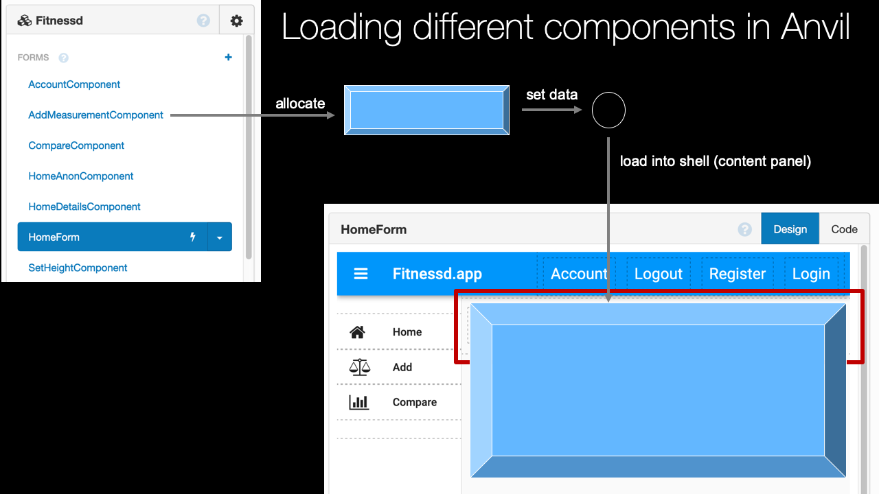
It's time to create our app and actually start writing some code and we're going to focus on that for the rest of the course. So here we are on anvil.works. Pretty cool domain. We're going to get started building our app. Now, like I said, you can create your account here. Having a free one pretty much let's you do what you need to do for most of what we're doing in this course. Having a paid one obviously lets you do more. For example, you can't host on a custom domain like we're going to without a paid account. So here we are, we're going to get started by just clicking Start Building. If we hadn't already logged in or registered we would do that, but now it's just going to take us straight to where we can create our app. Now, one of the things that is a little tricky for me working with Anvil is I always feel like I have the webpage and then I usually have an editor but the webpage that I'm viewing and interacting with created by Anvil, is also the editor. You should press the Stop button as you'll see and so in order to keep myself from trying to close that window and go back to my editor I like to have this full-screen just dedicate all the space to it. There's really no reason to leave our web browser, right? It's going to both run our app but also going to be where we're writing our app. Now, the app we're going to create is a fitness app. We've already sort of introduced that idea and I call it Fitnessd without the e in there. So Fitnessd, but without the e. Here, you can see a little sample one I built as I was writing this course taking the screenshots and everything. So we're going to start a new one that's why you see it down there already. So we're going to start with the material design one and it comes down, and it's just not so creatively called material design one. So let's give it a name. I'm going to call it Fitnessd, like that. Now, rename it, now our app is good. The next thing we want to do is we want to have some links over here, so we're going to put a title. On the right, you can see that there's sort of this drag-and-drop thing we have. Labels, we can put the labels over here. We have maybe a button if we want to put the button there. We can go and select the button and, say, change its style like it could say, Click Me. And we could set its role to be primary so it looks like this, and so on. This is not really how we want our app to look but just to show you really quickly how this form designer works here. Let's go ahead and put this title over here that we're talking about, that they're suggesting we put. I come down here, and I can rename these elements. If you want to program against them they should have good names, they always have names even if you don't want to program against them but you probably want to give them names. So this is going to be labeled Title, like that. And then, we could just put this up here as Fitnessd.app or something like that. This is going to be our title. Okay, so here's how the form editor works. We have a little output from when our app runs. That's like the console, terminal type thing. We have these forms here so by default they're form one, form two not super interesting I'm going to rename this one to HomeForm. And be like our main page, you'll see this is actually the center of our application in a lot of interesting ways. Here's the client side modules. We can go and add one of those. I'm going to get rid of it again 'cause we don't need it now but it just creates, well let me just look at it real quick. It creates a Python file where we'd write Python code but incredibly, this runs in the browser. It never runs on the server. The server modules are similar but these are going to run on the server. Right now, it's running. We can write Python 2 code over there but if we have the paid version we can have full Python 3, which is great. I definitely want to have that. If you don't have the paid version just write Python 2 code for now until you've decided that it's worthwhile for you, but, of course when I write code, it's going to be Python 3. Python 2 is just about out of the loop. It's just about deprecated and so on. We're going to come back when I have some of those. Here's the services that we talked about. We could have our data table service, our user service send an email, app secrets Google Drive, and login, and whatnot Facebook services, Microsoft which requires the business account and Stripe, as well as Uplink those are some of the things we spoke about. We can also configure the theme, and, just so you all know I have the individual plan here. Okay, so this is the basic look and feel of our app. This is how it's going to work. We're going to write code here and then when it's time to run it we just click this button. Actually, there it is, it doesn't do anything. It doesn't have anything going on and maybe if we put a button or something right here then you see this little button one. Run it, there you go, now, we can go about clicking our little button. So our app is running, this is what I was talking about with this sort of two experiences. Here's where we work with our app and run our app and debug it, and then you hit Stop and you're back to the editor. It's best to just have your web browser absolutely full-screen. Chrome is a little bit better than Firefox for this 'cause it actually hides the window the tabs and everything, which I kind of like but in general I prefer Firefox. So here we go, we're going to be using Firefox for this. All right, our app is created and now, we're going to have to start doing some cool drag-and-drop UI layout to start creating our application properly.
|
|
|
transcript
|
4:26 |
Now let's go ahead and create the rest of our forms. And we're not quite there yet in terms of writing the code, but I do want to speak just a little bit about how the navigation between these forms is going to work. I did say that this is kind of like the top level of our application. One really important thing to do or consider when you're writing web apps is what is the overall look and feel? You want the same navigation on the top maybe even on the side. A little footer on the bottom. Kind of want the same thing all over and then different content for the pages. So what we're going to do is we're actually going to set up this form so we can take little sub forms or components and dynamically replace them in here. So we're going to have one form that shows us our home view like a history of our measurements that we've saved in this as we've done work outs over time or just measurements over time. One that will show our account details one that will let us add another measurement in here. So we're going to dynamically swap those out. So right now we're going to create this top level material design form, we've already have. But then the subsequent ones these are going to be more blank ones and they're just going to fill in a little gap here. In fact let's go ahead and put that in here. Put a little column panel in here and we're going to give this a name. This is going to be content or something like that, right. Name it whatever you want. We're going to dynamically replace that... the value or the content of that with these other forms. Just to give us a sense of what kind of forms we need to build. Let's go ahead and add some hyper links over here. Before we do that, if you look carefully it says to... whoops, to put a column panel here. And so this is a column panel. Into the column panel we're going to put link one link two, link three. Those are not great names or values. So suppose we have one that's going to take us home. The text is going to be something like Home. Over here, let me just type Home. Another one we're going to want to add a measurement so let's just say Add. And we'll come up here and just say link_add. Maybe add measurement we need to be more clear and this one will be compare. So you can compare yourself against other people in the app stuff like that. So this one down here is going to be compare. Now we can add some little icons on top of this while we're at it. So if you're familiar with that, awesome. And then that kind of thing. So we come down here and say I would want some kind of home. If I choose that we have this little home thing there. This one I want some kind of scale so like, um measurement right? To indicate measurement. And for compare, what should we put? Lets put a chart or something like that. There we go. So now we have this cool little thing going on. Lets just take a quick look at that. Alright so over here we got our little hyperlinks with our stuff. We're coming along well. Alright that gives us a sense. We're going to need a Home form we're going to need a AddMeasurement form and a Compare form. The other thing that we need to do is we're going to have somethings like registration so come up here have Register. Actually lets put it in this way. Lets say you want to have an account and view your account details. Name Account and then the text is just going to be Account like that. We also want to have some other elements. We're going to come up here and we're going to have like, logout. So that's something you might see if you're logged in these are like the two things... You might have if you're logged in. These are the two things you can do. But if you're not logged in, you would have other operation. Now we could make these kind of dual purpose and change their text but it turns out in Anvil its generally easier to have different things in show and hide them depending on your circumstance. So this would be register like so. Then make the text register. We're just going to hide the logged out ones when you're logged in and vice versa. Okay, so lets just run this real quick and make sure everything's looking good. Great, now were not hiding these yet. We're going to, but we're not yet. So were going to need a home form an add measurement form and compare form something to do show me your account someway to login and register. Turns out login and register are little dialogues we don't have to write, they're provided by Anvil.
|
|
|
transcript
|
3:45 |
Okay, now that we know kind of what our app is going to be doing we can go and create these forms that are going to go into this little component that's hidden right there. Now these are wrapping around 'cause they're too big but remember only half of them will ever be shown at a time so it shouldn't be a problem. Right, now, let's go and add this here. So we could choose another separate page that looks totally different like the one we just created but like I said, we're going to have these components that we can use as we navigate around our application. There's a really interesting model pretty straightforward to do to swap in and out these views. We're going to write a little module, client module that's going to take care of that and just say go to Home go to Add Measurement, and it's going to totally solve it. So here is a basic form called Form One not super loving the name so let's go over here and give it a different name. Let's say we have an AccountComponent. We don't need to call it component just to conceptually for us to know like this one is being used in this way, I'm going to call it that. And we could just do real quick just something so we know that this is happening here. A quick name for the text and just call this Account. Something like that. The next thing we can do is we can add another one of these. We're going to need to have one for adding measurements. This is probably the most involved form in terms of user input and validation. So AddMeasurementComponent. And again just so you know what we're working with here let's put a label here and put some text on it. It could be like the title or something when we're done. If we want to compare us against other people. People that are our age or something like that we might have this compare form. That's one of our features. Now we have the Home Form but remember the Home Form is meant to be kind of like the overall application. So we want to dynamically swap out what you see when you're logged in. Just when you're landing on the site. We're going to have another one here like this and its name can be HomeDetailsComponent. Now it's easiest if we have a separate component for when you're logged in and you have details or when you first open the app but you're not yet logged in. So we're going to have one more of these here called HomeAnonComponent. As anonymous, not logged in, that type of thing. That pretty much does it. It turns out we need one more thing and I'm going to go ahead and just add it right now. And I'm going to call this SetHeightComponent. When you first register for the site it pops up a dialogue that says what is your username, what's your email what's the password you want to use. Stuff like that. But, it doesn't let us ask additional information. In order for us to compare you like your weight, your heart rate. Things that we're going to measure on you to others. We need to compare. We need to know like how tall are you, how old are you? Things like that. So we're going to have this other form that we're going to show just once to get that information when you sign up. Right so here's all the forms that we're going to use. I'm going to load this up and then dynamically put in here the AccountComponent, AddMeasurementComponent, Compare HomeDetails are anonymous and then the one time when I get your height and your age and things like that. And then we're going to store it. And we'll show you that one again. But, we do need to form for that as well. So it looks like we're just about ready to get going.
|
|
|
transcript
|
5:01 |
Well, our app is starting to come together. We have some forms in place these components that are going to dynamically swap out what we're showing and we have the overall look and feel in this home form. Let's run it and see where we are. Well, all the navigation bits are here and what we don't have is, really any content in this control thing we've got here called a column panel content. The idea is that as we interact with the app we're going to load different things like, probably that first thing in the anonymous bit then you're login will show you this and then you go in and add a measurement. If you click that, we're going to load that one in there. What I want to do, this is one of the more interesting forms is going to show you how we work with this designer and the code that handles the events which is super interesting. So, what I want to do is just start with loading this up as if this was what we're going to do. We'll talk about navigating between these different components and creating a navigational system later. For now, let's just, somehow have this appear right here when we launch our app. And that brings us to a super interesting aspect of this. You've probably already noticed it. Over here we have our HomeForm here's our designer we have all of our elements we can drag on and once we have an element selected we can set its properties. We also have events, down here when something happens like button when it's clicked we can have a function that's called. But, notice up here, this design and this code. We've only been working the design mode and the UI design is really cool but a lot of the magic happens here. So, check this out. This is Python code. It instantiates the form, the HTML that's basically what this does it sets all those properties you set in the designer and then whatever code you want to write happens here. So, button clicks, for example will happen here and so on. All right, I'll give you an example of that so if we click on, let's say, add make sure the names are right before you set this link add because the method name is going to contain part of the name here. So, that looks good. If I double click this, notice it writes a function and this code behind embed here that says the link_add has been clicked and this is what happens when the link gets clicked. Now, what we're going to do is write the code that gets the AddMeasurementComponent and puts it into the shell that is our home form. So, the way we're going to do that is we're going to write some Python code. We're going to say, from AddMeasurementComponent that's this module right here this is like a separate file. But then, inside there there's also a class named exactly the same thing. So, we're going to write code like that. Looks a bit funky, you'll get totally used to it. That's just how it goes. So, we're going to create a component and we're just going to call the in it method just create the class just like you would in standard Python. And then, over here, we're going to say self. and check out all that stuff. There's a whole bunch of cool things. In fact, over here on the right you can also see, you've got the column panel one this is the one we have the navigation in which, right, we should name it. But, this is the one that really matters and we can actually see stuff about it, right all of its properties and so on. This is really interesting, the beginning and the end after a while, I'll find that I don't really use that window that much but it's super nice to have it there. So, we're going to say self.column_panel_content.clear. And then, we're going to come over here and say Add Component this AddMeasurementComponent. Well, let's see how we've done. Let's run it. All right, here it is. We click this, it should clear out this part there's nothing in here at the moment but imagine we were on another view this is going to add that form we're going to have a better way a more global factored way, a refactored way. To do that, we're going to get in a later chapter but for now, we just got to bootstrap the process so we can build that form and see it. So, let's click. Boom. Look at that. It doesn't look like much but whatever we design in that add measurement component is just going to show up taking over the entire center of the screen here. That's pretty awesome. And, just so that we can get started a little bit easier let's just write self.link_add_click, like so. That way, when we run it it should start up with the AddMeasurement form loaded. See one other thing, you notice over on the left here you don't see anything going on in terms of it's not highlighted, showing us we're on this page. We can do one final thing in this section. We can say self link dot add role equals selected. Here we go. Now, see it's got that gray, even if I don't hover over. Okay, so we've loaded this up and again we're going to take out that home bit to load it on unload when we get a more full-featured app written. But I want to develop this AddMeasurement control component because it shows you the most power and most of the techniques you're going to need to know how to build these components, these forms and then add the event handlers in all of those kinds of things. Really cool. Looking forward to getting to it.
|
|
|
transcript
|
8:01 |
Well, here's our AddMeasurementComponent it's not super compelling is it? It has just like the words, Add Measurement what we want to do is build up something cool and interactive. Let me just show you over here on the previously published version health.Python.com we'll probably have fitnessd at the end but this is the previous one. So let me go and login. And here's what I want this form to look like. This is nice, right? We've got this cool little top bar we've got this called out card thing that shows us what you can enter we try to enter something that's invalid We're going to end up with the weight that's required we have a numerical Up-down we have a little placeholder text we're going to collect the weight in pounds and the resting heart rate and beats per minute each day, theoretically. So let's say I'm on 70. Try to say this required and so on and eventually if I add them all in there we're going to save that in the database and move on and show you like all your history of all your measurements including this new one you added. Okay, so we've got this cool error-handling here, and so on. So this is what I want to build add a nice little calendar and so on. So how are we going to do this with Anvil? Well, we're doing several parts. First, we're just going to spec out the UI then we're going to add the events and then add the validation. So we can make this a lot better by going down here and setting some properties on it. So Add Measurement, that's good. But let's go and set some more values. I wanted to go in the center I want the font size to be it's probably a little big about 28 pixels Put 28. It's always pixels. And then I want to set an icon, Member on the left we had the scale, and we wanted to add this in the link. And so we also want that topic over here and this all we want to see that appear over there. The next one we want, it's that little card. So we're going to Come back over here and there's all these different components that we can drop in and even more if you expand them out. So what we want is a card it's going to go below and it takes up all the space has this little shadow it's a slightly different background color. And then here we want to have a couple of labels. So one label it works a lot easier on a larger monitor just going to be label, title, date something like that. That's just kind of date like so, kind of boring but we're going to have more stuff like it so let's make a copy, can drag that thing in here in addition to the one that says date we want that's a weight in pounds. Alright, folks who are using the metric system I love it as well but it got to pick something so I'm just going to go with pounds, speed, title and pounds something like that. Another one like this. So we put it right, see the little blue drag it drop it indicator, so this is going to be rate for resting and heart rate. And here what are we going to put? Resting and heart rate, beats per minute something like that. That's about as much space we have to work with. So those are the labels that we saw. The other thing we want is to have people input value. So could get a single line text box or a multi line text area. We going to add Text Box. Now, could rag it here but what I want is to be next to this. So check this out. So I come over here and put it to the right I drop it in the right place and even move this little purple thing to make more room or less room you know so it's like 75%, text input 25% label and so on. And let's connect here and give them some values. So this going to be text box. Not date, let's put this down one. Let's put it there. Text Box, weight and then we can give it a little placeholder right here. This will just be, weight like that. Then we have type equals text number, email but text is actually what we want actually numbers is what we want, isn't it? So let's go set this to number and I'll make another one of those and we'll put it over here for the heartbeat. Okay, I think we're doing pretty well. We've got our weight set we've got our heart rate set and then I actually wanted a calendar for this first one. So let's put that right here and let's go set it's placeholder value too. So not a date picker. This is going to be, date of measurement or something like that. Right, that looks pretty good. Let's see how we're doing. We'll run it on auto load this is component for add measurement We click here, We got our date or we click on that date or the Weight, set it to some values not negative to this at 170 or whatever, hopes that the resting heart rates at 60 whatever happens to be things like that. So it looks like it's kind of working right? I think that's a pretty good looking UI. I got a few more things we need in our UI here we're going to need a button so let's put the button as Outside, let's say Inside-Outside. So your UI from when you're building it. So this is going to be a Save button which is going to be the Name. But down here, it's going to be, Add Measurement and again, let's put a little cool little plus sign or something like that here. so you want to add it and I kind of like the colored inputs here. So we can come down and set the role to either primary or secondary for different colors. I'll go with primary for now and then finally, let's align that to the right All right again, how we doing? Hoo, it's looking pretty good. I can click it. And the last thing though is what if I don't put weight here and I click it? Right, you saw that there's this nice error message. That's the last thing that we need to add here so let's go to in here and put this error message like even right in the way here so people know. And let's make it super obvious. Let's go, error message, like that. For the name, Let's go Error message, so we can see it more clearly. Let's put it in the center make it bold go down to the appearance here we can set the foreground color red's so harsh R-G-B, like that, make it red. And then the last thing we want to do is make it not visible by default. Someone will run it by default it's going to completely vanish from the UI but if we click this and something goes wrong, We're going to set the visibility, True Set the Error message to what it is Right, well, I think that pretty much does it for design in the UI of our AddMeasurementComponent. How cool is that! like, you notice we can grab these we can lay them out really nicely put them side by side we can even change the divider here lot of cool stuff for that. And for each one we have different class properties. We also have different events that we can click on down here and add we don't really need to do any of those for these. It's not like changing the date drive some other part of the UI that we need to work with. Right, but we will need an event for this one which we'll get to. That's the drag and drop way of building these forums. And you can see it's really, really easy. How much HTML Do we need to know? None. How much CSS? Well, unless you count knowing that, that hex code is red we really didn't need to know very much at all. Not that I'm saying knowing CSS is bad knowing HTML is bad, I'm a web developer. I love those things. But it's certainly cool that we can build this great looking UI without having to know it.
|
|
|
transcript
|
6:25 |
Well we've got our UI in place, but if I run it and I click on this Add Measurement, you can see not too much is happening. Let's go and actually have that button click do something and makes sure we have the right kind of data and then almost save it back to the database. We haven't created that yet, but when we do, it will just be a one shot, one line, to finish this off. So far, we've been in this visual bit on the design side of the form. Let's go to the code behind over here and hide that so we have the most room. Actually, we need one quick thing before we do that. We need to hook into this event when somebody clicks this. So we can just double click it, make sure the name is set to something you would like to have because it's going to be part of the method here. And then, we are going to go write what code we need to do. So we're going to have a couple of steps here. Let's separate it out. Let's actually you can override as many functions as you want these are just Python classes right? So I can come over here and write one called sync_data. The idea is it's going to take all the elements, UI elements like the text box's text and turn that into a number or given us an error message if it's impossible. So for a moment I write pass. Let's go down here what we are going to do is we are going to say and be an error that maybe, maybe has returned and we are going to auto-complete on that, that's awesome. And we'll say if error is return, which means just stay on the form, this sync data is going to set the error let's go and actually do it this way, let's say self. it was a label_error_message.text = error and let's do a visible = True. And then we're going to return. So if there is an error, we're going to show it. And also let's go at the beginning before we do any of this, let's say also we are going to hide it but in case there is an error we are going to show it but again and set the error. And then, later, I'll just print would have saved the data on the measurement. The other thing I want to do is have a way to easily communicate what those values are we got. So let's just go over here, we'll have a self.weight = 0 self.rate = 0, and self.date = None. The date is the day we said we recorded the measurement. And we can even come down here and say what measurements or what values we are going to put and we can do a little format, just like standard Python. So we can do it like this. Why am I so fascinated that I can write this code? Because this code runs in your browser on top of a Javascript engine. It's super cool. But we get a right Python which is the way we like it. This is good. Let's go over here and just put an error message for now. This will always fail. Try to run it. It will go click this, it's going to return an error the system will see there and error, it's going to show the error message and set it to whatever we return. that didn't work so well, did it? What step did we get here? Ah, because I forgot the word return. You know, details. Okay, try again. This will always fail. Okay, so our validation is working whatever message gets back, if there is any from that sync_data, it's going to show that as an error. So let's go and actually to the validation here. So there are several layers of what we need to do. First, if there is no data we can say if not self.text_box_rate.text alright if it's empty then we can return some kind of message like heart rate is required. We can do something similar for the others. Let it fall through but return none is probably good here. We're going to say, if you haven't filled out the heart rate that's required. If you haven't filled out the weight that's required and if you haven't selected a measurement date that's required. Let's just check those real quick. So click that heart rate is required, so put a 79 weight, 170, whatever it is. Measurement and date is required pick one of those. Boom, would have actually saved this it didn't really work because we didn't actually get the data but we're on the right path. So that's working well. The next thing we need to do is we need to try to get those values because maybe this is like some text value but it's not a number, right? Not a proper integer. So over here, we're going to say self.weight and let's just do Exception and we'll return a known error here alright so we're going to return the error message here but probably the most common thing is it's possible we get some kind of conversion error that's going to show up as a type error as well. And then, in this one we are going to return invalid format. Okay, so in here, what are we going to do? We're going to convert from a string to an integer. So we're going to take the string and pass it to the end constructor self.text_box_weight.text, and you know what? We're going to do something real similar for the rate. For the date it's already in the right format. So we just go to date_of_measurement.date as the selected date, and there we go. So if those all work right we should have those set when we get back here and we'll have a go. So, I think we'll have it right. Let's give it a shot here. We'll put this away for a minute and come over here and we add a measurement, a heart rate is required, okay so let's say the heart rate is 71 and let's say the weight, 170 or whatever it is measurement date is required, let's say it's today You ready? This should work. It should convert those all out and then print them into this little output window. Boom. Notice the red dot in the upper left. That means there is new output that would have gone to the terminal or somewhere. Go look back at it and you see we would have saved the measurement, it would have been 170 pounds on August 2nd with a heart rate of 71 beats per minute. It works! How cool is that? Now we haven't saved that to the database we just printed it with the console you're going to see it's actually about the same amount of work. Right, so there it is our add measurement component is done and we're ready to start using it.
|
|
|
transcript
|
1:24 |
We saw the core way to create UI elements is to use all the controls that you can drag and drop onto the Form Designer. You create these forms, you set the properties of the elements you drag and drop over, and that's it. You create these beautiful forms and they come in two parts. One part is we have this UI. Alright, this is the design for add measurement that we just built. Looks great, you can see we're in Design mode. But, on the other side, we have the code behind and here's where we write all the Python code that responds to events on those forms. It actually lets us write code for when it starts up and even other types of operations as well. What's super-interesting is this Python code actually runs on the client side. This is all running on top of a JavaScript Python runtime. That means it puts no load on a server it has near zero latency, it's beautiful. So, really, really nice way to take a great UI like this write some interactive code in Python and have it work the way you want. Course, we're going to add ways to reach back to the server talk to the database, interact with the APIs, and so on. That's really the next thing we need to do for this add measurement control is somehow save those measurements we've validated and gotten from the user. But, these forms are really, really great and pretty much anyone can go use the designer and build them out just the way they want.
|
|
|
|
24:44 |
|
|
transcript
|
2:25 |
It's time to expand our application. So far, we've only had the Add Measurement control. And yeah, it's doing some cool stuff. It does validation and it processes the request and things like that. But, there are many aspects for application and so we've already created these different components. The CompareComponent and the home details the AddMeasurementComponent, and all those things. But we need to talk about navigating between them. With normal web applications standard server side driven web applications or even static ones the way navigation happens is we navigate by going to different URLs and completely reloading the web page. Anvil, on the other hand, is different. The way Anvil works is it is what's called a Single Page Application, often shortened to SPA. In a Single Page App, the app does not actually reload. As you interact with it, just certain parts are changed. The DOM, the Document Object Model and HTML is just replaced. So here we can see the shell the home form that we've already created. And there's this section right here. Into this little panel, what we're going to do is we're going to start dropping different components. Let's imagine they've clicked add here in the left navigation, and we need to load the AddMeasurementComponent into this area. So what happens? We sort of did this early on just to get things up and running. What happens is, we're first going to create one of these add measurement components. We're just going to call it's initializer in Python. Then, potentially, we're going to set some data. I don't believe we actually do that on the AddMeasurementComponent but if we needed to we could go ahead and set some properties because maybe the state of one of the components needs to be passed over to the other. Then, we're going to tell Anvil to update this panel which will effectively change the DOM and insert this into this little shell thing that we've created. So this is how navigation works. We're going to load the overall HomeForm and it's little component there, that content_panel. And then as we interact with the navigation and the buttons and the app and so on we're just going to create copies, or instances of these components and load them up with data and set them here. As far as the user's concerned it's going to be super snappy. We're not actually refreshing the page. We're not going back to the server. We're not navigating the internet. This is all client side goodness. Of course, we may end up talking to the back end to get data, but there's nothing implicit about this navigation that does that.
|
|
|
transcript
|
5:32 |
Here we are in our application. And when we run it, we see that all we get is we automatically load up this add measurement control but when we click on these various things nothing is happening, right? There's no navigation. So let's go work on the navigation. Now we're going to do this in two parts. I want to show you the most naive basic straightforward way and then the more polished way that lets us build better structured applications. So we're going to start out just making it work and then we're going to make it right. So let's look at these various things here. We're going to need to go and add little event handlers for when somebody clicks home they can just double click that and it's going to add link home clicked. I'm going to do that for the rest of 'em. All right, here it is. Let's go and see how we might do this. Now, we already have this when somebody clicks on the link_add we're going to go and create this AddMeasurementComponent, we're going to change the role and we're going to put it in a panel. I'm going to push this off for just a moment. But what we want to do is basically, we want to create the various components and then add them here. Now notice this part is always the same. So let's add a function down here called load_component, it'll take self and a component let's say, component like that. And what it's going to do is, well it's just what's happening here. 'Cause we're going to need to do this for every control, right? All right, that looks good. Then down here we just say self.load_component kind of like that. In fact, at this point we could inline this, right? There we go. So this is all we really need to do and let's put this off for just a second here. The next thing is, when we click on go home let's go here, and what've we got? We've got the HomeAnonComponent and the HomeDetails when you're logged in. So let's do the HomeAnonComponent. Now we're going to load that one for now and then we'll just go ahead and load we figure out whether they're logged in. We don't have users yet so that' not a big deal. Remember, in order to get access to these we've got to write this statement p like so. So let's just run it and see that these two are working. If I click ad it should take me add, if I click home it should take me to home and back and forth. Right. Home, home anonymous. Add and look how quick add. That's zero latency, I mean yeah JavaScript has to execute the DOM has to be manipulated, but there's no network right, there's no changing of the URL or anything like that. So that's great, let's just go ahead and think about how we might do the rest of those. Just write those out and it'll come back to him. And then we have it. We have Add Measurement, Home Anonymous for now, Compare all count, we also have some stuff with login, logout and registered, those are not actually going to be separate components, there's a different mechanism for dealing with them, we'll talk about that when we get to it. This should more or less have it working. Let's go clicking around here. So home, add, compare, just like that. Then the last thing to fix, we started working on the AddMeasurementComponent here because it's the most interesting. I think we got the biggest bang for the buck. But it shouldn't really start out with this it should start out either anonymously telling you about the app, hey you need to log in, here's all the cool stuff you can do or, if you're logged in here's your recent measurements and things like that. So let's go up here really quick and just change this to link on click, like that. Now if we run it one more time it's going to have probably the most reasonable behavior, right so we go here, right right to account and so on. Like I said, these three we need to deal with separately. This is our simple navigation. What's wrong with it though? Before we move on, I said this is not ideal what's wrong with this? Well, here's the thing. If I go over to add measurement and I click on this and I submit everything correctly, recall what we're going to do is we're going to go and when we get to database setup, we're going to save this to the database and then probably the most natural thing to do would be to go to compare list, recent measurements, something like that. We need to navigate from here to somewhere else as the result of this button click. What do we do then, do we have this thing import the home control? That doesn't work very well because the home control is already importing this and that gets a little weird and also that very tightly binds together these various controls and their components. That's not great, right? So what we're going to do is we're going to make it so sharing this navigation concept is basically its own standalone thing, there's actually more happening. You saw over here as well that we have the various roles we could set another, you know, various things we could say I want to link for add role to be kind of active or home link active, things like that. Also possibly setting the title, checking for whether or not a user's logged in, making them log in if they need to be logged in. There's a lot of stuff that we have to add here and we don't want to just load this up in our home form we're going to have a separate little library whose job it is to only deal with navigation and we can share that library easily across all of these things.
|
|
|
transcript
|
5:26 |
Let's re-factor our navigation into its own little library, this is going to introduce an entirely new idea over here. So far, we've had forms and components. Now we have modules and server modules. These are both Python files that can be shared Python functionality that can be shared across your application. The modules these are things that can be shared with your forms. They live in the client. They execute in the browser. Server-side modules are more advanced Python code that lives in the server, and is not directly accessible through JavaScript or anything like that. So, what we want, is a client-side module or just a module and going to rename that to just navigation. Now, what we need to do is basically go, and work with that right here, we did the bottom go to this column panel component here and add this component to it. We can already work with this function directly. The idea is, we'd like to move this behavior and remember, right now, it's simple. Later, it's going to get increasingly complex. We want to move this out, so I'm going to take all of this 'cause we don't want to do that there anymore We're going to put it in our navigation thing. This navigation component is going to need to have access to that home control. So, what we're going to do is, when it loads up the home control's actually going to set itself back to the navigation another thing called the HomeForm, rather and we're going to start out as None. We could just work directly with this. But, I want to verify that this has been set to something other than this. So, we're going to say get HomeForm or I'll just get the form if HomeForm is None raise exception, you must set the HomeForm otherwise, it will just return HomeForm. Okay, this lets us, throughout the rest of our application make sure that we're doing things correctly. Now, let's go back here, and take, some of this; and we don't want to say, self here or any of these sorts of things, it's not, no longer an event. Let's just call this, go_add, something to that effect. This one will be go_home, go_compare, go_account. Now, it doesn't make any sense to have this self look component, because what we got to do is get a hold of the HomeForm and do that. So, let's just say, form equals, get_form, like that and then form load_component, okay? So, we're just going to do that for all of them. Now, let's go back here, of course we wanted this to do something so what we got to do is say import navigation and then we can come down here and say instead of this working with ourself we can say dot go_home, that, this bit down here can say go_add, that, perfect. Now, this might not look like we've done much yet and, honestly we haven't, we're going like I said, to add more features maybe we would want to set the title as we navigate around. That would make a lot of sense. Maybe, we want to set the selected navigation elements to be active or inactive, all of that's going to be dealt with through navigation. Also, do you have to have an account before you're allowed to access this stuff? So, you got to realize we're putting this in place to build it up over time, but now, it's a good start. First of all, the refactoring thing should still work let's find out if we got that right, beautiful. We already caught the problem with our first error. So, let's go here, and it says well, you tried to get the HomeForm when you called go_home, so the first thing we need to do right at the beginning, is say, HomeForm equals self, okay we do this once, at startup of the overall application and then we can use this back reference to like set the elements, and so on, try again. Oh, that didn't look good, what did I do? Aah, so what I did is I had this double underscore and that means something, a little bit funky in Python idea is to hide it and I guess I should have a function in set HomeForm, but, I decided to just rename it And just a little bit of a glitch there it should have said that it didn't exist when I tried to set it, anyway, sorry about that. So, we're going to set the HomeForm here and then, we'll be able to work with it. Let's run it, by the output, here's anonymous and compare, home, count, and so on. But, notice up here this fitnessd app we might want that to have, like dash home dash account, or something like this and we want these to be selected remember we had ad selected before. So, we're going to have the navigation deal with all those things, if you try to get to this account section, you should be logged in or even if you're trying to add a component you should be logged and then taken there. So, that's what we're going to do with this module the cool thing is, this runs on the client-side in Python, very nice.
|
|
|
transcript
|
2:53 |
When we run our app it's working but notice the title up here is just the title of the app and that may be okay but, in this example, I would like to see right now I'm on the compare page or now I'm on the add page and so on so let's go and update that. So let's go down here for each one of these and we're going to add a separate function. Now, I could just directly work with the form but again, I like have this nice and broken out so I have def set_title and what we're going to do is we're going to say form = get_form() and our form if we go look at it has a self.label_title. So, labeled titles is what we want to work with and we'll say label_title, that's the control and then we want to say the text is equal to, well what? We could just say text, right? But what we actually want to do is have the base title plus this. So, let's go back to our home form and say something to the effect of self.base_title equals this at start up that way we let people design it in the designer we have access to this here. So if we change up the designer we don't have to go and change code as well. So what we will do is say base_title = form.base_title. We'll say if there's some text passed in we'll do base title. We just want to set it to base_title. Like this. Okay, so this, I think this will do it. Now we just have to call set_title. So here we can say set_title("Add Measurement"). Just say, for this one let's set it to just nothing, like that. Compare. We'll have your account like that. Now, let's see if this is going to work. Form is not find. Where do we do this? Yes, it's with the self. Okay, notice nothing appeared. We click on add. Add measurement, compare, add home goes back to nothing remember that the colon is gone. Actually I would like to have a dash I think, but I will put that in a sec. So over here, you see how cool that is? Now it's super easy for us to give a little bit better idea to the user on where they are. 'Cause we have this all centralized into one beautiful place. Make one change right there. Every time it changes, every time that we navigate somewhere it's going to take that change. That's why we refactored it. So, if we go here we're going to add, there's our dash there's our compare, there's our count, there's our nothing. All right, looks like we're setting our title, great.
|
|
|
transcript
|
3:05 |
Our app is pretty good, it has navigation. It's setting the title as we navigate over as here you can see, but when we click on these we don't have them highlighted. They should be kind of this blue color to indicate here's where you are in the navigation as well. But lets go and make that work finally. So the last thing that we want to do here is we're going to have a set_active_nav and we'll have it state or something like that. This is going to be a string that we're going to pass in so that will let us do things like over here on add we can say set_active_nav add, keep this nice and short home, compare, account and I'm just making this stuff up. We're going to have it mean something in a second. What we're going to do down here is we're going to say form = get_form(). My form, I'm going to pass this idea onto it. Again, we could do this up here but I kind of like having it the idea of setting the nav just focused on this one function even if we're going to delegate it. So what we've got to do is to find a function like this over our home form 'cause the form is really in charge of it's elements, right? In charge of it's navigation and it's links and so on we shouldn't really be working with these too much outside of here but we're going to write some simple code we'll say something like self link going to pass self in this world so we'll say self.link_home.role equals it's either going to be selected or empty. Selected is a string, or empty. So we'll do a little ternary expression selected if state is home else None. And we're just going to do exactly this for all of the navigational elements, there's only three so we have link add, the navigation element is add and then the last one link is compare. What's nice, if it's none of those it deselects all of them, right if we pass account it's going to unselect home add in compare. All right let's see if this works. So here we are, we go home, we go add, notice how it sticks it's gray, go to compare, sticks but if I click on account all those on the left go away. How slick is that, right? Super easy, home sticks, add sticks, compare sticks. And even when the app starts up it's already got home selected, why is that? That's because at the very top here we're actually using the navigation to go home not just internally loading that control. That means all the cool stuff of setting the title clearing the title, setting the selected elements potentially checking for users all of that stuff is happening as we build out this navigation, very very cool so hopefully you're starting to see the value of this navigation module over here and also just how cool is it that we can write these Python libraries these Python modules and share them through our application? It's pretty cool.
|
|
|
transcript
|
3:08 |
So we built up this navigation and one of the things I gave as motivation was well, yeah if all the navigation actually happened within the home form well, we could just stick it in there and it'll all be well and good, right? However, it's mixed throughout all of these things and when I say compare or especially when I say add measurement when this is finished what I would like to do is have it take me away. So let's see what it's doing now. We come over here and I can add a measurement and I pick today, that's cool. I can say this let's put 180 and our validation works. I don't know what my heart rate is but let's say it's 70. Boom! And we get a little print. Hey, we saved this, that's cool. Great. And what would we really want to do? Not stay on this page. That's probably the worst possible thing. We would probably want to go home and here's like a list of our recent measurements we've added or a graph. A graph would be even better. When we're done adding it successfully we want to go home. Check this out. So over here this is part of the glory is say import navigation. This part, this would go home. Let's just say navigation dot go home. Let's see it now. Come over here we're going to say add. I don't need that. Let's still say it's today we're not actually saving in this. 179. I lost a pound in just as few seconds and my heart rate went up. Ready? When I click this, it should print out that we're going to save it which will simulate saving it and we'll get to that when we actually work with the database but the next thing to do is it should remove this component here and it should take us, effectively from what the user's perspective is back to the home screen. Ready? Boom! Home anonymous because that's what we're loading up, right? It should be the logged in one. I guess, sort of. Isn't that cool? How awesome is that? And look how easy it is to share this navigation function throughout our entire application even other modules. Right? If we have other modules over here potentially they could do navigation. Now, one final caveat within this function this initialization function the sequence of events happening here is this add measurement component is about to be put into the main view most likely. It's not quite there yet. It's about to member the processes allocate, set data and then put it in the component panel there. What that means is we're not ready to stop navigating here and go somewhere else. So you can't do something like, I don't know if not account navigation go home or go account, I don't know. Let's put it the other way. All right, if account we want you to go here instead you can do that within response to button clicks other behaviors, timers, and whatnot but you cannot do that in the initialization here. Just because of that workflow that we talked about at the beginning. We're not even done loading this component. We can't navigate away from it yet. Okay, so we just keep in mind this navigation does not work in the initializers but it pretty much works everywhere else and it's a thing of beauty.
|
|
|
transcript
|
2:15 |
Let's round out this chapter on navigation by reviewing where we started and where we ended up. So we saw that Anvil applications are single-page apps that means they all load up at the beginning and they never go back to the server they don't refresh the page as far as the browser's concerned we're just on this one page for a super long time. But, in fact, we do navigate around and the way we do that is by using JavaScript to get data which we haven't done a ton of yet but we're going to and then manipulating the DOM. And the easiest way to do that is to just take these components that we built like a HomeDetailsComponent or an AddMeasurementComponent and having Anvil have an area in our page which is most of our app where we just pop those controls in and out of. So, here if we want to load up the home view and we've got that HomeForm which is a shell in the HomeDetailsComponent which is like the here's your recent measurements and whatnot we're going to go and go to this content panel figure whatever happens to be there if something is there and then just add the one and only home details component like this. We potentially could pass additional data to the thing but we're not actually doing that so that's all well and good. We also saw that we can set the title we can set the active navigation maybe we check for users all that would have to be stuck in here and it's hard to replicate that in other places, right? This is inside the HomeForm. We also saw, like, other components might need to do stuff like this. For example, the AddMeasurementComponent. So what's better? Well, we're going to move all of this navigation concept to a navigation client side module. We just called it navigation and it has things like go add measurement. And it can do and check, does this page require an account? Yes, it does so we're going to try to get that account. If we don't get one, go home otherwise, we're going to set the title set the active navigation and then load that add measurement component, right? And then all we do is basically delegate back to the home form to say load control and pass it off. Also, set_title, set_active_nav and so on. So this is a really nice pattern within Anvil applications to factor all that kind of stuff about moving from view to view validation from view to view setting up things like the active navigation and the title and whether an account is required, all that stuff. Really great and this is how you do it.
|
|
|
|
17:29 |
|
|
transcript
|
1:44 |
What fun would our app be where we are going to store things like measurements over time and personalized information without having some kind of account? Luckily, Anvil makes it super easy for us to create accounts, log in with username and password or even things like using your Google account or other accounts like that, even Enterprise accounts. And it makes sure that it happens in a nice and secure way. Creating basic accounts is tricky. We got to make sure we store the password correctly. And oh, what if they've got to reset their password? Now we have to be able to send email. There's all sorts of stuff around user management and accounts. It turns out to be pretty tricky in from scratch web applications that Anvil's going to handle for us. All of this starts with the User Service. When you create a new project it doesn't have a User Service. But, there's a Services section and you just add the User Service and configure it as you want. So you'll see, we're going to go over there and we're going to click on the User Service and add it to our application. Then we get to pick how users can interact with our site. How do we want them to log in? We can say only active directory which is a way to basically have a single account within your company, managed by your company. We could have the traditional username or password. We could have sign in with Google or Facebook, certificates. We could actually do all of these things if we had the Enterprise plan. So here you can see, we can configure whether you could be remembered across sessions how long that should be for, and so on. So all this stuff we have to do to have a nice user interaction, Anvil just makes it a checkbox. That's what we're going to do in this chapter is we're going to configure this and then integrate it into our application. You can see the little sample code at the top anvil.users.login with form. That's a pretty simple way to get started and I think we'll start there.
|
|
|
transcript
|
2:09 |
Well, here we are in our web app and we want to add some stuff to say register or login. Now, we've already added these event handlers so if somebody clicks login here, or they click register or logout, we already have the placeholders but we need to fill our promise here to do actually log them in, and as you just saw this all starts with these services. There's actually a ton of services we could have. Data tables, users, emails, secrets, so on. We're going to start in this chapter with users. Let's see how we might let them log in. Let's say, email and password, and I guess we could go ahead and checkoff Google as well, if we want. We can allow visitors to register for the site we could enforce secure passwords can allow them to remember, lets say, up to a year, right? That's pretty good. We don't need to confirm the email addresses although that's a possibility here, right so we're going to also say the accounts can be used right away. So, that looks like it's all set up here and everything's good to go. You can see down here, a couple of the things that we can configure in terms of what we're going to store about the users. We'll talk more about this interface when we get to databases, but you can add other information like we could have a boolean column, or something like that about whether a user is Pro. Okay, true or false? Now, later we're going to let people buy a Pro subscription to our account, so let's go ahead and say that our users are going to have this is Pro, and you can adjust this later. You're not committed to what you're doin' right here. Alright, so it looks like our user service is set up and notice also that we have the Google API and data table service added. Data tables because that's where our user data is going to go this is actually part of the data table service and then when we checked the sign in with Google to make that work, we probably have to go and configure our API over here, right, things like this. We're not going to do that for now, just leave it alone, right? We'll just login with username and password. Okay, it looks like our user service is set up, and in fact all we have to start doing is calling from our code and we have full user support.
|
|
|
transcript
|
3:26 |
With our user service set up let's go back to our HomeForm here and work on register. So if somebody comes in here and clicks register we want to show them a form, gather their information create an account and then set a cookie potentially to remember across at least this session. We're going to do that, and then once we have the ability to create accounts, we'll be able to later log in and log out of those accounts. So here's our register, click handler and turn out if we go way to the top we have anvil.users, and this is the thing that we're going to use, to actually interact with it so let's go back down here, our register and we say anvil.users.signup_with_form. You can say sign up with just email, just Google or whatever. We're just going to say sign up with form and we're just going to run it for a second and show you something that's kind of annoying. We don't need a pass here. Once you do this we maybe want to refresh and send you back home, say go home. Now that we have accounts, what we want to do when you go home, is to, let me load up this HomeForm here. Let's say that's over here. We want to check and determine whether or not there is an account. If there is an account, show the anonymous component here or just hey welcome to our app, you should sign in create an account. Or, the one that is the details hey welcome to your account, here are your details. So we're going to deal with that in just a second. Let's take it one thing at a time but it turns out to be pretty easy. So down here, we going to go and register and then we're going to go back home. Just to refresh the screen here. Let's go ahead and run this. So we're on our anonymous page if we click register, now all of a sudden we get this cool signup. So we can sign up with an email or we can sign up with Google. Now, how do I decide that I didn't like that form? Huh, well it turns out if for some reason you click that and you don't actually want to register to bad, you've got to refresh the page. So let's go fix that really quick. That's kind of annoying but I wanted to show you that so we have this allow_cancel is True and now if we run it, it's probably the right experience that we're looking for. So click here, and sign up with email or with Google or you know what, actually never mind, forget it. So we're going to go over here and we're going to sign up. We just going to sign up with a simple email. No problem there, and say remember me. So we'll say sign up. Give this just a second, and it went home. We got some output over here. So it automatically created some columns in that table which didn't exist before right so it basically created that table over in the user service, and now you should be logged in. Our app didn't understand that. It do anything. So, that's okay though. We've already signed up. Let's see what else we can do here. We can also say remember by default, that is true but you could disable that if you want. Last thing, let's see if our user actually got created here. We go to our data tables. Look at that, there's a michael@talkpython.fm. This account is enabled, is_pro is unset. But check this out, we have a nice password hash here. We have the remember login details that have been set and the last time that we logged in. Super cool huh? So really really great to be able to just check a few boxes, call a simple function, and have Anvil handle all the tricky user management stuff for us.
|
|
|
transcript
|
3:23 |
Well, we've signed up and we now have users maybe, probably. I'm not entirely sure, right we have no way to tell whether the user's logged in. So, let's go and actually toggle a couple of things based on user state. First of all, let's go over here and say, the user is this. we'll say, set account stage, or something like that. What we need to do is we need to hide and show some of these elements depending on whether they're logged in. And, we'll come in here and we'll say, user. That's great. And, let's go write that down here at the bottom. Put a little self, because that's how Python works. And, here we'll say something like this if there is a user, we want to show account and log out. If there's not a user, we want to hide those two but then show log in and register. And, let's try to do those in line. That's probably the easiest. So, we'll say self link account.visible = user is not None, so we have a user. Probably the easiest way there. And, what other ones do we have? We have log out, again. And, then log in, we want that to be the opposite, right user is None. Same thing with register. Now, that's getting called here. Let's also call it right at the start. And, we'll do something like this we'll say, user, now where we do we get the user from here? There's no log in. We can just ask Anvil, is there a current user. If they're logged in, we get them if not, then we get none. Get user, like that. All right, let's go ahead and run this and see what happens. set_account_state is not defined because of course self. is what I should have written there. Look at that. We're logged in. So, not only did we see the account created in the database when we set that cookie, we are now logged in already and this is great. The other thing we need to do is derive this anonymous versus details page. Let's go fix that. That's super-easy as well. Now, this is going to happen over in navigation. When we say, navigation go home we're basically going to call this function as well. Let's go over to the navigation, go home we're going to get the user, and then we're going to decide if there's a user, I'm going to do something else we're going to do this. And, that something that we want to do is going to be the HomeDetailsComponent. Here we go. So, when we go home, we have to look. Do you already have this in details or not? Also, when we have things like compare or go to your account, we want to make sure that there is a user, and send them along. So, we're going to take care of that validation in a minute but let's just see that we're getting the right home screen as well. Spelling is hard. Let's see what's going on here. User. Look at that, home logged-in view. Now, it's not so easy to show you the not-logged-in view because there's no log out, right that doesn't do anything right now. We'll do that in a minute, but this is really cool. We're deriving this navigation and we're deriving the home screen based on whether or not there's a logged-in user. Great.
|
|
|
transcript
|
1:23 |
We saw we can register and we saw we can drive the user interface based on whether or not there is a user even from remembering us from session to session, right? So if I run this now we'll see that account and logout are shown but that login and register are not. However, we probably want to let them log out at some point, right? So let's go do that, that turns out to be super, super easy. So when you go down here and you click this you see Anvil.users.logout. Not too hard, huh? And we also want to go back home and set this user state. Okay, so we're going to go do those three things. I'm going to log out and then we want to set this to be None because we've logged them out and then we're going to go home that's going to trigger a refresh of potentially that home screen and show the anonymous view. if you're on the home screen, of course it's just going to toggle that but if you were maybe somewhere else like in your account page got to take 'em somewhere that's valid and home is always valid. Let's run that. All right, we're logged in, as you can see right here. I click logout, it should change this menu. Should re-navigate us home which is going to reload this to home anonymous view. Let's give it a shot, here we go. Again, the cell. All right, let's try it one more time. Well, our logout worked. We just weren't able to update.
|
|
|
transcript
|
1:20 |
With most of our user interaction working the last thing to do is log in. And, it turns out that that is super simple as well. No surprise, it's anvil.users.something. Log in, options are show signup options so you can log in, oh, don't have an account, create one. That's probably good, and that's the default. Now, remember, by default you can say, probably True. allow_remember, True. Those are all fine, but the allow_cancel being default of not, I'm going to say we do want to say True here. And, then we'll have just the user so we can say self.set_account_state with that user that we got and then, again, we want to refresh the screen so navigation, go home, like so. Those three lines, that'll probably do it. Let's give it a shot. All right, so anonymous view, we're going to log in hey look, we got a form, that's good. Now, what do we want to do? We could log in with Google. We're going to log in with our username and password. We could instead go to the register view we could cancel, or we could just log in. Let's go ahead and just log in. Boom, we're logged in, and, just like you expect this updated, went here, and as we move around again, we're still getting this logged-in view. Beautiful. So, we can now register, we can log out, and we can log in. Pretty good.
|
|
|
transcript
|
4:04 |
Here's our app running again and we have our user management working beautifully, right? We can log in, log out, register all that good stuff. However certain things don't make a lot of sense, right? We can't get to the account view over here because it's not shown, but in order to add a measurement, hey we need to log in before we can do that. In order to compare our history against the average person we also need to have us there as the source of what our data is. So these two views really don't make a lot of sense until you're logged in. What we're going to do is we're going to refactor things just a little bit to make sure that before we're allowed to navigate to those views we make sure that there's an account there So that's what we're going to do. So over here, let's go to the bottom and write little function here called require_account. And what this is going to do it's going to run and make sure either an account already exists, or already logged in or make you log in to do that okay? So let's go in here and say user = data_access.the_user() That's what we had before, we'll say if there is a user, return that user, everything is good. But if there's no user we're going to require them to log in. We'll say user = anvil.users.login_with_form(allow_cancel=True) Cancel true, what we had. Now maybe this worked maybe it didn't. So we're going to get this user and we also need to toggle potentially if they did log in and they weren't something like that, the user states so after we get the form like this we'll say form.set_account_state(user) what did we call this over here? Remember we have this set_account_state. And pass in, the user and it toggles the UI and then let's return user. So whoever calls this they can check to see that a user came back, either here or one was logged in. If there's none, then they can decide. Alright, so let's see, how will we use that up here? Let's just get rid of the top navigation. No, this one's fine. If you want to add you're going to need a user, right? So let's do that, let's say this. If user =require account, say if not, go home. So if there's no user, they didn't log in either the user already logged in or we asked them to log in and they didn't then we're just going to say look you can't go here, we're going to take you home and this is probably going to look a lot like that so same thing for compare and same thing for account. You can't go to your account if you're not logged in. Uh- this looks pretty good. Let's quit and run it. Dyr@theanonymous. We try to go here, it should log us in. Great, could log in. Couldn't log in the first time. Boom. We logged in. It let us go through. Next time, we're going to try go to compare but we're already logged in so it should just let us go there. Boom. Same for the account. Same for add now. If we log out, however, and try to go back to compare boom, either we log in and we cancel oh, that didn't work, did it? Aah looks like we're not quite there, I think I might need to return or something like that. So let's go and quickly fix this little bit. How about that? Perfect. Let's test our cancel. So we're going to try to go to add, we're not going to log in it should take us back to home anonymous, cancel, boom. This time let's try to go to add and actually log in. Took us there, super. Same thing should be the case for the others. Right, we go here, everything's fine not, it won't let us go there if we don't log in. Great, so, I think our user interaction is working pretty well. I might even call it done.
|
|
|
|
30:58 |
|
|
transcript
|
1:05 |
Almost every meaningful web application has some form of database. If you going to log in and have an account if you're going to have a listing of items even a blog post probably has some form of database. Now, simple blogs, they might have just have files on disk or maybe somethin' like SQLite but real web applications, they have database servers. This might be Postgres, it might be MongoDB. When you work with those there's a lot of things you have to consider. How am I going to talk to the database? Will I use the SQL query language? Will I use an ORM that maps classes into that database? How will I make sure that the web server is properly connected and securely connected to the database server machine and the database itself? All these things can be challenging. Luckily, Anvil's packaged the web app and the database together and they're already wired up and ready to talk to each other. So this is really great. You'll see that workin' with databases in Anvil is, well, it's almost transparent. In this case that's a good thing.
|
|
|
transcript
|
2:58 |
Now, let's create our first database table. Actually, it's going to be the second but just the first one we create. Remember, we added this user service and it actually added a data table into this database that I'm already talking about. So, we'll probably have data tables over here if you don't you can click plus and add them. You won't see them in that list cause they're already here. They'll show up over here, either you add them or something else like the user table or the user service put them there. So if we click, we'll now see we actually have a table. Here's my email from when I registered this is the email column. Whether or not this account is enabled whether or not it's pro, remember we set that up with user table. And then some other stuff about when I logged in and so on. Let's go and create another one. Let's call this measurements, like so. Now, remember, our web application the whole purpose is we record measurements over time and then we can graph these like how tall are you, and what is your resting heart rate and things like that. The most important thing about these measurements is they are tied to a particular user. In, quote, real databases, in relational databases you work with directly, you have to set up foreign key relationships between several things. Watch how easy this is over here. So we can just say we want to new column and this is going to link to a single row from the users table. That's it, and we'll just call this user. So this is actually going to be a link over to this table. So some entry here, only one we have now but they'll be many entries in theory, will be related over here through a foreign key. Now, let's put in some more data. We want to record the date when this happened and we're going to do it by just the date not day, hour, minute, and so on and we just want to record it once a day. So we'll call that record date. Then we want to know when this individual record was inserted, so this is when the measurement was taken. This was actually when in the app it was saved so we'll go ahead and say that here. And then we'll record a couple of things weight in pounds, which is going to be a number and let's have one more number here, the resting heart rate. Those are the main things that we're going to compare here. All right, there we have it. We've defined a database table. Pretty easy, huh? And you'll see that working with it is also super easy. Over here it shows us that it's app_tables.measurements when we work with it within Python. Also, notice the permissions. We cannot directly interact with it from the forms we have to go through what's called a server module. So that's going to be interesting. That's a security mechanism to make sure that you cannot get directly to the web applications. The only thing talk in the database, not say arbitrary Javascript running in the browser talking directly to the database. This is no big deal, it's easy to set up but you do need to be aware of the permissions and what that can mean.
|
|
|
transcript
|
3:02 |
Now that we have our table and we've talked about security a little bit let's go and actually save a record. Now, it turns out this is basically done all but for the database. So remember, we've already set up our account memory and all that kind of stuff. We come over here, we can pick a date. Like, let's pick today let's say I'm 178 pounds today and my resting heart rate is 72. We say add measurement and that sort of worked it says, well, we would have saved what you typed in to the database had we had one. Well now we do and so our job is to go and implement that over here. So remember, that is in the add measurement part. So here's where we say we would've saved it so we're going to write the code that actually does the saving. Now we're going to do this in two parts. We're going to do it directly working with it in these components which is probably not the best way to factor that kind of stuff. And then we're going to split it off kind of like we did with navigation into another client side module we're going to call that data access. That's going to be later let's just work about getting this into our database. Remember, if we look at the database here we have forms, no access, server modules, read write. What is a server module? A server module is like a regular module but instead of running on the client's side in JavaScript it runs literally on Anvil's back-end servers over there on Linux. So what we can do is we can add one of these and let's give it a name. So we're going to call that measurement_service and it gives us a cool little tip here. It says, hey, all you have to do is something like this. If you have a method it has arguments and it returns arguments you can just say it's server callable. Okay, so that's pretty easy. We could actually go and get this to run just so you all see what is up, let's go do that. Let's go, just went in the home details loads. We'll go over here and we'll say anvil.server. When we say call, it takes the function name and the arguments. Watch, this is pretty good integration here. So notice, I just hit enter and it is listing all the server callable methods that is knows about. Say hello, that's pretty cool. And then it knows that we need to give it a name so I'll put my name, Michael and it's going to return. 42, so let's print this out. Let's go ahead and just run this real quick to see what's happening. It's running, oh, something happened over here, let's see. Now, check this out. It says hello, Michael, and then it said 42. But, more importantly, look at the colors. The color here, white, means this happened on the client side in JavaScript in the client side Anvil code. The yellow means it ran on the server. How cool is that? So, if you look at this over here if we look at this, it has the white background. And we look at this, it has the yellow background. Just remind you, server, server, server client, client, client. And the output works the same way. So all we had to do is make this little function and we could call it.
|
|
|
transcript
|
4:57 |
Now that we have our server site module working let's do this little silly example way and let's make something that we actually care about. What we want to do is, we want to save our measurements. So let's call this add_measurement and let's think about the things we're going to need from our database. Over here, we're going to need a user that's fine, actually the user is passed in a side channel you don't actually have to pass user it's kind of like you can always just ask for who is the logged in user either on the client or the server so that'll be easy and then we have record date, created date, weight in pounds and resting heart rate. Now, the created date, you think the server knows what time it is? Yes, so we don't actually have to ask that. And come up here and say import datetime and down here, we just say and you have a standard Python like that date, datetime.now So that works pretty well, now what are we going to do? We have to create one of these records and save it. But we want to make sure that when it's called the user's logged in. So let's do this. Say user remember this anvil.users.getuser? Oh, that works the same here and when you say if not user, then we can either raise an exception or just return some kind of error. Now of course our app is going to enforce that we're logged in, in order to call this method but you know just in case we make a mistake or there's some flaw in our logic on the client side well here we can double catch that. And then it's super easy we just go app_tables.measurements and notice the auto complete right here super nice. Say add_row and look what it shows us right there. Going to say user, weight in pounds, record date created date and so on Let's say created date equals created date record date equals record date resting heart rate user equals user and I notice I have an e right here oh that should be a rate so let's fix that real quick, okay well, it looks like we pretty much have this all ready to go. The only thing is, to call it. Well, let's go try that. Now we've have a quick thing to fix real quick here Remember, we put this little print here so let's take that out, this doesn't exist anymore it's going to cause a crash. Here's where it gets interesting. We said we would have recorded it well let's go do it. anvil.server.call Here's our add_measurement and what do we have to pass it? Now, this dialogue here is in the way of that which is annoying. Let's see if we can make that go away like so, maybe. There we go. So we can pass in the record date which is going to be self.date we pass in the weight in pounds self.weight and we have self.rate, wow those are weird A weird combination. And let's just comment this out. Alright, if everything's hanging together when we go back here, we should now have at least one entry in our table. Let's go. Alright, we're logged in, we're going to go over here and let's say the date is let's do one for yesterday. Yesterday was 179, my resting heart rate was 71. Okay, that--did it work? I don't know, let's try to add one more. Let's say now it's today and my rest my weight is 177, and my resting heart is 69. Maybe I've been gettin' in shape, I don't know. Did it again, stop, let's go back to our tables How about that? That is so cool, there is is! We've got our recorded date, our record date these are the days that we've entered Here's the actual down to the millisecond time when we made these actions here's the weight in pounds that we typed in here's the resting heart rate and check this out we actually have the user over here that we could go to. So it's, pull this up, you can see all the details about the user and so on. Isn't that cool? Here's our foreign key relationship and all we had to do to make that happen was to call get current user and then right there just pass it over. Working with databases in Anvil is super easy we didn't even have to know the SQL query language or third normal form or any of those types of things although it wouldn't be terrible to know. It is a simple way to get started and just connect these things right together.
|
|
|
transcript
|
4:14 |
Well adding the measurement wasn't too hard. Let's see about querying the database. We're going to have this @anvil decorator here. The next thing we want to do when our app is running on the authenticated homepage we want to draw a plot of all of your measurements. Now, that's a lot of work. So what we're going to do is we're going to start by just showing a list. A flat, string list of all of our measurements. And then we'll turn that into a plot just a little bit. Either way, though, to make that happen on the data side, we need to query the measurements for a particular user. Turns out to be not too hard. Let's write a method here called my_measurements. And it actually takes no arguments. It's going to have a user. A logged in user just like before. This time, if somebody tries to ask for their measurements but they're not authenticated they don't have any measurements. We're just going to return an empty list, here. And that's fine. Next, what we want to do, is we want to say the measurements that you have are actually, app_tables.measurements. We're going to do a search. And we can just say either some kind of expression or things like, User=user. How about that? Now this will give us all of our measurements back but we want them ordered. We can, of course, order them in Python. But you know what's really good at ordering things? Databases. And the Anvil database allows us to specify a little search expression, here. So notice up at the top we have anvil.tables as tables imported. So we can say, tables. has a couple of things. Most importantly, order_by. And then we can say what we want to order by. First let's go and say ascending=True and the column name is going to be what did we call it down here? Make sure we get it exactly right. RecordDate. There. So we're going to order by that. That's here. Alright, perfect. Anvil looks like it thinks I did something wrong. Did I? We'll see, let's return measurements. Alright, that looks okay to me. Probably there is something wrong that I'm just missing but let's go and run with it. See if this works. So let's just go over here, in this authenticated bit. Instead of doing this, let's print anvil.server.call my_measurements, and that's it. Let's just run that and see what we get. Oh, there you go. Positional argument followed by positional argument in the wrong wording. Of course, that is not allowed and I was just not focused. Okay, try again. This should work. Look at that, we have an iterator. That's cool that we get an iterator we can loop over it but let's actually loop over the items here. I'll say, for m in this thing let's print out something like RecordDate. And we can also print, let's do a little format here. Let's just put out the heart rate. So I'll copy those over. And we're going to be printing the record date weight in pounds, and heart rate for each entry. Remember, there should be two for me so far. Run it again, and we get some output. Two output. This is encouraging. Hey, look at that, there are the dates. Exactly what we were looking for. So we were able to get this cursor back to the database from the server. Actually passed through Javascript over to the client where we could process the result of this query. So here we are querying this database pretty easily. Now let's just go back here and review real quick. We come over here, we got to our table and we just called search. And then we specified some filter criteria like user equals such and such. On top of that we threw in a order by record date ascending. Did that work correctly? Let's see. We should have the oldest first and the newest last. Well, there's two of them, they're ordered right. It must be perfect. No, actually, this is the right way in this limited data set, at least to show that off.
|
|
|
transcript
|
1:32 |
Let's review really quick. So, we saw that we have a database system already built into Anvil. All we have to do is go and enable the data table's service. We saw, in our case, that actually was already done or as someone created the user management stuff but it could be that you create the tables first before you do that, and you have to add it explicitly. So here we have a couple of tables that we've created averages and measurements, and one called users that was the one created by the user service. And you can see that we've added a record date created date, weight in pounds, resting heart rate. Those are standard columns, just direct data dates, date times, numbers, and so on. But we also had a foreign key relationship over to the user. This is the user to whom those measurements belong and those have a little bit different hyperlink-y looking thing here. You saw you can even click it and pull up details from the user table. That's pretty awesome. The other thing we have to look at is the security. By default, these are not accessible and probably should never be writable from Javascript. I don't know, that seems like a reasonable statement. We have the forms, that is, the client side Javascript cannot directly access this table at all. However, the server-side modules which are run on the server and are protected they can do the validation they need and then do whatever they want to talk to the database. So we had a server-side module that did two things. Added these records here and then we query 'em for the given logged in user. That's data tables.
|
|
|
transcript
|
0:52 |
We're going to need one more table for our web app to work. When we get to the compare yourself against the average person of your age and height and things like that we need to have that data so that we can then compare you to it. So, let's add one more table. Now, create a new table, averages and in here we're going to have just a couple of things. We're going to have a text column. This will be gender and it'll be like male or female. We're going to have a number and this is going to be your height, the average height. And have a weight. And we're going to have a rate as in heart rate. And that's it. We're going to write a little app to populate this later but for now, we're going to have this table just around 'cause that's going to round out all the tables we got to create, might as well do it here.
|
|
|
transcript
|
3:41 |
So, we saw that we could write some code like we did over here to query our measurements and we also wrote some code here to submit those. Now, there's a two-step process that I want to go through here to make this a little bit better architecturally and performance-wise. Architecture first, performance second. Remember, we had our navigation and we could have just crammed that all into various forms but we have a lot more fine-grain control and we can make sure everything happens just right if we have these go_home, go_compare, go_to_accounts and so on. So what I want to do is create a data access layer compliance side module that we're going to use to talk to the data base. First and foremost it's just going to be to isolate that so here we just call a really simple function and we get what we want. So let's go over here and maybe that's not the name we want how about data_access. And let's just go over here to these two we'll say import data_access and let's just replace this part here with something like my_measurements. Now, we need to go over here and define a function again so here's how you use it and this one's even simpler, there's really nothing to it. And I'll just grab this little bit here measurements, and it's going to be really simple. You might be thinking, Michael, this is too simple to justify making this. Hold tight, like I said, architecture, then performance. So the next one that we're going to do is add measurement like so and this is going to take similar arguments as we had here so, just to save typing, let's just rob that sucker put that here like that. And then, we'll go over to the AddMeasurementForm at the top, say import data_access way down here. We'll go down here and we'll say add, we'll rewrite it add_measurement, we just didn't quite finish it, did we? We'll add_measurement, and you know what? It probably takes pretty much exactly the same argument. And again, I'm just going to put this here. Let's just make sure it still works. Now this, again, seems like a silly thing because here we just have this but we're going to expand this a ton. It's going to get lots better and more useful. We'll just see how this works. So over here, we've pulled down our two records when we go home, if we go here, and we come back see again, notice it's calling a function correctly and we have a bunch of output. That's really good. Let's do one more add. Let's just work our way backwards in time I was apparently 180 and my resting heart rate was 72 that day. So we add that in, and we broke something here. Yeah, that's right. So we get to our data access. This will be a record date weight in pounds, and resting heart rate. Whoops, let's try one more time. Going to add, finally, let's give it a shot, is it going to work? It does, and look at this, now we have five items. So we have this factored in a way that as we use it throughout the application things are going to be a little bit easier. It's going to be a little bit more isolated. Anything we might want to change about data access like hint, hint, performance we can do in that one location and have the entire app benefit from it.
|
|
|
transcript
|
6:35 |
So our app is working pretty well. Let's actually clear this out and click around a little bit. When I go_compare, notice there's a little spinner and Ajax busy type of thing, and I go_home and it spins, and I go here, and it spins. And I go there, and it spins. What's happening? Well, every interaction we're going and getting the user object from the Anvil server. In this Home one, we're actually getting the user and we're getting all the measurements, every time. That seems a little silly. Maybe we could get it once. We had some location, some centralized place where we could do that, that would be great. We do, of course, that's why we created this data_access thing. So let's work on measurements first here. Let's create a private variable here called __measurements and we'll start it out being empty like that. Say global, that thing, and here we'll say if there are measurements, return __measurements. Otherwise, the __measurements equal to this you know, this is like a cursor thing into the database so let's convert this to a local list and then return Measurements. Just doing that one simple thing should make our app work a little bit better. Let's do some clean up, and then run it. Are we ready? Notice that we had a little spinner, we go to compare that's the user spinner, we go home. That's quicker, quicker, there was more spinner action going on before, but we're still getting a little spinner here. So what's that for? Well that's for accessing the user. So let's have a function here called def the_user. We're just going to use that whenever we want to access the user. You may be noticing a pattern. Okay, so now we have this other function called the_user and we just need to make sure that wherever we were working with the user before, so in this part right there let's just change this to data_access which we have not imported in this place the_user, something like that. Okay? And let's just cruise around and see if there's anywhere else we're doing this, maybe in navigation. Over in require_accounts, actually we're going to need to import data_access here, just to make sure that works. Again, we put data_access user, and if it's there we return it, otherwise we're going to log in. All right, this is looking pretty good for the user there. Let's see if we're doing anything about the user in these other places. Not there, but I think we are compare. Okay, we're probably ready to go. Let's do a quick clean up and re-run it. See if this is working. So it did the little spinny thing when it was starting up and we got that output. That's looking good. Let's go here. Wait a minute, that was faster. That was a lot faster. Let's go to compare. Let's go home. Oh, so there's still something happening on home. But notice, this is much, much quicker. Let's go see what we're missing on the home bit here. Yeah, I'm not sure we're missing anything. I think it's pretty good. There, maybe, maybe I'm missing it, but I don't see it. Let's do one final thing. Let's just do a little print statement where we show that we're returning the cached measurements for that, and maybe also, the same thing for the user. Something like print using cached user I think it's email, let's double check. Email, perfect. And when it first runs, we output our three measurements but there's no comment on caching. But as we work around now, as we click around notice we're using the cached user. We're not going back to the database. We go home, we're using our cached measurements. No more data access, and look how incredibly quick that is. I mean maybe, not sure how well it comes across in the video, but it feels nearly instant. This one right here, a tiny bit of spinning as it's loading up stuff, but it's much, much better and that's on a really fast gigabit connection. If we were on crummy 3G or Edge Cellular you would really appreciate the fact that this app goes super fast now. And that's it. That's how we use our data access bit to cache things. Now there's a few other things about, say logging out and whatnot, we got to be a little bit careful about, so, we're going to have a function called logout, and when we do that, we want to just clear out the measurements here. So we'll say user equals none. The other thing we want to be careful about is once we add a measurement, how does this get updated? Remember, this function was going to get more interesting? So down here we're going to say, that's equal to an empty list as well. If we're going to change the measurements we're going to clear the ones we've got and so the next time someone asks for them we go back to the database. And let's just make sure that that actually works. And everything should be good. Oh, we're not calling the, one other thing. We want to make sure we're call logout down here somewhere. link_logout so let's say data_access.logout. That should actually log out the user and I think we'll be good this time. Let's give it a shot. So we're over here, let's try to logout. Yeah, everything worked on that. Log back in, that looks like that works and yeah, we're actually getting the measurements logged in again. Now notice we're using the cached measurements. Let's add one more, go back in time. Add go, 181, say 73, 74, something like that. Notice there's a little spin right there as it took just a moment to add that measurement and now how many do we have? We have four. Right, 'cause when we went to the Home page we had to go back and reload it but again now, we're using our four cached measurements. I think we have this data access and caching thing nailed.
|
|
|
transcript
|
2:02 |
Let's quickly review the two concepts around our data access layer isolating data access so we don't have to worry about how that's done all over our app just in the one data access layer and the other is performance in caching. In terms of isolation, this was pretty simple. We wrote a simple function called my_measurements and that found its way over to the server and it called my_measurements thing there. Now this is really, really simple. Probably in a real app, maybe there's two different calls or something more interesting is happening or there's some kind of validation, things like that but even this is not terrible because it is a place where we can extend other things. We can put logging, or we can put other validation or we can put performance improvement, things like that. Speaking of performance improvement we saw that if we want to cache stuff on the client side this will go much, much faster. Remember, Anvil web apps are Single Page Applications. That means they pull down all their data and they run without refreshing the page. They also don't go back and talk to the server unless you call functions, things like anvil.server.call. So if we can avoid doing those we can make our app run nearly instantaneously at least instantaneous as far as the user's concerned. So we can expand on this and have a little local variable called measurements, and then we can check and see if that's been set. If it has, we don't need to go back and ask again. We're assuming this is the only copy of the app working with the data, and maybe we can have some kind of refresh mechanism. But for now we're assuming this is the one instance of the app working with the data. So if it hasn't changed within the app, it hasn't changed. So we just check. If we have measurements, just give 'em that. Otherwise, go to the server, get the measurements store 'em in this local variable, and give it back. You saw that when we did things like add a new measurement we just nulled this out. We just set this to none. That erased the measurements that were there and the next time someone asked it fell through to the server and got the fresh copy. Super easy, super fast, and really really useful for the users.
|
|
|
|
16:50 |
|
|
transcript
|
1:15 |
Because our application gathers a bunch of measurements, a really nice way to display these back to the user would be a chart. That way they could quickly see what their weight or their health is over time. So that's what we're going to do in this chapter. We're going to create some graphs, some charts right on the homepage. When people log in, just going to land there and see them. But what are we going to use? Well, there's a lot of options in Python for building really rich, interactive plots in the web. One of those is Plotly. So here's a really cool graph. You can see the life expectancy versus per capita GDP from 2007, and what's really nice is it's not just a picture. You can move around this little red boxes when you hold the mouse over, I guess the part that's United States, and you can see the different colors in areas and so on. And also, see that toolbar up at the top? You can zoom in, you can pan, you can do all kinds of stuff on these graphs so they're very, very interactive. And in Anvil, it's super easy. All you have to do is go over to your toolbox grab this little bar chart-looking thing bar graph-looking thing, and drag it over and then configure it, and it automatically brings Plotly into your web app. So that's what we're going to do in this chapter for our weight and our resting heart rate.
|
|
|
transcript
|
5:08 |
Here's the component that represents the logged in view on the Home screen. When we run it, this section right here this is actually what you see. Now before we actually get to adding the chart if we move around between all these different things you'll see that this one has a pretty good add measurement top piece, but the rest of 'em they're really kind of boring. What I want to do is have something that looks like this instead this. Let's go ahead and put that like so. I'll just take this one out. Now let's just change the value it's just going to be something like Your Health History. We don't want the scale let's maybe put some kind of chart so we'll do a little search and the bar chart that looks pretty good to us. Great. Everything's working in terms of having this look we're going to just now add our chart. That's it, we've now integrated Plotly but let's do a little bit more work here. Let's go ahead and give it a better name instead of Plot One let's call it Plot Weight History so we know what this is about. Really it's weight and heart rate, but that's fine. That's it. We're going to have this here. It would be great to just leave it like this and put it here but it turns out that what we need to do is we need to only show this element if they actually have entered measurements. If they don't we want to maybe show them a picture and a button that says Hey, you haven't added any history to your health click the button to get started, right? Kind of an onboarding type thing. Let's roll that back. What we're going to do is we're going to put a card down here like so, and we're going to put out plot into that. Perfect, and let's give this card a special name. We'll call it card_with_data, like so and let's it right while we're at it another one at the bottom and only one of these is going to be visible at any moment. This would be card_no_data, something like that. When the thing loads it's going to show either the one data or the one without data. Honestly I think just having this chart here that's probably what we want, maybe we'd have a button to have more, I'm not sure we're just going to leave it like this for now, though. However for the one that has no data what I want to do is I want to put a picture here to kind of inspire them what it might look like. I want to put some text below that and below the text I want to put a big ole button like this. Let's put something here for the image. Let's go down here and where's our data? We're just going to load I got this thing on my desktop here, just a picture no data, something like that. Let's change that to Zoom To Fill so it looks nice and big, along those lines. Then maybe we could make this a little bit taller there we go. It's going to look nice. Now for the label, I just want to put some text You haven't recorded any measurements yet as soon as we have some data on you we'll be able to track it here. Finally, for our button, let's put the text Add your first measurement, like so. We could also give it a role. Secondary, sure let's go with that. Let's give it the plus role, plus plus circle I'll go with the plus circle. This is going to be our button, and of course you want these elements to be named because we're going to have an event handler for them. Okay, I think everything's working. Let's go ahead and run it and see what's here. Probably not what we're expecting or hoping to have. Well there's our chart, that's not really doing anything and here is our image. Oh it looks like I didn't put that in the second card so I got to drag that over, but that's no big deal. We can just take this and we'll put it down in here. There we go, now it's in the right spot. Notice we saw both of them. Let's go and write the code to figure out whether or not which one we're going to show. Let's just set this to be even though we were pulling this in let's set this just to show the empty view at first 'cause that's going to be real easy. We'll just say self.card_with_no_data Not Visible it's going to be whether or not the length of measurements is zero and then we'll have self.card_with_data Not Visible something super similar, but greater than. Now we can run it. First I'm setting it just at no data, see how it works perfect you have no data so you haven't recorded anything, click here to get started. Maybe on large screens we want to center this text probably would look good, but there you have it. That's working well. We saw before that we were actually getting three or four measurements back here so let's go get those again. Here you hate it, a completely empty and boring chart but the visibility thing that we're working on is totally good. What's up next? Well, we've got to put the data into the chart and figure the chart to be a bar chart. We're off to a good start with this graph here.
|
|
|
transcript
|
2:15 |
We saw the chart was on the screen but it was empty. It had no styles and it had no data. So we're going to address this issue in two steps. Let's first just make it look good. Now, here's the thing about working with these charts: We come over here and we can click on them and we can get to some of their details like things like what their height is their tool tip, their user data some of their events and things like this. But to really program them and interact with them what we have to do is basically use the Plotly API. So I'm going to go over here and I'm going to put some design stuff to make it look good but there's no point in you watching me type it in. It's just a bunch of, this part of the chart has this width and this part has this line with this color and so on so here it is. Phew, look at that. We're going to say go to our plot here and set it's title to "Your Quantitative Self." Axis is the day whether or not we'll show grids and ticks and colors. The Y axis is going to have two things: It's going to be your weight and your beats per minute for your heart and we'll have different types of graph. One will be a line graph and one will be bars. When I put all this on there Now let's just run it and oops maybe not run it just yet cause if we run it nothing will happen. So let's go over here and actually call this part here. Okay. Give that a shot. Oh! Wow. Remember I deleted that element and put it into a card? Well, I forgot to rename it. Let's do that real quick. Here we go. Now we have that right there. Let's give it a shot. There we have it. It's not super interesting because our chart is empty but look, we have all these cool little interactive download as a .png, save and edit it to the cloud we can pan and zoom and scale and do all sorts of interesting stuff to it. We have no data so I'm not going to do that yet. Here it is. We have our days we have our pounds and beats per minute and our quantitative self. So, getting the chart styled even though you don't actually see the graph element just yet 'cause we don't have any data getting it styled we're off to a good start there.
|
|
|
transcript
|
4:11 |
So final thing here is to setup our graph with some data. So let's all load data or something like that. So down here we're going to write another function kind of like this one, like that. So, we're going to call this function and it's going to load up all the data. So first of all I'll go with measurements is data_access.my_measurements. Now, notice we're calling that here to do a little test and we're calling it again down here. If this was actually going every time to the server this would be scary and slow but remember we're caching it it's going to go super fast. It doesn't matter if we call it or pass it but I'll just call it here. So we can say, if not measurements return cause there's nothing to do. We don't need to add data if we have no data to add. So now we're going to have three arrays but have x for the x-axis, h for the heart rate and w for the weight. Now I don't like really short variable names most the time. Like I wouldn't use m, I would use measurements and I don't use p, I use plot weight history and so on. But when doing math, you know this seems okay. So what we're going to do is we're going to loop over all of our measurements and we're going to get what measurement number is that like measurement one, two, three. We're not actually trying to if we skip some days we're not putting gaps in the graph we're just going to take it easy. You can make this nicer if you want. But what we're going to do is we're going to get the index and we're going to get the measurement itself in enumerate measurements like this. That's cool, let's just do a print idx, m real quick just to see what happens when we run that. You can see zero, one, two, three and then a row, a row, a row, a row. All right so those are the four measurements and the numbers. Perfect, so now what we need to do is enter the x list. We're going to say idx plus one. So that's one, two, three, four just because that's the way people think. For the height we're going to append measurement the value that we have oh not height, sorry. The heart is a resting heart rate. That's what we called that I believe. And then for the weight, we're going to say append m of weight in pounds. Alright, so that puts the data in to these three lists. The next thing we got to do is just plot them in plotly. So, so when I set the data here to be, a list. In here we're going to create some graph objects and when we did the drag and drop to put the plot here it added some imports. import plotly.graph_objs as go Okay? So here we're going to have a couple of things. You see there's tons of stuff to work with. We're going to have a scatter plot. And in here we'll say x = x not super surprising there. y = h, for the heart rate. The name is going to be, heart rate. Alright, so that's one of the items in here. Here there is one that has a bar, bar chart. Again, x is still x. These are the same days. Y is going to be the weight. And the name is going to be weight in pounds. And this might do it. We've got our data we've converted it into these three arrays or lists that we can send over in. Let's just run and see what happens. There it is. Well, I haven't entered super different data. So you can't tell so much. But if I hover over it you see 181, 180, 179, 177 let's add one more. Let's add one for today. Let's say the weight is 165. Who knows, maybe I was like super sick. So whatever, I lost a bunch of weight. Maybe I'm getting ready for some kind of wrestling. I had to lose a bunch of weight in a few days. Notice you here you can see there that did a drop off and the heart rate went up. How cool is that? Look how interactive this is. Day three, four, five. You can interact with all the different elements. You got your heart rate, your weight. Yeah, Plotly is pretty cool. And it's super easy to use from anvil. In fact, I would say this part of our app is basically done.
|
|
|
transcript
|
2:44 |
All right. Our app is looking really good. We saw we can get this chart looking fantastic. Another thing going on, though down here, that's not great is we can show this. Alright. Let's actually go and test that. Let's in here and set that to be empty. All right. Here's our spot where it says Hey, there's no data. Maybe you should go add some. Well, this is an encouraging button but it's behavior is not so encouraging. We just need to take them here over to add measurement, right? That would be great. How do we do that? Well, it turns out to be super easy. Do we have navigation imported? Not yet. Remember we wrote this navigation thing specifically so all these components' controls can use the navigation stuff without knowing or caring about it. So let's go to our design do the double-click on that thing. And then, all we've got to do down here we want to go home, is we say, navigation.go_add Or go to add an element, we say, go_add like this. Let's get rid of this space. There. Like so. What do you think? Is it going to work? Of course it's going to work because our navigation is awesome. Alright. Here it is. Let's give it a click and see what happens. Ready? Boom. Just like that. We can add another measurement. If we had deleted our elements out maybe that's, maybe that's worth a little try here. Let's go and do one more thing. Let's go over to our data table. Delete out the elements. So I can go up here. Right now, remember, I'm faking this out to only...just only show no data. So what I want to do is go through the experience of there is no data, I click the button I enter an element, then I have data. So instead of deleting them just so we still have them, I'm going to try to simulate that by seeing... Let's go for the 6th onward one. Alright. Because there's five, and I said Give me only the 6th and onward measurements this thing thinks there's none. So let's go and add one. There should be at least one and we'll get started from there. So we'll say, add measurement and I'll pick yesterday. Let's say, The weight's 180, heart rate is 69. I hit this. It'll take me back home. Going back home should realize that there's now at least one element shows something different. Boom. There it goes. Now, why do we see all of these here? We see two, four, six because remember, I was doing the slice up here; but down the bottom we're getting all of them again. That works. That's the flow that we're looking for. You go there, you land on the page you've signed up for an account you don't have any measurements. Put one in. Boom. You're taken back. Now, that graph is shown. I think this whole graph and home page thing is well, it's pretty good. I'm going to call it done.
|
|
|
transcript
|
1:17 |
Let's just quickly review the two main steps of what we did to set up our chart and then put data into it. Well, first we set it up and we did that by just setting a ton of properties. We went to the layout, and we did a bunch of stuff with layouts at the title, and the X-axis and the Y-axis and so on. And on the X-axis, we have a bunch of properties like the zero line or show the grid or mirror should be ticks and things like that. You can just go look at different examples in the Plotly galleries and find one you like. You're like all right, what are the settings on that thing? Let me try that. And then you want to put your data into the system. So we used our data access to go potentially to the web service or to cache, local cache and get our measurements. And if there's none, well, we don't want to try to load this up with nothing. That might not work so well. But we just bail out and then we're going to create three variables x for the X-axis, h for heart rate and w for weight, and then we go through and we just build up the X-axis the H-axis, and the W-axis from the different parts of our data records. Then, super simple, we say go to put plot. We set the data to be two graph objects a scatterplot, and a bar chart where we set the X, the Y, and the name. That's it. Now we have a beautiful graph that's highly interactive. People are going to love it.
|
|
|
|
27:44 |
|
|
transcript
|
2:25 |
In this chapter, we're going to see how to build HTTP endpoints and JSON based APIs with our Anvil application. A good question that you might have is why would I build an API? So let's talk about the power of APIs really quick. Well, imagine we've got our Web app running an anvil up in, well, their servers. But, you know, maybe we consider our server. It's got a Web app. It's got a database service, the data tables. All that stuff is over there. And how do people work with it? Well, they open up their Web browser either on a PC or on a mobile device and find a phone, and they request the page. And that's what we built so far they can interact with it, has the graphs. It has the add measurement, the log in all that stuff. It's super, but this is only one part of the world. It's the most visible part, to be sure, but it's not the only one. I'm not necessarily the most important. We might also want to build a really sweet native app that we sell through the APP store for IOS or Android, and we'd like to talk to the same data, basically have ah, native app version of the website that people were going to use How does that talk to our server? Well, it's definitely not gonna just request the same pages. Need data in a computer readable format like JSON or XML or something else, but not HTML. Also, maybe some other websites or services want to integrate with ours. Maybe there's some healthcare company, and they have, like a wellness program for their people. And they would like to have all the customers of fitness have their data integrated in, so it automatically records this stuff into their system as well. So if we want to make this happen, well, of course, we've got to build some APIs to allow that to happen. Now, another really powerful reason for APIs is to break up our app into smaller pieces. This doesn't really make a lot of sense for Anvil apps, but when you hear people talk about microservices, these are maybe a little web app that does authentication, one that compares measurements, one that graphs them, things like that. These are obviously connected with APIs as well. Like I said, probably not a use case for Anvil, but certainly a use case for APIs. APIs are super important. They connect all these things that make our apps more amazing. Make the integrations work, make architectural decisions more flexible. We're going to see how to build APIs that are HTTP based and serve JSON in Anvil. It's easy as you can expect.
|
|
|
transcript
|
3:51 |
It may feel like we've already built an API cause if you remember, when our code over here runs this Python code runs, basically in JavaScript on the browser, and this server code like what we have here this anvil.server.callable, this runs on the Anvil servers and there's a communication across them kind of like a service or API would. This callable is not really for building external services. It's for gluing the server side and the front-end side of Anvil together. If we want to have a proper stand-alone service that folks can use, we need to do something different. So let's go down here and create something we are going to call an API. Now, Server Module 1 is exciting but I prefer the name, just flat api. And at first glance, there's nothing here that would indicate to you that you might be able to use some kind of service. So what you can do is come down here and you can do anvil.server.callable just like we saw. But like I also said, this is not what you want. So, we're going to do something different. Let me just clean up a few things. We don't need drives, probably need tables. Yeah, that's probably good. So, what we're going to use is something different here. And it's going to be an HTTP endpoint. And if you look at the parameters here the required thing you pass in is the path. This is like a sub part of the URL like basically the end part of the URL. And you can also say whether it requires credentials authenticates users, whether it does get or post or both. CORS is Cross Origin Request Security and then Cross Site Session and so on. Things like this, okay? So, we're going to say that and what I want to just set here is the path. And let's just have a super simple thing that just says, Hello. Alright, it's not going to take any parameters or anything like that. And instead of printing, it's going to return let's say, a JSON document that says Message: Hello from the API. Now we can go and call this. When we run this up here we get this quite funky URL and that's not something we can use for this. Okay, I got to put a little slash here. This is not what we can use here. We have to use a different URL and if you look at the bottom you get an even more crazy-looking URL here. That's fine, you technically could use that but what we can do is if we go back here to our app real quick and we say publish app we're not really going to publish it but we can say we'd like to be able to share it through a public link and it will come up with something like fresh-zealous-song.anvil.app. We can also add a custom domain, which we'll do later but for now we can at least get this public URL here. We hit okay, then notice down here we have a much better looking URL that we can share more stable, things like that. Let's just put, ah, Hello, maybe the same name or something like that. This is not actually what we're trying to build but we're just going to build a simple, little API just to test it to see that it works. We don't have to run the app, just as long as we save it we should be able to request it. So, let's try that. If we go here and then, what did I say? Hello...yes, hello. So, let's try that. Okay, that, we got some JSON back. If we look at the raw data, it's message is "Hello, from the API." How cool is that? This is what we have to do to create an API in Anvil. We convert the callable to an HTTP endpoint. We probably want to at least give it a stable, semi-public endpoint here that we can get to and then we write a function. The function doesn't take any parameters. We'll see how to pass data to it in just a moment. And then we return some kind of dictionary which is converted directly to JSON. The Python dictionary is in JSON, our super similar like, single quotes first, double quotes basically as long as all the elements are serializable in JSON. And this is a really easy way to get started.
|
|
|
transcript
|
1:53 |
Well, we created our HTTP endpoint but let's explore just a little bit about how we might pass data. There's a number of ways in which you could pass data to the API. Over here we're just calling /hello and we just get a basic response back. We could pass something like hello your name something like this. We could have query parameters x equals seven and maybe less obviously 'cause it's hard to do here but we could have a body element which is like a JSON document itself that we're submitting back. So, all three of those are ways that we could pass data over. And let's just play with those real quick. So, if we want to have like /name like slash Sarah or whatever we can say :name here and we can put back the name element there. And, if we want to capture the query parameters call this query params like that, and we get this. And if we want to get the JSON body I'll just put this here. This will be anvil.server.request. It's how we get a bunch of stuff about the inbound request. And we can say body_json. So let's echo the other ones back. Okay, so let's just save that. That'll refresh this. And we come over here we can say hello Sarah. Like that. And we see it says, "Hello Sarah," so it's passed over. There's no body passed over but we do have the query as x equals seven and we could also have y equals 10. So we, this actually, if you look at the raw this comes in as basically a little sub-dictionary with keys and values So that's how we pass data over. I said we can't really easily pass data in using the browser, just like this, for the body. We'll see how to do that when we build the real meaningful API for our app.
|
|
|
transcript
|
3:28 |
Let's start building the real application. The real service. So, the thing I actually want to build I'm going to come down here and build something kind of like this, add_measurement. Because, what we actually want to do is we want to enable some kind of rich application or offline application that doesn't involve the website for people to keep track of their measurements and their health. So, imagine we went to integrate with a smart scale or smartwatch or we want to build an iPhone or Android app that just is going to submit measurements daily that somehow magically it can take for us or you can just enter it on your phone without going to the web. Things like that. That's what we want to build but the very first thing we have to do is we have to come over here and say user = anvil.user.get_user() or something like that. And we're going to need access to the user. So, what I'm actually going to build is some mechanism for people to authenticate and login in store that in their app. I could come over we saw that at this in point if I can get the auto complete to come up. It'll say that it will authenticate users and require credentials and things like that. In order to do that, we have to do I believe basic authentication which means we passed the username and password in a header which is all fine and good but I don't want to store the username and password so much. So what I'm going to do is set up some kind of API key that we do store to the log in with their username and password once in the app and then there's going to store this API key that can't be reused or replayed against any other site or anything like that and we can always just have a button for them to regenerate their API key for some reason they need to log out sessions. You could even do it just invalidate almost for them and make them, you know, just log back in. I'm not going to use this built-in authentication mechanism here. So we're going to do something like get username and password or turn users API key. Okay. That's all well and good but the user doesn't have an API key. Let's go look. Do users have API keys? And here, nope, no API keys. Over here in this table, nope. We did have this cool thing we added, is_pro cus we knew in advance when we created the user Oh, hey, we want to have them be able to have a paid account but it turns out that we didn't think about this. So, we can just retroactively go over here and add a text column called API key. So, what we're going to do is we're going to exchange this API key and the way we're going to generate it is when the user first logs in, if they don't have an API key we're going to randomly generate it save it to their account and then return it to them. After that, or like when we work with the other methods we're just going to check, hey is the API key that you sent over is that the one that we actually expected. We're going to go over here, put this here get this, the one we actually want and I'm going to change this to authorize and then this add measurement is just going to expect an API key. User management and most importantly storing something on client-side, that's really the super tricky part that gets to be, you know a little bit tricky but I think this will be good enough for our purposes here. So what we're going to do is we're going to work on this authorize method next. Work on how we pass username and password and we generate this API key and that sort of thing and then just check for it over here.
|
|
|
transcript
|
6:15 |
Time to implement our authorize method. This one won't be too tricky. What we're going to do is we're first going to get the body. We expect them to pass the username and password in as a JSON post over here. So we're going to get the data back from the anvil.server.request.body_json. APIs need tons of validation and checks. Maybe they didn't paste some sort of body in, right and maybe they didn't post that to us. Maybe it's just empty or it was some other kind. It can be parsed or whatever. We have to say that if not data we need to give them some kind of error. In APIs, you typically return some kind of status code. HTTP Statuses, this place is great. So it shows you all the different status codes you're meant to return. And the one we want if they send in bad data is to tell them Hey, you should have sent in some more data. So like malformed or invalid stuff. But we can send over, we'll send this back. Now how do we do that in Anvil? Well we're going to return in anvil.server.HttpResponse and what we can put in here is the status code 400 and a message. All right, so we're going to do that first and we can actually go ahead and test this because we're not going to be able to submit that over where we had before. So if we pull this back up and we try to go to authorize we hit it, we should see the status message is this and if we inspect element and look at the request. So there you see, we're getting 400 bad request. Okay, so this is exactly what we want. We'll see that we can no longer use our browser to test this, which is fine. We'll find another way to do that in just a minute. But let's finish writing it so we can test it. The next thing we expect is that they submitted email and remember this is a Python dictionary. So we're going to be able to just call it get email and None as an option is probably fine. We also want password = data.get('password'). And then we're going to do some validation here. Right, so now we're checking is this data that we expected properly supplied. Finally, we have our data. We can try to log in. So we can do what I was attempting at before. We can say anvil.users.login_with_email. Okay, so we're going to say email, password and finally maybe they had passed this information in but it was wrong. So if we don't get a user we want to return another status code. But this time, we want to return some kind of authorization one like, "We're not going to let you process this," or 403 or something like that. Something like 403 invalid login. Okay and let's at the end, we'll just return "You made it," something like that. Just to see that things are working. Then we're going to figure out actually how to deal with this API key. If we were to try to request this again remember we're just not going to make it past this section because we must do a POST with a JSON body. And while you can technically make the browser do this with some plugins or something I'm sure there's better tools for it. So let's actually drop out of super full screen mode here and look at another tool called Postman. Postman is a free tool. It has a paid tier but you can use it for free. This allows you to build much richer requests. So let's go over here, go back to our URL that we need. We're going to add over here a post request to that. Let's just hit send and see what happens. What is the response we got? You must submit a JSON body 400 bad request. Okay, that's fine because we can come over to the body and say it's raw and we can start typing in here. Notice that, we can even switch it to JSON it auto completes the brackets, things like that. So we can say the email is michael@talkpython.fm and I'm ready to reveal my password to you. It's the same thing. It doesn't really matter, right. We can do whatever. It's just a simple little site, it's not really my log in. This actually, let's check that the log in doesn't work. How about even better, we'll check that if we don't have this data that we're validating that, hey, you must have the password. So let's send it again. The response should be slightly different. Oh an exception was raised. That doesn't seem so good, does it? Let's go back to our app logs and see what happened. Oh, it's because I can't write JSON. Of course, that should probably be coming back as a 400 bad request but this is deep down inside of Anvil, so it is what it is. I always do this when I work with JSON. These have to be double quotes. I think I maybe made a joke about that earlier but there we go. Let's try again. Email and password are required. So again, 400 bad request but a new message. And now if we put password, but this time an invalid one it should not log me in. I keep breaking this thing. What's going on with it? Oh incorrect email or password. I guess we got to catch that differently. So where was I doing this? Here, we can say. Here we go, either one of those should be appropriate. Now finally, let's try. Here we go, invalid login, again. Okay, so that was the 403 we expected. Finally, let's get us all the way through this and see where we are. This should say some kind of message like Hey you made it. Ta-da! Alright, a little bit of dialing in a little bit of tweaking on the way we were processing this. Now we're good. We've done all the validation that I think we need to do and we've passed over the information. And finally, we've logged in. The last thing we need to send back is our API key. We'll deal with that in a minute. But once we get that done this authorize bit will be finished.
|
|
|
transcript
|
2:51 |
Well, we saw that our authorized method is basically doing what it should it's verifying all the data's there it's logging in the user, getting access to them telling us that worked or it didn't work. The last bit is, remember we added this API key over here in the right, but it's not set. How do we set it? Well, we could set it when we first create the user but that's not technically necessary. You'll see it's super easy to do right here. You only need the API key if you're going to try to call the API anyway and in order to do that you first have to authorize using this little method we built. So lets do it like this, we'll say if we have the user we're going to test if they have an API key. Look at how sweet that autocomplete is. Thank you. All right, so we're going to test if there's an API key say if there's not an API key, rather. We want to generate it for them. And I'll say how to do that in a sec and then change this to api_key. It's just going to be the user's API key. So, that's what we want to return. But what do we do if it's not here? Well, we just regenerate it. So, we're going to go over here and say import uuid uuid is a library for generating unique identifiers and so on. So, we're going to go to this and say UUID4 like this when we set this here it's actually going to save it back to the database and then we're just going to return. So, lets do a print generated new API key. I'm going to put it in here. So the first time you should see this generated but the second time it'll be already there so it won't show up again. Actually, it's a little harder to see lets do it like this. We don't have to go back to the logs. Here we go, we'll just return that back to the caller. Okay, here we are. The first time I call it there's not going to be an API key. Clear this out, it's a fresh session. We hit send, it comes back. You see our API key is here, this is the UUID. And the mode is created. Let's run it again. There you go, existing. It's already there. And we can double check that, if we go with the Firefox and we go to our data tables. Notice now, there's our API key. So that's how we're going to work in this little API that I built. We're going to have this authorized method. And come in, we're going to log in and get their API key. Once they have this, they can just save this API key to their device however they want to do that and just exchange it over here to add measurements. That's our plan. We're just going to send this over. It should be all well and good. These other methods over here are going to just expect that API key, use that to get the user. We'll just do a little query, user aware that API key equals whatever they pass in.
|
|
|
transcript
|
7:01 |
Now it's time to finally start writing the code that we wanted, which is to add a measurement. First we talked about Hello, just to talk about how this API infrastructure works. We need to do this user authorization stuff. Let's get over here and make this happen. I'm gonna just paste a method here that we'll reuse throughout all these other APIs to just do to verify our API key and I'm gonna talk to it real quick. So what we do is make them pass in their API key and also email for validation to make sure it is their API key through the post body as just a dictionary. So that's what we're getting passed here. And we're going to say if you don't give us any data, just like before, you must give us data invalid request and then we're gonna get their email and the API key. They didn't give us that, you know, there maybe a 403 writing. So I'm not sure. Then we tried to log them in, and we say that login is not good. Well, we're going to return if it does log in just fine, the user and nothing. But if there's an error, we're going to return no user and some error code. So new user, some error code. And then we can use that in our methods up here so I can come up and say something like, user error equals login request. And here we want we actually going to need this in a couple places. So that's going to say data equals anvil.server. request.body_json pass the data there. Then what we'll say something like, if there's an error, an error response type return. Remember, this is HTTP status, HTTP response so it could be processed directly. And then down here we can just return works, write something like this. So of course, we actually want to add the measurement, get the measurements back. We can just check that this is working and we want a copy. Actually duplicate this 'cause there's some similarities here. We're going to change this to add measurement. Let's copy it to make sure it's exact, add measurement, and if we send it, it should just give us some kind of API key not found. If we go look at the body, we're sending, we don't send password anymore. We want to send whatever the API key is. How do we find out what it is? Well, we call this function, right? We go get this once and we get our API key and then we can just use it over and over. Of course, if we change it to seven there at the end, should run like before, invalid login, 403. Just like expected. But with the right API key, well, it works, so we're able to log in our user with an API key. That's great. Now what we need to do is we need to add the measurement over here and rename these things. All right, now we know which one we're working with, and we can get back to it from our little collections over here. So what we need to add is a couple of things and we can decide what these are gonna be called, but we're gonna need to add something along the lines of weight. Remember, this was like 175. Now it's unfortunate JSON does not like serializing actual dates. Kind of a shortcoming of it, but we have to pick a format and parse it back apart. So let's put something like this. Right. So this is what we're gonna pass over. Just make sure everything's happy. Yes, it still works. Response status code 200. Okay, this is what we're gonna pass over. And we need to get these things back out on the server side here. We're going to say, well, the weight is not 75, but it's going to be equal to data dot get weight. We could put in a default value. That's not none. It's probably an integer. But if they mess up and pass a string, we could probably parse it back into an integer as well. Same thing for rate and recorded. It's gonna be more complicated. We have to do some string parsing, which is really rough. All right, so we're gonna use datetime, strptime. I say we're getting year, month and day, and we don't want the datetime. We just want the date part of it. Believe that's the way we set it over here. Yeah, it's just a date, not a datetime, so we have to get the date part of it. Now we have to import datetime at the top or this won't work. Obviously, with that in place, we should be able to get this data and let's just echo it back just to see that it works. So we have weight, we'll just echo it back. First to see that things are working over here and go like this. We probably need some kind of thing to check that these are integers. But, you know, that's okay for that response. There, here we go. We could actually put, remember, JSON doesn't like this. We could say isoformat. That's the way to get that back. Basically the same format we sent it over here, we go like that. It looks like our parser is working, so we're passing our data across. Remember, if our API key, let's do one more thing. Let's put user.email so we can make sure that it is actually the right user that's being pulled back. Now, this is not echoing this value I passed. This is going to the database, getting the user, and then returning their email. So, yeah, it looks like everything is working great. Well, what we have to do to save it, and it turns out that that's super easy. So instead of doing all of this, we're going to go to app_tables.measurement dot add_row and then created date is going to be datetime .datetime.now, we don't pass that in. Recorded date is gonna be recorded. Resting heart rate is rate and weight in pounds is weight. All right, let's format this so humans can read it. And let's just say status code success True. We technically don't even really need to return anything. Let's make people happy. Give my little nice message. Yeah, that worked. Before we go back here and run this, let's look at our data tables. The measurements for me here, sort, there, here we go. My sort decreasing. Perfect. So we have one for September 20th. We should have one for September 21st. When I say go right here. Perfect. Success is true. We refresh. There's our record. Oh, did we forget something? Yes, we did, but look, it got inserted. That's pretty cool, but what did we forget? So if we go back over to our API, last super thing was user, go set that right? So user, we want to set that, get in the future. Little change that a bit. Hit it one more time, now refresh. Perfect. Everything's working, now we have the user associated with it. This is the date, there's our 176 and 70. We just entered. I love it. We have our API totally working.
|
|
|
|
29:33 |
|
|
transcript
|
7:07 |
In this next chapter we're going to dive in to building the client-side app. We've already built the API but what fun is an API if you can't use it? So we're going to go ahead and build out a Python application. And this is the first time that we're going to deviate from just being on the web, on Anvil. We're going to write this code locally, so that'll be a little bit of a different experience, as well. So that's going to bring us over to our Anvil repository on our GitHub repository. So let's go ahead and create a new folder called source or something like that and in here we'll create a folder called fitnessed_client or something like that. So what I want to do is create a virtual environment here and then I'm going to open this in PyCharm. You can use whatever editor you want. You probably should use PyCharm or Visual Studio Code with a Python extension, but you know feel free, whatever makes you happy, use that. Let's go over here and we're going to create a virtual environment. We'd normally type Python3 -m venv or something like that. But I have a shortcut which I will show you. Which is to do that but also to activate it and then to make sure we have the latest tools 'cause these are almost always out of date. Super big pet peeve of mine. So I'm just going to type venv and let that run for a sec. There we go. And now we get asked which Python on Windows You ask where Python and it has the right one. Okay, so we're done with the command line. We're going to open this in PyCharm and we're going to create our main little application which is going to be fitnessed like that Here and let's just double check in the terminal. So there we go. Check in the ternimal and notice that Pycharm automatically found our Python again So that's good, that means it's going to use this one to run it So we can just run our little app it's not going to do anything but just get everything set up. We can use the hot keys or this little play button to run our app as many times as we want. Okay, so our app is up and running. We're going to need to talk to that end point. So let me just write that down and let's call this base_url over to Postman and we want this, this much of it. That's going to be this like so and were just going to add on, like, authorize or add_measurement or whatever. Now I want to call this somehow and Python does have URL load built in and some other stuff that is not super duper amazing. So what we're going to do is use some other libraries and for that we're going to add a new requirements.txt file This is where we specify our requirements. I'm going to start just using requests and see PyCharm wants to install this for us I could click here and it would do that but I'll show you how to do it here as well So I'll say pip install -r requirements like that and that's going to install all the things that we need and make PyCharm happy as well. Okay, so this is the app that we're going to use We're going to get started with that. Now, What we need to do is build some kind of interaction and I don't like having all the code just crammed in here so I'm going to create some methods. I'm going to create a method called main like this and I'm going to use this convention called I don't know what it's called but dunder name convetion I'm going to call it, I'm going to say if the name is main then we're going to run the main method. I like this convention 'cause it lets me put sort of work flow at the top and the utility functions below in that order. So what are we going to do over here? We need to get the user input that we're going to submit So data = get_user_data() their measurements and stuff like that. And then we're going to somehow result save measurement It'll pass that data over like that and then it'll print. Done. Super! Well you can see there's two problems: This doesn't exist, does it. So let's go write that next and we'll do the other one as well just so everybody's happy. If we put a little type annotation on here not required, but very nice we can get dictionary behaviors and we can also get this to say it returns a dictionary. PyCharm is just saying you're not actually returning anything from here so this is not probably how you use it. This just 'cause we haven't written it yet. We're going to go through a couple iterations on this. First thing we're going to do is just write a real simple version that we type in everything every time get our information in and then submit it. Then we're going to use another one where we save the authentication so we basically save the API key and the email and then we're going to use that and then finally we're going to actually build a GUI version of this application Don't get super excited, it's a simple GUI but it'll still be really fun to build a GUI Python application. All right, so let's do iteration one where we just get this maybe iteration zero we just get the information from the user. So what do we actually need to get back? Well we got to ask them for their email and password. So we can just start going down the line and put What is your email? What is your password? And we say rate or let's do this, we say print nothing and then print entering measurement like so it'll say resting heart rate, weight in pounds and let's just say we're going to have the recorded date be right now. PyCharm import that at the top date, today, .isoformat there. Like that. Okay. So this will give us the ISO formatted string and then we're just going to return this information as email and so on. Okay let's just see that this is working and down here we're just going to print would have sent this to the server Alright, run it again. Oh perfect! what is your email? michael@talkpython.fm and remember my fancy password is also this. Let's enter our measurements: 71, 172 done. Look at that. So, email, password, rate, weight look those are as strings that's not good. We want to fix that. Recorded though, it looks fine. So over here let's do and we're not going to put data validation here. Obviously you should have it and you can put it in your real one but it's not really the point of this app. We already did some validation earlier so you can see about it. So let's do this one more time. Perfect. So, rate and weight are integers. We've got our data
|
|
|
transcript
|
4:19 |
You have the user interaction side of our little app built but we also need to have the server side with server communication built. So it's going to be in several steps. Actually, let's go up here and add the bit to get the API key separate. I'll pass in the data and I'm going to create this here as well. Let's just do it like this right here. It's going to be a dict and it's going to return an Optional of str if you're familiar with this, the typing thing that says it could be a string or it could be nothing in case it failed. So what we're going to do down here is we're going to get email, it's going to be data.get('email') and same thing for password. Now, it gets interesting. Now we get to the server side bit and maybe we'll refactor this into something nicer, have a server side, piece, and a user interaction piece, I would like that, but let's just keep rolling here for now. So, we're going to use requests. So we have to import requests up at the top. and PyCharm luckily will do that for us And then we need to do a post for a URL. Save the json equals, something like that. Those don't exist yet we'll figure them out in a second. Let's save the response to that and we want to make sure the response succeeded so there's a couple things we could do. We could either just check the status code or we could say resp.raise_for_status if it's not 200 or 201, this would cause an exception. I think though, actually, what I want to do is say something like this: if not resp.status_code == 200 return None. There's our optional bit. Otherwise, we want to return resp.json This will parse the body. .get and what do we have? API key I believe is what we're sending over. All right, well that should pretty much do it except we have to come up with the body. So, body is going to be super easy. Email. So that fixes body. If I were able to put an equal sign there, and colon there, and then the other thing is URL is going to be a base URL, remember that plus authorize, I believe is what we called it. Okay, so let's just check this part and we also have to pass the API key in here and just print API key. Let's run this again. See it before getting to the server or actually getting this authentication here. So Type this again. Moment of truth. Well we actually probably should do the authentication right away but whatever. This will still let us test it. See it took a moment and save measurement is not written correctly. Over here it expects not an API key. You know what that means? That means awesome stuff because it went past that line where it printed it out. Look! We got our API key. We logged in! Yes! It worked! I think there's a couple things we need to do. Let's put this at the top here and let's say this is auth_data = get_auth_data(). And we'll pass that over like this and then this one, we need to tell it to do less. So let's go here and let's ask like that, There we go. So we can factor getting the email and the password in one step. Getting the other information here, that let's us do the authentication and we're going to say if not api_key and bail out early. So let's do this one more time, just to make sure this is working. All right let me put something bad in here invalid login, exit, all right. Let me put in something correct this time Perfect! We logged in, we're ready. Now we can go enter our heart rate which is 71 whatever, something like that. It worked. Looks like our interaction and our little login even printed out later In the flow we printed this out. So I feel like getting the login and getting the user, the API key is actually what we need. This is totally working.
|
|
|
transcript
|
3:29 |
All right, the last thing we need to do is save the measurement. We have the API key, we just need to take that data and send it along. Let's actually do a little test here. It resolved, so we'll let this return some kind of thing here. Alright, so we're passing this in. We also need to have probably, we have the API key I think we also need to pass the email as well. The server's going to expect that so we're going to have to pass it. Let's make that happen up here. Not the cleanest look there, but that's okay. I'm going to say return true for the minute but let's figure this out. Okay, so instead of saying this is what we would send to the server, let's actually do this. Now, back to postman and we're going to say the URL is base_url plus and let's figure out what we're doing. You're in add_measurement. That's what this is. And the data is going to be what we're putting here, like this. So we have our API key is going to be API key. We have our email here. And then we have this stuff, it's already kind of good so say data.extend or update rather. Off, how about that? So this will add these two keys, or these two things into our data and I believe our data's already correct. We're going to find out in a minute. And then, just like before, what did we do? We went up here and we went to request data for this one. Actually, yep that should be fine. If the status code's not 200 we're going to return false. Otherwise, we're going to return true. And a better way to say that is just return the status code as 200. So let's print out actually server response is resp., just put out the text. That will also be the JSON but we'll just see that. Okay, so do it, let's give it a shot. Go ahead and run it one more time, do that again. Now it's going to ask for a measurement. The resting heart rate is, let's say one not 170, we'll be hurting. Let's say 73 here and then 175. Hit enter, it's going to go to the server. Let's see what happens. Yes! Success is true! Let's go see if we have a 73 and 175 over in our app tables. It should be right near the top. Perfect, there our 175 and 73 is at the top. Beautiful! It's working, right? So our little API, let's run just one more time. Obviously, the dates are going to be piling up on the same day. But let's do 74 and 181. I was beasting during lunch or something. We're going to hit refresh. 181 and 74. Check that out, we're using our API former external application. Now, yeah this is a Python application also because, hey, I like to write applications in Python and you probably do as well. However, this could be a Javascript app. This could be a Xamarin app. It could be C#, it could be Java, whatever. It doesn't matter, that's what APIs are about. We're talking to the API and we're saving our data there. How cool is that?
|
|
|
transcript
|
1:50 |
Now, I don't know if you picked it up in my voice, but I was cringing a little bit while writing this because it's like ugh, it's really just piling it all together and it's not writing really great apps. So, let's first, quickly save this to Github. Let's save it so you can go back and sort of view the history. First version of the client, save that. And now we're going to rearrange stuff. So, what I want to do is take the stuff that works with the API, like this save measurement or this authorize one which one, authenticate one, I want to move those somewhere else, so let's go and create a new file, Python file called svc, rob a few of these things over there let's go like that, and, I go that and we also need those things, the top whoo, okay, so let's just look through this and see it's hanging together, one up a little. Yeah, so we have our authenticate and we have our save measurement over here and those are the things that we need. Now, this, we want to say svc. And PyCharm will happily import that up at the top there. And then we come down here, say svc.save_measurement and we say dot, right, there's our server bits that we're going to do. And create now, if we clean this up I think that's looking really good just run it, make sure it still saves stuff. Yep, it still saves things, great. So, we haven't broken it, we've just move it around so, if you want to work with the server stuff you go over simply here, and you look at it and you're like, yeah, here's my server stuff. Well, that cleans it up, that moves our server side code to one place and our user interaction code to another.
|
|
|
transcript
|
3:40 |
With our app refactored nicely another thing I would like to do is stop asking for the email and password. Only ask on first run and then just remember the account. So we've got this authenticate method here that uses those. But we're over in this part where this get auth data down here. We're always asking this. So let's actually when we go through and get this API key here let's actually save that somewhere. So let's go and create what we'll call author something like that. And I'm just going to paste in the code and talk through it because it doesn't really matter. What we're going to do is we're going to have an email and an API key and we're going to ask basically is this set, right? Is this set correctly? And we're going to be able to save those which just puts them into a JSON file and load them, which just reads them out of a JSON file. Okay, so up here we'll say import auth. And we'll say something like this if they're not authorized we're going to go and get this. We'll say we want to save that. Actually, we don't want to save this yet, sorry. Let's go this authenticate. Let's actually change this to pass in email and password. So we'll set the email and password that way. Else, I want to say email was auth.email. The API key equals auth.api_key. All right, so that's not super clean, but that should work. All right, now here, I want to just pass the email that we had from before. Okay, so this should work just like it did before. It should ask us, when we run it for the email and the password, go get the API key. And then we also want to save it here. So we'll say auth.save, auth email and API. But say load_auth, and does that crash? Yeah. If it doesn't exist, it's just going to bail. So this authentication bit, it's kind of clumsy but it'll make the user experience a lot nicer. So let's run this again. The first time, it'll behave exactly the same. Ask for the username and the password. And now, we go over here and maybe wait a second or certainly I can trigger that if I say sync. Now notice there's an account.json with my API key and my email. It looks like it worked. So far as the user's going they probably are not seeing this, right. So they probably don't care. They'll just type in whatever they type. Let's put 178. It prints out the API key, success is true. That's all well and good. But here's the cool part, if we run it again, boom. Enter measurement. Now let's put 79 there and 184. I don't think I've entered that number before. It worked. So nice! Do it again! 80, 185. It goes, awesome! If we go refresh again over here you can see a whole bunch of those. 185, 184, all these things. My heart rate's going up because I'm getting excited! This is awesome. So that's a super cool experience for our users. They can just come in here, login once and forever after, the app remembers them.
|
|
|
transcript
|
9:08 |
We're the grand finale for application. We're going to convert this command line app into a GUI app that will run on Mac, Windows and Linux. How cool is that? We're going to use a library called Gooey. Not this, this. But we can just have PyCharm install it. You'll see it'll spin down here at the bottom for a sec. Again, just hit install dashboard requirements. You're not doing it through PyCharm. All right, well that worked well. Let's go over here and we're going to do some more imports. We're going to import this thing called Gooey and GooeyParser. And the way this Gooey thing works is we go over here and we say this is a Gooey application. We say program name is going to be Fitnessd Local. That's what we're going to call it. And we'll say show this doesn't have auto complete for some reason. It's kind of annoying. Anyway, show_success_modal=False. So when things succeed, don't show me a dialog that says Hey this worked. Like you know what, I know it worked. Tell PyCharm that's not misspelled. Okay so this is going to trigger an interesting UI. The next thing we need to do is come down here and say parser = GooeyParser. Want to give it a description of the app. Let's just put it in like this, Fitnessd Local. Local edition, record your health on the go. Now, what we're going to do is the way Gooey works is we go to the parser and we add an argument. These arguments show up as UI form elements. But we first want to check this part here. And if it's not authorized what we're going to do is we're going to add an argument for the email and we're going to set the default equals auth.email if for some reason that happened to exist. We'll say widget though equals password field. And that will put the little dots instead of showing the password. Now let's go ahead and just configure. That's going to take care of a whole bunch of stuff here. Let's go ahead and configure some more arguments. And I'm just going to drop them in there. So regardless of whether they're logged in we want these things to be added. So we're always going to ask for a rate a weight, and a date. Here's some description, the types are integers and we even have a calendar picker type thing. So that's all good. And then the next thing that we want to do is we want to show the UIs. The way we do that is parse args, like that. This is where it gets interesting. So we should be able to come down here not do a whole bunch of this stuff. Before we were getting user data and that's kind of gone now because the Gooey itself is actually doing that. But something like this we could actually drop this whole thing here or we could move maybe this into it. And the way this works, whoops I need to store this here. This data that comes back from parser it's basically like a dynamic object. It has the values, rate, weight, and date, in it. So super easy. data.Weight and I'm using capitals because this is the title in the UI. We have data.Date but the way this comes back is kind of crummy. So I'm going to bring in one more library for parsing it. Python dateutil. Just refer it to this code. Here you have to put the Python in front and that's not misspelled which is what I was actually trying to do. So that got installed. Up here, we can import dateutil and say dateutil.parser.parse. A lot of parsing going on here, isn't there? Okay, super. Now, we kind of have to ask the same question again. Did they already log in and get authorized? So if they're not authorized, is authorize again we want to get email over here. data.Email, password equals data.Password and we want to save it. But we need the API key. Let's put API key. So over here, we're just going to go to the service.authenticate email and password once again. So we're going to save that. And then finally, we should be okay. We'll say for some reason they couldn't log in. We'll print their authenticating and return. Otherwise, we'll put login successful. And we're down to this. Now the final thing we need to do is just save the measurement. And here, this is going to be auth.apikey and auth.email. And then we have our data and I guess it probably is a little bit nicer to pass those as values. Let's go ahead and change these. Rate int, weight int, recorded is a str and let's just change this to data, weight is weight, and so on. Whoo, all right. Final thing, we have to pass different values here so we can pass the, let's see where are we. We're at rate, weight, and recorded. Get those in the right order. All right, well this reworks is to use this parser idea. What does this parser even look like? Let's go ahead and run it and see well first if I got it working and didn't make any stupid mistakes while talking and coding. And second, what it looks like. If it works, you'll be impressed. Here goes. Oh check that out! How awesome is that? So we have our rate in pounds. Look, we built a GUI! This is so amazing! So let's go over here and put this as 77 and 177. Just so we recognize it. We even have a cool little date picker thing and that's not incredible but whatever, it still works. Actually, I do want to pick today. I guess we should probably default it to today. Wouldn't that make sense? Put that as 25 or something in the future. So this is going to gather the data and then we're going to run it and it'll call save that into the API. Let's see how that works. Oh, oh there's a problem. I need to import this, sorry. Parser, date util doesn't seem to import it's sub packages. That's fine. Oh here we go. For some reason, that's so weird that that didn't work before. Anyway, we were setting the default but whatever. All right, let's go 77, 199 again, just to get it a unique value there. Boom. datetime is not serializable. I forgot to call isoformat. Where are we doing that down here? Put isoformat. Remember I told you this is a datetime.date. There we go. JSON doesn't deal with dates, annoying. All right, last time. 77, 199, go. Could not save the measurement. What did I pass in wrong this time. Oh we're so close! But nope, it didn't work. Let's see what our app log says. Oh it passed in the wrong date time format there. So let's go back to our code. Dates are always super annoying here. Let's print this out real quick, just see what this is. Didn't really matter what I put there because it's not going to work. Yeah, I think it might be getting a time zone or something funky in there. So let's split on T and just get the last one. So that's sort of annoying but this should work. 77, 198, and that date. Off it goes. Yes! Success! This is probably not the message we want to show to them but let's go check it out and make sure our Gooey app worked. That 198, there it is. It just went in. So super, super cool. We were able to go and build these cool APIs. We authorized our users. And most importantly, we can now add our measurement. Once we have the API, we're able to call it externally from pretty much any client, as we saw with Postman here. And then we said Let's build something super nice like a Python app. Started out as a just throw it together command line app and then we actually converted it using the GUI library over here. GUI library and the GUI parser to be a full fledged GUI application. The grand finale, I guess, which we're not going to do would be to use PyInstaller or PyOxidizer to bundle this up as an EXE or a .app You could just ship to your user they double click it, they run it, they see that UI. Everybody's happy. All right well, there it is. There's consuming our Anvil API with our Python app.
|
|
|
|
34:26 |
|
|
transcript
|
8:02 |
Now there's a few parts of our app that are just kind of unfinished. Like, for example, this. Let's run our app and just see what the experience is here if we're not logged in. I think you'll find it to be less satisfying. So, log out. Login looks just totally good. But this, not so much, huh? Home anonymous? Yeah. If this was the thing you found when you went to the website to try it out to consider creating an account you would go away. So, let's just quickly add some kind of landing page here. So, let's go over. And I've got some rebuilt text here. Let's call this "Label Title". Something like that. "Home Anonymous" is not what we want. We want to set a few text properties to make it a little bit bigger. So, go down here. Let's actually set, span that out. Set that to be centered. And the font size to be 32. And let's actually go and add one of these little icons as well. Let's put a scale. Balance scale. There we go because we're tracking stuff you weigh with scales. Things like that. Next up, we want to put an image. It's going to go to the top there. Put an image. And let's say we want it about like so. Nice and big. Put that banner. So, here, I have this peaceful image I've gotten from a place called Unsplash. www.unsplash.com You get a whole bunch of awesome, free rights free, royalty free big images like this. So, go ahead and grab that and we're going to throw that in there. Make it a tad bigger. And let's go ahead and set that to zoom to fill. There we go, like that. That's good. We're going to put a little text box in here. We'll call this "Label Pitch" or something like that. It's like a sales pitch. Let's set thee font size here to be 18. All right, now let's just see where we are with this so far. All right, this looks really good. Maybe that image is a little grainy but it's okay. I've noticed there's nothing else to scroll down to. Which is fine, it's okay. But we need some kind of call to action. Right? Let's get a big button right there next. So, we'll call the button "Register" but the text will show as "Create A Free Account" like that. And its role is going to be primary. And "Create A Free Account". And does it have a name? Yes. So, that's cool. Let me double-click it. First we're going to use our "Sign Up With" form. And then we're going to set the account for our... Actually, don't need to do that. I think that should work. Here we go. Maybe we're still going to need some help here. But I think this might work. Anyway, we'll see. We might have to do something by setting the account bit. In terms of, you know showing register versus account. And login versus logout. And so on. But we got that. But let's just finish out the design of this page here. And I'm going to have a couple of icons. So, let's have one other section here. Put this image down below. And actually, I want to have some text in here as well. So, I'm going to use a column panel. There we go. Put a little column panel down here. And within that, I'm going to put three more columns. One column just goes like that. And let's go ahead and put some stuff into the columns so we don't lose track of what's going on. And let's put some text below the image. This looks pretty good. It's a couple of layers so it might get a little tricky with drag and drop but let's see what we can do. Notice here it's trying to go to the right of the image but if I go more right that little blue thing drops down. Now, it'll go right in that column, the outer column panel which is what I want. There. There we go. And in here, we want an image and we want a label. If we can get it to go down in this spot. Perfect. Now, that looks like it's not quite in the right spot. Just put that right over here. Yeah. Not always the easiest thing to do but there we go. Pretty close. We need to maybe align these up a little bit better here. Okay. Move that over. Maybe a tad bit more. There we go. Are these the same size? Perfect! Okay. Well, that was a lot of drag and drop playing but, let's just go ahead and set the text for these. I'm going to do, like, little icons and we're going to give them a nice message. We'll say, "Wake up feeling energized" and let's just set that to be bold and center. I want to pick an image here. And I got some more cool transparent images. These came from a place called The Noun Project. If you pay for it, also royalty free, like I do. If you don't, I think you've got to do attribution. But, got these cool icon-type pictures. So, we're going to put that picture there. The next one we're going to pick is this free thing. There you go. And then, third, is going to be that app. Like so. And then for the text on these two. All right, there we go. So, let's go ahead and run this and see how our page looks. We should be logged out now, I think. Yes, we are. And look at this Fitness works! Get fit by tracking your health! Are you looking to be more healthy? It takes time, we get it. But if you see progress, that'll keep you going! And that's where fit works will Get you started!" Or whatever. So, here's our cool little icons. And it's going to be our landing page. Obviously we would do more in a real one but it's an okay start. We click this. It's going to either let us sign up or Yeah, I guess, just sign up. I guess I'll create another one. Use the letter "A" for the password because hey, I'm security conscious. All right. Copy. That's how I remember it. All right. Try and sign up. Just take us home. Perfect! And that almost worked but notice "register" and "logged in" is up here. So, let's just quickly fix that. And I think the best way to fix it might be over here. So, when we go over here to load component rather Yeah, there's a couple options but let's go ahead and just put it over here into load component. I guess we'll say. So, we'll just ask if there is a user. Let's go ahead and set the account state. And I forgot Are we passing the user? Yes. This thing again. Okay. If we're doing this in the right order we'll be fine over here long as we go home. Yeah, I think this will work. Let's try it one more time. Now it's working because we're loading up from start but let's go down here. Click this button. And three@talkpython.fm. So many accounts. Totally different password this time. Alright. Sign up should not take us home with the navigation. The navigation will check for the user and then trigger that. Well, actually the home form will. Cool. So we saw that change as you would expect. Now, we're in our authenticated home but we got to add our first measurement. Perfect. I think this home landing page, when we're logged out. It's not perfect but it's going to be what we're going with. It's good enough.
|
|
|
transcript
|
6:46 |
Here we are in our app again. And we have our anonymous landing page, homepage working well and we also have our homepage. We've got add, we've two more to work on compare, that's kind of involved we'll get to that in a minute. Also the account, now that is not super interesting. It's cool, we can check you have to have the right page to be logged in to go there. But other than that we have nothing going on. So you already saw me drag and drop a bunch of stuff in there. Let me just do that again real quick and then we'll fill in the interactive bits or the part that loads up with the data. And here we have a nice, new account page. So this is going to be our account details. Now notice it's going to show a couple of things. Maybe it'll also show our email but it's basically going to show our account type whether or not we have a pro paid account or not. And a couple things about us we haven't spoken about yet. So I'll give you the rundown. That's our height and our gender. So later when we get to the compare section we want to show your stats against some average stats. How we going to do that? Well it doesn't make sense to compare guys and girls. We would obviously compare folks only with their gender and with their height. If you're six foot seven or five foot should probably weigh something different on average. The average person, of that size weighs something different. So we're going to have this data here. Now in order for us to actually have our height and our gender, we need to go over here to our data table or our users and again add some more stuff. So we have API key and we also saw we have whether or not it's pro That's going to drive that account type. But let's do the other two here. Let's go and add a text column. Called gender. Alright so we have a gender and we're going to add another number column called height. And so that'll have the gender and the height. We can use that actually, to show something on that page. With this data in here, we'll be able to go and load up those details. We still need away to actually set them hang tight for that. But here we can actually put something in here. So we need to come up with something for the value. This says pounds, pounds don't know why I said that. I want inches and value in inches. Okay so when it loads up, we're going to put your value in inches here. And initially it's not set, but eventually it will. So we'll come over and say the user is data access member or caching our user and I'm going to import that bit. There's other stuff that we don't really need that, that, that, that, that. I have the user, like that. I'm going to log them in. If it needs to or it will just give us the user if it's already gotten it. So let's put in here, we want to say valueandinches.text= and we've got a bit of problem because we might not have user height set value set for the user. So we come over here we can say, something cool. We can actually say that .format value=height. If we have that if we have a value there, else it could just be with a backslash. I think this'll work. Not set. Something to that effect and a quote and a parentheses. Let's make this a little bit simpler. Height=user of height. And let's just see what we get. It put none in there, it might leave it empty. I'm not entirely sure. I'm going to find out though. Alright go to our account over here. None inches. Okay well, that's not super but it's okay. We're going to actually set up something that will actually pull that in for us. You know what forget it. I'm just going to leave it like this and it's going to be good enough. The other one, we wanted to self.label_gender.text= use your gender and again that'll be something like none not going to leave it that way but that's what it's going to say. Alright, none and none, and then our account type that one we can work with already. self.label_account_type.text = pro if user is pro else it's going to be basic or something like that. The other thing we need to do we don't want to show them this button here if they're not already if they already are pro. So let's go and do one more thing say self.label, actually button sorry. Button.visable= whether or not they're a pro. I think that'll round out other than the fact that the data is missing. Count, alright basic, well that didn't work. Let's see what we're putting here. None or not, for some reason, we set it false but I think leaving it like this will do it. Final test, it's going to be the time it worked. There we go. So we have the basic account we can click this and go pro, obviously that's not written. Save that for eCommerce chapter but when this is pro, this button will go away. Alright, so I think this is great. The last thing we got to do is get this data. Now remember when you create all the forms through this little section in about getting our height and actually already through the elements in here it's going to ask you for your height in inches and your gender if you try to go to your account page or the compare page and you don't yet have those details that we need set. So we're going to gather them one and only one time and then send you along. So next, what we have to do is actually find a way to show this before we can show them their account page or the compare page, which is super easy. We'll can do that in navigation and set it on the server and we'll be all good.
|
|
|
transcript
|
6:35 |
All right, let's quickly use this set height and gender thing. I've even also added a little drop-down which is cool, we haven't seen that before. So we're going to implement something that happens when we click on this. And what we're going to do is we're going to gather up the details that we have over here. We want to get the height in inches, so we'll say self. let's just say height equals self. have a little textbox.text and that's going to come in as a string so we've got to convert that to an integer. Perfect, and we have gender is equal to self.dropdown selected value. And we could always do a little validation here. We'll say, if not one of these, like let's go if not this. self.error message, label_error_message, sorry label_error.text equals you must set your height. And this one's a little different because when it runs it's automatically going to have select your gender. So over here we'll say self.dropdown_gender.selected_value. If that's equal to self.dropdown.items of zero, which is the first one you must set your gender. All right so that's a good start. And in order to test that, let's go into the navigation and before we go to our account let's say if not user, what are we looking for? Gender, that'll work. Go set details, something like that, then hit return. So this we haven't written yet. Set the active nav to None. Set title to None. And then we'll do something much like this. And up at the top, we again have to import one last time from sent height component. Maybe I should rename that to details but I'm just going to leave it like this for now. There, like that. Okay, I think that'll do it here. And we also need to add that in compare in case they try to go to compare. Perfect, let's give that a try. Alright, here we are. If we try to go to our account it's going to take us here, that's cool. Let's go back. Try to go to compare also because these details are not set. Super, so now this page is showing up. If we try to say save, you must set your height. Whatever, that's not really height. Must set our gender, okay cool. If we pick this, the error doesn't go away. We just do the work and actually leave. So we don't need to worry about that. Now the last thing here is what happens when this actually succeeds, right? We get to this part, and just like before we want to make sure we refresh the user and we're going to talk to the server. So that was our data access we're using everywhere else. Let's say set details height and gender. And up here, we need to import that stuff. There's a bunch of things we don't need. Cool, now let's go over to data access and write one more function that's going to be very similar to the one right above it. So all we have to do is go and call server here a server thing, and it's going to be set details doesn't exist yet, but what we're going to pass it is height and gender. And the other thing we need to do is just wipe out the user. So we're going to go over here. And we're not going to log them out, necessarily. I guess we could just call a logout, but I don't know. I'm just going to set it to be none and we need that to be global. The reason is, we need to get the user again from the server because these details are going to be set on it. All right, so let's go and do that. The last bit is just going to be a real simple thing over on the server side. Remember, we don't have direct access to this. Here we have set details and we're going to have what order, this order has to be consistent. Height and gender. All right, height and gender. We're going to get the user. Let's just raise. Must be logged in. Okay, so that's going to require that we do that. Now here, this is going to be really easy. We're going to say user set to gender, equal to gender. And user height equals to height. And I'll just say return, there we go. Perfect, so this is all we should need to do. Let's make sure that this works. We will take it through it's paces real quick. All right, so over here, so over here let's try to go to our account page. Says no, no, no, we can't show you that just yet. I have to set your height and so on. And for me that is 71 and I come over here and use my dropdown and say I'm a guy. When I click this, it should go to the server and set those details. And then, well, let's see what happens. If it goes anywhere, I think it'll take us back to our account, we'll find out. So the details have been set. We should do a redirect, which apparently we didn't. But if we go home and then back. Check it out, it's set. We've got to fix that redirect really quick but look how cool that is. My details are now set. So quickly, we forgot a quick redirect here. Now we need navigation as well. I'm going to say go to your account. I guess we could pass it and somehow whether or not you go to the account or back to compare I'm just going to, just go like this. This will be good enough for what we've got going on I suppose. Okay, so this is going to take us to home. I can't really test it again because my details are set. I guess I could erase them, but it seems like that's going to be just fine. All right, so now our account page after a little diversion there, is working.
|
|
|
transcript
|
6:36 |
The last UI element, the last part of our site that we have to build, is this compare page. And the idea is that now that we have your gender, your height, and things like that and we've been collecting your weight and heart rate we'd like to compare you to folks of that gender and that height. Now, that's pretty imperfect, y'know there's a lot of factors in there but that's the data that we have it's those two things, so we'll compare you to that and you can just disregard it. That's the idea that I have, right. So we need to fill out this page and we also need to put some more data in the server that this is what the average person who is female and this height weighs and what their heart rate is and things like that. So, I'm going to fill out this UI, really quick and then we'll talk about how we get the data in there. And here you have it: Look at that. Here's our UI, let me scroll up just a little bit for you. So I've fleshed this out, let's just run it so you can see it, full size here. Now the fonts probably look kind of huge and they're a little bit huge, but and that's also just partly because my screen's small for recording. Alright, so here's what we have so far obviously we're not loading any data into it and we can do that a little bit in just a second. So the idea is that we're going to compare ourselves against the average male or female who is however many inches or feet tall and then we're going to put some information over here. Now, you might notice there's some weird symbols in our label values, like value :.1f. What the heck is up with that? An original sign in value, this is a little trick technique I guess is a better word that I'm using here. These are Python string formats and so this lets me design in the designer the look and feel and the text that goes in there exactly but still use string format to fill in the values. So I can say string format on this value is 172.0051 So I can say string format on this value is 172.0051 or whatever and it will actually format that value into this location and use Python's formatting characters disable. We're going to put one decimal place here, and then you know, no decimal places on this one, for example. So that's what's up with these funky bits. Let's put as much data in here as we can. So this we can not do, this is the average person we can't do anything, but the original we can put in here. In the sign, in the value, we'll see about those in a second; so let's me just copy this away. Get with me and remember where to put it. So let's go back to the code and let's import some stuff. Pretty much all of this stuff we don't need. We just need our cool little library there so it'll say user equals data access, the user, like so. And then we'll say self dot label we got a ton of these we got to figure out which one your weight equals, now, how're we going to get this? We're going to need to get my measurements your measurements, we'll just call them measurements. We don't have a great function to get our last measurement now we probably should write that but remember when you log in you're already caching all of these and the first one is the latest so we'll go like that, and let's say measurement equals nothing, but if... Actually let's do it like this. Do a singular measurement equals none and if there are measurements we're going to set that to the first one, okay, 'cause remember the way we sort them the newest one is first so we'll just show you your last measurement there; go ahead and show this. If we don't have any data there's a way to deal with this but let's go ahead and do this here let's say text equals... and dot format, and then what do we want to put? Well, let's go back here real quick and we have value, here, original in value so I think we want for this one to be plus or minus so value needs something we're just going to put original in there for now; original equals measurement of weight. Let's check our data table and make sure that's what it's called; measurements, weight in pounds. Let's copy that, we want to get that right. And what was the other one? We have our heart rate, resting heart rate so we're going to need to do the other one self dot label, and your rate dot text is going to be something like that, of label. There we go, let's just run that, see how that works. Going to compare... ah, perfect! We have not a number because that didn't get set and we have 181, that looks right for some reason our weight value didn't get in there let's see; original, and I guess we could set the others sign and value, let's format these a little bit. Put nothing, it could be plus or minus I'll put plus I guess, and we'll do it like that. Here, same thing, and this didn't work because I didn't spell it right. Here we go, perfect, so our weight and our rate is fine we need these values to determine what that is and then we don't want to share this if we have some value. So let's fix that's real quick, and let's do that. So we have our card with data and our card with no data, I'll say visible equals measurement is not none... Is none, yes, and our card with data like this. Alright, run it one more time make sure this is showing and hiding correctly. Perfect, alright, so it looks like this is working the last thing to do is just get the average and then compute the delta of whatever our value is compared to our person's average.
|
|
|
transcript
|
6:27 |
The next step to complete are compare yourself to the average person of your height and gender is to load up a bunch of averages. You know, if you are this height and this gender here are your average heart rates and average weights and so on. I've already dropped in an app here. It's very similar to the Fitnessd client at least the terminal command line version of it. So this is in the GitHub Repo for you to work with. But let's go and have a quick look. I guess we could clean up some things here. So what it's going to do is it's going to go to the service and see if the averages exist and not re-upload them because then we'd end up with weird duplicates. And then it's going to load some CSV data. So if you look over here, I've just going to the internet and found some probably highly inaccurate or at least maybe tilted data around gender and height and heart rates and things like this. Oh, it just says height and weight. They're just height and weight over here. And then we're going to take we have 10000 rows of this and then we're going to process it and come up with averages. If you're 71 point something inches tall then this is the average weight of these measurements. If you're 72, and so on. And then we're going to upload those really simply here. It's using the same authentication mechanism as before. Here's where it's computing the averages. And then we just did to not upload some when we're testing. This is kind of useless line now. We're going to go and upload those to the service and what we've done is we've added another load average function over an. So let's look at that real quick. So down here, we have a data loader service and I've moved the authentication step that we wrote before from management sorry from the API, over into the separate modules so that data loader in API can use it. And we're just going to upload a bunch of weights heights, genders and heart rate information and save that as an average, as I've described before. There won't be too many of them. Once we average out, it's like 40-some, 41 something like this. We also want to know are there any averages. Right, so what you're going to do is we're actually on that compare page only show the compare results if I even attempt to continue if there are some averages uploaded, okay. So if we run it now, then we go to compare it says, sorry, you don't have any information about a male who's five feet 11. Actually I've done a little bit more work to work with these API end points here in this compare 'cause not a lot of sense for you watching me do this the whole time. So let's just a quick look. So it comes in and it's going to ask for your averages and let's see what else does it Use this count thing. So what it's going to do is it's going to ask for your average. This is a function on the server side that says I'm this tall, I'm this gender. Do you have an average for me 'cause maybe, you know like I said we're just randomly grabbing a bunch of measurements and turning those into averages. So we might not have one for you which would be unfortunate and you might, may or may not have measurements so if you have measurements in an average then we're going to build this out here. And we're going to hide and show these cards. I also added two little quick functions the computer a foot statement so, like, five feet 11 inches out of just pure inches 71 inches for example. And then computing the sign so we want to show you're five pounds heavier or five pounds lighter than the average person of your height. And I just want to reiterate this data is super sketchy and please don't take any of this as, like, accurate like look at real medical data and stuff if you care about this. This is just a silly example and we just need some data that kind of sort of works. That's where that is. We're going to run this application here to upload it all right, and we've already gone through building this application before so we don't need to do it again, right. We basically did this with our interactive our fake mobile app or whatever. Okay, so I'm just going to run this and we'll see what we get. So it's running. It found no data on the server, so it's going to load it. It loaded 10000 entries. It then computed 41 averages by averaging that data and then it is uploading stuff so we'll give that a second. We don't have any data on heart rate so I just said, well, the rate is 80. I don't even know if that's good or not and it probably varies from male to female but it's 80. It doesn't really mean anything. We just need a number there. All that data is uploaded. If we go over here and we go back to our data tables we should have data in our averages table. Here you go! We have a bunch of stuff on males a bunch of stuff on females and their heights and then their weights and so on. Again, super sketchy data but here it is. So for the grand finale let's run this and we'll see over here in this compare, it's going to go and do a filter for this height, this gender, and so on. You get an average. It's going to take your latest measurement and it is going to... Here's your latest measurement. And it's going to set the average as far as it's concerned average weight, and it's going to compute your weight and the change relative to the average and it'll put a plus or minus and then the value. So let's run that see what we get. All right, let's compare. Compare me. Alright. The average person my size, their weight is 201.9. Their heart rate, surprise, is 80 beats per minute. I weigh, according to my last measurement, 181 which is 21 pounds less than average and my heart rate was 74, which is 6 beats per minute less than average. Again, contrived data, semi-contrived. I did get it from somewhere but I don't know how representative it is. Anyway, here's our cool little compare ourself. And we were able to use our API and some scripts to load up that data and to compute that data. And I think that's a really cool aspect of it as well. This should be it for our UI. We've got home. We've got add. We've got compare. We've got our account. Now, we haven't the go_pro part but that's going to be the e-commerce stuff. And then if we log out, finally we have this unauthenticated home page and then you try to go anywhere, it just says login. Okay, that's it. The UI for our app is done.
|
|
|
|
7:52 |
|
|
transcript
|
1:36 |
It's super fun to build a website but if only you get to use it, how much fun is it really? Obviously, we typically build websites for a whole bunch of people. In our wildest dreams, maybe millions of people. But the first step in order to getting our app available to anyone else is to give it a domain make it available to people. So there's a couple of options that we have. We saw that we could already host our app on that funky fresh fruit song or something like that, domain, .anvil.app. And that's fine, that's a pretty good public option. But if you're really going to build a site and make it professional especially if you're going to do something like e-commerce as we'll talk about soon you definitely want it to be on its own domain. So here's our app, but notice this time there's a couple of really sweet things going on. One, it has HTTPS, it's encrypted. And two, it's on its own domain. Now, I decided to make this a sub domain of talkPython.com just so that I don't have to deal with creating another domain and paying for it year after year to keep it around. It's easy to add it just as an extra sub domain health, for talk Python. In our demo, we're actually going to use fitnessd as in what you see right here, fitness, fitnessd as the sub domain there. But okay, so this is our goal of this chapter. To get the Anvil app that we built up here and running like this. You'll see it's not too hard. It does take a little bit of patience because, well, DNS takes time. There's some Let's Encrypt HTTPS certificates that take a little bit of time, things like that. But it's not hard and we'll do it right away.
|
|
|
transcript
|
1:44 |
Well, here's our app, and we saw that we could press run on it and that's pretty cool. We get this URL up here if you try to go to that URL in a private browser well, what do we get? Sign in. This is not the experience we want we don't want to share our login to Anvil, obviously. Well, we've done some work already as part of that API step and we said publish the app and we said we want to use fresh-zealous-song.anvil.app That first part was auto generated and this actually works. This is pretty good we have HTPS, we have a domain we could even login over here. Now we're logged in, here's our help history works like a charm. Okay, however if you really want to build your own product you don't want to depend on Anvil's domain you wanted to identify you out there. This is fine for little utility apps maybe even you share within your company things like that but if you want to have a public website you need a domain. So that's what we going to do here and you come down here and click add a custom domain and like I said what I'm going to use is Fitnessd, like fitnessd that's the name of our app .talkPython My main site is .fm, but I'm going to use .com. I have both domains really rather not mess with the talk.Python.fm domain really at all and notice here it says we're going to create an A record and we're going to enter Fitnessd for the pattern or whatever and then we're going to enter that as the place to map it to. And they have a little guide here on how that works. So I'm going to flip over to my domain provider quickly run through these steps and then we're going to come back and have a look at what happened.
|
|
|
transcript
|
3:07 |
Here we are at the DNS settings for talkPython.com. It's at GoDaddy, I actually really dislike GoDaddy as a company, but it's been around there so long I just don't want to transfer it away and deal with the consequence of possibly messing that up or the downtime so it's staying there. Our new domains I'm getting at domains.google.com I like them a lot. But, here it is. So, I'm going to use this, and we're just going to add a name server. The host is going to be fitnessd, and it's going to point to that location that I already copied. Time to live, let's make this as short as possible 'cause we're going to be possibly messing with it. So, here we go. Well, it's done. And here's where the patience comes in. So, just going to wait a couple of seconds to make sure that this works and then we'll see. So, here's a good way to start. Thing is, if you rush this too much then you're going to get it cached locally somewhere in the chain along the way and your system, either in your local OS's DNS lookup or maybe in your router, or maybe your ISP but, we'll try. All right, moment of truth, is the DNS ready? Probably, let's give it a shot. Aw, sweet, it's working. Okay, so there's a chance that Anvil is ready. Let's go back over here and let's try going like that. Aw. Now, I'm glad I ran into it. I'm not glad this is here but I'm glad I ran into this. So, what's going on? So if we look here you can see more information about this certificate somewhere maybe, maybe it's not pulling it down. So, here's the deal though let me take a step back. So when we go to things like fresh-zealous-song.anvil.app and we look at the certificate we'll see it's created by Let's Encrypt. Let's Encrypt is awesome. You can automate creating free SSL certificates. And, just by the way we go over here and look at this similar, right, same thing. Over here what we saw was we have this if we look at more information here, View Certificates, that's what I was looking for and see that it's for *.anvil.app. That's why when we go to this other view here, where it's not .anvil.app we're not seeing something nice, like SSL-encrypted what we're instead seeing is that it's not ready. Here's the process. I told you it takes patience but it is easy. The first part is we had to wait on our DNS provider to update so that fitnessd.talkPython.com resolved to something. That was pretty quick. The next thing we have to do is actually wait a little bit for Anvil to run some automated scripts that go out to Let's Encrypt and generate a certificate for that domain for us.
|
|
|
transcript
|
1:25 |
Well, I've tried to refresh this page over the last 45 minutes, close to an hour and it hasn't been there yet. But I have reason to believe that finally the HTTP certificate, HTTPS certificate SSL certificate, has been generated and everything all the automated systems have kicked in over on the Anvil side so let's refresh this and see what we get. Ta-da, there it is! Awesome, here is our application, and it's working. We can go over here and we can log into it. Tell it to remember us, here we are logged in. Again, this is running against the same data, the same app it just happens to be hosted on a new domain. So all the measurements and stuff we've already put there are in. We don't have any information to compare ourselves yet but that's okay, we can go and just go and add another one of these, another measurement. Let's do 182, let's do 20 20 is just going to mess up our graph. Let's put 74, 182 and 74. And there it is, 182 and 74 that's our new set of measurements but running over our own domain using encryption. And just to round things out that encryption is via Let's Encrypt. You don't really care, Anvil takes care of that for you but it's just a kind of bit of a curiosity there. All right, we've hosted our app. That's a really good step.
|
|
|
|
16:28 |
|
|
transcript
|
1:33 |
I've built a couple e-commerce websites over the years and there are really hard ways to do it and quite easy ways to do it. A hard way is to work with some ancient e-commerce API from some bank's merchant account and they're just really crummy, hard to work with. And then you've got to handle all the flow, all the forms and validation and all of that stuff and all the edged cases in your Web app. Another way to do it, is to use something modern and clean and simple like Stripe. And so, what we're going to do and what Anvil has done and supported is allow us to use something called Stripe Checkout. If you've taken any of our paid courses you will know what this looks like. So come over here, here's are site and see that blue button buy now, get lifetime access for $49? If you click this, what happens is something pops up that looks just like that. Our Python, here's our icon lifetime access to the course $49. You enter your email, your credit card number expiration and CVV date or CVV code and then you hit pay. In the bottom left, see how it says powered by Stripe. This is what we're going to add to our application. We're going to add the ability to have this dialogue come. And when we actually hit the pay $49 here what's going to happen is, there's going to be some code run over on Anvil as a response. Now, on this one it actually does a post back and loads up a different page. The way Anvil's done it they've kind of taken care of that. So it's even simpler than pure Stripe Checkout which is great.
|
|
|
transcript
|
1:51 |
Here we are in our Anvil app and we want to add Stripe checkout for when we click this button we charge $9.99. In order to do that we have to add the Stripe service. We have users, Google API for login data tables now we're going to need to add Stripe down here. In order to use this you're going to have to have a Stripe account. You don't technically, in the early testing have to have a bank account or anything that will make information linked to that Stripe account. Just have to create it. So I've created a separate test Stripe account I'm going to use here that is not tied to my business Stripe account. I don't actually want those things anywhere near each other so I'm going to do a quick login and then we'll carry on. So either you create an account or you login with an existing account. Perfect, so I've logged in, no big deal to that. Just click the add my current account, went over through OAuth and logged in at Stripe and then it came back here. Now it says we're in test mode and absolutely we want to be in test mode we don't want to have actual charges attempted here and stuff. There's actually a bunch of test credit cards that signify different scenarios. What does it look like if I want to have a successful charge? What if I want to have an invalid CVV? What if I wanted to have an expired card declined payment, a fraudulent card? All those kinds of things. Go in test mode we can test that and then flip it to live if we were a real app. This is just a demo so we're never ever going to do that. Anyway it shows us that the code down here is pretty simple. So we got to do that and then we'll be in good shape. So this is our first step here to do what we want with Stripe is to just have this connected the service added, and we're going to use this code so I'm going to go ahead and copy and paste and edit it because it's exactly what we want.
|
|
|
transcript
|
6:26 |
Well we have our Stripe service and our Stripe account all added. Let's go and try this. Over here what we want to do is to try and to run that code when they click this button so if we double click that it'll generate the little event handler here for us. And let's be naive first here and let's just try to run this code. I'm going to put this import statement up at the top. Just now look at that it's already there. That's interesting. There we go. So we're going to take this payment and we're going to say the charge is this. And I'm going to attempt to print out a charge. What a charge is, is a dictionary and it has all sorts of information in it. What we want to get is this thing called the result and the result is going to be succeeded or something. Something else like fail, declined, whatever. Succeeded is what we're hoping for. And let's change this to dollars. You can use whatever you want. I'm going to use USD. And down here we want to have fitnessed like this. And the description will be Fitness Pro, or something like that. All right and notice this is in cents here. All right so 9.99 times 100. Don't forget you'll be undercharging dramatically. Okay so we're going to need to log in cause we want to get to our account and make it Go Pro. Perfect, we go over to our account. And now we have our Go Pro Button. What happens if we click it? Boom look how awesome that is! Down here on the bottom left Powered by Stripe. Top right Test Mode. And we can put in our email. I don't like this remember me. Forgot how to make it go away. I think is a way to hide it. There certainly is a way to hide it in Stripe checkout. I don't remember the way to hide it in Anvil. We'll see what we can find there. Just don't check it. Now we need to attempt to do a credit card charge. Let's do a successful one first. Now here's the task card we want to use: 4-2 straight across the board 6 well, 8, 4-2's, right? 16 digits, so 4-2-4-2-4-2-4-2-4-2-4-2-4-2. How do I know that? If you search Stripe test credit card numbers there's a huge table of here are successful ones here are ones that are expired and here are ones that are right all these different kinds. And then long as you put a date in the future and anything there, this will work. So let's hit pay 9.99, now let's see what happens. If it works, we should print out the result and it should say succeeded. That checkbox is good. We wait and we're not dealing with the outcome, yet, but here you can see this is all the information we got back. Here's the payment ID. What we got the country, all that stuff is good on. Here's the charge ID. Sorry. And here is the... Yeah, I guess those are the same. And here's the thing we're actually going to test against. All right, we can go back and get this out of our Stripe Account through their reporting and stuff but we need to know did it succeed, or did it not succeed? So let's go down here, and we'll say instead of printing it out, we'll say if charged, remember this is a dictionary so we say, get result. If it equals succeeded let's give ourselves a little room to move that up the screen. If that's the case, we'll print. Yay! You're a Pro. We're going to try this else print. Oops, that failed. Now we could even try to set our label. We have a label error. Like this. It said it's text, to this, to do this. Like that, otherwise, let's make this invisible. Here, we'll just hide it. Wow we already tested the success case. Let me just show you. We got a little more work to do and I'll come back to fix this in a second. So if you go over here and we put in an email address doesn't really matter. Our test card that's going to succeed. Do the charge. Here's our little print, yay we're a pro. But let's go back here again and we decide, you know what we don't want this. We hit cancel or escape. Boom! Exception. Our app has crashed. Wait a minute. That is weird. What happened? So it turns out, that when this fails it doesn't return not succeeded it just throws an exception. Okay. For better or worse, but that's what it does. So we need to put this whole bit in here to a try. except. And now we got to come down here and do some more error handling. I mean just copy some stuff over for you. Because there's... Notice this is the exception we get when it failed. This is when you canceled it. There's other exceptions when it's expired or whatever. So we're going to say if that text is in the string representation we're going to say that the purchase was canceled. Otherwise there's some error we don't understand and we're going to tell people about it. All right, one more time. Go here. It's going to work for when we successfully enter a code but let's hit cancel. Name exception. Spelling's hard, isn't it? Let's go down here. Try again. We hit cancel. Boom, down here, purchase canceled. Instead of our app going boom it crashed we're just going to say, you know what? You didn't want to buy it, apparently. Or we could do nothing like we don't have to show them they canceled it. They canceled it. Right? But what we don't want to happen is to have our app crash. All right, well we're working with Stripe and if this was live we would be taking real money from real people. But are they pro? I refresh this page, or I go away and I come back? No. It still has the Go Pro and our account type is basic, so we need to actually record this in our app.
|
|
|
transcript
|
5:20 |
So the next thing we to do is switch this user account into actually being a pro. We saw that if we click this and we make them a pro it still just says that they're basic. And that's because we're taking their money yay, that's fun but we're not actually changing their account. Down here, instead of doing yay, you're a pro we need to do something. Let's go to this data access and say go pro. That's not a thing yet, but it's going to be. So over here this is where we've been hiding away all of our interaction with the server, right? Here's how we get our averages, set our details and so on. So let's just do something real similar. Here. Like this. So, we want the user. It's what we're going to work with. And what we need to do is we need to go and make a change over on the server. We look at our data table here and the user service they have an is pro, true or false? Right, so what we need to do is set that to true. But because we're setting it to true this user is being cached, right? We got a big performance boost from doing this here where we automatically cache it and only get a new bit of information from the server if it's not here. So we need to set this to none so that next time someone asks for the user they have to go over to the account, pull it down and they'll see that it has a new value for its pro. So we'll say go pro here. Going to be something on the server side remember the management service data side is the only thing that has access to write against the database which is appropriate. So then we're going to do this. And get the user, for some reason if there's no user I don't know what to do about this, we can't fix it. This is pretty hard, I want to say is pro equals true. Done. We've implemented the server side, that's pretty sweet. Let's see, let's work our way back we go to data_access. We're calling go pro and we're refreshing or knocking out the user there. We got to work our way back here to the account page. One thing that we could do is we could change the UI around so now it says pro in the account type and it says, you know, hides that button. We could also just reload this page which I think is probably the right thing to do. And so let's just go up here and import navigation. It'll reload itself, it'll recompute. You know, is the user a pro and all this stuff will rerun again so that's probably best, I'm going to go with that. Go account, boom. So let's refresh the page basically and we'll be good. Go to the database, record that, they are a pro. In reality, I would also record some of the details about this charge. That they attempted it that it either succeeded or failed. You want to have some record of people trying to do e-commerce stuff on your site. That would be a separate data table. We're not going to do it, 'cause it's not real, but, you know. Auditing in a real app around accounting and credit cards is a good idea. All right, are we ready to pros? I'm feeling like a pro already. So here we go. I come over here, I want to be a pro. Cancel, actually no. I want to be a pro, let's go pro again. Put my email address, do my four twos. All right, so what this should do is it should go make the charge, that should succeed 'cause this number, this credit card is valid and then it's going to go to the server and tell account that it is pro. It's going to reload the page which should make this button go away and make that text go to pro. Ready? Here we go. Boom. Yeah, that purchase canceled I need to hide that, don't I? All right, cool. I guess that was already there from the first time I hit it but yeah, perfect, this looks great. So now our account is pro if we go and look at the account of course it should be also a pro over here. And our users, and sure enough, there it is. I guess one super small improvement we could make is when I hit that, it kind of looked weird that it was left over from before. So let's, whenever they click that button first thing, the label goes away. So while Stripe is thinking and the server is thinking we're not going to have some kind of remnant error that might freak people out. I think we're good. How many lines is this? This is like 22 lines of code. Over here. Probably another four or five over here another five or six. That's it for our e-commerce and in like 60 lines of code we just added e-commerce support to our site. And we also want to send them an email probably with a receipt and all this kind of stuff. There's, like, real e-commerce is a little more complicated. But that was pretty quick and easy and, yeah I use Stripe checkout for my business all the time. I think it's great, so definitely recommend that you give it a try.
|
|
|
transcript
|
1:18 |
Let's just quickly review how we charged a credit card with Stripe Checkout inside Anvil. We had a button we clicked called Go Pro or something like that and we're going to go to Stripe Checkout and call charge. We pass the amount in cents and we're passing United States dollars, so $9.99. We set the title of the thing that came up that we're buying to be Fitnessd and then the description to be a pro account at Fitnessd. And, then we check if this dictionary that we get back that we're calling charge has a result. And, if the result is called succeeded then we flip the user to pro in the database. Here, we're actually just resetting the UI in ours we just reloaded it which triggered the UI to be reset. Then, we said, well maybe else we'll try to log a failed charge. I don't know, but in reality most of the time this is an exception, so we have to say try and then except and then we check for either a cancellation or a true error. And, that's it. As long as you have a Stripe account you can start taking money. Stripe is great. They send you money. They didn't hang on to it for a long time. There's about a two-day latency from the time that the money piles up in your account until it is received in your bank. Really nice, modern credit card processors. Great option here to integrate with your apps.
|
|
|
|
3:32 |
|
|
transcript
|
3:32 |
Look at that, you've made it to the end. And there it is, you see it? The finish line and you've made it across. Awesome! You now possess many of Anvil's super powers. And there's actually a bunch of things we haven't even spoke about. Background processes and other cool stuff like that. Go, take your idea, build it on Anvil and share it with us when you're done. You can put it together without knowing all the ins and out of the details of the web. You can even try prototyping something there and move it into Flask if that's really your end goal. So fun little platform, you can build some really cool apps as you've seen throughout this entire course. You can take the code with you. Now, sharing the source code with you here is different than maybe sharing it with like a standard Python course. Normally what I would do is just put the Python files that you need there, and other resources and you would go and use that. But Anvil is a little bit different so let's break out of this view. And actually let me walk you through GitHub real quick. So here we are at the Anvil Course Repo yeah, right now it says private, cause I haven't published this course yet, but soon as I do that'll be public and you can just get to it. So, we've got our source code down here and you've already seen two of the things. We've added the fitnessd_client and the fitnessd_loader. Right here is the GUI App that we've built for example. Right, you can see it's code here. So, this is regular Python code you just download this, create a virtual environment run the requirements, install the requirements with pip. And you can run the app. Nothing unusual about that. But, for Anvil itself, the thing that we actually get when we go over to this thing. You can't run this locally, that's not how Anvil works. It has to run within Anvil cause it's got to tie the client, and the server and the database, all that stuff together. So I gave you that code, we go back here under Anvil App. I gave it to you in two forms. You can export from Git, the actual raw code you can clone it, and if you go down here you can see the forms. For example, here's the UI definition of our Account page. It looks like this YAML stuff. And here's our card, and let's see stuff that we'll recognize here. Label gender, for example, right? And then here's the Python code, it is the code behind for it, right? Here's our Go Pro that we just did and there's the code. So this is really nice, you actually have the code locally. You can work with it, you can do whatever you want. With like a local editor and copy code around from maybe here, into your real app. That's a really nice thing, if I want to just copy this whole method into my app just go here and just copy into your app. However, this can't be run, right? So I just gave you this, you can download it and have the code locally as text files. If you want to run and edit the code you have to clone it into your account. So over here there's runable, and to do that you just click on this thing here. It says, "okay, you can start it by clicking this." and it says Michael has invited you to work on a copy of their app. Okay, so that's what you would get. That's how you would actually get a runable version. That you can tweak and play with, and so on. It's a lot of fun, you have all the code I think everything you need to take exactly what we built right during this course and run with it. So finally, thank you for taking my course. I'm Michael Kennedy, follow me on twitter where I'm @mkennedy. Check out our other courses over at training.talkpython.fm and go build something awesome with Anvil.
|